Beautiful decorating on a shoestring budget is something that a lot of us wish we could do.
For most of my life, it was that or nothing, so I completely understand about not having the funds to do whatever I wanted. And actually, I know some very wealthy people who don’t want to spend a lot of money on furnishing their homes.
This is a special treat today about a reader, Laura with a very interesting story involving a pipe organ. She has created the most charming music room with very little money. But, wait until you see the before.
OMGOMGOMG!
And you are not going to believe your eyes when you see her gorgeous art wall that looks like it must be thousands and it cost almost nothing.
Why are you scrolling down? You come back here right now! ;] haha.
I now am going to hand you over to Laura; please take it away. She makes decorating on a shoestring budget look easy.
(Laurel’s interrupting comments in this color)
Dear Laurel,
First, let me gush for a moment and tell you how much I love reading your blog.
Okay. I’ll go grab my raincoat.
From your dry humor to the long-lost fine art portraits, from the Mozart musical soundtrack to the narrative of your dancing days, I look forward to each post arriving in my email box. Thank you for what you do. It brightens my days 🙂
Thank you so much for your kind words, Laura. I appreciate that immensely!
Now on to why I wrote you, today.
I commented a few weeks back on a post about ‘drab gray’, but mentioned my husband has a pipe organ and collects antiques, which has been so hard to meld with my more modern aesthetic.
Yes! I remember reading that.
I’m also 12 yrs younger which further divides our tastes.
I have seriously felt like a stranger in my own home for years because nothing feels like me. It’s actually a really empty, sad emotional feeling that’s hard to explain, but very real.
I do know that feeling, but probably for different reasons.
This struggle is what led me to your blog and slowly I have seen how beautifully one can combine styles, giving me hope to finally find a balance.
Even my tastes are “growing up” and evolving from your imparted wisdom. I’m so happy to have been steered by an actual design professional, and not the hoards of bloggers spewing trite “Farmhouse” decorating cliché nonsense (that my friends have embraced). Blech.
So, armed with all your posts and guides
(and not much cash on hand (because we just bought this house), I set out to tackle the first room one sees in our home, the Organ room. The result, I have to say, almost brings me to tears. I feel like it is such a success, especially considering I mostly worked with what we had, only spending about $1000. And most of that was the light fixture, rug, sofa, and window panels purchased on super Wayfair closeout clearance.
But I feel like I was able to do it because I knew what styles I was looking for and had a good plan that gave me confidence!
Laura, these words I know, are from your heart and it means so much to me. I sit here working in isolation many hours and even though I stare at my stats (my entertainment haha) and see big numbers, it doesn’t really feel real. And this is not a ploy for more feedback. haha So many of you are already doing that and I love your emails so much! I’m truly blessed.
Okay, Laurel, brace yourself because first I’m going to show you the before.
Okay, I’m ready.
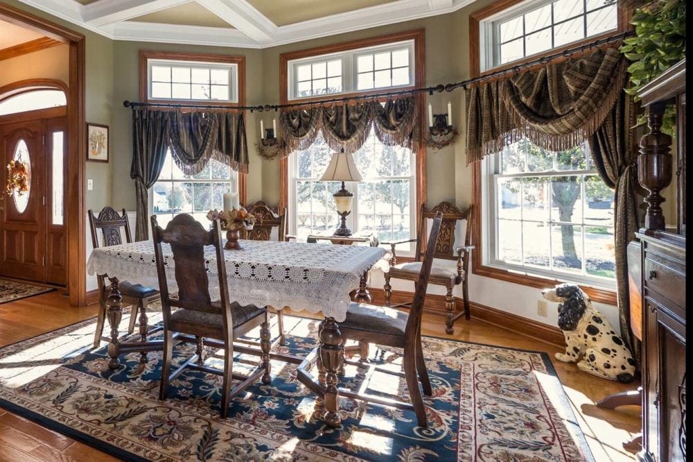
Oh, dear me Laura. Thank you for the heads up. So bad, so bad! Even the poor doggie has turned to stone.
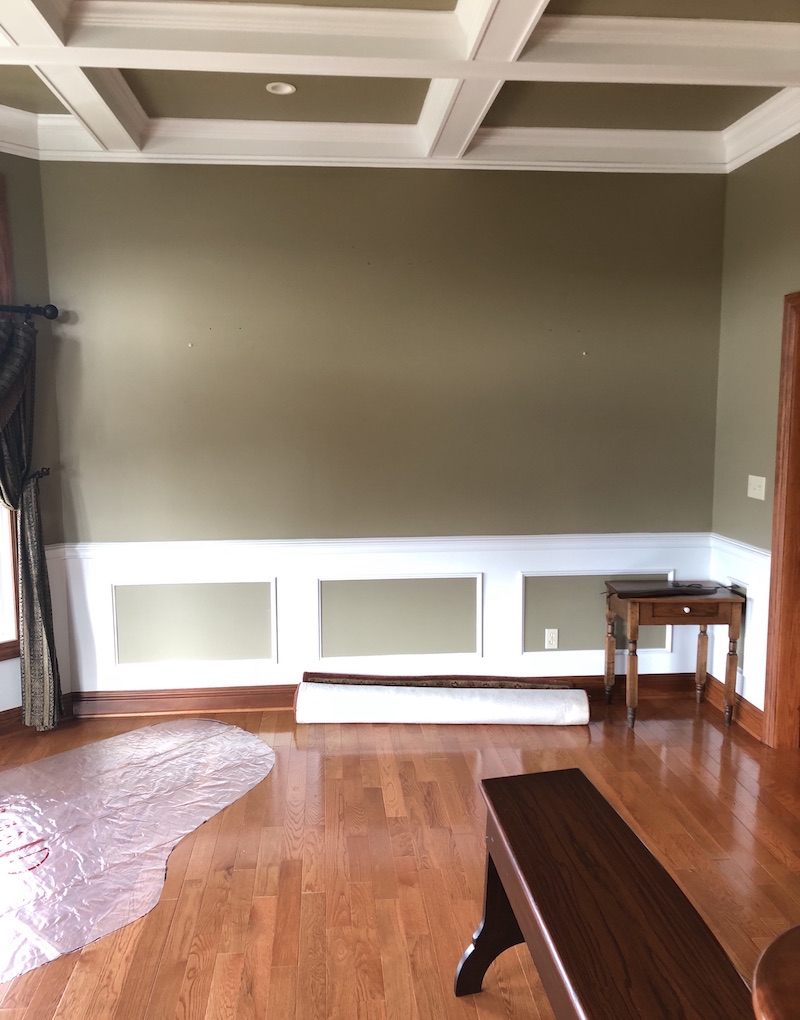
And here’s the yucko army-green paint with the weird paint job on the wainscoting and coffered ceiling.
I’ll say. Although, I’ve seen this done before and it’s okay, I guess, but, it’s not working here.
Okay, I’m a little nervous showing you, even though I couldn’t be more pleased. I’m attaching two photos just so you can see what I’ve done.
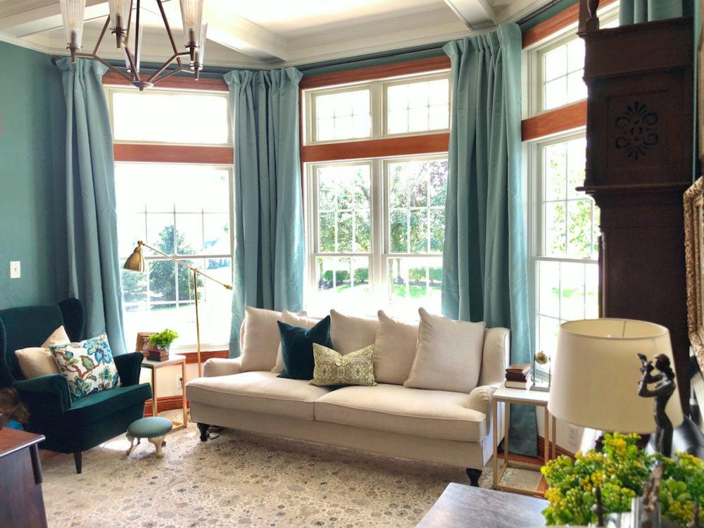
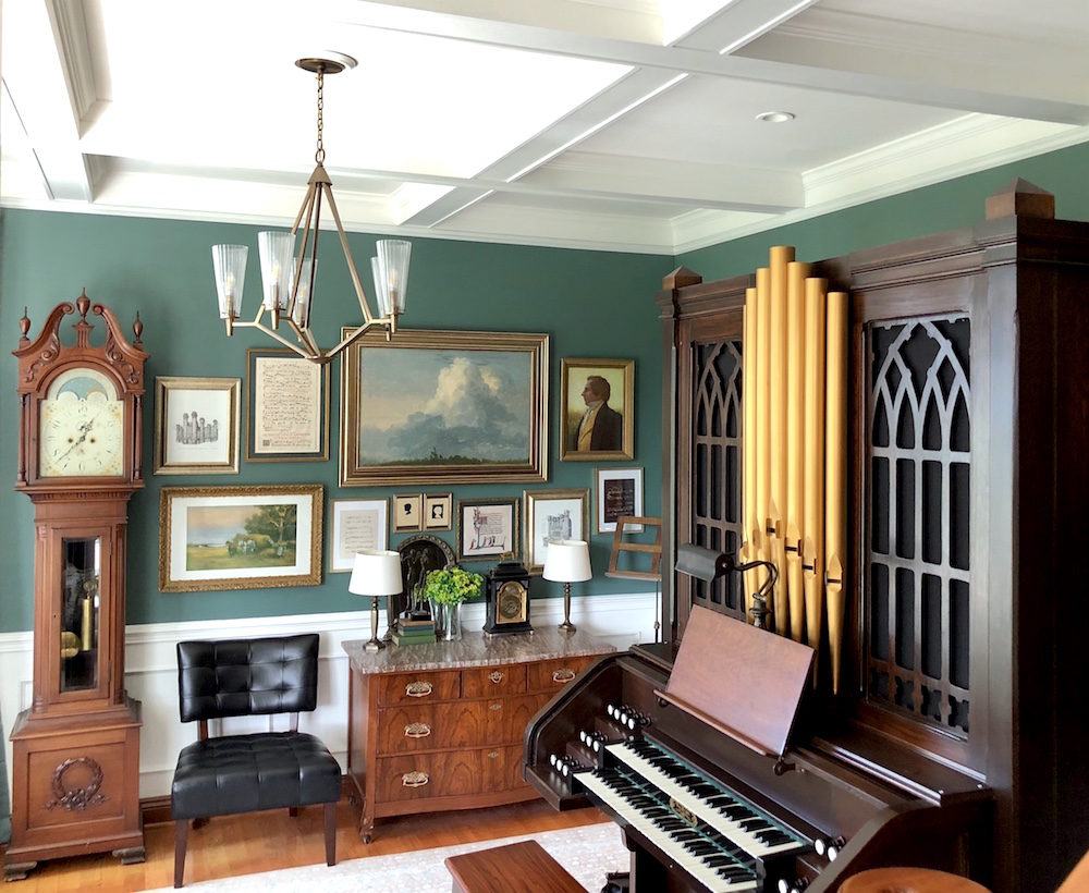
I am beaming with pride, but of course I realize these probably won’t seem all that impressive to you!
Are you kidding me! I just fell over I’m THAT impressed and immensely proud of you, too!
Here’s what I did to keep the costs waaay down:
- Old Walmart end tables
- Ikea chair and lamps
- a Big Lots chair (the black one)
- lots of diy projects like: the curtain rods, the art I printed myself from museum digital archives, and rub& buffing some frames don’t make for a room you could really blog about…
uhhhhh… you would be wrong about that one. :]
but I am truly so happy that I have found a piece of what feels like home in my life!
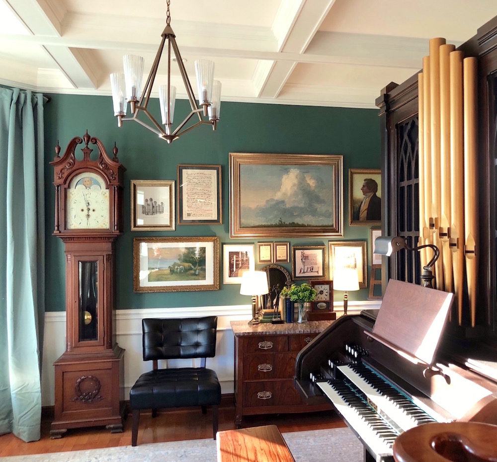
Thank you, thank you thank you for all you do.
You’re very welcome!
Now on to tackle on our family room! Dang it…… now I’m depressed again.
Best,
Laura Omgapipeorgan
*********
This isn’t really Laura’s last name, of course. Very good Laura Omgapipeorgan
This room is reminding me of the charming living room with the high ceilings and gorgeous mouldings. Remember?
But, what confused me a little is that the previous owners were using it as the dining room which means that the kitchen must be nearby.
Since I had nothing else to go on, I wrote Laura back and told her that I’d love to do a post about this and asked her a few questions which she dutifully answered.
Here’s what she had to say:
We live in a mostly rural farming area in Northeast Ohio. That’s right. The SNIRT belt and we have it for six full months! The original idea for why we bought this house was to move my aging father-in-law in with us after his wife passed away.
But then after everything was a done deal, with moving day only weeks away, my F-I-L informed us that he met a woman and she would be moving in with us!
Yes, I know…
That certainly changed things but, needing to work this out, we gave them the real den off of the entry hall. It’s the room with the French doors and is now their living room.
Fortunately, they’re the loveliest people, but I’m not even 40, with 2 young kids, trying to navigate a life and multiple careers– here at home. My own family is across the country in Arizona. It can get rather hectic and stressful at times. But, there are also positives to having my father-in-law and girlfriend here.
Oh, wow! That’s quite a story.
The organ, of course needs a home and the only place left was the dining room which also doubles as our little living room.
In addition, it’s a music room as both my husband and I are professional musicians. There are a myriad of instruments.
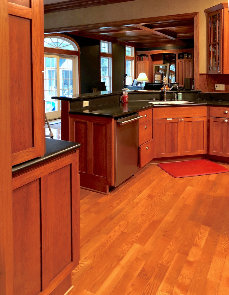
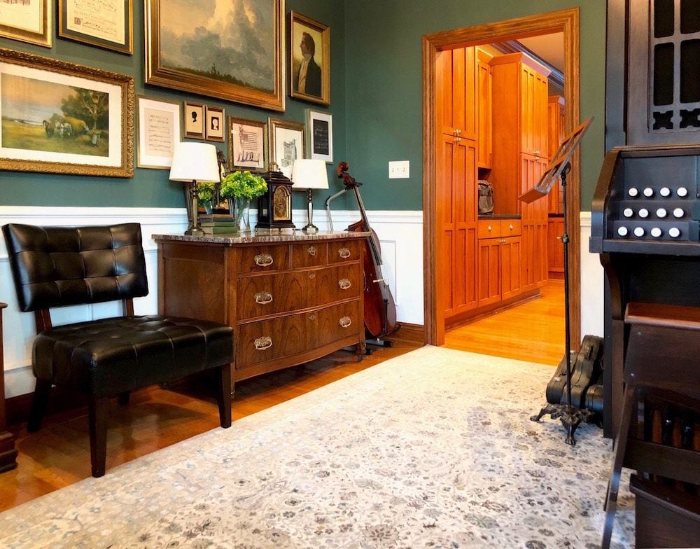 Here, looking into the orange-flavored CHERRY-wood kitchen you can see my cello in the corner and cases for other instruments. One of them belongs to my older daughter, age five.

What can I say, we’re a musical family.
Oh stop! The cuteness is killing me! But, thank you for letting me post this adorable photo of your daughter. I love that tiny violin!
Laura was so kind to share her shopping list and more for her decorating on a shoestring budget
She said that the final tally for the room was actually $1,350.00, including paint and other supplies.
What’s awesome is that she had a base from which to begin with her husband’s rockin’ antique pieces that he had inherited when his mother passed.
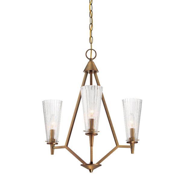
Ceiling light: Montelena 5-light Shaded Chandelier $175 at Wayfair.
Wayfair apparently discontinued the 5-light—maybe that’s when I snagged it at that price.
Below, there’s a small widget with about seven other chandeliers that are also very reasonably priced.
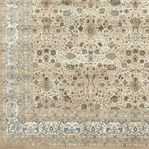
Rug: $250 Miara Cream Rug 10×13 Its not going to last forever, but for that size at that price?!
I have some bad news. It IS going to last forever. ;] It’s polypropylene. But, I had no idea from the photo.
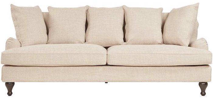
Sofa: On “Wayfair Day” this baby went down to $525.
Holy Crap!!!
I had read your post on the best sofas to buy and this one too about the number one sofa at least 20 times, and knew this could fit the bill, but it didn’t have great reviews. I took a gamble on the quality and it paid off as I’m very happy with both the quality and comfort of this sofa.
Phew! But, I look at the reviews, because it’s good to know WHY folks are giving a low number.
Sometimes people want to be mean for no reason whatsoever except that they are sadistic freaks. But a couple of people complained that the measurements are inaccurate. So, we have to consider if they even know what they are talking about. They say that the sofa is only 31″ high. Yes, to the back RAIL that sits behind the back cushions. The pillows are always higher. But, it’s not an exact science because well, they’re pillows and scrunchy. I can see from Laura’s images that the sofa is at least 34″-36″ high.
Window Panels: $225 loads less than velvet, but still looked to have a lush texture.
Mine are the Juniper Berry colorway in 120″ length; I hemmed them myself and added drapery hooks (to hang higher to cover my make-shift DIY rod) and rings.
I notice that they are a shade off from the wall color and I actually really love that. There are so many greens in the room and this reflects that.
Paint is BM Jack Pine in flat/matte with Simply White semi-gloss (thank you Laurel Those are both beauties from your curated paint and palette collection.).
Accent pillows were from a home stagers warehouse clear-out sale, $5 ea.
WOW! And I love the colors
The end tables were on clearance at Walmart this summer for $17ish ea.
That works.
Ordered the flowers from Amazon, maybe $3 a stem.
Now, for my favorite part.
A few of the art pieces we had, but about half a dozen were printed on my large format color laser. (in addition to being a flutist, I’m also a graphic designer and photographer).
Wow! You’s so talented and the art wall is my favorite part too. It’s what you see when you first walk into the room and it compliments the wall color so beautifully. It totally makes the room!
So yes, with paint about $1,350.
That is outstanding! And I love that the supporting players aren’t terribly flashy. They don’t need to be.
Below I created a small widget that has about ten items, mostly ceiling chandeliers that are under $250 and most of them way under that. I tried to choose pieces that are stylish and don’t look super-cheap. Some are quite modern and I think that’s a good move for this room.

Laura wrote to me in a later email some interesting info about her luscious art wall.
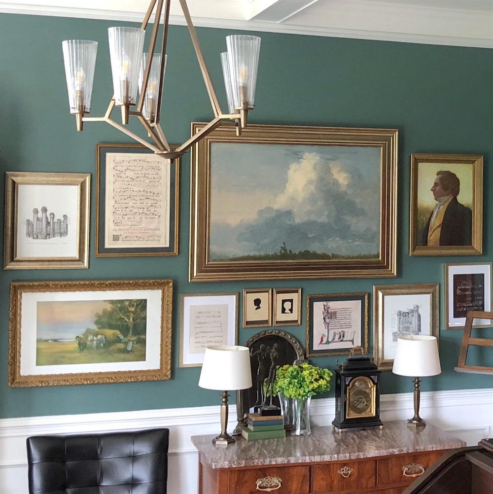
I wanted to use a portrait on the gallery wall and had a mass-produced print that seemed to work. But even after putting it under the wavy antique glass of a Victorian frame, it looked terrible. So I used matte Mod Podge craft glue and with a brush, replicated strokes following the print, let it dry and repeated. Behind the glass, it looks like canvas! Win!
Brilliant!
I asked Laura how much space is there between the sofa and organ bench.
It’s only 53″ and since this is a major path, a coffee table won’t work.
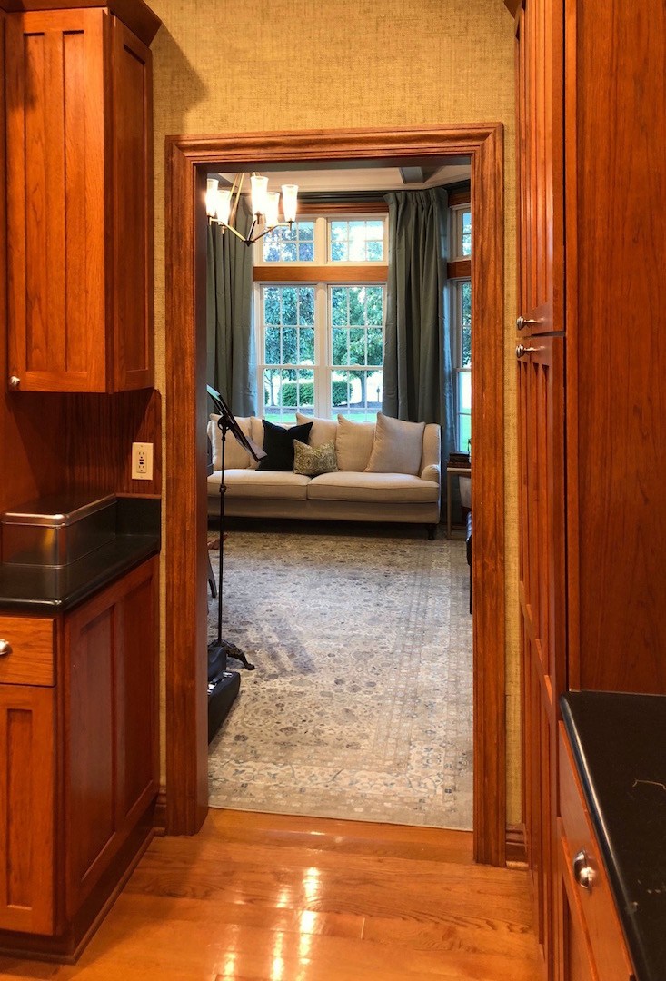
The view of the music room is stunning, but the cabinets do look quite orange in this photo.
Brace yourself again, this is the family room. “It’s beyond overwhelming,” Laura said and continued.
I know. The giant furniture is overwhelming and obviously the wrong colors.
Although I LOVE the Benjamin Moore Washington Blue that sort of balances the overpowering orange wood, it is WAAAAAY too dark in there), wall-to-wall built-in with ridiculously sized niches — it’s next on the list.
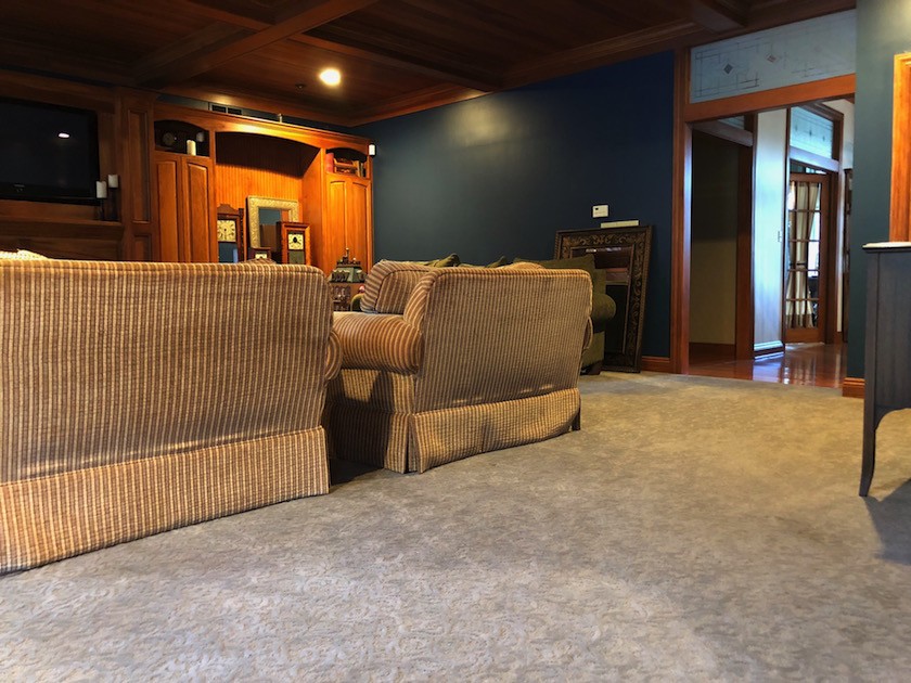
Though, with how long I had to wait to find pretty pieces at rock bottom prices, I’ll give myself maybe $2500+ for the family room.
Wow! That might be tough; especially if you want to replace the cabinet. Just taking it out and repairing the wall is pretty expensive unless you guys do it yourselves. I imagine that you have to be careful with your hands?
As an aside, I have found literally no help/ideas online trying to rework my kitchen with no windows.
The kitchen lives between the breakfast/table area and dining room, and as much as I’d love to do an unkitchen, I don’t have any pretty windows illuminating the space. And according our friend/contractor, taking down the wall in between the kitchen and family is not a realistically viable option. Just putting that out there maybe as a future blog topic.
*********
This has been incredibly interesting Laura. I want to make a few remarks.
First of all, as you know I think that you did an outstanding job; particularly with so little money. The only thing I would probably recommend is that the area rug be a little smaller next time. ALTHOUGH. I am thinking that the organ can’t be half on and half off the rug. Or maybe that’s all that was in stock at the time, that you liked.
Normally, I recommend a minimum of about one foot of wood showing around the room, but usually 18″ to two feet. It all depends. The rug could be floating even more.
I think that Wayfair should use your image of the curtains for their advertising. Their photo makes those drapes look cheap and yours look luxurious. Note to all. These are black-out drapes which have both pros and cons. The pro is that the color will remain constant as the day-light can’t go through it. The con is that they will block some light. But this appears to be a bright south and maybe west-facing room, so black-out is an excellent idea.
I would also look into having some UV film applied to the glass if it is not there already. Over time, if the hot sun is filtering through the room, it could harm the furniture and maybe even the organ!
I LOVE love these big beautiful windows and with transoms!
And, this is a lovely house, however, there is a LOT of wood. But, it seems to me that its biggest problem is that it can’t decide if it wants to be a craftsman-style of some sort or a Victorian-ish style home. Lotte’s home from Sunday is the real-deal Victorian.
One thing that is bugging me when you guys can swing it. I would definitely consider changing the front door.
If you click that link, you’ll see some similar doors. This makes Laurie (me, to be clear) very cranky.
They are 100% American fraud. There is no such thing as a Victorian door that looks anything like this. Of course, if you like it, despite my saying it’s wrong, it’s not the end of the world. :]
And while I adore the interior doors and transoms, I’m also not crazy about the ersatz (laurel’s favorite word) frosted glass with the trying-to-be Craftsman design in the interior transom windows. It’s not real leaded glass and this isn’t Taliesin.
But, but, but, there is so much potential here. Just look at how the music room came to life. You can do this! I do love the gorgeous high ceilings and the coffered ceilings too. Over-all, I think that this home is really more Victorian than Craftsman, and I think knowing that will be helpful when deciding what gets painted and what stays as wood.
You can see some authentic Craftsman and Victorian homes here and how they are painted (or stained).
As for the kitchen and family room, plus eating area.
I told Laura that if she sends me a floor plan of the entire area, that I might be able to work on this one. These are not uncommon problems. This is the heart of the house, but that’s just it. It’s dark and does have a ponderous vibe, as is.
However, we can discuss north facing rooms and rooms without windows and ways to integrate this area to make it as warm and inviting as the beautiful music room.
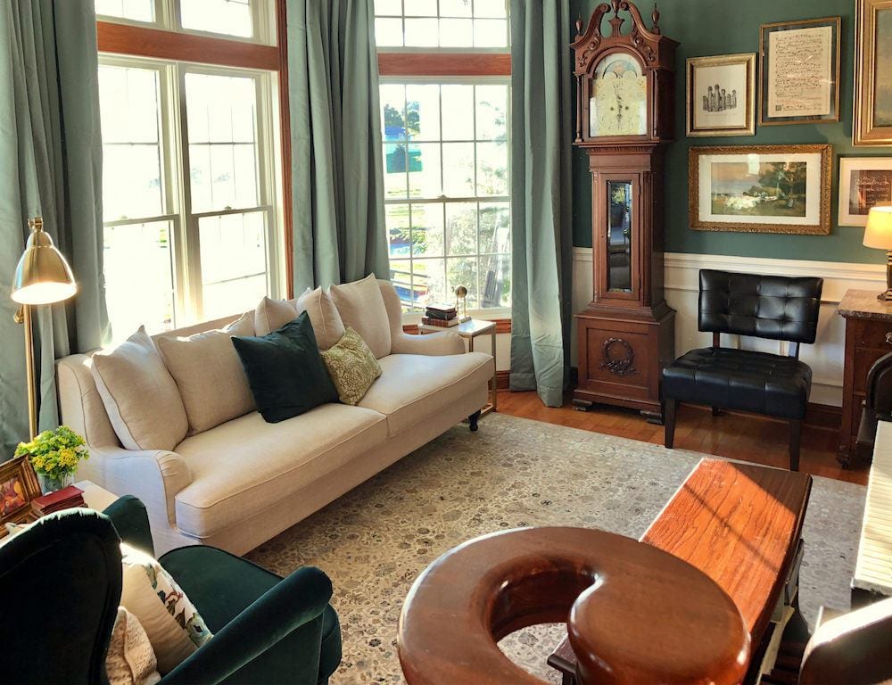 One last look before I send this one off.
Thank you so much Laura for not only sharing your lovely home with us, but a part of you and your lovely family, as well.
BTW, I didn’t comment, but I love the dark green velvet chair and then repeating that one pillow on the sofa. Muah! Really great. I think that you got the balance just right.
xoxo,

PS: Please shop the recently updated HOT SALES!
Related Posts
 Lampshades – What Size and Shape Should You Get?
 Free Art Wall Templates and Free Art Too?
 We’ve Run Out of Money. Is It Too Late To Install Wall Sconces?
 Is The “Unkitchen” Kitchen Design Trend, Here To Stay?
 A Frumpy Old House Gets A Sparkling Makeover
 Door Knobs – The Good And The Not-So-Good + Sources
 Laurel, Why Does My Decorating Look So Awful?


