Do The Best Dark Blue Paint Colors Make You Blue?

Hey Everyone,

Guess where I am on this early spring day in Boston?

I won’t leave you in suspense; I’m at the Boston Athenaeum!


And, I got to use my virgin membership card. I verified with the guy at the desk that they close at 5:00 PM. “Yes,” he said and then continued with a twinkle in his eye;


“oh, you can spend the night if you like. Just bring a sleeping bag, but don’t let [I forgot the name] catch you.”


haha! Who remembers the Sesame Street (My son Cale called it “Messy Street”) special, “Don’t Eat The Pictures?” Big Bird, along with a bunch of kids and their clueless ;] caregivers were ummmm… locked inside New York City’s Metropolitan Museum of Art.


YouTube video

Yes, that’s Sahu who’s undoubtedly a grandfather by now. ;]

Do You have any idea how many times I heard, “Where does today meet yesterday?”


If you guessed thousands, you are correct. Fond memories from the early to mid-90s.

*********

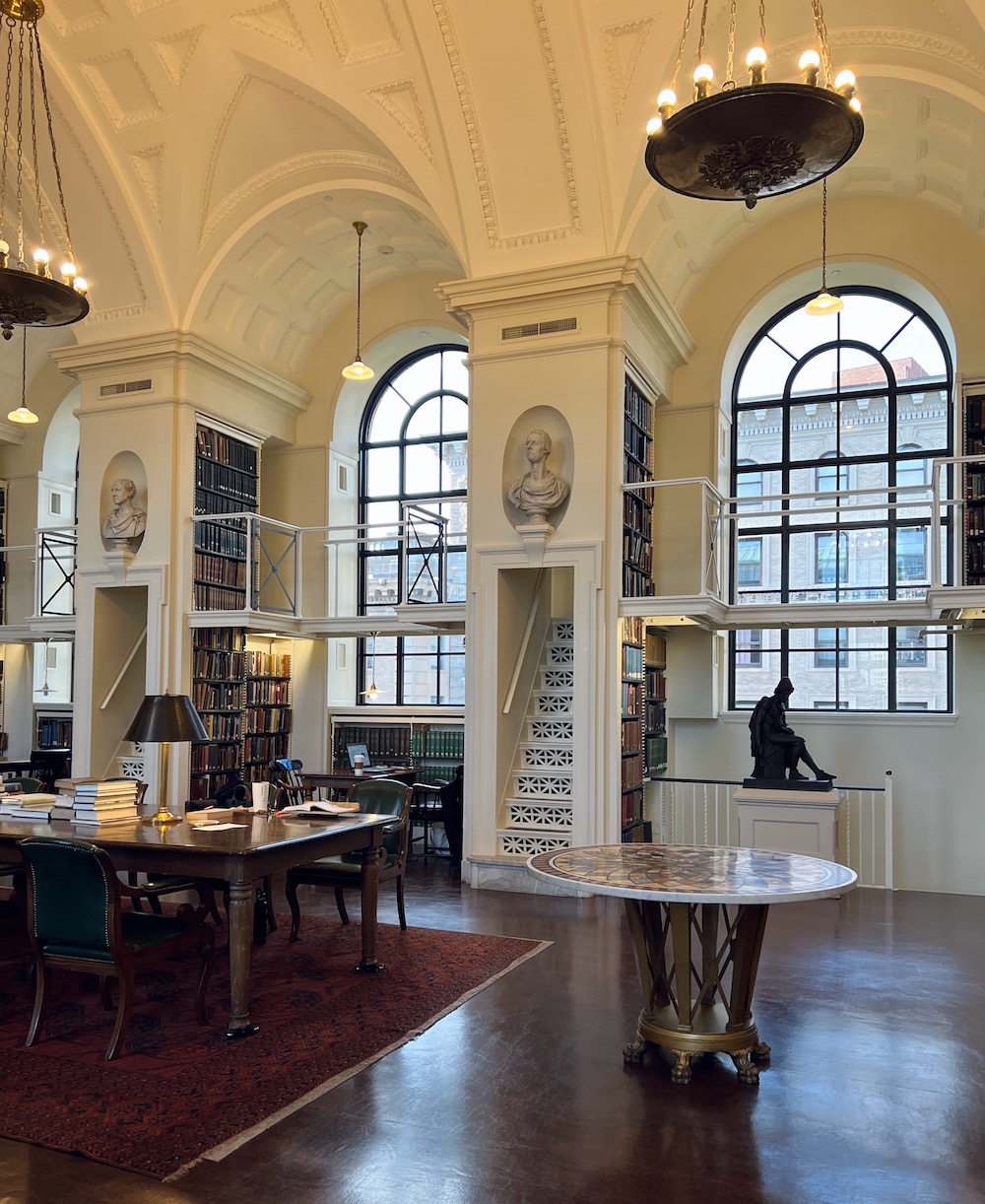
The Boston Athenaeum is exactly 9/10ths of a mile from me, but the last third is up to the top of Beacon Hill, just passed the Massachusetts State House. Along Beacon Street, the ascent is not terribly steep. However, it’s at least a quarter of a mile and quite a workout. After I arrived, I thought I would walk up to the 5th floor. Well, I made it to the third, thought the better of it, and elevatored the rest of the way. Since the ceilings are so high, it’s more like four floors. Maybe next time.
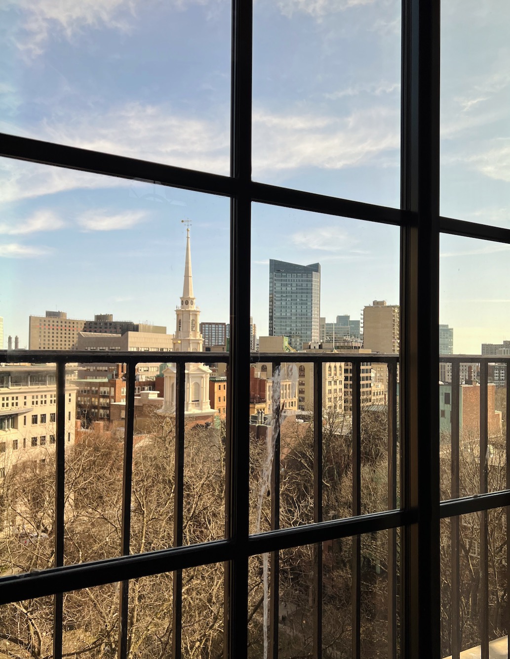
 

view out of Boston Athenaeum quiet reading room

The view from my “office.”

FYI, when I walked back down I counted 150 steps up back down the first floor. And it is 80 steps to the third floor!


Anyway, it’s good to do work somewhere else. It clears the head and paves the way for new ideas.
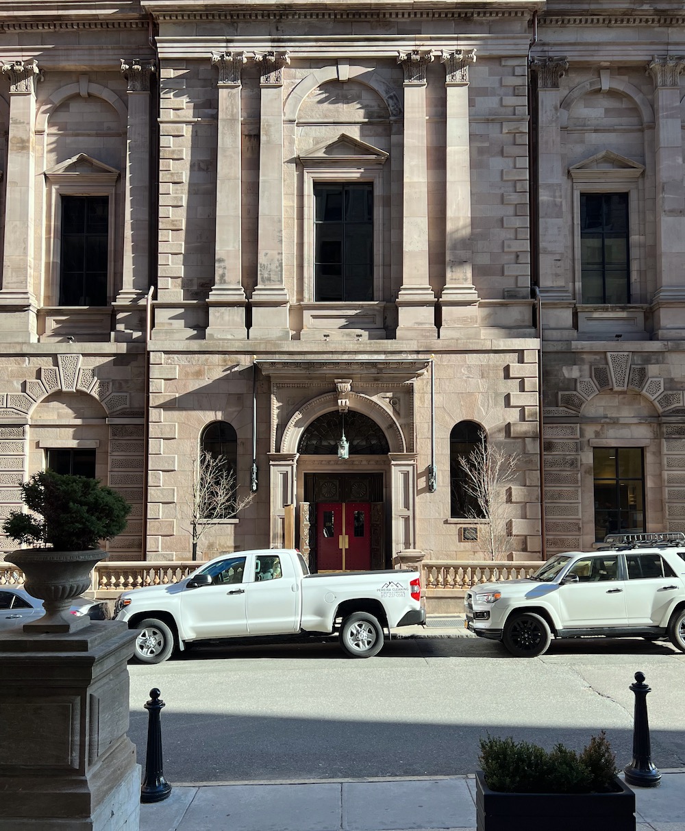
 

front facade Boston Athenaeum

The front facade of the Boston Athenaeum was taken by me from across the street as far back as I could go.

If you missed my post about the Boston Anthaneum, an exquisite library/art gallery/museum/cultural center, please go here.

Before we go on with the best dark blue paint colors, I have an update for you from the mid-week post where we looked at kitchen lighting. Thank you, too, for the many lovely comments I received; I found most of them quite helpful, but all are greatly appreciated.


Now we will get into the best dark blue paint colors, which begin with a real “Dear Laurel” letter:


Dear Laurel –

About a year ago, a close friend sent me the link to your website. And, you’ll never know how much enjoyment I’ve derived from your candid and fun blog posts. I also refer back to, save, share, and am continually inspired. I so enjoy your candid and fun way with words, too.

Not only have you expanded my horizons, but you’ve also saved me money!


[Laurel needs to interrupt to say that this lovely woman is not on my payroll. haha!]


Thanks to your timely hot sales alerts, we ordered two chairs, bedding, shams/comforter, and a Robin Bruce Sleep sofa (your feature on sleeper sofas got us over the hurdle). All have been received except the sofa, and we are thrilled with everything!

You’ve energized me to revisit my long-time favorite Blue & White Chinoiserie, so I’m underway on that too!

I need your suggestions for the best dark blue paint colors to go in the adjoining small-ish guest bath. The tile, tub, sink & WC are Kohler crisp white; the floor is stained wood.

All Best Wishes,

Judy


Gosh, that was a darling note. Thank you, Judy!


In addition, a few others have been asking for a post about the best dark blue paint colors.


Okay, then! Here it is…


But, one thing that often comes up is that most of us have connotations with specific colors. And, blue is one of those that comes up quite frequently.


I’ll never forget my COLOR professor at the New York School of Interior Design saying to a student in 1988, “No, you don’t like blue; you like indigo. Blue is a horrible color.”

It is?

I recall thinking that was a strange thing to say to a student or anyone for that matter. Mostly, I like ALL colors, but some need to be in tiny doses. haha. Here’s a good example, a child who picked a shocking color for his bedroom.


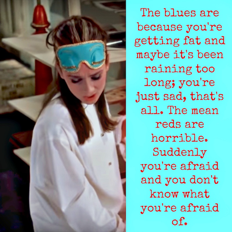
Below is a classic example from Breakfast at Tiffany’s where a ravishing Audrey Hepburn explains to her newly met love-interest, in the film, George Peppard, the difference between “the mean reds” and “the blues.”
 

YouTube video
 

Breakfast At Tiffanys - The Mean Reds - Best Dark Blue Paint Colors

Love the Tiffany blue sleep mask.

And, Audrey darling, you have a long way to go before worrying about getting fat.
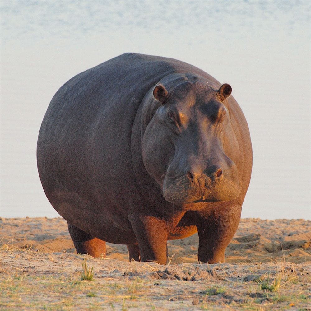
 

HUGE hippopotamus - the color of feeling fat

This, I believe, is the color of getting fat.
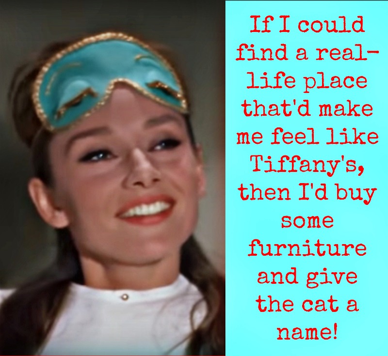
 

Find a Place Like Tiffany's

Of course, it’s not a place that she needs…

Oh, I hope that when she gets her life together, she goes and shops my hot sales for some beautiful new furniture!


Feeling sad has never felt like the color blue to me; quite the opposite, I think.
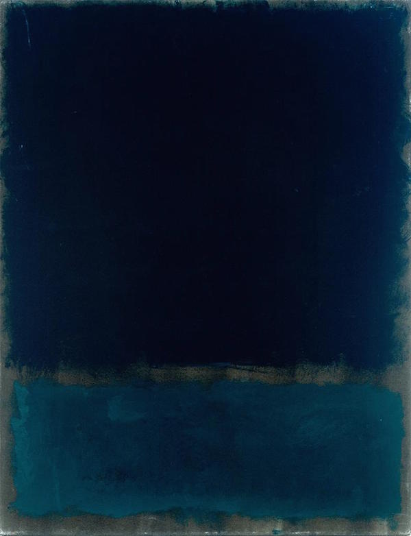
 

mark_rothko_navy_black464

Mark Rothko


However, feeling blue, or the blues, is prevalent in art and especially in music.


uhhh… The Blues. Everyone knows that.

The blues are associated with a genre of music evolving in the deep south after the civil war.

But, did you know that virtually all music today is a direct evolution of the original blues? Gospel, Spiritual, Soul, Rhythm’ n Blues, Jazz, Big Band, Rock (in all of its forms), Hip Hop, Funk, etc.


It seems that the blues are more about a catharsis of sorts, like a good cry.


It is the color of healing.

In fact, many years ago, when I studied acting in New York City, we had an exercise, amongst many, where we imagined a healing blue light flowing through our bodies. Our teacher told us we could summon the blue light any time we needed to calm our nerves.

I’m going on about this because a lot of us have preconceived notions about color (like Ms. F. at the NYSID) based on either what we hear or what we think we believe.

And, while some of you already love rich, dark blue paint colors, some of you might not be there yet. And, it’s fine if you never get there. But sometimes, I find that it helps to think of old things in new ways.


Here’s what the color blue is to me.


Blue is infinity.

 

photo-Kyle Gregory Devaras - unsplash - starry sky

photo-Kyle Gregory Devaras – Unsplash

 

Steve Halama best dark blue paint color

Photo – Steve Halama – Unsplash

It is spiritual.
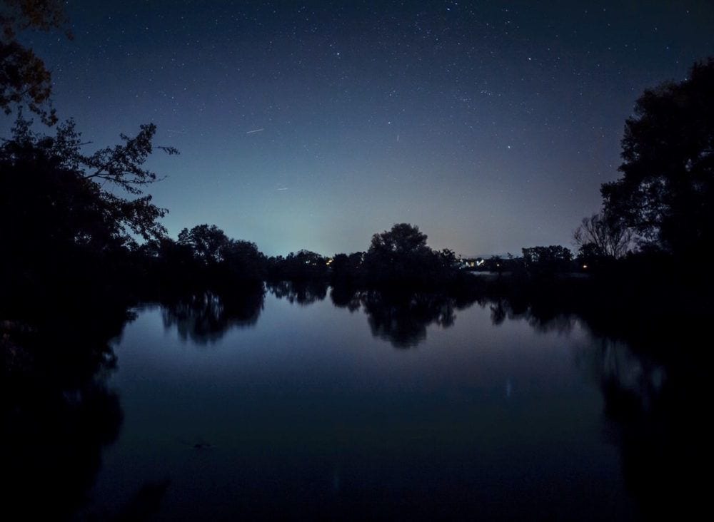
 

Markus Spiske via Unsplash

Markus Spiske via Unsplash

Dark blues are mysterious and heavenly.

I love black and blue together.
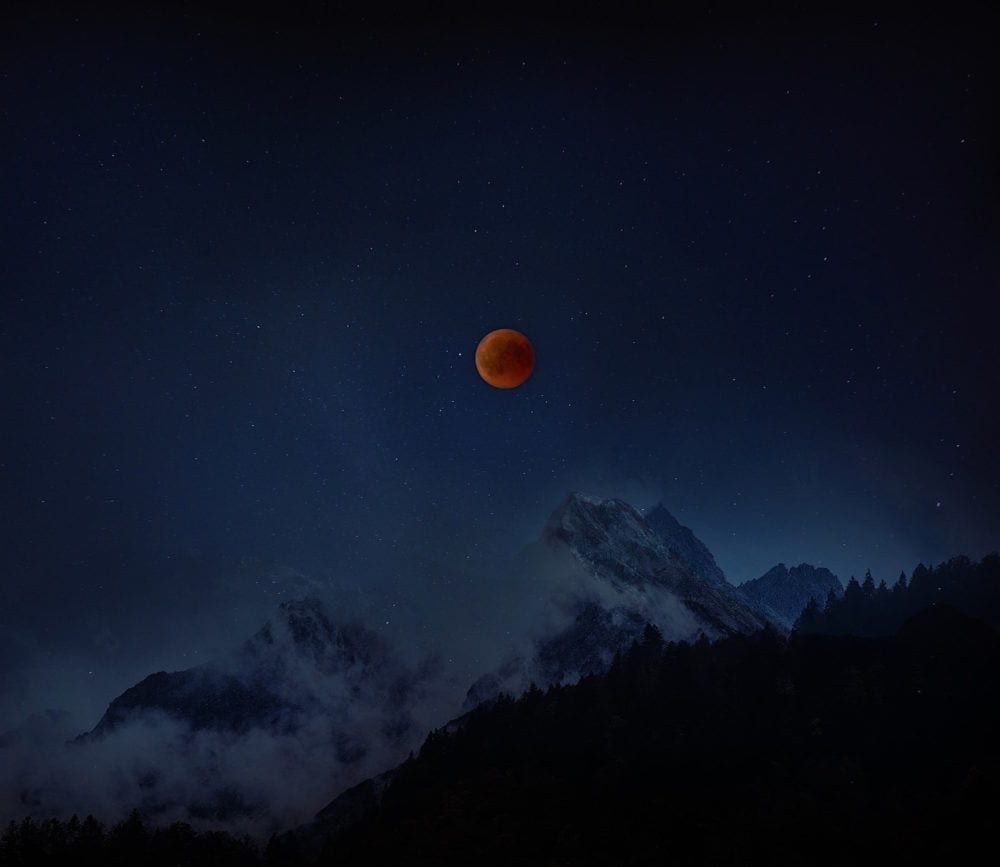
 

@foemedia - Fabian Oelkers via unsplash - lunar eclipse

@foemedia – Fabian Oelkers via unsplash

blue is calming
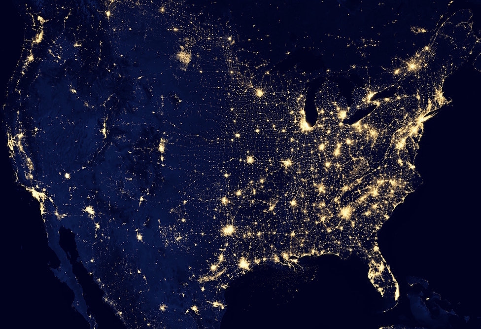
 

United States at Night - via NASA

Blue is magical. Photo: via NASA. Pretty cool!

 

And Dramatic


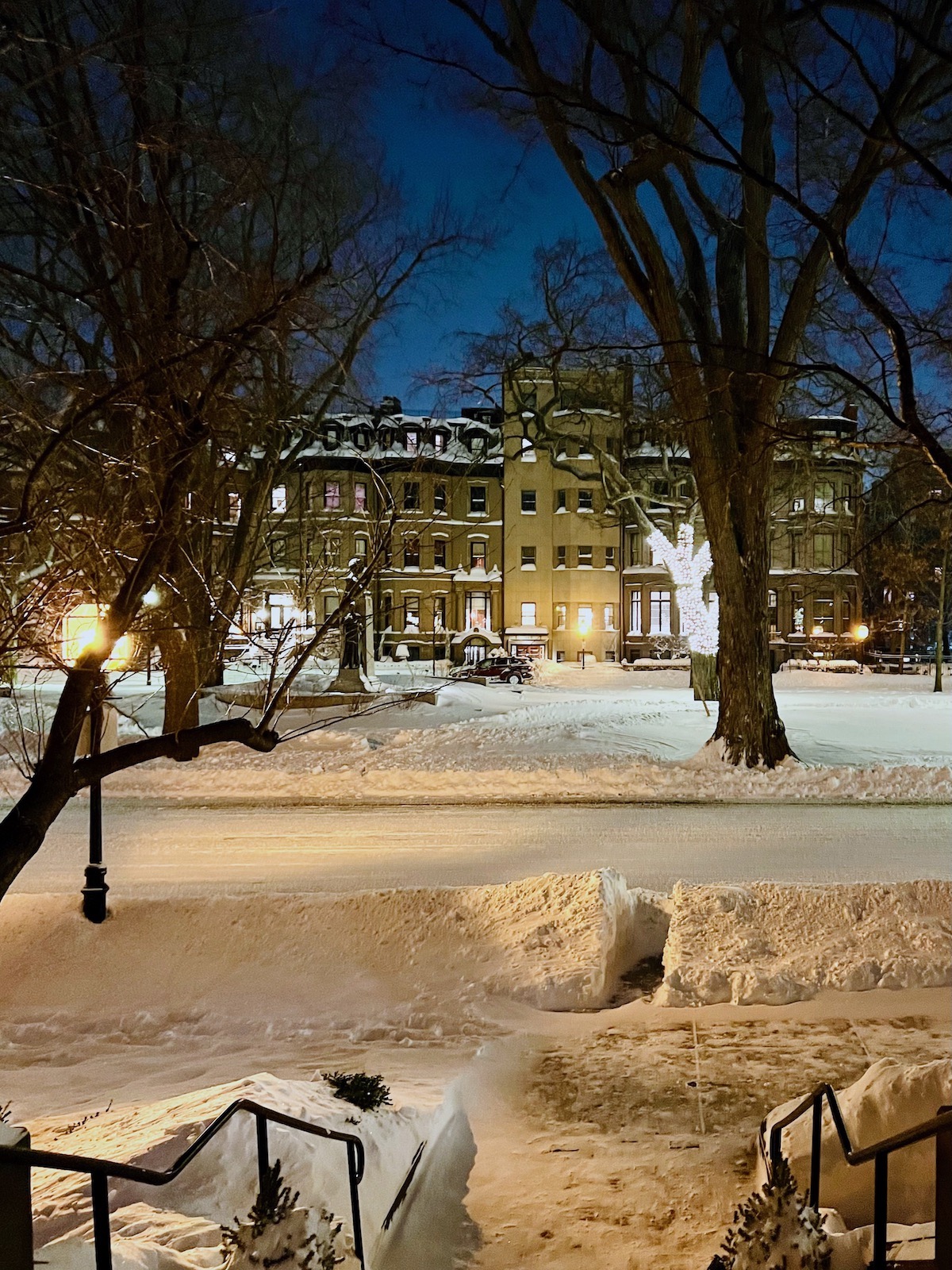
outside my front door Boston Blizzard 2022

Photo by me taken the night of the big snowstorm in January with an enigmatic evening sky.


Below are some inspiration interiors and exteriors featuring the best dark blue paint colors.
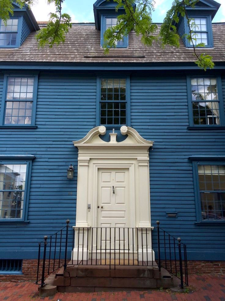
 

blue-house-white-door-newport-RI - best dark blue paint colors

I love this dark blue and white home in Newport, RI. However, I don’t know who took this image.
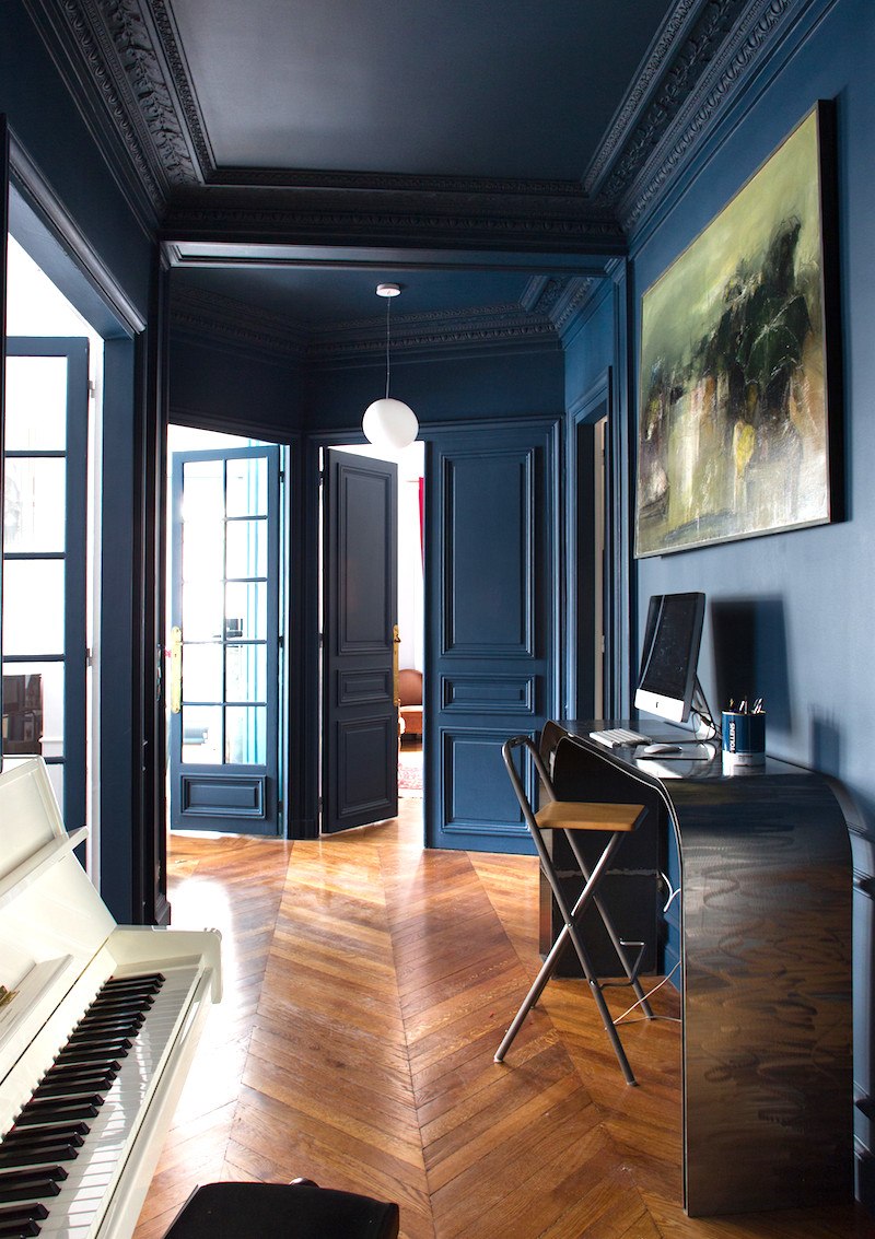
 

dark blue walls mouldingI don’t have the source for this image, either. However, I love black and dark blue paint colors together. In fact, I wrote a post several years ago about it.
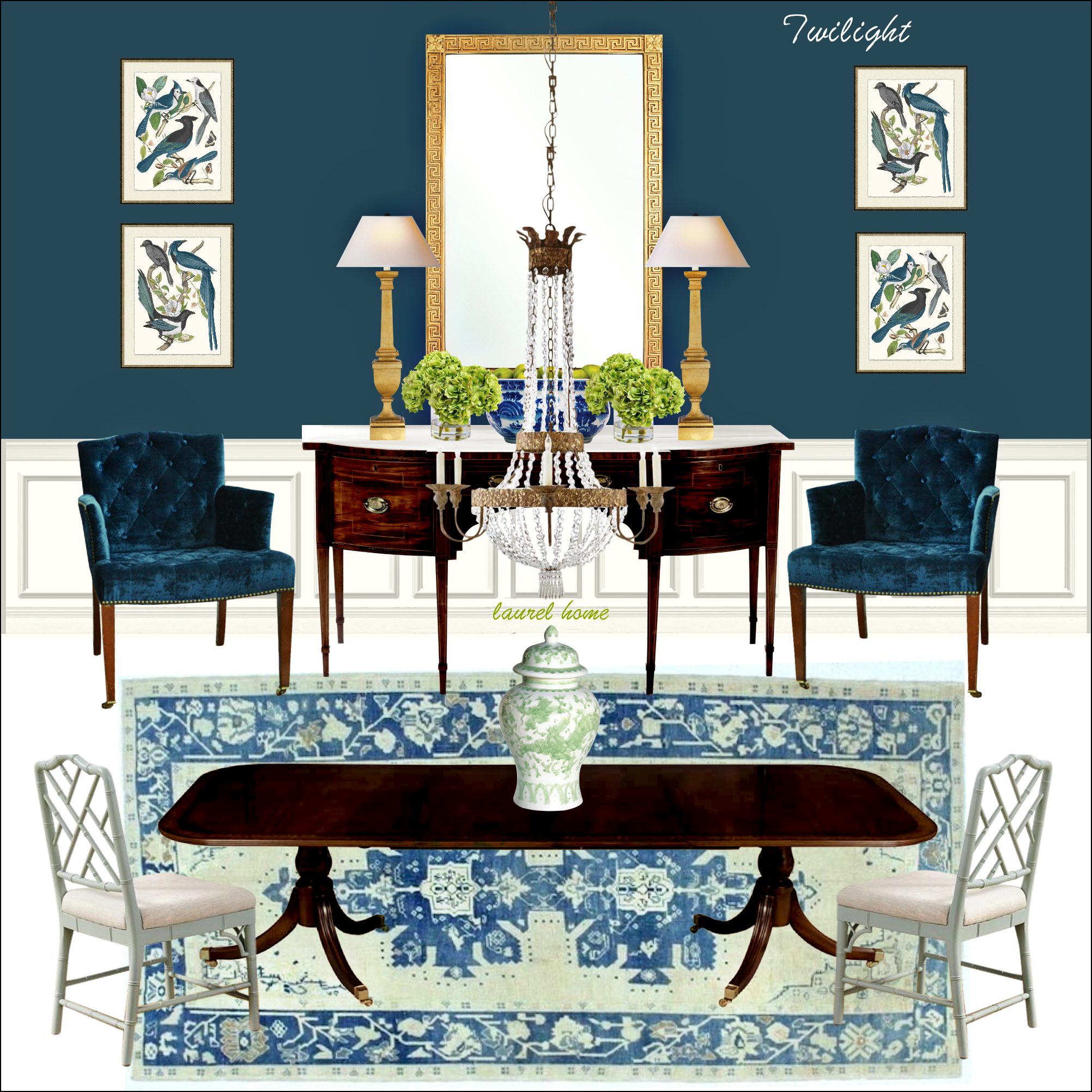
 

Benjamin Moore Twilight Dining Room - best dark blue paint colorsOne of my favorite boards from the Laurel Home Paint Palette Collection, featuring the color Twilight by Benjamin Moore.
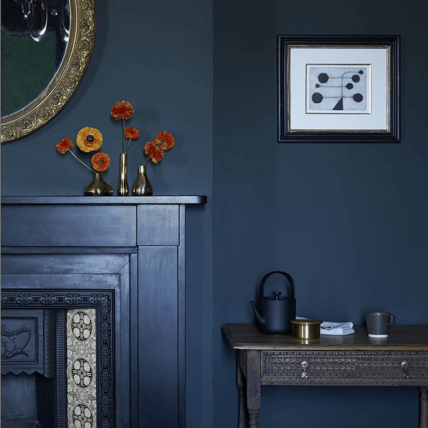
r Colors - Heckfield Place - deep blue black walls - English Country HouseFrom the exquisite hotel in the UK– Heckfield Place.


38 Lime Street Beacon Hill Holiday 2021 - gorgeous door - best dark blue paint colors

An iconic Beacon Hill door I took last December.
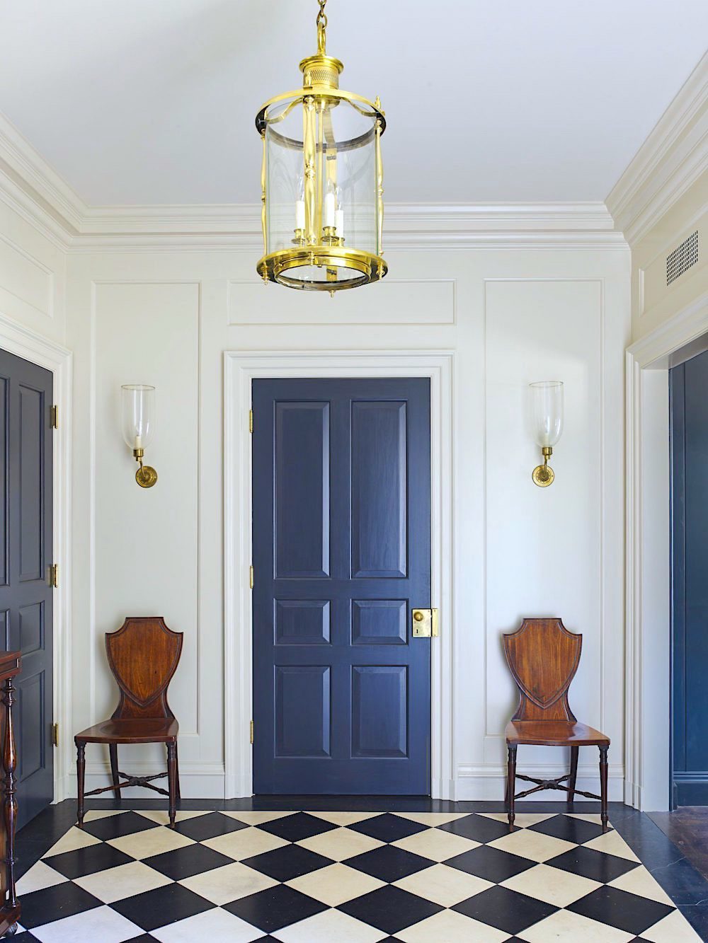
 

James Carter_classical architects - classical entry - black and white floor

Gorgeous, gorgeous by one of my favorite architects, James Carter, featured here.


Below are some older posts featuring mostly dark blue colors.


Blue and white rooms

A wonderful color palette featuring blue

Beautiful blue and white rooms with inspiring architectural features

Blue and White Chinoiserie


Laurel? Paint colors???


Yes, yes. :] Thank you for your patience. They are coming right up. These are by Benjamin Moore and are in the Laurel Home Paint and Palette Collection except for Hague Blue, which is by Farrow and Ball. To see the Benjamin Moore equivalents to Farrow and Ball, click here.
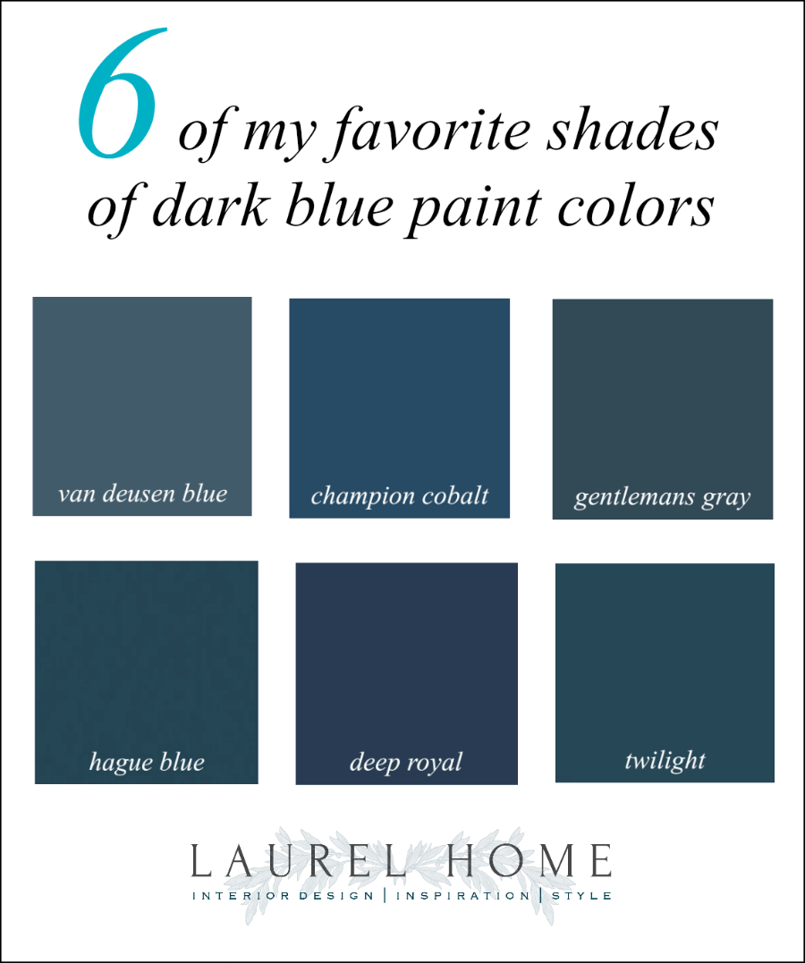
 

Six favorite shades of rhe best dark blue paint colors

The blue section in the LH Collection is the largest, with 18 shades from super pale to navy. Some may wonder why I did not include the popular Benjamin Moore color, Hale Navy.

Well, I was going to, and it’s a fine navy blue.


However…
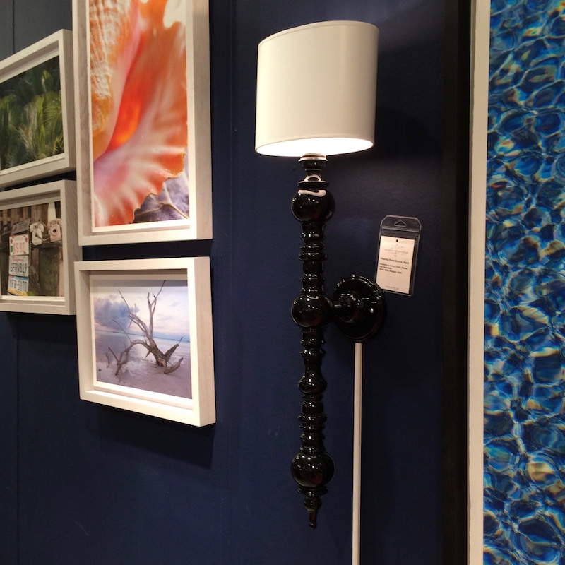
 

dunes and duchess black sconce colorful art - Benjamin Moore Deep Royal- best dark blue paint colors
In 2016, just before the paint collection came out, I was at the High Point furniture market, and that is when I saw Deep Royal at the Dunes and Duchess booth. Well, that was it for me. It is the perfect Navy Blue.

You might notice that most of the blues have an element of warmth to them. These are not quite teal but heading in that direction. It’s a personal preference. I suppose I could’ve put in a lovely indigo. (blue veering towards purple), but I didn’t.

What are your best dark blue paint colors? Do you have any favorites? If so, have you used them, and in what room(s)? Please share in the comments.


Below are some other posts about specific color groupings.


warm grays (which sometimes veer into violet, beige/greige, and khaki)

cool grays (which sometimes veer into blue, green, indigo)

pale blues that don’t scream out BABY BLUE.

some of my favorite green paint colors

green paint colors that aren’t called green

yellow paint colors and a popular shade from the early 18th century

orange paint colors, from pale to deep

red paint colors

How to Work with the Color Pink

And brown, masculine shades preferred by the wife, not her husband


There are even more posts about paint.


If you are looking for more. You can either try the search box near the top of the sidebar. Or, you can go to the categories (lower down on the sidebar) and look for “interior paint colors.”

xo,


PS: Please check out the newly updated HOT SALES!


35 Responses

  1. We used Ben Moore’s Big Country Blue in Aura 2066-30/big-country-blue on a long northern wall that spans two irregular-shaped rooms beginning at the base of a curved stairway in our Medallion Room and stepping down one more seagrass-fringed step to where it continues into the Living Room. Adjacent to the blue wall in the Living Room are telescoping glass sliders that open onto a deep-covered sun-splashed waterfront Terrace on both the east and part of the south sides of the Living Room.

    In our space this blue reads decidedly darker than shown in the Ben Moore photo while retaining its brilliant blue hue; surprisingly, it has become my favorite wall in the residence. Hung with a wave of contemporary artwork punctuated by a sandy marble fireplace over which is inset a Samsung The Frame matte version TV in Brushed Stainless that seems quite content with its contemporary artwork cousins

  2. My kitchen cabinets are Fine Paints of Europe Blue Dynasty satin, and I LOVE them. They are a deep, rich, warm hue. They are in a bright kitchen and have not faded over time.

  3. We painted my all the built in cabinetry in my husband’s office BM Gentleman’s Gray. The walls and trim are a creamy white. It’s a refreshing change from their original dark wood stain.

  4. So much inspiration and always a fun read! It seems we are on the same color wavelength, you know, like orange. Thank you.
    Years ago, I painted my bedroom BM Cadet Blue — it faces north and into a large stand of trees. Serene. The bed, small night tables and vanity are painted a pale green with a tiny gold highlight (original 1960s Drexel French garage sale find). The armoire is walnut.
    So all this has me toying with the idea of very dark blue walls in my small living room. Love the cozy look.

  5. Today, before I read your post, I bought a quart of Twilight to paint the front door of our recently purchased townhouse. And the shutters will be black.
    I feel so smart because I think your insight is right on! I so appreciate your love of history, architecture, and art that you share with us and which is often the foundation of what you teach us. Thank you for all the inspiration always!

  6. We chose BM Old Navy for our powder room and dining room walls and have been very happy with it. We considered Hale Navy but it was just a hair darker than Old Navy, which is quite dark as it is. Sometimes in photographs it appears to be black. I love it against our white trim and with our mahogany sideboard and cherry table/chairs. And it makes a nice almost-neutral background for artwork. Highly recommend!

  7. Love this!
    “ It seems that the blues are more about a catharsis of sorts, like a good cry.”
    So true!
    Both our front and back doors are BM Deep Royal on the outside. Beautiful with our pale beige siding.

  8. The very best blue is Van Deusen! Used it in my Family Room that has low light and it doesn’t go black or purple. It is STUNNING and I get compliments all the time. Never thought I could use this color in a large open concept space with dim lighting. I do have lots of cream woodwork and a vaulted ceiling. My realtor told me not to change it if we put our home on the market. This was a surprise since ALL homes for sale seem to have only gray walls and neutral decor. So boring. Lol. Love your blog, Laurel!!!

  9. I am late, but indigo is my absolute favorite color, period. I am trying to figure out how to use it in my new place. I call it blue purple for those who do not know what I am talking about. Now, how about a posting about your favorite and my favorite, please.

  10. I’ve been reading your posts for about six months now, and love your style – and wit! I have a question – not about blue – but about the flooring in your first picture here at the Boston Athenaeum. What is it? We are designing a guest house that will host children and pets, and we’re looking for something that will be both durable and lovely. Your thoughts? Thank you!

  11. Laurel: It was your endorsement of BM Buckland Blue (which is a more medium shade, I guess) that led me to use it in my guest room -and I love it! It’s a smallish room, and we did a chair rail effect with Cotton Balls on the bottom. (I’m not particularly adept at spotting paint on a chip and visualizing how it will look in a room, so your advice on that front is invaluable!)

  12. I painted my cozy little office (walls and baseboard) Denimes by Farrow and Ball (which I think is a dupe for Gentleman’s Gray by BM) and the window trim/door Downpipe by Farrow and Ball. I just painted my daughter’s bedroom Borrowed Light by Farrow and Ball, which is a light blue, although it is very saturated. So a *bright* light blue, if that makes sense. I tend to splurge on Farrow and Ball because I feel confident that their colors are all pretty much gorgeous and sophisticated. It’s hard to mess those colors up.

  13. My dining room has been BM Deep Royal for 12 years now. So amazing at night, rich and centering. For the past two years, I use the room as my office. Now it’s too dark with my medium-stained woodwork, although south-facing. I’m either painting trim White Dove or switching to a lighter blue. I’ve loved Deep Royal – as someone here said – it plays so well with other colors, and artwork. But often needs a lot of white/tan/cream for daytime. So curious how room function can impact color choice (and vice versa!).

  14. We are in the process of painting our dining room, BM Deep Royal. It is a small, dark room where whites and creams look dreadful, and no one wants to spend any time. We sampled many lighter blues and greens but most of them looked grey in this east-facing room with just one window. I was thrilled when my husband fell in love with Deep Royal, knowing it is a favorite of yours. Half the room has been painted, and I love it more every day!
    Thanks for sharing so much with your readers. Your blog is one of the highlights of my weekends, and our home would look far less beautiful had I not found you.

  15. Laurel, I so look forward to your Sunday posts. I usually read them with my first cup of coffee. So blue is really a wonderful color. I have a much loved navy blue sofa and lots of blue and white chinoiserie. Yet putting blue on the walls has always terrified me. I have yet to get the shade right, it never came out as I expected. And is why I took the safe route of neutral wall colors when we redecorated. However, per your post I am pondering what my study would look like in the FB shade in your post. Hmm, lots to think about. Thank you. P.S. I have made your paint color chart my go to for some time – I love FB paint, but getting it is difficult when you live more than 30 minutes west of Boston. So your chart of Benjamin Moore shades that are the same or almost the same as FB has been incredibly helpful.

  16. Thanks to a quilt bequeathed me by my grandmother, I’ve been wanting to do a red, white and blue room (but not Americana). I was leaning towards Hale Navy for the walls but now will go with Deep Royal. This is not the first time you’re posts have been serendipitous in aiding me with a decision. Many thanks.

  17. Painted our shutters and front door Benjamin Moore’s Midnight Navy. It has a strong purple undertone, but the color positively glows in bright sunshine and coastal fog. Our front door is recessed on a small portico and Midnight Navy is a vibrant enough color to have impact day or night.

  18. Several years ago I painted our powder room SW Grays Harbor 6236 (BM equivalent Powell Gray CW-665). Although the color names say “gray”, in our room it is decidedly a lovely dark blue. Fixtures are white, creamy white trim, stone-look tile floor in taupe, ivory with a little gray-blue. The room is tiny, partly under stairs (sloping ceiling) and windowless. Muted bronzy-gold mirror frame and accessories bring it all to life. I’ve been very happy with the color. BUT, Laurel, I so wish I had found your website sooner. You are so right that dark colors on textured walls should always be flat. My semi-gloss was a big mistake!

    I’m sorry we missed the Athenaeum when we were in Boston a few years ago. Perusing your photos, I’ve noticed the various stair railings, all lovely, and would love for you to do a post about railing options, especially painted ones.

  19. PPG/Glidden Regatta Bay PPG1154-7

    After a ton of exploration and swatch ordering, I used this in my office and, to my surprise, it has developed quite a following among my family and friends – 2 bedrooms and counting. It is a beautiful blue and looks lovely with a creamy white – see PPG “Accolade.”

  20. I love this post and I do love blue. We have a room, where we watch TV, that we painted in BM-Twilight (one of the 6 blue shades Laurel favours). Cleverly, we now call it the “Twilight Room”. It is a peaceful refuge. BM’s Twilight has some green in it which makes it feel warm and it eagerly accepts the navy blue of our sofa, bench and drapes, as well as a teal ottoman. It also loves black, picture frame gold and some yellow oak stained window frames. On the other hand, our living room with BM-Wild Blue Yonder is cooler and requires some purposeful “warming up” with creams, taupes and gold furniture and accessories. Despite striving for a more casual look in the “Yonder” room, the Twilight feels more comfortable.

  21. Oh gosh, I was well out of diapers (and out of the house) by the time that Sesame Street movie came out. The first line by the Cookie Monster made me laugh out loud. Didn’t know he’d been given a “message” update!

    I’m a little surprised by the ancient Egyptian kid storyline..seems a little scary for kids.

    “Me so hungry!” -Classic Cookie Monster quote. Okay, I have things to do, I gotta stop watching.

    I love the Rothko. It’s been a while since I’ve seen his work. I’ve always loved it.

    Thank you for a post that is a feast for the eyes.

    The only blue I don’t love is the ones my dad has always been attracted to. But I suspect it’s more about the ceramic ducks with blue bonnets on the walls than the actual color.

    Oh no! I’m at the “Don’t eat the pictures” song…not good. Not good. I’m so glad I was not a mom in the 90’s. It would have driven me batty. 😀

  22. Laurel, I have a question. Does deep blue paint fade over time the way lighter blues do?

    I’ve had two experiences with this. The first is having our bedroom painted with a soft blue from Eileen Kenyon’s full spectrum line of paints. It has faded to a beautiful, ethereal blue gray that I love. Very soothing. The second is having our stairwell to the basement painted a medium blue. I think I went overboard on the brightness level because I had lived for 25 years with it painted a drab medium sort of pinkish brown and had hated it all those years. The woodwork was painted white, the handrail painted black, and I lined the stairwell with family pictures in black frames with white mats. It looked pretty good, despite the somewhat garish blue, but that too has faded and softened over the past eight years. I can’t remember the color, but it was BM paint, probably from their Aura line, so not cheap.

    Someone told me that blues always fade. Is that true?

  23. I love blue. I think most people do. In fact, I think it is the favorite color of most people. I just find many shades to be too cold for me to live with. I prefer aqua, or turquoise. Blues that naturally occur in warmer climates, such as the tropics. But blue is a stunning color, nevertheless. Beautiful post, Laurel. Thank you.

  24. During our gut reno/second floor addition, I ordered BM Brittany Blue (a pretty light blue) https://www.benjaminmoore.com/en-us/paint-colors/color/1633/brittany-blue for the primary bedroom. One day we walked in and the painter was finishing the second coat of BM Britannia Blue (a very moody color) https://www.benjaminmoore.com/en-us/paint-colors/color/1623/britannia-blue (which looks much darker in our room due to which way the one set of windows face). We were so far behind schedule in getting the house done that I told him to finish and we’d love with it. It’s a good color but I think I may have reached my limit on it and will look for something ‘happier’ or at least less moody. I just repainted the guest room from an admittedly beautiful light dove gray to a cheerful but not too bright or in your face light apple yellow/green and I LOVE it. I think I need a similar feeling everyday in my room too (different base color though).

  25. I loved this post, thank you. Deeps are scary. There are disastrous blues, green and reds, and sublime ones and they may live in the same paint card. It’s terrifying, bc you are making a statement, instead of a pale neutral, and you don’t want the statement to be “I *+*#ed up!”

    Your posts always give me confidence to make the calls I want, after running it thru the Laurel-sieve. My whole exterior is a gorgeous blue now and it makes me so happy every time I come home. It was to be a dull greige until a few days before paint day. I’ve never looked back!

  26. I saw Blue Nose (Benjamin Moore) at Kenneth Roberts home – Rocky Pastures- in Kennebunk Beach. The room was so warm and inviting! I had to email the decorators to find the color.

  27. Dear Laurel, First you have cost me $! Because of you I bought the Brooke club chair in Forest velvet. Then, I found George Smith sofa on Sotheby’s consignment website. So you didn’t save me money but I love my pieces. Second, I love blues. When I was young and I picked the color to paint my bedroom I chose a dark Wedgewood blue with white trim. I lived in Marshfield, on the South Shore. I always loved this room. Next, black and blue together are very sophisticated. I wear these colors all the time. It is funny that many people don’t think this is a correct combination. I know I can’t stand red and black together. I don’t know why. I lived in Boston for years and never visited the Atheneum. So many things are taken for granted when you live some place. I would have loved this place. The one thing I loved to do when I lived in Cambridge was to haunt the halls of the Peabody Museum particularly on gloomy days. It was fascinating and creepy at the same time. It was only one block from where I lived. I moved from Boston before the ducklings were installed. I love the photos you are sending about this charming Boston attraction. Makes me smile!

  28. Yes! Just painted my master bedroom SW’s Naval and we absolutely love it! Goes terrific with our bedroom suite furniture by Bernhardt (Napa Valley Collection) and it’s very classy looking!

  29. Love this blog on “the blues”.
    Also love your blog in general.
    I’m a blue person(not literally of course)
    I have used Sherwin Williams “Naval” in several areas and rooms in my house and outside,including my garage door and double front doors.
    All are show stoppers.
    Thanks for what you do Laurel–I so look forward to your blog everyday.
    I’ve learned so much from you.

  30. After reading a former column on blue colors, I tried Benny Moore’s “Gentleman’s Grey” which was the perfect color for my exterior front door & covered up the sunshine yellow quite well. In fact, I liked it so much, I painted the exterior back door the same! But I did re-name it to “Gentlewoman’s Navy.” Thanks for all the gorgeous blues, Laurel. I enjoy your knowledge of color, proportions, architecture, etc.

  31. I painted our guest bath SW Naval above the wainscot painted in SW Pure White. I love this room. It is calming and looks exquisite

  32. I’ll have a rethink about blue. I love the dark shades, but detest baby blue.
    We just bought a historic home (1780) and the people we bought from… they decorated it like a beach house. Lots and lots of baby blue, sky blue, sea-foam green. None of it historically appropriate and all of it hideous. I can’t paint over the baby blue fast enough.
    I’m reading through the paint archives here with great interest! Thanks for another wonderful blog post. The Atheneum is divine.

  33. We just painted my husbands north-facing office F&B Stiffkey Blue and it *glows*. I love it even more in real life than I did in swatches. His office is a railroad room to the “bonus room” above the garage which we will use as our guest br. It’s a heavily eaved room with east and south facing windows. The walls are F&B Parma Grey and the ceiling (incl sloping eaves) is Borrowed Light. It’s magical! (Laurel, hi from Northern Westchester!)

  34. We had the opposite issue at garden design school: none of my class liked (or would admit to liking) yellow flowers. One session, the botany tutor and the art tutor, who were great friends, were both in class and laughing uproariously at our indignation: ‘Same story every year. Not one single student has liked yellow since 1986. It’s not cool, it’s too damn cheerful for your artistic souls.’ They had us grab our coats and cameras took us around the grounds. ‘What’s the yellow doing in this scheme?’ ‘And here?’ Yes, sometimes it was just being cheerful. More often a sprinkle of yellow was bringing a blue scheme to life. Lesson learned. It’s not the colour, it’s what you do with it that counts. Having said that, a vote for Inchyra Blue by Farrow & Ball. Happy Sunday.

Leave a Reply

Your email address will not be published. Required fields are marked *

This site uses Akismet to reduce spam. Learn how your comment data is processed.

Welcome To Laurel Home!

laurel-aarons-18th-e1456449963926

Hi, I’m Laurel, and Laurel Home is the website and blog for Laurel Bern Interiors.
I’ve been creating new-traditional interiors since 1988. The blog is where I share all.

New Edition, November 2023! Get The Indispensable Guide For 100s of Home Furnishings And Interior Design Sources That Everyone Is Raving About

laurels-rolodex-final-book-cover-master 10th edition 23-24

laurel home archives

Categories:

Please click the image below for more info about my rockin’ Interior Design Guides for 2024!

Laurel Home Interior Design Guides 2024
Amazon ad

please click below to check out my favorite decorating & design books

Laurel Bern's Favorite Interior Design and Decorating Books