

Dear Laurel,
I seem to recall that you struggled with your white wall and trim colors. And, there was something about you going to the store, and the guy behind the counter started rolling his eyes the second he saw you?
Well, that’s me, too!
I realize your eye-rolling guy was back a while, and I know you’ve had a lot more experience since then.
I love those posts. I’ve also read the 20 best shades of white paint. And, the number one white paint color. However, 20 colors are too many for me, and one is not enough of a choice.
Could you go over, maybe, the six favorites that you’ve used over and over? And, maybe what wall colors do they go best with?
Connie White
***
Hi Everyone, on this bitter-cold Boston day in January. Connie is a fictitious reader.
But, if she were real, I’m wondering how much she’s shelling out for paint samples? Do y’all all know about samplize?
In any case, I know that struggling with paint colors is a common issue. That is why I created a guide that narrows down some 3,500 Benjamin Moore paint colors to 144 of the best shades. Plus, for each color, I recommend the shades of white that would work for the trim in the room.
There are 12 white paint colors in the Laurel Home Collection, but I’m narrowing the list to only six today. It’s not that the other six aren’t good; I’m trying to make life easier, is all.
Some of you may have remembered a similar post to this one written in 2015. Well, that was nearly seven years ago. And, although I had 27 years of experience, at that point, I, along with everyone else, am constantly learning. Therefore, this list has been tweaked by one color, which I’ll explain later on which one and why it was eliminated.
Many of you have been asking me about and are stressing over your white wall and trim colors.
Before I begin, I have a tremendous amount of respect for other designers who may have a similar or a somewhat different philosophy regarding color, undertones, and light.
I think we all know that colors on the wall reflect light, but the more dim the light, the less there is to reflect. Therefore, the wall color will appear darker. In the absence of all light, every color will read as black.
So, if you have a dim or north-facing room or any room on an overcast day, the color will look deeper and usually grayer.
This is why I encourage everyone to test your paint and trim colors, whether white or any other color. Please read common mistakes people make when choosing their paint colors.
And there’s more. I have seen this over and over.
My reality has always been that paint colors not only change with the light and time of day; sometimes, a single color can look very different on different walls at the same time.
I had this situation in my old home. I painted the walls and trim (crown, wainscoting, baseboard) in my living room ONE COLOR. It was Pratt and Lambert Ancestral, and I loved it. But one thing. The crown moulding always looked ever so slightly pink in one spot.
Nowhere else did it look like that.
There was no pink in the room, and there is NO pink in this paint color. As a matter of fact, the colors underneath Ancestral are shades of green! It didn’t bother me; in fact, it was kind of interesting, and it wasn’t on every wall.
Another oddity I’ve found is off-white paint that looks stark white. Or cream paint that looks positively peach, yellow, or gold.
This is why white may very well be the most tricky color. It’s highly reflective and can take on seemingly bizarre characteristics beyond our control.
Really Laurel? But if the white wall and trim colors look cold and gray or yellow?
Well, they might. But, that’s why you need to test, and not just in one spot. If these six colors look yellow, you’ll need a white with a cooler undertone. It’s not on this list, but a great one for that situation is Benjamin Moore Decorator’s White.

Above is Decorator’s White. Against the white background of my monitor, it looks like a cool gray. And, yes, in a north-facing room, it will most likely read as a cool gray paint color.
These six white wall and trim colors cover the gamut and are ones I’ve used repeatedly, except for Chantilly Lace.
Why haven’t I used that color?
First of all, it’s a relatively new color, and around the time it came out, around 2005, I was introduced to Cotton Balls, which became my go-to all-purpose shade of white paint.
Still, you must test, test, test as always! And test the paint in the can to ensure that everyone understood what to order and mixed it correctly!
First, I’m going to tell you some other things I think will be helpful about white paint trim colors
- For walls with colors, certain colors like blue and yellow will look horrible if the trim is slightly beige, pink, or dirty gray.
- Try to pick one white paint trim color for the entire home.
You don’t have to do this, but if possible, it’ll make your life easier
- if you’re doing a white kitchen; it will also be in the same white as the trim
- paint the ceiling in the same shade of white, as well.
But, Laurel, what if I want the moulding to pop and I want contrast between the wall and the moulding?
Of course, you can paint it a different shade of white, but I think it’s quite elegant to do everything in one color, but different finishes:
- Ceiling: flat or matte
- Walls: matte or eggshell
- Trim: semi-gloss or satin
To learn more about paint sheen, please go here.
Here are some lovely examples of rooms where the ceiling, trims, and walls are the same color or almost the same.
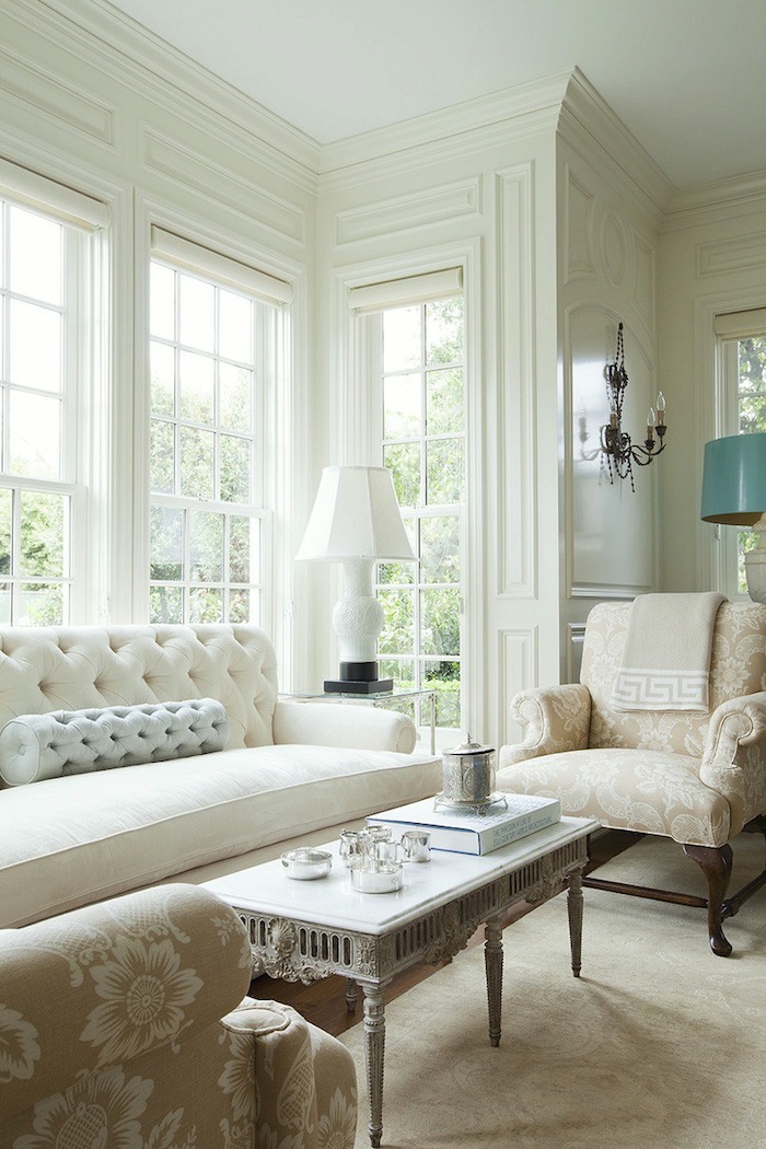
Have you ever seen such beautiful millwork? Just yummy! By the way, I have been asked dozens of times what the paint color is for this lovely room. I have no idea. It could very well be White Dove. However, people are reacting to the beautiful mouldings, architecture, and furnishings that are working together harmoniously.
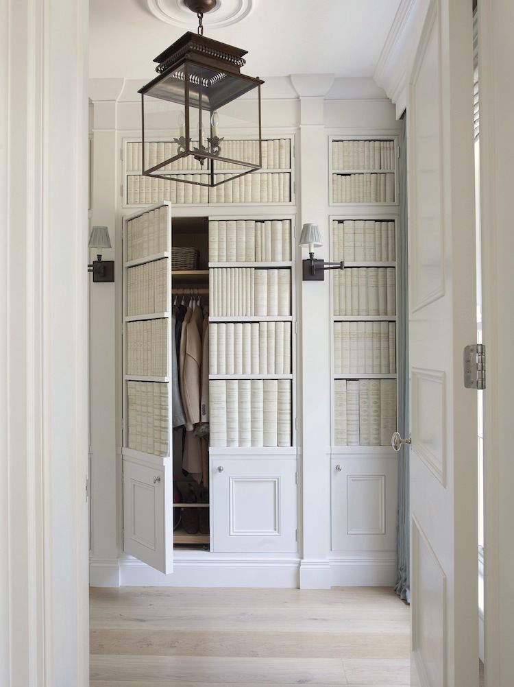
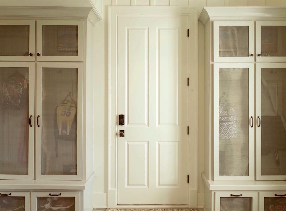
Don’t you just love those closet doors? Faux books source is here.
And, if you love secret doors as much as I do, please check out this post.
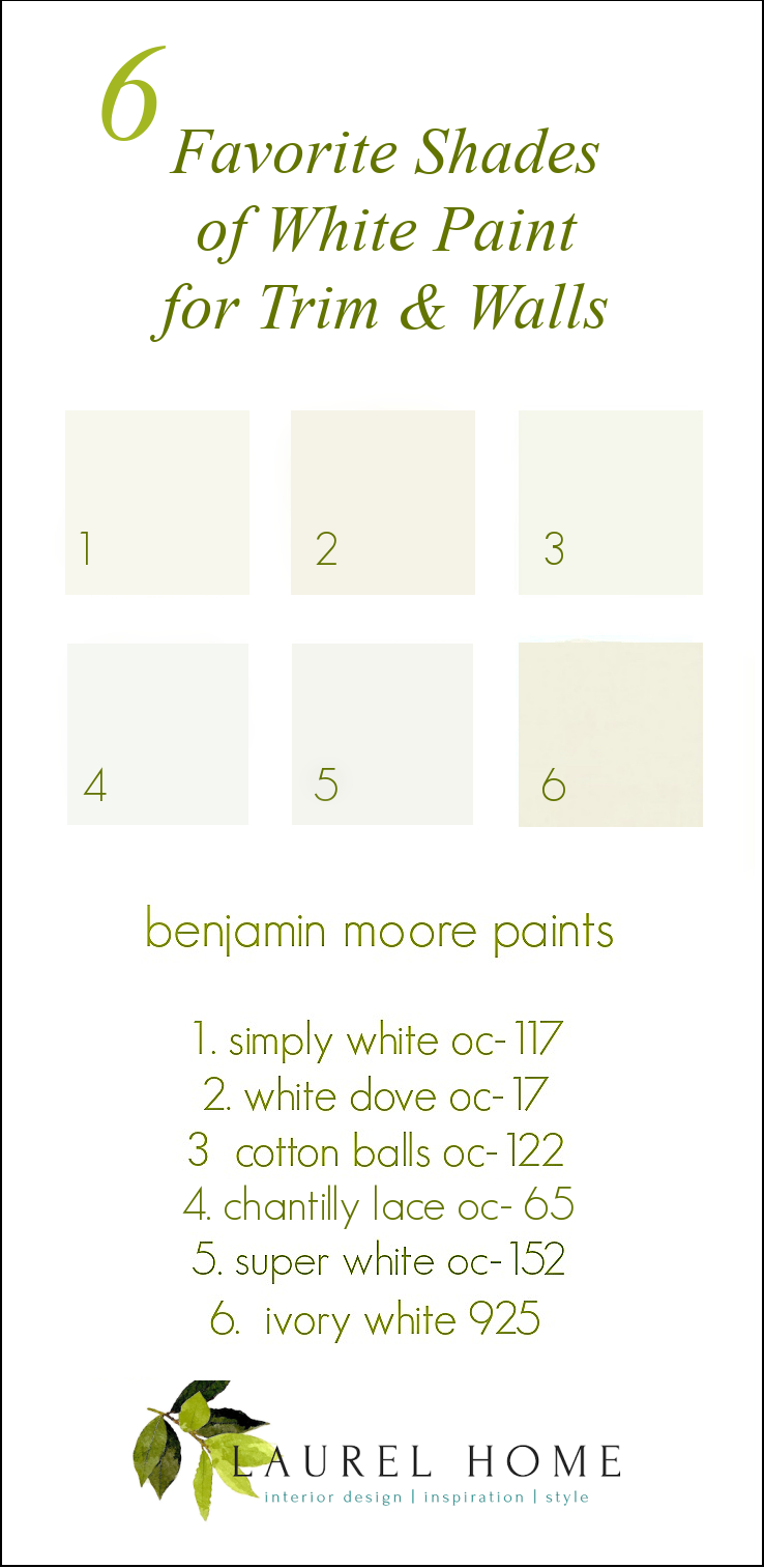
Below are the six white wall and trim colors:
Simply White OC-117 – a soft, warm white, but might be too bright for darker colors.
White Dove OC-17 – the universal donor of paints. It almost always looks great. It is a white with a touch of cream and a touch of gray without being dirty– usually. But, it can go golden in some lights. It usually does not, however.
Cotton Balls OC-122 – This is another universal donor, very much like white dove but a tad brighter.
Chantilly Lace OC-65 – Chantilly is the whitest and most cool of these six shades of white. But, it is not a cold white, most of the time.
Super White OC-152 – A beautiful, warm white, just a hair brighter than Simply White.
Ivory White 925 – Another lovely cream that’s a bit brighter than linen white
Now, let’s look at these white wall and trim colors as they appear in interior spaces.
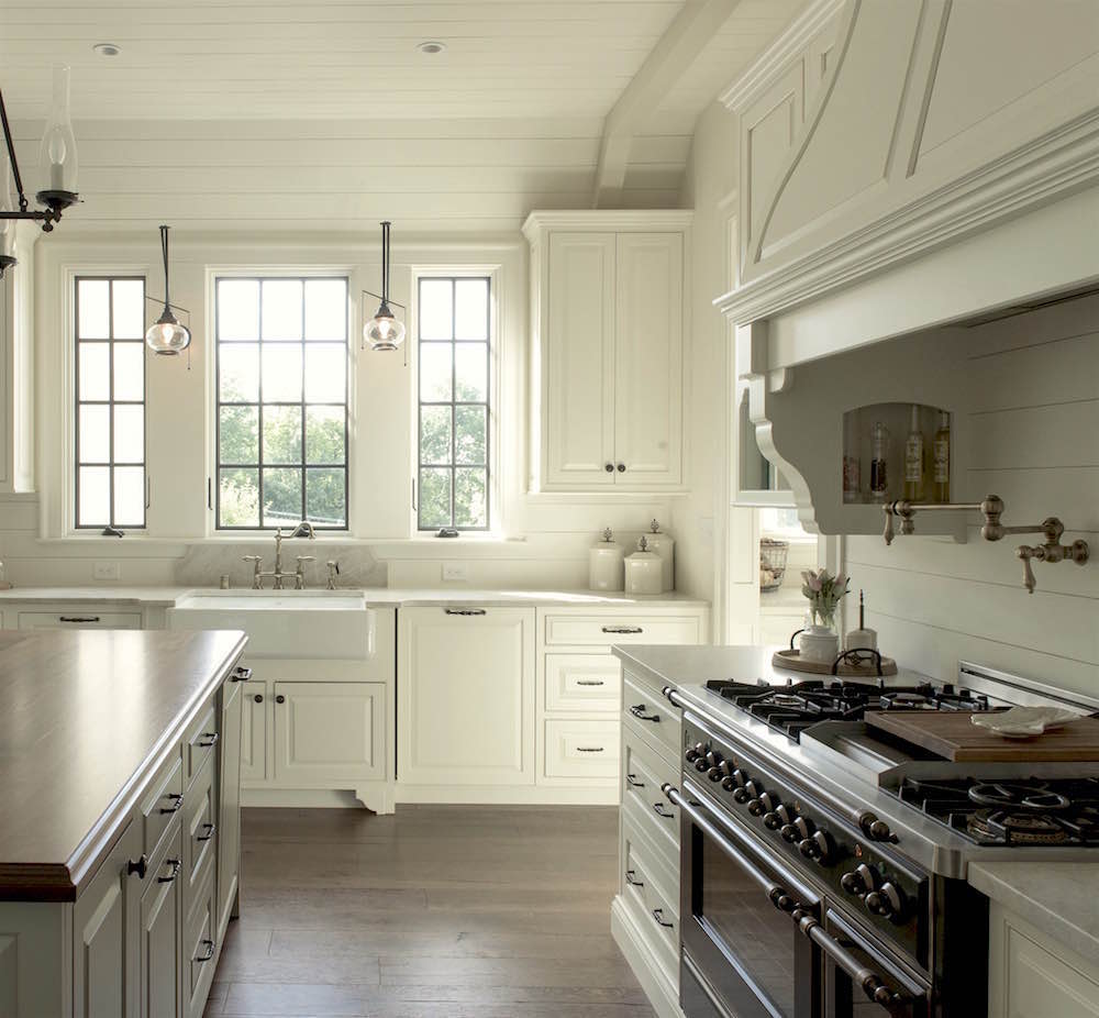
Who was it who said that an all-white kitchen is cold?
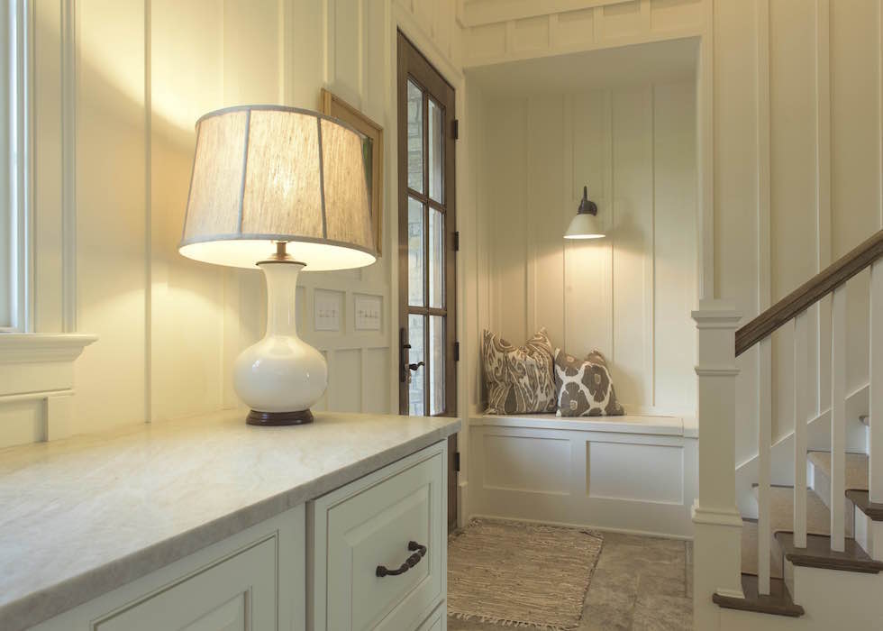
This is also Ivory White in the lovely back entrance.
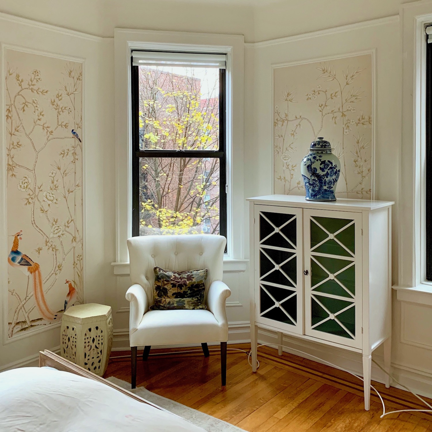
White Dove is on my old bedroom’s trim, walls, and ceiling.
I miss my old bedroom, but I am happy that a nice young woman is enjoying it now.
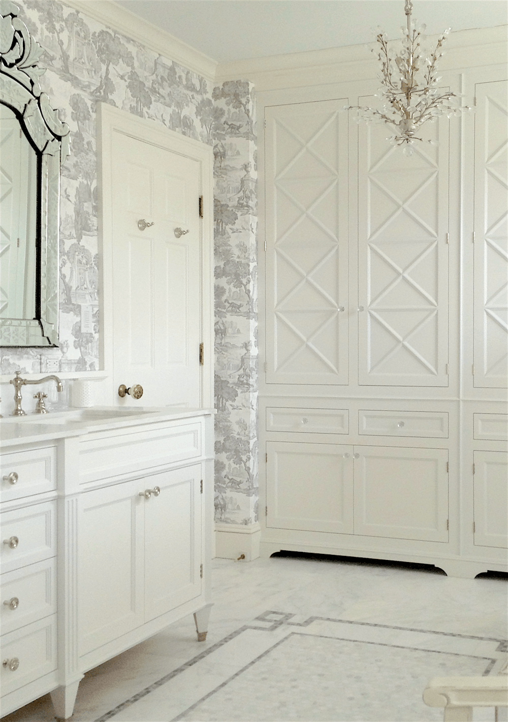
White Dove is the white we did in this bright south-facing bathroom.
 The dining area adjacent to a kitchen I helped an old client with a couple of years ago has Simply White on the walls and trim.
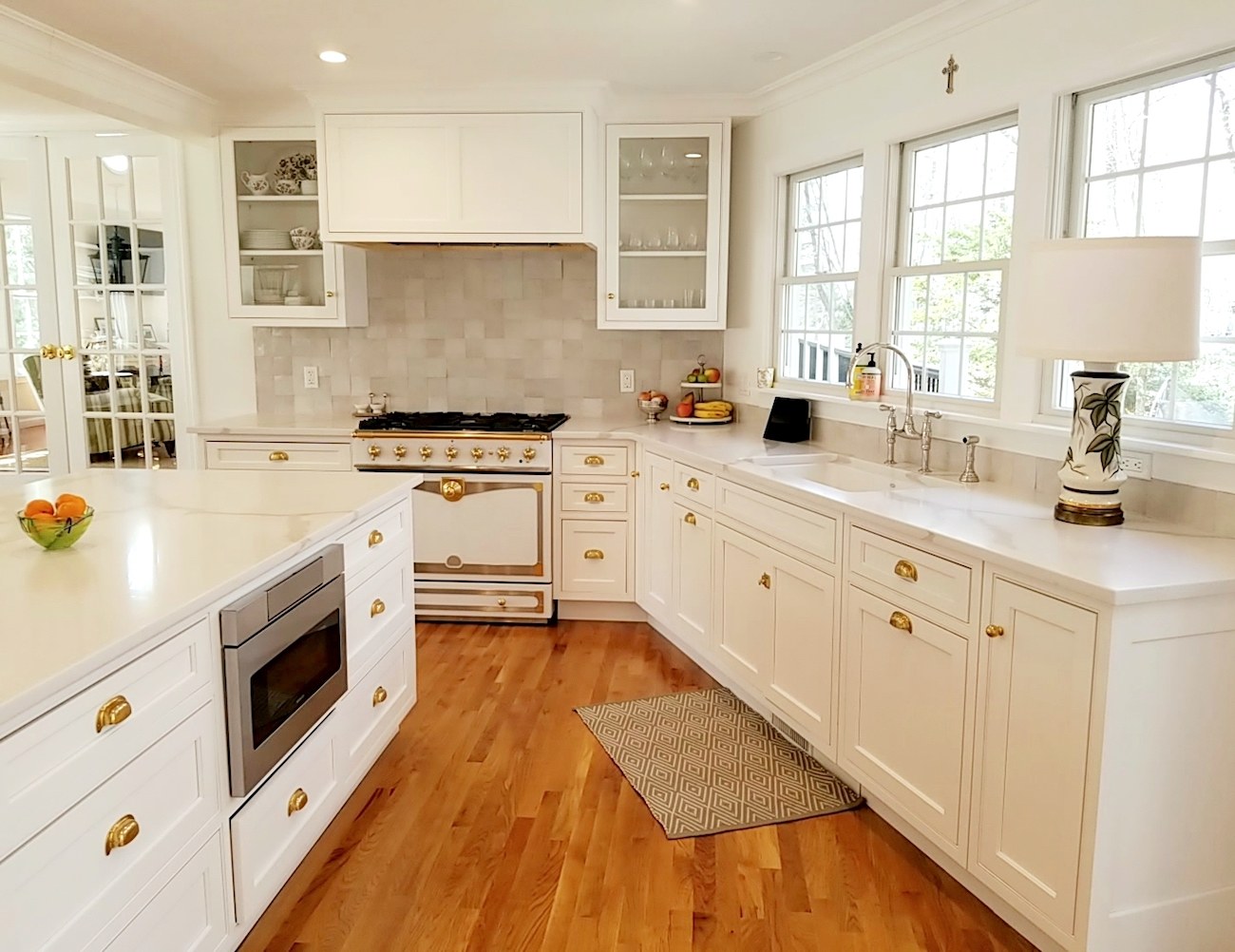 We chose it because it was a close match to the cabinet company’s shade of white.
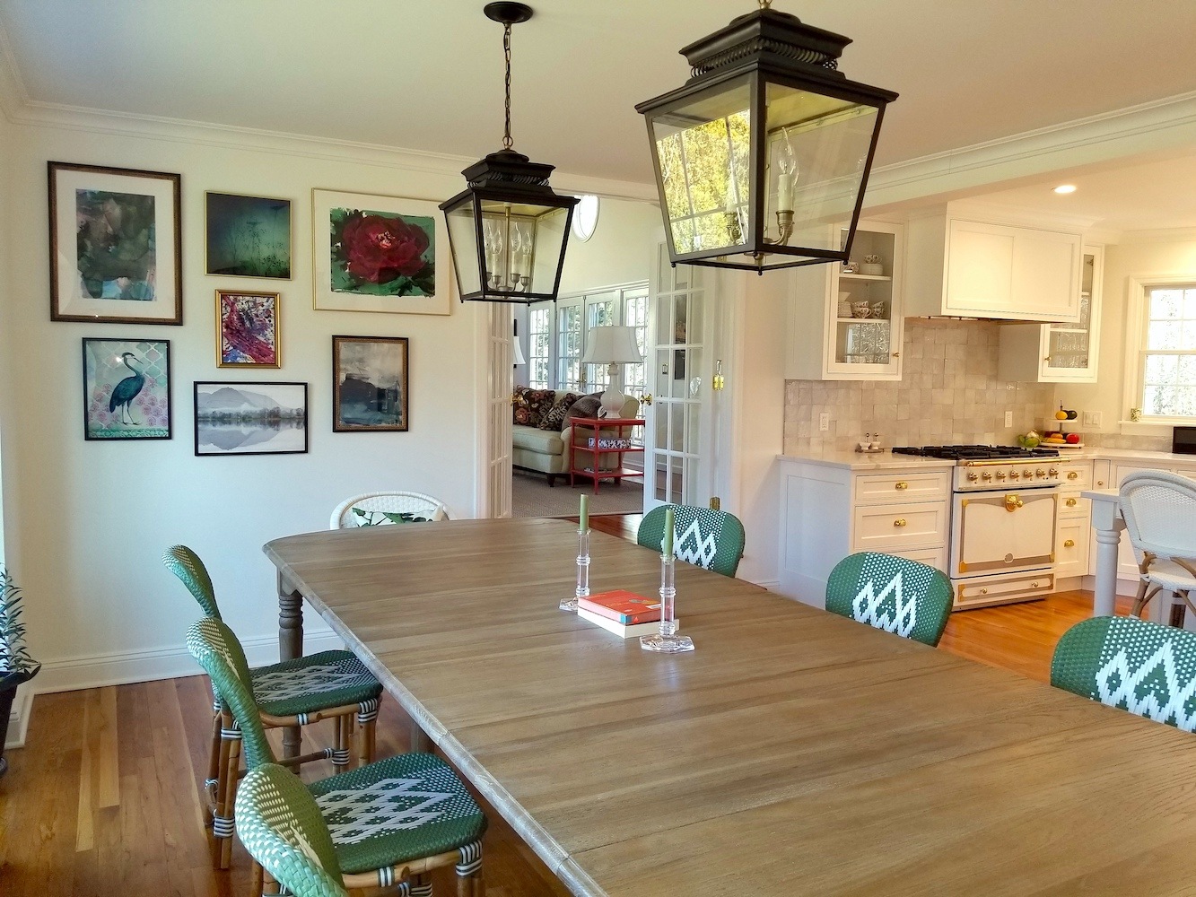
I love those lanterns from Ballard Designs! You can find them on the Hot Sales Page (keep scrolling), and they are currently on sale!
My old apartment where I painted the big cabinet in Benjamin Moore Cotton Balls oc-122.
Interestingly, Mary painted the trim in her kitchen Cotton Balls. The cabinet maker was supposed to have matched the cotton balls. However, it turned out to be a shade deeper. I have to say that I love it this way! To see more of this gorgeous kitchen, please go here.
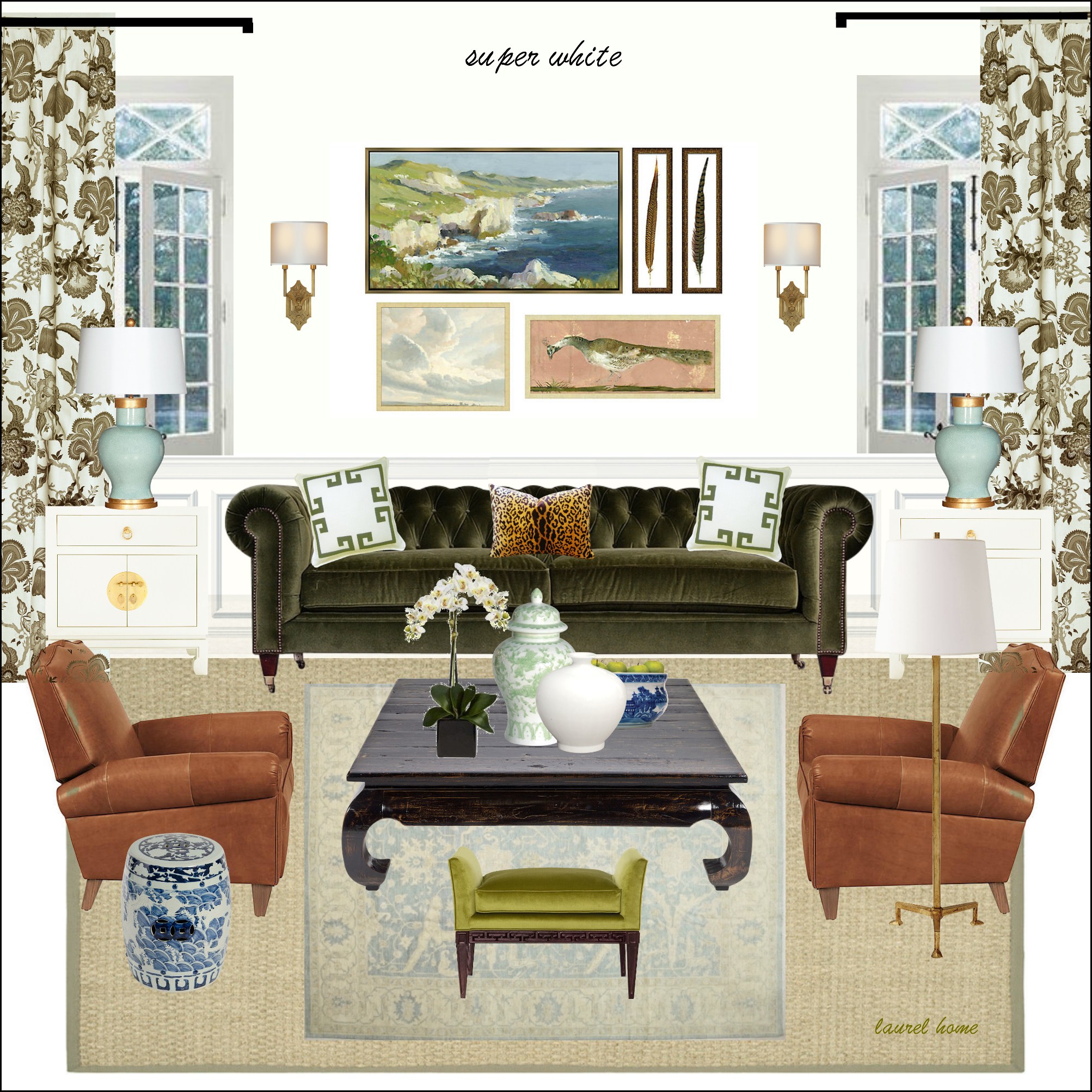
This is one of the bonus boards from the Laurel Home Paint and Palette Collection featuring Super White. There are 40 more boards and palettes in the collection!
Super White is a beautiful, warm, clean white. Before I moved, I had my apartment repainted and used Super White in all rooms except the bedroom, and I loved it!
Loi Thai is no longer writing his gorgeous blog, Tone on Tone, but he has zillions of followers on his exquisite Instagram account. Please follow him if you’re not already doing so. Above is Chantilly Lace in his gorgeous home’s living room.
Chantilly Lace is the new color, as previously mentioned. I decided to replace Linen White because I wanted one cooler shade of white that will definitely go with cool colors in all lighting situations.
The color eliminated is Linen White because it has a lot of gray in it, and as a wall color, unless the room is quite bright, it looks pretty drab and sometimes a little bit peachy. It is, however, an excellent trim color for medium to dark, warmer shades of paint.
Above is a sunroom we did in 2010 painted Benjamin Moore Linen White.
Ivory white, however, is a touch cleaner than Linen White and still looks good in darker spaces, as you can see above in my client’s Kentucky home.
Above is a graphic of the six white wall and trim colors to pin to Pinterest for reference.
Are there other great white wall and trim colors?
Yes, of course, but I’m trying to simplify our lives. With some of the colors, the difference is so minute anyway. If you want to see the entire list of exceptional shades of white, here is a list of 20 great shades of white paint.
What are your favorite white or off-white trim colors? Have you ever made a whopping mistake that the rest of us can learn from?
For More Info Below Are Some Favorite Posts About White Wall and Trim Colors
For my very favorite shade of white paint, click here.
Are White Painted Walls Boring?
White on White Decor Inspired by a Top Magazine Stylist
Do You Live With a Drove of Pigs But You Want To Decorate With White?
And What About Your Ceilings? Must They Always Be White?
xo,

PS: Please check out the newly updated HOT SALES.
Related Posts
 A Formula for Eclectic Interiors To Avoid Matchy Furniture
 Analogous Color Schemes In Interiors – The Right Way
 True or False? Painting Walls White Will Make A Room Appear Larger
 Have You Seen These Incredibly Romantic Paint Palettes?
 Affordable Home Decor – 18 Ideas You’re Gonna Love
 Economical Decorating Ideas – The Ultimate Guide
 The Controversy Over Hardwood Floor Stains and Finishes


50 Responses
What are your thoughts on BM Frostine (AF-5)?
Hi Claudia,
It looks like a fine color and similar to White Dove. However, please always test and test with the actual paint. I know that seems like overkill, but please make sure that what the store mixed, is what you expect.
1. Obsessing about multiple tone whites throughout house: easy button – one color, multiple finishes! YES!!
2. Ohhhh…the all-white kitchen in Ivory White…sold and <3 <3 <3.
A favorite example of mine is Calvin and Kelly Kline's house in the Hamptons; as art etc. collectors, the entire or most of the house walls were pale, pale ivory-ish with white trim and then deep walnut floors. It was a beautiful canvas for everything else. I'm not sure if I saw it in a magazine or in a coffee table book they did.
I read this blog the day you sent it – and chased a few of your links and read those too. Love it all!! Somewhere you or someone mentioned what sheen for Black Paint. I have tried to find what was said but can’t seem to find it. Did you ever mention what sheen? I think it was said to not use matte for black or navy.
When my daughter lived in Chicago, she painted all of the walls and trim Chantilly Lace and it really enhanced the look throughout.
We live in he South and our living room and dining room are open to one another. The living room has high ceilings, windows facing north and the windows on the porch side face west. Our front door opens into the dining room/foyer with windows facing east and another set facing north. My daughter thinks we should paint these rooms Chantilly Lace but we are leaning towards the Simply White.
I’d like to hear from you and other readers for suggestions.
FYI my husband hates gray and I don’t like green.
NO snark, scout’s honor! Years ago when I was a working decorator Linen white was the white of choice down here in the Deep South. I have used it myself many times, and currently have the bonus room upstairs (my husband’s big den/office) painted in that color. It gets a lot of light. It seems to have a yellowish undertone which is why I used in there. The woodwork we inherited which he likes (and it is his room) is stained, as are the doors. They have what I suppose one could call a butternut finish, and the linen white looks great with it. I am curious to try some of those other whites next time I need to paint something. As always, interesting and informative article. Thank you.
In the past couple of decades I painted two different properties ‘all white’, have agonized, Samplized, spent more on samples than I want to admit, but my conclusion is this, it doesn’t really matter. All of the above whites (I used all of them except #6), are beautiful and will work beautifully in the right space, it’s all about the space really, it’s about the light, the ceiling height, the windows, architectural details, your furnishings, style and also the climate. In one apartment with very high ceilings, huge windows, an abundance of light I used different whites in different rooms, Chantilly Lace, Super White, All White (F&B), ceilings, trim, walls, all the same color. I loved the end result, but I swear, because of the abundance of light in the apartment, all the whites looked the same! I could have just used the same white everywhere! Later, in a 1940 colonial in the NE with low ceilings, front to back rooms with few windows, bad light, I went ‘all white’ again (Simple White, Cotton Balls, White Dove) and all the whites looked bad and too stark and cold! Low ceilings and lack of light also creates a lot of grey shades, I mean you do see a LOT of grey! The kitchen came out best where I used Timid White, which is a soft cream, a beautiful color, and I regret not doing the whole house in Timid White, or something like Lily of the Valley, Linen White or #6 above, or any white with more yellow in it to warm it up. One room we repainted in Wimborne White (F&B) and it still looked too stark, so we mixed in 1/4 White Tie and the end result was a gentle cream which reads a soft white in the north facing room and balances out the grey. White color really needs good light IMO. I know we all want ‘white’ and nobody wants ‘yellow’ but in spaces with little natural light using whites with a bit more yellow (or beige or gold) mixed in can balance things out nicely. I also want to add that I really love the effect of walls, trim and ceiling being the same white color, I think it creates a very smooth and elegant look.
Thank you Caaren! Really appreciate it 🙂
I was charged with decorating a large north-facing room for our church and studied all of Laurel’s posts on white paint. I ended up going with Chantilly Lace, and it has been a winner! It does not go gray on cloudy days, and the painters definitely approved, saying it was the purest white BM had. At my home, I use Super White for all trim and just love it.
Hi, Laurel!
Sorry about snarkiness…with 6 boys, I handle it about every 7 minutes. (I hope they outgrow it!!🙄)
I just wanted to say that on your suggestion, I did Cooton Balls, and it looks so beautiful! Thank you! At first, I thought it might be too yellow, but the more I’m in the rooms, and arranging the furniture, the more I like it. It reminds me of vanilla ice cream!
Thanks for vetting these colors…it is such a gift!
Hope you have a hot beverage and a great book for the cold days up there! I’ve gotten spoiled here in AL after 16 years…forgotten ( almost) what that cold crinkly feeling in my nose used to be on those bone-chilling days. But I do miss snow!
Hi Laurel– Since moving into my 1940s colonial in New Jersey four years ago, I have relied on your amazing blog for help with many decorating issues. Your posts on paint colors in particular are so helpful, I truly can’t thank you enough. Based on your “best white wall and trim colors” list, most of the rooms in my house are painted BM Ivory White; some rooms have Simply White trim and others Ivory White trim, and I have to say that I do prefer the walls and trim color to be the same, but just don’t have the energy to re-paint all of the dental molding in the Simply White rooms! For our very bright family room, I did Cotton Balls, which almost reads as Ivory White in the other rooms because of how much light we get there. Before finding your blog, I wasted many hours of work and gallons of paint on the wrong whites. I learned the hard way that the direction your room faces and the light quality is everything when choosing a white paint color. Thank you, thank you, thank you!
Thank you for the white paint post, Laurel. Coincidentally, another blogger that I read, Beth Connolly at Chinoiserie Chic, did a post about paints today too. I do so miss Loi Thai’s blog. So many wonderful bloggers have switched over to Instagram, and although I still follow them, I miss reading the amount of text I got with a blog.
Thanks for the white paint post. It confirms what I just experienced by trial and error. We just moved and wanted a white paint to match built-in cabinetry which can’t be painted. Simply white seemed yellowish (we face east/south). Had White Doce in previous house but it was a little too off white. Picked Chantilly Lace and it’s perfect. Nice and bright but doesn’t seem like an operating room. Thanks for all your research Laurel & happy new year! Mary
Hi Laurel, I recently painted an east facing bedroom White Dove OC-17 and it’s beautiful. I tested your short list of whites and that was the winner. You saved me so much time & paint anxiety, I can’t say Thank You enough. Your 333 Rules have made my home a lot more beautiful, too.
Happy COLD New Year! Thank you for posting the kitchen makeover in this post. It is probably one of the most appealing kitchens I have seen in a long time.Simply stunning. The green paint on the lower half of the William and Sonoma cabinet looks terrific.
I learn A LOT when i read your blog….thank you.
Hi Brooke, I hope it’s ok to respond to your comment. We just built a house and also have a N-S exposure. I probably spent 20+ hours deciding on white paints, read every blog of Laurel’s on whites and gathered way too many opinions. Ended up going Simply White on the inside trim, ceilings, and walls in the sheens she recommends. It is beautiful and doesn’t turn weird in any light. We did Swiss Coffee outside and it is a great warm white in the sunlight and doesn’t turn too cool. Good luck with your build! I would be happy to send pics if you need to see it in different lights. So much fun!
Hi Laurel, happy new year! I started reading your blog almost a year ago when we bought our new (old) house, and I was agonizing over white paint colors. Ok, so “agonizing over” might be an overreaction regarding paint as you state above 😂, but the struggle was real. After getting inspired by something you posted, I ended up painting my north facing kitchen in F&B Wimborne White – walls, trim cabinets and ceiling. I then used dark, oil rubbed bronze accents and knobs to contrast. I love it, it’s simple and elegant, and I got the idea from you, I would have never thought to use the same color on walls and trim! I did toy with the idea of “pure white” trim, but it called attention to the warmth in the Wimborne White which would have bothered me. With everything painted with the Wimborne, I could feel the fresh coziness of the color, rather than see and analyze it, if that makes sense. I’ve learned so many things from you that have helped me get closer to my happy haven, thank you!
Thank you for calling out the snarky. People look to you for ideas, advice, and sound principles of design. There are ways of expressing opposing ideas without belittling others and self-aggrandising. Civility now please, or perhaps they should feel free to start their own blog to spew their vitriol.
Laurel, I painted all my wood stained woodwork with oil based white dove. Getting rid of the dark stain was a huge improvement. Over the years, however, the white dove developed a golden hue. Because it was oil based?
In our new home I’ve used cotton balls on new woodwork. So far it’s great. Not oil based. I’m going to take the plunge and paint my Craig’s list ersatz cherry china cabinet white, plus some oak bookshelves, which will benefit from your styling templates. I won’t paint my good brown cherry furniture. I still love it. I’ve kept my spouse for 48 years for the same reason.😁
I always appreciate and learn from your posts.
When testing all the popular whites for my south & west facing office, all of their undertones stood out too much for me. I went back to my old stand-by — Behr’s Ultra Pure White and I love it. No undertones!
One additional comment which may sound like a horror to almost everyone: As a vacation rental property owner, I learned the hard way to paint semi-gloss on the walls of my properties and high gloss on the trim. The various versions of washable “flat” paints really don’t hold up to vacation renters, and I was repainting every year. The semi-gloss really doesn’t appear shiny and the walls wash up easily with a rag and Pinesol. It was a lot better than the remnants of footprints and handprints and dog bodies washed off of walls.
We painted all of the cabinets and trim in our home White Dove and our ceilings Simply White. We chose Classic Grey (looks more of a muted white than grey) for the walls. It’s the perfect combination and a great neutral backdrop for our framed art and photos.
Thanks for the reply. He said he uses BM all the time, but this is the first time he has had this problem. He had never used Cotton Balls before. I saw the problem as he was painting the job. He prepped with all new base paint and also had the problem on the new wood in the renovated bathroom. The finish was semi gloss. I will be careful to vet the BM color with the painter before going ahead with the rest of the house. Martha
Love your choices. You turned me on to Chantilly Lace, and I’ve been a fan ever since. I think in one of your other posts you mentioned that by comparing Chantilly Lace to other swatches you can see the undertones in the other colors, and I’ve been using that trick for a while, now. BTW, I love, love, love the wallpaper in your old bathroom. Actually, I pretty much love everything you do. <3
I used Olde Century Colors “Moravian White” simulated milk paint (walls) and their acrylic latex “Old Farm White” (trim) in my very recent living room redo (west facing). It looks beautiful. A true white. Olde Century Colors specialize in colors from the 18th and 19th Century and manufacture their paint in small artisan batches with pigment ground at the time of production. They offer a very limited selection of colors — and frankly — that appealed to me. Their colors are perfect and one can blend them to achieve any “tweaks” in color anyone could possibly imagine. I used these paints years ago and then strayed to using Farrow and Ball — only to return to Olde Century. I was originally introduced to this unique paint years ago by a decorative painter (artist) who swore by it. It is a brand of paint that I’ve never seen mentioned here and thought I would share it.
Hi Lori,
Sounds interesting and thanks for sharing because I’m not familiar with that brand.
We had all the trim throughout our 1930’s colonial in New Jersey painted White Dove and loved the cohesiveness. We recently relocated to a simple house in the country in the middle of the country and I ordered white paint samples from Samplize, including Chantilly Lace, Simply White and Winter Snow. It was nearly a toss up between Chantilly Lace and Winter Snow but i went with Winter Snow. I had the painter use different finishes for trim and ceiling as you recommend and I am loving it. We haven’t finished unpacking and accessorizing and my husband commented he feels it’s a bit stark. I asked him to give it time while I layer in window coverings, pillows, etc. Freshly coming off the warm colors of our other house, I have my fingers crossed he comes around to loving the light and airy setting as much as I do!
When I was redoing my kitchen in 2013, I wanted Carrara marble counters. Another color expert said I should use Chantilly Lace, which is really a true white, neither warm nor cold. I specified it for the new cabinets, and although the makers matched it rather than using BM paint, and it’s slightly different, it looks fine. I ordered a shade of white subway tile to go with my sample cabinet board and the marble sample. Then, for the open shelves over the subway tile, I ordered a custom color to match the tile. That white ended up being so beautiful that I used it on all our enlarged moldings and our areas of millwork in the rest of the house. So I have three slightly different whites in the kitchen, and it looks beautiful. White is an adventure!
Great post. Chantilly Lace is my go to white. I have it on my trim against Farrow and Ball’s St. Giles Blue walls and it is a perfect true white.
Yes. I am totally on board with simplifying options…so less stressful. My question about white is this: What is the recommended white for an open concept area that runs east to west, has a wall of windows at both ends, and contains Indonesian/Caribbean dark mohagany furnishings? I think I need a pure white with no undertones..do you agree and what would that be?
Thank you for your help Lily – I can’t put a door because it is all opened. Are you suggesting the all white or keep the black and white look but change hardware or something else?
Hi Laurel,
I just gave my contractor all of my color choices. He’s painting this weekend.
Swiss Coffee for the walls. Chantilly Lace for the trim.
I can’t wait to see it next week.
To Maura,
In my opinion, make it look like it’s on purpose, which should be easy because it is. Do something else in the pantry that isn’t the same as the kitchen. Or you can add a door or trim that would make the doorway more noticeable. The goal would be to make the black look like a feature of the kitchen rather than a leftover as tastes change.
Having worked for a Ben Moore dealer and mixing a lot of paint back in the day my go to is;
Favourite Crisp Clean White is …..Oxford White CC-30
this white makes me happy!!
Hi Laurel,
Thanks for this update on white paints. I have repainted all of the rooms in my house in the last several years and sure did find out the influence of the direction the room faces, how much light the room gets and even what is outdoors that might affect the color. There is a large southern magnolia (evergreen) about 20 feet from the house that covers about 1/3 of the double window in my east facing bedroom. Every color I tried looked green and I was the crazy paint lady at the Benjamin Moore paint store trying to find the right color! I finally settled on BM Windy Sky. It looks much more green/blue on the walls than on the swatch but is pretty. Trim isn’t painted yet but I plan is try BM Paper White (a light gray) for trim and also wall color and trim in the adjoining bathroom. Paper White is the color in the hallway outside the bedroom. If it looks dingy or not good with the green-blue bedroom I will repaint with Chantilly Lace. That’s what is in the rest of the house and is a beautiful crisp white that looks great for trim but I thought it looked a little too bright with the Windy Sky. I like a clean light color for trim but don’t want it to “pop”.
Hi Sherry,
Paper White is in my curated Paint Collection. I repainted my little bathroom in Bronxville and it’s funny but it didn’t look substantially different from its predecessor, Shoreline. It’s a very pretty, cool, but not at all icy, pale, pale gray. However, if it was used with trim, say with navy, it would definitely look white. I used it once on the outside of two built-in bookcases, where the inside was painted orange. I know that might sound weird, but it looked great in the living room it was in.
I have a log house, and used Canvas Tan, which Sherwin-Williams calls a white. It’s canvas toned and warm without being yellow, which works wonderfully with logs and with the sagey-greens prominent in most of my rooms.
Thank you for one of the most helpful and informative design sites around! We are doing a new build, which I plan to largely paint white inside in most of the common spaces. I’m already a big believe in sampling, but I’m a bit stumped how to do this. With the new build process, I’m going to need to pick a color before I can properly test it and certainly won’t be living in the house. We have a N-S axis exposure with our common rooms in the back/S. Should I just tack up color boards to the framing? Any guidance if you’ve gone down this road would be deeply appreciated!!
Hi Brooke,
I would wait until the sheetrock is up. It only takes an hour to go to the paint store and have them mix the paint. At the very least, they’ll be priming everything first. You have time, so please don’t let the contractor rush your decisions.
I just painted my bedroom trim and new bathroom Cotton Balls. While I like the color, my very experienced painter had a terrible time covering the surfaces, which were properly prepared with this color. He ended up giving the trim 4 coats, which cost me more money. He characterized it as “chalky”. I spoke to Benjamin Moore, but didn’t get anywhere. Just a heads up for people considering this color.
Hi Martha,
I wonder what finish he used. Or, if there was something wrong with the base, like it was old, or something. I’ve never heard of this or experienced it with myself or dozens of clients who used Benjamin Moore paints.
Hi Laurel,
Thank you for your wonderful insight on just about everything.
I have a question and hoping you can help. I have 100 year old Tudor with a small but elegant kitchen on south side of house and have black impala granite. I am doing my pantry which you can see from the kitchen and you walk through that area to get to the dining room. Pantry is on the north side and I was set on all white with Carrara marble. I have picked the slab etc. I am now doubting myself and thinking since the pantry is wide opened and visible from kitchen I should do the counter the same as the kitchen. Thoughts?
Hi Maura,
I hope you will understand, but I can’t address individual problems, and also prefer it if we keep to the topic. However, I almost always do a different countertop, not only in a butler’s pantry but on the island, as well.
Happy New Year Laurel!
I painted my entire kitchen cabinets and walls with different glosses of Cotton
Balls a few years back.
I love it in my Eastern light, with terracotta floors and all white
appliances. Every one comments on how
warm and bright it is.
Pat
Pat
Thank you for this post, Laurel. I just went through the excruciating exercise of selecting a white paint color for my dimly lit kitchen, pantry and laundry rooms. I purchased and studied your Laurel Home Paint and Pallette Collection and researched until I was crazy. I tested my final four BM white paint colors, and despite the staging designer’s recommendation of BM’s Chantilly Lace or Oxford White, I chose White Dove because of our dimly lit rooms and the brown granite countertops and backsplash in the kitchen and another brown granite countertop in the pantry. White Dove is perfect! This post confirmed my selection, and I’m so relieved I didn’t follow the staging designer’s recommendations. I also followed your advice about using BM White Dove for the ceiling, walls and trim using the different sheens you recommend; the guy at BM talked me into buying a Pearl sheen for the trim, but I quickly realized my mistake, and I asked the painter to repaint it with White Dove semi-gloss. Now I LOVE the look!
Laurel: Thanks for reminding us yet again, how wonderful a room can look in white. I do love yellow and wonder what color yellow you used in your NY apartment’s living room?
Hi Carol,
It came painted Benjamin Moore Hawthorne Yellow hc-4.
My entire house has some shade of navy in each room. I painted my bedroom with White Dove and love the color with my dark furniture and tufted velour navy headboard. Then I remodeled two bathrooms. I used the same color and didn’t like it with the white Kohler fixtures.
I changed it to Chantilly Lace and the change is dramatic.
I used Chantilly Lace for my cabinets, doors, and trim and it is a gorgeous color. I hate it when white colors go yellow and it is a perfect cool white. And I strongly agree that colors need to be tested in different locations and at different times of the day because the color you love in the bright if day may be the color you hate when it’s overcast.
I wasn’t too aware of paint colors until I bought my own (first) home a year ago. During the time between acceptance and closing I thought about little else. And I ended up choosing Chantilly Lace even though for a while a green color tempted me. The painter was enthused, telling me she had just finished a home with that color and it was gorgeous.
Well, it is. My home has enough windows that I get direct light from all directions. Chantilly Lace looks stunning, just beautiful, on all my walls, in all kinds of weather, and at all times of the day and night. I prefer cool colors so this was perfect.