Hi Everyone,
And, a very Happy 4th of July to all of my fellow Americans!
Guess where I’m headed to?
Yes, I’m taking a trip back to New York to visit friends! It’s my first time back since I left on that frigid day last December.
In the meantime, today’s post is a little shorter than unusual.
I know how busy you are. That’s because you’re either building an arc or putting out a fire (depending on where you live).
OR, you’re shopping online, taking advantage of all of the great 4th July sales.
So, think of this post featuring one awesome home exterior transformation as the starter course for the main course that should be arriving Tuesday into Wednesday.
Then, you’ll see a gorgeous and very accessible remodeling of this kitchen.
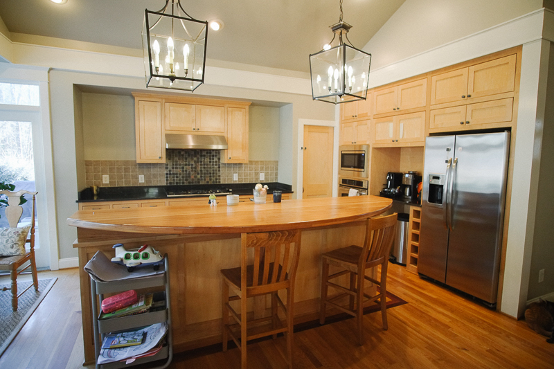
As you know, I’m not a fan of upper cabinets going over the counter. However, what’s going on that range wall doesn’t make sense. It looks like they ran out of money and didn’t have enough for the four missing cabinets. I’m not going to talk about the tile. Obviously, this is the before.
However, I don’t mean to be a tease, but you’re going to have to wait to see the results.
But, I think it’ll be worth it as I’m also going to give you the information on every single item put in the new kitchen. And, with the sources! Oh, it’s so good. I want to be sure to do it justice without staying up until 3:00 AM.
So, where did this kitchen come from?
Drum roll…
~~~~~~~~~~~~~~~~~~~~~~~~~~
It came from our very own NANCY KEYES!
(some 40 posts are mentioning Nancy, one of the most talented interior designers I know!)
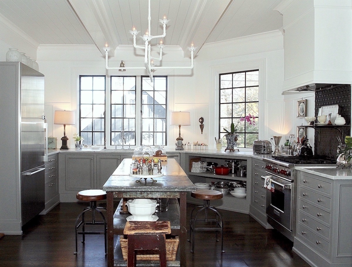
Yes, Nancy Keyes of the giga-gorgeous kitchen with the cool gray cabinets with NO upper cabinets. And, so stylish, it is too.

And, it’s the same Nancy who designed the world’s most incredible silverware drawer.
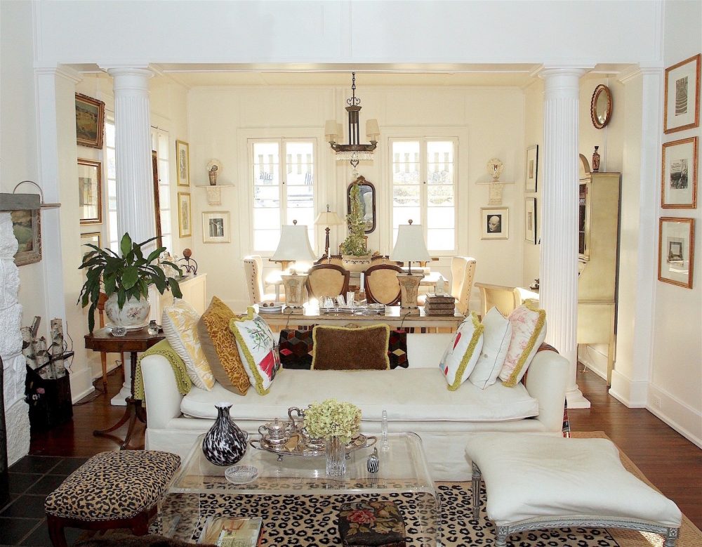
Plus, there’s her super-stylish living room.
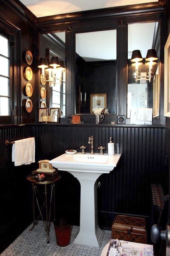
And, this sophisticated powder room.
. 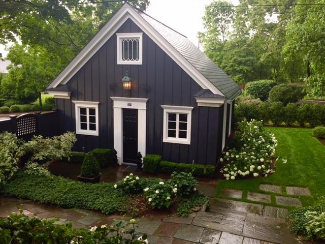
And, who could ever forget Nancy’s jaw-dropping GARAGE painted in Benjamin Moore Racoon Fur. In fact, based on this one pic alone, I knew it had to go in the Laurel Home paint collection.
Wait, Laurel! THAT is a garage???
lol, I know. I’ve told Nancy that all I need is a pillow, blankie, mattress, and a microwave oven, and I’ll be all set.
So, knowing that Nancy can do no wrong when it comes to interior and exterior design, you may well imagine how excited I was to learn that Nancy has a new kitchen to share with me. I mean, with US!
Oh, I almost forgot. Of course, she also helped our lovely Melissa with her home and kitchen refresh a few years ago.
Here’s what Nancy said:
Laurel,
I have to tell you. I don’t really want to work anymore.
Believe me. I hear you, Nancy! haha.
However, because of you, Dear Laurel, I’ve had a few requests from lovely people. Alas, the timing was off, so that I couldn’t help them out.
But then, several months ago, I received a message regarding a kitchen remodel from a woman named Dottie.
Blessedly, everything Dottie wrote resonated with me perfectly. Plus, the timing was perfect, and there was just that “something” that clicked between us. You know it’s a little tricky to do a remote project, but I could tell that we spoke the same design language. I know you know how important that is.
Uh-huh…
Then, amidst the kitchen work, they needed a new roof. And that led to painting the house. In typical fashion, we had three days to decide on the paint colors.
Oh, I hate that! But, yes, that is typical.
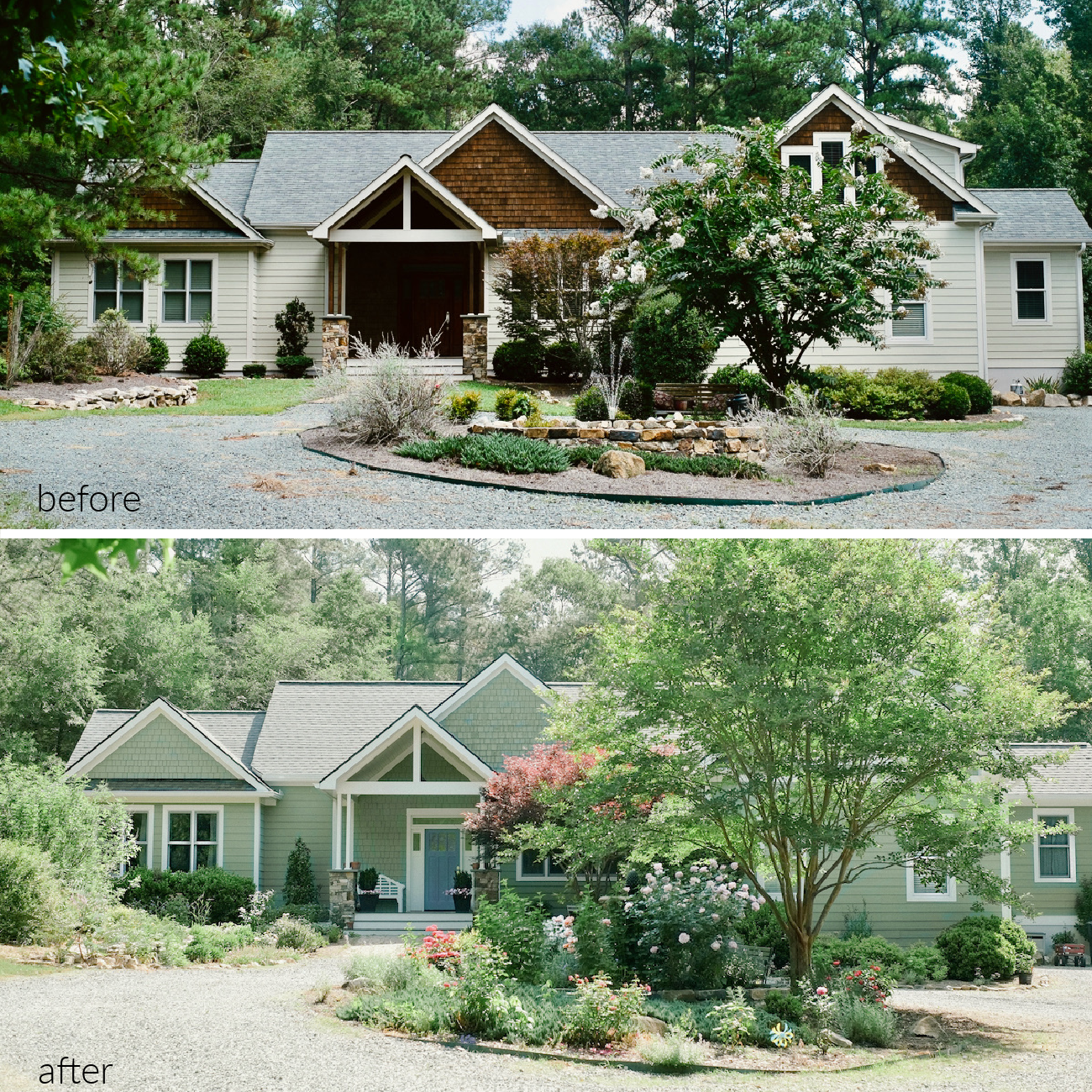
Here’s the house before the much-needed home exterior transformation.
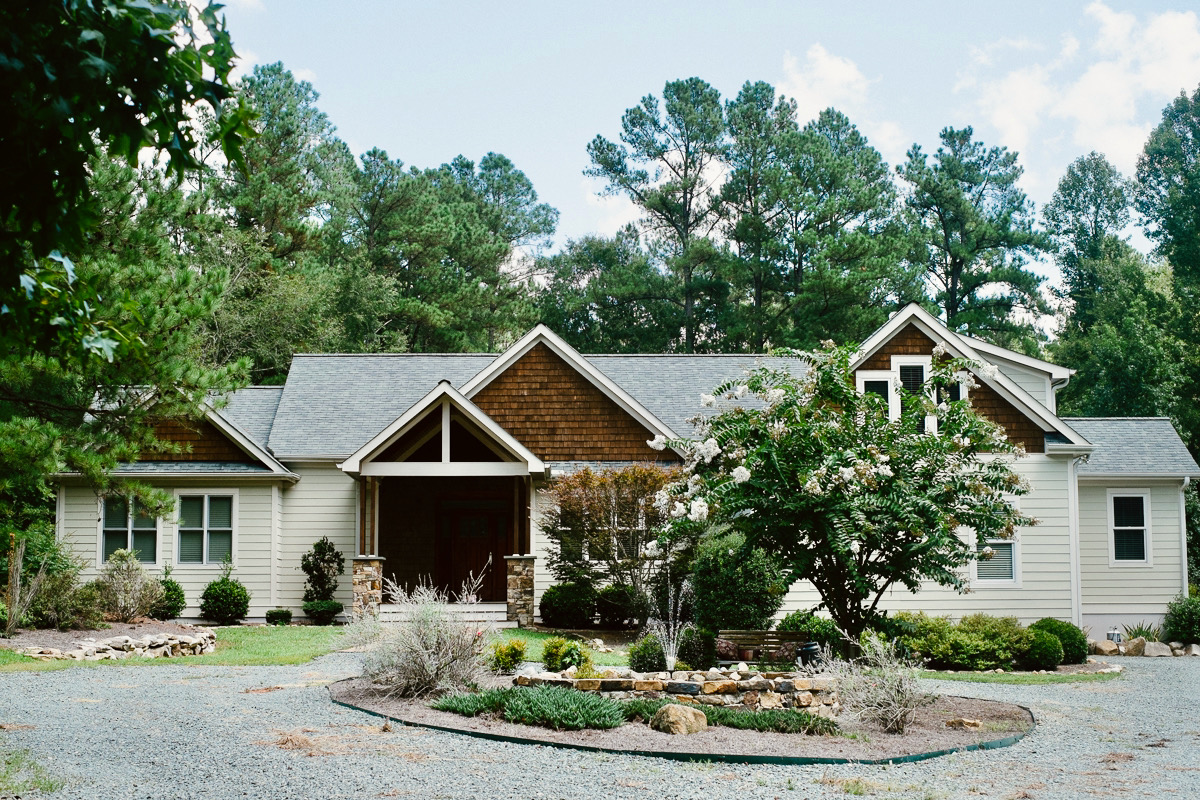
Ya think it needed it, Laurel? lol
Oh, my word! That is positively scary, Nancy. I mean, does anyone actually use that black hole masquerading as a front door? Welcoming, it is certainly not!
During our rush to pick an exterior color, Dottie mocked up several choices and then a light bulb moment, Furlow Gatewood’s peacock house.
I scoured the internet and held samples of the pictures in his book. Then all of a sudden, I remembered you “cracked the code” on the color a while back in this post.

photo via Rod Collins
So, we have you to thank for that, too. It suits her gardens so well.
Gosh, I barely remember writing that post.
Nancy sent me a whole slew of photos. Or, rather, her darling husband, Marc, did.
Some of you may recall that Nancy’s talent isn’t confined to the inside of houses. She’s equally talented in her exteriors.
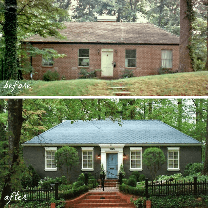
Who could forget this beauty, Nancy’s old home in Atlanta from several years ago?
It triggered a memory of one of my favorite posts about before and after home exterior makeovers and paint colors too!
Plus, this post about some of my favorite exterior paint colors.
And another post about some beautiful before and after home exterior shots.
So, guys, I have to go and fold laundry. ;] But, let’s give another big drum roll for what I think is one awesome home exterior transformation!
~~~~~~~~~~~~~~~~~~~~~~~~~~~
First, the dreary before

and then the after
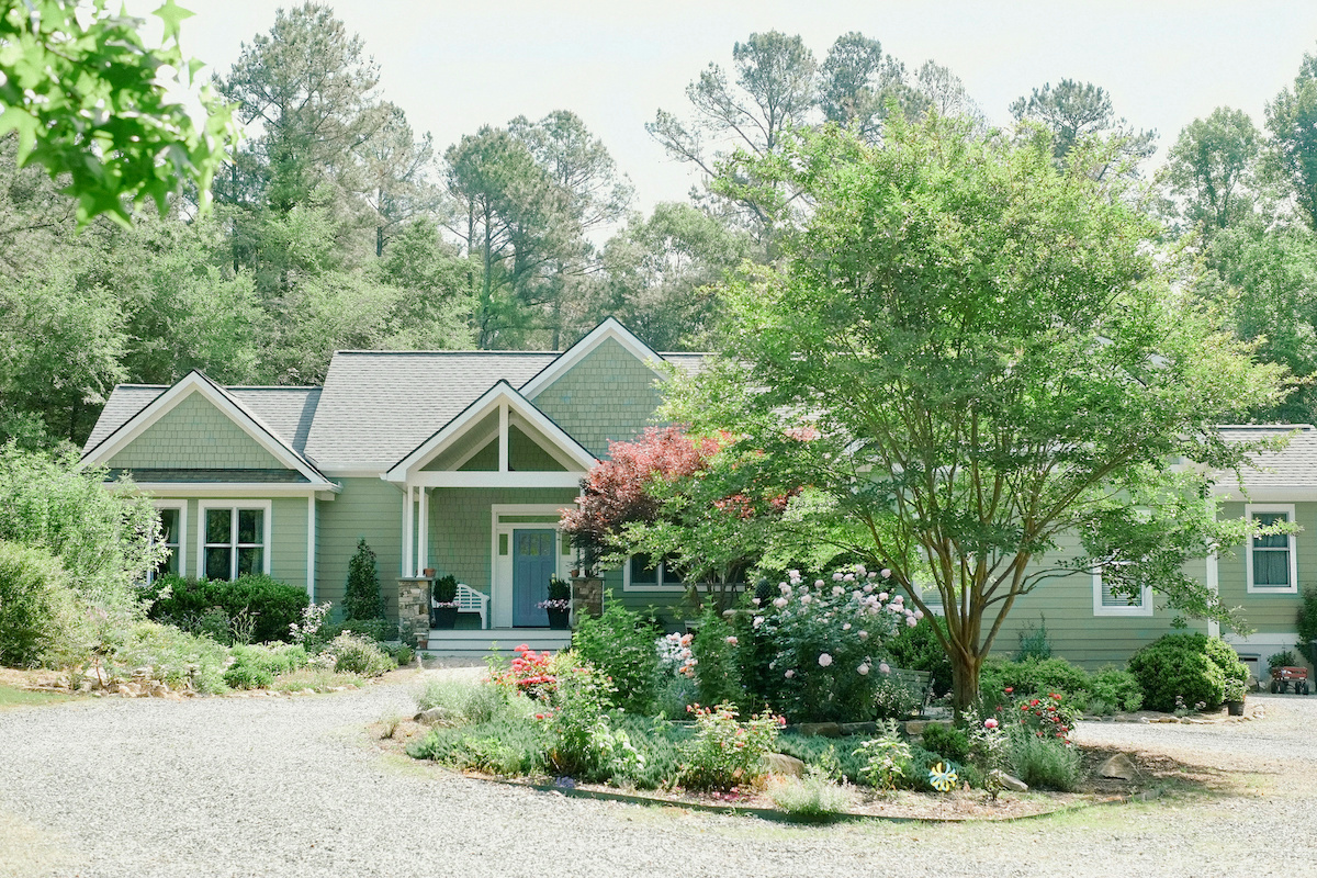
Ta-dah!!!
Oh, I can’t believe it’s the same home. This is a young family home and looks absolutely perfect to me. Great job, ladies!
Please pin to your Pinterest boards.
You may also pin it to Instagram, but please tag me @laurelberninteriors and @nancy.keyes.design when you do so.
And, please follow us both. That is greatly appreciated!
I adore this exterior makeover so much. And, now we can plainly see there’s a handsome door that’s also beautifully styled.
For more front door inspo, please go here.
The green looks so fresh with the new plantings, as well.
Thank you, Furlow Gatewood — Again!
By the way, Mr. Gatewood is turning 100 next month!
Well, everyone, I hope you enjoyed this gorgeous home exterior transformation.
Laurel, wait. Don’t go!
Yes, What is it? I’m trying to pack. ;]
Aren’t you going to tell us the paint colors on the fabulous home exterior transformation?
Oh, blimey, yes! Thank you so much for reminding me. ;]

The main exterior color is Benjamin Moore Kennebunkport Green hc 123.
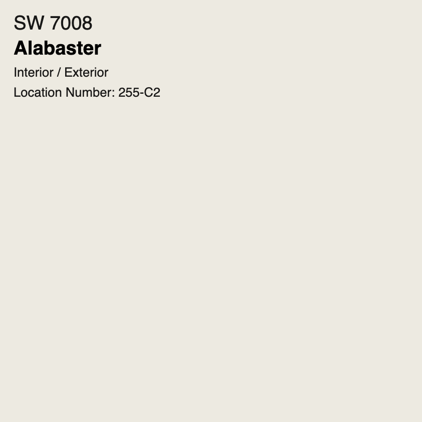
The trim is Sherwin Williams SW 7008 Alabaster.
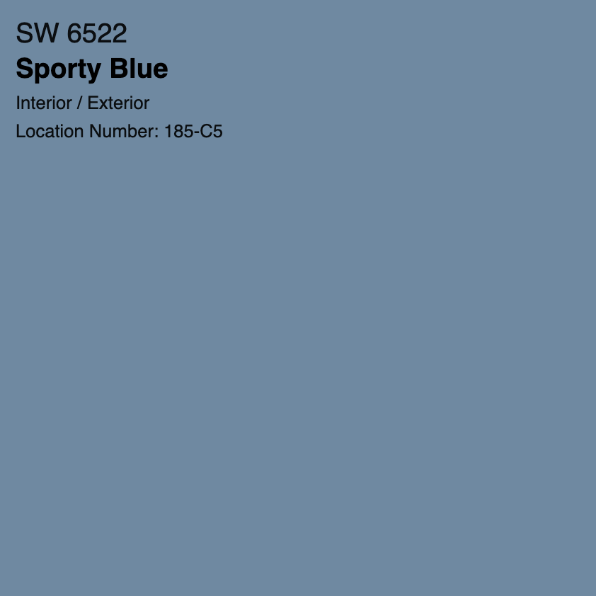
And the front door is also Sherwin Williams sw 6522 Sporty Blue.

Thank you so much, Nancy and Dottie, for generously sharing your time, talent, images, and much more! I can’t wait to share the stunning kitchen!
For some more beautiful home exterior ideas featuring painted brick, please go here.
Again, Happy 4th of July, Everyone!
This is one of the biggest shopping weekends of the year, and there are great savings to be had. So, please check out the newly updated HOT SALES!
xo,

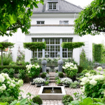
PS: If you’re wondering, the featured image for the post is Nancy’s own home exterior transformation!
Related Posts
 Contemporary Interiors – Are They Trendy or Timeless?
 The Best Builder Upgrades You May Not Have Considered
 60 + High-Low Chinoiserie Lamps (Some are Rare)
 Ultimate Guide To The Best Kitchen Floor That Isn’t Tacky
 The Most Exquisite Gardens and Landscaping Ever!
 Curtain and Drapery Hardware – What You Need To Know
 16 Magical Farrow & Ball Colors For Your Home











21 Responses
Wow! What an amazing and beautiful exterior renovation. I have the same problem with a black hole front door at the lake house we inherited. It’s all that “natural” rough sawn cedar. The only problem is that I don’t recall seeing orangey cedar in nature. I want to paint the cedar do badly! I’m showing hubby this!
I had pinned Nancy’s Atlanta exterior for years now. It’s probably my favourite exterior of all time. Our house is very dark brown brick and it’s depressing. Plus it’s a very small house, and Nancy illustrates that a house doesn’t have to be grand in size to look stunning. I live everything Nancy does! I cannot wait to see Dotties kitchen!
Thank you Laurel, Nancy and Dottie!!
Hi Laurel, I loved the colors chosen for the house. We have a double-wide in Florida that is the same color green. Instead of painting the faded shutters and doors dark green like everyone else I chose the same color blue that is on the house you are showing. You don’t know how happy that made me to see my choices on that house.
Laurel, I am a devoted reader….just love your blog!
Something I’ve never seen you address is how to freshen the look of a brick house without painting the brick. I would love to see some examples of this type of house that has been given a “new” look.
Thank you so much!
They tried to use color blocks for visual interest, but the architecture was not havin’ it. Nice change. Now it breathes.
How fun to see my home on Laurel’s blog! I have been a loyal reader for years, and I am so grateful to her for leading me to Nancy and to Nancy for helping me create a lovely home. I never could have chosen these paint colors on my own and the look is perfect for me!
To answer a few questions, the before photo was taken the week we bought our house five years ago. Since then, I let the trees and shrubs grow a bit wild, replaced the grass in the front with a cottage-style garden, and turned the driveway circle area into a rose garden. The dormer window is still there, just hidden by the crape myrtle tree. The entire west-facing front porch was dark stained wood and really did look like a black hole. The shingles are CertainTeed Landmark Pro in Max Def Georgetown Gray.
Excited for the kitchen reveal. It is beautiful!
Thank you so much, Dottie!
Hi Kelly,
I will check with Dottie and one of us will reply.
@ Nanci, probably just ONE season. Its obscene how fast crapes grow–as SO many of them are planted in our New Orleans neighborhood in INAPPROPRIATE places!
True story: I have Nancy Keyes to thank for introducing me to your blog 3 years and 3 months ago! I was reading another blog that featured Nancy’s amazing exterior transformation of her Atlanta home. There was a link to Laurel Bern Interiors, which I clicked. It took me to your blog post from Nov 26, 2016 “Our Modest Starter Home Might Be Our Forever Home.” That click was fateful! It led me to hours spent reading your entire blog from the beginning, and now, I am a faithful Laurel Bern fan :] Laurel, your blog is my all-time favorite; I hope you never stop!
I absolutely love everything Nancy Keyes touches. This exterior transformation is perfect – I LOVE that green. Can’t wait to see the kitchen!
It’s a great transformation. Did she eliminate the second story dormer windows which appear on the right side of the before picture, or are they just very well hidden by the tree?
I remember your first post about the house that she redid, and I still think it’s a phenomenal transformation. The garage and surrounding landscaping are just lovely. Who would have thought that one could make a garage so inviting? And Furlow Gatewood is a master of fantasy. He can do no wrong, in my book.
Thanks for the wonderful post, and have a very happy 4th, Laurel!
Wow…what an amazing transformation! I’m not sure why, but I’m not usually a fan of green exteriors. This house is beautiful and blends in nicely with the landscape. Thanks for sharing the color and for all of the work you do to make this blog happen. You’re a great resource when I have questions regarding design, and I appreciate knowing you’re here.
There must have been several years between the before and after. That Crape Myrtle really grew much larger that it covered up part of the house. I love how you can now tell there is a front porch and door!!
Yes. The new landscape plantings really added to the whole setting too. Who plants a tree that big? What a feat! It looks like it was always there. The power of paint and plants.
Really enjoyed this post, Laurel. A fabulous product I discovery for transforming a home’s exterior (specifically ugly brick (it does exist)) is Romabio Lime wash. I used it on my home to spruce up my unfortunate multicolor brick and make it blend with white siding. Applied it myself with a 2.5” brush because I’m a crazy person. Just thought I’d throw that out there for any of your followers who are looking to update a brick exterior and want an alternative to paint. You can search #romabioclassicolimewash on instagram for a wealth of inspiration.
Hi Krista,
I love that stuff and talked about it in this post about painting brick from Oct 2019.
Beautiful transformation Laurel. I see so many choppy looking homes that have an assortment of surfaces, which is okay texture-wise but when there are 5 or 6 different colours also, it just does not flow. Even if that house had been painted white, it would have looked much better but I love the green. I wish up here in central Canada, folks were a little more adventurous in their exterior colour choices. We have so many grey, taupe and beige exteriors. People are scared to go with a colour, even if its a soft historical one. Happy 4th of July to all of you.
I love all the colors and landscape. Well done.
Hi Laurel,
Wow, the house looks so pretty. I can’t recall the last time I’ve seen a green house. This looks so fresh!
Enjoy your trip.
Would Nancy be willing to tell us her brand and color of roofing shingles that top off this amazing transformation?
Thanks, Kelly
Wow…..the power of paint!