Page update November 2, 2022
First of all, before I get into today’s topic, the number one interior decorating problem, I want to thank you all dearly for your support and for the incredible comments I’ve gotten and continue to get.
There are a lot of you now… I mean A LOT! And I’m always shocked but grateful. A lot of you write me and I love hearing from you. And it’s almost always the same thing.
It’s your number one interior decorating problem
Drum roll~~~~~~~~~~~~~~~~~~~~~~~~~~~~~~~~~~~~~~~~~~~~~~~~~~~~
What the hell paint color do I need?
Please LAUREL!!! Just tell me! Tell me what to paint the _______!!!
I understand your pain oh so well.
That’s because I was once you. I had the same interior decorating problem.
Yes, I ran to the paint store two dozen times.
Alright. I’m lying.
It was five dozen times.
I had an entire cabinet filled with dozens of test quarts.
Oh man, I easily spent $300+ on the test quarts.
But that was 20 years ago and since then… I’ve learned so much about choosing colors.
I know that there are those that teach techniques, however, I know that it’s still difficult for many to select a color. We just want to know THE ONE! Right?
And then, as if that isn’t enough…
We’re bombarded with so-called interior decorating and PAINT COLOR TRENDS.
I did some investigating and what I’ve discovered is not only shocking but quite disturbing.
Let us begin with Pantone‘s interior colors of the year for 2016.
I know… poor Pantone. I just can’t leave them alone. Well, thank you… maybe they will leave US alone and then I will shut up. (maybe)
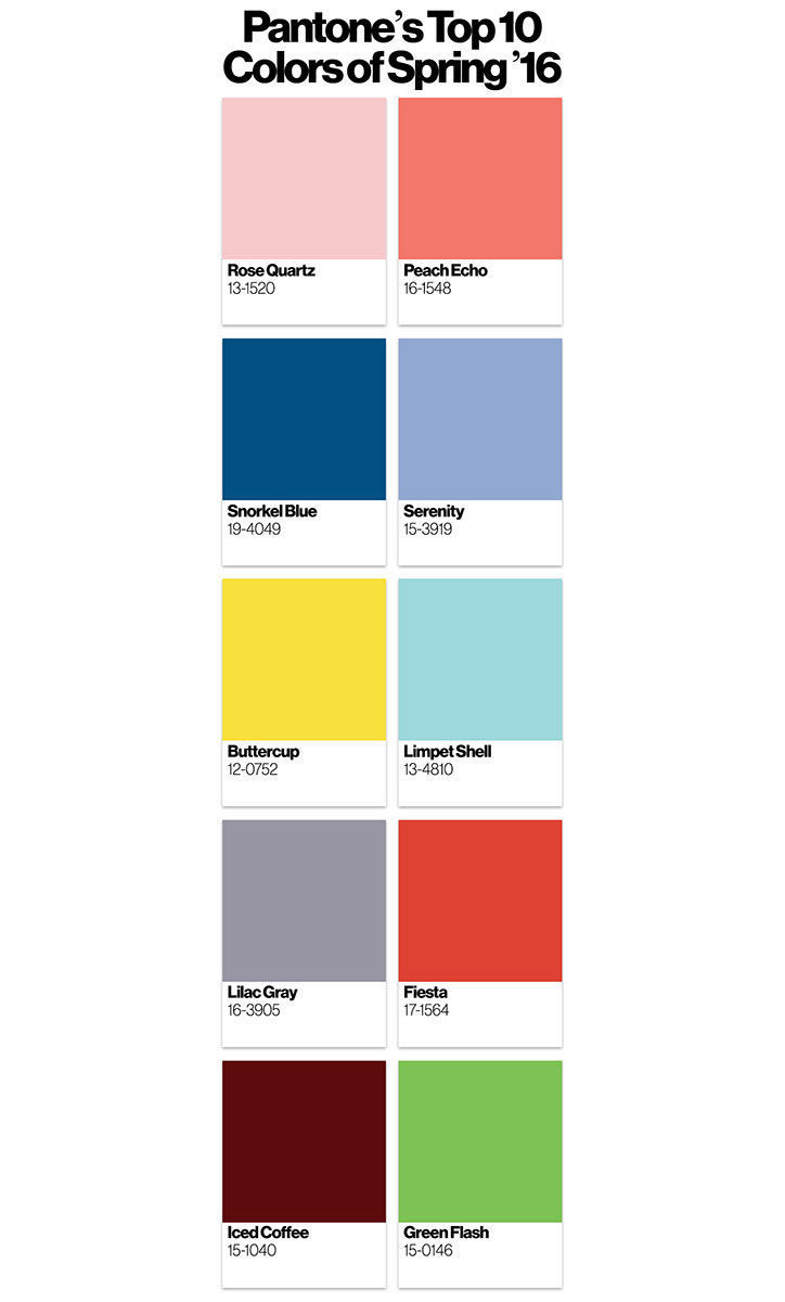
Is this supposed to be a palette?
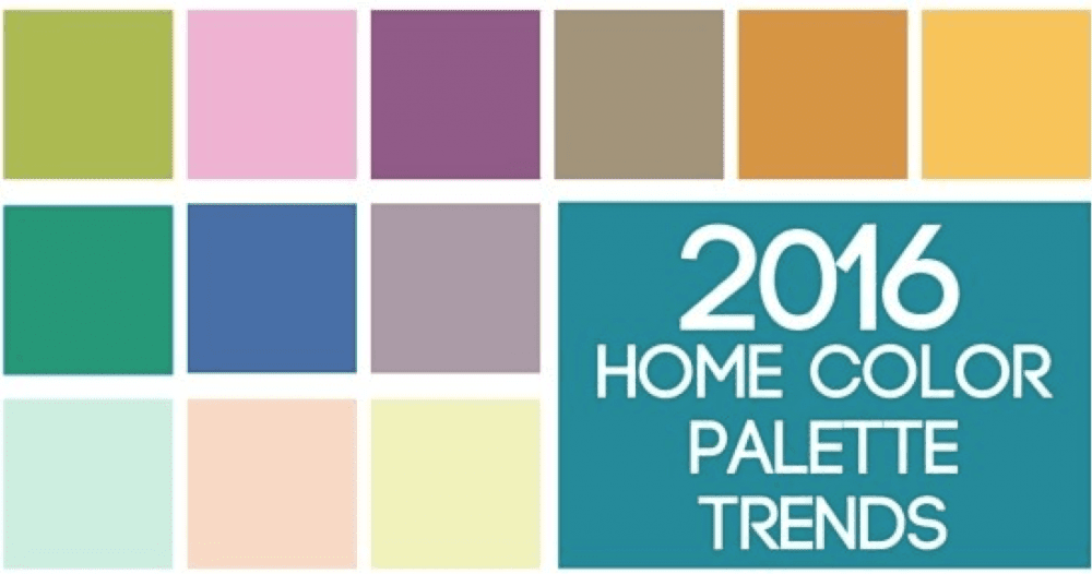
But then I found this also from Pantone.
WHAT?????????
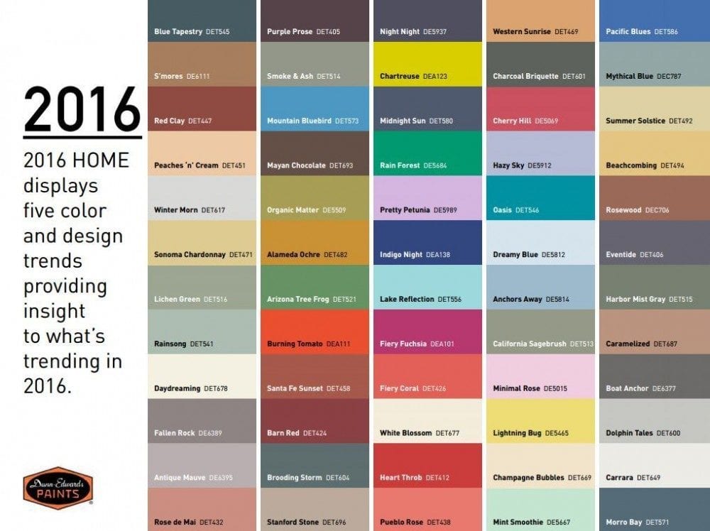
Dunn and Edwards ideas for what’s “Trending.” Obviously, that would be everything! lol
Sherwin Williams at least has some schemes that make a modicum of sense. However, we still don’t know how to use the colors. Where’s the trim color? Will these go with my wood cabinets? What about my puke beige tile. Which one will work?
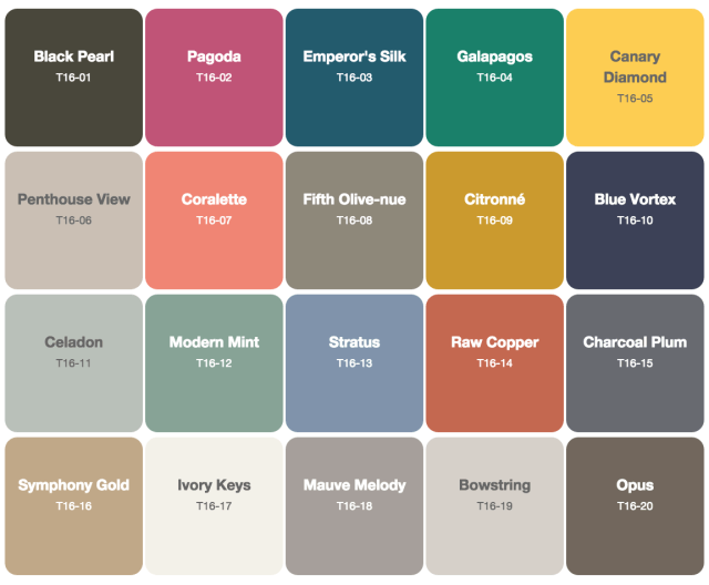 Above is Behr’s take on color trends for 2016.
Oh, I see a trend alright. The more gag awful, the better!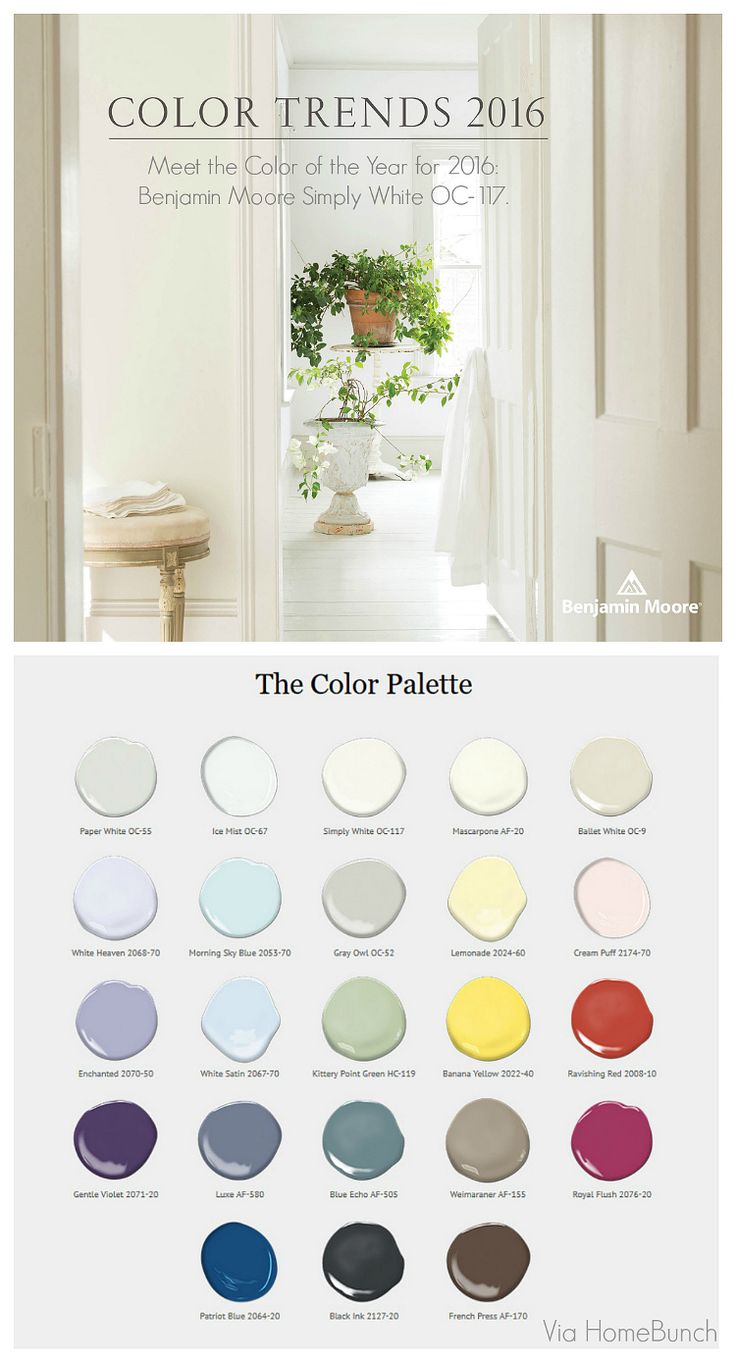 Homebunch
Benjamin Moore is the ONLY company that at least makes some sense and most of these are very nice colors. They are not all faves, but used appropriately, would work for me.
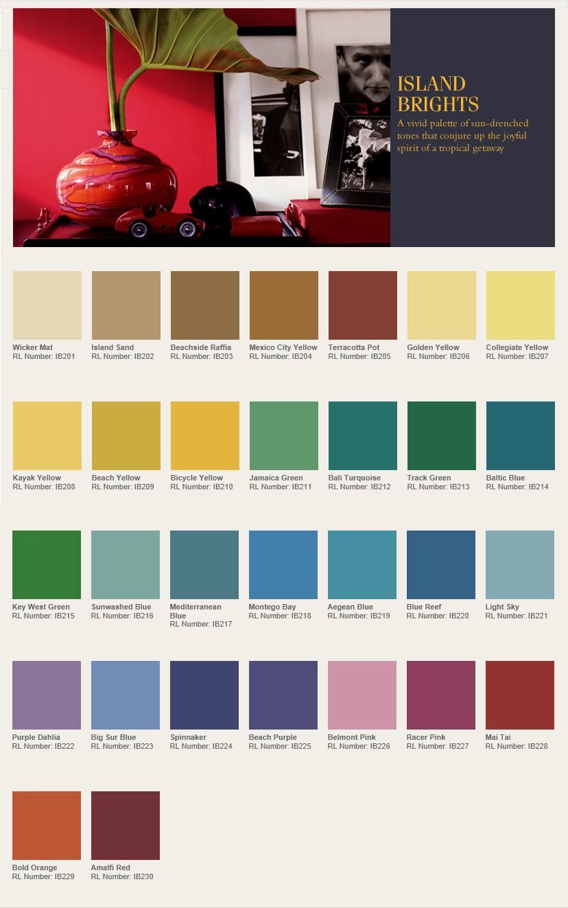
Ralph Lauren has many color palettes. This one is their attempt at garish. It’s a shame, because I’ve always been a fan of their trad old-money-type palettes and especially their blue palettes. Glorious! This one. I just wouldn’t put all of those colors together on one page!
So What is the Paint Color Trend for 2016?
The answer is clear.
Anything goes.
But does it go together?
NO, of course not!
The interior paint color trends are created by teams of color, paint and marketing specialists whose job it is to demean and confuse.
And here’s the proof, via Home Accents Today.

Here ya go! In fact, they are proud of the fact that they are messing with our heads. After all… it’s a tumultuous fast-paced world. Let’s make it REALLY CRAZY!!! hehehehe.
And finally. I’ve saved the best for last.
PPG AKA: a rebranded PITTSBURGH PAINTS has a wonderful PR campaign on their website where they have presented four distinct palettes.
The Odyssey Trends
The word Odyssey represents the adventurous experience in our fast-changing, unpredictable world that is keeping us excited and vigilant at the same time.
Alright. It’s a fast paced, unpredictable world and yet we need to remain vigilant. What does this have to do with paint colors? Let’s see what they came up with.
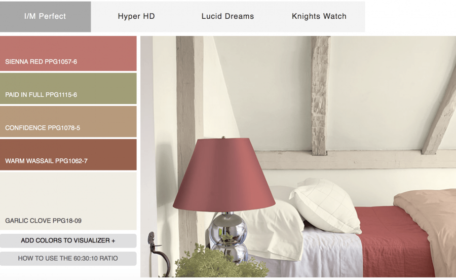 Palette #one. Not sure what I/M stands for. Instant Message? Guess they had a lot of leftover Marsala to get rid of.
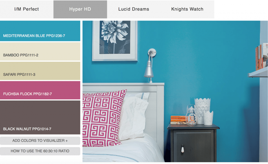
Palette #2 Yes, Hyper is a great name for this collection.
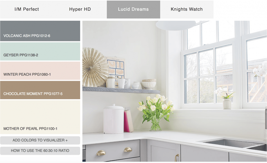
Palette #3 I’m starting to get angry. The kitchen cabinets are pale GRAY! Where is the peach, aqua and brown?
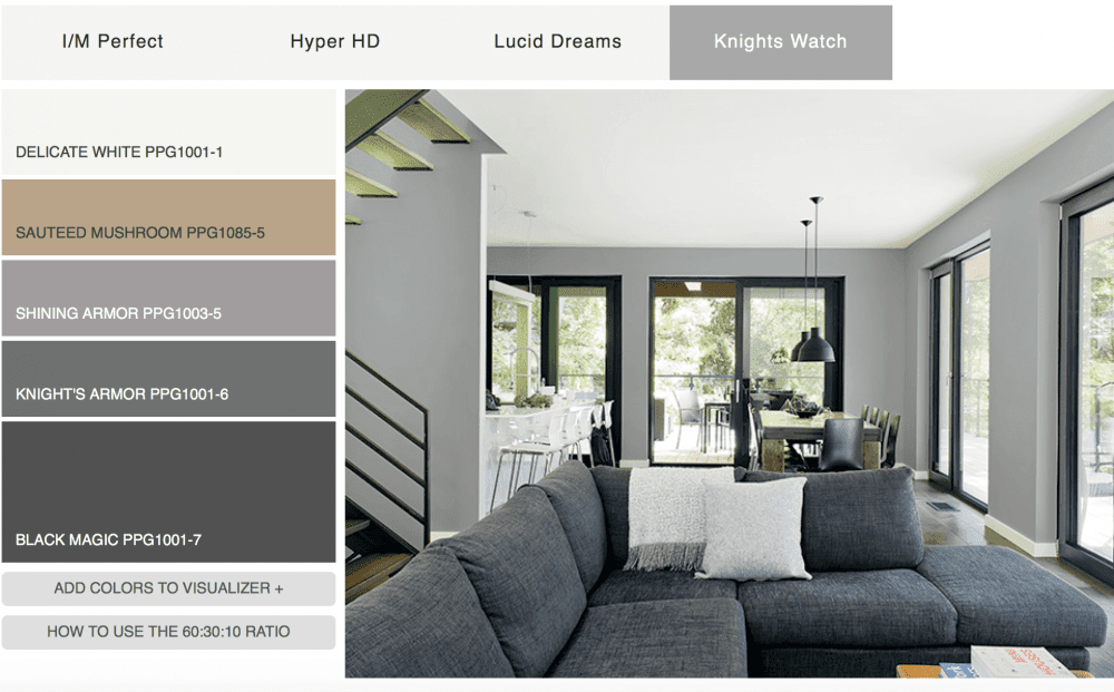
Paint palette #4 Ugh-ly, not to mention horribly dated. Ya know… I had a boyfriend over 30 years ago… in the eighties who decorated his studio apartment just like this only the walls were a deeper gray. His was cool. This is horrid. Just horrid.
In addition, the colors in the palette don’t match the colors in the images or many colors are left out.
Why? How? Who?
Well… thank you! The good folks at PPG actually tried to distract us from the hideous color palettes shared how these paint color palettes are chosen. You can read it all here.
(and what’s with the colors below? This isn’t funny any longer.)

Here’s my fave part.
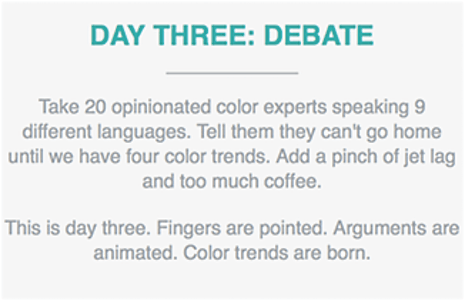
haha! Seriously?
So, let me get this straight. Our paint color trends are decided by a bunch of sleep-deprived, jet lagged caffeine junkies, arguing in nine different languages? I mean, I’m sure that they’re all very nice, very well-meaning, very talented people.
But… 30 of them? You know what they say about too many cooks…

Can you imagine what they are thinking?
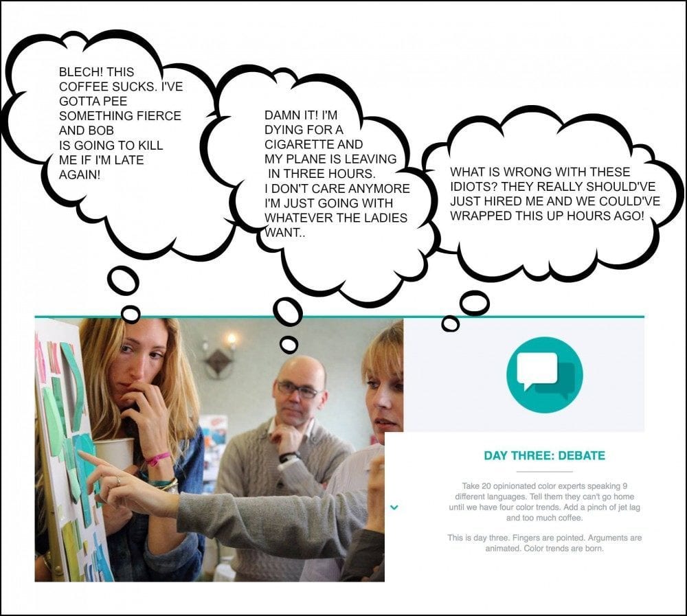
Just having a little fun.
I do feel for them.
It’s a tough job. But when you look at this cacophony of discordant colors, does it help you make a choice for your home?
Well, it doesn’t help me. It’s like Mahler, Mozart, Stravinsky, Bach, Beethoven and the Beach Boys all playing at the same time. Individually, they are all masterpieces, but together? Well, you get it.
So, what’s the answer?
Here are my thoughts.
- First of all… color trends don’t shift that much from year to year. It’s a gradual thing.
- Second, like just about everything, there are many, many styles to choose from. That right there, can dictate many of the colors.
- Third— I’ve been doing this counting interior design school for 28 years! My favorite colors then are STILL my favorites! The only difference is that I’ve expanded my appreciation for many more colors.
- Fourth, how often do you paint? Once every 5 years, 10 years, 30 years? Never? lol It’s not like you go out and get all new underwear. It’s a big deal! That’s why we stress so much.
Well… please try not to.
And, I wouldn’t pay too much attention to the marketing BS.
Sure, once in a while, they come up with something terrific. But when they do, you’ll know it! It will speak to you, not make you want to reach for a barf bag.
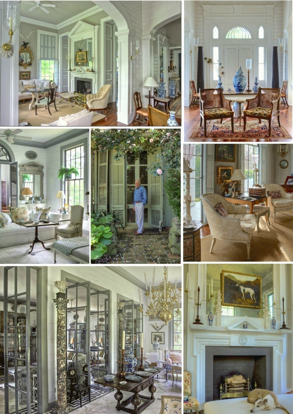
It will speak to you like Mr Furlow Gatewood’s astonishing work speaks to me and a lot of other folks too!
I made a little collage of a few of his living spaces in one of his homes in his compound.
He’s a master at everything interior design! At first glance, one sees a lot of neutral colors. And yes… it is primarily creams and grays, but look around and you will see a myriad of other colors…
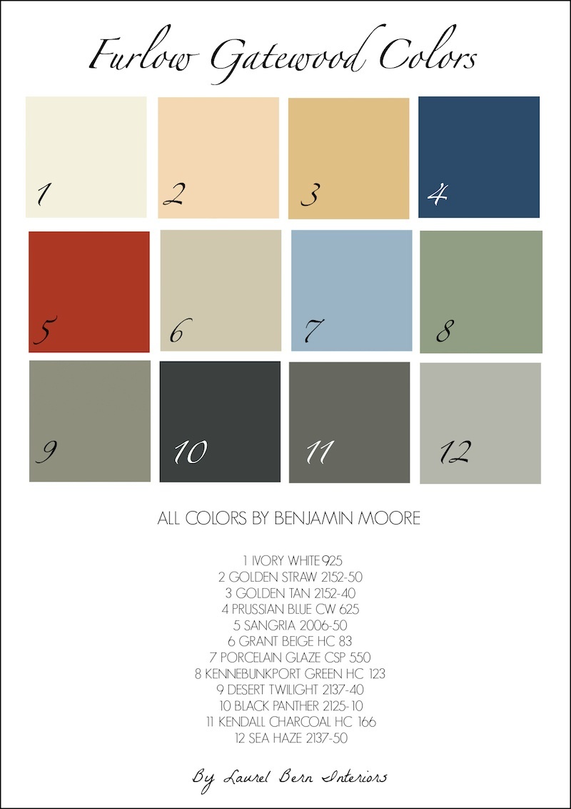
For fun and a little New Year’s presie for y’all, I made a little palette of Furlow Gatewood’s colors.
Are these his ACTUAL colors? Well, probably not. If anyone knows how to get them I’ll be your best friend forever! In the meantime, these are close enough. Not all of the colors in the palette were used as paint, but I selected a paint color that was close to the color in the palette.
These are all terrific colors! This could be incorporated into an entire home palette.
Please feel free to pin it to your pinterest boards!
This is what I’m working on for y’all.
I am working on a paint color collection that will be in palettes and will include trim and ceiling colors, woods, tile, counters, floors, and tons of other information to make choosing colors for your home–easy(ier).
There will be dozens of whole house palettes/finishes.
I did one a while back; nine no-fail paint colors. I’ve had several people write to me that they used them and couldn’t be happier!
If there’s anything else you’d like me to address with the paint collection, please let me know in the comments.
xo,

Related Posts
 Can This Boring Bland Living Room Be Saved?
 The Best Bedroom Paint Colors You’re Probably Not Using
 20 Fabulous Shades Of Orange Paint and Furnishings
 Granny Decor Mistakes You Might Be Making!
 Do You Know What is the Most Classic Color?
 White On White Decor Inspired By Charlotte-Anne Fidler
 The Number One Interior Decorating Dilemma and How to Get Past It!





49 Responses
Laurel, in our new townhouse I am doing white trim with off white walls. Any recommendations. I was thinking ballet white for trim and ballet white for walls. Any thoughts? I don’t want the color to read gray at all. Thanks!!!
Hi Donna,
I’m sorry but I can’t recommend colors in the comments for a myriad of reasons. Ballet White is a lovely color, but it is NOT white. It is more of a light putty/greige color. However, if the room is bright, it may read less so.
Hi Laurel,
Thank you, I have just lost my appetite after looking at those colors…But I need a double martini! I didn’t read all of the posts to see if someone already mentioned this, but Furlow Gatewood used Fushion, which is an Affinity color, on his walls. I moved into my house in 2011 and had to paint the barf beige master immediately. I chose BM Paperwhite and didn’t even look at it until they were finished because it would “do” until I had painters in to paint all of the other rooms. (It is actually quite nice reflecting the sky and water) I posted on my blog that “I had my bedroom painted with paint right out of a can”. I usually mix my own colors or at least tinker with them. A few days later I was reading about Mr. Gatewood’s Americus house and he made the same comment! ( Forgot to mention that the barf beige had a “wallpaper border with khaki, burgundy and forest green…so you know it was an emergency paint job!)
Hi Nancy,
Too funny! You had me running straight for the fan deck before I could even finish reading your great comment! I can’t wait to see it in the light of day, but yes, I can see how that is the color in the living room. Wonder what the off-white is?
Paperwhite is a good one to just go–ANYTHING to get rid of the cat puke walls! But, it’s a lovely whisper of pale, pale white dove gray. And I KNOW that border! It proliferates in my part of the world. :/ You would think that Westchester County being adjacent to New York City would be a bastion of sophistication. Well… sure, it exists but it’s not common. Talbots Taste rules in these parts! lol
Hi Laurel
I couldn’t resist one more comment. I now live outside of New York City as well. We lived in “Intown Atlanta, Ansley Park” for many years before moving “home”. There was SO much style in Atlanta. All of my friends lived for design and all had beautiful homes. When we were house hunting it was a shock to see the lack of style so close to the city.
Nancy
I live in a 2-bedroom condo and my walls are still white just like the day I moved in eleven years ago. Then I just tweak my accessories on a monthly basis to correspond to the seasons or seasonal holiday. You can never go wrong with white; it’s a lot easier to change the accessories than repaint the walls.
Well Susie, I think that’s wonderful and I couldn’t agree more! White is my favorite color!
I have spent so many years looking at the “colors of the year” and trying to figure out why I wasn’t cool enough to see the beauty! Thank you for this post! So nice to see it was them and not me.
And, I currently have your 9 colors for the whole house written down and would love a couple more palettes!!!
Thank you, Laurel for another great post!
Hi Megan,
It is my pleasure to shout out that the emperor is butt neked! lol
Surely there is a colour listed somewhere that is labelled ‘trying to hard’. It certainly seems like that is the goal for many of the manufacturers when developing trends.
Several of the palettes made me think of my mother’s old living room in hunter green and peach – which was bloody frightening.
Yes, I remember that combo all too well Katherine. It could work if there was lots and lots of white, some chartreuse and other greens, a touch of teal and a little brown and a bit of black. Then, it could be really lovely. Especially if the peach veered more to salmon.
Can’t wait for tour next blog!! I live for your shot of impeccable taste and sense of humor! Keep them coming!
Hi Sally. Thank you so much! I very much enjoy it too!
LOVE this post, Laurel. Sounds a lot like Congress, doesn’t it? Chaos, can’t go home until they reach a “consensus”, and are there to drive us all crazy and confuse the hell out of us!
I love Furlow Gatewood’s home and design sensibility, too. It’s what resonates with me, as far as good design. I am certainly am no professional, so I can’t speak from an educated perspective, but I love the feel of a house that is a home. One that “embraces” you when you walk into it. I suppose for me, it evokes a feeling as well as an aesthetic. There are so many beautiful houses that you see in design books and magazines, but to me they have no warmth. But, each to his own. I have his book, One Man’s Folly. It’s a joy to read and browse through again and again. Where has this man been hiding all my life?
Lisa D.
Hi Lisa,
I know… Furlow is a treasure. I do know that for years he worked with John Rosselli. He’s an antique dealer first and foremost. And that is why his homes have that collected feel. It’s because they are! And yes, it all feels very personal and homey, yet put together.
Great Post and I couldn’t agree more that everyone and their dog is choosing paint color schemes these days. Chaos seems to be the mood of the day. By contrast the palette you put together is beautiful/calm and my blood pressure suddenly returned to normal ? I’ve been itching to paint a piece of furniture Prussian blue for our coastal house. And another in Kennebunkport in a different house. A small, dark bedroom with one small window on a deeply wooded lot. Do you think it would work in a cabiny themed lakehouse?
Hi Pamela,
20 years ago I worked for someone who had a decorating store and it was pretty dark and the entire place was painted in Kennebunkport. It’s that English library color. I think that it could definitely work, but always test first!
Dear Laurel,
The Furlow Gatewood colors are beautiful. I was wondering what your opinion is regarding Benjamin Moore’s Affinity Colors. They claims that all the colors work well together and that you can choose pleasing color pallets with your eyes closed. Are these colors good? Are their claims true? What do you think?
I’d love to hear Laurel’s take on the Affinity colors. I have to say, it worked for me, once I found my main color. It was less stressful choosing the coordinating colors for adjacent areas and hallways. The guy in the Ben Moore store steered me there; he said the Affinity line uses a larger number of pigments in each color than in the other lines, so that’s why the colors work well together. He advised choosing three colors; better than expecting five or six to play well together.
Laurel, what’s your take?
Hi Maryanne, The colors work well if one wants a largely warm palette. If one wants cooler colors or more clear colors, they’ll need to go elsewhere. As I said before, I love some of the colors but a good number don’t do much for me. And yes, he’s right about choosing three colors. I always love colors that are fairly close together, or at least a couple that are. It depends on the situation.
but… let’s not forget that Affinity which is also called Aura is double the price of the standard Ben Formulation. That’s my take. lol
Hi Laura,
That is a very good question. First of all, the Affinity colors are only available in the Affinity formulation which is 70 bucks a gallon. Do they all go together? Sure, for the most part although there are a ton of colors I’d never use and there’s a lot that’s missing. There’s hardly any blue. No clear shades. The line is very heavy in golds and beiges. Those were VERY popular when the Affinity line came out. On the other hand, there are some wonderful colors in the line, but a lot of them have siblings in the other fan decks. Or the difference is very insignificant.
so, it is possible to put together a color scheme using only Affinity colors but a lot depends on what else is going on and the look one wants.
Thank you, Laurel. I appreciate your advice.
Oh, and I completely identify with the poster who described her painters as politely hating her. Mine were very patient but I’m sure rolled their eyes every time they had to talk to me. Not to mention the men in the paint store (my new best friends) every time they saw me coming through the door. If not for his superhuman patience, my husband otherwise would have left me. So yeah, #1 decorating question/problem. I’m glad it’s over for me and I can move on!
Hi Maryanne,
I know that there are a lot of us who’ve made umpteen trips to the paint store. They love it! KACHING! LOL and so do the paint companies! I daresay those test quarts are a significant portion of their bottom line!
Hi Laurel-
Your help has been indispensable – can you talk about exterior
colors? Roof, siding, stone, etc? Thanks so much!
Oh wow! That is another ball of wax Kathleen. That’s because the relatively harsh outdoor light–eats up colors. But the testing process is pretty much the same.
p.s. Your comments about picking paint colors are a good dose of common sense for everyone, me included. I’ve spent a fortune on paint samples over the years.
I just spent the morning reading Furlow’s book One Man’s Folly for maybe the 10th time. (I toured his home last fall, I thought I’d died & gone to heaven, never wanted to leave.) I just discovered your blog a few days ago, I love it. Your mix of good decorating advice, great pictures & sense of humor make your blog one of my favorites.
Hi Terri,
Thank you so much! If you see this… How does one get to go on a tour of Furlow’s home? That would definitely be worth the trip to Georgia!
Laurel, His home would absolutely be worth a trip to Georgia. If it’s ever on tour again I’ll be sure to let you know. It was part of a tour sponsored by the Georgia Trust for Historic Preservation last fall. His nephew’s home on adjoining property was also on tour that day & was also fabulous.
Hi Laurel. I love reading your blogs. They cheer me up and keep the hope up that some day I will find my whole house color palette which is now going on two years of frustration, lots of tears, and two boxes full of paint samples based on articles I have read about paint colors that are supposedly perfect for a house with very little natural light, colors great for north or east rooms, etc., perfect for certain undertones for my fixed elements, and on and on I go in an endless circle. I know what I love and sit for seems like hours in the different paint stores putting palettes together with some of my accessories and a floor sample and they look absolutely beautiful when I am at the store. However, I get the samples home and they look totally different. The true undertones come through when I get them home (gray colors look violet, linens and soft tans look dirty green, creams looks too yellow or just plain blah). I have accepted that the look I want that involves soft colors that will support the “clean” colors of my artwork and fabrics are not possible in this house of mine. I recently tested Benjamin Moore’s Hale Navy in my kitchen and dining room which is essentially one long room, and I do love it. It fits the room. Now the search is on for complimentary colors for the living room and the stairway which both transition off the kitchen/dining room on either side. I look forward to seeing your color collection and whole house color palette, and the fresh, honest insights you provide. Happy New Year!
Hi Anne,
This is such a wonderful comment because it’s a common issue. Sometimes people will want to have something that isn’t possible. They want light bright and airy and no paint can create what isn’t already there! And sometimes, using those colors can make things worse.
Hale Navy is what I would call a universal color. It goes with everything! So, you other colors can stem from a rug, a fabric a piece of art and then you can build.
This would be hilarious if it weren’t so infuriating. As usual, you hit the nail on the head. As I was reading, my takeaway was “Consider trendy paint colors like trendy fashion: check it out to be informed, then run fast and far in another direction.”
I mean, HIDEOUS! What were they all thinking? I think you’ve come close to figuring that out. But you know that we are going to be seeing these colors featured in magazines and on websites soon. I always hated the gray trend but after these colors, gray is finally looking good!
I thought my husband and I were moving to a new condo in Boston and I obsessed over paint colors for weeks, along with other decisions that just seemed impossible… and eventually realized that nothing worked because I didn’t want to live there! So we never moved in. After six years of house-hunting we’d made a terrible mistake, but now that it’s under agreement to someone else, we are feeling much better and have learned a lot about ourselves and how we want to live.
Along the way, I found your blog and my perfect paint color, which I have yet to use, but I can’t wait. And wow, there it is on your new palette: Ivory White. (Please note you list it as “125” when it’s “925.” We may have lost six figures from our bank account (and I also lost 12 stubborn pounds from anxiety) but I learned that the reason I can’t choose golds, blues, and greens for walls anymore is because I have plenty of colors in my rugs, furnishings, and paintings, so most of my walls just want to be creamy. So 925. And the other walls will want to be similarly neutral. (Grant Beige looks promising.) Done. (Trim will be one of your other whites, and you know, several will work so I won’t obsess.)
It’s like you said somewhere about some dark blue kitchen walls: the walls will tell you what they want to be…. So thank you for helping me get there. When we buy our next place, I will know what I’m doing thanks in part to finding your blog and learning how to think, look hard, and figure things out for myself.
Hi, APB,
Thank you so much for this wonderful comment and especially for noticing my typo! I just went in and changed it so it’s correct now.
You touched on a point that was more or less implied in the post. When we are talking about “palettes” it’s not just paint! It’s the permanent finishes, furniture, fabrics, metals–everything. And it all plays a part like instruments in a concerto. Sure, the pianist is the star, but the supporting players are just as important!
It’s very true about paint being number one issue. We’re doing huge remodel of our new place..suffice to say it’s been a year, ..and now we kinda getting dangerously close to painting..and I feel how my spirit sinks more and more..)) And I thought about the palette a lot(I had time! LOL), and went to the store(unfortunately our contractor strongly prefers Dunn Edwards since we’re on the West Coast now, and they’re big in here and have a good reputation) that was completely new to me, and studied the colors a bit, and I thought I had an idea. But the closer we are to the painting the more I think about it and question myself, and the gloomier I become.
I was choosing kitchen cabinets’ color for more than a week..taking these sample doors(I think I grabbed 14? all presumably one color)) around the house, looking at them morning and evening and noon, writing to the carpenter asking for some more time to decide..
I just imagine how it will be with interior painting-I stop the job for a week or two, run around like a worried hamster, looking at the walls and the ceilings, and the painters politely hate me with all their might.
PS I couldn’t wait till Sunday)) Happy New Year!
Hi Jenny,
You really made me laugh with your worried hamster and the painter’s attitude. I can relate to all of that so, so well!
One bit of advice that’s helped me is to not over-think it too much. Colors CHANGE! So, depending on the time of day, sunny, cloudy, time of year, you can get a vast change in ONE color. I realize that it’s easy for me to say that. The first time I painted for myself 20 years ago, I was you. When we had to repaint 5 years later because of a flood, I made far quicker decisions and was thrilled with every color!
Hi Laurel,
So happy to see Sea Haze in your chart. One of the prettiest grays out there with blue/green undertones. Love it so much that I’ve used it in both my living room and bedroom. Also Ivory White is another great color that isn’t mentioned as much lately. Have used it on all my trim and my kitchen cabinets. The funny thing is that someone led me to this color almost 30 years ago and I have never tired of it. Have reused it in different formulas throughout my house. It is pretty much no fail. Thanks for your blog. Love it!
Hi Jeanne,
Thanks so much. Yes, you hear a LOT about gray owl (the color above it on the fan deck) which of course, is also lovely, but sometimes a deeper shade is more desirable. The one below that desert twilight is another wonderful color. I used it once in a unique, contemporary bedroom. They collect art and the art looked amazing against it as did their warm deep wood colors. Ivory white IS a really great color. Occasionally, I’ve heard some say that they see too much yellow but I have not had that experience. It’s just the perfect warm, creamy white!
Dear Laurel,
My husband and I are currently hunting for our forever home so I’m squirreling away all these great paint ideas of yours for later. The paint color palettes and whole house palettes are just exactly what will be needed. Can’t wait to get started!
Hi Holley,
Glad you’re finding it helpful! Good luck on your search!
Thank you SO MUCH for your wonderful blog! I’ve learned so much in studying your articles and pictures and greatly appreciate that your advice fits the “real” world most of us live in. Seems as tho every time I start to read I’m off following links and sidetracking on more useful advice. It so often helps to clarify decisions/choices I’m working through in our home, and I appreciate your generosity in sharing your experience and enviable talents. Thank you and keep it coming! You rock!
Thanks so much Erika!
Thank you so much for your sweet comment Erika. I’m so glad you’ve found the posts helpful! I very much try to keep it real because there’s so much that is smoke and mirrors. Sometimes we see it and wonder… Is it me? I don’t get it. I think with the palettes, they put all of the colors on the wall and then they blind-fold the experts. Then, they play a sort of pin the tail on the donkey and whatever color gets pinned— well, that’s the one! haha!
Laurel
You are amazing and should be snapped up by these ‘colour’ companies who have clearly lost touch with reality & common sense!
You are a breath of fresh air to those of us who share your passion and joy investing in our homes & families. Thank you for your continued invaluable advice& support. I hope you know how much we love you.
Hi Liz,
Thank you so much! I think they should snap me up too. lol Well… Benjamin Moore, anyway. I love you guys too!
Hi, Laurel,
just looking over my shoulder to check no-ones reading this…I need help..I am
strangely drawn to Gloss & lacquer again.
I know Gloss paint is still perceived as tasteless, in england at any rate, but, if you’ve a
minute, I would really appreciate a little wry advice on how, & when to use. I have my
own ideas but would appreciate a little vindication (or not).
Am I before my time or are my feet just stuck in the glossy sticky past?
Discuss.
Jo x
Hi Jo,
So sorry, I read your comment and then missed it when I went back to reply.
Okay, there are two different things here. Gloss paint as in high gloss or semi-gloss that we use for trim. And lacquer which is a labor intensive glass-like finish for the walls or ceiling.
If it’s the latter… let me tell you that it is HOT, HOT, HOT! All of the top designers are using it like Miles Redd and Jeffrey Bilhuber. The old guard, of course, Albert Hadley, Mark Hampton, Sister Parish et all used it, but it is definitely NOT tasteless. Quite the contrary!
I have never used it because
A) my clients for the most part wouldn’t want to shell out the bucks for it
B) I’m in suburban New York and my clientele has been largely young families. Dark colors are especially beautiful in lacquer. I would love a room with deep lacquer walls– a rich chocolate brown, perhaps, or navy. Yummy!
Of course, my philosophy is do whatever makes you happy. If you want to paint pink ducks all over your walls, I am totally fine with that! haha.
Hi Laurel…Gosh would I love complete palettes! Of course having just painted an entire new house I’m not painting again for fifteen years! Choosing the palette for an open-floor plan newer construction home was soooo hard. Everything I love about the open-ness complicated paint choices. And I was starting from scratch, since we’re updating/redoing/replacing a lot of our furniture so…..no “inspiration” pieces.
Reading your blog helped me be more knowledgeable about color and undertones, but what really set me back was how the light affected what were beautiful palettes on the paint chips. I paid a designer for a color consult and she was helpful with some choices….until I put the main color on the largest wall. A gorgeous greeny-gray chip read seafoam on the wall. Not what I was going for at all. Easily twenty quarts of samples later I came upon a great palette from BM Affinity line (with a couple other colors in the closed rooms.) Palette: Wish, Etiquette, and Peau de Soie. Hot Spring Stones in study and Gray Cashmere in kitchen. Ewing Blue in two bathrooms. I got exhausted and did the Master in Linen because I couldn’t think anymore. All trim in White (thanks to my painter who swears by it.)
So…what I need from you going forward (in addition to the palettes) is more info on how colors read in certain light (high, low, sunny, cloudy) especially with regard to amount of light. High ceilings and a sunny exposure did me in. I was stymied by what colors to complement my wood tones (designer was inadequate to this task: told me everything “goes with” wood…)
Thanks for your help along the way; even though I’m done painting (phew!) I’ll still be reading whatever you write!
Keep it coming.
Thank you so much Maryanne. I think I missed answering your comment because I answered one from another post and then forgot to go back into the ones for this post. Your palette sounds very lovely. One thing I’ve discovered with all of my investigating is that within the different fan decks, there are colors that if they aren’t the same, are so close that the difference is insignificant!
Why do they do this?
Because they can. It’s for their benefit, not ours.