Dear Laurel,
I very much enjoyed your blog post talking about mixing modern and traditional styles.
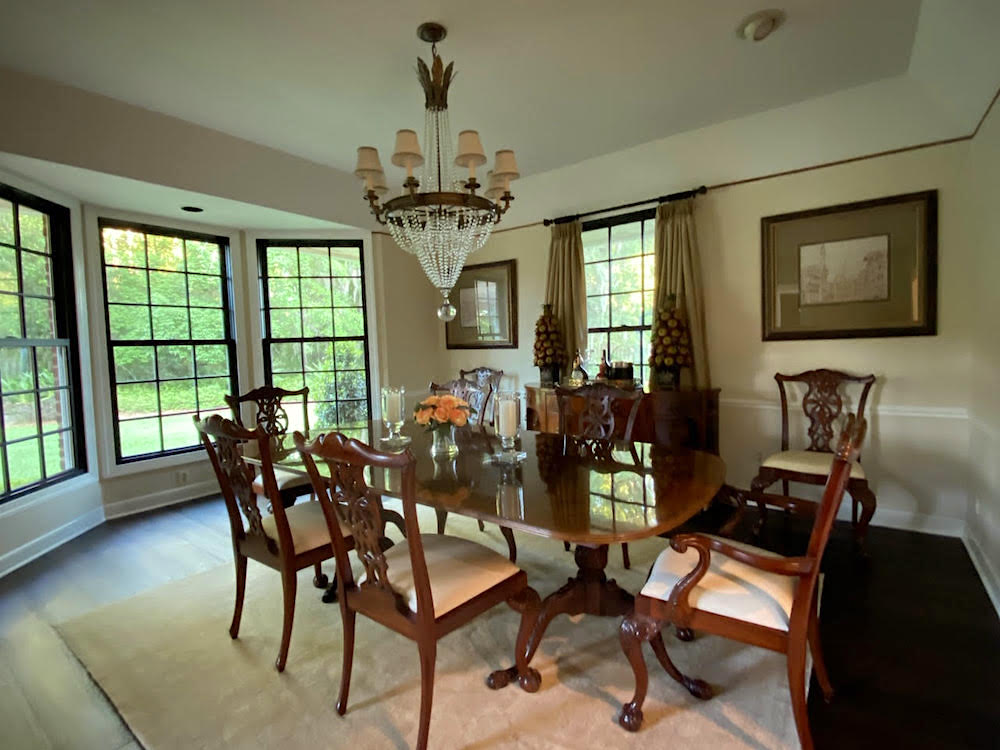
Here’s my situation. I bought some traditional dining room furniture that cost me a pretty penny. Therefore, I can’t get rid of the set without feeling bad. At the time, I was afraid of making a mistake and thought that a formal dining room was the way to go.
But, now, I wish I had gone in a more classic-contemporary direction because the formal dining room isn’t my thing.
I love most of the dining rooms in this post. And, this post has some terrific dining rooms and ideas, too. I think you have a great understanding of getting the dining room mix right in a formal dining room. The Gil Schafer dining room is so gorgeous!
I also took a look at your page with dining room furniture.
I also like this blog post about using different host chairs than the side chairs. That is something I might consider as a compromise as a solution.
In addition, I recently purchased the Ballard Designs Hartwell sofas in a performance linen. In all honesty, this is my style, because they are classic and cleaned-lined. I realize now, that I far prefer that which is sparer.
However, the formal dining room is another story, as you’ll see if you look at the attached photo.
While I think it’s over-all a lovely room (the bones, as you say), it looks phenomenally tired and blah. I did add the Oushak rug thinking it would help, but it doesn’t. Fortunately, that one wasn’t too expensive, so I could put it in a bedroom, or give it away.
So, Laurel, here’s the challenge should you choose to take it on for a blog post.
What can be done to make this traditional dining room look fresher but still use all of the furniture that’s there?
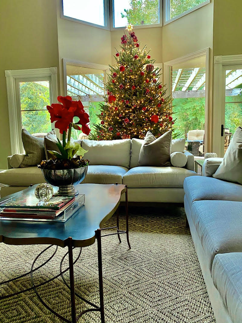
Oh, and still have it look like it belongs in the same house with the living room. (Please see the photo of the living room at Christmas-time). I guess what I’m trying to say is that I wish the dining room was not so formal and had more of a classic-contemporary feeling. There’s something I’m missing, but I can’t put my finger on it.
The dining room chair seats definitely need to have new upholstery.
And, with a covering with more personality, as well. At least, that’s what I’m thinking. But, since I’ve already screwed up, I’m really not sure what the solution is.
Sincerely,
Liz
***
Thank you, Liz. This is a very lovely home, and I’m happy to address the situation of the formal dining room.
And, please know that nothing you have done is terrible. I wouldn’t walk in and go, “what the hell happened here?” I mean, I wouldn’t anyway, but that isn’t the case. In fact, I imagine at night with your pretty china, some candles, and a dimly lit chandelier; this room is quite lovely.
However, you are right. This too-formal dining room is not living up to its potential.
But, as nice as the living room is, I think it could use a little help too. (Most of the help has nothing to do with you.) And since the two rooms are connected, I think we need to make some changes in both rooms.
Okay, here’s the deal. Liz is not a real client. Plus, all I have to go on is two photos. There’s much I can’t see and, therefore, don’t know. Usually, I ask for more photos. And, sometimes, more information. I didn’t this time.
However, for the purposes of this exercise, I have enough information to make some educated guesses.
Plus, okay.
At the risk of sounding like a deranged stalker, I did an internet search of Liz.
I now know everything about her, including her dress size.
No, just kidding. And, believe me. I do not normally look up any readers unless they are:
- Insanely nice, supportive, and consistent in commenting.
- A condescending, judgmental, inappropriate cow who’s about to get her arse blocked. (they are very rare, thank God!)
- I’m doing a blog post about their home and need further information and don’t wish to bother them. Or, I’m just curious to know more in general so that I can be helpful. As much as we don’t like to admit it, people do generally fall under certain patterns of likes and dislikes.
Of course, I will always protect your anonymity. (unless you don’t want me to)
However, I can tell you that this is a good-sized home built in the mid-80s in Florida, somewhere.
And, Liz is a very pretty-green-eyed blond in her mid-fifties.
Why is that important?
Well, I’m looking for clues, and it has been my experience that most blond-haired women love warm reds. They also tend to like blue. I’m not saying that they don’t like green. They frequently do.
However, Liz decorated her tree in RED. Therefore, I know that she’s fond of red.
The other colors in this home are various shades of beige, gold, and greige.
So, let me continue with the design process as I would do if Liz were a real client.
Of course, I would measure each space to be worked on very carefully.
Then, there would be an interview discussing wish lists, givens, plus, things that can and cannot change.
Although, sometimes we find a practical way to change things even though there might be a small loss.
Many times, clients have donated furniture to charity and received a tax deduction. Or, have sold the furniture. Sometimes they give some pieces to a friend or relative.
Let’s first discuss the bones of this home.
There is a post-modern-double story living room with contemporary windows.
And, adjacent to it, is a traditional dining room that has fabulous black window frames. Right now, that’s my favorite part of the room. However, I’d be willing to bet money that they are not part of the original home. I didn’t start seeing black window frames until about 15 years ago. This home is 37 years old. No way. But, we sure saw them here in this post about black window frames.
Now, am I suggesting that Liz and her husband change out the windows in the living room?
Well, that would be nice. However, that would probably mean changing a lot of other windows. If they need to be changed anyway, to be more energy-efficient, for instance, that might be a possibility.
I tried to see the house and neighborhood from google street images. But, for some reason, it’s not working. Otherwise, because of real estate listings, I have gleaned that this is an upscale neighborhood of similar homes built around the same time.
However, let’s leave all of that aside and address these two rooms as best we can. We’ll discuss the issues and the possible solutions.
The first issue with the living room IS the windows as they are, black frames aside.
Can I tell you how crazy it makes me to see the windows/door at two different heights?

That uneven window design definitely falls under this category.
Then, we have a vast space above the smaller window and door.
Above the bay window are matching clerestory windows.
Beyond the windows looks to be a lovely patio area with a pergola. It’s a complete coincidence, but I just added some similar string lights to my outdoor furnishings widget. I bet that area looks great at night.
In addition, there is the overly-traditional corner-plinth moulding on the small window and door.
AND, there looks to be a third window casing on the clerestory bay window!
The formal dining room looks to have the same or similar moulding as the lower bay window in the living room. If possible, I would change all of the mouldings to that one. And, another thing. A talented builder could bring the bay windows down to match the height of the small window and door. Since the windows are inoperable, I think this is a terrific solution, whether they change the window frames or not.
However, they should LOOK like real windows, so I would add a window frame so that it doesn’t look like just a plain sheet of glass.
It’s a subtle thing. However, I feel that it cheapens the home without a frame of some sort.
If it doesn’t make sense to add the muntins to coordinate with the dining room, I can live with that.
The other thing I’d add for architectural interest would be some picture-frame moulding like we do for faux wall paneling or wainscoting. I would make boxes above each window the same height and distance from the windows. That distance is about 3″-4″ And, then I would do one more box to line up with the clerestory windows.
We’ll move on to the formal dining room soon, but what I want to do is talk about the colors for both rooms.
I don’t think the wall colors are working in either space. For the living room, I would do a creamy white with the beige sofas and two-story space. The current color appears to clash with the linen sofas. Those gold-greenish colors were wildly popular 20 years ago. I did a ton of rooms with them. And, you still can. However, for a double story room, I usually prefer white walls.
For the formal dining room, and mahogany furniture, usually a deep, rich, saturated color looks best.
It’s not that you can’t do white walls. However, this does not appear to be a light, bright room, so I’d probably stay away from white, if possible. Please look at North Facing rooms, here.
The problem with this room is that the pale colors clash somewhat and feel tired. While the black window frames help somewhat, they’re not enough.
I suspect there is also a matching china cabinet somewhere.
But, getting back to the dining room, I would probably paint it a warm red. My clues came from the fact that Liz is a green-eyed blond; she loves Gil Schafer’s dining room, (maybe Miles’ Redd’s design-work). And, she decorated her Christmas tree in red– only.
I had a boss who always said that there’s a lot of logic in this business. She was right about that!

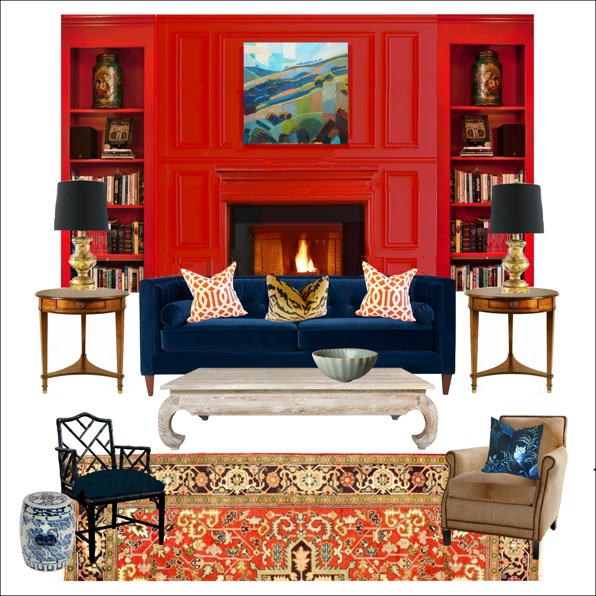
One of my favorite warm reds that looks sensational with mahogany furniture is Strawberry Red. It’s a warm, very soft red that isn’t orange, but definitely won’t ever read as burgundy. It’s great for north-facing rooms which this one appears to be. I love it so much that I made it one of the Laurel Home’s Paint and Palette Collection’s colors.
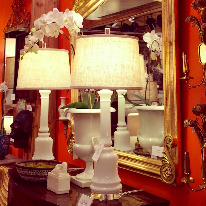
Or, Liz could go even more towards orange with Racing Orange red for her formal dining room. Or, choose a color somewhere in between. That’s one of the beauties of the laurel home paint and palette collection. It gives you a jumping-off point. So, that if you make your samples and think that you’d like to go a little more in a different direction, you can then tweak your paint color choice.
In between 1996-2015, I probably did at least a dozen or so red rooms.
Usually, it was the dining room, but I have at least one red living room and two red bedrooms that I can recall. Every time the red rooms looked terrific and the clients were thrilled. I’m not saying that to demonstrate my abilities. It’s just something I learned over the years. (find out some of my favorite shades of red paint, here.)
Now that I have more information, I have a direction I can explore.
Let’s begin with the area rugs. I love the sisal diamond rug which I found at Ballard Designs.
However, the rug in the formal dining room is a problem.
Here’s why. First of all, it does not look to be a real Oushak rug. I could be wrong. But, the tells for me are the very even carpet pile.
- overly mono-toned disappearing pattern.
- No border. And, maybe no fringe.
- Plus, the rug is too small. It looks to be an 8×10. This room can easily take a 9 x 12 or maybe even larger.
What kind of area rug should it be?
I think that it could either be the same as the living room rug. Or, it could be an Oriental rug with warm reds, blue and gold like these more saturated rugs on Overstock.
OR, Liz could put the more traditional saturated rug in the living room and the sisal rug in the dining room, if it’s the right size.
Either of those choices, I think will be beautiful. I’m leaning more towards the latter because putting a more trad rug in the living room will help balance out that room better for a more eclectic, cohesive look.
What if Liz doesn’t want a patterned rug like that?
Well, then I’ll just need to fire her.
No, I’m kidding. (as usual). I won’t fire her (even if I could) or chastise her. She could also do two sisal rugs.
But, for now, I’m going to assume that she wants to do it my way. hehehe
The dining room chairs come next.
I’d love to see some slipcovered skirts.
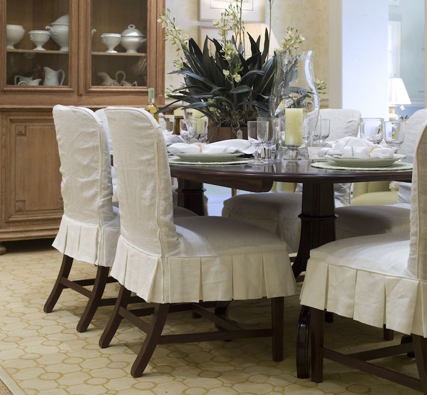
In fact, the entire chair could be slipcovered. Slipcovers are a wonderful way to knock back the formality of these mahogany chairs.
She could also change the host chairs to ones that are fully upholstered. See this post about mixing dining room chairs.
But, here’s the thing. Liz could end up spending about the same on custom slipcovers as she would for new chairs.
There are a lot of very reasonably priced dining room chairs in the market-place. I have a number of them on the pages Liz linked to in her note. And, there are several I love from Wisteria and other sources. You can see some of them in the HOT SALES widgets, here.
And, I linked to some pretty pale chairs the other day.
Laurel, this is reminding me of your do-over of the Deerfield Inn from Thursday.
haha. Yeah… thanks. And, thank you so much for all of your sweet comments. Some of them made me cry a little. The good kind of crying. I know that this has been such a trying time for all of us in so many ways. If I can create a little space to get away from it all, for a few, it’s a good day for me.
Balance in life is always key.
It’s just not easy to find, sometimes. OH! and I forgot the other day. But, I’ve added a cute pic that Cale took of me on my knees while photographing the beautiful Deerfield Inn. BTW, he read the entire post and your comments and appreciates your kind words, as well. And, no. I did not make him read the post. I lost all control over him a long time ago. haha
Okay.
The next issue with the formal dining room is the curtain treatment.
It’s too low and too drab mid-tone. If it were black or white, it would be better.

Let’s bring that image down here, again. I’m not sure what that brown line is, but I would get rid of it, or paint over it. Then I would raise the curtain rod to just under the new crown moulding that will be added. lol, It doesn’t need to be a large moulding. 3″-4″. Please see this post about proportions in mouldings.
I would do a plain white lined curtain on the window behind the server. If custom, it should be a panel and a half in width. And, then, there should definitely be another rod, hung the same height over the bay window, with the same curtain. In that case, I would do a double panel because it is a wide window. The drapes are not meant to close.
One bit of styling that would be awesome in this room would be a deep contrast hem that comes up to the bottom of the window frame.
I’m guessing that to be about 13″-14″ in this case. Or, how about doing a custom trim as we did here in this post about how to make budget window treatments look expensive. I worked hard to crack the code.
Already, I think that this traditional dining room is feeling far more alive and in keeping with Liz’s desire for a fresher, more inviting dining room.
Is there more that she can do?
Yes, there’s always more. :]
One thing she might consider is changing the sideboard. This is not necessary, but for those starting from scratch, it’s something to consider.
In any room, tone on tone is always a good thing.
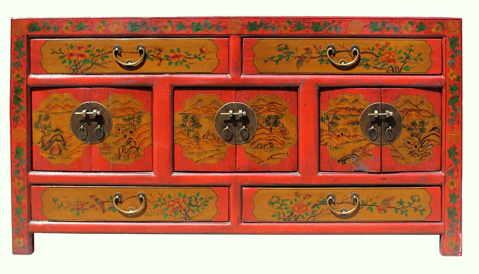 To knock back a too-formal dining room – I think adding a piece like this distressed Chinese sideboard from Golden Lotus Antiques on Etsy would be utterly fabulous.
In any case, I would definitely add two buffet lamps. We’ll get to that in a sec.
But, the point of all of this is that it’s a process.
So, that’s when I just start putting it all down on (virtual) paper.
Ala picmonkey.com.(this links to a tutorial I did a while back)
For the last ten years or so, I’ve been making mood boards for myself and clients. This tool has made a tremendous difference in being able to visualize how everything will look together.
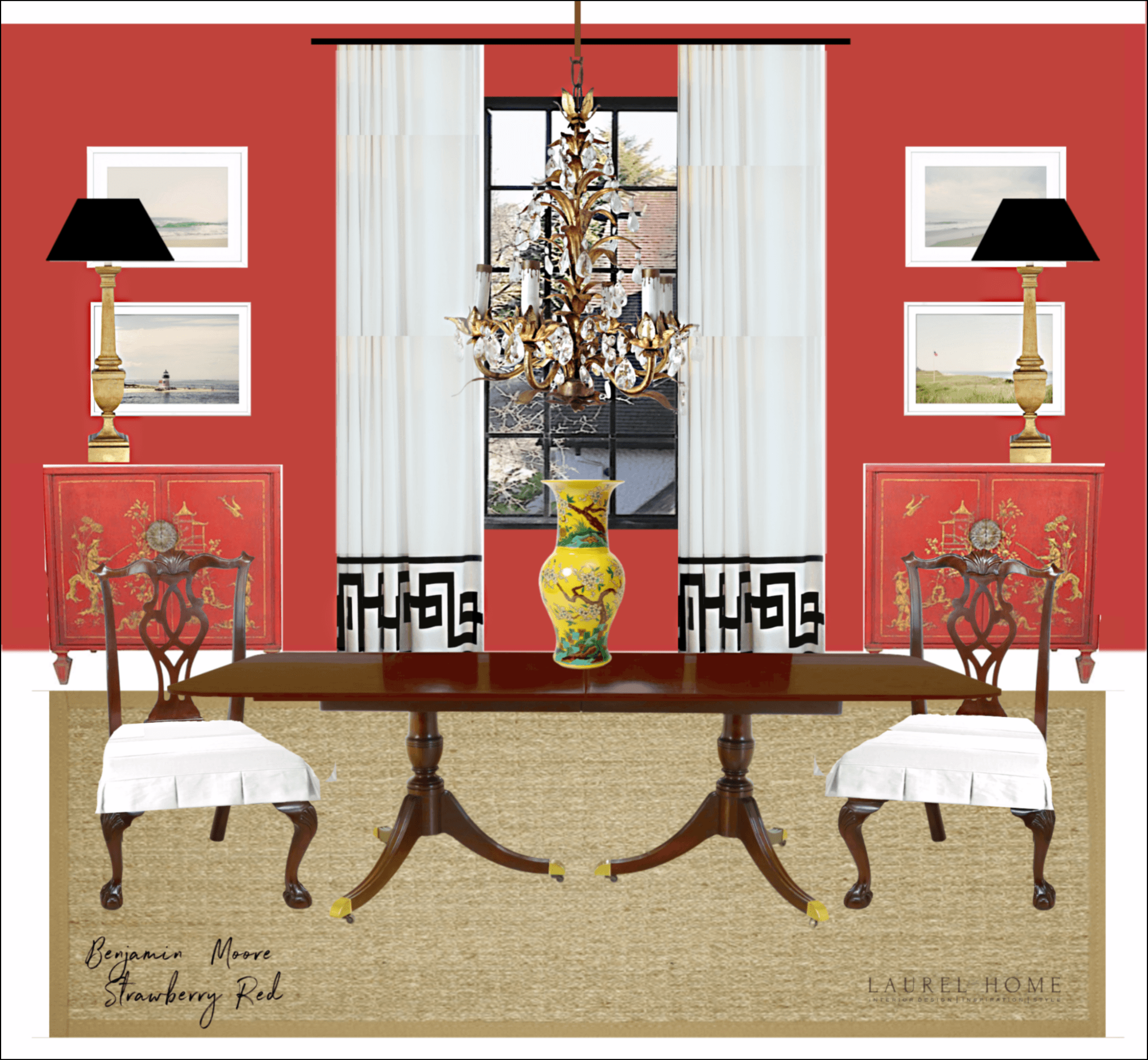
Above is my mood board for Liz’s dining room. I could not use her chandelier. I think it’s fine but maybe could use a touch of gold paint to brighten it up. The red walls immediately bring this room to life. And, the white adds a lot of freshness and feels more contemporary. But I think it makes it more timeless.
 I found these fabulous chests on 1st Dibs. But, don’t get too excited, they are sold.
Why did I switch out to two chests? It’s just an alternative to having the one sideboard in front of the window. But, it’s not necessary.
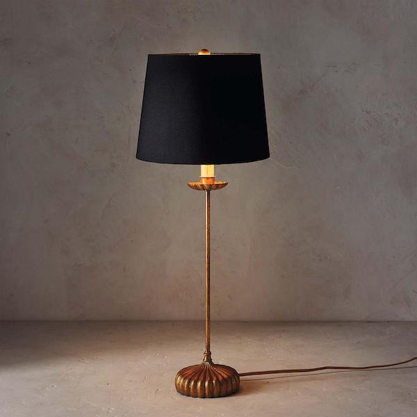
The lamp I actually selected is the Clove Stem Lamp, which I believe is from Regina Andrew. It’s at a great price on sale, right now. In fact, I put it in the Hot Sales general furnishings widget. That’s the second grouping of images on the page that carries numerous brands. The top widget is only One Kings Lane.
I added some art. There are some lovely art prints at One King’s Lane, and these four are part of a large series by artist, Christine Flynn.
Why did I choose these? Well, Liz lives near the ocean, and I love the softness of her work and, it provides a beautiful counterpoint to the saturated color and dark furniture.
Balance.
For the living room, I could see bringing in some of the red colors, but not in the same concentration.
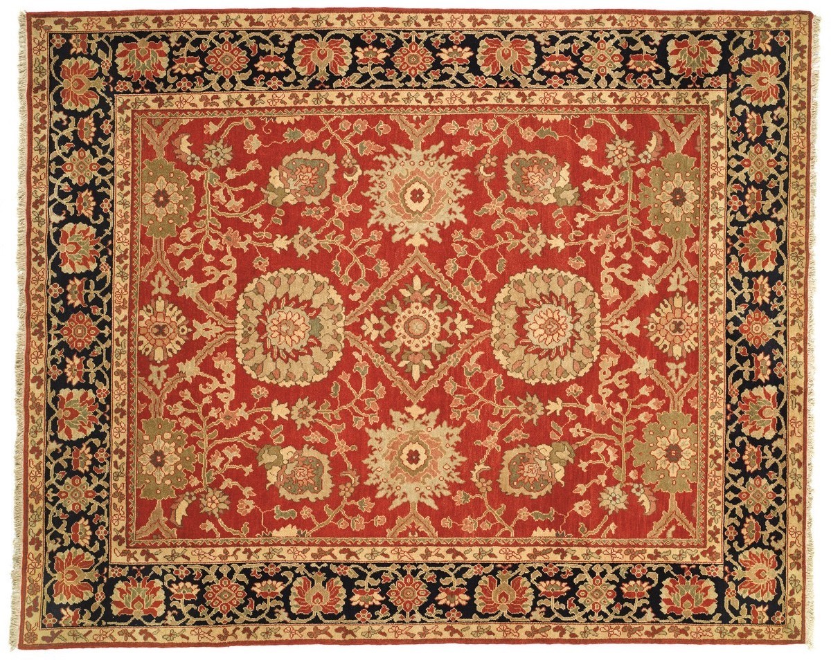 For instance, Liz could do something like this 9×12 Ziegler Mahal, now on sale at Overstock!
Below are some pillows she could add. Of course, I’m always linking to pillows. But, here’s one post with a lot of interesting (I think) pillow combos.

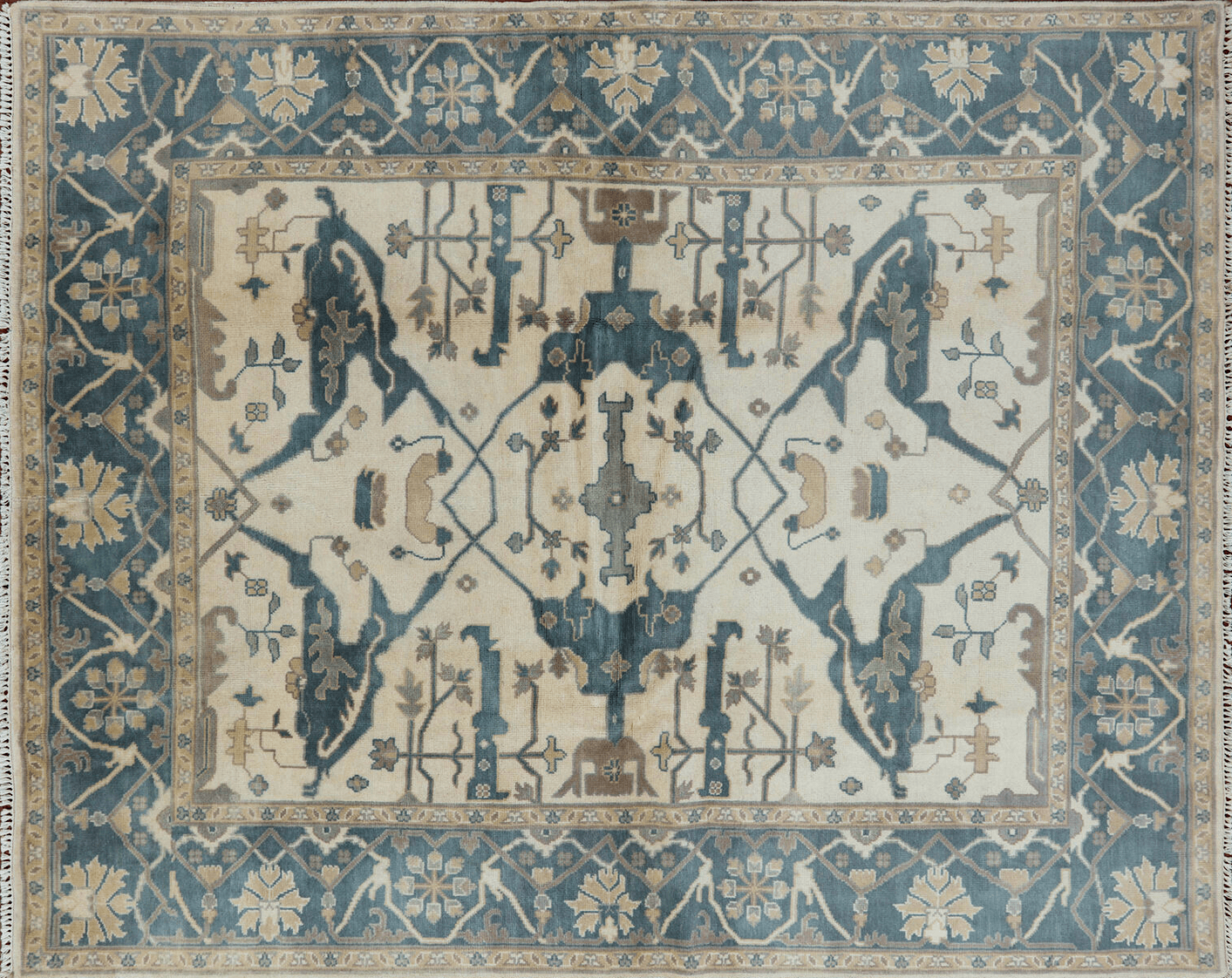
This 100% wool hand-knotted Oushak-style rug is in the hot sales rug page. (it’s super-cheap on eBay) I color-corrected this rug. It’s an alternative that could work, as well. Remember my client, who got one of these? It looks sensational in their family room.
I would also add another end table and two beautiful table lamps.
Now, some might want to know this?
What if Liz really doesn’t want red and blue? What if she wants it more neutral. Could she do anything else?
Oh, yes, there are dozens of directions she could go in.

She could do a color like Cleveland Green in the dining room. And, she could pretty much keep everything else. But, this is a different post.
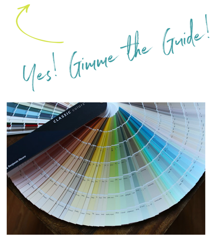
Guys, if you don’t yet have my two-volume, approximately 500 page Laurel Home paint and palette collection, it is something you should consider getting. That is, if you’re struggling at all with your decorating.
The guide is designed to help open up your mind to all of the possibilities that, through my years of experience, know will work.
If you’re just starting to decorate, how are you supposed to know? I didn’t 32 years ago. It was only through working in this business since 1988 that I figured all of this out.
Well, I’m at 3,400 words!
I hope this post is helpful and that everyone is doing okay this week.
xo,

PS: please check out the newly updated HOT SALES page, and also the beautiful Father’s Day Gift Guide. FD is in two weeks!
Related Posts
 Affordable Bathroom Fixes With Big Impact
 Our Ugly Brick Fireplace – He Vetoes Painting It!
 36 Cheap Sofas and Chairs That Look High-End!
 A Long Narrow Hallway – Help For A Dark Scary Mess
 Easy (and affordable) Ways To Fix A Boring Room
 How To Mix Patterns – Designers’ Secret Formula
 How to Fix Dreary Decorating + A Mistake I Made!









47 Responses
I love that you added beach pictures to a room that doesn’t scream coastal or Florida. Lovely.
That Strawberry Red is to die for.
Red! You made my day, Laurel. Blonde, green-eyed follower here. I was just admiring the Downtown Abbey red library last night and missing this color. So this heartens me that I can repaint my dining room red again and strap on my red sandals lying dormant in my closet for the past decade. Just when I was thinking that the pandemics of health and injustice would mean I would lean towards more neutrals. The solution I guess is using lot of neutrals elsewhere, in the red room and other places in the house. Thank you., Glad to know you’re well and keeping up your work.
HI Laurel!
I love your blog! The way you transformed the dining room was awesome! Love the color scheme in both rooms.
This post is totally educational! I am in the mist of remodeling the kitchen and redecorating the adjacent 2 rooms. Decorating is over whelming but you take it one step at a time!
By the way, I am a blonde with blue eyes and love the color blue; I do not care for the color red and I own nothing in red. I do, however, use a little red at Christmas time since Green and Red are the traditional Christmas colors 🙂
Thank-you!
Sue
Not so different from Aerin Lauder’s dining room, js
Wow Laurel! You knocked it out of the park! And I don’t even like red rooms! But, hey, this sure kicks it up a notch or two. Love the rug switching suggestion. Liz needs the two spaces look like they belong to the same house / family. The light curtains with chinoiserie trim sure wake up the space, and those red sideboards bring in a whole new layer.
I’m a blue-eyed dark-blonde who is into blues. My dream dining room would have a beautiful Gracie wallpaper. Or maybe Zuber. I just need to win the lottery, right? I plan on reupholstering my great -grandmother’s dining chairs (again) in a blue/while leopard Sunbrella fabric. That would freshen them up, for sure. I love the table…it is a classic and will never go out of style. If Liz decides to sell, let me know, ok?
I’m with you on the chandelier. Perhaps she could use the 2 armchairs in another room at a Parsons table with a backgammon set, then replace them with some cool contemporary wicker or upholstered host/ hostess chairs. Something fun. Buffet lamps are a must. If she can’t swing two sideboards, then I think it should go in front of the bay window. A large statement piece of abstract art could wake up the room, possibly where the sideboard is now.
Anyway, there are lots and lots of ways to pull those 2 rooms together and bring them into the 21st century. Thanks for all of your suggestions. You are the bomb!!
Laurel, So glad I discovered your blog.
I think the problem with the “too formal” dining room is that it’s boring. I won’t get into color schemes, but it could obviously be much livelier. Slip covers would disrupt the curvature of the legs and throw off the nice proportions of the chairs. And I think the money saved would be better spent on more interesting accessories and art. Websites such as Artful Home have interesting choices. A local artist guild and antiques dealer would also be helpful. I would replace the curtains with a casual Roman shade, switch the rug for an Oriental, and replace the formal chandelier with something less grand, but with beautiful lines.
Great ideas Laurel! I’be always loved how Alexa Hampton combines natural wood blinds with curtains to lessen the formality. The dining room lacks texture and depth and your ideas add dimension and character.
I also had an Ethan Allen table and chairs for decades and was tired of the dark, heavy feel of it, so finally i painted the chairs white and changed the upsholstory on the seats and added a seagrass rug and some fresh linen Roman blinds – it made such a difference – i actually loved that room afterwards (we have since sold and i no longer have a formal dining room). I love all of Laurel’s ideas as well – especially the skirted white seat covers.
Hi Laurel,
I have learned from you so very good lessons.
My decorating is Asian and traditional. You
have kept me from making mistakes since I have been reading your blog. Thankyou.
Hi-love your blog but I’m getting it sent to me 2x. Can you change that to just one email. Thanks so much!
Hi Sabrina,
If you’re getting it twice, unless you’ve subscribed with two separate email addresses, it’s because you didn’t open the original email. That triggers it to go out again the next day. Sometimes people miss an email. Or, they intended to read it, but were just too busy at the time and it got buried. The second email usually goes out 24-30 hours after the original email was sent. Sometimes they do have different headlines.
Otherwise, at this time, I can’t change it.
Wow, the mood board where you landed all the suggestions for the dining room is just HOT! It looks so different and so good…and it really seems doable!
Fellow readers, seriously, purchase Laurel’s guides (and read them thoroughly)! They are the biggest bang-for-your-buck you’re going to find, as far as working toward achievable “Wow!” in your home goes. You can drool over Mark D. Sikes’ web portfolio all day (and I do!) but Laurel’s guides are where the feasible action is at! 😀
I also have lived with a very unloved formal dining room, just because it was purchased with very little knowledge. Luckily, the set wasn’t terribly expensive, so no guilty feelings in replacing it. I love your suggestions because creating a balanced and visually interesting room can truly be a challenge, especially with a restrictive budget. I love posts like these, well done Laurel!
Laurel–you are amazing! I’m a green eyed blonde and for years I had a red dining room–and I loved it! Now I lean more to blues (with some green in them)…also, how did you know?
I love this post about the traditional dining room set. I have purchased most of my furniture at Ethan Allen and my bed from Charles P Rogers. I love my furniture but it is very traditional. Although I love farmhouse style or something more contemporary, I will never part with my furniture because it is so well made. It’s hard to add touches to bring it into a more contemporary style though.
I always love your ideas, especially helping us to use what we have and add to it in order to make everything look fresh and cohesive. I need a lot of help with that myself!
Wonderful post! I have been giving my own traditional, cherry dining room the side eye for about a year. I had planned to paint the matchy match chairs a contrasting color prior to becoming a ‘Rona home school teacher. I have been studying the art of spraying furniture and was all set to go when my otherwise delightful husband informed my mother-in-law of my sinister plans. For the love of Pete, there was drama. “Why would you do such a thing?” I showed her some great pictures. She made an actual fart noise with her mouth to show her disgust. Anyway, the gentle and kind thing to do would be to have custom slip covers made. But, I’m still leaning towards painting the chairs and maybe throwing in black walls for shock value. I enjoyed your post, as always.
I do love your blog posts. Recently I thought of opening my phone, laptop, and iPad to read you so I’m not going crazy going back and forth to the photos and your recommendations. Makes life with Laurel easier. You already knew you were complicated, didn’t you!
Hi Nancy,
Actually, I think it’s easiest on a laptop, alone. Every link opens in a new tab. But, phones are trickier. Of course, do whatever works best for you.
Thank you so much for sharing your experience and knowledge with us. I’m new to the design industry and your story will help me a lot to my journey. I hope you and your family are doing good during these times.
Paint dr set black. Cover seats in tapestry or like burlap but not scratchy. Bring some large tropical greenery inside, echo to outside. Pergola needs climber. For that matter, view outside should be to garden with interestingly shaped foliage (and daytime color), uplit at night. Maybe statuary. Not Greek. Replace chandelier with two updated chandeliers. No crystal! Maybe Interesting glass like Chiluly or pastel or copper? Some large colorful art – like Samuel Bak’s. But don’t pick art or frames that fight with chandeliers. Agree get rid of bullseye mouldings. I think when you decorate a room like this, you have to first think of your guests. What will make them comfortable, stimulated, entertained, ready for a delicious meal, camaraderie and good conversation? Lighting should enhance them. And consider both day and evening. I might skip a rug unless it contributes to fresh, natural look.
I’ve been seeing NoraCora pop up all over the place recently. The shoes and clothes do look so cute, but at those prices it made me wary about the quality. Thank you for sharing. I won’t be clicking on their ads anymore!
sorry, I have zero control over the ads, the advertisers, or what’s being shown to you. If something is clearly objectionable, or an advertiser’s ad is out of line, please let me know. I’ll need to see a screen shot. On occasion, I’ve contacted my ad network to resolve the problem. For instance, a few months ago, I saw an ad for vaping. WTF???
I love your suggestions, Laurel. That red is so gorgeous! I also like Chris’ idea of a wallpaper with a red pattern. That ceiling is tricky. If drapes cannot be hung higher, what can be done instead? I love the artwork, chests, and lamps you featured. And to Cynthia Novotny, I like the chandelier Liz has, too! I love these “real-life situation” posts! Laurel, I can’t thank you enough for the education you’ve been giving me 🙂
When my husband quite unexpectedly agreed to a red dining room with our mahogany furniture, our decorator suggested that we consider wallpaper. (We were doing our own paining and she knew that it would take multiple coats of primer and paint for it to maybelook right.) She steered us to small overall tonal patern that reads Strawberry Red. It gives life to the room without appearing to have a pattern. (It supposedly drove the paper hanger crazy because it needed a complicated match.) I still LOVE it many years on.
Hi Laurel,
Great suggestions – particularly on the dining room colors. The major problem is too much beige.
Disagree with folks who suggest replacing the chandelier because it leads the eye to the dining table (it’s a dining room after all!) or because it’s traditional. While it is a classic style of chandelier it is incredibly versatile and can be used in a million ways that are anything but blah (for instance, google Alex Papachristidis’ [purple!] Manhattan dining room, or Furlow Gatewood’s dining room, or Tony Duquette’s SF living room). Spend money on the changes Laurel suggests and let the chandelier be. BUT I would suggest taking off the little lampshades, which make it look much more fuddy-duddy (and are beige!).
If the dining room is not used regularly, consider doing a tablecloth and lamps/books to make it more of a dining/library. Laurel did a fabulous post on whether dining rooms are “out” highlighting this concept. (Also in that post, check out how Mark Sykes worked in a similar looking “traditional” chandelier while making a very non-traditional dining space).
Yes I saw that too – not a cove ceiling, exactly, but a straight 45 degree angle up to the ceiling – was wondering what it does over by the bay window (it’s obscured by the chandelier). That brown line marks the top of the wall, essentially. A tricky situation for sure!
Loved the post and all your ideas. The only thing I might add are large scale indoor trees in large pots, maybe blue and white porcelain in the bay window. Also a collection of orchids in pretty cachepots on the side board along with the lamps you suggest. There is nothing like live plants and flowers to bring life to a room. Also a bench or settee in the the bay would warm up the space.
Am I the only one that loved the chandelier? Or was it just too formal for the new look she craved. So many good points to consider; including using Strawberry Red in my own North Facing Dining Room. Still looking for the right chairs for my oval walnut drop leaf table purchased 39 years ago. Never found a buffet to coordinate and a hubby with his own ideas. Laurel never fails to motivate!
Hi Laurel –
Thanks for another great blog post. I always learn so much from you! Here in Colorado, those dining room windows with muntins would be original, circa 1970’s-1980’s, especially since they are the old fashioned brown or black. The white living room windows without muntins would be the newer replacement windows. Aren’t regional differences fascinating?!
Her dining table does look massive, but then it isn’t set. Phoebe Howard’s photo features a dark traditional table that looks *simply perfect* because of the angle of the camera, the slipcovered chairs, and the centerpiece grouping is in proportion to the size of the table.
Excellent post! Gosh, can’t read as often as I used to, but you never disappoint.
Thanks for all you share.
E
Great post, and how fascinating that you’ve worked with enough clients to know that blondes tend to like warm reds abs blues! I’m a natural blonde, and blue is my absolute favorite color to decorate with, followed by warm reds, then green. So in my case, you nailed it.
Anyway, the white dining chair slipcovers you suggested, Liz’s mention of “performance linen” and a recent post about outdoor furnishings got me thinking. Would you consider doing a post on white/light furniture and rugs for people with kids, pets or who maybe occasionally drink red wine in the living room? I’ve been wanting to replace my brown leather sofa and my dark patterned rugs with something lighter, but am too chicken because I fear my family would destroy light-colored furnishings in a week.
Laurel, What about painting the chairs and adding some more up-to-date fabric. I like the idea of 2 small chests under the (updated) art and putting the sisal rug in the dining room and adding a traditional rug with the red in the living room. That way it is a mix of both traditional and more contemporary in each room.
There are so many ways one can go. It’s fun to read everyone’s suggestions.
Hi Laurel,
My unprofessional suggestions:
Take down the drapes.
Remove the picture molding.
Remove the chair rail.
Repaint rooms a fresher color
Replace chandelier with something large & textural.
Move sideboard into bay window
Add buffet lamps
Replace artwork to something abstract/modern
Replace rug with a larger jute
Add slips to chairs
Place a wide runner on top of table
Add a collection of plants in colorful pots to tabletop
I have the almost the same dining set made by Century from a long time ago. In other words, the same dilemma.
I decorate with red balls at C’mas too and my entryway is a beautiful coral red. Re the dining room chairs: My solution was to recover the seat conditions in mandarin orange fabric, which looks fabulous with a red wall. And also a rug similar to the Zieglar Mahal that you show. The eye goes to color and pattern and then there’s less emphasis on the chandelier.
at a minimum: new chandelier, new artwork, new upholstery on chairs. How about a little Ralph Lauren touch and incorporate a plaid into the room? I love Ralph’s masculine-looking rooms.
Hi Laurel! Your ideas really bring this space to life! i was wondering on the dining room bay window do you need a curtain rod that follows the lines of the bay or would it go straight across? Thanks! Very good post.
Hi Kim,
The rod would go straight across the soffit, underneath the new crown moulding.
You always offer so many beautiful solutions to our decorating dilemmas and this is no exception. I’d like to suggest that she also consider using a colorful patterned wallpaper, adding woven blinds (from Arlo), and moving the sideboard into the bay window area or to the wall opposite the bay. Buffet lamps would make a huge difference here as would moving and the rug from the family room to the dining room. Please ask her to give us an update if she decides to take any of the suggestions.
Knowing your blog post is here gets me out of bed on Sunday mornings! Thanks so much for sharing your pearls of wisdom with us.
Carolyn appears to be correct.
Your suggestions, as always, are on point. Unfortunately that table is SO formal and massive it will continue to be the focal point in the room. I would haul it to the nearest consignment shop or, gasp, get out my paintbrush and get to work.
I wanted to let you know one of your advertisers, noracora, appears to be a scam. I accidentally clicked on it and was sucked in to their cute clothes and great prices. I was going to order to the tune of a few hundred but decided to check out their reviews. Apparently they’re in China, typically never send merchandise and on the rare occasions they do the quality is poor. They steal photos from other companies to make everything look appealing (and they do a GREAT job of that). You’re much too professional to have a company like that on your site.
I can relate to this post as I, too, have a very formal mahogany dining set that I paid a fortune for ($20K +). When you invest that much, you likely need to make the furniture work and I think your update is terrific. I notice so often that adding a bit of chinoiserie or Asian influence along with a strong wall color seems to do wonders to update traditional rooms and give them great visual interest and a lighter more contemporary vibe. I like a traditional red dining room and your recommendation of Strawberry Red is a nice one. If the fictional client went with red for the dining room walls, I’d like to see the adjoining living room have some red accents to tie the two together. Many friends are completely repurposing their formal dining rooms as they use those rooms only a few times each year and it seems a waste for them to go unused the rest of the time.
Hello Laurel and readers! I was wondering if you, Laurel, or someone else could tell me what brand of sisal rug is best for performance and softness. I am looking at Pottery Barn and Ballard, but maybe there’s another option as well. I kind of wanted the plainer style, with no pattern and maybe even no border. Also, you mention the size of the rug in the dining room. Do the chairs need to be all on the rug when they are pulled out? Thanks in advance. 🙂
The rug under the table was the first thing that caught my eye with the chair at the end half off of it. I would have no rug at all. Never understand a rug under a table where you eat. I would just remove the drape altogether. I think it looks out of place since none of the other windows have them. The table makes the room look heavy enough. I think a pretty light blue wall would brighten things up. I don’t know. Formal dining rooms are not for me, but everything just seems drab in here (and as someone noted, even the frames and matting around the artwork needs an updating). The best feature are the the black window frames.
Hello Laurel, All of your ideas are spot on for freshening this room. “Not much of a budget” can mean a few thousand, a few hundred, or nothing at all. If I had to do this on a very small budget, I would consider the following: First, that chandelier is massive and leads the eye directly to the formal table and chairs. I would replace it with something a bit higher and more contemporary, even if it is a much less-expensive fixture. Also, there is no relief from a drab/dark color palette. I would re-frame the art (which I rather like) getting rid of those wide, dark mattes which match the curtains, or better yet move them somewhere else, and get some brighter art for the room. The same thing goes for the sideboard. Get rid of what is on it and get some lighter and more modern pieces–your lamp suggestions are good ones. Finally, the table itself is a vast expanse of mahogany. I would get a tablecloth to keep on it, and put some Chinoiserie or modern sculpture or tableware(like a tureen or candlesticks) on top of it. At that point I would start saving my pennies to follow your other suggestions.
–Jim
Hi, love your blog. But a question:
Isn’t the ceiling in the dining room a tray ceiling? Wouldn’t that make it difficult to raise the height of the curtain rod?
I would consider a loose Roman shade on the window by the server.
It might be. I thought that too at one point. For now, let’s assume that it isn’t.