

Picking paint colors is probably the most difficult decorating issue of all.
It would seem based on the number of queries I’ve received over the years that what folks really want is a palette for no-fail paint colors. A sure thing. A done deal.
The typical inquiry reads something like this…
Dear Laurel,
I am desperate. We’re closing on our home next week and the painter says that he needs to know what colors we’re using? We went to the paint store, but have absolutely no idea what will work. We can’t keep it the way it is.
In addition, I’m 8 months pregnant with our third child. We love the house, but the previous owners have lots of hideous wallpaper and disgusting neon-colors that we cannot live with. Should we just paint everything some shade of white?
Certainly that would be better than what’s there, but we would prefer not to have to paint twice.
I’m attaching a floor plan to give you an idea of the flow.
Help! Could you recommend some no-fail paint colors? We’re desperate!
Thank you ever so much!
Stressedout Homeowner
ps: we do like sophisticated colors and more earthy shades if that helps.
It’s as if they’re assuming that Laurel has the answer for this as if I’m handing out a recipe for chocolate cake.
Well, that, I have. haha
(click here for the recipe for the world’s best chocolate cake)
And in discussions with my colleagues, they get similar inquiries.
So, are there no-fail paint colors, Laurel?
That’s a very good question.
Is there such a thing as a palette of say, nine colors that one could just mix and match and they would look great in any home, no matter the situation or room?
Well, that would certainly be nice, but the answer should be “no, not in every situation.”
But I need to stop here for a sec and state that this post is a revision of an old post from 4.5 years ago. And, well, at that time, I actually said that it is possible.
So, what gives? Why are you re-writing the post, Laurel and why did you say yes you can have a no-fail palette and now, you’re flip-flopping?
I knew that you’d want to know that and I think that I have a fairly lucid answer. :]
Back then, I figured that this palette could work in some fashion or other for just about every house and I still think that. I didn’t say that you have to use every color. You don’t.
But, over time, thousands of people have read this post. And guess what? A few went out and got the colors and painted their rooms with them. And do you know what happened after that? No, of course you don’t.
They were actually very happy!
Phew! What a relief. Look. I take everything I say very seriously, (even when I’m joking) ;] but when I first wrote this, the blog was still not very widely read and it never occurred to me that somebody would actually blindly go out and get the colors and use them for their home.
Still, even with that success, I didn’t do much to promote this post about no-fail paint colors and here is why.
I think that I can do better.
First of all, the graphic I made is HORRIBLE. I mean HORRIBLE!
At the time, I was working on a Lenovo PC. Foolishly, I believed with all of my heart that the colors I was looking at were the right colors and Benjamin Moore screwed up.
Later, I realized that the Lenovo put a blue-ish cast on everything.
So, when I got my Macbook Pro four years ago, I was horrified to see that most of my “perfect” color-corrected images had a sickly yellow cast to them. Ugh. Like, no, the dog did not pee all over your screen. It’s me, not you. I peed all over the images before I uploaded them.
Oh gosh, that is so gross. I hope that you didn’t just choke over your French toast. And of course, I didn’t really pee on them. Sick. But, I might as well have.
Knowing that the colors were off, I wished the graphic hadn’t circulated all over pinterest, but alas, it did.
Please note that some paint companies do put up colors that look quite different than their colors do, in real life– on ANY monitor. Here’s an excellent example of that.
In addition, the writing for this particular post and probably others is not altogether to my liking 4.5 years later.
Therefore, I’m going to edit some parts and leave some in so that we can have a little fun. This will also serve to bring the post up-to-date. In addition, some of the images are different and of course, the graphic for the colors is going to be more accurate.
I realized when I was creating the Laurel Home Essential Paint Collection that what I was seeing on my monitor WAS very close to how the colors look in real life; at least, from Benjamin Moore.
Please enjoy the new and (hopefully) improved post about no-fail paint colors.
[my comments about what I wrote are like this]
your comments are like this
The post, is like this. Hope that’s not too confusing. :]
Dear Stressedout Newhomeowner,
Yes, you could paint everything linen white.
b o r i n g
[Actually, I have no idea why I said boring. Common, perhaps, but I love white on white. I probably would not pick linen white as my one white, however. Long-time readers are aware that when someone was holding a gun to my head I chose ONE shade of white as the one to go with that goes with everything.]
However, there are other great white colors. For the big list of white paint colors click here. And for the only six white trim (and wall) colors I’ve ever used, click here.
Linen white is fine if your room gets a lot of light like the sun room with the two white love seats in my portfolio. In a dark room, Linen White can look dirty and/or peachy. However, Linen White is a fine trim color for deeper golds, green, warm red, rust, orange and shades of brown and other dark neutral shades.
What IF I could give you nine no-fail paint colors that will work no matter if your home faces north, south, east or west? Colors that will go with EVERYTHING and of course, with each other?
Yes, I can…
[Oh dear. Did I really say that? Apparently, I did. The reality is, I can’t. I can come pretty close and I can explain the caveats just like I did with linen white and like I have tried to do with the Laurel Home Paint Collection. That way, it will help you to make a more informed choice.]
Well, what if I don’t like your choices Laurel?
Well, you have a painter breathing down your neck and it’s either this or Barney on Acid. Your choice. :] But, I think that you’ll be okay.
Normally, I would advise you to choose your colors AFTER you know, or in conjunction with your other choices. But, I understand that’s not always possible.
Now, some of you are going to be nervous because some of these colors are not in any way pastel.
Of course, you don’t have to use the dark colors. But dark colors are wonderful for smaller spaces; just something to keep in mind.
These colors all go with each other, AND you can mix any other color in these rooms. They also all look good in a variety of lights. Yes, they will look different in some lights as all colors do, but they look good in all of them.
Just so you know, there are dozens of other fabulous colors in the Laurel Home Essential Paint/Palette Home Furnishings Collection.
Okay… I know that nervous look on your face. Yes, of course, you should always test your colors. So, go out and get your test pots and make some boards.
And please do me a favor and not wimp-out on me and ask the guy to mix anything at 50% or some crapola like that. Whoever started that is utter nonsense, except maybe for something like white dove at 50%, but that is probably the same as Simply White or Cotton Balls.
If a color is too deep or saturated or bright or dark, pick a different color!
So let’s get to it! (please note: This is for a typical home, although, I think that for the most part, this could also work with some modification for open concept homes.)
Today is Part I, the first floor and nine no-fail paint colors including trim and ceiling.
Part II – is upstairs. (that one, I’m sure needs revising too.)
 Here is the original no-Fail Paint Colors Image. Please do not pin this
The First Floor
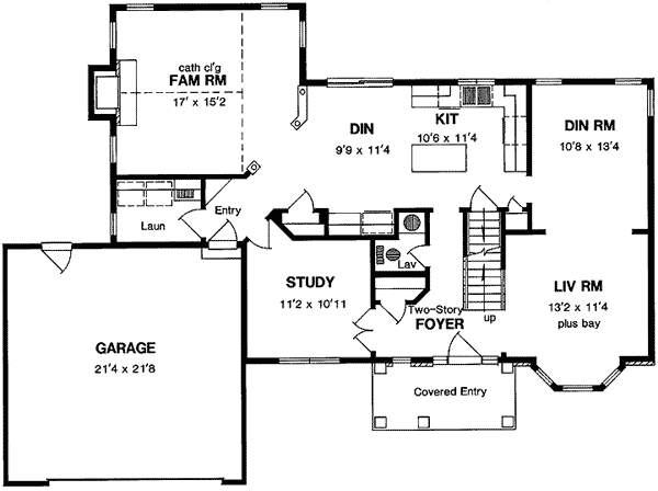
First Floor Plan
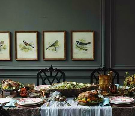
This home is a pretty typical center hall colonial with smallish rooms. Cozy. (pardon me, for all of you, who abhor that word.) There is an entry, a study, living room, dining room, kitchen, family room, powder room and family room. That is a total of eight colors on the first floor.
Are you ready to look at the No-Fail Paint Colors?
For the purposes of creating less stress, I am going to stick to ONE PAINT COMPANY. Isn’t that a load off your tired shoulders already? Don’t you just hate it when there’s a list of “go-to” paint colors and there’s a list of five different companies? That means five different stores— like life isn’t difficult enough as it is?
Besides, your painter is going to go apeshit on you if you make him run around and you don’t have time either. The paint company that I am the most familiar with and find that painters in my area like, is Benjamin Moore. It’s not that I don’t like other companies and colors. I most definitely do, but I am trying to create less stress for you, not more.
[Above is where you can see the origins of my sticking with Benjamin Moore, primarily]
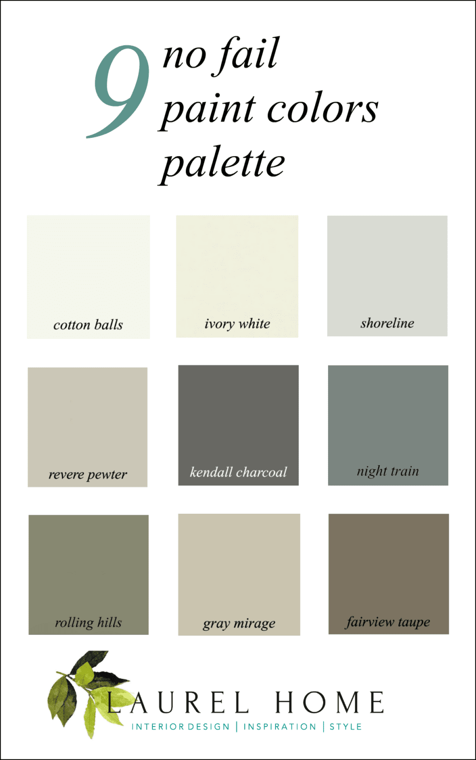
Below is the graphic for nine no-fail paint colors- please pin to your pinterest boards for reference
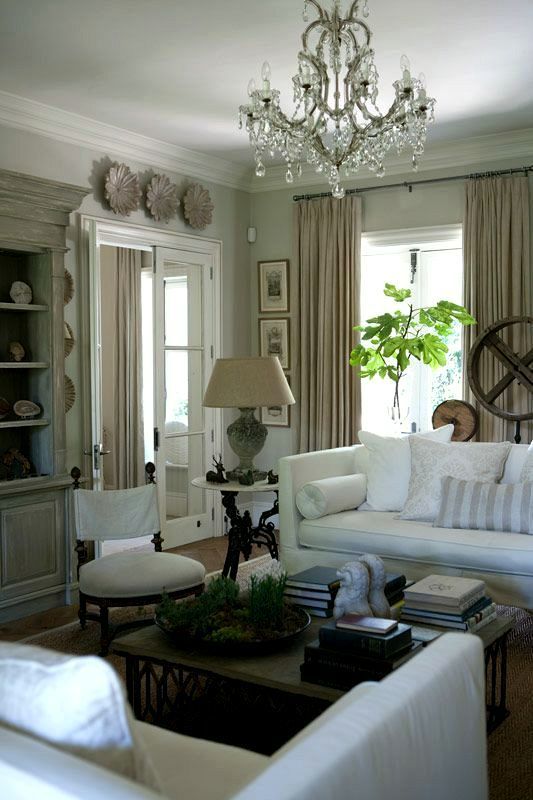
my living room
The first color is Benjamin Moore COTTON BALLS OC-122. We can use that for the trim and ceiling. You can read about it here.
1) Entry
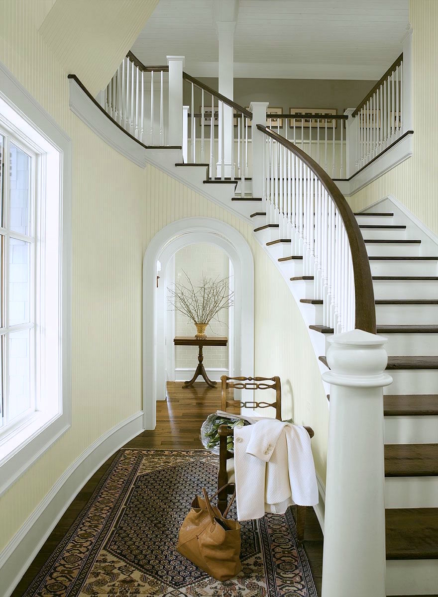
The entry is the area that welcomes people into the home. It could be a wow! Or it could be soft and serene. However, it is the backbone of all of the other colors and it will be the same color downstairs and upstairs as well. We are going to paint it a soft cream.
IVORY WHITE 925 (ACADIA WHITE AC-41 is the same color) is a lovely cream that looks great in bright or dark spaces. You pretty much can’t go wrong. I’ve used it several times and even in a dark, dreary living room, it brought it back to life.
You can see a lot of this color in this lovely home I worked on three years ago.
One rule to keep in mind, when choosing which no-fail paint colors is that if you can see into the room from front to back, it is better to have the deeper colors behind, not the other way around.
You can see how masterfully Susan Serra did that in last Sunday’s post.
2) Kitchen
Let’s pick a terrific neutral as this room is a pivotal space. However, there isn’t very much wall space, so don’t be afraid. GRAY MIRAGE 2142-50 goes with everything. It is a warm gray-green with a touch of khaki. You will love this color as it’s very easy on the eyes and goes with everything!
3) Family room
ROLLING HILLS 1497. I once went into a store that sold stone. It was their showroom, actually. The color in there was the most sophisticated mossy, rich greenish, grayish I have ever seen. I couldn’t say anything but… please, PLEASE, please tell me the color. He said that EVERYONE said the exact same thing. He remembered it because of 1492 and he had also painted his living room this color.
4) Dining Room
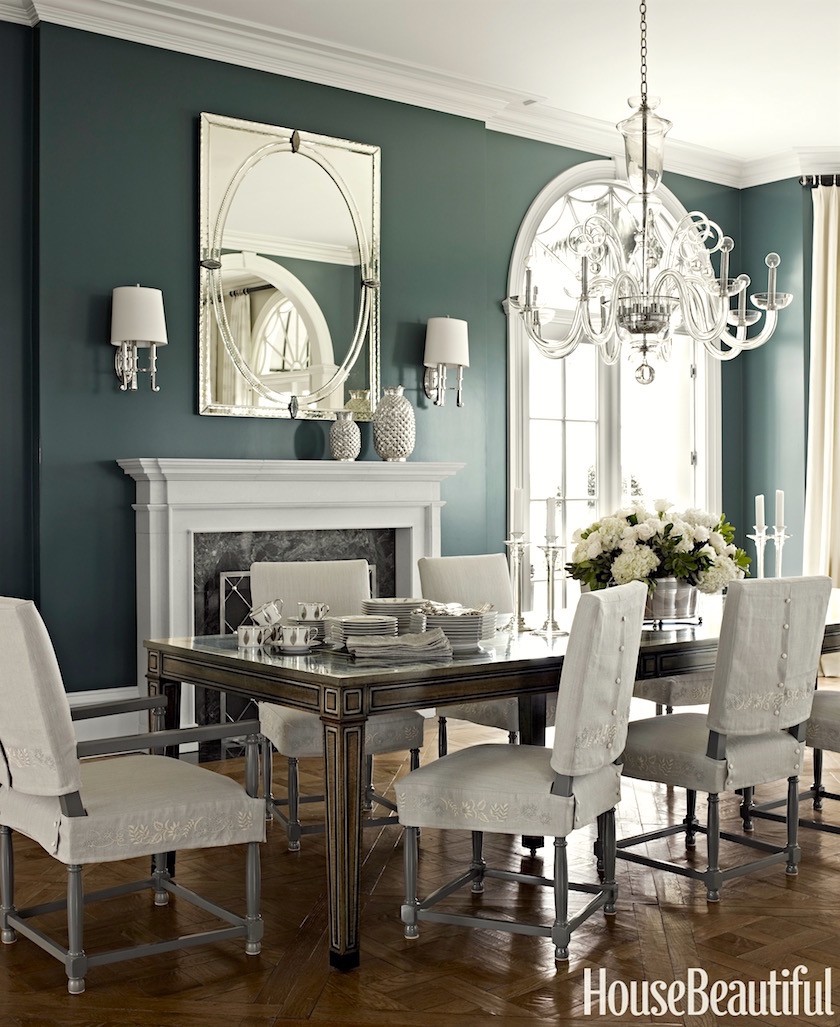
NIGHT TRAIN 1567 This is going to be a saturated, deep blue-green gray with just the right amount of blue-green. This color looks AMAZING with wood tones. It will play off the family room color nicely and of course, the kitchen.
5) Living Room
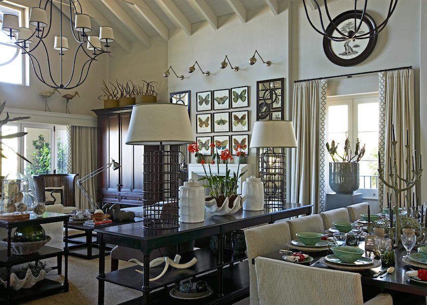
above and below by John Jacob
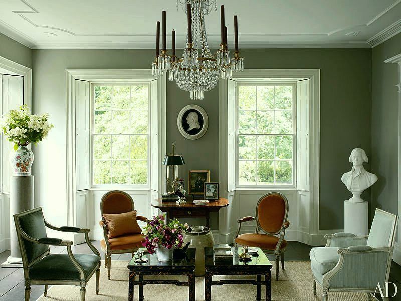
The living room needs to have a dialogue with the dining room AND the office/study. It should be sophisticated and a soft wonderful neutral.
Let’s go with REVERE PEWTER HC-172. This is one of the best colors that God ever created. It’s a warm gray that can look slightly khaki depending on the lighting. It is sophisticated and it goes with everything. In a bright room, it will look more like a creamy gray. I prefer it in darker rooms.
6) The Office/Study
via Bill Food and Drink (but they have gone out of business)
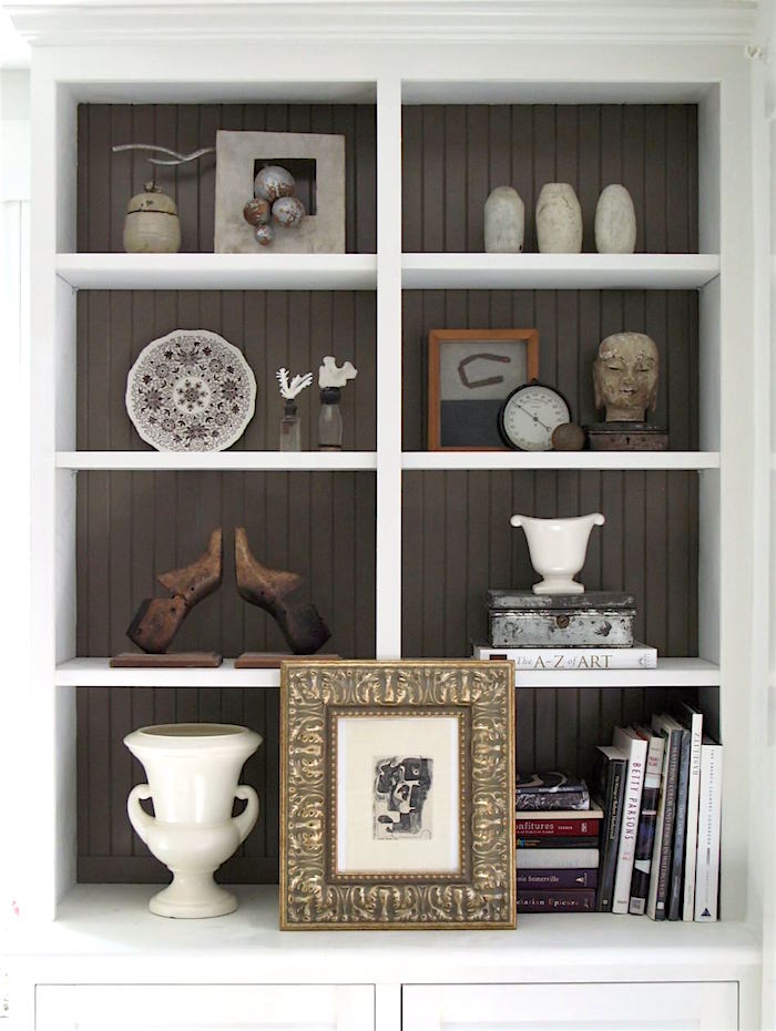
a rich, deep brown FAIRVIEW TAUPE HC-85. Stop whining and complaining about how dark it is. ;] I know, but I think that you will love this color. I promise you that it looks nothing like shit. It’s a very soft brown-gray [BRAY, we call it] :] and actually has no red in it at all, so the taupe is a misnomer.
I love how it looks in the back of those bookcases above.
Two more spaces.
7)Powder Room
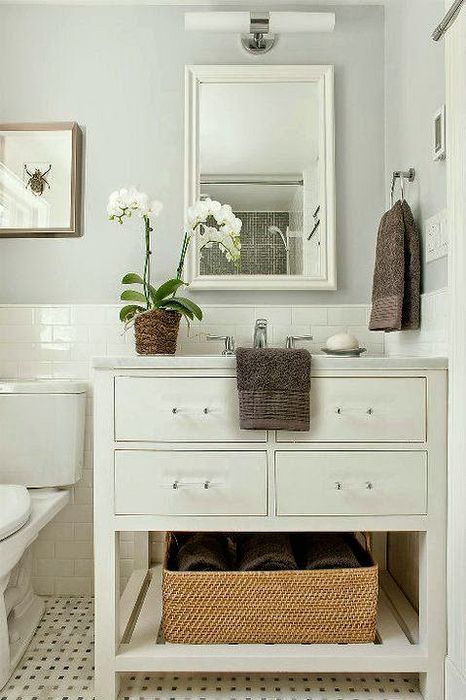
I love pale bathrooms with white fixtures. Originally I had HORIZON 1478. But, I’ve been living with my SHORELINE 1471 and still love it after nearly six years. Just a whisper of blue-green in the gray and I mean a whisper. To see it in my bathroom, click here.
8) Laundry Room
Okay. Hang on now. It’s a small area with big white boxes and we’re going to paint it a deep almost black color that is going to be so chic, you’ll be hosting folding parties in there! KENDALL CHARCOAL HC-166 This will be a refreshing change from the other colors and a shot of it in our palette is going to look amazing.
Alternatives for trim and ceiling. SIMPLY WHITE OC-117, WHITE DOVE OC-17, and CLOUD WHITE 967.
Trim, which is anything that’s wood, like casings and doors should be in a semi-gloss finish. For ceilings, I prefer a flat finish.
Walls can be in either matte or eggshell. Nothing shinier than eggshell, for me. You don’t need eggshell, because the matte is washable. I prefer that finish to the eggshell. But darker colors should be in eggshell because dark colors can “chalk” if something rubs against the wall.
The no-fail paint color graphic again. Please pin it to your Pinterest Boards.
Well, I hope that you enjoyed this post about a no-fail paint color palette, and please remember that these are only suggestions and that it is important to test your paint colors, first.
xo,

PS: Please visit the newly updated HOT SALES here.
And there are a lot of new things in the holiday shop filled with beautiful holiday decor, trees, wreaths, ornaments as well as dozens of great gifts.
Related Posts
 One Living Room Layout – Seven Different Ways!
 Paralyzed By Perfection – Should She Paint Wood Paneling?
 This is How I’m Creating a Cohesive Color Palette
 21 Common and Hideous Interior Design Mistakes
 She Fears Her Trendy, Painted Antique Table is a Mistake
 The Staircase Railing Mock-up is a Failure + Answers to Your Questions
 The Perfect Shade Of White Wall Paint For Oak Trim


