Tongues Are Wagging About The Color Of The Year 2019

Yes, that’s right; tongues are wagging about the color of the year 2019. To be specific, Sherwin Williams Color of the Year 2019.

I’ve sort of given up on these proclamations of the “it” color or color palette.

To me, it all seems completely arbitrary.

I’m pretty sure this is the method they use to select their colors, each year.


how to choode the color of the year

This has to be the way they do it. It has to be.


And that’s because 3/4 of the time, I am sitting scratching the ol’ noggin wondering…


However, in their defense.


A color in isolation is meaningless.

Still.

When we are talking about house paint, we are talking about either the interior walls/trim or the exterior.


Uhh… Laurel?


Yes. How can I help you?


Will you stop yammering already? What IS the freaking color???


Oh, sorry. I thought you knew by now. Perhaps you were dodging the hurricane. However, I hope not and I hope that everyone is safe as well as your home.


This is the Sherwin Williams Color of the Year 2019– Cavern Clay SW 7701 – (it’s in their Concepts in Color fan deck.)


Sherwin-Williams Color Of The Year 2019 Cavern Clay - SW 7701
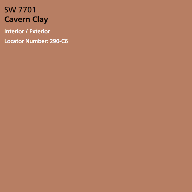
This image is directly from their website.

However, I find images on their site claiming to be the same color. And, they aren’t.


sherwin williams color of the year 2019
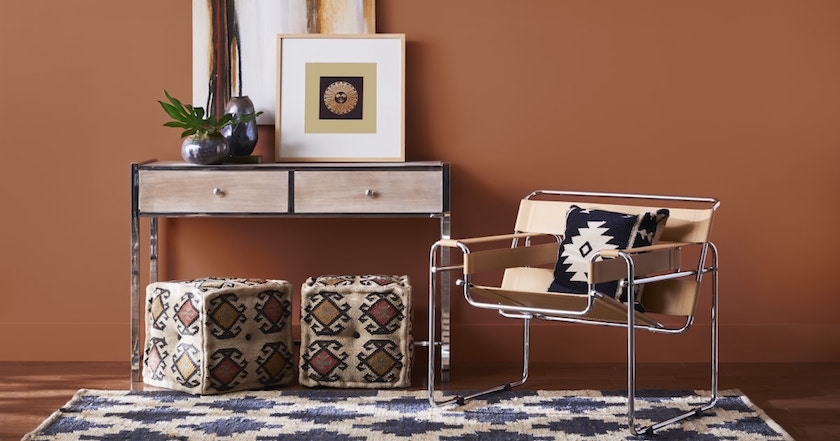
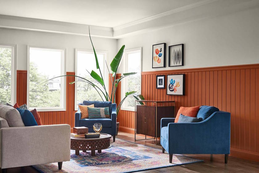
This one is too orange.

Although I like this shade better, I can’t look at this because it’s making me want to heave used as they have. That orange is just way too much! That is– with the big blue chairs. And, who paints their wainscoting orange and the walls above it white? Fine. Maybe, if there was a bold orange and white damask print for draperies. But like this? No.


And it’s not that I don’t like blue and orange together. I DO. Actually, I love it.


However, we need a lighter hand! Below are a couple of examples.


New-Batik-curtains-and-pillows-Mary-McDonald-House-Beautiful-April-2016

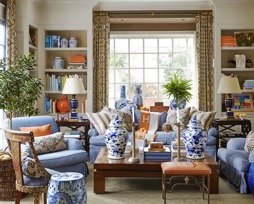
Mary McDonald in House Beautiful via Quadrille Fabrics

One Kings Lane

In fact, I have written a number of posts that feature shades of orange, terracotta, and/or blue and orange.


These include:

20 Great Shades of Orange Paint

Poor Orange, The Most Misunderstood Color

The Problem with Halloween Decor

Love Me a Warm Color Scheme, But Is It Going To Look Dated?

My North Facing Room is Making Me Depressed

The Hottest Color Palette 2014

Ten Colorful Paint Colors That Act As Neutral Colors

Please note that in the links above, are some of the colors in this color-family of corals and warm reds that I love that are in the Laurel Home Paint/Palette Collection.


There are a few problems with Sherwin-Williams choice for color of the year 2019.


  • It is not really orange.
  • It’s more of a rusty-brown or a terracotta which has more pink and brown in it than orange.
  • The way they’ve used it is either cloying or boring.


  • Usually, it doesn’t work to have equal concentrations of colors that are opposite on the color wheel. I think that it looks best if one is the dominant color and one is an accent color. And there always need to be other colors


My biggest issue is that they did not use the color in any kind of classical way.


No. Instead, they did the predictable southwest theme and are marketing it as such. Is that a good idea? I don’t think so. I can recall clients who nearly had a nervous breakdown because they were desperately trying to understand how they got taken in by the whole southwest theme thing a couple of decades ago.

This is nothing against southwestern decorating, or Tuscan decor. But, a lot of it is done wrong. Or over-done.


Sherwin-Williams_Color-of-the-Year_Cavern-Clay-SW-7701_2This is not very interesting, IMO.

I mean, if they want to sell this color, it would seem that they should hire some designers who can make it sing.


In addition, I think that Sherwin Williams has far better shades of terracotta


Sherwin Williams reynard


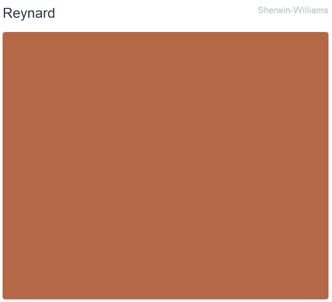
Reynard SW6348 is one that I prefer. It has more life and I think makes a better backdrop.

But, of course, nobody asked me, so it doesn’t really matter what I prefer. :]


What I’d really like to see is more imaginative decor.


I mean, color inspiration can come from anywhere. You guys know that I love fine art. And in fine art, there are always numerous colors and shades from the same color family.


Poussin Abduction of the Sabine Women- http://www.metmuseum.org/art/collection/search/437329

Poussin Abduction of the Sabine Women


I’m not sure what’s going on here, but oh, just look at those colors!!!


Poussin Detail Abduction of the Sabine Women- http://www.metmuseum.org/art/collection/search/437329

hubba hubba… I have such a crush on this dude. haha! Isn’t it amazing? This was painted nearly 400 years ago! I have a feeling that humans haven’t changed very much in all of these years. Not really.

Oh sorry to be so distracted tonight.


I’ll try to stop focusing on paintings of hot guys who’ve been dead for 350 years. ;]


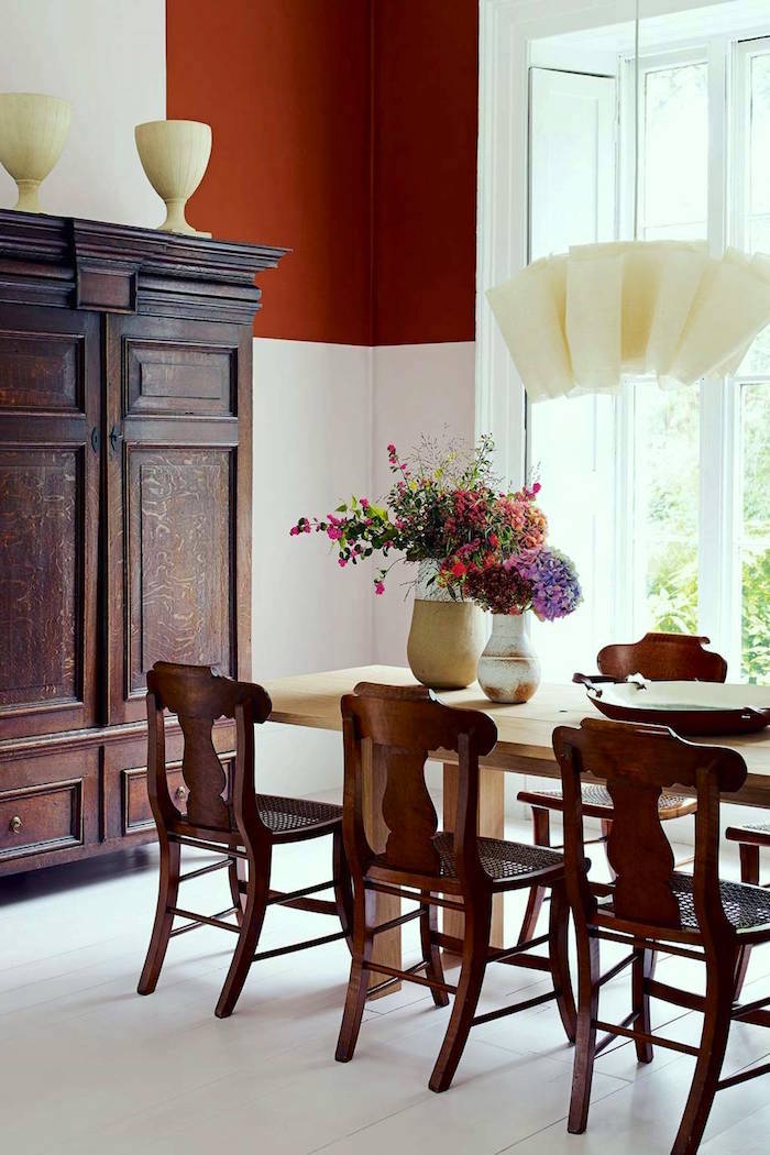
Below is a beautiful example of a similar color in a Greek Revival Home.


color of the year 2019 - similar - greek-revival-home-photographer-pieter-estersohn

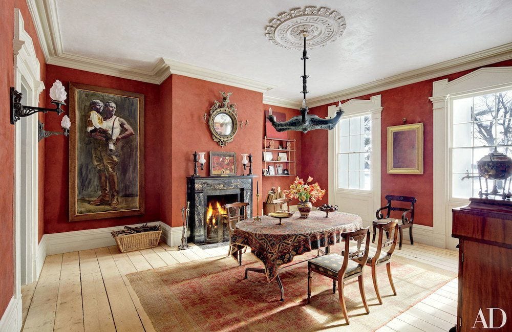
The home of photographer Pieter Estersohn with a similar shade on the wall. It’s a plaster finish and the color is a little less brown, however, I think it looks fabulous here.


Remember Gerald Bland’s Greek Revival home?

Oh, man, he recently painted it white and it’s just beyond the beyond.


Axel Vervoordt terracotta walls

Axel Vervoordt


JakeCurtis_House and Garden - deep terracotta wall - brown armoire white

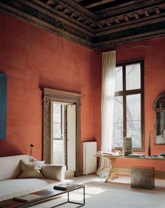
Jake Curtis – House and Garden


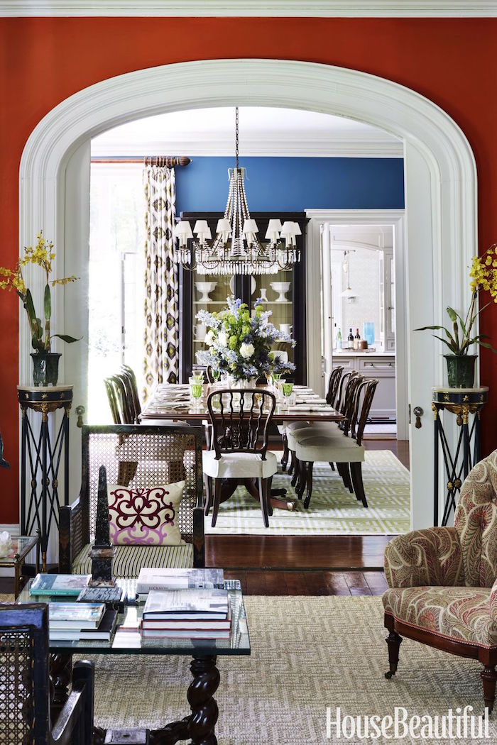
I realize that this is a deeper, more saturated color. But I think that this dining room looks so fresh.

LOVE the white floor!


michael-maher-living-room-arch-cinnabar - photo: Luke White-red walls

Michael Maher living room – photo: Luke White

And this color is an even further departure; I love this scheme. And, it’s the small amounts of khaki, beige and green that keep it from looking like a flag. But, this is a gorgeous, beautifully decorated home. You can check out the rest in the link under the photo.

Well, believe it or not, I was not going to do a review of the Sherwin Williams Color of the Year. haha. However, I was reading about it this morning, so here we are.


What were you going to write about, Laurel?


Well… actually, I was going to write a little uhhh… “newsletter.”

It’s in quotes, because anyone who’s heard me speak or read my blogging guide, knows about my aversion to the ubiquitous blogging query to SIGN UP TO OUR NEWSLETTER– BE THE FIRST TO KNOW.

Know what?

And that’s because people landing on your site for the first time are not interested in your news.

Happily, some of you have been with me for YEARS now! And every once in a while, I like to share what’s going on behind the scenes.

First of all…

Remember, last year, I was getting ready to take a trip to England?


Well, this year– in one week, I’m taking another trip. This time to Denmark. Copenhagen.


True to form, I know very little about it except approximately where it’s located and that Danny Kaye sang a song about it in Hans Christian Andersen.

Oh, and I understand that the Danish pronounce it COPEN HAY GEN; not HAH GEN.

If anyone has any words of advice for something I don’t know, but should know, please let me know in the comments.

I am going with the fabulous group of interior designers led by Veronika Eagleson, owner of Modenus, a fabulous design library, focusing on kitchens and baths and Design Hounds.

This is not a blog tour, like I’ve been on for KBIS and there are no sponsors.


Wait. Why are you just telling us now?


Sorry, yet again. Much going on and I only decided about five weeks ago.

And YES, I am reminding myself right now, to take photos. Although, I had no problem remembering last year when I was in England.

Speaking of which…


The Amara Design Blogging Awards.


Amara interior blog awards - nominated blog

Thank you so much to all who have voted for me already. The voting process is still going on. However, the deadline is the 19th. And, to make it to the short list, I need your votes if you have not done so.  You can vote for me here.


The last bit of news is that we are coming up to the third anniversary of the launch of Laurel’s Rolodex.

Laurel's Rolodex - A unique Insider's shopping guide to the world of home furnishings


I can’t believe it! I just checked and to date, have sold 1,854 of them! The next update of Laurel’s Rolodex is coming out on November 7th.

Anyone can purchase one.

Lots of design enthusiasts have gotten a rolodex and love it.


But if you’re in the profession and/or know someone who is, this guide is a must-have.


There are some 180 vendor/manufacturers (out of over 500 in the guide) who work directly with designers. All you need to do is sell a couple of lamps and you will have more than made your money back.

You can make more money AND save your clients money too. It’s a win-win-win. There isn’t another list like this one. At least not one that I know of. That’s because nobody else is as crazy as I am. lol These are the companies that I worked with and some of them are not well-known because it is by word-of-mouth. No, they are not NY area vendors.

To find out more, click here.


*And yes, if you’ve purchased a rolodex, you are entitled to free lifetime updates.


This time, in addition to more vendors, I’m including a free Top 100 Best of Etsy, Chairish and One King’s Lane for vintage and antiques. Etsy will have hand-crafted items as well.

If you do not have a rolodex, you can lock in all of the additions for the current price. If not, that’s fine, but the price will be going up on November 19th at 11:59PM (eastern time)

Now, whenever I mention Rolodex update, I always get a slew of emails stating that they didn’t receive their last update. Or, they can’t find it. Or their hard drive died.

*I fully understand, but it would help me a lot if before you email me, if you could first do a search of your email (unless you used your husband’s paypal account and then it would be his email). You can search for Rolodex, or Sendowl. That is the shopping cart service.

Well, that’s all for now. It’s quite a bit!

xo,


107 Responses

  1. I had to laugh when I saw SW color of the year. It’s the exact same color that is already on the walls in the large living room in one of the houses my hubby and I are redoing this year. I can’t wait to paint over it. It makes this already dark room look like Howes Cavern. Sure it’s bold. But not in a good way. I agree, just say No!

  2. Oh, Cavern Clay, go back in your cavern so we can cement the opening shut. Yuck. Laurel, you are right! indeed this was a game go Pin the tail on the donkey’s hind end.

  3. Your from the gut posts make me happy. The supposed “It” colors are initially pulled from large trend forecasting firms, especially out of Europe. Merchandising, fashion, textile design, paint companies all waiting to hear the (supposedly) distilled data of what folks are interested in across the spectrum of life, so that they can turn the info into something they can sell. Tech innovation, market trends, travel, lifestyle focuses…all barfed into formulaic predictions. So, the focus on ethnic design, world travel, green living becomes divided into 6 colors. But that is then interpreted by folks whose superpower is marketing and NOT design. Color balance, nuance, finesse…well, without those, ALL color predictions and formulas are just globs of color on a paint palette, that will look like baby’s plate after pureed peas have been introduced. Not pretty.

    1. Very well-put Minto! I know that Pantone distills a lot of different factors, but a house paint company should be primarily concerned with dwellings. But, it is evident that it is marketers, not designers who are involved in these processes. Too bad.

  4. I have painted my craft room with SW 7702 Spiced Cider and I have always really loved it. I believe this is a toned down version of their color of the year for 2019.

  5. Actually I Like the ‘kinda-orange’ color….just not on the walls. I guess I run a bit slower here in the mid-west….Finally finishing my house in black, white and grey. Be Still my heart-it has left me breathless! Ha. Maybe folks could put that color in flowers, paintings, and throw pillows? I agree with you that ‘orange’ goes well with blue. Anyway-I will stay with my ‘new house’ for now…..hahah…. I hope you win as your is my favorite design post. 🙂

  6. Hello Laurel,

    I had to write, for two reasons: 1) I dislike the SW color of the year A LOT… what were they thinking? I’m sure some people must like it, but I don’t even want to look at it. 2) I only recently discovered your blog, after reading “12 of the Hottest Kitchen Trends”. I felt like I’d just found my long-lost decorating soul mate! I even made my daughters come and read it, while pointing out how much your comments aligned with my own. Haha

    Thank you so much for sharing your thoughts and expertise with all of us!
    Regards,
    Candace

  7. Hi Laurel,
    Deep orange is my favorite color, and I agree with everything you said about the SW color–it’s boring, almost dull, and their examples are all incorrect and/or expected. Of your suggestions, the Axel Vervoordt room is my dream. In my next life!

    Have a wonderful time in Copenhagen. You are right–the only American the Danes allowed to pronounce it the German way was Danny Kaye, who they loved too much to correct. I’m sure your group will get to Tivoli Gardens, which is not-to-be-missed. To prevent his country from having a revolution like France and the American colonies, the Danish king built his people the world’s first amusement park. And it still stands–so amazing.

    If you see street vendors, stop and look. I found some lovely 1930s picture frames that way. You never know what will appear.

    Also, if you like bike riding, do not miss the Copenhagen experience. It has the best, safest, and most complete system of bike roads and highways in the world. (Yes, better than Holland) Even if you don’t have time for a ride, see if you can visit a couple of the bike shops. In Denmark, bicycles are art as much as transportation.

    Speaking of art and craft, I saw the Georg Jensen exhibit here in Chicago last week. Breathtaking. Now I need to visit Denmark again. 😍 I wonder how many of these places you’ll see–I’ll be there in spirit! https://www.visitdenmark.com/denmark/design/design-tour-denmark

    Have a wonderful time!
    Amy

  8. Laurel,
    I’ve been following you and reading your blog for about 6 months and I adore you. I have never LOL’d at an interior design blog so hard (or really not many general blogs) because everything is so typical and cliche (or a snooze fest)… but you are hysterical! I love your dry sense of humor, how you share your expertise (because you really are quite genius and I know you know that), and your candor about WHY things work or don’t. Your heart really is about educating your audience (as well as expressing your opinion because you can’t not)… and that’s a true teacher. So keep it up! I look forward to many more posts to come.

    1. Oh, that is the sweetest, loveliest message Jess! I don’t know that I know that I’m a genius, however. I’ve just been alive long enough to have made a crapload of mistakes and learned from them. That’s really all it is.

      One thing I learned, and it took a while too. But, it wasn’t until I really changed this important mind-set that things started turning around for me.

      The blog is primarily for the readers; not me. Every time I pick a topic, my first thought is “what’s in it for them?” Because, if there’s nothing to be gained for the reader, then there is no point in reading.

      However, it’s a mistake that I see many bloggers making. I see them primarily writing for themselves.

      And that doesn’t mean it has to be for the benefit of the readers 100% of the time. I always say 90% for the reader and 10% about me, or things I find interesting. I think it’s nice to mix it up a little to keep things from being stale. And, it’s fun for me too!

      Sometimes, despite my best efforts, I probably miss the mark a little, but as long as the majority of posts are in the ball park, all is good.

  9. *I thought I posted this earlier, but usually comments show up as “pending moderation” and I never saw it show up at all, so I will attempt it again.*

    1. Hi Anita,

      I’m so sorry. Something is messed up, apparently and I have an SOS out to my super-techie-geek. The subscribe to comment box is missing and you are not the only one to think their comment went missing and rewrote it. It’s happened about 6 times today. So, something is wrong and I apologize.

  10. Your upcoming trip sounds wonderful. My daughter wants me to move there with her. We’re done with the gun violence in our country. Especially here in Chicago. But my husband doesn’t want to move. I couldn’t go without him. Or could l?? LOL
    As for the color of the year, I think any color can look great if it’s used in the correct way. It’s all about context.

  11. Do you mean Tucson or Tuscan (which is in Italy – do they use this color there?) Tucson is in southern AZ which in my opinion is the heart of SW decorating. And I don’t see much of the washed out color that is Sherwin Williams color of the year down here. Instead the colors here are richer and more saturated; think deep turquoise, umber yellow, cobalt blue and terracotta red. Seeing all the references to Tuscan reminding me of the time my mother-in-law sent me the book “Under the Tuscan Sun” thinking it was about where we live. No matter, she’s a wonderful mil and the book was a good read!

  12. Was wondering how they came up with Color of the Year. Agree that it does appear somewhat random.
    Wondering if this is a marketing gimmick? Sure feels that way.
    That said, I do like the color, we have ia similar color from another company in the powder room – and we love it!

    1. Hi Linda,

      You know… That very same thing has occurred to me too. They purposely choose a color that’s off so that our tongues WILL wag! But, I doubt it. No, I think it’s something else.

  13. Haha – Living in Austin, TX, and having attended the University of Texas, I am very familiar with “burnt orange.” The photo of the burnt orange wainscotting with white walls nails it perfectly for a big Longhorn fan’s den 😉 And quite seriously, my daughter and I toured the Southern Living Idea House 2018 in Austin last weekend, and they had painted the guest room that color. From the website “Meredith has a knack for working with unusual colors. This spice-colored guest room (Sherwin-Williams’ Cavern Clay SW 7701) is case in point. Most people would shy away from using such a rusty orange shade, but she embraced it (keep in mind that this is University of Texas Longhorn country) letting it steer the cozy direction of this bedroom.” Here’s an image of the room.

    1. Hi Anita,

      Thanks for sharing. That particular link was so full of ads and so slow to load that I pinned the image to one of my pinterest boards and that is what the link is linking too. If people click on the link, they’ll go to the article.

      But, she actually did a terrific job with that small bedroom. And, it’s a testament to how the deft hand of a skilled designer can make this color look terrific. I think the addition of the bamboo bed, black accents, plus other colors in the art, and all of the other details make the color less overwhelming. And this time, they color-corrected it to be the correct color.

  14. While I like the direction SW is going in, I think they did play it awfully safe with this choice. I’ve just used BM Pennies from Heaven on a client’s library walls and it is FABULOUS.

    1. Hi Cyndia,

      I read this earlier and went to compare in the daylight and the BM color is definitely warmer and a little more clear. I could see it looking beautiful in a library with lots of wood tones.

  15. oh friend, I wholeheartedly agree on SW’s selection.
    ugh.
    but am SO excited re: your trip!!! what an incredible experience it will be, and I can’t wait to hear all about it and see your pics!

    1. Hi Elizabeth,

      I did read a lot of the comments on Claire’s page yesterday which is the “tongues are wagging” reference. haha. It seems that the majority are underwhelmed with a few rogue dissenters. That’s fine. They are entitled to do whatever they wish.

      Designers. Claire Jefford is a rocking interior designer as well as interior design coach. And she has a wonderful facebook group, that you should join. The group is free. That link goes to her website.

  16. Let’s be honest, this color closely mimics a certain leader of the free worlds skin tone……..
    Great blog as ususal.

    1. Sherry, I even like the red Georgia clay better. Plus, since I am, sadly, So susceptible to paint color names, I might actually try SW Red Georgia Clay!

      Painted a hall bath in a clay/brick color in 2009. We’d bought an antique 60” buffet in San Francisco, had a Santa Cecilia granite top put on with sink and ORB faucet, wood floor. Big pretty mirror above. My 20 yr olds choice. It was quite stunning and pretty in an average looking house. But once she married/ moved out, I repainted. The clay/brick color wore on me.
      And come to think of it…I painted that vanity area in Valspar Rope. Very calming color. Painted the guest room the same. I’m using all BM or SW colors these days…Laurel’s colors are so carefully chosen, beautifully described and edited. But that Rope. Had forgotten that one. Laurel, can you carve out room for one tiny color chip from Valspar? Just stick it in near the Gray Owl or Stonington Gray. No one will notice.

      Red

      1. Hi Red,

        Of course I can carve out a space for Rope. I’m not familiar with it, but it’s always great to hear of wonderful colors. I primarily stick with Benjamin Moore because it’s the one I know best and also, it’s fairly easy to get for most people.

  17. Cavern Clay next to all the gray and white? I’m cringing already. At least CC is cozy. I think. Can’t wait for the new guide! The old one is well-loved here in my amateur hands.

  18. Personally, I think I’m getting old. I am TIRED of “colors of the moment” & I’m tired of trends. I cancelled my HGTV mag. I have older family members with style. Their homes are gorgeous and timeless (you would love my MIL home). They know the colors they love and work with a decorator who really knows decorating/design and not just decorating a trend (like yourself). I hope there is hope for me. It’s been a tough few years because I have never liked the color gray..it depresses me but give me greens, blues and pops of my favorite color orange and I’m happy.

    1. Hi Cheryl,

      One thing about gray is that it is very seldom just gray. And it’s all about what else is in the room. I think that gray is depressing in a room that’s pretty much one-note and with a lot of heavy, overbearing furniture, lack of architectural detailing and light.

      1. I am so sorry. I just read my post and realized I worded it incorrectly! I meant to say that YOU decorate understanding style and do not just decorate according to trends! Sorry. I must remember to proofread first!

  19. Hi Laurel – enjoy your trip to Denmark! Looking forward to your posts. It was fun to revisit your shopping trip in the linked blog post.

    Hate the SW color! I feel as if it’s an “Emperor’s New Clothes” color. The color is a shade of brown, not orange, as pictured in the official photos. Just a brighter brown in the room photo.

    This is coming from someone who loves blues and orange together and purchased an orange print slipper chair and a blue/cream print occasional chair and blue ikat pillows (one pictured on the slipper chair) from OKL through your site (and happy to do so!). They could happily be in the same room but currently in foyer and adjacent living room (small by current standards w/ 3 windows, fireplace, 2 radiators and 2 openings).

    I have enjoyed the floor plan series and am so aware how room sizes and perceptions have changed during my lifetime.

    1. Hi Libby,

      Yes, it is brown-ish. And I don’t know why they mislead people like that. It’s like they’re going. “Oh wait, that color doesn’t actually go with that blue. We better tweak it. No one will notice.”

  20. Personally I was thinking it’s a sign that things are going to be moving away from the gray/cool color trend. Or at least the people at SW are ready for that to happen–they must be tired of selling gray paint!

    1. Hi Jenn,

      It’s a logical theory, however, I’ve seen some pairings with gray paint. This color in small doses is nice with a cool gray, and other colors as well. I see this as an accent color.

  21. Yes, you nailed it on the shade. Of all the orangey terracotta shades they had to pick one of the blander and more insipid ones for some mind boggling reason. I think your suggestions to saturate it or lean it more to one side of the color or the other (and avoid baaaad Southwest) are just good sense.

    Also? I haven’t had much cause to use my Rolodex yet, but we are still in the process of painting our house via the two palette/paint collection books and they have been invaluable. I can’t tell you how frequently I’ve recommended them to people pacing the Benjamin Moore store anxiously. Bravo, Laurel!

    1. Hi Taryl,

      Thanks so much! S-W has a fabulous collection of oranges and they went with “safe.” Except that safe, in this case is a tough nut to swallow. And, thank you so much for your recommendation of my paint guide. I’m very proud of them. And, BTW, I’ve heard more than one story of people standing in line at the paint store, who read my blog.

  22. No, No, No!!! Reminds me of the kitchen/family room area of my home when I first moved in. It was a C2 called Sahara. Simply Awful!!!

    1. Hi Dian,

      It has stalled because I had to fire the contractor. What I really need is a rental husband. I’m only half joking with that one. But aside from that, I get very bogged down here, because behind the scenes is constant, constant. For instance, I’ve just spent the last hour trying to figure out what happened to my “follow comments button.” Things are always changing. And some of it, I have no control over and some is to make things better and more efficient.

  23. Hmm. I think you’re right about the whole Tuscan/Southwest thing, and the muted hue seems to be an easy way to repackage ppls “modern farmhouse” decor.

    If you like your fiddle leaf fig, you can keep your fiddle leaf fig… and the farmhouse furniture, but change all the white accents and floral cow prints to hipper southwest print pillows or funkier Tuscan throws. Toss in some leather or denim.

    Kind of a bargain way for people to reuse what they have for a different look and sell some paint, too.

    Not my shade anyway but I suspect I’ll keep clear of this trend… as I do all trends.. until they’re just. about. over. 🤣

    It IS always fun to see if Pantone, SW, BM, Behr, Valspar ever agree on what is THE color.

    Fun post! And have a lovely trip!

  24. You are going to love Copenhagen! Don’t miss Tivoli Gardens.

    I think you are right about how the colors are chosen. It always seems very random, with no thought to the natural progression of how people actually evolve with their colors from time to time. The first thought I had when I saw it a couple of weeks ago or whenever it was, “Oh Lord. The Wild West look again” And have you looked at some of the fashion sites like Moda Operandi? We are all supposedly going to be dressing like pioneer women or sister wives again. Not me.

  25. Color of the year is what my dad called a used Audi we almost bought 40(!!!)years ago: Titty Pink!!!! Noooo, we did not buy the car! And sorry if this ruins this color for any of those peeps who are sensitive, but this color has way too much pink in it to not be anatomically connected! In my mind’s eye.

  26. Just say “No”to this color. Your future self will thank you when it comes time to sell your home. Last year we bought a house that was wall-to-wall Tuscan. It was on the market too long for this very reason. In addition to entire rooms painted this shade, it features terra-cotta tile floors. For now, I am stuck with a kitchen that has floors, a backsplash, AND countertops in this shade, plus cherry cabinets.
    Redecorating around this hue was a challenge. With guidance from Laurel (a godsend – thanks for all the free expert content!), we went the Mark D. Sikes route. We painted most walls SW Madison Blanche and used a blue and white theme for the furnishings and styling, along with a few dark accents. For some bedrooms and bathrooms we opted for SW Rhinestone. If you must use Cavern Clay, stick with accents as Laurel suggests above.
    Laurel, I should send you a photo of my kitchen to add to your file of Cavern Clay gone wrong. It’s a beast of a color.

  27. Oh NO! For one thing I am watching reruns of Mad Men and that color or a reasonable likeness thereof, appears in the homes of some of the characters. Is this color a throw back to the 50’s and 60’s? Also, remember the craze in diners and small restaurants that used a mauve and grey scheme? Why it reminds me of that combo is beyond me but I’m scared. Very scared I will see this color all over the place. I don’t like it at all.
    SOS!

    1. Hi Rosemarie,

      I think the 50s 60s color was a little brighter orange as I recall. Well, at least from the 60s. :] What I find is that people will tweak the color, but call it the same thing. I see that all of the time. And yes, mauve and gray is the worst!

    2. Oh yeah, mauve and grey. Everything from cars to my doctor’s office. If I went there sick, I came home sicker. 20 years it was that color. I have a new doctor now. If they redecorate with Cavern Clay, I’ll quit them !

  28. Maybe it’s MY age…. but I’m just cynical enough to think big corporations just don’t get it. I’ve attended classes put on by SW and the very nice GIRLS from SW are usually in their early 20’s. Not that you can’t be fabulous in your 20’s……. Are they the one’s making this color decision?! OY Let’s call it Rusty Mud!
    Thank you for the other color choices in this range. You always show such beautiful inspiring photos. And thank you for sharing your knowledge and taste!!
    Congrats on your trip!!!! Have a blast.

  29. Hi Laurel,

    I wonder how they choose these colors. Obviously, it doesn’t require being universally appealing. That room with the wainscoting looks so bottom-heavy.

    And the color just isn’t pretty.

    I do love the rooms you posted, because they are so unusual, at least to my eye, and the colors work so well together. If I had multiple homes, I might do some blue/orange balanced with white. I find them lovely.

    Have a wonderful time on your trip to Copenhagen! I will look forward to your photos.

    And my fingers are crossed for the design award.

    Connie

  30. the “color of the year” seems to be a mix of pink and clay. It’s not too objectionable, but it is kind of blah and would need a lot of accent items to perk it up.

  31. I voted for you, Laurel! Love your blog so much. BTW I think you will enjoy CopenHaygen:). The vivid house colors are quite charming, the food is amazing (but expensive, be prepared), and the people are truly nice (and friendly to visitors) and they are all beautiful. No kidding. Must be all that biking they do, plus the good genes, lol. We loved our time there last summer visiting our son who was completing his study abroad program. Enjoy! Safe travels!!

  32. Hi Laurel,
    Love orange…But not that one. You’re right, it’s too yuk.
    Have a Great trip, Fly safely, Arrive safely…With all bags
    That’s my travel mantra
    Looking forward to many new photos
    Farvel

  33. Ugh! There’s a place for this terra cotta color, but agree it has to be with a light hand. I love it on “antique” floor tiles, crockery, accessories. But, I recently moved to a new house where the walls in the bedroom were painted in this color. I could not sleep in this room so just finished painting it in Edgecomb Gray. Ahhhhh, that’s better!

  34. If you are feeling adventurous in Copenhagen you can visit Tivoli Gardens (lovely) and ride the Star Flyer. According to Wikipedia “… at 260 ft, it is one of the world’s tallest swing rides and affords sweeping views of the city’s historical centre.” It’s not fast but incredibly high (which scared the heck out of me). Make sure to leave your shoes on the ground!

  35. *cries inside at the idea of either Tuscanish or Southwesternish clawing its way back as people haul out their Kokopeli themed ironwork.*

    Have a lovely trip, I’m sure the pictures will be refreshing.

  36. Not a fan at all of the SW color of the year! I would never suggest it to a client or anyone else for that matter.

    It reminds me of my childhood kitchen (1970’s) that my mother painted one day while I was in school. I left for school and the kitchen was blue and I came home and it was puke orange/brown rust – God love my mother as she thought she was being so “in”….haha!

    Love our posts and look forward to them every week!

    Thanks Laurel!

    Pat

  37. Hah! Here in the UK Dulux have announced Spiced Honey as their colour of the year. Describing it as a warming amber shade. At least it’s a move away from the all-pervasive grey!!

  38. Hello Laurel, Terracotta-type colors can be wonderful in real stone or brick, with their uneven shadings and mortar lines, but are dangerous as paint, when they can be unrelieved and monotonous, as well as a bit strong and dark for many spaces. It seems to me that its use is so specialized that it should not be broadcast as the “color of the year.”

    By the way, the button for “subscribing to comments” has disappeared–or is it just for me? This takes away one of the enjoyable parts of your blog, reading your replies, and revisiting posts with a new perspective after reading comments and thinking about them a bit.
    –Jim

    1. Hi Jim,

      I agree with your first paragraph, completely.

      No, it’s not just you re: the “subscribing to comments” button. I don’t see it either and didn’t remove it. The box is checked to allow that option to show. I will have to have my techie look into it. Thanks for letting me know.

  39. I live in the Southwest now, and I wouldn’t use that color! Terra Cotta floors are not so in, but to me they’re classic here and I may use them in a remodel. I would not use that color, though.

  40. Sorry SW that’s awful. What were they thinking? On a positive note Copenhagen is one of my most loved destinations. I have been twice and hope to return. Lucky you Laurel. The city is flat and so walkable you will love it. Beware though it is expensive to eat. I assume you have your hotel sorted but if not or things don’t work out I recommend the King Arthur which is a small Danish style hotel with a great breakfast. Nice quiet area not far from the pedestrian area. Writing this makes me think how much I want to return to that part of the world.

  41. Yeah, it’s in line with World trends. A couple of years ago I was telling people not to rip up their terracotta floor tiles because this colour palette was coming.

    1. Thanks Connie. I think that it always comes down to doing what one loves. If they love their terracotta tile, then they should keep it. It’s actually classic; at least in some places. But, if it’s not humming for one, then it matters not if it’s coming or going. That’s how I see it.

  42. The only way the SW 2019 color should be used is at the hands of an accomplished designer like yourself! I have no doubt that this color could work in very small doses but a whole wall or heaven forbid a whole room in this color would be horrible!

    1. Hi Beverly,

      Well, I’d probably not use this exact color. No wait. Strike that. I would not use this color. I’d use something not quite so dull. Although, colors like this look better at night in incandescent or some sort of warm light.

  43. I was just with Pieter Estersohn last night at a party. We were talking about the new book he has out, about the Livingstons, a powerful Hudson River family who owned most of the Hudson River Valley at one time. That portrait in the photograph of his house that you posted is of Pieter and his son.

  44. Hi, I couldn’t resist putting in my 2 cents here. The color looks plain dated already even before it comes “OUT” I have noticed it creeping into interior magazines for the last year. The only room it feels right in here is Axel’s and even then it looks like the 90’s Tuscan Villa (sorry Axel, I love you!) I can’t remember where I saw it, but I know it was on your blog, I think Mark D. Sikes did a Pumpkin colored wall and he was one of the few besides Ben Pentreath that was able to pull it off and make it Chic. Again, Ben is in the countryside. I would not paint a N.Y. or Metropolitan Apartment this color. I am not a decorator and it really doesn’t matter what I think. I just couldn’t help sharing.
    Martina Mondadori has a lovely living room with that color on the walls…….can’t think of any others that are nice, can you?
    Amy

    1. Hi Amy,

      Ben’s color is more “peach” but with enough brown in it to keep it from being obnoxious. It’s just kind of warm and there. But, yes, this one feels dated. I think it’s fine in harmony with other shades. It’s reminding me of Pantone’s Marsala a few years ago. They both need other, brighter reds and corals, I think.

  45. Hi Laurel,

    Congrats on your trip. I know you will love the trip and have fun. I am not a fan of that color whatsoever as a paint, but oddly I have some pottery barn floral pillows in that color way that I paired with pink and it is lovely. It’s all context I suppose. Surely a company as large as Sherwin Williams can do better than that marketing picture? Maybe I am just getting old and jaded, but geez…..were they trying to save a buck or two??? I voted for you a couple of weeks ago, really hoping you win as you so deserve it. This is by FAR my favorite blog. Thanks Laurel for another funny post….I needed it.

Leave a Reply

Your email address will not be published. Required fields are marked *

This site uses Akismet to reduce spam. Learn how your comment data is processed.

Welcome To Laurel Home!

laurel-aarons-18th-e1456449963926

Hi, I’m Laurel, and Laurel Home is the website and blog for Laurel Bern Interiors.
I’ve been creating new-traditional interiors since 1988. The blog is where I share all.

New Edition, November 2022! Get The Indispensable Guide For 100s of Home Furnishings And Interior Design Sources That Everyone Is Raving About

laurels-rolodex-final-book-cover-master 9th edition 22-23

laurel home archives

Categories:

Please click the image below for more info about my rockin’ Interior Design Guides for 2023!

Laurel Home Interior Design Guides 2023
Amazon ad

please click below to check out my favorite decorating & design books

Laurel Bern's Favorite Interior Design and Decorating Books
Subscribe To The Laurel Home Blog And You Will Receive A FREE Guide Where I Share How To Get Your Paint Colors Right, The First Time.