Color Of The Year 2018 – And The Winner Is…

Well, guys, this is it. The last two weeks of 2017 and that means it’s time to discuss..

The Color of the year 2018


Did you ever notice that the word discuss is made of these two words?

DIS

and

CUSS???


How fitting. And that’s because anyone who’s read my blog for at least two years has figured out by now, that I don’t think much of these color of the year proclamations–well, actually really only by that one color company that doesn’t actually make anything. The one beginning with P.

But some of you don’t know, how strongly I feel. And if you don’t, you can read away to your heart’s discontent, here, here, here, here, here and here.


Not mentioning the P Company’s name, because I don’t want to give them any press.


That’s how disgusted I am. Quite frankly, I think that’s what it’s all about. They purposely pick the most obnoxious colors and then let most of the bloggers Dis and Cuss them out, thereby getting lots of free press. Sick. And not the good kind of sick, either.

And true to form, the company beginning with P did not renege on its rep for hideousness with their proclamation for color of the year 2018 recently. I don’t care what they’re calling it. It’s BarFney Purple.

I actually received an email the other day from a major manufacturer who has created BarFney Purple SOFAS.

You know, I was going to put an image here, but I can’t. I mean I won’t. And besides, I’ve blocked out who it was.

And one of my favorite lamp companies, just sent me some big purple lamps. ew. It would take a highly skilled decorator to pull that off.

I’m fully expecting to see a bright purple Lacanche coming out any day now.


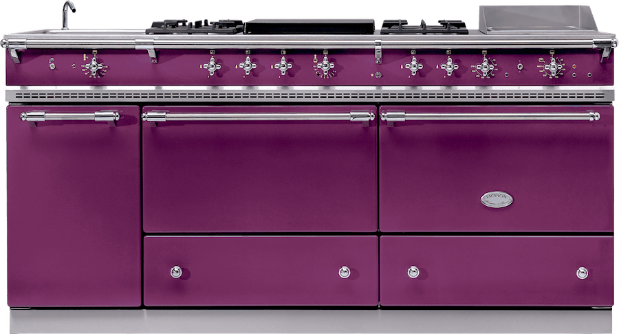
HOLY MONEY DOWN THE DRAIN! THERE IS A PURPLE LACANCHE!


And don’t get me wrong. I do like some shades of purple. After-all, my own freakin’ bedroom is purple. (please click the link to see it)


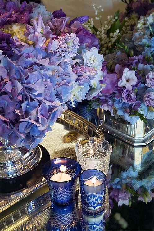
And I adore purple hydrangeas too!


Plus the Laurel Home Paint Collection of 144 colors has nine shades of purple.


Well, “dirty purple” as I call it.


However, there are nine major paint companies that have also chosen their Color of the Year 2018


So, here’s my idea. I’m giving you a very short assignment, should you choose to partake. I’d like YOU Guys to select a winner from one of these nine color of the year 2018 choices.


Here’s what you do. Please tell us in the comments what your choice is (by number) and why you chose that color. And if you like, why you didn’t choose some of the other colors.


Pay no attention to what anyone else says.

(but please, be respectful of other opinions)

note: Sunday evening. Wow! Thanks guys. Several people have emailed me their answers. I’m sorry but the replies need to be in the comments. (please see above)

Now, I realize that several of the colors are actually quite close to each other which also makes me wonder.

Are there spies? Double color agents?

If there are two that you like equally as your number one, here’s what I recommend doing to help make a decision.

Pretend that someone is holding a gun to your head saying “choose one by the count of three, or I’ll shoot.” That technique usually works nicely for me. ;] 99.9% of the time, there is one that edges out the other if only slightly.

Oh, and I am not going to put the manufacturer down. Of course, many of you will already know or will look it up. That’s fine; I would do the same. lol

And then for Wednesday, I will do a post all about the winning color based on the comments.


Here are the colors from the top nine paint companies in the USA that have a color of the year 2018.


 color of the year 2018 - major paint companies


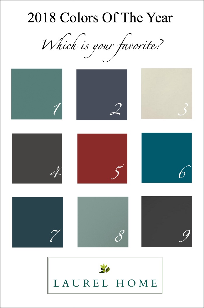
I’ve picked out my favorite and no, I’m not going to tell you which one. However, none of these are bad colors. In fact, I think that the choices reveal that a lot of intelligent thought processes went into their selections.

I am very much looking forward to your responses!


And now, I’m going to get a pedicure.


I’m tired and my floor is getting all scratched up from my feet, they’re so rough.

Besides, I know that you’re busy (and tired); no need for a super long post.


However, if you’re still struggling for gifts,


it’s not too late to shop online for them. Or, at least, you can look over my gift guides at the holiday shop. Most companies have a cut-off date of around the 20th of December for deliveries by the 24th.

Also, please check out the hot sales page, because I’ve JUST listed some new fabulous deals that I only found out today– with massive discounts on many of our favorite brands. And all of them have tons of fabulous gifts!

And don’t forget… if you know of a designer or design enthusiast who would love Laurel’s Rolodex or the Laurel Home Paint Collection/Paint Palette Bundle, you have the ability to give it as a gift and you can even time it to arrive whenever you wish. That all happens during the purchasing process which is super easy.

xo,


PS: Please, only ONE color! Sorry, not your fault. I should’ve put this in a survey. Thanks for all of your replies!

273 Responses

  1. It is clear the best color is number 6. It is perfection. Calm, warm, comforting, inviting yet somehow mysterious. 6 is nothing short of beautiful. Besides, the world needs to feel those attributes right now.

  2. I like number 3 the best because I don’t like a lot of color on walls but reserve that for buying cool accessories that I can change out. I don’t paint too often because it builds up too much on walls. I also don’t like combo colors like room scents. Straight up a basic color Ok to paint an old piece of furniture that way however. . Guess I’m a little unadventurous when it comes to wall paint.

  3. #1. Looks like Benjamin Moore Stratton Blue which we have in our office and on our front door! Love the blue-green mid-tone. Muted, but not blah.

  4. After specifying airy blues, aquas, turquoises and deep teals for clients for the past 6+ years ad infinitum (I live in Florida after all), and although I still love them and use them all the time, I am so ready to spice up life with #5. Red adds warmth, drama, and passion, sparks conversations and conviviality, and yes, it can be (and I have) used with blues and aquas.

  5. #2. I live near Lake Michigan and this color reminds me of the color the Lake turns when there is a winter storm on the way. I would name this color winter storm.

  6. As a life long South Florida girl the colors are a bit to “jewel tone” for me!! But, I would pick #8 if I had to pick one. I am tired of the blah #3.

  7. I love #1. I painted my master bathroom if not that color, one very similar to that 10 years ago and have never gotten tired of it. The trim and cabinets are a shade of white and the tile is marble. I feel like it is a timeless color.

  8. I’ll pick 1-3-5-8 as my faves and in that order. I would really like all the bookcases and trim in my study painted in a high gloss version of No.1.

  9. I choose #8 because I love blue, green, and grey and this colour is all of these. It is close to the wall colour in my living room, at least as it appears on my computer screen.

  10. wow I looked at the answers and saw all the #8s. I think #8 would be my third choice.

    It may be seen as being more livable or more likely to go on the walls, but I don’t think it really stands out on it’s own the way I would like to use it in fabric or on a painted cabinet.

  11. I vote for #1- it looks like a blue-green on my monitor. I also like #6 as my second choice.

    I have 2 Serena and Lily fabric samples that I was considering for a chair that are similar: Storm and Aegean in the brushed cotton canvas.

    I am liking the deeper coastal colors that are still fresh.

    Not saying I would paint the walls either color, but in fabric and pillows, rugs. I prefer white walls 🙁

  12. #3. I am in a mood for peacefulness and not yet ready for all of the light, serene colors to go. I’ve used deep rich colors most of my life, but something about the eyesight dimming has made me like pale colors–especially if they’re on the cool side. Love the pale turquoise Gracie-esque wallpaper you were looking at for your bedroom. My guest room walls are really close to that color, and it’s the most refreshingly peaceful room in my house. Merry Christmas!

  13. I already voted for #5 but I came back to read the comments and decided to tally some to see where the vote was headed. First I listed my likes in order of appeal. Number 8 was my second to last choice. I was quite shocked to see that it seemed to be the favorite of the majority. I stopped counting when #8 got to 30 votes. I shouldn’t be that surprised since I tend to be “different” when it comes to home decorating. Given that, it stands to reason that my last choice was #3.

  14. #6 The depth of this color is fabulous. I can see it in any room – I see it as being a neutral, at least of Mother Nature since there is so much blue in the sky and waters. And the funniest part of loving to work with this color – in general I do not like or use blue other than navy.
    Oh wait, I just used a slightly darker version of this in a small study, with a barely tinted blue ceiling and Art Deco woodwork. The entire house is a lovely Art Deco.

    Least favorite is #3. I am so tired of beige and grays – although I do use them plenty. 🙂

  15. My favorite color forever has been black…mostly in accents until recently. Now I love it for trim, walls and cabinets and recently painted a dresser black. Heck, in the 80’s I had black wallpaper with tiny pink roses. I’m sure my neighbors thought me ‘mad’!
    I’m following a lot of the British gals on Instagram who are rocking it on their walls! It really does look fab with gold. Love your blog Laurel..Happy Holidays!!

  16. #2 is my favorite, with #3 a close second. I always gravitate to blue, but every room in my house is a pale color (lighter than #3) with lots and lots of blue and white accents. The only other color? My dining room ceiling is pretty close to #2.

  17. 5. Red is one of the big fashion colors this year and I really like my house and wardrobe, everything to look well together. So I’m going with five. Plus I love red with chinoiserie. It’s a color that works so well as an accent, and it can be pulled from natural elements and it can fit into lots of styles. Plus it’s such a warm color that invites conversation. on my screen this color is muted so I think it looks like it would work for a lot of situations. All that to justify that I basically just like red and that’s why I picked it. Haha!

  18. #7 pretty and would go well with all the gold that’s out there now….(again)
    #8 is a classic wonderful color! calming….

  19. #5 Used it this year painting the dining room matched with Abalone from the paint guide. Really Laurel is genius with her paint guides. #5 is an amazing color up on the walls.

  20. #3 – I just painted our home in neutrals and have paint to do our island in a bold brown called Tea Chest by SW. Our kitchen cabinets are a BM creamy white. So glad to see some rich colors selected.

  21. None of these colours rock my boat but perhaps thats because all the images look rather ‘bald’.

    Think most colours don’t come into their own until they are used WITH something containing another colour. or a tone of the same colour. That lovely image of the purple hydrangeas is a case-in- point…look how the blue & purple combination make each other sing.

    I think one of the joys of interior design is how the alchemy of colour is perfected when mixed with other tones by us Hubble bubble design ‘witches’ & wizards.

    P.S. I LOVE purple..just look at a summer herbaceous border with tones of Pink & blues or
    yellows & reds. It is how it is handled that is the art of the interior.

  22. No. 6 is my favorite. This deep teal (or so it appears to me) color is incredibly versatile. It works with classical antiques, with modern, in libraries and dining rooms, in kitchens and bathrooms. Depending on what it is used with, it is elegant or bohemian. It can be the major color in a room or the accent. It is compatible with so many other colors. I am planning on using this in my home office.

  23. As an artist I love all color, deep, pure, exciting tones are in my paintings. I find this selection rather heavy for backgrounds in my home.Coming from the NW where winters are grey and depressing, light and airy have always been my choice. Even now in sunny Tucson. So with a gun in my back #8 diluted is my choice and you may shoot me if I had to live with that sickening purple. Love your blog and great humor. Hugs.

  24. I’d say it’s a toss up btw 6 and 7 for me. Currently have BM Newbury Green on my office walls…the color most likely to be btw 6 and 7. But. I do like Ultra Violet. A neutral in my world, as is black and Magenta, as they work with any color on the wheel.

  25. #7 in a laquered dining room with a mix of metals (unlaquered brass, nickel and a bit of iron), crystal, antiques and a rustic piece or two.
    I LOVE the fabric or paper at the top of the post. What is that?

  26. #8 is my choice. I have a similar color in my home, and people always ask about it. I like the color because it is soft and fresh.

  27. #8 is the new neutral. It’s not that old-fashioned sage green but a more rich, saturated color with depth. It will work with everything from bold tones (think deep red or blue) to muted shades of white, cream, and sisal. And, gold or silver accents work as do pops of black.

  28. #8 love green mixed with blue. Also #7. Not 3 too many neutrals in same tone already on market. Don’t like #2. Reads as purple to me.

  29. #8 is my choice. I’ve lived with this color in three houses, have never tired of it, and it always looks beautiful.

  30. This is really fun! I’m picking #3. I try to keep rooms from looking so busy, and bold paint colors make a room look busy in a hurry. They look good when u r standing in the doorway, looking in. Or looking at it on Pinterest with no people in the room. But houses should be lived in. And as soon as you put people in these rooms, with their own colorful clothing choices, you have clashing colors and just too much color noise. My eyes don’t even want to take it all in. I just want to clear everything and everyone out, and paint the walls, well, #3!

  31. #2 -My first instinct. When I look at color I like to take a quick glance at it. Then look away, and then look back. #2 is practical, sultry, romantic and I can’t think of a darn color you couldn’t combine with it….and I don’t even like blues!

  32. I don’t really like any of them; I just can’t see them working in my home. If I had to choose it would be #8 only because it the one I dislike the least. 🙂

  33. I am choosing #5 as my favorite. It’s certainly not the color we are going to use in same way we have been using gray, but we need it to spice things up and red can do that in smaller doses.
    While the other colors are very pretty, I’m ready for something that makes me feel really happy and excited about my home. And the good news is, it works great with gray.

  34. #6 beautiful colour as an accent. My front door is this color. It just resonates with me at this point in time. Love this in your various palrttes.

  35. 6. I have a (pleasant) visceral reaction to this blue/green shade. I could see using it in a small alcove with well-placed sconces. Preferably enamel.

  36. I love 6, the saturation is beautiful! I’m saving my pennies for a new sofa in something similar to this. I also like 1, I have a the wall above my orange brick fireplace painted in a color similar to this.
    I really like all the colors here!

  37. #6 because it looks like the best combo of green and blue. Also it just makes me happy. I’m so tired of gray, which is kind of a depressing color.

  38. #5 (good rich red; can go on walls, used in upholstery, accents)
    #8 (comfortable but not boring; as old as 18th century, as new as today)

    #3 (good background for complex colors, I suspect; would do nicely with ones I chose, but a designer I know addicted me to Cotton Balls)
    #4,#2 look “washed-out” on my screen
    #6 is a color I bet I would like in the right room and lattitude, but the Southern sun might turn it yellow.

    Had I not clicked on your little button, I’d have more $$ now. Discovered lovely embroideries and wall shelf at Wisteria.

  39. #4 for sure. A platinum brown tone that makes anything look richer, sexier and more elegant. Close was #9 (love the charcoal tones)but not this year. Thanks for empowering us!!

  40. #7, Close to navy and navy always a favorite. A friend has a navy office with white woodwork and the room is beautiful.

  41. #5. I love red & have a red dining room. I will be repainting it this year & will have to choose #5. I get tired of some colors very quickly but not red, I have used it for 12 years & still love it.

  42. Difficult. As you said, several are so close. Funny, I’m a blue person and 6 and 7 do make my heart go pitty-pat a bit, but I keep going back to the muddier number 1 as more livable.

    Maybe some 6 as an accent somewhere, like a fat glossy lamp.

  43. #7. Interesting-has character-on the neutral side so easy to work wth-not overwhelming -classic-works with many other colors. It’s not gray (love gray but gray is not new news) -or too “pastel”

  44. I am torn between 6 & 7. I recently painted a piece of furniture Farrow and Ball Hague Blue, and depending on the light it shifts between these two tones. Gun to my head I will go with 6, peacock blue for velvet pillows, a piece of upholstered furniture, a pop of color in some art work, or appearing in the color scheme of a gorgeous area rug.

    I don’t dislike any of the other colors shown!

  45. #5 It exudes warmth and energy. It can go in many different directions: Asian, country, lake house, patriotic, farm house. Red gives a pink glow to the skin. It’s cheerful. I love reds unless they’re too orange.

  46. #3-the warmest color (on my monitor)great background for art
    #8 – very elegant & peaceful
    then #1 and #6 and #9
    in rooms with a lot of light to balance
    the stronger color during the day.
    wouldn’t matter so much at night

    Purple stoves? only for those who can change anything any time…

  47. Seriously, these are all stunning and look great together on the swatch board! My vote goes to number 5 (which looks a lot like the Benjamin Moore Caliente which I used in our music room) because we live in Pittsburgh where it is very dark, gray and dreary during winter. This color is so warm and lively to come home to!

  48. I studiously avoided looking at others comments before voting (but I will read them once I’m done). Since I’m thinking in terms of wall color – a large scale use of the color rather than accents, #8 gets my vote. It closely resembles the shade I have in my bedroom, & it is such a calming, comfortable color. It is elegant without being stuffy & works well with so many other colors. First time visitors frequently comment on & ask for the specs on it.

  49. I love both #7 and #8. I have a shade very similar to #7 in my dining room and I love it. Is it blue? Is it green? It can be either one you choose to see. However, if I had to pick one shade to put on all the walls and live with forever, it would be #7. It’s so versatile it’s practically a neutral. And very easy to live with.

  50. I Pick #5, it just jumped out at me, 4 and 8 were runners up, 4 because I cant tell what color it is, but I like it, 8 because its soothing. and 9 are close to the same color, but 4 is much more “rich” looking, it has more depth. The rest of the colors are just rehashes of other colors (to me).

  51. Hi Laurel…something must be wrong with my computer, or maybe I’m not in the best of moods today, because none of the colors look very appealing to me..If i must choose, #6 would be the closest to a what I would pick.

  52. #2 and #3 for me. They are classic, organic feeling colors with just the right amount of gray. These colors blend beautifully with many colors and could be used successfully to create many different moods from fresh coastal to moody library.

  53. The lot is heavily weighted on muddy blues and dark muddy greys –

    All of which are great, Muddy colors forever.

    Not a fan of purples. The LaCanache in that color is a crime against decorating humanity.

  54. Number 8. I have a room a little lighter than that. I never get tired of it. It makes me feel calm, and the color changes with the light all day long.

  55. #8 please. It is versatile and would provide a pleasant background. #3 is nice, too. I know, it is very safe; however, it would give you a lot of design latitude. Btw, P’s Ultra Violet is just TOO strong unless you are doing a Barnum and Bailey themed room.

  56. #1 – a beautiful shade of aqua. Crisp and clear, not grayish. Would work great as a painted island in a coastal kitchen or as an accent color for chairs.

  57. #2 because I love navy – deep rich color without any yellow. Can be paired with so many other colors as it acts almost like a neutral. Gotta admit, I love purple. And I had a “heathered purple” living room from 2005-2015. Yep! Ten years!. Was gorgeous and got tons of compliments. However, this P 2018 color? GARISH and LOUD is the only word that describes it. Fine if you’re planning or can afford to repaint in 2 years.

  58. Hi Laurel, #7…I know… somewhere out there, there’s a gorgeous room in each and every color. But we have to choose. Your readers have amazing ideas. I am repainting our den/office and the back of the dining room china built-in a color similar to #7. My dishes look amazing against the dark shade. Cotton Balls on the exterior of the built-in and all the molding, walls and doors. Fanciful wallpaper in the powder room with some of that color would be my choice. Love the Timorous Beasties! The den is currently closer to #1 and I just want it to go a smidge more blue but not navy. I have a rug in the den with a bit of #6 in it. So #7 seems like a quieter way to go. I did use (similar to) #8 in my last home in a guest bedroom and everyone loved it. # 3 is a complex neutral which I really like. Reminds me of the finish on a wood dresser I had in the guest room. So in order it’s 7,1,3,8,6,2,5,4,9.

  59. I pick color number one.

    I love aqua and this shade I could use to paint a wall, accessorize, or even wear. A versatile color. Not too bright, not to “dirty”.

    Love you, Laurel!

  60. 2 is my favorite. It’s masculine yet feminine- a nice neutral that’s not the over-used gray. I imagine this color in a dining room with lots of silver and a soft pink accent.

  61. #8! I tried a few times to let other ones grab me but that’s perfect. Complex, yet fairly neutral, and not beige. Loooove!

  62. 2, 7 or 9. I’ve always liked dirty variations of common colors, they look aged and interesting, great backdrop for art and all kinds of other colors. P.S. have you heard of the Color Marketing Group? They along with Pantone and some others actually use a bunch of metrics to arrive at the colors. A lot of it is what is happening in the world socially, it’s like interpreting where collective minds are in color. It’s really kind of fascinating. None of these color trends were ever intended to be taken literally as color for the home although they might find their way in in various interpretations.

  63. Laurel, I totally agree de the P. company. Their pronouncements are absurd. Please explain: what is their importance, who in the world actually follow them? Or is this just a PR ploy for their over services, whatever they may be? I don’t get it. Thanks. My choice:#3.

  64. #5. It’s the color I’m getting up my courage to paint my north-facing living room with white molding and white bookcases. Childe Hassam’s painting of Celia Thaxter’s garden on Isle of Shoals is my palette. I think #5 is my rebellion against the ubiquitous grays I see everywhere. I live in a climate where, in winter especially, there’s all too much gray around. I want color!

  65. #8 gets my vote. If my contractor EVER finishes my new home, I may use this color or a very similar one in the dining room. I also like #1 and #3 and actually painted a dining room in a former home a color similar to #5! I used lots of white (corner cupboards, windows and doors) and the room had lots of windows and abundant sunshine. That was 30 years ago and I loved it but most who saw it did not. When we sold that home, I’m pretty sure that was the first thing that got changed!

  66. I have not (yet) read any of the comments, as I am a rule follower 🙂 . I like #8, I think it is a classic color that a person could live with forever, and put anything (nearly) with it. It would work with any number of styles, and is peaceful and calm.

  67. Laurel, you are so funny. I have a friend who calls purple God’s angry color, and I think I have to agree with her. But I don’t really think the hydrangea photo is one of purples. Well, maybe some purple, but to me it looks like shades of blue that kind of move in the purple direction, but I am by no means a color expert or decorator. As to my favorite out of the nine…hmmm…I have to say I am not really partial to any of them, but if I had to pick one it would be #3. I happen to love the soft pale Gustavian colors that you see on Loi’s, (did I get his name right?), beautiful blog, Tone on Tone. They are so pretty, and I find them restful and easy to live with.

  68. I’m a big fan of teal. In fact, I just painted my master bedroom BM Twilight! So I’m drawn to both 7 and 8. I love the depth and boldness of 7, but I also love the more neutral and toned-down quality of 8. As far as the color of the year? Gag me!!!

  69. Red #5 for me for COLOR. But I would use it as an accent color and would have #3 as a main color. Skipped the blues/greens because my house now is Neutral Ground with lots of blue/teal/turqoise. Although my bedroom is a light but bright spring-new leaf green.

    1. I think it also has to do with individual computer screens. For example on my screen #2 just looks like a muddy gray and 4&9 are the same.

  70. My eye first went to #5, a warm red. I like red accents and it reminds me of Frank Lloyd Wright. I would definitely use #2, a subdued navy blue, perhaps in my dining room with white trim and wainscoting. However, # 7 is a rich teal and a little more daring. It would make a lovely front door.

  71. Sorry for incomplete message…but where or what is that gorgeous image—blue ground, flowers, fruits, foliage, butterflies, lady birds—in your mail but not reappearing in your website? So lovely, and it’s probably what drove me to a #6 choice!

  72. Oh,this is difficult!! I would go with 3 and 8, because they are so similar to the Federal Blue and Latte colors in my house. However, I once painted a teenage boys bedroom a similar number 9 black upper wall in mat finish and bright crisp white wainscot…wow… that was surprisingly gorgeous, it would have made a striking combo for a clubby bar with chandeliers! These colors remind me of velvety shades…mmm, great for winter months. I can’t wait to find out what is your favorite 🤔Sending you holiday wishes dear ,Laurel 🌲

  73. Any of those shades could make a good accent in a room—a primary color in fabric or the base for a lamp. But, as difficult as this was to choose one of them to use as the Leading Lady for Color of The Year…I finally went with number 8. It’s not my favorite color up there. It’s not the most neutral. It’s not even the prettiest. But, in my analysis, it Could Be kitchen cabinets. It Could be a dining room wall. It Could be leaves in a lovely drapery fabric. It Could be…and is…the velvet upholstery on an inexpensive prettily shaped tufted chair I’m looking at right now in my bedroom. So. Number 8.

  74. I’m torn between 3 and 8. Love them both. Guess I’ll go with 3. BTW the colors look totally different on my desktop than my phone and would probably look just as different in my home!

  75. #1 is my pick. And I would pair it with #3, #7,#8 and #9. I am envisioning adding pops of dusky purple, rasberry and flamingo for the summer. It would pair nicely with the warm tones of pumpkin, tangerine and mustard for the fall. And it would lend itself to a nice green or white Christmas tree with lots of glass ornaments and lights. Please no more cool gray or hospital greens of the 80’s.

  76. #8 Works with most colors, turns more blue or green depending on light.
    Restful, but fresh at the same time. Works with all metals. It works on kitchen cabinets, front doors, bedrooms, bathrooms and dining rooms. Gender neutral too.

  77. I like 8 because it is not only beautiful but it is versatile. If it’s colour of the year one should be able to use it in lots of settings. We get our first turkey dinner tonight with my dad’s side of the family. I’m exhausted from renovations but I’ve got a bottle of sherry and my husband is driving so everything should be just fine. Have a happy Christmas everyone.

  78. Bright/Rich/True Purple is the ONE color that I admire in nature or an organic setting but will NOT use in my home (not including grey purples or lavenders). There’s something about it that has never ever appealed to me. Truly, it’s my one. I can make just about any other work.

    My pick is #5 – (and not just because it’s pointedly standing out amongst the others, ha!) because I want to lay down in that rich, warm color and pull it up to my chin while reading a book. I want to paint it on my fingers and toes and wear something sparkly. Plus, I’m biased because I love warm colors and opulence and have never been a (gulp – braces for design backlash) a “blue” person.

    All of that being said: I think teal is the actual color we will SEE evvvvvverywhere this year. It’s the next “it” color, taking the place of mil pink. #1 and especially #7.

    I have a whole theory on how I think color trends catch on with people, but I have absolutely no data or evidence to back it up, so I won’t ramble. 😉 But I think it has a lot to do with swinging from one direction to the other. Everything was white and farmhousey and industrial for so long that we’re all dying to wrap ourselves up in rich velvet and pretty textures and luminosity.

    Although, what do I know? Last year this time, I thought that by THIS time THIS year we would all be embracing London pub type of colors: imagining a yellow slicker with red wellies walking into an emerald green plush room with worn chairs and a fire and brass and…

    erm. see? always rambling like a wanker.

    xoxoxoxoxoxoxoxoxoxo

    P.S. please don’t tell any of my former English teachers about my grammar issues. xo

  79. I’d choose #6 for the simple fact that teal is a universally flattering color for most people to wear, it looks great on me, and all my future home decor choices will be made according to how lovely and luminescent I appear in my own home…”soft-focus” is my mantra! 🙂

  80. Love #8! We had a dining room several years ago with something similar, and absolutely loved it! I’m actually thinking of adding more green tones around my house, so I hope to see more colors in this range.

  81. “7 it is. Teal is a neutral! Would love it paired with blush, burnished gold accents, or with copper in the kitchen. If #7 is F and B Vardo, I am all in!!!

  82. #1 is my favorite with 8 as a close second. With #1 shades of greens, blues, and/or whites, would be splendid along with a few other pops of accent colors. I see 6 as an accent color.

  83. Depends for what. If we’re talking about a room that’s all painted one color-my choice would be number one(#1)..:)
    I’m a warm color person, and to me, on my monitor at least, it reads the warmest..even warmer than that red:)
    Also I can imagine it being great background for art.
    A very close runner up is number three. I think I have a lot of it already though, so was interesting to mentally take myself out of my natural inclination and just go with the first thing that made “ding!” in my head this time. I’d like to try and work with it.
    The rest can be accents, smaller or bigger ones. Now if I pick favorite for the accent then my choice becomes # 4..because lately, I’m really into exploring darks/almost blacks. It’s attractive to me in fabrics, and especially in art. It took me many years by the way to get bolder about it, and I think it reflects a lot all sorts of channges I underwent.
    PS I’m obsessed with purples since I was a teenager and have a lot of them; but yes they should be murky, gloomy purples, especially on very big surfaces like walls..and also took me many years until I started introducing them into my rooms. One thing is to love the color, another -to embrace this love and express it, go from within oneself to outside. Appears sometimes it takes some inner change, some switch.

  84. #6. Color is back, thank goodness. Velvets are everywhere in upholstery and fashion, especially blue greens and pinks. A friend is painting her lower kitchen cabinets in a deep teal, and my sister just purchased a turquoise velvet sectional. Enough said.

  85. 9,2,3,8
    #9 I just painted my small powder room a shade a black and the result is dramatic! The white trim really looks bright and the hardware sparkles.
    #2 Blue/Black or Charcoal, I love this color with other bright colors as accents also works well with soft pink which has turned this 57 yr old into wanting to jump on the blush trend.
    #3 Because every home needs a neutral to help make all of the other colors play nice.
    #8 I like this color in bedrooms and/or bathrooms for its calming effects. The color is restful and allows for deep breathes like sage, eucalyptus, mint. It looks good with #3, soft and quiet or #9, dramatic with white and black.

  86. #9. I think brown is a color that is often looked over or considered drab and dull. I think it can be beautiful, warm and soft. This brown feels like it captures that depth and warmth and would be gorgeous in a mud room or study.

  87. #7. It’s elegant, can be casual and formal, rustic and contemporay, and plays well with so many other colors. It’s versatile and grounding. It would make a fabulous trim paint, velvet for a sofa, and lovely for curtains. #7 is timeless, makes a pleasant impact, and is for me – impervious to the whims of trend.

  88. I’m ahead of the game; I recently painted my main floor ( can anybody spell Robaxisal?). I painted dining room and kitchen close to number 8 and my living room a slightly dusty version of 2. I would say number 8 is a very versatile colour which works well with a variety of decor styles and lighting situations. My close to number 2 living room looks great but it’s a colour that packs a punch……It might not be to many people’s taste. My living room is very dark and most of my furniture and art work is pretty bold so it works. If your tastes tend to more calm and soothing, this colour is way too bossy and will not fade into the background which is what a good wall colour should do.

    I also like number 1 and 3. As for the others, I am a big believer in never say never and every colour can look great given the right circumstance. Let’s just say the others might look great in a limited number of applications.

  89. My vote is #8. I find it less intense, a little greyed down, so comfortable to live with. I could also live with #3, and it would be my first choice to put on walls (of the 9 options given), but #8 would be my choice for an accent colour, and setting direction for the colours in the room.

  90. I will go with #3. Thinking of this color for my interior with soft white trim. Easy to live with on a day to day basis.

  91. My first choice was #8 and then I naturally started to over think it. In the end, I decided to go with my gut and first choice. I love color, but not one that is so strong that you only notice the color of the walls. #8 plays well with others.

  92. #3. Why? I need to land on a whole house colour asap as main floor reno is almost complete. I’m absolutely Modern/Agreeable/Worldly/Reposed out and not faring any better on the Accessible/Kilm/Canvas/Wool Skein side of the equation. #3 could be Goldilocks – not too grey, not too brown, not too dark, not too light. But if I weren’t being so selfish, Colour of the Year would be #7.

  93. I like me 2,3,5 & 6. Number 8 reminds me too much of the years when everything was sage. Of my top four I think 2 & 3 are lovely but feel very basic. I like the red in 5 but years ago had my living room that color so seems like a repeat. The deep teal in 6 feels new but not so in your face that you’d have to repaint immediately because it became dated so it’s my fav.

  94. #7 of course! It’s deep and bold but not too bright. It’s perfect. In 2nd and 3rd place are #5 and #6, nice rich colors that I just plain like.

    I do not like #4 and #9 as a color of the year….just too dull and been done before so recently. #8 is something I used to see back in the 80’s called celery and I didn’t like it then and sadly, still don’t like it today.

  95. Though I find all the colours way too dark for me, I would opt for lots of #3 with a little bit of blue #6. My favourite colour is Benjamin Moore Smoky Green (which really looks like a blue) or Woodlawn Blue. Cathy

  96. All of the colors are beautiful IMO, however, I love #7 with a room full of blue and white accessories. My second choice is #8, it is gorgeous as well.

  97. #6 – rich and bold as an accent but also a wonderful rich pseudo nuetral that would support other jewel tones (bright greens, teals, oranges and reds)

  98. #2 For sure! Bring on the Chinoiserie and transferware. I’d add in lots of #3. Classic and crisp and moody at the same time.

  99. Number 8………..i like many of the other colors, but after several years of having dark, saturated colors in my home, I’m feeling the need to lighten up a bit! Perhaps that’s because I will be selling my home in a couple of years and I’m worried that my colors may not appeal to everyone. Now, to look at everyone else’s comments.

  100. I love 6. I would use it in faux patent leather on dining room chair seats and sofa pillows. It looks rich and clear to me. A powder room would be pretty and a fun surprise with all the BM Cotton Balls in the rest of mu house.

  101. My favorite is #5 followed by #1, then, #8, 3, 6, 2, 7, 4, 9.

    I like reds in almost any shade, and this one is nice. I also like the greenish blues. I don’t like browns so those are at the end.

    I look forward to the winners.
    I love reading your blog and have learned so much.
    Ellen

    1. I’m with Ellen love number 5. My next home project is to have a pretty brick to coral red brunschwig strie paper installed in our dining room and a fine C&T grasscloth with red peeking out in our entry. I have a bricky red coromandel screen hung on entry wall thought why not go all out? I have red running thru my house so cheerful in gray Seattle

      1. Forgot to add I have number 5 painted on my front door. I have white painted brick Spanish rambler, it picks up some of the clay tiles color on our roof just love warm colors

  102. It was between 1and 8. And I’m going with 1 as my final choice. Those color will the main accent color in my master bedroom makeover.

  103. #8 I have that color in my kitchen with white cabinets and a collection of antique milk glass, it’s just the best non-color-green that’s just lovely.

  104. I’ll eliminate down to the winner….1, 5, 6 are just to reminiscent of the 80s and 90s; 3 and 9 have been used to death in the last 10 years, 7 and 8 are not bad but I just have an aversion to teal since the last house we bought was bathed in it, and 4 made a strong finish for second place with no great reasoning. That being said, Number TWO is my favorite because I love any color with a hint of navy in it. I can see cabinets done in this color in a high gloss finish or library shelves, walls and trim all painted in this color. I fully intend to have a library in our next home and it will be some form of navy. This was fun, and I agree with many other commenters that it’s just gimmicky of the paint companies and designers to pick a color for the year; but every industry has to reinvent the wheel each cycle to turn profits, and that is just good for the economy!!!

  105. #1 and #8, and #8 the best. I have no idea why, I don’t know enough about any of this stuff to be able to enunciate a reason! Hate #5, feels like a lot of “country” stuff that I used to see years ago.

  106. #2 wins for me. I chose by eliminating the two teals and the two greens and the two charcoals. Not because they weren’t nice, but because it would have been too hard to choose between them! The greige was easy to eliminate and the red is nice but not too terribly
    interesting, imo. #2 is complex and lovely and the one I would be most interested to see on a wall. Now I’ve looked again and am seeing that 4 is more interesting than I originally thought. So that will be my runner up.

  107. #8- most of the other colors are too dark for my taste. Any time I have used such dark paint, those were the colors I was quickest to change out. I know #3 is a light but it is too blah for me.

  108. #6 – beautiful and versatile that can be dressed up or down. Super chic with black or warm and cozy with tans. A great accent in a neutral setting or mixed with reds, golds, and greens for a rich color scheme. Classic.

  109. I love color, but neutrals have their place, I also love purple but really like a bit brighter than theirs. If I had to pick my favorite out of those 9 colors as I’m seeing on my monitor it would be #6. One thing I don’t understand is the need for three colors that are really all black! Does anyone really go to the paint store and try to find the exact same as one of their colors? I don’t really care what they pick, I just like what I like. I don’t think any color is hideous since it’s all a matter of where it’s used and what it is combo with. I would never want black walls but I do love my black appliances and granite counters. I also find that all beige and white rooms do nothing for me but to each his own.

  110. #8 is the one I like the best!!
    Interesting how most are dark/deep colors…a swing away from all the white of the last years.

  111. 3. No, 8. 3 or 8—okay, okay, 3. Love the rosey-ness I see, or at least that’s what my computer is showing me. Fun post!

  112. #8 with #1 as a very close second. I just painted the exterior of a craftsman style house in one of those two colors (not sure which one of those is it but I think it’s #8). I have had that color floating around in my head for over a decade, since I saw it in Charleston and Savannah while on my honeymoon. If I can love a color for that long, it’s a winner.

  113. My vote is for #6. I wouldn’t paint the walls with it, but it is a beautiful accent with almost any color. Just look at it with the other color choices in this contest. I’m kinda in love with this pretty peacock :0)

  114. #8 is my choice. It if a comforting color that would work as a accent, wall color, or exterior trim color.
    #3 least favorite – please din’t Let beige come back.

  115. Hi Laurel.

    Number 6 is the only one that appeals to me. It is very cheerful. Normally, I would also choose a red, but I am not a fan of Caliente and was disappointed that it was you-know-who’s color of the year. To my admittedly jewel-toned-loving eye, their other reds are much prettier.

    Speaking of beautiful jewel tones, would you mind sharing the name of the gorgeous wallpaper in today’s email?

  116. I like #5 because it is a beautiful rich red. I already use red in my accent colors and my powder room walls and it looks terrific with the white fixtures. To me red is a warm and inviting color.

  117. I choose #7. It reminds me of BM Gentleman’s Gray, which I am currently obsessed with but too chicken to use. It makes me think of a Rembrandt painting- dark and inky.

  118. #3-love this neutral color-it took me a half second to choose-could feel the gun!!! Lol ! Anyhow…. why because lI love soft neutral rooms and the other colors -if chose a few favs could all work in a neutral room as touches in pillows, black coffee table or mirror etc….

  119. #8 is my favorite — luminous and completely classic color with a bit of “dirtiness” in it to keep it from being to saccharine. Beautiful in bedrooms, dining rooms, bathrooms, even living room. My second would be #4. I love the mossiness under the gray. Would be fabulous in a study, home bar, or a bachelor’s bedroom.

  120. I choose number 3 as I think beige is due for a comeback in decorating as grey and greige have long outlived their purpose….I happen to like number 3 also..

  121. I choose number 3 as I feel beige might be making a comeback, as grey (and greige) has worn out it’s welcome. I also happen to like number 3…

  122. I chose number 3 as I feel it is time for beige to make a comeback, as the grey look might have run it’s course….I also happen to LIKE number 3….

  123. #3 is my choice. “Been there, done that” with all of the other colors at one point in time or another. #3 feels like bisque.

  124. My pick is #6. In the right setting it could be a neutral, but is bright-ish and has depth. All the rest are too greyed for me. I’ve never been a fan of the grey trend!

  125. My eyes first went to number 2. I really like that color! I also really like number 3, but 2 drew me in first. I’m not a fan of bright colors or jewel tones in my home except in the accessories. I just like things cool and calm, it helps me relax. Darker is fine, just not bright…which is odd because much of my wardrobe is bright jewel tones. And, I could not agree with you more about that awful color of the year company.

  126. Hello Laurel, I agree with Chris, that colors don’t exist in a vacuum. To give it context, I am currently looking for new curtains for my bedroom. The problem is that the color should be light to make the room seem bigger, and to be able to see mosquitoes when they alight (very important!). On the other hand, a color too light would show Taiwan’s dark dust too quickly. I do have a small bookcase almost the color of #6, but I don’t think that I would want that much color in the room–there are curtains on three walls, and some of them rise to the ceiling.

    Therefore, I would pick #8, but if possible add a touch more blue to it.
    –Jim

  127. My current house has #1shutters and kitchen and used to be sorta kinda the color in the dining room wallpaper and glorious striped silk window treatments …that is until 6 realtors came in a said to paint everything and “ make it look like Pottery Barn”. So now I’ve got a lot of #3 going on. My least favorite is 6… dealt with teal in the 90’s and wasn’t fond of it the first time around.
    My new house is ‘builders white’ and I am enjoying the neutrality of it all, but I’ll cave shortly and start agonizing over which Colors to paint… did I mention the new house is one huge room per floor!?!? Once I pick a color it will go on and on and on and it certainly won’t be one of these!
    So I reckon I’ll pick #3.

  128. I like #8, it reminds me of a color you would use to paint garden structure in an English garden – – it would give the garden some color and structure but would not compete with plants.

  129. #2! I’m not sure what color this is, but I just used BM Lead Grey in my dining room and it’s AMAZING! Really rich, changes from blue to grey depending on the light. I also just used BM Hales Navy in a tiny powder room…BAM! now it’s a beautiful little jewel box. Color of the year should not be safe, but I agree, that purple is dreadful.

  130. I immediately went to #7 (was surprised that so few others chose this one, but to each her own!). Love the depth and as another person put it, masculinity of it. I upholstered a large headboard in velvet in a color similar to this a few years ago, and it is beautiful. I used something similar to #8 in other fabrics and rug in the same room and they work great together.

  131. #8 deep color but not too bold; #3 neutral but not boring and #4 love myself a little “charcoal” – looks charcoal but you know how color on line looks!

  132. Sorry for the incomplete message! Must have touched the wrong key at the wrong moment.
    I was going to say I don’t have any well-lit rooms, it’s one of the things I’m envious about when I see American homes.
    Other colours? I like 3 as a neutral, but for the floor: limestone floors, yes! But not for walls (too “dirty” to reflect light). Hate purple (2) in all shades and forms (purely personalfeeling), not sure how one would use the two browns (4&9). All the others as accent colours only. But one could combine several of the 9 colours to make a beautiful palette — it’s the combinations that make any colour work.

  133. Favourite colour? 8. But where would I put it, that’s the big question. In a really well-lit room, it would look great on the walls (but I don’t have . Have you noticed that this is the wall colour in one of the thumbnails (related posts, “My No Fail Paint Color…) and it looks terrific?

  134. I need the gun! 3 is it as it is easy to live with over a longer period of time. The others strong. I hemmed and hawed over 8! Lovely color, same reason, could live with over a long period of time. But still think I would change it before number 3. Kathi

  135. If I was, “Living my best life, blah blah blah,” I would be #6; it’s so rich and looks very @ArchDigest to me. However, my safety net, come back to reality choice is #2. Classic, but not dull. I would love a big ol’ velvet sofa in #2.
    #8 is a tough one. One the one hand, it could be a complex but muddy, Farrow & Ball style color, or it could just look institutional. All depends on the context. #5 looks like everyone’s fave color for an accent wall in 2007. Blech.

  136. All of the colors are attractive, but since i have a gun to my head #5. It’s vibrant but not too bright-cherryish. It has depth and presence. The tone works with a broad range of other colors. I have lived with a similar color to this in my home and never tire of it. It makes me feel good to look at it. Love how you put it in the center like the bulls-eye of a target! Looking forward to your follow-up post-

  137. #5 I’ve used it before on a painted kitchen cabinet which turned out rich. Went well with Le Creuset cookware.

  138. Even if I didn’t have a gun to my head I would pick #3. I’m totally okay with boring because it’s timeless, And, you could easily add the purple lamps to a room painted #3 😊

  139. Loved #8 from the start but I like #3 a lot because it is such a pearly looking color that could look iridescent in the right light.

  140. I choose #8. It was a difficult choice as not really liking any of them. I did paint the walls of 2 of my homes in a shade somewhat like #8 but I had to have it mixed special.. the secondary color in those 2 homes were (YES!!) purple. Choosing the right green and purple back a few years was beautiful.

  141. #4 and #8 are intriguing. My color display shifted the tone somewhat but #8 edges ahead. How beautiful as trim against white walls.

  142. #6, it’s lively looking. Btw a neighbor with a boring gray-green house painted their front door chrome yellow. It’s such a great look.

  143. Without a doubt, #8,#8,#8,……it goes with everything. I had the interior of my last house painted thruout ina color very similar, and it was fantastic!! Had girlfriends copy it with entirely different decors, and it still looked fabulous!! It is classy, calm, soothing, different yet totally chic!! If I could I would do my new house in this color, but my husband would kill me!! Got to wait awhile…..🤢🤢🤢

  144. I pick number 1 just for the complexity of the color and a personal affinity for blue green (or green blue). Murky n a good way. But there are lots of good choices here, which leads to the most interesting thing about all of these colors. They are all a tad weighty, or subdued, and they all go together. There are a huge number of combinations of two and three colors here that work really well together, especially with that nice “white” for number 3. It looks like a designer collection as a group.

  145. My vote is for #8. I like it because it doesn’t grab your eye immediately and seems like it would make a wonderful backdrop for many different design schemes. It also seems to have a depth and a faded from age feeling going for it. Perhaps the color of the year needs to make more of a statement but I think that it is a very tranquil and calm color.

  146. I was immediately drawn to #2 and #8. Then using the gun to my head image, I picked #8. But now as I keep thinking about it I really love the richness of #2. So, I’ll pick #2 with the more user friendly, #8, as my second choice. My least favorite is #6. I find it too harsh and would not be happy living with it.

  147. #6 is my favorite. We live in a coastal area and I love blue green colors. We just painted our front door a similar color and it is beautiful.

  148. My two favorites are Nos 2 & 8. No 2 looks sort of SM Hale Navy to me. There’s a new store in Litchfield, BluePrint CT Home. Lewis painted his back wall this color and it’s really fabulous. Probably the only one of these colors I would use is No. 8. I could see it an English kitchen for the cabinets. Also in a DR (although I don’t usually like green in a DR), but I think this could be very pretty. And perhaps in a library with fruitwood bookcases, velvet sofa and a plaid footstool or two. Hunt pictures on the walls and some nice tarnished brass lamps.

  149. Sorry folks…This just doesn‘t make sense to me.
    How can we pick one color, when all colors work together to create a whole?
    I don’t want to decorate in ONE color…or dress in ONE color.
    I guess I just don’t understand the purpose of this exercise. Just like I don’t understand the purpose of “color of the year”.
    It’s all sales gimmickry.
    With a gun to my head, and I would have to pick a basic color to start decorating with, I guess I would choose color #2 Blue/Grey

  150. I choose #7. Why? It’s deep, moody, classy, masculine AND elegant, and rich. Besides, I just finished watching Four Christmases (an annual favorite–hilarious!) and was struck once again by the gorgeous den/study/library of Kate’s (Reece Witherspoon) father (Jon Voigt)…and I think the wall color is close to this. Stunning!

  151. I clicked for the timorous beasties in the email 😄 (one day I’ll have that print on something in my house!!)

    Maybe it’s the snow, but I’m feeling very number 7 right now!

  152. #2 This color spoke to me when I looked at all of the 9 color choices together. #2 drew my eye into its square immediately.

  153. #7 like the deep color. And it is not “muddy” or ” flat”. One can see color. # 4 & 9 are my least favorite. Looks like something one might step in. Ugh!

  154. #8. It’s soft and very versatile, usable. #3 is boring, lifeless. #4 is also a beauty. Calming, mossy, lovely. The others are bold. Great for some hardiness for a “special space.” 🤔

  155. #3 versatile, the color good staying power. Looks good with colors that are “white”. IS a white on paint charts…Good for interior and exterior. Also, good for woodwork, cabinets and furniture. Might be a chameleon – something the paint company will exploit. Plus, there may be discussion about what color it actually is – more buzz.

  156. 6 is my favorite because it’s just a lovely color! 3 is my least favorite, it’s just kind of blah to me. Fun post!

  157. I pick number 8 only b/c it is the only accent color i can live with in my all shades of white home! It appears in antique tapestry pillows I picked up when living in Sweden years ago.

  158. Don’t get me wrong – I am a #1 color fanatic and follow boards, blogs, Houzz, garden web, etc. but to start with I think #3 cannot be beat for all around neutral. I think I read about a color earlier today by Martha Stewart called “Fossil” that is similar and it works everywhere. If need be, move onto color next but you have to start first with a basic. So this is my vote!

  159. 9!
    It’s a bit mysterious- to me it looks grey, green and blue all at once?
    I was tempted by 8 as that is a personal favourite of mine and the colour of my front door.

Leave a Reply

Your email address will not be published. Required fields are marked *

This site uses Akismet to reduce spam. Learn how your comment data is processed.

Welcome To Laurel Home!

laurel-aarons-18th-e1456449963926

Hi, I’m Laurel, and Laurel Home is the website and blog for Laurel Bern Interiors.
I’ve been creating new-traditional interiors since 1988. The blog is where I share all.

New Edition, November 2022! Get The Indispensable Guide For 100s of Home Furnishings And Interior Design Sources That Everyone Is Raving About

laurels-rolodex-final-book-cover-master 9th edition 22-23

laurel home archives

Categories:

Please click the image below for more info about my rockin’ Interior Design Guides for 2023!

Laurel Home Interior Design Guides 2023
Amazon ad

please click below to check out my favorite decorating & design books

Laurel Bern's Favorite Interior Design and Decorating Books
Subscribe To The Laurel Home Blog And You Will Receive A FREE Guide Where I Share How To Get Your Paint Colors Right, The First Time.