

Sorry if I’m beating a dead drunk horse, but there has been such a shitestorm in the interior design community on social media regarding Pantone’s Marsala— the IT color for 2015. If you missed my recent post on the Pantone color of the year for 2015, you can see it here.
In the meantime, through a stroke of good luck, Lamp’s Plus quoted a paragraph from the post along with 5 other esteemed interior designers. Most of the others used the words, “rich” and “warm” to describe the color. I was the only obvious dissenter.
Alright.
This is the problem that I mentioned in the previous post and wish to expand here.
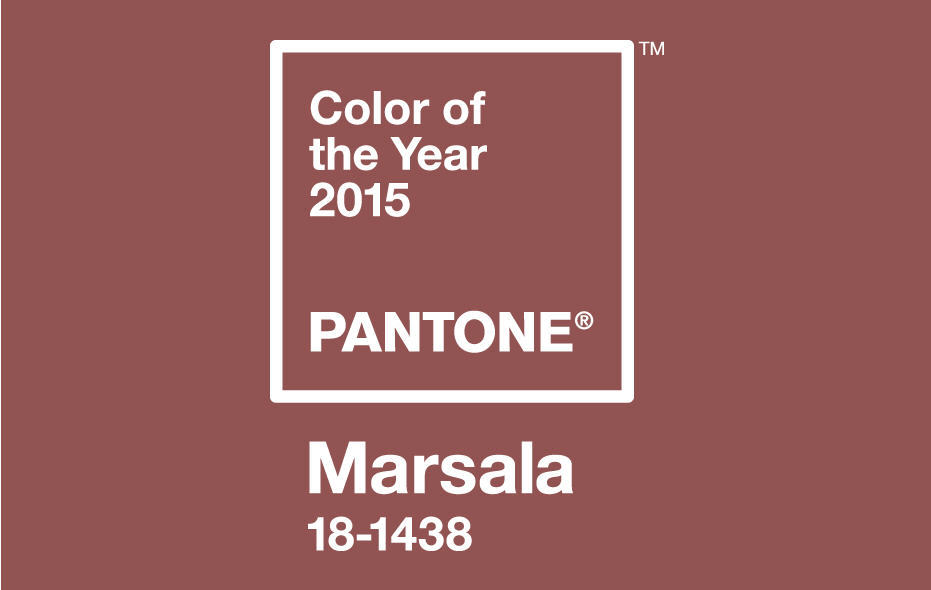
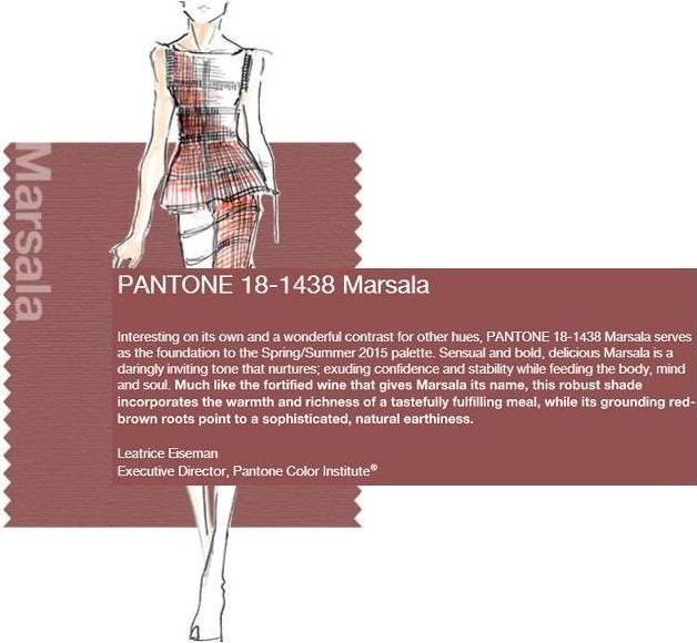
What IS Pantone’s Marsala?
It’s as if they selected the Pantone color of the year which is NUMBER 18-1438– and then something went horribly wrong. It is ONE specific color that is NOT warm, or rich. Some have gone so far as to call it the color of dried blood— and worse! On the blog, the Decorologist Christie Barnett wrote a fascinating post and represented the color with a couple of kidneys. I truly respect that kind of honesty. She’s right.
What is not honest is that it appears that after it was too late and they had manufactured 50,000 mugs in the not-so-great color, Pantone themselves, seemed to side-step their decision by admitting that there are “variations” of the color.
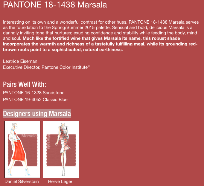
From their press release:
With the ever-growing popularity of floral prints and striping, variations of this hue will undoubtedly carry into men’s and women’s clothing throughout next year…
This highly varietal shade combines dramatically with neutrals, including warmer taupes and grays. Because of its burnished undertones, sultry Marsala is highly compatible with amber, umber and golden yellows, greens in both turquoise and teal, and blues in the more vibrant range.
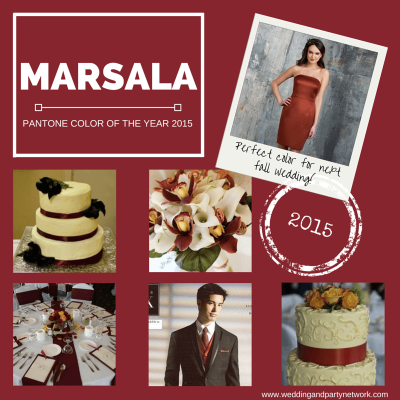
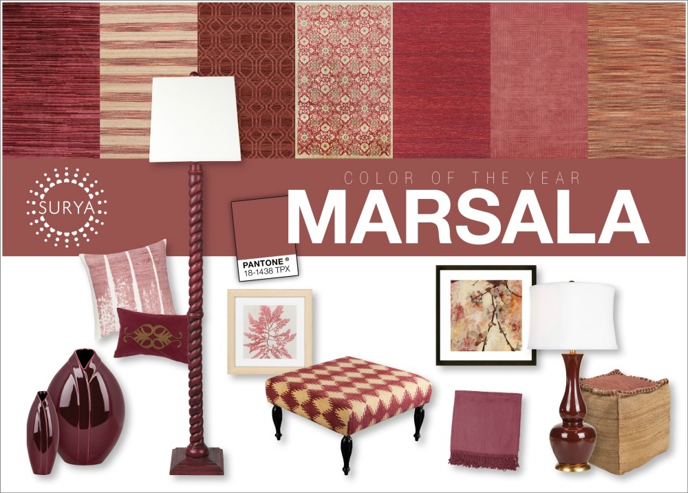
This would all be fine if it was called the Pantone color family of the year and then give us a series of say a dozen or so analogous, coordinating shades, like this lovely collage.
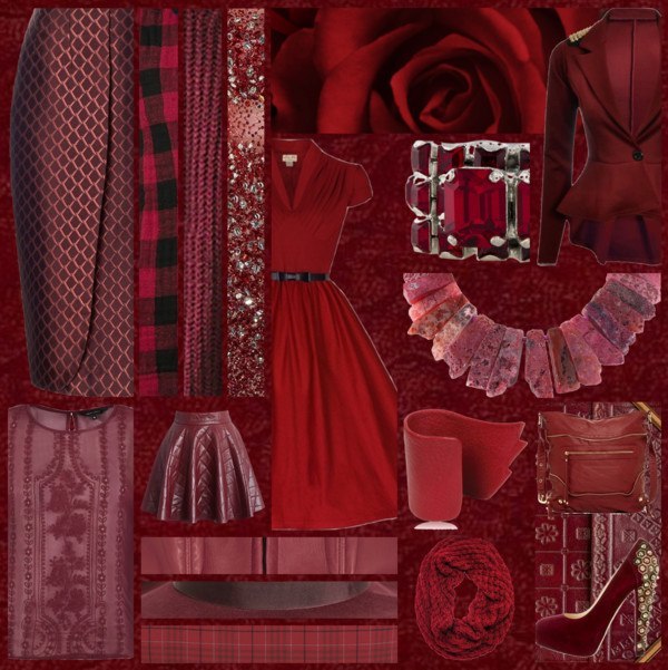
Then, YES, they could’ve created a rich, robust palette of reds which essentially IS what they’ve done without saying so. Well, you get it. But here to prove my point are several different iterations of Pantone released BY Pantone!
This IS the color.
but then… and speaking of mugs… Here is an ad that was VERY hard to find in a large size. [for obvious reasons is my guess]
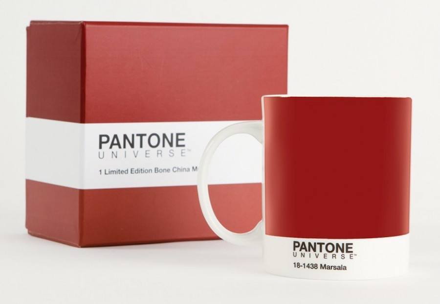
Oh dear.. Now THIS is a gorgeous color!!! hmmmm… Forgive me… but this is from Pantone the company that was created to make a uniform color system. Apparently, they can’t even get it right with their ONE color of the year! Somethin’ went horribly wrong it would appear!
Because there’s also this version… similar to the one above
and this version, back to mud…
and then this one…
Will the REAL Pantone’s Marsala please stand up? Never mind. We know. It’s the muddy one.
In all sorts of publications, I am seeing many, many widely respected blogs and magazines share images of Marsala that are NOT Marsala. And this is why I’ve come back to this subject, because I’d like to set the record straight as I see it. Of course, the fact that there appears to be so much confusion is perfectly understandable since Pantone themselves is struggling to convey what the color looks like.
The following photos all are being referred to as having Pantone’s Marsala in them. Some do, but most of them don’t.
Here’s one that is called Marsala. I found it on House of Turquoise. The window fabric is Robert Allen’s Crystal Lake in LACQUER. It is RED. Yes, a deeper red, but it is definitely NOT Marsala!
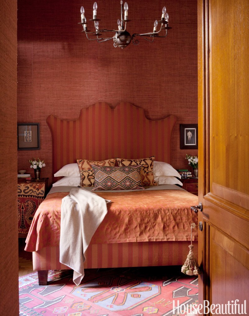
House Beautiful published this image which if you click on it, you can see that they saved it originally as RUST. That is because it IS rust. However, because they want to appear up-to-date, they are calling it Marsala. It’s not.
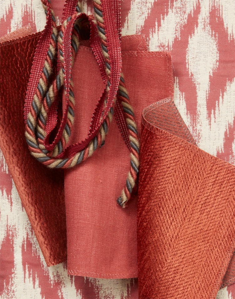
Salmon and rust, but Kravet is calling it Marsala.
my lovely vendor Surya didn’t know what to do, so they put in anything in the color family, but most of these are way off the beam of the actual color.
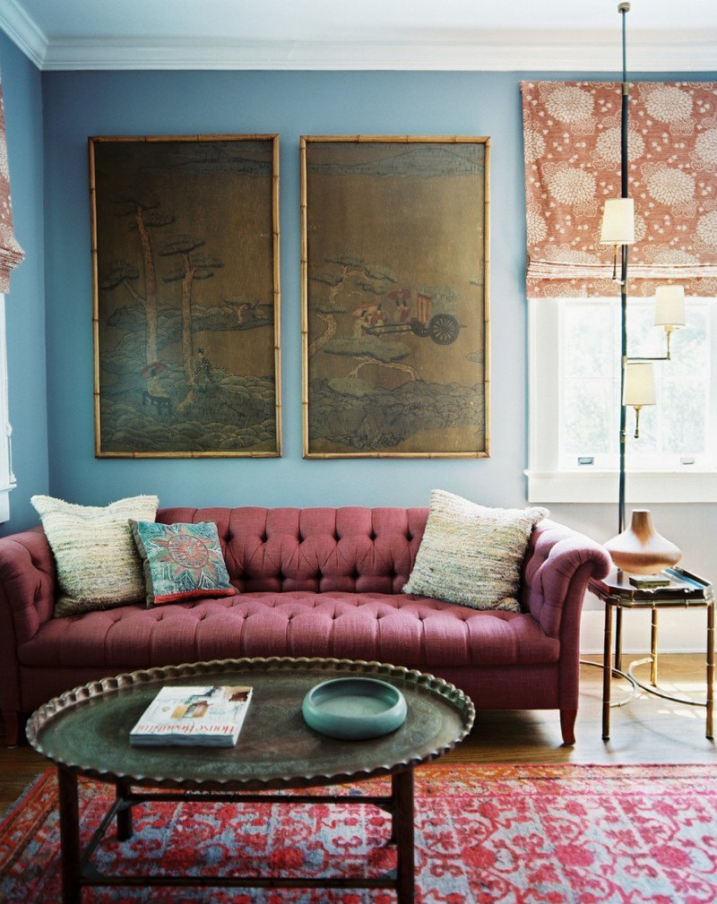
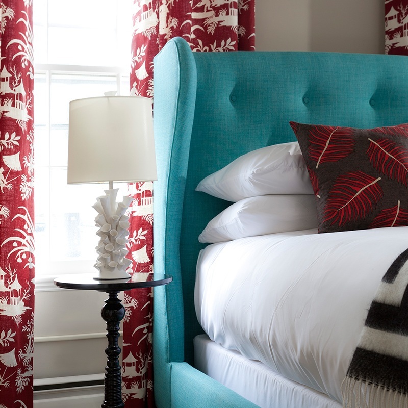
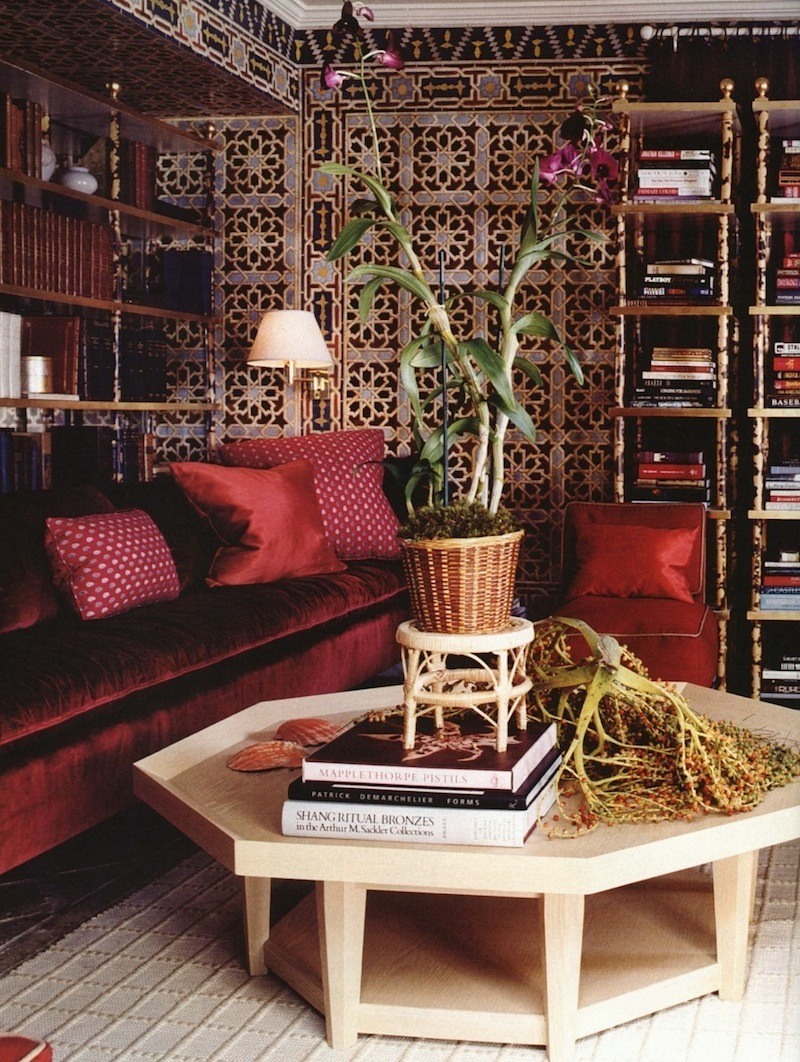
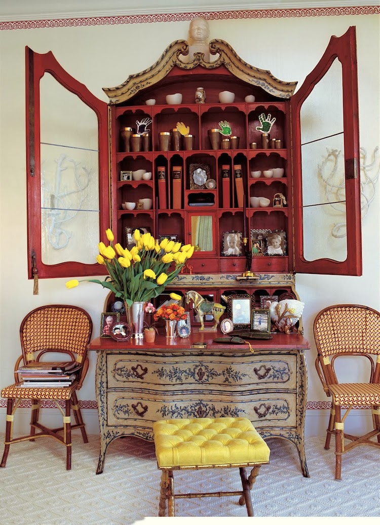
The photos above and below are also being touted as Marsala. To be fair, the sofa color is getting closer, but is skewed towards violet. The other red tones are more to the fuchsia in the rug or a muted rust in the Roman Shade. All of this gives the Marsala color an interesting analogous edge. The blue is not too gray. This is a very cool room! Love the Chinoiserie panels!
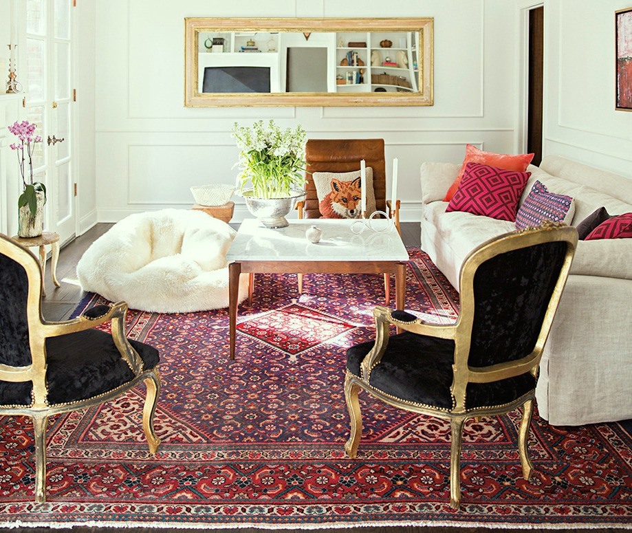
Here’s another photo I’ve seen attributed to having Marsala. This is starting to make me angry. Oriental rugs either have a slightly cool cherry red or a warmer rusty-red. They do not have Marsala unless they are old and faded. This one is not.
This is a “marsala” that goes warmer and dustier and mixed with other warm analogous tones. Wonderful, but not Pantone’s Marsala.
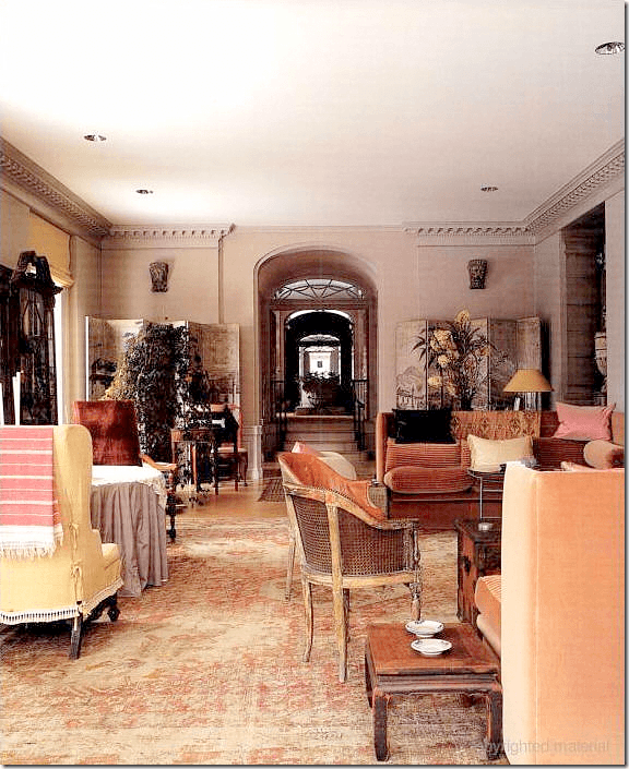
Fabulous room by another guru, John Saladino who is considered to be in the top ten geniuses when it comes to color. Warm and wonderful analogous color scheme!
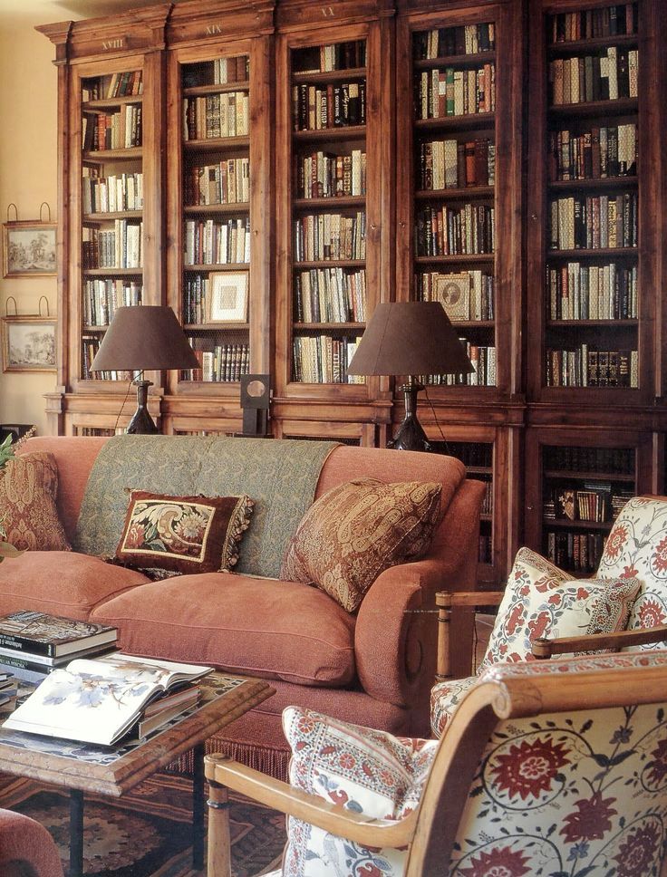
This shot of a redder marsala is very welcome in this warm, cozy library.
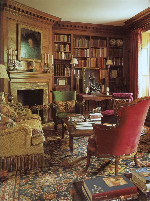
Fabulous vignette by Jeffrey Bilhuber
Conclusion on Pantone’s Marsala.
For those who are insisting that Pantone’s Marsala is a wonderful, warm, rich color, please consider that what you are looking at may not be the ACTUAL color, but some color that an editor or blogger mistook for the color. Or even worse, a color that Pantone themselves misrepresented. That’s just not right. Either they have A color or not!
As an accent with other warm, red, rust, orangey, gold tones, Marsala is a fabulous color. The way Pantone presented it looks tired and cold.
Amen.
Any other thoughts on the matter, and then we can bury that dead horse!
xo,
![]()
Related Posts
 My North Facing Room Paint Color Is Depressing Me
 The Number One Interior Decorating Dilemma and How to Get Past It!
 What You Need to Know About Wallpaper
  Freshening Your Home for the New Year {part V – wall art ideas}
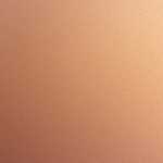 20 Great Shades of White Paint {and some to avoid}
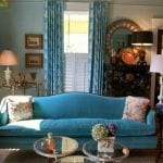 Hot Off The Press! High Point Furniture Market Fall 2014
 Bobby McAlpine = A Badass Architect You Will Love!


13 Responses
It’s all in good fun, but really, Marsala??? Who drinks that? Give us Bordeaux or Burgandy or Cabernet. Give us real richness and passion. Give us the color of an amazing lipstick. Their sku looks flat and completely uninspiring. After all, it seems that the color-of-the-year should reflect a mood of the times, a sense of spirit about the world, a bit of inspiration! Something to get you going! Something to inspire products, decorating schemes, fashion! Right? Something to make people want to go out and buy!
They missed the mark. Period. And all the marketing hi-jinks out there and ways to spin the obvious, ain’t gonna do it.
🙂 Oh well, we’ll see what next year brings. And I thought Radiant Orchid was bad! I’m kind of loving that now. 🙂
Great post and you are so right, the “Marsala” photos are all so different. Marsala seems to be such an obscure color that it is not easy to find many interior examples. I am not a fan of Marsala either but what I do like is that Pantone put the “red” family on the map so to speak. I feel like we have been turquoised and greened to death. Happy to see a warm side of the color family finally getting some buzz.
It’s very “Golden Girls” to me. I could see Blanche rocking it for a night of indiscriminate sex with an octogenarian.
hahahahahahahaha!!!!!!!!!!
Funny this color is creating such confusion. OK not funny, just coincidental. Was having this same conversation last week with a woman who owns a furnishings boutique in the SF Bay Area. We both agreed this color reminds us of burgundy from the mid-70s and early 80s. Both of which were horribly mixed with various shades of pinks and greens. As I’ve seen this color so far (in its various incarnations), Marsala remains muddy and undefined. If it were deeper, say an oxblood, I might find it intriguing. Instead it’s just ugh and not inspiring at all.
and it reminds me of that hideous mauve and gray of the late 80’s. I moved into a home that was all mauve and gray and couldn’t wait to change it back in 1991.
Order chips and swatches from Pantone. They will differ to a degree because the substrate, paper, plastic, textile and the medium dye, paint, ink, etc. will render the color differently. It will be within a certain tolerable difference, but to a ‘trained eye’ there will be a difference.
It’s the same every year. This is not a new issue. For those of us who work with color professionally, it’s just business as usual and it’s expected.
What’s different is more people have access to the same (or similar) resources professional color experts have had for years. And they don’t know to use them.
The image you posted as being “the” one isn’t correct either. The Hex/RGB values are off. Should be 955251/149-82-81. To be really picky, for blog pictures, the sRGB value should have used.
But that’s not something most people would know.
So is it fair to say Pantone misrepresented the color? Probably not because color is device dependent – meaning it’s up to each device to render a color and it’s up to the person using the device to know what they’re looking at.
Pantone provided their color notations for all of their systems across the board. It’s not their fault that people don’t know how to read them and use them.
And maybe they should default to naming a hue family instead of a color in order to deal with this new age of color.
Trying to define Marsala is in a singular absolute term is like trying to smell the color 9.
thanks Lori for that very interesting assessment. And you’re right, the vast majority of people, even in the ID profession don’t know what a hex code is. And I’m totally fine with slight variations. In fact I’m totally fine with not-so-slight variations which I hope was the main point of this post and the same conclusion you had which it would be better to name it a hue family instead of one isolated color. The one on their site in their press release with the models is uniformly cold and muddy. At least that’s how it looks on my macbook pro. I haven’t looked at it on my PC which does render colors differently, but if anything, the PC renders colors more blue and red than they really are and the mac renders them warmer. Do I think that they are intentionally trying to mislead the public. Probably not intentionally, but it does appear that someone goofed based on the wide discrepancies and also other designer’s perceptions.
You Go Girl!
I whole heartedly agree!
This color is going to be a tough color for me to embrace as an interior designer.
Spot on post Laurel!
You ago Girl!
I whole heartedly agree!
This color is going to be a tough color for me to embrace as an interior designer.
Spot on post Laurel!
Hi Robin… that is the consensus I’ve gathered from most of my colleagues; many of them quite outraged!
Dead-on brilliant! Great post and insight here, Laurel! Thanks so much for the mention, too 🙂