I received this email recently regarding French Country Kitchens:
I will respond to the email like this.
Sorry, Ms. Bern
Uh oh.
But your article on 12 kitchen trends was impossibly subjective!
(I believe this post no longer exists.)
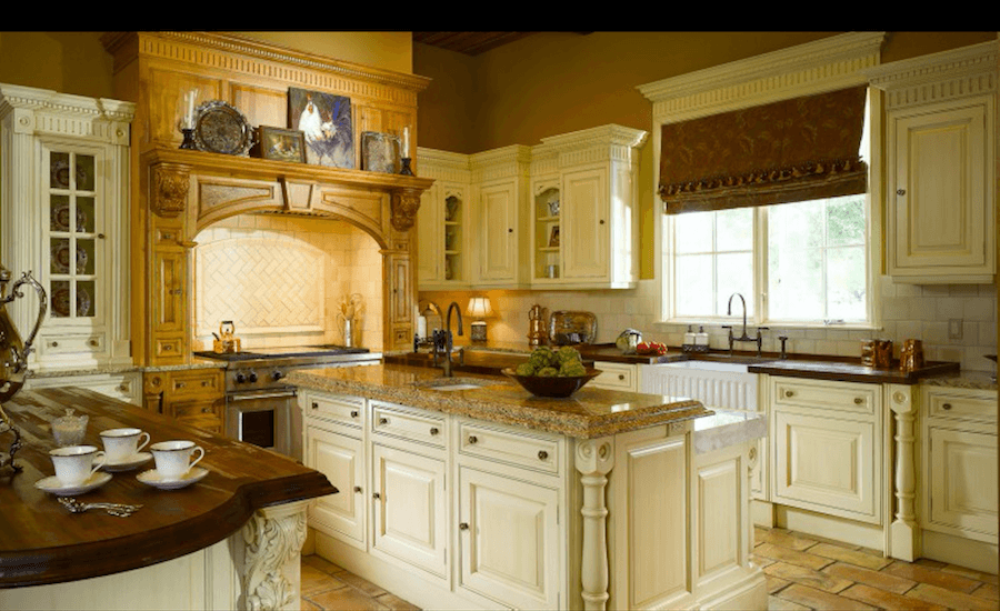
The ornate French Country kitchens you had disdain for were spectacular, and there was not a square foot that wasn’t visually beautiful.
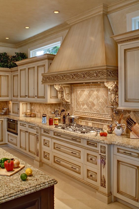
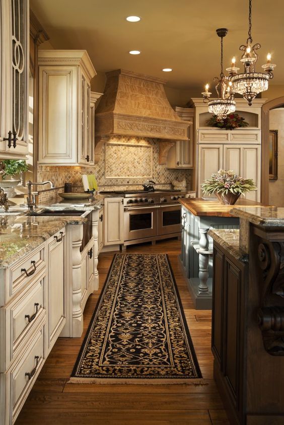
Sure, if you like miles and miles of tumbled marble, brown granite, fake antiquing, over-the-top-badly proportioned carving, cabinets of varying heights and depths for no apparent reason, exaggerated ogee edges on the counters. In some cases, too many disparate materials.
It’s a matter of taste.
The simple “French Provencal” example was charming, too, and both styles should be appreciated. Designers think they have re-invented the wheel with the white shaker cabinets, white marble top trend. 10 years before; it was all about dark cabinets and granite countertops, which are now looked upon with disdain. What’s next?
Hold on, just a second. I would prefer not to be lumped with “designers.” I have a great appreciation for different styles of cabinetry and finishes.
I’ve done real estate speculating on houses for 35 years and seen it all come and go and come and go.
My last purchase was a deck house from the mid-seventies. The cabinets were in a dark, flush mahogany design with staple-shaped, stainless steel pulls. The cabinets stayed; the only change was replacing the orange Formica countertop with white Silestone.
I wasn’t going to be coerced into the new mantra of “Granite or go home.” It paid off. By the mid-twenty-first century, ignorant young buyers will point to anything brass and utter “Gold…I hate gold.”
I only liked granite for about three years, from 1988 – 1991, and after that, no more!
However, earlier on, you stated that every square foot of the [phony French kitchens] is visually beautiful. However, all of these beauties have granite countertops that neither of us cares for.
Never mind that brass has been around since the time of the pharaohs.
Yes, of course.
The metal was an affront to their ‘refreshing,’ newly formed opinions of what was right or wrong.
Now ‘gold’ is back, reinterpreted in a softer finish to save decorating-trend-sheep– Sorry, I mean’t savvy followers!- from lapsing into PTSD convulsions.
Oh, stop being a d*ckhead!
It’s gotten pretty silly, or maybe as I get older, the decades fly by, blurring into a moment of short-term memory loss in home buyers.
Sorry, you lost me completely.
And don’t get me started on open-plan living where every dirty pot and pan is on view for the guest’s admiration.
No, please keep going. I couldn’t agree with you more on that one.
I mean, why trouble yourself with high-end materials if everything is going to be splattered with spaghetti sauce?
INDEED!
BTW, GOLD has never gone well with gray, no matter how you finish it. Other than that, your website is visually very informative and appealing.
Rob
***
Gold doesn’t go with gray? Well, don’t tell that to Robert Adam.
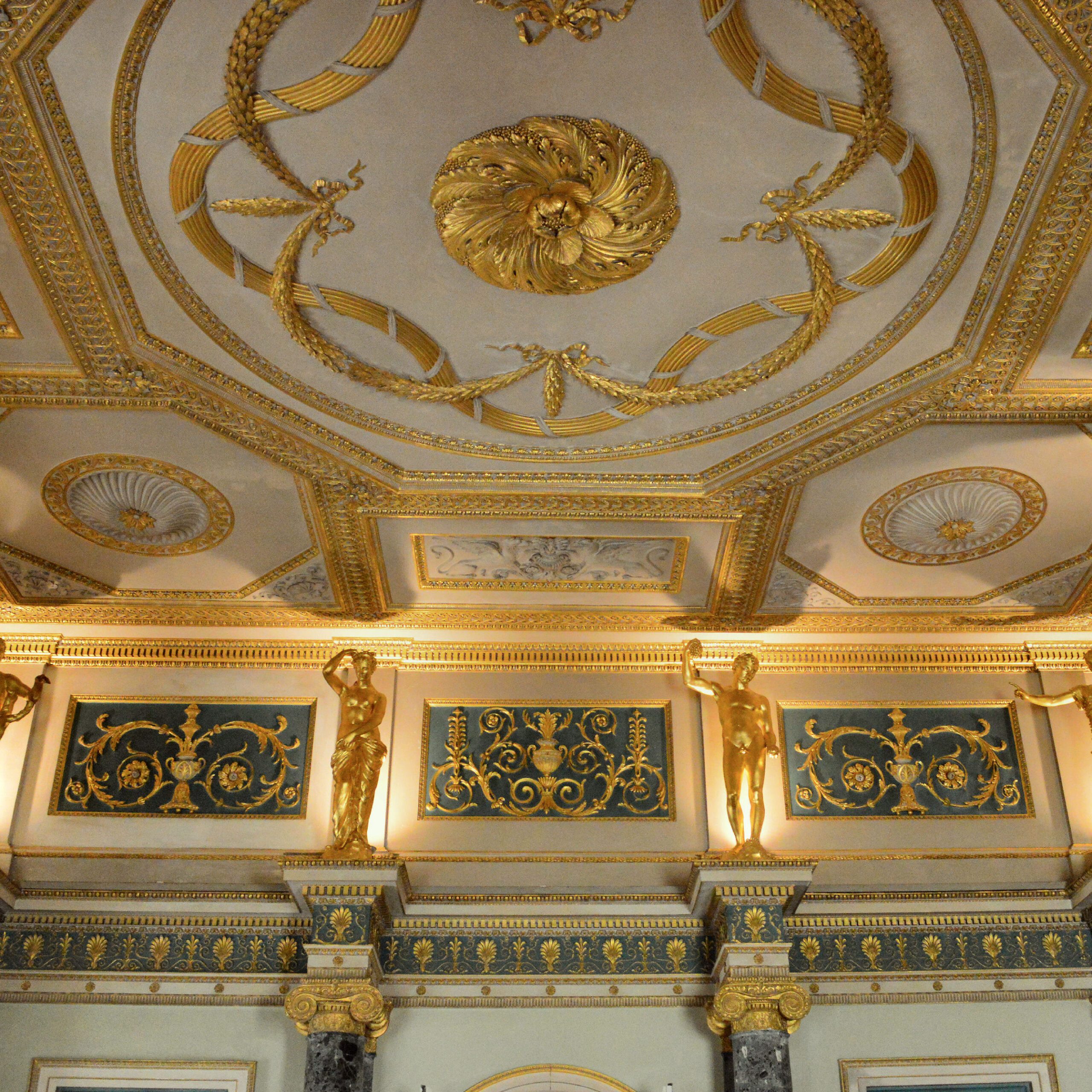
Unfortunately, it sounds like Rob missed the point of that post which talks about my philosophy of kitchens and design as a whole.
Aside from Rob’s pedantic diatribe beginning with French Country Kitchens and much more, I stumbled and fell over this one.
It is not a matter of taste; it’s a matter of authenticity. Big dif.
While taste does come into play, my point was that these kitchens are not French Country. It is fine to like them. However, they are French Country Kitchens, like saying Cool Whip is the same as home-made whipped cream.
However, Rob (not Robert Adam) is not alone. Over the years, in my design practice, I found it to be one of the most misused interior design terms.
Today, I will try to answer these questions about French Country Kitchens.
- What goes into an authentic French Country Kitchen?
- And how is one supposed to differentiate between French country kitchens, English country kitchens, and Italian country kitchens?
- And American country kitchens, for that matter.
- What period of history do we need to go back to?
- Plus, what about today? Isn’t there room for interpretation?
- Can we mix different styles, or is that a no, no?
Well, those are all terrific questions. So, to begin, let’s go back to the 17th-19th centuries to see what French Country Kitchens looked like.

Jean-Baptiste_Siméon_Chardin_017 – 1738 woman cleaning turnips
Not much to see here except a woman who looks like she’s about to dig the knife into her wrist. But fine. French Country kitchens must’ve been pretty basic.
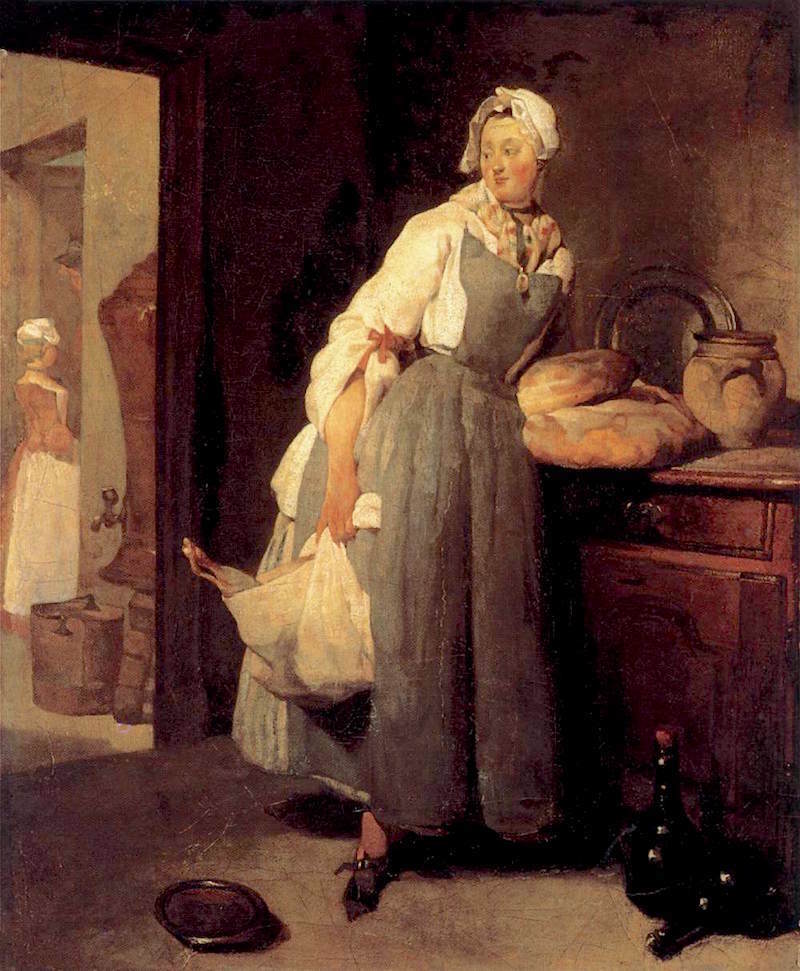
Jean_Siméon_Chardin_-_Servant_Returning_from_the_Market_La_Pourvoyeuse_French-Country-Kitchen-18th-century
Her feet have got to be killing her. Love the buffet! That would be in the French Country Louis XV style.

Pehr_Hilleström-En_piga_höser_såppa_utur_en_kiettel_-_i_en_skål
Sorry, that’s in Swedish.
I bet whatever she’s ladling into that bowl is delicious! I wish there were more to see, though. And yes, it’s not French, but, for our purposes, it doesn’t make a lot of difference.
That is because most people don’t know what French Country Kitchens are or any of the European Countries. And for the most part, they were much the same. Very bare and rustic. Kitchens were for cooking, not conversing with your guests over cocktails.
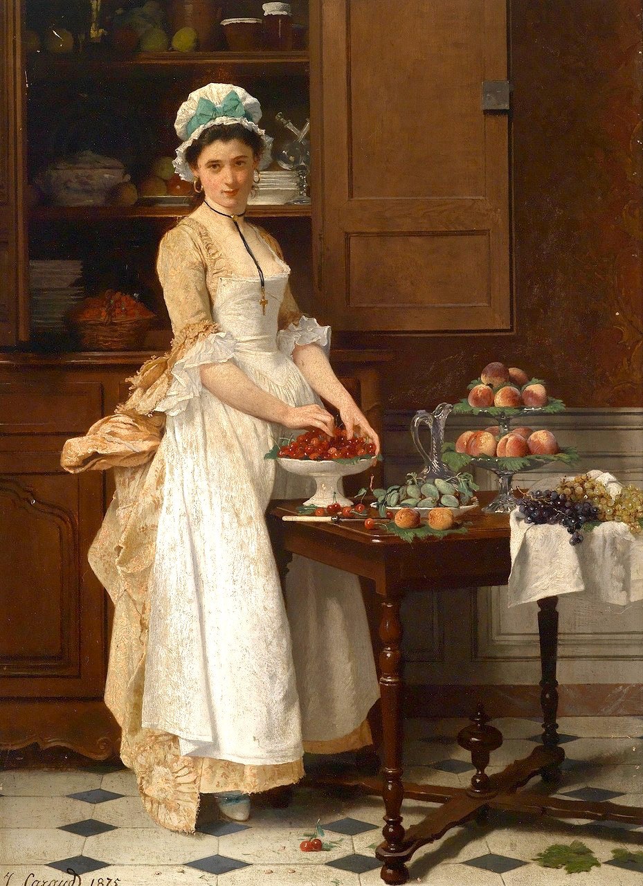
“The Cherry Girl” (1875) by Joseph Caraud (1821-1905)
What a punim! It’s okay; I’m giving you permission to eat a few. No one will know. But, there’s an encaustic cement tile floor!

Joseph Bail, né à Limonest (Rhône) 1862- 1921 – “The serving Maid.”
Ahhh.. I see a glimpse of a Country French-style armoire in the background.
Well, we’ve already been through this.
The kitchens of 100 years ago or more were utterly different than they are now.
I wonder what those maids would think if they walked in and saw this.
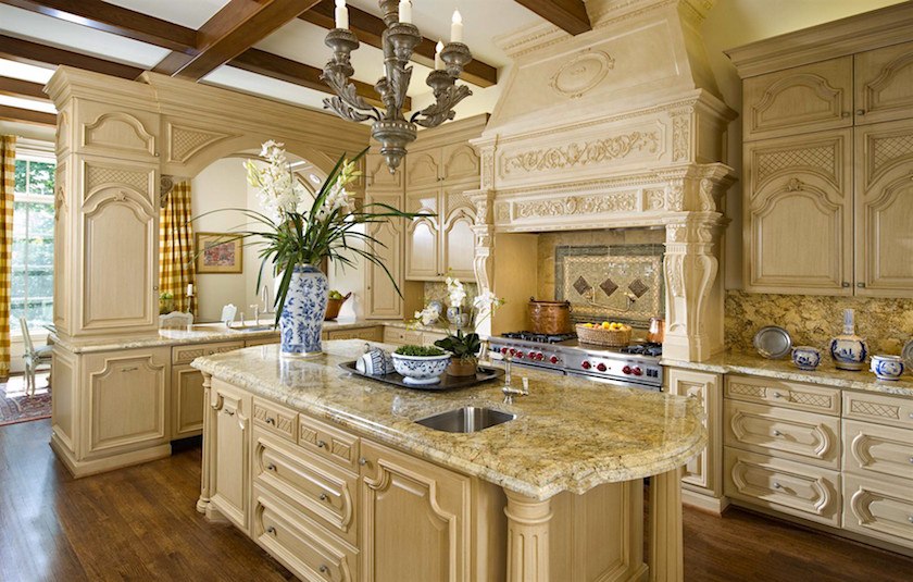
French Country Kitchens
I can’t tell you the number of times I had a prospective client on the other end of the phone line, and I would hear, in a voice identical to Fran Drescher—
“I want a French Country Kitchen.”
OR, she wants to do the entire home in “French Country.”
Here’s the thing. If she really wants a French Country Kitchen, it might look something like the kitchen below.
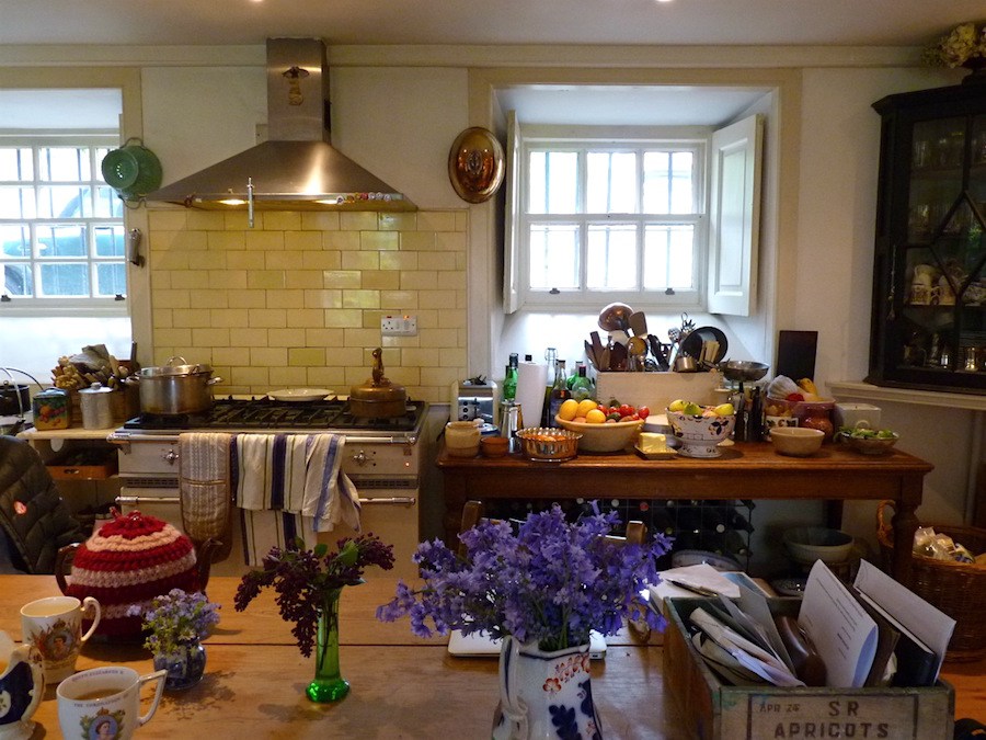
Above and Below, from The Bible of British Taste
Okay, these are English, not French, but when it comes to European country kitchens, there isn’t a significant difference between countries.
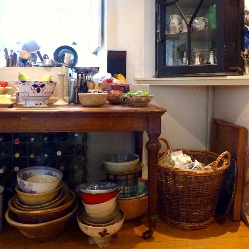
However, we all know that my Westchester housewife, on the other end of a landline phone, would rather bungee jump with a frayed cord down a 200-foot cliff than have a new kitchen that looks like this. ;]
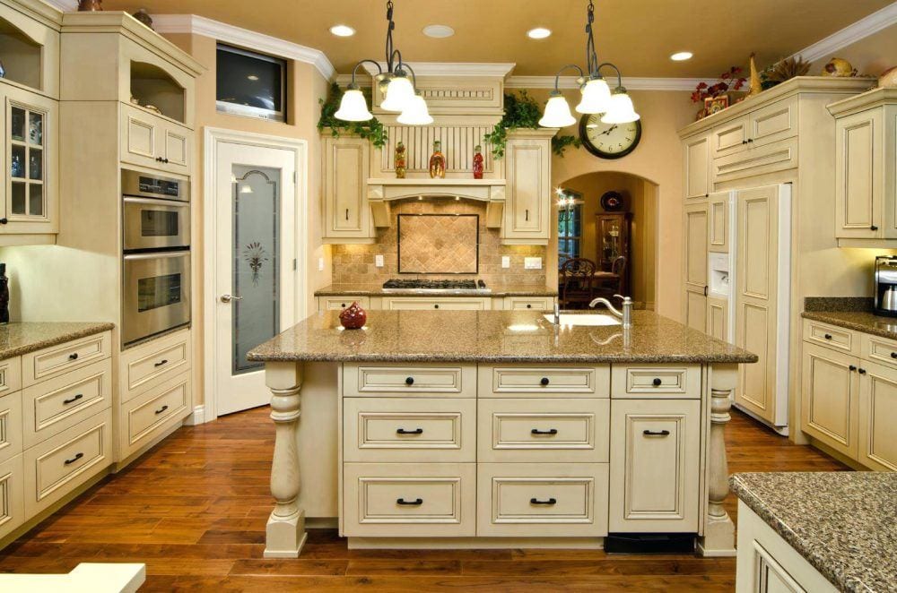
She wants a kitchen like the one above. But, since this type of kitchen is not something I’m incapable of doing, I gracefully bow out.
By the way, Ruth Guilding’s blog, the Bible of British Taste, should be required weekly reading for all Americans starting the day they begin eating solid food.
So, Laurel… Are you saying that French Country Kitchens means that you need to make a big bloody mess and have all of your shit stuff lying around?
No, French Country Kitchens doesn’t mean you need to have everything out, but that’s a lot closer to authentic Country French Kitchens than some plastic, fake, disproportionate, carved-up-the-wazoo design masquerading as something it’s not.
It’s not anything– except bad design.
And Rob, I am not sorry! It is NOT a matter of taste.
There is good design and bad design.
But not all good design is to my liking. That, is a matter of taste.
However, all lousy design is subjecting itself to my intense scrutiny and ridicule. That is because I am aiming to rid the world of BAD DESIGN.
Do some people disagree with my categorization of good and bad design?
Yes, absolutely, and I am totally fine with that.
The point is that Americans, in particular, have become so imbued with the false, faux (the lousy kind of fake) we don’t always know what is good design and what isn’t.
In truth, I have done a lot of thinking about timeless elements vs. what’s on-trend. Sometimes a classic element is on-trend, but because it becomes so overdone, the saturation alone can make it feel tiresome after a while. However, that is a different blog post.
By the way, not all English people like having all their stuff out. In fact, from what I observed when I was there last October, most of them are pretty tidy. However, they also knew that 30 American designers and architects were about to descend on their home.
Well, where does that leave us, Laurel?
That’s an excellent question.
I think that we Americans need to loosen up and 86 (get rid of) some or all of the upper cabinets IF the kitchen is large enough, and we can eliminate some counter space. Floor-to-ceiling cabinets are great. Pantries are too. There WILL be enough storage. In fact, MORE storage if we can stop the copious number of counters. This kitchen will be easier to keep clean too! (for great kitchen storage ideas, click here)
But let’s call it a French or English “inspired” kitchen, perhaps.
And if you like the word country, because it sounds more charming, then sure. Call it whatever you want. French Country, English Country, Italian Country, Botswana Country. I don’t care.
Love is love, and Country is Country!
Below are some things that your French Country inspired kitchen might have. But really, there are no hard and fast rules.
- A stone floor, like limestone. Both the English and French love this.
- Or encaustic cement tiles like we just saw in the 19th c. painting above.
- Painted or very pale acid-washed cabinets with some rusticity.
- Stone and/or brick on the walls
- hand-made tiles.
- Open shelving and glass doors
- Any antiquing is either an authentic antique or a very well-done antique reproduction. (Please check out the Max Rollitt kitchen!)
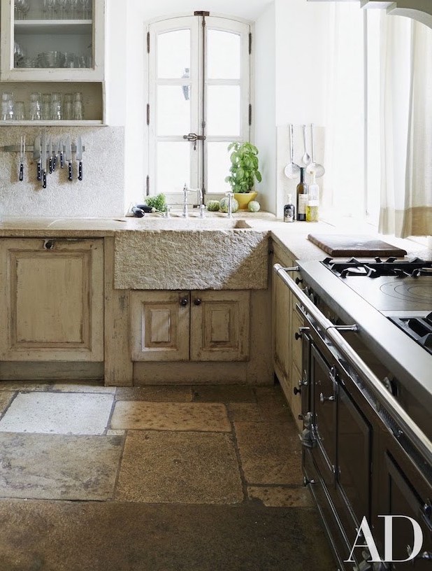
Photo by Simon Watson – Kitchen belonging to Frederic Fekkai.
If, I had to say what the quintessential French Country kitchen looked like, this would be it.
But this is not going to fly with most Americans. They will think that it’s too rough and dirty looking.
But hey, it’s the COUNTRY.
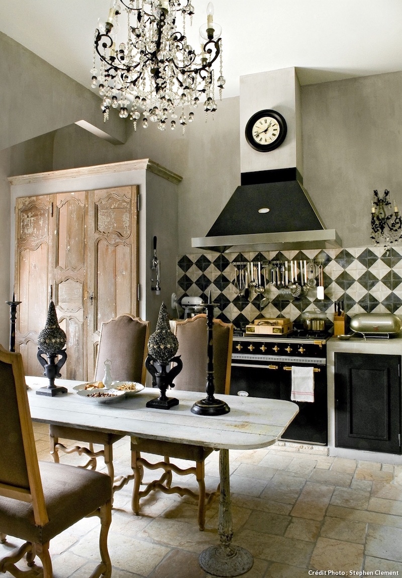
This is another one that embodies the feeling of an authentic 21st-century French Country Kitchen.
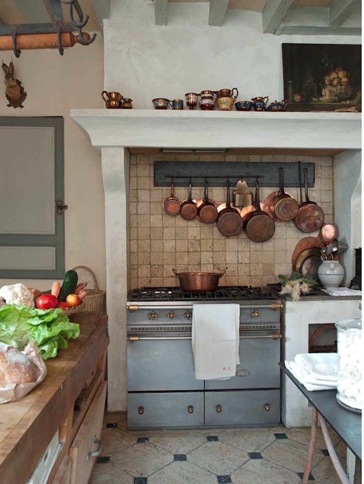
And this one too.
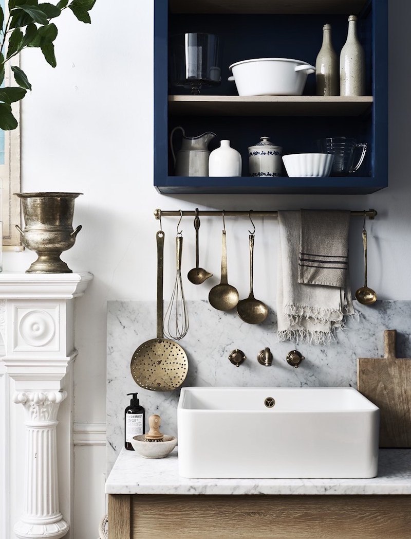
photo: Benjamin Edwards for Neptune Kitchens
This might be more English, but I love the juxtaposition of materials. I wonder what the rest looks like.
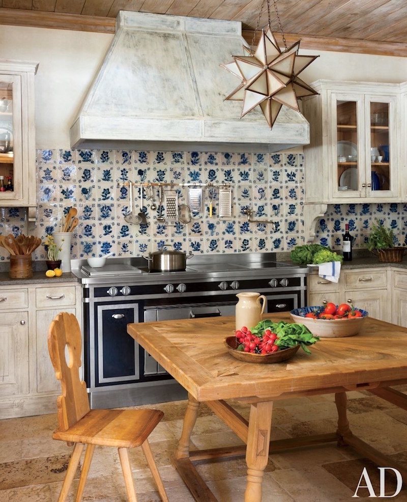
Photo-Oberto-Gili-Design- Studio Peregalli
This one is like stepping into Provence.
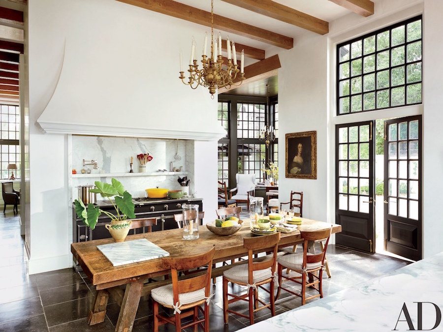
I’ve long been a fan of Bobby McAlpine and associates. If you are too or think you might be, click here for more.
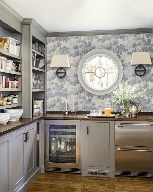
French Country kitchens don’t have to be rustic and dirty. Although, I would say this is more of a contemporary kitchen that I could see in a country or suburban home. However, it could also work in an older home in a city.
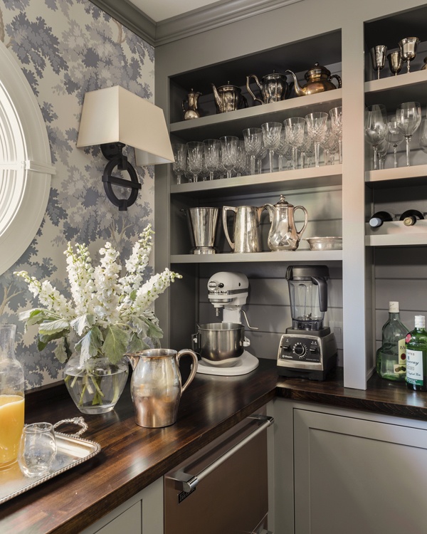
Love this fresh kitchen pantry with Raphael Wallpaper by Sandberg.
You may have remembered the Raphael wallpaper in the green colorway in this kitchen I helped design about three years ago.
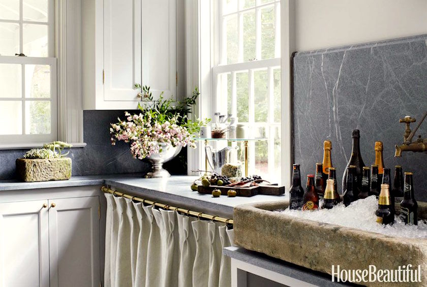
Jeannette Whitson
We were talking about Jeannette Whitson’s fantastic kitchen. Remember, she’s the incredibly talented designer who said, “Kitchens are my gateway drug.” haha, I love that! This is a different one.
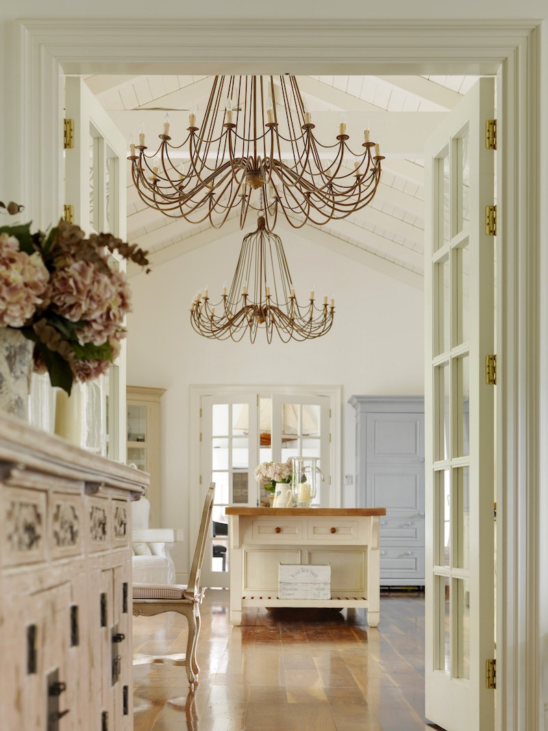
Minnie is another fantastic designer. I adore her work! Please check out her website at the link above.
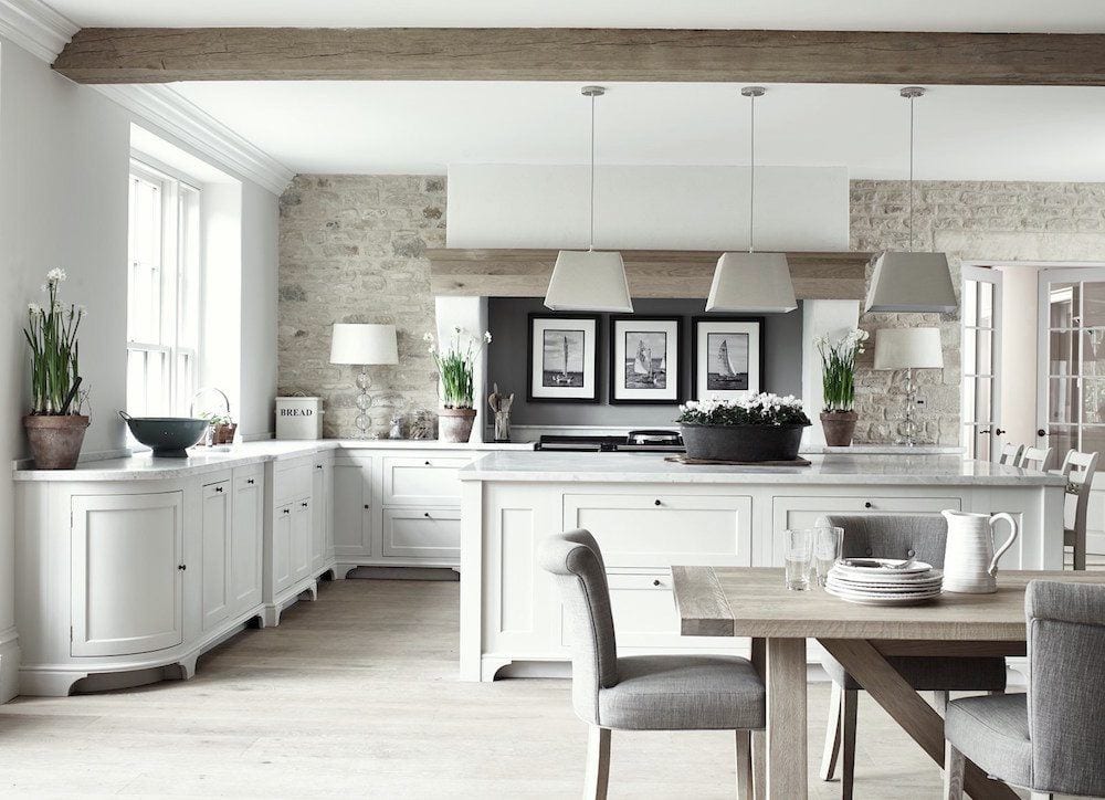
This last kitchen by Neptune Kitchens to me embodies the spirit of the contemporary French Country Kitchen. It is beautifully proportioned, airy, highly functional, sleek, easy-on-the-eyes.
And, I dare say that if a French maid from the 19th century walked in…
She would say… “Vraiment Cool!”
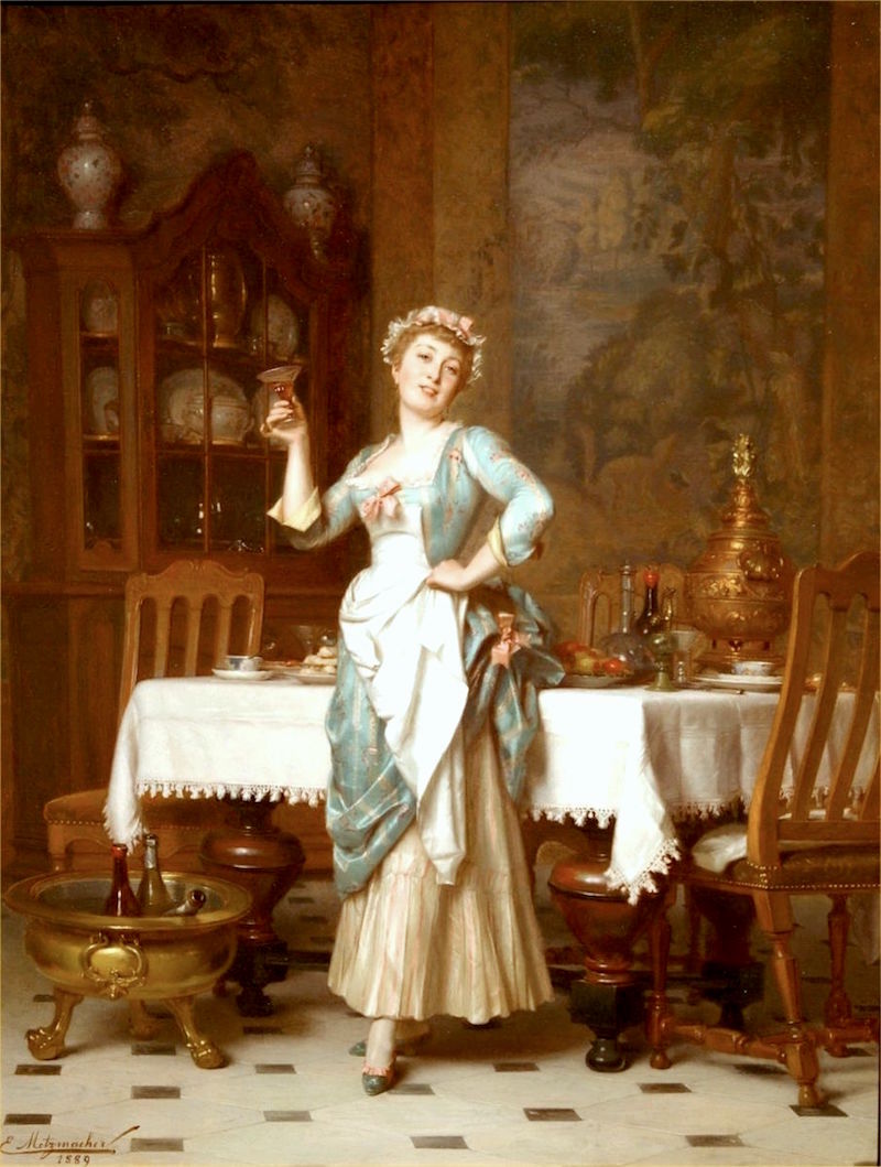
Emile-Pierre_Metzmacher_-_An_Elegant_Maid,_1889.jpg
xo,

PS: The Serena and Lily 20% off sitewide sale continues. Please check it out and the rest of the newly updated HOT SALES here.
The news is below.
Oh, man, that Neptune kitchen reminded me I have something to show you regarding my new kitchen.
I read all of your fantastic comments. They were phenomenally helpful. Thank you so much! I’m not going to say anything else here, but if you are interested, I’ve posted a new rendering showing the final kitchen design. (please click here). I am 1000% in love with it!
Related Posts
 A Sophisticated Staircase Gallery Art Wall Template!
 The Best Swivel Chairs And Swivel Gliders, too!
 Curtain and Drapery Hardware – What You Need To Know
 Don’t Be Seduced By Chintz! A Personal Story
 Inherited Furniture That Must Stay – How To Work With It
 The Best White Paint Colors-20 Classic Shades
 Staircase Decor, 3 Common Mistakes + what to do instead















26 Responses
What would you call Minnie Peters style? I like it a lot, but even she goes a bit too far into the ornate for me, but only in some spaces. I do use more color though.
Hi Ramona,
I think it’s an amalgam, but feels northern European to me.
Maybe its me, but I never liked that overstuffed style. I cannot call it otherwise. To me it looks tacky and arrongantly shouting “I have money, but I don’t have taste”. I def like understated better.
I really enjoyed reading this post Laurel. I love it when you bring in the images of 19th century paintings. I personally like having all my tools at the ready. Some people might think its a cluttered kitchen, but its very organized clutter!
Rob sounds like the guy who created my friend’s “fake, disproportionate, carved-up-the-wazoo” ‘merica-designed “French Country Kitchen”. It’s an abomination, but hey, the house itself is a circa-1980 1500 sf bi-level, complete with popcorn ceilings, so it couldn’t get any worse. Beauty is in the eye of the beholder. I think her kitchen guy found the beauty in his checkbook after she spent >$100k on that eyesore.
Thanks for the link back to your final new design. Your kitchen is SO gorgeous!
I need those overhead cabinets with doors to hide all my kitchen stuff. I am not a super neat person. I use my not so attractive dishes regularly. I would love a toned down version of that “French country kitchen”—beautiful cabinetry without being over the top. I also can’t stand my kitchen being open to the rest of my main floor. Everyone can see the clutter and dishes.
Laurel, Bravo.The final design is beautiful and true to your original vision. None of the main characters were killed off in the cliffhanger episode.
LOL!
I would like to know who came up with that faux French Country style kitchen. Off with his head I say!
I’m so happy you have decided on a final design for your new kitchen. It’s lovely. The way you think through every detail is inspiring.
That. Is. Hilarious. You are spot on. Thanks for the laugh…and beautiful kitchens at the end.
So I love your new/old renderings of your kitchen. I think I finally have a handle on the size of the space. Three feet on either side of the sink is plenty. If I understand correctly, the refrigerator will be on the right of stove and pantry on the left? Beautiful all the way around. I would do white counters for sure.
The unkitchens you post, Laurel, are truly fabulous. I love the idea of a wall of cabinets making the overhead kitchen cabinet a thing of the past. The 20th century American kitchen was always stultifying, no matter how wonderful the overall design because of the overhead cabinet. May they go the way of the dodo bird, please?
Now to terminology. Those ugly examples are just ugly design. I guess I haven’t been exposed to any of those ugly ‘french’ examples in real life although it seems many people have.
But, everytime someone uses the term French Country, they do not mean that ugly design. My style includes touches of French Country like the Neptune kitchen. I never desired a FC kitchen though. I prefer simple Shaker style inset kitchen cabinetry. That doesn’t mean I wouldn’t put in French touches which for me mean a set of curves against the simple square of a rectangular design. The toe kick feet on the Neptune cabinets signal ‘French’ to me. In fact, the Neptune kitchen is a good example of the feeling I am going for throughout my house.
For me, curves, rush woven seats with or without cushions, a certain style of leg for a table or a chair/sofa arm that curves in a certain way, flowers (and some flower and leaf carving as accents on wood furniture), lavender (and the silver green of lavender foliage) and blue, gilt mirrors, stone and stucco exteriors, light wood floors in wide plank, herringbone or at a 45 degree angle, light white washed or pale painted furniture, natural fiber rugs, baskets, silk or linen drapes.
A couple of bergere chairs (mine are upholstered in a very pale green and cream zebra stripe). A no for traditional French country colors — too primary for me — yes to Scandinavian color, and no toile — too fussy for me. No roosters. In fact, bad ersatz French always carries the curves and flourishes too far and adds too much stuff in every category.
I would really like to know what terminology to use. Should we say, “modern French Country”? I do confess to owning an vintage ersatz “French Country” breakfront. It is solid, well built, came at a very reasonable price, stores a ton of stuff in a very small footprint and, while not my favorite French design, does the job. My plan is to paint it, maybe even a fabulous color on the outside or inside on the shelving, definitely contrasting color either way. For me that would be the modern touch.
I do not want to live in 19th century France but I like to have some 18th-19th century French touches around me.
So please, can we have some new terminology that doesn’t set everyone off? I think there is a lot of stuff calling itself French Country on the web which goes too far into ‘cutsey’ although not as bad as the ‘ugly french’ you have pictured here.
We need a term which will not make people recoil with imagined images of builder horror fantasy style kitchens carried into the other living spaces.
If we could post pictures or links, I would include examples of what I think of as good French design a la the Neptune kitchen. It is out there for sure.
I completely agree with you about hating the “faux” French kitchen, BUT I have one!!! Please don’t put down this type of kitchen without telling those of us who have them how we can “de-fang the faux”. A complete remodel is out of the question. My “french” cabinets are cream. I could possibly change the countertops, hardware, light fixture over the island.
This is a great idea for a blog post. Thank you, Mary.
I agree completely. I have been obsessed with Italian country kitchens lately (we bought a house in the hills of Umbria) and find that most of my inspiration pics are actually from Provence. The countryside is very similar as well as the climate and lifestyle. Have you seen @vivietmargot ? She has the most charming kitchen in her current home and is in the process of moving to another house she is renovating. Cotto floors, oregano green cabinets, brass and copper accents. Vey unfitted feeling. She’s a Brit who lived in the USA and is now in France.
I love your “new” kitchen design! I like having more space on each side of the stove and the sink, and I think looking into your kitchen from the living room and seeing that beautiful pantry will make your heart sing.
I love, love, love the Neptune Kitchen! That would go in my imaginary dream home in a heartbeat. I love the countertops, brick wall and space for lamps and beautiful things as well as space to cook and prep.
I feel any country kitchen needs a study wooden table in the middle of the room. It’s where breakfast and lunch are served, and it’s where my Granny made bread, biscuits, pie crusts. I guess islands serve that function these days but the table says country home to me. Granny’s kitchen was unpretentious, practical and meant to be lived in. The charm came from practical things like tile behind the range, or on the floor which are easy to clean, a built in drain board to the sink which was deep to clean big pots, a fireplace on one wall. There was a big walk in pantry that she called a larder where all the jars of canned produce were kept. The canning was a big process and done outside in a covered area to keep the heat out of the house in the summer. Everything was clean but worn from constant use.
As much as I love my memories of that kitchen, it isn’t what I would want to have in my home today. I would not want to live without my dishwasher! or the fridge! And I wouldn’t choose the heavy wear and tear. I would love to have the pantry and the fireplace though.
You are absolutely correct on all counts on the faux french kitchen. Heavy, over the top, not scaled for humans. Thank you for sharing your wisdom and wit, as always.
I like the one with the blue tiles in the backsplash. Funny, I don’t hear anyone saying they want a kitchen that looks like Julia Child’s kitchen.
“Not much to see here except a woman who looks like she’s about to dig the knife into her wrist”-thank you for making my morning so much brighter, Laurel, your style is *incroyable*! As always.
We’ve been here before in earlier posts! I think the problem is plain to see in one of the phrases from the e-mail: “The ornate French Country kitchens you had disdain for…”. A country kitchen has no business being ornate, even if it’s French, and if the said kitchen is in America, it has no business being French either. (There’s a nice extremist view for readers to get their teeth into!) Of course the expression as used in America has nothing to do with France, it’s a local fantasy, which is linked to the “French Provincial” furniture of yore (at least I hope it’s from that nebulous period).
I don’t think anyone in his right mind would want an authentic period kitchen from any date before 1960 — no mod cons. It’s a bit like the “period bathroom”: ain’t no such thing.
Great to see that you’ve solved your kitchen plan dilemma. Is it authentic? No, there wasn’t a kitchen there originally. Is it appropriate? Yes, it’s just plain right.
Laurel, some readers just refuse to get your point. There is no comparison between the faux French and the authentic French kitchens. Years ago I had the occasion to spend some time in France in two different country homes, and I loved talking with the cook. It was before the days of digital photography–alas. I now wish I had photos of those authentic kitchens. These more authentic rendering of the style are all beautiful.
Good morning from Norway, Laurel – and thanks for letting me start the day with a smile!
You are totally right. I have never seen a ‘US-style French Country Kitchen’ ANYWHERE in Europe.
But don’t worry, we have ugly kitchens in our own unmitigable style ;).
We are looking for a home and as soon as I see that horrible, ornate, faux French kitchen, I say NEXT! Great post – all so true!
Thank you for the laugh, love your sense of humor!! Yeah for real french kitchens!!!
A few years ago I was lucky to visit some farm homes in Normandy where the owners had us sample their wonderful cider that they sold commercially and fed us delicious regional food. The houses were very old but updated to handle frequent visits by large numbers of hungry guests. The kitchens very much resembled your photos of those kitchens attributed to Mr. FekkI and Ms. Whitson, notably the durable and simple flooring and counter materials (easily cleaned) and the presence of a large wood table for food preparation and serving (see McAlpine). To me, if it has an island iinstead of a table it is less authentic.
Laurel, I’m with you on those hideous faux French kitchens. As much as they had to have cost, I would have to yank all of it out. But I am feeling quite chuffed right now, because your final design that you put together is exactly what I suggested in the comments on your kitchen design changes post. That just makes so much sense to me to do it that way and of course I think it looks beautiful. I’ll bet it feels good to have made those decisions and let it rest a while.