The Best Warm Gray Paint Colors Designers Love!

Hi Everyone,

Before you say ugh! Not gray again; please try to keep an open mind about the best warm gray paint colors. Or, any gray, for that matter.

It’s not that I don’t understand. I definitely do!

Gray sucks. You’re sick of it. No.More.Gray.LAUREL!


However, the color gray is one of the most abundant colors found in nature.


  • Cloudy, gray sky
  • Murky, gray water
  • Most stone is some gray shade, whether cool or warm gray.
  • Cedar will turn gray if left exposed.
  • Silver, platinum, pewter, and nickel are all gray.


Before I go on… once upon a time, there was a different post on this blog about warm gray paint colors.


It was written in 2015 and was very popular for the first few years, but over time, not as much.

So, last year, I did an update for the best Benjamin Moore cool gray paint colors.

And, last January, I updated the post asking: Is the Gray Paint Trend Over Yet?

I highly recommend reading that post if you haven’t already.


But, then I got an email from someone, and all she said was:


“NO MORE GRAY!!!”


Thank you, I love you too.

Anyway, I also wanted to update the warm gray paint color post, but not just then, so I took it down and did a technical thing nobody cares about except maybe my developer. haha

Ummm, I know I’m putting you to sleep, but for God’s sake, can you please stop snoring?


Laurel, please stop the chit-chat and just tell us the best warm gray paint colors!


Yes, of course, but, as I’ve often harped, paint colors do not live in isolation unless they’re in a fan deck. When they’re up on your walls, it’s a very different story.

Of course, I kept the old post. But, when I began to write this post, well, blimey, I couldn’t find it. Finally, I did find it in my drafts folder. I had just forgotten to give it a headline.


In the original gray paint post, I shared nine of my favorite warm gray paint colors.


However, after that post, I wrote other posts about gray paint colors, both cool gray and warm gray.

In fact, when I put the word “gray” in the search box, I found 13 pages of posts that are either devoted to gray or contain the word gray somewhere in the text. That comes to about 300 blog posts mentioning the word “gray.”

That’s a lot of gray.

However, it makes sense because gray IS the most classic color!


Darryl Low via Unsplash Greek ruins
Darryl Low via Unsplash

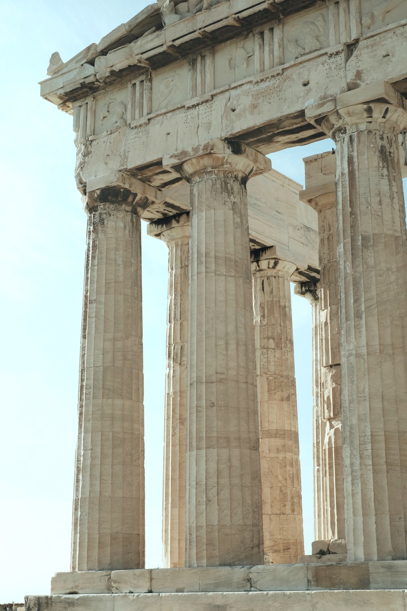
Remember ancient Greece?


Geez, Laurel, can we see something a little more modern?


Yes, of course.


Yana Marudova via Unsplash - the Pantheon in Rome

Yana Marudova on Unsplash

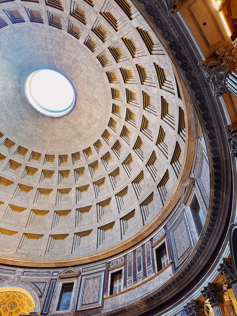
Above is a beautiful image of the Pantheon in Rome. What’s wrong? You asked for something a little more modern! ;]

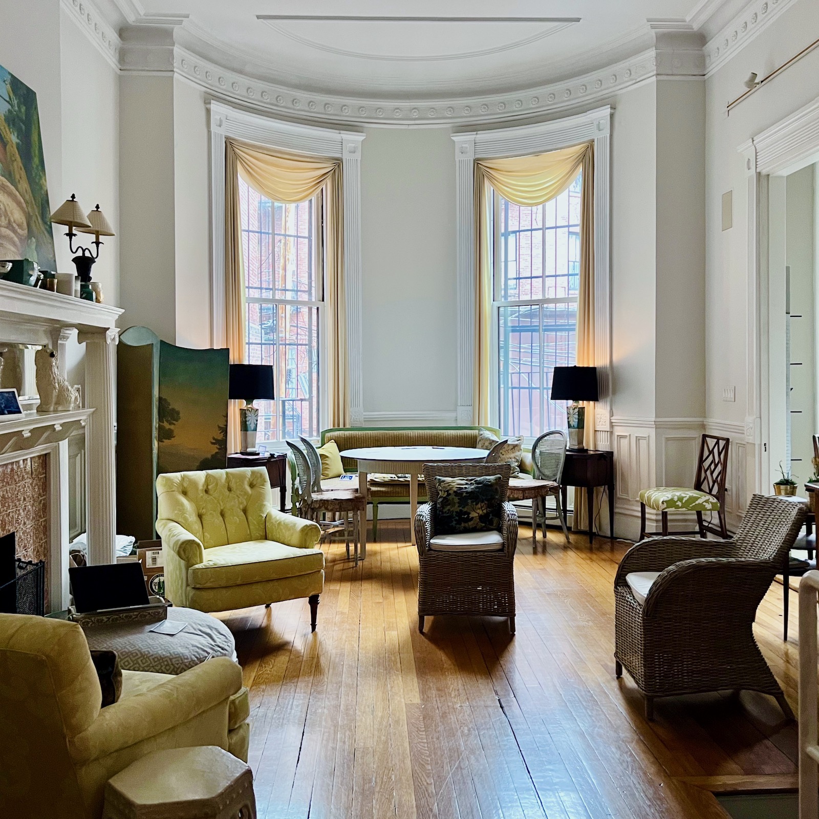
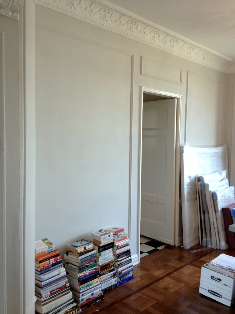
Guys, here’s the other thing. I’ve been living with Benjamin Moore warm gray paint colors on nearly every wall in my Boston condo for well over two years now.


Well, do you like the colors, Laurel?


No, not especially.  I mean, I usually don’t notice them. They’re just kind of there.

But, in the past, I’ve lived with colors I did notice because I loved the color. My current rooms were not designed to go with the warm gray paint colors that are there. The floors are an orange-y brown which usually throws a golden/peach tone, but not always on my living room walls.


Hey, Laurel, what’s happening with the contractor?


Ummm… Yes, I’m working on it. Now, will you please stop kibbitzing, or I’ll never finish! ;]


Jan 8, 12-22pm - den - living room color changes

Remember this post where I showed how drastically the colors changed in the same room and at the same time of day?


Before we go on, I want us to think about:

What is a warm gray paint color?


Let’s take the color gray, which theoretically has no discernable color. By the way, that isn’t easy to do. Gray paint colors are usually a very muted blue, green, yellow/peach, or violet, and sometimes veering slightly towards beige and brown.

However, some colors straddle the line between cool and warm. Just to confuse you. haha

These days and for quite a while now, warm gray paint colors are usually called greige. Of course, that means the color is a cross between gray and beige. However, beige, too, has its variations.


For today’s exercise, I am focusing on the warm gray paint colors that go a little violet or beige-ish.


None of them go towards a cool blue.

Some of these colors might look taupe in some lights or ever so slightly green or khaki.

Again as in the previous post about cool gray paint colors by Benjamin Moore, I will focus on 9 fabulous Benjamin Moore warm gray paint from light to dark.


Later, I will have a fantastic surprise for you.


Please don’t spoil my surprise by scrolling ahead. Thank you. ;]


Nine Benjamin Moore Warm Gray Paint Colors


So, let’s begin with my living room color.
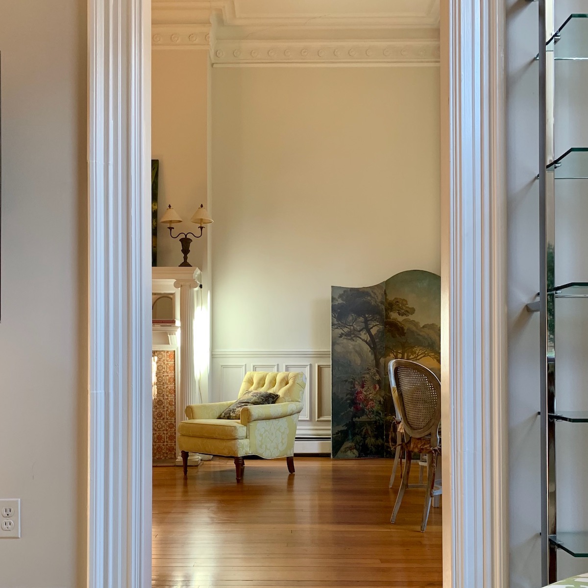
CLASSIC GRAY 1548


Wait, Laurel, I thought you didn’t like it.


I’m not too fond of it for me. :]

Classic Gray is a pale, pale gray with warm undertones. And, it’s very pretty.


bronxville-entry-classic-gray-walls-tobi-fairley-cr-laine-stool-circa-lighting-sconce-pilasters-traditional-entry-gracious-home

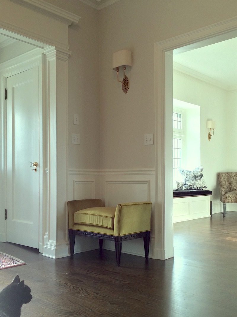
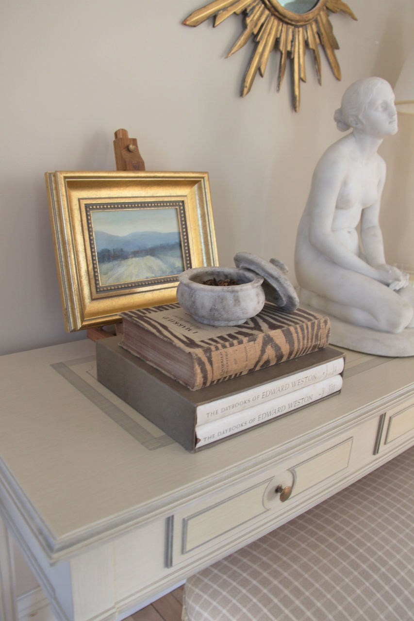
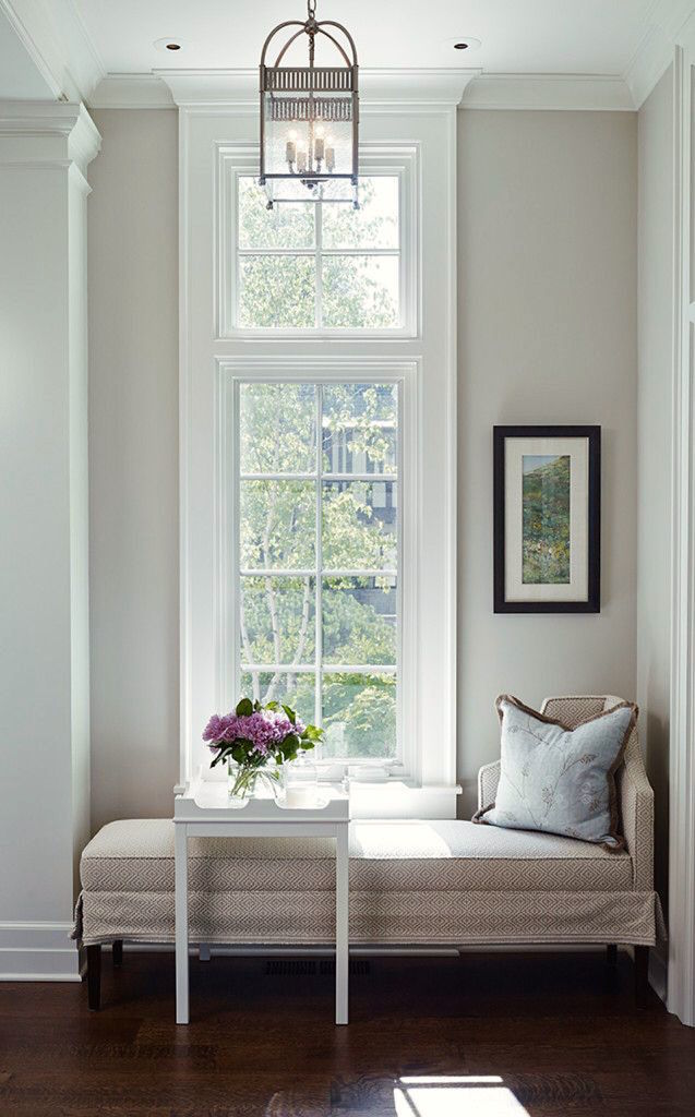
I loved it when we did it in Mary’s low-light entry. Now, that I’ve been living with it for well over two years, here’s what’s going on. It’s an immensely changeable color in my room and I prefer it in darker rooms with dark floors.

Like Mary’s lovely entry above. Yes, Mary, of the gorgeous kitchen.


Jan 14, 12:24 pm - living room - dining area

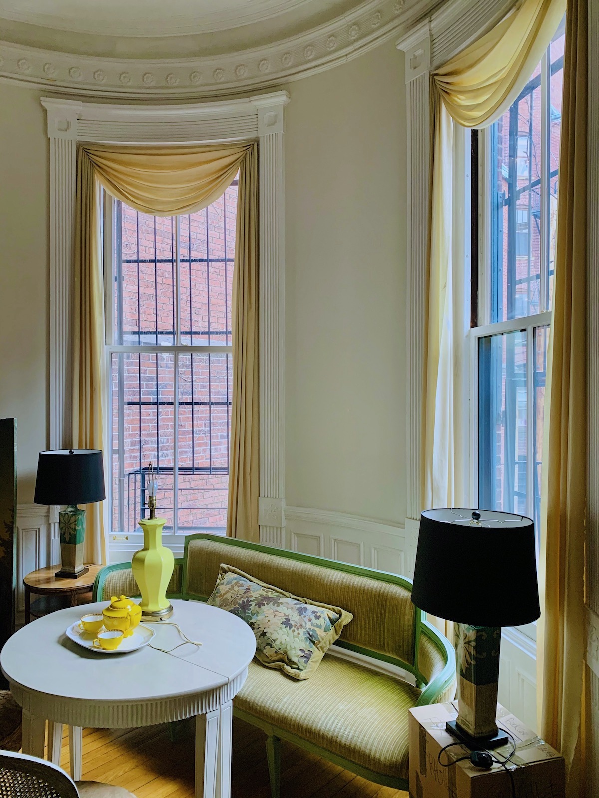
In my apartment, in the living room, there’s only one wall, and it’s on the opposite wall from the window where it looks like Benjamin Moore Classic Gray, consistently. Sometimes, it looks like a dirty cream like you see above.

my Boston living room February 2022


But, sometimes, it looks like a dirty shade of white.


my Boston Living Room - Benjamin Moore Classic Gray walls

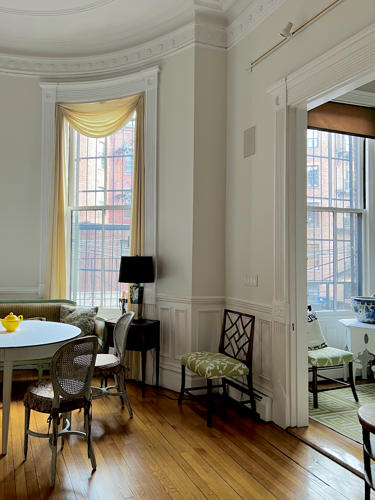
I took the above image this afternoon. It was slightly overcast outside. Sorry about the brown shade in the den. Fortunately, it’s way above eye level.


Okay, let’s move on with more of the best warm gray paint colors.


The colors below are NOT necessarily what the room was painted.
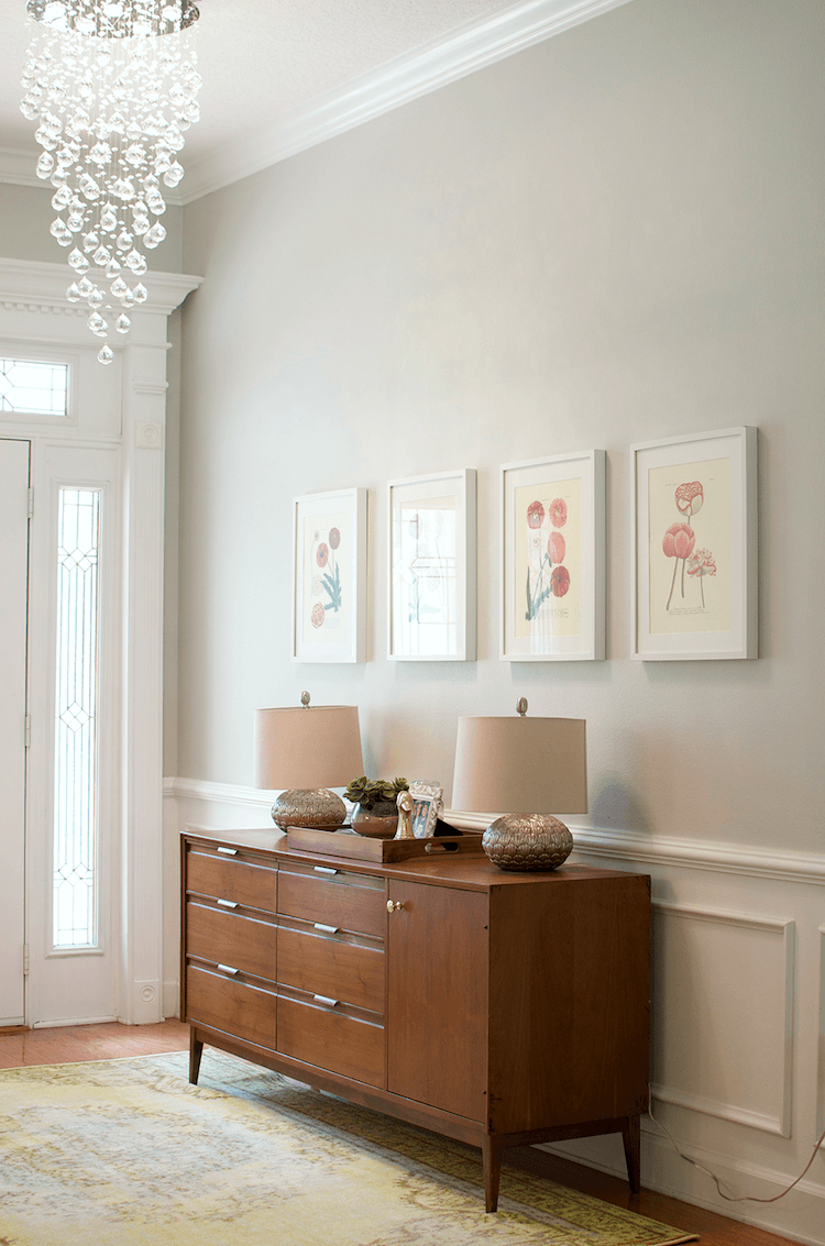
 

benjamin moore warm gray paint colors pale oak in a soft monochromatic bedroom


PALE OAK OC-20


Benjamin Moore Pale oak is a true greige. Again, I’ve never used it, but it’s one of Candace Olsen’s favorite colors. ’nuff said.


emily brown photography_masterbathroom Benjamin Moore warm gray paint colors

Marianne Brown via HGTV Blog

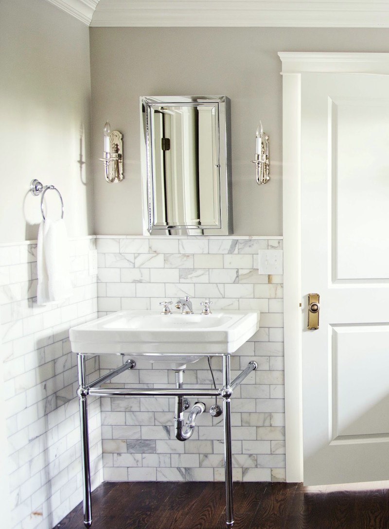
Pale Oak again in a bathroom with a deep red mahogany floor. The marble looks to be calacatta gold or something of that ilk. By the way, for those of you who know how I feel about a lot, not all, but a lot of shows on HGTV, their website is like a completely different company! It’s terrific!


Study_lkaeinteriors Benjamin Moore warm gray paint colors - Revere Pewter - classical fireplance mantel

 The source of this image is unknown.

These two images show one of the most popular warm greige paint colors of the last 15 years or so.


john jacob dining room with Benjamin Moore warm gray paint colors - Revere Pewter

John Jacob


REVERE PEWTER HC-172


This is an exceedingly popular color that changes considerably with the light.


revere-pewter-north-south-faving


Years ago, clients painted two small bedrooms side-by-side and both Benjamin Moore Revere Pewter. The room on the left is south facing, and the room on the right is north facing. I love the color in the north-facing bedroom.

For more about north-facing paint colors, please go here.


via homemaker.com Benjamin Moore warm gray paint colors - Edgecomb Gray


EDGECOMB GRAY HC-173


Alright. I must admit I was a bit on the fence about this color. Sorry, but on the chip, I think it looks like cat puke. However…………………. I researched this one until the cats came home and could not find anyone who had anything but the most glowing love for this color. Anyone? Any experience?


Ben Pentreath pale gray wall color

Ben Pentreath

But good case in point. The chip is only a SUGGESTION. AND… never, but never look at a color horizontally. It’s going up vertically (unless, of course, duh, the ceiling), and you must stick the chip flat against the wall! For more tips on how to get the color right the first time, please look here.


I don’t know what shade of warm gray Ben used, but it resembles Edgecomb Gray.


Samplize Removable Paint Samples


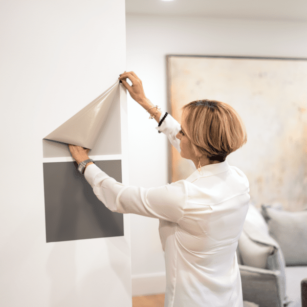
And, I recommend getting the Samplize paint samples made with real paint.


You can reposition them over and over. There’s no mess to clean up or paint all over your walls. (and clothes) It’s a brilliant product developed by an interior designer.


You can purchase your Samplize samples online here.


balboa mist benjamin moore warm gray colors Balboa Mist - paint entry progress-fabulously vintage

Fabulously Vintage


BALBOA MIST 1549


It is a touch deeper than Classic Gray. So, if you need something deeper, this might do the trick. I used it in a large contemporary home several years ago, which was lovely.


via henurst-blog-gray Benjamin Moore warm gray paint colors - Collingwood


COLLINGWOOD 859


Above is an image by Phyllis Higgerson of the Henhurst Blog. I don’t see her blog any longer, however.


Benjamin Moore warm gray paint colors oomph Edgartown Side Table Fabulous Daybed. James Thomas Interior Design

James Thomas

Side table by Oomph


ABALONE 2108-60


I used Benjamin Moore Abalone years ago in a lovely lake home in northern Westchester County. There is a very subtle undertone of violet, but there’s enough brown and gray to keep it from ever looking purple. It’s a very lovely color. I highly recommend it.


CHELSEA GRAY hc-168


handsome mudroom in young family home painted Benjamin Mooreo Chelsea Gray

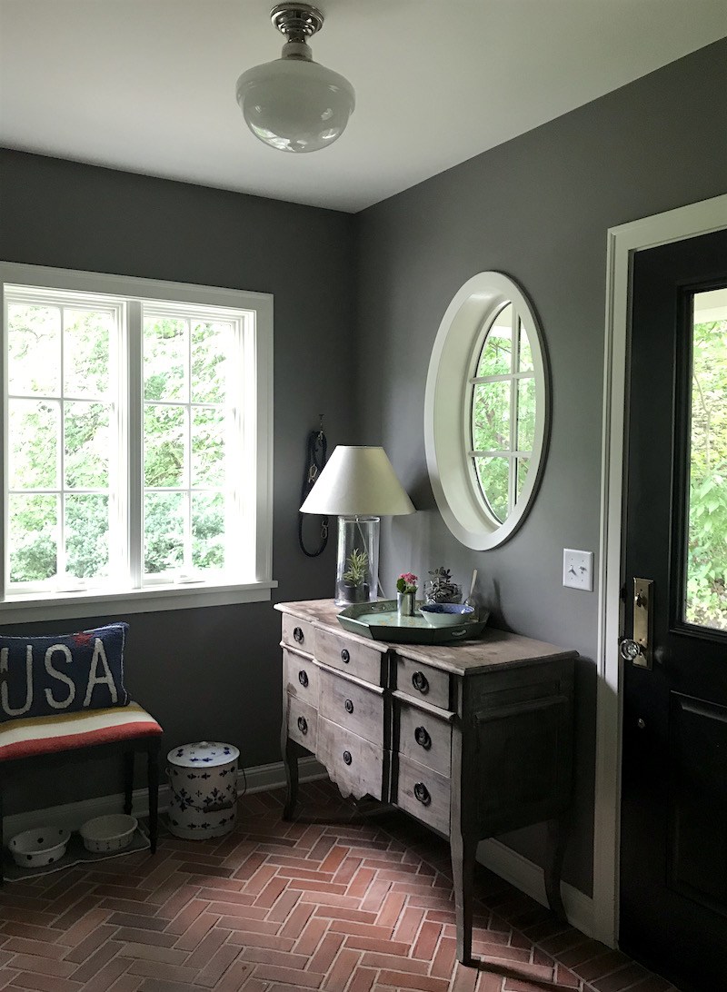
Above is a mudroom by this lovely reader from a few years ago.


Newberry Ave John Jacob warm gray paint - white creamware

John Jacob


GRAY MOUNTAIN – 1462


I was intrigued by this rich, deep, slightly chocolatey gray with purple undertones. I almost repainted my bedroom this color, but I went with Tropical Dusk, which was very nice but more purple.

This is a wonderful color. I’ve seen it twice and loved it both times. It’s a classic, warm deep gray with enough brown in it, yet you wouldn’t call it charcoal or brown.


Now, for the special treat.


Furlow Gatewood vignette warm gray p
Look familiar yet?

Furlow Gatewood magnificent classical entry
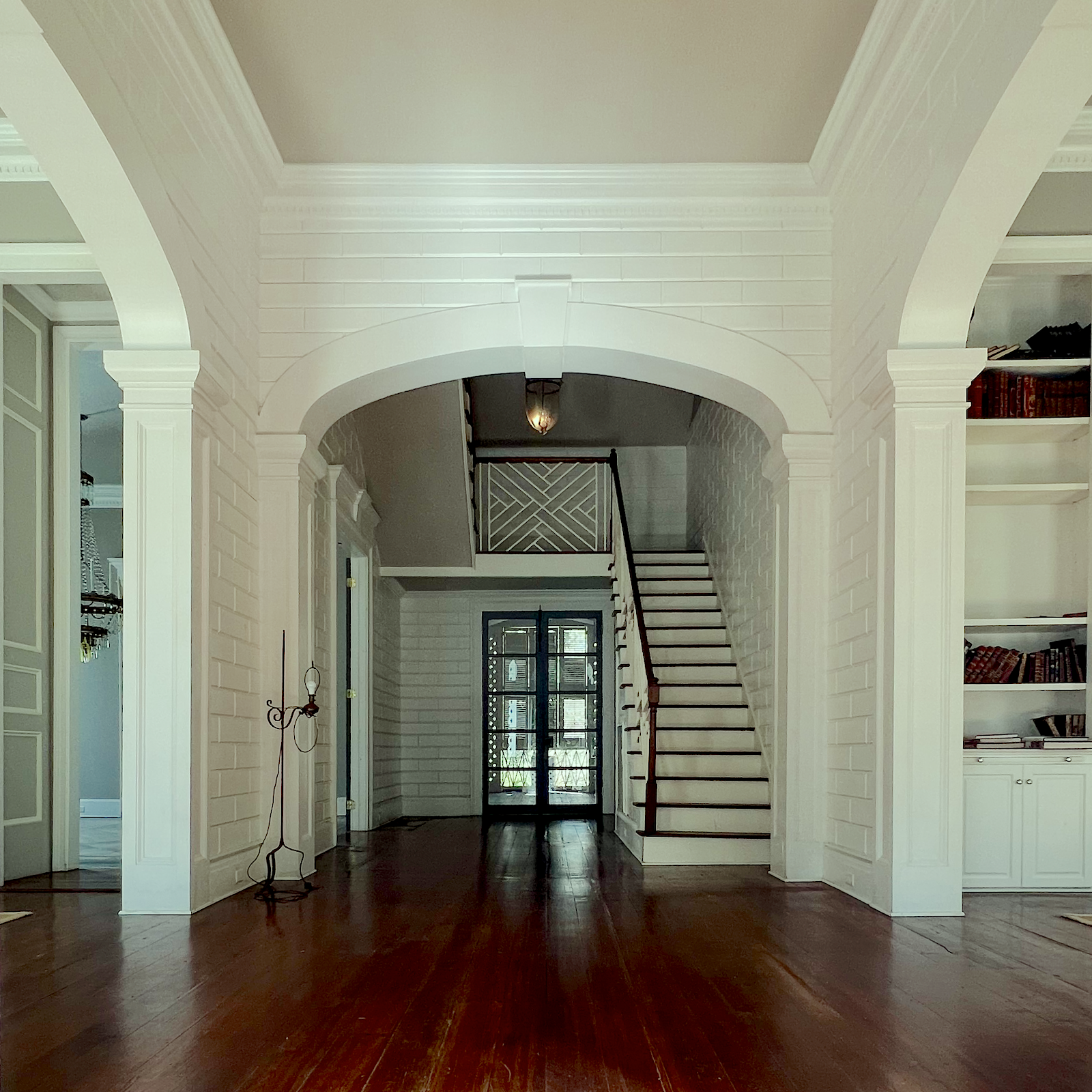
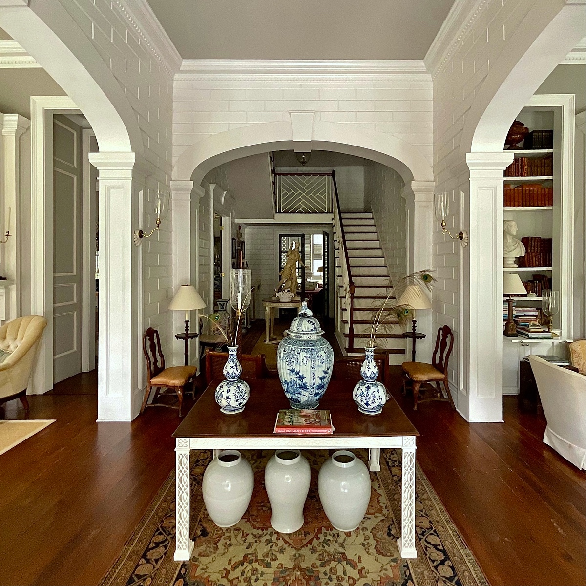
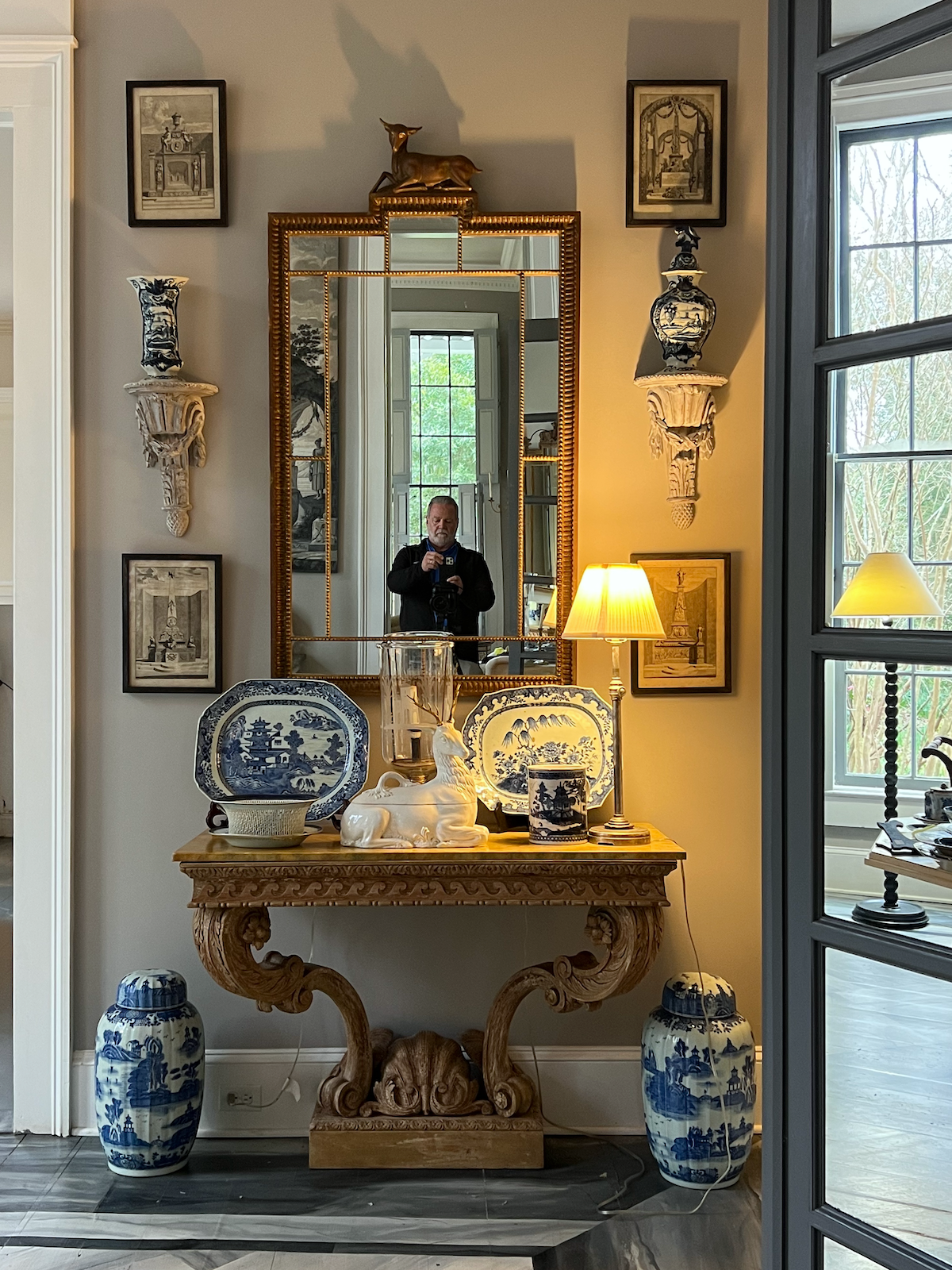
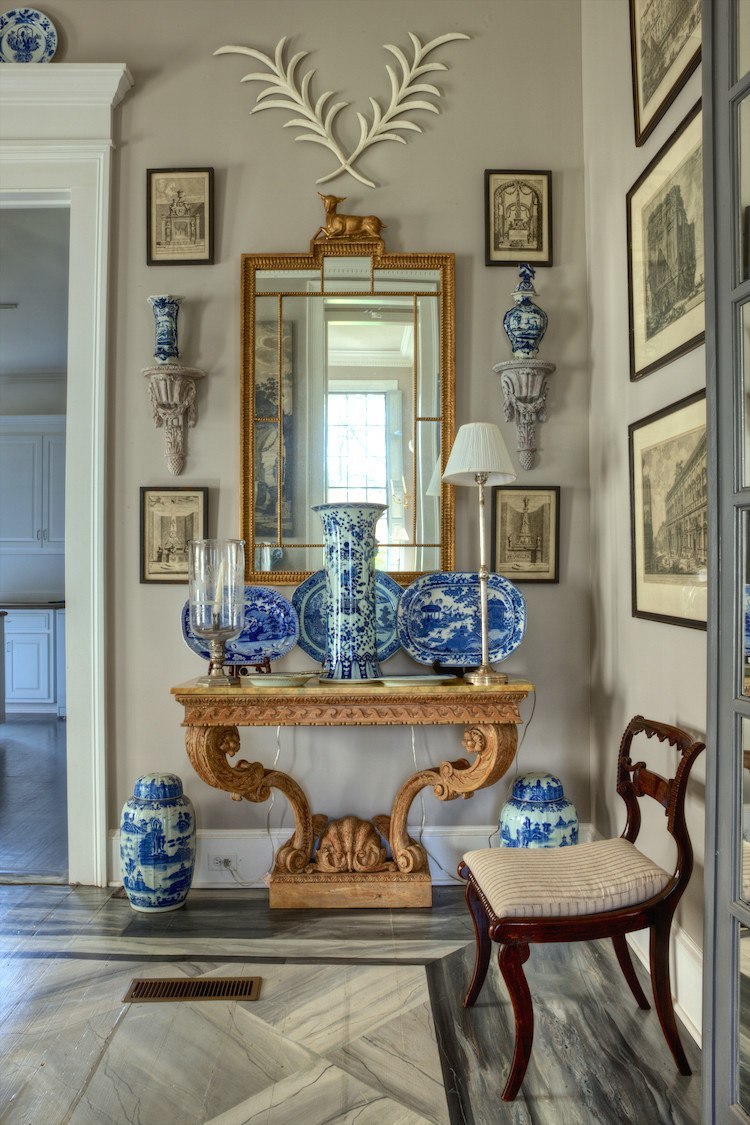
Yes, it’s Furlow Gatewood’s gorgeous home sans furniture.  I know. It’s surreal and sad seeing the empty rooms. However, it also gives us a chance to learn a powerful lesson. The wall color is not the most important element. First is the architecture, and then, the furnishings.

So, if you paint a room and hate it before the furnishings are back in, it might be a fantastic color!


Furlow Gatewood architectural gem

Here it is as it was a few months ago. I noticed for the first time that he painted the ceilings the same as the walls. This actually makes the ceiling seem even higher.


Furlow Gatewood exquisite dining room

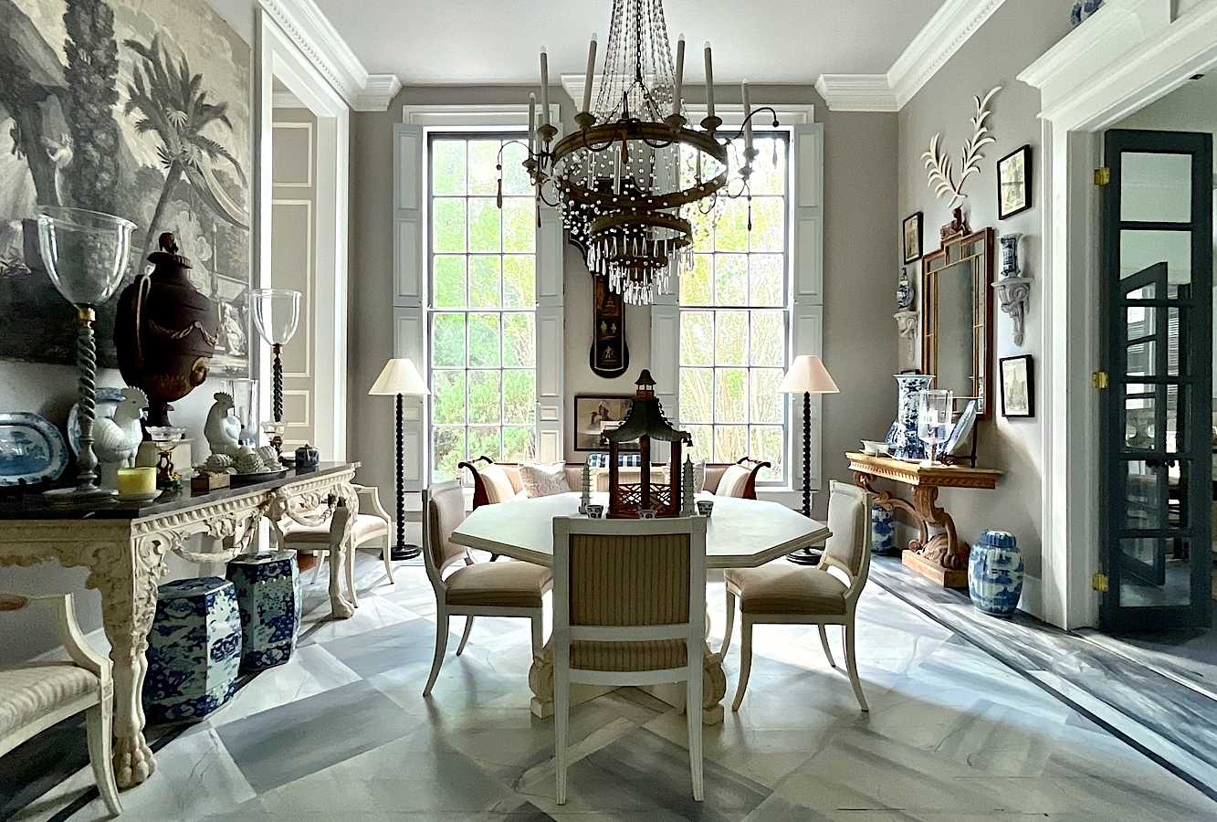
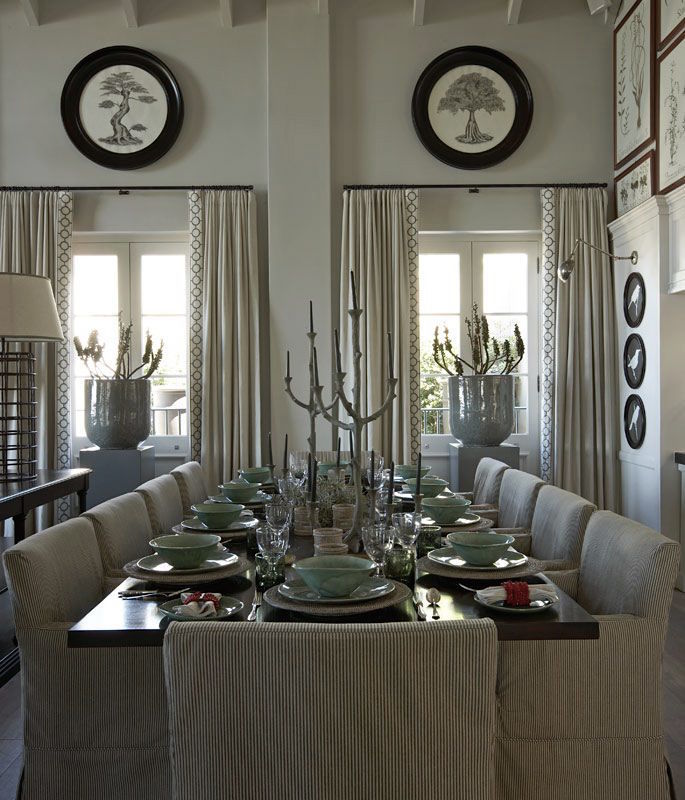
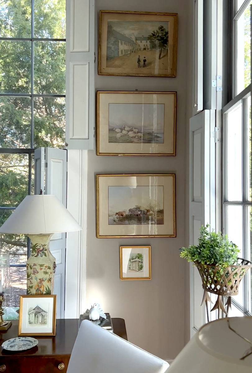
Remember this incredibly lovely dining room?


Furlow Gatewood medium warm gray paint color - Fusion Benjamin Moore - photo-Rodney Collins

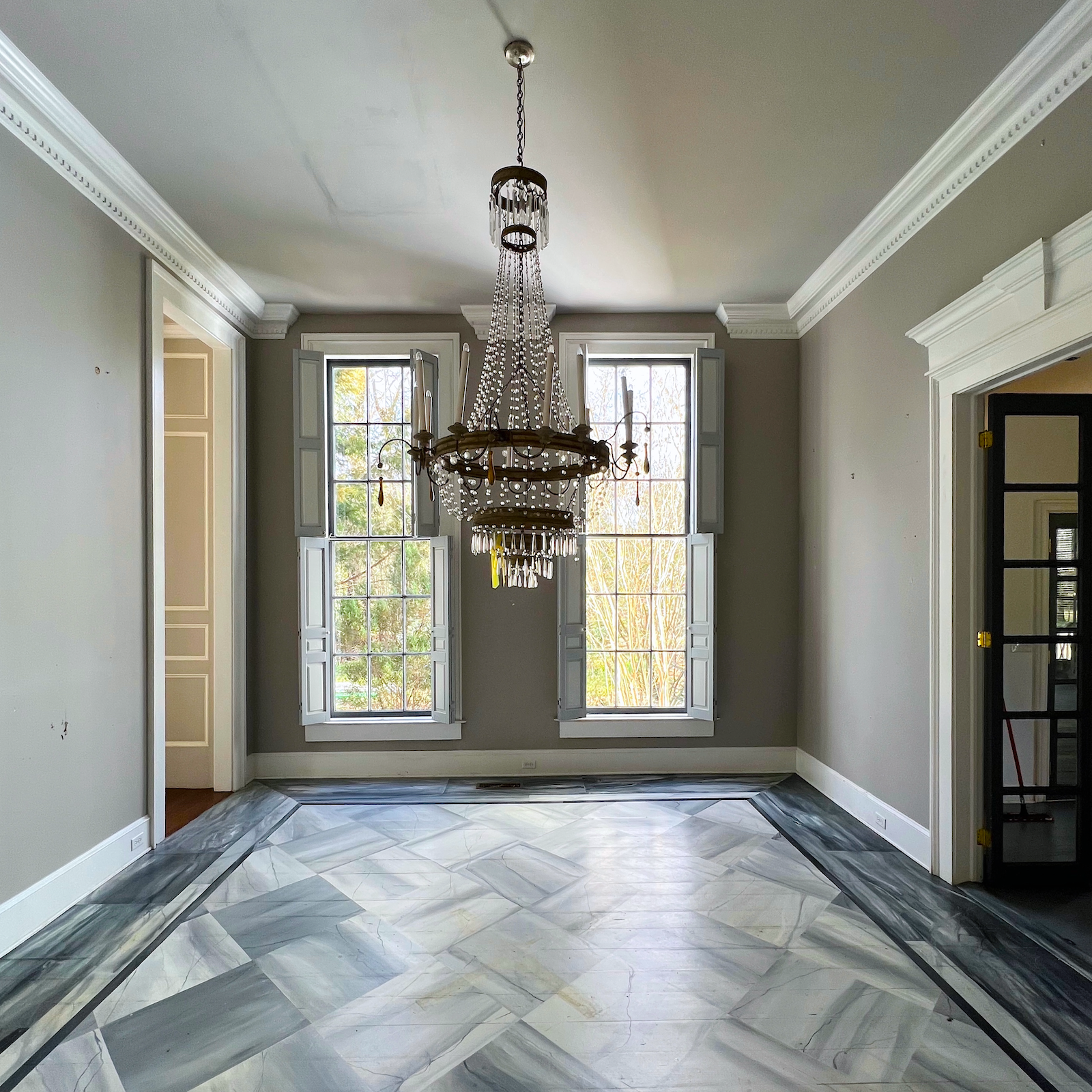
I know. Holy crap is right!  There is so much I find interesting. One, is the loss of scale. These are very high ceilings. I believe they’re at least 14 feet, maybe more.

The other thing is the cold, charcoal-gray floor against the warm, medium-gray walls.


Doesn’t it clash, Laurel?


Yes, it does!

And, that’s what makes it so wonderful in the finished room. THIS was Furlow Gatewood’s incredible genius. Remember when we talked about visual tension in interiors? This is a superb example of it. If you imagine using another warm gray on the floor, it wouldn’t be bad, but it wouldn’t have this space’s interest.

Sorry, I thought I had a color for the floor, but it’ll have to wait until tomorrow because it’s dark now.


Furlow Gatewood parlor - empty Benjamin Moore Fusion paint color
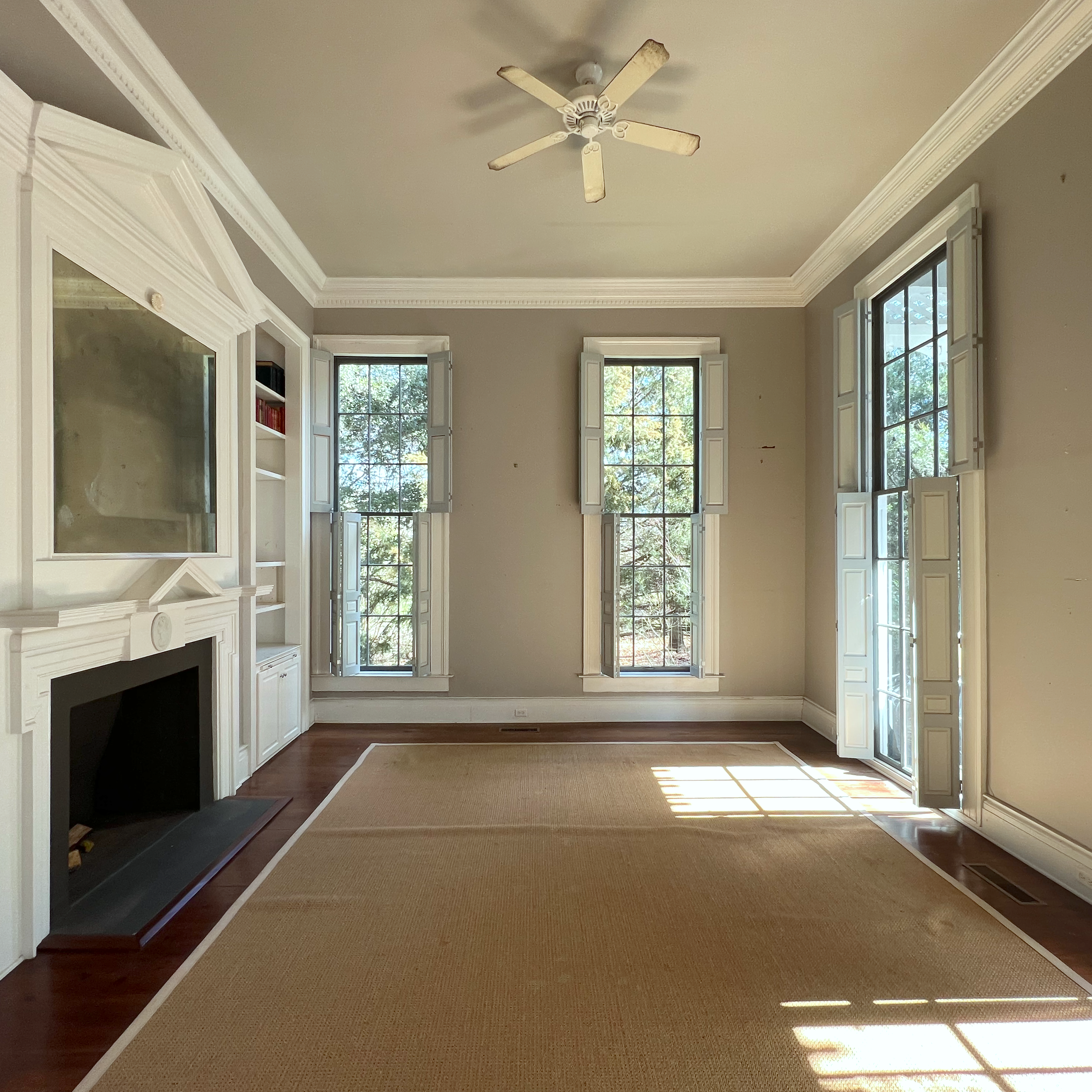
Again the scale is lost in one of the front-facing twin parlors.


Furlow Gatewood neoclassical design living room

Furlow never changed the furniture scale to match the room’s scale. Like I always say. The furniture is for the people, and we don’t change size all that much. (except in December) :]


Furlow Gatewood home walls Benjamin Moore Fusion- Photo-Rodney Collins

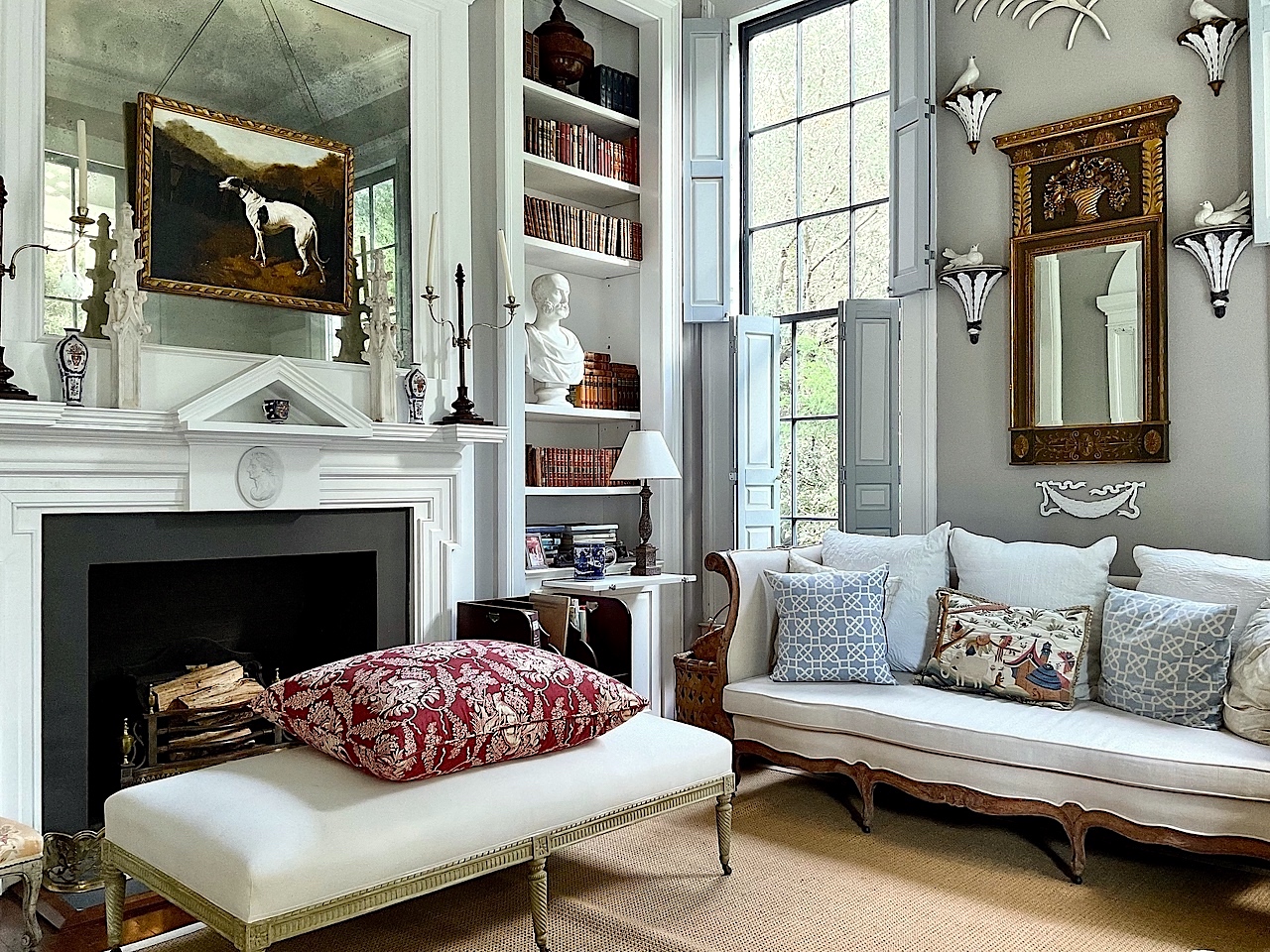
A moody vignette in the dining room. Rod Collins is such a talented photographer.


Furlow Gatewood vignette - photo Rodney Colins

And, here he is, in the reflection. By the way, you can see hundreds of other photos of Furlow’s homes over the years taken by Rod Collins on his Smug-mug. Not only are there photos, but there are videos of the houses and also some with Furlow from a couple of years ago.


I purchased an entire folder of images for only $100.


I wish all photographers offered that. But, they don’t. Some of you may recall that Rod is also the photographer that took the gorgeous images of Iris Court, the exquisite Antebellum property in southern Georgia.


furlow-gatewood-porcelains


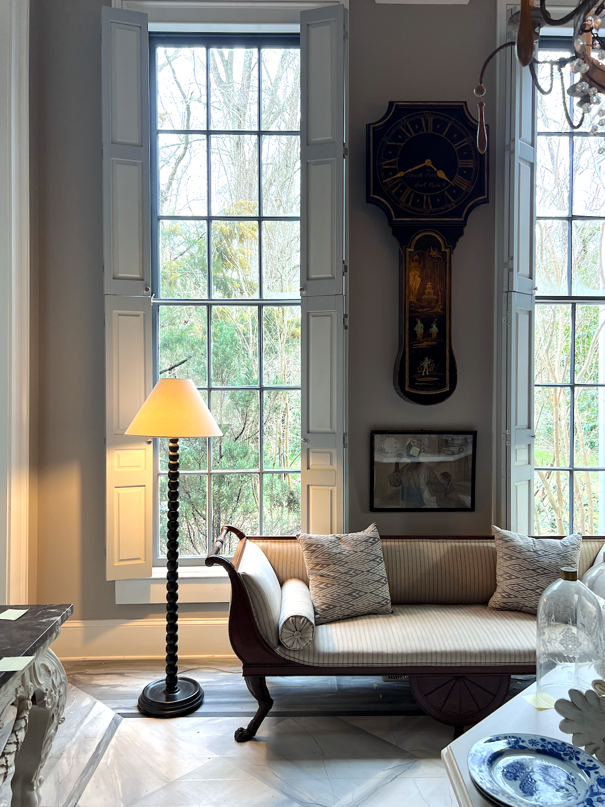
A much earlier image of the same vignette


Laurel, is Furlow’s wall color one of the warm gray paint colors on the list?


Yes, it is, and thanks to fabulous Nancy Keyes, who shared the answer years ago, I can tell you that it’s Benjamin Moore Fusion AF-675 from the Affinity fan deck. If you see a lavender undertone in some images, it’s because there is.  But, if you’re in certain lighting situations where everything looks green, the lavender might not come out.


Benjamin Moore Fusion AF-675
FUSION AF-675


stormy monday Benjamin Moore 2112-50
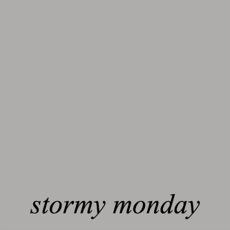
Coincidentally, a color in the Laurel Home Paint Collection called STORMY MONDAY 2112-50 is very close, just a touch lighter.

It’s funny how many times I’ve featured another color and then realized it was the twin of one of the colors I obsessively selected for the Laurel Home Paint and Palette Collection. You can see one such post here with last fall’s newest Farrow & Ball colors.

9 designer warm gray & greige paint colors - Benjamin Moore

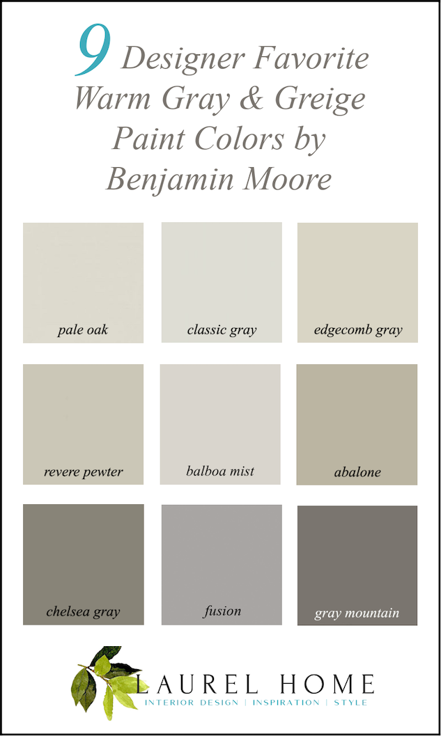
Above is a graphic of the Benjamin Moore Warm Paint Colors for your Pinterest boards


For more helpful wall paint info, please click on the following links.


The perfect white trim color for your warm gray paint color

There are also some terrific gray paint colors in this post asking the question. Can You Use Gray Paint in a North-facing Room?


Please click here if you missed the Benjamin Moore cool gray paint colors.

Do you still hate gray wall colors? I didn’t even get to the dozens of designers who often use gray and do so beautifully.

xo,


PS: Please check out the newly updated HOT SALES! 


***And, also, thank you so much to those who are clicking on this Amazon Link.


All you need to do is click it and forget about it. If you place an order within the next 24 hours, I will make a small commission at no extra charge to you. If you don’t purchase anything, that’s okay too. But, your clicking the link helps support me, (and my face cream addiction) and this website that is expensive to run. Thank you so much!


56 Responses

  1. I prefer to spell it grey like they do in England. Not sure why. That’s my only opinion on gray. Oh, and I tend to prefer cool grays to warm ones, but many of these are quite agreeable. Thats two opinions. I’ll let you know if any more pop up.

  2. I have been obsessed with those white palm fronds for years, and I too have tried to find them and can’t find anything similar anywhere. I didn’t even know what to call them! I did find an article that said he had “the white tole palm fronds made in India.”

  3. I have had an aversion to gray since it started trending because it was everywhere and on EVERYTHING. Hard finishes, especially floors, cabinets, tile, should not be gray. Paint does what it must do: pull a room together. Sometimes a gray really is the best choice.

  4. Love your posts. Look forward to reading and learning.
    This post mentions Stormy Monday in the paint collection which I bought and thought I updated. Am I missing something? It may be a tech error I made.
    Keep ‘em coming!
    Patricia

    1. Hi Patricia,

      There have been no recent updates and there aren’t likely to be, at least not for a while because, if anything, I could’ve whittled it down a little further. It’s not there aren’t other terrific colors. Of course there are. But, this is meant to start as a foundation, and a good reference point. I’m mostly writing this for anyone who’s reading who is curious about the paint collection.

      If you’re looking in your guide and can’t find Stormy Monday, it’s the last color under the greige and taupe category.

  5. I painted my entryway Edgecomb Gray, to match the adjoining wallpapered stairway. I don’t love the wallpaper, but it’s too high for me to remove. I think EG has a slight pink undertone, which is why I used it. I also used it in my main bath reno when I saw the tile in the hallway and realized it would be perfect there as well. It looks totally different in the two spaces but I like both!

  6. Cubby – I was so hoping someone would come back with an idea on the pal fronds. Thank you!!

  7. I adore Furlow Gatewood’s style and I own One Man’s Folly and have read it about a million times. Do you, in your designer wisdom, have any guess as to the dimensions of that front living room of his? We are going to be doing an addition that includes a formal living room and I’m not great at envisioning scale. Thanks!

  8. Great post! Many of my clients cannot do total re-designs of their spaces so I have used Edgecomb Grey and Revere Pewter countless times when they were keeping some older beige furnishings but craving a more updated look. Those colors seemed to bring a freshness to the older furnishings. I’ve also used Collingwood many times. It seems to work when nothing else will do.

  9. I used Balboa Mist in a small east facing bedroom. It plays well with the apple green sofa bed and colorful artwork. For 7 years my foyer and family room were painted Revere Pewter, the color everyone seems to love. Unfortunately, I don’t and I just changed to Alabaster by SW. I love color, but I’m not a fan of gray for rooms you spend a lot of time in.

  10. I made what I now know is a classic color mistake in my bathroom earlier this year. For a long time, I have wanted to use the Ralph Lauren metallics line. The exact same paints are now sold by PPG who manufactured them under the Lauren name. The paint is expensive, the chips ridiculously small and the metallic nature makes the whole thing problematic. My contractor was giving me a ridiculously low price to paint. There was really no way to know how it would look. Well, the chip looked pearly white, but after the three coats we needed, it came out gold. I wanted a shimmery blue on the ceiling but lost my nerve once the gold was on the walls, so just went with silver which now mostly looks grey. The bathroom came out gorgeous, but the colors are just tolerable. There are many, many other things to do, so repainting is not on the schedule.

    My various handicaps make it difficult for me to understand which label goes with which picture on this site much of the time. I thought it was me, but now that others have mentioned it, I do get confused.

    Don’t take it as a criticism, Laurel. It would help if captions were sometimes to the side of a picture. This isn’t that difficult to do, but perhaps, you are unaware of the coding for this trick. I do think there might be a cognitive style difference between how you ‘see’ a page fitting together and how some of perceive it. Maybe this doesn’t make too much sense as I expressed it.

    Anyway, we are all grateful for your expertise and generosity.

    As for grey, well you have taught me to love it for others. Now that I am out from under the Michigan sky and into the clear blue of Northern California (admittedly with a lot of grey days this past winter), grey is a possibility for my walls, but there really isn’t enough space for the colors I love in my life. I want to drink violets, blues and reds. I want to see amethyst everywhere.

    Yes, grey is a color and many beautiful greys have purple undertones. But my soul wants a sharp shock of color (not garish please).

    1. I feel bad that you’re struggling, Ramona. I do try to make things as clear as possible. Most of the time the captions are under the image. This has been my practice for the last 7 years, at least. Often I do say, the image above. It is rare that I’m talking about an image before one sees the image unless it’s a situation of above and below.

      I hope that helps!

  11. I think that Jane Hoke, one of my favorites, might use Edgecomb Gray. I love her work!
    It would be so interesting for you to do a column on the good, the bad, and the ugly regarding HGTV shows. I am disgusted by their waste and ripping out of beautiful architectural features, among other gripes. I would like to see your list.

  12. I must be in the minority, but I love gray! I also love how it looks good with blues, greens, peaches, pinks, yellows… It’s got to be one of very few colors that goes with nearly anything, and that is what makes it so useful.

  13. I’m in the “enough with the gray” camp. There is so much focus on gray in this and other similar columns that I think some people feel pushed into using it because the experts seem to like it so much. While I don’t mind it as an interior paint color, and actually like gray and white for home exteriors, there is too much emphasis on it, as there used to be on using beige (which, while boring, is at least a bit warmer). Yes, gray does exist in nature, but I don’t recall my mother ever saying “kids, you need to go outside and enjoy the overcast weather.” While I now live in sunny (usually) California, where gray interiors might feel like a relief, I wouldn’t want gray interiors in the pacific northwest, where that is the dominant weather pattern. How about some more columns featuring use of pastels (yellow, peach, etc.), which can still register as neutrals, but have a bit more personality?

  14. Your comment section is so much better to read now. I also get confused about which photo goes with which name. Is the name first and the photo below or reversed? Confusing.

  15. As usual, your posts are awesome. A few years ago I bought your essential paint guide and it has been a lifesaver multiple times! Any updated one coming out??? Anyway, I recently used Sherwin Williams Worldly Gray in a new construction home. It’s a soft, light greige. This color does not get the due it deserves. It plays well with blues which is why I chose it. I find the color to be versatile and calming. And all indicators are that gray is OUT and beige is back! And Worldly gray leans toward its soft beige side.

  16. I painted my entire house Edgecomb Gray. I love it! It looks different in every room. Sometimes beige & sometimes gray. The only room I did not like was a powder room with no windows – it looked like hospital walls – and I repainted. As an afterthought I realized I should have changed the lighting in that small room & it might have made a difference.

  17. I was raising my hand waiting to be called on for the color that Furlow Gatewood used in several rooms, but I guess I already told you! He could do no wrong. I recently specified a gray for a friend’s bedroom. I am SO over the Pottery Barn type of gray rooms, but in this case she insisted on keeping her teak furniture. I felt like a dark gray would neutralize the orange tones of the teak. It worked especially with the rug. I believe gray to be classic, as you do, but it is the usage these past several years that has given it a bad rap.

  18. Thanks for this post! Seeing as how you’ve purchased that folder of 100 Furlow Gatewood images, could you do a post (or three) about his work? I learned more from your commentary comparing the empty vs. furnished images than I have from hours of seeing the same furnished images posted over and over on other sites. Five design rules Furlow usually follows? Five that he breaks in a magnificent way? What element define his style? Thanks!

  19. I always liked Martha Stewart’s “Bedford Gray.” I’m in the process of turning one wall of my guest bedroom into a home office. I decided to paint the wall in question. Based on the things that will go on that wall, I chose Sherwin-Williams “Silvermist” which is kind of a greenish-blueish-grayish.

  20. Hi Laurel, Each time I purchase another bottle of Sisley Supremya La Nuit Le Grand Soin Anti-Age (the name needs a few more words) I remind myself that it’s cheaper and way less scary than surgery! Also- even when I’m not that interested in a topic you present, I will always read it and I always learn something. Many many thanks!

  21. Love the blog and agree with Joanne; hard to match the verbiage with the appropriate photos. Logical order for my brain is to state the color (heading) then have text and photos related to the color follow the heading.

  22. I have painted two entire homes in Collingwood. The first was a 50 year old ranch style, and the second a new build with high ceilings. In both, I painted the walls, ceilings and trim all the same, using gloss on the trims. I would probably do a third house in the same color. It is a gray without looking too gray. Happy to see grays have not run their course 🙂

  23. I have both Revere Pewter and Edgecomb gray in my home, in adjoining rooms. Edgecomb is fantastic, constantly changing, warm and welcoming. Revere Pewter is a workhorse; always looks good; a great color for putting old prints, mirrors, whatever, over it.

  24. Great article Laurel! Love Gray Mountain! Warm warm warm. It’s so difficult to see empty Furlow Gatewood rooms. But his spirit is still there in that house! I would love to find those palm fronds, and have looked and looked for something similar with no luck. I know he had them designed and made, they are the perfect touch!

  25. HI Laurel;

    I love this post! I have used many of your recommendations. I also love OC-22 (Calm, Ben Moore) which can look grey or beige-y depending on the light.

    Cheers! Welcome to Boston! Come and visit us in Marblehead!!

    Coleen

  26. Laurel, I used Edgecomb Gray for the first time in my den on painted paneling. The room has only a bit of natural light, and I wanted to brighten it but not be white. I painted the ceiling and trim Simply White. It is a gorgeous combination. The color is not gray at all… more like parchment and I could not be happier. I will recommend it for clients moving forward although I do believe the lighting is vital with this color.

  27. Edgecomb Gray is usually a good color for staging a home. Because it is a true griege it seems to go with both homes that are mostly beige or homes that are mostly gray. It is not too light /not too dark /not too gray so it fades into the background.

  28. I have Edgecomb Gray in my entry. I’m not in love. Th room gets a lot of afternoon light and the walls looks somewhat pink. I’ll repaint – something more mid-tone. I’m the one who didn’t like Revere Pewter because it made the entry (different house) feel like a dungeon. Alas, I continue frozen not being able to choose a living room paint color.

    PS – the site works fine for me.

  29. I painted my west/East joint dining room/living room edgecomb gray and ended up repainting it. For some strange reason it had a strong purple tinge on the walls. (Yes, I used Benjamin Moore brand) I don’t know if the green trees outside reflected and changed the way it looked inside? I lasted about a month before repainting. I ended up going with Benjamin Moore Halo and have loved it.

  30. p.s. This is weird, but many of the photos in this post had disappeared again when I tried to scroll back up. You might want to mention this to the technical Powers that Be. –Jim

    1. Hi Jim,

      Oh dear. Can you try using a different browser, or device, if possible? This is a new theme since last summer, and my developer has spent countless hours making it function optimally. The LCP (Largest Contentful Paint) is operating at dizzyingly fast speeds. Yes, “contentful” is a word. haha

  31. Hello Laurel, None of your photos are coming up (and possibly some of the text), making it a little difficult to reply. The problem with gray is not that it is unattractive, but that it (along will all other colors) can be overdone, resulting in a drab appearance, even if the undertones are warm. UPDATE: After waiting a few minutes, some of your photographs materialized. As I suspected, the rooms you admire are not the gray rooms that are creating the uproar. In your illustrations, regardless of undertone, the gray is applied with taste, and there are contrasting floors, trim, and other decorations. The “cheap” gray rooms that flood the internet all look like someone threw a firecracker into an open can of gray paint.
    .
    Incidentally, while defending the use of gray, including metallics, you stated: “Silver, platinum, pewter, and nickel are all gray.” This naturally follows from the words of the poet Thomas Gray, who famously stated, “All that glitters is not gold.”
    –Jim

  32. I agree with Joanne! Confused as to which image goes with what text. Can you clarify for those of us who are a little direction dense? Love your blog, btw 🙂

  33. I don’t paint my walls in any shade of gray but I truly love the warm grays. They remind me of old plastered walls with patina. Just don’t think you can get the depth with drywall.
    Love the wonderful gray of Greece. They were originally polychromed and I think we would give that a thumbs down. Can you imagine colors on those gorgeous columns????? Perhaps bright blue OR Sienna red and bright blue with a little deep mustard thrown in???
    Thank you for all the very helpful info and pics.
    Enjoy your spring and I’m so happy you moved to Boston. Boston has given you a new life!!!

  34. Gorgeous rooms. May I suggest that it be made more clear whether the photos go with the text above or below? I get confused, especially when there is more than one photo for a color section.
    Thanks for the lovely images.

  35. This was a great post. After reading, I clicked over to the ‘cool greys’ post. Well, now I know I love cool, and loathe warm grey. Good to know the difference! Thanks heaps.

Leave a Reply

Your email address will not be published. Required fields are marked *

This site uses Akismet to reduce spam. Learn how your comment data is processed.

Welcome To Laurel Home!

laurel-aarons-18th-e1456449963926

Hi, I’m Laurel, and Laurel Home is the website and blog for Laurel Bern Interiors.
I’ve been creating new-traditional interiors since 1988. The blog is where I share all.

New Edition, November 2022! Get The Indispensable Guide For 100s of Home Furnishings And Interior Design Sources That Everyone Is Raving About

laurels-rolodex-final-book-cover-master 9th edition 22-23

laurel home archives

Categories:

Please click the image below for more info about my rockin’ Interior Design Guides for 2023!

Laurel Home Interior Design Guides 2023
Amazon ad

please click below to check out my favorite decorating & design books

Laurel Bern's Favorite Interior Design and Decorating Books
Subscribe To The Laurel Home Blog And You Will Receive A FREE Guide Where I Share How To Get Your Paint Colors Right, The First Time.