

Dear Laurel,
I am new to your blog and I truly love it……and your sense of humor (probably cuz that is mine!).
As it happens, I’m a realtor in Carmel, CA and there is so much bad Mediterranean/Tuscan/blech architecture and decor.
I adored the blue and white decor in the Mark Sikes post.
But here’s where I’m struggling.
It’s my home. We purchased it a couple of years ago when I was pregnant with twins and while the location is everything I have ever dreamed about. The home itself is the aforementioned dark, dreary, beige and brown drek.
The home is a 1970s split level. I want to make it fresh and current. I do like blue, but I also am afraid of it looking cold and that’s not me either.
BTW, this is not a solicitation for free advice.
Do people really do that to you?
Thanks if you feel like writing about this. That would be great.
Carmela Callie
*********
Yes, Carmela,
People do write me all the time asking and expecting me to help them– for free! It’s very difficult to work long distance, especially for free. ;] And no matter, I can’t help someone from a brief description 99.9% of the time.
Before I go on, part of this story is true. I did, just a few hours ago receive a lovely email from a new subscriber from Carmel, CA.
Okay, her name is not really Carmela Callie.
But, what’s funny is that she did want me to write about what I’m writing about.
How to Take a Dark, Dreary beige and brown Mediterranean and/or Tuscan and make it look ala Mark Sikes place with lots of blue and white decor.
Well, we’ve been through this.
But, I have to make a confession.
I am foaming-at-the-mouth batshit crazy a little obsessed with blue and white decor.
However, it’s not just blue and white.
It’s many shades of blue and many whites, and still some beiges, neutrals, black and gold. And lots and lots of white and texture.
Oh, wait. I just have to interrupt myself.
Coincidentally, I received another nice note this morning. Remember the post on Wednesday with the round dining tables? And the old Baker table I talked about that I had done two times before?
Here’s what happened. A designer read that post and nearly fell over. She had also sold that table about 16 years ago to a client. And then she went to get one for herself a few years later, only to find out that they no longer made it.
That is one of the most hated words in the English language. (well, for me, it is.)
DISCONTINUED.
How dare they!!!
Well, you know what’s coming next. Yes! She bought the table! If I still hadn’t had night-time crud in my eyes, I would’ve started crying. But I’m seriously happy for her.
Now, here’s the other thing you need to know. She got the table for HALF of the marked price! This is on Chairish.
But, here’s what’s really cool, so please listen up.
I don’t know if that works all the time, but when they say “make an offer,” apparently, they mean it. So, absolutely, if you feel that the price is a little high, then offer what you think it’s worth or that you can afford.
It’s all done online, though. You can write the vendor a note but you cannot give them your email address and they can only contact you via the site. It’s that way on Etsy too. Obviously, the companies want the business to stay on the site. And that’s perfectly understandable.
Okay. Let’s move on.
It seems that blue is in just about every interior being done today. It might be an accent or it might be the primary color. Blue is hot. But don’t worry. I do not think that blue is the new gray. lol
But here’s what I’d like you to understand about working with blue and white decor in your home.
Each room should not have the same concentration of blue and white.
In fact, some rooms don’t need to have a lot of blue in them at all.
But, some rooms could be heavily blue, or even just one room.
And, some could be mostly white.
So, what I would recommend is that the over-all color scheme of the home is actually neutral with lots of white and then blue, but as more of an accent in many spaces.
And as always, accents of black and then some gold as in metallic gold and/or brass.
Glass is nice too.
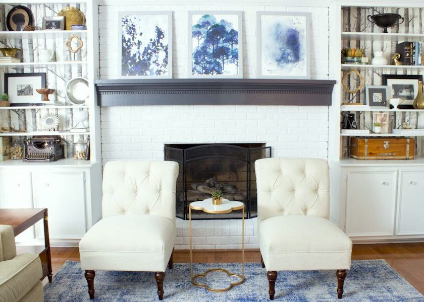
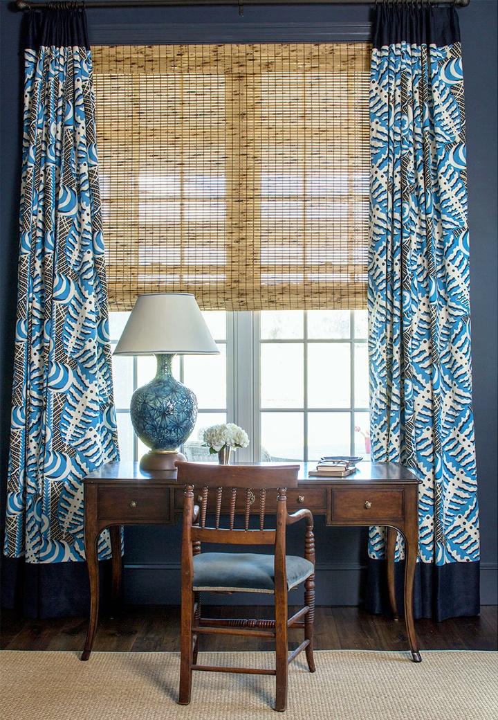
This is a lovely – young-eclectic-traditional home. (I CANNOT say transitional. not my word) There is lots of inspiration for the look that I think would translate well for Carmela on Erin’s site. Love those slipper chairs!
The lovely prints here, here, and here are from Minted which is one of my favorite sources for fresh, lovely framed art prints and more. Geezzz, there are so many great websites!
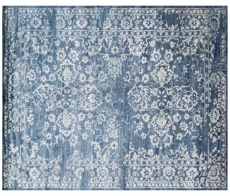 Miramar Rug from McGee and Co.
This isn’t the same rug, but it’s really pretty, I think. McGee and Co has lots of gorgeous rugs and other wonderful home furnishings.
In fact, their entire site is on target for this updated blue and white and IMO classic look.
And by updating, that means paint.
And lots and lots of it.
Yes, paint it all.
Hey, maybe even paint the stone.
And while you’re at it, you might paint the floor too.
Or not.
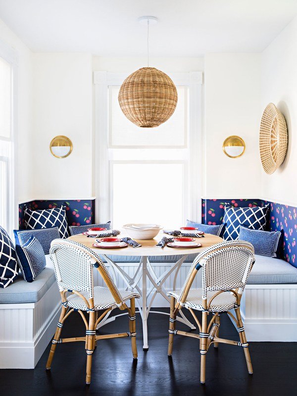
The floor might be stained a dark, rich ebony, like in this charming eating nook from Serena and Lily.
The only thing is… dang it. But the dark floors seem to show every spec of dust. Does anyone know a way to do a dark floor so that doesn’t happen as much?
But Serena and Lily are possibly even more obsessed with blue and white than I am.
But since I’ve had a love affair with S & L for nearly a decade, I guess it makes sense.
Seriously, I could’ve stopped right here with the blue and white decor,
but this is me.
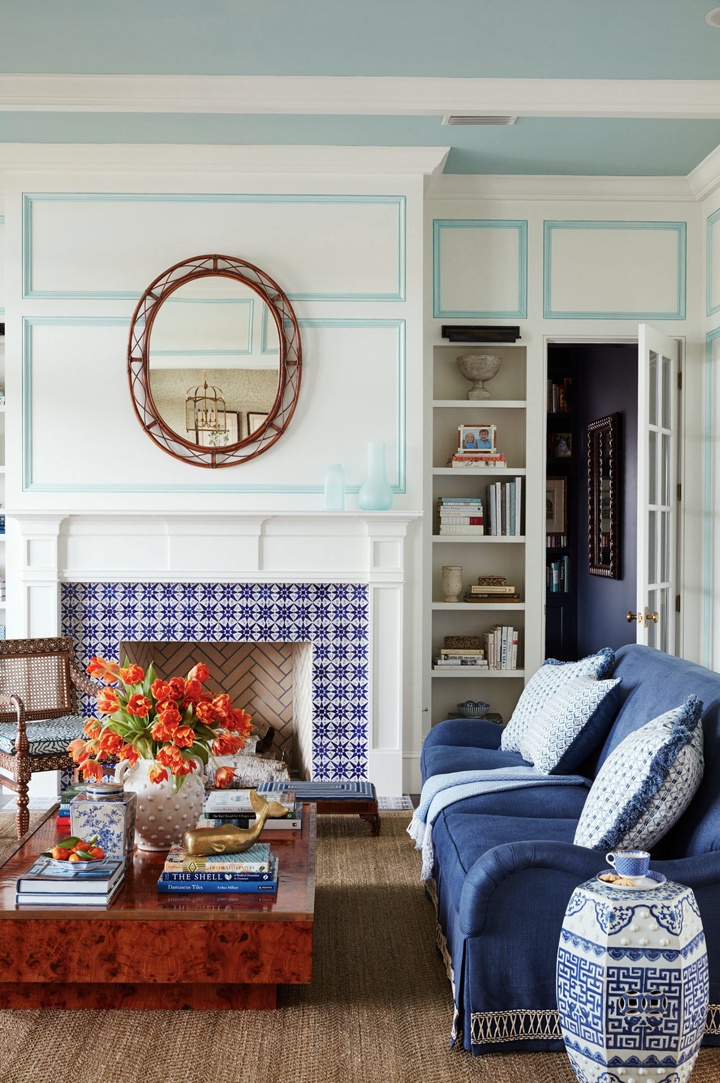
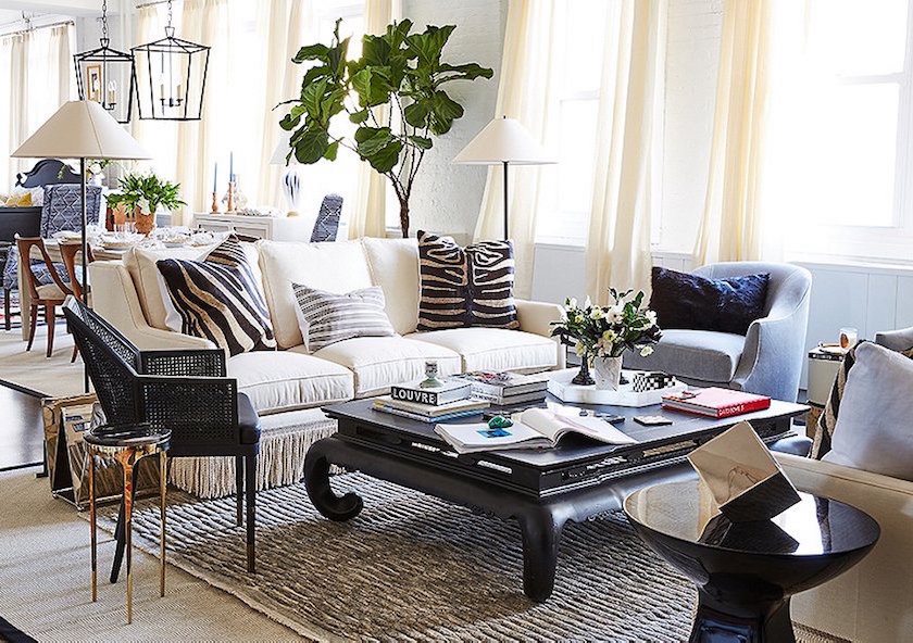
What happens when two giants of interior design and architecture, Phoebe and Jim Howard (and masters of blue and white) get together and procreate?
Well, they create one of the most talented young designers on the scene today.
Andrew Howard. That’s his room above.
quite smashing, I think.
I love how he’s mixed in an unexpected aqua-turquoise into the mix.
I know, I know.
WHAT’S THAT COLOR, LAUREL!!!
How the hell should I know?
I mean… Sorry, I have no idea.
Okay. Fine. I have an idea. It might be Benjamin Moore Dolphin’s Cove which yeah… is part of the Laurel Home Essential Paint Color Collection that comes with the palette collection too–and much more!
BTW, a number of you have paint color questions.
I fully appreciate your need for help. That’s why I wrote the color guides and Laurel’s Rolodex.
These guides are the only way for me to help out with your decorating issues, short of you having to pay for me to fly out to wherever you are and put me up in a 5-star hotel with a hefty per diem.
Okay?
I knew that you’d understand. ;]
Back To Andrew’s beautiful decorating.
The room beyond the living room is this way handsome library/office/den/whatever.
I love the drapery treatment with the banding top and bottom.
I know how that happened too.
The intern didn’t allow for the repeat of the fabric and so, six weeks later when the workroom went to sew them up, WE get the call.
Laurel, you didn’t send enough fabric. We need six more yards.
SIX MORE YARDS!!!???
BLIMEY! Where’s that Christopher? What? he’s back in Scotland? Well, isn’t that just peachy? Gina, get Lee Jofa on the horn to overnight 6 more yards of that stuff STAT to the workroom.
WHAT DO YOU MEAN THAT THERE’S NO MORE STOCK? WHEN’S IT COMING IN?
WHAT???
IT’S DISCONTINUED???!!!
WELL, ISN’T THAT BLOODYTASTIC!!!
YES, I’M SCREAMING!!! THIS IS DISASTER!!!
I know that you designers are collapsing with shadenfreudic glee, because this has happened to all of us.
Yeah, too many times.
But oh man. I’ve got it.
“Gina, get Norbar on the phone, and please order 6 yards of Navy cotton to go with the Lee Jofa. And, when you have a sec, call Carmela and tell her that we’re doing a little something extra for the drapes that she’s gonna love. No extra charge. (hehe) And then get me a glass of chilled rose. Thanks, hun.”
Okay, I just made all of that up. Not the premise, but the rest. I am sure that Andrew INTENDED to put the border on the drapes. I do love it!
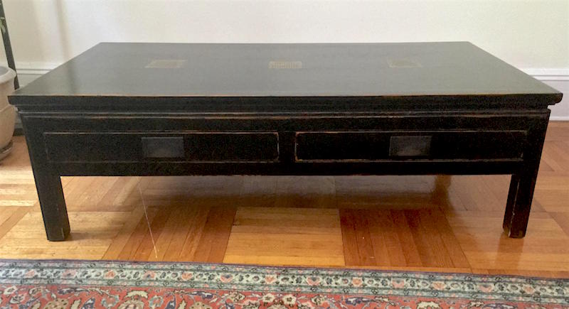
Here’s a very nice black slightly rustic ming-style table for 400 bucks. It’s more casual, but still quite cool. It would be great for a family room or a laid-back living room.
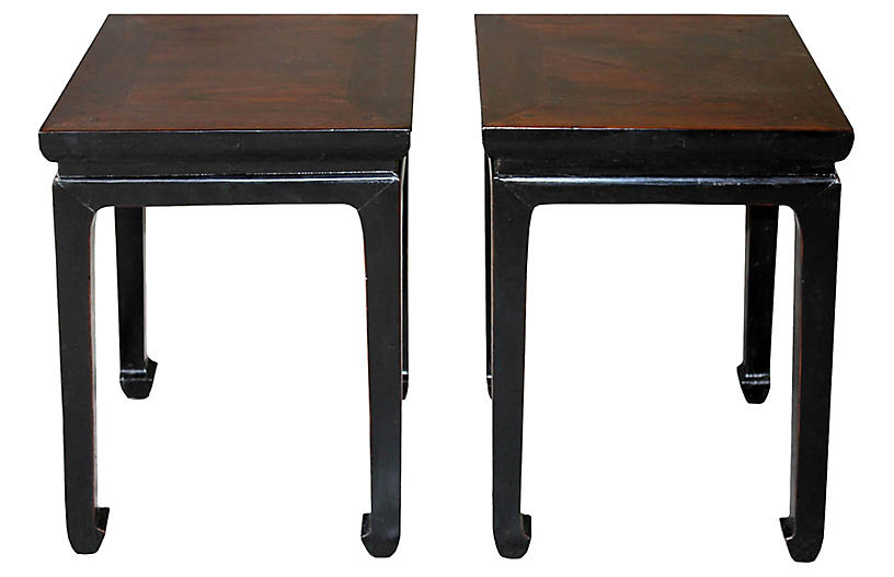
In addition, I also found these little ming end tables. (not to be used with the ming coffee table, though. Too much)
They are only 20″ tall, so a little low for a side table – unless it’s going next to a slipper chair. Then perfect. OR, they could go with an English roll arm and then do a nice tall skinny lamp.
OR, they could be used side-by-side as tea tables in lieu of a coffee table. That’s a great look and wonderful if space is a little tight.
Did you see the sale that McGrath II is having at Chairish?
(And yes, that’s their gorgeous room above.)
Their “collection” of mistakes stuff, they are trying to get rid of sell.
Wow. I’m in some mood tonight.
I’m really only about 3% serious. There are lots of reasons that we end up with stuff we can’t use. It doesn’t mean that there’s anything wrong with it. Sometimes things get ordered and then something changes and it can’t be used. Or the intern orders the wrong color-way. That sort of thing.

Or the client decides to hang her children’s portraits where these fabulous prints were supposed to go. Fine. It’s her home. I’ll take the prints! I am sure that I’ve done that too, but blocked it out! (used stuff that the client didn’t want.)

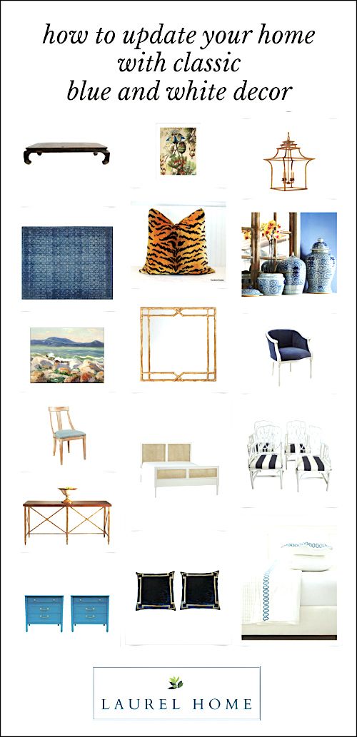
And now some beautiful blue and white decor and home furnishings.
please click on the individual images for more info.

Oh, before I forget. Please check out this week’s HOT SALES page. Lots of terrific sales going on mid-summer.
xo,

Related Posts
 Thanks for the Design Inspiration – Here’s More!
 Stunning Architectural Features That Make a Big Difference!
 My Paint Guide Got a Makeover Without My Knowledge or Consent!
 The Secret For A Cheap, Chic Kitchen Refresh
 The Ultimate Guide For A Small Patio Garden
 A Dated Southwestern Farmhouse And How To Fix It
 Where Are The Non-Sucky Bi-Fold Doors?


34 Responses
Hi Laurel,
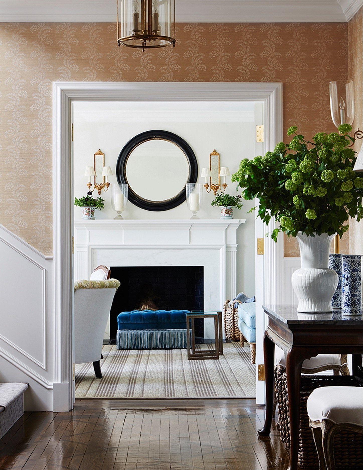
I don’t know how you do it everyday but I am so grateful and read all of your posts!! I do have your rolodex and paint guide as well. I do have a favor to ask? I was wondering if you knew how to find out the name of the tan grass cloth wallpaper going up the staircase of the first McGrath 11 pic on this post? It looks like it has dotted white leaves in vertical rows? The one looking into the living room with the white mantel and blue ottoman in front of it. Any advice on how to do it or if you know the name or designer would be so very helpful!! Thank you!!!!!!!!!!!!!!
I’m sorry I don’t know who makes that wallpaper and I used all of my methods to try and figure it out.
Love your blog and this post. Just sharing that Phoebe is actually Andrew’s stepmom but still obviously a huge influence!
Oops! Thank you for clarifying that PB. And definitely nurture often has something to do with it and sometimes not!
Just YES to this blue and white blog. I was wondering if these items fall mostly under the Super White palette as opposed to the Ivory White? We are renovating an NJ beach house and I was looking to follow Super White from your collection (what a great Laurel purchase!!) until I saw the Ivory White Palette that incorporated the beachy blues, greens, and tans. In the Paint Color Collection-my other bible- it says Ivory White is not so hot with most blues-Huh? The ones in the Palette look good. I’m confused. Which Palette to use with those beautiful blues…
Hi Julie,
I can’t say for sure because I don’t know the light in your home or the shade of blue either. My rec is to hire a professional if you are struggling.
Laurel, you featured so many beautiful finds. You have opened my eyes to buying used furniture. Thank you! I guess I always thought , I already *have* used furniture! It’s fun when a reader reports they have purchased one of your finds, too!
Enjoy your vacation!
Hi Libby,
Well, I think it’s a win-win. It’s like buying an old house. They don’t make ’em like that anymore. And you can get some great deals on classic pieces!
It’s like cars. They say “preowned” not “used.” lol
Hi Laurel!
I just wanted to let you know that I am a newbie to your wonderful blog. I absolutely love it, it is the best!!
I am also in love with white, a color which I had not paid much attention to (always liked, though), but now, thanks to you, you have introduced me and have educated me to this color (that is really a million colors, isn’t it?)in ways that have been nothing short of delightful.
I am 62, a teacher, and in about 5 or 6 years, when I retire, I plan to build me a little tiny house, and I think I shall paint it all in white, haha!!! (Except outside – I’m partial to dark siding and light trim)
I am not bothered by white everywhere, as I think it just makes everything look so classy, classic and serene. Love it!!!
My fave whites so far are BM Chantilly Lace and your beautiful Cotton Balls…even though CL pushes me more because it is such a deep clear white, and I can’t see any underlying color in it. Cotton Balls has a touch of cream in it, to my VERY untrained eye. Still beautiful, though!!
Just wanted to let you know how much I enjoy reading pretty much everything you write.
Have a wonderful summer!!!!
Elena
Thanks so much for your wonderful comment Elena! Much appreciated!
Hi Laurel – Regarding your note about dark floors and dust, in my experience it’s actually not the color as much as the sheen of the finish. In several recent projects, I’ve used Rubio Monocoat, a newer, revolutionary product with zero VOCs (doesn’t smell at all when it is applied) that is an oil – so it stains the floor and doesn’t sit on top. I’ve done a matte finish and dust and hair do not show. I recommend it all the time.
Thanks so much for that info Elizabeth! I knew that somebody would come through with an answer. Or at least was hoping for that!
I LOVE blue!! Especially light blue & white. Back in the 80’s, I fell in love with the country look and I painted 4 apartments light blue. Then the country look was out but I painted 4 more apartments light blue and had a contemporary style. It was really hard to find things to match in the stores. But I haven’t had blue in about 10 years. I have been dying to go with light blue walls again but now with navy accents & sofa. So YEA!! for all your posts on blue.
Glad that you’re enjoying MH!
Hi Laurel! More thank you vibes coming your way! My husband and I just bought our first home and I’ve been struggling to decide on furnishings to the extent that I was worried we were going to be sitting on the floor for the first 6 weeks or more once we moved in. Between your paint guide, rolodex, and blog, particularly the one about dining chairs you’ve (virtually) helped immensely! When I saw the neo-cassical style dining table by Henredon I knew it was EXACTLY what I’ve been looking for, and for $200?! INSANE! I can’t wait for it to be delivered, I know it will be perfect!
Hi Ashley,
Oh wow! Thank you for such a sweet note and that is so cool that you got that table. The lines are perfect and even if needs to be refinished, how can you go wrong?
I’m really hoping for your sake that your going on vacation because your kitchen is being “handled”. Also, thank you so much for always including so much chinoiserie so that it was drilled into my head that it always looks good. My husband won’t let me get rid of the horrible couch (I’d personally rather be couch less) and he won’t let me even paint the wood paneling around the beautiful fire place also it’s a play room untill my husband builds shelves in the actual play room. However I was at an estate sale the other day and found a small chinoiserie vase that I put lavender in and it somehow made my whole living room so much better! I am so glad I listened to you!
Hi Rachel,
Well… the kitchen. Nothing is happening with that. In the scheme of things that MUST be done, it’s way down on the list and other things need to happen first, so we’ll see. I may just have to get some new appliances on my own. I also seem to be having some plumbing issues as I smelled mold under the sink. So, I took everything out and doused it with bleach. And then there was the ginormmous waterbug. You would think it was a python or something, but they are truly disgusting. I need to get the super in here!
Sorry about the husband. But just know it’s more the rule than the exception, in my experience. Hang tough and great on the vase and lavender. Sometimes it’s the little things that make the biggest difference.
I love blues and whites. Both colors are all over my home. There is a less expensive version of those blue botanical prints. I actually plan on putting these in my hall bathroom when I get to that room remodel.
Hi Laurie,
I wasn’t able to look at the prints up close because that website wasn’t loading. But wordpress, let me see a preview. These are similar but may not be the same quality of print. I’m not saying that they’ll look bad, but there are several differences in size, in the background and frame. But thanks for bringing it to my attention.
So lovely, and I do think the blue and white interiors are beautiful. I’ve ended up with a lot of blue and white because it’s so easy to find right now…but I’m afraid it isn’t me. Not in the deep, soul satisfying way green is for me, and I’m myself more nervous every time I buy something else blue! Oh, how I wish the stores were full of green right now!! And more than one shade, not just the “it’s summer so here’s your lime” kinda green. 😀
Hi Cathlin,
While green isn’t as prevalent, it’s also timeless. Grass is green, the sky is blue sort of thing. Stick with your loves and you’ll never go wrong!
Laurel,
You tell my story! I spent a fortune(another mistake) on custom duvet covers. The (experienced) designer didn’t measure right..so they arrived with the solid navy panel at the top…The only GOOD news is that the fabric is Blue and White….my life long fav color combo..These twin bed duvets will go into my guest room in MAUREEN’S CONDO RENOVATION that I will move into in late fall. I will paint the vintage dark brown beds(bought at auction years ago)
the green as seen in Sarah Bartholomew’s pic!
PLEASE DO A STORY ON INTERIOR DOOR KNOBS.
best to you….
maureen
Hi Maureen,
Oh dear. Wait. The designer goofed and you have to live with something you weren’t expecting and don’t like? Did I read that correctly? NO, NO, NO! It’s her booboo and she has to eat it for lunch and dinner for the next 3 months!
Door knobs. Maybe tied in with other decorative hardware and finishes. Great idea!
Another drool worthy post that will sate our design hunger until Wednesday:-)I have some blue in every room in my house, even if it’s nothing more than some blue and white china. I just love it..
Have a wonderful mini vacation!
P.S. I recently saw THE most gorgeous Stately Homes BAKER table on eBay, up for bids at $300, plus there was a MAKE an OFFER!! That exact same table was on eBay, by another seller for $5000. You have no idea how much will power it took for me not to say one word to my daughter that this ’could- have- been-the- perfect- table for your dining room..Sigh..
https://www.ebay.com/itm/Baker-Furniture-Dining-Table-Collectors-Edition-pedestal-table-w-3-leaves-/192191838878?hash=item2cbf86ba9e:g:HmsAAOSwfpVZHyjW
Hi Dolores,
Get the H out! 300 bucks! It’s like, just please come and take it away! That’s crazy good!
Hi Laurel, have a lovely vacation.
Thanks so much Betty!
Laurel! You are psychic!! First of all, thanks for the picture of the blue and white breakfast nook. Last week I found out we probably will have space for an eating nook in our new house. But it’s hard to find one that doesn’t look too ‘rustic’.
Here in Norway we have a site called Finn, which is like Craigs List. Somebody actually gave away (!) a table much like the one in the Suzanne Kasler picture, plus a gigantic dresser/cupboard to go with it. And six chairs. All fantastic quality, but a bit too matchy-matchy for our farmhouse. (And yes, thank you for your recent post on that, too!)
Also on Finn there are chairs like the ones in the Suzanne Kasler picture, for about fifty bucks each (!). I don’t like the colour, however, and was wondering how it would look if they were painted. Well – today I got my answer. Thanks! Will start surfing NOW to see if they are still available.
Have a great Sunday – and a well-deserved holiday!
Thanks so much Michele. Yes, painting is a viable option. I’d look into chalk paint because it’s so much easier to work with for furniture. Do you guys have Annie Sloan or something similar?
Just looked into the Annie Sloan paint – there actually is somebody selling it in a tiny place just 15 minutes from here! Thanks for the tip!!
I actually was wondering what to use to put some black accents on a very bright gold mirror (think you used the Rub ‘n Buff, but that we don’t have over here). Seems like Annie Sloan has some products that could do the job.
One question, however: if you paint dining chairs, doesn’t it have to be high gloss paint? Because of all the sticky fingers/handling? Am worried that a wax would not hold up in this household…
Hi Michele,
Well, there are forums and a ton of info on the interwebs about Annie Sloan. I’ve never used it, but folks swear by it for it’s ease of use and durability. But perhaps do a search or call the company. That is always a great way to learn how to deal with a product and to know if it’s right for you. That’s what us designers do.
That Suzanne Kasler chandelier toward the end was everything. How gorgeous?!
indeed!