

Thanks so much for all of your great comments and suggestions for Sunday’s post about dark house colors.
So, today, I was cleaning out my email and found a kind message I had inadvertently over-looked from mid-July. I had already decided to write about some of the most common home painting mistakes. Coincidentally, this email shared examples of some of the most common home painting mistakes I am talking about here. (please note that emails are usually edited and anonymous)
Dear Laurel
This is just a quick note to say that of all the blogs out there about top paint colors; I love yours the most.
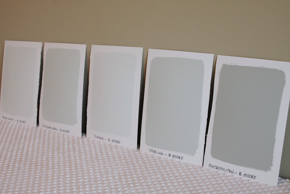
And, I’m laughing because I have 22 samples of paint on a wall in my kitchen right now. (#3) Although, they are not all for the kitchen. But still. I’m kind of embarrassed to admit that.
Our painter of 15 years confessed we are number two on the list for indecisiveness and, driving ourselves crazy with lots of colors.
However, I’m happy to report that we were beaten out by a man who has 19 colors. And, that’s just for one room! Thankfully, we have only a few colors per room.
In addition, there are at least five or six at shades of white trim paint that we have used over the years in various parts of the house. (#14)
Also, it made me feel so much better to learn that you also had a bad case of “pondering white.”
I think your articles made me see the light of some of the home painting mistakes I’ve made.
Laurel, I loved this post, where you used Benjamin Moore Shoreline in your small bathroom. It looks like the perfect shade of pale gray. And, so I painted an entire column in our living room with it. (#4) However, my husband vetoed it as he felt that Shoreline is too light. Oh well. Thanks for all.
Robbie
***
Okay, thanks so much to Robbie for her timely note.
In case you’re wondering what the numbers are in Robbie’s email, they correlate to the mistakes we’re about to discuss.
So, let’s dive in and go over the 12 most common home painting mistakes.
I fully understand these mistakes because I’ve made most of them myself. haha. And I want to save you at least some of the pain, and stress. It doesn’t have to be that way.
Home Painting Mistake #1
- Not testing the paint extensively in the room it’s going in, before painting.
Yes, the color looked fabulous in your friend’s home, in the store, on TV, on your computer, or in a magazine. It is ALWAYS a mistake to choose a paint color based on seeing it somewhere other than your room. You need to see the color in your space.
No two rooms have the exact same lighting. And believe me when I tell you that I’ve seen some wacky things, over the years. Therefore, the color that you see elsewhere may look ENTIRELY different in your room. I guarantee that it will, with 99% certainty.
For more info about the proper way to test paint colors, please look here.
Home Painting Mistake #2
- That is not looking at the paint chip in any direction except flat up against the wall or ceiling.
Never look down at a paint sample. And, do not prop it up against the wall. That isn’t the color. The only way to look at a paint sample is FLAT against the wall.
Home Painting Mistake #3
Is viewing multiple colors together.
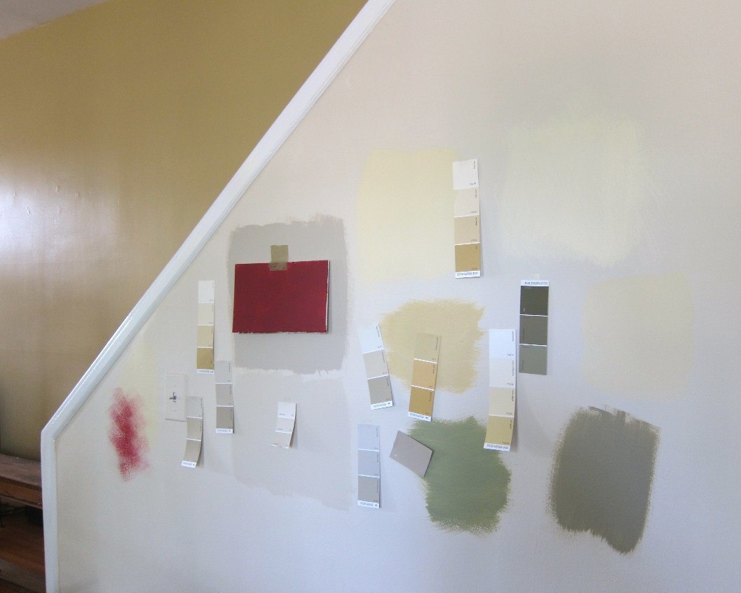
Like this
 or this
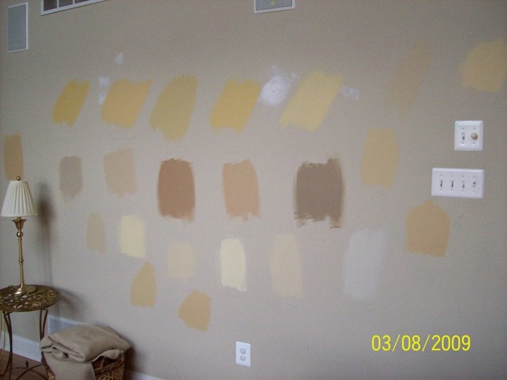
or this
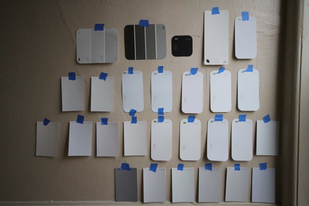
So bad. #confusing at best.
It’s impossible. The colors will affect the adjacent samples skewing the color.
Oh, believe me. I can obsess with the best of ’em. This brings back painful memories when I, too, was pondering white. Go here for the only six shades of white I’ve ever used.
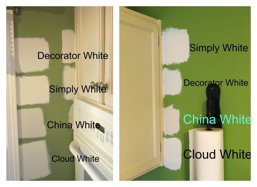
And, this? Not only do we have the confusion of too many shades of white paint, the samples on top of bright green walls. I realize that you may have a situation like this. There are a couple of things you can do.
- One, if you’re going to paint very soon, just have the walls primed. They’ll need to be anyway.
- If that’s not possible, then use larger pieces of white cardboard behind your paint samples.
- Or, if there’s a room with white walls adjacent to the one to be painted, you can view the colors there. But, view your paint samples ONE AT A TIME!
Home Painting Mistake #4
Not moving the samples around the room.
And, I mean ALL over the room. High, low, and every wall and in different lighting situations, as well; sunny, cloudy, morning, evening, and night.
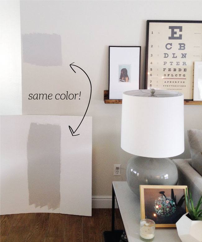
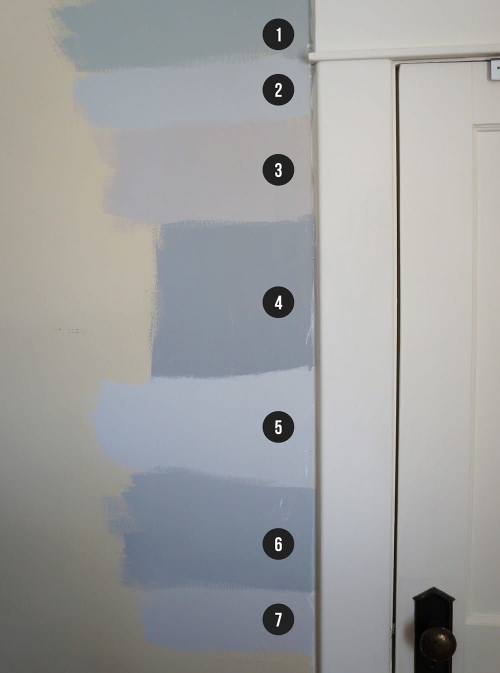
And to further make my point. Here’s the proof.
But the wall is where it’s going, so why not paint it on the wall Laurel? And which one is “right?”
Well, in this case, probably neither. The sample needs to be FLAT against the wall. And you need to make it two coats. And it should be against a white background. At least, they made the poster board.
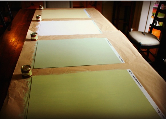
That’s what you should do. You make large samples like this and put them flat against the wall. Then, you need to move the sample around because:
You could put your sample right on top of a reflection from a green tree and think that you’re getting a beautiful warm gray, when in reality, what you’re going to be getting over-all is a not-so-nice cool purple. You need to look at the colors on all the walls and high, low and in between. And please… no lights on, at first. Then, you can turn on the lights.
Also, pay close attention to the corners. Colors tend to be more intense in the colors in some lighting situations.
In addition, Robbie painting her column Shoreline, is another part of this same mistake. Something I’ve discovered over the years is that colors out in the middle of the room tend to look lighter. So, unless it’s the column and only the column that’s going to be that color, use a separate sample taped flat against the wall.
What about those peel and stick on paint samples?
That’s a great idea if you don’t want to make a mess. I would still paste them on top of a piece of poster board and tape that sample to the wall. Otherwise, it’ll be challenging to keep moving the self-sticking samples around the room.
Let’s move on.
Home Painting Mistake #5
- You’re worried that the color is too intense, and then you order it at 50% or some other percentage.
The thinking here is that the color will be half as “strong?” No. It’ll be another color. Now, it might be a lovely color. But why drive yourself even more nuts? I would try to find another color first. But, if you want to experiment, then fine. But, just know that you cannot make a color 50% lighter by adding more of the base color.
Home Painting Mistake #6
- Painting the trim “WHITE.”
Sounds easy, right? All whites are the same, right?
Well, no, most of you know that there are many variations of white paint. Otherwise, you wouldn’t be pondering it.;] But, if you are a novice at decorating and painting, you may not yet realize that all whites are not created equal.
Here’s the problem. The color that Benjamin Moore calls “white” is actually a very, very pale gray in some lights.
In a north-facing room, their plain white is most likely going to look dingy and drab, most likely. North-facing rooms do better with medium to darker shades with warm undertones. Or for white trim, one with warm undertones, like Cotton Balls oc 122.
I won’t kid you, north-facing rooms are not easy, and there can be other factors, so my best advice is to experiment if you’re not getting the color that you want. For more great colors with north-facing rooms, go here.
Home Paint Color Mistake #7
- Believing that to “brighten” a dark room, you should paint it as white as possible.
See above. :]
Home Painting Mistake #8
- Painting the ceiling— “ceiling white.”
I never specify that color because, again, it can go gray, and usually, the ceiling looks grayer than the walls, to begin with. That is unless you want the ceiling to be a pale gray. For one of my favorite posts about ceiling paint colors, go here.
And, you might also enjoy this post talking about problem ceilings.
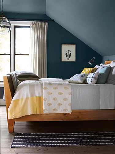
How dramatic is this! It’s a beach house with a black ceiling. Sounds wrong, except it’s anything but. Don’t be afraid to play up your room’s features. And by the way, painting a ceiling darker will make it appear higher.
Home Painting Mistake #9
- Not considering the color of the floors in relation to the walls.
Do your floors have orange, yellow, red undertones. That’s something to consider.
Home Painting Mistake #10
- Not considering what your furniture is going to look like.
I’m sure that’s obvious except that sometimes we forget to look at the big picture.
Home Painting Mistake #11
- Not doing an adequate prep job.
Here’s a post which gives 20 terrific tips on what you need to do to paint a room properly.
Home Painting Mistake #12
- Not paying attention to the color as it relates to the rooms around it.
One room is electric blue. The next one is purple, then orange, then greige. Next thing ya know… out comes the plastic table-cloth. haha!
Home Painting Mistake #13
- Finding an expensive paint and thinking that you can just go to the Off-Brand paint store and get a perfect match.
NO COMPUTER MATCHING!
Buy the paint from the company that manufacturers it, if possible. Computer matching is a crapshoot at best. And I don’t care what your painter says. He’s going to try to tell you how fabulous it is and that it works.
Well, sorry; it usually doesn’t work. If he’s still insisting and won’t back down, I’d be very suspicious. Chances are, he’s going to use an off-brand and sell it to you at a premium price. It does happen. :[
This one’s not necessarily one of the home painting mistakes, just something to consider
- Just going with the same old, same old. White trim. White ceiling. Linen White walls.
zzzzzzz
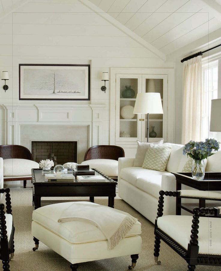
Have you ever considered painting the room all one color? It’s a wonderful look. In fact, with sloping ceilings, especially, I love to use one color everywhere.
Here’s a beautiful example of what I’m talking about in this charming attic room that would be perfect for a boy or a guest room.
For more examples of walls and trim painted the same color go here.
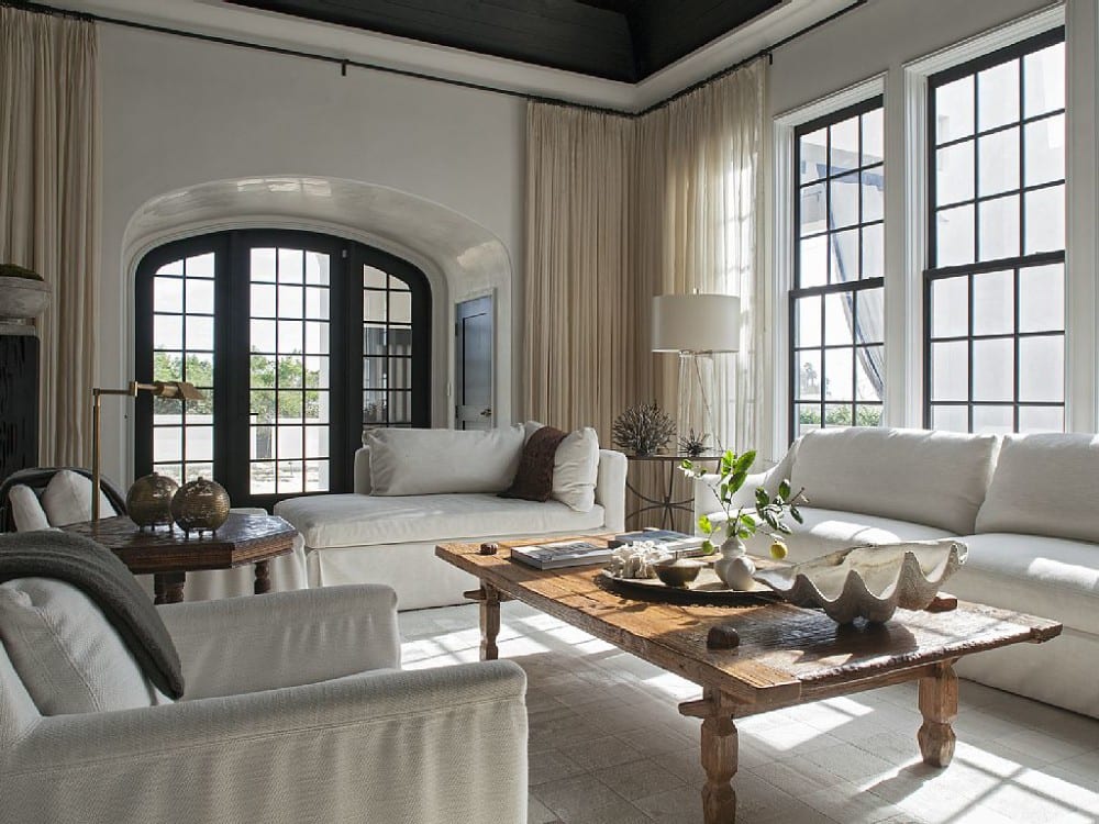
I adore white on white.
I love how serene and quite these rooms are. There is no need for the trim to “pop.” I’m not even sure why anyone would want their trim to “pop.” Of course, it can contrast, but it doesn’t have to. That’s my point.
Home Painting Mistake #14
You are using more than two shades of white for the trim throughout your home.
Robbie said that she used six different shades of white paint for her trim in the house. I recommend trying to avoid this, if possible. The most I have ever done is two shades of white. But, usually, it’s only one shade of white for the trim.

please pin to your Pinterest boards for reference
Well, I hope that talking about these home painting mistakes will save you time, trouble, and stress. Do you have any painting mistakes we can all learn from? If so, please share them in the comments.
Oh, and if you’re confused about your paint sheen please check out this post.
xo,

PS: Please check out the newly updated HOT SALES!
- Serena & Lily has put all of their beds and bedding on sale.
- And, also there’s information on the Nordstrom Anniversary Sale Early Access, which is starting this Thursday, August 13th, 2020.
Related Posts
 Is it Antique Furniture OR is it a Reproduction?
 Perfect Architectural Proportions – The No-Fail Formula
 A Virtual Kitchen Design And The Results Are Stunning!
 Here it is! A Palette For No-Fail Paint Colors
 An Exquisite Kitchen Restoration Has Charm To Burn
 The Guaranteed Way To A Beautiful Room (It’s Not The Wall Color)
 A $10,000 Kitchen Design Mistake – Part I & 2


35 Responses
I’ve done Mistake #10….going for that clean crisp white with no warm undertones, then realizing the taupe/gray or griege colored sectional was now looking like a $50 flea market find, dirty and dingy.
I run a paint store. Some colour formulas are not accurate for a quart because of this. An example would be if there is 1/2 short of black in a gallon. You would need to divide this by 4 for a quart and my tint machine doesn’t dispense that small an amount.
Sorry, I forgot to add what colors I did throughout!
Silver Strand: Living Room, Kitchen, Breakfast Room, Foyer
Hazel: Master Bedroom, Guest Bath, and Hall Between Guest Bedroom
Waterscape: Master Bathroom, 2 Bedrooms, Laundry Room
Peacock Plume: Dining Room, ½ Bath
Green Trance: All ceilings
High Reflective White: Kitchen Cabinets and all woodwork
Vintage Vessel: Front Door inside and out along with the Shutters
White with hint of grey and Light Grey mortar Brick Home with Pale Grey vinyl siding trim
Gables done in Reserved White a white with a hint of grey
Hi Laurel,
For 20 years my living room, dining rm and kitchen were a yellow with a slight green undertone called Lily SW it is a beautiful color if anyone is looking for a great yellow.
I sold my house and moved into an apt. while waiting for our home to be built.
I have been reading you for years and having learned so much, I put it to the test.
I wanted a light grey to go in the living room, kitchen and breakfast room. I bought sample paints and painted canvas & took w me to the site. The show Fixer Upper when she first started the show used a lot of SW Silver Strand, it has an aqua undertone. I found a show of hers the first season where she used this paint and I liked it.
From there I found on the back of the chips colors that go together.
https://www.sherwin-williams.com/visualizer#/active
I am very happy with my choices. I read one of your blogs when you were in school & the teacher said you just think you like blue. I thought cobalt blue was my favorite color but looking at the things in my house I love the most is aqua & turquoise!
I have always had a decorators flare but it has been enhanced by reading your blogs.
Thank you,
Cindy
The only thing worse than north facing rooms are east facing rooms in Evansville. It’s like they have a multiple personality disorder. Not only from morning to evening but especially from summer to winter. Summer it is intensely bright and hot and then November-March it is just gray and shades of gray. What looks great in the summer looks intensely out of place in the winter. It stresses me out so much that I think I’m just going to paint in Ballet White and be done with it.
I häv3 Always succeeded in my own home. But once, I had a friend who over the years became my husband. But we were not really dating at that time, butiatjll banged to make a good choose for his kitchen. I chose a middle blu color with white and grey in it.
it looked adorbs in the store.skippedvall Laurels advice/steps.
Painted it a strangely luminescent, discoy mistake for a paint.
Hi, Laurel,
Excellent advice. I wish you had posted this a week earlier, as it should have been viewed by a woman who thought people (via the internet) could advise her on a specific color and paint brand for her house. She kept whining about all the undertones in paints she had tried, but never mentioned having done any of your techniques. She also failed to acknowledge the impact of lighting (real and artificial in the store vs. in her home), furniture and rug colors, etc. It was enough to drive one to drink. Hopefully, your post will be “pinned” for future reference!
Hi Laurel,
I have to remember your tip regarding not using “ceiling paint” on my ceiling. Your right, it always looks dingy.
I thought it was because of smoke from our wood burning fireplace. You’re so smart!
Maureen,
I had a similar experience and was told that sometimes the amount of of tint in a gallon is so small that it can not be added in the proper proportion for a small sample. Has anyone else heard of this?
I realize they mixed the paint incorrectly but I was told in a paint store that the sample cans are made in eggshell gloss and the colour may appear slightly different depending on the sheen chosen.
Dear Laurel,
Your emails are the ones I wait for twice a week! I enjoy all your advice, the photos to demonstrate how your advice looks, how to choose a paint colour, etc. It’s all great!
I have a suggestion for trim whether it be for baseboards or mouldings (sorry, all the spelling mistakes are actually correct in Canada). For eons (probably since ’86, I’ve been using a pure white in full gloss. It’s like a frame for the room! Best yet, it cleans up far faster than any other paint finish and stands up to bumps, scrapes, etc. In other words, all it takes is a quick swipe with a Swiffer cloth to clean off all the dust that accumulates, especially in the summer. The one I use is from Behr. I know high gloss is not something I’ve heard you write about, but it may suit some of your readers.
Thank you for all the research, recommendations, and self-deprecating humour! Can’t wait for the next installment!
Sincerely,
Nancy
Thanks for yet another lovely post. Also for the link to paint sheen. I do have a question about paint sheen, and kitchen cabinets. I haven’t seen this addressed in the blog, are cabinets supposed to be the same sheen, more or less shiny than the trim?
Hi, Laurel. Thank you for another great post about paint colors! Just wanted to share an experience I had last year.
I bought a sample can of blue BM paint to try out. I really liked it so I gave the painters the name and number of the color. When I saw the finished job, it was a different color. Luckily both the sample and the gallon cans listed the formula – and they were different. The gallon size contained a red, whereas the sample did not.
According to the store where I bought the sample, samples are just a “representation” of the final color. Not sure if the guy I spoke to was just making this up, but forewarned is forearmed.
I brought the sample can to another paint store and the person there mixed it according to that formula, minus the red. I got the color I wanted but it was an expensive mistake.
Maureen
And I’d love the job of naming paint colors!
Yea, I’m one of those OCD-type of paint pickers. Lately, I’ve been using the peel and stick samples of paint color. They are large enough and you can unpeel them off the wall and move them to a variety of different locations. They are not necessarily cheap ($6 each), but in the long run its cheaper than making a terrible color decision. The company I use carries all the Benjamin Moore colors, and they are very accurate. You can keep the samples for ever and use them again at some time in the future.
Hi Laurel,
All good advice. I know I’ve mentioned before to you that I am a colour consultant and painter. All of my sample boards are created on 1/8” Masonite. They are very durable and I can recoat them every so often to freshen them up. Moving them around to all sides of a room in all forms of lighting (daylight, nighttime, etc) is so important.
The one thing I will disagree with you on is that Benjamin’s Moore does an excellent job of colour matching paint from other brands. They have the best colourants (colours added to the base colour) in the industry. Did you know that other paint companies are trying to purchase colourants from BM. Maybe I just have great luck with my dealer, but they always do super great colour matches. I have had many farrow and ball colours matched and some C2 colours. I would say the green ones present the most challenge for my dealer. I know you give equivalent BM colours to F&B but I don’t find they are close enough. Some would ask why I simply don’t use F&B or C2 when I’ve chosen those colours for a client; because BM paint, particularly Aura is a superior paint. It looks like velvet on your walls and it has amazing coverage and durability. Regal is also good and about $20 less per gallon. My advice to folks is buy the most premium paint you can afford. Why pay a painter to have to do three coats of paint with a cheap product that doesn’t cover well and won’t hold up than pay $40 more a gallon for a finish that will last.
Hi Laurel! I would also love to see a post on how to transition colors when the room is painted all one color. Or are we overcomplicating this point LOL
You hit the nail on the head, Laurel!
All fantastic points that every homeowner should consider when selecting a paint color.
Also since it’s easier to match one of a thousand paint colors to the colors in the rest of the room, wall color is the last selection to make when decorating a room.
I have to cut off the names and just go by the numbers. The names totally bias me. I’m a sucker for a great paint name.
This post couldn’t have come at a better time for me. I’ve chosen the paint, Nairobi Blue from Clare, and I’ve had a difficult talk with myself regarding my level of patient. In other words, it is not a high enough level to paint a room right, so I’ve hired a professional company whose owner is a perfectionist.
Such a good, useful post, Laurel, and one of your best. There are so many things a trained designer or someone with a damn good eye knows that the rest of us don’t. And that knowledge and eye for color and contrast and experience painting a lot of rooms makes a difference in our outcome. I’ll never have your level of knowledge or experience, and I have firmly given up on developing an eye for these things, but you are teaching me what I can do myself and what needs to left to professionals.
Last comment, I promise! That Matthew Sapera room gives me a feeling of relaxation, loss of tension and stress. It’s gorgeous. The feeling I get looking at it is similar to when I put on polarized sunglasses for the first time—-ahhhhhhh.
Hello! I have been a loyal follower for years! I ckicked on the link about trim and walls the same color. We have a large farmhouse…on an actual farm. It’s dirty! We painted our living room Newburg green, and the trim! The white was getting so gross with dirt flying. It looks amazing…my question though is, how do I transition the trim color to another room that is not the same color. The doors and everything are the newburg but my boys wanted a different color in their room.
My condo had been painted with white walls and ceilings when I bought it and I have no intention of changing it. With white as a backdrop, you can change things up with the seasons/holidays etc. and it is always going to work.
Great post! I am thinking of painting a few rooms in my house all one color and had a finish question. Can you use the same paint for walls, trim, and ceiling or do you need separate paint with different finishes for each?
Did it all right according to you . Poster board painted with 6 samples. Still bad. North facing room. I essentially have yellow walls. I should have halved the paint intensity is what everyone said and they were likely right. I just did a sample and it looks much better but no room in the budget to repaint. I’m not happy.
LOL! With grandbaby #14 on the way, there are just way more important things to do!
As usual, your post is right on target with what I needed.
Thank you for your lovely post! Love!
Hey, Laurel. You have given me some fun ideas to explore for my kitchen. It is small, so the multiple colors of the walls, cabinetry, floors etc, chunks it further into smaller units.
My cabinets are a gray. Assuming everything else will be white, would you suggest I paint them, too? Easy to do, I’ve done it several times before.
My ceilings are plaster, ICK! I thought I’d address this by changing to a shiplap, painted the same white as the walls and trim. Getting excited about this thanks to your ideas!
Suggestions?
Linda
(meant to be a reply to Mary Elizabeth)
(meant to be a reply to Mary Elizabeth) I’m old too and in my forever home, so any advice that uses the words ‘resale value’is ignored by me! I do find the idea of a single wall color throughout very peaceful. When I lived in Austria and Germany years ago, all interior walls were white.
I’m old too and in my forever home, so any advice that uses the words ‘resale value’is ignored by me! I do find the idea of a single wall color throughout very peaceful. When I lived in Austria and Germany years ago, all interior walls were white.
Agree with everything but painting over white. Unless you prime your walls white before you paint you need to see how the underneath color affects the tone of the paint. Other than that spot on. Our kitchen is north facing, with LED lights. Almost every white I tried looked either pink, gray or too yellow instead of the warm white I was looking for. I finally mixed up my own color then had it copied by our local amazing old timey color matcher by reading what colors were in the paint, definitely an artistic talent. No computer matching but starting with a close color then tweaking it until it matches. I worked years ago for a paint store and we only could match by eye since computers were far, far in the future. People would bring in faded paint they wanted to match. It was challenging but rewarding when I was finally told I did a better job than the owner 🙂
Laurel –
Love this post….one question….the two ‘white on white’ rooms…are they they same color white, just a different sheen? I’m confused because earlier in the post, you referred to an all “Linen White’ room as boring…”Just going with the same old, same old. White trim. White ceiling. Linen White walls”.
I’m asking because I’m thinking of doing exactly that in our bedroom (our trim is linen white throughout the house….bedroom currently has Whythe Blue walls…but thinking all linen white would open up the room and allow the colors in the rug, etc to shine…..
Hi Laurel, always wonderful advice! I used all these tips to choose a color for all my rooms, so glad I did. I didn’t have your paint guide then but I do now because I anticipate my daughter in law painting soon, she ASKS for my help:) :). I am always amazed at what light does to color, on anything! So fun yet so frustrating. Thanks. Look forward to the days your blog comes out 🙂
We are “nearing” the end of a longer than planned complete renovation! Just bought the last wall paint today! Way back when we started, I agonized over the trim color, but have never regretted my choice (BM AF-35 Vapor). But with the wall color(s), I’ve made all of the mistakes above – more than once!
On our main floor & upstairs, (exception the living room) I used all Edgecomb Grey (BM- HC-173). With our lighting & windows, it just does what it needs to in every room!
The last phase is the lower level, but Edgecomb didn’t look right when I first tested it there. Maybe bcuz all the walls were a dark forest green- duh! With all new, freshly primed drywall, I bought a half dozen BM samples. Made the extra large poster board samples, yada, yada, yada…!
None of those were “right”! Decided to try the Edgecomb again – voila!
I’m actually relieved (in a way). I love the continuity of one color throughout the entire house, and I’m old. I never plan to paint walls (or trim) again!!
Years ago we had painters in Chicago who were directed by our interior designer. They would bring “tints” and add like artists to produce a color that was approved by our designer. They woud sit on the floor and concoct the color the designer envisioned. One of the colors was a red for a room that honestly had so many “tints’ that it looked like a math equation on the can. Whatever happened to those artistic painters???? They were true artisans and I miss that process! I think paint is the most difficult project in the entire interior design process and if you get it wrong…..well it is a mistake that is over the top costly and causes a huge inconvenience if you have to do a “do over”!