The Color Pink – Revered and Hated. Here’s Why

Hi Everyone,

I hope you’re having a good week. I have some great news.


Yes, I have my Instagram account back!!!


I haven’t posted yet, but I hope to soon. Please follow me if you aren’t already.

***Oh, and please follow my gorgeous friend Natalie Reddell. (Commander in Chic)***


Natalie is not only super-talented in all things life-style related, she’s a stunning beauty, the sweetest person ever, AND screamingly funny!

Like what happened to me, her Instagram was hacked, except in Natalie’s case, she did not get her account back. No, the crooks DELETED everything she had worked years for and some 65,000 followers. Disgusting!

She’s just starting to build it back up. You can also listen to Natalie’s cool podcast here.

So, in honor of my getting my account back, I’m doing a post all about the color pink.


What does that have to do with Instagram?

Absolutely nothing. Haha, except the post is full of a lot of beauty, and getting my account back is a beautiful thing.


In addition, I’ll be sharing some of my favorite designers who frequently use the color pink and do so beautifully.


Plus, there will be some of my favorite shades of pink paint.

But, hold on a sec. I see some glum faces out there.

Oh, I bet you’re the folks who aren’t so fond of the color pink. Am I right?

Okay, fair enough. I’m going to address that too. I’m hoping this post will change some of your minds. However, it’s okay if it doesn’t.


I do realize that some love the color pink, and some hate it.


This post will examine the color pink to discover why that is so and ways to incorporate the color pink in your interiors.


Poor Pink. It’s really not fair that such a lovely, peaceful color has received the kind of treatment it has.


It all begins when we are born.

If you’re a boy, you’re assigned – BLUE

And, if a girl, you’re assigned – PINK

(Remember those fraternal Pantone twin colors Rose Quartz and Serenity back in late 2015?)

So, right there, in one fell swoop, we made the color pink unacceptable for the male gender.

However, I do believe there is a trend to change that.


Roper Mens Pink 100% Cotton L:S Snap 1 Pt Back Yoke Poplin Western Shirt the Western Company - the color pinkThe Western Company


There ya go—a handsome young, blue-eyed model posing as a cowboy in a pink shirt. That works for me!


Still, for the majority, they wouldn’t dream of dressing their BABY boy in pink.


And then, there are the associations we have with some shades of pink.


  • Bubble gum pink = cheap
  • Cotton candy pink = the same thing
  • Peptol Bismol pink = gastric upset


Adding these visions to the mix, and it’s obvious why many of us don’t conjure up good thoughts about the color pink.


However, the biggest issue with the color pink is that men have been brainwashed to see it as a feminine color and not one they would ever want to live with.

That is, at least American men. I do believe that European men might not have as big of a problem with the color pink. And, the British especially seem to love it, based on many walls painted pink I’ve seen.
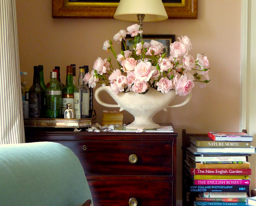
 

Ben Pentreath living room color - color corrected parsonage pink or benjamin moore careless whispers

For instance, Ben Pentreath of the legendary warm-dusty-pink that I think I came pretty close to matching in this post.


So, how can we use the color pink in our interiors so that more men will like it?


What I think and what I believe is also great for all pink rooms to some extent is that there’s a masculine Yang to give pink some oomph.
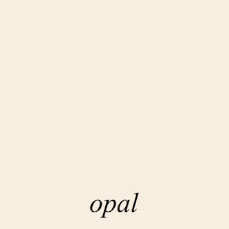
 

Benjamin Moore Opal oc-73


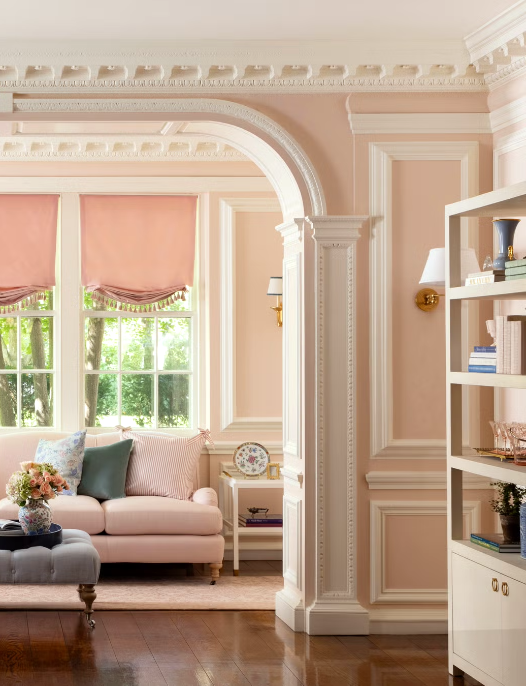
Above and below from the Laurel Home Paint and Palette Collection, Benjamin Moore Opal, a beautiful, warm, pale dusty pink.
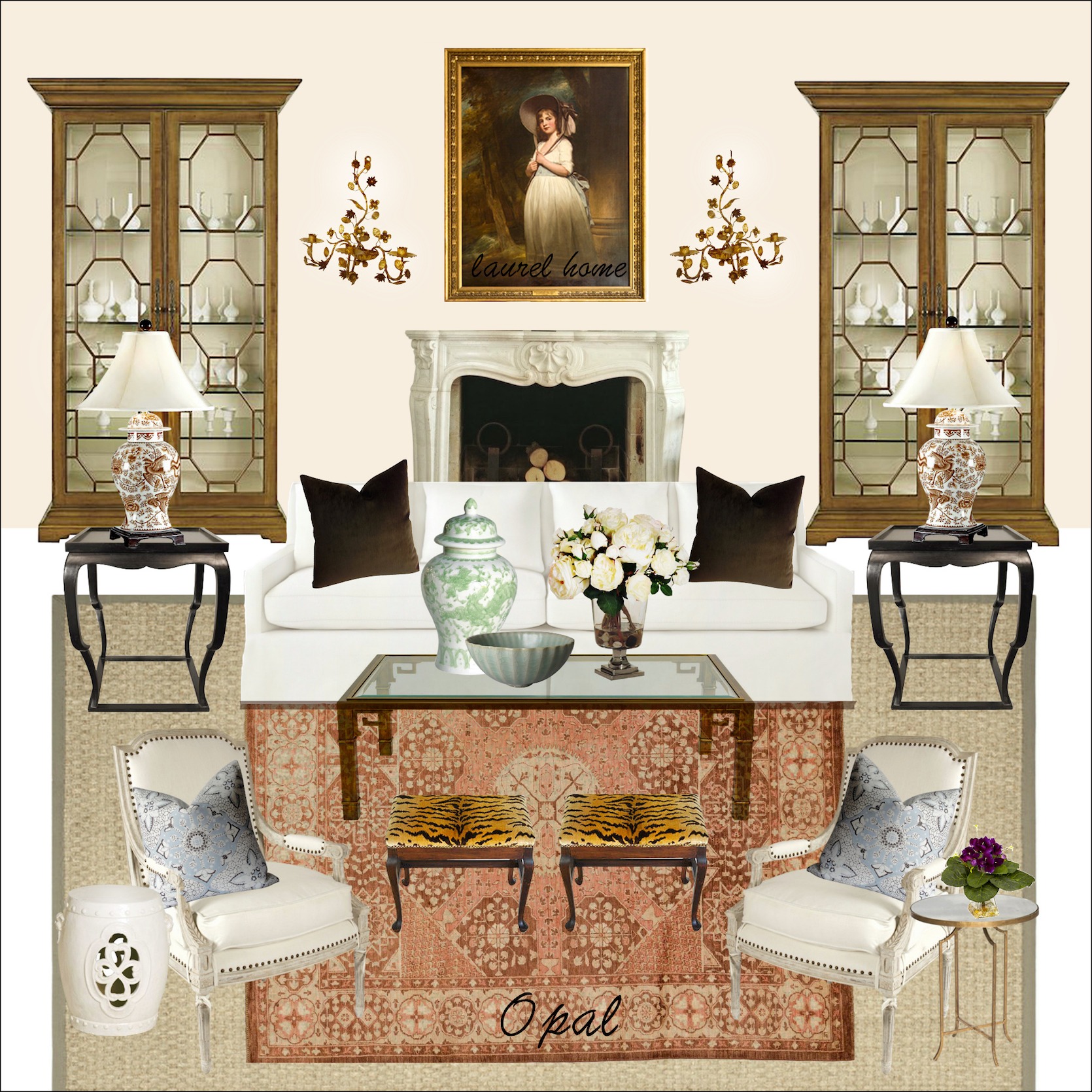


One of 40 mood boards in the Palette collection.


In addition, as you can see in this post, the paler, warmer pinks will appeal to more men.

In fact, some of these are so dusty that they are veering ever so close to the barfola “pinky-beige.”


Alas, pinky-beige, if done right, is not so gag-awful.


I know you think I’ve been sniffing glue, but just trust me on that one for now.

Here, let me show you an example of pinky-beige-taupe that’s beautifully done.
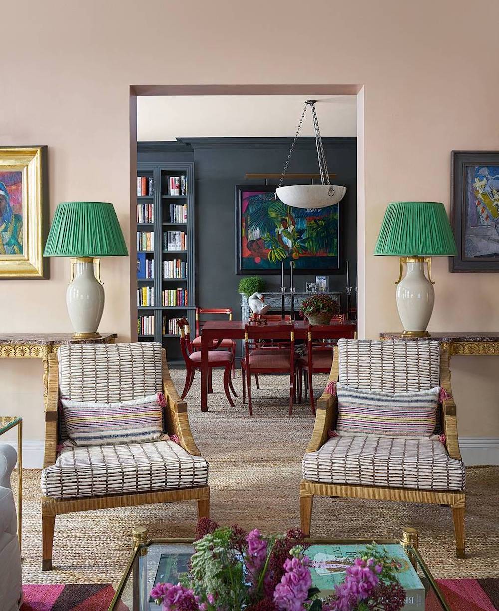
 

hg_morrison - taupe-pink living room walls

Penny Morrison via House & Garden


While it’s not a clear pink, I think this is a shade of pink that most men wouldn’t mind. And, I love the hunky charcoal color of the dining room walls. See how the deep color, plus the jewel-tone accents, bring life to a color that could very well not look so great.


There is an ancient post about rethinking pink, which you can read here.


And of course, much has been said about Ben Pentreath’s gorgeous living rooms with pink walls.

You can see Ben’s living room:

here, here, and here


But many interior designers and lifestyle mavens are embracing the color pink.


And it’s not just people born between 1980-2000 – aka Millenials and their favorite color – Millenial pink.


Aerin Lauder designs for Williams Sonoma Home.


Others who embrace the color pink


Suzanne Kasler


Suzanne Kasler Ballard Designs Fall 2015 collection pink bergere

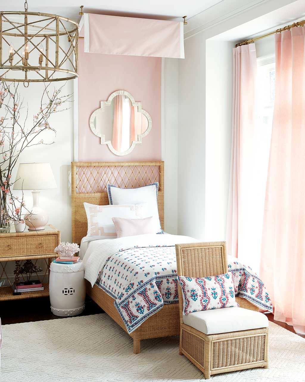
Suzanne brought her fondness for the color pink to her collection of home furnishings at Ballard Designs.


Suzanne Kasler Southport Wicker Collection Ballard DesignsHow charming is this, for a child’s or guest room, by Suzanne Kasler, for Ballard Designs.
 

Summer Thornton color pink closet

Summer Thornton

Fabulous pink closet!


India Hicks Home Fine Art

India Hicks above and below loves pink!

You can see more of India here.


India Hicks Caribbean pink home - color pink sofa

The touches of black look fantastic with pink!

India Hicks, who I was lucky to get to hear a talk a few years ago, ADORES pink. But, of course, she’s British royalty (one of Princess Di’s bridesmaids and a great, great, great-granddaughter of Queen Victoria!) Anyway, they adore pink!
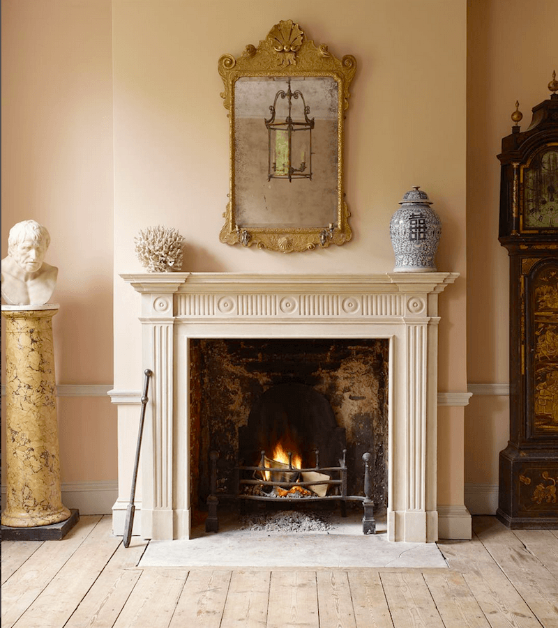
 

Jamb - London fireplace mantel - timeless interiors - the color pink is one that is loved in the UK

Jamb Fireplace Mantels – London


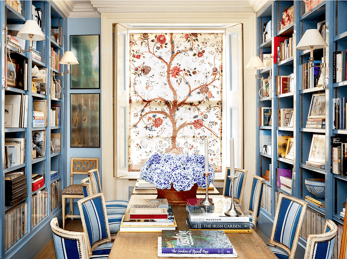
caroline sieber london home library dining roomCaroline Sieber London home library dining room


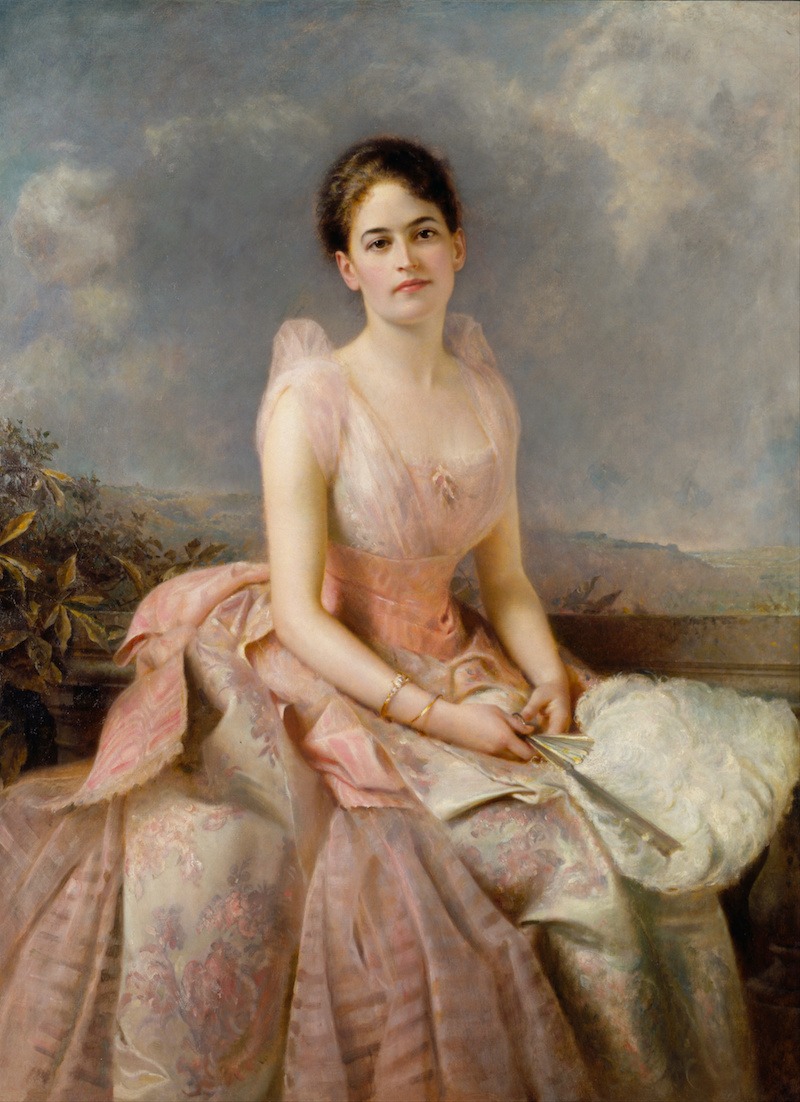
Edward_Hughes_-_Juliette_Gordon_Low_-pretty-in-the-color-pink

Edward_Hughes_-_Juliette_Gordon_Low 1887

The color pink is frequently seen in fine art.
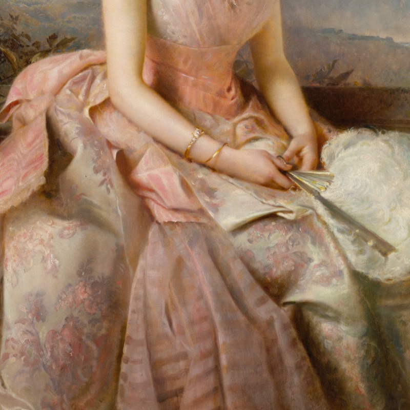
 

Edward_Hughes_-_Juliette_Gordon_Low_-pretty in the color pink - detail

Let’s look at a detail of that dress.

And please check out the post about fireplace Mantel styling that this image was previously seen. There are a number of beautiful photos that have pink in them.


Pink is also a fabulous house color for doors and siding. At least it is in the south.
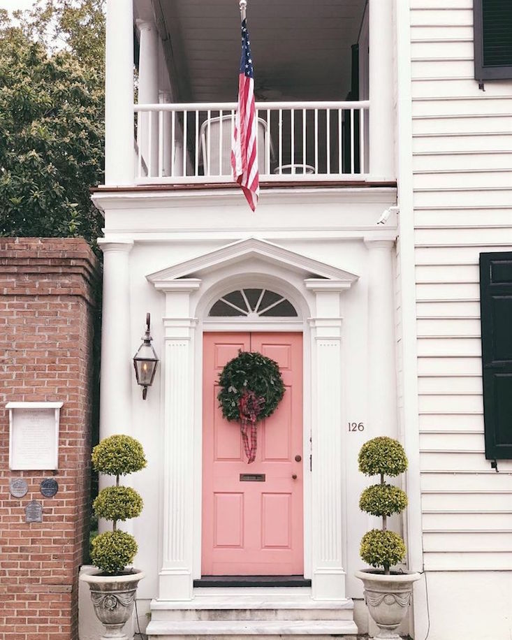
 

An oft-photographed door in Charleston, SC. Unfortunately, I could not find the photographer for this image.
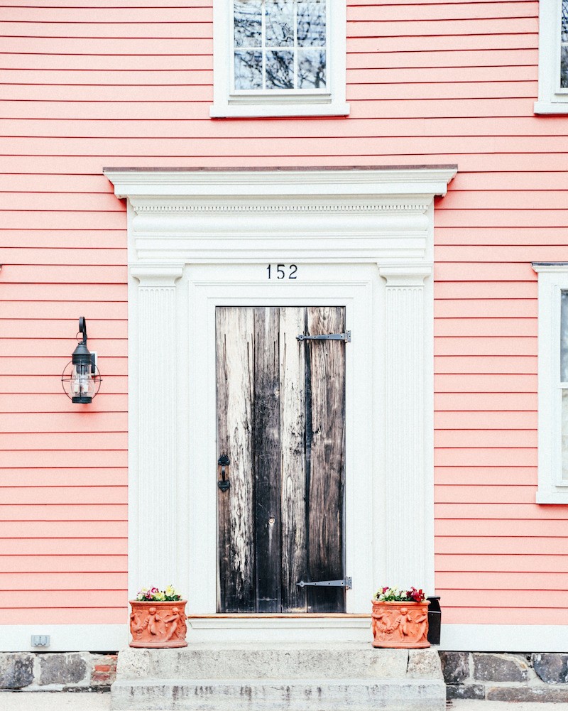
 

Another lovely home with quite a weathered black door. But I love the classical surround, and the pink clapboard looks great!

In the Laurel Home Essential Paint Color/Paint Palette Collection, there are 9 gorgeous shades of the color pink. And there are 135 other beautiful colors—all colors by Benjamin Moore.
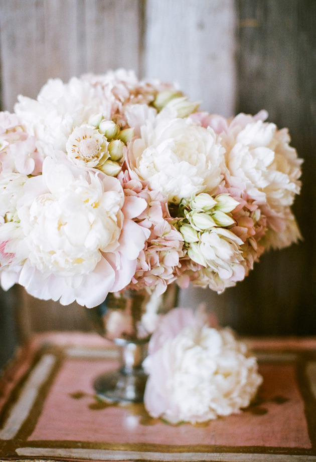
 

Thefullerview.tumblr - pink peonies - via the style-cocktail

Thefullerview.Tumblr – pink peonies – via the style-cocktail


Below are three of the pink colors from the Laurel Home Collection.


Benjamin Moore Opal oc-73

You can see a room in opal here.


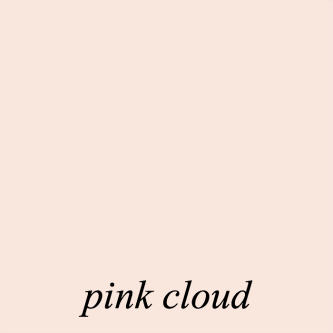
See a room with pink cloud.

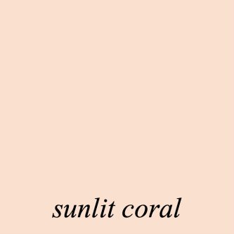
Here’s a palette of colors with sunlit coral here.


You can read more about the Paint Collection here.
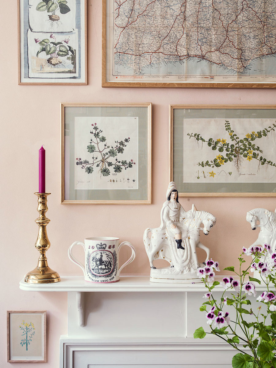
 

farrow-ball-pink-ground-walls-staffordshire-figurine-fireplace-mantle-queen-elizabeth-loving-cup-mug-royal-doulton-ben-pentreath-and-hall-rugby-street-london

Farrow & Ball Pink Ground

designer Ben Pentreath


Farrow and Ball Pink Ground pink paint color

Another very pretty pink paint color is Farrow & Ball’s Pink Ground.


It is probably their most popular pink paint color with a lovely amount of dusty warmth.
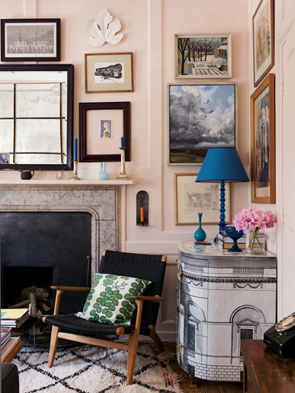
 

Ben Pentreath-home-Pink Ground-Farrow and Ball-wallsBen Pentreath, London home, Pink Ground-Farrow & Ball walls
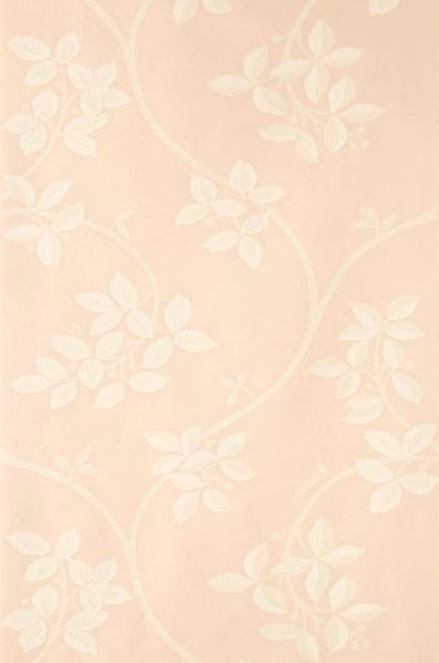
 

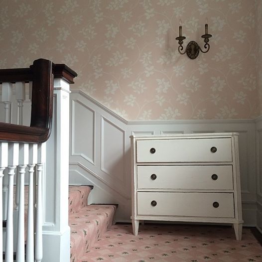
Ringwold wallpaper Farrow & BallAbove is the Ringwold wallpaper we did several years ago.

It’s one of my favorite wallpaper patterns.


via HonestlyWTF - pink wall color - pink color - rosequartz8

Tilton Fenwick

A beautiful, soft shade of pink

We did that rug in this home!

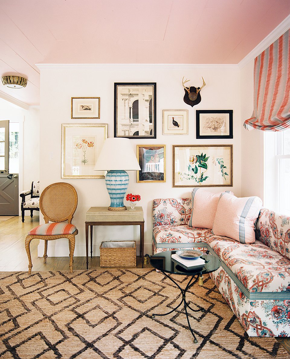
We also saw this room before in this post about ceiling paint colors.


And below, I created a widget with lots of beautiful home furnishings featuring the color pink.


Please click on any image for more information.


Well,  hope this post gave you some good ideas for using the color pink in your rooms.


So, for those of you non-pink lovers, how do you feel now? Please tell us in the comments.


The reality is that at night a warm, soft pink is probably the most flattering color there is. That’s probably why so many bedrooms are the color pink, I think.

xo,


Please enjoy the newly updated HOT SALES!


50 Responses

  1. Great post, Laurel. Aside from one or two of the rooms (Suzanne’s bedroom is great!), I still don’t like the light and dusty pinks. They remind me of the 1980s (not in a good way) or, as you suggest, little girls’ rooms. But, contrary to your suggestion, warmer pinks do not win me, a man, over. I, instead, love hot pink. It’s a color that wakes up a room, looks great with different skin tones, and works well with many other colors. I’ve worked it into two rooms we just did, and it looks great!

  2. Oh yes, I painted our master bedroom pink at one point. My husband walked into the room and said, “It’s pink”. “Don’t worry”, I replied, “the bed is still here and in the same location.” Marital bliss continued.

  3. My daughter painted her daughter’s room a lovely shade of pink called Rosebud by Sherwin Williams. It is a perfect color for a young pink/purple loving girl, but it does not scream PINK when you enter the room. Very relaxing with lots of white, but dark traditional furniture.

  4. P.S. My best decorating advice ever: Get yerself a hot cowboy, and no one will care what your house looks like. That’s pretty much what I did. My husband is so charismatic and good lookin’ that even the straight men can’t keep their eyes off him. Lol. I had to buy love potion number 9 to make that happen, but it was worth it…I never have to worry about colors or drapes, or cat hair, for that matter. Nope. He opens the door and no one sees a d*mn thing.

  5. I grew up with five brothers and I wanted to please my dad, so pink was NOT for me. However, it’s grown on me in the last decade to the point that my glasses are pink and I wear pink more than other colors. What happened? Weird. For men, I love pink with grey or rich brown. And for me, I love pink with orange! Thanks for all the eye-candy (especially the one in the hat!). Fun fact: a hundred years ago pink was for men and blue was for women.

  6. Born in the mid-50s, I associated pink with girly and being a girl that meant less of everything for me. That emotional punch stuck with me for a long time. I started to thaw out in my 50s: maybe pink is just another color to enjoy. Your post is absolutely gorgeous! I love the way you use paintings in your posts. The room with the pink ceiling looks like peace, calm, and beauty summed up in a space.

  7. Laurel,
    After this post on “The Color Pink”, I can confirm that you could have saved me a lot of time and money back in early 2017 if I had already known about your paint collections!! I was determined to paint the formal living room in our new home the palest of pink/peach to compliment my husband’s beautiful antiques. I must have purchased and tested at least 14 different pale pinks, all of which became cotton candy or Pepto Bismol on the walls. Finally, I found Benjamin Moore’s Opal – the perfect solution! When I started to scroll through your blog post yesterday and saw your recommendation of Opal near the top . . . I just burst out laughing. You are right, it is the perfect soft warm pale pink -it just took me a long time to figure that out on my own!

  8. “There ya go—a handsome young, blue-eyed model posing as a cowboy in a pink shirt. That works for me!” Yes, works for me too!

  9. Thank you, Laurel. Your blog and images remind me of how I do love the color pink, although it may be one of the last colors I use in home home. My husband plants predominantly pink flowers in our garden, but we tend to reserve pink in our interior for flower arrangements and a splash in artwork. The pink you’ve featured here are gorgeous.

  10. I LOVE pink, in makeup, clothing and home decor alike. I never understood the negative connotation. Every single one of the above pictures is amazing (the lady portrait that initially looked like a Sargent to me takes the prize though, how can something be so breathtakingly beautiful??). Pink is a fresh, happy, uplifting color, that just like navy blue, looks good on everyone and enhances complexion, hair, features. Men look good in it, too, and I see it more accepted in the south and all men, young and old, look good in it.

  11. I think Ralph Lauren has shown men it’s okay to wear pink. Through the years my hubby has worn pink in his RL polos & RL button downs. Also, I think “preppy” men in the Northeast don’t have an issue. After all what is Nantucket Red but a pink? Lol. Gorgeous pics as usual!

  12. Awww, thanks for the reminder of how much I love the soft pink colors. Thinking about painting my MB but was stumped about what color would look good with my white-washed oak bedroom furniture. I was convinced that I would have to go with a darker color, but alas, no! I also have a Persian rug that’s basically red with lots of other colors including pink. Love your blog, Laurel!

  13. I LOVE pink…years ago after a bad divorce I recovered my sofas in pink peau de soie. Turns out it is a wonderful neutral color! It looked smashing with olive, dijon mustardy, brown even navy! At night, when lit, it provided a warm sexy look. So now it is 20 years later, people STILL remember my sofa’s! I had a pic just yesterday, from an old client who just bought a pink sofa…and thought of me! I now have a white sofa-HATE it!
    No one will sit on it!

  14. Glad your Instagram woes have been resolved, Laurel.
    I’m firmly in the pink-hating camp — and don’t even mention any shade of purple, of which the French are so fond, at least in decorating mags (aubergine, plum, etc) — I’ve never understood why. I think pink belongs in the garden, where it originated, the name of the colour coming from the name of the flower.
    That said, most of your examples are very successful. I think because either the pink is an accent to point up other colours (the mainly blue library) or the pale pink is a background to lots of other things going on (B.P.). The exception which proves the rule is the Jamb fireplace room, where the sparser objects are all really high quality, and the walls are a cleaner version of the lovely bleached floor colour. Yum! It’s all about what you put with it — perhaps one could even make purple look good!

  15. Glad to hear your IG account is back – your Pink Post was just the antidote I needed today.
    I’m repainting our master Br & bath and thinking OPAL might work. And maybe the LR.
    “Think Pink”. We all could use some light and bright colors these days…

  16. Congratulations on getting your IG account back. I love your blog and thoroughly enjoyed this post. I will soon be embarking on a whole house renovation (I’m terrified!) and now I am thinking that will include a pink living room.

    I remember reading somewhere, some time ago, that pink was once considered a boy’s color because British soldiers wore red coats and pink was the child version.

  17. What a wonderful post! I love pink. My young daughter’s room is painted Benjamin Moore Soft White (a total misnomer) and it’s beautiful…soft, feminine, and fresh. Has a lovely glow in the morning sunlight.

  18. Ben Pentreath makes it look cool, and I think it’s because there’s a healthy dose of masculinity and rule-breaking mixed in… he uses it in sort of an ironic way. Also in some regions it looks historically appropriate. But I dislike most of these examples, Laurel, I’m sorry to say!

  19. I love the color pink! I recently moved to a home in historic Charleston. A designer lived in the house previously and had painted the front living room a pale pink. My husband actually loved the color and insisted that I keep it. I’m glad I did because all the color in the home has really made it unique.

  20. I have always loved pink and wear it often. I am getting ready to redo my bedroom and master bath and pink will certainly play a role. Thank you for showing the more sophisticated side of pink that I have always known and loved!

  21. Pink is such a gorgeous color, that I can only think the hatred for it is another form of misogyny.

    It also sets off brown furniture and brown hair beautifully. I got the most compliments at a party once when I wore a hot pink blouse. Everyone said, “That’s your color!”

  22. I discovered that a light pink like those you show work well in a bright south facing room to “calm down” the light and avoid glare. My tiny 5×8 feet office/studio was much too bright when I painted it bright white with a yellow hint, and after trial and error, I chose a lighter version of the pink cloud color shown above. It stays light and fresh but doesn’t glare, during sunny, cloudy, or night lighting. The wood floor is painted in a dusty grayed purple. This is an adult version of a pink and purple palette. It makes me happy to be in my tiny office.

  23. Lovely in a post, but not in my house please. I just cannot do pink. Pink flowers yes. Maybe a few pink accents. . .but I have never actually pushed the button on that choice.

    In a house I visit, done right, okay. Sometimes I see pink in ads, etc. and think it is done very nicely indeed, as in your examples here.

    I’ve never chosen it, not even for a dress, etc.

    I will look again after I post this.

  24. I actually love pink. Like all colors, there are so many variations, and I think some shades of pink can be quite sophisticated. It’s also a very flattering color.

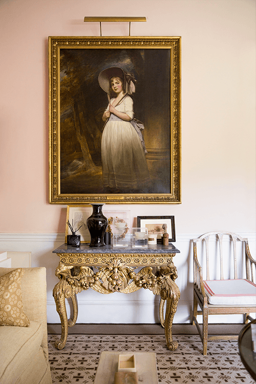
    That composition of the English bureau with bar tray and vase of flowers against the soft pink walls is just gorgeous.

  25. What a pretty pink blog post, Laurel! I do love pink – pink roses & peonies & camellias – but I’ve too many friends who did the stomach-turning southwest mauve theme in the 80’s & 90’s. Today you’ve opened my eyes & I’m appreciating pink done right. Thank you!

  26. Loved your ‘Think Pink’ posting. I read somewhere years ago that other colors when lightened become a pastel of that hue…blues, greens, yellows, etc. but when red is lightened, it becomes another distinct color of its own–PINK! So flattering any time of the day or night.
    Glad you have your IG account back! Good work.

  27. My Mother always used pink light bulbs in every room. They cast a beautiful flattering soft light. They still sell them.

  28. That sophisticated shade of pink found in the royal palace in London (wasn’t open when I was there, but I’ve seen pictures) and in other fine old British homes almost look as though the paint used to be another shade altogether and has faded to the current very genteel color. I think that must be one of the things that separates Ben Pentreath and other designers of his caliber. It’s that ability that seems peculiar to Europeans to know what old things to leave as they are to give the design a certain weight and charm and importance.

    What I like about your style, Laurel, is that, like Ben and Suzanne Kasler and your Uber-talented friend, Nancy, you walk into one of your rooms, and you don’t know what year it is. I love that.

  29. I painted my downstairs great room in a dusty pink called Queen Anne pink by Benjamin Moore. It was part of the historical collection. It was warm and soft and flowed in lamplight. We loved it and I got comments on it all the time. That was a decade or so ago and now I have repainted it in ivory tusk (which I also love).

  30. Hi Laurel, Love Pink and all of your photos are so inspiring. We did our 1 1/2 story foyer in BM Fondant about 2 years ago after seeing it in a home featured in a magazine. I found a vintage curved black framed Chinoiserie mirror and hung it by the front door. Still deciding if all of the doors need to be black. I am leaning yes after seeing this gorgeous post. Glad you got your account back too!

  31. What a brilliantly GORGEOUS post!!! I love pink!!! It’s just hard to pull off if you’re not an expert. And now I’m really really tempted to paint my dining room ceiling Opal in a pearl finish. James Farmer said this is a good finish for ceilings if you’re not paying someone to lacquer it. My dining room is almost finished and I executed many of your suggestions from your January blog post you featured it in. I ended up keeping the ceiling mayonnaise but I think Opal would give it that little extra something I think it’s missing.

  32. Thank you for this great post about how to do PINK well. These are absolutely beautiful examples. I have never been brave or knowledgeable enough to actually use it in my home, but I wear pink frequently. Then of course if you go to Mexico and further south, you will see hot pink everywhere and that’s lovely too.

  33. Dear Laurel, I love pink in any shade. You made me think back on a favorite Aunt of mine who decorated in French Provincial with pale blue and pale pink with creamy white. I don’t know if it was my adoration for her or the decorating but now I love that look. Thank you for bringing back such good memories for me. I love your posts and try to read every single one. You are hilarious and so smart. Best Wishes on your new home!!

  34. I enjoyed your “pink post” more than you can imagine. When I was a wee lass, my parents built a house, moving the 4 of us from a 1 bedroom apartment, into a 3 bedroom home that they had scrimped and saved to build. To save money, the plasterer dyed the plaster so that no painter would be needed. My bedroom was to be pink but the dyed plaster was a sickly pepto-bismol color that ruined my love of pink forever. I don’t wear anything pink. But, I promise to change my stick-in-the-mud attitude and at least keep my mind open.

  35. Love dusky pink. My wedding gown was called “blush pink”. But, you’d elevate any color to hit a high note!

  36. Hi Laurel,
    So relieved the you got your Instagram account back.
    There are a lot of unscrupulous people out there. We can’t be too careful.
    Thank you for enlightening us about the color pink. And all of your suggestions with paint color. I desperately want to paint the bathroom in my new home pink.

  37. Thank you for validating pink! You have now made it respectable, lol. Many years ago, before the dusty mauves of the 80’s, I painted my living room and dining room a lovely, soft pink. People would be surprised when they walked in, but a funny thing happened. Guests never wanted to leave. They would sit down, sigh with pleasure, and stay way too long. There were times I had to shoo them politely. It turns out, years ago, there were color studies to determine what the best color was to keep prisoners calm and not agitate them. Turns out it was guess what? Pink! BTW, chrome yellow is the absolute worst, sparking anger and anxiety. Use with caution.

  38. I’m in the process of updating my bedroom. I’m going to try Opal on the walls. I think this is the color I’ve been looking for. Thank you.

  39. Laurel, I’m not at all “girly” but one of your previous pink posts inspired my dining room. We did crisp white wainscoting and painted the upper walls Opal. It’s the prettiest room in my house and we use it everyday. The leftover paint went in my tiny, walk-through laundry room, and my husband sprayed the door to the garage pink. Makes me smile every time I see it!

  40. So glad your IG is back! Yay! I love pink and it all began when I bought a copy of UK House Beautiful on a visit back in the late 90s! The cover story was a pink thatched-roof farmhouse in the country, with lots of pink in the interior too! I still have it somewhere. I also have a sample of pink cloud from your previous recommendations–still waiting to paint. You have inspired me!

  41. Just finished painting main areas of my condo Tissue Pink by Benjamin Moore and love it. Soft pink and depending upon the natural light presents a light tan. Love it

  42. I was in heaven when Blush became a decor staple. Just reading through your post left me feeling uplifted..
    I LOVE pink đź’–
    Well done on your Instagram rescue.

  43. So glad your IG account is backed! Woot-woot!!!

    Regarding pink: My brother loves red, pink and orange…because he can see them! Otherwise he’s color-blind, I think. I like pale pink, but can’t wear it or any pastels, so instead I painted it on the exterior of my childhood dollhouse! Now my dollies live “happily ever after” which is what pink looks like to me. 💖🙋‍♀️

Leave a Reply

Your email address will not be published. Required fields are marked *

This site uses Akismet to reduce spam. Learn how your comment data is processed.

Welcome To Laurel Home!

laurel-aarons-18th-e1456449963926

Hi, I’m Laurel, and Laurel Home is the website and blog for Laurel Bern Interiors.
I’ve been creating new-traditional interiors since 1988. The blog is where I share all.

New Edition, November 2023! Get The Indispensable Guide For 100s of Home Furnishings And Interior Design Sources That Everyone Is Raving About

laurels-rolodex-final-book-cover-master 10th edition 23-24

laurel home archives

Categories:

Please click the image below for more info about my rockin’ Interior Design Guides for 2024!

Laurel Home Interior Design Guides 2024
Amazon ad

please click below to check out my favorite decorating & design books

Laurel Bern's Favorite Interior Design and Decorating Books
Subscribe To The Laurel Home Blog And You Will Receive A FREE Guide Where I Share How To Get Your Paint Colors Right, The First Time.