It’s hard to believe, but I moved to Boston 27 months ago. The first year I was here, I was frequently asked,
“Why did you move to Boston?”
Usually, I answered with a big smile:
“I moved here for the architecture.”
Mostly, I was met with a somewhat confused expression. However, this beautiful city’s architecture was one of the factors that led me to come here. Boston is an old city, and I love old.
Of course, there were other compelling reasons to move here, such as it was closer to my son. (He just left after barely a 3-day visit.) I will not see him until the end of the summer because he is learning more about being a timber framer in a work-study program in eastern Kentucky.
But, getting back to the topic, we will talk about one of my favorite architectural elements, the frieze.
What IS a frieze?
It can be more than one thing, but it is always a horizontal architectural element, far wider than tall. It is usually high up.
To review please check out this post about classical architectural elements.
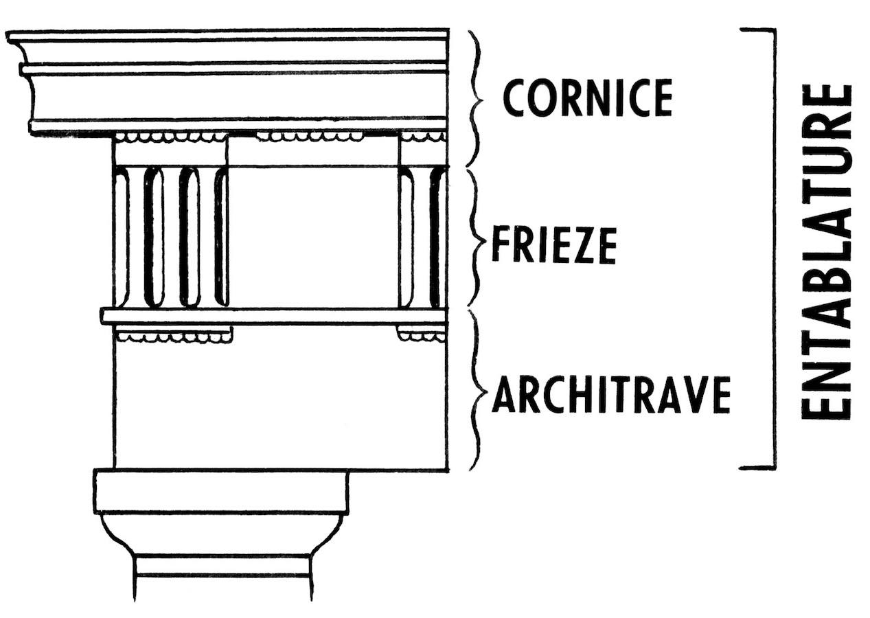
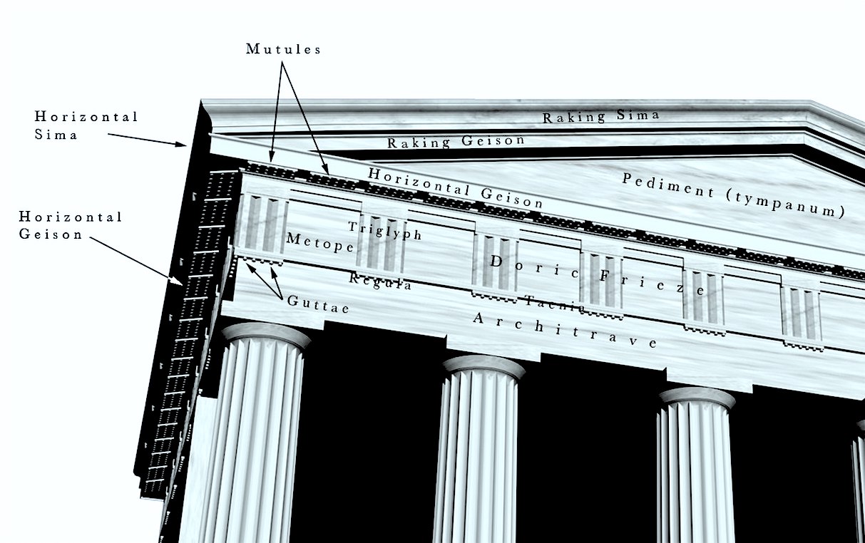
The frieze is part of the classical entablature. It’s a horizontal element underneath the cornice (crown) and architrave (if there is one) but above a picture rail in an interior.
The frieze is often a way of dressing up a lintel.
A lintel is a horizontal beam or entablature above columns holding up columns. Or, it could be used as a decorative element on the exterior or interior of a wall.
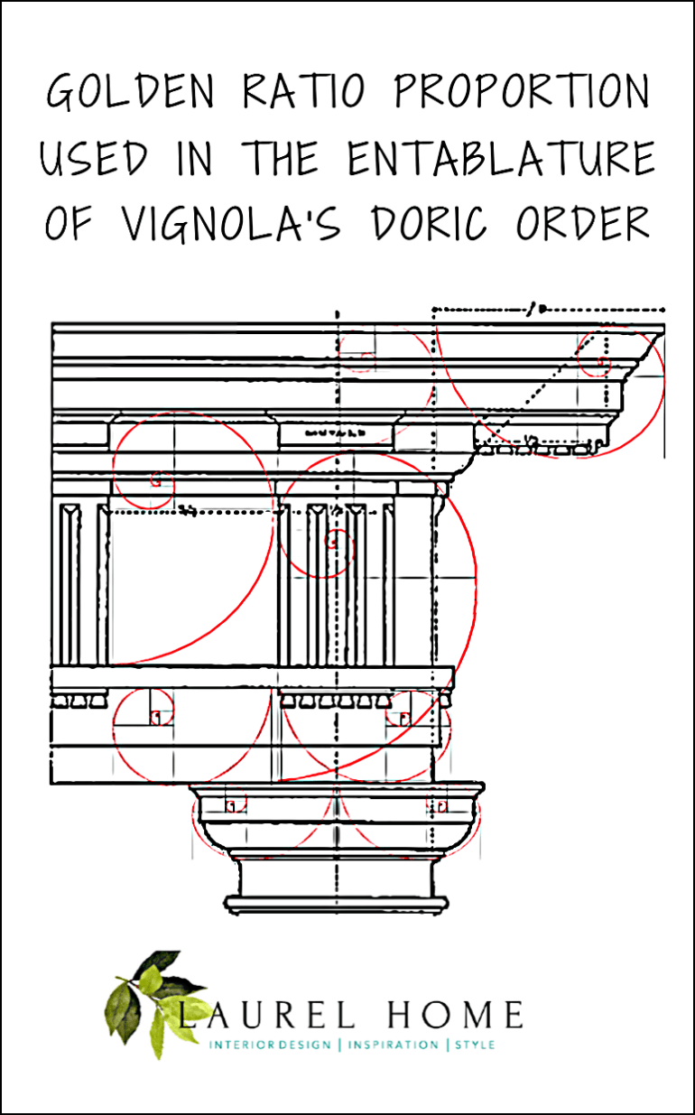
The architrave is part of a classical order. And there were other friezes for each order. Above are all of the classic elements of the Doric order. This post isn’t going to get into all of that because I’d rather share many examples from the gorgeous buildings that surround me here in Boston.
A frieze is usually carved, and in centuries past, a bas-relief of a scene was sometimes used on the exterior of buildings.
However, a frieze can also be painted onto a wall. It can also be wallpaper.
Today, I’m going to share many examples of an architectural frieze. The majority are on a building exterior, but several are in interiors.
Most are in Boston, but not all.
Let’s begin super close to home.
Well, we can’t get any closer than my living room!
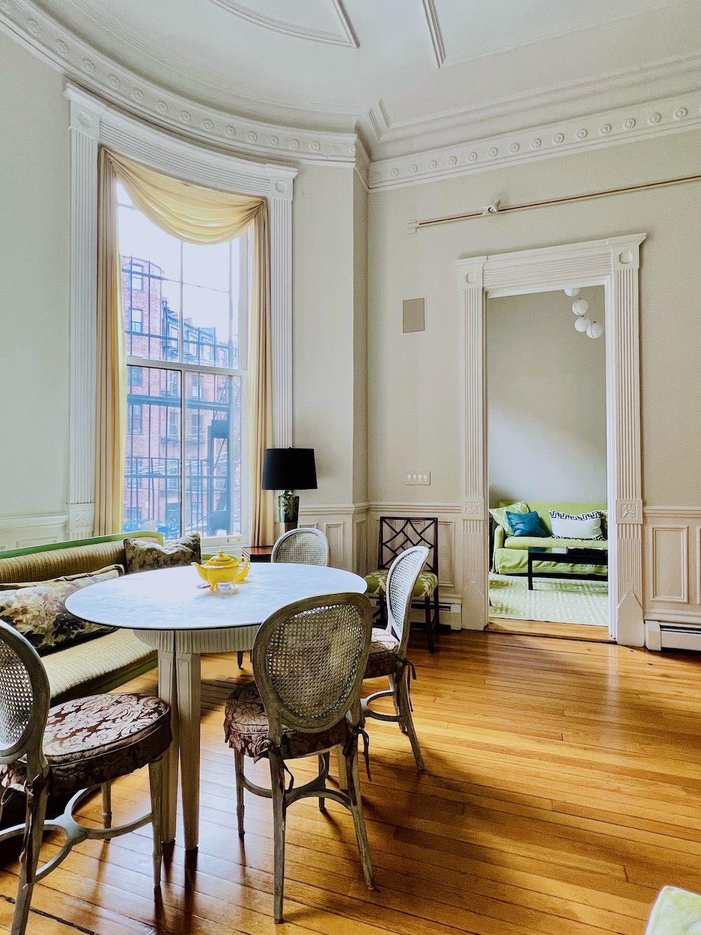
Above, you can see the original plaster crown moulding and decorative frieze below it.
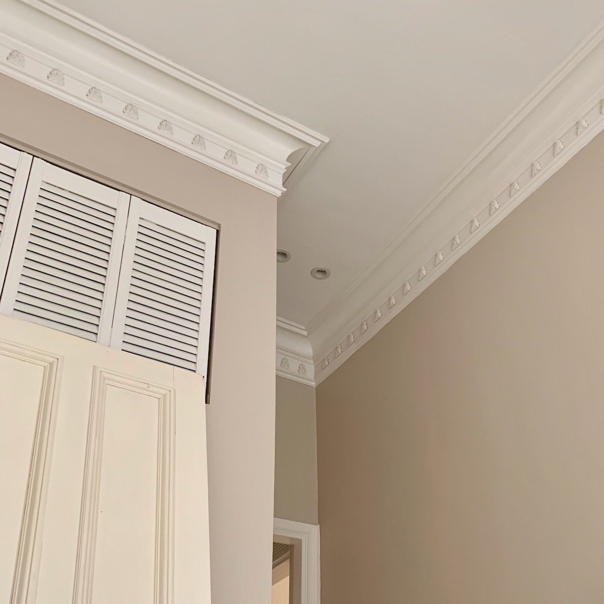
Above is a similar moulding in my den. This is not original, but it is well done. Phew! There was nothing in here originally because the den was the butler’s pantry, a utilitarian room, and closed off with doors.
So, let’s begin in England with one of the most breathtakingly beautiful classical buildings I’ve ever seen.
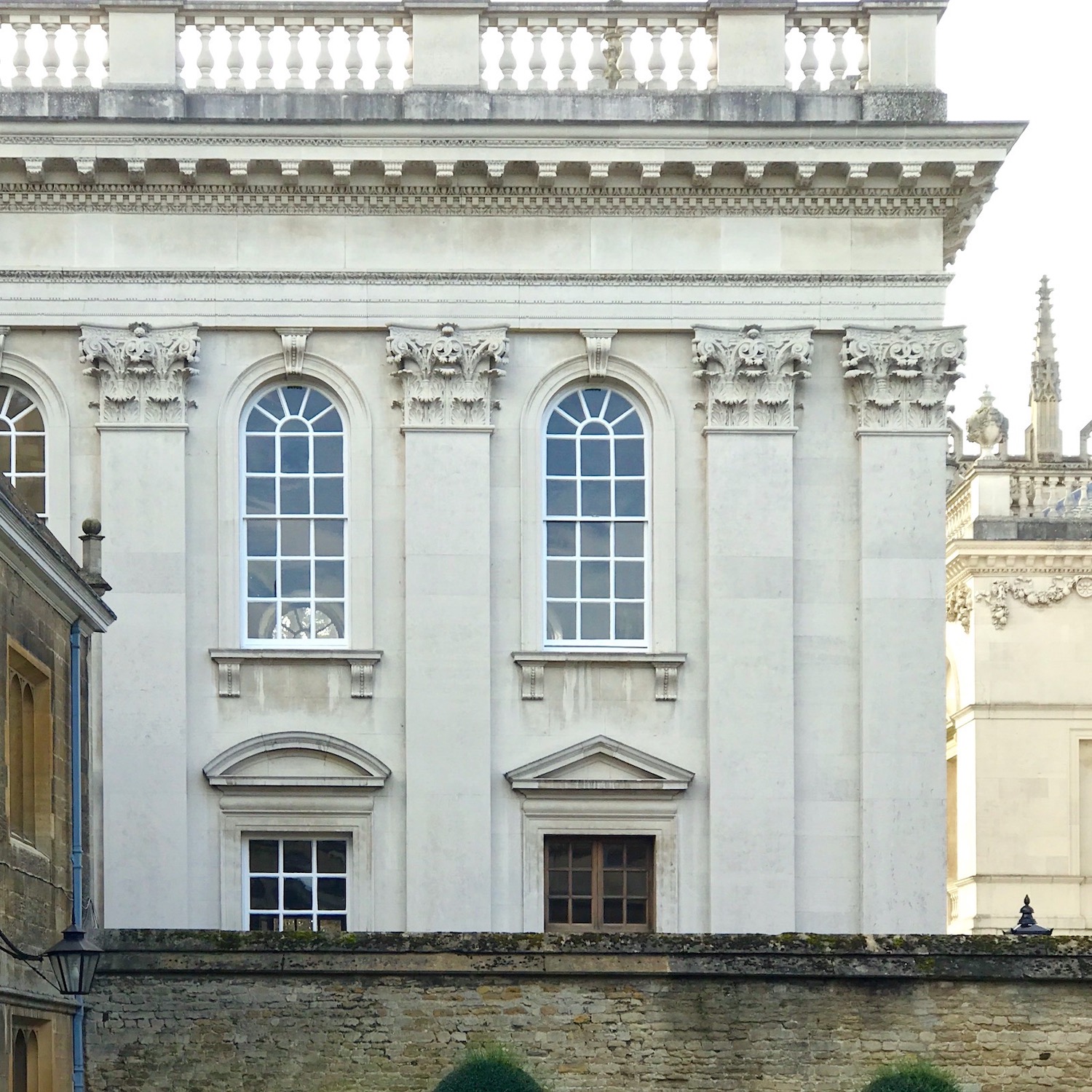
Gonville & Caius College, part of Cambridge University in Cambridge, UK. I took this image while on a trip to England in 2017. Here the architectural frieze is just under the dentil moulding. This one is lovely and plain. In this case, it should be because the stars of the show are the magnificent cornice, balustrade, and Corinthian order Pilasters.

Above is a building in Chicago. Please forgive me. It’s already late, and I forgot the name of this building. I did share a different image in this post from my trip to Chicago with Cale last year.
Last Thursday, Cale and I played tourist, visiting the Massachusetts State House, Faneuil Hall, and the Union Oyster House restaurant.
The following few images are from the Mass State House, where you will see many friezes.
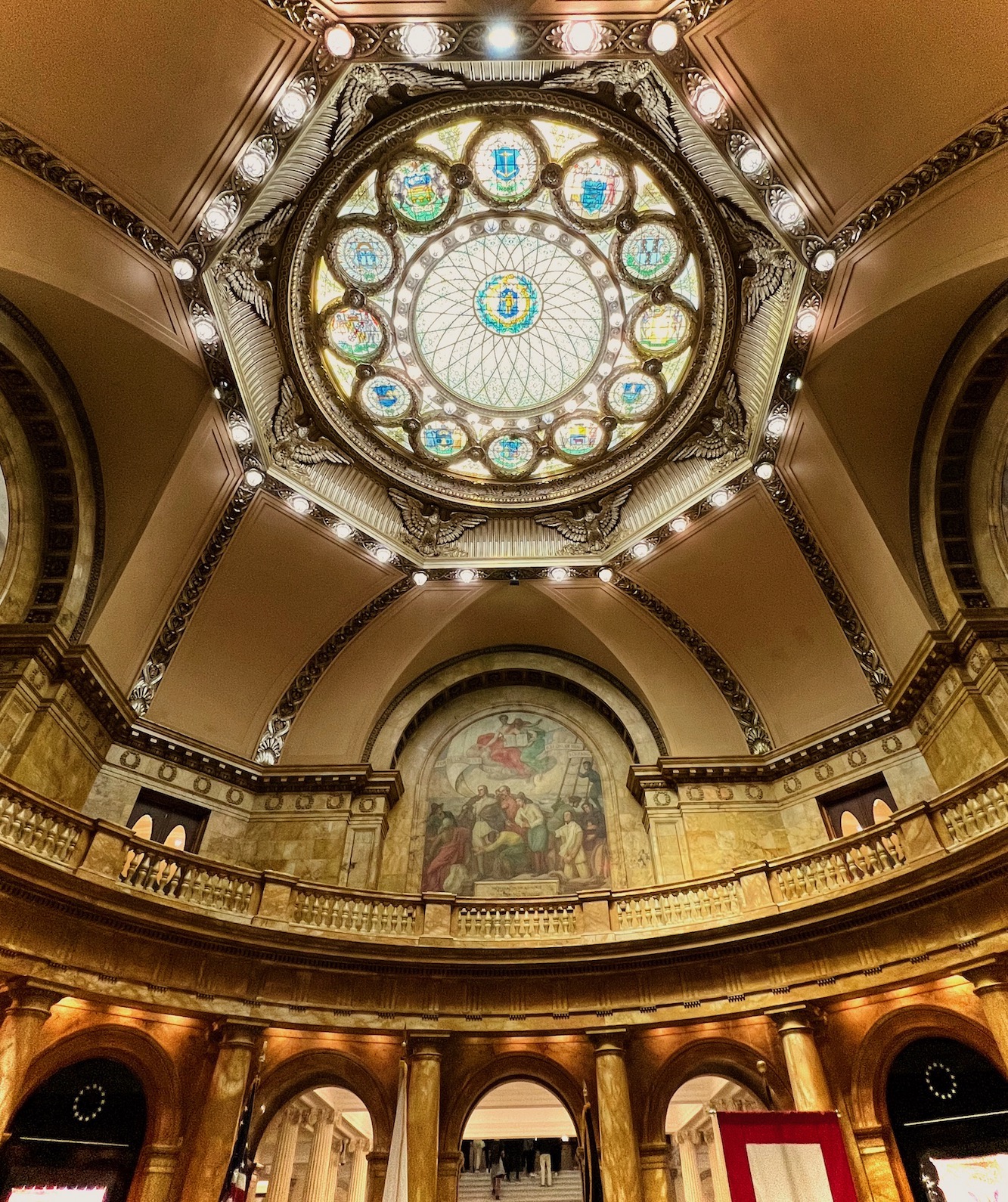
Above we can see friezes on each level. The lower one shows the classical triglyphs familiar to most of us and found in many buildings in Boston.

Above are more triglyphs.
I’m not sure why there are two domes or which one is THE golden dome one sees outside. Above is the State Assembly room. Very cool! By the way, you do have to go through security, but we were able to go on a self-guided tour. Nothing was in session last Thursday.
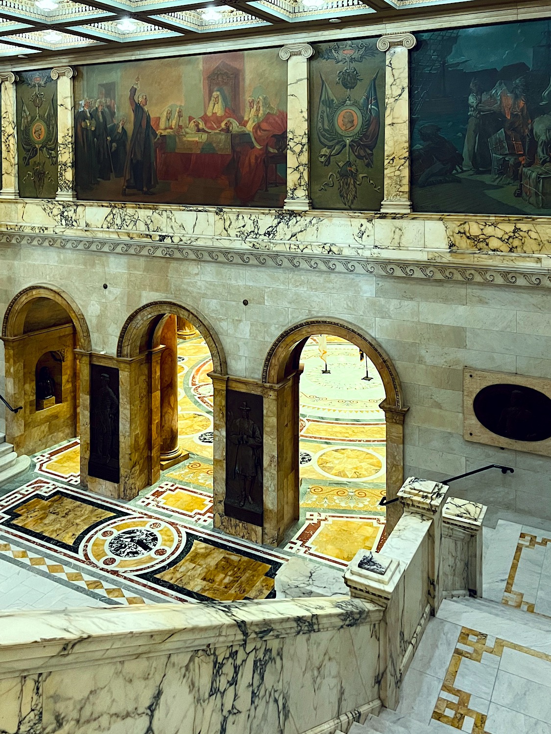
Near the ornate dome is this equally ornate area that doubles as a stone quarry. I’ve never seen so much marble in one place! Above, a mural frieze depicting historical events in the state of Massachusetts.
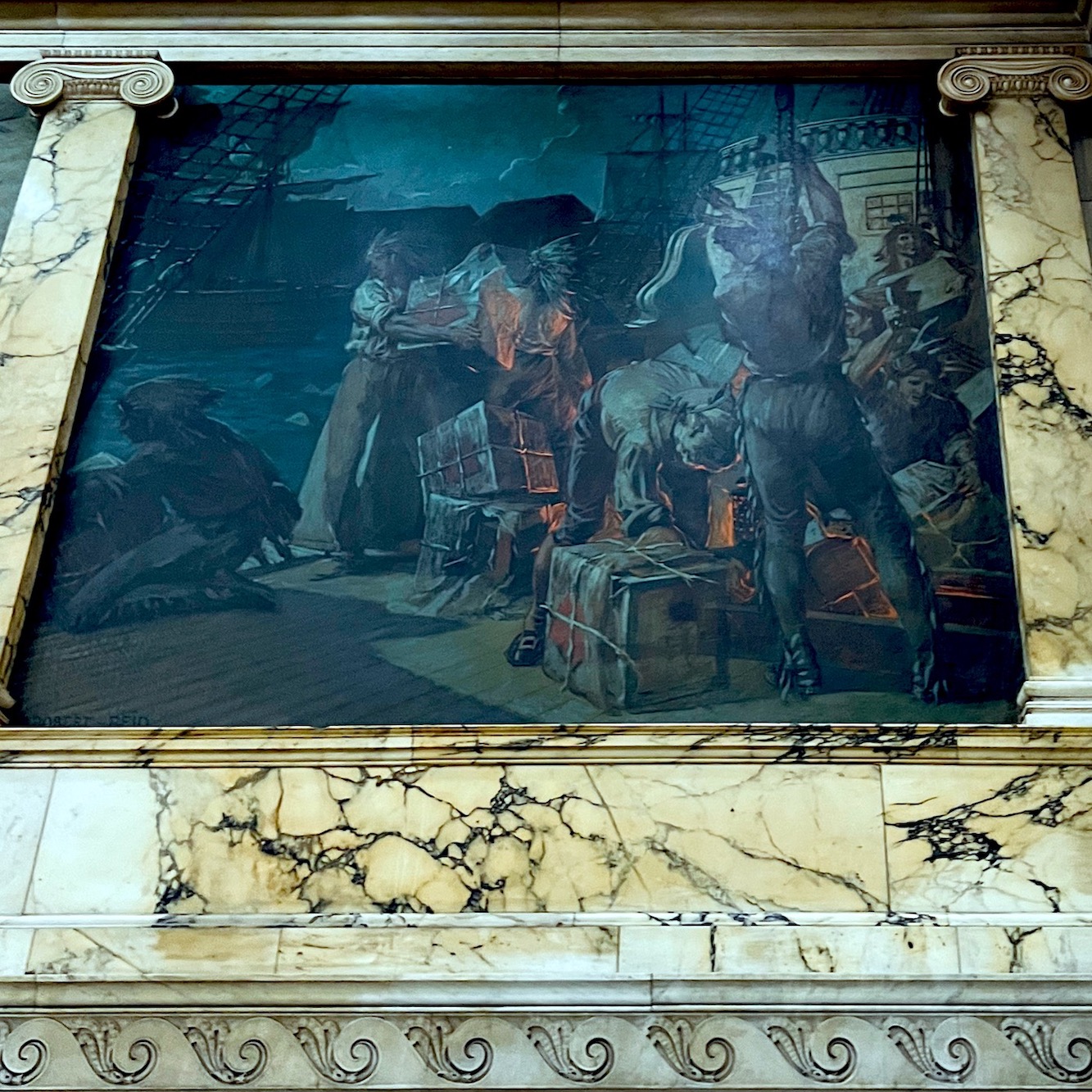
It doesn’t take much to figure out what the one above is about. Of course, it’s the Boston Tea Party.
I took a zillion pics, but I am only sharing a few of them.
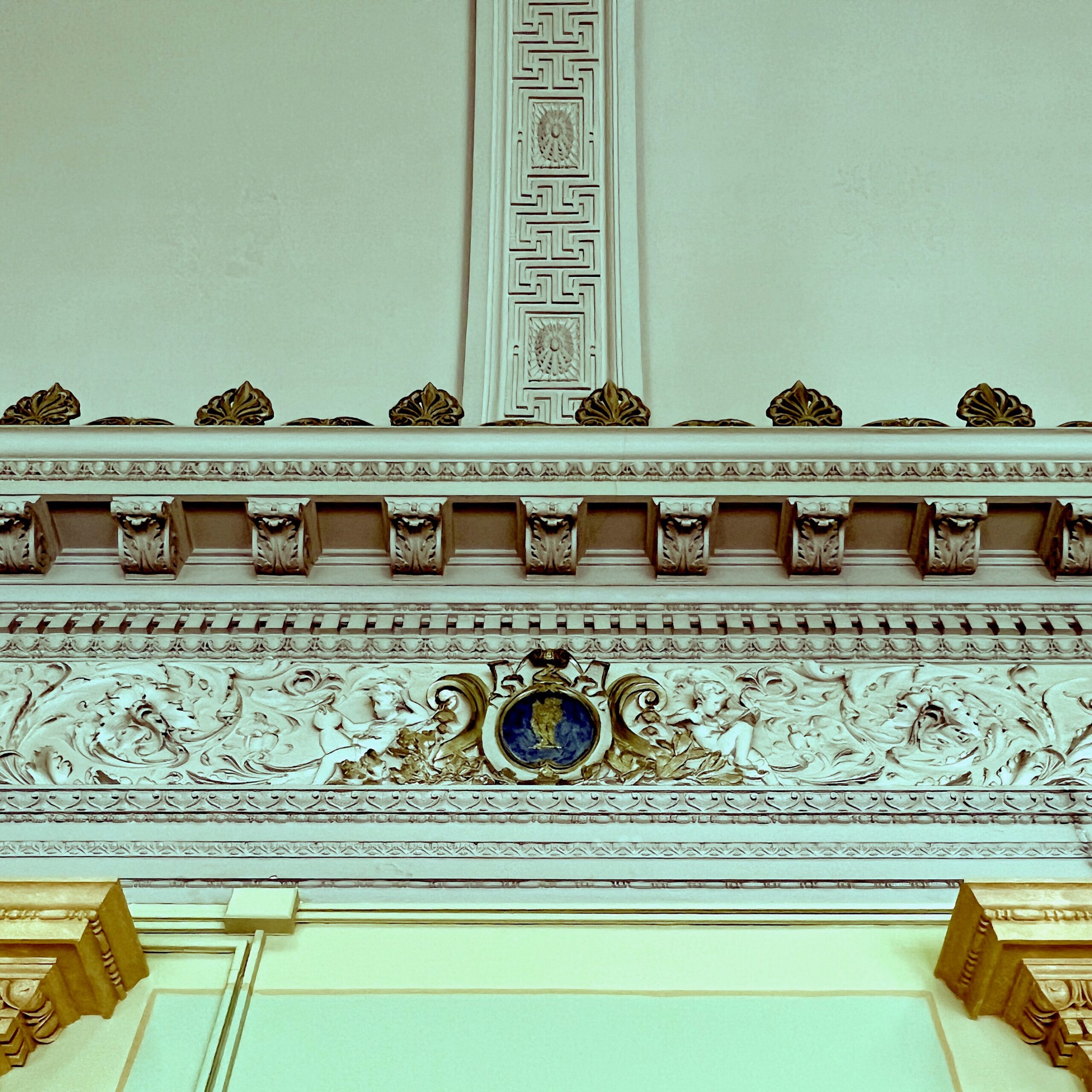
Above, is a vignette from the opulent library. The frieze is the ornately carved horizontal element. The wonderful meandering Greek Key pattern is on the ceiling. However, that pattern could also be used as a frieze.
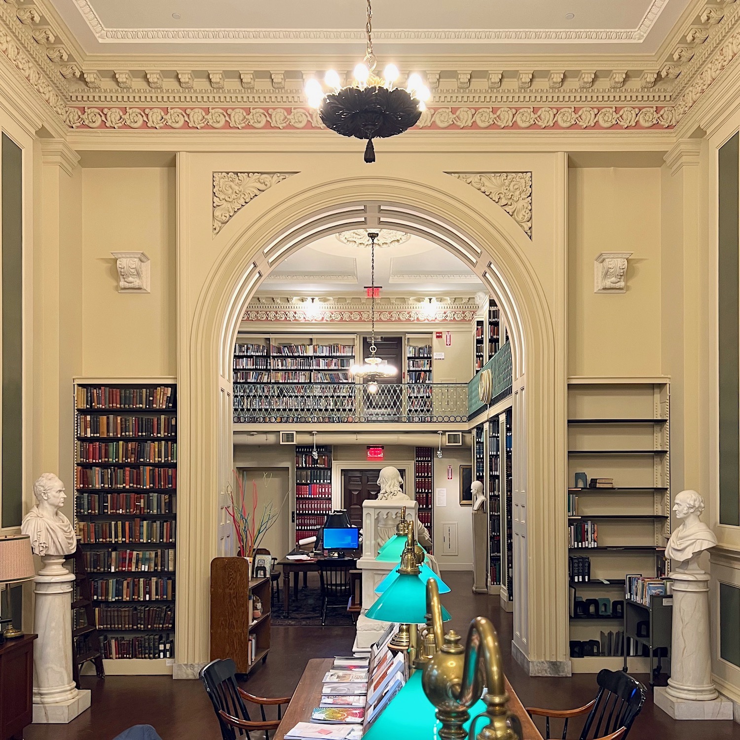
A year ago, I visited the Boston Athenaeum, where there is the most beautiful classical architecture and many friezes, such as the stunning plaster carved and painted frieze in this reading room.
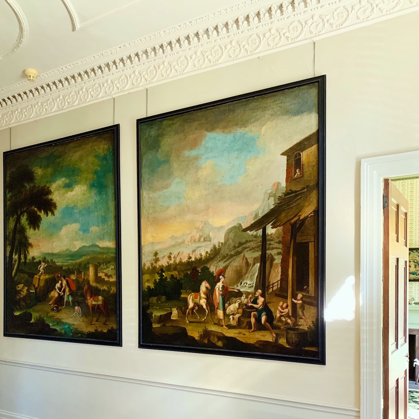
In the fall of 2021, I visited the Harrison Gray Otis House. This home was built at the end of the 18th century and is decorated as it would’ve been then.
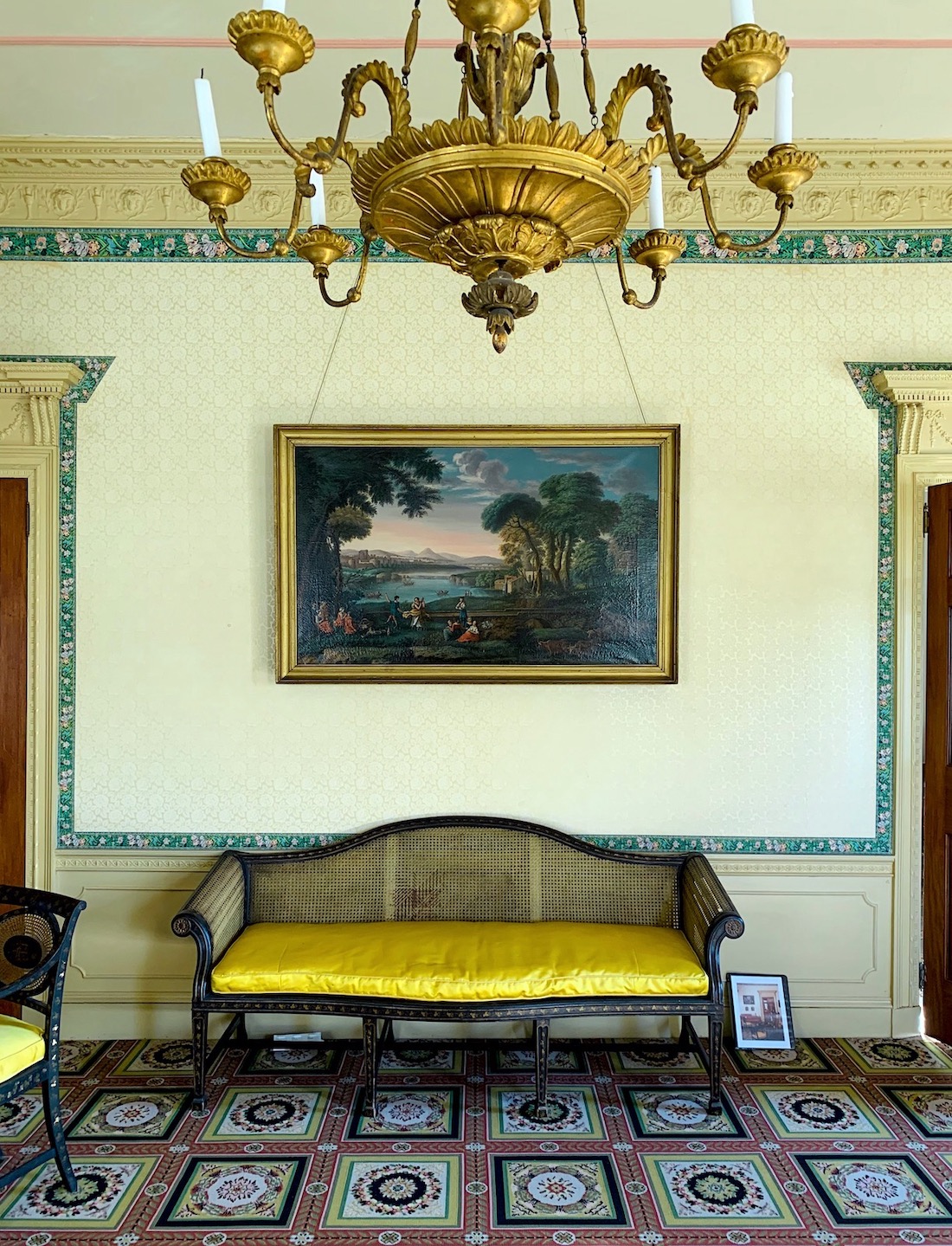
This beautiful parlor in the Otis House features a frieze in plaster relief and a decorative wallpaper border.
![]()
In Beacon Hill is this gorgeous building with patinated copper friezes.
![]()
I love the frieze over this entry door in Beacon Hill. If you love the doors of Beacon Hill, you will love this post.
![]()
And I adore this simple and elegant frieze over the door in a classic Beacon Hill Boston home.
![]()
This frieze is a decorative element, not under a crown.
![]()
A Triglyph frieze supporting Tuscan columns Beacon Street, Boston, MA
The rest of the buildings are in Back Bay.
![]()
This was taken in April two years ago on Beacon Street in Back Bay. I am ready for spring. It will be here in a few weeks!
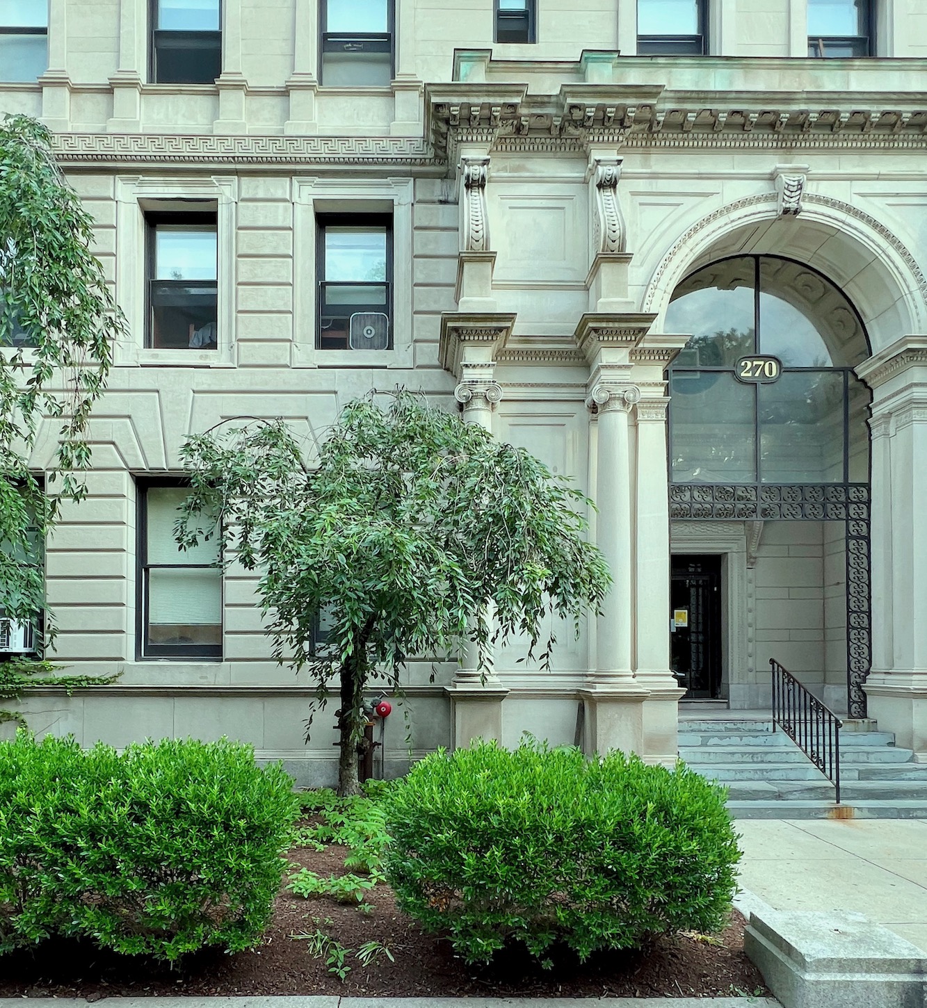
While most buildings in Back Bay and Beacon Hill are of red brick, there are a refreshing number with limestone facades. These are all in the Beaux-Arts style, which was popular in the early 20th century.
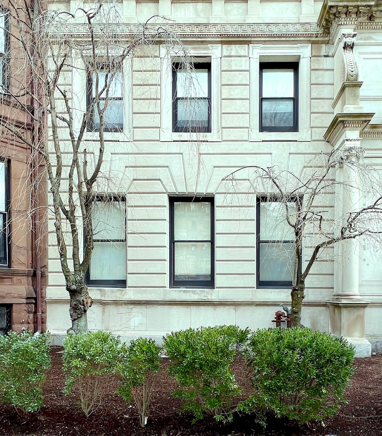
Yes, the same building, but in the winter. That’s a frozen frieze. ;]
Sorry, couldn’t resist.
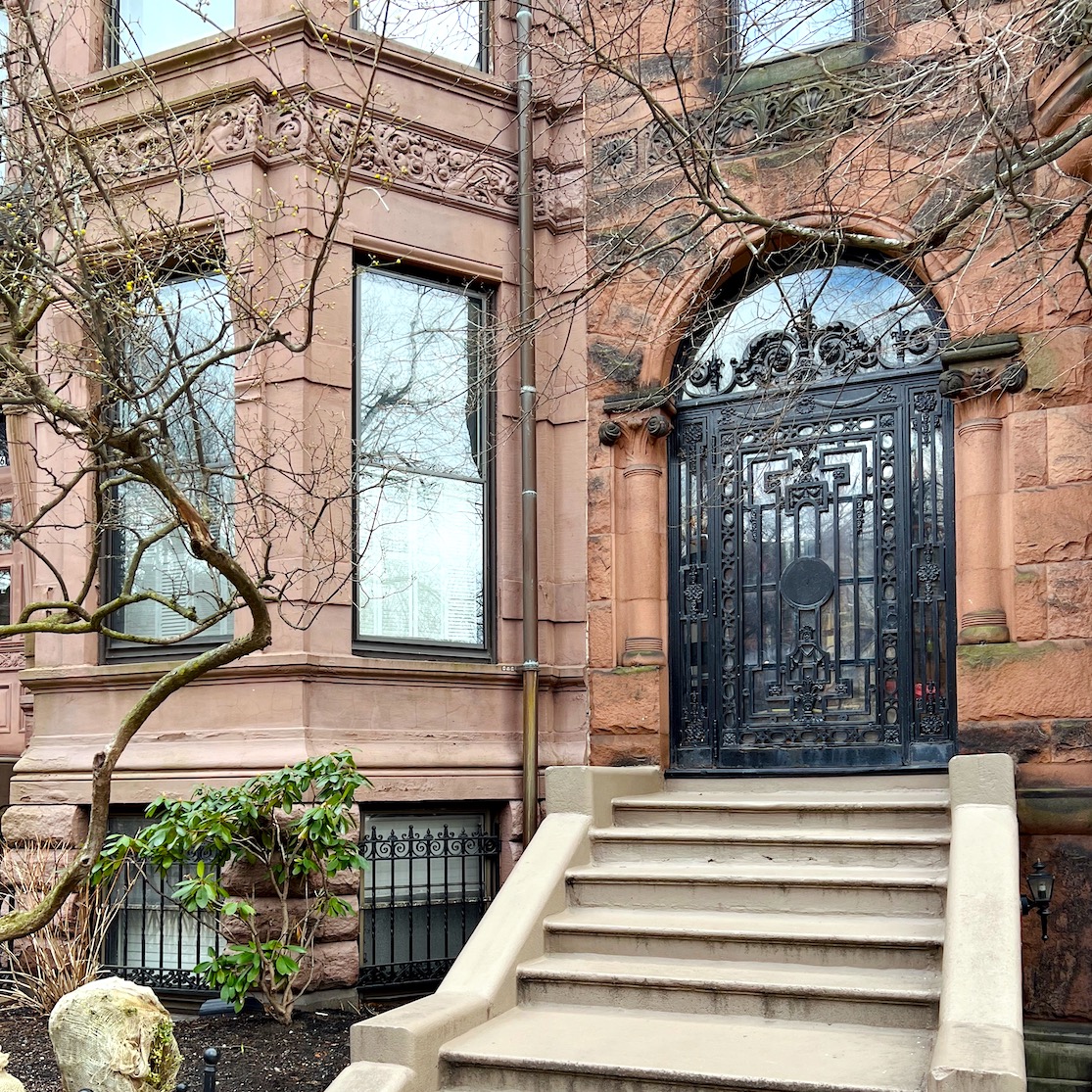
In addition to brick, many buildings are made of classic brownstone. Above, a jaw-dropping iron door and gorgeous frieze in heavy relief.
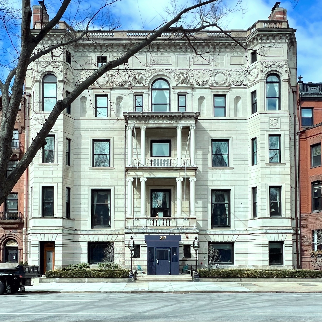
The ‘Quin Club Boston Back Bay with an exquisite frieze in Bas Relief. This is the very recently remodeled Algonquin Club. The interior, designed by Ken Fulk, is unbelievably gorgeous. I was exceedingly lucky to get an invite for dinner here last year. Alas, photos are forbidden.
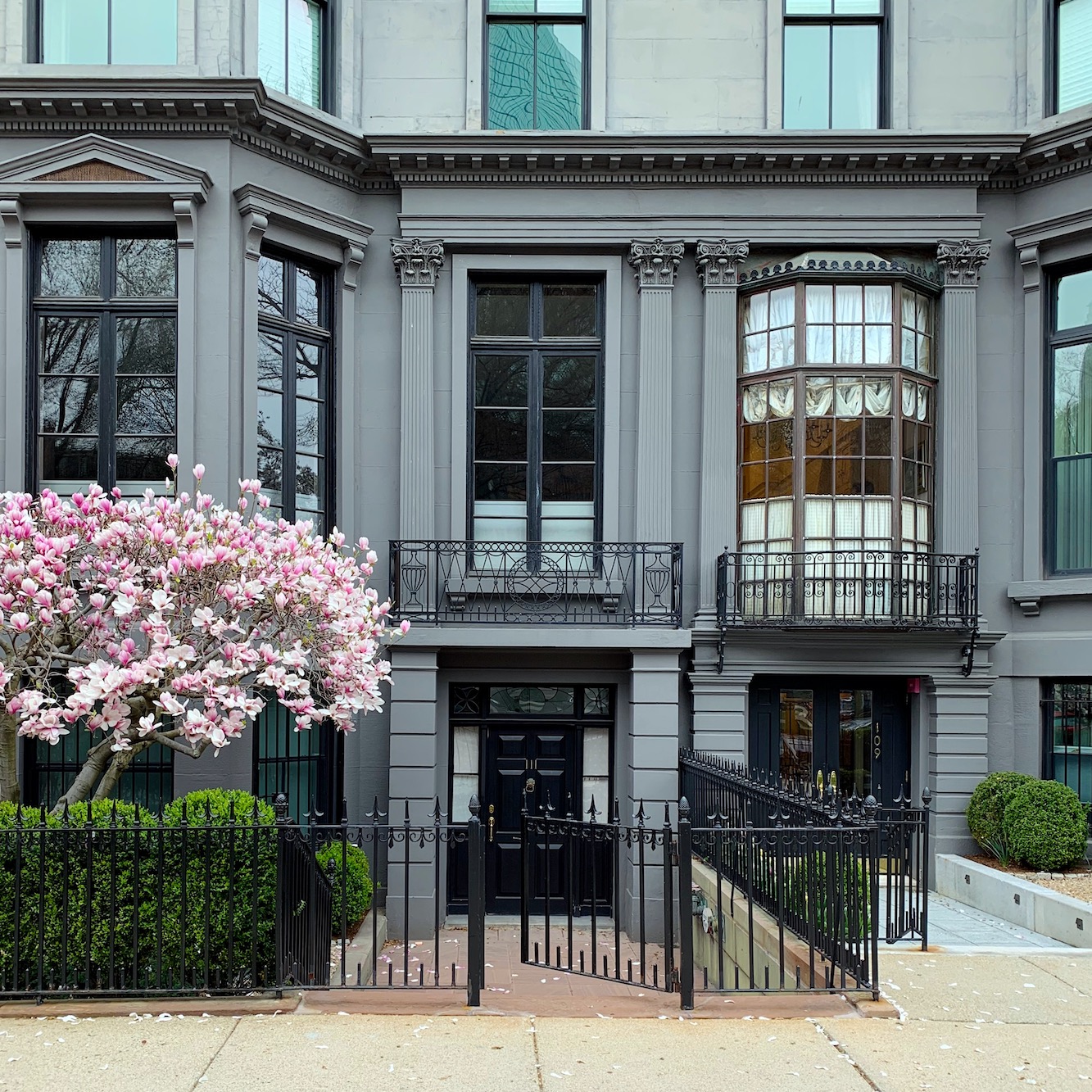
Across the street from me are two of my favorite buildings in Boston. The twins, 109 and 111 Commonwealth Ave. I met someone who lived here many years ago, and he said that it was not considered that nice back then.
I’m finding that hard to believe.
I mean, even if this place was a wreck inside, just look at those windows!
Still, for much of the 20th century, these gorgeous old homes in Back Bay were mostly rooming houses; my house included.
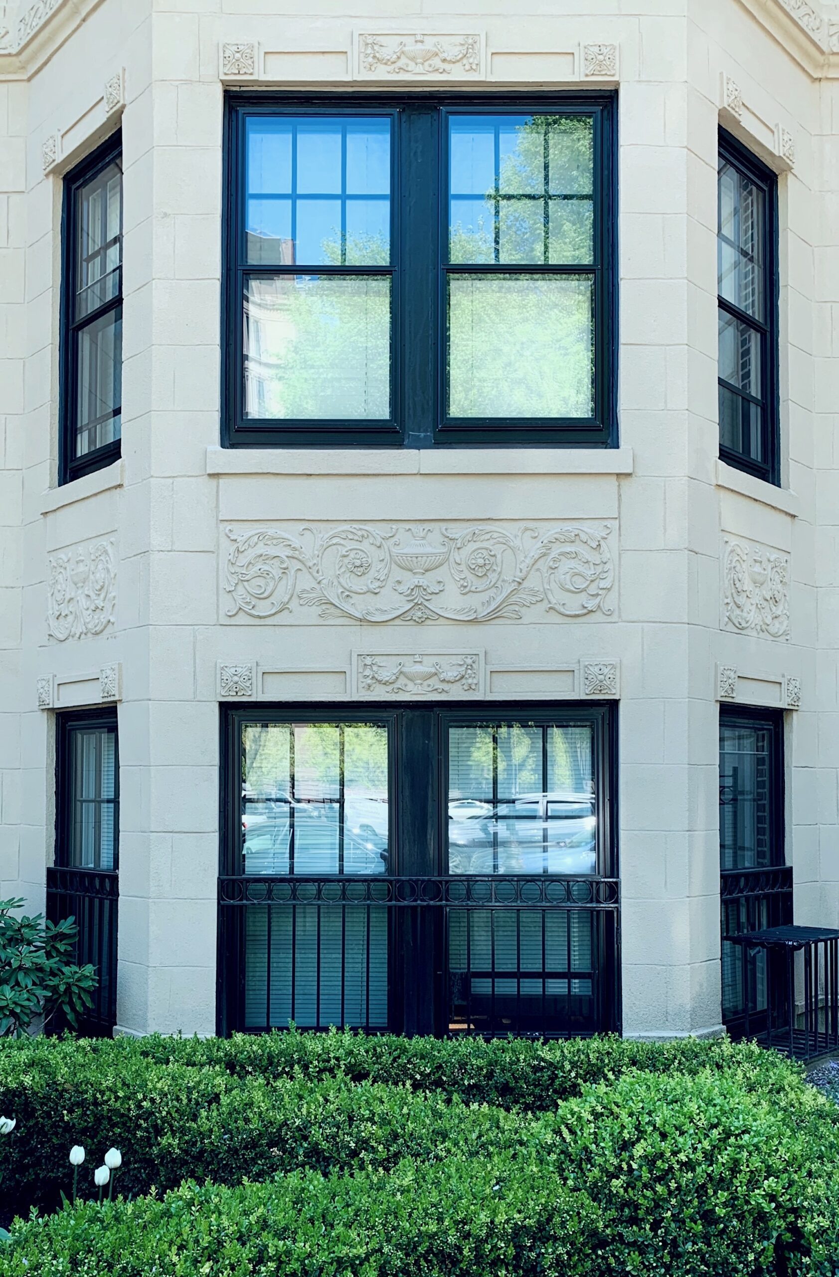
Down the street from me is this beautiful apartment building with a lovely carved frieze on the exterior. These types of friezes are common in old buildings in Boston.
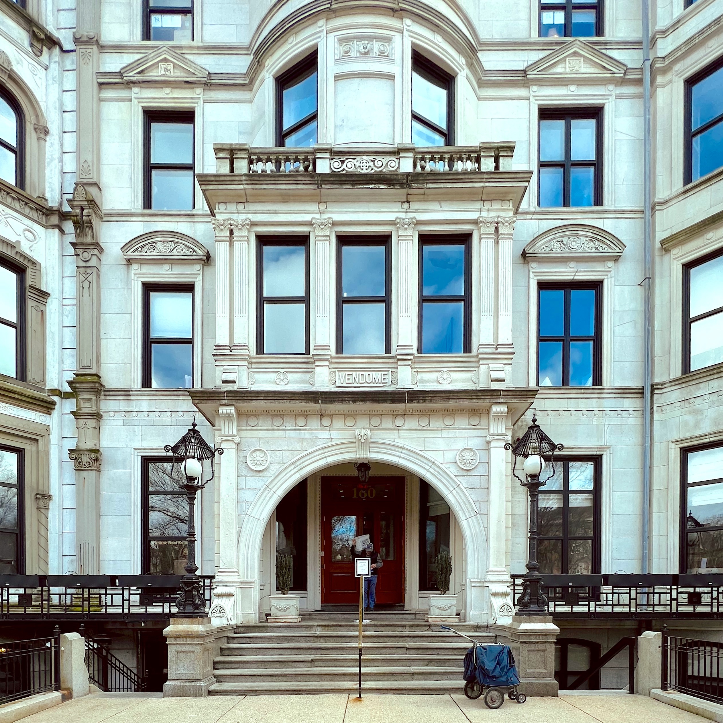
Another favorite building is a stone’s throw away from me on the corner of Dartmouth and Commonwealth; the Vendome Hotel.
Although the Vendome is no longer a hotel, it is a condominium like all homes around here.
About 50 years ago, a horrific tragedy occurred when several firefighters perished fighting a fire in the Vendome hotel. In their honor, a monument was placed nearby, on the Commonwealth mall.
You can see a lovely image of the Vendome before I knew what it was when I came to see my apartment in the fall of 2020.
I am finishing with two images taken several weeks ago when I visited the Boston Public Library on Copley Square and just around the corner from me!
And, yes, I took a bunch of pics here, too. This place is gorgeous!
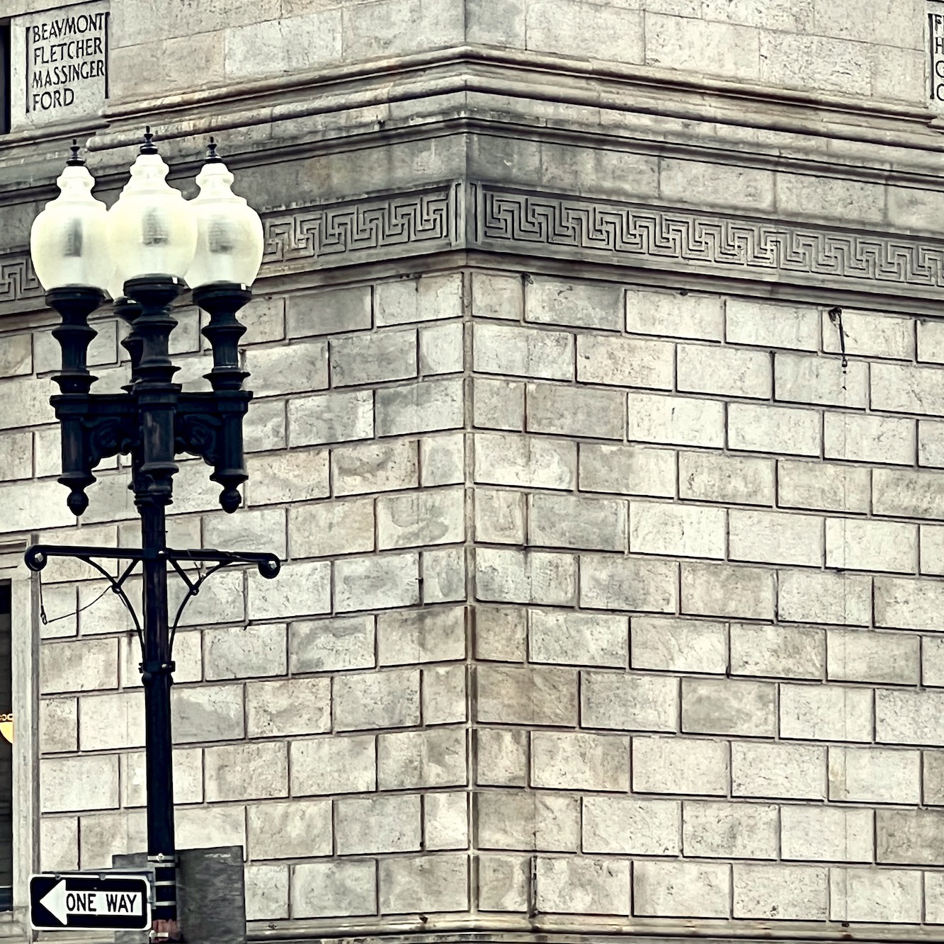
But, you guys know me. I can’t pass any kind of Greek Key pattern by, whether it’s meandering or not.
I realize that some of you will see a swastika in this pattern. It is true. Before the Nazis got their slimy hands on it, the swastika was ONLY a symbol (and still is) of beauty, serenity, and peace.
However, it is also a symbol of the most unspeakable evil imaginable.
I’ve thought long and hard about it. While I’m angry that the beauty has been robbed from us, there is no going back. However, in this form, I am fine with this interconnected geometric pattern. The connectedness of it symbolizes unity and peace. The Nazi version is very different and looks like what it is. Evil.
On a far lighter note and getting back to the library. I took the image below while on tour with the Chestnuts. Our guide pointed out that when the library was built in the late 19th century, there was quite an uproar over the “putti” on the front facade.
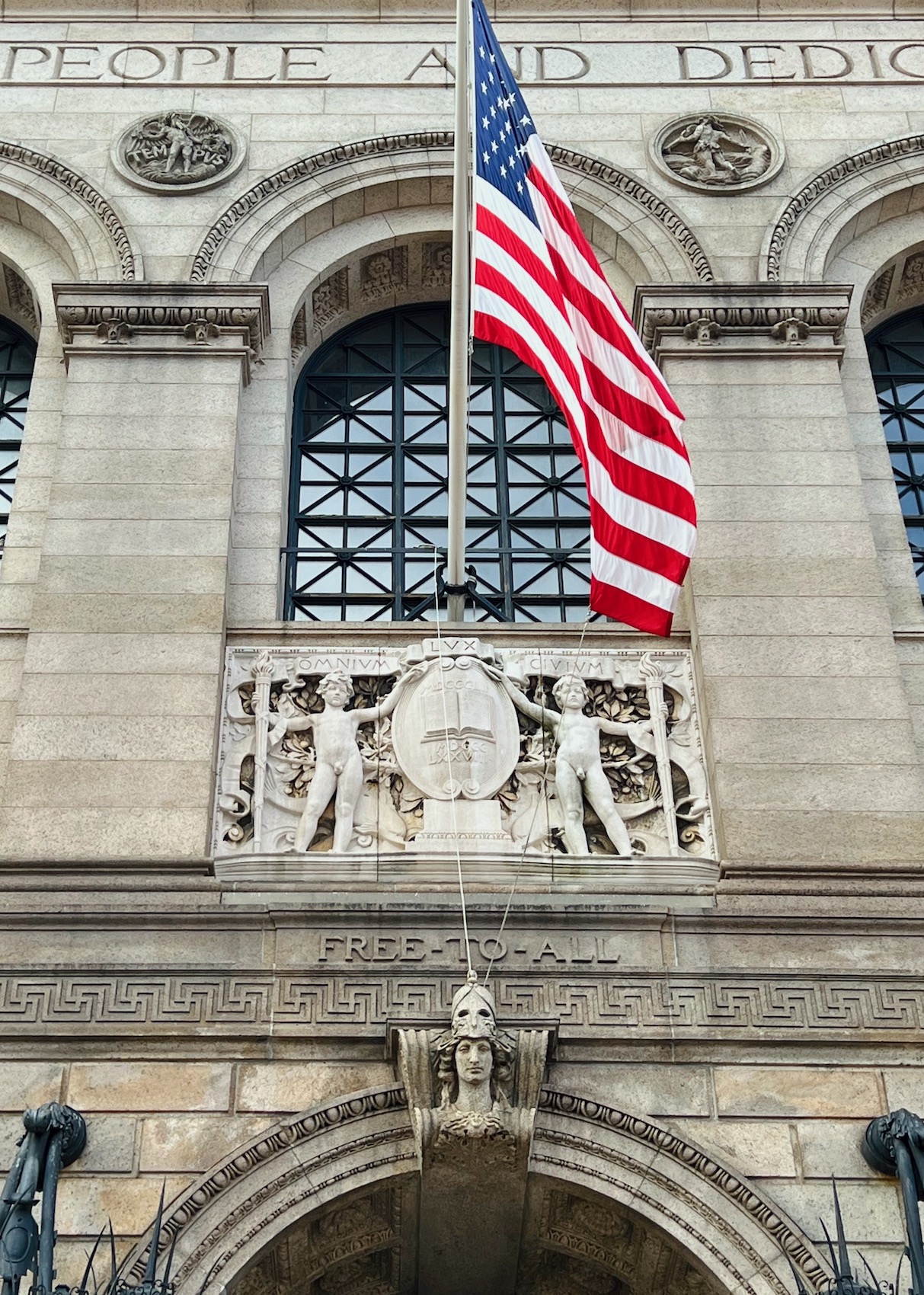
“Why are there naked boys on the front of our library?” the locals cried out.”
As the naked little boys are still there, I gather that the architect said, “Deal with it!”
The architect was Charles Follen McKim. Yes, that McKim, of McKim, Meade, and White, who also designed the New York Public Library, parts of the Metropolitan Museum of Art, and dozens of other gorgeous buildings in New York City and New England.
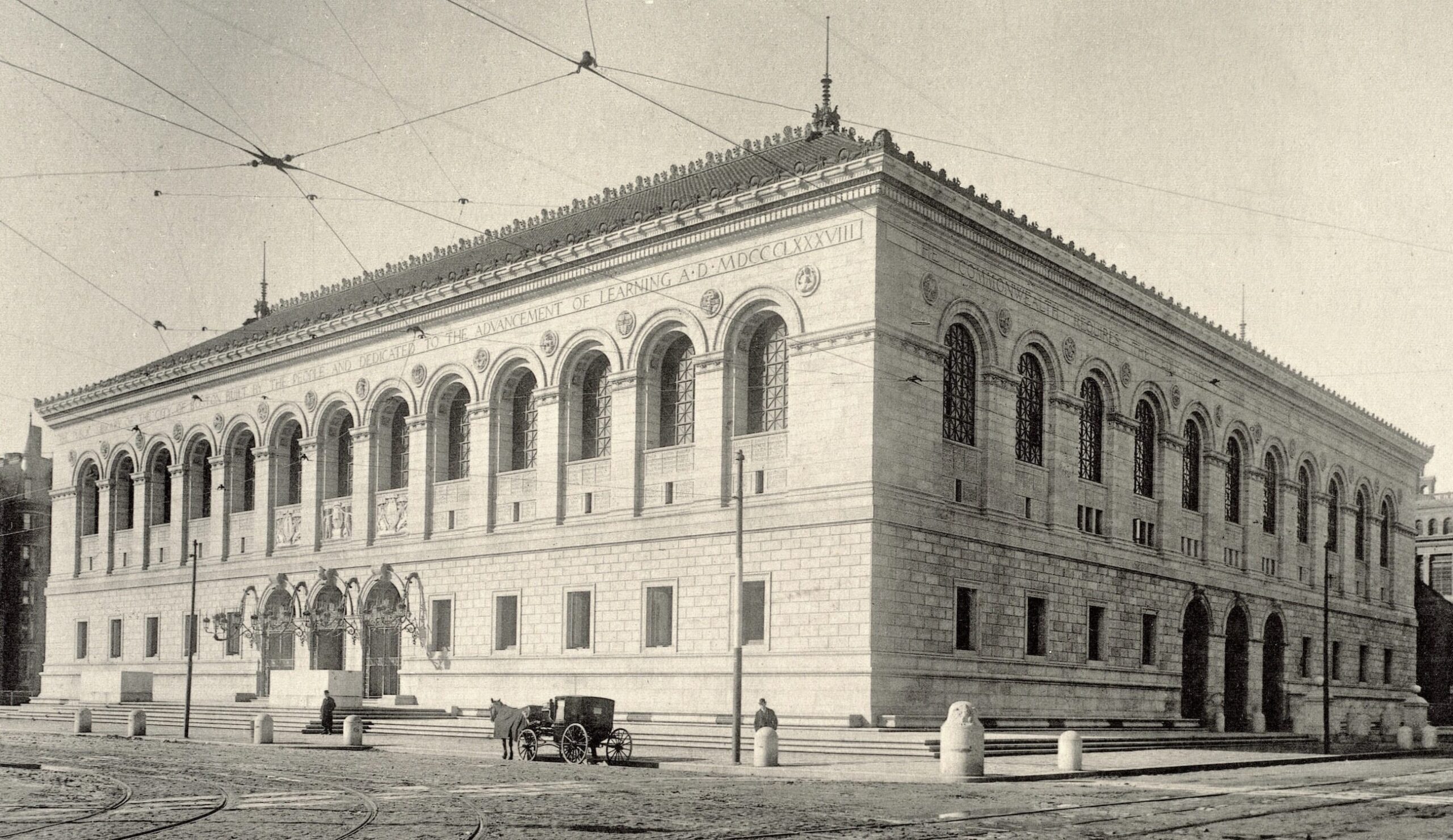
Above, the brand spanking new library back in 1895. Image via the Boston Public Library.
Yes, you can see the pristine putti as they appeared back in the day.
Last night, on our way home from grocery shopping, Cale stopped to watch some skateboarders on the other side of Copley Square, and I took some pics about 50 feet away from the beautiful Trinity Church that faces the library, but about 500 hundred feet away. I told Cale the naked boy story, and in keen male awareness, he pointed out that the pious old men statues are facing the naked little boys.
haha
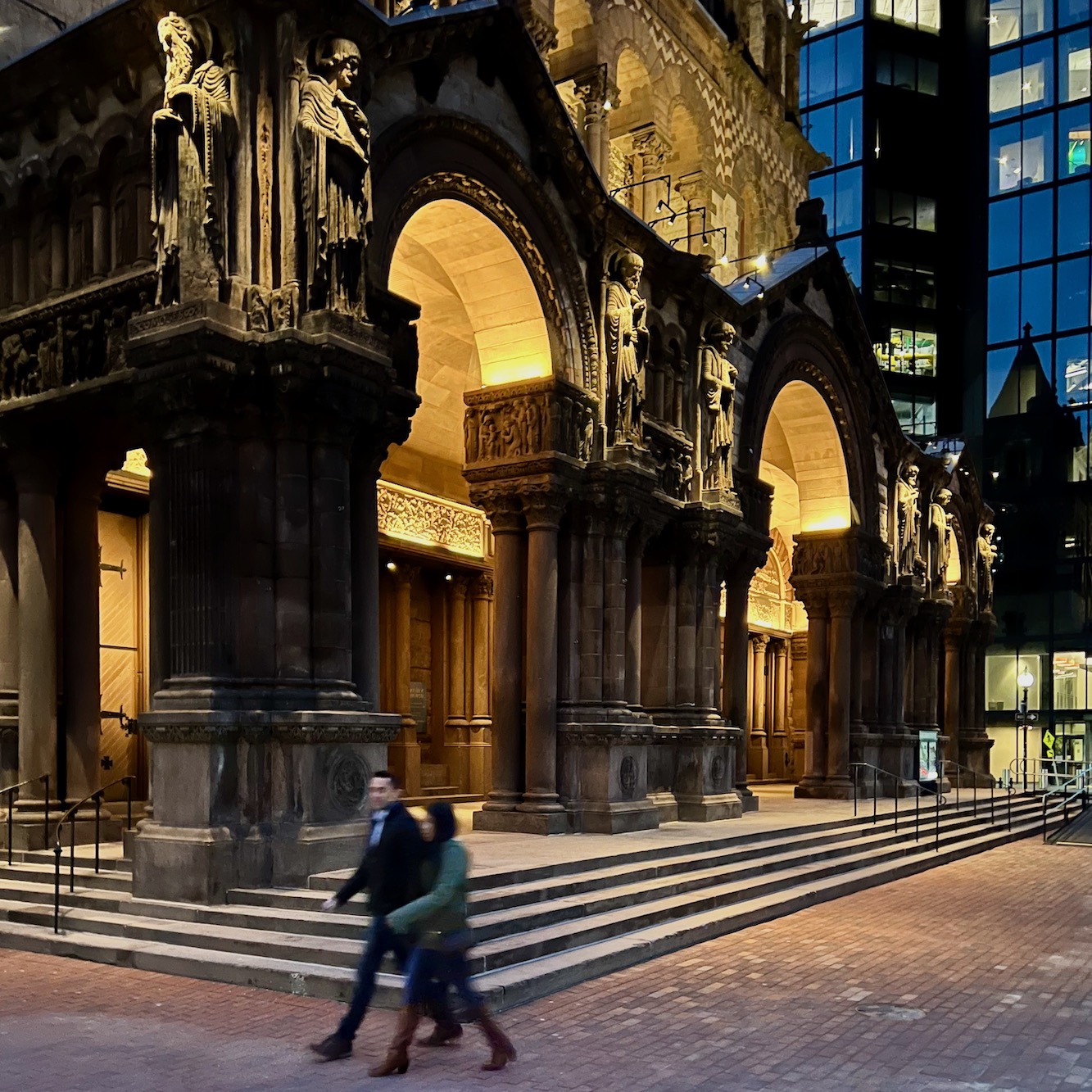
Of course, the pious old men statues are looking down. Of course, they are! ;]
My camera is so smart as it put the couple walking in my path a little out of focus which wasn’t my intention, but I like the effect. However, the object of my lens was the beautiful frieze in relief that adorns the entry into the church.
I hope y’all enjoyed looking at the beautiful buildings and seeing many examples of the beautiful frieze as it appears in classic old buildings.
I am going to be adding a frieze in my kitchen and entry. Although, I haven’t decided whether it’ll have a pattern or not. If it does, it will be a simple one.
xo,

PS: Please check out the newly updated HOT SALES!
Also, I will add something new to the bottom of my posts. All you need to do is click this link.
Or, click the image I made below.
It will take you to Amazon. That’s all you need to do. But, if you order anything within the next 24 hours after clicking the link, I’ll get a small commission. (except for Whole Foods, liquor, and gift cards) There is no extra charge to you. The vendor makes less money. It would help me out a lot.
I have decided not to do a membership site. I know there were some rumblings about that. However, it’s too risky. Still, this is a business, and it’s taken a massive hit for many reasons I have no control over. However, my expenses to maintain the website have practically doubled in the last few years.
Thanks so much!
Related Posts
 Coffee Table Styling Using What You Already Have
 Bathroom Design Inspiration – Revisiting an Old Project
 Horrid Windows Installed By Drunk Contractor
 No Foyer Entry-We Enter Straight Into The Living Room
 50 Interior Design Trends for 2020 – In or Out?
 Crown Point Cabinetry – Here’s Why I Chose Them
 Stainless Steel Sucks – What You Should Use Instead


