


Hi Everyone,
This is a three-parter. And below is the link to go directly to part 3. There’s a link to go directly to part 2 if you scroll down a bit. Or, please start reading at the top of the page to read all three parts.
Today, I will be answering some of your questions. I also answered some in the comments. In addition, I created a mood board and a palette of 16 colors I see in James’ interiors and especially the dining room we’re focusing on today.
Oh, Sorry. The link below doesn’t work as well as it should. It will get you near the bottom of part 2. I can’t figure out why it’s not going where it’s supposed to go.
Part 3 Begins Here
Hi Everyone,
This is a very short part 2, where we take a closer look at the beautiful style and furnishings used by interior designer, James T. Farmer. If you missed part 1, please start from the top.
However, there are two widgets. Please know that the first widget has changed by about 20%. So, please check that one out, as well.
Widget #1 focuses more on living spaces, with a bit of dining furnishings. Widget #2 focuses more on dining furnishings and accessories.
If you’d like to skip to part 2, please click the link below, but then scroll up a bit to see what I added to widget #1.
Apologies if you’re looking on a mobile device. I realize it’s a lot to scroll through. You’ll always have a better experience reading on a desktop computer.
Part 2 Begins Here
Part 1 is below:
Oh, Laurel! James T. Farmer?
OMG, I’ve been waiting for this for YEARS!
Oh, thank you, thank you!
Okay, calm down, and for heaven’s sake, please get up off the floor! ;]
Well, you can’t blame us, Laurel. James Farmer is divine. But what took you so long?
I’ll explain. It’s a wistful tale. You see, a little over three years ago, on December 29, 2022, I received a five-page threatening letter in my snail mail from a Boston Litigator. I know I’ve mentioned this before, but I don’t know where. Long story short, the photographer makes 95% of his living suing people like me. In my case, to the tune of $175,000 for one image.
Naturally, I was incredibly upset; however, the image they sent back to me had been uploaded to my blog two years earlier, and they captured it immediately afterward.
The date was right there at the top of the page. February 5, 2021. I mean, it was so devastating to this dude’s livelihood that they waited 23 months to let me know. They don’t ask you to take down the image. No. They threaten and demean.
Sometime early in January 2023, because I wanted to do the post you are reading, I summoned up the courage to contact James Farmer’s primary photographer. E.J. Followill.
She was cordial, for sure, when I asked her if there was a way to pay a small fee to use a few images. She had no idea how much to charge and was debating the entire situation with herself, (Well, James, I’m sure would love the publicity) as I sat in my den listening to her and the road noise as she was driving.
She didn’t give me a straight answer, and I didn’t press it.
The point is, I let all of it go and also got the nasty lawyer off my back.
However, I always wanted to do a post about James’ beautiful style and then share it with y’all.
It’s difficult to do that without sharing a few images. Of course, I encourage you to visit James T. Farmer’s website here. Please also visit James T. Farmer’s fabulous Instagram. He was one of the recent accounts I recommended to follow on Instagram.
Jeff Herr is another who takes photos of James’ work.
Okay, here’s the thing. These posts are a lot of fun, but whew! They take many more hours than there are in a day.
Therefore, I will need to break it up.
What I’m doing today is posting three images.
(They are either by Emily or Jeff)
The primary focus will be on the room with the warm red sofa. (below)
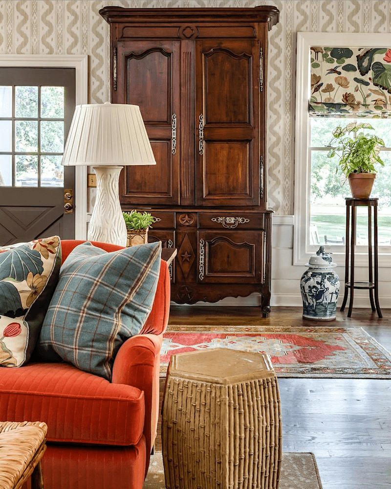
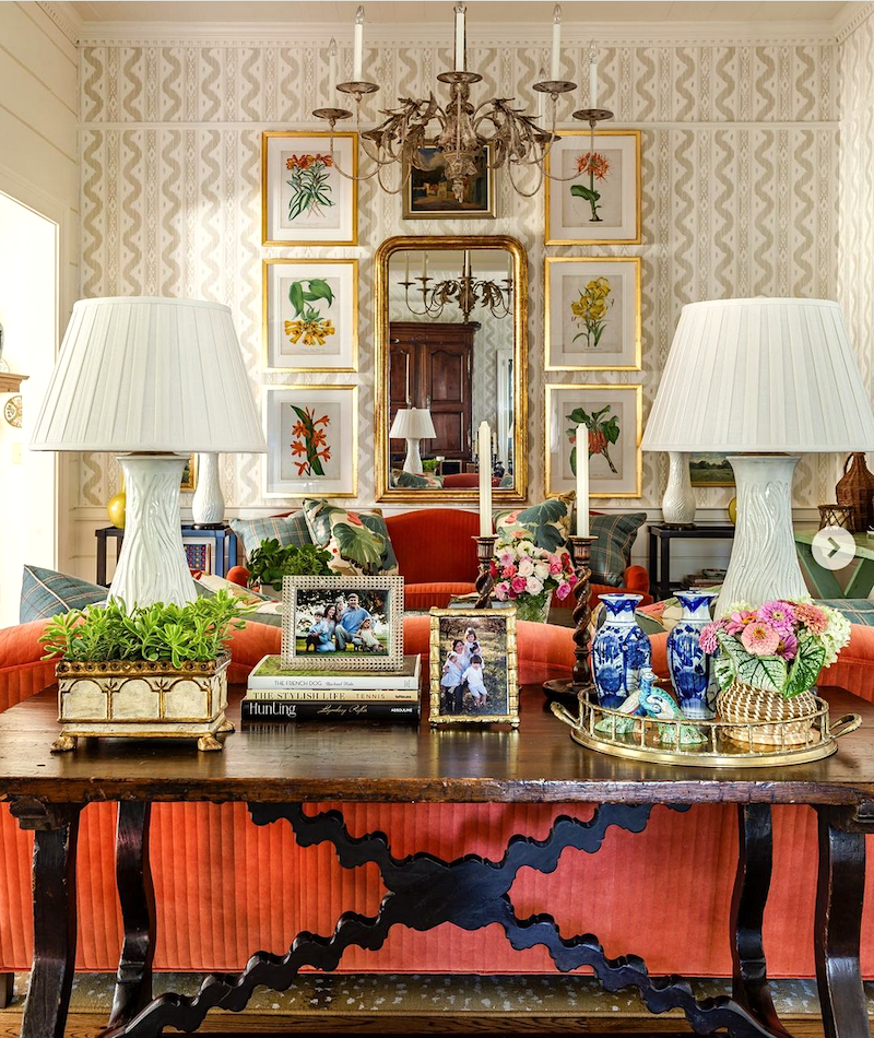
Let’s take a closer look at James T. Farmer’s interiors.
If there’s one word to sum up James’ style and body of work, it would be:
Gracious.
But not only that.
James is not only an interior designer, but he’s also selling an entire lifestyle— one steeped in immense beauty, warmth and the most calorific, delicious food imaginable.
If one is lucky enough to be in James’ company, we know we’re going to have a good time because he is the embodiment of the legendary southern hospitality, on steroids.
But that doesn’t mean over the top. No, never. His taste level is exquisite, and his rooms are a perfectly
composed symphony of timeless furnishings.
Wait, isn’t James T. Farmer a maximalist?
I suppose one could say that. However, I prefer effortlessly layered, but so layered that it looks cluttered. It’s like a well-cared-for garden.
James T. Farmer’s Style
The overall umbrella is traditional, but it’s not the stuffy, formal traditional some of us remember from decades ago.
There is never a feeling that one can’t touch anything for fear of wrecking it.
French antiques live beautifully next to new pieces. James’ rooms almost always are full of warm colors and beautiful rich wooden vintage pieces and antiques.
He loves wallcoverings; everything from thickly textured grasscloth to Chinoiserie florals and geometrics.
Porcelain pieces can be found everywhere.
- In the dishes that often jump off the table and onto the wall.
- Lamp bases,
- Urns, stools, and vases.
Dining rooms are lit with classical, Regency, and French Empire-style chandeliers.
Dining tables are often French provincial or English, either Georgian, or sometimes a more rustic style.
James loves 18th-century-style dining chairs. He also uses a lot of natural materials in his furnishings, such as bamboo and wicker.
Tole can be found in a cachepot or table lamp base.
Art could be a Chinoiserie mural, an old screen, floral prints, fine old-master oil paintings in gilt frames, or a vintage painting done by somebody’s aunt. Everything feels loved and personal.
He loves to layer rugs, not always, but he often uses natural fibers as a base with a smaller Oriental over it. Or, sometimes, no rug at all!
Window treatments are either Roman Shades or drapes with a Parisian (Euro) pleat, like we were just discussing.
There is usually a trim whether the fabric is a print or plain.
James T. Farmer’s interiors mirror the colors of the flowers he uses in abundance.
Most rooms have several shades of green. And the other colors that stand out are coral, shades of orange and gold, with black accents and gold metals.
However, one sometimes finds a healthy amount of blue as well.
Here’s the thing. James doesn’t cheap out.
While not everything is ultra expensive, many items are way beyond the budget for most of us.
Let’s talk about upholstery for a sec.
He chooses classic shapes found in English Country and French styles. The pillows are usually expensive, iconic prints from sources such as hand-blocked prints from Sources such as Schumacher, Brunscwig et Fils, and Lee Jofa.
Incidentally, when it comes to throw pillows, 98% of the time, I say go for the real thing, not a cheap substitute.
First of all, we’re usually talking about a couple of yards of fabric, not 20. In addition, I’ve never had a pillow that wore out. Some of my pillows are nearly 30 years old. Please check out one of my favorite posts about beautiful throw pillows.
That beautiful fabric will elevate your room like nothing else.
Beautiful pillows are one of my favorite tricks for making a room look much more expensive than it is.
Below is a more formal living room by James T. Farmer.
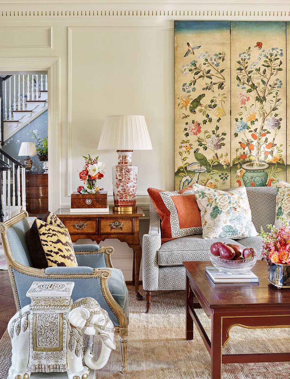
James also uses touches of whimsy, such as the ceramic elephant stools used as drink tables. How clever is that!
The primary influences are English and French with accompanying Eastern designs.
Below is a classic vignette by James T. Farmer.
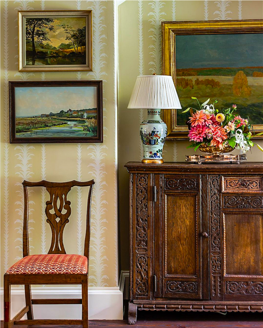
Above is the Palm Stripe Wallpaper by George Spencer.
Okay, it’s time for the widget, but there’s more to come!
This one is focused mainly on living room items; however, I want to focus also on dining rooms, lighting, accessories, pillows, window treatments, and more art in the next one.
So, it will most likely be two more blog posts.
Please enjoy all of the beautiful furnishings I found!

If there’s anything in particular you’d like me to focus on, please let us know in the comments.
Oh! This has been such a busy time, and I meant to say something last Sunday, but Zephyr, who kindly gifted me a range hood, did a lovely write-up on Instagram.
I sent a bunch of photos, and naturally, they chose the one of me from 2015. Haha! My cousin told me, “You don’t age.”
Anyway, if you’d like to check it out, here’s the link to my page, and you’ll see Zephyr’s post at the top. They also posted some images of my kitchen.
Please feel free to follow me on Instagram. I don’t post as often as other people think I should. lol Oh well. I’m incredibly grateful for what I’ve accomplished in the last 14 years.
xo,

*********************************************************
Part 2 Begins Here
Sunday April, 19, 2026
Hi Everyone,
This is the shortest part 2 ever! That’s because I once again pulled out all the stops (12+ hours!) to find many more beautiful items in the manner of James T. Farmer.
The thing is, I feel as if I’ve only truly scratched the surface.
Before I share the widget, below are three more images, so that what I’m sharing will make more sense. Of course, please check out James’ website for many more images.
Also, there are links to James’ books in the widgets above and the one below.
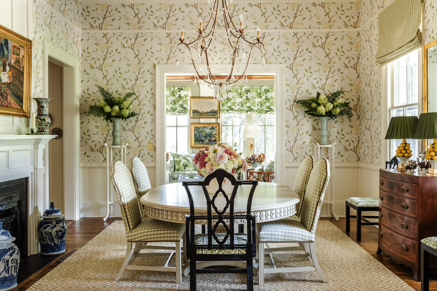
@southernhomemag @jamestfarmer – eclectic dining room – Zoffany wallpaper – checked fabric – Brunschwig and Fils
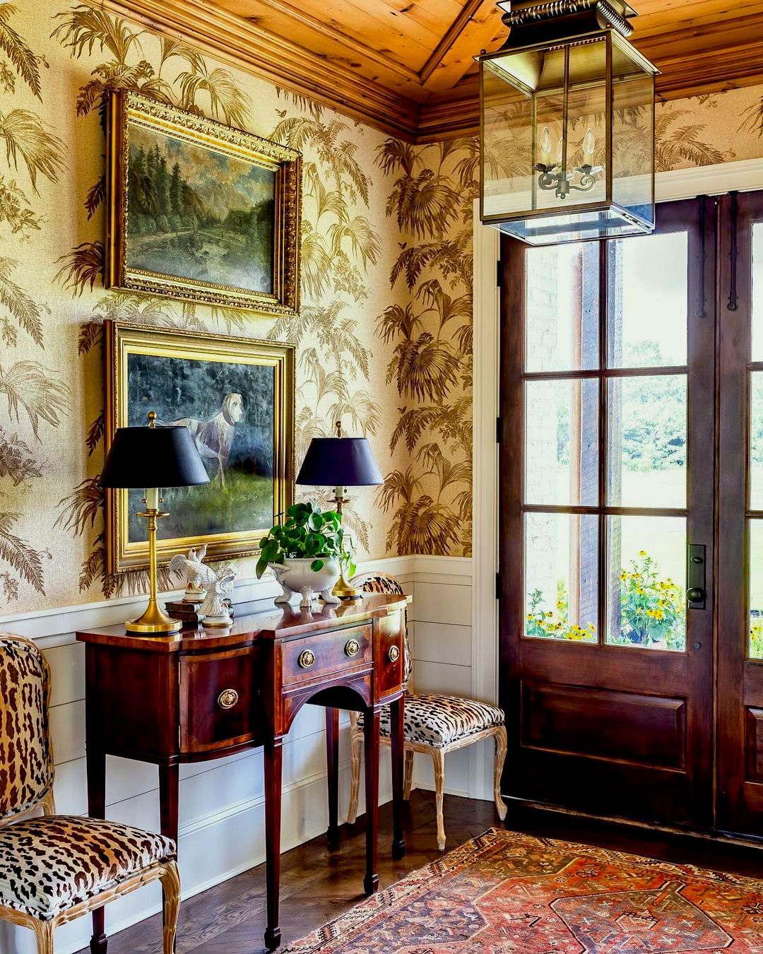
via instagram @jamestfarmer – @jeffherrphoto
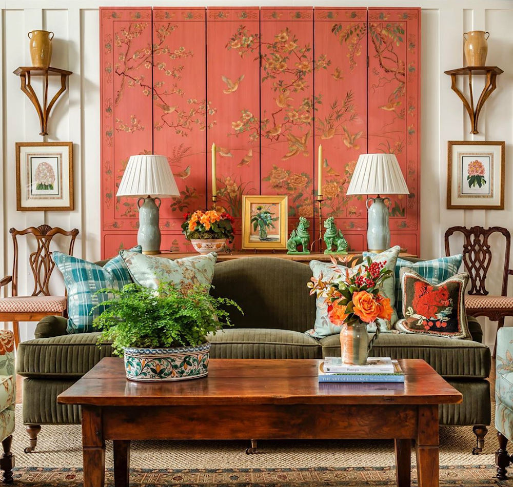
@jamestfarmer on instagram
If enough of you want a third post, I will be happy to do it. Maybe you’d like me to create a virtual room, or do a paint and color palette. But if you’ve had enough, we can say goodbye for now. Please let us know in the comments.
In the meantime, enjoy this tribute to the beautiful interiors of James T. Farmer.
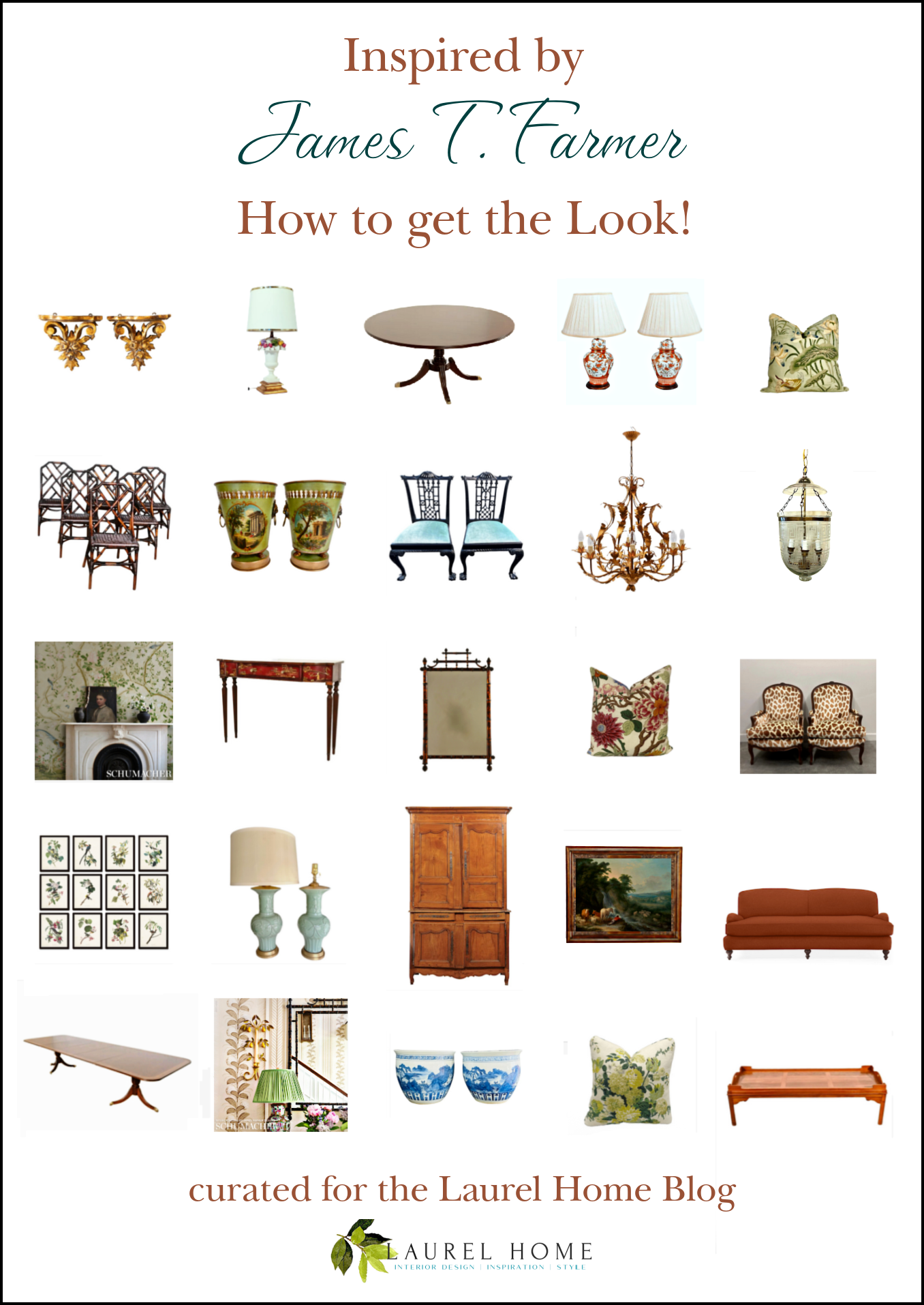
Please pin this image to Pinterest for Reference

April 18, 2026 – Boston Marathon weekend!
Happy Spring!
xo,
*********************************************************
Part 3 Begins Here
Wednesday,
April 22, 2026
Hi Everyone,
I debated making this a separate post, but then I figured if you weren’t already annoyed, you would have to switch back and forth.
This is not a long entry, and it will be the last.
Before I begin, I answered some of the comments, but one I didn’t answer, which I am repeating here, so you don’t have to go wading.
I enjoyed seeing these rooms designed by James Farmer. I especially like his color schemes (not much gray!). About layering, some of it feels just right, and in other cases, a bit too busy. I kept finding myself blocking out bits of some of the photos and imagining how much better the room would look with a few solid colors (e.g. drapes or throw pillows) mixed in with the busy patterns. How do you know when there is enough layering of patterns vs too much? Maybe the advice of Coco Chanel, “before you leave the house, look in the mirror and take one thing off,” would apply here? Or is it all just personal taste?
This is such a wonderful question because I believe there’s a bit of a misconception when I admire a designer and share their work.
No matter who it is, even if it’s Gil Schafer, there is never a time when I love every element.
In fact, there are times when I’m seriously bothered. This happens all the time, and I’m including my own work on occasion.
One thing you might not realize is that when we’re looking at photos in an editorial in a magazine, there is usually a team of stylists who showed up with a van filled with stuff for the shoot.
 
What? Do you think James is out in his garden picking flowers and artfully crafting them in vases?
 
Oh, he might on occasion, and for big shoots it’s highly likely that he’s there. Of course, I might be wrong about that. Styling is his thing. Still, they do move things around.
The point is that the room might end up looking somewhat different from the way it did the day before.
There are other reasons things might end up a certain way.
- The perfect fabric was discontinued or on a six-month back order.
- Or, the client’s husband had an aversion to caning and mismatched chairs, so they went with the less cool chairs that matched the table.
Laurel, does anyone disagree with someone like James Farmer? Isn’t that why they hired him?
Well, I’m not there, but I imagine most likely agree to at least 95% of what he’s proposing. And some might just give him the keys. I don’t know. However, I always felt that no matter how much I loved something, if the client didn’t, I never pushed it on them.
One thing you might notice is that James’ rooms are often “mix and match.” What I mean by that is that you could take furnishings from one house and use them in another.
Ramona mentioned in the comments that she’s tried to like James’ work but can’t get there. It’s okay if you don’t like anything. But maybe you’ll like a mirror or a chandelier. You’ll see the scale. Even if you’re a minimalist, scale is still important and most likely doesn’t change much. You can pick and choose. Or, you’ll learn what you don’t like.
It’s 100% okay to dislike something I like.
I have a fairly broad spectrum of furnishings under the umbrella of classical that I’m fond of.
And yes, you can distill the maximalist look without losing the charm and beauty.
By that, I mean that you don’t have to have patterns on everything or even anything.
For those who own the Laurel Home Paint and Palette Collection, I would say that a distilled look is what’s on most of the 40 boards in the collection. Sure, I’ll use three or four fabrics for the sofa and chair pillows, but on most of the boards, that’s it.
Below is a board I made about 3.5 years ago when I was inspired by the gorgeous work of McGrath 2.
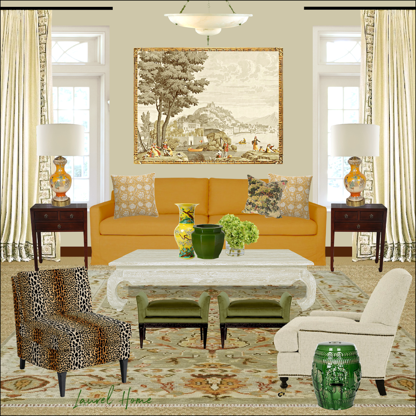
This gives a good idea how much pattern I’ll use for a room.
The final point I need to make, and I’ve said this many times, is usually when it comes to my home.
Looking at a two-dimensional photo is an entirely different experience from living in a room.
So, what looks busy and too much in a photo might very well not look that way at all in person. It’s important to understand that, if you’re not already aware.
Okay, there’s one more widget coming up.
 
This one is centered on one dining room and there’s a board coming up that includes a palette of 16 Benjamin Moore Paint Colors. 14 of the colors are from the Laurel Home Paint and Palette Collection.
I added a couple of colors that are not in the upcoming dining room, but they are in other Farmer rooms.
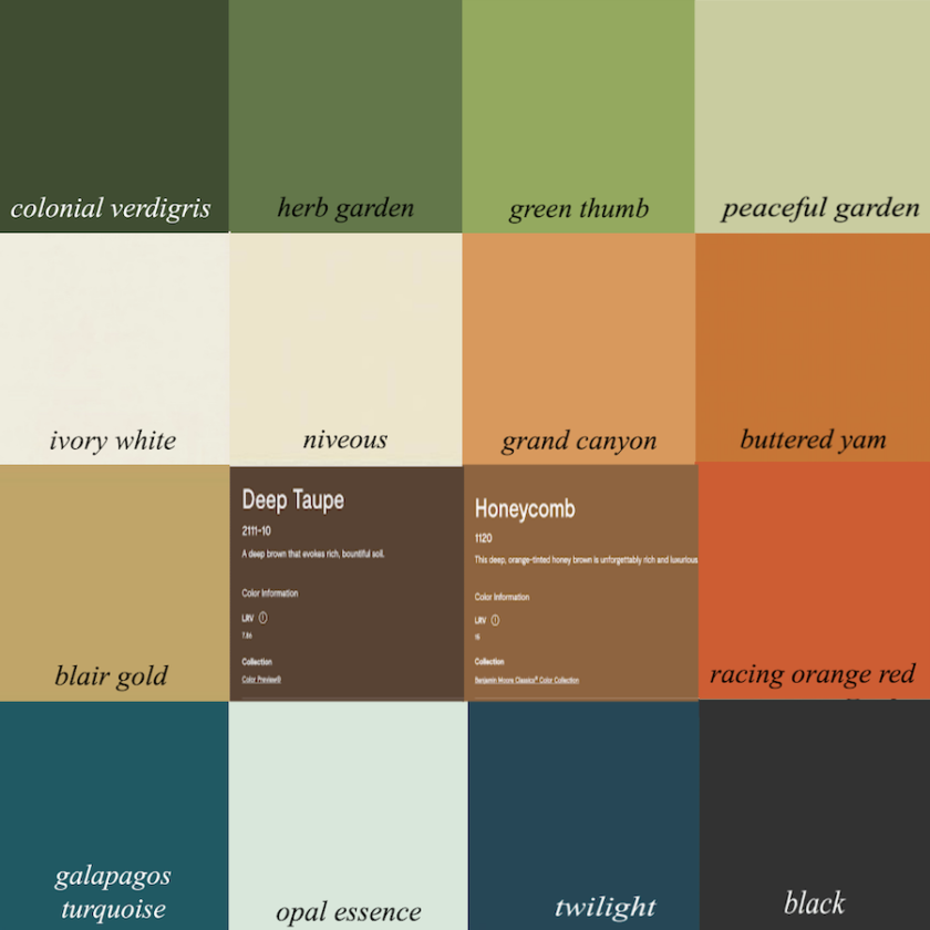
The colors with Italic labels are all in the Laurel Home Paint and Palette Collection.
The ones with Benjamin Moore’s writing on them are colors I selected that best mimicked the wood tones and would also make terrific wall colors, particularly Deep Taupe.
Incidentally, that is not taupe. Taupe is a warm, slightly pink, brownish gray. Chelsea gray is a beautiful color that doesn’t always look like taupe, but is much closer than Deep Taupe.

Below is the “in the Manner of James T. Farmer” board I made.
For more images of this beautiful home, please check out James’ Instagram.
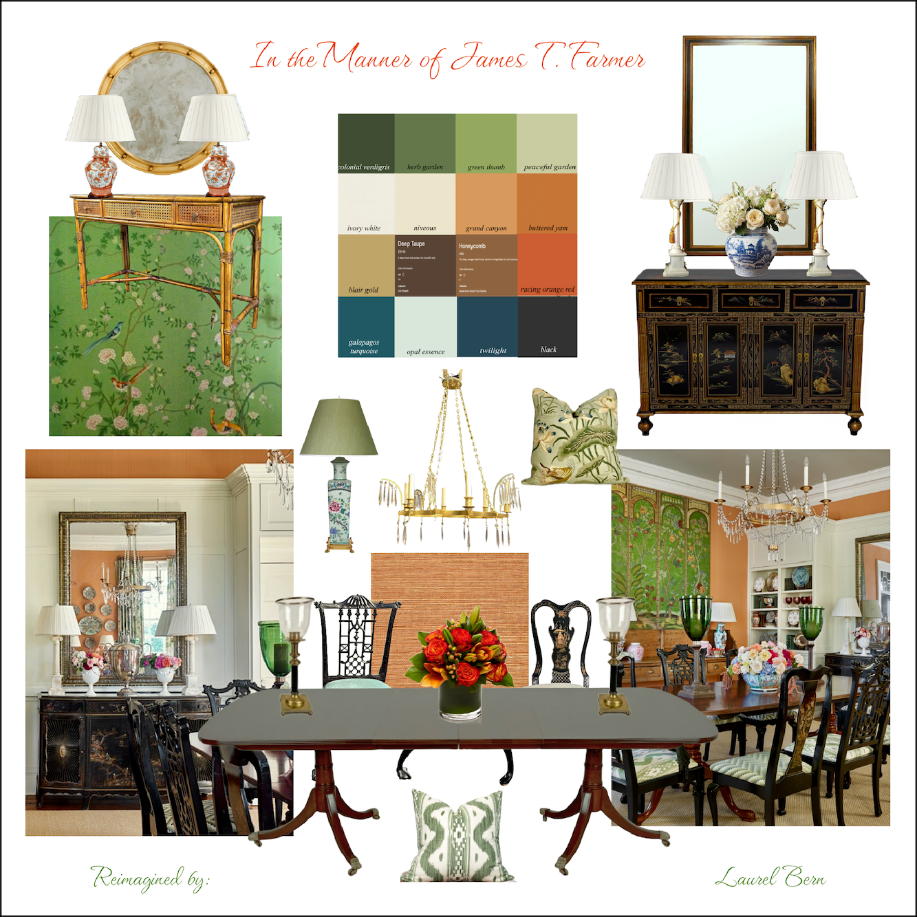
The wonderful hurricane lamps that James uses are from Makenzie Bailey and Company.
They are sold on her website, and I can’t find them anywhere else. No one else makes anything like them. They’re so fabulous, and they’re not as hellishly expensive as many items out there these days.
For the Chinoiserie server, you will notice that the one in the widget looks different. That’s because I antiqued the one on the board. Virtually, of course. I did that before in this post with a similar Chinoiserie cabinet.
It’s a lovely piece; it just looks too new!
Please enjoy the widget, below.
Okay, I hope y’all have enjoyed this series. We’ll be moving on to another topic.
But… Get this. Serena & Lily has put their entire site on sale– AGAIN! So, I will definitely be doing a new edition of the Hot Sales for Friday. In the meantime, the widgets were updated today, and I did a big overhaul of the vintage widget a few days ago.
xo,
***Please check out the recently updated HOT SALES
Also, if you’re doing some shopping on Amazon, please click this Amazon affiliate link or the graphic below.

Thank you so much!
I very much appreciate your help and support!
Related Posts
 Adding Trad Style to a Contemporary California Home
 The Secret Source for Josh Young’s White Slipcovered Sofa
 Her Open Floor Plan is an Excedrin Headache Nightmare!
 5 Classic Kitchen Combos, Cabinets, Hardware, Lighting…
 Problem Ceilings That Could Definitely Wreck Your Room
 60 Downton Abbey Colors +10 Exquisite Palettes
 Bed Making-The Ultimate Guide You Will Love!






37 Responses
Replying to Dee,
Thanks for the link, https://charliewestlamps.com/about-us, I think you are correct. Good find, I know Laurel searched forever, and I have searched since I saw it on his website.
Christine
You’re welcome!
I *think* Farmer told that in his Instagram several years ago.
My first thought when I saw that first photo of the room with the red sofa was, my gosh, it looks like the homes people had when I was a child in the 70s and 80s, only now it’s being done right! It feels really familiar, but James Farmer got all the details right. The scale, proportion, lighting, color palettes, patterns, surprise elements and sense of drama are all spot on. AND he manages to do even the most formal rooms with a style that is still comfortable and inviting. There’s a trick to that, but I don’t know what it is exactly.
Port 68 makes a similar lamp finish for $600 but it’s not the same shape. I like Jame’s choice better.
I love posts like this and hope you’ll do more. I love James Farmer’s syle and use use of color. Thanks for the link to Makenzie Bailey website, I’ve been looking for an affordable source for several of those hurricanes.
Laurel,
At least I searched high and low for that lamp. I found the same one you did, https://hwangbishop.com/collections/table-lamps/products/leila-faux-bois. Close but no cigar. When I find it, it’s sure to be very expensive. Thank you for trying.
Christine
Longtime admirer, first-time commenter. This series has been fabulous, Laurel! Truly appreciate the care and effort that went into it.
I really enjoyed these posts. While the overall style is probably over the top and inappropriate for my newish, sunny Colorado home, it reminds me of my daughter’s lovely, cozy Charleston home. I appreciate the use of color, accessories and fabric. I believe that some interior design styles are more suited to certain architecture and locales. James Farmer’s style is one of those. His spaces are gorgeous!
This post made me smile and miss my mother all due to one little widget of yours. I have my mother’s dining room table and chairs. I always considered them a little unusual as I have never seen them anywhere. They are the mahogany regency dining chairs. Originally I had 4 side and two arm, then a few years ago I found 6 more on FB marketplace in great condition and just 300.00 for all of them. A little clean up of the mahogany finish, and recovered the seats and now they are used daily in our home. I like JF style and would love to read more from you about this.
The following link (There is usually a trim whether the fabric is a print or plain. James’ colors.) links me to a page showcasing your e-books but I can’t find a specific link to James Farmer. Am I missing something? I know it would feature his beloved coral (or CARL as he sometimes calls it to evoke the way it sounds in his Georgia accent).
The olive green corduroy sofa in first photo (which I think is from one of his own houses) appears to be a sibling of the warm red sofa.
Hi Penny,
I don’t see a link associated with that sentence, but I did fix the typo.
More! Would love to know the sources of the plaids James employs.
Hi Susan,
The one plaid in the first widget links to its source. James gets a lot of his fabrics and wall coverings from Schumacher, Lee Jofa, and Brunschwig et Fils.
Thank you! I love everything about James Farmer’s style and designs. I have his books, I have your books; thank you for the widgets! You are both my favorite resources and inspiration. Now that I know he holds tours in the spring . . . I might have to look into that for next year. 🙂
Hi Laurel,
You’ve shown so many beautiful items to recreate the James Farmer look. Thank you.
I enjoyed seeing these rooms designed by James Farmer. I especially like his color schemes (not much gray!). With regard to layering, some of it feels just right, and in other cases a bit too busy. I kept finding myself blocking out bits of some of the photos and imagining how much better the room would look with a few solid colors (e.g. drapes or throw pillows) mixed in with the busy patterns. How do you know when there is enough layering of patterns vs too much? Maybe the advice of Coco Chanel advice, “before you leave the house, look in the mirror and take one thing off” would apply here? Or is it all just personal taste.
Hi Ann,
That would make a terrific blog post! Even with my favorite designers, I don’t always like everything I see. However, it’s super important to remember that looking at a room in a photo is a vastly different experience from being IN the room. Every detail jumps out of a photo and commands attention. That is not the case when one is in the room.
First, I want to thank Elizabeth for her book recommendations! Laurel, I’m up for more, but I’m always happy with whatever you feel like posting. I love it all! Thanks for the additional eye candy :]
I love when you do a high/low re recreation of a room post, if you want to do a “James” one, that would be fantastic! I know you’ve given us so many of the components in the widgets, but lazy li’l me would love to see it all “done”! 😂🤣
Hi Sue,
It’s a challenge, because I have to source and then make a board, so it takes a long time. I did try to put less expensive items in the mix and tried to stay away from the hellishly expensive stuff like a pair of lamps for $20.000! Although, there might be one or two items like that. The fabrics, like I said, for pillows, it’s best to stay with the high-end fabrics for the most part.
Hi Laurel – LOVE these posts! Thanks for introducing me to James Farmer – where have I been?
Yes, I’d love a few more posts re: color and styling. A girl can dream!! Your writing is the best! Thanks for all you do.
Sheree L, I would start with A Place to Call Home, then Arriving Home. He’s written a couple others that are more entertaining and/or garden-focused if those are interest.
His latest interiors book is Home Again and features some updates he’s made to his property in Georgia. But I think it’s kind of nice to do them in chronological order and you can see how his style has evolved. APTCH is some of his earliest work and I do think some of it is a bit more ‘approachable’ to the average homeowner/decor enthusiast. You can definitely see the projects growing more $$$$ In the later books.
Thanks so much, Elizabeth for your recs!
I gave this a good try. Far too many objects for me. I am not as minimal as I used to be, but I need less, and it does look cluttered to me with far too many colors.
Not my cup of tea. Usually, I like the decorators you recommend.
p.s.
Can you do a post for those of us whose eyes really, really need bright spaces. I know this is anathema to you, but some suggestions for how to create bright spaces spaces would help a bunch of us with dark rooms and the need to not feel shut away. The main living spaces of my home are south facing and bright (just one reason I purchased it) but the north side only has windows facing due east and west. I can’t fit many more lighting fixtures in the space. The bedroom has two four bulb fixtures, two wall lamps and room for a smaller lamp on one dresser. There is not really any more floor room, or an appropriate spot for a floor lamp. I know your eyes would hurt in the light I need, but conversely my eyes would hurt in your spaces.
Hi Ramona,
That would be a good blog post, and I have talked about it in the windowless rooms post.
Mirrors are your friend.
As for my preferences, my living room is south-facing and painted white. On a sunny day after 10:00 AM, it is plenty bright. In Victorian times, they would’ve worn sunglasses in my living room. lol
What I object to is flat, overly-lit, shadowless rooms. If that’s what you’re trying to achieve, I’m not sure how to achieve that.
Harsh shadows from single source lighting overhead is also horrible. Light should come from multiple sources, but if I had to pick only one, table lamp light is never bad. If you put mirrors behind a couple of your lamps, you will magnify the light in a very attractive way.
Dear Laurel, I have you to thank for introducing me to James T Farmer’s work. I swoon when I look at the rooms he’s done. I love his use of color, patterns, and texture. That room with the red sofa is one of my favorites. Also, I may have been hyperventilating just a little while clicking on items in your widget! Your taste is exquisite, and I want everything :] To you and your readers, if I were to get one of James T Farmer’s books, which would you choose?
I too love James Farmer and have many of his books. When I subscribed to Instagram I always looked forward to his Farmdale Friday Posts. My main reason for commenting was to say that I met James while my husband and I were vacationing in England a while back. He was staying in the same hotel as we were and I recognized him immediately. After quietly getting giddy every time I saw him on the grounds I finally got up the nerve to introduce myself. He was every bit as nice and charming as you would hope he would be. I babbled on about how much I loved his interior design work and his gardens. He was just a genuinely nice guy.
Hi Karen,
I have heard that too. So cool you got to meet him!
Well, Laurel, it is common knowledge that a picture is worth a thousand words, but know we know what that comes to in cold, hard cash. I very much admired the pictures you shared today, but I have to admit there are things that I would change in each photo if that were my own house. I suppose that is universally true for every existing home and every individual, but one common element that I noticed was wavy and zig-zagging lines, which my eyes cannot process. I think this was the largest widget you have ever assembled–Mr. Farmer could design and fill three houses with your elegant choices.
–Jim
Oh, I love this post and James Farmer. I would love to know who makes the faux bois lamp next to the red sofa. I have seen it used also in a green. Tried searching everywhere in vain. Thanks.
Hi Christine,
I spent about an hour yesterday and also couldn’t find it. The closest I found is very beautiful, but expensive as it’s completely handmade.
https://hwangbishop.com/collections/table-lamps/products/leila-faux-bois
In the specs, it says 18″ width, but in the image it says 16″ which I think is what it actually is. It comes in 40 colors, and either a gloss (my preference) or matte finish and a choice of base or no base. It’s the perfect size table lamp at 28.5″.
Hello, I like James Farmer’s style, too.
Pretty sure that lamp is made by Charlie West.
Farmer uses those often.
I’m trying to locate his lampshade person, tho.
It’s different source.
https://charliewestlamps.com/about-us
Thanks so much, Dee!
Eye candy! Beautiful post and so nice to see timeless, meaningful pieces. So refreshing to see “pretty” vs trendy trinkets and trash so many influencers push. Tasteful!
Every thing she said – James will be my first call if I ever win the lottery (that, and I’ll never fly commercial again!). I have all his books and they are my constant reference. The living room and formal dining room room in my new are are completely inspired by his work. I using beautiful fabrics for draperies, Roman shades and upholstery, garden stools, some antiques and bamboo furniture, etc. I don’t have the budget for the wonderful furnishings, but there’s lots to be found on Marketplace, HomeGoods, At Home, etc.
Thank you so much much for doing this post. I hope there will be more to come.
Oh, I love James Farmer, and have 2 of his books. He’s the perfect embodiment of updated traditional style, with a hefty dose of brown furniture and scrumptious color!
I love James Farmer so much, to the point that my husband always says, “if we ever win the lottery, James Farmer is our first call”. 😀 you’ve done a beautiful job of highlighting his gracious southern style. I highly recommend his books, they are some of the ones that I consistently refer to when I need inspiration or just want to look at pretty things!
For anyone interested, he opens up his home and gardens in Perry, Georgia, every spring…. I believe this year’s tours are the last weekend in April!