A Boring Hallway-Ideas to Make it Your Favorite Space

Hi Everyone,

Shortly after I wrote this post exactly three months ago about a boring hallway, I came up with the solution for the bedroom closet that was in the way of my nightstand.

If you’re just tuning in, please read the post from the beginning, or the middle, if you prefer.;]

The rest of you might need to refresh your memory if interested.

However, some of you, I know, do remember this cliffhanger. I apologize for leaving you hanging. Guess who was here for 26 hours?

Yes, my son, Cale, and he slept on the other side of the sofa. It worked out really well. And he made soup for me.

Please click the link below for those who wish to skip to how I fixed the door issue.


Part 2 Begins Here


Part 1 starts below:

Hi Everyone,

Well, I’ve been a bad girl today.

That’s how I started the post last night.

It is now 11:15 AM on Sunday. This post got away from me because I was having too much fun. So, that’s why it’s about 10 hours later than usual.


Did you take more pics you weren’t supposed to take?


No, not that. I’ve been creating instead of writing.

However, there’s still a post to do, and it’s 10:00 PM. So, I’m doing a heavy update on an old favorite post, originally entitled A Long Narrow Hallway – Help for a Dark Scary Mess.

Okay, that didn’t work out. As you’ll soon see, there’s plenty here for one post. Incidentally, that older post has some lovely ideas, so please check it out here.


However, this new post is still about hallways.


I need to focus on my hallway downstairs because it’s nothing I’ve ever done.

Remember, a few weeks ago, I discussed the final plans for the downstairs bedroom ensuite. I had Furlow Gatewood’s gorgeous paneled doorway jams on my mind for my currently boring hallway (that isn’t even a hallway). It’s just an awkward space.
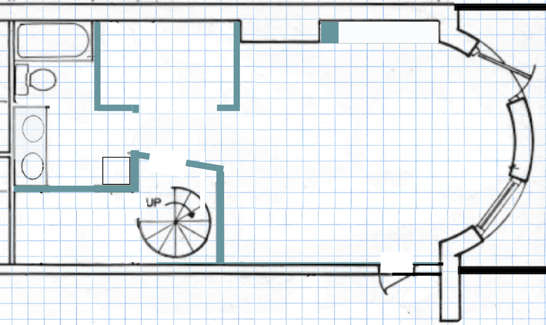
 

114 Comm Ave #2 Garden Level existing plan

Above is the configuration, currently on my lower level. As I’m sure most of you know, the spiral staircase is going, and the contractor will put in a straight-run staircase.

Right now, there is a lot of not-very-useful space next to the spiral and in the big closet. We’ll be looking at the new floor plan shortly.

However, after finding this fantastic image and others on Rod Collins Smugmug filled with thousands of Furlow Gatewood images of his home and gardens on his exquisite compound, I knew I needed to incorporate this idea into that new hallway area.
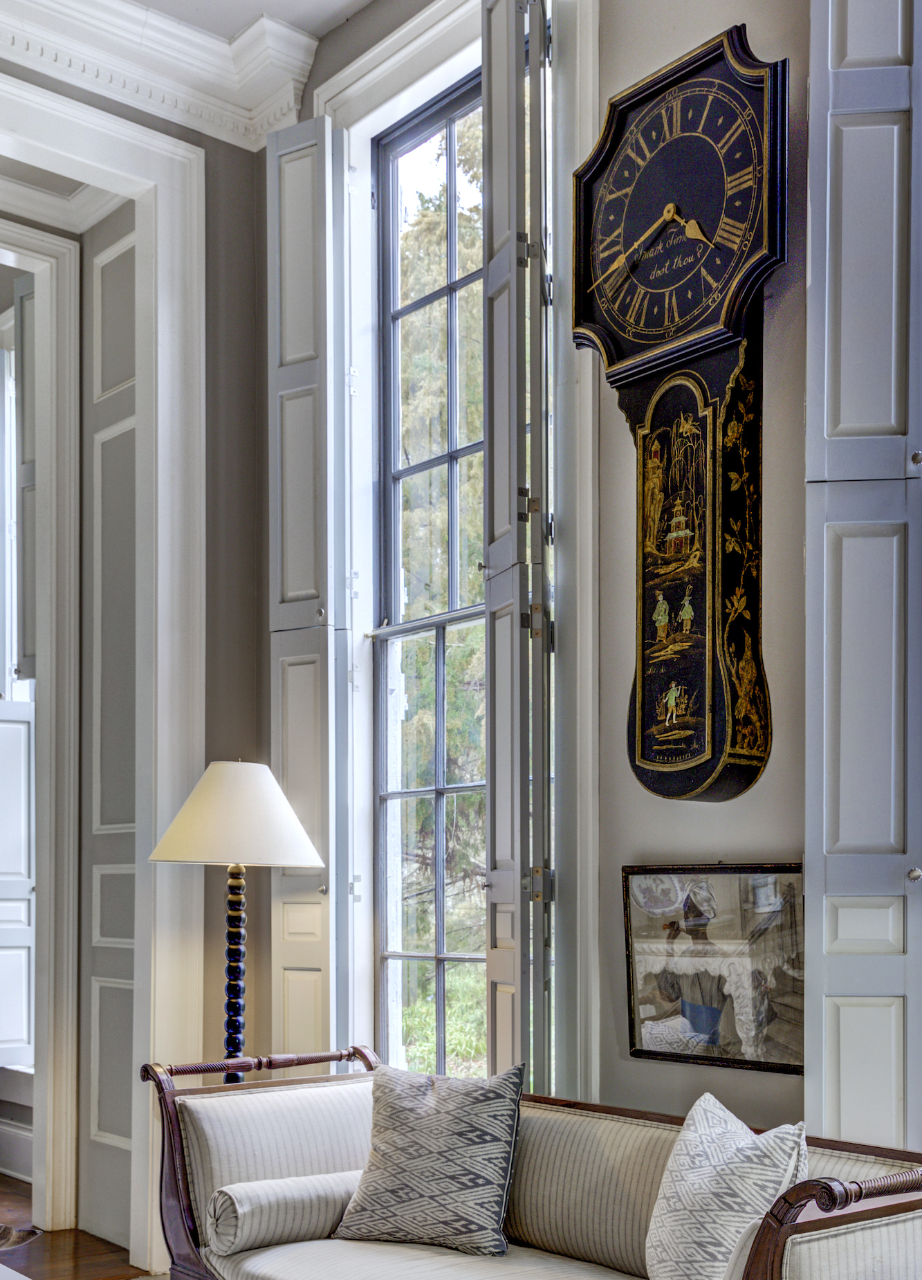
 

Cuthbert House - Furlow Gatewood - exquisite architecture - renovation countdown - detail doorway

Above are the panels, and one of you kindly told me about embrasure doors.  Thank you! So, I went back to the monkeyboard. (picmonkey) and tweaked a few things and created a plan to complete the new hall with two sets of these paneled walls. Only mine will be embrasure doors that sit in a pocket.


Below is a superb video narrated by Brent Hull that explains what I’m talking about regarding hallways and embrasure doors.


(I’ve cued it to start at the beginning of that topic, but the entire video is fantastic if you have time.)


Last week, May 11, my new architect came by to measure with an assistant. I also sent him a whole bunch of drawings and photos. We discussed the embrasure doors. He loves them, too! Terrific. He said the only problem is you can’t do a light switch.

That is not a problem.


Okay, below is the floor plan after about 200 variations on a theme. haha
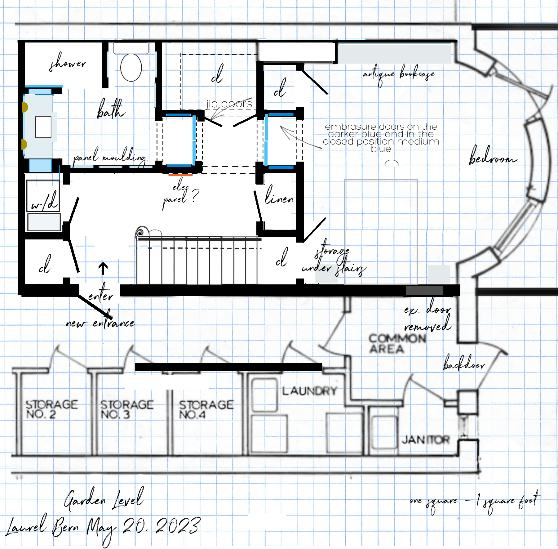
 

Straight run stairs Garden Level May 20, 2023 proposed plan bedroom suite hidden door panels - new hallway
Okay, to explain my somewhat eccentric drawing: The hall is where you see the blue doors. The darker blue lines are the embrasure doors in their wall pockets, and the lighter blue is how they will be when closed. I love that the bedroom and the bathroom will have a little vestibule when the doors are closed.

The dashed lines indicate a soffit (overhead), however, it’s only a few inches because I want to do super tall doors, if possible. However, in the two little areas where the embrasure doors are, the ceiling is flush with the top of the door, minus a tiny gap.


Below, I found a source that sells the hardware called a Harmon Hinge for these doors.


They call them pocket pivot doors, but it’s the same as embrasure.
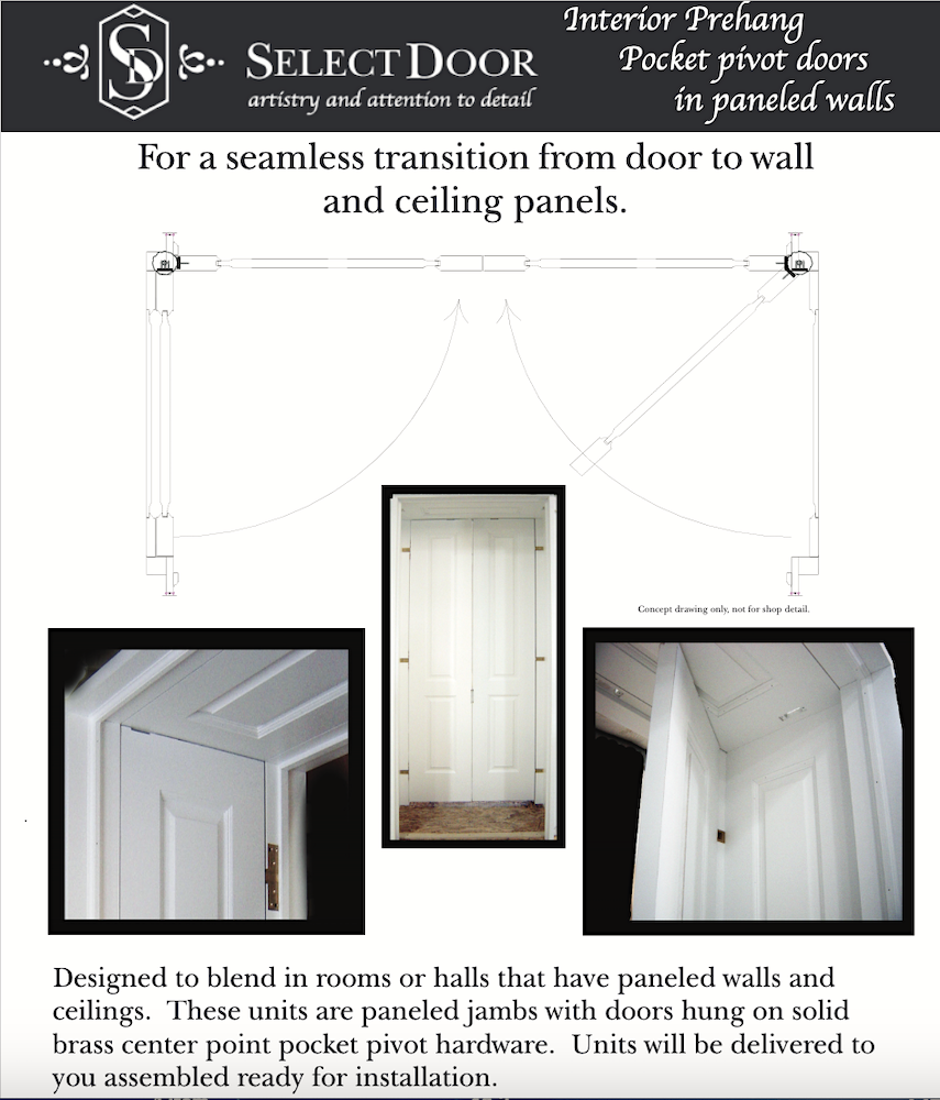
 

Select Door - Embrasure doors hardware - panel door

Select Door

I wonder if it’s okay to spray the hardware to match the doors. And, yes, when the doors are closed, there is another panel behind the doors. How cool is that! I suppose there doesn’t have to be, still, it’s a much more finished look, for sure.


So, let’s look at the garden-level floor plan again.


Straight run stairs Garden Level May 20, 2023 proposed plan bedroom suite hidden door panels - new hallway


My new hallway is approximately 8′-6″ long. For the width, I might need to borrow about four inches from the staircase hall to make the embrasure door hallway up to code. That is fine as the staircase hallway is currently 48″.

Some of you may remember a post from a few years ago, Mrs. Laurel Builds Her Parisian Dream House. This stunning home is loaded with charm and fantastic ideas we can use for inspiration for our hallways.


Typically, the embrasure doors are found between two spaces, such as a hall and a living room or library.


We’ll be coming back to that in a sec.
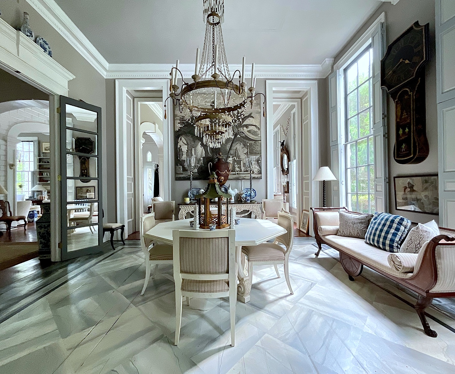
Furlow Gatewood neoclassical dining room

Furlow Gatewood’s paneled door jams connect one of the pair of front living rooms to the dining room in his extraordinary Cuthbert House. Thank God for Bunny Williams and John Rosselli, who convinced Furlow that he HAD to write a book about his “Exceptional Houses!”


One Man's Folly, The Exceptional Houses of Furlow Gatewood

You can find it for sale here.


Like, Furlow’s doors, I would like to make my doors downstairs extra tall.


Doors are typically 80″ tall, plus the door casing. All of the doors in my place, no matter how high the ceiling at this time, are 80″, except the door that’s always in my way on the way to the bathroom upstairs.

However, my ceiling height downstairs is 9′-1″. I had 9-feet ceilings in my Bronxville, NY apartment, and the doors were super tall and came right under the coved ceiling. I adored this feature in my place, built in 1927.
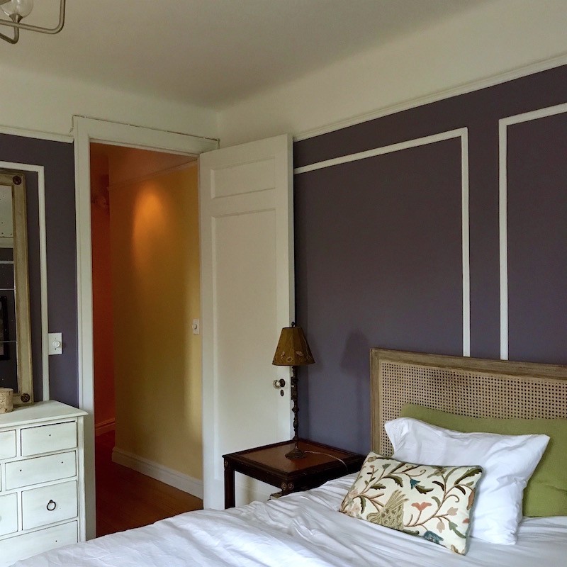
 

my bedroom with serena and lily harbor bed


Above is a photo from 2017 before I did the Chinoiserie wallpaper. Duh. (You can see that here.) That was a tremendous change. Here, the door is about 10 inches under the ceiling. Since the ceiling is 108″, that makes these doors 98″ high.

That’s over eight feet for the door and 18″ taller than standard. However, having those tall doors made everything more elegant and made the ceilings seem even higher. In fact, I had two of those super tall doors in my little hallway.


Funny, that snaking little hallway was my favorite part of the apartment.
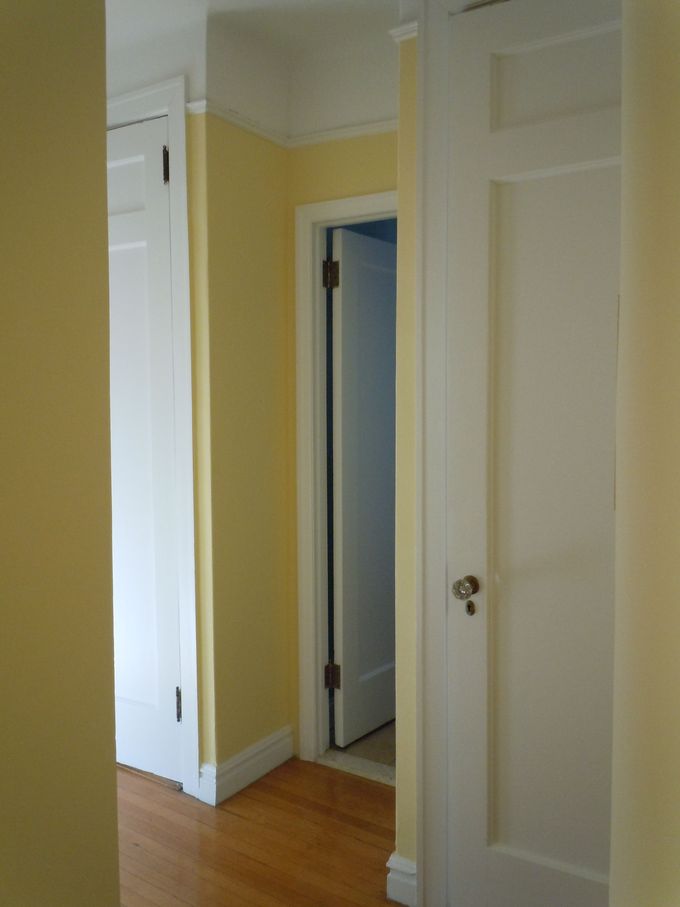
 

hall and bathroom - my old New York apartment

The door to the bathroom was a little taller than a typical door today. Walking down this hall, I recall the ceilings seemed more like ten feet high. It always gave me a good feeling.

If custom taller doors aren’t in your budget, there’s so much you can do with mouldings. I love this post featuring AB Kasha for some terrific ideas for architectural enhancements. They take these downtrodden Parisian apartments and turn each of them into the architectural gems they were 100 years ago or more.


Okay, Laurel, this is all very nice, but I don’t understand what on earth you’re talking about because all I see are lines on some graph paper.


Okay, sure. I realize it’s a bit complicated. This is why it’s on my mind. This renovation is starting in two weeks, and I think it might be helpful to clearly show the architect (who can convey to the builder) what I have in mind.

Here’s what I find interesting.


Whenever I do this exercise to create a perspective drawing, it helps me hone in on other important details.


And quite often, what I was thinking in my mind turns into something else once it’s on virtual paper. One example was when I did the bathroom renderings that you can see here.

I’m still contemplating that one too. Ugh, I need to stay focused on the hallway design. And then, we will look at other ideas for the often neglected, boring hallway as well.

So, when I do these drawings which I do on Picmonkey, I begin with a photo or with the kitchen; Susan Serra, the fantastic kitchen designer, sent me her renderings that I “laurelized.”

Note: Don’t hesitate to contact Susan via the link above if you need design help with your kitchen! I can’t recommend her highly enough. And, she does long-distance consultations!

You can see those laurelized kitchen renderings here.

And, other kitchen renderings are here.


However, as I said about 30 paragraphs ago, ;] Normally embrasure doors lead into a room from a hall.


They are not in the hall but perpendicular to it.


So, I had trouble finding one image that would give me a hand with the perspective.

Then, I looked at the old sister post about the long, scary hallways and found one close enough to give me a base for my rendering.
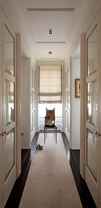
 

basis for rendering of my new hallway
Sorry, I don’t have a source for the image. I also manipulated it to be a little more narrow than it is. My hallway will be about 40″ wide. This hallway looked at least four feet wide before I squeezed it.
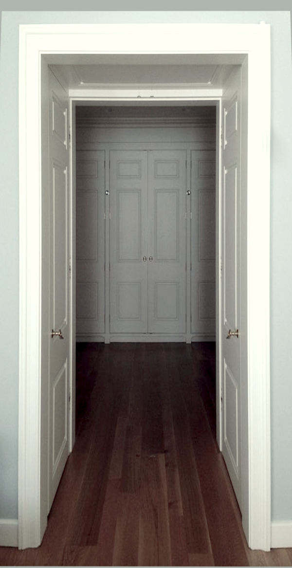
 

HarmonHinge.com gallery image - embrasure doors

I took this image from the HarmonHinge.com for the embrasure doors.

This doorway looks to be three feet wide.

While the jamb (on either side of the door in the pocket) can be flush or almost flush, I made my jams on either side of the doors have door casings as Furlow did. I can talk with my architect about which way will be best. If we do the latter, that is why we need a few more inches.


So, are you ready to see my new hall going from the bedroom to the bathroom?


Oh, I see… You’ve all left the room. ;] Can’t say I blame you. Okay, hang on, please. I’m going to fetch it right now.

First, sorry, let me share with you what it currently looks like. I’ve never shown you this view.
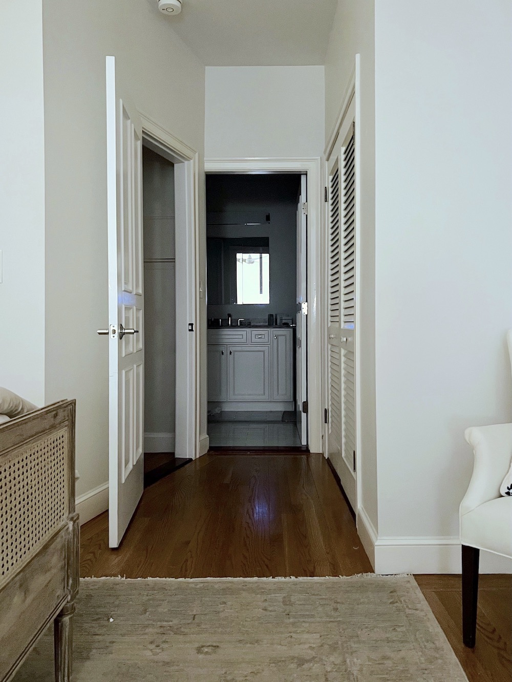
 

forlorn hallway bedroom to bathroom
Well, it’s not a slum. However, it’s certainly nothing special, either. Please notice the great job they did with the door casing to the bathroom. lol, This is what can happen when folks who have no design training have no architect or designer to help them.


In defense of this space, it used to be the kitchen for what was originally a single-family home.


That there are nine-foot ceilings on this level is very rare. Usually, they are as much as two feet lower!

Yes, the new walls will line up and will come forward about four feet. This way, the stairs breaking through the ceiling will not be seen. The bedroom is quite large, so that is not an issue.

Therefore, the new wall will be right about where the image begins in the foreground.


Okay, drum roll, please. I’m calling it Laurel’s Hotel ensuite.

~~~~~~~~~~~~~~~~~~~~~~~~~~~~~
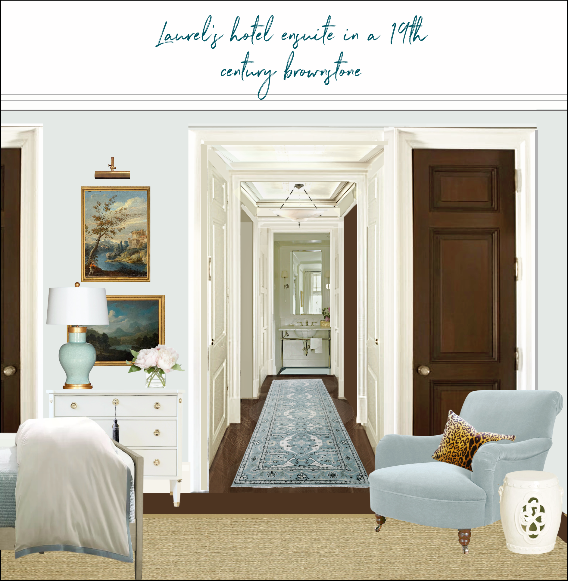
 

Bedroom hallway to bathroom walnut doors embrasure doors George Smith chair after renovation
Okay, the monkey was giving me problems, and it’s late. However, I’m in mad love with this. It’s my fantasy of a perfect hallway. Can we make this happen?


Walnut doors, Laurel???


Yes. :]

Hopefully, you can see that the ceiling with the embrasure doors is lower than the central portion where the light fixture is. That’s 109″. So, having a chandelier with a drop of as much as 29″ is not a problem. The embrasure door areas will have a height of about eight feet, and instead of a crown moulding like the center section, will be a panel that coordinates with the door panels.
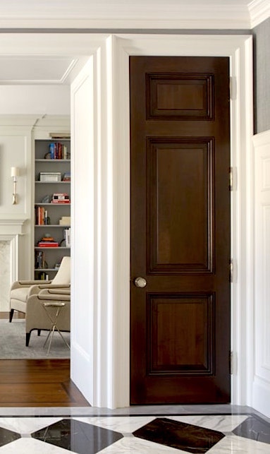
 

Philip Mitchell-Entrance-Portfolio- entrance walnut doors - ideas for a hallway & bedroom ensuite


Above a section from a gorgeous hall by Philip Mitchell. As you can see, his wide wall is the side of a closet. Of course, this is a regular wall panel, not a door. You can do that too.  Yes, that’s Phillip Mitchell with the wonderful galley kitchen. He’s the king of mouldings.
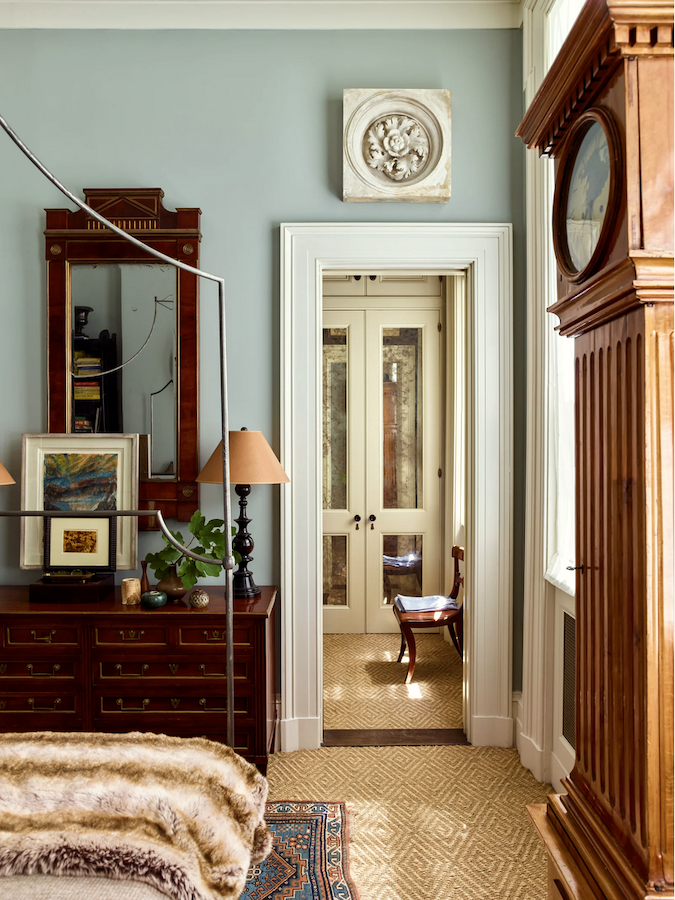
 

Gil Schafer bedroom painted Farrow & Ball Light Blue color corrected - ideas for a hallway & bedroom ensuite

As always, I also channeled Gil Schafer. I have learned so much about design from studying his magnificent work all these years.
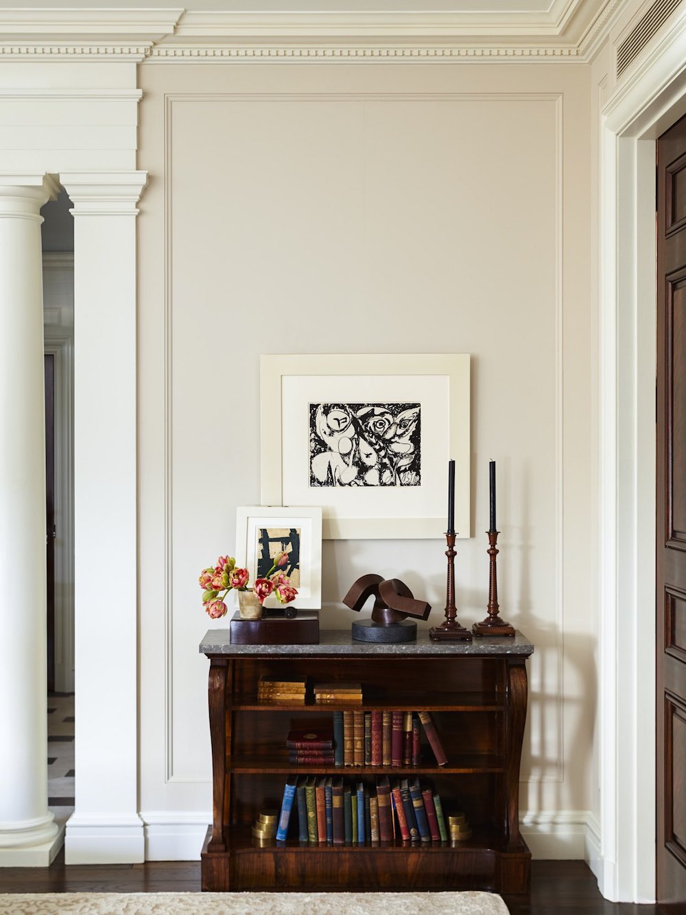
Gil Schafer - moulding-cabinetry-classical architects - ideas for a hallway & bedroom ensuite


So, what did I learn from this exercise?


Well, remember the early, early, early iteration of this bedroom?
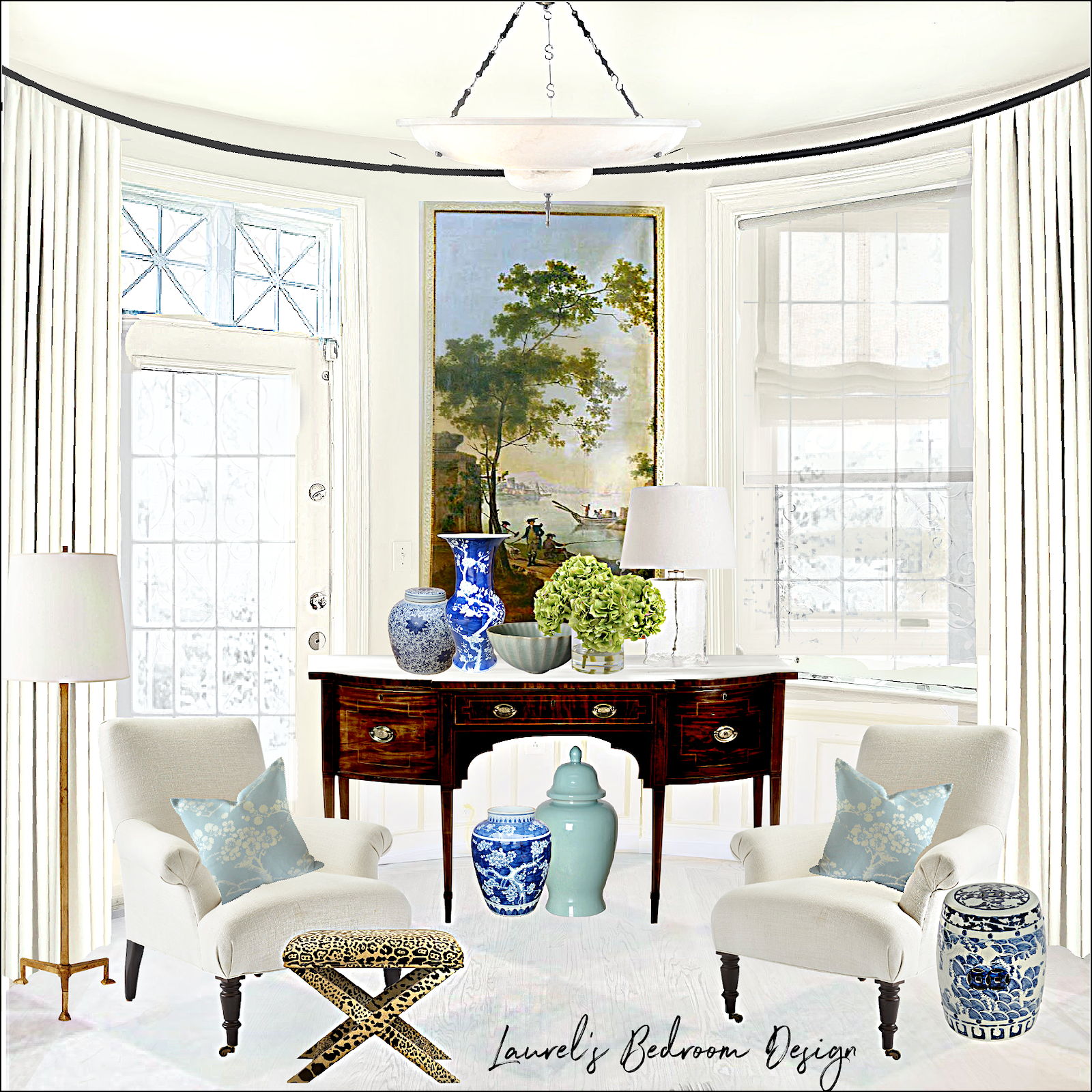
 

my backbay bedroom design
I always imagined a light floor in the bedroom. Well, could I switch floors from the super dark ones to something like the one above, or even a solid pale floor? Well, aside from budget issues, the answer is:

YES! Absolutely. However, here’s my rule for that.

It has to coordinate yet be something entirely different, and not two kinds of wood that clash. For example, like golden oak on one and special walnut butted against it unless something ties the two floors together.


Wait, Laurel. Oh, please don’t do the super dark floors; they will show every speck of dust.


***Guys, I love you and know you want only the best for me. (Well, most of you do.) ;]

I fully understand what you’re trying to save me from. I have Robbie and Twiggy to eat the dust. Besides, there is surprisingly very little dust in this place. The thing is… While I adore white and super pale floors, this home keeps telling me they must be dark, rich, and lustrous.

That’s in keeping with that sophisticated old hotel look I’m aiming for. This is a historic home in Boston, not a beach house in Key Biscayne. ;]

Anyway, I love super dark floors, too. I can have pale rugs to keep things lighter.

Remember that stunning Greek Revival in Kinderhook? Funny, that one IS a country home. I drooled bucketfuls over that one. There’s a link in the post that shares many more images. Amazing house!
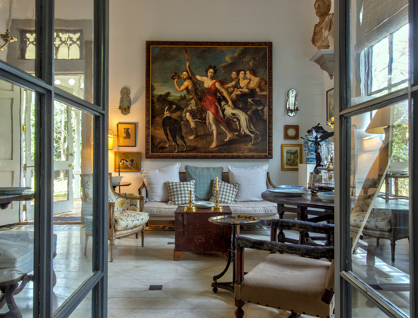
 

Furlow Gatewood spectacular home - art furniture

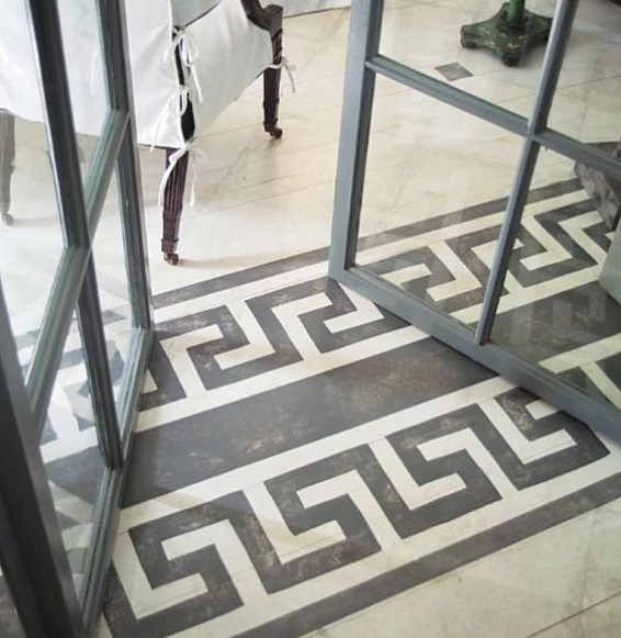
However, one way to do a coordinating floor would be to do something as Furlow did in Peacock House. Or rather, a border could be stenciled in the bedroom in dark brown or dark gray. Or, there could be a dark diamond, as Furlow did.


All photos of Furlow Gatewood’s homes via Rod Collins SmugMug
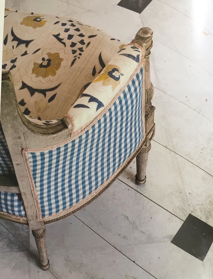
 

via Katie Considers - Furlow Gatewood hardwood floor finish - white floor - antique-armchair-robert-kime-fabric-gingham-upholstery


furlow+gatewood+-+greek+key+2


Crazy, beautiful! This is the Anna Moffo of painted floors!

Please enjoy this exquisite version of Rachmaninoff’s haunting “Vocalise.” No one has ever done it better, and no one ever will.


She does the descant from 5:57 to 6:20 in ONE breath, up to a high C, and back down. It’s like crème brû·lée. As I said, crazy beautiful and incredibly difficult to execute.


Furlow’s decorative painter did an incredible job.


Well, we’ll have to see. I don’t think it’s in the budget. That is unless I can find some super-talented, starving college students. haha

In any case, I love the new little hall and hope we can make it happen.


I hope this post gave you some good ideas for how to make more of your hallways.


For more about that, you might enjoy these posts.

I did a number in this Florida Hallway. Or, it might be in this post about architectural mistakes and easy fixes that talks about the same home.

See also 18 secret doors you’ll be inspired to have.

Another fun post is 21 Hidden storage ideas for stairs, kitchens, and bathrooms.


*********************************************************

Part 2 Begins Here

August 21, 2023

As promised, here is the solution for the closet door in the way of my nightstand.

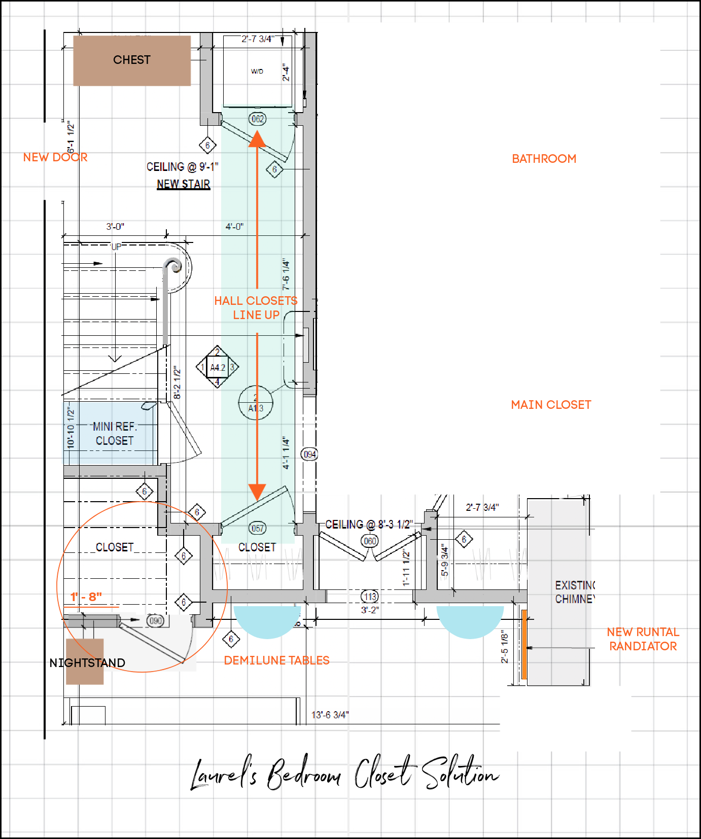
First, this is the floor plan downstairs three months ago, on May 20, 2023.


Straight run stairs Garden Level May 20, 2023 proposed plan bedroom suite hidden door panels - new hallway

The closet door where it says storage under stairs is in the way of my nightstand.

Bedroom hallway to bathroom walnut doors embrasure doors George Smith chair after renovation

Above is the old rendering.

bedroom closet solution

This floor plan is rotated 90 degrees from the original floor plan. However, it is oriented in the direction of the rendering.


Let’s look at this from right to left.


I closed up the doorway near the new Runtal radiator on the right.

It is now part of the main closet, which I love.

Then, we have the embrasure hallway leading to the main closet, out to the staircase, and the bathroom.

I might put my two small demilune tables I’ve had for years on those two little walls.

At one point, we were going to put the mini fridge in the closet by the left side demilune table. However, that closet is not quite deep enough and can’t be made any more deep, because it would throw everything off.


However, I realized there was enough space in that closet to borrow about 14″ from it and add it to the closet under the stairs.


Now, we have enough room to move the door over about 16″ and make it a little more narrow.

And, voila! We have plenty of room for my 13.5″ deep nightstand.

A bonus is that in doing so, we created an 18″ wall (next to the closet door- 057), where a sconce will go. (You’ll see a 6 inside a diamond)

Please also note that the two closet doors in the stair hall line up. The far closet has a stackable washer/dryer.

And, that’s all the news for tonight.

xo,


Please check out the recently updated HOT SALES!


There is now an Amazon link on my home page and below. Thank you for the suggestion!

Please note that this website is a free service. However, it’s very expensive to run. To provide this content, I rely on you, the kind readers of my blog, to use my affiliate links whenever possible for items you need and want. There is no extra charge to you. The vendor you’re purchasing from pays me a small commission.

Amazon ad

To facilitate this, some readers have asked me to put

A link to Amazon.com is on my home page.

Please click the link before items go into your shopping cart. Some people save their purchases in their “save for later folder.” Then, if you remember, please come back and click my Amazon link, and then you’re free to place your orders. While most vendor links have a cookie that lasts a while, Amazon’s cookies only last up to 24 hours.

Thank you so much!

Your support of my work and website means the world to me!

57 Responses

  1. Great post! I can’t wait to watch more of Brent Hull’s videos. I like the dark towards and white trim! In your pic monkey rendering you have selected a light blue wall. What color is that, please? It’s perfect with the white trim.

  2. Thank you so much for sharing the process. I thoroughly enjoy following your journey. Your bedroom just gets more beautiful with each change. This is certainly an argument for taking your time in the design process. You’ve added so many wonderful features. When my parents built their home they chose dark hardwood floors–they were beautiful! As a result, I’ve always gravitated toward that look. The chair in your bedroom rendering is lovely–do you have a link to share?

  3. This is so much fun! I live in a California ranch home which I love, but watching you plan for your exquisite Boston home remodel is something I look forward to every week! I love all the moldings and high ceilings, amongst all the other details. It’s so lovely and elegant. Thank you for sharing this journey with us!

    Will you be using the existing knotted rug that you have in the pictures of your bedroom? All your renderings have natural fiber rugs. I’m searching for rugs but feel uncomfortable buying such a big purchase online.

  4. Sorry, I didn’t realize I was cutting and pasting a “link”.

    I realize we are not supposed to do that. 🙁

    1. Hi Kent,

      It’s okay, except the link was pulling a 404 page not found. Thanks so much for the great information that might be helpful for others. In this case, what’s behind the sheetrock is a 9″ thick load-bearing brick wall. This is what has created the need to hire two structural engineers, for the stairs and new door.

      Therefore, I’m not gonna muck with that old masonry wall any more than absolutely necessary.

      Most of the sound is probably coming through the steel door, not the wall. Some insulation could be added to where they are filling in the door. I suppose we could try that first before adding anything and see if that does the trick. If not, adding a thin layer of sound-proofing sheetrock along that 9′-3″ wall would not be a big deal.

  5. Laurel,

    (I was going to call you “Professor Bern”, due to all the education and knowledge you share along your journey)!

    In your response to Jessica, you mentioned plans to “put some heavy-duty sound-proofing sheetrock” on the common hallway wall.

    I don’t know if you have considered adding acoustic insulation within the walls. We did that on a house we built in Iowa, and again in a dental office we built in Virginia, and it does significantly help with reducing sound transmission.

    In our dental office, we use an air compressor (which is quite loud) to power the equipment, but we had added acoustic insulation and also a “Soundown Tuff-Mass-UL® acoustic barrier” during construction, which is also used on boats to reduce sound transmission. The combination of these products greatly reduces the sound so it barely registers in the patient areas.

    I looked up what the architect had recommended, and here is his information, in case any of it is of use in your planning:

    “I used the tuffmas (Soundown) product when I built boats for engine room noise control. It would be installed before sheetrock goes up. I think a good solution for the wall b/t the neighbors. It also takes up very little space. I would do just the common wall.

    Another product is https://acousticalsolutions.com/ which can be added after sheetrock goes on.

    I also am checking with Creative Conservation about any spray foam insulation products they have with acoustic qualities. We could remove the existing batt insulation in the wall and spray before sheetrock installs”.

  6. Catherine commented about your laundry area, and you said a pull-out table would be great. You can very likely find a solution on this side of the pond in the world of recreation vehicles, which are masters of space management. Here’s just one idea, and though I looked no further, I’m sure a design could be found to suit your situation, and your talented contractor could implement it.
    mountainmodernlife dotcom/diy-expanding-table/
    Also, I just want to say that following your vision has been such fun, and so educational. And inspirational! I’m headed back to the Twelve Rules, and am going to get serious about some improvements in my home. I’m going for “emotionally heightened” (thanks, Sandra!), even though they will have to be mostly cosmetic.

  7. Electrical boxes certainly don’t make a design statement but there are ways to make them disappear. In a restaurant that had electrical panels on opposite walls on the second floor, I took a six panel folding screen and separated it into two pieces placing one in front of each panel. They were tethered to the wall in a manner that allowed them to be easily unhooked when access was needed to the panels. In my studio I covered one with a bulletin board that is lightweight and very easy to remove when necessary. A light weight piece of framed art would accomplish the same thing. I suppose there is a rule in the code book that makes this a no-no, but I haven’t read it, so I can plead ignorance.

    1. Hi Tricia,

      The electrical panel is supposed to be in a conspicuous spot, so that in case of a fire, the firemen can quickly shut off the electricity. If the panel is covered and the firemen can’t find it, the insurance company will likely not cover the loss. This is what I was told by two contractors. Still, do they have to be so freaking ugly? I think there might be ways to make it obvious and more attractive, at the same time.

      They can be painted or wallpapered over, just so long as it’s clear what it is, and the door opens easily with a little handle.

    1. Hi Sue,

      I don’t know the answer to that. What makes it an embrasure door is the Harmon Hinge. The door itself is not different from any other paneled door. They usually but don’t have to, come as a pair, on either side of an opening.

  8. More great modifications. Keep them coming! Every time you alter your plans they get better and better. This is proof that taking your time, using your imagination and talent and picturing how the space will be used is the secret to making good designs great. Thank you for walking us through the process and sharing what you are doing and why. Seeing the photo of the example of embrasure doors in Boston designed by Steven Harris Architects makes me wonder if horizontal moulding like what is above them might be a solution for making the mirror doors in your living room look taller.

  9. Regarding the light switch: it is possible to put a Lutron electronic Caseta switch in the “gang” that has the power going to it even though that’s not where you want the.switch. Then, you get there a remote mounting kit and mount a remote switch which looks just like a real switch wherever it is that you really wanted it. Therefore you can put it on a wall that contains a pocket door or some such. where you don’t have the depth to put a junction box. Hope this helps people who don’t have a light switch where they want it. I have used it to fix problems where my kitchen had light switches all over the place, but none in the same area. I mounted three remotes with one real switch and now have all light switches b near the door where I enter the room. Much cheaper than hiring an electrician to put in a three-way, and as I said, the ability to put the switch, where you normally could not install wiring.

  10. Laurel, these renderings look beautiful! I can’t wait to see your bedroom!
    Now that you have 20 inches depth on the closet wall opposite your nightstand, and then the door opening, could perhaps you plan to access that closet under the stairs a little more frequently if you put in two narrow double doors on each side? Then you would only really have to open one of the narrow doors to slip in and get a drink out of the mini fridge that you could now put under the stairs. That way you don’t have to move the nightstand or the lamp to access what’s under there, and you could enjoy the space a little more.
    There are several highly rated mini fridges that come at an 18 inch depth so looks like it would work well being plugged in on the exterior wall under the steps.
    I bet you would really like having one there! And since the refrigerator would be under the top of the new stairs, you could even put a shelf above it and get one of those little mini Keurig coffee makers.
    Just a thought!

    1. Hi Laura,

      I’m not sure if I’m understanding what you’re saying and it might not be clear from the floor plan. As it is, I don’t have to move the lamp or the nightstand to access the door under the stairs, in the bedroom. However, there are going to be two doors in separate areas leading to storage under the stairs. One is the one I was just talking about in the bedroom that I was able to move that door over so it’s not in the way of the nightstand. The stairs will break through and make for a slanted ceiling.

      The mini fridge door is opened from the side of the steps out in the hall. The two closets are separated by a wall.

  11. Hello Laurel, I love to hear real experts explaining their fields, whether it is you on design or Mr. Hull on architecture/construction, and of course this post focuses your talents together. You are really imposing a lot of elegance and presence onto your space. If you are worried about dark floors showing too much dust, I can send you some of our black dust from Taiwan (I won’t miss it).
    –Jim

  12. My comment has nothing to do with your beautiful door ideas, but, rather, with your laundry area! It appears that the area dedicated to laundry only allows for a stackable washer and dryer? I notice you have a separate closet next to the the w/d. What about eliminating the separate small closet adjacent to the w/d and install full-sized units? This will allow you to actually lay out and fold your clothes on top when they are removed. Otherwise, you will have to take them out and dump them on your bed! By the time you get around to folding they will be wrinkled! I am the master at taking my clothing out of the dryer and laying it very nicely, and smoothly, on top of the dryer. I have forgotten it for days with nary a wrinkle! I would be irritated not having a place to hide that stack of towels (undies!) or having to walk into my bedroom to dump it on the bed, only to have to fold it at lower than counter height. (I’m too old for that!) I love space planning and have fixed an awful lot of functionally short-sighted design decisions in our homes. Increased functionality will only make you love that beautiful space more. Now, you probably have this all figured out and I am just not seeing it. In the event you are in the honeymoon phase of planning your beautiful space with those lovely doors and you had not considered this, perhaps it will be useful.

    1. Hi Catherine,

      That’s a great point. I’d still do the compact machines, but I definitely see your point about folding space. That is, unless there’s a pullout counter. Oh, wow! I just looked it up. I know there are pullout stools, but yes, there are pullout tables that take up very little space. Please check this company out. They’re in the UK, natch. Of course, I’d have to weigh whether the expense of doing this offsets having an additional closet.

  13. If you have walnut doors in your bedroom, I can also picture the handrail and trends on your staircase being walnut. Adding walnut in other areas will draw everything together and make it look well thought out.

  14. Yay Laurel, now you’re in my world with walnut beautiful 8ft+ doors with beautiful casings and medium wood floors! I believe it’s the first time in following you that the doors aren’t painted. I love the mix you are creating with the white walls. Can’t wait to see your creations come to life. What a day that will be for you to move back in and arrange your furniture! Great post

  15. Thank you for explaining why electrical boxes are always hung in the open. I’m sure you’ll find a way to make yours beautiful. The embrasure doors are one more way you are making this space feel like the most upscale hotel. Having mouldings, whether they are open or closed is a detail that makes them over the top! I can see you doing a jig every time you walk through your hallway. It will probably become your happy place, although it’s definitely going to have to compete with your kitchen for the honor. All the mouldings and features you are incorporating throughout your remodel add to the beauty, while keeping it period correct. So many remodels result in the character of the home being lost; you are embracing and enhancing them. Bravo! Once it is finished, no one will ever guess it isn’t the original design (except for the modern features). You are honoring your home’s history. It’s going to be a showplace – but one that is comfortable, homey and a place once people enter they’ll not want to leave. I’m so happy your 2.5 year wait is almost over. On the days when things aren’t going as planned, remember it will all be worth it when it’s done. Compare it to having a baby, once you see it, you’ll forget the pain. My only regret seeing it finished is being able to peer over your shoulder while you tweak your design and share your ideas and thought process. You have been very brave and patient to allow us to weigh in. You have provided hours of entertainment and I’ve learned so much. Thank you! I’m using your Amazon link to repay you in a small way.

  16. Gorgeous! You have fantastic taste. I wonder if you might regret having your headboard on the common hallway? Thinking about noise. I wonder if you might be able to have your bed so when you wake you look out of the gorgeous windows? Other ideas if you stick with the current floor plan, consider putting the closet door by the bookcase into the hall instead. That way you have more options for furniture placement in the future. And perhaps a pocket door on the closet by the nightstand? Easier to get in and out of that closet.

    1. Hi Jessica,

      I appreciate your ideas, but please allow me to explain some things.

      My headboard is currently on the common hallway. Only at that point, it’s the common vestibule that leads to the back door of the house and then, another set of doors to the right of my door! Across from my door, there’s a janitor’s closet. So, yes, there are doors on all four sides of a small vestibule.

      And yes, people wake me up all of the time. The plan is to close up the door and put some heavy-duty sound-proofing sheetrock on that wall, so little if any sound will get through that wall.

      In addition, any time someone comes in the back door, like a repair person, for example, or even a friend, I have to traipse them through my bedroom to come inside the apartment. Yes, we could go through the locked doors and then down the corridor and up the building stairs. However, that never seems to happen. This way, no one will ever have to enter or leave through my bedroom. #awkward Finally, it’s just plain creepy to have my bed a few feet from the back door of the building which faces a public alley. The first summer I was here, everyone else in the building was away, plus, it seems that everyone around me was away. Even the rats went on vacation. lol There were no cars parked there at night, for weeks!

      My new door will be behind the aforementioned locked door with a deadbolt, which gives an additional layer of security. Another advantage is my new door will be across the corridor to my deeded storage closet in the common area. That corridor is what exists in the area underneath my den, upstairs bathroom, vestibule to the bathroom, and half of the entry.

      I can’t believe no one has ever changed this door before. For legal reasons, I do have to have a door, even though I do have exterior access through my garden.

      As for more furniture placement options. I’m not following your vision for moving the closet door to create more space for furniture arrangement. It’s not possible, anyway, because of the embrasure doors. They need to be used as my bedroom door, not a door to a closet. As you might expect, I’ve been thinking about all of this since October 2020 when I knew I was going to be buying this place.

      The nightstand closet door is rarely going to be used, so I’d rather not do a pocket door. I’d need to do one on the other side, as well. It’s not a problem having a traditional swinging door as there will be 30″ between the door and bed and the door won’t be more than 28″ wide.

  17. Love the floor plan! You are going to be happy everyday that you did that staircase. I would recommend adding sound proof paneling to your bed wall since it’s an exterior wall and I would open the closet space into the walk in closet rather than the bedroom. I lived in an apt set up like that and my neighbors weren’t very thoughtful. You might need to move the bed to the other side, but that apartment is going to be stunning!

  18. Hi Laurel,
    When I didn’t see your post this morning I thought it was just an email glitch. I went to your website & didn’t see a new post there either. Then I started to get worried. I was concerned that maybe you fell again. I’m relieved that you’re ok.
    You must make the embrasure doors happen. They are so beautiful. It will take you space from nice to spectacular. Thank you for showcasing them. I had never heard of them before.
    I continue to learn from you.

    1. Oh, sorry about that. It’s a tossup between sending a letter saying the post will be late and annoying some readers, or sending it out late and apologizing. Of course, I can’t help but annoy people no matter what. lol

  19. I love the dark floors. They add a nice contrast to your all white rooms. I’m not so sure about the walnut doors. I’ve never seen both white and walnut doors in the same area, but I have no background in design so I trust your judgment. Furthermore, this is your place, not mine, this is your opportunity to do what you want. The large linen closet is a good idea, too. I am rather sad to see a closet back again at the foot of the stairs, but I’m sure you have a reason you want one there. I think the hinges on the closet door under the stairs should be on the left side instead of the right, so you don’t have to walk around the door to open it. Would it be possible to have the electrical panel inside a closet? Maybe it could be on the wall right inside your big clothes closet. It still would be easy to get to but wouldn’t be so noticeable. In a condo I owned, it was at the end of a hall and no matter what I did to try to hide it, it was ugly. You probably have a plan to hang a picture over it or something so you don’t have to look at it every day, but it’s something to think about. I’d hate for an electrical box to ruin your beautiful remodel. Good luck with your big project. It must be exciting to be so close to getting it started. I’m looking forward to updates as it progresses.

    1. Hi Susan,

      There is an image in the post with creamy white walls, and a walnut door, and dark-stained floors. It’s a classic look I’ve always loved. But, it has to be balanced with mouldings, and other details. This is not like the seventies white walls with plain not-very-attractive brown doors. That one is more difficult to pull off.

      It is not possible to have the electrical panel in a closet or in a bathroom. It is supposed to be out in the open in case of a fire. But, I’ll figure something out.

      About the closet under the stairs. It’s not easily accessible, no matter what because there’s a nightstand there. It’s only for items needed infrequently, or a great place to store outdoor chairs in the winter. That sort of thing. Of course, we’ll discuss which way is preferable for the doors to swing. These are not drawings for construction, only design concept.

      As for the closet in front the stairs. For resale, the closet is a good thing, and they are going to be beautiful doors. Right now, I step off the spiral that’s two feet from a wall where the current electrical panel is. haha.

  20. Hi, Laurel, I tried leaving a comment earlier, but it didn’t post, as far as I could tell 🤔

    Thanks for the embrasure door post, and the video from Hull Millworks. My guys enjoyed watching it with me! And another son is helping me choose a Laurel-approved sofa.

    We are all eager to see your project become reality…the renderings are beautiful!

    Thanks for another fun Sunday of “Learning from Laurel” 😉

  21. Thanks, Laurel, for another splendid post!

    The embrasure doors look so perfect, and I think the solve a problem we’ve been struggling with in our small living room. We wanted to put a pocket door, but no space in the wall ( old lathe walls). But bc the walls are already so thick, it’s possible that we could further deepen the wall into the hallway to fit a pair of slim embrasure doors. Do you think glass panels in the doors would look too odd? I’d rather let in some light, but that might look silly when they are in the wall.

    Next, I showed the Hull millwork YouTube video to three of my guys…they are pretty excited by the classic design videos!

    We all learned a lot today, and another son is helping me choose a new Laurel-approved sofa (we won’t horrifying you with the sofa we are replacing – it was bought in a moment of great haste and weskness!)

    Thanks for another great day of Sunday Lessons with Laurel! 😉

  22. Laurel, wonderful post! Little things can change everything.

    I note mention of Furlow Gatewood (Bunny Williams & John Rosselli’s persuading him to do a book on his houses). Is there another book besides that written by the late Julia Reed? Those buildings are extraordinary.

  23. Love seeing your ideas and creativity but … Anna Moffo! Thanks for bringing her to my attention! What an exquisite voice and outstanding talent!

    1. Hi Annie,

      I’m old enough to remember her when she sang at the Met, but never heard her until a few years ago. I read about her and apparently, her husband, (maybe her second) overbooked her and the workload wrecked her phenomenal voice. So sad, but she sure was a beauty!

  24. Oh Laurel, I want to live in your home. Everything will be stunning. Somehow I’ll try to emulate (okay, copy) your creations because the style and the colours and the choice of furniture speak to me and you’ve done all the dreaming and planning for me! Thank you. And may the journey to completion be pain free.
    Cathy

    1. Thanks so much, Cathy. Every day I’m making my bed because my rental has a murphy bed which I will HAVE to put away or I’ll have to climb over it, to get out. haha That’s how teensy this place is. It will make appreciate what I have all the more!

  25. Always inspiring, Laurel. The Brent Hull and Steven Harris examples are [chef’s kiss]! I’m gonna be rethinking a few things…especially my cluttered hallway (pic in insta). 💙

  26. Laurel, I love what you’re planning for your en-suite and the elegant hallway. It looks like it will be just right and so beautiful and classy! I wish you all the best as the work begins, wishing you smooth sailing.

    I have a long, narrow, dark entry hall I’m working on now, in the visionary stages. I’ve thought of many ideas for this hall, but lately I’ve become enamored with a house in Malta. It is a beautiful combination of old Malta and modern design, very serene, the home of David Comenzuli and his wife, Leah. That home is entered through high old limestone walls and a garden. My hall is nothing like that, of course, but now I want to emulate that feeling of entering through the old stone walls. I have found a beautiful wallpaper that looks like old weathered brick in a light color, which will be the background for a shoe cabinet and mirror, along with an old weathered window frame. It looks beautiful on my mood board and in my mind. Do you think it’s ok to use wallpaper in this way to emulate another material or will it look silly to everyone but me? My hallway opens up into a long dining/living area with an amazing view of the river. I think it will feel great to walk through the weathered brick hallway into the light room with the view. Wish I could do real brick or stone, but the hall is very narrow, which is why I want to create the illusion instead. What do you think? Am I on the right track or am I delusional?😃 Thanks!

  27. Hi Laurel,
    I LOVE your latest set of lower level plans! It’s going to be gorgeous and I can’t wait to see the finished results! I think the biggest take away is that it shows what one can do if you are willing to spend the time researching and planning. One very tiny comment: In your bedroom, the door to the storage under the stairs looks like it could interfere with your nightstand. You may have already taken care of this, but could you use a pocket door there instead?
    Best regards,
    Carol

    1. Hi Carol,

      Yes, the nightstand is definitely in the way. Even if there was a pocket door, I’d have to move the lamp and nightstand to enter. So, the space will be used for things I don’t need very often like my one suitcase. lol They’re both very light, so it’s not a problem moving them on occasion.

  28. YES to your beautiful plan, walnut doors, and yummy dark floors that will make the ceiling appear even higher. Cannot wait for the project to begin!! Very best wishes for a smooth journey.

  29. So glad the post was delayed due to creative and wildly productive pursuits rather than being in jail for taking photos where they were not allowed….Your rendering of your new ensuite hallway is gorgeous and looks just right. I love the walnut doors and medium-dark floors. They ground the space and hold the space for the intricate moldings on the walls and embrasure doors and also provide wonderful contrast for the light rugs you will source as you show in your rendering. So many ideas and iterations to come up with this gorgeous plan! It is truly a dream coming true.

    1. Thanks so much Elle! I’m sure I would’ve been thrilled with any of them, because what’s there, isn’t optimal. If I had decided not to mess with the staircase, there are a lot of things I could do to make what’s there look a lot better. However, the staircase necessitates tearing up the bathroom, at least up to the shower.

  30. Thank you for a really great issue of your hallway plans. I love Furlow’s doors, the painted floors and
    Anna Moffo!! Happy Sunday!!

  31. Vestibules and embrasure doors – important visually and a great vibe.
    Love what you’re doing – everything feels elevated and emotionally heightened.
    We’re all walking through the new space with you…
    Great project – appreciate the walk-throughs of your creativity…

Leave a Reply

Your email address will not be published. Required fields are marked *

This site uses Akismet to reduce spam. Learn how your comment data is processed.

Welcome To Laurel Home!

laurel-aarons-18th-e1456449963926

Hi, I’m Laurel, and Laurel Home is the website and blog for Laurel Bern Interiors.
I’ve been creating new-traditional interiors since 1988. The blog is where I share all.

New Edition, November 2023! Get The Indispensable Guide For 100s of Home Furnishings And Interior Design Sources That Everyone Is Raving About

laurels-rolodex-final-book-cover-master 10th edition 23-24

laurel home archives

Categories:

Please click the image below for more info about my rockin’ Interior Design Guides for 2024!

Laurel Home Interior Design Guides 2024
Amazon ad

please click below to check out my favorite decorating & design books

Laurel Bern's Favorite Interior Design and Decorating Books
Subscribe To The Laurel Home Blog And You Will Receive A FREE Guide Where I Share How To Get Your Paint Colors Right, The First Time.