

Hi Everyone,
Welcome to Laurel’s NEW Home! Tim is working around the clock fixing things that aren’t working.
I won’t bore you with the technical stuff. We have enough fixing to do with our two Florida Homes.
Today, we will focus on Flo-2, which features more architectural mistakes: she doesn’t know what to do with it.
There’s a lot to cover because I also created a new floor plan for Flo-1.
So, if you missed that post, please go and check it out. Also, if you’re curious to see what I did, please do so. I took many of your suggestions and incorporated them into a vastly improved version of my floor plan.
Alas, it did require my having to cover up a window. That is discussed at the end of Flo-1’s post.
Initially, I was going to put these two posts on the same page, but I feel it’s a bit much. Anyway, I find if you want to take a few to review Flo-1’s revision for a poorly designed home. I enjoyed doing that one so much; I want to live there. One of my favorite parts is the new library hall. I think this slightly rambling hall is the perfect remedy and will make this home feel BIGGER.
Okay, I’ll go make myself a cup of tea while you’re catching up.
***
Great, I see everyone is back, so let’s begin with Flo-2’s darling note to me, and then we’ll see “what’s doin’?” (as they say in New York)
Dear Laurel,
Long-time reader, first-time emailer here 🙂
I have a suggestion for a post, as I haven’t seen this topic on your blog:
How to handle a room where the ceilings are *too* high?
Yes, a #FWP in every sense! Maybe others are dealing with the same problem?
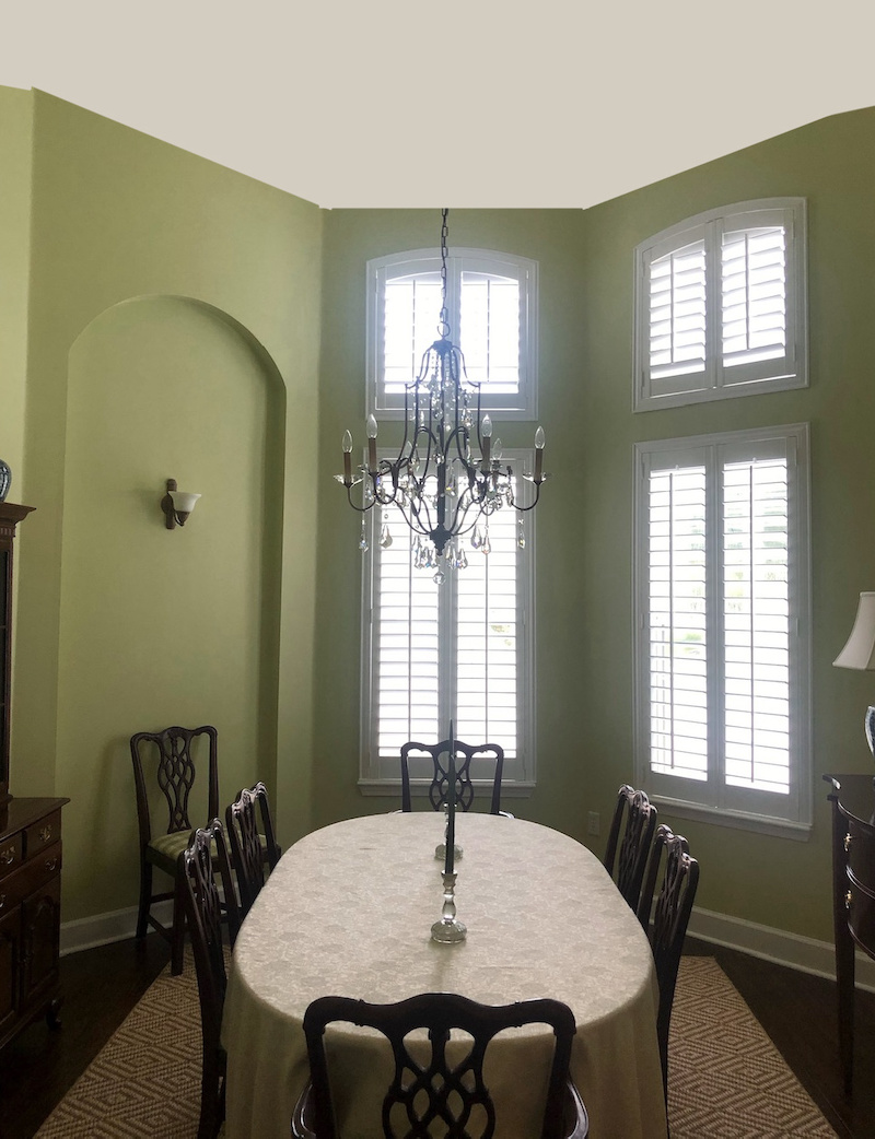
The room that’s giving me fits is our dining room in our new home in Florida. The room measures about 10′ x 12′ and with 14’ walls. It’s an elongated hexagon.
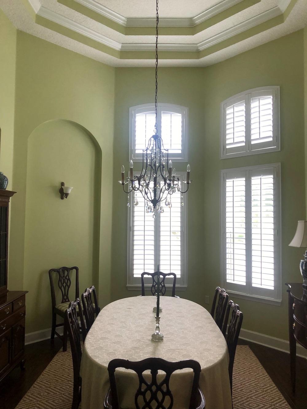
But then, capped off with not one but a double tray ceiling. So, the total height is well over 15 feet! Because it’s a fairly enclosed room, it creates the effect of a very tall, dare I say silo?

Laurel, I am struggling here.
I have a background in design but am stumped and combing Pinterest for ideas. I’m wondering if adding wainscoting will add a choppy effect. I would be happy to share photos if they would be helpful for a future post.
Thank you for your time!
***
I wrote Flo-2 back. Guys, just so you know, I answer everyone, or try to. If your email goes unanswered, it is only because
A. It’s a blog day and your email got buried
B. I read it on my phone and forgot to answer later because it got buried.
I’ll always take a look at your pics– unless it’s a basement, or something that most people don’t care about.
However, if you send me something, it’s now mine. Just half joking. I’ll ask you if it’s okay to post the images before doing so.
Okay, here’s what Flo wrote back, a few days ago concerning her silo–errrr dining room with a slew of architectural mistakes.
Thank you, Laurel! I have no expectations so if you can use this at some point, great. It’s therapeutic typing it all out:)
I bet!
We are a military family with young kids who have moved a lot. We are now settled in a long-term home in Florida. When we first toured the home, I thought the dining room was quite grand and felt it had lots of potential.
Now, I’m baffled because it’s not coming together.
Problems – Rather Architectural Mistakes:
- 15’+ height creates vast expanses of blank walls and a ‘silo’ effect.
- Varying heights of doorways and recesses create a visual “busy” feeling.
Things we have added:
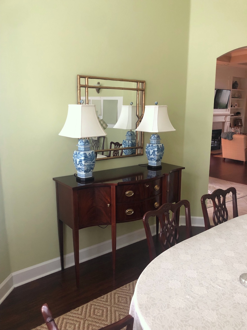
-plantation shutters, server, and lamps, chandelier
-table and chairs are new-to-us (Hickory Chair and Baker)
-sisal rug
-The room was painted, but I’m not 100% on the color. (BM Pale Sea Mist)
You can see in my photos I have been playing with tweaking the paint, along with a coral/green drapery fabric. The sconces are awful and need to go.
I’d love to replace the china cabinet at some point (maybe with a painted piece? I know they’re old-fashioned, but I need the storage) and likely need a larger mirror.
Thank you for any thoughts you or your readers may care to lend.
Architectural mistakes? You are too kind, darling Flo-2.
There’s a good reason this room isn’t coming together, and it’s not your decorating; not at all! What you’ve done is lovely and perfect for a young family in Florida.
What bothers me the most is that this space has the potential to be wonderful. But, it’s like they did everything in their power to screw it up.
Incidentally, I love Pale Sea Mist!
However, I think some beautiful wall art will help break up that large expanse of color. Yes, a larger mirror would also be fantastic.
One word of caution. Your selections are lovely but don’t be afraid to use this color even if it’s not a perfect match. The room will turn out better!
Coincidentally, Pale Sea Mist is one of the Laurel Home paint colors from the LH Paint and Palette Collection.
Below is a good example of different yellow greens, greens and gold which are not a perfect match.
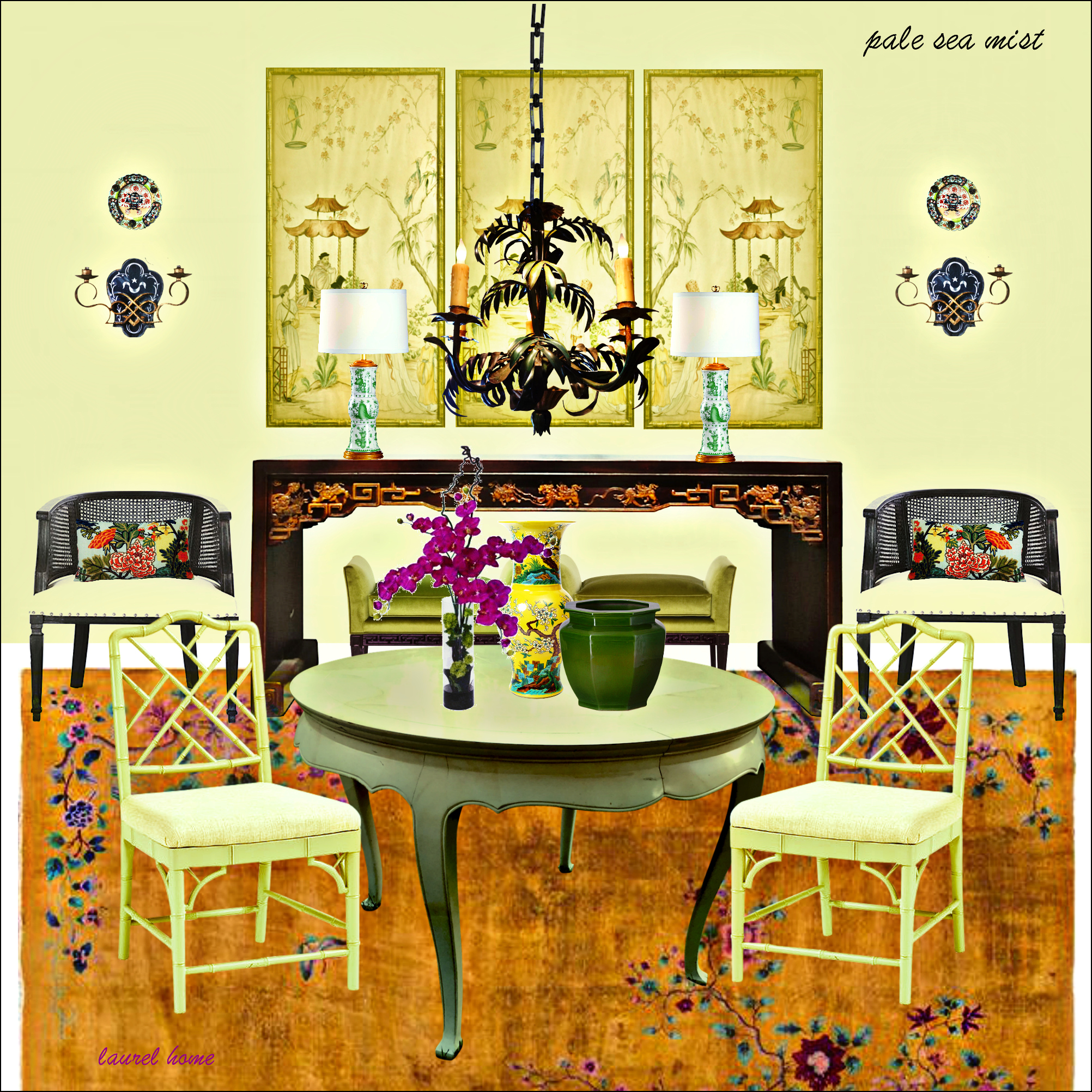
And featuring Benjamin Moore Pale Sea Mist on the walls. Same color!
Above is one of the bonus boards I made in 2017.
Gosh, I barely remember doing this one. For some crazy reason, I promised a new board every month for a year. These boards and palettes are not quite as detailed as the paint collection guide’s original 40 Paint Palette board.
Every once in a while, I link to the bonus palette boards which I ended up storing in my media library. Enjoy!

Oh, this is reminding me of another lovely home a reader shared with us, years ago.
In this case, the color used was Benjamin Moore Pale Avocado, another Laurel Home paint color.
There are 144 beautiful paint colors in every color family.

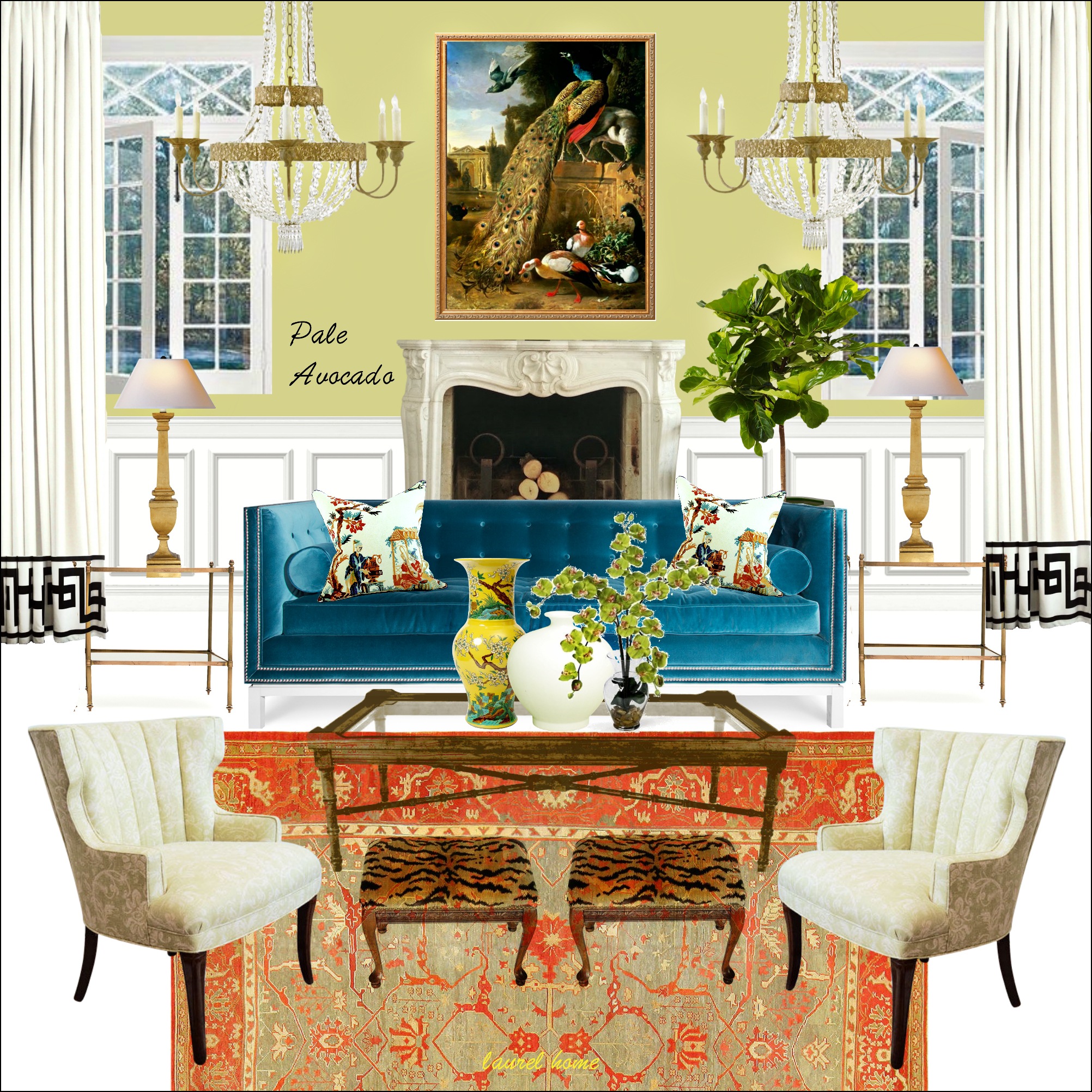
Above is another board in the collection.
I think either of these examples would be gorgeous in a Florida home.
I do not feel that any of the greens you have up are an improvement. They look a little tired in this room. But, let’s try to fix this baby. That’s because changing the paint color isn’t going to help.
Therefore, let’s put our focus back on architectural mistakes.
The most egregious of the architectural mistakes is the nearly 15′-6″ ceiling height in what should be a jewel-box of a dining room.
Laurel, is there a rule about the ceiling height ratio to room size?
That’s a bloody great question, and so I’ve just spent the last 90 minutes working on it. I found a few different ideas, but none worked if the room was small, like 5×7, or larger than 12 x 15.
If anyone knows of a great formula that works no matter the size of the room, please let us know.
I’m sure it has something to do with the golden mean. Please read about the golden mean and how it relates to perfect architectural proportions, and the no-fail formula.
Of course, many spaces these days are at eight feet high. Actually, a super large room that’s only eight feet high, is another problem to address.
However, I don’t think there’s any space that can’t be 10 feet high.
My small kitchen and entry are both 10′-2″ high. And, they are lovely to be in.
My living room is just over 13 feet. Standing up and walking to one end, I feel 13 feet would be too high for a room less than 150 square feet.
Flo-2’s dining room is 120 square feet. I don’t think it should be more than 12 feet high. Of course, 13 feet would be a lot better.
But, there are other architectural mistakes in this little room.
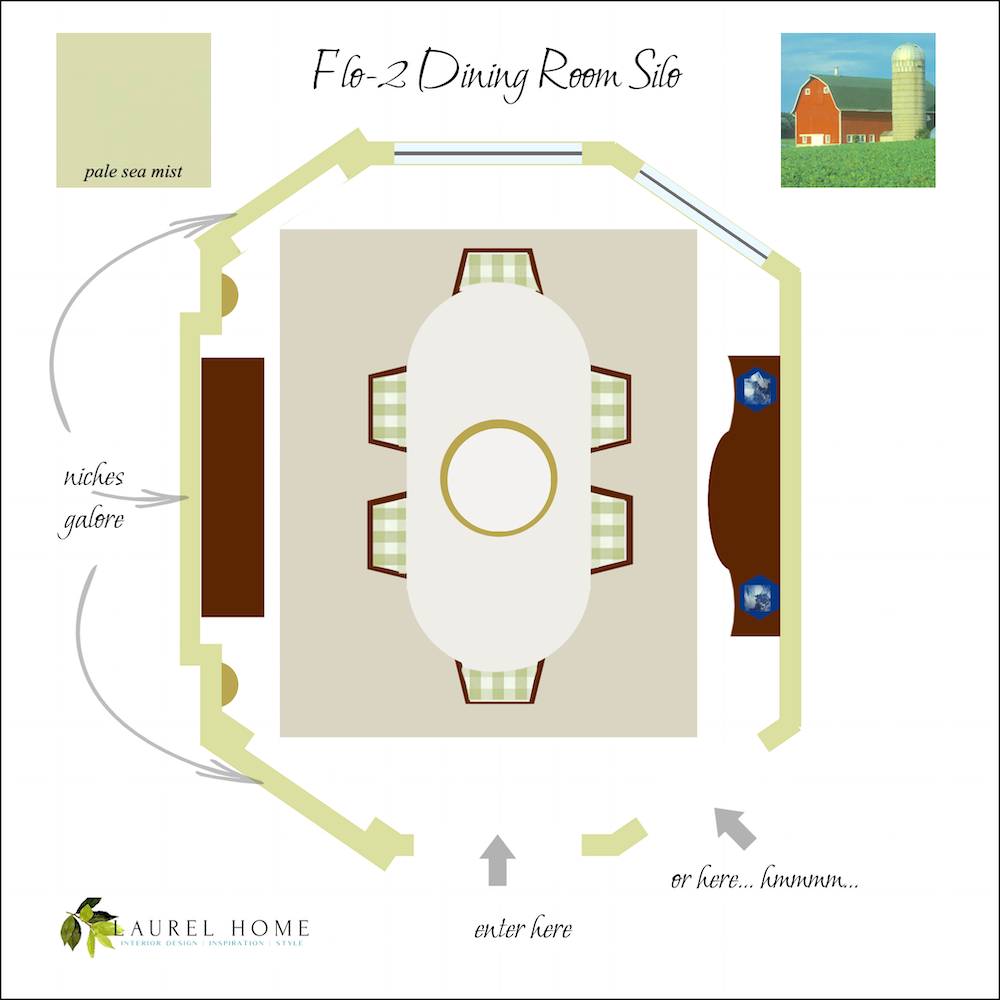
Let’s look at a floor plan I made above.
There’s the door inches away from another door? Whaaa? I think it looks dumb, and no door casing, either. Plus, the doors are at different heights. Who does that?
Unfortunately, way too many builders do that. Why they do such idiotic designs, I have no idea.
Let’s look at the windows.
Eegads! Why Oh Why is there not a third window? Is it possible it’s an interior wall? I guess, it’s possible, but not likely.
Unfortunately, I’m not finished with this little room’s architectural mistakes.
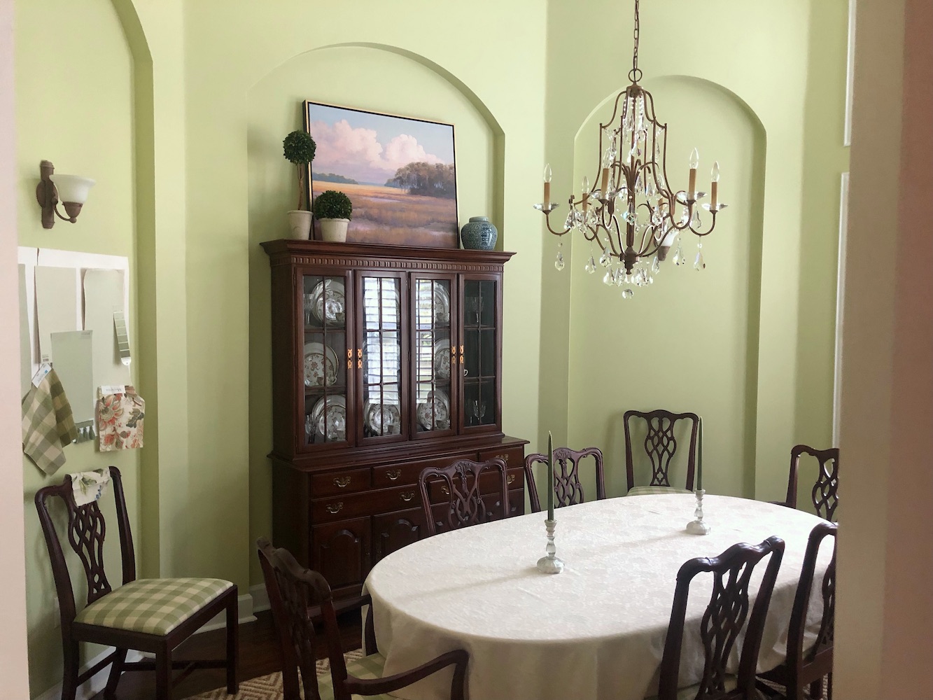
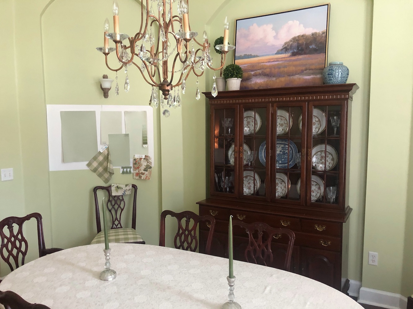
Next up are the niches. The niches are much taller than the doors. And, even taller are the transom windows. Ugh.
Oh, wait. One more. The arches. There are seven arches in four sizes and shapes.
That’s gross.
Okay, yes, it’s first-world-type gross. But, what does it take to make things uniform?
Look, this is an architectural mess.
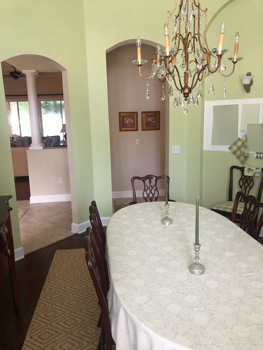
To boot, check this out. When Flo-2 sent me the pics, they were attached inline and in a large size. That’s fine, but this is what I saw in Flo-2’s email to me.
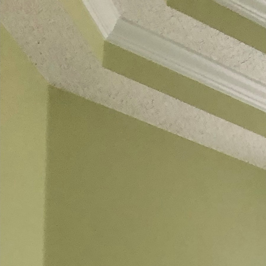
Yes, they put this awful stucco on the bottom of each tray.
Okay, as is the case of Flo-1’s home, sometimes it’s folly to work with something that’s gone terribly wrong. Of course, you can live with it the way it is. I’m aware Flo-2 and her husband are young and might not have the funds for major renovations.
I wonder what would happen if we turned the table so it’s centered on the two windows.
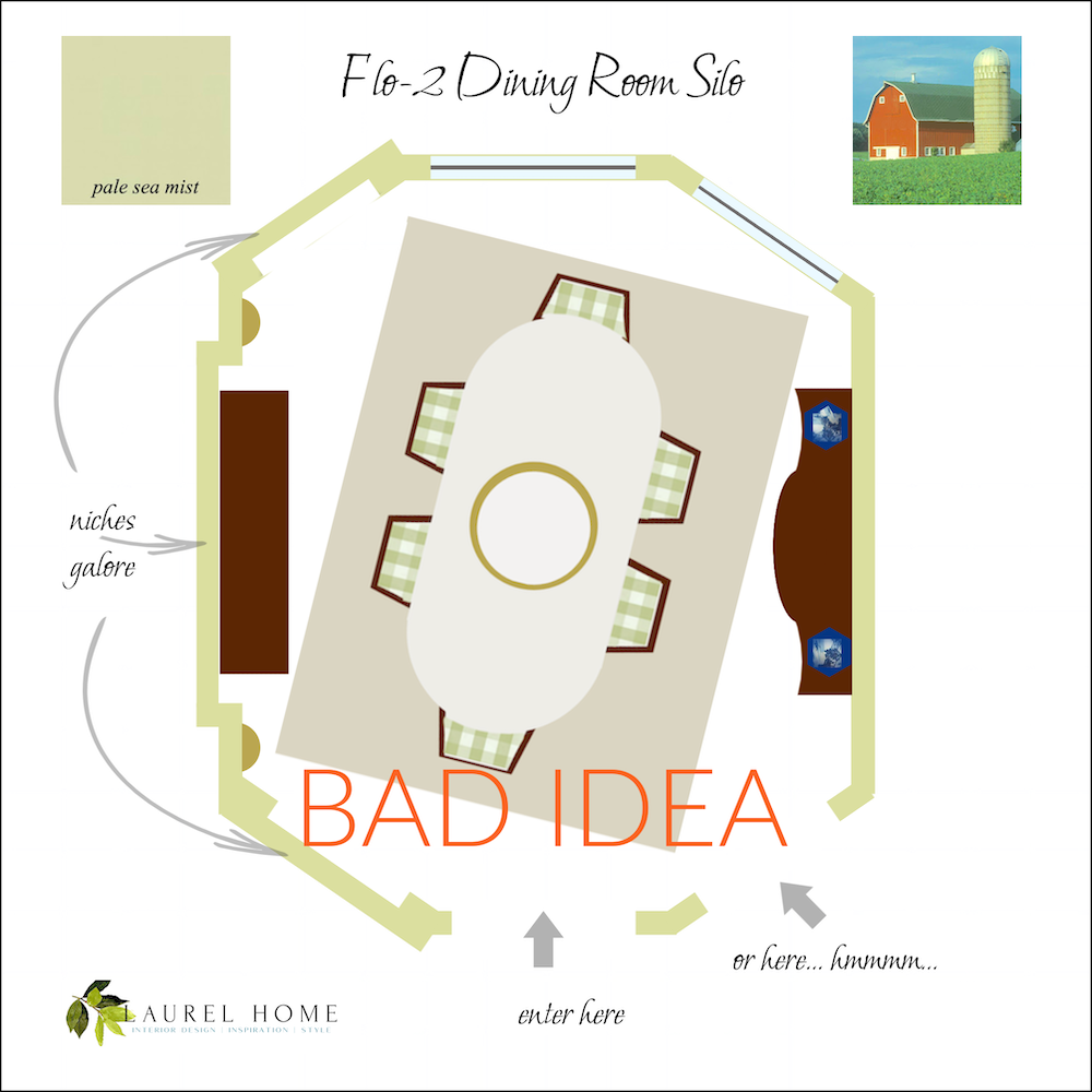
Ummm… no.
Are there any cheap fixes for these architectural mistakes?
Yes, but they aren’t going to make a huge difference.
One trick would be to paint the trays, on the bottom, the same color as the walls and then only paint the very top and the highest crown moulding a creamy white, like Benjamin Moore White Dove. That will make the ceiling feel ever so slightly lower. And painting out the trays will help not call attention to them.
After that, I would fill in the two niches next to the windows and where the fabrics are hanging.
She can keep the one in the center. That one, I don’t mind.
Let’s look at the door openings again.
One of them has to go.
After debating this for a while, I think it should be the one on the right. I would prefer if the doorway was squared off. And, of course, it needs door casing. (moulding)
Of course, Flo-2 doesn’t have to do this, and I can’t see what else is happening behind the dining room except for a sliver of the entry and living room.
But, if this were my home, I would lower the entire ceiling to about a foot below the bottom tray. And, then reattach the crown moulding, which will sit about 6″ above the top of the transom windows.
That will make the ceiling about 13 feet. That’s still super tall, but at least it won’t be as bad.
The only other option is to sheetrock over part of the transom to remove the arch and make it about a foot less high. Then reattach the moulding. No one will know that the window is taller. It will look the same from the outside.
We also talked about doing this in another post from a few years ago.
And, part II of this post concerning some strange windows.
Laurel, what on earth are you talking about?
Oh, sorry. I made another graphic!
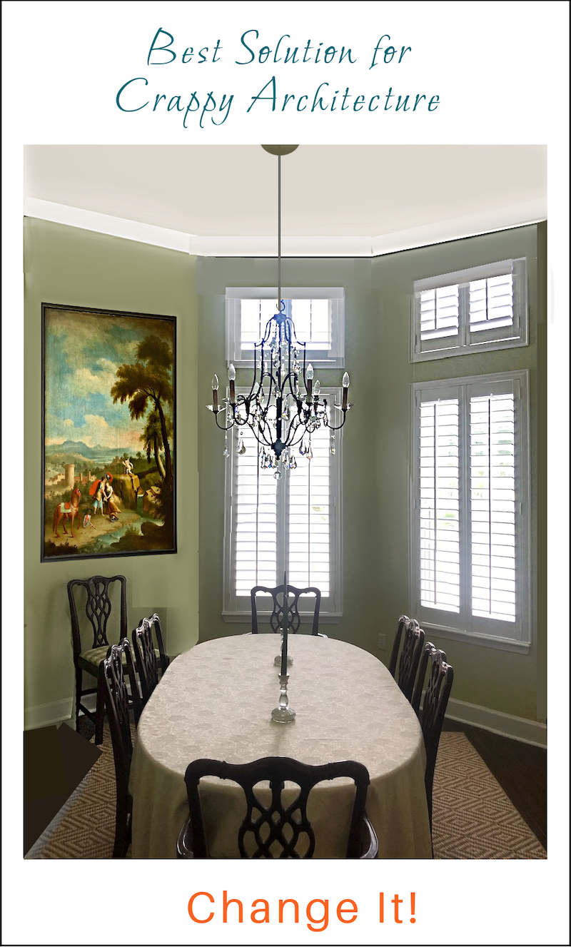
It’s difficult to make it perfect, but hopefully, you can see what I’m trying to convey. The transom is more proportionate, and the weird arches are gone. Please note: This is still a super high ceiling at about 12 feet!
Phew! These posts are fun, but take a while to put together. I hope you’ve enjoyed these architecturally challenged homes in Florida!
Again, if you missed part I, you can see it here, and see the revised floor plan.
xo,

PS: Big, Big Weekend has already started in the HOT SALES! Melissa has done a wonderful job updating all widgets and fantastic home furnishings sales!
Related Posts
 Can A Raised Ranch Home Become A Traditional Home?
 I’m Afraid Our New Rustic Home Will Be Depressing!
 20 Breathtakingly Gorgeous Ceiling Paint Colors and One That Isn’t
 36 Cheap Sofas and Chairs That Look High-End!
 20 Timeless Kitchens You’re Going To Love Forever
 The Best Swivel Chairs And Swivel Gliders, too!
 Sophisticated Twin Beds – 20 Ideas For Grownup Bedrooms


26 Responses
So many great ideas here. What a fun post! Thank you Laurel, and thank you to all who added ideas to the list. It’s always hard to know which suggestions will hit home when you don’t know someone’s budget.
.
My suggestion to Flo2 (who has already done a fabulous job!), is to get some quotes for different parts of the plan that she likes. It’s surprising to me that people assume something will be super expensive without actually asking a couple of professionals.
.
Remember, the quotes are free, and you are not obligated to hire them.
.
Ask the contractor to separate the items so you know which ones you can afford: (close up doorway, get rid of side niches, add another set of windows, lower the ceiling, etc). You may find that one or all is not outside your budget.
.
Please send Laurel your updates! We’d love to see where you land.
I’d like to nominate another Benjamin Moore green with the unfortunate name of Gray Mist. It’s actually the most beautiful shade of pale sage that you could hope for. Before finding Gray Mist, I went through 2 green paints in our powder room that were very close to the colors she has on the walls and the samples she’s considering. They remind me far too much of the un-mourned Avocado Green which, along with Harvest Gold and Cocoa Brown, comprised the entire American color palette in the 1970’s. Gray Mist has none of that, just pure subtle gorgeousness. You can’t really see the green shade clearly on the paint strip but the color comes out beautifully on the wall.
Or she could be really bold and go with coral on the walls which would pair beautifully with the curtain fabric sample and the painting over the china cabinet. Maybe Coral Essence or Heartbeat would be a good match with the fabric and painting. It would also make everyone look so nice and attractive at Thanksgiving dinner 🙂
I’m not a fan of that range of green, but as another reminder of the reasons I read your blog, I agree that is better than the options there and I think it’s perfect for that room. You always make me think and shift my perception, which I love.
The previous owners who built our home altered the floor plan under construction and added even more to spaces already jammed with openings. I don’t think I fully appreciated homes with wall space and layouts conducive to furniture arrangement before our current home. Your suggestions are definitely improvements.
Flo2, you will soon have a beautiful space and here’s to hoping you all soon have great times there.
Tall framed Chinoiserie panels would be a great way to fill some of the vertical space in the room.
I had been thinking along these lines, as well! Found some beautiful ones by Chelsea House I am eyeing…
Yes I also agree that lowering the ceiling is the way to go plus blocking up the arch. I live in England where there are lots of high ceiling Georgian rooms and think that if you had higher skirting boards it would look more in proportion once the ceiling was lowered. I love all the owner’s swatches and think it will be fabulous when it’s finished after you have corrected as many of the architectural mistakes as you can. Just a thought – could you put in a fake third window?
My first, gut reaction to the tray ceiling is a Napoleonic tented ceiling, with the peak of the tent being gathered into the ceiling medallion. I would use a lightweight, rustic cream colored fabric for the tent, it could be cheap fabric- nobody’s going to get close enough to see it in detail. I agree with the larger chandelier idea and hang it just a little lower to the table. A custom cut rug for the shape of the room is also a great idea. I think you could remove the sconces altogether (use the lamps for ambient lighting), then a coordinating but not matching plate wall could be arranged in the niches flanking the china cabinet. A painted china cabinet, as Flo2 mentioned, would take away some of the excess matchiness of the dark wood. I think this room has potential and the color is lovely.
Just wanted to chime in. As a professional real estate stager, I look at projects with how I can make a
space “WOW” at the least cost. As is, you have such a great opportunity to make this dining room a super special room, by embracing it’s unique features. After all, it wowed you when you looked at the house. I feel a dining room is the place to really create an atmosphere, like a beautiful restaurant where guests are transported.
Until you really want to, and have the money to spend on architectural changes, I would:
~ Where Laurel suggests lowering the ceiling to, I would instead paint that entire upper portion and ceiling itself with a darker color. I just did Behr-Frog in my dining room below the chair rail and it’s
wonderful. (I had a mirrored curved top armoire- with great china storage -that I painted the same color. It was a $195 craigslist find.) Or Laurel certainly has beautiful color recommendations!!
~ Immediate need: A “Wow” chandelier, with great presence. Lighting is the jewelry of a room. One I always address in staging, even on the tightest budget. That high ceiling is a great opportunity to have a fabulous chandelier. Search for tall chandeliers for high ceilings. There are many across all price ranges. A ceiling medallion would make it fabulous. Again, they aren’t that expensive for a look they achieve. Shades definitely would improve the current chandelier.
~ Embracing the uniqueness, Yes, I would tilt the table on an angle, but going the opposite direction than “bad idea”. I’d have the head chair back to the niche. In that niche, I hang a mirror the size of the artwork Laurel showed in that space. It would beautifully reflect the lighting of the chandelier.
~ Flip the china cabinet & buffet to opposite walls. Scooch the china cabinet a bit towards the windows to create more walking room around the table. Again, it’s embracing the “less than perfect” symmetry of the room.
~ Put a tall pedestal between the windows, topped with a plant, statue, or even a great lamp as there is an outlet on that wall; adding some drama.
~ Hang a large piece of artwork over the buffet.
~ In the niche by to the right of the doorways, I’d put a large palm, or other tree (with tiny led string lights) there. Future possibilities as the budget allows, 1.) a tall cabinet with white shuttered doors could replace the large china cabinet. 2.) An open bookcase/display cabinet, 3.) a bench or two side by side for extra seating with art above.
~ On the two doorways, I would install 2 metal “turn back” curtain rods at the wall height of the niche on the right (where the curve begins.) Hang simple white curtains (faux silk or velvet) on ring hooks. Left open, they will bring drama, softness and a sameness of height to the openings.
The cost, if you don’t already have these items, would be: a chandelier (or just shades), a mirror, a large piece of artwork, 2 inexpensive (Target) curtain rods and 4 curtain panels, a tall pedestal & plant (etc.), tall palm or other tree, paint & painter.
Your dining room would “Wow” on a shoestring budget, until you want to make bigger investments.
Lastly, wishing you all the happiness in your wonderful new home!
We had ugly double tray ceilings in every bedroom with alternating wall color and ceiling color, giving the appearance of stripes. When painted all one matte neutral color, the whole ceiling sort of went away. The eye no longer is drawn to it, thank goodness! A cheaper way to lower her ceiling (without really doing it) might be to install trim toward the top of the wall and then paint everything from the trim to the actual ceiling the same light color. A matte worked well for us since there is no shine to catch your eye and make you notice it all. Even the trim pieces are matte. Flo2 has beautiful colors and her painting with the clouds is so pretty. Good luck to her!
Thank you for the tips! Very helpful! We have a single tray in our master bedroom and it’s fine, coffered ceilings in the family room which are quite nice. But this one is 😬😬
Another great post Laurel. You are the best !!
Me again!
@Laurel, yes, my pick of Pale Sea Mist was inspired by one of your paint palettes (the Downton Abbey one, maybe?) I hadn’t seen the particular board you posted above and love it.
In my head, I was going for a James Farmer look (warm tones, bold patterned drapes, blue-and-white mixed in). Have a drapery fabric chosen, etc. But I have become paralyzed from further executing my plan due to all the problems you see here! Will consider deeper/colored rug, we have Oushaks in adjoining rooms so one reason I went with sisal was ease of blending.
GL-I will change out chandelier candles, thank you! def agree we need a larger/grander mirror. I’ve considered swapping buffet and cabinet but due to the angled entry wall you’d be somewhat walking into the ‘side’ of the China cabinet. Would love a mural/scenic wallpaper…that was my hope when house-hunting. Something to think about.
@kate a round table doesn’t really fit the space. It’s actually about 12×15 (I think Laurel was guesstimating) but with server and China cabinet it’s not quite deep enough. We need to be able to seat 10+ for holidays.
Love all the thoughtful comments and ideas, everyone! Thank you. Dropping the ceiling had never occurred to me. Will have to ponder.
Gratefully,
Flo2
I wonder if you would consider having a rug custom made to fit the shape of the room, with a small border of bare floor around the perimeter. You can buy broadloom in many colours and textures and have it cut and bound on the edges. You could go for a richer colour but in a texture like woven sisal. I find the rectangular shape of the rug distracting in this room with distinctive angles.
Hmm, that’s an interesting idea! Hadn’t thought of that for this particular space but I see what you mean. Could probably have done in sisal if we wanted to keep that, as well.
What an improvement lowering the ceiling makes!! That would be the first thing I would do. Another idea would be to add more color…when you look at the paint palette board for “Pale Avocado” the colorful rug and sofa attracts your eye and you don’t notice the background as much. A different rug and lots of art will distract from the architecture. Flo2 I hope we will get to see a follow up when you are able to make the changes.
Agreed, definitely need more color—it feels very one-note in here to me at the moment. My plan was printed drapes on lower windows in shades of coral/green, plus art…wondering if that’s enough. Hmm.
James Farmer would be proud of your starting points for sure, I love the paint and chair fabric and the accessories you have. I agree with all of Laurels suggestions and think you could start slow by painting the ceiling and trays all the the same like the other reader mentioned while you save money and decide how to go about permanently lowering the ceiling. some larger artwork and new sconces will also help so much! Thank you for your families service to our country and all the best to you.
Architectural changes get extremely expy and if this isn’t your forever home some other changes are more cost effective and easier to do. Firstly, chandelier, sconces and lamps are way to small. A chandelier at least 42″ wide is needed. Using a round table instead of rectangle would address the ackward room structure. Paint the ceiling all one color of off-white. Accessories such as art and mirror need to be larger and get rid of the small stuff it makes the room seem to busy. Lose the carpet as it throws off the balance of the room.
Dear Laurel,
I love everything Flo-2 has done with her home. I also would keep the lovely shade of green. Since she commented above letting us know that the doorway on the right goes to the kitchen I had an idea. Lower and frame that doorway (transom?), fill in the arched doorway to the entry and add a new framed opening from the entry where the buffet sits. Then one’s first glance into the dining room would be of a lovely symmetrical vignette on the far wall rather than the lopsided window situation.
Whadya think?
I agree with that elimination to one of the doorways. I think that will make a huge difference but if the other doorways in the home are arched I would most likely keep this one arched. I would definitely eliminate the center niche and possibly add wallpaper inside the other two niches. The wallpaper could be a large print like a mural or a textural grass cloth to show off some artwork. I think that if you replaced the rug with a rug that has an accent color and pattern that would coordinate with whatever you choose to do in the niches.
Laurel, thank you for your amazing website. First time commenting but I have been a fan for years.
Wow! I looked at the final layout for Flo-1 and love it. The value you added to this home should the owner adopt your recommendations is immense. The only thing I do not like is the angled tub in the master bath – toooo hard to reach to clean ( yes I let my cleaner go and keep my own home these days.) This is a rhetorical question – are all Florida homes built by the same demented developer? My cousin’s home had many of the same issues. They solved their problem when they moved. Anyway, your recommendations are spot on. Love them – and love your new website – beautiful!
Great board with the pale sea mist Laurel. I like the pale sea mist color with that wood tone in Flo2s room. Somehow, the room seems too crowded to me, could be the photo angles though. Could a china cabinet, or console be moved to the hallway, drawing the eye into the hall, or maybe the pieces are too large for that. I like the choice of fabric on the chairs and the sense of applying some restraint in a busy room. This “related post” at the end of the article might be helpful:
https://laurelberninteriors.com/georgeous-ceiling-paint-colors-and-one-thats-often-not/
Flo2 here…Laurel, love the new blog look! You are a doll to feature our hot mess dining room—thank you! I’ve been so excited yet slightly terrified, ha. Can’t wait to follow along in the comments today.
For clarification, yes the angled wall by the windows IS an interior wall so no possibility for a window there.
Agree, the mismatched double doorways drive me nuts. The one on the right leads back to the kitchen (just past the two gold frames). The one on the left opens into the large entry hall and ‘matches’ a doorway on the room opposite (a study).
OK, it was me, sorry — must have touched something on the keyboard!
What happened to the name? Trying again, a test to see if it works!
Totally agree that the only thing to do is to change the architecture! I think the ceiling must be lowered and one of the two doorways eliminated. It’s a pity the proportions of the one on the right are so wrong, as that leaves no choice but to keep the one on the left. When I first saw the photos, I wondered about using the niches to do murals (tropical landscape of the Zuber persuasion) — and change the sconces as you and Flo-2 suggest, for something Rococo-ish, closer to the chandelier in design. On which subject, the candle sleeves need to be changed to get rid of the brown tops — unless that’s just an unfortunate effect of the photos. I would swap the china cabinet and the buffet, to get more height where there isn’t a niche. The lamps are lovely and would look good in front of a mural. But the mirror doesn’t give enough height.