In recent months, I’ve been getting a lot of questions about windows.
And, it’s funny. We’ve certainly talked about window treatments. And one of my favorite posts is about transom windows. Then, there was this post about a home with some difficult windows.
So, after all of this time, I think it’s a great idea to talk about the best windows. Not to scare you, (too much) however, if you want to be sure to muck up your home, getting your windows wrong is an easy and super-expensive way to do it.
The most prevalent question is about the “new” and trendy black frames. Yes or no? That’s a very good question and we will be addressing it, as well.
We will not be getting into more technical things like energy efficiency and noise blocking. By the way, I have a friend who has the latter type in the city and they really work!
One reason I most likely haven’t spoken about windows so much is because it’s not something I’ve ever specified. However, windows are my favorite architectural feature. My dream is to have a house something like this one. But, really, a third of it would be fine.
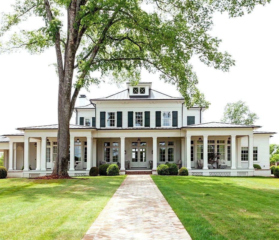
Stephen Fuller (please be sure to check out his gorgeous website!)
But wait. Actually, my inner secretary just walked in to inform me that I have specified windows before. Well, it was a long time ago.
Story-time.
I know that I’ve told this one before, but since I don’t remember when or where, here it is again.
It was Thanksgiving weekend 1993. And, I was visiting my folks in Wisconsin when my step-dad, Mark asked me if I could help him with the design of a new building that he was going to have built for his business. It was going into a brand new industrial park in a neighboring town. Oh, and of course, he would pay me. :]
Well, I imagine that I smiled sweetly. And, said something like, “oh, gosh, I’d love to help you, Mark, but I’m an interior designer.” But, seeing that he was looking anxious, I told him that I’d have a look.
He whipped out the plans immediately and tried to lay them flat on the table.
Oh, you already know the deal. Otherwise, there would be no story.
Yes, utter shite.
Whoever had just phoned in the same old boring commercial dwelling; squat, bare-bones; just a plain, ugly building with a few random windows.
I looked up and said. “What do you think?” He said that he was pretty underwhelmed. I said that I was very underwhelmed.
Then, I thought back to all of the work I had done in design school and remembered that much of it was architectural in nature. Anything would be better than this! So, I told Mark that I’d give it a go and completely redesigned the entire facade as well as the interior!
Sadly, I don’t have any photos, because the windows are pretty cool. That is, until today!
Gosh, I couldn’t even remember the town. And my mom sold Mark’s business circa 2006, five years after he died. But, somehow I managed to find the town and from there, I had a hunch as to the name of the street.
And, what I did was get on Google Maps and I started virtually driving down the street. Raise your hand if you’ve ever done that. It’s a helluva lot of fun. You just take your arrow and drive down the street with your computer mouse.
However, what’s really funny is I went a few virtual blocks and thought, no, it’s in the other direction! It must’ve been Mark. So, I turned the “car” around and virtually drove down about a half mile and OMG!!! there it was on the left!

The windows to the right of the door with the awning are all square with nine panes.
Each of those is a separate office space for the principals of the company. Mark had the corner office.
I thought the windows were the same on the front of the building, but at least the first one is. But, apparently, the middle one is a double. The one on the left had to be the same as the one on the right, but it looks like it got changed at some point.
The building needed to be made out of this cinder block that was molded to resemble limestone.
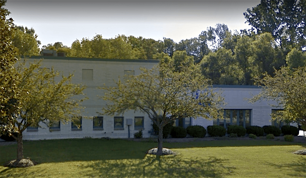 The small windows on the side were for the call station. Every operator would have their own window to look out of.
In the clerestory, I designed a reveal to mimic the shape of the windows, but placed between two windows.
The original building ended there. But, they needed more space, so they added on later.
Afterward, I was told that the developers of the park liked the building so much that they encouraged new builders to use it as a prototype.
And yes, my step-dad paid a fair amount more than he had originally planned, but he said that it was worth it because he enjoyed being there so much. At that point, I had only gone to design school and had worked for others for only a few years.
It just goes to show that if you think you can’t do something, think again.
That’s been a lesson driven home to me over and over throughout my life.
Okay. Time to move on. There’s a lot to cover with windows. And, of course, I’m not going to be able to go into everything, but hope to get to the bulk of your questions.
Let’s begin with what not to do with our windows. And, believe me. There’s a lot not to do. But, this one is precious.
The other day, I received an email from Gail who frequently leaves the most lovely comments. She lives on Vancouver Island, BC. Here’s what she shared:
Hi Laurel,
I just had to send you pictures of this. We have a painful new trend in our neighborhood. Early 20th century homes are coming down and in their place, they are putting up these modern boxes.
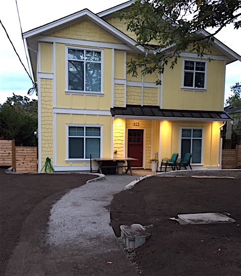
please do not pin unless to a blooper board
Some builders have decided to try to make the boxes match the early 20th century homes by applying fake composite panel siding made to look like uneven, crooked shingles.
Why crooked you ask?
I have no freaking idea! My early 20th century home has shingles and they’re perfectly straight. Oh and we might as well paint them brilliant yellow while we’re at it. Check out the weird windows down the side. This one sold for over a million bucks!!
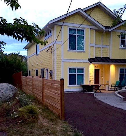
please do not pin
I swear. I just sat here staring at this abomination for at least ten minutes, just shaking my head in disbelief. Please, tell me are there any two windows that are identical? It took me a while, but I finally figured out that those bizarre little windows directly underneath the eaves are meant as a means of emergency egress for the rats dwelling in the attic. You know, in case of a fire or something. Right?
Oh, so bad. So bad.
In addition, a larger window NEVER goes over a smaller window; not to mention that these are not the right kind of windows.
The Color. The FAKE CROOKED SHINGLES!!!
omg.
And wait. Not that I wish to see more of them. haha. But, why on earth do they just stop two thirds of the way? Did they run out of them? Maybe the company went out of business? Let’s pray together.
Pity. Maybe some irate neighbor came in the middle of the night and stole them?
Horror show.
I could go on, (and on…) but I won’t. It boggles the mind. Oh man. I do hope those wires are only like that temporarily. Or maybe that’s what’s keeping this place from blowing away?
Yes, please! Make it blow away. Do they have hurricanes in Vancouver?
Thank you Gail. You definitely have my sympathy. She also sent me a photo of her home’s facade and it’s wonderful. Of course, it looks nothing like this.
I was going to make a graphic of all of the parts of a window, but I thought rather than bust my hump with that, I am directing you back to Mcmansion Hell as she made an excellent graphic. And, she shares many more abominations featuring how not to do your residential windows.
Ack!
Laurel, please, oh please address the black windows. Yes? No? I’ll hate myself in 10-15 years if we do it? We’ll be the laughing stock of the neighborhood? Or, maybe that’s all wrong and it’s timeless?
Okay. Fine. Let’s do that.
The answer is yes and no.
Sorry, you knew it wouldn’t be cut and dry. That’s because there are so many variables. Don’t I always say that?
Look, black window frames are not anything new. They’ve been around for centuries.
What’s new is combining black window frames with a “modern” (sorta) “farmhouse” (sorta) with a dark gray or black metal roof.
Yes, you already know. It’s a trend. And, yes, it’s most likely going to look dated.
If, you have to ask, that means that it’s probably not classic.
However, there are some situations where black frames are not only okay, they’re desirable.
Plus, there are some compelling reasons for doing black frames.
- They look better from the inside when looking out the window.
- And, they don’t ever get dirty, really.
- They never need painting, unless they are black painted wood. But I prefer iron muntins and frames.
However, it is never a mistake to paint everything white. Or paint the window frames (if wood) another color other than black or white.
In addition, there are some situations where white frames would be all wrong.
Let’s begin with some black window frames that IMO are not working and why.
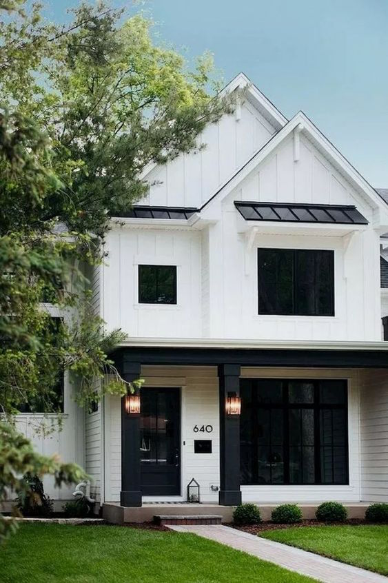
Pretty self-explanatory. Those black “holes” are not very inviting, are they? And why the black columns and lintel? That’s weird. One look that I don’t mind is to have only the front door with the black frame and everything else is white.
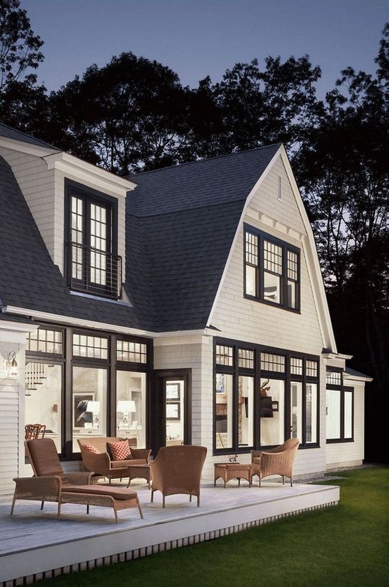
The architecture isn’t bad, but those black frames and mullions are way too heavy looking, IMO. This, look, I fear will be dated before long.
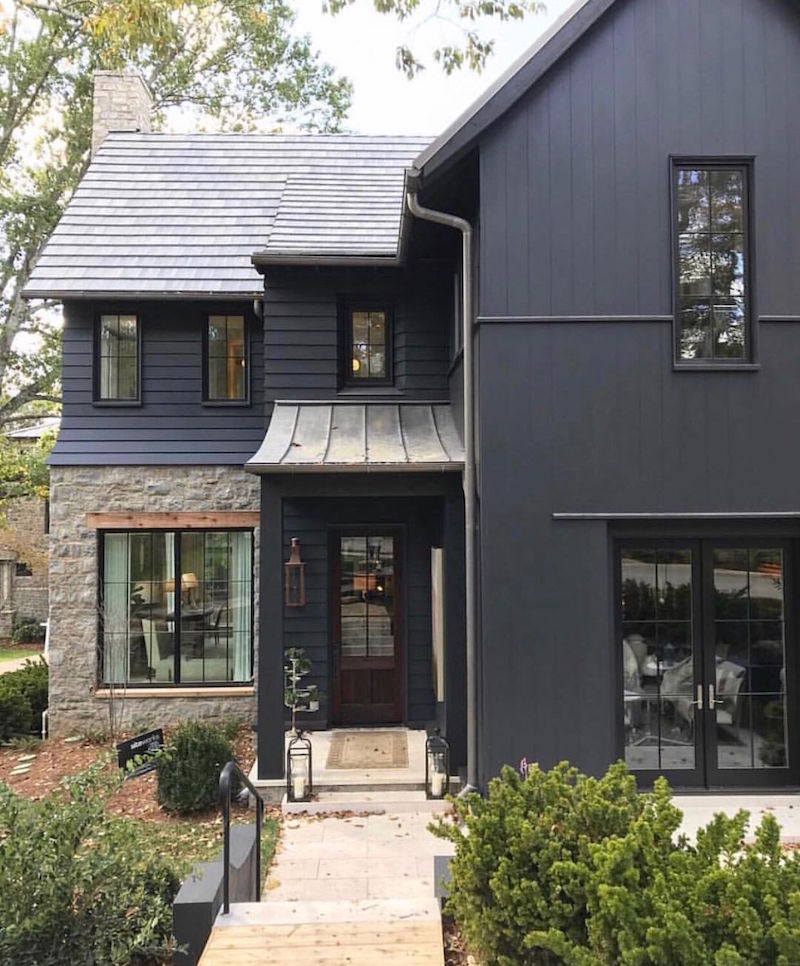
O’more Showhouse– black window frames. These look great with the dark siding and rusticity of the stone.
This is the thing with black window frames.
They are almost always appropriate for an urban or rustic setting.
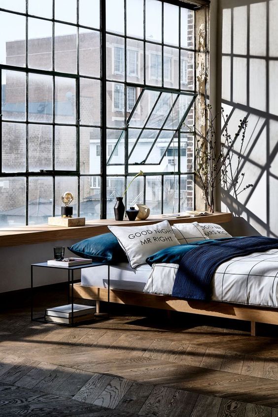
In addition, there are painted wood frames and these cool black iron frames. The latter, I love. In fact, I had a client who renovated a contemporary home and put them in. They are wonderful.
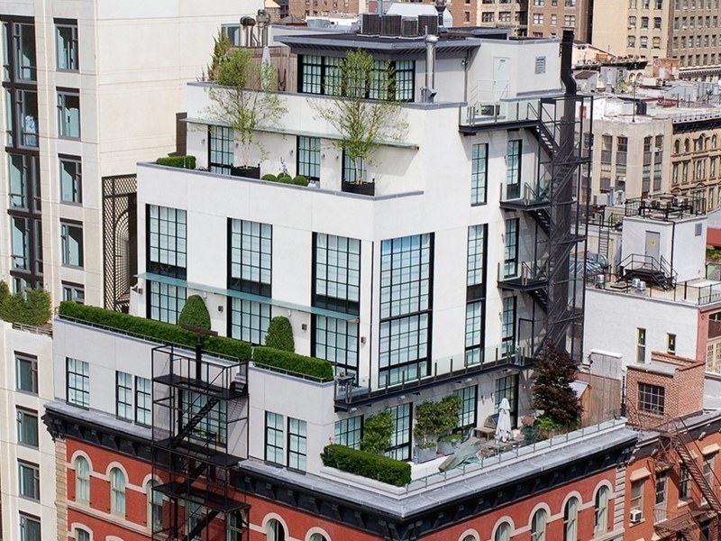
Cool townhouse in Tribeca, NYC with iron black window frames
And, Bobby McAlpine has been doing black window frames his entire career which is well over 30 years now. They are perfect for his style which is usually a blend of rusticity and a sophisticated urban, earthy flavor.
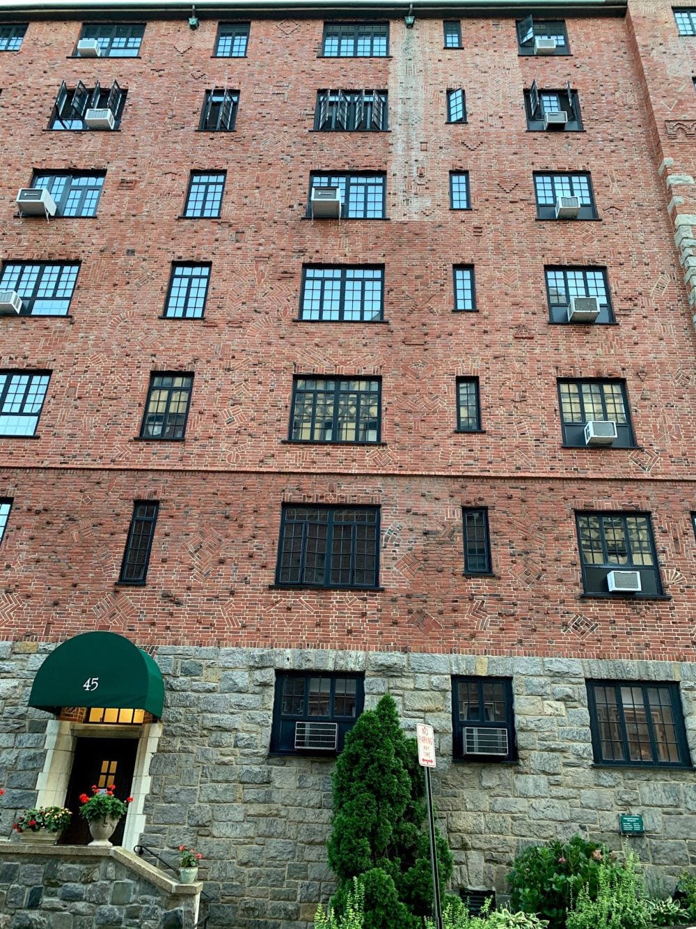
This is the building across the street from me. I just took these images. I’ve always loved these black-framed casement windows. They’re not ideal for the air-conditioners but otherwise, are lovely.
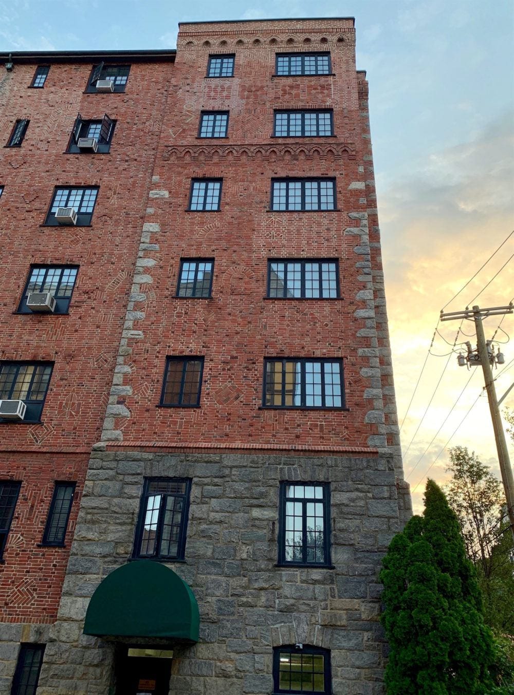
Interesting brick patterns here too!
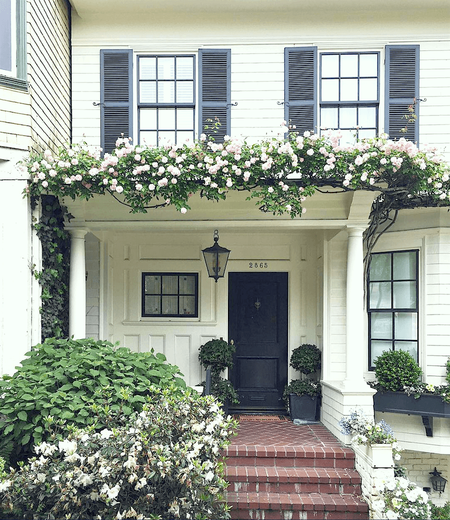
photo: @sophia.gb on instagram
Above and below, one of the most popular homes in San Francisco, photographed on instagram.
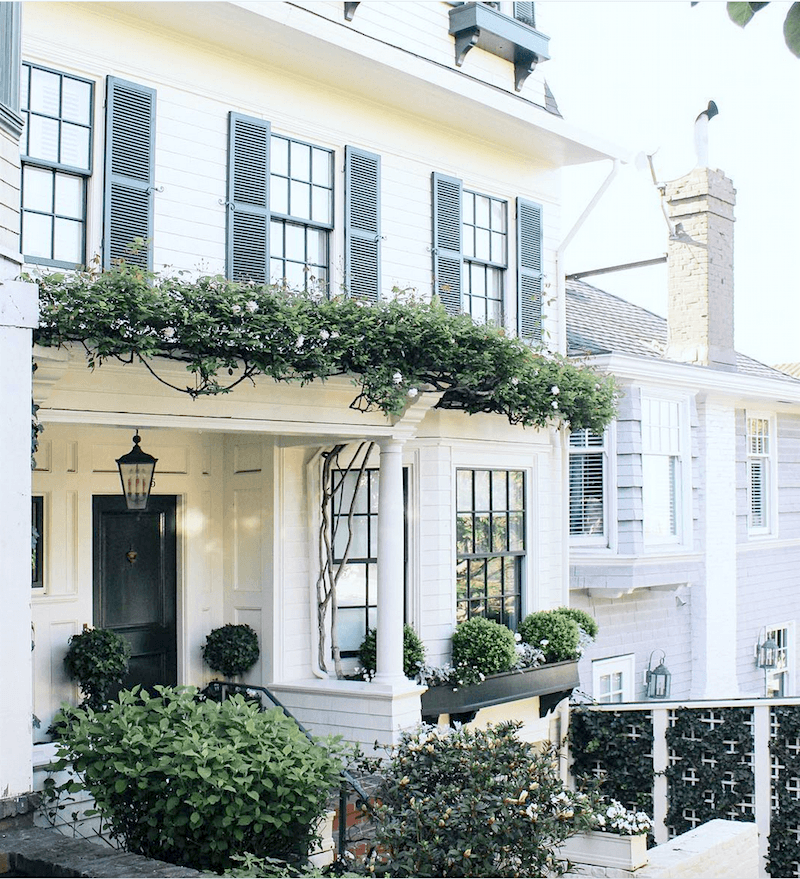
Too, too charming! I can’t tell for sure if these window frames are black or gray, blue. But, whatever, I think that this looks just right.
So, if you do black frames, please make them thin.
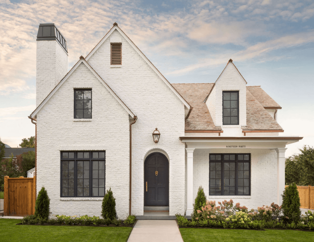
The black frames look appropriate, as well, on this modern Tudor-style house.
My friend and colleague Maria Killam wrote a very good blog post about black frames. She brings up some very valid points, as well.
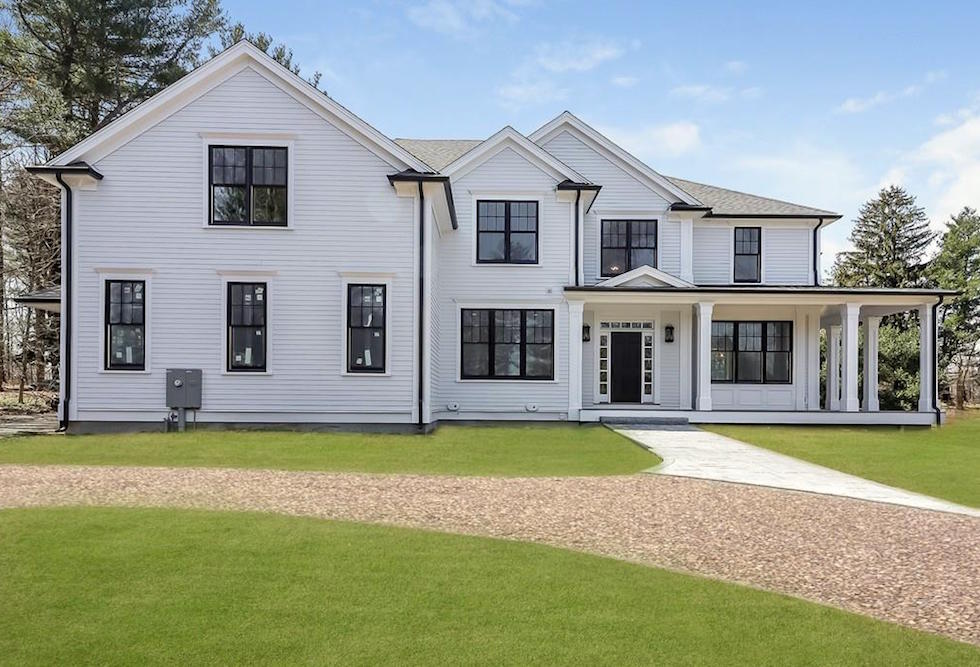
Albeit, there’s no landscaping. And, what? Is that the electrical meter in the front of the house? While there’s nothing inherently wrong with this house, I feel that this look is going to look dated in a decade or so.
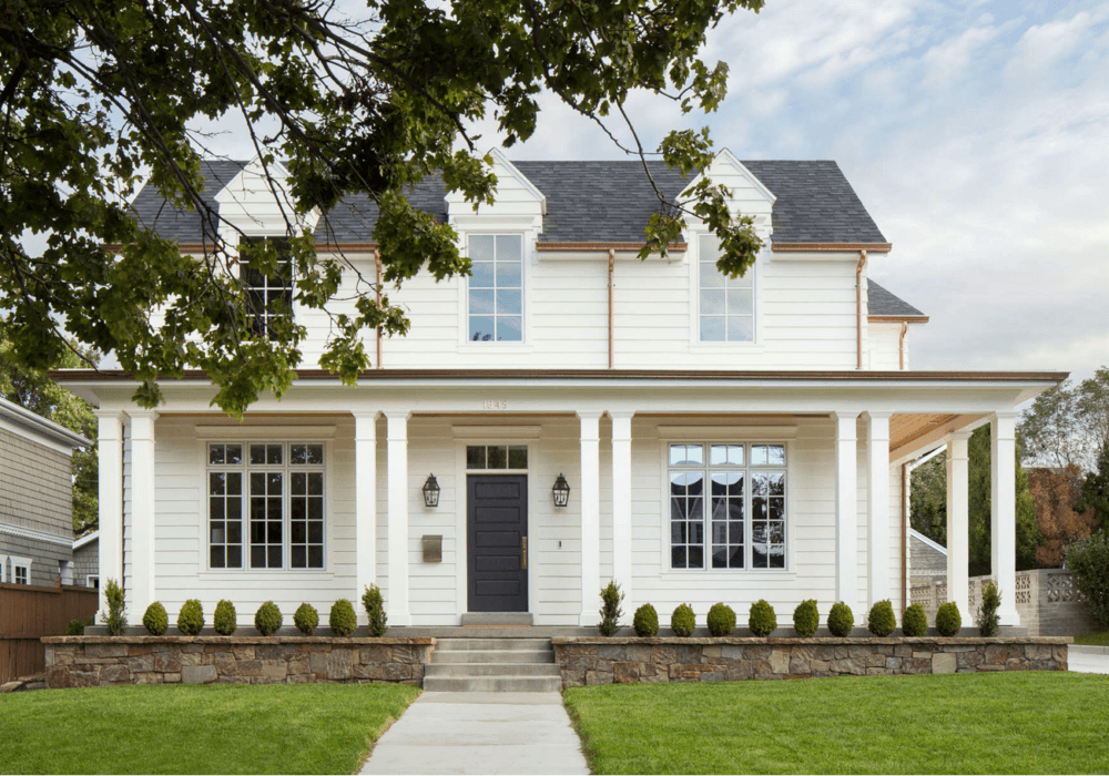
The Fox Group – Another beautiful website filled with gorgeous homes and ideas.
I think that this updated farmhouse style is far more classical. The only thing I would change are the window panes in the dormers. Ideally, they should match closely to the windows below. And it seems that they could’ve done a third row. Otherwise, the scale and position of the windows is excellent. And, I love the copper gutters and drain pipes.
By the way, I understand that the front door color is Benjamin Moore Iron Mountain, a charcoal gray with a cool tone.
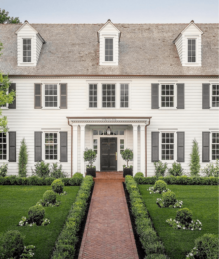
This is another by the Fox Group and I think that these are the best windows and, actually everything is perfect.
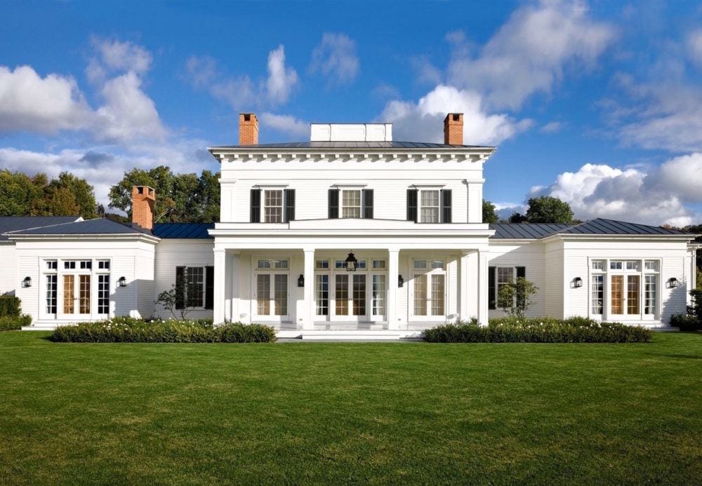
Gil Schafer never makes an error. Perfect times three!!! Seriously; I’m not greedy. I’ll just take that middle section.
You know, when you see it done right, it makes so much sense. And then I see the train wrecks in this post; well, I’m still scratching my head.
But, again, white windows and white on white is never wrong.
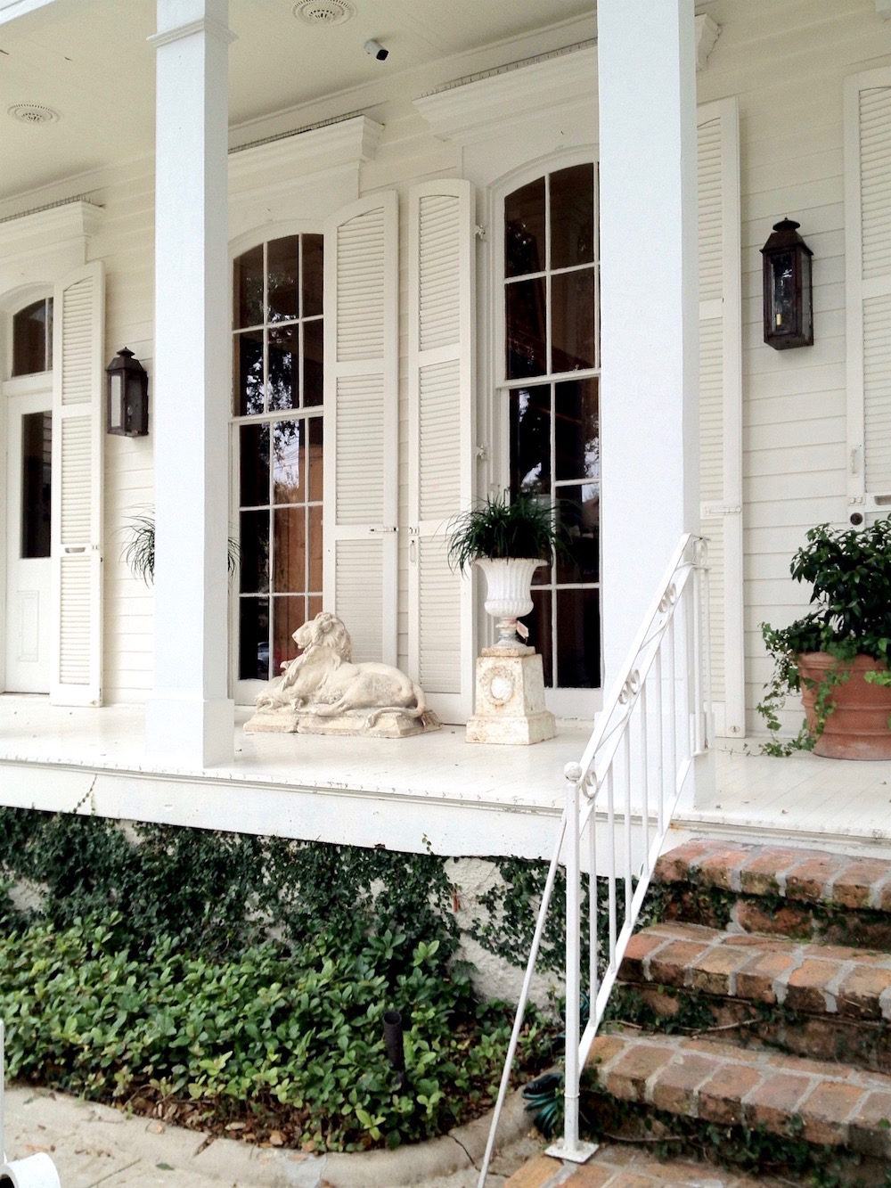
New Orleans – gorgeous white on white windows – via Katy Considers – Julia Reed House
That’ll do! Love this house so much!
Please click on the following links for more inspiration about home exteriors and windows.
For some more home exterior ideas click here.
And, this post about front doors has some gorgeous windows too!
Oh, and you’ll find some lovely home exteriors here, as well.
And funny, I wrote it over two years ago and touched on the black frames. My advice was the same. Tread lightly.
Well, it’s going on midnight. Hope that you enjoyed this post about the best windows. (and some that aren’t so great)
Of course, I’ve barely scratched the surface. So, let’s use the comments to discuss.
xo,

PS: Please check out the newly updated hot sales!
Related Posts
 Can A Stained Wood Kitchen Look Fresh?
 Did You Say Enfilade? On Fill What?
 Bookshelf Styling-The Ultimate Guide with Templates!
 20 Stunning Lifestyle Instagram Feeds You Must Follow
 The Truth About Flush Mount Ceiling Lights & 24 Under $200!
 A Frumpy Old House Gets A Sparkling Makeover
 Three interior decorators with no formal training– Scary!










106 Responses
Yes although those looks more bright red than the brick red. Scroll through this and you will see what the red frames look like on a house in this link. https://www.apartmenttherapy.com/hannas-anglar-scandinavian-decor-sweden-home-photos-36639989
Thank you so much for sharing that Nanci! Gorgeous home, beautifully photographed, as well. I’m following that woman on instagram now. Love those windows too.
Hi Laurel! To be sure I understand, painting windows black versus white on the inside (as in Nancy’s kitchen) helps to see the view better? I guess it all depends on the style and decor of the house too? I now subscribe to just two blogs, yours and Maria’s. No need to look anywhere else, in my opinion. Thank you so much!
Hi Kelly,
Yes, it all depends on the style, decor of the house, but in all cases, it does help one to see the view better. Black blends in better with the scenery than white.
Thanks for the mention Laurel, I appreciate that! x Maria
Any time! Hope all’s well, Maria!
Laurel just want to thank you for your book recommendation in a recent post, Get your house right : architectural elements to use & avoid / Cusato, Marianne and Ben Pentreath.
Such a wealth of information on all things architectural. Loving it so much. A happy concidence that I had just read the part on windows when I read this post. 😀
So glad I found out about it too!
Great advice. Thank you. I have fairly thick framed antique wood framed windows. The cross slats in between the glass are thin but nevertheless, white may be better. Any difference if near the beach in a sunny area?
I’m sorry, Samuli. I can’t answer that because I can’t see what you’re talking about.
Laurel, thanks for your response to my post, delayed or otherwise! I’m amazed that you take the time to respond as much as you do! So appreciated. You are an inspiration, btw, and I will be studying all your furniture placement and advice for the new furniture going into my new old 1898 house. Also, recently signed up for your paint and Rolodex products now that I can really use them. 🙂 I would love to send a picture of the home with the fabulous photoshop exterior paint job, which also includes the black sashes, but I don’t know how to include a picture. Anyway, you’re probably inundated with pictures, so no worries. 🙂 Thanks again for all the time you take and the inspiration you provide. Best to you.
Hi Louise,
Answering comments is part of the gig. Years ago, there were a couple of blogs I would comment son frequently and every time I commented, was ignored. It wasn’t personal, the bloggers ignored everyone. However, after about the 10th time of being ignored, I lost interest. In fact, I lost interest with the blog as well.
You’re a subscriber, so any time you want to send me something, you can simply respond to any email you receive from me, even though it says Mail Chimp. Responses go back to my email.
Another great post Laurel…
And a gazilion interesting comments and answers! I keep waiting for the day when you can no longer answer them all! What a job!
My problem is that my house has white painted wooden horizontal slider windows. I don’t know if these are common on the east coast. They are plain, boring and no mullions or anything.
House was built in 1993 and is an expensive house to most, over a million bucks, but only because RE is expensive here in Seattle. It is a shingled craftsman‘ish style and is pretty big with 4000sqft.
My question…does anyone have solutions for sprucing up simple horizontal sliders and making them look like more..more architecturally interesting? Adding wood mullions on the inside, or something? All the windows here are already so nice, even if not proportional at times.
Hi Chris,
Well, the day I don’t answer them all, I’ll either be in a coma or dead. And, yes, it is a job. There are also a lot of emails, as well.
I hope this doesn’t sound mean, but I discourage asking questions for the other readers unless it pertains specifically to something in the post. So, if it’s another reader’s home and there’s a question for them, that’s fine. But asking for help from other readers with your home issue is going to create a forum situation.
And, then, I will definitely have a nervous breakdown, will be in a coma and will soon die. Either that, or I will have to farm out all of the comments and emails to a service like zen desk and then you’ll get answers like, “thank you for much for your comment, that sounds interesting” for EVERYTHING. OR, just not answer anything, turn off the moderations and let the nasty trolls take over. But, I’m not doing that either. Thank you for your understanding.
https://pin.it/qbuvnc4ogght7y
The red is more muted. Pella makes several shades of red, factory painted wood windows. Brick red or cranberry colors are close to what I have seen, usually on expensive homes. Perhaps it is more regional?
Hi Risa,
Yes, definitely a regional thing. I’ve never seen that around here. But as I think I’ve said before, Westchester County and our New England neighbors, Fairfield County in CT, tend to be more conservative and traditional.
Dear Laurel; as usual, lots of great information! We just purchased an 1898 American Foursquare Colonial Revival in Spokane, WA, which needs exterior paint. We plan to paint the window sashes black, no matter the house color.
Link to the listing of the house on Trulia, with pictures: https://www.trulia.com/p/wa/spokane/2615-w-maxwell-ave-spokane-wa-99201–2119849229
Link to a great article on correct color placement of paint on windows. https://www.oldhouseguy.com/painting-windows/
This same person will also mock up pictures of your home in any color combo you want (for a price, of course). He does a great job. Very realistic. I would love to send you a few renditions he did for our old house. You will be impressed! All with black sashes, of course. 🙂
Hi Louise,
Sorry, for the delay. If people comment on a Friday or Saturday, there might be a delay, because I’m usually behind the 8-ball. I so wish I had more time to read these interesting posts more carefully. Thank you for sharing. I’ll come back to this later.
I agonize over the windows in my 1918 English cottage. It has lovely original wood casement windows on the 1st and 3rd floor, but at some point a previous owner decided to “upgrade” the 2nd floor windows with cheap vinyl. It’s hideous and ruins the whole look of the house. Someday I hope to have the funds to “upgrade” them back to the original look.
Hi Debra,
Sadly, there’s a lot of that going on. People have good intentions, but don’t really understand what they are doing. Or, they get bad advice.
You’re reading my mind again! Very informative post. Thinking about windows a lot since I have to replace nearly every window in the house in the next few years. And trying to think beyond that to what will eventually replace the white vinyl siding. Dark frames would definitely hide the dirt and bugs more effectively. 🙂 Here’s a different question: do you think multi pane windows obscure a great view? I’m not fond of the huge picture window look but I also want to frame my gorgeous view well.
Sorry, it’s taken me so long to get back to you Marsha! I wish there was a simple answer, but there’s not because there are many different styles of windows that would be appropriate for your home. But, at the very least, I think that you should have sash windows be they with panes or not. There is also a style that has panes on top and not on the bottom. And, there’s one that divides the window into four panes which I like a lot. I think this might be another post!
Excited to see this post. Half of Westport has black muntins and it drives me crazy. I only like it with brick and really prefer a charcoal or very dark brown to black. As you mentioned, great in TriBeCa or on a Tudor.
If you follow the logic that windows are the eyes to a home, do you really want black eyes ??
I admit to skimming this posting and was curious if you mentioned that both windows and window lights look best when they mimic the golden ratio — the proportion of a human face 🙂
The only thing I disagreed with was in the photo that you posted that you said was perfect, the dormer windows had a funny shape to me…
Hi Jennifer,
I did “command find” and see that I said “perfect” six times. haha But, I think I know which one you’re referring to. Looking at that house again, from the outside, you’re right. I think the dormers should be a little wider. But, maybe there’s a structural or other reason on the inside that makes it not possible.
I grew up in rural Wisconsin where the majority of century-old farmhouses sported white paint and windows painted one of two colors, dark green or black. The trim pieces (muntins?) and sills were quite narrow, none over 2 inches, so the black didn’t overwhelm. My personal observations (after having to wash windows AND storm windows twice a year) was that black and/or dark green were better at covering dirt and grit than white would have been…and farms tend to have a lot of dirt/dust/plant bits blowing around.
While in Santa Barbara this year, I noticed that their century old houses are usually painted in a color (many pastels) and their window trim and sills are painted white. I don’t know that I had ever seen this done consistently before, and all I could imagine was that it was easier to clean in sunny and warm California.
Hi Celestial,
You know that I lived in Wisconsin for several years and I know what you’re talking about. (my mom lived in Port Washington for 30 years) Those are clapboard homes, I believe. Just a different animal altogether. Authentic farm houses! haha.
The storms are on all of the old windows. The kitchen windows are new, true divided light single pane. Not practical but pretty!
Thanks so much, Nancy!
Well imagine my tickled pink surprise to see my email here. Glad it provided some grist for the blog idea mill. Sorry to the kind readers for subjecting them to that lemon of a house.
We put a suite in our above ground basement level. Vinyl windows were the only option for our budget. By painting our original wood-framed windows black and going with black frames for the new windows, we were able to mix the old and new to much greater effect. Also the black doesn’t scream vinyl like the white does. Thanks Laurel. You made my night! And, no, we don’t have hurricanes here.
I’m so glad you liked it Gail! and lol, I really do know that there are no hurricanes in Vancouver! But, maybe some other act of God where no one gets hurt, of course. Just the poor house!
Wow! That is terrific – the black and white checkerboard is a wonderful look. And the chairs – lovely. I LOVE that your mother told the woman they were avant-garde!
It definitely wasn’t your average commercial building.
Lost my long comment ( the comment box display is super teeny on my iPad). Short comment: kudos Laurel on the commercial building. Well done
Hi Libby,
Oh, I’m so sorry. That’s happened to me before too! And, it’s bloody annoying. But, thank you, just the same! That was such a fun job and especially to see something I designed get built. They did a fabulous job, too! I also helped with the decor inside. In the little entry, they put in a black and white checkerboard floor and I spec’ed two Napoleon chairs from Pottery Barn painted teal.
They still have the side chair! But, these were the armchair version and darker than this color. But it’ll give you an idea. I think I had a chair cushion made, as well.
Well, one of the women working there, was confused by those chairs. My mother told her that they were avant garde.
I will not enclose any photos unless you are interested, but there is a weird thing that has happened in my neighborhood re windows.
A few years ago when there was a tax credit offered to people who wanted to put in more energy efficient windows, many people here jumped on it. I do hope they got lower energy bills, because they certainly bought a whole lot of ugly as well.
This neighborhood is a “development” built in the late 80s and early 90s. It is nice, safe and generally a good place to live, probably largely due to an HOA and covenants, which, of course, is a two-edged sword.
What happened with the windows is that wood-framed windows which were painted in a color scheme to match the exterior of the house, usually a combination of brick and wood siding, were replaced with those hideous vinyl atrocities.
Houses that were painted in a dark color got white vinyl windows!!! And the homeowners did not always replace ALL of them!!! Nor have they painted the rest of the house or remaining frames white!!!
I don’t know how they got away with this, given the usually stringent enforcement of the covenants and the Architectural Review Board. Most of these offenders have left the siding painted in whatever dark shade of dark dusky green, taupe, mushroom, etc. that was popular then.
These vinyl atrocities practically glow in the dark! Sorry for the rant, but I was wondering if you might care to address this in a future post.
Hi Ellen,
I feel your pain! I’m not sure what the post would be about except for how badly some people suck. lol I mean, it only stands to reason that the dark homes, needed a black or some other dark color vinyl window frame.
Of course, the white looks ridiculous. And, I’m sure that the white is WHITE! And, that the homeowners didn’t change all of the windows is also very strange. But, some don’t really care or notice these things.
Laurel,
Thank you so much for sharing all of your wonderful knowledge and the gorgeous, inspiring photos! I love all the beautiful homes and really do like the black window grids. I have a fixer upper home which we are slowly working on with some beautiful large wooden grids on two windows which I love and other windows that have none – crazy!
You’re welcome, Linda!
Laurel, what is the architectural style of the house in your 18th photograph down from the top? The one by the Fox Group where you said the windows are right and everything is perfect. Is it Colonial? Salt box? (Maybe Colonial and Salt Box are related. I don’t know.) As you can tell, I know nothing about architecture. (Thankfully I can tell the difference between the good ones and the bloopers.) I’ve always liked this traditional style of house, but never knew what to call it. Thanks.
Hi Lisa,
This house, right?
That is a Georgian or Colonial or sometimes called Georgian Colonial style home. A saltbox is more plain with smaller windows and a distinctive roof which sleeps steeply down the rear of the home. Here’s a good example.
Laurel, you’re reading my mind! Been wondering about the black frames as well, because I’ve read in numerous places that black frames inside disappear and frame the view beautifully — and I have a beautiful view to frame! Related question: If you’re replacing large outdated “picture” windows that have a great view, do you opt for fewer panes/muntins and more expansive glass? (I know, a very first-world problem to mull over…)
Hi Marsha,
All good questions. It depends on the size of the windows. But depending on what ones house is made out of, the size of the windows could be changed, possibly.
I don’t love the design above, but I love a nice yellow on a house. There’s nothing wrong with that color. There’s everything wrong with it looking like a jaundiced crocodile because of the terrible shingles.
There’s a house (1930s ish) here that’s a similar yellow with a dusty apple green on the trim and it’s so chipper and just gorgeous. Brightly colored houses forever!
Hi Lily,
Yes, it totally depends on the house. An authentic Victorian would be wonderful painted yellow. But, here, it’s like the house is saying? Look how bad I am. Just in case you missed it. :/
I really appreciate posts like yours and Maria Killam’s on black windows. We’re putting black windows in our PNW modern house; the architect spec’ed them (and dark siding and trim) as “right” for the style. Your advice has helped tremendously in making sure that the other choices we make coordinate well, rather than making it all look like an odd mish-mash. Your blog (and ebooks!) have been invaluable!
Thank you so much Kristin! Made my day!
The frames and mullions are a kind of brick red. Very popular here in newer homes they look nice.
Hi Again, I just posted a link to one I found on Pinterest, right below this coincidentally. Is that what you’re referring to?
Oklahoma girl here, I believe Nanci is referring to the red frames which seem to be used a lot here on French Country wannabe houses, or somewhat similar styles.
I often see them on houses with stonework trim, or all stone facades.
I found something on Pinterest but I’m not sure if this is what you’re talking about.
Hi Laurel,
This is a great post. There are so many “white modern farmhouses with black windows” around here and on instagram before/after posts. I think a “trend” that will look very dated. An the other hand the examples that Laurel used of “doing black windows the right way are classic”!
Responding to you and Kmarrisa, I so totally agree that old windows are beautiful. That was one of the reasons we bought our 1910 house with the original French casements with wavy glass. The triple track storm windows were horrible though and I think replacing them with single sheet “historically acceptable” storm windows made a huge improvement. (I know you have seen the before/after on my instagram). Loved this post! XO
Hi Nancy!
But wait a second! What’s wrong with me? Your kitchen has those stunning black framed windows that make the room!
Is that where you put the storm windows? Oh wait. I just went back to the original post that shows the old kitchen and see that the windows did change and much for the better.
Oh, and I read that Maria Killiam article before. She pointed out that all the pretty photos with black windows have no window coverings on them. And sure enough, this rustic house on the lake has almost no window coverings. It’s surrounded by forest on the sides and a lake in back.
Hi Lorri,
Yeah, it can be a problem.
Egress for roof rats! Ha-ha-ha!! I get a kick out of your posts. This one is very appropriate for the area I live where modern (sorta) farmhouse (sorta) is everywhere. Thanks for the great read!
Yeah, it’s sorta not-so-great. A farmhouse, unless it’s on a farm, feels a little off to me. But, to me, the quintessential farmhouse is a Queen Anne Victorian. I guess that’s what these are based on– loosely.
Educational post. I learn alot from you. I love that by reading your post I am training my eyes to see what you see. The difference between good design and not so good design and the differences between the two.
I love black windows in an urban setting, Brooklyn has alot of black framed windows and I always loved them, not sure about them in a suburban setting. I guess it depends on the house as you illustrated in your post. Since my house is a humbled tri level split, there is not much I can do about the exterior, I am improving it slowly do it has curb appeal.
Thank you for your wonderful post. I enjoy them.
Thanks so much Tina!
The building across the street from you, I wonder when it was built. Do you know if that style of brick laying has a name? It looks sort of Craftsman-ish. But the quoins don’t–very odd but effective mix of styles. I’ll bet the mason had a lot of fun with that job. I love it!
Hi Carol,
That building was built in 1928. My building, in 1927 and it is in the Tudor style. I took some pics of my building too, but didn’t post them as it was late. Our garden is so lovely at this time of year.
I’ve always admired black windows so jumped at the chance to use them in our home remodel four years ago. We opted for black on the exterior and paintable wood on the interior. Fortunately we had a fantastic architect and he turned our average two story home into a lovely Arts & Crafts style three story structure. Black windows were perfect for the project.
Hi Christine,
Sounds beautiful!
It is a mystery. Why so much money is wasted on such much bad design and build. I guess it goes hand and hand with Hollywood’s inability to come up with an original story line. I went to your site with the behemoth house and I could not believe the waste of building supplies. I thank you for helping to educate in good form and technique. You are right, when you see some homes they just feel wrong, and with closer inspection you can see why. 🙂
Thanks so much Kim!
The farmhouse that you said would be dated with the black framed windows is not the problem is that they randomly decided to paint the downspouts black as well. Downspouts were never meant to be an architectural feature. Bllkk!
Hi Betty Ann,
I agree that painting them black is a mistake. I’m sure that some excellent landscaping would help this house, a lot!
I loved this post. It has been really helpful to me as my light beige stucco with green shutters and green roof house needs new windows, and the color is beginning to look dated. I am thinking of painting it some kind of white color with black shutters and a medium gray roof. Therefore, your pictures were a great help. I was thinking of using black window frames, but I think I will stay with white.
Hi Beth,
So glad the post is helpful for you!
Laurel, I am so lucky because the best thing about my 1986-built Sun City West, AZ duplex is the dark-framed windows that the HOA has historically demanded be kept – new efficient windows are OK but the frames must remain dark. Those windows are wonderful – front windows are large mullioned (6′ wide in guest BR and smaller otherwise). In back, two 8′ wide windows (4′ picture window with a 2′ slider on either side) looking out to a beautiful greenbelt – true heaven. The homes are stucco with a Spanish/California bungalow feel with an arch and a vaulted ceiling as well. You are so right about the joy of looking out through them. The first thing I do every morning is walk around my small house pulling back every curtain and drape so that the light can pour in and I can look out (eaves all the way around help keep some of the heat out). To me they are not dated at all; in fact they make the house and the community and I would seriously consider moving if the HOA ever changed the regs.
Hi Sandy,
Sounds fabulous! And definitely, Spanish/California/stucco style is one that lends itself to black window frames.
Thank you Laurel…another very informative post. Have you previously discussed window grilles ( or are they Mulions?). I almost said Minions…grandmother mind ! I hesitate to use them top and bottom because they block my love of staring out the window. Since I am still making my way through previous posts, maybe I will just hit the search and save you from repetition! Best Regards, Pam
Hi Pamela,
Time got away from me, or I would’ve done the window parts graphic. A Mullion is the heavy vertical support between two adjoined windows. A muntin is the grill separating the window panes. The glass or panes are also referred to as “lights.”
Hi Laurel,
First of all, I adore all of your posts and find them extremely helpful and entertaining. I can literally go down the rabbit hole for hours reading all your posts. I study and laugh through all of them!!
So I am a designer in Atlanta and I’ve had so many clients lately who want to paint one room for their house a dark moody color or a dark high gloss color. I love the look but always struggle with what to do with the moulding…paint them, leave them white, paint the ceiling, leave the base boards white, paint the trim around the cased openings in the dark or leave white. What is the correct way to treat mouldings if the rest of the interior walls and trim are white?! I’d love to hear your take on it..
Thanks,
Sherry Fitch
Hi Sherry,
It’s impossible to say for sure not knowing what room we’re talking about, how much trim, what else is around it and other variables. However, usually I would do the trim as in the other rooms as a unifying factor. But, not always. I have sometimes painted everything one color. If there’s a door and there probably is, I’ll paint the jam white and if the door is dependent on whether it’s usually open or closed. But, there’s nothing wrong with painting it one color on one side and another color on the other. Again, if that’s the case, I’ll paint the sides the white color.
Great post! Of course, black window frames have been around forever…on the West Coast. Every time I visit the other coast I love their architecture and it usually includes black windows. I’ve never done it here as my homes have always been more traditional cuz I’m a sucker for architectural moldings 🙂
Thanks so much D.Miko!
I have lived in three old houses (built from 1763-1844) in Massachusetts. In each house some of the original 6 over 6 windows had black muntins. They all became white as I repaired them but one day I’ll go back. I read somewhere that large panes of glass were expensive and black muntins made the small panes look like one sheet and hence the owners looked wealthier. I’ve read the same about wide boards – sawing was expensive so the narrower strips were downstairs and the wider boards upstairs. Funny how our displays of wealth change over time.
Janet
That is so interesting, Janet. I love New England architecture!
Thanks you for your professional input. I’m currently in the middle of a massive renovation with a Dutch colonial style home. And I’ve asked Maria Killam for advice and white windows were always the plan. Don’t fall over with this bit, but my builder insists on LP siding. We have harsh winters and we are no where near the ocean for the salty air to weather the shingles. And the reason I’m getting new siding is because the amount of wildlife living behind previous material was incredible. Is there a good way to do composite shingle siding?
Hi Jennifer,
That one is not something I would know off the top of my head. I’d have to research it.
Hi Laurel,
I enjoyed this post, as I do love some of the black windows I see. But I can certainly see the difference in the thinner and thicker window frames. And you may have saved me from making a big, expensive mistake with your example of the house with the black windows that look like gaping holes. We are not replacing our windows, but we (I) have been looking at black garage doors. Hmmm–I’m gonna think a little more about that!
How about a post on exterior colors? My house is clad in stained cedar, and that can be particularly tricky, I am finding, as we update and replace exterior elements. I imagine other people might have difficult finishes as well. I’ve said it before, and I’ll say it again–I wish I’d had you in my life 20 years ago!
Take care,
Connie
Thanks so much Connie. There’s a link in the comment before to some great exterior house colors.
I’m with you Laurel…. Windows can make or break a house. Pictures you shared are gorgeous – minus the bloopers!
Here’s a question for you…. For these lovely white homes you showed us with dark shutters…. What color for the window boxes? Sometimes I see them as white, sometimes as the color of the shutters. What’s the best approach? Is there a rule of thumb?
Ani
That’s a good question Ani. I love that house in San Francisco. However, it looks like the window boxes are not on the windows with shutters, except on the third floor. I don’t know if the light is hitting it different, but it looks like the window boxes on the third floor match the shutters which appear to be lighter, but again, it could be the lighting in the photo. I would tend to make the boxes match the shutters, but I suppose they could match the house as well. I love href=”https://laurelberninteriors.com/horrid-roof-color-____-exterior-paint-colors-dont-work/” rel=”noopener” target=”_blank”>Martha Stewart’s look of painting everything one color. Problem solved! :]
We just purchased Marvin windows. Although they make great products, please let your readers know that they have a new line (Synergy) that has black windows, but the sides are all angled. This makes installing previous blinds or new ones impossible without a valance to cover washers that balance the angles. Lesson learned after a lot off extra money spent!😔
Hi Beth,
Thank you for the heads up on that product!
This post couldn’t be more perfect in timing! My husband and I recently purchased a second home that we are tearing down and rebuilding. Funny, my dream home photo for my architect is the first photo you have on this post!
While I love the look of those black windows I know I would regret them down the line.
Thank you for steering us (me) in the direction of timeless homes we will always love!!
Hi Kristen,
That Stephen Fuller home is one I would give my architect as well!
Laurel I love your site! I stumbled across it earlier this year after we bought our first home and eagerly await your posts on Wednesday and Sunday mornings. This topic was particularly timely for us as we are working on updating the exterior of our home. One of the things that really caught my eye in the images you posted here are the fantastic choices in exterior lighting. Perhaps a topic for a future post? I haven’t managed to come across one in my obsessive search of your archives. 🙂
Hi Anne,
You’re right. I don’t think I’ve done a post specifically on exterior house lighting. It’s possible that I’ve tucked away a few here and there, and I’m pretty sure I’ve done some exterior lanterns in the hot sales, but not all the time.
Educational and informative as always! Thank you for addressing the black window trend—great info and things to consider.
You said you weren’t getting into energy efficiency in your post, so I hope this comment is okay. If it’s too off topic, please feel free to delete. I just wanted to spread the word and encourage those of us living in older homes (1940’s and earlier) to look into window restoration instead of replacement if the windows aren’t operating properly. Many people think you have to replace old windows to make them more energy efficient (I used to think that myself!) but it’s just not true. Old windows can be restored to like-new operation, and when weatherstripped and used with storms (there are attractive options nowadays, really) they’re just as energy efficient as most new replacements. And greener because you’re reusing old materials.
IMO replacement windows often look much flatter (wrong shadow lines) and oddly proportioned compared with what used to be there. Once the original ones are gone, there’s really no adding them back.
Just my personal soapbox to spread the word. I hope I’m not out of line! If so please delete 🙂 I love reading these blog posts—they make my mornings.
Kmarissa,
Gosh, you’re not even close to being out of line. That is great advice! And, if I do the research, would be an awesome blog post. I love old, original windows, wavy glass and all. Getting a window like they made 100 or more years ago, means totally custom and that can be thousands per window! I have a client who has the most gorgeous leaded glass windows with what you’re talking about and you can’t tell at all that they are storm windows.
She also had them UV protected retro-actively. There are companies that will put a film on the windows that is undetectable. But, it’s a necessary step if you have strong sunlight streaming in as that will wreck your furniture, floors– EVERYTHING big time. Plus, it helps to keep heating/air-conditioning costs down.
Thank you Laurel, for an excellent informative post! You answered a lot of questions I have rolling through my head! I also love the way you link back to previous blogs and other designers or builders.
Bw Laura
Thank you too, Laura. Linking to relevant posts both inside my own blog and to others, I think enhances the post and also Mr. Google likes to see that going on. So, it’s a win-win.
Our house is a 1980’s Dallas style home in Oklahoma City. It had bronze aluminum windows. We are gradually replacing them with more energy efficient and went with black and they look great with the black shutters in the front. I do not think they will look dated. A big trend where we live are the muted red windows.
Hi Nanci,
I have not seen the muted red windows. Do you mean the frames or does the glass look reddish too? I’m trying to picture that. I tried googling it but didn’t come up with anything. I did come up with a stunning red front door with a transom, however that I added to my pinterest queue. haha.
Now this was a good post, Laurel! (It didn’t make my brain swirl with too many numbers..haha) Anyways..the first time I saw black window frames I quite liked them. Thought they were different.(and I like different) However, whatever home I saw them on, must’ve been the “right” home. Because after that, everyone seemed to be doing them and most didn’t look good and I was turned off. When we were building our new home last year, not once did I ever think I wanted them. I think it’s a trend that will pass. And yes, that first yellow home is ugly and whoever decided on the exterior, did a shitty job. I believe the wires you see is because the owner was too cheap (or for whatever reason) to have them buried. There are quite a few older homes in my little town that have never gotten them buried and it looks awful having lines running from the poles on the house. . Another thing I don’t like is when people brick the front of their homes and put siding from the ground up on the sides and back. Anyways..love those classic white homes. Beautiful!
Hi Colleen,
Maria Killam mentioned in her blog post, that with the right house, landscaping, interior decor, etc. the black windows can be smashing. But, if that’s not all in place, it can look not-so-great. I say if there’s any doubt, stick with white or some other color if they are wood. Or, hire a professional designer to help you!
I saw something recently that surprised me. It was a new rustic house on a lake, and the window frames on the outside were white, while the window frames on the inside were black!
It looked wonderful. The white framed windows on the outside contrasted with tan siding and stone. The black framed inside windows contrasted with whitewashed wood walls and ceilings.
And since the frames were thin, the black inside windows looked delicate instead of overwhelming. I’ve never seen windows with different colors inside and outside before!
Hi Lorri,
That is interesting! And, a thin black frame is very cool on some homes, I think.
Laurel, this seems like the appropriate moment to ask a question about windows in America. I see the narrow glazing bars in the black-frame windows and in some of the white ones. How does the technology work to have such slim bars and double glazing? I’d love to know how it’s done! … because:
I love the look of sash windows, but unless you’re living in a château, they’re not appropriate in France. And the standard window, two sides opening inwards, with 3 smaller panes in each side, needs a biggish opening as the glazing bars have to be fairly big to take the double glazing and thus reduce the amount of light coming in.
Hi Gilly,
That’s a very good question. But, if the muntins are very thin, they are probably iron. I am not sure who makes them. Of course, there are the snap on muntins are grills, some call them. Those are vinyl and aren’t supporting anything, of course.
Very few of my clients were new home builds and if they were, they weren’t doing anything as exotic as black iron muntins except for the one contemporary client. Westchester County is actually quite a conservative area, on the whole.
Hi Laurel,
What a wonderful article! Another good one to bookmark. I’ve been getting a lot of requests in my color consulting practice, and I tell everyone that black windows are kind of like a prescription drug. They need to be used very carefully. And my big pet peeve is people that want to paint gutters black. I don’t understand why anyone would want to highlight a gutter like that!
I’ve been forwarding Maria’s article when I get the question, and now I’ll send a link to this one too.
Many hugs, and thank you so much!
Thanks so much Michelle!
We just put black windows in our house. It’s tannish brick and previously had hideous cheap white windows with aluminum storm windows on. I stressed over this for months and cruised a lot of neighborhoods with similar style homes. White was out. Tan was ok but created no contrast and seemed so blah. We kept feeling drawn to the bronze windows but were worried that color would look to retro and dated. Also, wanted black interiors for the view of my wooded lot and with the window we chose black ext. was the only way to get black int.
Project still isn’t complete but so far I love them and can’t see wishing they were white later on. I would have really freaked out to read this post before I decided. Hope I don’t hate myself in 2030!
Any thoughts on landscaping? Starting with a blank slate. 40 year old house and previous owner put in nothing but a bunch of stone.
Hi Katie,
It sounds like you made the right choice. I’m not a landscaper. Wish I was; just know what I like when I see it.