

Hi Guys,
This is the third and final blog post regarding Mary’s home in northern California.
And Part II focused on the family room’s layout and additional furnishings.
I didn’t have time to go over the back of the family room (with the sliding glass doors) or the stained wood kitchen.
So, for today, I will do both of those areas, plus some small architectural changes to pull this home together better.
Let’s begin with the architectural changes before we get into the stained wood kitchen.
Excuse me! Where the hell do you think you’re going? ;;;]
Stay with me, please. Please try to have some self-control! ;;;]
Thank you.
First, let’s take a look at Mary’s family room, looking into the stained wood kitchen as it is today.
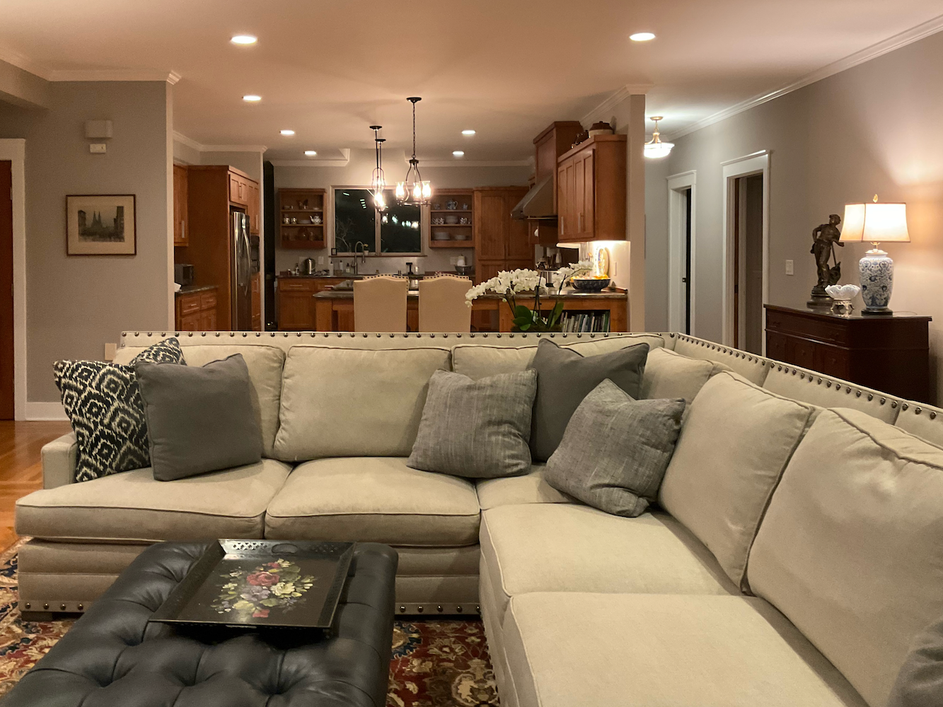
Okay, does anyone see a rather glaring problem, architecturally speaking?
Ummm… Don’t all shout out at once.
Anyone?
Yes, in the back row. I think I saw your hand up.
No, Laurel, I was only checking to see if I had put on deodorant today. Sorry. But, I’ll be happy to take a guess.
Well… it kind of bugs me that the kitchen wall on the right just sort of ends. Also, it looks like it doesn’t come out as far as the wall on the opposite side of the stained wood kitchen.
Bingo! You did great!
Like, did they run out of sheetrock or something?
Okay, so let’s look at what I have in mind in plan view for this space. I also tweaked the placement/size of the rug.
Some of you have some great ideas, so I incorporated them if they worked better for the plan. No, I did not change the slipper chairs.
However, I am thinking of starting an exercise program for people struggling to get out of a chair unless there’s a crane lift nearby to hoist them up out of their seats.
Of course, you can do whatever chair you fancy, and so can I. Thank you.
Below is the new floor plan.
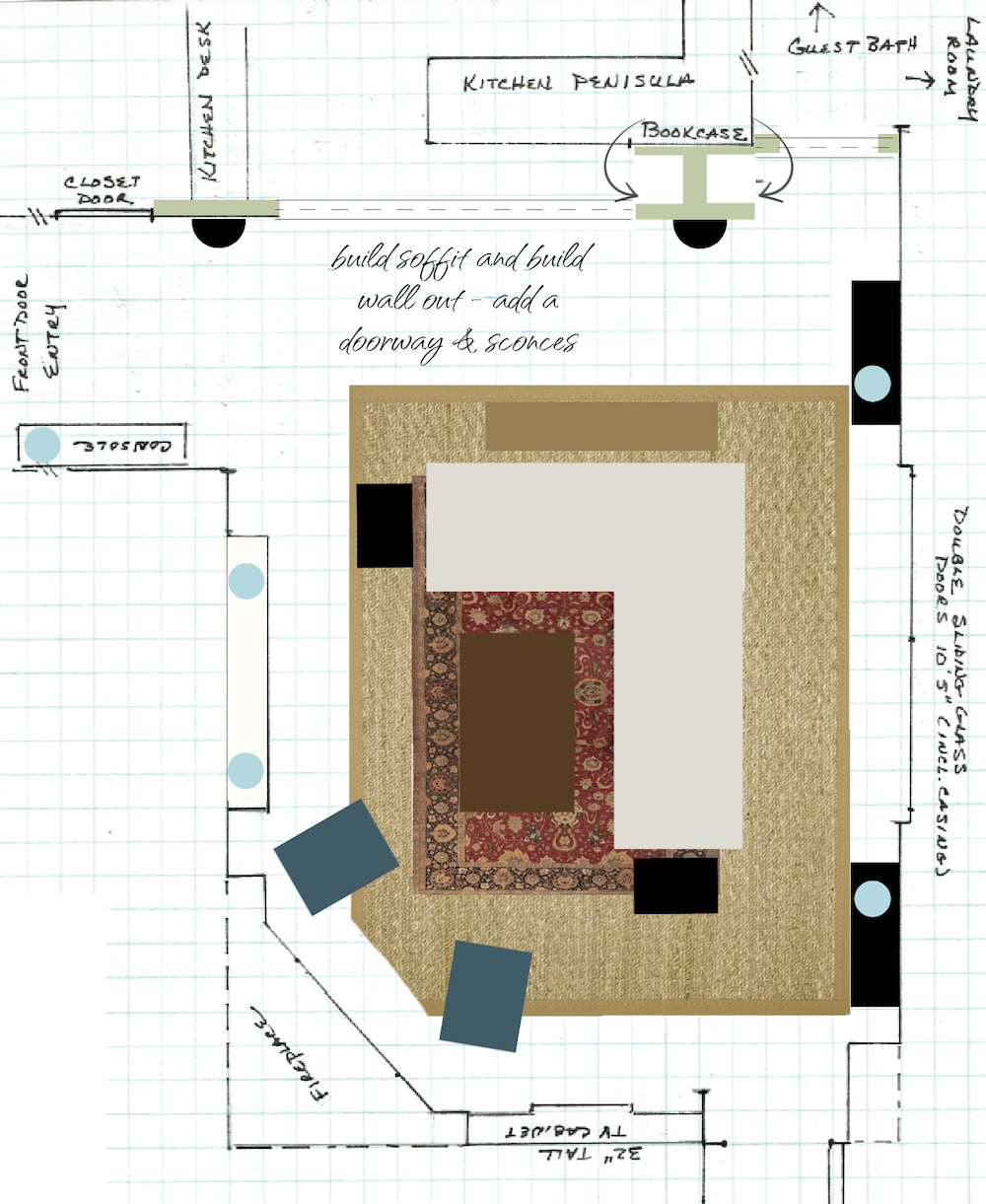 Yes, I covered up the bookcase because the extended wall wouldn’t provide enough space to access the current bookcase. The dotted lines represent a soffit. And, I made a doorway to the hall, making it its own space. That way, if Mary wanted to paint it a different color, she could.
Wait, you covered up the bookcase, Laurel?
Yes, but look a little closer, please. I added two floor-to-ceiling, back-to-back bookcases.
I also added two sleek console tables to the back of the room.
Now, I realize there’s already a sofa table behind the sofa.
Kind readers, if you’d like to see what I’m talking about, please refer back to the last two posts.
Post one has the most images of the space.
It’s okay to do two more console tables flanking the sliding doors, if they are very plain and minimal pieces. I would do black.
Then, each of them will have a lamp. So, that’s the third new source of light. I am pretty sure, that this alone will give an excellent lighting plan. However, for ambient light, putting the recessed lights on very dim will be lovely.
I feel that the two mismatched traditional pieces flanking the sliding doors look out of place in this room. It’s not terrible, but, for this exercise, I’m creating what I think would be optimal.
We’re just having fun making this space more cohesive without a major renovation or new kitchen.
Yes, the stained wood kitchen cabinets are staying.
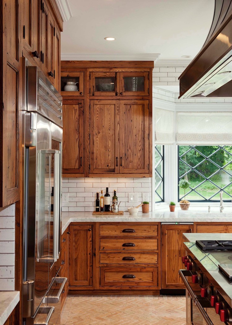
However, Crown Point Cabinetry, (the cabinet company who’s making my new kitchen cabinets) has shown me that stained wood kitchen cabinetry can be just as handsome as a painted kitchen.
Above is a shot when I went to their lovely showroom and factory early last December.
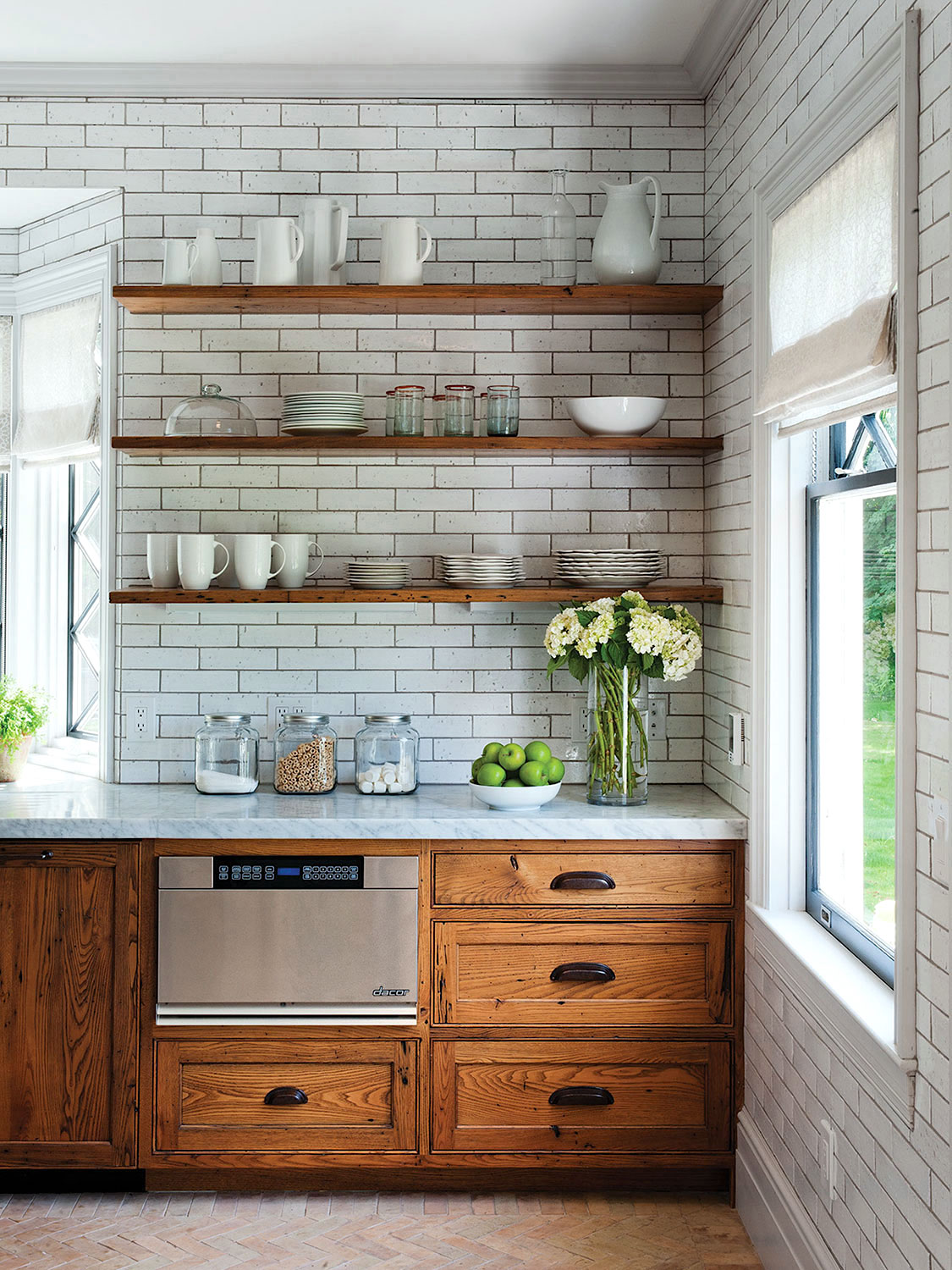
Above and below is from their beautiful portfolio, filled with dozens of exquisite kitchens. I posted some of my favorites here.
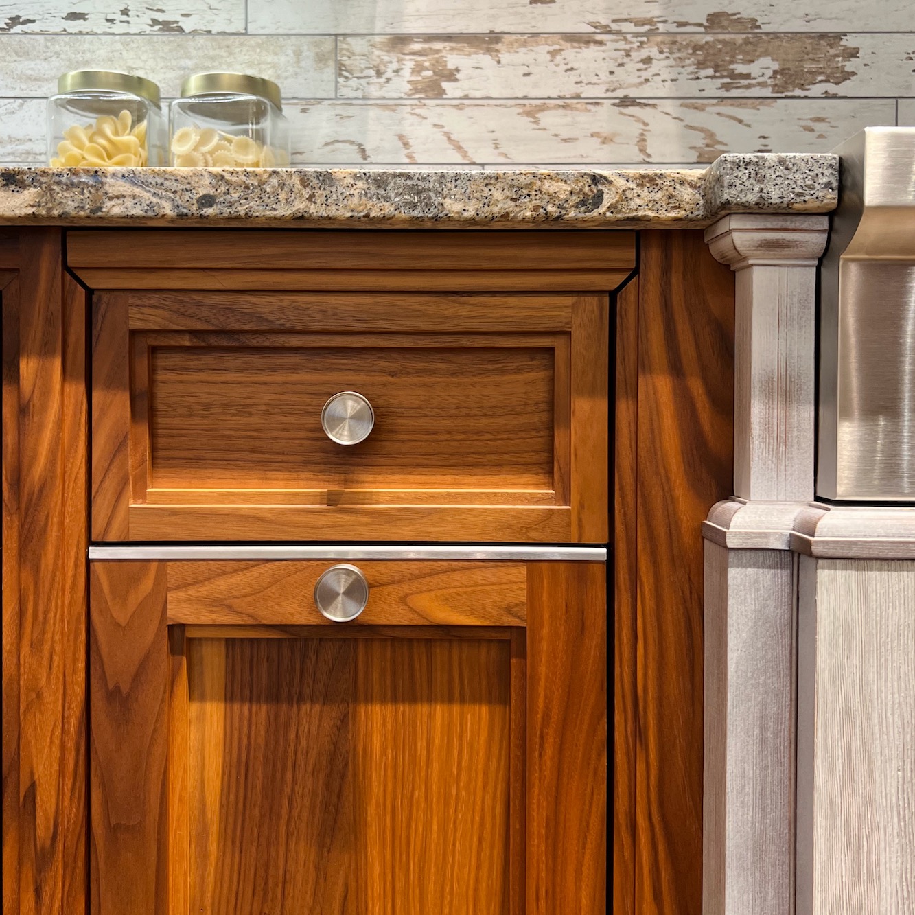
I couldn’t be happier with the job they’re doing. Please pardon me, I just have to interrupt myself to share with you the final plan for the sink cabinet. That’s the one with the rounded end. They spent hours getting the design so that it’s perfect. The beauty is that the design work is included in their price.
And, (shhhhh!!! I don’t want them to know, so I’m whispering.) Their price to you is 60% LESS than the quote from the fancy Boston showroom, for their top of the line cabinetry. (not Christopher Peacock)
Anyway, below is the design for the sink cabinet, in plan and elevation.
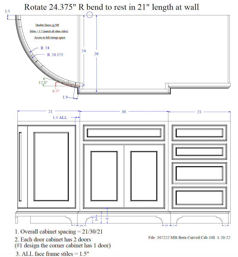
See what I mean? This was one of several versions.
Okay, let’s look at what this room looks like in perspective, looking into the stained wood kitchen.
No, not the new kitchen just yet, but very soon.
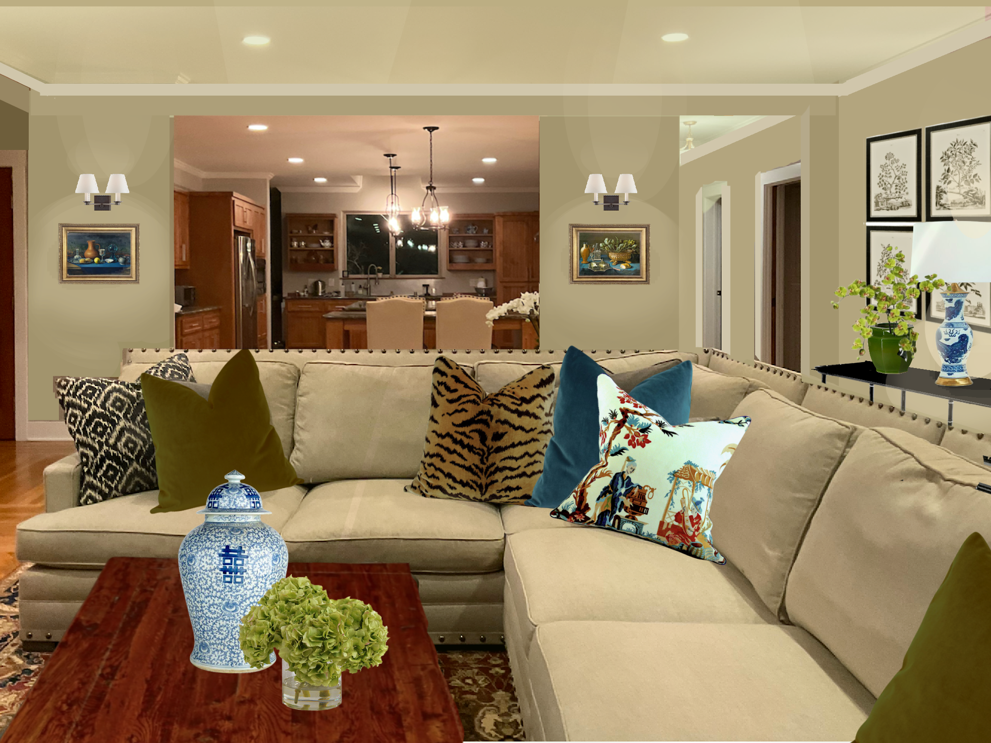
I did my best to recreate light spots and shadows, but the shadows would actually be darker than they appear here. Of course, this is the room at night. I am hoping for warmer bulbs. They could do halogen bulbs. They last a long time and are warm and dimmable. I would consult with a knowledgeable electrician who also appreciates warmer lighting.
As you can see, I added some new, more colorful pillows. I didn’t go hog-wild with the accessories, but enough to give one an idea.
I didn’t show it, but I would do simple linen draperies on a black wrought iron rod. The rod should be put up right under the crown moulding. The drapes can be a similar color to the walls, sofa, or trim. The curtains for these doors will need to be three widths of 54″ fabric on each side to close. However, if they are always open, a double panel on each side will be fine; a single panel, no. That would look skimpy.
And finally, the close-up image of the kitchen!
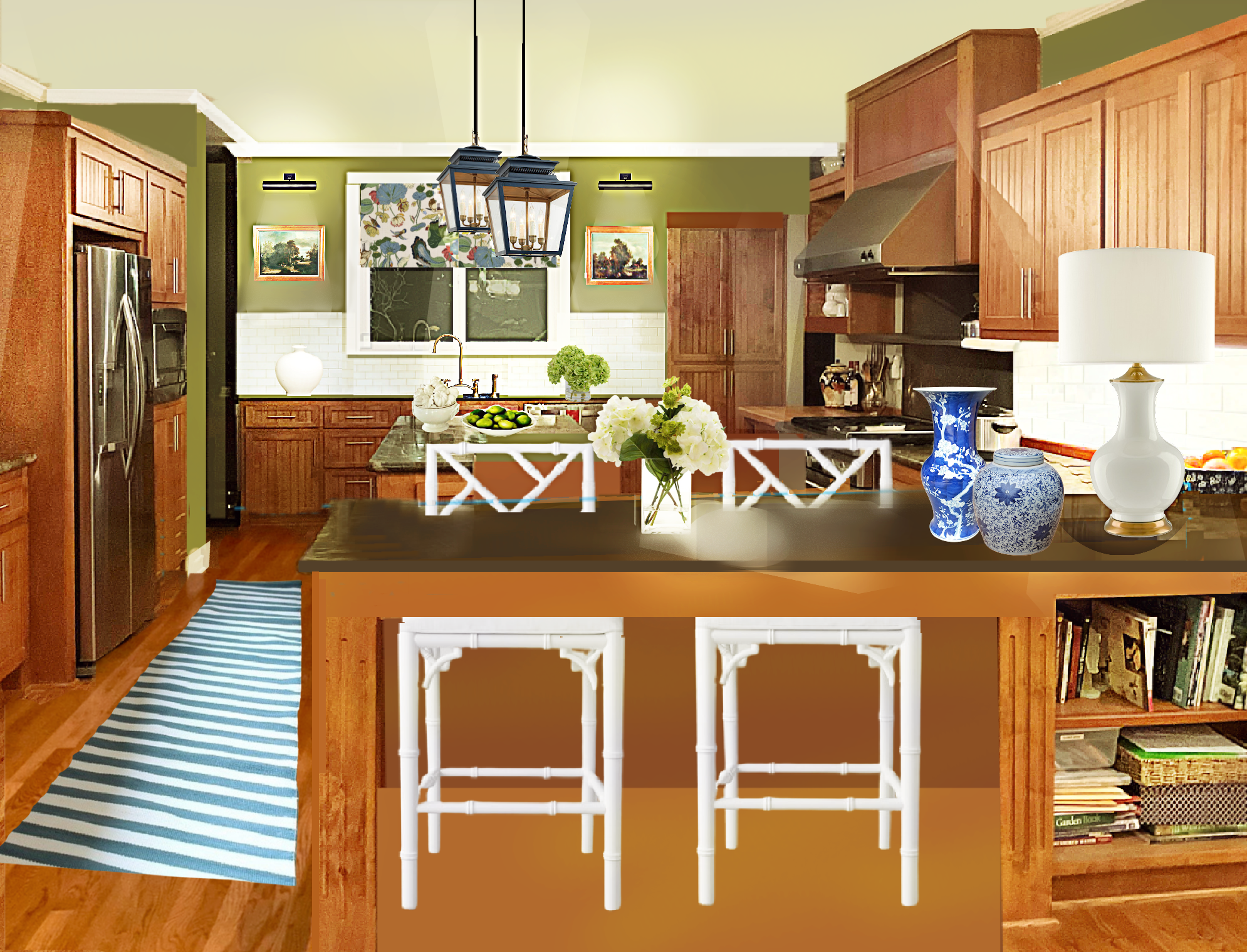
As you can see, I took down the back shelves. And added some lovely trim around the window.
I also added a creamy white subway tile backsplash, new lanterns from Ballard Designs, art, and picture lights or sconces flanking the window and sink. The stools from Williams Sonoma Home. The rug is from Dash and Albert. The fabric is GP&J Baker Nympheus.
Below, are four shopping widgets with most of the items I incorporated, plus some that I didn’t.
Mary did purchase the celadon lamps, but I put them in here for reference. Please click on any image to learn more.

I hope you enjoyed this series of posts for refreshing a family room and a stained wood kitchen!
xo,

PS: Please check out the newly updated HOT SALES!
Related Posts
 A Secret Decorating Trick Designers Won’t Tell You
 The Horrid Gray Trend – Is It Finally Over?
 The Living Room TV As We Know It Is Over
 Don’t Be Seduced By Chintz! A Personal Story
 Wallpaper – The Complete Guide To Avoid Screwing It Up!
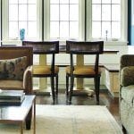 Why Is kitchen Lighting The Hardest Thing To Get Right?
 The Truth About Flush Mount Ceiling Lights & 24 Under $200!


41 Responses
Great work; particularly so with the reformed opening. A thank you to you and the homeowner. I have just used that color. One lady at the paint counter was vocal in her dislike. I love it and the consensus is that it works really well. We are in the treetops and there’s so much greenery visible from inside the house that I find it’s easier to go with it. I heartily recommend it in a space with a lot of wood surfaces.
Oh, that drives me nuts with the unsolicited advice. I can’t tell you the number of times I specked a paint color for a client, when the clerk, contractor, or painter voiced their unasked-for opinion. Then, the client comes back to me (naturally) worried, and I have to talk them down from the ceiling.
This sitch is the worst. She’s not even in your home. It’s phenomenally unprofessional, presuming you didn’t ask her. If you did, then okay, but otherwise, NO!
WOW! Just WOW! Laurel, I really love Mary’s warm kitchen! It feels like a fresh & open space now without the upper cabinets flanking the window. And adding the white tile backsplash, timson green paint, navy lanterns & Nympheus roman shades takes the room up 20 notches to WHOA! Gorgeous!
But my favorite aspect of this whole project is the crane lift you’re installing to hoist people out of the slipper chairs. Hahaha!!! 😉 😉
Oh my gosh – the transformation of the room/kitchen was incredible. Really beautiful results. And, like you commented, I also have found that a room looks its best when I allow the room to tell me what it should be – lol! I really enjoyed this post, thank you.
I never really fell in love with non-wood kitchen cabinets. So happy I didn’t go for the painted look trend. Several designers said “wood isn’t coming back in style”… I love the kitchen you presented in today’s blog!
Although many of us covet a white kitchen, in this open concept I think the stained wood cabinets which match the floor is great! A white kitchen with so many cabinets would scream kitchen. To my eye these cabinets work as an unobtrusive neutral background to the focal point of the lovely open living room.
Awesomely perfect. The readjustment to the bookcase seems much more useful for the kitchen area, as I am assuming some of the books are cookbooks.
Dear Talented Laurel,
As others have said you hit a home run with bases loaded! I have two questions about the kitchen runner. First how does the rug stay in place? I keep looking for anti slip runners for my wood floored kitchen but they are limited. Second question is how did you choose the color? My screen shows blue and I would have thought a complementary orange/red or a deeper green might go better. Just a thought and again you’ve done a beautiful job. I appreciate the hard work.
Cathy
Just wondering if the little metal edge protector shown in the close-up of the stained Crown Point Cabinetry is commercially available. I would love to have one for my pull-out garbage can cabinet. I have searched online and all I can find is a plastic protector. A brushed gold/brass version to match my cabinet pulls would be perfect!
Touches of white really brighten and freshen the kitchen beautifully! Would love to see Mary’s “after” photos some day.
Thank you for clarifying the kitchen lighting. That makes sense.
Wait did I miss something? What happened to her breakfront that she was keeping and the dining area in the living room? Did she decide to do without those? I sure didn’t find that in your last post. But your idea for the kitchen is really great.
Hi Nanci,
I think you are referring to Cher. That was 2 weeks ago. We have moved on; this is a different home belonging to Mary and Al.
I reread the article and see the chairs are from William Sonoma Home. Al wondered about the number of chairs ( I thought he might). He likes the clean look around the sink and the picture lighting. He thinks we would still need two lights over the island and wondered what to do over the peninsula. The current lighting is inadequate in both areas and we want to address that.
I cannot thank you enough for your wonderful suggestions. I see this area with new eyes. I now have confidence to move the space to a new level and I think the changes will be worth the time and expense since it is the heart of the home. By the way, I absolutely love the green paint.
Hi Mary,
You don’t need anything over the peninsula. I put a big table lamp in that area. I can’t see the desk across the way, but of course there is lighting over there. If you do the sconces, or at least one sconce on the existing wall next to the door, that’ll be more light that will come into the kitchen. You could also add a sconce if you do the new bookshelf wall. However, that might be redundant with the lamp. Lamps on kitchen counters are fantastic if there’s space, and it appears that you have it.
You can keep your recessed downlights, but I feel you need warmer, softer bulbs and maybe some or all of them need to be directed towards the walls/cabinets with a new fitting. I would also dim them.
Also, I can’t see every corner of the kitchen, but there might be another spot where a wall sconce could go. You don’t have to do picture lights everywhere. And, they don’t have to be picture lights flanking the sink, either.
You can get a lot of great ideas on the new Circa Lighting website, now called Visual Comfort.i
Yes, there are two lanterns over the island. There are two with a dark finish that I think would be very handsome and they are reasonably priced. You can see them in this kitchen I worked on in 2020.
Doing these varied lighting sources with warmer, softer, bulbs will eliminate a lot of the harsh shadows created by having only recessed lights.
Lamps, sconces, and floor lamps always give off the best light because they are either on the wall or close to a wall, where the light can bounce off and reflect back into the room.
As a person who washes her own floor, getting rid of the recessed lights is a mistake. Everything else is great. One of your best lessons to date, although I think drapes at door should be white or cream and I don’t find the bamboo Chippendale backs to be comfortable for long.
Hi Janis,
No, she doesn’t have to get rid of them. She needs to supplement them. Sorry if I didn’t make that clear. However, please notice that they are turned on in the renderings; just not as brightly.
From ’92-’93 I worked for a decorator who had a lovely shop. I sat at a desk only 27″ high. lol My chair was A Chippendale carved back chair. I would spend much of the day giving myself do it yourself shiatsu! Loved it. But if one prefers, they can always put a pillow behind their back. :]
Home run! Your suggestions for the kitchen are amazing & so doable. I sure hope Mary does everything you recommend. Her home will be fabulous.
Thanks so much, Mary E!
Oh Laurel. I am completely blown away by the kitchen transformation. There isn’t anything about it I don’t love. Extending the wall and adding a header is exactly what was missing to pull this side of the room together. That and removing the shelves that flank the window make such a difference. I never felt quite right about this kitchen but it was the least quirky room in the house. I love the white trim around the window. I do not have white window frames (they are a sand color…another quirky thing about this house I hate. Although not ideal, I could just ignore them like we did around the sliding glass doors. I have found they do pick up the wall color that is near them). And I like the crown moulding continuing across the window. I think it would help unite the space below the skylight. Then I could paint the wall above the same as the ceiling.
We are planning to replace the kitchen stools this year and I love what you chose. Do you have a source for them? Also, we currently have four stools but I assume two would reinforce the separation between the rooms. Can you comment on that?
I will comment again when my husband Al has seen this post.
Reading backwards which is actually better, I think for not missing comments. I’m so glad you like the changes, Mary. I never know how these rooms are going to turn out. But, often a room will tell me what it wants to be. For instance, my den is insisting on blue. A warm blue, but still, blue. I’ve never had a blue room.
Wonderful lesson for us all. Thank you!!!
This post today, along with the previous one, has been so instructive and informative. Really Laurel, you outdid yourself! I learn so much from watching you work and hearing your reasoning. The room is going to be amazing. And how in the world do you have time to put so much information online so often? I am going to go back and read it all several times to absorb everything. Thank you!
Hi Janice,
I don’t have time. haha I mean, if I had a lot of other obligations, I couldn’t do what I’m doing. However, I do take time out for social activities 2-3 times a week, on average.
as always.. a nice room.. elevated to a great room!
Laurel, you’ve done it again! Such a fun journey to such a beautiful space! I love it all.
Put some bi-fold sliding doors between the rooms, and you have the perfect setup. Open plan that can also be closed/separate.
Fabulous! You took it from perfectly nice to amazing! Now I know what to do with my open layout. I’ve been struggling to find a paint color that will compliment my off-white cabinets and my great room decor. A wall at the end of the run of cabinets will allow me to give each room its due.
These posts have been so helpful! I wouldn’t be surprised if everyone wants to send you a pix of their home to get suggestions! I know I do 🙂
Hi Laurel,
What an amazing transformation. Do you know that before I did not realize that there were windows on either side of the back shelves. The shelves distracted my eyes. Thanks again for your great suggestions.
I immediately guessed the architectural issue with that right hand wall, but I certainly didn’t come up with a double bookcase as the solution. Brilliant! I love a wide cased opening which your solution creates. I was curious, though, why you didn’t have that wall in the final gorgeous photo of your suggestions, I would have loved to have seen it there. I would imagine it would be hard to mock up.
My favorite change was the colors! Seems so much warmer and the wood goes so well the soft greens.
That looks amazing! I gasped when I saw the living room looking into the kitchen.
And your sink drawings look so good too. I’m always happy to see updates on your kitchen.
Laurel, this is so beautiful! Removing the side shelves by the window really looks so nice with the green walls and white trim. And I love the sconces with the paintings. Makes the space so homey and warm. The fabric for the windows is a statement piece. Just lovely.
I missed on the architectural question. All I could see is that something was wonky. Once you showed your idea, it felt so much better. I really like the splashes of white you added with the bar stools and backsplash. It contrasts nicely with the stained wood cabinetry.
Oh, and I liked the sconces and paintings you placed on the living room walls that lead into the kitchen. The two matching consoles you placed on each side of the slider door would be a nice addition and add some ambient lighting. Love that the recessed cans were removed from the kitchen.
What a transformation! Laurel, thank you so much for letting us into your head for a few weeks and guiding us threw the design process. Thank you, Mary, for sharing your lovely home and allowing us ‘in’.
Brilliant Laurel!
Removing those cabinets and adding the brighter backsplash brought this kitchen current while also making it timeless. The window treatment added the needed color to the mix!
Laurel, this looks so good!! You are so talented!
What an improvement lengthening the wall, adding a header across the kitchen and hall opening and turning the bookcase make! This frames the kitchen as you look into it from the living room. One other thing I love about your design is when people are sitting at the peninsula counter they will feel like they are in the kitchen, not the entry. These relatively simple changes add the separation so often lacking in open concept plans and allows the change of color to be made to the kitchen. Seeing a bookcase as you enter the hall by the laundry room will be a sweet surprise. I also love the placement of the rugs in the living room and the clipped corner in front of the fireplace. The two matching console tables behind the sofa will frame the patio doors and add balance to the room. Hopefully they can find another room for their lovely desk. I agree with you, Laurel, recessed lights dimmed low, add a lovely mood to a room. They should never be used as a primary light source. I also want to commend Mary and her husband on how they remodeled the fireplace corner. What an improvement! I, too, love the over-mantel detailing and how it compliments their built-ins. Their living room and kitchen will be stunning and warm with the addition of drapes on the patio doors and the suggestions you have made. Even if they only paint the kitchen but don’t make any other changes, beyond the wall renovation, it will have a striking new look. I can’t wait to see your kitchen cabinets when they arrive. The rounded end is just what your small space needs. Beautiful. I keep wondering how you stand looking at pictures on Houzz or other decorating sites and seeing the design flaws. It must just about drive you nuts.
I love this. I’m a novice so I did not guess what the architectural changes would be, but I love the result. As an aside, for anyone wanting to paint their stained wood cabinets. Here is my experience. We had solid maple cabinetry with a clear lacquer. They had a raised panel door and were starting to yellow, due to the lacquer that was used 20 years ago. Because they were in such good shape, we had them professionally sprayed white, because I had always wanted a white kitchen. At first, the end result was really beautiful and for the most part, I am happy with the result. What I am not happy about is how the humidity levels in my house effect the doors of the cabinets, even though they are 20 years old. In the summer, when the humidity in our house is at about 40%, the cabinets look fantastic. Like the day they were first painted. In the winter (our winters are really cold and dry on the prairies), even though I have the humidity turned up, it will only go to about 25%. As a result, the wood shrinks just the tiniest bit, resulting in a line around the raised panels on the doors. It is annoying. In the summer, everything goes back to the way it was. I have since learned that this is happening because the doors were previously lacquered. It would not have happened if we had used new doors. I hate waste, so I did not want to go that route. Anyway, this is something to keep in mind if you are thinking about painting your cabinets. Our cabinet painter did a great job, he primed and sprayed them. They are not chipping and have worn well, except for the line.
Very nice! I guessed the architectural problem correctly (you’ve taught us well) but had no clue as to what would remedy it. Good job with it and all of the changes. Also, good on you for leaving the stained cabinets as they are. These improvements shouldn’t cost Mary a fortune and I bet she appreciates that.
I tried guessing the architectural change, but I think I was trying to put molding across what looks like a skylight above the sink?? But my second thought was that right side wall, so I gave myself a “B” 🤭
I always love an extra bookcase, and I can imagine it would be an interesting focus as seen from coming in the front door.
Thanks for such great design tutoring, Laurel! When you design an online course, I’ll be one of the first to sign up 😄
Congratulations on your lovely new kitchen cabinets! That sneak peek was so fun.
Thanks to Mary and Cher for sharing their homes. I hope they will post any of their changes so we all can see them.
Hope you get dome rest, Laurel! Thanks for shoeing us all your hard work!
You nailed this one! It’s amazing to see the huge transformation that can come from a few well-placed, well-thought out additions.
What a beautiful makeover, maintaining the wood yet giving the rooms an amazing refresh/redo.