Is Benjamin Moore COTY 2019 Metropolitan A Good Color?

Just yesterday, I received an email from a kind reader:


Hi Laurel,

Love your blog and all the great things you so generously share!


Wondering what you think of the new Benjamin Moore COTY 2019 Metropolitan?


I’m thinking about it, but seeing it online and in little dabs isn’t like seeing it for real. Could you perhaps share your answer in your blog?

Many thanks,
Kristi


Vilhelm Hammershoi - Benjamin Moore COTY 2019 Metropolitan

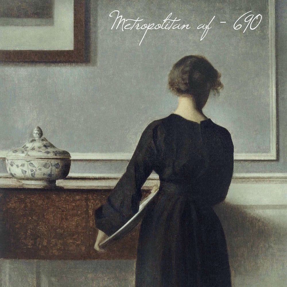
painting by Vilhelm Hammershøi


Thank you Kristi! This is a very good question for a lot of reasons because it’s a common mistake to choose a color after falling in love with it in a magazine or on a computer screen.

Invariably, the unsuspecting person is blissfully rowing away in a rowboat on a river and does not see the impending waterfall ahead when he/she asks, “What IS that paint color?”


Usually, it’s for a room that is not mine and I have no idea what the color is.


Sure, I’ve asked the “what is the paint color?” question, myself. But usually, it’s to see just how far off it actually is from what it’s supposed to be. :]

When you see a paint color in a room either in a photo or from a photo which is then shown on your computer monitor, I can pretty much guarantee that the actual color in YOUR home is going to look different.

How different?

Different enough that you’ll wonder what the hell happened.

So, when you say that you can’t tell from the little dabs you’re seeing, you couldn’t be more right. You won’t be able to tell until you actually see the color in your home and in many different lighting situations and locations in the room it’s to go in.  Click here to find out the best way to select a paint color in your home.


But, here’s the thing.


The color you’re thinking of should usually be treated as a reference; a beginning point. It might be the ending point, but you won’t know that until you test it.


The reason for this (as some of you have learned) is that a color in one room that looks great might look terrible in another room. Same color. I know that some of you have mistakenly taken a beloved paint color from your old home and then used it in your new home and to your shock, it looks completely different and not in a good way.

This is why I don’t get too carried away with “undertones.” All things being equal, the undertone theory works beautifully.


Unfortunately, things are never equal or constant; not when it comes to light.


And, the color you see is always dependent on the light it’s reflecting. It is not possible for a color to look the same in all lights/conditions.


(By the way, this is in no way a disparagement or refutation of anyone’s undertone theory. I don’t have enough information regarding their teachings. It is possible, that the philosophy is the same, but expressed differently.)


Here’s an example below of what I’m talking about in my bedroom, recently painted Benjamin Moore White Dove oc-17.


Benjamin Moore white dove differences - Benjamin Moore COTY 2019 Metropolitan - discussion
My bedroom. Please don’t ask when it will be finished. (little chuckle) There have been circumstances beyond my control and one of them is that my rep at Serena and Lily left and the people currently there don’t seem to know anything about the collaboration that they instigated earlier this year. Hopefully, it’ll get finished by next summer.

(BTW, the S&L 20% off sale is ending Monday night!)


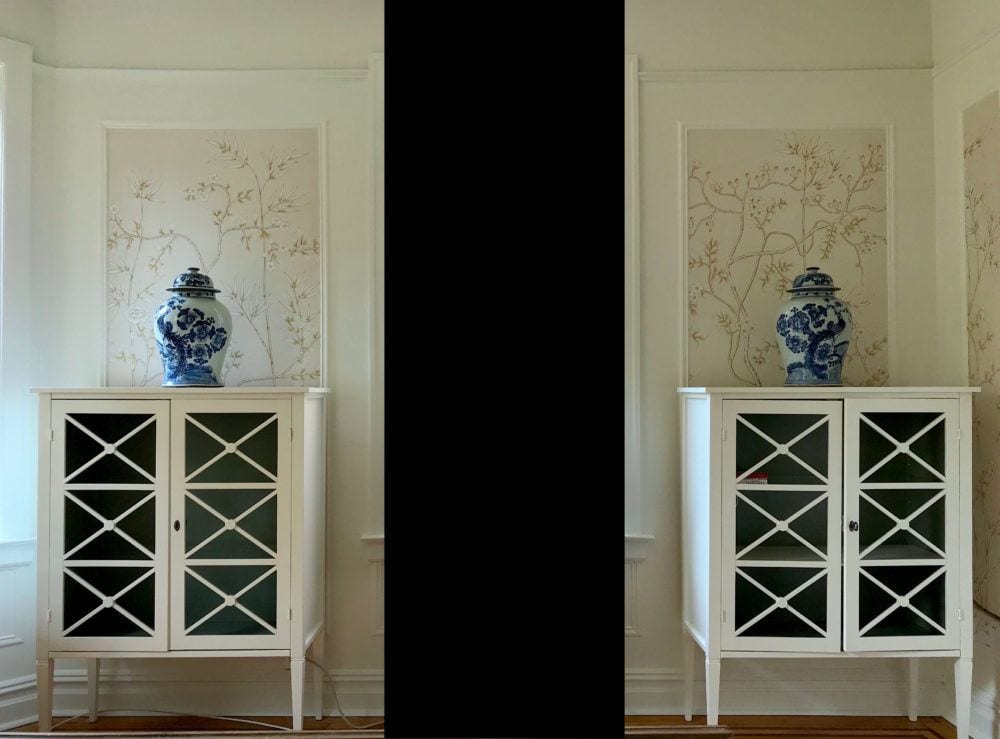
My point in showing you this with the black 2001 A Space Odyssey monolith, lol (but it makes it easier to see) is first to show you why you need to tape your colors flat against the wall if it is the wall being painted and try the color in different areas, throughout the room.


Everything that’s not wallpaper is Benjamin Moore White Dove. And yet, the color looks quite different as you look around the image. Let’s examine this further.


The wall paint is Regal Select Latex in a matte finish. And, the cabinets and trim are the Advance Alkyd formula which emulates a semi-gloss oil finish. This is a good post about different paint finishes.

Notice first, how different the two cabinets look from each other. Identical cabinet, painted the same color and on the same wall. And yet, clearly, the color does not look the same.

Another point is that the cabinets both seem to have a little pink in them, but not any in the walls. In fact, I would say that the two doves clash a little. Crazy time! In addition, when does White Dove EVER have a pink tone to it?

The answer: In my bedroom. Sometimes.  But on some walls, particularly by the closet, it looks very creamy. And usually on the opposite wall, a much cooler white.


Which is it? Warm or cool?

Both. It is dependent on the light.

I did color-correct the image to remove some of the pink that isn’t really there. This is how it really looks. At least on my computer monitor!

Let’s look at a detail shot.

Benjamin Moore white dove differences detail - cabinet clashes with wall


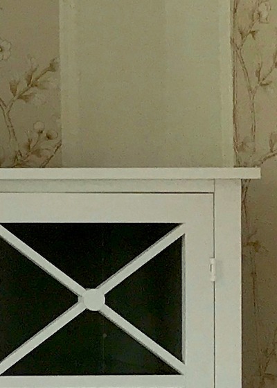
Again, yes, the wall and cabinet are the same color. AND, sometimes, they do look like the exact same color! (White Dove) But, not here.

This is why I tell you to stop driving yourselves (too) crazy pondering obsessing white or any other color, for that matter. Apparently, even the same color can clash with itself!

(yes, you can tweet that) ;]


This however, is the reason why I created the Laurel Home Curated Paint and Palette Collection. I did it to reduce the number of choices from 3,500 to 144. And, I wanted to make sure that you had at your finger tips, some of the best colors. It’s not that you can’t use other colors. But this becomes the point of reference I mentioned earlier.

But, here’s the danger when we see an image on our computer screen and see that it’s the Benjamin Moore COTY 2019 Metropolitan. If you’re waiting to see if Laurel gives you the okay, I’m sorry; that’s not going to happen, either. And, it’s not because I’m trying to hold back or be nasty.


It’s because any paint color in isolation is meaningless.


By the way, the color in the Laurel Home Collection that’s very close to Metropolitan is the Historical Color Coventry Gray hc-169. Coventry is a little deeper and has less green than Metropolitan. Actually, there are a few colors that are similar.

Benjamin Moore and others describe Metropolitan as being a gray-blue. But, if you have a south-west facing room like I have, Metropolitan is going to look pretty green, most likely! It sure did this afternoon.

However, in a low-light room, the green will probably disappear and the color may even look ever so slightly purple-ish. That’s how it looks when I look at it in my dim hall or bathroom.


How is this possible? How can a color look in some lights greenish and in some lights purple-ish or blue-ish?


As with the white dove in my bedroom, it’s how the color is reacting to the light. You can see this phenomenon in this post with the popular color, Revere Pewter.

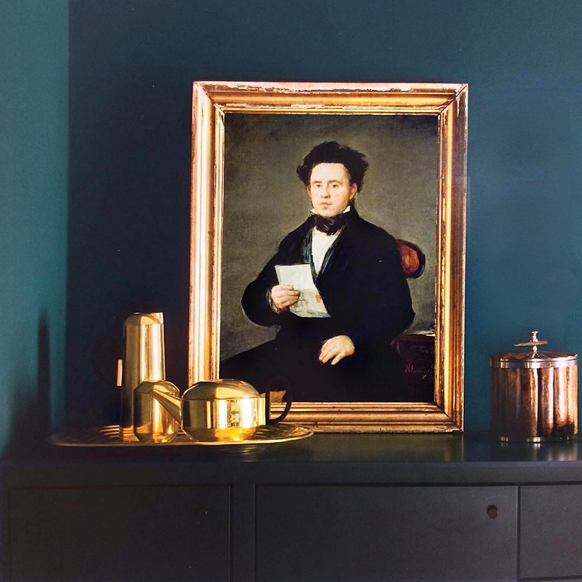
Another thing to think about is what happens when you see a color in a magazine or online and you LOVE the way it looks in the photo. And, you’re just dying to know what that magical color is. Right?


Image via: @danu.design - instagram Benjamin Moore COTY 2019 Metropolitan - Teal looks like - Slate Teal

via danu design on instagram


People often ask me “What is that color?” It’s pointless because I can pretty much guarantee that it’s not going to be what you are expecting. Of course, you can ask. I ask all of the time. But please remember that the color is not going to look the same on your walls.


Here’s what to do instead when you see a color that you love and would like to try out.


If you like THAT color, then go and find THAT color by matching it up, that way. For instance, in the beautiful photo above, the color to me, looks maybe like Benjamin Moore Galapagos Turquoise or maybe Slate Teal.

I would also get a pot of Benjamin Moore Twilight. Then, I would make sample boards of all three.


Does that make sense?


These are just a few of the gorgeous colors in the Laurel Home Essential Paint/Palette Collection of 144 curated colors and palettes. If you start here, you can read the intro about the paint/palette collection and then there are links for more information.


Well, Laurel. You still haven’t answered the question. How do you feel about Benjamin Moore COTY 2019 Metropolitan?


Metropolitan is a fine color. :]


benjamin-moore-color-of-the-year-2019-Metropolitan af 690

via Benjamin Moore


However, in most photos I’m seeing, the color is used in a fairly well-lit room and it is sometimes looking paler than it might in your home.


Benjamin COTY 2019 Metropolitan AF - 690
This is how dark Metropolitan is on a chip from the Benjamin Moore website

And, it would actually look darker than this in a darker room.


Actually, a lot of paint colors in photos look lighter than they do in real life. But, the color might look like the room above, if your room is getting a lot of light.


Benjamin Moore Gray Owl


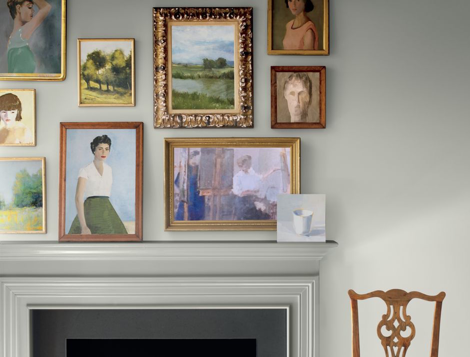
A color in the same family, that I like a lot that’s a good amount lighter is Gray Owl.


In general, when it comes to gray, I mostly prefer either fairly pale or much deeper.


But, if you would like to see some of my favorite cool Benjamin Moore cool gray paint colors, please click here.

There are also some wonderful cool gray paint colors in this post about bathrooms.

My own little bathroom is painted Benjamin Shoreline. You can see photos of how that looks here.

And, isn’t it funny, but just one month ago, I did a post asking if the gray paint trend was over?

And if you are looking for some of my favorite warm gray paint colors click here.

I know that there’s a log of pondering gray or pondering beige pretty silly. And, it’s not that I don’t do it myself. But, it’s not the most important thing. There is rarely only ONE color that will work in any one space, no matter what.


This link will take you to the MOST IMPORTANT THING you need to create a beautiful room. It’s the one thing that if you don’t have it right, no color is going to look good in the space.


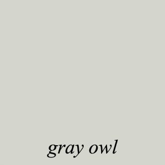
There’s more to discuss regarding the Benjamin Moore COTY Metropolitan af-690. And it’s information that I just discovered– after I wrote everything above this.


Benjamin Moore COTY Metropolitan AF-690 - Hue Family - Green-Yellow- image via Lori Sawaya - Camp Chroma


First, I found this graphic and then after putting it in a search discovered both an instagram account (@thelandofcolor) and a very interesting website, Camp Chroma belonging to color expert Lori Sawaya. I should know who she is, but I don’t believe that we’ve met, although the name seems familiar.


Oh crap! I just did a little investigating. Yes, Lori’s a subscriber to this blog and she’s also left a few kind comments. I’m so flattered!


So, if you’re reading this, “Hi Lori!” Love your blog!

She breaks it all down in scientific terms and I find it all quite interesting.
I encourage you to read what she wrote in this post about the color of the year 2019 Metropolitan.

While I do not want to get into any debates about any of this. (It’s just paint, okay?) :] I do agree with everything that Lori says. This is based on my color training in design school and years of observation and experience.


But, what I love here is that the reason that Metropolitan sometimes looks green, is because it IS green.


The green is not an undertone. It’s just a very grayed-down green. But, in some lights can also look blue-ish. And in my place, it did look purple-ish. However, it might not look that way when it’s on the entire wall.

If you like muted grayed down greens, please check out this post about these shades of green.

I hope that this post gave you some new insights that you may not have had before. Or, maybe it corroborated what you already know. I realize that choosing paint colors can be difficult. If you don’t have my paint/palette guide, then I very much recommend that you hire a color consultant to help you with this, if you’re still struggling.

To wrap up: If you did not see Friday’s post, please take a look. Because of the devastation in Florida due to Hurricane Michael, I am donating 30% of my earnings for the entire weekend to the relief effort. This goes for affiliate products purchased or any of my three guides. Laurel’s Rolodex, The Paint/Palette Collection and The Six Figure Income Blogger.

Thank you so much for your help!


39 Responses

  1. Hi, Laurel. I’m an interior designer and I couldn’t agree more with everything you said about choosing paint colors! Some of these things I have learned the hard way! I’m not sure if the larger color samples from Sherwin Williams and Benjamin Moore are only for the trade, but I find them very helpful. I’ve ordered at least four 8″x 11″ samples of my favorite colors from the Sherwin Williams and Benjamin Moore websites. Some don’t come in 8″ x 11″, but they are way bigger than the little chips! I tape them on white poster board and put them on all four walls of my client’s room. I leave them there for a day so they can see them in different times of the day and night. It’s an alternative to buying many cans of paint samples. After we think we have the one, we get a sample size can of paint and paint sections of the walls near the trim. Another thing I’ve noticed is that Sherwin William paint samples only come in one sheen. I believe it’s eggshell. Colors change a little according to the sheen. But they are close enough. Oh, and don’t forget how the lightbulbs can change the paint color! It took me forever to figure that out! Keep passing along the great tips! I find your blog very helpful! 🙂

    1. Thanks so much for your kind comment! I’m pretty sure that the larger samples from BM are only to the trade. But, one can also get the sample pots and make their own samples. Some say that there is a difference between the actual paint and the samples. I say, okay. Whatever. lol I like your assessment of “close enough.” Wait an hour or two and it’ll be something else.

  2. Laurel, What a timely article! I just painted my house I believe Benjamin Moore, “Thunder”. It is not a warm gray. It is green! What is the best color for the trim to tone down the green in the gray? Blue?

    1. Hi Ann,

      No trim color is going to tone down the wall color. But, any white with a touch of pink or red in it, will enhance the green. I’m sorry, I can’t make suggestions from where I’m sitting as to what you should do. But a few things. A lot of time people freak out before all of the furniture is back and the window treatments, artwork, accessories, etc.

      But, if you really don’t like the color, then I would tweak it. The other thing that I’m wondering if this is natural light, or artificial light. Incandescent and other warm lights will bring out the green in the paint. But, I happen to love those deep gray-greens. And I’ve also read some lovely words about that color. It may begin to grow on you. Swiss Coffee might be nice with Thunder. But, you can also look at my other favorites here.

  3. Hi Laurel, True Colour Expert here. I totally agree with you that it’s impossible to correctly diagnose a colour from a screen!

    The idea with undertones is not that a colour looks exactly the same in all lighting situations. The idea is rather that a colour will work no matter the lighting situation because you chose the correct undertone that either matches, or complements your existing finishes. If the undertones clash, it will become sorely obvious and look very wrong and different in certain lighting situations.

    It’s also all about comparison. It’s impossible to correctly diagnose a colour without comparing it to another. If this Metropolitan colour looks slightly purple-ish in your bathroom, then put it next to a real purple gray and suddenly you’ll see that Metropolitan is not purple at all. Now yes, one may have a preference that will dictate their enjoyment of a colour, light vs dark, the lack of comparison and therefore the wrong diagnosis of a colour, etc, but 90% of the time, if a colour suddenly looks very different in certain lights, it’s just the wrong undertone that was chosen for the space, and the clashing undertone suddenly jumps at at you. The idea is that you should see a colour that’s in harmony with the space, instead of different clashing undertones dominating when it is used in the wrong context.

    For example, your cabinets look different than your walls, because you have a different paint finish and sheen. Is it reasonable to say that perhaps the semi gloss picks up some reflection from your hardwood near by? Or your bed? Even though your cabinets and your walls look different, and the walls being matte aren’t picking up the reflection, but the point is that they DON’T clash. That’s because they have the same undertones (being the same colour)! Now put a bluer white on your cabinets, and suddenly your walls will look yellow and dirty, and will look terrible in all lighting situations, and definitely clash with your cabinets.

    So that’s just my two cents about paint colours, I adore your sight and all of your fabulous blog posts, you’ve been the biggest influencer in terms of finding my style! Thank you!

    1. Hi Émilie,

      Thanks for taking the time to write all of that out. Yes, the cabinet is picking up other things, (not the bed, because it is ashen and not very much of it) but it probably would if it was the exact same paint as the wall. That’s because it’s hanging out into space and not against the wall. I don’t mind the differences. I think it’s because I don’t like everything to match precisely.

      Over the years, I figured out my favorite whites and none of them have blue in them. I’ve always said, “if something looks crooked, then it is.” It’s the same with paint. Once you find your husband, you don’t need another one. Usually. ;]

  4. Hi Laurel,
    I painted my dining room in BM ozark shadows. It’s a true steel grey. It doesn’t go green or purple in any light. I love grey! Hope you are over your jet lag! It takes me a few weeks every time.
    Bw laura

    1. Thanks Laura. I find when I go east, the first 12 hours are rough and then after sleeping, I’m fine, but coming back is fine at first and then it hits me. Maybe it’s because I’m excited to be someplace new?

      Good to know about Ozark Shadows!

  5. Hi Laurel,

    Something your readers might like to know; the formula for a paint colour can and often is different for each sheen. For example, in your white dove, because the base is different in the advance paint than in your wall paint, the number of drops of colourant can also and very likely is different; hence one looking pinker than another. Yes, the way light reflects on the paint also affects how it looks but what sheen you chose can make a difference in the formula. Now, if it was me and I didn’t like that my trim paint was looking creamier/or whiter than the wall paint, I’d be going back to the paint store and getting the paint altered.

    I just went through this with a client last week. Thankfully I have a great paint rep. I was mixing a colour I once did in aura and was economizing with this client and using regal for the same paint colour but my rep advised me that the formula was different in the regal – and both of them are eggshell finish! I didn’t take a chance as we had already looked at the colour boards in many different lights so Aura was used. It’s the best paint anyway.

    Margaret

  6. Hi Laurel. Thanks for your generosity this weekend. It’s a great chance for people to pick up your terrific e-books and help people in Florida at the same time.

    You may have answered this before, but do you remember the maker of your wonderful little bookcase? I think I love it as much as you do!

    1. Hi Tsippi,

      Thank you so much! I’m exceedingly proud of my products. I’ve seen some that are so thin, that I’m horrified at how much they are charging. I’m the girl who if the teacher gave a choice of doing one of three extra-credit assignments, I did all three; just in case. lol

      The bookcases in my bedroom? Oh, it was one of those catalog companies like maybe Grandin Road? Can’t remember exactly. I got it circa 2000.

  7. Holy cats. What a thing to wake up to on a Sunday morning. I mean that in a good way!

    Thanks for the shoutout and links, Laurel!

    I’ll apologize to everyone right now because if this is your first time hearing that we can quantify how we see and experience color – that there are devices designed to *see* color EXACTLY like our own eyeballs so we can quantify the human sensation of color – you could very well become a bit obsessed. Once bitten as they say.

    My advice is don’t start Googling and researching unless you’re comfy with beverage at hand because once you start, you’ll probably be glued to your computer for a while.

    As far as Metropolitan the Benjamin Moore Color of the Year 2019, this is my take. Metropolitan is one of BenM’s most neutral in appearance grays they have. Meaning most people will look at it and see no discernible hue, they see “just gray”. It belongs to the middle of the Green-Yellow hue family, has an LRV of 51% which is the middle of the reflectance scale, and it is super low in chroma (colorfulness) which means it is very near a true achromatic, neutral gray.

    If you searched thru the entire BenM collection of colors and wanted to find a color that didn’t have much of a statement to make, it would be Metropolitan.

    It’s a “good” gray as far as gray paint colors go; it’s a great foil for art and decor. However, I personally expect a Color of the Year to have more to say and Metropolitan leaves a lot unspoken.

    1. Hi Lori,

      No, actually, thank you! What amazed me is that much of what you said, although your explanation is far more thorough, mirrored what I had just written. I have to admit that I’m a little afraid of going against the roaring undertone-tide– in public, that is. And it’s not that I don’t think that there is such a thing. I do. It’s just that it’s not one thing. It can’t be.

      One of my favorite examples of this that I observed which I’m totally kicking myself that I didn’t take a pic of was this: I was standing in a friend’s dining room on a sunny afternoon in August a couple years ago when I observed a corner of their dining room painted Benjamin Moore China White. There was one window on the other side of the room from this corner. But, in that corner, one side was a cool pale gray with a slight lavender shade and on the other side was a pale, pale gold color. Sort of a dirty cream, but warm. Our eyes are used to seeing these differences caused by reflection and shadow. In fact, on those computer generated things where they put the color in the room and it’s all one color, it looks mighty strange.

      However, it is still one color in the same room, but adjacent walls. One is warm and one is cool. What is the undertone? warm or cool? It is obviously both. And maybe that’s why I’m not so fond of China White. I think it’s okay in a very bright room, but my old home had this everywhere and in the north facing den, it was quite dreary.

      But, sometimes, I’ve noticed that what some call an “undertone” is not under anything; it’s the actual color!

      As for BMs not making a statement; actually, based on their promotional video on their site and youtube, ;] I believe that is exactly their intention. They start out with an annoying chime that actually made me turn the sound OFF. It’s meant to be irritating. And then comes in Metropolitan to save the world with peace and calm. haha! However, there are hundreds of Benjamin Moore colors that do this. I think that they just want to draw more attention to the Affinity (Aura) fan deck. lol

      After-all, all it is, is marketing. They know that they will put this out and get tons of free publicity.

      But, let’s not go there. (eyes rolling)

      Thanks so much, Lori for your insightful teachings!

      xoxo ~ Laurel

  8. When I was looking to change the wall color in my living, dining, and hallway, I picked up a bunch of Ben Moore sample pots of colors I liked from Pinterest. Then I painted big swaths (with 2 coats) of each color on the walls, in each room. With all the hoopla about Revere Pewter and Grey Owl, I was sure I would be picking one of them. Nope! They looked terrible in my home under all different lighting conditions. I ended up with BM’s Pale Oak and it’s beautiful.

    Thank you for your great site!

  9. I’d also to add to the discussion by saying that color theory is a great starting point but any discussion about paint colors should include consideration of the type and quantity of pigments used to obtain that color. Measuring the reflected color and placing it in a category is different to how the human eye will see pigments mixed in a suspended medium. Of course the quality of light and reflected light influence those perceptions but it’s the quantity and quality of pigments and the type of medium (resins) that most influence how you see the color. This is why different paint brands or even emulsions can appear different in the room-even if they are the “same” color.

  10. Re your comment to Korina, “I’ve noticed that the cabinets are often a different color than the walls” – when trying to choose the white for my trim (ended up with Cotton Balls per your recommendation – perfect!) I discovered that the color is also different on each material on which it is painted, i.e., wood trim, composite doors, and sheetrock walls. Drove me nuts for a while but I finally accepted it didn’t really matter because it all blends beautifully. Your blog has taught me so much and I read and re-read as much as I can make time for. Thank you for all your wit and wisdom!

    1. Hi Gail,

      Yes, yes, yes, yes and yes to all of it! Nobody has learned as much as I have putting these 571 blog posts together! I cannot believe that’s how many I’ve done! But, I just checked and that’s what it says.

      The irony is that I am a much better designer for having done this blog. I’m not better at the business side, however and I don’t have the stomach for the catastrophes that happen on a weekly basis.

  11. Color is light and perception is all relative.
    For a color of the year, I have to say I like it! Though I’m not in the market for new paint right now.
    I also like lori’s color system, because it’s based on true color science and objectivity. I am also a fan of the Munsell system, which she uses.
    I like that your bedroom paint looks different in different planes and locations. Can’t wait to see the finished room!

    1. Hi Susie,

      Yes, for a COTY, it’s a fine choice. And, actually a brave one. The bravest and most brilliant, IMO was Simply White. But, it drives me crazy when I read “the current white fad.” What the freak? White on white has been around ever since I can remember. And, my living room was white on white as was my kitchen when I did them 22 years ago in my old home.

      I still think about redoing my living room and going back to all white. Love it, but I also love the color in my current living room.

  12. Hi Laurel, thanks you SO much for this post and the link to paint finishes. Hard enough to find the right colors, then you have to pick the right finish! Here in California almost every house has a textured finish on the walls ( I think it covers up all of the builder’s drywall mistakes), so when we got our new home I wanted a flat finish to minimize all the bumps. But I have 8 grandchildren, and one of my colors at the ends of my large great room is Kendall Charcoal, so I knew it might easily show smudges. I was planning on Regal matte, but when I went to my Benjamin Moore paint store they encouraged a new Benjamin Moore paint called Skuff-X. The samples were pretty amazing- super smooth, very matte and velvety, no scuffing- so I went for it- everywhere! It’s almost commercial grade it’s so durable, And it doesn’t cost anymore than Regal. My painter was skeptical at first, especially for the bathrooms and kitchen, but he LOVED it and will be recommending it to all his clients. Love Benjamin Moore even more now!
    Thanks again for your amazing blog- I never miss it!

    1. Hi Dee-Dee,

      Well, I’ll be! I have never heard of Skuff-X. You’d think that they’d send this stuff out to us. But, they don’t.

      But, the matte formulation is supposed to be scrubbable. However, since it’s a dark color, it might “chalk.” If you don’t know, that’s when one rubs against a dark color and there’s a light, chalky looking streak. It’s like a white-ish smudge! Maybe that’s what you were referring to.

  13. Something I’ve been thinking about for a while when it comes to finding a neutral gray: why not ask the paint store for black lightened by (however many) percent white? Like if one wanted a really pale gray with no undertones, take a pure black and ask for it to be lightened 80%. You’d get a gray that’s a pure mix of white and black. Yes? No? It’s early and I haven’t had my coffee.

    1. Hi Nikki,

      That would make sense if both white and black were pure, but they aren’t. The pigments that make those colors have an inherent color in them, even if it isn’t readily apparent. In order to get that color out, one has to add other colors. I learned this in my color course back in 1989 at the New York School of Interior Design. For instance, black and white mixed together make baby blue. And black and yellow make a surprisingly bright GREEN! That was a fun class!

  14. Thanks! Knowing all of this why do we still need to know the paint color we see in a photo and turn into a detective worthy of Jessica on Murder She Wrote to find it?
    Light matters, thank you! My Wisconsin South room turns even the most trusted internet star paint colors baby blue or gray. You should see what it did to pale oak. Criminal. xo

    1. Hi Brooke,

      This is reminding me of the bedroom, where everything we tried looked green. Even pink looked green. I think I’ve mentioned this one a few times. We ended up going with a cream which looked like a pale celery green, but it was very pretty.

  15. I’m now working on a thousand dollar, DIY, total cosmetic redo of the kitchen in my 70 year old ranch house. There are so many different colors are all called “gray,” even a simple color scheme like white and true gray has been tough.

    The hardest part was finding the right fabric for a tailored window valance to go with the repainted cabinets, peel and stick trellis wallpaper, and marble look backsplash. After weeks of looking, I went to spoonflower.com and had a fabric custom printed. The 8″ swatch arrived yesterday, and my search is finally over!

    1. Hi Nancy,

      It’s true. Most colors that are called “gray,” like Nantucket Gray or not gray at all. Nantucket Gray is really a lovely, muted green. Yes, it has a lot of gray in it, but it is still green, nevertheless. Hooray for finding your fabric solution! I’ll have to take a look at that website.

  16. Hi Laurel,

    I learned the importance of trying paint on the walls during our kitchen face lift. I painted several samples on all of the walls, and was surprised at how different they seemed from their color chips.

    After the painters applied the first coat of my chosen color, a grayish green/greenish gray called BM Stingray, I was freaking out, because it looked baby blue to me! It wasn’t dry yet, and after they applied the second coat and everything was thoroughly dry, all was well. It’s just amazing how different light and all the surroundings can affect our perception of a color. Now I always buy little samples, and then I give them away to a friend who paints furniture to sell.

    Thanks for helping out the hurricane disaster victims. If everyone gives even just a little, it can help immeasurably.

    1. Hi Connie,

      Part of the problem that I didn’t realize for many years and I’m sure that most people don’t is that when you look down on a color, it reads completely differently than when vertical. And it reads differently when vertical away from the wall than when flat on the wall. That makes sense because the light is hitting the color at a different angle in each case, relative to our eyes, that is. Very interesting, I think.

  17. Hi Laurel,

    Oh gosh, I love that you referenced Lori Sawaya in this discussion of color! She’s amazing–I’ve read a lot of her posts on her site, The Land of Color, and her answers to homeowners on Houzz.

    She really clarifies the whole “undertone” issue (I know she hates that word!) by relating color to the Munsell system of describing color. And like you, she does it with a good amount of humor and panache!

    This discussion is so right on–I learned a long time ago about the mutability of our perception of color, and you’ve now summed it all up here. Great job as usual!

    1. Hi Diana,

      Yes, the Munsell system was what we learned in interior design school and “chroma” is the word to describe a color’s brightness or lack of it. A shade has black added and a tint has white added. Glad that you enjoyed the post!

  18. Thank you for your help with Michael Disaster Relief. My in-laws lost their home in Mexico Beach. Gone! Thanks for getting the word out and for all you do!

    1. Hi Katy,

      Oh, I’m so sorry to hear that. The devastation they’re showing on TV is shocking. It’s like the homes were made out of toothpicks. I pray that there will be no more loss of life.

  19. If there is one thing I learned at a fine art school, it’s that colors change in relation to what is next to it. I suspect the reflection of your floor is making white dove look pink.
    And, totally off topic, just got an 8 burner vintage Wedgewood stove for my kitchen remodel and it is huge. Like 72 inches huge. And black. So now I need to add some more black in my kitchen. Learned that from you! Thanks

    1. Hi Korina,

      You are so right about colors changing in relation to what they are next to. The pink is mostly in the late afternoon. But, I’ve noticed that the cabinets are often a different color than the walls. Most of the floor is covered with a pale rug. I don’t think it was when that photo was taken. It’s unusual lighting with the configuration of the windows. I rather like that the color changes throughout the day.

Leave a Reply

Your email address will not be published. Required fields are marked *

This site uses Akismet to reduce spam. Learn how your comment data is processed.

Welcome To Laurel Home!

laurel-aarons-18th-e1456449963926

Hi, I’m Laurel, and Laurel Home is the website and blog for Laurel Bern Interiors.
I’ve been creating new-traditional interiors since 1988. The blog is where I share all.

New Edition, November 2022! Get The Indispensable Guide For 100s of Home Furnishings And Interior Design Sources That Everyone Is Raving About

laurels-rolodex-final-book-cover-master 9th edition 22-23

laurel home archives

Categories:

Please click the image below for more info about my rockin’ Interior Design Guides for 2023!

Laurel Home Interior Design Guides 2023
Amazon ad

please click below to check out my favorite decorating & design books

Laurel Bern's Favorite Interior Design and Decorating Books
Subscribe To The Laurel Home Blog And You Will Receive A FREE Guide Where I Share How To Get Your Paint Colors Right, The First Time.