

Hey Guys,
I’ve had some requests to talk about wallcovering.
And I have talked about wallcovering before which you can read about here, here, here and here and then also inter-woven in other blog posts.
If you are ever looking for anything on the blog. Just put the search term in the search box, right under my little bio in the sidebar and the posts will all pop up. I use that feature all the time; I’d be dead without it!
But Wallcovering Is A Massive Subject!
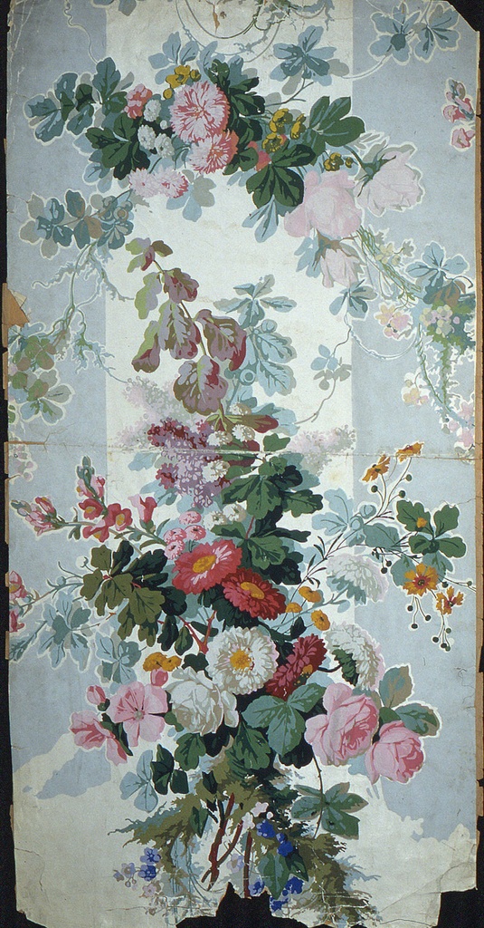
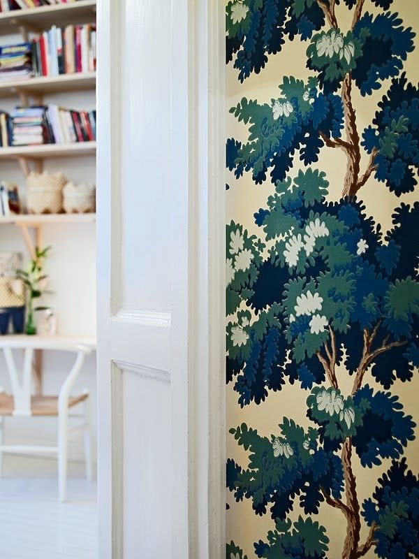
A wallpaper remnant via the
It’s been around for ages, but I’m sure only for the well-heeled back when this beauty was created, some 200 years ago, most likely.
And then there are the myriad of applications for wallcovering.
- The whole room.
Typically, wallcovering is on all four walls. As a rule the bolder the wallpaper, the smaller the space.
- One wall
Right. Most of us know that I am not fond of accent walls. I’m not fond of them when they make no sense or when they are a copout for not using a paint color all the way around. But one wall of wallcovering
in a dining room or an entry and other rooms, often makes a lot of sense.
- In a wall panel
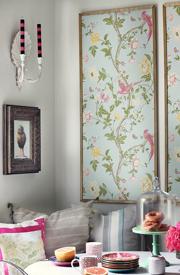
This is a great way to use an expensive paper and get away with a lot less. And it’s also great if it’s a design that could use some rest areas.
- Above the Chair rail
- Below the Chair rail
- On the ceiling.
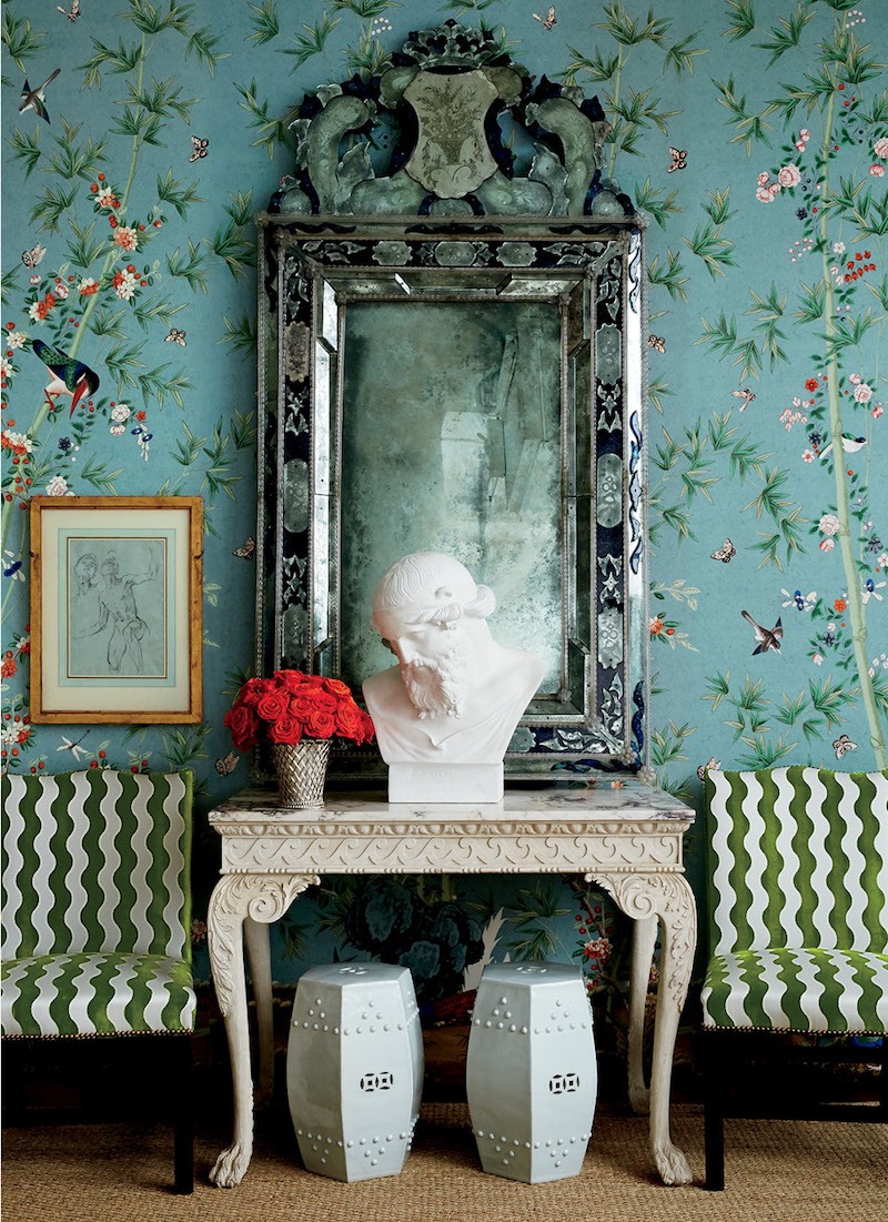
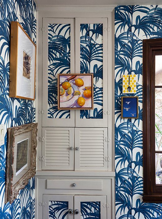
- With Art
Indeed. I love wallpaper that’s layered with art and/or mirrors, lighting, etc.
This takes a lot of planning.
And then all of the different types of wallcovering
Oh my, I don’t know where to begin.
I really don’t.
I mean, people have written entire books about wallpaper.
So, what I think I’m going to do is give a very general overview today and then in the comments, if you guys like, please let me know specifically about any areas you’d like me to cover.
One example would be natural wovens and grass cloth and its applications.
I am definitely going to do another post about Chinoiserie wallpaper, but this time, I have a whole slew of sources for panels and I’d love to have them all in one place.
A Few Of My Favorite Wallpapers and Wallcovering Sources
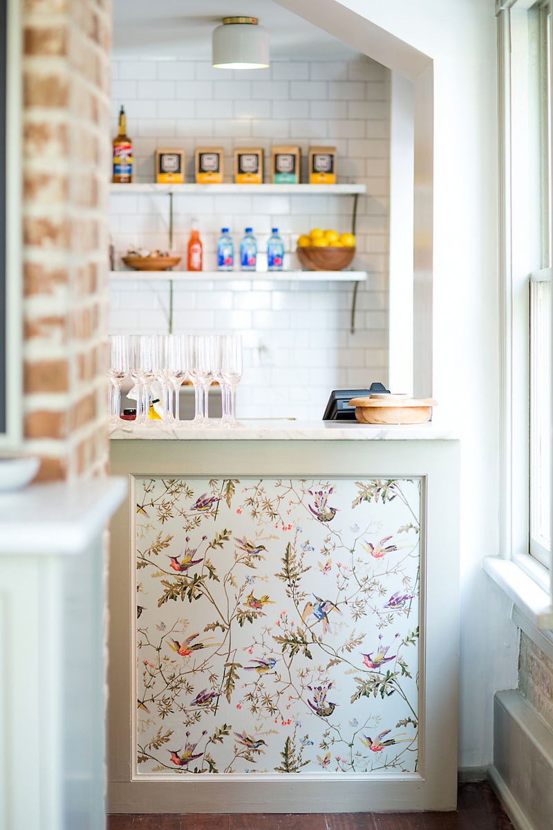
Mirabelle Suites and Cafe via Rethink Design Studio
I’ve seen this paper – EVERYWHERE. Mostly in bedrooms and even in a nursery, but I love this unexpected application in a restaurant with exposed brick.
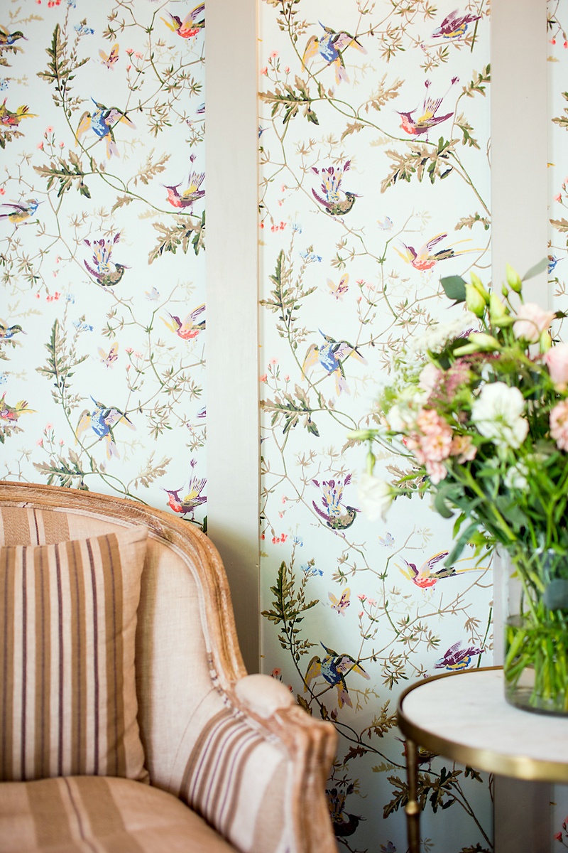
Mirabelle Suites and Cafe via Rethink Design Studio
WE INTERRUPT OUR WALLCOVERING STORY FOR A BREAKING NEWS BULLETIN
FROM THE OFFICE OF LAUREL HOME SECURITY
Well, you know that I have vowed that if I see something, I need to say something…
Here’s what I saw.
I happen to know that this wallpaper is manufactured by Cole and Sons.
It is also available retail at Decorator’s Best.
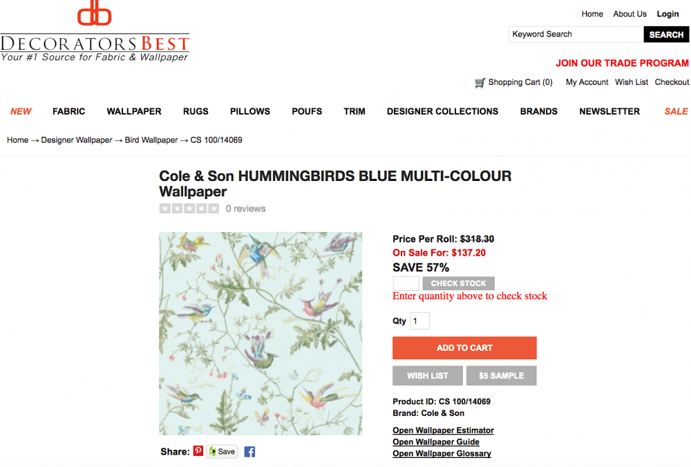
If in the trade, you can go directly to your trade source. (In the USA it’s Lee Jofa who reps Cole and Son) and it will be a far better deal than the not-very-good discount Decorator’s Best gives to designers.
By the way, that is the primary purpose of Laurel’s Rolodex. I do not ever divulge net prices, but I do tell designers the best designer-friendly trade sources for home furnishings. And I also point out a few to look out for. Remember these folks?
For design enthusiasts who purchase the rolodex, I always recommend hiring a professional designer for a million reasons. But they will learn of 100s of sources they’ve never heard of before and most have retail divisions.
We will now return back to our regularly scheduled program
Wallcovering Favorites and Tips already in progress.
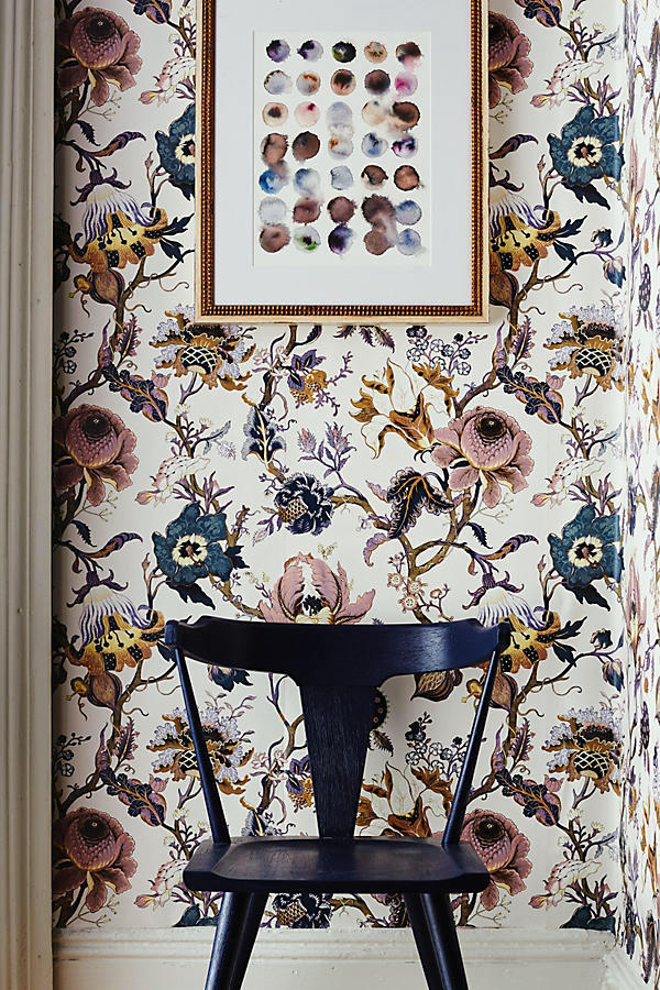
Another wallcovering from a very cool English brand, House of Hackney. But this one is also sold at Anthropologie. It’s quite traditional and yet has a fresh look to me. I love art hung over wallpaper.
I had this up not too long ago, but adore this fabulous Chinoiserie print wallpaper,
Brighton Pavillion by Miles Redd for Schumacher
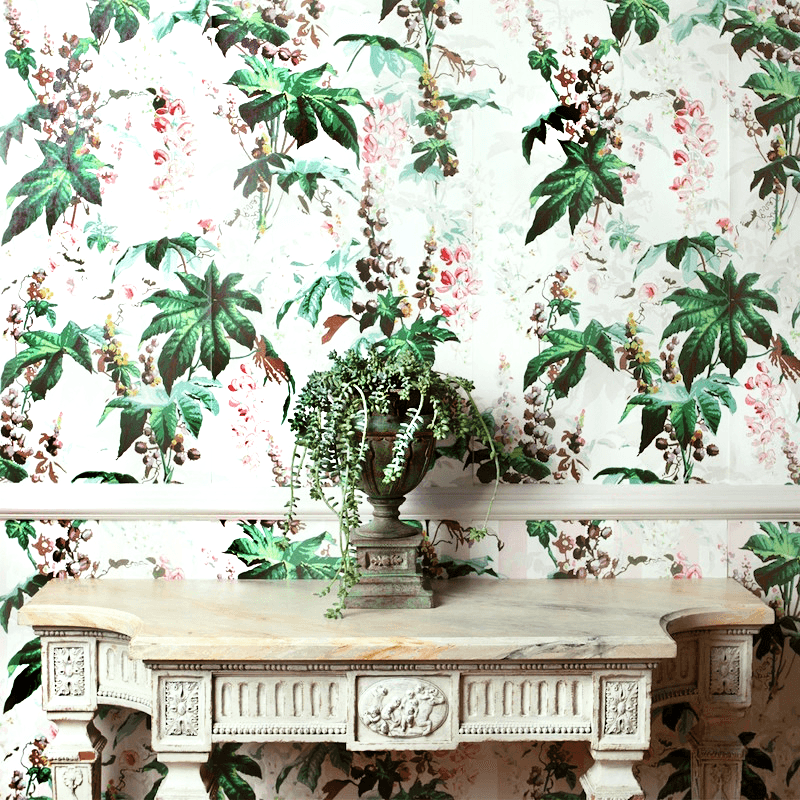
I just had to include this one because isn’t that table almost an exact clone of Maura Endres’ console table?
House Beautiful – Designer – Charles O. Schwarz III – photo Mick Hales
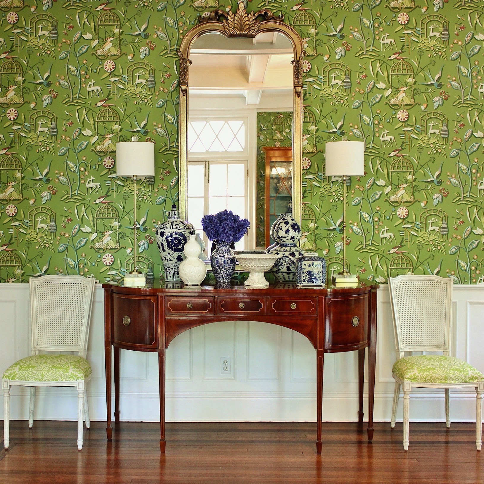
The Ringwold Pattern at Farrow and Ball is one of my favorites and I’ve done it a number of times for clients in different colorways.

I seem to be in a tropical mood today. Maybe it’s the thunderstorm we had earlier. I could see being enveloped in this paper with lots of mirrors and art.
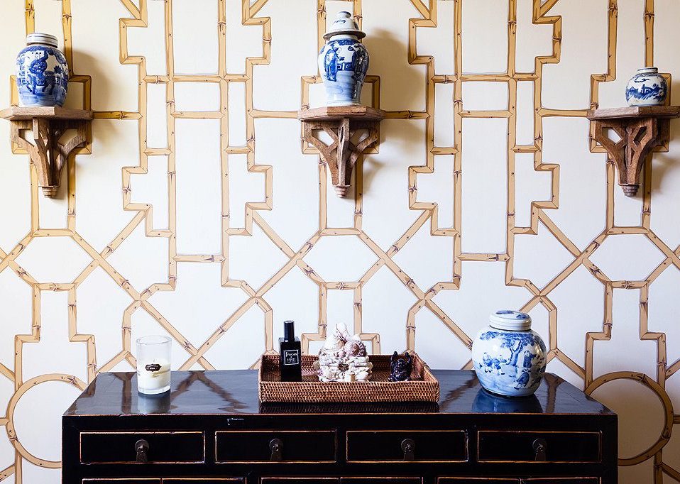
Baldwin Bamboo from Scalamandre
Fabulous vignette by Megan Rice Yager. Please check out the entire home.(link below image) It’s quite stunning!
Designer Lulu Powers’ home with another paper by
House of Hackneye –Palmereal
It’s interesting how she used the paper inside the panels to make them almost disappear.
Thibaut Providence
People often ask me about the source of the wallcovering. Alas, it has been discontinued. :[
This paper has become an internet favorite the last few years.
It is by a Swedish company called Sandberg and the pattern is Raphael.
It is repped by Old World Weavers in the USA.
This is a very strong pattern that is based on a Swedish or French design. That’s cool. I love it, but for me, only in a small space and even then, broken up with art and mirrors or in a wall panel.
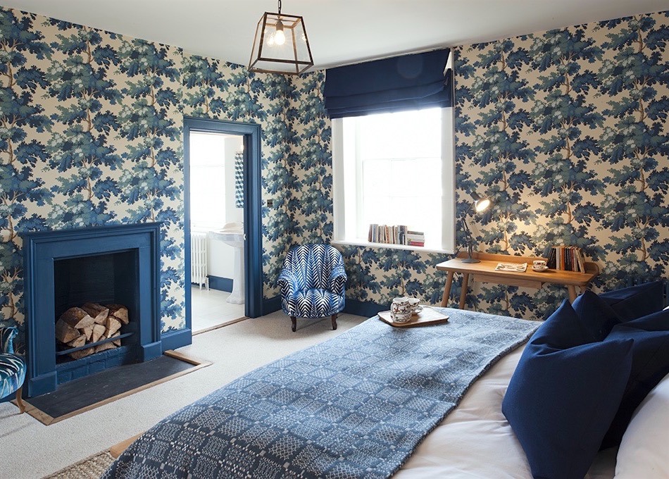
I love the blue trim and I think that overall, the room is fine, but it doesn’t look finished. It needs art and a better piece next to the window. I’m also not crazy about the shade and the pendant isn’t up to the level of the rest of the room. It just seems like the room wasn’t ready for the photographer and they faked it.
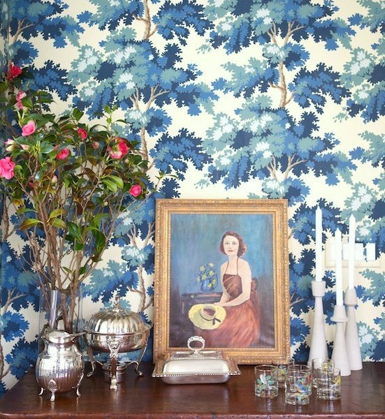
But this is an example where I might have just papered the fireplace wall. Maybe.
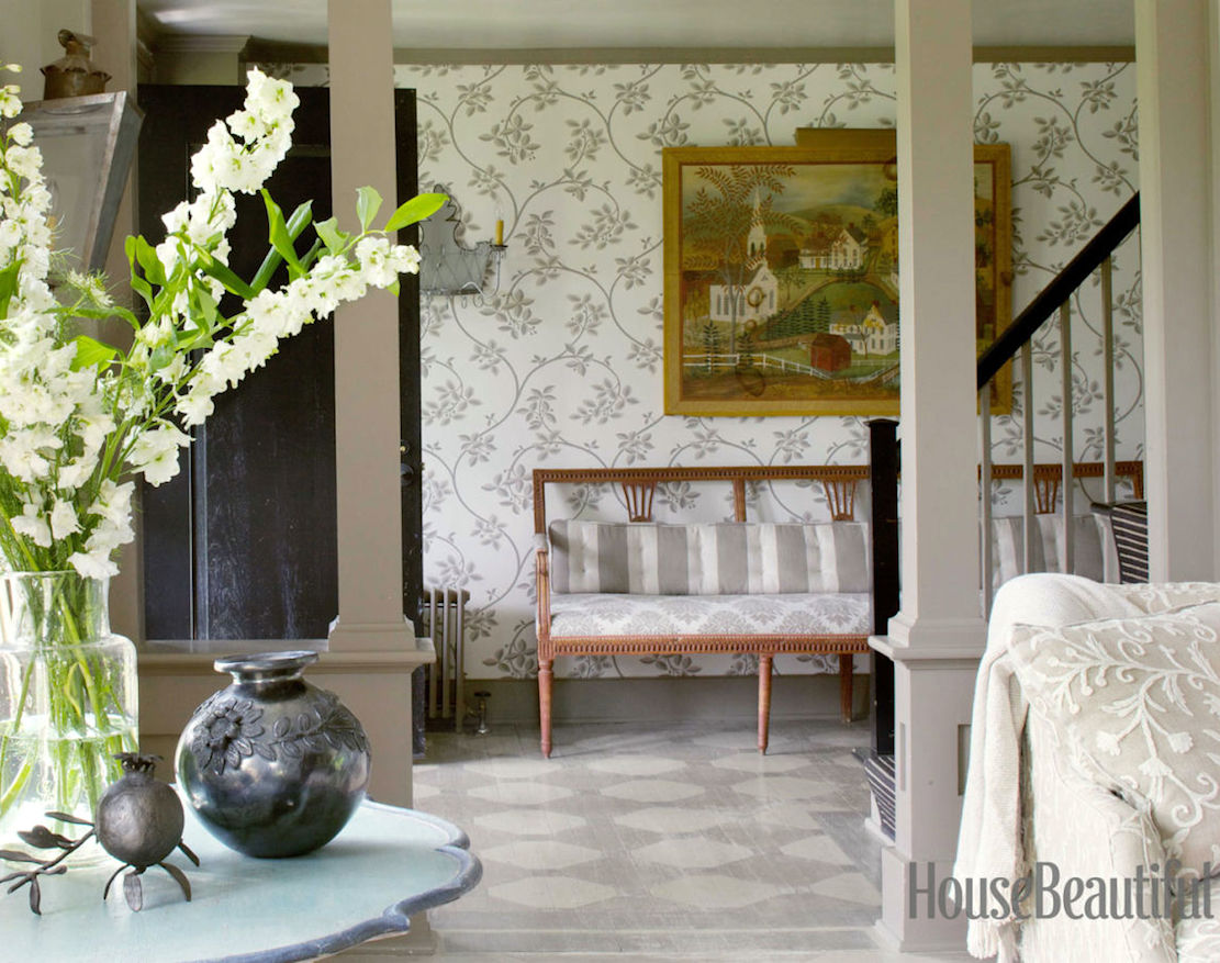
I love this for a small entry. I don’t know what the rest looks like. But when one has something this dramatic, I’d probably keep the adjoining rooms very quiet and pale as you see here. This is credited to the Remodelista – Lou Archell’s Home, but I couldn’t find it.
xo,

Related Posts
 This is How I’m Creating a Cohesive Color Palette
 Astonishing Home Makeovers You Won’t Believe
 Her Family Room Addition Is Tricky, Or is it?
 The Color Orange – Love it, or Hate it?
 My Historical Home Renovation Is Driving Me Mad!
 Can You Do A Guestroom Suite on a Shoestring Budget?
 A Refined Soothing Color Palette Inspired By Nature


