Hi Everyone!
Happy 4th of July if you live in the USA!
Guess where I am?
Yes, I’m back in Northampton, MA. I’m here for the holiday, and also the new house is getting a big inspection on Monday.
And, I’m happy to say that things are moving along quite nicely.
I’m almost ready to sign a contract with a closing date of November 9th. And, it’s unusual, but the sellers are allowing me to move in on September 1st with rent going towards the purchase price.
That one thing alone is a huge plus, given the closing date is still over four months away. It gives me a huge head start in getting things ready to go.
Soooooooooooo… How are y’all doing?
I’m so happy to be here in Mass. And, am once again struck by how much more conscientious folks here are about mask-wearing and social distancing.
Oh, and guess who’s keeping me company again, while I’m working?
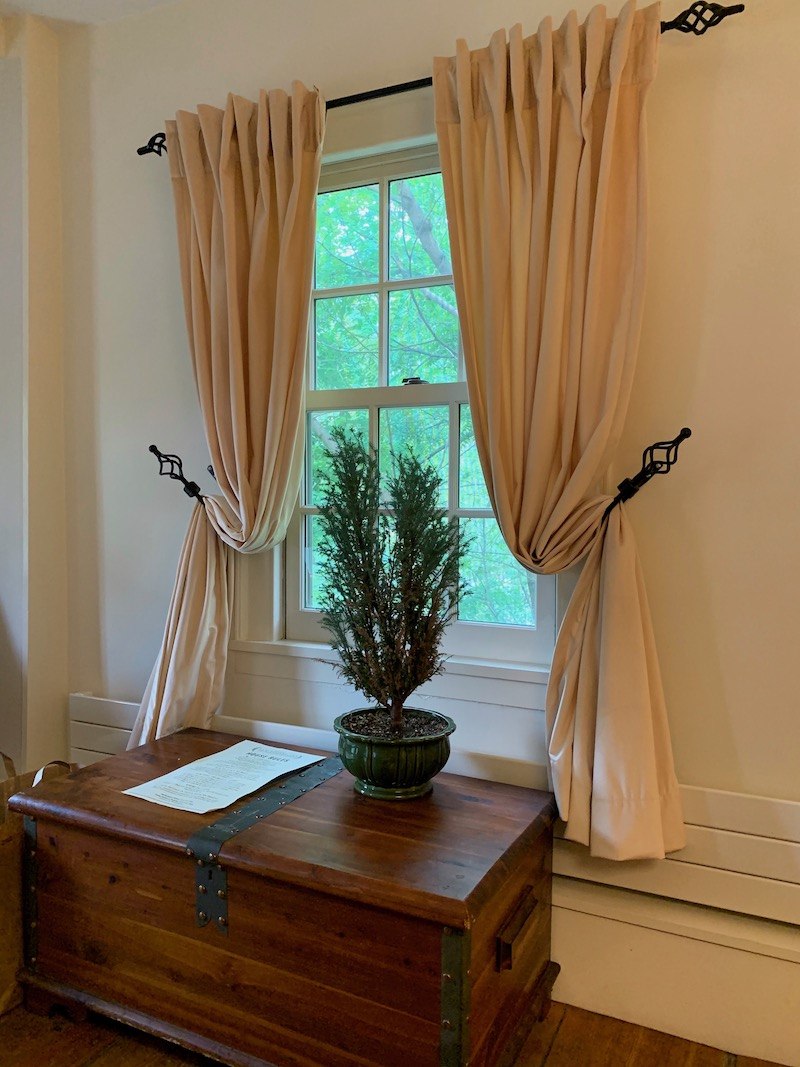
Yes! My darling Joe!
Where are we?
We’re back at the Elm Street Inn, a four apartment Airbnb in the historic district on Elm Street. And, believe me, this place IS the real deal and has been lovingly restored. I highly recommend it.
So, let’s get into the subject at hand which is the biggest decorating mistake we ALL make.
And, when I say WE, I mean Me too! Although, only for myself. When I was taking clients I would obsess over every detail.
Of course, the biggest decorating mistake is decorating without a plan.
I don’t care how straight-forward you think your room is. It rarely is.
But, sometimes, the space is so incredibly challenging, it’s infuriating. Did the builder give ANY thought to furniture placement? Apparently not.
It’s so frustrating, you feel like screaming. It’s not coming together and you’re so afraid of making an irreversible decorating mistake!
Raise your hand if this is you.
Oh, man. I tried to take a selfie with my hand raised, but I forget to attach my third hand to snap the pic!
But, even worse, is just going out and buying a bunch of furniture without a plan. That is going to result in a whopping decorating mistake, almost guaranteed.
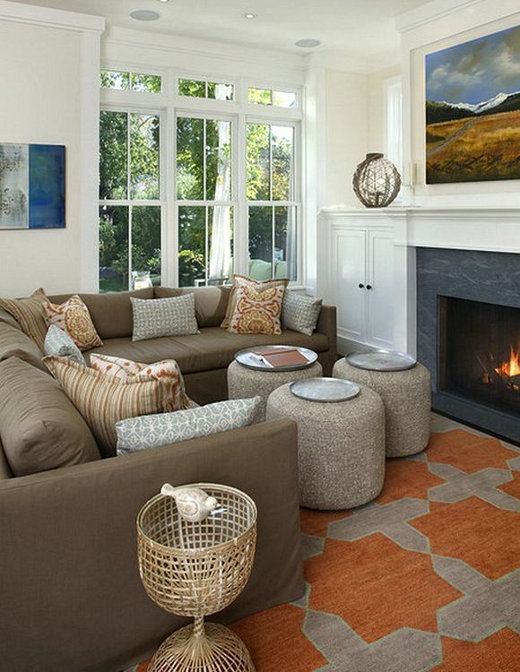
And, this mess was published. Please tell me how is one supposed to open the cabinet doors? There’s a lot of logic in this business. But to avoid hideous decorating mistakes like this one, you need a plan. I can’t say it enough!
To create a decorating plan, you need to do a room layout, floor plan or space planning, we call it.
With the view to go over how I create my floor plans and using myself as an example, yesterday I began working on the plan for my soon to be spectacular double parlor living/dining room.
In my mind, I already pretty much had it “all worked out.” But, after all these years, I should know better.
But, I don’t.
What’s the problem? Working things out in our heads can only take us so far. And, therefore, it’s exceedingly dangerous as our mind can play tricks on us. This is the biggest decorating mistake.
However, I knew with almost 100% certainty that I would not have two seating areas like sickly talented Steve Cordony created in his Rosedale Farm home.
But, here’s where not having a decorating plan can get one into BIG, expensive trouble.
And, we ALL do it.
We start fantasizing and imagining. And, then we start LOOKING at stuff. And, sometimes we find things that we like– a lot.
For instance, the other day I found the most amazing round dining table.
However, it’s 66″. And, that’s a pretty big table. Is it too big?
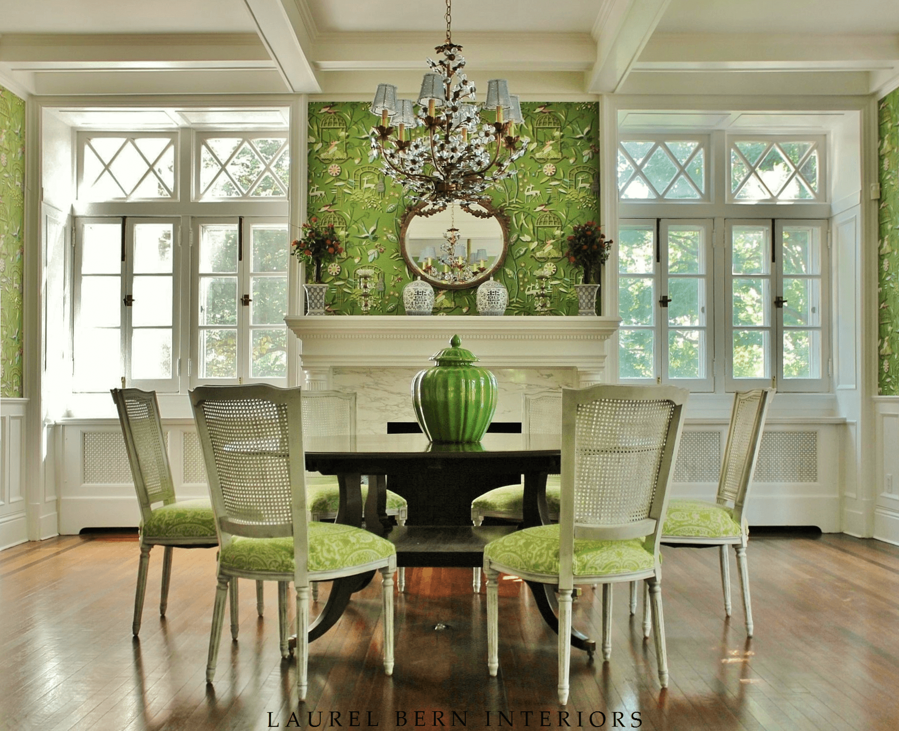
The table above which I had custom-made for a client is 72″ and opens up with one large leaf.
I love a big round dining table. And 66″ can comfortably seat 8 and maybe 9 if the chairs are 21″ wide or less. And, the people aren’t too large. Round tables are a little more forgiving in terms of getting more people around them, I think. Normally, you should allow at least 24″ per person. If you seat 9, you only have 23″.
***For hundreds of other rules you need to know,***
please consider getting my 333 Rules and Tips You Need to Know Guide Book. It’s only $49 and I think well worth it for the vast amount of information in it. Please click the link for more info.***
Laurel, can we see the table?
Ummm… sorry, but no. And, here’s why. It would be easy for some of you to find it. And, I don’t want anyone scooping it up from under me.
My point in even mentioning it is that we must be careful not to get seduced by what we think will work before we know that it WILL definitely work. That is definitely a decorating mistake you can’t afford to make. And, yes, as I said, I have foolishly made purchases without knowing for sure.
If you have an already existing room, and you see a piece of art, or lamps or end tables; that sort of thing. Then, yes, all need to know is if the dimensions work for you.
Oh, I hope the lovely sellers are not reading my blog. I don’t want to make them nervous.
But, that amazing double parlor living room as magnificent as she is– nearly empty, is the bitch of all bitches.
And, here are some of the reasons why:
- the room is wildly asymmetrical– all four walls. And, from front to back. I mean, nothing lines up.
- Let’s also not forget that this 33-foot room is the only pathway to get to the bedrooms, bathroom, kitchen, keeping room and three-season porch– from the front door.
- That means that there must be a MINIMUM THREE FOOT PATHWAY, the entire length of the room!
- But, it shouldn’t look like all of the furniture is hanging on the other side of the room. Just one more ball-busting challenge after another.
Could I possibly open up the hallway that’s currently closed off?
Oh man, that’s another story. It is a possibility, however, we are talking a tremendous renovation, which equals big bucks. And, there are trade-offs, as well. For instance, I would lose the double parlor, and maybe even one of the fireplaces.
In my initial attempts to conquer this space, I tried putting up two small walls of about 2-3 feet. It didn’t matter where I put them, it pretty much sucked; at least on paper. However, if this happens. Please take heart. Do not throw in the towel immediately. That’s also a decorating mistake.
I can’t tell you the number of times I began to work on a client’s room layout and it wasn’t going so well.
Stressful, much?
I would leave the plan out where I could see it. Sometimes just coming back a few hours later, I began to see something I missed the first go-around. And then I’d sleep on it. Well, not ON the plan. You know what I mean. In the morning, with fresh eyes, I always saw things differently.
In addition, sometimes, I needed to work with some of the client’s existing furniture. Well, I have the same issues when I design for myself.
I realize too, that most of you are doing your own decorating.
So, you need to be extra vigilant and take extra care. Decorating mistakes are incredibly easy to make.
Therefore, before you get serious about purchasing anything, you absolutely must create a floor plan.
Now, I want to go over HOW to create a room layout. This is the key to avoiding costly decorating mistakes.
More details are in the 333 rules and tips guide, but, this should be enough to get you started.
Here is what I recommend that you do:
- You begin by giving yourself a little quiz. What do you want to be able to do in this room? How many people would you like to be able to sit in it (comfortably)? The people before us used this room as the dining room, but maybe this should be the family room instead because we don’t need such a large dining room? You explore the possibilities.
- I would go to a place like Staples and buy a pad of 1/4″ graph paper. 1/4″ will equal one foot. Then measure the perimeter of your room with a heavy-duty steel measuring tape like contractors use. (I recommend a 25 footer). I do a rough draft on my pad indicating an approximation.
- Then I go back and redraw it on a new sheet using my architect’s scale (see below) for a more precise measurement. For a straight edge, I use my ruler (architect’s scale). I was taught to use something else, but it really is not necessary, IMO. As you do your drawing, you will map out where your doors and windows are and a fireplace, if you have one. If you have a furniture template in 1/4″ scale, that would be very helpful. I have used one exactly like the one below since 1988 and you can order one like it here.
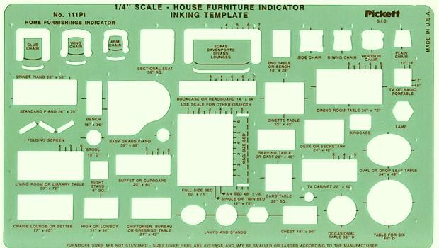
You will also benefit from using one of these tracing templates.
Don’t get nervous. If you are not familiar with this handy device, we call it an architect’s scale. (using it will make you feel like a badass architect.) It’s really just a ruler with different scales of measurement. You will be using the 1/4″ scale. :]
Don’t worry. It’s clearly marked. You will need it to more accurately scale out the inches. Don’t worry if you are a couple of inches off here and there. That is alright. Once a new client gave me a floor plan measured by someone else.
Well, the room was actually 42″ LONGER than indicated on the drawing. Yikes is right! And that was not the first time that had happened.
So, that is another decorating mistake I dodged at least twice.
Do not rely on other people’s measurements no matter how qualified. (of course, if you hired someone and they goofed, that’s on them.)
This will be your FLOOR PLAN. The floor plan is as if you were a bird and looking straight down at your space. Oh, and yes… there are online ways to do this and quite frankly, I still don’t use any of them. And, doing your own hand-drawn floor plan is fun and frighteningly easy.
(shhh… this will be our little secret as some of the other designers want you to think that it’s some complicated thing that takes YEARS to learn. It doesn’t.)
- You will also need two or three really sharp #2 pencils with erasers. However, I prefer those yellow mechanical pencils. You never need to sharpen them.
- Then after you have accurately drawn the perimeter of your room, you can start playing around with the space planning. This is really a lot of fun and the most essential thing you need to do before you get caught up in the quagmire of purchasing new furniture.
Quick Space Planning Primer
- Create a sense of entrance. Do not block the major entry into the room.
- Make sure there’s a focal point and build your seating area around it.
- You will need about THREE FEET for major passageways. Or at the very minimum—30″.
- The space you need between a sofa and coffee table is about 12 inches.
- Try not to line all your furniture up against the wall. No more than one case piece on a wall unless it is a pair of something flanking a doorway, window, or fireplace.
- Do not overlap furniture at right angles.
- Once you have your space planned, now is the time to think about what those pieces will actually be. Some will be easy. Say, you know that you need a sofa. Should it be 60″, 72″, 78″, 84″, 90″? Depends.
However, bear in mind that unless the room is for watching TV, 99% of the time, no matter how long, the sofa will only sit two people for conversation.
So, don’t let the salesperson try to sell you the standard 84″ sofa, when you only have room for a 72″ sofa! Figure out what other seating/pieces you need and draw them in using your template.
- You might want to do this while looking online at specific manufacturers and seeing what pieces you might like that they are selling. (Do you have Laurel’s Rolodex? It is chock full of 100s of wonderful vendors!)
- Think about scale. A lot of today’s furniture is REALLY BIG. The store will have pieces in a vignette, but even though, it is still in a LARGE room with a very high ceiling usually. Please pay close attention to scale. But also, do not make the mistake of getting only very diminutive furniture for a small room. (I know… sounds contradictory, but it could make it look too much like a doll-house)
Feeling stuck? Even more scared, confused? I know, I did too, in the beginning.
Okay, it’s time to take a closer look at my darling bitch of a room.
I have two versions of the plan.
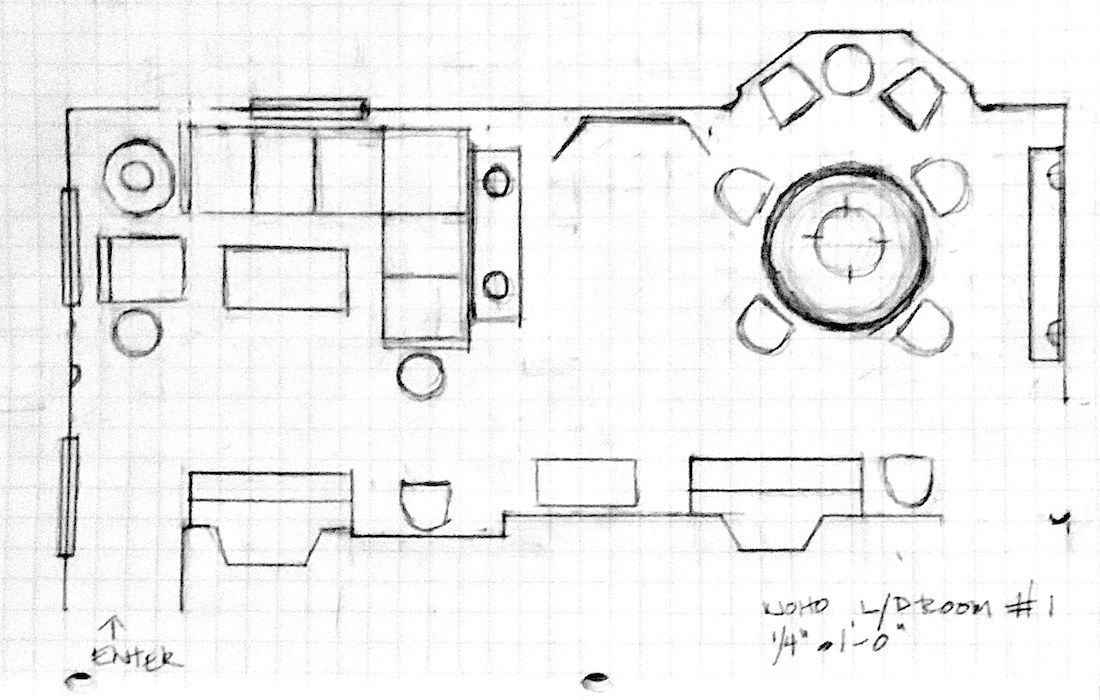
Version one features a sectional from Serena and Lily and the large dining table. Rather than keeping all of the chairs around the table, I created some other places for some of them.
The table, here, is centered on the bay window. To the right of the table is my large, medium height painted bookcase.
Please note the prominent spot for my lovely Zuber screen. (you can see it here behind my desk)
I think that this is a very good first attempt.
I don’t really know if I want a sectional for this house. If the space were strictly for TV viewing and I had a good-sized family, it would make sense. Or, if I had frequent gatherings of 6 or more people. I don’t in New York, but six people in my apartment is already getting close to the limit.
I think the size of the table is fine. Although a round table that opens up with leaves would also work. It’s a toss-up, except I could see doing some beautiful styling on the large table which would be stunning.
Let’s look at version number two.
After I did version one, I began to see where the small walls could work!
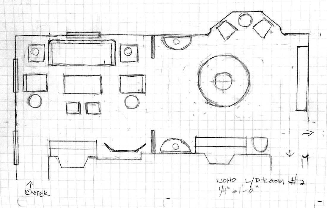
Please note that I created a symmetrical seating area which is a lovely way to enter the room.
I also moved the screen and the way it’s placed, hides the uneven walls. And, for occasional TV watching, I could mount a TV behind the screen. Move the screen, for viewing. And then, put it back when done watching TV. It also hides the thermostat.
The sofa is one of my favorites that’s often in the One King’s Lane widget on the HOT SALES page.
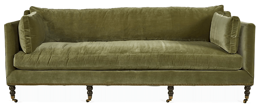
Margot Sofa, Moss Green Velvet
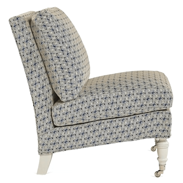
I also love the lines of the Lewiston Slipper Chair by Lillian August.
It’s reminding me of this post where I was bemoaning the paucity ( a big word I learned from my wasband) of the pretty club and slipper chairs.
I keep seeing all or most of the upholstery slip-covered in heavy off-white denim.
I’m not going to show any more furniture at this point. Again, it’s really best to have the plan in place, before selecting specific pieces. Sometimes, if there are two or three viable plans, then one can see what’s out there that will make the plan come to life.
This time, I centered the dining table on the fireplace. I think that over-all, this is a better location for the table for this floorplan.
Where are all of the dining chairs? Well, three are in the room. The other five are in other parts of the house. If company is coming, just gather them up and put them around the table.
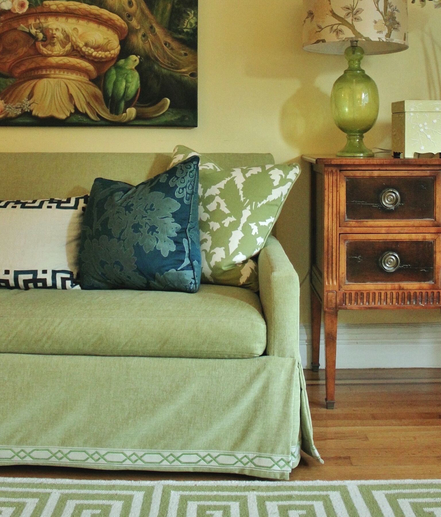
Another option would be to use this chest I’ve had for years, instead of the bookcase and put the bookcase in the keeping/breakfast room. Then, on either side of the chest, I could add two more chairs.
The bookcase would fit on either of these walls, perfectly.
I also incorporated my two demi-lune tables.
Of course, there’s more.
Which of these two plans do you prefer?
Well, I hope this post has helped you. And if for no other reason than from making a whopping decorating mistake.
It’s so easy to do. But, if you have a cohesive and comprehensive furniture plan, you’re less likely to make one. However, if you want to read about more hideous mistakes I made with fabrics and upholstery, please check out this post.
xo,
Related Posts
- Beige Decor — How To Make It Go From Boring To Sensational!
- To Brass or Not To Brass In the New Un-Bathroom
- The Secret For A Cheap, Chic Kitchen Refresh

- New Traditional Decorating – Little Known Ideas You’ll Love
- The Frieze – One of Architecture’s Hottest Elements

- Subway Tile Alternative Everyone Knows About But Me
- A Secret for Creating A 25 Color Whole House Color Palette
122 Responses
wonderfull!
I like the second option but possibly without the added walls dividing the spaces. Without the walls, you may find the plan open and spacious enough to keep four chairs around the table. I would try that first, then add the walls later if still desired. But of course, this is all hypothetical for brain exercise.
Sorry you decided against the house, you will find another that passes litmus testing.
Hi Laurel! So glad to hear about your Northampton home..now you’re in my neck of the woods before I moved to NH. Love, love, love this blog and it came at a perfect time as we are about to embark on a pretty expensive journey to a new sofa. Always just point me to the most expensive fabric because that’s where I’m going to end up anyway! Luckily, my husband “demanded” that we do a floor plan because our sunroom is pretty small…12×16…and has 8 large windows. We’re going today to actually order our new sofa. Check out Kincaid’s Siamese #647260 in Ballard…velvet. We’re going for the boho look! BTW, I love your floor plan #2 best although I’m not sure why you wouldn’t have at least 4 chairs around the table? I love the small walls just for a little bit of separation while still remaining open. Can’t wait to see what you do with this room(s)! Thanks so much for all the advice you offer up to us novices!
I really LOVE option 2!
Write a book about your new adventure!
Can’t wait for your posts!!!!!
Our daughters are recent Smith graduates. Not a day goes by that my husband and I don’t miss visiting Noho and breakfast at Sylvester. It’s a remarkable town.
and almost forgot View #2 gets my vote.
Laurel, you are the best. I went out at lunch and got the interior template. The link you posted took me to Amazon and there was a post, they don’t have it in stock and no idea if/when coming back. Anyway, now I have one and am ready to tackle my husband’s office! Love, love your blog and your wicked sense of humor and your cleared eyed view of this world. All the best to come for you and your new house!
#2
1) I agree with someone below who said put your work area (or whatever area you are in the most) in the best room in the house.
2) If the parlor will be the main room for watching TV and there is there may be a future man in your house, put in a tasteful recliner. (Although I would want that recliner for myself. )
Laurel, You are the only designer blogger I read. I know there are so many good ones out there and I’m even signed up, but I actually click on yours.Thank you! Best wishes to you with your big move:)) warm regards, LW
Version 2 meets the sophistication and integrity of the house and the area. I would keep the bookcase in the dining room to create a dining room/library feel. How often do we actually dine formally these days? The library vibe reflects the tone of a university community. Thank you for sharing this — it is so interesting to follow you on this journey!
So excited for you Laurel! Your new home is gorgeous already. Can’t wait to hear more.
I’ve taken my time about replying to this post, Laurel, to think a bit. Like many others, I prefer plan 2, and for the same reasons as many others. But this one also leaves me a bit uneasy about the dining room part. The non-alignment of the fireplace and the bay window is a pain, seen as a plan it looks wrong in some way no matter what you do.
Here are some thoughts: in the dining room, turn the bay window into a “different” area by putting a small desk and chair there; the chairs for the dining table could go where the demi-lunes are (I think the one on the fireplace wall looks a bit cramped on the plan). Then I think one could put the demi-lunes symmetrically on either side of the window in the sitting area, and turn the seating round, to have two smaller sofas facing each other perpendicular to the fireplace, with a coffee table between. The sofa on the right could mark a separation between sitting and dining by having a console table behind it, offering a serving space for drinks in both areas. Extra chairs in the sitting area could be placed on the diagonal — I’m thinking of the layout in the sitting room at Vignette Design’s house in Asti. This would mean dispensing with a wall at the bottom of the diagram, but perhaps a longer one at the top or none at all. The screen is so lovely, and where you put it performs several concealing functions.
I guess there are a few of us with challenging rooms we have to walk through. I actually love #2 with the two additional walls. I enjoy the balanced look of the parlor as you enter the space and the design flexibility of sofa and side chair options. Love the dining table centered on the second fireplace. Oh and how clever to think of using your screen to disguise the TV and thermostat! If I remember correctly, you have some tall cabinets in the kitchen, so it makes sense to me to put the bookcase in there (begone pesky floor vent!) to add height, texture/warmth and balance to the breakfast room side. Clever demilune’s locations would give you additional space to layer lighting, mirrors, art, additional serving space, or even pushed both together as more dining…so many options! Lastly, observing the photo from the breakfast room out into the dining room and parlor (I think the shopping bag is a wall stand in?) you’re GENIOUS to add those two (possibly paneled?) small walls. They actually guide traffic both visually and physically from the parlor through dining, to possibly avoid walking over the floor hearth….it’s like they were meant to be there all along! It will be fun to see what you finally decide. Hope you had a great 4th, we’ve got 90’s and humid here in Wisconsin and all I can say is “Thank God for central A/C!”
Ohhhhhh—this is SUCH a great post—for entirely selfish reasons: I have an open floor plan 55’ or thereabouts x 24’ open floor plan area that has a kitchen , an entry door on the right side of the kitchen—and to get to every other room in the house, you have to walk through 35 or so feet of this space…and the opening to the rest of the space is about 2’ from the side of the room, parallel to the kitchen.
I’ve lived here almost 10 years now, and probably twice a month, I find myself sitting down and staring at everything, trying to reimagine the area, to make it flow more…with zero joy. Your first layout is actually very similar to what I have…which is vindicating, if nothing else. 😉
So thanks for that! 🙂
I like the combo version, too… soda & chairs with the dining table in the bay. The sectional feels very “first real adult apartment in a chicago townhome” and the sofa + chairs feels very “I’m old enough to move to my bed to sleep because that’s not what a sofa is for.” A floating table would drive the little tiny ocd part of me a bit batty. I love taping out furniture or trying to approximate what the new might feel like with what I have existing – there’s on paper and in person and they’re never really the same!
Of the two, I prefer #2 for several reasons. One, in the first plan the right-hand fireplace isn’t the anchor for that side of the room. It seems a pity to have this gorgeous double parlour and not play up the double fireplace. Two, a sectional feels too bulky and modern for this house. Three, I LOVE the moss green sofa. Four, the chair by the bay window is more usable with the table farther away from the window.
But I agree with those who suggested switching the table and seating area, unless you expect to eat regularly at the dining table and you need it to be near the kitchen.
Maralee,
I keep thinking the same thing about others’ opinions on a Designer’s home! Obviously, Laurel knows what she is doing, but everyone is entitled to an opinion….
Thanks for the great post, Laurel! I’m so excited for you. A designer sharing their dilemmas on their own home gives us great insight, and a deeper level of learning due to addressing the little things, for example your screen hiding the thermostat.
I prefer plan #2. I love the symmetry. I like the extra space in which to walk to the seating area in the bay window. I like the little walls added on. You’re lucky that your fireplaces line up along the wall of your pathway. We’re in our second Victorian house, and both houses have similar living areas to yours. The last one had the small walls, which defined the two areas nicely. They provided wall space to hang art, which was nice, because the other walls were full of windows and doors. Also, our little walls housed sliding doors, which were fantastic, especially for a family of four. It gave me a chance to contain noise and the warmth of the fireplace. I could close all the doors to the living room when others were sleeping and watch a movie, and only heat the one room. I realize that adding pocket doors would be a great expense – we were lucky that we already had them. We don’t have these little walls in our present house, and I’ve considered curtains to define the space, but we need the space for a pathway.
Sounds like you found a great dining table. We found a fantastic large round table for our last dining room. It was beautiful, and worked perfectly with the space. It was great for entertaining a large group, but our family of four had a long reach to food on the centre of the table, and we had to reach really far to pass food to one anther. We often had to stand up to reach something. It all depends what you’re using the table for. I love when a table is styled with loads of beautiful things, and is a piece of art in itself. I can’t wait to see what you do!
As an aside–would you ever consider pilasters instead of pony walls to define the space without taking up space?
First of all, what a wonderful son you have to go fetch Joe for you. (Glad to see you today, Joe). I’m so happy for you that you have made this decision to purchase the house in Northampton. It sounds perfect for you. Idyllic and close to Cale. Especially now, its nice to be in close proximity to family. I love every one of your blog posts.I love your sense of humor and the knowledge you share. Can’t thank you enough. Todays post is fun for me, I’ve been using graph paper since I was a child–it helps me visualize furniture placement. Well, just what you said. And its a fun exercise. I linked to the furniture template and of course its sold out. Grrr! Anyway, I like plan B for your new home. The table felt like it was trying to squeeze in when it was centered on the bay window area. Also, I have a thing against sectionals. One thinks it will fit more people but you lose the seating where the two parts meet. Their only use is when you have a bunch of kids and they all pile on to watch TV. Then they’re great! But that’s just me I guess. Plan B also feels balanced. Wishing you only good things in the future.
Good morning Laurel,
I think both plans have advantages. I personally can’t settle on a floor plan until I’ve lived in the space using my existing furniture. Then I can tell what feels best based on light & traffic flow.
I realize I’ve been no help.
Love this post! I prefer the 2nd version. It’s more in line with Steve Cordony’s room, plus hiding the TV is fantastic! So excited for you.
Dear Laurel,
I’m sure there’s absolutely no pressure to nail this when you are an interior designer with a blog audience! I found your blog this past winter when I was working on my living room plan. I’m the kind of crazy pants that measures, graphs and stencils. Then, I build furniture models with things like king bedsheets draped over 5 dining room chairs to make a second sofa in my room. By the time I figured out my living room plan, evil ‘Rona came and crashed my party. An unexpected, 2 month, unpaid vacation from our business destroyed my living room plan.
Ugh! More recently, my kids forced my decorating hand by breaking a pedestal sink. I built a faux custom apothecary sink, backsplash, mirror and wall sconces, (to scale….duh), of my new powder room. The plumber looked at me like I was insane when he saw it, but then ended up using it to position my plumbing for wall-mounted faucets. I love that heavy brown paper on a big roll for this sort of OCD. Mood boards anyone? So many. Did I turn one powder room into a project that has last over two months now? Marble templater comes tomorrow, so two months and counting….. Thank God I am not a pro on a timeline. Back to you, Laurel. I’m betting money that despite the Serena and Lilly sectional’s sharp look, you will not get a sectional. My keeping room really would look good with a sectional like the Serena one, but I see a sectional and my mind automatically adds cup holders and recliners to the equation and I start to get queasy. Although I am not a long-time reader of your blog, I suspect that you have some of the same phobias about sectionals too. We’ll see…..
I’m digging the living room in floor plan 2. Excuse my ignorance, but what are the two small squares across from the sofa? Small upholstered stools?
I’m not sure about the dining room, because I love looking out my bay windows while I’m at the table, but it will be easy enough to play around with that. I think the bookcase might be better in the keeping room, so you can have some kind of sideboard (or something like that) in the dining room. That would come in very handy when having meals in there. Then again, as you stated, how will you be using this room? That should dictate how you arrange things!
And I absolutely adore looking at floor plans and arranging furniture. When I was a teenager, one of my favorite pastimes was to draw various floor plans of my “dream bedroom.” Laurel, this is so much fun! Thanks for taking us on this journey with you.
My thoughts exactly! Tho I’ve no doubt that whatever Laurel chooses will be a delightful and beautiful space.
Hi Laurel, This is a very exciting time as you make plans to move into your new home. Knowing you like I do— simply from following your blog for many years! — I believe that version #2 of the floor plan would be a better fit for you and your aesthetic, and it would definitely offer the most flexibility. The dining room table, along with the placement of the pieces that you will be bringing from New York, would finish the room beautifully. Great job!
Hi Laurel, This is a very exciting time as you make plans to move into your beautiful new home. Knowing you like I do— simply from following your blog for many years! — I believe that version #2 of the floor plan would better fit you and your aesthetic, and it would definitely offer the most flexibility. The dining room table, along with the placement of the pieces that you will be bringing from New York would finish the room beautifully. Great job!
I’m sure your new home will be beautiful. I also have a long living dinning room but mine is 15×25. You enter on the dinning side and there is no way to place the furniture except against the back walls. Doesn’t leave any other options. Would love to see how you would handle it when furniture has to be against walls
Laurel, have you thought about two loveseats (facing each other – table between) in the living room? I see from your sketches that a sofa (even a small one) would be too long positioned that way. I did exactly what you are doing (but the hard way, I cut out tiny paper furniture to scale) when I had my house built. Even though I knew beforehand what was going to fit best in my new space I still moved things around multiple times hoping maybe a layout that I didn’t think would work on paper would actually be OK in person. Nope, ended up doing exactly what the little furniture cut outs told me to do LOL. I am happy with it though and fortunately I’m not one of those people who need to rearrange every month.
Wow, reading all these ideas makes me dizzy and I wouldn’t dream of giving you advice.
I only know, once I had an ivory leather sectional and I loved it a lot. After a while I had to admit, 2 love seats or sofa – loveseat was more useful for my small space. if I lived alone and had a dedicated TV room, that sectional all the way!!!
I’m so excited about your house! I can’t wait to see!!
I like the first dining room and the second living room. I prefer chairs and a separate sofa to the sectional. It looks more balanced as does the table centered in front of the bay window. The rest will work itself out as you live with it for a while. Beautiful home! Congratulations!
2
I like the second living room. I am not a sectional fan, and it looked like it had more seating. I think people generally prefer to sit in chairs, if they are comfortable. I like the first dining room, with the table centered on the bay window. It is the larger and more noticeable architectural feature in the room. Regarding the cabinet, is there a floor vent that would prevent you from putting it on one wall?
Just looked at your April 3 2019 post
3rd photo down
Is that the kind of cased opening wall you’re thinking of?
Pony walls…good in tiny bathrooms…IMO
Dearest Laurel,
First of all, I just want to thank you so much for sharing this process with us. You are so brave! Everyone has an opinion about YOUR new house. I’m not sure I could stand the pressure lol!
I believe my vote would be for number two, only because I’m not fond of sectionals.
I was wondering if in #2 , do the two side chairs perpendicular to the couch need to match each other?
My living room is set up the same way and I was wondering about that..
Thanks again, and please take us with you on the color palette process too😉
Sincerely, Maralee
#2 – more pleasing to the eye, has fluidity and usefulness. Love the Dining Room/Library – excellent work space. A local architect could provide the info on a cased opening w/or w/o pocket doors. Your beautiful screen as divider:casters for movability? Bay window- dual pane glass ? Good for New England winters. No need to hide TV’s today. They’re sleek and could blend in. Since you’re not designing around it.. Wishing you great happiness and joy on your wonderful life adventure. 2020 – what a year! blessings where you find them…
Looking forward to your next update.
Thanks and p.s. just love the widgets…
How about a version #3? Moving the new walls slightly toward the dining room, leaving more space for the sectional. Then center the dining table in front of the bay window as in version #1. I think being able to sit and eat enjoying the view would be nice.
I very much like the idea of the short walls. It will make create architectural interest and wall space for hanging pictures or furniture placement and disguise the fact you have 2 fireplaces along one wall. Also it is closer to the way the home was probably originally designed.
No pony walls until you live there a good while. I like the idea of sofas perpendicular to the fireplace and maybe a desk behind one for your working space. Also, maybe flipping the rooms although I do not know where your kitchen is. I am not sure the measurements would work if you flipped the rooms. I’d like fewer pieces as too many is not necessarily serene.
Exciting for all of us.
Congratulations on your new home!
Some random thoughts:
Wouldn’t the dining table work better in the smaller space on the left? (Probably not if the kitchen is off to the right.) That area looks a little cramped in your sketches.
I wouldn’t worry about centering the table in front of the fireplace, and I particularly dislike dining tables centered in front of a bay window. A chair and side table there would be nice. Doubt anyone will notice that things are off center once you’re finished furnishing the room.
Don’t hide that jog in the wall with a screen! It’s oddities like that that give an old historic house its quirky charm.
I wouldn’t put up any permanent walls dividing the two areas, because they would limit the way furniture could be arranged. What if you wanted to do something different in the future and they weren’t quite in the right place? If you really need something to define the two areas, how about a paneled screen?
Just my 2p… It’s going to be such fun seeing what you do with this house.
I love the dining room and the open feeling of #1. I’m not sure about the sectional however.
I prefer version #2 for the seating area, and #1 for the dining table. I like the idea of the table centered on the bay window, rather than the fireplace. Instead of a table,I would maybe add a small, comfy chair with a tiny side table, placed at an angle (facing the dining table) next to the dining area fireplace. I love cozy little nooks. Congrats on your new home…can’t wait to see the finished design!
Congrats on the charming new home! I’m joining Team Option 2! Love the look of the seating area from the entry and the dining table floating in the middle of that space. Can’t wait to see what you do! Also so true about working – mostly- from a plan. We just moved too and I thought I could wing it but things are different in real life then they were in my head. 😠
hey mrs laurel 😊 im a 14yo girl that LOVES your blog!!! ive learned sososo much, i want to get a degree in interior design, thank you! anyway im so happy for you! the house is beautiful and im excted to see what you do wit it! anyway i think that both of the plans look great!! but if i had to chose, id say that i like the second one better 😁. thanks again, wini brinkley
Congratultions on your new house…I just love everything about it! I prefer space plan #2. Looking forward to your design adventures.
Congratulations and best wishes for every happiness in your beautiful, new home!
Thanks for sharing the your design process with us and asking for input. I prefer version 2; the living room space is more traditional in feel. Maybe save the sectional for the upstairs apartment (add big screen TV) that can be enjoyed (holidays/family visits) when not rented out. (Depends on how much TV watching you do; if not much, I would not furnish as a TV watching space). I would add the wall build outs to add back definition to the two spaces. Also, like the idea someone mentioned about hanging the Zuber screen on a wall (not above the sofa, as there is a window there already) maybe it would fit above the mantel in the living room? Like the idea of a library/dining space. Have you thought about putting your desk in front of the bay window? Maybe on the built out walls on the library/dining side you could do narrow bookcases on either side.
Thanks for keeping us in the loop; this is going to be fun!
What a timely post! Just moved into my new home and while I have done a floor plan, I haven’t measured everything we moved here and I need to buy a new sofa. Funny that it is always so much easier to help a friend figure out a layout or colors in her home than to do my own. I get bogged down in too many choices.
Without reading comments, #2 for the win, unquestionably, will look beautiful!
Separate comment, I really do not understand the angst (and ‘need to hide’) a flat panel tv….I once bought an armoire for a TV in my living room…never closed the doors, not even for company…every one knows there is a TV *hiding* in there..I actually like the look of the new flat panels…very sleek, and looks great even with more traditional furniture, imo
I vote for #2 Always love a fireplace in the dining room .and think it should be a focal point instead of an after thought.
Lol, my method has always been “move my existing furniture into a space then shuffle it around until everything fits.” As you can imagine, it’s led to many many ugly rooms!
I love the little tips that I pick up reading your blog. Sometimes I’ll read a rule or guideline, and realize, “oh THAT’S what’s bothering me about this room/wall/spot.”. It’s so educational!
Dunno how this happened. Sorry
Our biggest mistake over the years has been hanging on to pieces of furniture or area rugs, and trying to make them fit with new house or design. It seems like it turns out better if you change more, hang onto less
Kingdom of like going to Disney World with kids, the first time. Once you realize it’s going to take all your money, stop fighting it, it’ll be fun.
Have you thought of using 2 sofas perpendicular to the fireplace in the first plan? I don’t care for the 2nd plan. Not sure about the small walls, but for sure would back them up 18″ to line up with the “dip” in the fireplace wall to make it less noticeable and make the walls only a foot or so deep. Have you thought about switching the rooms? That would give you a 14′ dining room and giving the larger 18′ section to the living area which will be used more than the dining room. (In the South you almost always see the dining room before the living room.) Your demi luns could flank the window across from the fireplace. (Maybe play with draperies covering more of the wall on one side of that window more than the other to “move” the window to be a little more centered on the fireplace.) Then in the living room you could have two small sofas facing each other in front of the fireplace with a large cocktail table in between. Maybe a narrow sofa table behind the sofa that’s back is to the dining room with a couple of lamps on it. Anyway, that’s what I would do to maximize the living area and balance the dining table/ fireplace dilemma. Have fun in your new home!
Number 2 for the win. More balanced, more elegant, more in keeping with the house. Do you have room for a chaise or chair/ottoman in the bay window? Dining by the fire with friends, reading/working by the window daily. I think the dining room gets more use if it functions as a library too, and then the round table can get tarted up a la Bunny Williams and doesn’t need chairs to be around it (with few or no chairs, I always feel like your dinner party ended in a fight and everyone went home :)).
I’m so ecstatic for your move to Western MA. This area of New England is glorious! I’m thrilled for me, and all of your blog readers, because we get to travel along with you as you make your new house a home. I live in New England and can’t wait to read about your personal decor ideas for your beautiful vintage home.
I love so much about each of your two floor plans.
Plan 1: I love the symmetry of the open space in the dining room (despite the fireplace not being centered) and how the dining room and the living room areas have the same amount of openness. The symmetry of the bookcase and the side table is lovely in the dining room. Since the fireplace is already off center could you make the living room area just a foot or two longer? Losing a bit of length in the dining room doesn’t appear to be problematic. I personally do not like seeing a sectional in a vintage home unless the home’s overall esthetic/decor is a modern vibe. Also a sectional could impede your movement in this plan. What about a couch and a smallish chaise?
Plan 2: I adore the idea of that green sectional and the symmetry of the living room design plan. Perhaps make the chair closest to the dining room wider to accommodate a table or bookcase behind it for dining room use when serving company. Or put two matching pieces of wooden furniture on either side of the chair to provide a dining room serving area and/ or a divider (I really loved the two Lamps on the piece of furniture in Plan 1 and extra lighting in and older house is critical). I love the idea of hiding the TV behind your lovely screen. I’m not a fan of half walls unless they appear to be functional and appropriate for the period of the house. I don’t think you need a permanent divider – could bookcases or some other functional divider be used? I do feel that the living room layout is looking a bit crowded as compared to the dining room. Again, perhaps use more length for the living room layout. Which room will get more use?
Overall I shouldn’t be giving you any suggestions because I know you’ll make amazing decor decisions!
Lucky you to be moving in September. Autumn is THE best New England season. Happy new adventures to you!!!!!
PS If you decide to create an AirBnB I we will definitely book with you. We love visiting your historic and beautiful area since we’re only 2 hours away.
What an exciting time for you! I vote for a combination of the two plans. The bay window is a more dominate architectural feature than the fireplace. It would drive me crazy to have the table in the middle of the space with the window off to the side. Of course I don’t know how often you use a dining table but I use mine (and also the kitchen table) all the time not only for eating but paying bills, reading the newspaper etc and when guests come over often we end up sitting around the table. I love eating and working in front of the window. I prefer the sofa rather than sectional and don’t like the two little walls at all. They serve no purpose other than to define the two “rooms” and that could be done with furniture placement or going back to the sectional. The two little walls seem dinky for such a large space.
It’s going to be fun to see what you do!
I like the dining room of #1 and the living room of #2.
Here’s a wild thought… how about trying the table in both locations and seeing what feels best? 🙂 i do think putting in front of the bay window makes it more of a use everyday thing, while centering it in front of the fireplace and styling it with branches and pots etc. would be lovely to look at. Goes back to your first question when putting together a plan – how do you want to use the space? Either way, its going to be great.
I love the #2 though I also love the dining table in the bay window bc I think you would actually use the table and its nice to look out the window. I also would hang the Zuber screen maybe above the sofa.
Can you please explain this rule: “Do not overlap furniture at right angles.”
Thanks!
How about the dining room from #1 and the living room from #2. I like the idea of the small walls but not having them is OK in may opinion. Maybe you could add them later if you still feel like you need separation.
Laurel, I would go with #2 design, it seems
less crowded and I think it would make the space appear grand. I am not a fan of
dining tables and chairs that dominate a space. Unfortunately that is what I have now in my great room. I decorated the space without a plan I will not make that mistake next time.
Hi Laurel,
I’ve been looking following your blog for years and always look forward to it! Love your quick wit and really appreciate your knowledge that you pass along. Congratulations on your new home! I’m sure it will be fantastic and so nice for you to be near your son.
Both of your floor plans are very nice but when I saw #2 I immediately thought it felt more intimate (I admittedly have an aversion to sectionals 😳), I love the placement of the dining table and lack of chairs when not needed. I immediately pictured the area as a library with that table, your bookcase and a Mark Sikes-esque tablescape.😊 It easily becomes a cozy dining room when needed. Brilliant! In any case can’t wait to see how it all unfolds!
Arla
As someone who is completely untrained I LOVE learning from you! The two options are so interesting and I would never have put the table in front of the fireplace but it certainly makes sense! Also, I use your hilarious vocabulary all the time..with “snirt” being a favorite that I pass along often to my fellow Coloradoans. (we don’t often get snirt thanks to the bright sunshine here, but it does happen). Today’s new word was “wasband” which you have likely used before but I hadn’t ever seen. Hilarious!!!! Cant wait to follow along with your design process, so excited for you!
I LOVE number one! I like everything about it. I think the table looks better centered to the window. I like the placement of the screen and bookcase. I like how the sectional defines the living area. I understand the concept of #2 and it will be beautiful but as a fellow designer that loves your blog, I vote #1. I’ve always been contrary. 😂 PS: my house is the most difficult project I have ever done also.
PS, I do have to say my new Kitchen is Perfect for my needs. If one cooks, pay attention to HOW one cooks and what one needs. Not everyone will need the same setup of course. The only improvement I could see is if my builder listened to my NEED for vertical pan shelving. Otherwise, I’ve been extremely overjoyed. I approached this kitchen with function over form but with an eye to aesthetics at the same time.
Hi Laurel,
I have another tip for making the planning easy. The reason I love my electronic floor planning program (Chief Architect)is that it allows me to quickly try many versions of the plan. You can replicate this with paper! Instead of drawing and erasing the furnishings, cut out small templates of the furnishings and place them like puzzle pieces, inside the room.
And for your new beautiful home Laurel….you seem to spend a lot of time working. Have you thought about putting your work space in the very best spot in the house? And building your plan around that? (A question I would ask if you were my client.) You are the one who will be spending most of your time there so make it work best for you.
“But, sometimes, the space is so incredibly challenging, it’s infuriating. Did the builder give ANY thought to furniture placement? Apparently not….. ”
Yes, my builder did that. I am so glad that if I had to break my ankle it was the FOLLOWING week – because he decided to ignore the updated house plan and was going to make it so the bed in the Master would have to FLOAT without being attached to a wall!
For most of the furniture, I moved things I already had up here. I mean, budget and not being wasteful, especially if I still liked something.
You are in Northampton. I’m in the Hilltowns just to the west of you.
Not everything is perfect, but all the colors are, and I can work out other details over time.
I like 1 the best. As an engineer, practicality is important. Function first. In my left sided brain, the table must line up with the bay window, and tables have chairs.
I like the table placement in version #1 because I LOVE looking out windows but it could go either way. Initially, I liked the second version overall BUT then remembered that I love to read and the older I get the more I prefer to have my legs up as I read and my knees supported so I sort of miss my old sectional where I could get cozy in the corner and prop my legs up. So, for me, it boils down to whether I want to live with the priority of how it looks (in which case I would choose #2) or do I want to decorate to make my body and hobbies priority (in which case I would have sofa version 1 with table placement 2 because I like a garden out the window and to look out).
Both plans are equally attractive, but for me I prefer plan #2. It has been my experience, although I like the looks of sectionals, they are awkward for the person stuck in the middle. Prevents gracious escape from dull conversations. Also, I really like using a dining table. We raised 4 boys and it was always the one chance we had at good conversation and once in a while instilling a few social graces. Also, in my smaller homes, it is where I would Put my sewing machine. So actually “how are you going to use the rooms” will be the deciding factor. Both will be beautiful. The floors are so gorgeous! Enjoy!
Hi Laurel,
Very exciting times for you. Great news that you can be in by September 1st.
I prefer view #2 also, but I would put the dining room closest to the kitchen. It will save a lot of steps. I like the flexibility of the couch and chairs. Good luck tomorrow!
Pat
I vote for #2 with a few suggestions. The idea to move the bookcase to the kitchen area is a good one. I would have the chairs in the bay different from the other dining chairs and still function as table chairs when needed. Is it possible to turn the demi-lune tables to back up to the short walls…even if that means extending the wall a bit to accommodate them? Maybe even adjust them slightly backwards or forwards..which ever room needs the space most. I love the small walls as I think they add an architectural element that probably was there at one time and is visually important to break up the space. I also love the screen as a cover-up for the TV. Bonus idea! I would love to have a round table with no chairs to style for the seasons. One more pitch for small tables on the new divider walls..I would find new tables if the demi-lunes don’t work and put tall narrow mirrors over each. I’m invested now and can’t wait to see what you do with your new home.
Fun post! It caused me to go back and look at your photos from the post that had lots of pictures of that room. I could be wrong, but it looks like there is a built in bookcase between the thermostat and the fireplace closest to the entry. The screen might be crowded if put in that spot, or block the bookcase. I like the living room arrangement from option 2 and the dining room arrangement from option 1. The dining room in option 2 would make me think, “who stole the chairs?” 🙂 I’d hold off on putting in pony walls for now, unless they serve a purpose, e.g., a bookcase. Maybe what’s needed is a very large cased opening between the living and dining areas (where the original wall probably was? We have very similar moldings in our home, which was built in 1856. The window trim (fluted like yours) is too pretty to put curtains over, so we have some tailored white linen valances with trim (I could see Greek Key at your place!) at the top, such that the fluted trim actually looks like drapes. This is going to be fun! Hope the inspection goes well tomorrow!
I like plan #2. Thank you for sharing your new home with us. It is so much fun to share your new adventure!
I’m the odd ball who likes #1. Both plans are beautiful but the bay window makes me desire symmetry. I like the sectional idea with the sofa table used to define the space. If you want the dining table without chairs store them in other rooms like you mentioned in room 2.
Anyway I’m reading your posts because I need decorating insight so what do I know! I do love the two little walls in room 2 along with your brilliant screen idea. Congratulations of your new home.
No 1 is good but nr 2 is much better, the seating area, the (tv)screen and the dining table without the chairs is genius.
wonderful post. I really like #2. At first I didn’t understand the position of the dining table, but then I realized it gives more room to the sitting area in the bay window. excellent
Hi Laurel,
I vote for floorplan #2! I like the dining room table centered on the fireplace and the symmetrical seating arrangement on the other side of room with screen hiding television! I love watching all of this come together!!
Always, Robin
Living room of #2, with walls, with dining table centered in bay like in #1
Oh if the bay window would just line up with the fireplace already! I considered a hybrid approach like so many others, but number two as you drew it makes sense. The dining table without chairs would take on a center hall table look. I see an oversized blue and white ginger jar that can be filled with branches from your grounds. Think pussy willow and cherry blossoms.
I like aspects of both layouts and wonder if you can merge them. I love the overall layout of #2 (without the short walls). However, I like the dining room table centered with the window (in the first layout).
Hi Laurel. What an exciting time for you! I like the dining scheme from option 1 and the parlor seating from option 2. The little walls could work. If they are kneewalls, is there an architecturally correct column you could place on the top of the wall to ceiling, or would that be overkill? If they full-height walls, maybe an arched opening to match style of home? Re centering dining table on fire place, how hot will it be for someone sitting with a blazing fire directly at their back? If you center the dining table on the window, you might also be able to move the screen in front of the bay during a hosted dinner so neighbors can’t see in and your guests facing the window have a view of the screen. I’m sure whatever you do will be fabulous! Have fun!
Best,
Anne
I love plan #2. It is a more inviting view for the entrance and I love the moss green sofa and the slipper chairs.
I agree with many others that design #2 is my favorite. I am not generally a fan of sectionals and I think the round table will look amazing when you style it.
I’m not sure what post Cat is referring to – conspiracy theories? Maybe someone deleted their post?
I still have my template and architect’s scale from years ago in college. I need to pull them out and dust them off. I agree that is much more satisfying than using the computer to plan.
Very excited to see how this all comes together.
I started skimming toward the end, and I’m in the minority but I like #1. Especially if you’re like me and you like to stretch out and watch TV without angling your body. I just think overall #1 is more restful and has a nice variety of angles without being busy. #2 feels more busy to me.
…and the original crazy post that this was written in reply to has seemingly disappeared. Sorry Laurel — feel free to delete!!
Thank you, Cat. I appreciate your words of reason. Make no mistake, I deleted her inappropriate and highly disturbing comments and wrote her a strongly worded cautionary email that if she persists, she will be banned from the site.
Laurel,
Plan 2, is my vote
If your not using the sectional for watching television then everyone will be looking at the outside wall. The sectional also doesn’t feel right for this house.
Plan 2 also downplays the dining area which as I’ve learned from having grown children you will rarely use.
Congratulations on your new home!
Best
Kathy
GAWD, I love your posts! Ok, I like scheme #2, mostly because I love the dining table without chairs around it and the way the furniture is placed on the other side of the room. I am neutral about the “little walls”. Mostly I think it’s brilliant. I also LOVE the moss green couch. I’d love to have it, but it’s WAY to big for my space, dang it. I am the exact person who should be reading this post too. I’ve made many expensive mistakes, like buying a LOT of furniture that is much too big. That was, until I found a decorator who helps me plan. I pay her by the hour to “consult” with me. She does everything you’re talking about, writes it all out, tells me what I should get, and I do the rest. When it came time to place the furniture in our living room, she came over with a couple of her kids, and we moved ALL the furniture out of the room, and started carefully placing it back in. We’re still living with ill-sized purchases (couch, chair and rug from 8 years ago) but until the wee-ones grow up and the dog stops pooping on the carpet, their here to stay. Have fun planning and keep posting – I am living vicariously through you. Cheers!
Did you see Mark Sikes made it on the Elle Decor A list? Yes, when I first looked at my current condo, I started measuring the “rooms” and went back and measured my furniture pieces and started figuring out what would go where. The thrift store roll-top desk didn’t make the move, nor did the full-size sleeper sofa. But I’m very happy with the way my new condo turned out.
Number 2. If just seeing it on paper made my heart sing, imagine what it will be like when implemented. Love being able to hide the telly behind your screen. If it were not for my hubs I wouldn’t have the black box anymore. Love the separation of rooms. Excited to see the table styled, just in time for fall? Highly anticipating the next episode of “Living Vicariously Through Lauren”.
Love them and love this house! I love plan two, somehow it makes the space look bigger bc the scale of the furniture is smaller maybe? I can see you decorating the table with a fabulous table scape like the ones you’re always showing us with books, vases, plants, etc. Chinoiserie? I just can’t wait to see where it all goes and I love that you’re taking us along beginning with drawings on paper and dreams!
I vote for #2…can’t wait to see future posts of progress!
Congratulations… You sound very happy in your new home. Many blessings❣️
And another thought…what about flipping the rooms so that you have the “living room” in the bay window space and the dining room where the sofa is on the layout? That way you could have a sofa facing the wall where you have your painted bookcase on the layout (which would make a great tv wall.)
That is a tricky space. I would love to see a mix of the 2 floor plans, the front space layout from scheme 2 and the dining area layout from scheme 1. Your screen could still be part of the sight-line when one enters the home and make for a better traffic flow around the dining table and to the other areas of the house. Perhaps you could use your demi-lune tables on either side of the sofa. As a designer, I am not sure about a layout that will require having to move stuff whenever you want to have guests or watch TV. Just a thought. Love your blog!
I love number 2. I also love the bookcase in the dinning room. I can see the table beautifully set up like in Maura Endres home. I cannot wait to see what you do.
Laurel,
I didn’t read ANYTHING past the first few paragraphs. You’re making this mom NERVOUS with your reports on mask wearing in NY. I’m sending my kid back to college in that state. I thought NY would be wearing masks given all that NYC went through. UGH! Maybe parts of the state are more trusting in science than others?? Thankfully, this college is out in the middle of nowhere. Although, I’m sure they wouldn’t describe it as such. 😆
I don’t know about the rest of the state; only my tiny, but rather densely populated village in southern Westchester County. I haven’t even been to New York City since this all began. However, New York has one of the lowest infection rates in the country, at this point.
Do you think that the house’s original layout had a dividing wall between the living and dining room? Probably with pocket doors. Maybe that’s why layout two seems to work a little better. I looked back at your blog with interior photos and where the bookcase is next to the living room fireplace might have been a doorway too? One idea would be to try to get an idea of what the original layout for the house might have been and that might give you some ideas of any hidden spaces (like under the stairs in the front hall?) that might become new powder room or different flow with new doorways even. I would think it originally had a center hall from doorway under stairs.
My favorite design plan is #2, the sofa is prettier than a sectional, IMO. I prefer the round dining table centered on the window and love the seating inside the window. The two demilune consoles help to give definition to the separate spaces. I had a pony wall in the foyer of my home in New Orleans and spent the entire time in that home wanting it removed. If it had glass doors with bookshelves, I would have loved it more!
Hi Laurel,
I like the placement of furniture in the living area in number 2 but for the dining table, I like the placement of number one. I just think its nice by the bay window and I like how you can easily pull in the extra chairs but that is such an easy thing to change and you’ll probably figure it out once there. It’s getting the size of the table right that will be important (as you say).
I like your plan 2 seating arrangement with Plan 1 table arrangement. It makes it feel like two rooms to me that way. Also, if you hide the tv behind your screen on a swivel arm, you can always sit at the table and eat while watching a movie or tv. Fun blog! Enjoyed reading it.
I really like the 2nd version and the moss green velvet Margot Sofa. Love your decorating ideas – can’t wait to see your dining table!
What a terrible etiquette dilemma this post poses for me. Do I send it to a man I’m getting to know but am cautious about, who is brilliant and warm, but apparently utterly non-brilliant about how to furnish his new condo? He has these two leather chairs with ottomans (one black, one white) perched in front of a large TV in the living room area of the big open-plan space (like the expensive middle aged version of a male graduate student apartment) and is about to buy a sectional that is 104″ by 92″ with another ottoman, this one 38″ square. Do I say STOP? Do I send him this post to try to save him from himself and end up making myself his helper?? This is a décor Trolley Problem!
I’m so excited about your new venture!! This is going to be fun to watch. I love Version #2 of your layouts 🙂
Great post on planning, which is absolutely the number one step in creating a beautiful and functional space. And the first step in planning is what you want to DO in the room, which informs all the subsequent decisions.
I agree with everyone that plan #2 is preferred. A sofa with two chairs is so much more flexible than a bulky sectional. And centering the dining table on the fireplace makes better use of the space. Love the idea of building out small walls–it defines the two rooms without totally closing them off.
Good luck with closing on your new home!
Should also add that it is often nice to be able to sit at the table to read, spreading out a newspaper or such without having to move a chair to do it. It also makes the home look more lived in and less like a show piece or historic place for tours. These often have the chairs moved off to the side to allow for better movement.
Prefer #2 because I like the sofa and chair arrangement better than the sectional in the space. It suits the age of the home better. Love single seat cushion sofas.
However I prefer the table centred in the bay window as I think it is more of a feature than the fireplace.
I don’t feel you need pony walls at all.
Prefer not to have the bookcase in the dining space but like your chest as it is more practical near the dining table, you can use the top for side dishes, coffee cups, a table lamp etc.
I feel the bookcase can be more practical in the kitchen dining space as you can use it as a bookcase with books, magazines etc. A bookcase can look too casual when used for what it is intended.
Like a few chairs around the dining table rather than none, it helps to ground the table rather than have it floating as a centre piece.
Your new home will be so beautiful, and in the process of coming up with the perfect design, your readers will learn so much from you.
Plan #1 feels a bit bulky, ‘forced’ and not harmonious with architecture; plan #2 makes the room feel serene, calm and with a wonderful, unobtrusive flow.
I like #2 – except that I would like some dining chairs around the table for me to be able to use without having to pull up a chair every time I wanted to sit at the table
Laurel, this is just a wonderful post! I like scheme #2– I prefer sofas over sectionals most all the time. This scheme is elegant and flexible. My husband and I just bought a condo that has some quirks in the floor plan, so this is very helpful to me! I have a fun afternoon project in mind with graph paper and an architects scale….
This is too fun! I think #2 fits the vibe of the home really well plus gives the opportunity to bring in a different fabric for the chairs.
I prefer plan #2. It allows more flexibility in case you want to rearrange the living room furniture placement. The round dining table is unexpected. I love it. I’m not a fan of so many scattered dining room chairs but I’m sure they will look nice in your arrangement. I like the idea of using a screen to hide the TV when not in use.
If you do the sectional, can you do one large seat cushion on each side. It looks cleaner than the smaller seat cushions?
Love seeing the planning stages. You already have some lovely pieces to build upon and once you move in you may feel differently about how to live in the space…..or is that just me?
Since you enjoyed Deerfield so much may I suggest the The Clark Art Institute – a fabulous small Museum designed by Tado Ando and only an hour drive from your new home!
Laurel, this is getting really exciting! i definitely prefer plan #2. I am not feeling a sectional in this space and really like the sofa and slipper chairs. I like your bookcase in ths dining room, the small walls for definition and the screen to hide the TV etc. Great idea! I agree that seeing your current furniture in the space will help. I moved 2 years ago and despite my stuff fitting the space, a couple of end tables just didn’t work in the room. thanks for sharing – looking forward to following your journey!
Hi Laurel,
Such an exciting time for you – many wishes for much happiness in your beautiful new home! Plan 2 seems so much more inviting, cozier and provides wonderful opportunities for choices of where to sit, interesting layers and changing displays of things and flowers you love. Plan 1 not so much……often sectionals feel a bit like a train station, and one-dimensional – certainly not reflective of your interesting self! Enjoy your new adventure, and may you have every happiness! Thanks for sharing!
Dear Laurel,
I am so envious of your current condition! Getting a new space is one of life’s most exhilarating experiences!
I suggest using a single sofa to separate the two spaces, keeping the desk behind it. Pretty lamps on desk will look fabulous and provide lamp light in the center of the room. I also suggest keeping the dining table centered on the bay window, as the window longs to be a focal point. The fireplace in this area is ancillary.
What a lovely space it will be for a lovely lady!
Faye
Wow, Laurel, this is a great tutorial in space planning – thank you! I broke the rule about planning by falling in love with a 3 metre long antique folk-painted Hungarian bench before we’d even bought our house. It’s 299 cm and my distracted brain translated this to ‘just over 2 metres. Luckily, the only available space to put a bench in the dining room is along a wall, just a few cm over 3 metres, and we’ve decorated the whole room around the bench. But the sleepless nights before ascertaining the bench would fit have taught me my lesson ha ha!
I like the 2nd plan best. The screen is actually doing something in this plan (hiding TV and thermostat. The symmetrical seating is more in keeping with the period of the house than the sectional. The pony walls work. And the dining table being in the centre of the dining end make a statement and make the whole space look bigger. The keeps the pair of chairs in the bay as a separate nook, uncrowded by the table. A statement chandelier and lovely table dressing will make it truly grand, and give it a separate identity from the living room end. That’s enough, I’m off to buy an architectural scale ruler and that clever template.
I’m so happy for you! The second plan looks much more sophisticated to me. But both are lovely.
Hi Laurel,
It’s very exciting that you’ve purchased a new house (and such a great one at that), congratulations!
Number two floor plan is best and I love the chest in your current living room.
May I make a suggestion? Imagine, plan, make lists but don’t do anything until you move in with your furniture. Unless are you leaving your things in Bronxville?
There’s nothing like living in a space for days, weeks, months even to truly know what suits it and you living there best. You’re the doctor but I heard something recently I really love, “designing your home is not a sprint, it’s a marathon”!
Enjoy!
Ellie