Hi Everyone,
Thank you so much for your wonderful comments regarding my new kitchen design. I couldn’t be happier with how it’s looking. If you missed the kitchen renderings or would like a refresher, you can see them here.
I also love my new final layout for the master bathroom design.
Some of you may recall a post from the fall of 2020, shortly before I purchased my condo, which revealed an idea for my “mistress bathroom design.”
I don’t know. I’m struggling to call it a “master bathroom;” and not because Grammarly says it’s politically incorrect, (oh, stop!) but because I am a woman. Duh. Yet mistress is a somewhat derogatory word. IMO, far worse than “master.” Aren’t little boys sometimes called “master?” Well, anyway, I guess we can call it an “ensuite master bathroom design.”
The ensuite bathroom is a term I never heard until HGTV.
However, it makes sense. It’s a bathroom with an entrance from a bedroom, or, at least, connected to a bedroom.
My ensuite altogether is about 425 square feet. I’ve often thought it could easily be a separate apartment. In fact, I learned very recently from the Gleasons that before they purchased the building in 1978, the lower level was indeed a studio apartment.
Like most of the houses in Back Bay, my building had been a rooming house from 1943-1977.
I mentioned this in Sunday’s post about architectural friezes.
Below is the most recent iteration of the bedroom, with an ensuite bathroom design, entry, and laundry area. I keep making tweaks to the design. You will find some later on in this post. If you’d like to follow the progression, please go here.
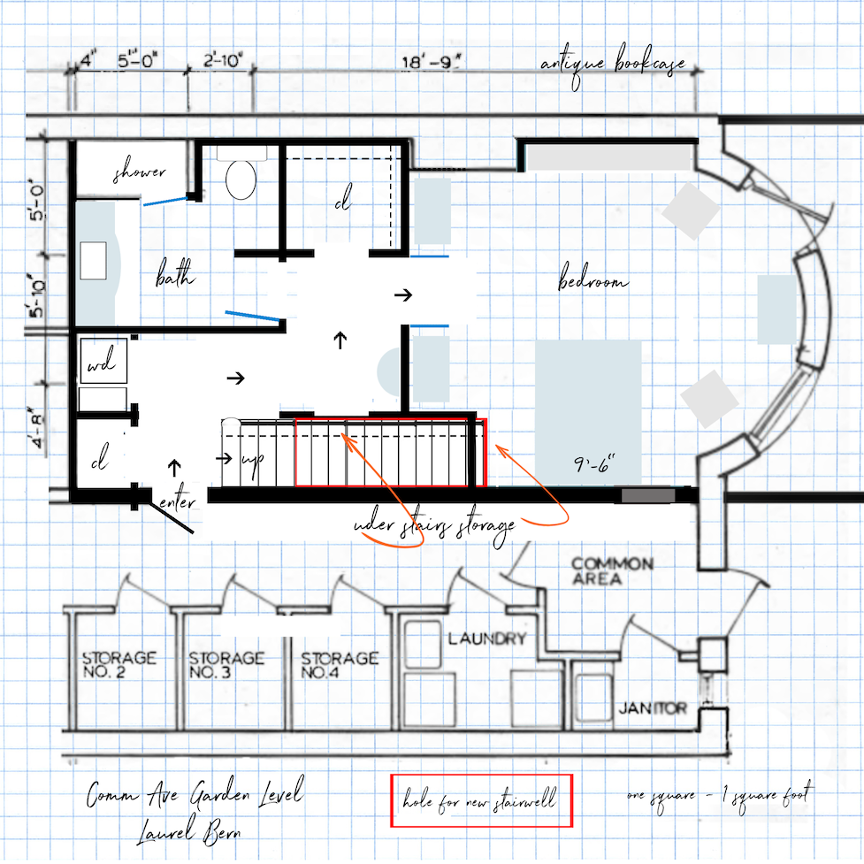
Okay, for today, we are going to focus on the mastress ;] bathroom design.
It is square, which I love. Some of you are going to be delighted to know that I’ve taken out the partition by the toilet. I don’t need it, and you’re right, it really was blocking off the space. Now, I have 36 square feet of uninterrupted space to practice my pirouettes.
Just kidding.
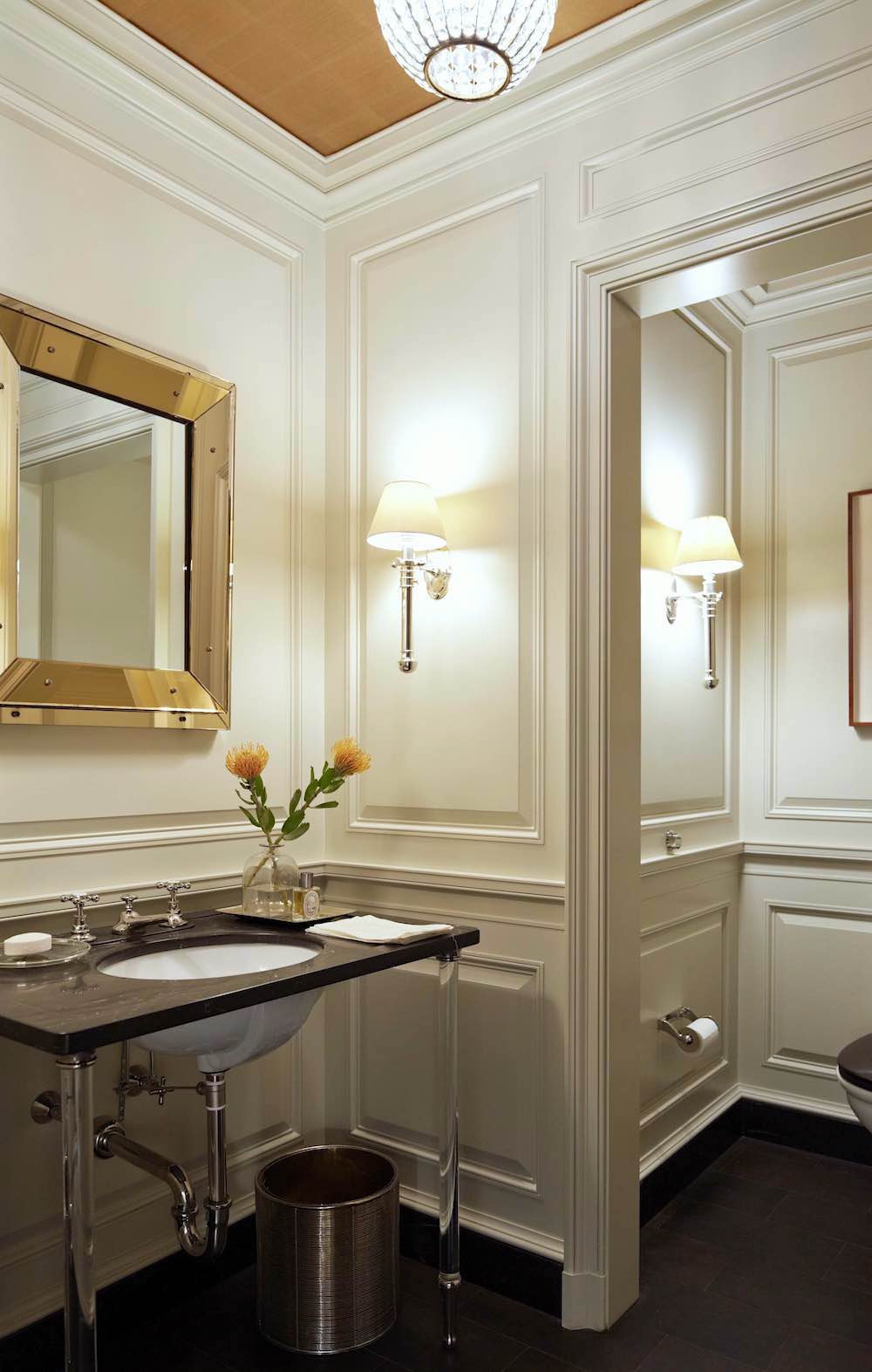
I believe I mentioned in the blog or maybe it was my “love note” to subscribers, that I’d love a “hotel feeling” for my master bathroom design, similar to the vignette above by my idol, Gil Schafer.
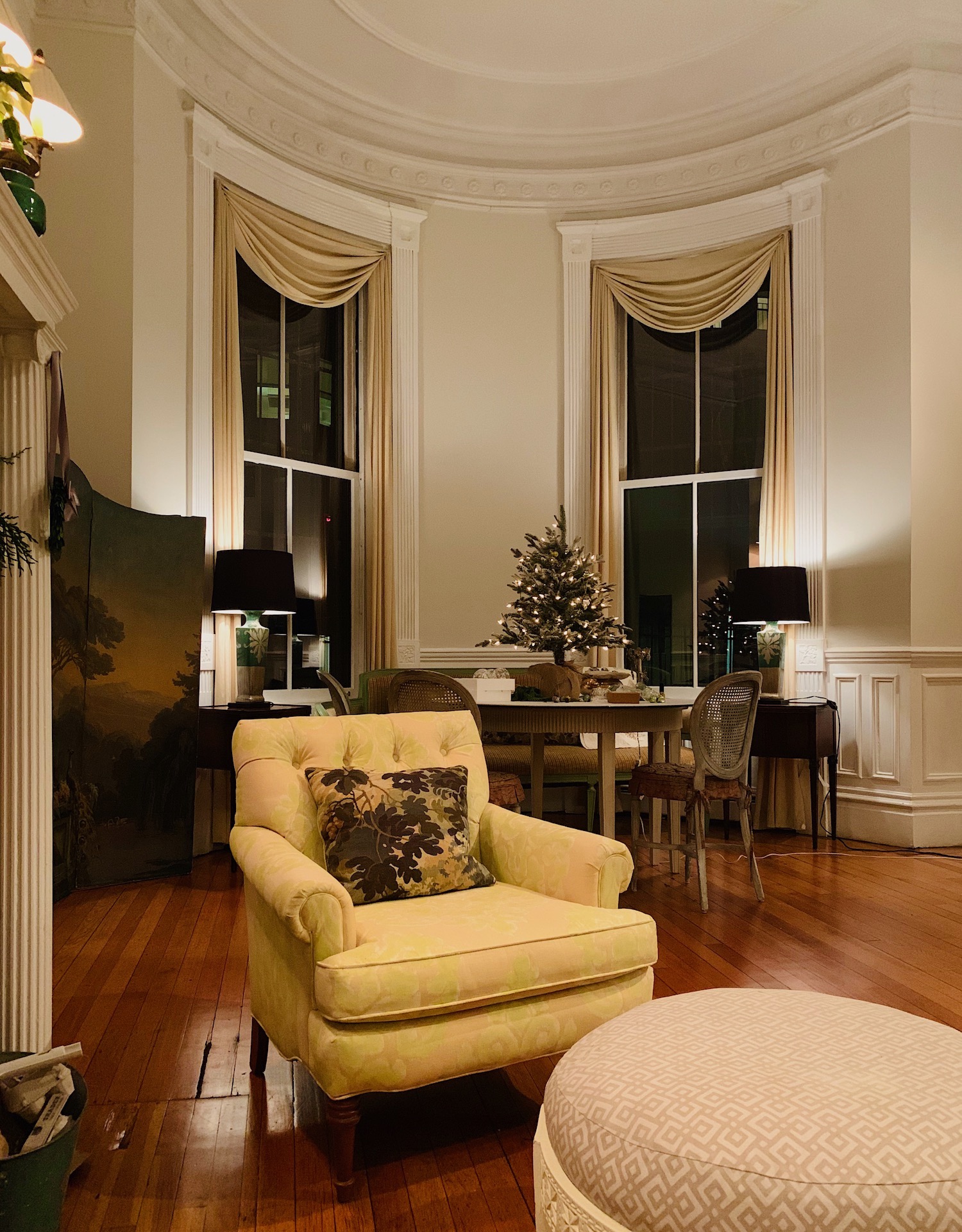
At night, with the lamps in front of my eight-foot-high windows, I’ve always felt like I’m sitting in an elegant hotel. That’s the feeling I wish to retain throughout the renovation.
What is currently there, is not my idea of an old, glamorous hotel.
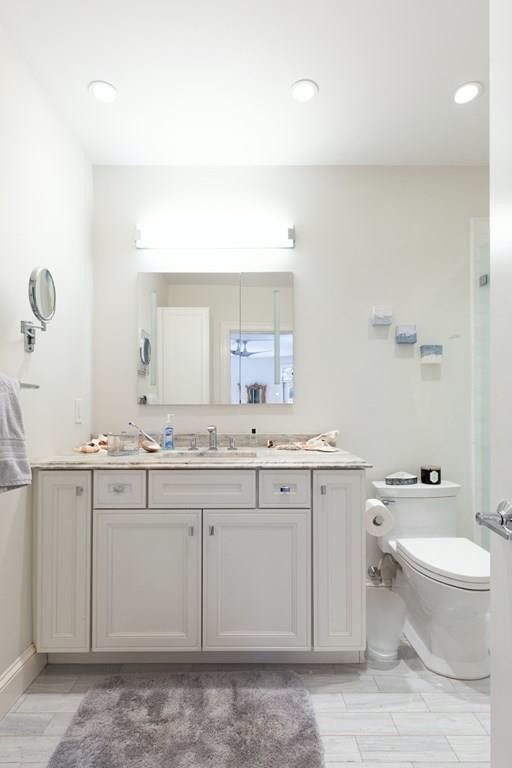
Above and below, my bathroom before I purchased the apartment. Even if I didn’t want to, it has to get changed because the wall needs to come over about 20 inches towards where the toilet currently is.
However, that entire space will be occupied by the bathroom vanity.
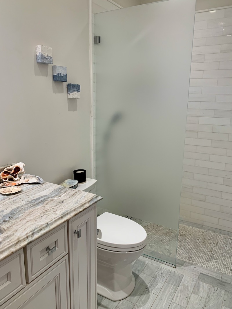
It’s funny, but when I first moved here, I couldn’t fathom the amount of storage in my new bathroom. Well, compared to the New York bathroom, that makes sense. In reality, it’s quite a normal amount of storage.
What I had was horrible. Remember the scalding pipe?
I plan on keeping the tile in the shower, except maybe changing the floor. I want a lighter floor, and it’s too gray. The entire bathroom is too contemporary for my liking. Some people would love it, and it’s not that it’s bad. But, it’s not what I envision for this 143-year-old brownstone in Boston.
What I want for my master bathroom design is something more like this.
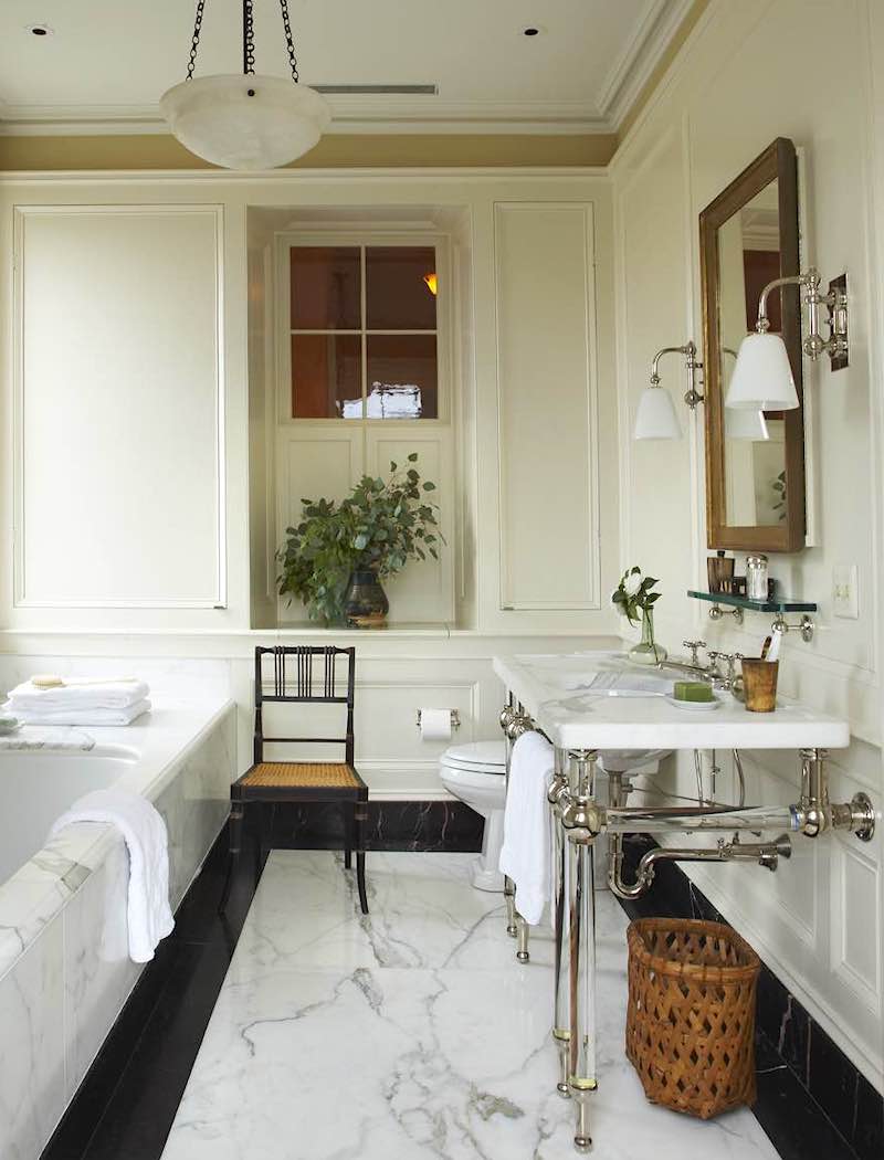
Yes, Gil Schafer’s giga-gorgeous bathroom for a home in Charleston, SC. There is his signature console vanity and fabulous classical detailing with just the right amount of detailing. One of my favorite parts is the interior window. But, here’s what’s extra special that could be overlooked unless one has stared at this image for about 150 hours, as I have. :]
There’s storage in the seat under the window, AND in the side panels.
See those tiny silver thingies? Those are for opening the panels!
Anyway, I’m stealing the floor and the interior window. However, I can’t make my wall this deep because of the doorway.
While I adore the console sink, I need the storage a vanity provides. So, let’s see some solutions for my smallish bathroom.
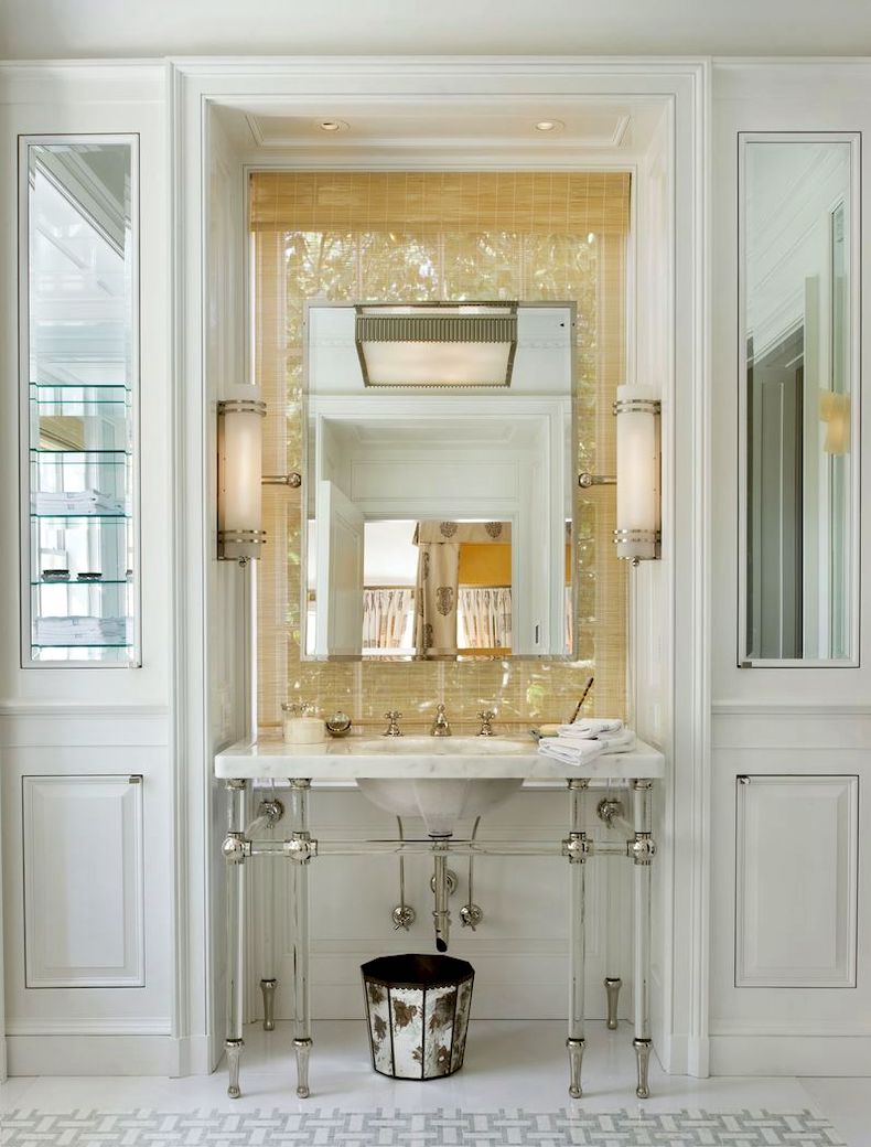
Another inspiring Gil Schafer master bathroom design. I love the niche and have decided I absolutely need one. Yes, the mirror is in front of a window. :] But, please observe. There are those little silver thingies again, flanking the sink. Yes, those panels open for storage. Brilliant!
Okay, then, let’s take a look at how I combined elements for sink wall rendering #1.
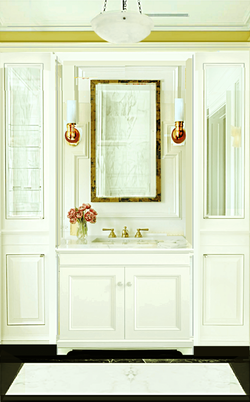
Here, you can see the case pieces flanking Gil’s sink above. And yes, I stole Park and Oak’s fabulous moulding design.
You can also see this bathroom featured in this post about dark bathrooms.
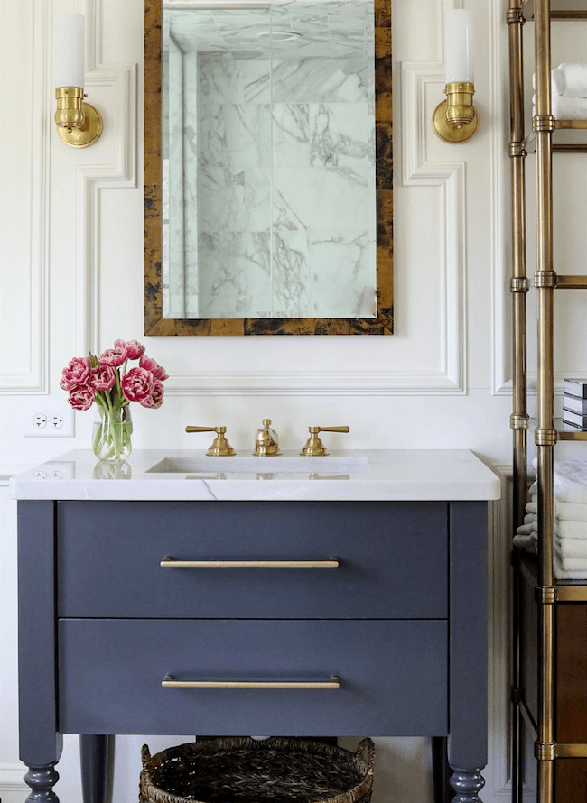
But, since I love stealing other people’s ideas designing, I collected a few more images I adore for inspiration for my ensuite bath design.
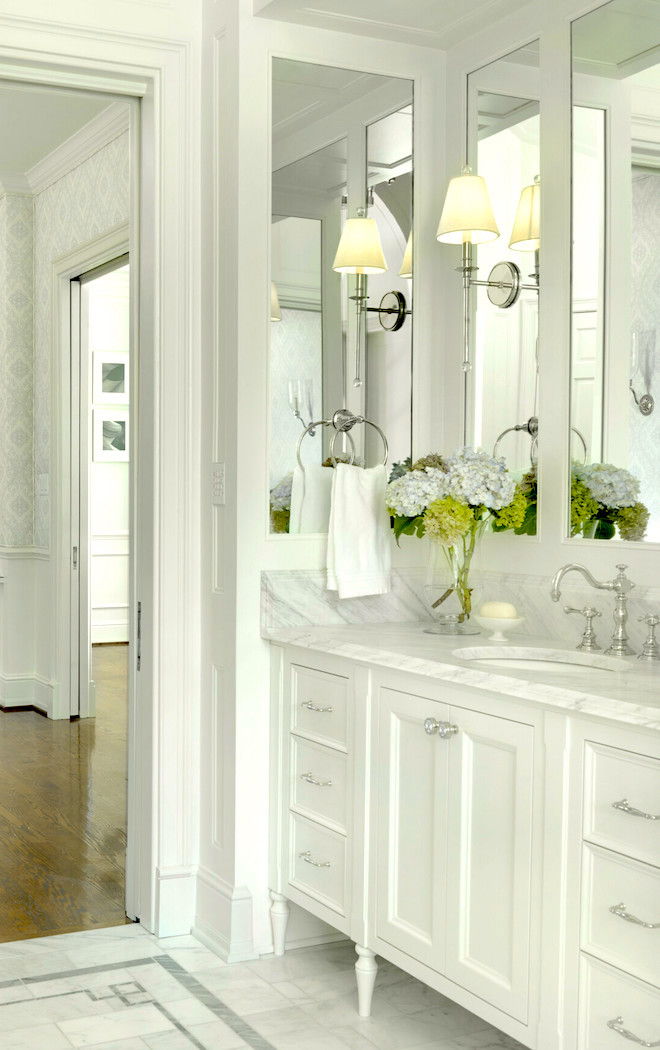
That floor reminds me of the Bronxville aster floor.
Maybe she stole the design from me? Oh, I hope so! I would be incredibly flattered.
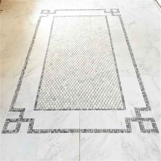
Oh, wait. No! Amy’s is similar but not the same.
My client wanted the hex tile. I did not; I prefer what Amy did. But, never mind. That vanity with the mirrors is gorgeous! And, there’s a little spot behind the side mirrors to have some shallow storage.
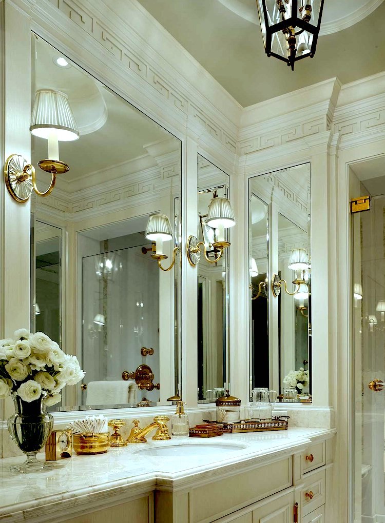
And, here we have this idea again. Sorry, I don’t know who to attribute this bathroom to.
While this one is a tad too fancy/glitzy for me, I love the basic idea of it. And, lookie here! There’s a gorgeous frieze design. It’s a Greek Key pattern, too! Oh, I think I see a brass thingy on the side mirror. This is the idea. The shower is also in the same location as mine.
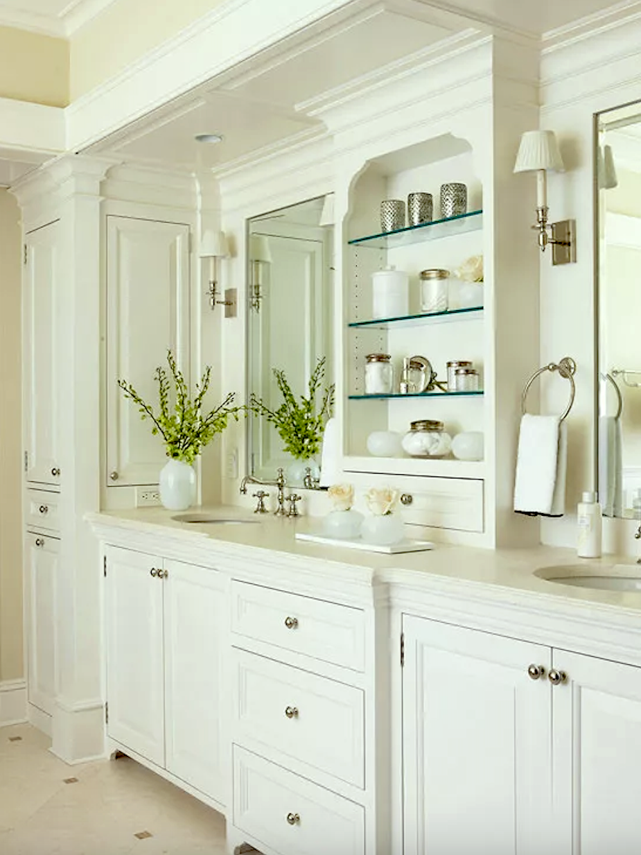
I’m posting this one because it’s such an architectural gem, and would be perfect for a master bathroom design. I really love the bump out in these two bathroom vanities. I didn’t get my bump out in the kitchen, which I’m fine with. But, I feel that for the new bathroom, I would like to have it. There isn’t nearly as much going on in the bathroom as there is in the kitchen. (To see what I’m talking about, please check out this recent kitchen post.)
Okay, there’s one more rendering coming up where I put many of these ideas into play.
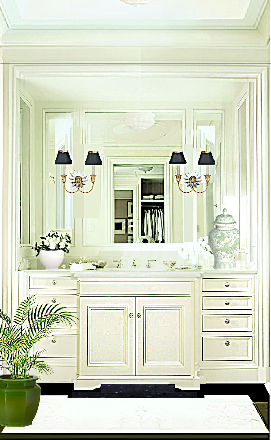
That’s it! There will be some tweaking. I will play around with the vanity design. However, I love this idea. If interested, you can see the real life bathroom that inspired a portion of this bathroom design.
So, let’s look at the floor plans which haven’t changed dramatically since last October, but a little.
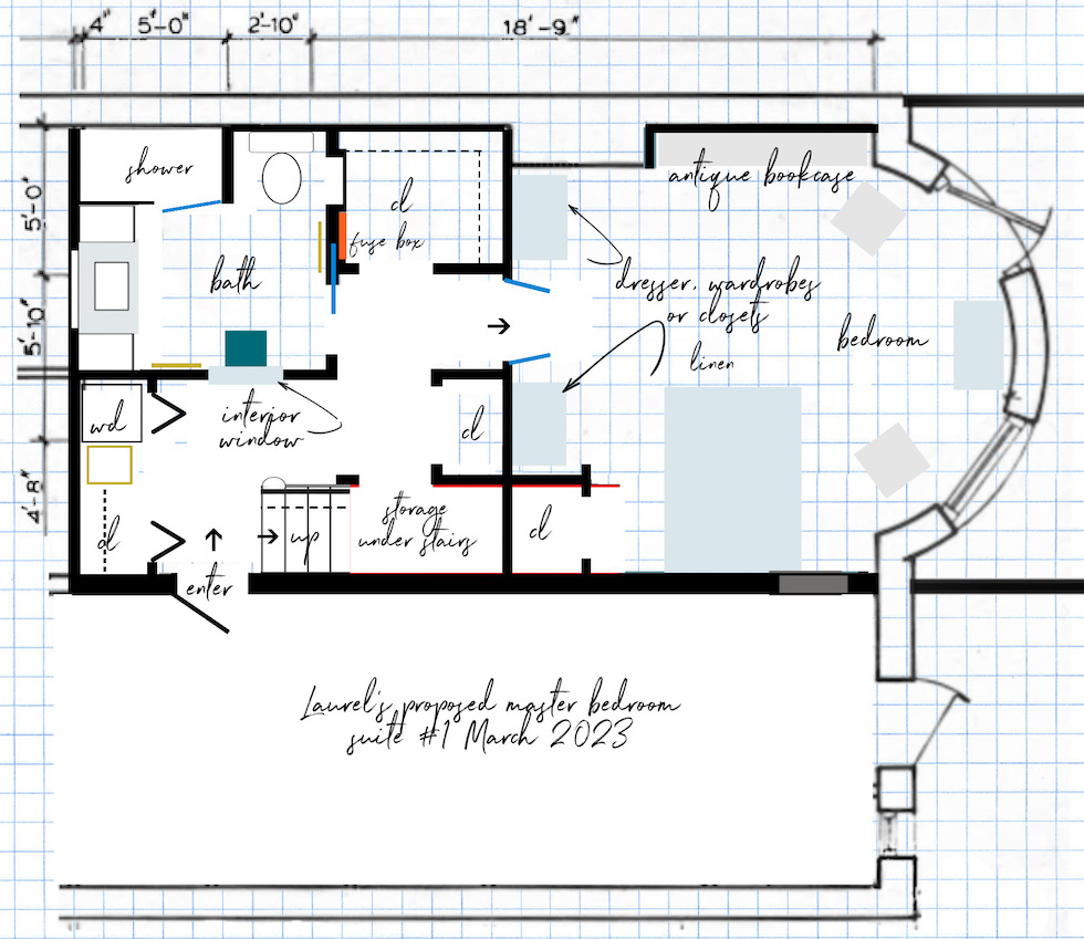
This is the floor plan for vanity #1. The sink area is 36″ wide. That’s certainly adequate, however, I’m leaning towards version #2.
I’ve added back the closet by the stairs. However, I still might leave it off in favor of a piece of furniture. still, I like how the twin walls create a beautiful entrance into the bedroom.
With this ensuite design, except for those two little walls, there’s only wall space flanking the window. And, not much there, either.
Please note: The closet next to the bed is underneath the stairs, but will be used only for things like luggage and other items seldom needed. It’s also a wonderful selling point for the apartment.
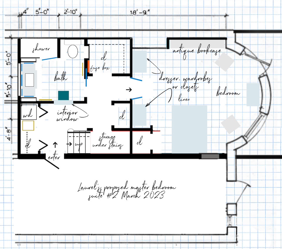
These floorplans have a few mistakes, but it gives a good idea. I’m happy with the designs.
Vanity number two is more spacious. I’ve indicated where the mirrors will go. This is going to make the light bounce around in a beautiful way.
I made a little niche by the toilet, which could have a door. But, there, I can put in extra rolls of TP and other toileting essentials, plus cleaning stuff.
The little teal square is either a small chair or stool.
Which master bathroom design do you prefer?
By the way, I reached out to my contractor last week, just before Cale arrived, to see how his schedule is going and if we are still on track for June. He got back to me the next day by email and said he was six months behind.
WHAT???
Only, I didn’t say WHAT??? With my heart in my stomach, I called him up and let him do the ‘splainin’. Two of his jobs have expanded by a lot. I could tell he felt terrible. However, I felt worse. So, I asked him if he knew another contractor who could start in June.
Without skipping a beat, Rick said, “Yes, I do! I will call him right away and see if he’s available.”
One hour later, I got another email from Rick, and he said the new contractor IS available in June. I looked him up. And he has hundreds of five-star reviews on numerous websites. Anyway, I’m meeting him this Friday morning.
You may exhale now. lol
Laurel, aren’t you going to interview other contractors, and get quotes?
Some would say I should, however, based on his reviews, he sounds amazing.
I wonder if he’s ever heard of an unkitchen?
Okay, that’s it for today. Hope you’re all having a great week!
xo,

PS: Please check out the newly updated HOT SALES!
Also, I am adding something new to the bottom of my posts. All you need to do is click this link.
(And, thank you to everyone who has already done so.)
Or, click the image I made below.
It will take you to Amazon. That’s all you need to do. If you order anything within the next 24 hours after clicking the link, I’ll get a small commission. (except for Whole Foods, liquor, and gift cards) There is no extra charge to you. The vendor makes less money. It would help me out a lot.
I have decided not to do a membership site. I know there were some rumblings about that. However, it’s too risky. Still, this is a business, and the expenses to maintain the website have practically doubled in the last few years.
Thanks so much!
Related Posts
 COTY 2023 – Two Companies – One Winner!
 The Most Amazing English Country House Of Them All
 Does Your Living Room Furniture Need To Go On A Diet?
 Yellow Walls – Why Do You Hate Them So Much?
 Hubs Thinks Farmhouse Style Is For Farmers- Period.
 How To Turn Bland Decor Into A Room Of Sublime Beauty!
 A Novel Way To Get Priceless Art Masterpieces For Cheap


