Dear Laurel,
Here’s my dilemma which I’m hoping you might discuss in a blog post.
The topic is How to put together room colors when working with a colorful sofa.
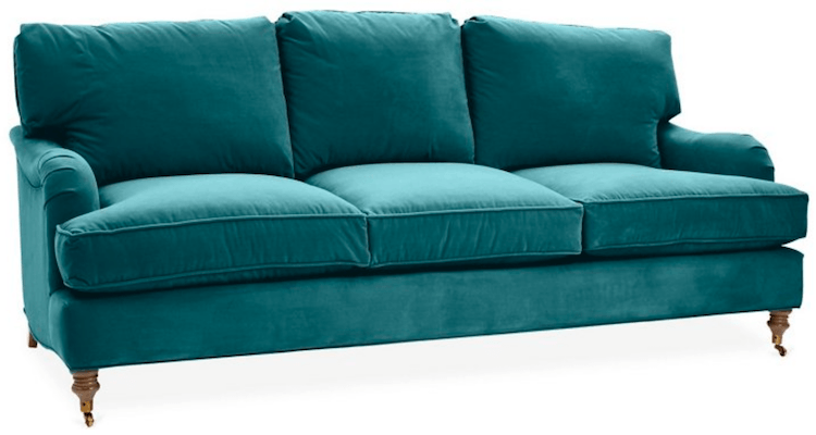
In my case, it’s actually the Brooke Sofa on One King’s Lane in peacock velvet.
For some reason, I’ve become obsessed with that color. But, I’m stumped where to go from there with the other room colors.
Would you consider discussing the pros and cons of selecting a bold color for a sofa?
For context, it’s time to retire my current sofa, which is slipcovered in a neutral sand-colored linen fabric.
I’m kind of sick of it. And, I truly feel ready for a big change. However, this is such a departure from anything I’ve ever had, that I don’t know where to begin.
Thank you for considering my question. I appreciate your time.
All the best,
Debra
***
Thanks Debra. Actually, there is a post from about 2.5 years ago that talks about a bright red sofa and how to work with it. And, I explored three ways to work with it. As I recall, you guys enjoyed it a lot.
But, here’s the thing. I chose three ways, but it could easily have been 300 ways if I wanted to spend a year working on coming up with that many possibilities.
Figuring out our room colors; the color palette of our rooms is one of the most difficult parts of decorating. I get it. We make ourselves crazy for fear of making a mistake.
That is why if you can figure out how to use picmonkey (there’s a tutorial here), you will have a wonderful tool at your disposal for visualizing how your color scheme will work together.
And, that is also the basis for the Laurel Home Paint and Palette Collection.
The curated Laurel Home paint collection consists of these 144 Benjamin Moore paint colors. And, there are 40 boards where I put the colors into palettes. All together, it took me an entire year to put the two part collection together.
But, getting back to how to figure out room colors with a colorful sofa, here is what I have always done when I get stuck.
I look for inspiration.
We recently talked about monochromatic color palettes and analogous color palettes. And, if you go to those links, you’ll find that some are pale, some dark and some are quite colorful.
Some designers only work one way. For instance some decorators love only pale muted rooms, or earth toned interiors. And, some love to work with highly saturated colors.
And, there are many designers in the US who love to work with saturated colors; like, Miles Redd and Katie Ridder, Sheila Bridges and Jeffrey Bilhuber for example
And, remember this post about Tony Duquette. His jewel-toned rooms are legendary in the world of interior design.
However, whenever I think of lots of color in interiors, the designers who frequently use saturated room colors. Well, we have to swim across the pond.
The British designers.
But, here’s the thing when it comes to English tastes in color and American tastes in color. They are as different as chalk and cheese.
Or, rather it’s identical to how most Americans feel about marmite.
You know that concoction the English love to spread on toast. Except that it looks like axle grease? They love it. We don’t have the foggiest why they would enjoy this barf-flavored substance. Apparently, you have to be breast fed marmite in order to enjoy it; if “enjoy” is the word.
Actually, I fear that I’m about to be shat on from a dizzying height.
So, I will just say that my wasband was rather fond of marmite. Or, rather veggie-mite– a slightly milder version. And, since we always had some on hand in the fridge, I would gingerly venture to have a little on occasion.
Admittedly, after the initial shock wore off, it began to grow on me. A little.
Well, I feel the similarly about how the Brits use color in their interiors.
Here, let me show you what I’m talking about.
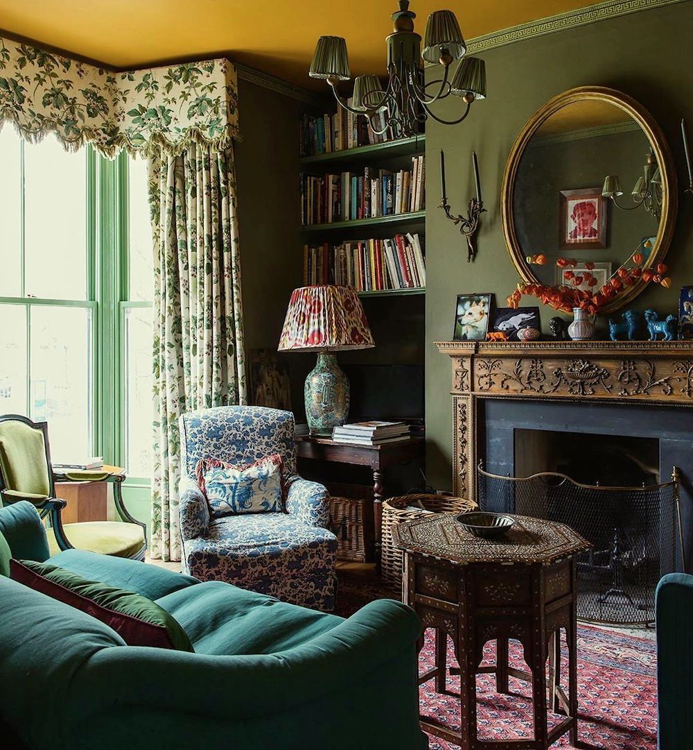
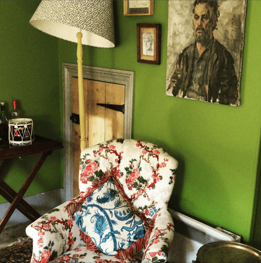
This is from the home of the illustrious British designer Gavin Houghton. You see, no American in their right mind would put the print from the draperies next to the print on the chair. And, then the print on the lampshade and the design on the base. All on top of each other.
But, in England, this is considered to be a delicious way to decorate; just the same as marmite.
And, then there are the colors. It would appear that anything goes. And, apparently bright mustard yellow is a neutral. Fine, it’s pretty Gray in the UK. I’ll give them that.
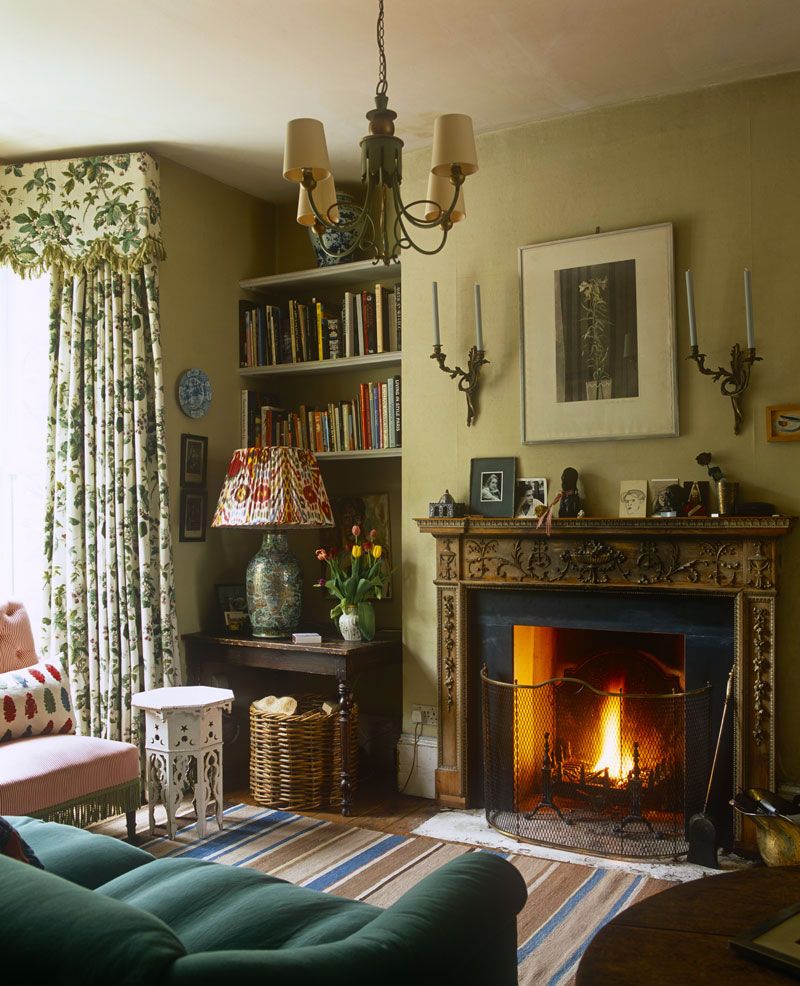
Now, I found what I believe to be an earlier iteration of the same space. I prefer this version. In fact, I love the wall color!
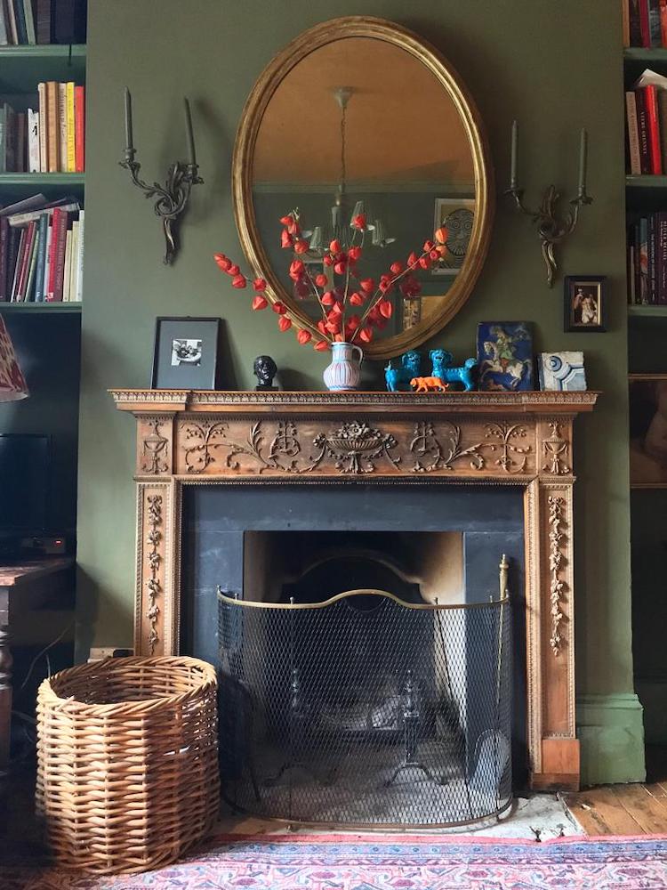
And, how sublime is this vignette with that exquisite fireplace mantel from Jamb.
I also featured Jamb mantels in this post.
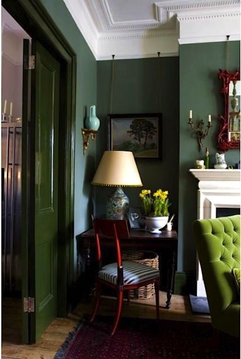
I did not know until today that this very popular vignette is also Gavin Houghton’s work. The other side of the room features bright yellow draperies.
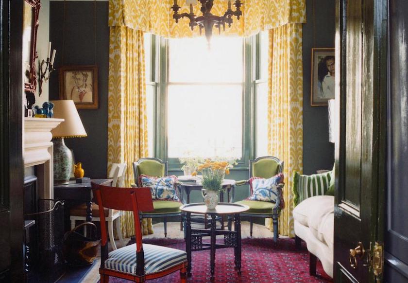
See? An American would never put that pillow on this chair, in front of that bright green wall color. For us, it’s like eating oysters topped with BCP (banana cream pie). Both are lovely; just not together.
But, who am I to say?
And, in the scheme of things, I am truly not bothered by this. However, I know that some people are. In fact, I’m quite sure there are readers at this very moment having an apoplectic fit because the lamp shade is crooked. That is, unless it’s meant to be like that.
Apparently, they do some things differently over there. But, they are the most charmingly kind folks, I have found. I still have the fondest memories of my trip to England.
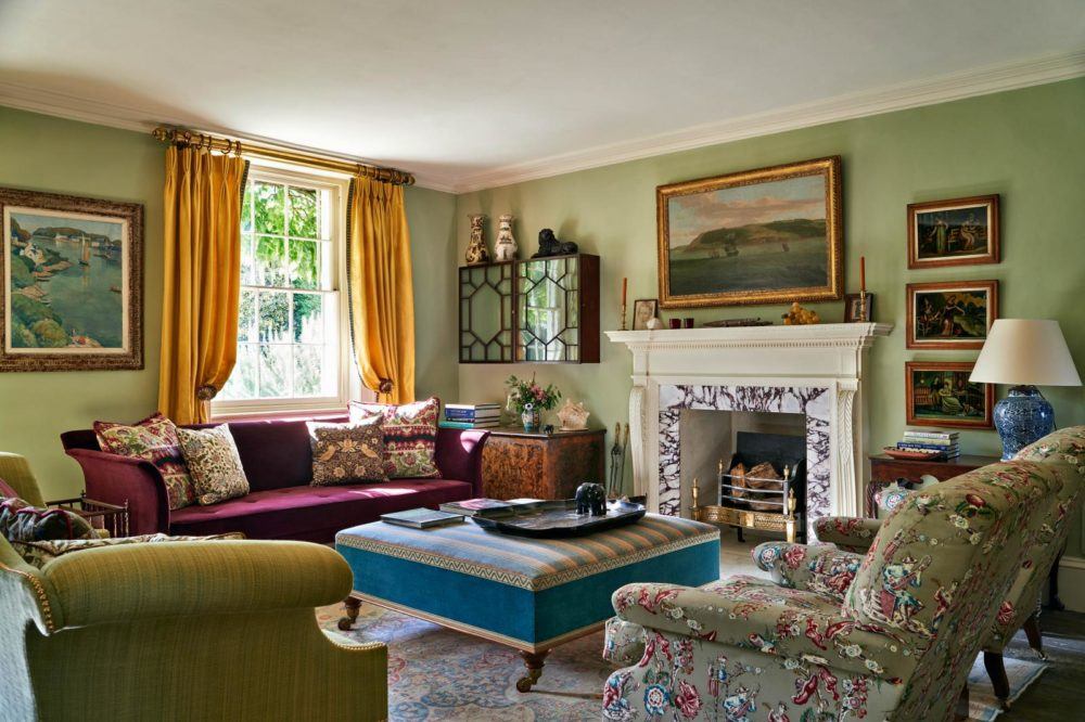
This is from the website of the wonderful furniture maker and antique collector, Max Rollitt. Remember? He’s the one who created Ben Pentreath’s fabulous yellow sofa.
Speaking of Ben. Remember when I cracked his paint color code? (or, at least tried to)
Still, most Americans are going to be confused by this room.
I kind of love it in a masochistic kind of way. ;] It hurts a little. But, it’s a good kind of hurt. Actually, I genuinely love the wall color and ALL of the art. Love, love, love!
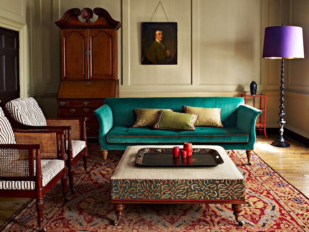
Another Max Rollit space.
What do we think?
Somebody is having fun with us, I think.
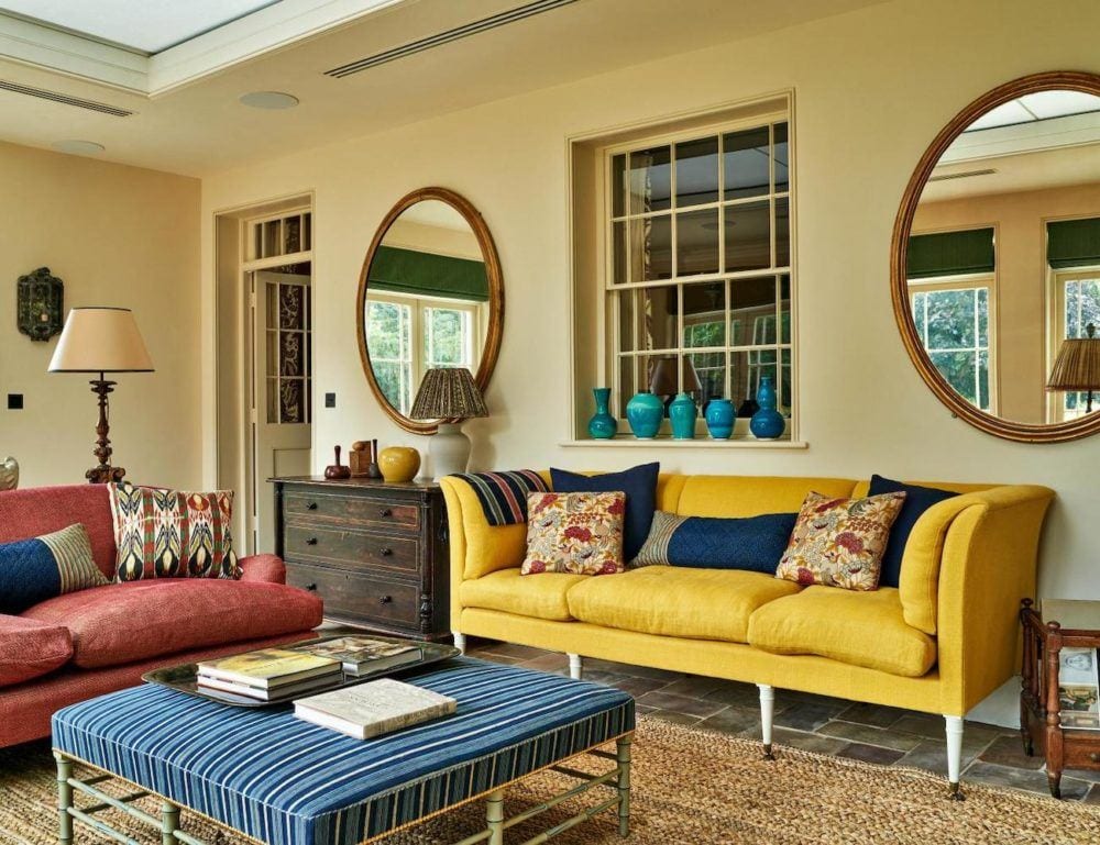
@tom_mannion_photographer @houseandgardenuk – @max_rollitt – all on instagram
One last one for Max Rollitt. This is not a common color scheme in the states. But, I think that most of us Yankees would find this to be quite a jolly room.
In my internet travels, I found another British Designer with some interesting work.
She uses very little pattern. But, there is often, the same kind of quirky color palette in her room colors.
Her name is Beata Heuman
This is Beata’s beautiful instagram account.
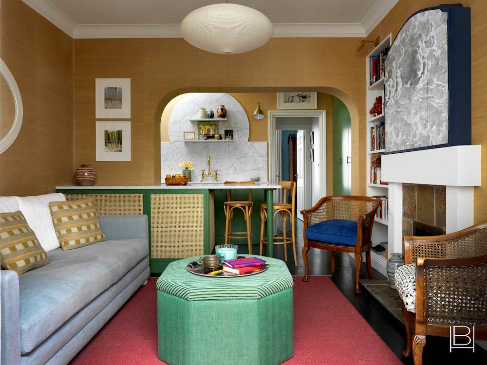
I don’t know why. But, I don’t mind this. And, actually, I bet these colors are wonderful at night. Plus I like the mix of cool and warm.
And, what a cool TV concealment. Recognize Cole & Sons wallpaper?
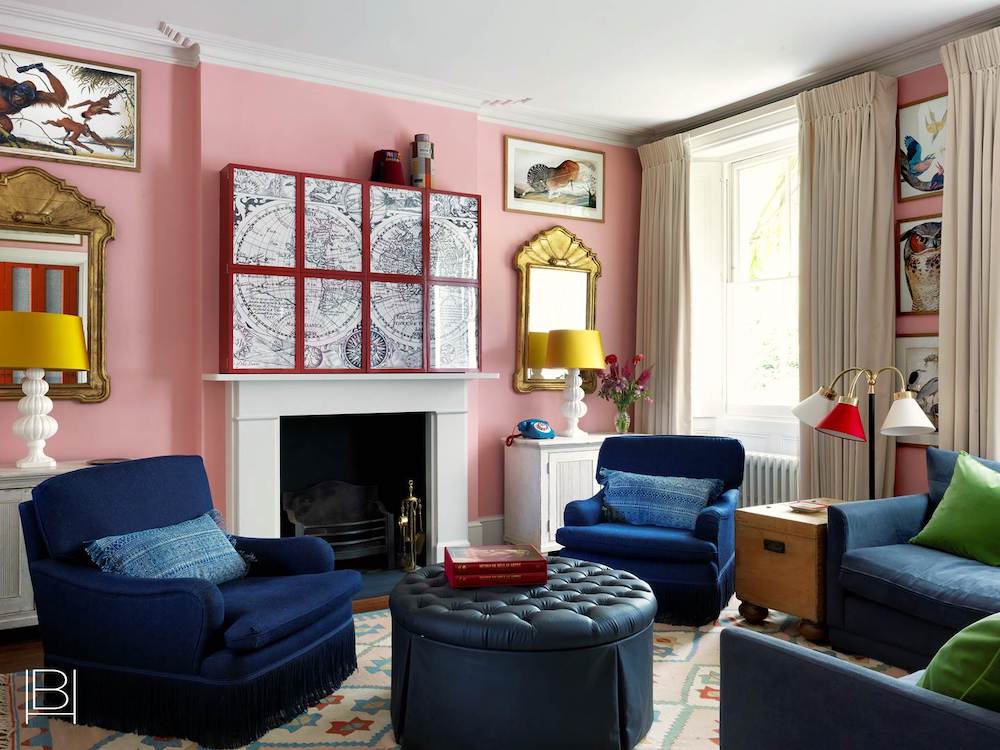
What do you guys think of this space?
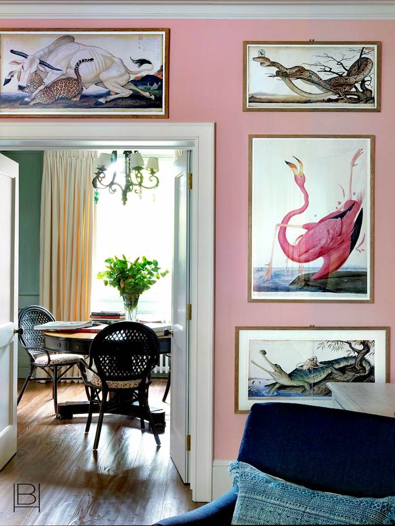
I do love this view in another one of Beata’s lovely spaces.
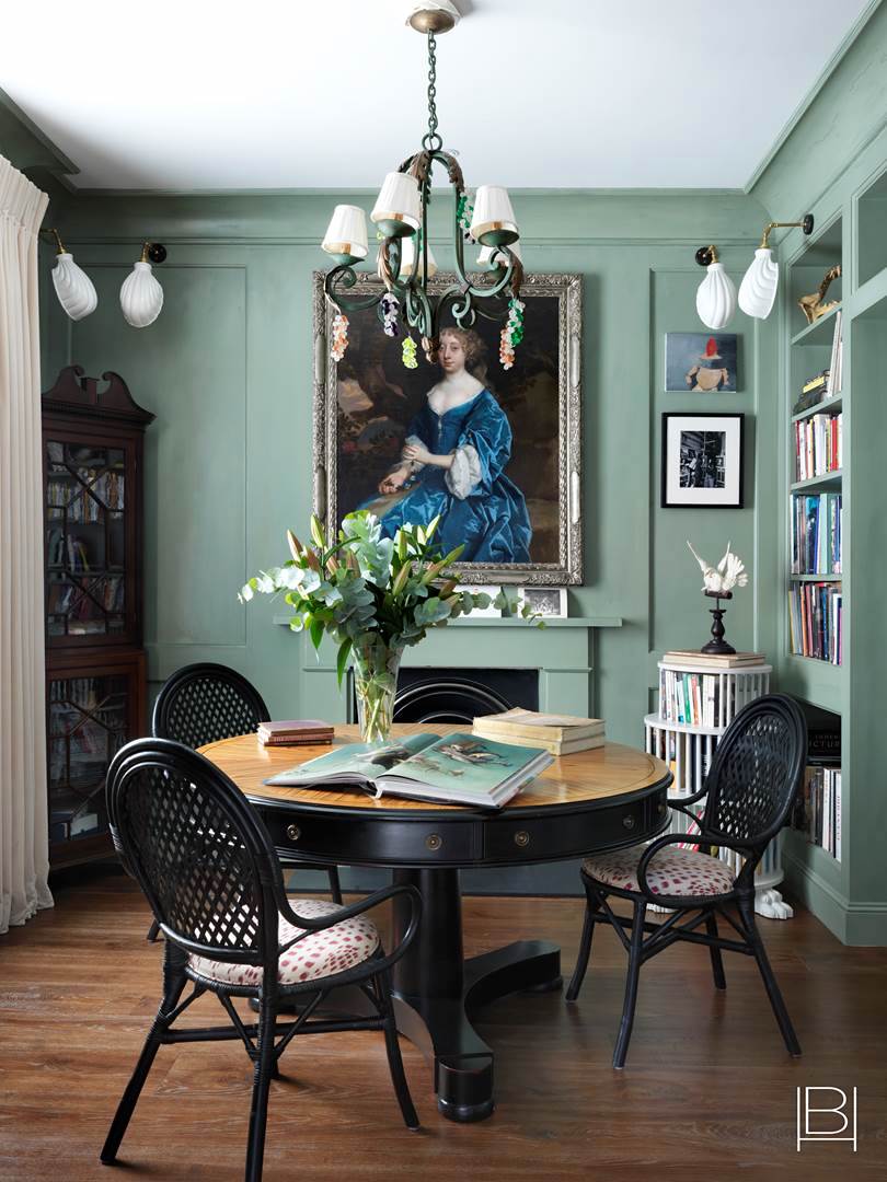
Gorgeous!
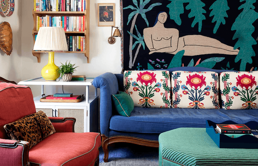
Love this colorful living room that Beata did.
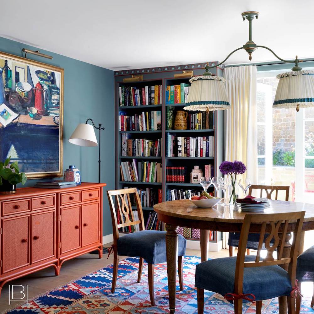
And, one last colorful Beata Heuman interior with interesting room colors.
The lesson could be that we need to learn from our British friends how to just go with the flow more.
Besides, I do think it was wrong of us to dump their tea into Boston harbor. Pardon me. I mean harbour. That was quite a childish thing to do. Don’t you think?
Fine. The tax issue was a little draconian. But, I guess what’s done is done.
Well, Laurel. Are you going to get to the peacock colored sofa?
Yes, right now.
One reason I decided to do this post is that I just happened to have done a Laurel Home Palette Collection board with a teal sofa. I made this in the fall of 2016.
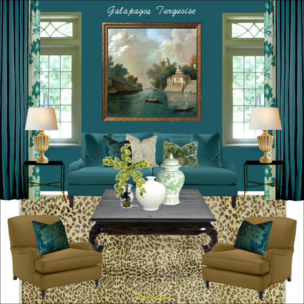
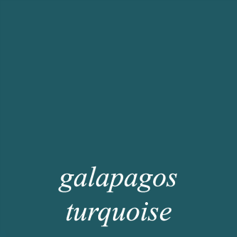
galapagos turquoise 2057-20
Here is the palette I made for the Galapagos Turquoise board.
But, there are also other palette families that can be mixed with these colors.
For example.
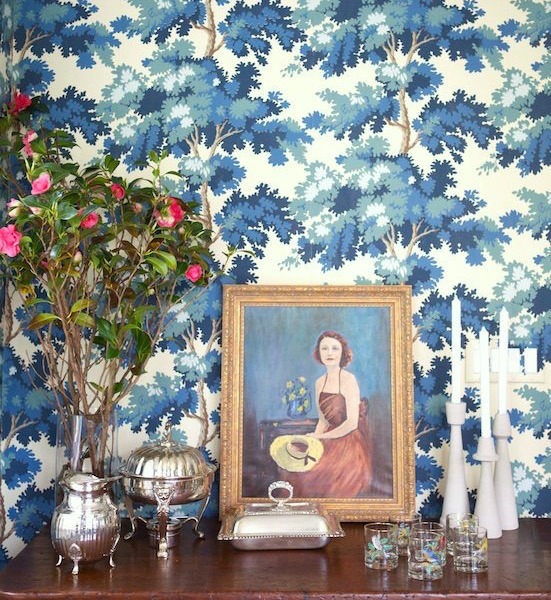
Remember this board from the other day?
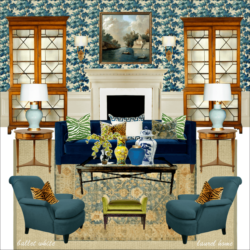
It’s the board that uses ballet white as the paint trim. Oh, by the way. Sorry, some of you wanted to know that wallpaper. That is Raphael by Sandberg.
You can purchase the Raphael by Sandberg wallpaper here, if interested.
And, you can see it in another color way in this wonderful bathroom.
And, more of the bathroom with the Sandberg wallpaper here.
Well, Laurel, is there anything else you can do besides teal walls with a teal sofa?
Sure, you can do fuchsia walls, if you like. Or, orange, or lime green.
Well, what if I want a teal sofa but I don’t want a deeply saturated wall color? Is it possible to do a pale wall.
I knew you were going to ask that. So, I came prepared. :]
But, first a little background.
Some of you may recall that early in December 2018, I attended a luncheon and interview with Charlotte Moss in Manhattan.
Before the event started while we were chatting, the most darling young woman came running up to me with her husband. I mean she was absolutely gushing and fan girling all over me. It always tickles me because I just see myself as this aging former housewife from Westchester County NY.
Well, let me tell you… It should’ve been me fan girling and gushing all over HER. This girl is the real deal. Super talented. The freshest newest trad out there.
And, I’m so happy to have an opportunity to share her instagram and website with you. Her name is Alisa Bovina
Her instagram handle is @aglassofbovino (please be sure to follow her)
And her website is A Glass of Bovino
So, in answer to your question. Yes, absolutely. You can do a pale or even a white wall with a deeply saturated sofa and other furnishings. But, like everything else it needs to be balanced out with architectural elements and art.
And, some other strong elements in the space.
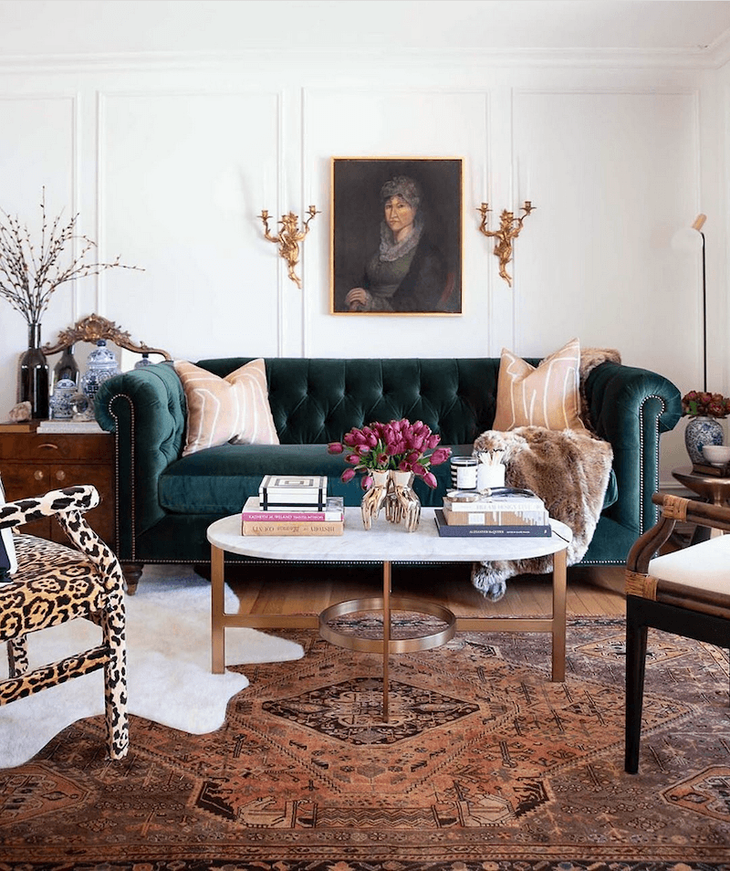
Alisa did this spectacular living room for the One Room Challenge last year. And, she’s done other rooms, as well. I love all of them. Just gorgeous. That bathroom! I’d hire her in a nano-second. By the way, yes the trim is from Metrie.
Oh, and the sofa. It’s not quite teal, but almost.
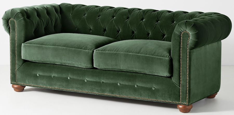
Well, this classic Chesterfield is from Anthropologie. It’s available in numerous colorways. And, there’s also a three-seat version.
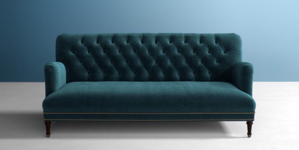
I also love this teal velvet sofa by Anthropologie
And, I have a couple more images to share with you that I found on One Kings Lane. They are currently have a wonderful 20% off sale on their beautiful upholstery. And so, is Serena & Lily. For more of my favorites, you can go to the HOT SALES page. Or, go directly to the websites.
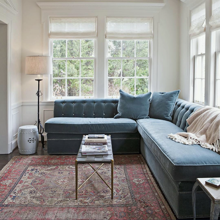
Another favorite of mine is this pretty blue-gray sectional by Rachel Halvorson
Oh, my. May I be excused?:]
Hope this post was helpful in terms of working with more saturated room colors.
You might also enjoy another favorite post from a year ago about 25 colorful home decor vignettes. These are always so good to read at this time when we long for spring to arrive!
xo,
PS: Please check out the newly updated HOT SALES
Related Posts
- How To Achieve Furniture and Color Balance in a Room
- The Color Orange – Love it, or Hate it?

- The Best Upholstery Fabrics For Pets and Slobs
- Affordable Chinoiserie Murals & Panels + Sources!
- A Long Narrow Hallway – Help For A Dark Scary Mess
- Quick-Start Interior Design Guide 2019 – Plus News!
- How To Decorate A Blank Long Living Room Wall
60 Responses
Hello Laurel, Could you possibly say who is the designer of the beautiful teal room with the red Chinese Chippendale chair that you used for the post photo (it doesn’t appear in the body of this article itself but is on the page with all the blog posts and is the photo you click on for this article). Whew, that was hard to explain. 🙂 Thank you in advance. -Laura
Love so much about this post and I really enjoyed Beata Heuman’s spaces. Our sunroom has a teal sofa with light tan walls and a peaked navy blue ceiling. We love it.
Will do!
LOVE!! these types of lampshades too. I found some at Ballard Designs that are similar and aren’t too expensive. They are on sale too.
Debra, I love the Brook chairs/sofas in the Peacock. I was really close to ordering them for my library/study room to go with a rich red oriental carpet. They are so luxurious looking in the velvet. I went with the Brook chairs in the Indigo Crypton because this is in a house that I will be renting on occasion in a vacation town. Please send photos of what you decide to do!
This is one of my favorite posts, for it speaks to my own style of decorating. I never want things too precious; a little shabby with lots of color and pattern is definitely my jam. Robert Kime is nothing short of brilliant, in my book. Your photos and comments about each of the designers you mentioned made me smile. I too would love to find some of those beautiful pleated lampshades but every source I’ve found thus far is insanely expensive.
Thanks, Laurel! You have brightened my day, once again!
Too funny … currently I’m trying to decide on a living room wall color to go with my light blue velvet sofa. In fact, my sofa is also the Brooke from OKL. It’s sooo comfortable, and I love the English roll arm look. Highly recommended! We’re moving to a new house. In our current house, our pale blue LR walls look more gray against the dark stained wood trim. The new house will have white painted trimwork. I’m considering going with a moody smoky blue on the walls (darker than the sofa) or the same pale blue, which will look bluer against the white trim. I’m sort of feeling a moodier room, but having hard pulling the trigger.
IIRC, I was first drawn to your blog through posts on color, so of course I love this one. I think you’re right about the gray weather influence in England. It’s probably also those gorgeous gardens. Things I struggle to keep alive grow like weeds there. Brits’ way with color to me has its parallel in their architecture, where as with color, they seem to excel at assembling seemingly disparate elements from different eras and cultures into a coherent whole. I think the appeal to me is in seeing multiple generations’ influence in harmony in a single space. Of course, not everyone sees it that way; my mother always took a hard step back upon seeing patterns mixed. As always, you’ve clearly invested substantial effort in finding the perfect images to make your point, so I want to thank you so much for that.
That room with the plum velvet sofa? That’s my jam!
As a subscriber to 3 British magazines, love and appreciate allll. (Ahh… the lampshade slightly askew…not so much.)
I eagerly await your posts each week! Love these beautiful, colorful British rooms and designers you featured and the work of Alisa Bovina. Your own boards are always gorgeous and inspiring, too.
Laurel do you like warm and cool mix in a bathroom too? What color would you paint walls if you choose Carrara marble? Cream or grey paint? What is your take on it????Do you like marble floors? Too many questions please don’t hate me I love you!
I must be British! Your post finally explains why I don’t feel comfortable unless there are many colors and patterns in a room. Plus my love for Persian rugs.Thank you, loved this post and the two boards. As someone else said, it’s hard to try to fight your innate preferences and biases, so it’s nice to see rooms that look like mine only better
Wasband. That’s funny, Laurel!
yeah……………………
What???!!! Laurel I am so so honored that you shared my living room. I have learned so much from you and have gotten myself lost for days while reading your blog. Most of what I know hasn’t come from school, but from you 😉 haha! Thank you again!!
Hi Alisa,
I meant everything I said. Your home is stunning! Hope our paths cross again very soon.
Omg!!! Debra needs to buy that sofa! Laurel, I looove your blog! You are so inspirational and funny. I just discovered your blog last year and I am a devoted reader.
Thanks so much Leigh!
Susie – I would LOVE to know the answer to this, as well! I’ve found a few places but they’re outrageously expensive.
Hi Kim,
Please see below. Those are expensive too.
As the owner of two peacock velvet sofas and two cobalt blue sofas – I love this post. I have had the teal sofas 10 years and am not even close to being tired of them – they look great with every color- pinks, greens, browns, other blues, creams – and I have colored walls .
I have often referred to your home paint palettes and paint colors – love both of those.
I tried to follow much of your advice when we moved to our current home 3 years ago. Thanks for your great blog.
Hi Julie.
Absolutely. Teal is a neutral! It goes with everything.
Laurel – when I first skimmed through this post I thought it was YOU who had fallen in love with the peacock sofa. I was thinking it would look amazing in your yellow living room – what was the fuss ?
Hi Andrea,
Well, I just double-checked. But, yes in the palette collection is a Hawthorne yellow palette. And, yes, I put in a teal sofa! I also added in photos of my chairs. And, I have my reproduction painting over the fireplace mantel. Everything else pictured in the room is different from my living room.
where does everyone get those custom pleated lampshades in custom fabrics?
I believe that Ben Pentreath sells them in his shop in London. So, you might look on his website. Pentreath & Hall
I love your Galapagos Turquoise Room photographed above. Can you tell me about the painting above the sofa?
Thank you
Hi Ann,
Well, I created the painting from a piece of wallpaper or panel. Something like that from Ananbo. It’s a French company. And, then I “put it in” the frame. Each of the boards I did and the accompanying information; usually three or four pages. Plus creating the palette was from 10-15 hours of work. When I look at my guides now, I have no idea how I did it. haha
Laurel this is such a fun post!! I have to say… I didn’t know what my style was, but apparently it’s “Gavin Houghton” 😀 I don’t like “cluttered” rooms exactly, but British eclectic sounds about right! The color, the texture, the we’ve had this around so long we’ve gotten quite used to it feel. This was an empowering post since I often feel tempted to “fight” what I want because of the classic beauty of white-on-beige.
Hi Laurel,
I’m all for a brightly colored sofa. Life’s too short to live with beige! If you fill your home with things you love, you’ll be happy.
What a wonderful post, Laurel, but I enjoy all of them! Loved seeing all the colorful British rooms, a bit much for me but very inspiring! I enjoyed some of the quirky art in Beata Heuman’s rooms. I’m on the lookout for her flamingo and the alligator, or is that a crocodile!?!
That is a really pretty sofa and it could be smashing. Loving and committing to one big thing can really make a room.
Miriam Killam of Colour Me Happy in Canada argues that having a colorful sofa is actually more classic than getting one in the neutral of the moment, especially if you really love it.
https://mariakillam.com/colourfulsofa/
Her own living room features a bright yellow sofa paired with raspberry curtains.
Thank you, Laurel! This is a wonderful article and so appropriate for me. I have two darkish emerald loveseats that I am in love with. I had been hesitant to buy them because the conventional wisdom is the keep the larger pieces neutral and add small touches in your favorite color(s).
But I have found that having bright color in a large piece makes me truly happy. So thank you for all your thoughts and ideas. My home has now been developed into the perfect one for me.
I enjoyed this article and all of the photos. I love these kinds of rooms from the British examples. They are cozy, rather Miss Marple-ish, and take me back to my one trip to England 50 years ago! I’ve followed Nora Ephron’s advice from her collection of essays called I Feel Bad About My Neck. She advised sticking with a beige/taupe/tan sofa and using colorful pillows for enhancement. I have zero creativity, and I find this is the way I can achieve a pleasing room, pleasing to me, at least.
Laurel, I forgot to ask in my recent comment. For these luxurious velvet sofas or any sofa for that matter, have you done a post on pillows and how to mix the colors, patterns and fabrics. I am seeing some crazy mixes and love it but I am just trying to figure it our for my green velvet sofa. Is there a formula? : )
Here’s a post about throw pillows.
This is an interesting post. I was surprised to see how differently these British designers do interiors.
Not my cup of tea! Lol.
I was struck by the last Max Rollit room. It has a yellow soda and a red one and a blue coffee table. The three primaries. I find this triangle of colors always makes a room feel more ‘juvenile”. Which might be great for a living/family room for a family with young children.
I loved both the options for the teal sofa that you gave. It would depend on what else is going on in the house as to which one I would choose.
Thanks for a fun post.
I love color and I enjoy the richness of a contrasting mix of patterns. I have a large paisley sofa with some richly patterned pillows. It’s sitting on a lively Persian rug that definitely clashes, and there’s a leather chair nearby that’s usually covered by a dark paisley throw. The walls are golden with a “venetian plaster” effect. It sounds wild, but people tell me it works, and we find it cozy and interesting.
I imagine there can be a huge difference in effect between looking at a colorful, lively room in photos and actually being in the room. Up close, the “clashing” fabrics and colors in Max Rollitt’s rooms may seem much more cozy and fun. If you aren’t objectively analyzing a room from a distance, but are sitting in one of its chairs and taking in the space from one angle/viewpoint at a time, you’re going to have a different impression. I’ll bet that detail shots from his rooms are less problematic for typical Americans. I wonder if he doesn’t rely on a color/design board but works very actively in the space, adding and subtracting pieces, patterns, and colors until he’s hit a happy, layered harmony that is his style. And I notice that his “clashing” patterns may vary in color, but very little in terms of style, mood, or scale.
At any rate, his rooms make me feel less like a weirdo. Glad to know my taste is “British”!
Hi Laurel -So glad to see this post. Last week, I finally bit the bullet and ordered 2 Emerald Green Velvet English Roll arm sofas I have been drooling over for a year. They will flank each side of my white brick fireplace. I love the leopard rug you paired with the teal sofa and I would like to get one to layer over a very large jute rug I have for some pizzaz. Is this a OKL one? Would love to know where to purchase.
First off… “aging housewife from Westchester County NY” !!!! This is your BEST comedic post EVER, Laurel! You had me laughing all the way through. Have you ever considered stand up comedy? No? I didn’t think so. But you really should! Gorgeous, gorgeous post (as usual). You know, the Brits are a bit curious to me. As I was reading this post, it occurred to that I have usually found that the Brits seem to be much more subdued, stiff, proper, stoic than most Americans, not revealing how they REALLY feel. I hate to generalize, but at least that’s how they come across on the tv. haha. In their decorating, it’s like they just “let loose”. Let it all ago. Loosen it up. Anything goes. Americans seem to be the opposite. Much looser socially but very “everything must match” and look perfect and lots of rules in their decorating. Much more refrained in style and color. Interesting to me. I love the English style of decorating…for the most part …Robert Kime, Ben Pentreath, Rita Koenig are a few of my favs. Such a beautiful and HELPFUL as always post from just a little ‘ol “aging housewife from Westchester County NY”. Yeah, right, Laurel. “Just”…hahaha! You’re a GENIUS in our books! BTW, this is Kim from the bossy builder post you did in December (if you remember). If you don’t it’s ok. haha. We finished up our new wall enclosing our living room from our entry. Just have to trim it out, drywall, and paint. Really pleased with it. And thank you again!
Wow, what an interesting post, Laurel! I had no idea the Brits liked so many colors all together like that (although I was dimly aware of the marmite thing—ew!). I think that each person has their own color personality. You might be influenced one way or the other by your surroundings or by what’s available in the stores, but if you were born a “color” person, don’t try to change it, just go with it! I think of my everyday dishes. They have a design in a fairly saturated blue, edging toward periwinkle, on an ecru background. The conventional wisdom out there is that only plain white dishes are stylish and timeless. Well, I bought those dishes almost 20 years ago, and I still love them, and I’m still not sick of them, thank you very much. [This is not an advertisement, but they are Pfaltzgraff Villa Flora.] White looks great in someone else’s kitchen, but in my own everyday home, I find white dishes terminally boring. You can do a lot with a teal sofa. Don’t let other people tell you what you “should” get or what you will “definitely get sick of” in a year.
I agree, Laura.
These rooms all look very appealing to me. I don’t think they would have a few years ago. Why is that? Could be that they reflect the state of our country? If I surround myself with something similar in my living environment, will that make the unresolved lunacy of our current governmental/political situation seem a little less insane…? Kind of like the British drink hot tea even in the summertime, and it’s the warm southern countries that tend to have very hot and spicy cuisine.
Thank you for this post. I’m getting ready to repaint and redecorate. My current palette looks a lot like the saturated English designer photos. I have been tempted to go completely neutral as a reversal with pops of color in pillows and art only. I’m now considering a bit more more boldness to include deep lagoon-colored barrel chairs (Room and Board) on neutral linen/taupe area rug (Coba, Ben Soleimani) with off white linen sofa (Oyster, Maiden Home) black, metallic gold and maybe coral accents (like the gorgeous roses pictured). I’m enlightened in a good way I hope!
Most of us Americans with English ancestry don’t inherit a taste for marmite or great pieces of furniture. Here’s the thing with the British. They don’t throw anything away! So, of course they compose rooms of overstuffed chairs from grandma and an obviously Indian coffee table from when great-grandad served there, the last year of the Raj. What Americans look at these rooms and envy is their sense of undeniable history that tells a compelling story of not just them but their families. Also, the fact that many homes in Britain are a century or more old and have that unmistakeable air of age that lends a verisimilitude and gravitas to even the most cheerful of interiors is something the most talented builder and designer would have difficulty emulating.
While I would never take a bucket of spoons and hot glue them to the walls, I understand what Grace Mitchell says about walking into a house and not being able to connect it to the people who live there. Would that occur to you, looking at any of the English rooms Laurel has posted? Heck no! Each of those rooms speaks volumes about their owners.
We Americans move a LOT more than our English cousins, so we worry about resale–not making the house too specific to our tastes, which means many of us live in bland, this-could-belong-to-anyone homes that don’t cheer us, don’t comfort us, don’t provoke memories (unless we look at a few photos) and don’t, ultimately, feel much like home.
Lastly, do yourselves a favor and pick up a copy of Nick Bunker’s Empire on the Edge. It’s a history book about the Revolutionary War that will explain so much. Mr. Bunker is British, and this is a book that concentrates on what went wrong. Again, the British don’t throw ANYTHING away, and Mr. Bunker took advantage of that and read letters and other documents no one has looked at since the mid-1700s. The book is amazing and so well written and witty, it is no burden to get through, I promise you. You’ll learn more about the Boston Tea Party and the Shot Heard ‘Round the World than you ever did in school. The book is one ah-ha moment after another.
Thanks so much, Madonna, for that beautifully expressed comment and information.
My advice (as someone who loves white walls and has a husband who loves boldness) is to take either of the color palettes you posted and copy them as close as she can EXCEPT make the wall color a pale neutral. So she could take the cotton balls color from the first board and make her walls that. Then the rest of the room would have the color she’s craving. I’m currently attempting to do this with the saybrook sage palette in my living room. It looks quite balanced I think. Nothing too jarring.
There are an infinite number of combinations. What works best for one might not for another. But, that’s how it always is.
Thoroughly enjoyed this post. Took me back 50! years when I was hitchhiking around Europe after a year in France.
I loved touring the grand houses and remember how nothing looked new. Perhaps new slipcovers but the chairs and sofas still sagged. The mixing of fabrics is my favorite. Certainly a collected look.
Hi Laurel, such a great post! Thank you for introducing me to Beata Heuman’s work, really love it, especially that green room with black table. Overall it’s interesting contrast between American and British style of decorating. And then both are much different from what you see here in Eastern Europe, where Scandi style is everywhere (and has been for some years now). It’s not bad, but when you see it everywhere, it gets old very quickly.
I purchased the Brooke roll arm sofa in peacock, at the suggestion of a designer. My living room was already quite saturated in color. Admittedly I was hesitant, but could not be more pleased. Her inspiration was an old ship oil painting, with blue-green rolling waves. As you say, designers are very visual people. Also, I painted my sons room on Galapagos teal and used the other colors from your mood board. Again, I am quite pleased. Thank you for making me feel sane in a world of monochromatic grey rooms!
Sounds gorgeous all the way around!
I don’t like yellow so I’m not a fan of the yellow drapes or yellow sofa. Smaller patches of yellow, like in the lamps, I can stomach. i’m all for a colorful sofa!!Once my grandma had a little studio sofa and I slip-covered it in a bright red for my apartment at the time.
Thank you Laurel!
That special charm….
I never had marmite but I think I would love it!
Thank you for this wonderful glimpse of English rooms and color therapy. And I have to say, I always enjoy your boards. I learn so much from them. The articles you do on classic rooms are sublime.
Best advice in the post:
STOP FREAKING WORRYING
Love all your posts–so informative!
Laurel, thank you for introducing us to Alisa Bovino. Her work makes my heart race, and sing!
My front room art salon has this unusual color scheme with an English vibe. Starting with a intense mustard/gold wall color in many of these pictures, and the couch is rich navy velvet. Then gold club chairs, Ikat Aberdeen teal & gold cotton drapes, wood & rattan side chairs, huge old breakfront filled with blue canton, books, & interesting objects. Art floor to ceiling on one wall, & lots of books. The two 2016 boards lay it out so beautifully. She will not regret a rich couch color amidst layers of other textures & patterns, interesting art & objects.
Hi Laurel, Tricia Guild of Designers Guild Fabrics, an english designer, comes to mind for images of her vivid, colour saturated fabrics on sofas. Pinterwst has many Tricia Guild images which could inspire.