

I recently received the most interesting email from a reader who wants to build a new home closer to her children and grandchildren. Sound familiar?
However, they’re having numerous issues.
- They can’t find anything with real rooms.
- All of the dining rooms are really a dining area that is either in the kitchen or living room.
- If they’re separate dining rooms, they’re too small for her large family gatherings.
Let’s read what Meredith (Mer) had to say.
Dear Laurel,
We are a retired couple wanting to move closer to our grown children and grandchildren. I’ve been looking at online house plans by the thousands. Most allow a straight sight line from the front door to the kitchen sink.
Our current home is 37 years old, and we have a foyer, beautiful separated rooms with moldings, block paneling painted white, tall baseboards, and lots of gorgeous trim. I’ve never tired of it.
My question is, where do I find house plans that are not open-concept?
I’m sure we could create this with a custom home plan through an architect, but that is definitely not in the budget.
I love reading your posts and the great ideas you have to help us make our houses homes we can love!
Thank you,
Meredith (Mer)
***
I received this on a non-blog day, and since I adore looking at house plans, I went to one of my favorite sources, houseplans.com. It’s funny (well, not really), but I couldn’t find one house plan with a sightline that was straight to the kitchen sink. I have to agree, that would not be ideal.
However, Mer’s observation about mostly open floor plans is ubiquitous in the home-building world.
But, here’s the thing. You CAN put up walls. You CAN create doorways. Yes, I Laurel, Queen of no one, doth grant you permission to put up a freakin’ wall if you want to.
I put in my parameters on houseplans.com.
- One story, (but should have a bonus room),
- 3+ bedrooms, 2.5-3 bathrooms,
- minimum 2,000 square feet, and a max of 3,500 square feet.
Immediately, I found a plan I liked that had some interesting possibilities. This is before I received the next email from Mer.
Here’s the plan. (with a bonus room)
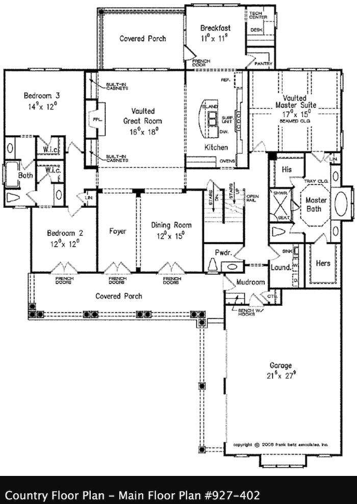
Although, she didn’t specify the size, this seems like a nice size home that won’t feel cavernous when it’s just the two of them but also won’t feel claustrophobic when there’s a good amount of family visiting. I like the layout. However, I’m not fond of the lack of walls, or the dining area that’s melting into the home’s entry. What for? That is, unless one wants to make a quick escape.
After sending Mer a quick response and the link to this plan, Mer responded with more info:
I will add this: Mostly, it’s just my hubby and me in our home. We no longer host many social events.
But here’s a consideration, we have ten grandchildren between the ages of 12 and 32. The oldest is married with a 2-year-old.
[Oh wow! They’re great-grandparents!]
The next one down is engaged. We host holidays that have been known to include mother-in-laws, a “wasband,” and a few others thrown in for good measure.
My dining table seats 12, and I’ve often added another table to the end of it to seat more.
[I’m assuming a folding card table which would add two – four more seats]
All this to say, we really want to downsize but also keep our wonderful holiday traditions. We use our breakfast area for a two-person tv spot and eat at the island. If we have more than 4 people for a meal, we do sit in the dining room.
I looked at that example plan you sent. Yes, I can see using the living space for dining.
I’m not sure I want dedicate that much square footage to a rarely used room, however.
[No, you don’t have to! That room can do double duty.]
I actually thought about having the dining room arranged in such a way that when used for a crowd, I could extend it partially into an adjoining room or hallway. Under normal conditions it would be in a dining room with walls with one opening wide enough to extend.
***
Thanks, Mer!
Yes, that situation does exist and it’s a great idea. What’s funny (this time it is funny) is that I somehow divined the situation as if I already knew without knowing.
Mer didn’t say how often the family comes, but it sounds like it’s at least three or four times a year. And, I’m guessing, there are other times when it might not be the entire family, but let’s say portion of them, for birthdays, anniversaries, or just a lovely Sunday dinner.
So, let’s say it’s once or twice a month on average that it’s more people than Mer and her husband.
But, even if it’s not, they still have a need for a larger dining area regularly.
While I did find another plan that had space to extend the dining area into a large hall and beyond, I still wanted to work with this space.
The reason is, you can still create a very large dining area out of a room that is not used for that purpose except for a few times a year.
Yes, you can. I did it about 20 years ago with a deck that was turned into a sunroom and an occasional dining room for 20.
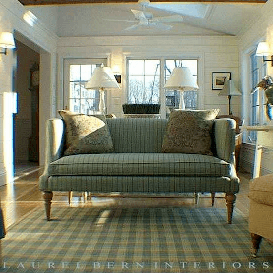
I’ve posted this old photo a couple of times before. After I took this pic, we did do some simple white cotton Roman Shades. The room was lovely, and the contractor who was about 6′-4″ and built, (sorry, but not really ;] for the blatant objectification,) was a doll I used to joke that we were separated at birth.
Before I show you the plan, I’m going to preface it with this. I think that ready-made plans are terrific to start with as a base for a final home. However, they almost always need tweaking or even some major alterations.
We’ve already gone through this a number of times on the blog.
Here are two posts that feature house plans I’ve altered.
This one is bemoaning a too-open floor plan.
Our Home’s Difficult Floor plan is Giving me Fits!
And, another favorite post features several room layouts for one living room, plus some additional architectural plans with modifications.
Before we look at the floor plan again, we need to go over some of our dining area parameters.
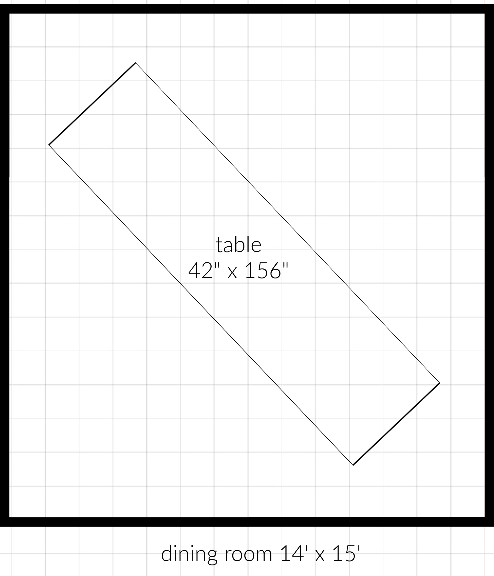
To seat 20 at one dining table, you will need a table that is about 16′ feet long and 45″+ wide. It can be more narrow, However, if the table has a rounded end, you can lop off two feet and still seat 20 because of the curve at the end. However, if you need to have a 16′ foot long table, you will need a bare minimum of 18″ of space on each end, but preferably a little more.
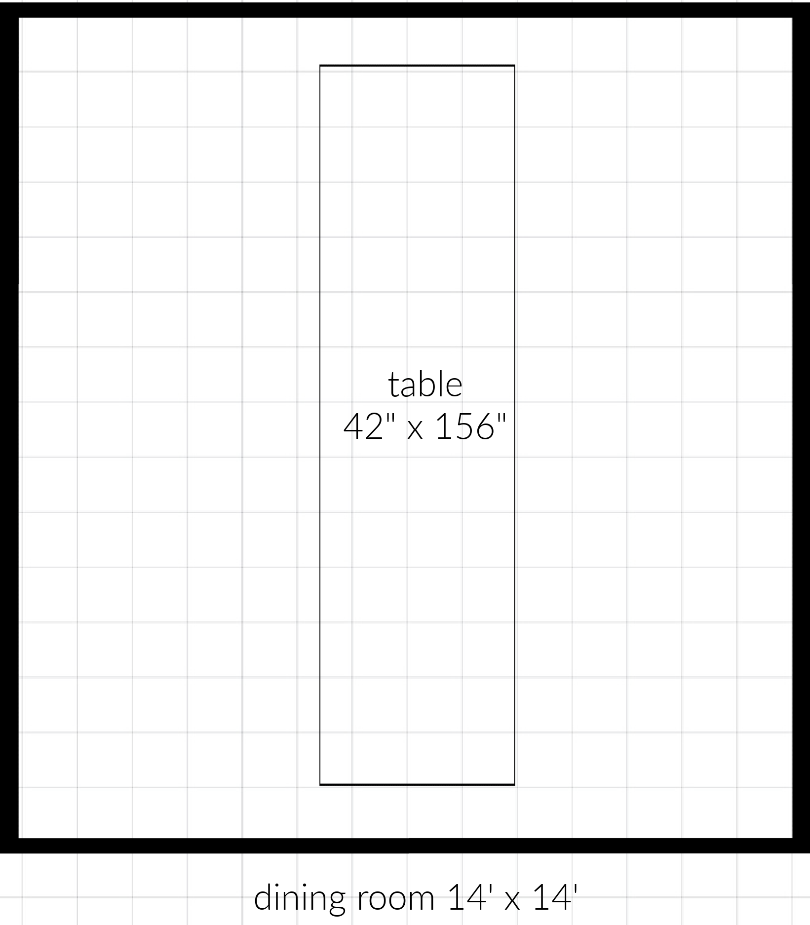
Sorry, the dining room is 15 feet long. But, you get the idea. This table is too long for the space.
 Above is the same dining room that is still 15′ long. As long as there’s no other furniture in the way, turning the dining table on an angle gives more space for the table. I bet y’all already knew that.
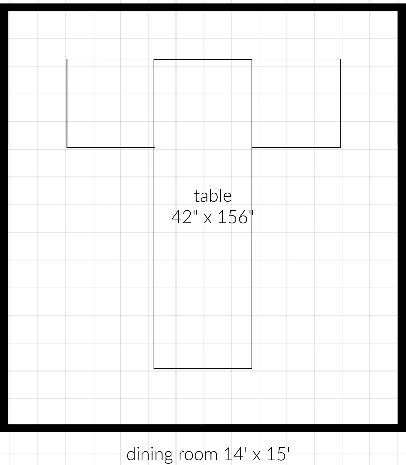
One other possibility is to do what Bronxville Mary did for Thanksgiving in 2021. Only the T on hers went even further.
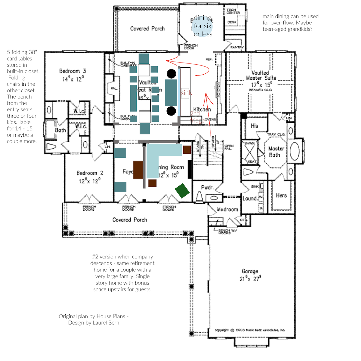
Okay, let’s look at the floor plan I sent Mer. And then, we’ll look at the architectural changes I made, as well as how we can turn the great room into a dining room that can seat 18-20.
This is a floor plan that I thought would make a comfortable home for an older couple who also has an extended family that visits several times a year. Not only do they need more sleeping quarters for some of the family, but a space that will serve as an expandable dining area, that can seat up to 20.
Now for the architectural changes and space planning.
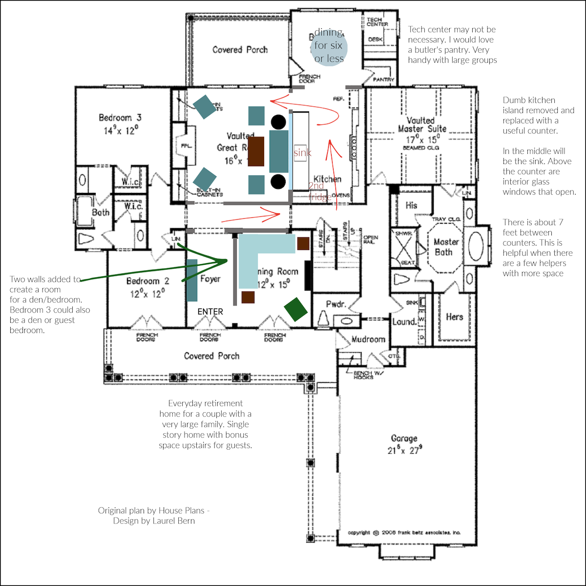
Let’s begin where it says “entry.” I didn’t add any furniture to the entry, but one certainly could. The entry is quite wide at about seven feet.
Where you see thick dark gray lines, those are walls that I added, or extended from the original plan.
I added two perpendicular walls to the den/guest bedroom and narrowed the opening into the hall to match the front door.
In this version, I also added a wall to the great room and made an opening to match the front door and adjacent opening.
There’s a lot of logic in good design. If it looks wrong, it usually is.
However, form follows function– always.
And if we need to be able to spill the dining area into that hall adjacent to the great room, then that wall I added has to go. Boo hoo. That’s life. However, if you can get by with an 18′ long dining room which is a pretty long room, then you could add that wall which is why I left it in.
Since there is another table nearby, depending on your needs, you could always make a kids table, or an over 40 table. haha Or, whatever spill-over group works best.
Let’s keep going with our architectural changes and layout.
I also changed some things in the kitchen. I got rid of the island, so the kitchen is not IN the living room, but it can be open to the living room, if the interior windows are open. It’s the best of both worlds. The kitchen can be closed when needed and open when needed. Plus, interior window walls are soooo pretty! I also added them to this post I did not too long ago.
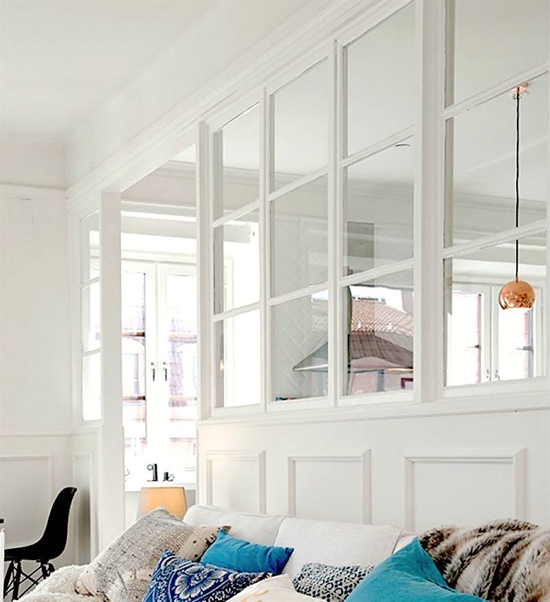
I’m sorry, I don’t know the source of either of these lovely images. However, they are fantastic examples of interior window walls. You can see more in this post about creating an entry where there is none.
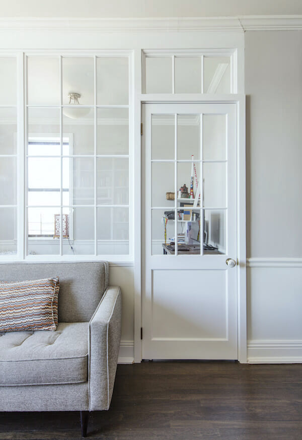
blog.sweeten.com – interior window wall – Deeksha_Living_Room
I see the disapproving looks. You’re still hung up on the “no island,” right?
Let me ask all of you lovelies over 50. Did your kitchen have an island when you were growing up in the 40s, 50s, 60, and 70s? Think very hard.
It didn’t? Have you been scarred for life because there was no island? If you have, then, of course, you must have an island. For the rest of you, it’s not absolutely necessary.
Gosh, sometimes, islands make things less convenient, not more. Sometimes they are in the way.
There are still two entrances into the kitchen.
There’s a good flow. I like this arrangement. Of course, it needs some finessing, but I love how roomy the kitchen is now. There are some additional notes on the images, you can read if interested.
This plan has numerous options to change things around, like putting in a small butler’s pantry instead of the tiny work space.
As for furnishings, it’s pretty basic. The great room has an 84″ sofa and two chairs. The chairs by the sofa or by the fireplace can serve as host chairs for the family dining area.
So, it’s time to abracadabra and turn our living room/great room into a dining area for 20 or so.
First, the strapping men (or women) need to move the coffee table and maybe the two club chairs into the entry. If there’s room in the corners, the chairs can stay in the room. That’s fine. The sofa and end tables (with table lamps) can also stay put. You will need about eight feet in width to accommodate most rectangular tables with chairs and have a little space to squeeze by.
In one closet is storage for either five 38″ square or three 36″ x 72″ longer folding tables.
The strapping members will have to haul those out and set them up.
In the other closet are folding chairs. I love those bamboo chairs you can get a Wayfair.
Now, if you have more than 15 or 16 to seat and it really needs to be 20 or more, you can go a step further to allow this dining area to accomodate that many people.
Of course, you could also do this with the five tables, and you definitely wouldn’t have to put the two club chairs in the entry.
Wait, Laurel. What if the guests are staying for a few days? Do you need to keep the dining room in the great room?
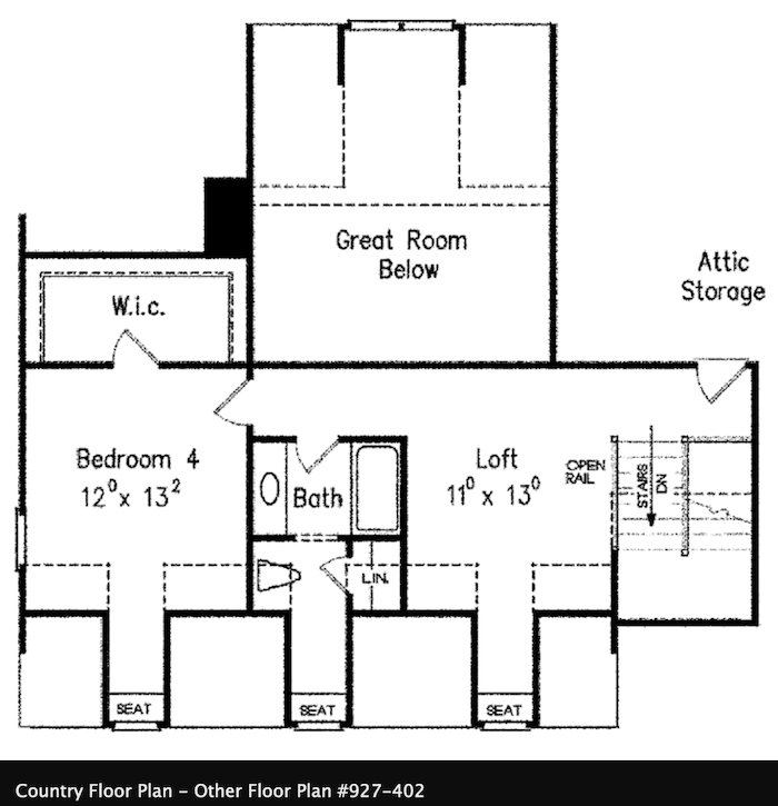
Excellent question! Actually, I don’t see any reason why you can’t. You certainly wouldn’t want to have to keep moving the tables and chairs. This is also why the bonus room will be a big plus.
The other home I sent Mer is this one.
This is a lovely layout and as you can see, the dining table could expand into the great room quite easily.
Of course, you’ll have to move the furniture there, too, but maybe not as much. I’d make numerous other changes to this house plan, too. But, I’ll save that for another day.
Guys, thanks for much for your kind comments regarding my kitchen design. Well, most were kind. Please read the post before commenting. And, it’s good to remember that I’m only a partial idiot, not a complete idiot. Or, at least, I try not to be.
I hope you enjoyed this post about creating a large dining area in a room not generally used for dining.
xo,

PS: Please check out the newly updated HOT SALES. Melissa and I did a vast weekend update, and some fantastic sales are going on, especially another sitewide sale at Serena & Lily!
Related Posts
 12 Things You Don’t Know About Me
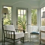 The Dreamiest Bedrooms + Where I Go For My Bed Linens
 The Massachusetts Building Codes are Cramping My Style!
 Hot Sales For October 13, 2017 Means Starting Holiday Planning
 Yuck. Loved the Wall Color Before The Furniture Arrived!
 40 Outdated Home Trends. But, Are They All Passé?
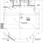 The Bedroom Entrance Looks Like a Renovation Mistake!


27 Responses
My husband and I had a similar problem to Mer’s when we were house hunting. We already owned an Amish-made table that came with a cabinet of extra leaves; it’s 14 ft long with all the leaves in. The first criterion for every house we looked at was, will our table fit? We ended up in a house where the wall between the living room and adjacent bedroom had been removed to enlarge the living room. We use one end as the dining room, and when everyone comes for dinner we push the living room furniture aside and extend the table into it. It
Hi Laurel,
I’m not sure if you are aware of a company called “Tablevogue.” They make amazing tablecloths in all kinds of fabrics. The cloths are fitted to all types of commercially available folding tables plus several sizes of round tables. They look especially nice because all the cloths fit tables exactly, come to the floor, and have pleats on the corners. I have personally used these for years. I have them for 6 ft. and 8 ft folding rectangular tables, 34″ card tables, and 48″ rounds. They are great for parties and would be wonderful for your writer to use several times a year.
Off the dining topic but on the slight plan changes topic, I would move the master suite door forward. Our master is similarly situated with respect to other spaces and the longer (than this plan’s) hall we have accomplishes 2 things: 1) it increases separation which improves privacy as well as noise issues, and 2) it obviates the use of bedroom wall space to accommodate an open door. Number 2 results in improved symmetry and provides more wall space, which open floor plans often lack. Not that Laurel wouldn’t work out any such issues, it’s just that bit that makes our house work well.
We downsized and gave our formal dining table and chairs to my son and daughter in law. They now host the large parties. We are enjoying our life in a smaller home with more intimate dinners.
I think all your changes to the plans are wonderful. We do not like open plans, either. As for an occasional dining room, though, this is what I would do (depending on how many times a year I would be feeding the multitudes): I would use those folding tables and chairs in the GARAGE because that is the largest space! In the summertime, I would set them up on that covered porch or in the back yard. Problem solved!
I’d add a large enclosed sun porch across the back or front and use that for trying to feed everyone in one spot. Folding tables and nice tablecloths + attractive stacking chairs. All of which can be put away when the crowd leaves. A beautiful view or at least beautiful lighting to be enjoyed all the time.
Hi Laurel – and yet another informative and timely post!! Thanks.
My two cents:
I’d nix the tech and pantry and open that space the primary dining area with a large (72”) round table. I can seat 8 comfortably – 10 if is use smaller chairs – at ours and it has a large lazy Susan for easy meal passing. Round makes for great conversations.
I really like the idea of a closing off the kitchen with the interior windows! Fabulous idea! Would it be weird if some of the windows were operable so you could pass dishes through? That I don’t know. We gave up the island idea in our current home and I don’t miss it a bit. We have a large galley kitchen and people still congregate there . . . And it works. One of the reasons we bought this house is because it didn’t have the mandated island. Kitchen islands remind me of cars – where people will compare the length and size of their islands to those of their neighbors!
With a big part of the dining space now at the round table, I’d go ahead and do your plan for the great room, but on a smaller scale – you now only need to seat 10 people. This would allow for folks to sit and converse when not at the table. With this plan, I don’t think you’d need to add that extra wall along the hallway. Which I think would be nice, so it wouldn’t seem like a somewhat narrow, long space.
I’d change the foyer just as you did but I think I’d add an opening into the former dining-now tv room on the wall across from the kitchen. That way you aren’t walking so far with your big bowl of popcorn!
This is so much fun to think about!
@GG: That’s so funny, I thought jokingly to myself “just put them in the garage!” which, of course, isn’t always the most comfortable nor festive space. Sounds like you’re husband is the magician that makes it happen!
@ Laurel: I love the puzzles you present, Laurel and am always delighted by your solutions. Thanks again for the great entertainment.
Laurel, I was completely gobsmacked when I looked at the second floor plan you suggested. It is our floor plan, although we didn’t get it from this same place, and we made our kitchen much larger. With three islands. (Haha!) We love it! And yes, when we need more space for dining we turn the table and add on to it. Ours is entirely open floor plan and Lauren, we’re just going to have to agree to disagree on this one. We often have large parties and it works beautifully, with people congregating in various areas as the mood strikes them and it just flows. So, it works for our lifestyle. We’ve done some things with varying ceiling heights to keep it from feeling cavernous. And like you, we walled off the 7’ foyer. It’s nice to preserve a little mystery so the home is gradually revealed as people progress into the house from the front door.
We also love having a guest “wing” (a la Downton Abbey, my dear) and a master “wing” so everyone has a little privacy of an evening. Thanks for all you do to help us consider various aspects and I’ve particularly enjoyed watching you think through your kitchen design. Love Crown Point!
Great suggestions—very practical.
At times I host large groups, not necessarily sit down if the weather is warm. My dining room is the largest room in our 1500 sq ft house (not counting the partly finished basement), and when both leaves are pulled out, the table can seat ten. I’ve hosted afternoon tea for 14 people and divide them into groups—eight in the dining room and six in the living room.
We have spent quite a few years looking at houses closer to our daughter, and without fail they have tiny dining rooms. We have quite a few substantial pieces of furniture, which fit comfortably in our 1964 house, but we would have to get rid of about half of it if we moved into a house with more square footage! One very nice house we saw had a dining room so tiny that our 9×12 rug wouldn’t have fit.
Older houses seem much friendlier to furniture than newer ones, with their lack of uninterrupted wall space. I find it very strange that we have ample living and storage space in our small house, including a medium sized kitchen with lots of counter space and tons of storage. What we don’t have are large bedrooms—they’re around 12×13.
Love what you have done with the house plan. If I were building, I would certainly use this plan with your modifications. I totally agree with your island stance. Last 2 houses (we moved twice in 2 years) had islands, a first for us. One island was just in the way and the other was actually useful. My biggest complaint about islands is that people (my husband to be exact) will use the island AND the counters for whatever they are doing and it’s an extra area to have to clean up! While it is nice to have everyone at one table, there is a lot to be said for smaller tables or several rooms being used. I think people tend to mingle more with options instead of 1 table. We hosted 20-25 at Christmas for years with tables in 3 rooms and people mingled. Usually 1 area turned into game room and 1 stayed for food/visiting. The third was a drop leaf table in the living room that flexed for either visiting, games, or food. We were fortunate to have large openings between the rooms so the areas were not isolated but the chaos was better contained.
Alison Ramsey’s floor plans also often run more traditional and might be worth a look. A fair number do seem to have succumbed to the open floor plan trend, but there are still quite a few that have more traditional room separation, formal dining rooms, etc., and many of the more open ones could easily have walls added back in. A number have the formal dining room next to another space (sunroom, for example) into which you could expand. Might be worth a look…
Many of the houseplan sites still have plans from the eighties when things were more divided at the end of their searches if you go to the end that might require less modification.
I understand Mer’s dilemma, but I would suggest the following:
1. Add the walls, per Laurel
2. Keep the island
3. Keep the tech center where it is
4. When there’s a crowd, utilize your covered porches and add tables there when needed and if weather is an issue, add free standing heaters. Consider adding shutters or outside drapes to the open porches to create “rooms”.
5. Embrace your new lifestyle!
How about keeping the large opening between the dining room and foyer? You have 22′ in which to place a large table, or several tables into a “T” arrangement, or other arrangement. Guests can enter through the mudroom entrance, or there might even be enough room to enter through the front door (keep the table pushed to the right wall of the dining room until everyone is in the house). That way, you keep the great room available for people to sit in when everyone is not at the table. I also agree with suggestions to make the tech room part of the pantry/breakfast room. That area gives an entire different “station” when entertaining.
I can see why folks contact you with their dilemmas. You always come up with great solutions.
My dining space is 7×10. It’s a good thing I live alone & only have 2 people over for holidays.
I would have a custom made refractory table. The leaves stay under and u could also make it to open for more leaves. The base made to extend. This way it stays a correct size for 2 and then can go big. For a moment in time it goes very long but stays out of the living room.
Rather than a plethora of chairs, folding temporary chairs and 2 benches not to big but fun for the kids
I wouldn’t be happy with the kitchen. I cook a lot from scratch and the kitchen is a work room that gets messy. I also like lots of sunlight and access to the herb/veg garden. How about swapping the DR and Kitchen. Then the breakfast nook/Tech/Pantry/old kitchen can be a room to hold a really long table. and a nook when not in use.
Love these ideas! We host 45-50 for Thanksgiving. Our 8 ft island holds all the food. The adjacent dining room hosts 8, living room another 6. But the best part is my husband transforms our 2 car attached garage into a banquet hall of sorts. He lines the walls with draping, puts down a large area rug, strings lights across the ceiling, adds a console table with large TV tuned to a virtual fire in the fireplace. Hangs art work on the draping. The door to get to garage is removed. The laundry room pass thru is transformed into the coffee/drink area. All the tables have coordinating tablecloths. We use simple white melamine plates and stainless tableware. It takes planning and some work but so worth it.
My husband and I enjoy perusing the house plans available via Southern Living, if Meredith hasn’t checked there yet. Lots of more traditional options.
So much of the ‘newer’ construction (last 20 years or so) in our area is open concept; I’m a mom of young kids and prefer the separation (and noise control!) of walls. We bought our home during the first few weeks of Covid and felt lucky to get separate formal living and dining rooms. It’s not perfect but was so much better than most of the (limited) options we saw.
I was going to say instead of a huge banquet-sized rectangular table like you’d find at Windsor Castle, how about a group of round tables instead?
Nice solution to a all-too-common situation… where to seat the extended family on holidays? My husband and I are in a similar position – we are building our retirement home. So many house plans on the internet are “open floor plans”. I like the idea of interior windows to create some room definition.
My question is … In a open floor plan do the cooktop and island have to line up in the center of the fireplace? Also, do the built-ins on either side of the fireplace have to be symmetrical?
Thank you.
First, welcome to Boston! As a kitchen designer/space planner, I love your blog and have enjoyed watching your design process unfold. I think I own an iteration of this home, downsizing after my divorce. I’m not a cook so I turned my dining room into a family room. My kitchen has a table for 6-8 which is ‘good enough’ for most casual dining. I will turn my living room into dining for 30 at holidays, owning multiple folding tables & renting chairs. I make a G shape out of the tables. I turn the couch 180 degrees, in towards the family room, roll two club chairs into my office and take the glass coffee table off its base and hide them in the office. And I serve off my table in the kitchen and my island. Works great.
Laurel, Very interesting post as I have similar challenges in our “retirement” home. We have always been the ones to host the huge family holidays but 5 years ago downsized and now live in an open design house. We have a dining area that seats 6 similar to what you are showing here. I’ve tried various things for the big events but never tried to get everyone at a single long table! I’ve moved out the coffee table to a downstairs bedroom (I would not want to block the entry with furniture), and put 2 round tables in the middle of the LR which worked pretty well to seat 20. One year, I put a kids table in the loft which they absolutely loved and seated everyone else downstairs. You’ve got me thinking now about what other options might work. I usually “pop up” (with lots of help) the tables in the middle at the last minute so everyone can hang out in the living room in front of the fire until dinner is served as well. I actually like the island to set up appetizers and then clear it to use as a buffet rather than trying to pass serving dishes among such a big group. There are always trade-offs, I know!
I want to suggest an amazing product – I do not work for the company – I promise! It’s called the transformer table, and I bought one for my son’s apartment, when they were hosting large fraternity dinners. It is truly amazing – please let me know what you think. Now that he’s living in the city, it’s still used every weekend, is permanently set up at it’s longest, and looks great. The link is transformertable.com, and yes, we purchased it with the free coffee table, which they no longer use because it’s permanently extended. Thank you!
Love that you added some walls to reduce the open plan and make the space more usable! I would remove the entire tech space and pantry to expand that space into a much larger dining room; I would hate to have to rearrange the LR every time. A shallow pantry could be installed along the back wall of the DR; a tall pantry could also anchor the end of the kitchen counter with the sink. As a designer myself, I love your ideas and suggestions!
Would love this old folks home! Get rid of the tech space and create a nice dining room and pantry. Tech space could be a cabinet in one of the bedrooms.