Hi Everyone,
First of all, my sincerest condolences to everyone, but especially our friends across the pond, for the loss of our worldwide treasure, Prince Phillip, Duke of Edinburgh. May his memory always be a blessing.
It made me think of another treasure in the United States. Furlow Gatewood.
Mr. Gatewood is now 100, or about to be. I figured this out because I read an article written in 2015, and he was 94 then. Pretty smart, huh? ;] You can see Furlow on SmugMug. Rod Collins, who took all of the gorgeous images on my tribute post, frequently visits Furlow. The most recent was last month. If you go here, you can see a glimpse of Furlow’s mirrored backsplash. :]
Otherwise, I have an intense case of spring fever. I mean, it was 75 degrees in Boston today and felt more like June 10th than April 10th. But, we’ll take it!
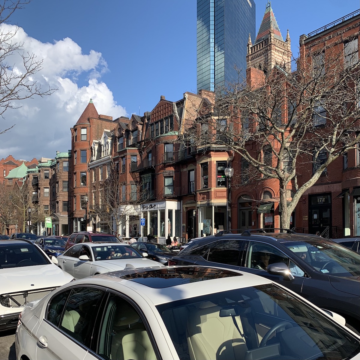
I went for a walk, of course. Well, Newbury Street was teeming with people and cars, too!
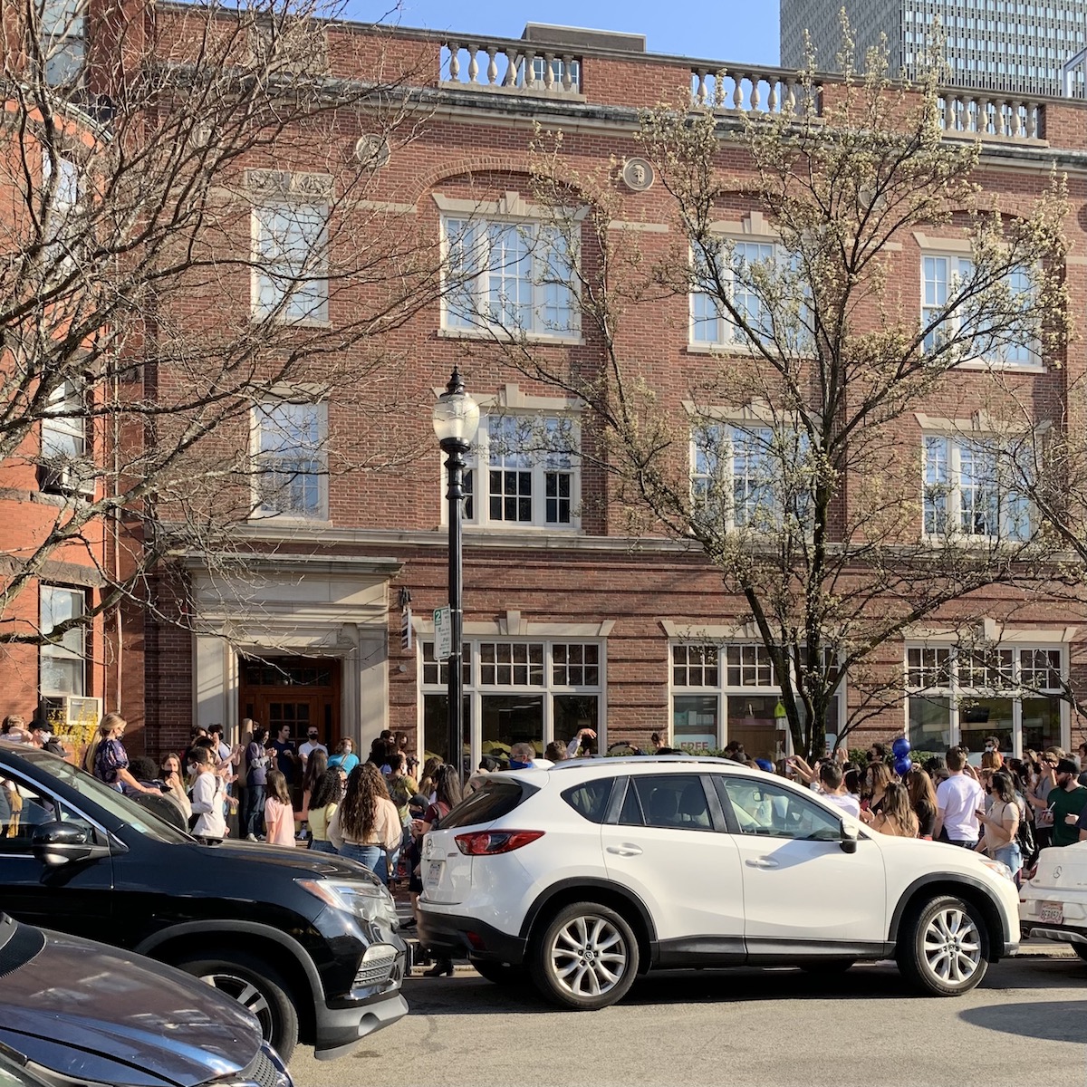
Lots of young people listening to music on every corner.
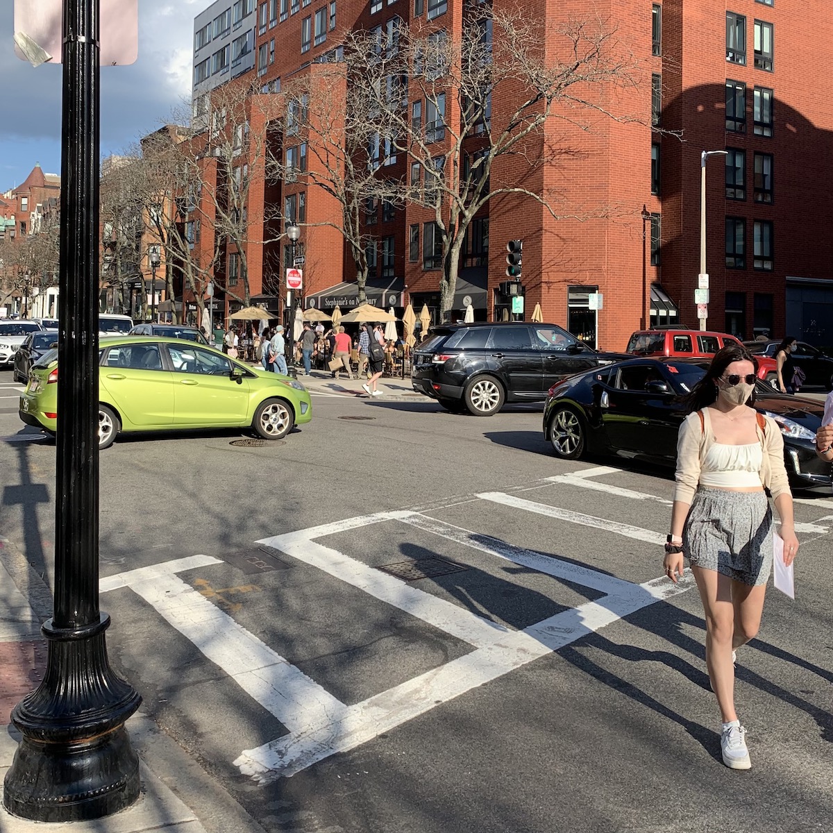
All of the outdoor cafes were filled, and much traffic on Newbury Street.
I have to admit, after the last couple of kitchen posts (you can see them here and here), I’m pretty pooped. But, thank you guys so much for all of your great ideas.
I did call a couple of contractors who’ve come highly recommended.
But, all I did was leave a message. I realize that I’m going to have to put on my big girl pants and be persistent. And, also call a couple more this week.
OH!!!
For those of you who read my HOT SALES love note last night, you already know this, but for everyone else,
My Bronxville, NY apartment closed yesterday— FINALLY.
I’m sure the buyer is also relieved. It is bittersweet. If you missed the pics of my old apartment, please check them out here.
So, today, I want to turn the focus on some bathroom design inspiration.
And, we’re going to revisit one of my favorite projects from 2014.
But, do you know what is driving me the craziest these days?
The floor finish or finishes. I mean the stains.
You see, I love both super light floors and super dark.
I know. I know. For those of you who skim, I’m going to make this very bold.
Dark floors show every spec of dust.
But, I have Roberto now. (Robbie).
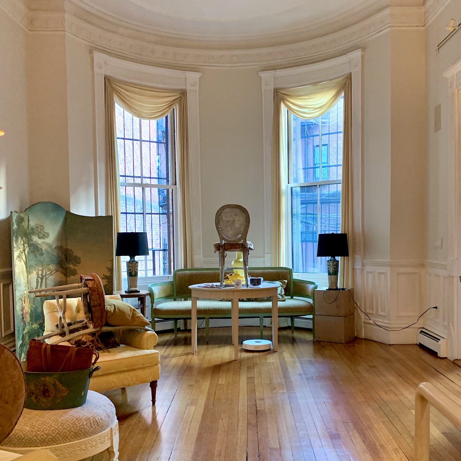
He’s my Roborock Robot vacuum, and I’m madly in love with him. You can read all about him here. As a matter of fact, he’s hard at work as I’m writing this. My floors are always gleaming and free from dust. Therefore, the dark stain is a non-issue from a dust standpoint.
However, I think I’ve figured out why this is such a problematic decision for me.
During the day, I see the floors being light and, at night, definitely dark. The floor does look significantly deeper and richer at night. I know you’ll say, well, just keep them the way they are. Well, I could. We’ll see.
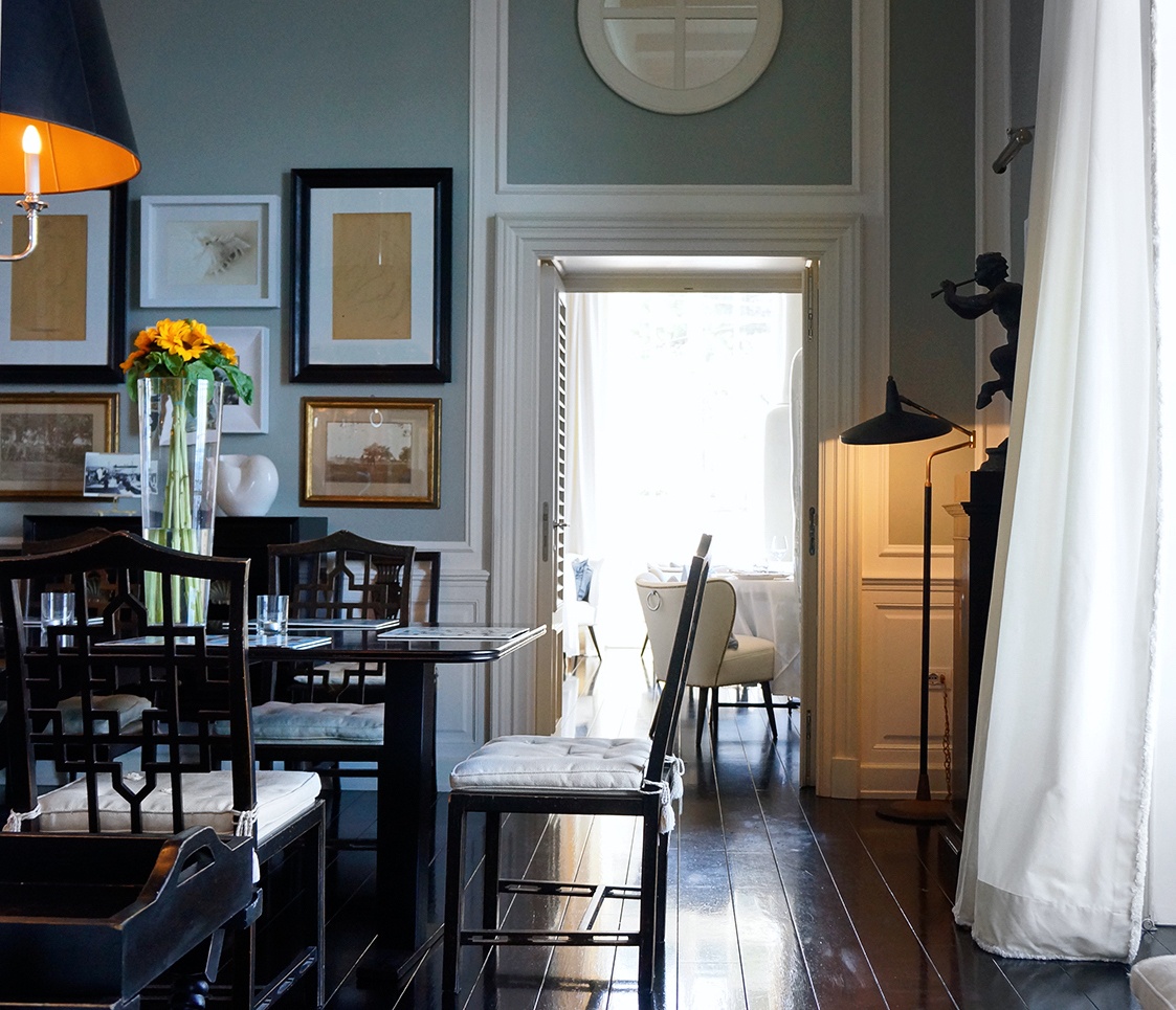
Below are some spaces with dark floors I adore.
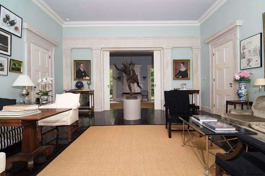
But then there’s also this amazing Greek Revival masterpiece in Kinderhook, NY, we saw here.
Conversely, there are the gorgeous pale floors I love too!
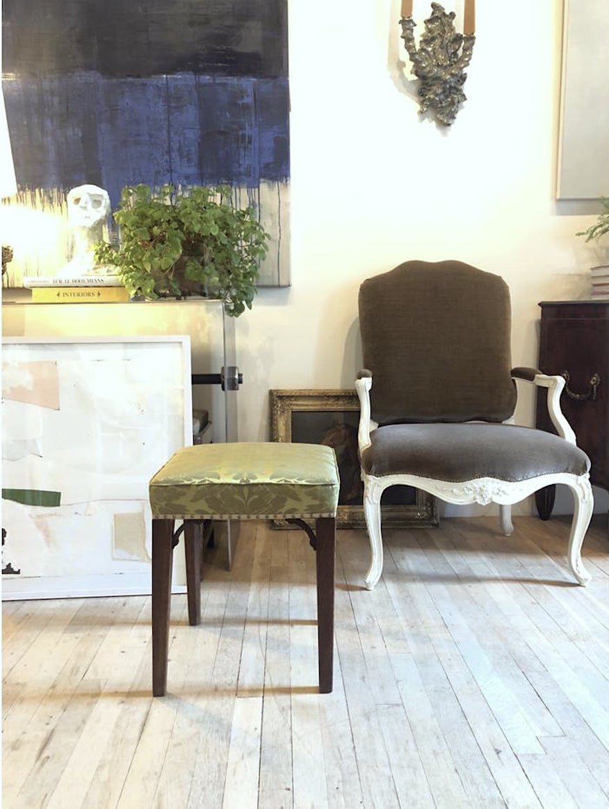
Gerald Bland. Please follow on Instagram.
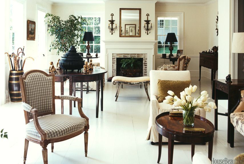
The timeless interior is done quite a while back by Albert Hadley.
Okay, we’ll let that one go for now. If you’re interested in seeing more and didn’t see it or forgot, please visit this post about dark floor finishes.
And then here’s another post featuring light and white painted wood finishes.
And, this post about painted hardwood floors.
But, back to more bathroom design inspiration.
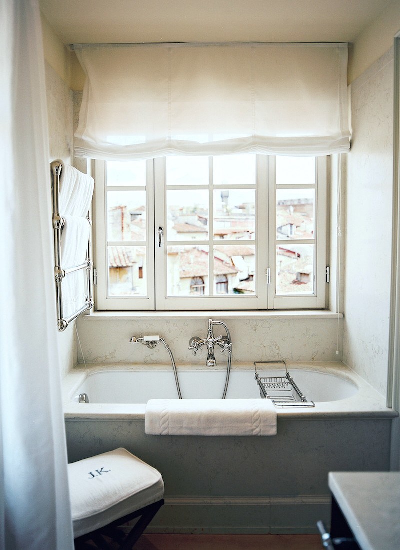
Above is my dream bathroom that I’ve posted many times.
All of the JK Place hotels, and there are several now, have been designed by Michele Bonan. My dream is to stay at the JK Place Capri. I tell this to all of my potential boyfriends. The one who doesn’t look at me like I just grew three heads might be allowed to stick around. lol
Actually, I’d be delighted to LIVE at the JK Place Capri. I mean, who wouldn’t?
However, at a minimum of about $1,000 a day (at the off-season) for a “modest” room there, maybe I need to rethink that.
For all of the posts about the JK Place hotels, please go here. There are some gorgeous images.
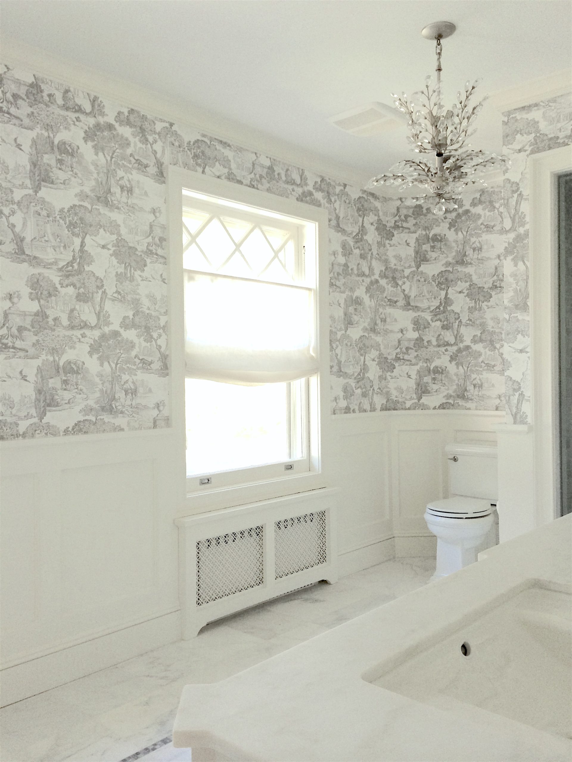
Okay, I promised to share some old pics of the best bathroom I’ve ever done.
Actually, it’s one of the few I’ve ever done. Haha. In fact, I’m lucky to have any photos at all. Never mind.
If you’d like to see the original post, please go here. These photos have been cleaned up a little.
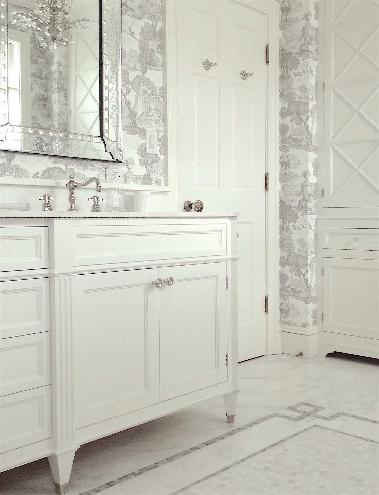
Everything was custom-designed by me. However, I didn’t create the design of this vanity out of thin air. I’ll show you in a sec.
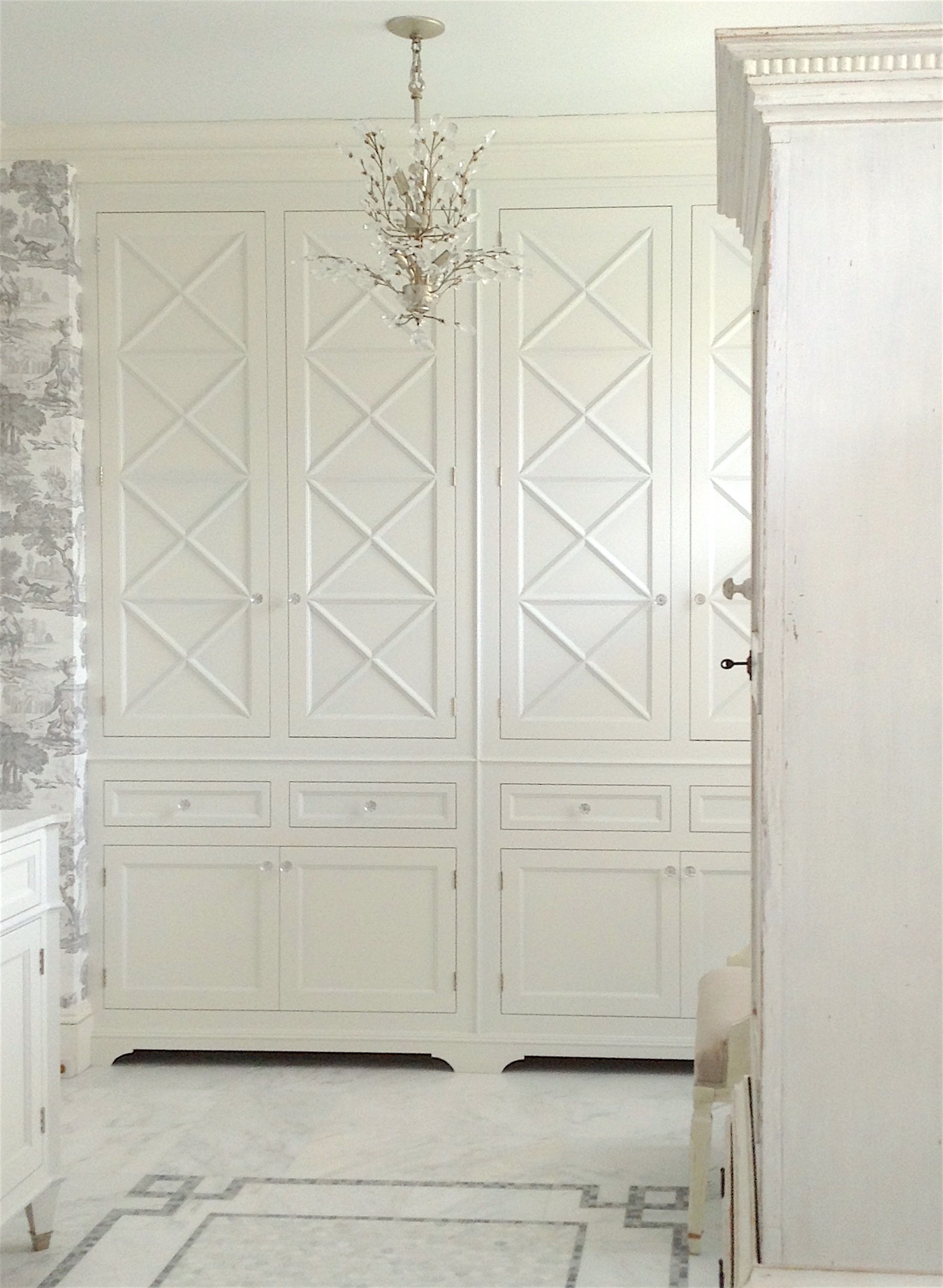
The original post explains how I came up with the design for these cabinets.
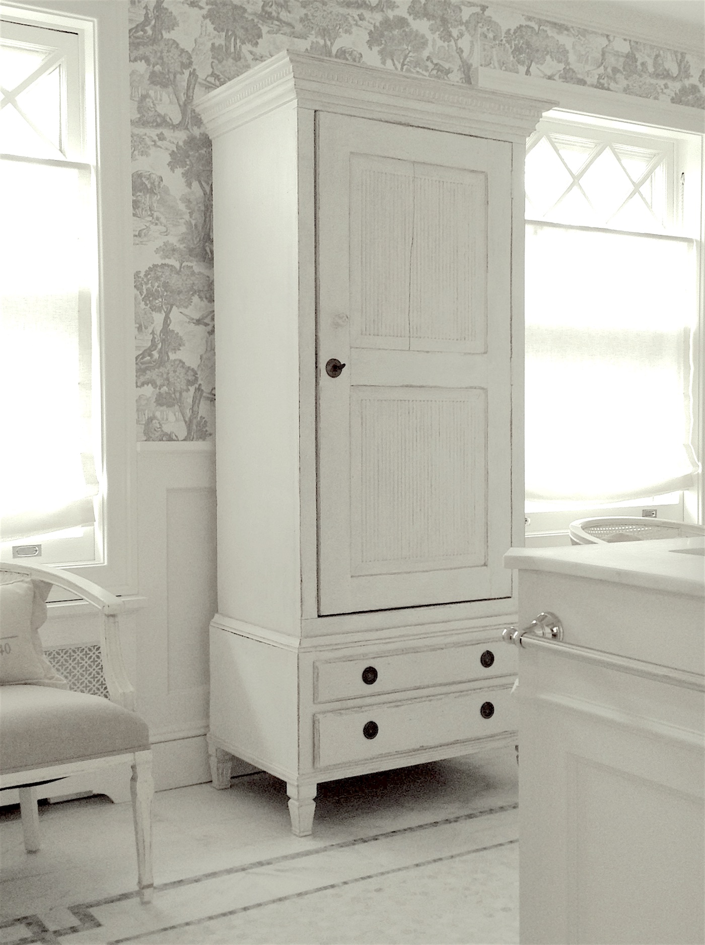
Actually, I had forgotten about the x windows. Maybe it was in my subconscious.
The chair is new. The pillow is hers. And the wardrobe which I love is from Chelsea Textiles.
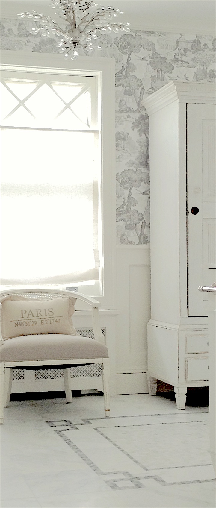
Oh, there’s another post that shows how I copied the design on the floor. Maybe I can find the image.
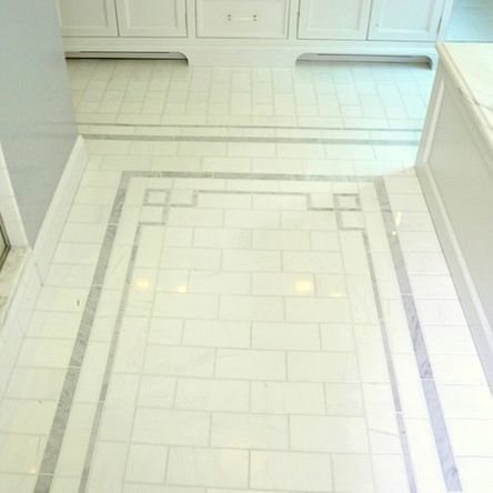
Yes, I did!
Here you can clearly see the canted corners of the marble vanity top and a sliver of the shower. The client did not want a tub in this bathroom. We intentionally mounted the Roman Shades below the X detail so we could see it!
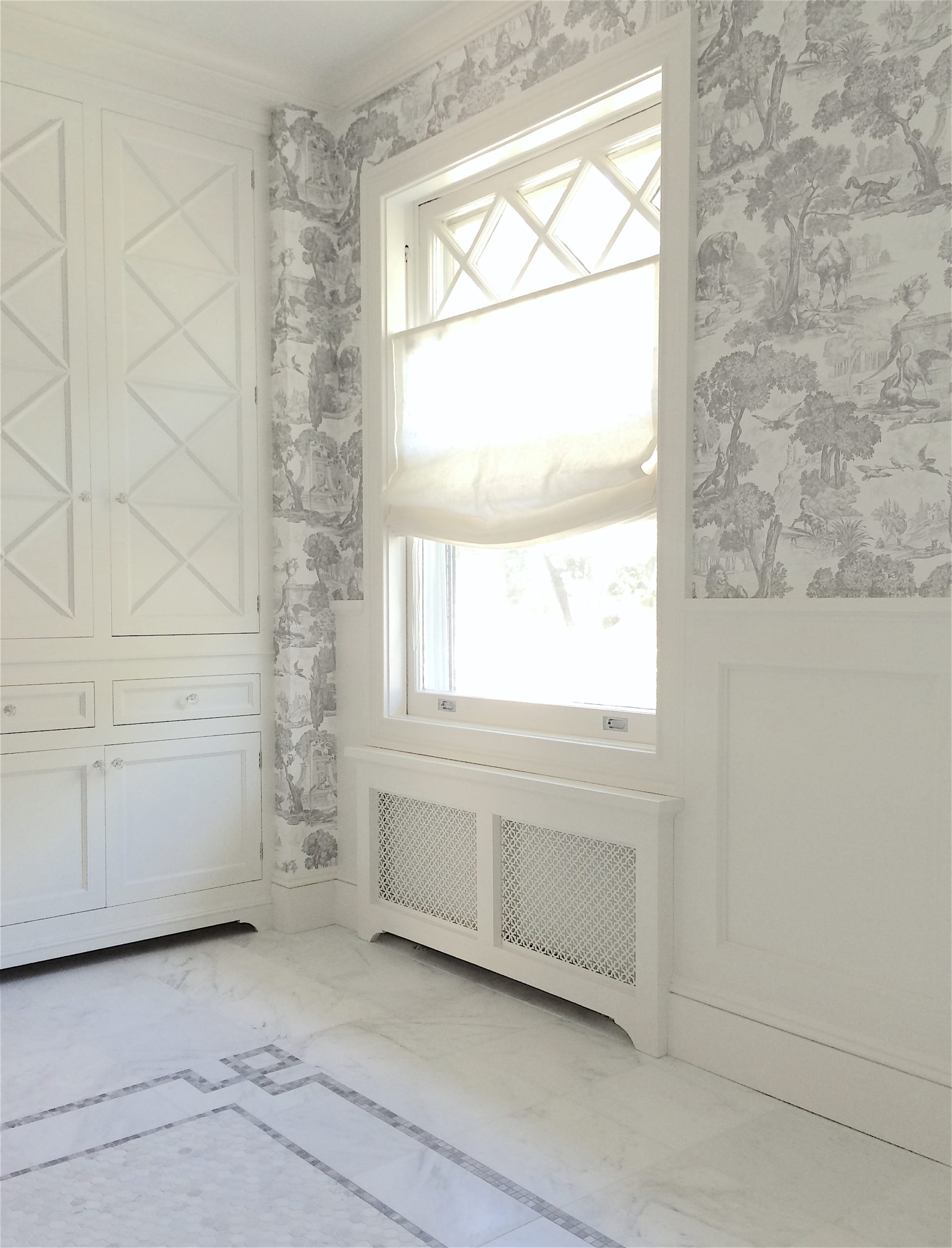
The radiator covers are exactly what I wanted. That came out of my head. I also love the smaller furniture base. That’s what I want for my new kitchen; not for every cabinet, but the sink, end built-in, fridge, and entry closet.
Well, I hoped you enjoyed visiting bathroom design inspiration. But, there’s a lot more inspiration in the two earlier posts, linked to below.
This one’s about dark bathrooms.
And, this one’s about affordable fixes with a big impact.
I see there are two more posts. I guess I was on a bathroom roll last September.
Seven Bathroom trends to avoid or embrace.
Oh, and the transformation of my scary (old) vanity.
Oh, speaking of vanities, I almost forgot. I’ll bring that pic down, so you don’t have to scroll all the way up.
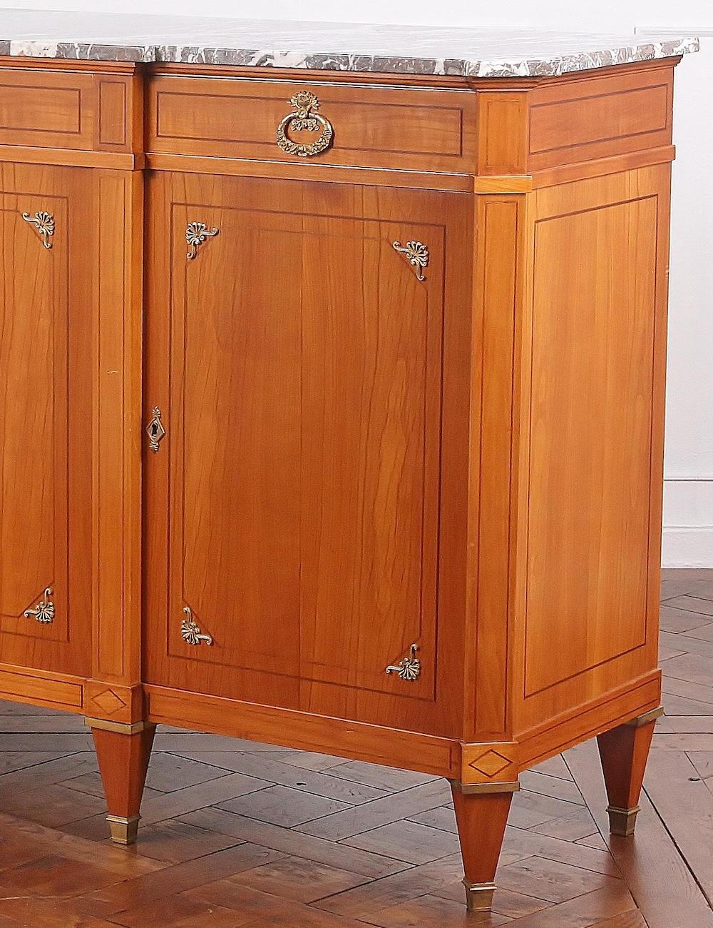
I actually found a piece I loved and had the cabinet maker, JEM Woodworking, copy it.
And, while I don’t have that image, I found one very close to it.
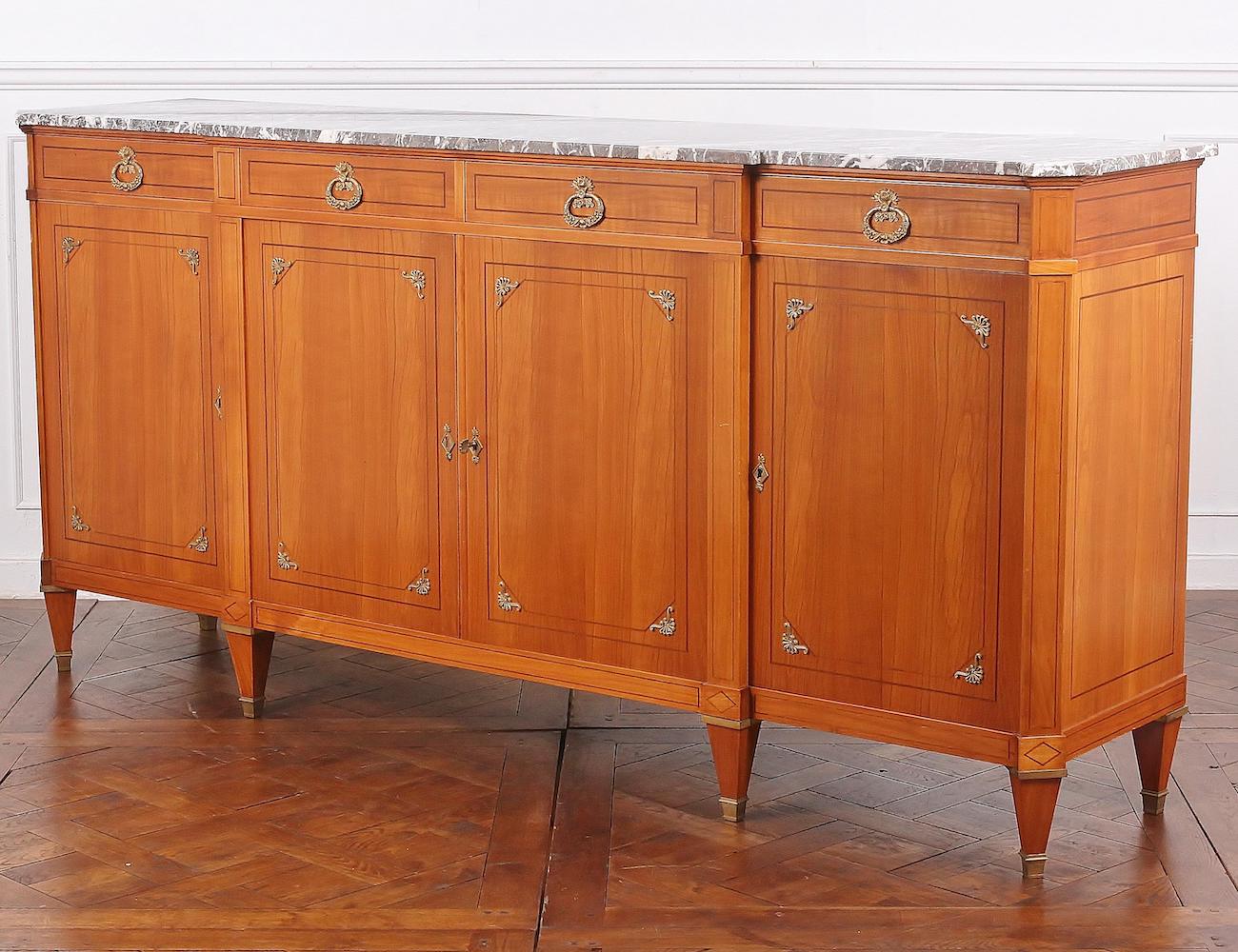
And, here’s a close-up showing the canted corners. Like I said, this one’s similar but not the same as the one they copied.
Here’s one last bathroom post. This is one of my favorites. There will be more in the related posts, if interested.
Oh, I just have to end with one more image.
One of you lovelies sent me this gorgeous butler’s pantry on Instagram.
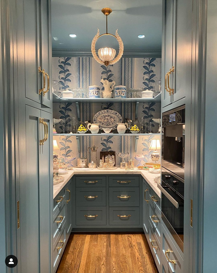
@boxwoodinteriors on Instagram
How pretty is that? And, please, please, please take a look at her gorgeous account! The owner has a gorgeous shop in Houston, and her vignettes are to die for. In fact, if you want to know how to accessorize your spaces. Or, at least one way, just copy what they’ve done.
Oh, Laurel, what IS the paint color and that divine wallpaper?
Well, I don’t always know,
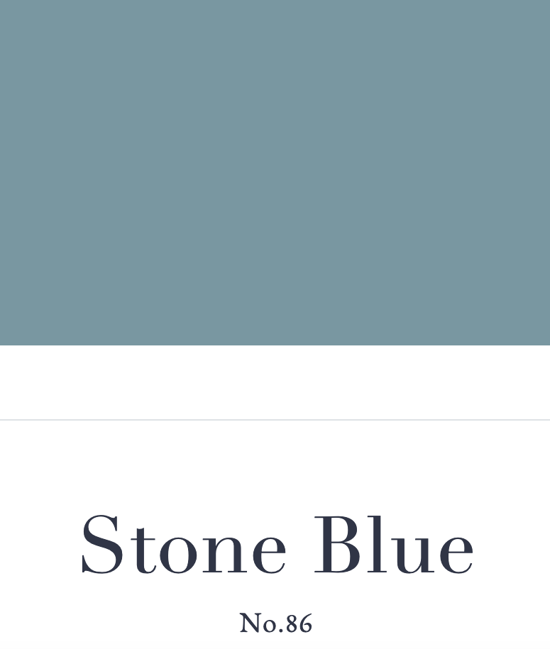
However, it does say that the paint color is Farrow and Ball Stone Blue. Please remember that you can now purchase Farrow & Ball samples and paint colors ONLINE!
The wallpaper is:

Paul Poiret for Schumacher Hydrangea Drape Wallpaper
Wait. The colors are so different, Laurel?
Yes, that’s the genius of this designer. There are lots of shades of blue in that pantry.
As Barbara Barry said many years ago: “It’s the complexity that makes rooms rich.”
I agree with her completely!
xo,
PS: Please check out the newly updated HOT SALES!
Related Posts
- Staircase Design – Which Comes First Beauty, Or Safety?
- The Granny Decor Mistakes You Might Be Making
- My Top 100 Timeless Furniture Pieces
- 21 Best Hidden Storage Ideas, Stairs, Kitchens, Bathrooms
- Gorgeous Bathroom Vanities + Sinks, Faucets, Mirrors, Lights
- 80+ Timeless & Classic Home Furnishings You Will Love!
- French Doors + News About My Boston Apartment
47 Responses
Lovely bathroom and floor photos! Dark floors will show the Boston ice melt which is only around for about 8 months a year. Even if you take off your shoes it gets everywhere. Does Robbie mop as well?
Yes, Robbie mops.
Sometimes it is acts of God. Sometimes the subconscious mind holds a detail and we repeat it subconsciously. I absolutely love that bathroom!
Hi Laurel, Great bathroom design. I love the thoughtful window treatment, and the repeat of that window design in the space.
When I see the photos you’ve posted of your dining room with the grand windows at different times of the day–I always think how lovely the colors are–graceful. I’m not sure that that golden glow isn’t somewhat due to the golden color of your wood floors which add a certain lived in look that is to be appreciated.
Your post on pantries:
https://laurelberninteriors.com/25-sumptuous-kitchen-pantries-old-new-large-small-gorgeous/
brought up Heidi Piron. If you haven’t already, check out her revived victorian kitchen (looks less Victorian dark gew gaw, and more clean, classical). It is a knockout.
In order to avoid a huge cost, I wonder about less onsite construction (I have no idea). Could you do that great lacquered black armoire from Heidi Piron’s as a fridge on your back wall? Properly scaled, it could be a purposeful, beautiful focal point. It would thereby free up where the fridge is now which you could dedicate to a lovely sink with a beautiful faucet. Water is life, and loveliness–so, not as objectionable to see a glimpse of as compared to an appliance.
Enjoy your outings, garden and Spring!
Love Heidi’s work! I will check out her updated Victorian kitchen.
My vote for the floors: paint them and then stencil them ala Lee Radziwill!
Laurel, the bath you designed is stunning! Magazine worthy.
Love the butler’s pantry too.
That bathroom! The pantry! Wow, so gorgeous. One question- I’m always noting paint colors, but what sheen achieves that pantry look?
Laurel, gorgeous photos but I have one observation that you probably already realize…you seem to prefer dark floors with colorful walls and light floors with ale floors. At least that’s the pattern I noticed today lol. You can’t go wrong either way 😉
What a beautiful bathroom you designed!
Laurel,
That butler’s pantry in F & B’s Stone Blue made my day. It is exquisite! And you – you are always entertaining to read.
Many thanks,
Renee
On a lighter note: Instead of searching for a contractor, you might consider searching for a boyfriend, with a pickup truck and power tools. Definitely cheaper. That’s what I did. New cabinets? New shower? No problem. Any crazy idea I came up with, he would build. Heck, he can even do plumbing and electrical. Any man who can mix and pour concrete is a keeper. I ended up marrying him, and now we have the most beautiful house in the neighborhood.
Oh, how romantic, Liana! I love stories like that!
It could work for me as long as he:
Doesn’t call me “Blogger Girl.”
Isn’t a controlling, condescending pr*ck.
Isn’t a middle-aged (or any age) lothario, alcoholic, drug addict, compulsive gambler, prone to bankruptcy, been in trouble with the law in the last 25 years. (I’m not talking about one or two speeding tickets)
Will allow me to pay for our accommodation at the JK Place Capri for one week
AND won’t feel in the slightest bit emasculated or like a “kept man.” He’d be helping me fulfill my most precious DREAM. I don’t give a rat’s arse who pays for it. I just want to go there with the love of my life, to the most enchanting place on the planet.
Hell, if I could find all of that (plus cute and nicely built – nothing extreme) I wouldn’t care if he can’t even screw in a lightbulb. Just so long as he treats everyone with respect and is capable of giving and receiving love.
Hi Laurel! First-time commenter here! I’ve been reading your blog for a few months and have already learned sooo much! I’m a newlywed in my first home and I’ve been taking much of your advice into consideration as we’ve been decorating and renovating. In fact, I wish I had discovered your blog sooner! It would have prevented me from purchasing anemic throw pillows and too-short curtains… Lol you get the idea.
Anyways, I have a curiosity question for you. The bathroom pics you have shared in this post and in others are stunningly beautiful. But… I find myself wondering how designers accommodate practical items like wastebaskets, soap dispensers, toothbrush holders, and even toilet plungers. Now I realize these items are decidedly unglamorous. But they have to be in a functional bathroom! (Ever since I once witnessed an embarrassed guest lean out of a bathroom at someone else’s home and sheepishly inquire about the whereabouts of the plunger, I resolved that I would always keep one in each bathroom.) So — what are your recommendations for keeping unglamorous bathroom items in harmony with beautiful bathrooms (especially if there is a lack of cabinetry to hide them)?
Miss Carrie! I saw your comment. Don’t you fret! Wallpaper does very well in bathrooms as long as they are properly ventilated. If you’re overly concerned, they make vinyl wallpapers that are specifically designed for bathrooms. So go for it, girl! It’s beeeeeeeautiful in bathrooms! Make a statement. Laurel.. I have solved your floor stain indecision…match it to your favorite cat box sand. Dark sand (walnut shells), dark floors. Light sand (clay), light floors. You have a cat right?
Awww, Michelle, I did have a kitty, but he died in December 2014. I’m still heartbroken over the loss of my darling “Snooky.” AKA Peaches.
Try contacting contractors by email with a brief but concise message about your job. Include a few photos to stand out in the crowd. Send three times over a two week period. If you don’t get a response toss their name. In Southern CA this is the preferred method cause contractors are busy working. Good luck!
I’m swooning looking at the pics of the bathroom you designed. I love every detail, but especially the floor and the cabinets with the “x” design and the floors. Oh and the grisaille toile wallpaper! And that pic of the butler’s pantry is also swoon-worthy! Your blog has help me gain so much knowledge and helped me cultivate my aesthetic. Thanks, Laurel!
That is the most beautiful bathroom floor that I have ever seen!
I love your bathroom design and color. This is so my style. We are in process of finishing a new home and I think the all glass decorative mirror would look wonderful in the guest bathroom. I am always in awe at your knowledge and creativity and adore your wit. I do so appreciate when you share your feelings too.
Your bathroom design is fabulous. I also designed my own bathroom and was so proud of myself. It broke my heart to leave it behind when I moved. Oh well, maybe I’ll get a chance to do it again. I’ve also noticed an increase in the use of wallpaper lately. The 2021 Kips Bay Showcase is full of wallpaper designs.
Love this post. Thanks so much for always sharing information and beauty.
Hello Laurel,
Welcome to Massachsetts and hope you visit Cape Cod where I live. PAINTED FLOORS: my family home built in 1843 has painted wood floors, many coats of various dark colors.We have gone through multiple paint types and finishes in white to finally achieve a livable and pleasing result. The only paint that ever worked was marine paint. It requires no poly coat for finish and it stands up to wear. The white shows everything and so taking a clue from the past in the house I spatter painted the floor. Problem solved. It works because the house is a simple Cape Cod Farmhouse. You are so engaging, and informative. Your blogs are like a free course in interior design. Many,many thanks.
I’ve only been to Cape Cod once in 2018, but I loved it. Here’s the post about my trip to P-town!
The bathroom is indeed magnificent. Love the cabinetry, the wallpaper, mirror, details, etc. The Butler’s Panty is perfection. Thank you for the inspiration.
I would give my eye teeth for that beautiful hard wood floor. I think the existing color is perfect, nice neutral tone. If it were mine, I would paint a large, Greek key border around the room. You love Greek key, and, it would add interest and drama, and work with the symmetry of the room.
One other observation, about the photo of your kitchen. The first thing I noticed, was the funky little light fixture, casting yellow light over the whole room. The other rooms had clean white light. It might be as easy as changing the light bulbs, so the white paint looks white.
You have glorious high ceilings, and that tiny light fixture looks too small.
Hi Liana,
Just reading through comments now and vowing not to stay up all hours of the night. Rest assured that I NEVER turn on that gross chandelier. lol That is from the real estate listing. All I use right now are two lamps and the light from the hood which is warm. It’s not bright, but it DOES at least make it bearable to be in there.
One other comment Liana. That is a very good idea about the border on the existing floor. I’ll have to see. I was chatting with my upstairs neighbor this afternoon and am still reeling from him telling me about the quote to renovate his very small 5′ x 7′ guest bathroom– nothing lavish in any way. Gutted, to the studs except for the ceiling and new tile, tub, shower enclosure, floors, tiny vanity, toilet, medicine cabinet.
The quote was for $66,000.00 for one tiny bathroom!
There was a line item. $4,000 just to keep the stairs and hall clean. $1,600 for the “lead carpenter” to park. $7,500 for plumbing.
Good morning Laurel,
Even though I love a mix of styles in a living room, I adore a classic, traditional style in a bathroom. And the one you designed hits the nail on the head. I especially love the design of the floor tile.
Have a great week.
That blue wallpaper was in our falling apart 1985 bathroom, which we inherited when we bought the house. If the bathroom hadn’t been in such incredibly horrible condition, and hadn’t been in the wrong place (!! Total renovation), we might have kept the paper.
I am thinking about wallpaper in my new bathroom, but I am really concerned about it peeling from the humidity. It looks so gorgeous though.
WOW! Laurel! Your bathroom design is gorgeous. Every square inch is pure perfection. And the butler’s pantry! I don’t know where I’d put it, but oh, I want it!!! Have a wonderful Spring day in the Back Bay!
Wow! What a gorgeous post! The bathroom you designed is phenomenal. The butler pantry you shared is the coolest I’ve seen, and I’ve looked at thousands. And, I totally agree with you on mirrored walls and doors. When done tastefully, they add exquisite charm, light and sparkle to a space. Love your work, Laurel!
The bath you designed is stunning! I love how you brought the window detail into the cabinet design. It’s the bathroom of my dreams! Now, about dark vs light floors. I like both but for me living in a cold climate all winter dark floors feel warmer. From my own experience with a busy family, lots of entertaining over the years and now three dogs, my medium toned floors seem to hide dirt very well (medium honey oak color). My Roomba named Ruby (because she’s precious) has been the workhorse that keeps my floors almost spotless. My dark wood floors in the lower level hide dirt very well also and Ruby 2 does a great job of keeping the dust and hair up. Maybe if I lived in a warm climate I’d choose a light wood floor. For right now I’m stuck here in the northern midwest and dark floors seem to be more practical.
Hi Diane,
Thanks for sharing your floor experience. I know this might be hard to believe, but the repeat of the X in the cabinetry was 100% accidental. (or rather, it was an act of God) I had forgotten about the windows!
Gorgeous bathroom you designed, Laurel! It was inspiration for one of my bathroom remodels (although not quite as high dollar and beautiful as yours)! I just put in very dark hardwood floors but they are not a shiny finish wood. They are super easy to keep clean and show no dirt. I think it’s the finish that keeps them clean looking. Mine are engineered hardwood because I’m on a concrete slab in Houston. Solid is a big no-no here.
P.S. I also bought a Roborock on your recommendation but haven’t pulled it out of the box yet.
It takes just a minute (or two) to set up. Very easy. You’ll wonder how you ever got along without one once he starts doing his job on a regular basis. Well, at least I am.
Cole & Sons (sorry for the brief, curt response.) I was on my phone and getting ready to go out for brunch for the first time in I don’t know when!
The bathroom you designed is beautiful. I like it more than your dream bathroom. Who makes the toile wallpaper you specified?
Just sharing my experience….I had wood floors whitewashed cream years ago and I found that no matter how the finish was sealed that sooner rather than later (about 3 years) the finish began to show significant wear. 🤷♀️
I actually like a worn look. I’m going to have a lot of fun with my contractor. “Can you please refinish the floors and make them look like they were stained and waxed to a rich luster, 140 years ago and they are polished by a team of maids (think Downton Abbey) on their hands and knees every week?”
I need one of those cry-laughing emojis!
I love your bathroom ideas!!! All fantastic
And, If you don’t mind, I am sharing, my vote for floor color is dark. I feel it is more ‘cozy’ in the winter months especially in the North East, we do have winter 🙂
No, I don’t mind at all, Sue. I’m leaning that way too. I will have a large area rug. And I want mostly white slipcovered furniture. I adore that look!
Now if they would just make a Robby who brushed down baseboards, right? Your bathroom design, stunning.
Robby absolutely needs to do the baseboards and dust everything else too! Actually, I’d love it if he could climp up the walls and hit the crown moulding. Is that asking for too much? lol But, I do derive an incredible amount of pleasure from listening to him groan as he maneuvers around the table legs.
The bathroom that you created, and its pale gray toile wallpaper, is marvelous.