Dear Laurel,
I very much enjoyed your blog post talking about mixing modern and traditional styles.
Here’s my situation. I bought some traditional dining room furniture that cost me a pretty penny. Therefore, I can’t get rid of the set without feeling bad. At the time, I was afraid of making a mistake and thought that a formal dining room was the way to go.
But, now, I wish I had gone in a more classic-contemporary direction because the formal dining room isn’t my thing.
I love most of the dining rooms in this post. And, this post has some terrific dining rooms and ideas, too. I think you have a great understanding of getting the dining room mix right in a formal dining room. The Gil Schafer dining room is so gorgeous!
I also took a look at your page with dining room furniture.
I also like this blog post about using different host chairs than the side chairs. That is something I might consider as a compromise as a solution.
In addition, I recently purchased the Ballard Designs Hartwell sofas in a performance linen. In all honesty, this is my style, because they are classic and cleaned-lined. I realize now, that I far prefer that which is sparer.
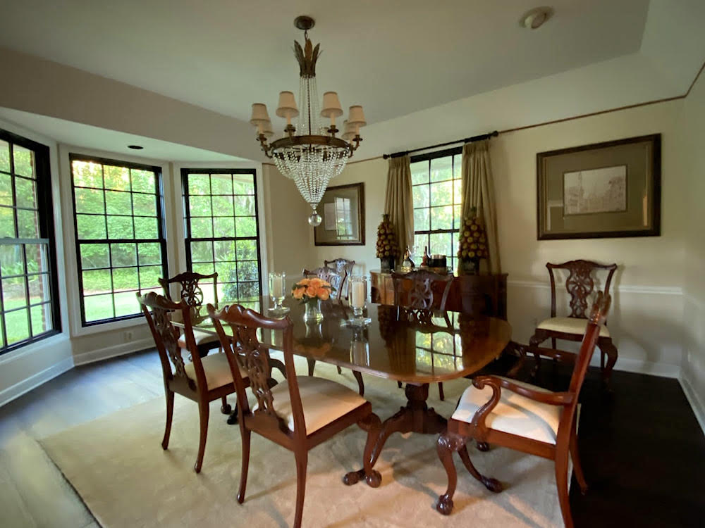
However, the formal dining room is another story, as you’ll see if you look at the attached photo.
While I think it’s over-all a lovely room (the bones, as you say), it looks phenomenally tired and blah. I did add the Oushak rug thinking it would help, but it doesn’t. Fortunately, that one wasn’t too expensive, so I could put it in a bedroom, or give it away.
So, Laurel, here’s the challenge should you choose to take it on for a blog post.
What can be done to make this traditional dining room look fresher but still use all of the furniture that’s there?
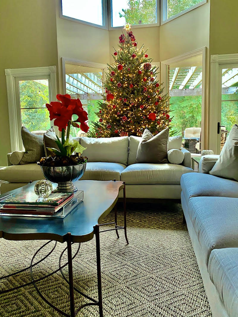
Oh, and still have it look like it belongs in the same house with the living room. (Please see the photo of the living room at Christmas-time). I guess what I’m trying to say is that I wish the dining room was not so formal and had more of a classic-contemporary feeling. There’s something I’m missing, but I can’t put my finger on it.
The dining room chair seats definitely need to have new upholstery.
And, with a covering with more personality, as well. At least, that’s what I’m thinking. But, since I’ve already screwed up, I’m really not sure what the solution is.
Sincerely,
Liz
***
Thank you, Liz. This is a very lovely home, and I’m happy to address the situation of the formal dining room.
And, please know that nothing you have done is terrible. I wouldn’t walk in and go, “what the hell happened here?” I mean, I wouldn’t anyway, but that isn’t the case. In fact, I imagine at night with your pretty china, some candles, and a dimly lit chandelier; this room is quite lovely.
However, you are right. This too-formal dining room is not living up to its potential.
But, as nice as the living room is, I think it could use a little help too. (Most of the help has nothing to do with you.) And since the two rooms are connected, I think we need to make some changes in both rooms.
Okay, here’s the deal. Liz is not a real client. Plus, all I have to go on is two photos. There’s much I can’t see and, therefore, don’t know. Usually, I ask for more photos. And, sometimes, more information. I didn’t this time.
However, for the purposes of this exercise, I have enough information to make some educated guesses.
Plus, okay.
At the risk of sounding like a deranged stalker, I did an internet search of Liz.
I now know everything about her, including her dress size.
No, just kidding. And, believe me. I do not normally look up any readers unless they are:
- Insanely nice, supportive, and consistent in commenting.
- A condescending, judgmental, inappropriate cow who’s about to get her arse blocked. (they are very rare, thank God!)
- I’m doing a blog post about their home and need further information and don’t wish to bother them. Or, I’m just curious to know more in general so that I can be helpful. As much as we don’t like to admit it, people do generally fall under certain patterns of likes and dislikes.
Of course, I will always protect your anonymity. (unless you don’t want me to)
However, I can tell you that this is a good-sized home built in the mid-80s in Florida, somewhere.
And, Liz is a very pretty-green-eyed blond in her mid-fifties.
Why is that important?
Well, I’m looking for clues, and it has been my experience that most blond-haired women love warm reds. They also tend to like blue. I’m not saying that they don’t like green. They frequently do.
However, Liz decorated her tree in RED. Therefore, I know that she’s fond of red.
The other colors in this home are various shades of beige, gold, and greige.
So, let me continue with the design process as I would do if Liz were a real client.
Of course, I would measure each space to be worked on very carefully.
Then, there would be an interview discussing wish lists, givens, plus, things that can and cannot change.
Although, sometimes we find a practical way to change things even though there might be a small loss.
Many times, clients have donated furniture to charity and received a tax deduction. Or, have sold the furniture. Sometimes they give some pieces to a friend or relative.
Let’s first discuss the bones of this home.
There is a post-modern-double story living room with contemporary windows.
And, adjacent to it, is a traditional dining room that has fabulous black window frames. Right now, that’s my favorite part of the room. However, I’d be willing to bet money that they are not part of the original home. I didn’t start seeing black window frames until about 15 years ago. This home is 37 years old. No way. But, we sure saw them here in this post about black window frames.
Now, am I suggesting that Liz and her husband change out the windows in the living room?
Well, that would be nice. However, that would probably mean changing a lot of other windows. If they need to be changed anyway, to be more energy-efficient, for instance, that might be a possibility.
I tried to see the house and neighborhood from google street images. But, for some reason, it’s not working. Otherwise, because of real estate listings, I have gleaned that this is an upscale neighborhood of similar homes built around the same time.
However, let’s leave all of that aside and address these two rooms as best we can. We’ll discuss the issues and the possible solutions.
The first issue with the living room IS the windows as they are, black frames aside.
Can I tell you how crazy it makes me to see the windows/door at two different heights?

That uneven window design definitely falls under this category.
Then, we have a vast space above the smaller window and door.
Above the bay window are matching clerestory windows.
Beyond the windows looks to be a lovely patio area with a pergola. It’s a complete coincidence, but I just added some similar string lights to my outdoor furnishings widget. I bet that area looks great at night.
In addition, there is the overly-traditional corner-plinth moulding on the small window and door.
AND, there looks to be a third window casing on the clerestory bay window!
The formal dining room looks to have the same or similar moulding as the lower bay window in the living room. If possible, I would change all of the mouldings to that one. And, another thing. A talented builder could bring the bay windows down to match the height of the small window and door. Since the windows are inoperable, I think this is a terrific solution, whether they change the window frames or not.
However, they should LOOK like real windows, so I would add a window frame so that it doesn’t look like just a plain sheet of glass.
It’s a subtle thing. However, I feel that it cheapens the home without a frame of some sort.
If it doesn’t make sense to add the muntins to coordinate with the dining room, I can live with that.
The other thing I’d add for architectural interest would be some picture-frame moulding like we do for faux wall paneling or wainscoting. I would make boxes above each window the same height and distance from the windows. That distance is about 3″-4″ And, then I would do one more box to line up with the clerestory windows.
We’ll move on to the formal dining room soon, but what I want to do is talk about the colors for both rooms.
I don’t think the wall colors are working in either space. For the living room, I would do a creamy white with the beige sofas and two-story space. The current color appears to clash with the linen sofas. Those gold-greenish colors were wildly popular 20 years ago. I did a ton of rooms with them. And, you still can. However, for a double story room, I usually prefer white walls.
For the formal dining room, and mahogany furniture, usually a deep, rich, saturated color looks best.
It’s not that you can’t do white walls. However, this does not appear to be a light, bright room, so I’d probably stay away from white, if possible. Please look at North Facing rooms, here.
The problem with this room is that the pale colors clash somewhat and feel tired. While the black window frames help somewhat, they’re not enough.
I suspect there is also a matching china cabinet somewhere.
But, getting back to the dining room, I would probably paint it a warm red. My clues came from the fact that Liz is a green-eyed blond; she loves Gil Schafer’s dining room, (maybe Miles’ Redd’s design-work). And, she decorated her Christmas tree in red– only.
I had a boss who always said that there’s a lot of logic in this business. She was right about that!

One of my favorite warm reds that looks sensational with mahogany furniture is Strawberry Red. It’s a warm, very soft red that isn’t orange, but definitely won’t ever read as burgundy. It’s great for north-facing rooms which this one appears to be. I love it so much that I made it one of the Laurel Home’s Paint and Palette Collection’s colors.
Or, Liz could go even more towards orange with Racing Orange red for her formal dining room. Or, choose a color somewhere in between. That’s one of the beauties of the laurel home paint and palette collection. It gives you a jumping-off point. So, that if you make your samples and think that you’d like to go a little more in a different direction, you can then tweak your paint color choice.
In between 1996-2015, I probably did at least a dozen or so red rooms.
Usually, it was the dining room, but I have at least one red living room and two red bedrooms that I can recall. Every time the red rooms looked terrific and the clients were thrilled. I’m not saying that to demonstrate my abilities. It’s just something I learned over the years. (find out some of my favorite shades of red paint, here.)
Now that I have more information, I have a direction I can explore.
Let’s begin with the area rugs. I love the sisal diamond rug which I found at Ballard Designs.
However, the rug in the formal dining room is a problem.
Here’s why. First of all, it does not look to be a real Oushak rug. I could be wrong. But, the tells for me are the very even carpet pile.
- overly mono-toned disappearing pattern.
- No border. And, maybe no fringe.
- Plus, the rug is too small. It looks to be an 8×10. This room can easily take a 9 x 12 or maybe even larger.
What kind of area rug should it be?
I think that it could either be the same as the living room rug. Or, it could be an Oriental rug with warm reds, blue and gold like these more saturated rugs on Overstock.
OR, Liz could put the more traditional saturated rug in the living room and the sisal rug in the dining room, if it’s the right size.
Either of those choices, I think will be beautiful. I’m leaning more towards the latter because putting a more trad rug in the living room will help balance out that room better for a more eclectic, cohesive look.
What if Liz doesn’t want a patterned rug like that?
Well, then I’ll just need to fire her.
No, I’m kidding. (as usual). I won’t fire her (even if I could) or chastise her. She could also do two sisal rugs.
But, for now, I’m going to assume that she wants to do it my way. hehehe
The dining room chairs come next.
I’d love to see some slipcovered skirts.
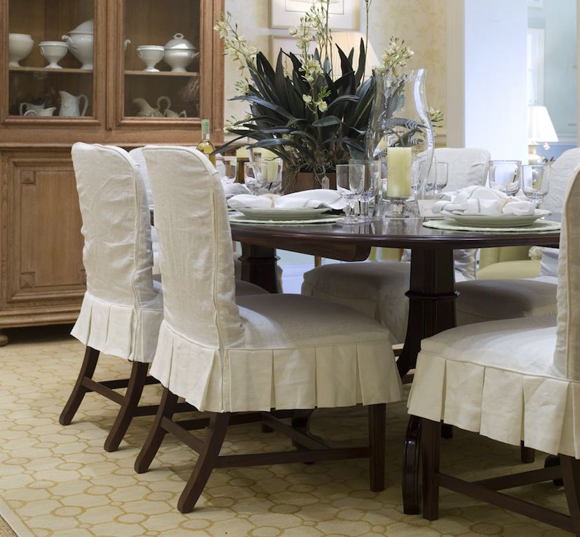
In fact, the entire chair could be slipcovered. Slipcovers are a wonderful way to knock back the formality of these mahogany chairs.
She could also change the host chairs to ones that are fully upholstered. See this post about mixing dining room chairs.
But, here’s the thing. Liz could end up spending about the same on custom slipcovers as she would for new chairs.
There are a lot of very reasonably priced dining room chairs in the market-place. I have a number of them on the pages Liz linked to in her note. And, there are several I love from Wisteria and other sources. You can see some of them in the HOT SALES widgets, here.
And, I linked to some pretty pale chairs the other day.
Laurel, this is reminding me of your do-over of the Deerfield Inn from Thursday.
haha. Yeah… thanks. And, thank you so much for all of your sweet comments. Some of them made me cry a little. The good kind of crying. I know that this has been such a trying time for all of us in so many ways. If I can create a little space to get away from it all, for a few, it’s a good day for me.
Balance in life is always key.
It’s just not easy to find, sometimes. OH! and I forgot the other day. But, I’ve added a cute pic that Cale took of me on my knees while photographing the beautiful Deerfield Inn. BTW, he read the entire post and your comments and appreciates your kind words, as well. And, no. I did not make him read the post. I lost all control over him a long time ago. haha
Okay.
The next issue with the formal dining room is the curtain treatment.
It’s too low and too drab mid-tone. If it were black or white, it would be better.
Let’s bring that image down here, again. I’m not sure what that brown line is, but I would get rid of it, or paint over it. Then I would raise the curtain rod to just under the new crown moulding that will be added. lol, It doesn’t need to be a large moulding. 3″-4″. Please see this post about proportions in mouldings.
I would do a plain white lined curtain on the window behind the server. If custom, it should be a panel and a half in width. And, then, there should definitely be another rod, hung the same height over the bay window, with the same curtain. In that case, I would do a double panel because it is a wide window. The drapes are not meant to close.
One bit of styling that would be awesome in this room would be a deep contrast hem that comes up to the bottom of the window frame.
I’m guessing that to be about 13″-14″ in this case. Or, how about doing a custom trim as we did here in this post about how to make budget window treatments look expensive. I worked hard to crack the code.
Already, I think that this traditional dining room is feeling far more alive and in keeping with Liz’s desire for a fresher, more inviting dining room.
Is there more that she can do?
Yes, there’s always more. :]
One thing she might consider is changing the sideboard. This is not necessary, but for those starting from scratch, it’s something to consider.
In any room, tone on tone is always a good thing.
 To knock back a too-formal dining room – I think adding a piece like this distressed Chinese sideboard from Golden Lotus Antiques on Etsy would be utterly fabulous.
In any case, I would definitely add two buffet lamps. We’ll get to that in a sec.
But, the point of all of this is that it’s a process.
So, that’s when I just start putting it all down on (virtual) paper.
Ala picmonkey.com.(this links to a tutorial I did a while back)
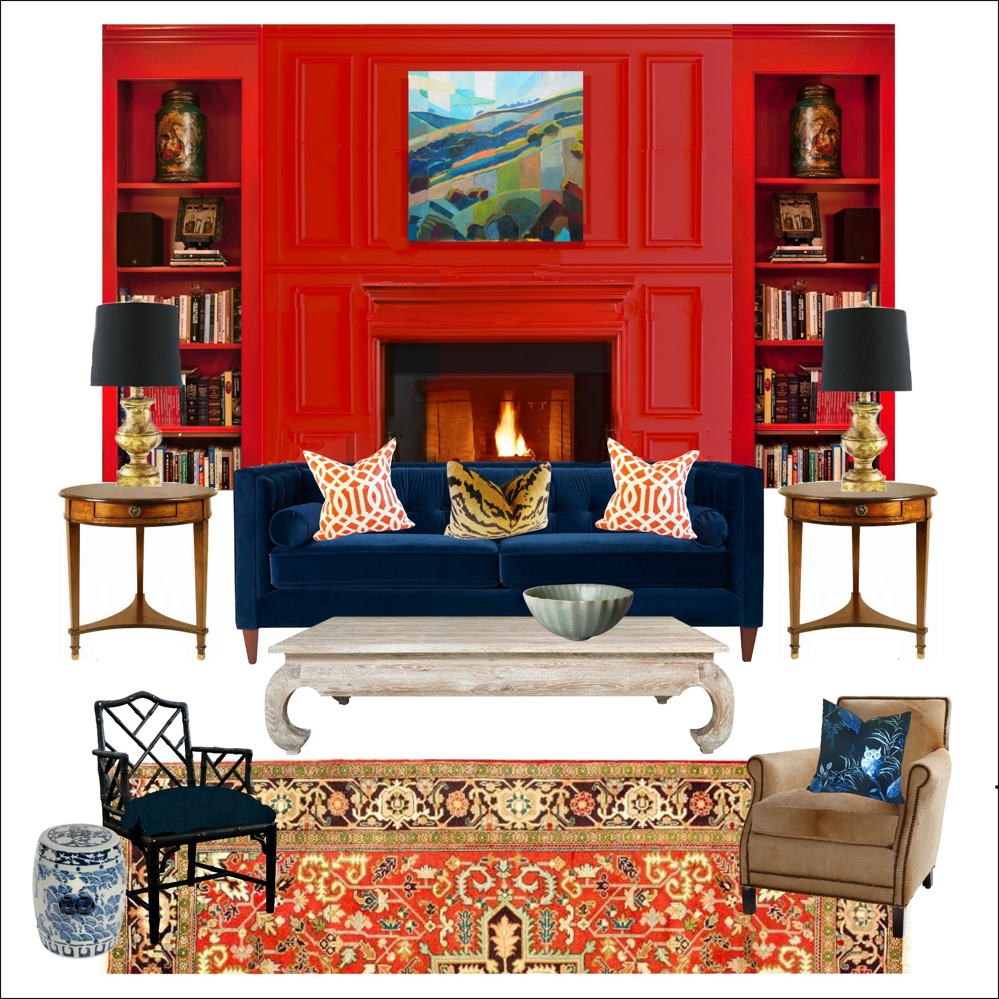
For the last ten years or so, I’ve been making mood boards for myself and clients. This tool has made a tremendous difference in being able to visualize how everything will look together.
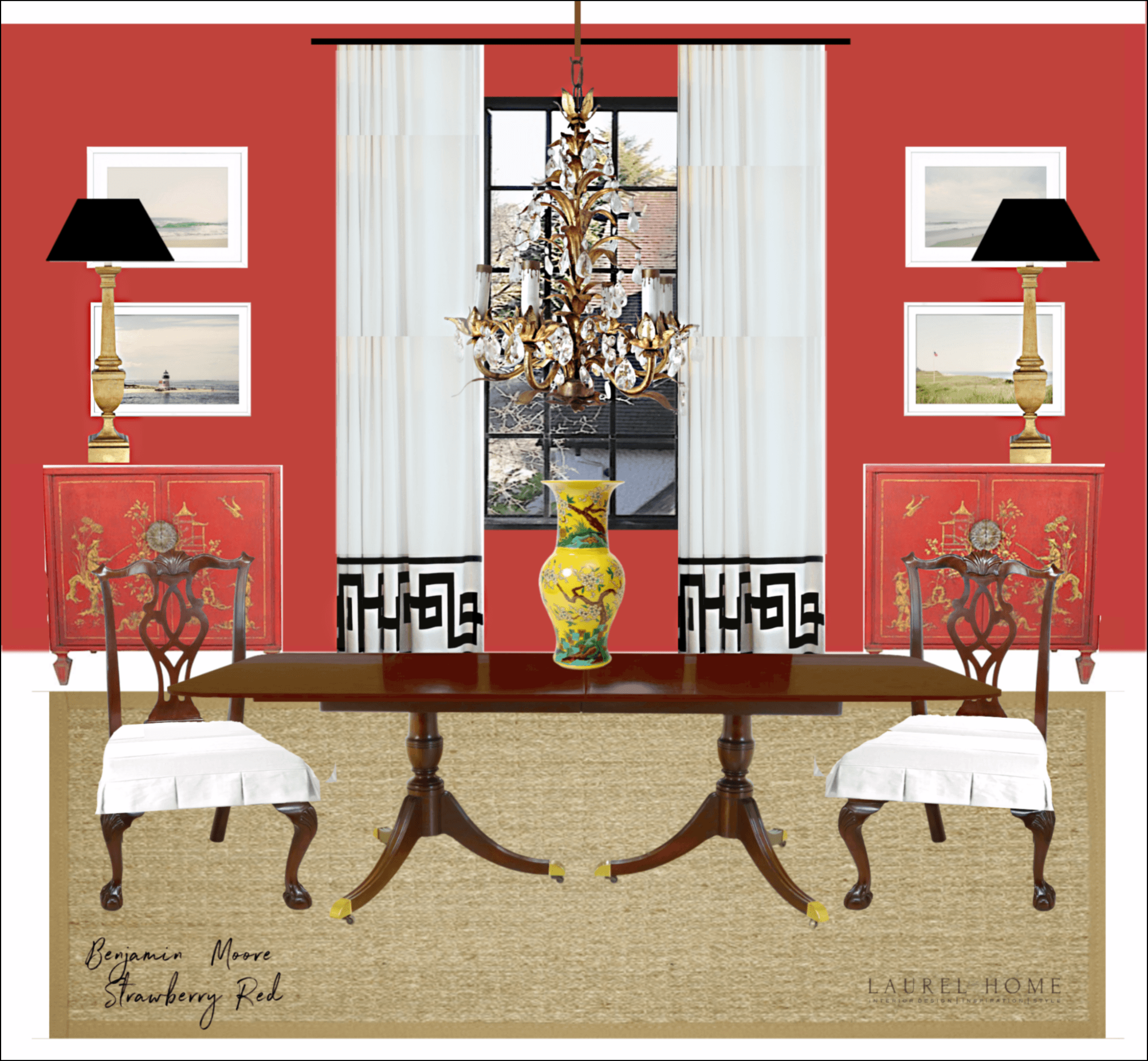
Above is my mood board for Liz’s dining room. I could not use her chandelier. I think it’s fine but maybe could use a touch of gold paint to brighten it up. The red walls immediately bring this room to life. And, the white adds a lot of freshness and feels more contemporary. But I think it makes it more timeless.
 I found these fabulous chests on 1st Dibs. But, don’t get too excited, they are sold.
Why did I switch out to two chests? It’s just an alternative to having the one sideboard in front of the window. But, it’s not necessary.
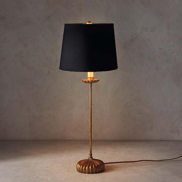
The lamp I actually selected is the Clove Stem Lamp, which I believe is from Regina Andrew. It’s at a great price on sale, right now. In fact, I put it in the Hot Sales general furnishings widget. That’s the second grouping of images on the page that carries numerous brands. The top widget is only One Kings Lane.
I added some art. There are some lovely art prints at One King’s Lane, and these four are part of a large series by artist, Christine Flynn.
Why did I choose these? Well, Liz lives near the ocean, and I love the softness of her work and, it provides a beautiful counterpoint to the saturated color and dark furniture.
Balance.
For the living room, I could see bringing in some of the red colors, but not in the same concentration.
 For instance, Liz could do something like this 9×12 Ziegler Mahal, now on sale at Overstock!
Below are some pillows she could add. Of course, I’m always linking to pillows. But, here’s one post with a lot of interesting (I think) pillow combos.


This 100% wool hand-knotted Oushak-style rug is in the hot sales rug page. (it’s super-cheap on eBay) I color-corrected this rug. It’s an alternative that could work, as well. Remember my client, who got one of these? It looks sensational in their family room.
I would also add another end table and two beautiful table lamps.
Now, some might want to know this?
What if Liz really doesn’t want red and blue? What if she wants it more neutral. Could she do anything else?
Oh, yes, there are dozens of directions she could go in.

She could do a color like Cleveland Green in the dining room. And, she could pretty much keep everything else. But, this is a different post.
Guys, if you don’t yet have my two-volume, approximately 500 page Laurel Home paint and palette collection, it is something you should consider getting. That is, if you’re struggling at all with your decorating.
The guide is designed to help open up your mind to all of the possibilities that, through my years of experience, know will work.
If you’re just starting to decorate, how are you supposed to know? I didn’t 32 years ago. It was only through working in this business since 1988 that I figured all of this out.
Well, I’m at 3,400 words!
I hope this post is helpful and that everyone is doing okay this week.
xo,

PS: please check out the newly updated HOT SALES page, and also the beautiful Father’s Day Gift Guide. FD is in two weeks!
Related Posts
 Affordable Bathroom Fixes With Big Impact
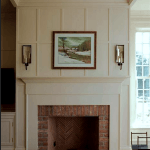 Our Ugly Brick Fireplace – He Vetoes Painting It!
 36 Cheap Sofas and Chairs That Look High-End!
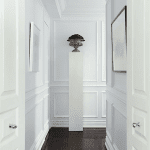 A Long Narrow Hallway – Help For A Dark Scary Mess
 Easy (and affordable) Ways To Fix A Boring Room
 How To Mix Patterns – Designers’ Secret Formula
 How to Fix Dreary Decorating + A Mistake I Made!