

Dear Laurel,
It should really be “Oh, Laurel,”
Ten years ago, we moved into our dream home. We built it and did everything “right.” I mean, we didn’t want to muck this one up.
I mucked it up.
It’s not that I hate my home, I hate the beige decor.
Beige, beige, beige
and more beige!
My decorator INSISTED that my penchant for white would look “dated.”
Ha! If anything white, from what I can see is more wildly popular than ever; love it and I love gray too.
Love this post you did last December. This is what I wish my house looked like!
Some will say that gray is going to look dated too, but one of my favorite posts on your blog is the one you wrote about the fact that gray is an ages old classic color.
I also love the posts about the cool gray paint colors and the warm gray paint colors.
Hmmmm… Unless I missed it, I haven’t seen anything about beige paint colors on your blog. Now, why is that Laurel?
Never mind. You don’t have to answer that one. I know the answer.
It’s because beige decor SUCKS!
And, I’m a sucker for listening to that lame decorator; totally kicking myself. To make matters even worse, I can’t even go and kill her, because she passed away two years ago.
Geeezzz, I feel like a cruel, insensitive cow for even thinking that!
You don’t suppose it was the beloved beige decor that killed her do you?
Well, if it was; I’m a goner, for sure.
That is how strongly I feel about it. In fact, it’s made me feel a little ill since day one. Have you ever done something and felt that way from the onset?
Now, my DH. Bless him, however, he’s understandably getting pretty tired of hearing about my beige obsession. He thinks the house is fine and that it’s time I picked a new “hobby.” Sweet.
Of course, he’s right.
Here’s what I want.
I wish that we could have more gray and white.
Can you mix beige and gray? I doubt it.
Please, though. No judging. I’ve learned my lesson. Always follow one’s instincts.
We can’t go hog-wild with changes, but what can we do to make this look better?
Thanks,
Paige Onbayje
*********
Hi Paige,
I don’t think that all is lost with your beige decor dilemma.
Actually, in case y’all don’t realize it. Paige is another of my made-up amalgam of people. In other words, she’s a work of fiction. But, her plight is very real and not-at-all uncommon.
I so wish I could put up some images of that of which we are speaking. Blah, beige decor.
However, the blog has gotten to the point where I feel that unless I have permission, I shouldn’t use someone’s photos. Some people love their blah, lifeless rooms. And of course, would be insulted if I post them here as examples of what not to do. But believe me. They’re out there.
What usually makes it blah is that it’s a lot of the same. And usually there’s some bloated furniture involved, too.
The closest images I have are in this post about a bland living room. (not to be confused with this “Bland” home)
So, please go over and take a look and just substitute beige carpeting. Then, replace the coffee table with a banal golden oak one. Also, take out the sofa and put in a big hunk of ugly, instead.
Okay, I found a pic from a furniture company. I won’t say who or where. :]
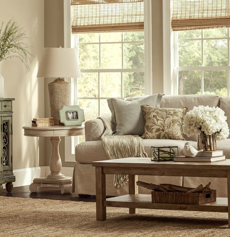
Actually, this is not the worst room I’ve ever seen. But, it is a little one note.
Okay, fine. It IS one note and it’s a flat note at that A flat B-flat! This room can’t decide if it’s going to be casual or formal. The coffee table looks out-of-place to me. I see a lot of ersatz too. But, you get the point.
Some small changes in this bland beige room would make a huge difference.
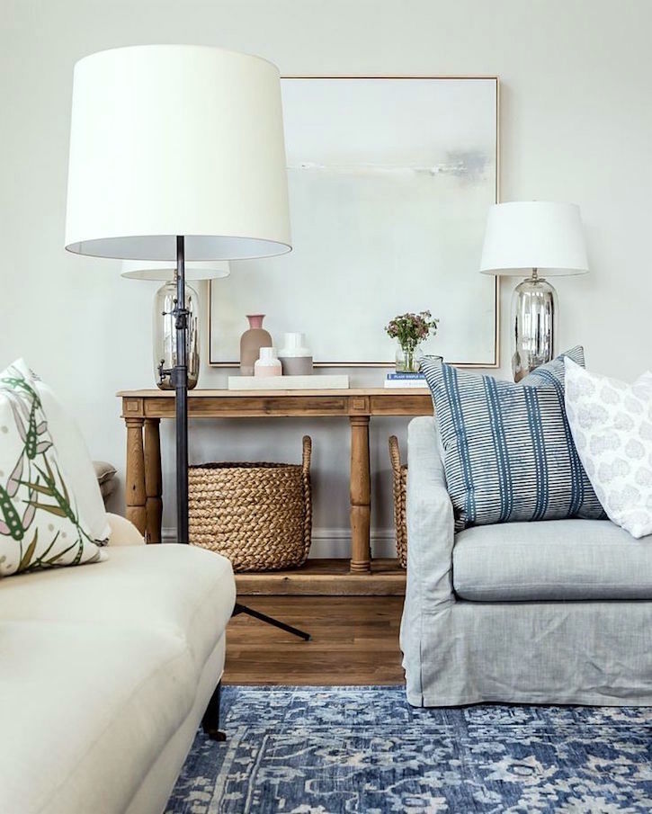
For instance, let’s say that we substituted the lamp for a blue and white Chinoiserie lamp. And, a far more stylish coffee table.
The buffet that I cropped, with all of the curlicues; that needs to go too. Love the windows, but they are crying out for some white linen draperies.
The walls we could keep.
OR change.
In fact, the walls could be almost anything!
And then, elements like the accessories can make a huge difference.
In other words, if you have a room that looks like this and you’re feeling that it’s tired, dated or just plain blah, it is not terribly difficult to make huge improvements with paint and accessories.
For kitchens that need a face lift. It depends. But, if you need to keep warmer, creams for tile and/or countertops, then don’t go TOO white with the other elements. You’ll still need to stay with a creamier tone for kitchen cabinets, most likely.
If there’s room in the budget, I find that changing the vertical in-your-face elements is far more beneficial than the horizontal counters.
If there’s an island, perhaps just change the island or the perimeter countertops, not both.
But over-all with a lot of beige decor, the problem isn’t so much the beige, I feel.
There are lots of beautiful beiges. The problem is the sameness– the lack of a beautiful, rich, complex color scheme. And usually the lack of both white and black and other dark colors.
And sometimes the lack of architectural interest.
Let’s not think just beige and gray, but other colors as well.
I also find that some gold is helpful to spice up a room.
And even in a monochromatic beige room, a shot of chartreuse or coral, dark blue— even brown can make it have more depth and beauty.
This is actually an extremely extensive subject because there are hundreds of ways we can go.
Here is a post from a while back with a similar idea.
However, please know that when it comes to beige decor, I think that beige and gray look fabulous together!
Ever go the beach on a cloudy day?
Gray and Beige. Right?
(I’m thinking beach, because I’m getting ready for a short vacay on Cape Cod this week!)
Mom Nature, is one of my favorite sources for color inspiration.
But let’s throw in a bit of drift wood, bright green seaweed, some pretty beach glass and a dead fish or two. Just kidding about the dead fish.
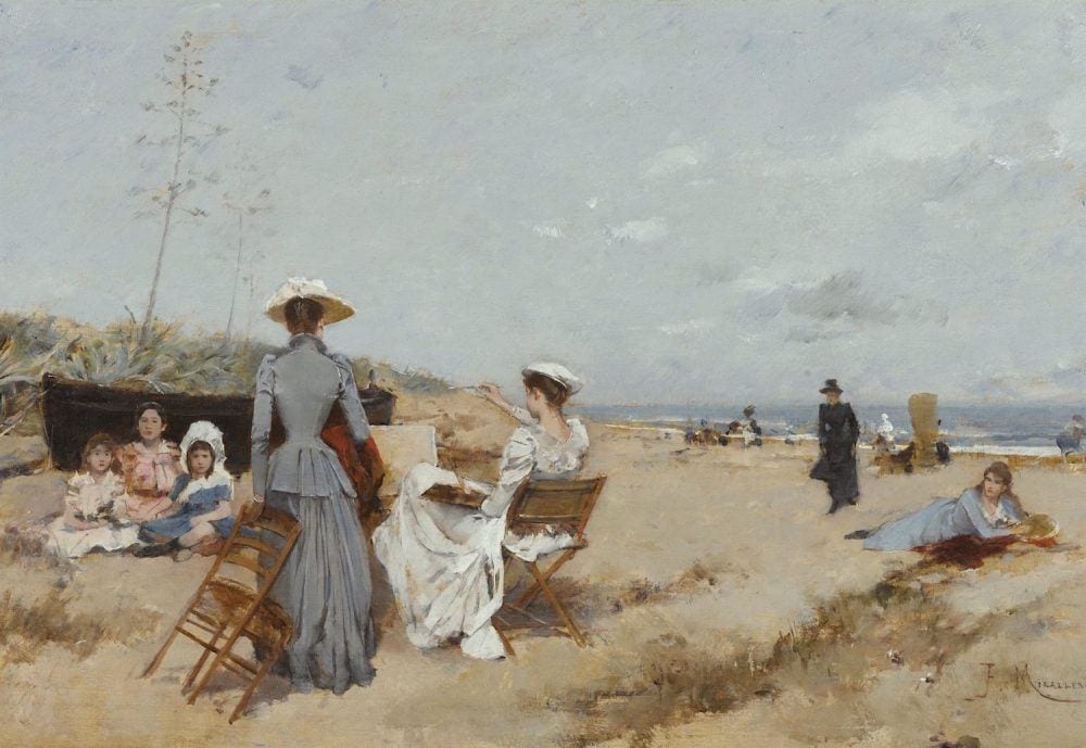
Francisco Miralles via Sothebys- Spanish Painting On The Beach
This turn of the century beauty is estimated to be worth between $20,000-$30,000.

An ephemeral excerpt from a painting at Ruby Lane Antiques– $7,250.00
Let’s look at some Gray and Beige Decor by some favorite sources and designers.
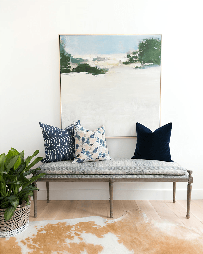
Beautiful vignette from Studio McGee. They say that they have the art piece above in their studio.
Did you know that they have a fabulous shop on their website?
Well, they do, and it’s one of the nicest collections out there, I think.
Below is one of my favorite fabrics in gray and beige.
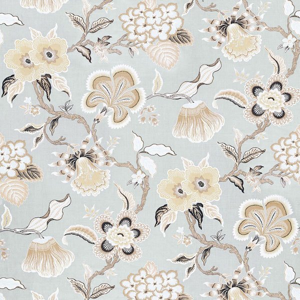
Schumacher’s Hothouse Flowers in Mineral

Here it is done up in a pillow from Spark Modern
And now for some more roomspiration (and some furniture too)
Another beautiful gray and beige room scene from Studio McGee.
When you think about it, we’re almost always working with beige or brown if we have a hardwood floor and any other wood for that matter.
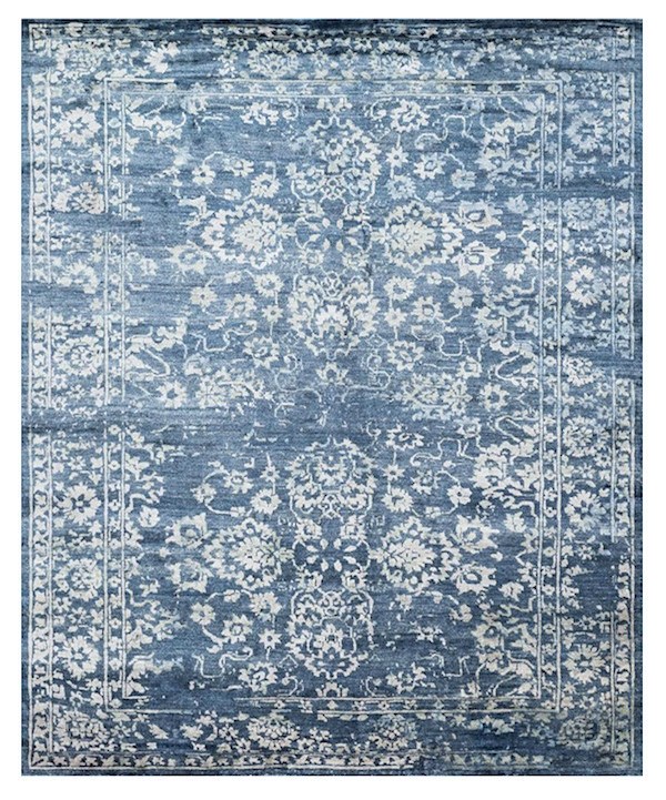 Gorgeous Miramar rug in a beautiful blue-gray that they sell on their website

Above are just a few of the dozens of rugs that from McGee & Co.
And they have a lot of gorgeous classic contemporary and new trad furniture.
It’s a little like hiring them. :]

Fabulous pillows to add texture to a blah, beige room. (they have a lot more than this)
William McLure does tone on tone beige (and everything else) to perfection.
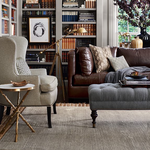
Lovely den in shades of gray, beige and brown – all furniture from Williams Sonoma Home
Classic gray ottoman from Williams Sonoma Home
 And the faux bois occasional table in gold is so chic.
I always love finding these small tables to use when there’s not enough space for something larger or next to a slipper chair.
In fact, Williams Sonoma Home seems to specialize in gray and beige furnishings!
Love Williams Sonoma Home
and they are having a 20% off sale on upholstered furniture at this time.
However, somewhere in my internet travels, I think it was on pinterest, I happened on a new firm that I then traced back to instagram.
The company name is Park and Oak. (above are the links to their pinterest and instagram)
And, the company principals are Christina Samatas & Renee DiSanto. Their firm is located in Glen Ellyn, IL, a suburb of Chicago.
I would say that their style embodies a fresh, young traditional aesthetic.
They primarily use a palette which focuses on whites, beiges, greige, cool grays, from light to dark. And a smattering of roses and purples, on occasion.
But, let me tell you are these women talented! That’s not a question. haha
Please enjoy some pics I swiped off their instagram. Please go over and follow them! (and then come right back, of course) :]
Elegant living room which beautifully combines traditional and contemporary elements. Plus pale, pale gray and beige. The wall color looks like Benjamin Moore Pale Oak. A Laurel Home Paint color!

Wonderful kitchen. The cabinet color is reminding me of the DeVol kitchens.
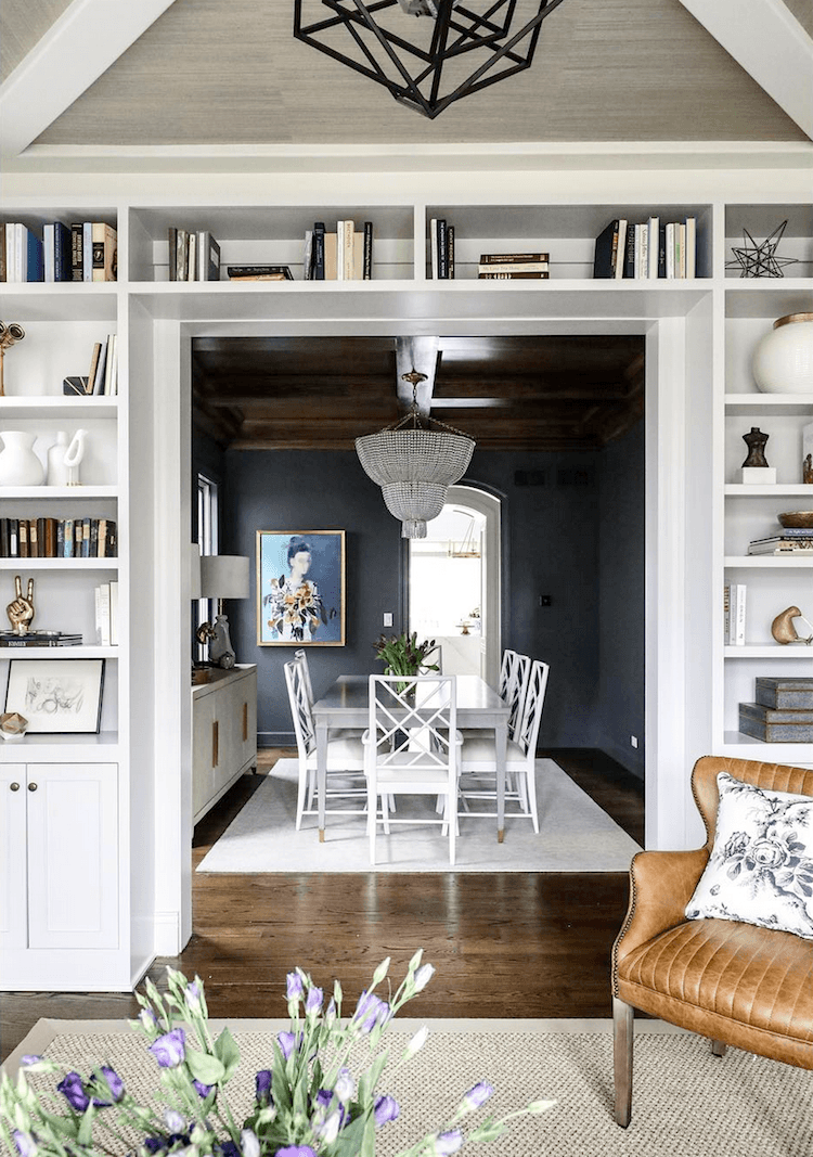
Oh, man, brilliant design! Here’s what I love. Many of you ask me how to do dark colors. Well, here’s a superb example of a home that’s largely pale colors and then sandwiched between two pale colors is the darkly enigmatic dining room. Love the Chinese Chippendale dining chairs.

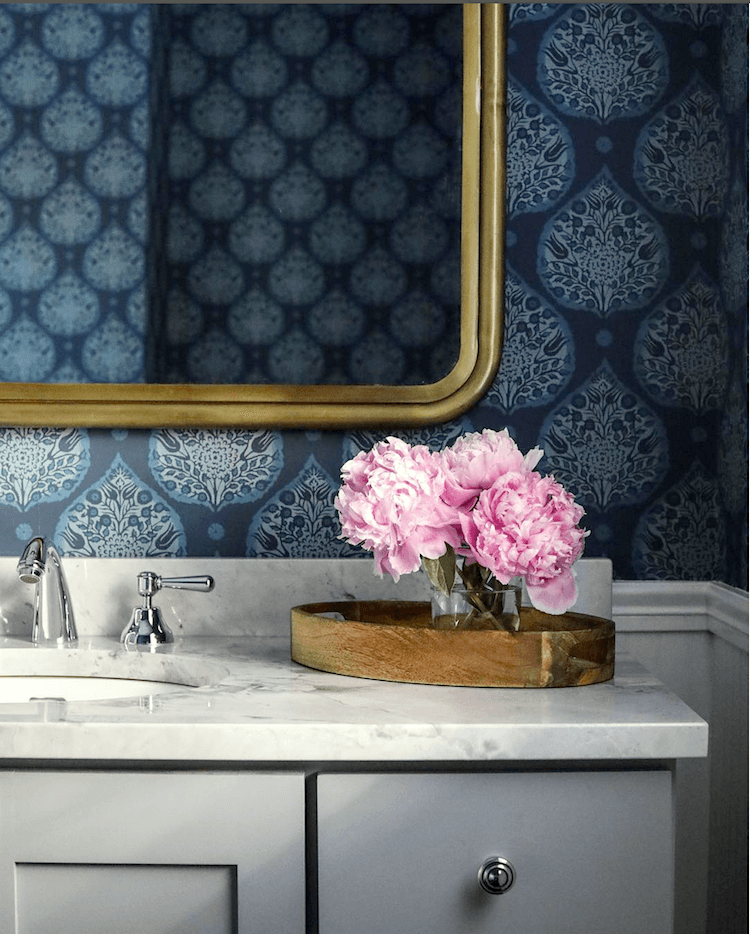
Look how the bathroom color palette below mirrors the John Singer Sargent painting above.
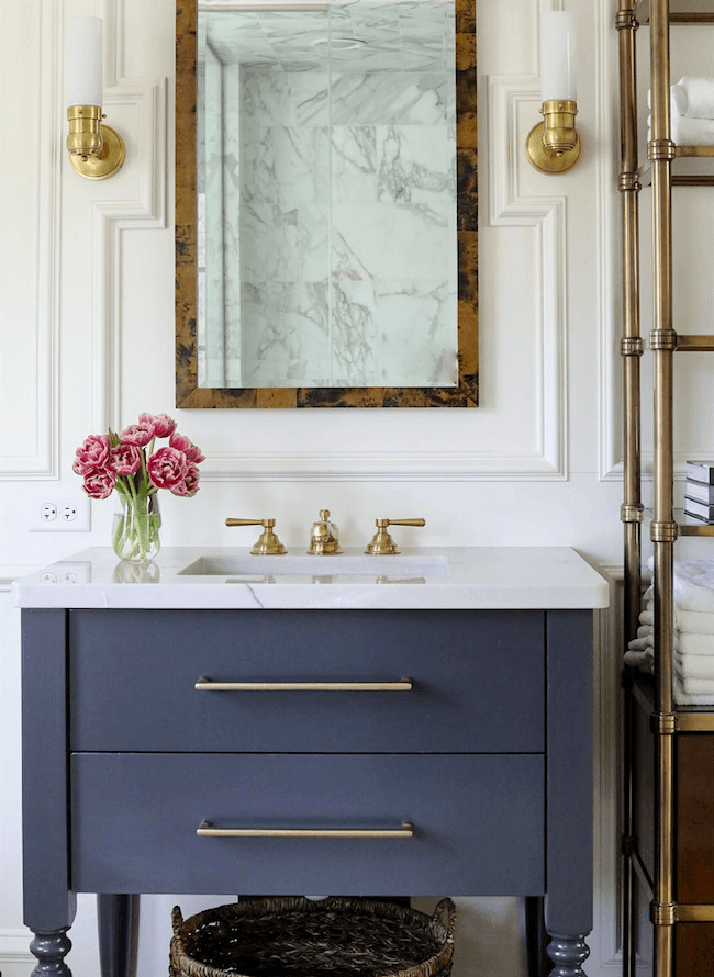
Love this bathroom. The moulding is so cool surrounding the mirror. The antique brass is reminding me of the post about door knobs. That looks like an authentic aged brass.
The moulding details add so much!
They didn’t say but this looks a lot like Benjamin Moore Boothbay Gray.

Benjamin Moore Boothbay Gray hc-165
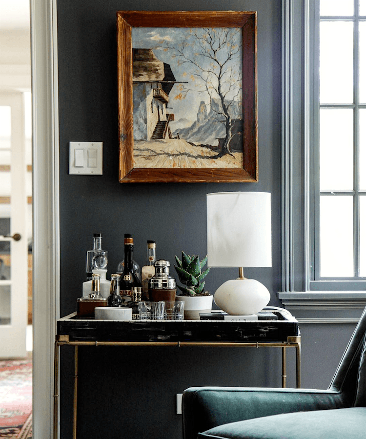
I ADORE this bar cart vignette. All of the elements of which I speak are here. And the painting mirrors the entire palette without looking contrived. Just gorgeous.
What I also love about their rooms is that they are neither overtly feminine or masculine. And that’s not always easy to do. I think that there’s an excellent balance of yin and yang.
One color that gray and beige decor love is GREEN. All shades of green, too.
Here are nine fabulous shades of green paint.
Speaking of fabulous!
Seriously. Where have they been hiding these girls?
Or maybe it’s me who’s been hiding? haha.
But, put your hand over the flowers and food. See how much that little shot of color adds?
Yes, yes, yes, I know, I know!
( and ahem…You have a little foam coming out of the corner of your mouth)
No worries, I’ve got you covered; the wallpaper info is below.
I did the Laurel method of finding products which I go over in great deal in the back of Laurel’s Rolodex. I have about an 80% success rate with it, as long as the image is clear.

Little Lotus in Ink from Galbraith & Paul
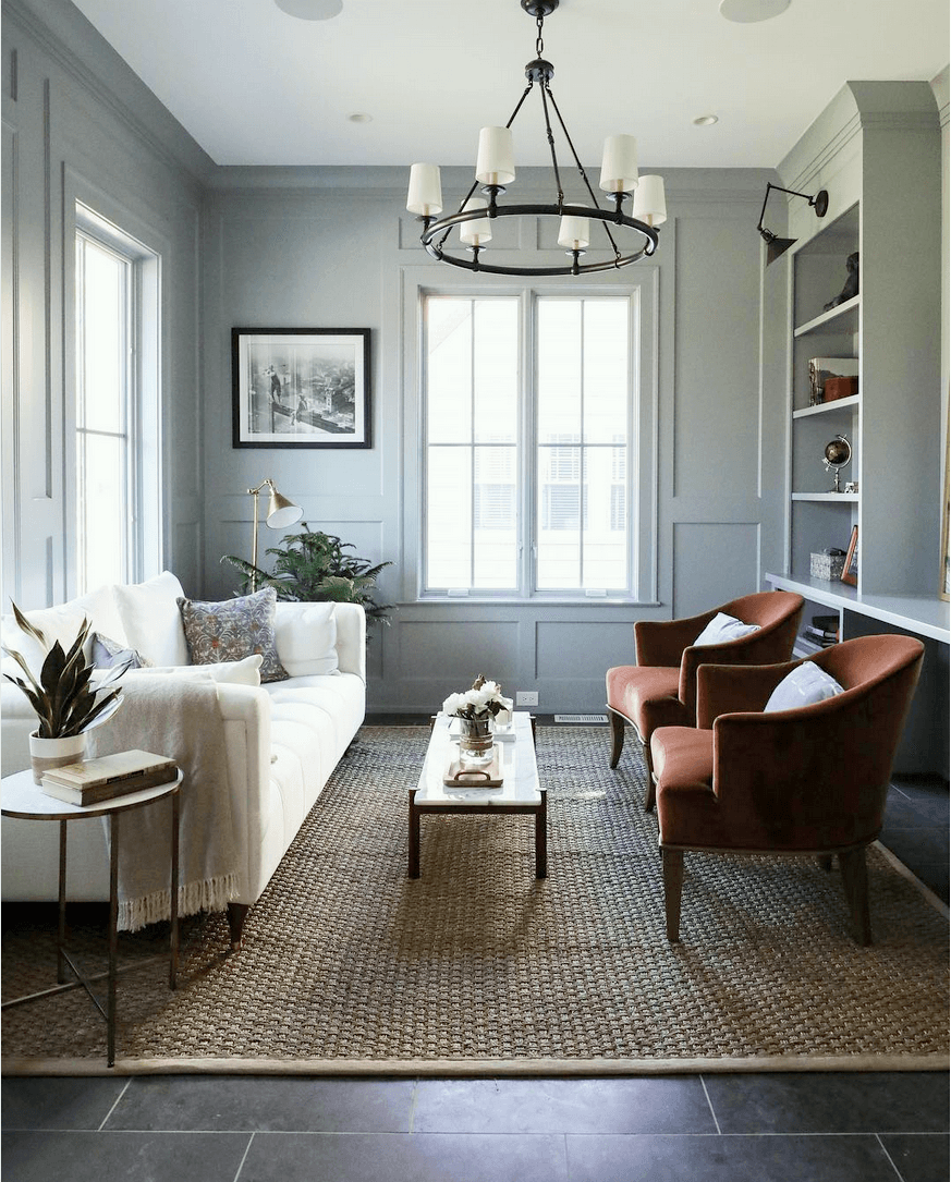
Gorgeous den. Looks like Benjamin Moore Gentleman’s Gray– another Laurel Home paint color.
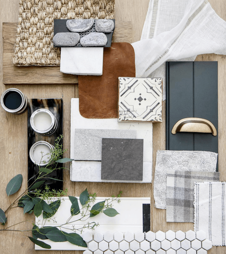
Above is a handsome flat lay of samples for a job. And that’s exactly how it’s done. Put everything together. If something’s not working, I always found that it would shout back at me.
I’M NOT WORKING.
And now for a little surprise. Last year I created these palettes for a post that no longer exists. (technical stuff)
But, here’s what I think is so cool. These palettes from last year mirror the colors used by Park and Oak Designs!
Please enjoy these three coordinating palettes using colors from the Laurel Home Paint and Palette collection. I think it’s a total of 23 out of the 144 colors of the collection.
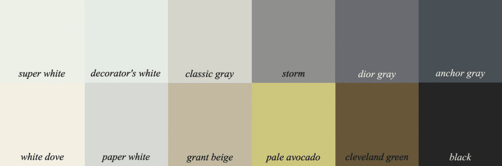
Palette number one has lots of whites, pale and dark grays, a little beige and a hit of chartreuse; plus that wonderful, warm bronze-y color Cleveland Green.
For those of you who don’t own the Paint Palette Collection. (yet) :]
The idea behind these palettes is not that you go and paint each room in your home one of these colors. No way! You might use two or three, OR you can also combine these palettes with other palettes in the same palette family. It’s all spelled out in the two-part guide which is nearly 500 pages filled with tons of info and inspo.
The palette indicates the colors that work together. They might be in a piece or art or a fabric. And of course, you don’t have to use all of them. Paint collection owners have 40 boards along with the furnishings and sources!
Palette #2 incorporates more color.
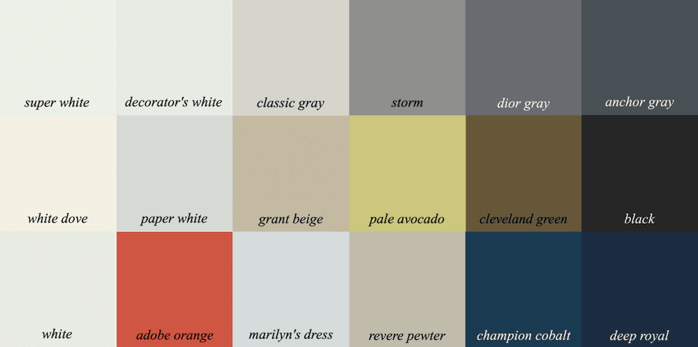
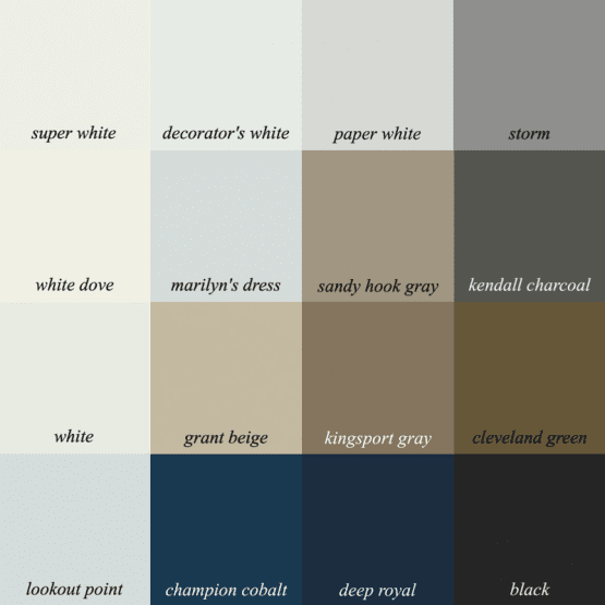
And because I love squares, here’s a square palette with just the neutrals and blues
The upshot to all of this is that beige is not a dirty word. Beige within a beautiful palette of neutrals, whites grays and blacks, with shots of other colors and gold, makes for a lovely color scheme.
And it’s possible to incorporate these colors in rooms that are currently all-beige.
xo,


PS: Please don’t forget that today is the last day of the Nordstrom Anniversary Sale.
All prices will be going up at midnight. (Sunday night at 11:59PM) Please check out some of my favorite items. You can start here and it will lead you to all. Lots of new things to see!
And also don’t forget the Serena and Lily Tent Sale. In fact, they just put their sale on sale. And by that, they are offering an additional 15% off. This too is only through the 5th of August.
Related Posts
 My Favorite Sources For A Chic, Affordable Medicine Cabinet
 Some Of Your Recent Interior Decorating Questions Answered
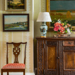 What If Your Room Plan Falls Apart In The Middle?
 Can This Boring Bland Living Room Be Saved?
 Here’s How You Can Create Beautiful Rooms – Effortlessly
 Sisal Rugs Shocker + A Gorgeous Home You’ll Want To See
 A No-Fail Decorating Plan In Time for Christmas


40 Responses
Laurel, thank you. The inspiration coming from paintings is dead on. All the photos you have featured are quite delicious to look at, and I have confirmed in my mind that the palette I have started with for my new house is the one that will make both myself and my very masculine husband happy and peaceful (greys, blues, and chocolate) . Though, I love purple, the combination of warm beiges and browns with muted greys and blues combined with the greenery from live plants will create a calm and welcoming but sophisticated look for our very common colonial layout. Thanks again and keep up the awesomeness!
Thanks so much Kirsi!
As always, a great post! Always hated beige, didn’t know how to pair it with other colors without making the place look like an old people home. I agree that it makes a nice looking color scheme with shots of other colors and gold. Dark blue and dark green would work rather well too.
Great post! Tonal rooms of any kind need lots of different textures and materials to come alive as you demonstrated so well here. Biege isn’t boring or dated at all if the mix of hues and materials are varied. And gray and beige? I have a whole Pinterest board devoted to it! I love the mix of warm and cool as a base to mix metal finishes too.
Also agree with you and some of the comments- green and black provide much needed punch.
Great post as usual! I love those cabinets in the kitchen with the purple blooms. It’s not White Dove, I did a kitchen in that color years ago.It’s a great color, whatever it is.
Oh lord this is me right now. We just bought our first house and all the walls are beige, like 3 different shades. And we have no (and I really do me, NO) adult furniture. I’ve been stumped on how to add color and contrast without repainted the whole dang place. Thanks for the inspo!
White is an uncommon wall color in my part of the country due to the intensity of the natural light (they don’t call it Big Sky Country for nothing!), so some shade of beige is often used. The main problem is being afraid of using other colors along with it. .I have a library with cabinetry in dove grey & red walls. It’s very dramatic and I didn’t want to change it, but I wanted to paint the rest of the first floor a medium khaki, (both gray & tan are in the marble flooring).. So I used the same tone of red in some accessories on the first floor, along with a lot of black- you are definitely right about a “shot” of black, Laurel. I found a rug for the library & fabric for the living room couches in this “palette” (palettes seem a great deal more planned out than what I did!) which forced me to bring in color and pattern so the areas would make a unified whole. I know the general advice is to START with a lovely fabric or rug and work out from there, but the reverse can work to tie colors together, and with the internet one can now scan hundreds of textiles very easily. Of course, if there isn’t such a textile, then it is possible the color scheme really is an icky one, but most people tend to be drawn to certain colors that seem to work together. You just have to make color choices look deliberate rather than accidental.
Oh, I’m so sorry Danielle. I’m actually on vacation. And there’s nobody else to answer comments. But, thank you just the same.
Laurel, I feel you have missed your calling as you are a ‘sensational’ teacher and are never ever ‘boring’ thus rest assure can never be accused of being a ‘beige’ person … ☺. Thank you so much for another very informative post.
-Brenda-
P.S.: Followed the link for Park and Oak Designs and agree they do fabulous work.
Hi Brenda,
That is so sweet. Much appreciated!
Hi Laurel,
I love your advice and design sensibilities. You’ve helped me pick the perfect blue paint and helped me choose a back splash for my kitchen. I’m wondering have you done a blog post on choosing the right kitchen counter top?
Joanne
Thanks Joanne,
This post is primarily about marble and quartz countertops.
I’m the shade-blind reader who bought a beige sofa thinking it was grey. Before your previous post on beige with grey I felt immobilized by the sofa. That post empowered me to forge ahead. Thanks to you, I love the almost finished project. The office is a blue grey with navy and small bits of black and color from maps and other art. The living room and dining room are predominately Shoreline grey [I love your bathroom]. The entryway wall which is open to the living room is Bergamot. Those rooms also have black, along with shades of blue, and, of course, more orange sprinkled about the room. My rugs are grey and cream and the hardwood floors are at least three shades of brown. Thank you Laurel for talking me down that cold, dark night. Now I’m not just living with beige and grey, I’m loving it.
Hi Ann,
Well, this just makes my day and it’s already been an especially good one!
Love, love, love this post! I wish I had seen it a year ago. I worked with a designer to up date our home in Arizona (Beige everywhere here!). I love so much of what she did…we added some creams, a bit of brown and some orange, but I feel it needs something else. I wish I had seen your palettes before we started. That pale avocado is just dreamy!! I learn so much from your blog…thank you, thank you , thank you!
Thanks so much Marcy. I’m glad that it’s helpful!
Add some BLACK!! That was my immediate response to the poor beige blahs in the “reader” letter. And yes, take another step and throw in a few judicious dabs of color as well. Put some non beige art on the wall and add a handful of accessories in related colors. To me that’s easy. Now adding in gray with beige certainly works but I feel it’s possibly a little harder to hit the right balance so that both neutrals feel intentional. Totally doable, but harder. Lately however there are more home goods out there with both gray and beige in them as tastes are shifting .
Yes, always some black! All rooms need it, but especially pale rooms. But, I love dark blue with a little black too.
The 19th century french artist Eugene Boudin was a master of these colors. Some of his work is very small; sometimes the colors in the small works are the most instructive. There are plenty of his works in US museums. In person the color are much richer than on our computer monitors.
Thanks Rose,
I’ll have to look him up.
You must have been channeling me when you wrote this post! I’ve always been a beige gal! My creative friend suggested I try going gray, and after she painted my horrible gold stone fireplace in beautiful washes of gray, I was elated and after a year of stressing over wall color went with Alabaster on the walls, and since my favorite color is Sherman Williams Copen Blue (old color) I painted the ceiling with it and the bummer is it looks sky blue, which I detest, however I like being married, so for now I’m stuck. To further compound the problems in this room I impulsively bought an expensive sofa in an oatmeal beige Sunbrella fabric with navy welting, and we’ve been living in this room with just the sofa for over a year because I’m afraid to make another design debacle.
So THANK YOU, THANK YOU, YHANK YOU for this amazing post, finally I have a roadmap for success…..hopefully I’ll stick to the road.
Sincerely,
Ellen
Hi Ellen,
I’m so glad that this post served to give you some direction! It sounds like you’ve already made a great start.
In the 80s in California, a friend and I used to make fun of the upper class people decorating with flat beiges and wearing only beige.
The irony is that my mother loved, loved wearing beige even though she was a coal miner’s daughter who never made it into the middle class.
I am a blue/purple plus person. I feel starved without those two colors. I do have a white couch in Sunbrella type fabric which can be bleached with a silver grey bench coffee table in front of it. The blue/purples are in the pillows.
The wonderful ‘neutral’ alternatives you posted are gorgeous. You are affecting my color sense. I am trying to work out a more subtle use of my favorite colors which include aquas as a foil for blue/purple.
My next home will have far more worked out colors even though I will not give up my blue/purples. The color scheme in my present house works but not as well as your examples.
I’ve bought you ebook on creating a web site. I love it; however, I am wondering if you have any palettes based on blue/purple in you paint colors ebook?
I simply have to have blue/amethyst/aqua color scheme. Am I nuts?
Hi Ramona,
I don’t think that you’re in any way nuts! I think that almost all colors, if used correctly are beautiful. I think that purple is more difficult to work with than other shades, like turquoise. But, what I’ve noticed is that with a color, the more abundant it is in nature, the more it works with all other colors. So, colors like yellow, orange, red, purple and pink which are not as common can be more difficult to work with. Nature is filled with greens, blues and browns from pale to very dark.
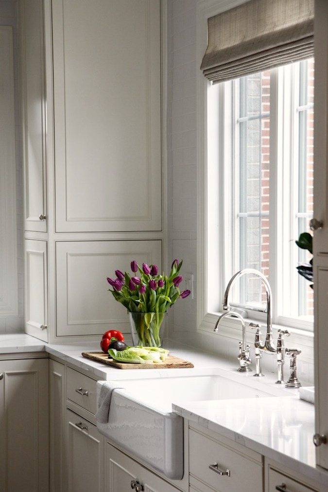
Laurel, what is your thought on the color of the cabinets in the kitchen shot with the tulips and red pepper? I love reading your posts. Thanks!
I love it! And no, I have no idea what the color is. I just like the whole feeling of it.
If you look through their website it says the cabinet color is BM White Dove
It is? wow! That’s a shocker, for sure.
If you happen to see this and can remember where you saw it, I am very curious because I would never guess it to be white dove. Not saying that is incorrect, just that it looks quite gray. My bedroom is white dove and what I see here looks exactly like what I see in real life. I did color correct it to my macbook pro. But it also a testament to how looking at colors in photos and trying to figure out what they are, is a futile exercise. I always say that if you like a color, try to find one that looks what you are seeing. I can guarantee with 99% certainty that what one is seeing in a photograph, on a computer is going to look quite different than the color on the walls in one’s home.
Hi Laurel,
I think I found you by looking for ‘the best whites’ too! I love your blog- I have learned so much from you. We recently moved into a new house with one of those huge great rooms (living, kitchen, dining & breakfast nook together). I picked a pallette of white, beige and gray, black and white, with touches of kelly green. And I used Benjamin Moore Kendall Charcoal to give everything some depth. And white linen curtains with my woven woods! Pale Oak for the rest of my walls. Your blog has given me so much inspiration! Thank you.
Dee-Dee
That sounds beautiful Dee-Dee! Thanks for your kind words, too!
Thanks for the great post this morning. You make decorating with beige look lovely & easy. When dealing with beige, do the undertones all have to be the same or can they be a mix?
Regarding Park & Oak…I’ve been in love with their work so long!! And they are located very close to where I live. I’ve had many a fantasy of them re-doing my home. If I ever win a lottery you can be sure they will be the first one I call.
Have a great Sunday!
Hi Mary,
I don’t think that there are any hard and fast rules. Everything’s contextual. And at times that can mean undertones, too.
But what has always worked for me is to hold everything up as it will be living, as much as you can.
There’s one other thing. Twice in my lifetime, I’ve put two colors together that most would say “clash,” looking at them, not in their context. However, the reality was that I loved them. Both instances involved a rug. That has been a fantastic lesson for me.
Thank you so much Laurel for featuring some living rooms and dens that are not huge in this post. We live in a modest century home with very small rooms and I’m always looking for inspiration.
Hi Sue,
I prefer smaller rooms on the whole. Of course, a lot of readers have BIG rooms. They are more of a challenge to decorate, IMO.
I bought a house with a grey and beige bedroom color palette. At first, I thought it was crazy. However, I ended up buying Ralph Lauren’s hathersage bedding and it looks amazing!
Hi Heather,
That’s very pretty! Love Ralph Lauren.
The decorator who died had been greiged to death. It makes me sad to think that so many people out there still think that neutrals are the way to go. Their brain is stuck in neutral like a car – going nowhere. Colour is the thing – and always has been. I just looked at a million dollar real estate listing, and the house was completely in neutrals. I’ve never seen anything so boring and insipid. The kitchen looked like a surgery and my eyes glazed over so quickly that I don’t even remember the rest of the house. It’s all part of the phoney HGTVization of America. People think that you can’t sell a house unless it’s neutral because that’s what they say on HGTV, which is completely, yes, ERSATZ!
It’s all part of the phoney HGTVization of America.
Bingo!
Laurel,
Long time reader who found you when I googled best white trim colors when preparing our home for sale over 3 years ago. Look forward to receiving your blog on Sunday, especially love your reference to the great works of art that inspire your color sense and the historical attention to molding and trims. Not familiar with the Sargent painting in today’s post but Sargent Fans might enjoy reading the book,Sargent’s Women. Wish you were my neighbor!
Hi Cynthia,
I wish that you were my neighbor too! I’ll have to look for that book.