

A LOT of you have asked:
WHAT is the color of Ben Pentreath’s Living Room?
WHAT is the color of Ben Pentreath’s Yellow Kitchen?
Good question because I too, love the Ben Pentreath Paint Colors
Thus, ever since I came back from England, four weeks ago, I’ve used every power of my God-given talent for sleuthing revved up to max stalking speed.
BTW, because some run for cover, when I say “stalking;” lol, What I mean is a colloquialism heard commonly amongst millenials (love you guys!) which merely means LOOKING on the internet.
Fine. INTENSE looking.
However, the stalkee, has absolutely no idea nor are they in any way terrorized by my obsessive quest for knowledge.
Besides, it’s for the benefit of all mankind.
We very much NEED to know the Ben Pentreath paint colors!!!
However, our adorable Ben (he really is) has a brilliant way of making you think that he’s told you the color without actually telling you what the bloody color is! That’s a very special talent, indeed!
But the truth of the matter is; I’m willing to bet you a divine tea at Harrod’s that he truly has no idea what the precise colors are!
Why? Maybe because he knows that he will be hounded or maybe he actually doesn’t care all that much. I have a feeling that Ben loves all colors!
Therefore, we need to resort to using all of the information we do have, plus visual clues, plus some educated guessing.
Let us begin with the living room.
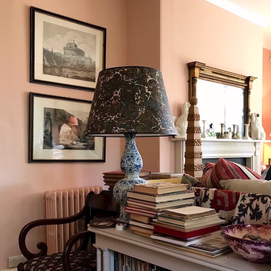
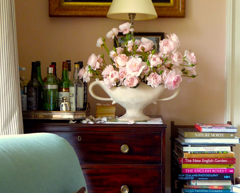
It still doesn’t seem quite real. I was there. OMG! Surely, I was just having a lucid dream, but no, I have the proof in all of the pics I took. I was IN Ben Pentreath’s living room. It was a bright sunny day at around 1:00PM which is about as good as it gets. However, there were also some lights on in the room, which is not ideal.
Clue #1
Ben has said that the paint was custom-mixed by Paper’s and Paints and that is true.
Oh dear me! An 11th hour surprise! I just linked to the page where Ben’s “Parsonage Pink” lives and there are TWO VERSIONS!
Two weeks ago, there were only four colors on that page. And they don’t give the “Odd Useful Colors” out.
I found that out after contacting them for some samples Paper’s and Paints. For 350 English pounds, I could’ve had all of the samples except for the ones I really want which are the Parsonage Pink and the Soane Yellow.
That’s bloody cruel, if you ask me.
But, they’re on to us.
Of course we want to SEE the color.
Could I have bought the paint? Yes, most likely but that would ruin the fun. ;]
FYI, I am positive that Ben’s color is the original Parsonage Pink which is the darker of the two pinks. The other one is very pretty and is very close to a couple of the pinks in the Laurel Home Essential Paint Collection.
Well, we need to move past all of that.
Remember when I said that I burned the Ben Pentreath paint colors into my brain?
Well, I did and of course, have my own photos. And actually, the colors my I-phone 7 takes are about as true as I’ve seen on ANY camera.
But one trick I use is to color-correct and one of the best ways is to look at the whites to make sure that they don’t look pink, blue or purple. That’s a sure sign, that the image needs to be color-corrected.
clue #2
We already know that the living room is a pinky-peach color.
Like orange which we discussed a few days ago, peach is up there amongst the most feared colors.
And this is why I believe that is so.
In order for peach to be lovely and enticing, there needs to be a decent amount of brown (beige) in it; not so that it reads as beige, but just to give it a little heft. And that is because a peach without that note of brown is going to feel mighty cloying.
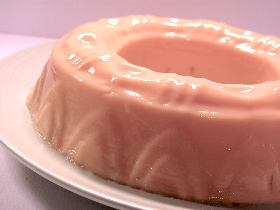
It’s like living inside a giant peach jello mold. ;]
But, that’s not Ben’s color.
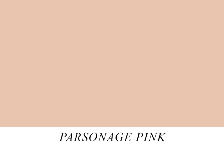
This is Ben’s living room paint color custom mixed by Papers and Paints.

And this above is the Benjamin Moore equivalent, or very, very close.
It’s called Careless Whispers 1214.
 Pretty good, huh?
Above and below are my photos in case you don’t realize that.

Because there are a couple of lamps on, there’s a little distortion, but otherwise, very, very close.
I feel quite confident in Careless Whispers. I’ve had it taped up on my door frame for two weeks and every time I look at it, it takes me back to Ben’s living room.
What’s interesting is that most, including me wouldn’t think to look in this part of the fan deck. And I didn’t, at first.
That’s because the typical jello mold pinky-peaches are in the front.
And when one looks at them on the chip, they look very pretty, but on the wall, they are too icky-sweet.
Now for the kitchen.
Ahhh…
My clue (#3) here is that it’s one of the super bright yellows from Dulux. Ben said that he didn’t remember which one.
Right. Of course not. :]
Now, here is where it gets super interesting. (if you click on the above link)
I love Ben and think that he is one of the most supremely gifted designer/architects on the planet,
but…
His photos well… they aren’t very good, at least not in terms of color correctness. And that is not going to help us much.
For instance, going back to the living room, we have this lovely vignette from Ben’s blog.
This is stunning, but it’s not the color at all!
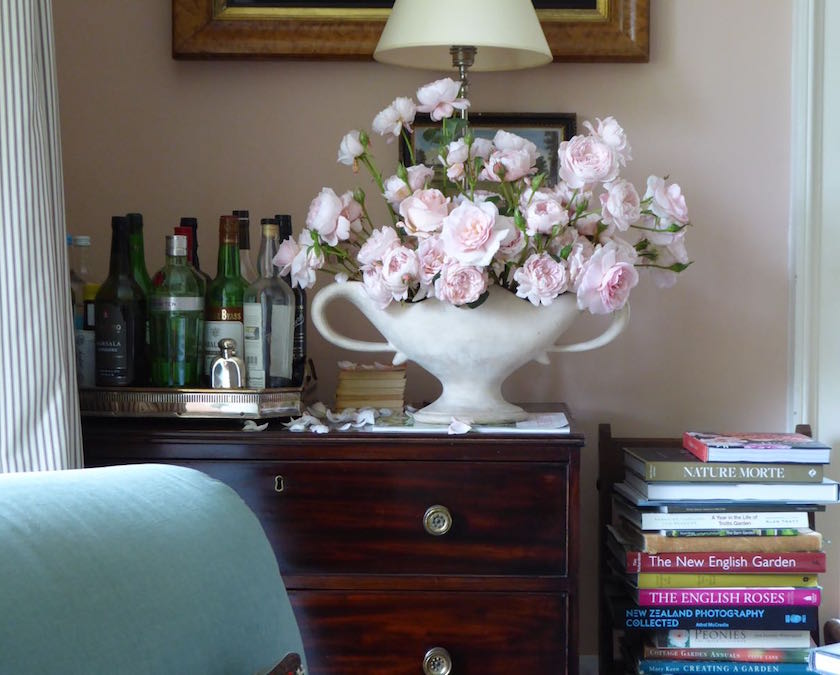
And below, after some careful editing.
This is much closer.
Obviously, the correct color is not terribly important to him, like it is me. My problem. Still, if we’re talking about replicating the colors, we need to be as true to how the eye sees them in real life as possible. Makes sense to me.
In Ben’s defense, it was undoubtedly a dark, cloudy day when he took his pics. And that dark gray, put a cool, muddy pallor over all of his colors. It’s not that anything looks bad. It’s just not what they are.
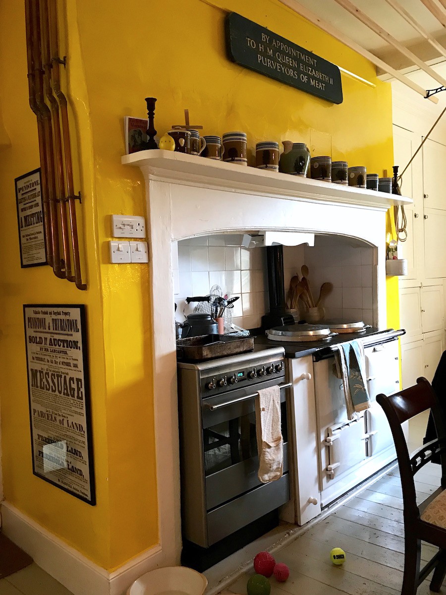
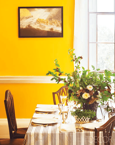
Let’s look at the kitchen.
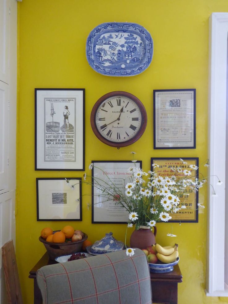
This color is also wrong. (taken from Ben’s blog) The color is not nearly that icy or like someone took a case of yellow hi-lighters and painted the kitchen with them.
My memory of the color is that it is highly saturated, bright and warm, but not blinding. And everything looked great against it. I particularly love the Welsh dresser that you can see here.
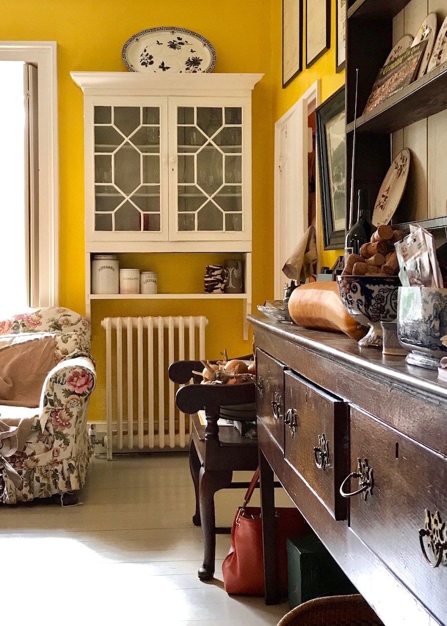
photo taken by me in early October 2017
The color is a true, bright egg yolk yellow. And there’s my purse on the floor for color reference. Looks good! This is the color!
But let’s go back to Dulux. If we can figure out which of the Dulux colors it is, as that would be helpful.
Unfortunately, Dulux is inconsistent with how they convey some of their colors.
For instance.

Dulux Dandelion
And on another page, another version of Dandelion
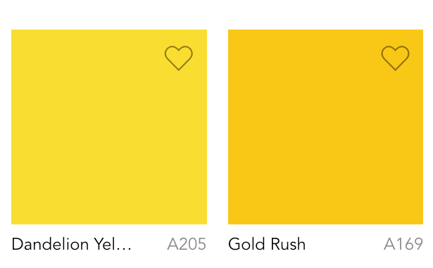 To me, the first dandelion looks like a combo of the second dandelion and gold rush.
The one on the left, I really don’t think so. That would be quite neon, on the wall.
Another shot of the yellow in Ben Pentreath’s and Charlie McCormick’s Dorset kitchen.
Me thinks, Gold Rush!
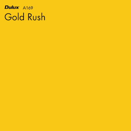
I found this shot of a door painted Dulux Gold Rush
Since I’ve pretty much been focusing on either Benjamin Moore or Farrow and Ball, I figure that it is best to stick with those. Farrow and Ball does not have a saturated yellow like this. The closest is Babouche and while that is a wonderful saturated yellow, it is not quite the same as Ben’s yellow kitchen.
Benjamin Moore has a PLETHORA of bright, saturated yellows. In fact, too many!
Just bloody great.
Because believe me, I can drive myself nuts, with the best of ’em!
But then… hold on…
Didn’t I do about a post about bright saturated yellow paint colors?
Yes, I did. And it’s a pretty good one, if I say so myself.
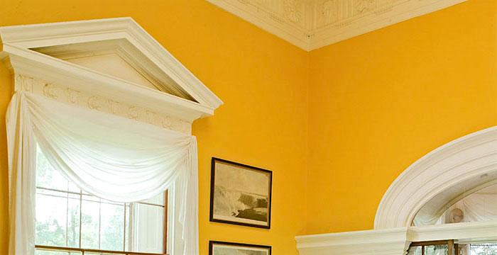
It focuses on a Ralph Lauren color that they have aptly named Monticello Yellow because they used it in the Monticello dining room. Please note that you need the gorgeous architecture to pull something like this off in such a large room.
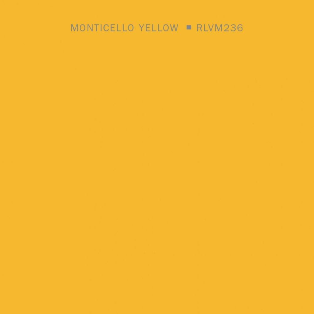
And below, we have a very close match!

And this is also a very close match to the Dulux Gold Rush.
Yes, the Dulux is reading a little brighter here. But when we’re talking about this intense saturated yellow, I’d rather go with a touch more brown.
And something else.
I’ve looked at every bright yellow paint color and I keep coming back to Sunrays because there’s something more complex about it. And that almost always means a great color.
But, there’s more.
All of these vivid yellows took their inspiration from the pigment, Chrome Yellow.

This pigment was discovered in the early 18th century and became hugely coveted. I’m sure that it was quite an expensive color to make in those days.
Back to Ben’s kitchen.
Above is the previous kitchen color which is an archived color at Farrow and Ball called Wet Sand. I would describe it as when someone puts too much fake tanning cream on their skin and it turns orange. But on the walls, it’s super-nice as you can see.

And I found a very good sub at Benjamin Moore in the color Harvest Bronze.
And while we’re in the kitchen, someone, I think that it was Dolores wanted to know about the fabric for the chairs. I did find the answer on Cote De Texas. But, this is the actual fabric and link to the source.

It is from a Swedish company called Svenkst Tenn and this is the pattern.
Another shot from their website of the Textile Aralia done in draperies.
I am not sure if they ship to the states, but you can kindly inquire if interested.
And finally, we have Ben’s beautiful dining room.
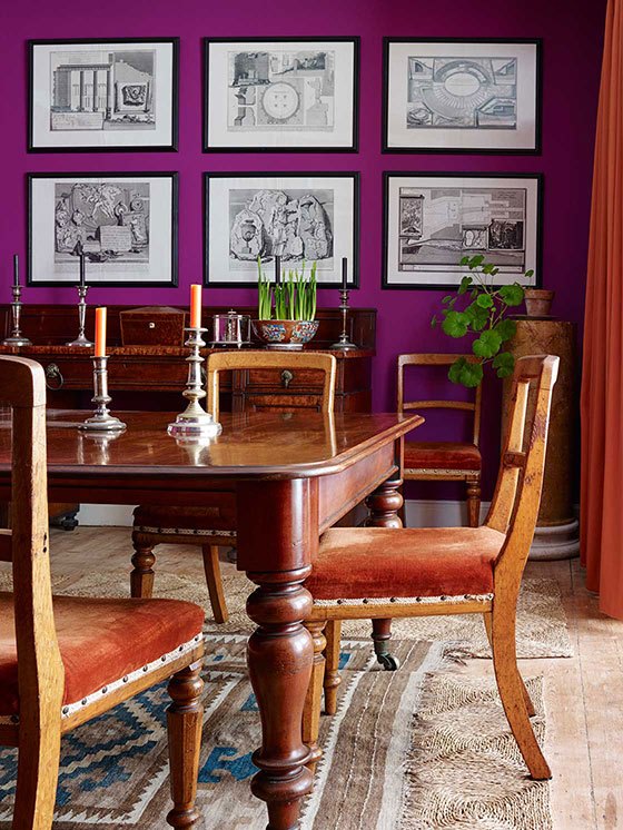
Formerly, it was painted this fuchsia color which quite frankly, is not my cup of tea.
But then again, maybe this isn’t the color since the other ones are incorrect.
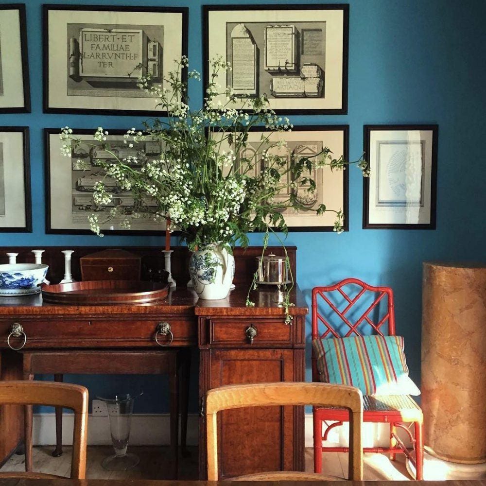
But the recent change to Farrow and Ball St. Giles Blue is absolutely perfect. And I love it with the orange drapes!
 Above is St. Giles Blue

The closest color is probably BM Lake Tahoe 783. (above) Although I have it as the one above it when I color-matched to Benjamin Moore a couple of years ago. One thing is that color charts, particularly F&B change from dye-lot to dye-lot. So, that is why things can change.
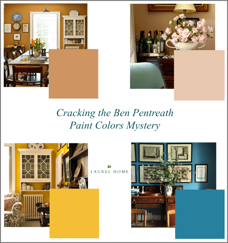
Below, I made a graphic for reference that you can pin to pinterest.
I hope you enjoyed this post about Ben Pentreath’s Paint colors!
xo,
 P.S. Please note that if you do not own a rolodex and/or a paint/palette collection, but would like to purchase, the price is going up on November 13th. There is a $30 reduction if both products are purchased at the same time.
Related Posts
 Here’s How You Can Create Beautiful Rooms – Effortlessly
 The Best Sofa Style To Get – My Number One Choice
 The Best of Laurel Home 2014 and What’s Next?
 Make Your Table Lamp Cords Disappear Like Magic
 Normal-Size Upholstered Furniture + Insider Info + Best Deals!
 Here’s What You Need To Know Before You Install Marble Countertops
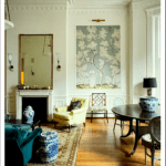 50 Living Room Decorating Rules You Need To Know


27 Responses
Damn, you’re good! Thanks for all your hard work!
Thanks Pamm!
Good morning Laurel, I so enjoy your blog, thanks for sharing all your years of design experience and knowledge. I have perused your site for the best way to achieve a warm, cozy and PEACEFUL home, primarily with the use of paint. Is is best to paint all doors, trim and walls the same color to achieve this goal? Is it best to use a light paint color? Dark paint color? An actual “color” or more neutral? Any thoughts would be appreciated?
Oh Wendy,
That’s a lot of questions. I’m sorry but my brain turns off because if I start with one person, there will be a flood of folks wanting all of their questions answered. I know that you mean well;I but it’s impossible for me.
I am so sorry Laurel for all the questions, just trying to figure out how best to get a sense of calm from my paint selection. I might be better off consulting a psychologist rather than a designer. 😉
haha! Please take me with you!
I don’t need this info, but it’s v interesting to read your about your process. Ben’s rooms are beautiful but I think using his colors well in an overall room design will take a lot of skill – skill he has in droves. Also, there is a little-seen British movie I love whose name is Tamara Drewe (based on a graphic novel based on a Thomas Hardy book) whose main set is one of those delicious Ben-ish English houses. It’s well worth watching, darkly humorous and enjoyable, with terrific exteriors as well as interiors. It’s on DVD, not sure about streaming.
Naomi,
I think that interior design takes a lot of skill, no matter what. I’ll need to check out that movie. Thanks for letting me know about it!
Yes, you’re totally right re interior design in general.
What a super sleuth, you are Laurel ! Perhaps you were a sniffer dog in a previous life ?
Fabulous research. I am waiting for you to become a comic book hero, a.k.a the Wonder
Woman of the interior world.. xxx
Hi Joanne,
I’m a sniffer dog in the current life. haha
I have been wanting to know the color of that living room since I first saw it ages ago! I want it for my north facing bedroom with the tiny windows that let in no light. I’m THRILLED!!!! I think it looks like the color of a perfectly patinaed teracotta pot. Love it!
Hi Laura,
Glad to help out. Please test the color first since I’ve never actually used it.
…so sorry….have used what seems to be a perfect match for Ben’s yellow…..Bicycle Yellow by Ralph Lauren
Can’t find a good sample of it. It’s definitely in the neighborhood. But Monticello yellow is probably closer. And a good point that maybe I implied is that it doesn’t matter. They’re all fabulous saturated yellows!
…..Love that pink …have used it in many projects,,,,was called Trillium pink……..the brand eludes me at this moment….Thanks and kudos for a wonderful blog
Thanks Liz!
…the yellow….Ralph Lauren Island brights……Bicycle yellow
??? sorry, not following.
Oh my goodness!I believe that you’ve just given me an early Christmas gift, for which I am eternally thankful! For me, Ben’s living room is such a wonderful, calm and cultured space, and the warm glow of those peachy walls makes for entirely welcoming background.
I haven’t old my husband yet- but I want to paint ‘his’ room/guest room in this wonderful color, and, it’s the room that has the same tall secretary that Ben has in his living room, so I know that it will be just beautiful. Thank you so much for this fabulous post!
Oh, you’re welcome Dolores. Please do test the color first, just in case, it’s not what you have in mind.
Josef Frank fabric (sold also by Svensk Tenn) is available via https://www.justscandinavian.com/textiles.html
Ahh… thanks for that Debra!
Just a quick note to say that if you don’t follow Ruth Guilding’s delightful Bible of British Taste blog (with an IG as well), the newest post the other day features George Saumarez Smith’s house,
https://www.bibleofbritishtaste.com/measure-draw-build-george-saumarez-smith-architect/
Thank you Rebecca,
Yes, I do and I do. She’s fabulous and so is he!
Hey lovely Laurel! Don’t know if you’ve posted on the when/where/why and how of your trip to England. I was excited with your lead up, and thrill at all the stories and photos you’ve recounted. What I mean is–how in the heck did you get there and how can I sign up to do the exact same trip?
It’s with Classical Excursions through the Institute of Classical Art and Architecture. You have to be a member.
It’s not something that they’ll likely repeat the exact same thing. But I’m sure that there are other tours.