

Dear Laurel,
I’ve been loving all of the blue and white Chinoiserie porcelains you’ve been posting.
But I have no blue in any of my rooms.
The dining room is mostly red and the living room is neutrals, creams and white. And then we have a dark green library.
I’d really like to incorporate some of these pieces but don’t know if it’ll look funny if there’s no other blue in any of these spaces.
Sincerely,
Betty Bluper
***
Actually, someone did write me about this, but forgive me, I can’t find the note now. So, I apologize to whoever asked about this. Her name is not Betty Bluper. lol
But I wrote back a quick note to say that I think that blue and white chinoiserie goes with EVERYTHING. And no, you do not have to have any blue in the room.
So, I went hunting for many examples of Blue and White Chinoiserie in non-blue and white rooms.
And some of them have already been featured here.
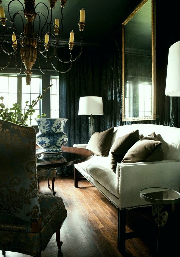
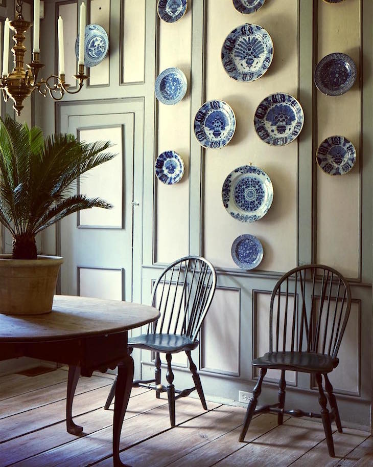
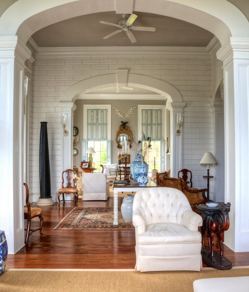
Like this one from a post about one of my favorite designer/architects, Bobby McAlpine and all of his associates. Now, there is some dusty gray-blue here, but I wouldn’t call this a classic blue and white room.
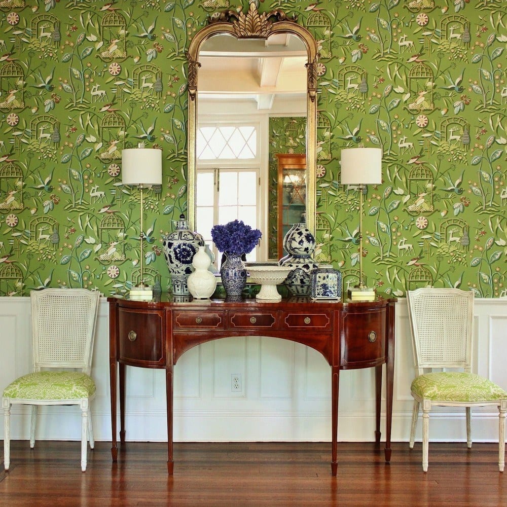
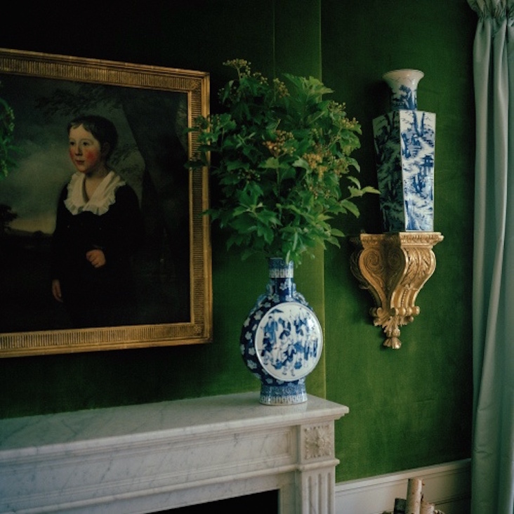
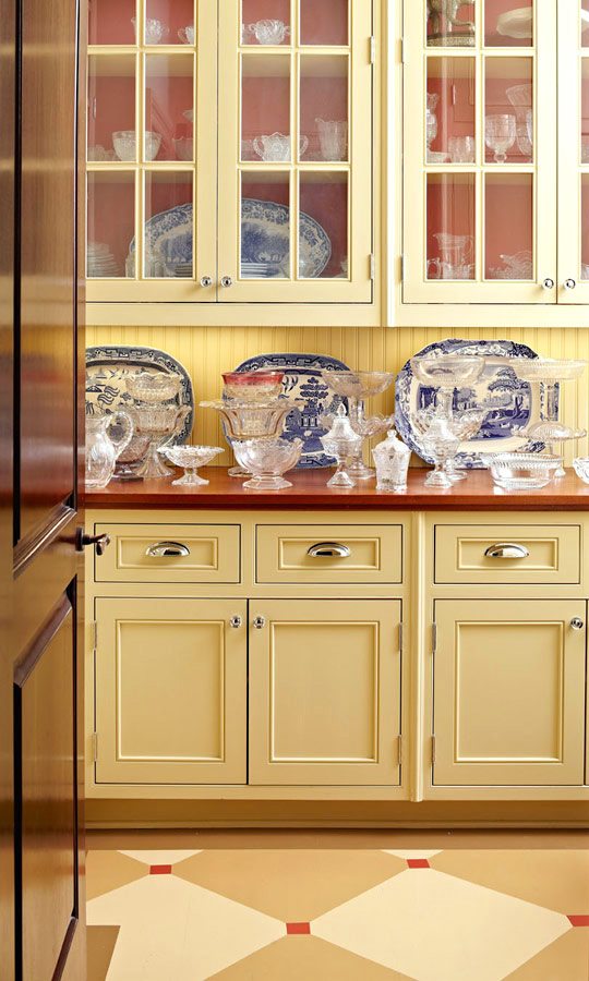
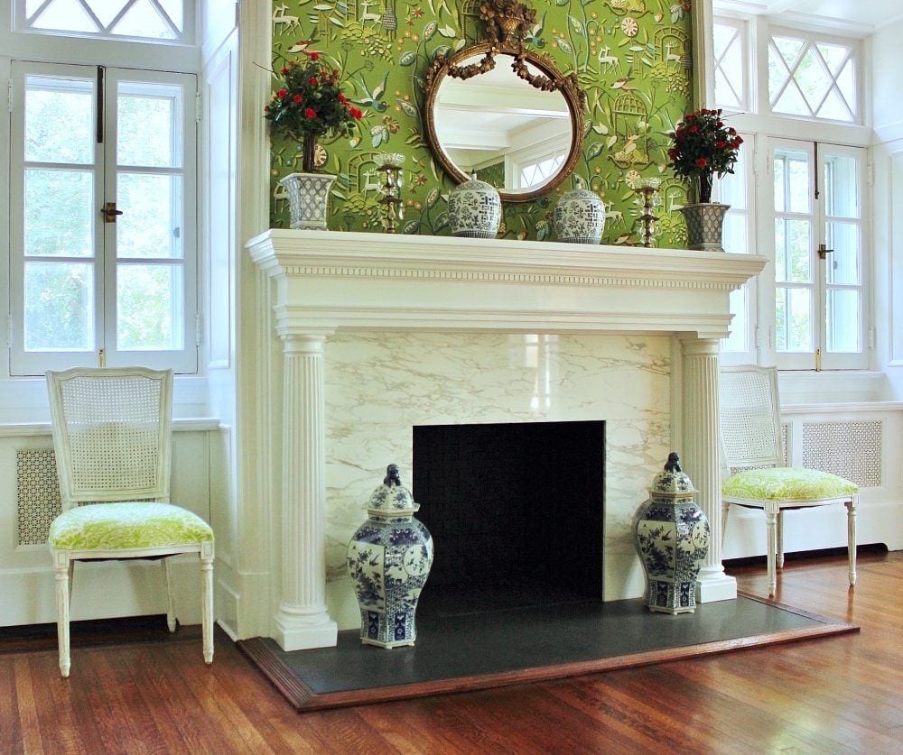
I always forget about rooms I have done for some reason. Maybe it’s like the “visitor from afar” sort of thing. And I’ve posted this image a number of times. But here it is. Green and white looks fab with blue and white.
I had clipped this image out of a magazine long before we were using computers.
Lovely vignette by Mary Douglas Drysdale.
And likewise for this fabulous dining room/library Miles Redd designed for his mother. Miles gives us courage to try things we’re afraid to do. And no, it’s not drilling a hole in the table in order to plug in the lamps.
And who can forget Tory Burch‘s stunning living room designed by the wonderfully talented Daniel Romualdez. It just wouldn’t be the same without those blue and white vases and I love the shallow vase made to go on a mantel.
That reminds me. It’s not easy to figure out how big a vase you can get on the mantel. And that depends on the difference between the widest part and the base. But as long as the entire base can sit on the mantel, it’s okay if the widest part is hanging out a little bit.
We can see that here in an image taken sorry, I forget where by Parker Kennedy Living; although that vase on the mantel looks like it’s hanging off a smidge.
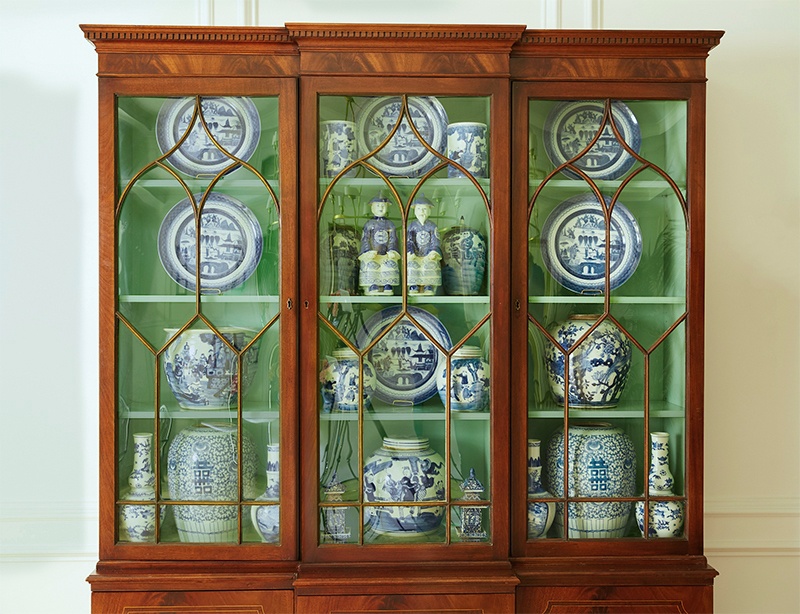
A gorgeous staged Chippendale-style China cabinet by Jennifer from the Pink Pagoda. She recently did this for The One Room Challenge™ held twice a year. Please check out Jennifer’s instagram that also links to her blog.
Lovely traditional entry vignette by James Farmer.
Anna Clark via Traditional Home
A soft living room by Meg Braff. She’s a designer that I can’t always recognize her work. She’s known for using a lot of saturated colors, but not this time.
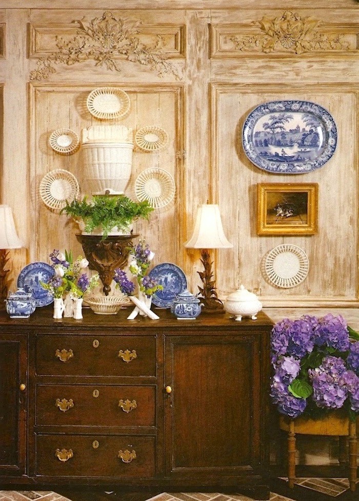 Image found on Habitually Chic.
The other day, I found myself sucked into Ben Pentreath’s instagram. Fair warning. His home in the English countryside is straight out of a fairy-tale. (if you’d like to follow me on insta, here’s the link)
From another gorgeous instagram feed by Jonathan Gargiulo
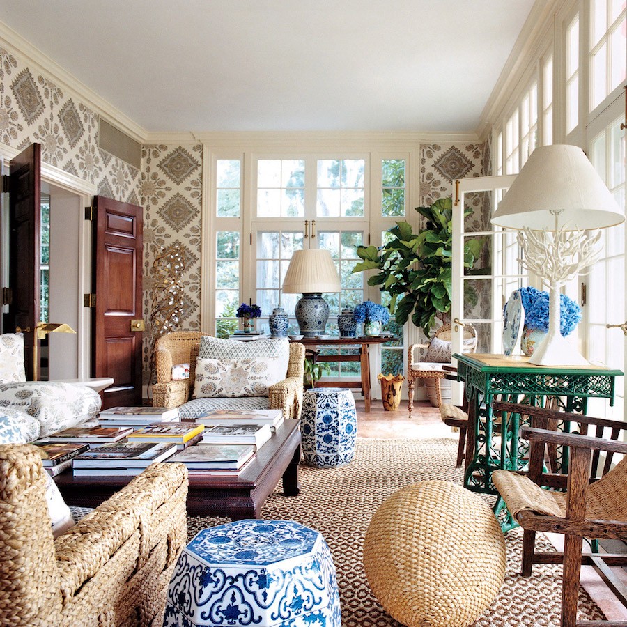
And who can forget what is now, Tory Burch‘s iconic and most pinned sun room ever, again designed by Daniel Romualdez.
The lower left-hand corner gives a clue as to who this gorgeous design belongs to. It’s the fabulous room designed by Summer Thornton who’s definitely in my top ten but wasn’t on my radar when I wrote that series a few years ago.
You may recall that another image of this beautiful room spawned the shitestorm of the century. (well one of them.) ;]
![]()
More plates against a saturated persimmon via Nancy’s Daily Dish. (cute) :] Ahhh… orange and dark blue. It’s one of the most gorgeous combos in the colorverse. In fact I devoted an entire post to the pairing of orange and dark blue a while back.
And another previously posted beauty by the amazing Carolyne Rhoem. Here we can see a gorgeous example of taking a rug and using that as the inspo for the color palette. It all goes beautifully with the blue and white Chinoiserie porcelains!
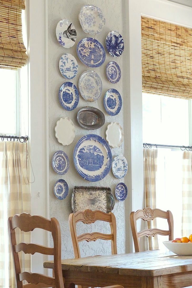
More lovely plates via Decor Design Review on Tumblr and not a lick of blue anywhere to be found in this sophisticated European-country room. I’ve always adored this scrubbed look.
A beautiful Becki Griffin photo of a Holly Mathis Interior.
And here’s Holly’s website. Lovely work.
If I had to live my life as a dining room, this would be the one. Christy Ford’s dining room was featured a few years ago in Lonny. She is the owner of a wonderful antiques Emporium, And George in Charlottesville, Va.
She owns the store with her mom. I could never figure out how they came up with the name until I read that her dog is “George.” So cute.
![]()
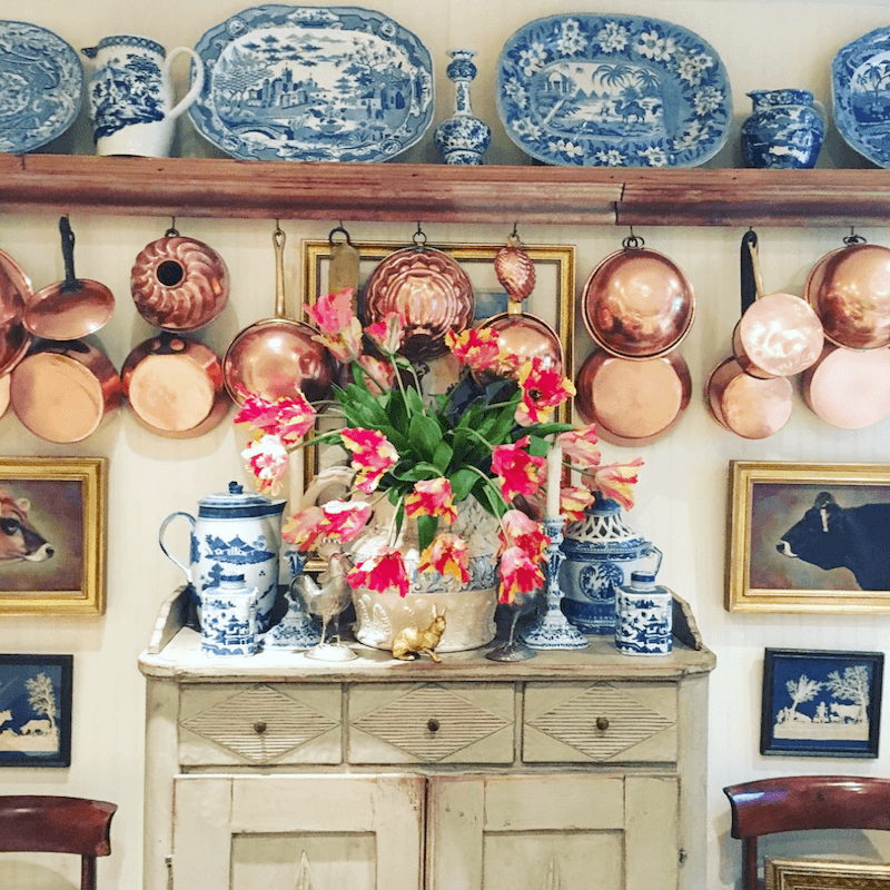
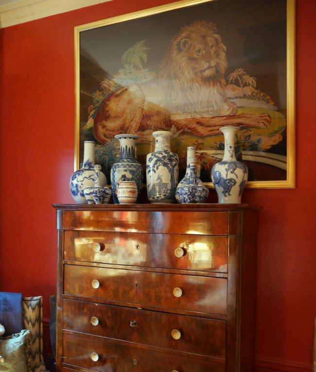
And of course, there’s the fabulous Furlow Gatewood whose rooms often feel like they are blue and white because he uses so much blue and white Chinoiserie, but mostly, his palette is creams, beiges, and gray.
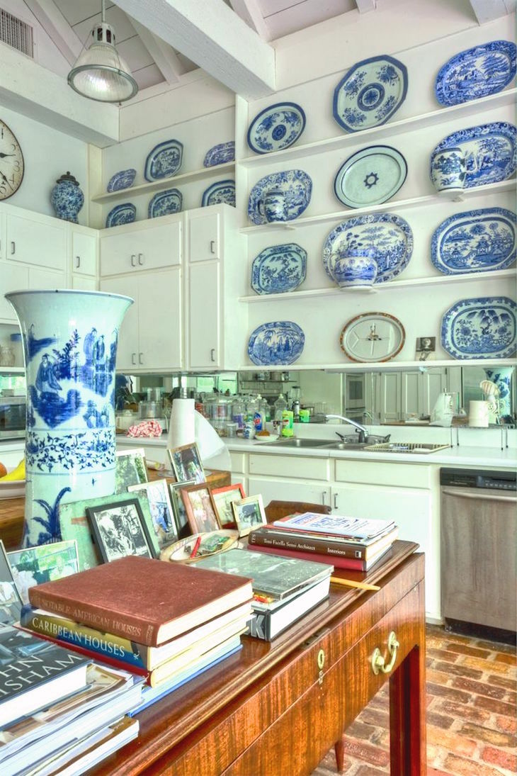
Mr. Gatewood’s kitchen. Ya know. I could’ve probably just shown his rooms and stopped right there. haha.
The latest rendition (I think) of Mark Sikes glorious living room in the Hollywood Hills. Layers upon layers of delicious chantilly cream inside the flakiest puff pastry.
Shhhh… Come a little closer because I have to share a little secret with you; but please don’t blab about it on Twitter, okay?
Mark IS the one I would hire. But, I also need to kidnap his amazing home!
More from Mark. Okay, we slipped in a little blue.But this is in no way a blue and white room.
Yes, it’s the same gorgeous Chinoiserie vase from Bungalow 5,
but I found it at Kathy Kuo Home as well.
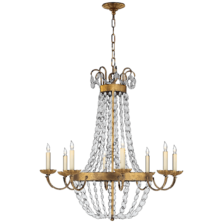
Mark used the Paris Flea Market Chandelier from Visual Comfort
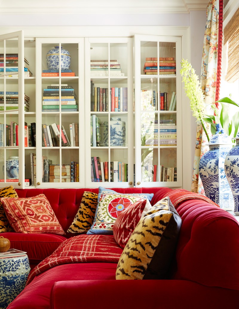
It’s brave to do a red sectional, but Mark pulls it off beautifully. The trick is lots and lots of white, the gold and black and the fresh blue and white.
And notice something else? The walls are actually a pale, pale lavender. Whoa! Genius! It is reminding me a lot of Benjamin Moore Violet Pearl – 1451, a color in the Laurel Home Essential Paint Collection.
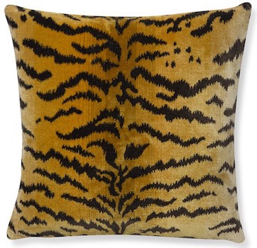
Tigre Velvet pillow available at Williams Sonoma Home
Speaking of red, a shot of John Rosselli’s bedroom. But doesn’t that mean it’s also Bunny Williams bedroom? No problem. I don’t ask questions. It’s none of my business. Maybe she hates red. That would explain it.
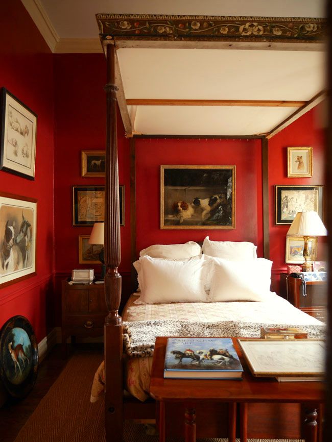
Another shot of the John’s red bedroom. As a matter of fact, I’ve done at least two red bedrooms that I can think of off the top of my head. And both times, they turned out splendidly. Who knew? Red is a fabulous color for a bedroom!
Oh and I just have to add this image.
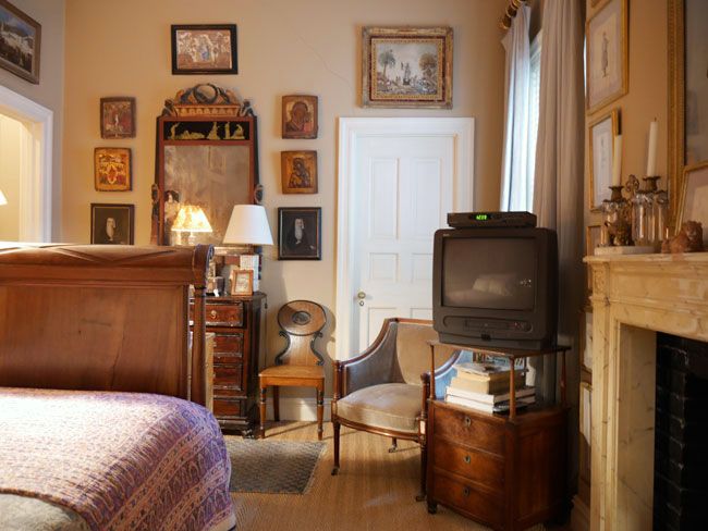
I’m not sure whose bedroom this is, but ahemmmmm!!! There it is. Le TV!!! (remember how some of you roasted me for having a TV all neked in my bedroom?)
Of course, this one is elevated to high-style as it is sitting atop a priceless antique. Is that a VCR??? Maybe a DVD player. No matter. John and Bunny’s rooms are the epitome of timeless. The only give away is technology.
And a pretty vignette from Bunny Williams‘ bedroom (in their Punta Cana home) with a light blue wall. (sorry, no photo)
Blue is definitely Bunny’s color! And Cleveland Green!
I love the black and gold cabinet.
And there it is.
Blue and white Chinoiserie is timeless, classic and goes with EVERYTHING!
Well, it is Wednesday morning and I am going to the ballet today! I am seeing ABT do Swan Lake. I see it every year as it’s my favorite ballet.
Today, the young soloist, Devon Teuscher is playing the part of Odette, the doomed swan queen.
Although there’s a happy ending version (no, not THAT happy!) where the prince grows some balls and kicks that evil Von Rothbart to the curb. I definitely prefer that version as I think all fairy tails deserve a happily ever after…
xo,

PS: I’m back! The ballet was gorgeous!!! Devon Teuscher danced the part of Odette/Odile. She’s amazing! Oh, and I saw Caroline Kennedy in the ladies’ room! I behaved myself and pretended not to notice. haha
It’s good to take a break for a few hours!
Related Posts
 Summer Whites {with a little red and blue}
 Chinoiserie Decor – What Is It? & Why You Need It
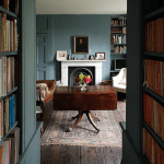 Egads! My husband Won’t Let Me Change The Blue Trim Color!
 60 Downton Abbey Colors +10 Palettes {like you’ve never seen}
 Here it is! A Palette For No-Fail Paint Colors
 20 Little Known Small Room Ideas to Maximize Space
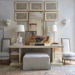 Monochromatic Interiors – A Misunderstood Color Scheme


54 Responses
Hi Laurel,
Thank you for including my image of Holly Mathis’s home in your blue and white round up. I so enjoyed reading the post !
Becki
Hi Becki,
I’m so glad that you found it. Love your work and Holly’s too!
Can someone send you a picture? I seriously need to send you a picture of my mother’s living room. She has gold walls with a lot of red painted furniture and she loves blue and white vases. She bought a red cabinet with glass doors and decided to put them in there. There really weren’t any other blue accents, but the room just came alive and looks fabulous. I think they are on her mantle, too, in front of gold walls. She is someone who should have been a decorator and missed her calling, I hope I can post it!
Quick question…where can I get a sample of your essential paint guide? I am interested in buying but want to get an idea of what it actually looks like b/f I buy. Is it possible to see one page?
Thanks!
Hi Tanya,
Yes, the information is at the top of every page where you see rolodex and paint guides. (unless you’re on a phone, but it’s in the menu there.) There are several pages of both guides, + the table of contents.
https://laurelberninteriors.com/rolodex-paint-collections/
If you are subscriber, you can write back via any email I send you and attach a photo.
Thanks so much! Once again…just love your blog and the fact that your posts are so informative and regular…love the regularity!
Hi Tanya,
Yes, I’m on a schedule. It’s the only way anything gets done. lol
After reading your post I want to start collecting those blue and white beauties! Can’t go wrong with the classics. Thank you, Laurel, for the inspiration today.
Glad that you enjoyed the post Karen!
Great examples of blue and white chinoiserie porcelains fitting in so many rooms. I think the original question about that from a reader was in the comments of the other Summer Thornton post that you linked to above, where you found similar items to copy her room.
P.S. Thanks for linking to one of my pillow covers again! Since the last time, I have two new blue and white pillow covers, both Schumacher. One is Huntington Gardens and the other Ming Vase. Yep, blue and white chinoiserie for one’s pillows!
Thanks Hollie!
when she mentioned a pink and orange interior, it reminded me of Pat Buckley (Mrs. William F.) who decorated in her favorite colors of orange, red and purple.
Hi Susie,
The pink and orange is made up but maybe I had Mrs. Buckley in my sub-conscious.
Oh Laurel,
I think I just have to ramble a bit here. The pics are so fabulous. I love the pics of your work! And the photo that stopped my dead was my idol, Mr. Gatewood’s kitchen. While all of his photos make me swoon and feel good…I had never seen this one of his kitchen. I so loved that the kitchen is old, and I don’t mean trendy antique-y old, just plain old. No new granite or marble counter-tops, no new stylish faucet, no new cabinets, nothing trendy here…even the Ajax and sponge are on display…but oh would I love to just have a cup of tea there with him. I almost can’t stand the trendy stuff anymore. Who cares if you have marble counter tops. Who cares if you have a $1000 faucet? No one. And his kitchen still looks great and best of all it’s real and displays his love of blue and white plates! Thanks again Laurel, you alone are educating us on the value of real, not trendy. Hugs from the friggen’ cold northwest.
Hi Chris,
Yes, I know, I know! I was waiting for someone to comment and so glad that you did!
It’s because one can feel the HUMANITY in this room. Its soul. And that’s what is so incredibly appealing in all of his spaces. Sure the architecture is over-the-top-magnificent, but it’s the placement of objects that one just knows that each one is there for a reason and has a story behind it.
This is giving me an idea… :]
Yes you’re right! Humanity! Human Scale! And maybe a dose of Humility? By that I mean positive, graciously quiet humility, the kind that makes us want to make a guest feel comfortable in our surroundings. That is sorely missing from our extroverted, me-first, loud world of today where the loudest most obnoxious reality show stars get all the attention.
Enough grandstanding…can’t wait to read about your new idea…XOXOX
Indeed!
I did a double-take on Mr. Gatewood’s kitchen as well. The cabinets are fine, but nothing to write home about. The stuff on the counter looked a little cluttered. The dishwasher was not the prettiest. But that ceiling! Those plates stacked along the wall! Somehow the room came across as gorgeous despite the non-glamorous elements.
I know… and that’s what I love so much about it. There’s indeed a wonderful lesson there. And I truly think it’s about the bones. The super high ceiling, the shelves and the beauty of the platters make this an exceptional space!
Laurel, this morning I feel like you walked into my house and redone it! I can envision every lovely item you rounded up and so kindly posted. It’s heartening to see oriental/persian rugs in many of the photos. I love them. Designers right now seem to use them, if at all, in limited doses in favor of natural rugs (sisal/seagrass, etc.) or relatively quiet (grey/white/beige) carpets. Or they have paler, less busy persians. All beautiful but I have a number of big, bold, bright vintage rugs and they are a design challenge. At times I feel like I’m living in a rug bazaar, and I’m worried about my aging parents navigating across a room with a couple rugs. None of the rugs really match. I’ve chopped up furniture in awkward arrangements to accommodate them. It seems absurd to put another rug, say a sisal or grass one, under an already large, 10 x 12 rug. I’ve considered rolling my beauties up out of sheer frustration.
Hi Paula,
I’ve layered Oriental rugs over sea grass numerous times and have to tell you that it always looks FABULOUS! In fact, I wrote a post about it a while back. Not as in depth as the posts are now, but it’s something.
https://laurelberninteriors.com/my-area-rug-is-too-small-now-what/
Oh, Laurel,
Thank you for informing and entertaining! Your blog post is about the only thing I enjoy seeing in my inbox. You’ve even skewed my taste towards traditional, and I never thought I’d go there. So my Mom has great taste after all!
I’ve noticed you mention the ballet a couple of times, and that thrills me because I mentioned it on that survey you sent out. You really read them, huh? So glad you got to see your favorite ballet!
Your follower forever,
Lisa
Hi Lisa,
YES! I really do read them and man I was shocked at how many people have responded.
Funny. My mom is not at all traditional in her tastes. I think that it skipped a generation. lol
Thank you so much for your darling comment!
Perfect timing, Laurel. I just suggested the blue and white for the niches in a restaurant that sorely needs refreshing. Now I have pictures at my fingertips to get my point across. Bless you! My face lights up when I see you have posted something new. I ALWAYS pause whatever I am doing or going to do and read it.
Hi Tricia,
That is so kind of you and to come from a colleague is like over-the-top. I’m very grateful! Good luck with the client!
What about Blue & White Chinoiserie porcelains in a ‘regular’ home with less traditional furniture? (possible blog post?)
Hi Maggie,
I was just realizing that I didn’t include any contemporary/modern rooms, but yes, yes, Chinoiserie looks beautiful in these settings too. But of course, used more sparingly.
The other thing is the definition of ‘regular’ home. I talked a lot about terminology in the recent post about mixing modern/contemporary and traditional styles.
Laurel, By ‘regular’ I mean homes with 8″ ceilings / smaller moldings and no special features like wonderful windows or doors.
I think of them as the kind of home built from the 50’s until the McMansions took over.
Hi Maggie,
Oh, okay. One thing that I don’t think some realize is that a lot of the homes that I post are 8 foot ceilings but because of the architectural beauty, they seem more than they are. Of course, many have higher ceilings as well.
Sometimes just blue and white plates can do the trick, you may run across some at the thrift store or antique store or locate some online.
Hi Susie,
Yes, the photos all link to online sources.
Laurel I love the displayed collections in these photos. I confess to having a plate addiction (though I’m all about Green Majolica, while my mother is the Blue & White fan). I know you’re a Blue & White aficionado too. I’m wondering if you could do a post someday on editing collections. I want to use my plates more in decorating, but am afraid of going overboard – don’t want to be known as that crazy plate lady. Thanks for another great post!
Hi Sarah,
Crazy plate lady. haha! That’s a new one. And I have to admit that displaying and editing is an art unto itself. I think the example photos are all beautifully done. (well, duh, or I wouldn’t have posted them)
It’s not one that I’ve cultivated, not out of lack of desire, but out of lack of funds and space. Occasionally, I’ve helped some of my clients, but it’s not very often.
Thanks so much for another great post! I’ve been pinning like crazy on this one!
I don’t want to appear demanding or ungrateful, but would it be possible to include a line under each photo example explaining why that particular combination works? It would be enormously helpful.
I look at your examples and see that they look great but I don’t know why or how the designer did it. Is it something to do with the color shades, tones, etc. or how they relate to each other? When I try to do it they just look chaotic and unrelated.
Thanks again.
Hi Susan,
I don’t know. I’m doing my best.
Hello Laurel, Oddly, blue-and-white is not so prevalent in Taiwan, although I wish you could see the pieces in the Palace Museum; all of them are to die for. And they are not even the high point of Chinese ceramics, which is robin’s-egg blue Ru ware.
I have a number of miniature blue-and-white antique pieces which I am trying o figure out how best to display, but they would not be the kind of big statement pieces you have shown us above.
–Jim
Hi Jim,
I looked up Ru Ware. It’s more earthy and I guess it’s what most of us would call a Celadon color.
One thing a lot of people don’t know is that “Chinoiserie” is not Chinese. It’s mostly European– an interpretation of what they imagined back in the 1700s. https://en.wikipedia.org/wiki/Chinoiserie
Although yes, the original blue and white pieces are far older and from China and are still made there today.
But other blue and white pieces such as Delftware are European but made in the Chinese manner. Interesting.
Laurel, I believe the Chinese have been creating and trading in pottery for hundreds of years (if not thousands), and have always made plates, bowls, and other tableware in designs and colors meant to appeal to other cultural tastes. (I.e., not “Chinese”.) This is why china is called china, haha. China has provided the tableware for all the kings, sultans, and other royalty, and even the common folk, of countries around world, in the style that the various cultures called for since people starting doing business with China (a while back!). So, when you see today something that looks like it came from Italy or Portugal, but it is made in China, it’s not that China is just “copying”, it’s that China is making ceramics to appeal to anyone who happens to like and want that style of product, just like it has always done. (Sometimes on spec, but mostly on demand.) I recently saw some mugs in World Market that looked like they were hand-thrown and glazed somewhere in Gatlinburg or Eugene, but were actually from China. The reproduction was perfect. This is old-hat for China!
Hi Louise,
You know, you are so right! While China has this rep for being poor quality aka: “cheap crap from China” a lot of it is beautiful! ASAMOF, a couple years ago, I saw an exhibit of Chinese design through the ages and of course, there was tons of porcelain– some hundreds of years old and in perfect condition. But dang. Show me the difference between what it is today and what it was then. I did a post which nobody read. hahaha! Here it is.
https://laurelberninteriors.com/blue-and-white-porcelain-vase-sells-for-7-66-million-yes-dollars/
Just finished reading it! Correctly picked out the $7.66 Mil vase too, although that was sort of a guess. 🙂 Learned upon further research that the Chinese have been doing business with people around the world since at least the Medieval times–about 1,000 years. Lots of trade and lots of china from China! Ships’ cargos filled with it. Celadon was popular with the folks in Europe and the Middle East at that time, too. Love your blog. You put in the effort, for sure!
Thanks so much Louise!
Oooh, I lived in Wisconsin for ten years! We were in Stoughton, WI and lived on the Yahara River which was so beautiful, muskrats and canoes and everything! Kids loved it too.
Visited Door County too and were so tourists.
Susan
I had to look up Stoughton. I see that it’s near Madison. I lived in Madison for two years and graduated high school there. Great town!
Dear Laurel,
Thank you for the great post!!!
I am going to keep buying the blue and white porcelain when I see what I like and spread it around my house….I actually do have a white den with a very old blue sofa sleeper and that is where some of my blue and white pieces are residing.
I am also adding a deep navy blue accent wall that has a very large window on it to add a peep of blue contrasting with the white blinds and the white, cream, and beige, paisley floor to ceiling curtains….a big risk for me! But I think it will look nice and not over the top as my house is not over the top…..thank you thank you thank you for the reassurance on the blue and white porcelain.
Susan
Hi Susan,
I think that a lot of people are afraid to take risks. That’s why they do what everyone else is doing.
Maybe if the one wall looks nice in navy, paint the rest of the walls. I know, it’s like going into a big cold ocean– a little bit at a time. But, if it’s not right for you, the one wall will be fine.
Laurel thank you for the comment. I am excited to get the paint on the wall and the curtains hung and then will see….I am cautious because I once did a room in a what I thought was a pretty bold navy floral wall paper and after it was up it made me uncomfortable; I am just not a lot of blue person, but the bits of blue and white etc here and there seem to diffuse some of the warmth and averagness in my rooms. Again thank you for your comment; it gives me courage even though it is just paint. LOL
Hi Susan,
Well, there’s a big difference between a high contrast floral wallpaper and a solid paint. Of course, there needs to be art, windows, doors, mirrors, tall furniture to break up the space. A big swath of navy with nothing on it will probably not work.
I also love the mouldings on the dark blue wall in this post.
https://laurelberninteriors.com/presenting-the-hottest-color-palette-for-fall-2014/
Hi Laurel! Imagine how excited I was to receive this post in the mail this evening-I’ve always been in love with blue and white chinoiserie. All of your photos are just gorgeous.
My first purchase was a blue and white lamp at B. Altman (you remember?) which still sits in my bedroom. Anyway, I’m in the process of redecorating the dining room and even though the walls and trim are BM Linen White, and the curtain fabric is green/red/teal/yellow (Schumacher’s Fox Hollow), I am accessorizing the room with blue and white porcelain. My new kitchen is white with BM Revere Pewter and gray backsplash tiles, but also accessorized with blue and white porcelain. I think it’s much more interesting and “undecorated” to use blue and white in a room that’s anything BUT blue.
Hi Diana,
That last line was the subtext. Yes! Glad that you enjoyed the post. I enjoyed this one too!
Beautiful post, thank you! So much color. You actually advised that I not paint my off white cabinets white a bit ago and I finally gave up on the white/gray/black scheme. I should have listed when you listed your fav colors because in trying to warm up the walls from cold gray I tried some that were not great. Speaking of ballet, Ballet White is not at all like ballet. And I think I am the only person who doesn’t like Revere pewter. Anyway, I was in benjamin moore and knew so much that they asked if i could work there so thanks for the knowledge. I cannot because it is 45 mins away in Green Bay where winter weather would be a problem.
And, that blue in Bunny Williams house is so pretty and fun. We need to loosen up a bit! xo
Hi Brooke,
It’s funny, but you’re not the first person who’s had a paint store story having to do with the paint guide. Benjamin Moore, neither knows nor cares. Oh well.
I lived in Wisconsin for 5 years, ya know.
I do know that! that is also why you know I don’t want to live in Green Bay! This store had larger samples and they told me to take what I wanted. That was cool. They are going to check out your blog. I told them they should get your kits and use it to help ppl make choices. I did buy the classic colors deck. I was trying to get by with the color preview. So sad to have to paint over shoreline, the prettiest color ever. I have a wall of test colors that are meh. Revere pewter, Ashwood, Ballet, Seashell. Really, how hard can it be to paint cabinets?? ha
Yeah… it’s really not my cup of anything. I lived through some particularly harsh winters in the 70’s.
While the Color Preview has some nice colors, it’s insufficient which is why they brought the “classic” colors back. It’s just like coke.
I was just at a Benjamin Moore store recently and asked why several of the specific colors/numbers I was trying to find were not on the wall. The salesperson told me about the Color Preview line being brought out, and that designers pitched such a fit that BM brought back the classic colors and now there were too many to fit everything on the wall. 🙂
Hi Hollie,
Well, after suffering for several years after they “retired” the “classic colors” and then they brought them back, I found out that we could’ve gotten them all along!
Yeesh!