A Designer’s Secret Method For Selecting Nine Interior Wall Colors

Dear Laurel, 

It’s mid-May and we are getting to the final stages of a massive reno. The painter is on my back to give him the paint colors by next Thursday.

I went to the paint store and now I feel like throwing up. I’m not joking.

I mean, I have no idea how to come up with color number one much less all of the interior wall colors!

Ada Nauseum


Hi Ada,

It’s a daunting task, right?

Selecting interior wall colors. (and ceiling and trim colors too!)

And why is that?

Well, one issue is…

THERE ARE TOO MANY DAMN COLORS!


Is it white dove or cloud white? Gray Wisp or Pale Smoke? Abalone or Sea Salt? Himalayan Trek or Plymouth Rock?

Oh, I could go on and on and on…

Sometimes the differences are so minute that we are talking a difference of dye-lot. Yes, paints have a dye-lot of sorts which is why they say to buy all of your paint for one room all at the same time because it is unlikely to match EXACTLY if you buy it a month later.

And then there are the names.

Misleading names.

Like DISTANT GRAY which is so distantly “gray” that it’s actually a cool, bright white and not at all gray. Or, conversely PURE WHITE – which is actually a very cool blue-gray!

Or French Canvas which sounds so rich and lovely but is really a greige with prominent green undertones. It’s fine if you want a light green.

I fully get why people are so scared. Colors that look great on the chip can be icky poo when up and colors that look kinda blah on the chip can be the most glorious thing ever.


Here’s the thing that a lot of people seem to lose sight of.


Unless you are decorating a bomb shelter (raise your hand if you ever played in one as a kid)

There’s going to be a lot more going on than just the wall, ceiling and trim paint.

The wall paint is only the background.

And it’s not the only background because usually there are also windows.

My point is that your interior wall colors are not an island unto themselves.

It’s like focusing only on your hair color when you still have to figure out your clothes, makeup and jewelry.

So, my next question is…

What else is going on in your room?

In your home?
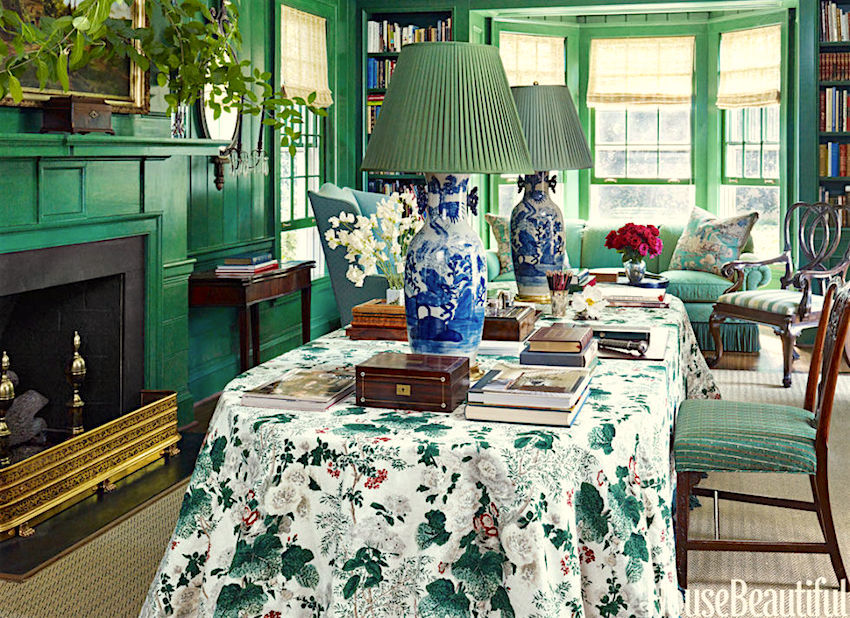
miles-redd-3

miles redd green library

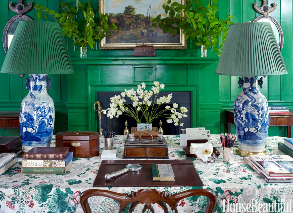
Here is a room by the amazing Miles Redd. I’m leading off with this to make what I hope is a compelling point.

That’s a pretty intense, saturated green on the wall, isn’t it? Now, imagine that the room is just painted this color and there is NOTHING else in it. Nothing.

Note: This looks to be a glaze and multi-layers of color, etc. and probably took many days to create, but let’s say that you woke up one morning and the walls were white and the painters came and you came home to this butt neked room; except for the wall color.

Pretty gag awful, right?

Yet, here the color, while certainly not everyone’s taste and one I doubt I would have picked works beautifully.

Why does it work?

It works because of all of the other elements in the room that make it a finished space.

  • wonderful architectural features
  • The analogous green of the plants
  • The balance of brown, white, blue
  • beautiful objects, mirrors and art

So, How Does One Come Up With The Perfect Color Scheme?

When I’m doing a whole-house interior design project, I like to start with the living room. The living room is generally the heart of the home. It is usually close to the front door and often there’s a dining room adjacent.

Here’s what I find the most helpful.

  • First, I look at the home in a holistic sense. Where is its location? What style is it? What are the materials the home is made of? Is the home new or old.
  • Second, I discuss color preferences with the client. Some love color and some prefer a more neutral palette. Some are adventurous and some more timid. I’m not going to suggest an emerald-green living room to a client that prefers something subdued.
  • Third and this is the part that’s the most fun. Is there a jumping off point?

There might be a rug. A piece of art. Furniture pieces the client would like to incorporate. That makes life a lot easier.

But let’s say that this is the client’s first real grown-up home and they are starting completely from scratch.

This is when I ask them to do some research if they haven’t already. They need to begin to collect images of rooms that they like. Most of my clients have done this already.

Sometimes there is one room that the client says is their dream room. But sometimes, the reason that it’s their dream room is not the colors or furniture, but the brilliant way it was styled. Or it’s the architecture–the windows, mouldings, etc.

After the client presents this to me, I am already beginning to see the patterns. Then, I’ll work on their floor plan and at our next meeting, bring over a bunch of fabrics to see what the client prefers.

Other times, we will begin with a rug, particularly an Oriental rug. That is often our jumping off point, but it might be a fabric.
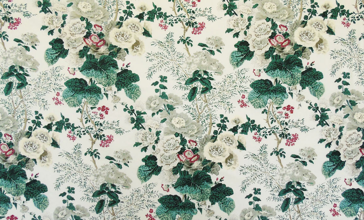
Althea_1813B_F_massive

I don’t know, but Miles may very well have begun with this glorious fabric from Lee Jofa called Althea. (There is a sister fabric called Hollyhock. I always get them confused, they are so similar).

Then, he had fun with the different shades of green, added in a healthy amount of brown and the wonderful Blue and White Chinoiserie lamps to give the scheme even more balance.

Often, people contact me with descriptions of their room, like it’s east facing and is a center hall colonial, new construction. They have wood trim in the adjacent room and dark floors.

What color should I paint the walls?

Sorry for the glibness, but you tell me. What color? It is not as if us designers have a running list of colors we can pick out based on a description. We can’t. But a lot of folks don’t understand this.

The important point is:

What else is going in your room?

Don’t have any idea, but you need to paint?

Well, then, you may very well be painting yourself into…

Oh, I understand. You have a painter breathing down your neck for the colors. You just want to get it painted before you move in and then you’ll deal with the furniture. That is understandable, but you have to realize, that it is more difficult than doing it all together.

So, how can you come up with say nine (or more) colors for a good color scheme that will work with whatever you’re choosing down the road?

The same way. You must start with SOMETHING.

So, go searching for a rug or a piece of fabric you’d like to incorporate somewhere. Cut out your images and decide your style and general color preferences.

This is one reason why I came up with the 66 Universal Colors in the new Laurel Home Essential Paint Color Guide.

And before someone feels compelled to bitch-slap me (but please don’t. I’m quite sensitive, actually) and tell me that they are appalled how unprofessional I am and that I am leading y’all into a sales pitch.

Fine. Yes. I’m leading you into a sales pitch. ;]

BUT

It’s up to you. If you want some help, feel you need help, then perhaps this is a good solution?

If you don’t, then you don’t. And absolutely no worries, whatsoever. I am not expecting anyone to buy anything I’m selling! However, it’s new, so please bear with me. I promise that I’m not going to hound you for weeks on end because I too, hate that; just, until the end of the month, when the special is over. :]

There are two parts of the paint guide that are especially helpful for people who are in a bind.

There’s the 66 Universal colors that all go together. And then the trim colors that go with them.

Almost done. :]

There is a discount if you would like to buy laurel’s rolodex in addition to your paint guide. You can read all about it in last Wednesday’s post which also goes into great deal about the laurel home essential paint color collection. For more info about laurel’s rolodex, please click the link.

One last thing, because once in a while, someone doesn’t understand. These are PDF files that you SAVE to your electronic devices. It is possible to have them made into a book, if that’s your preference.  Just google “how to turn a PDF into a book” and they’ll all pop up.

Again, if you’re not interested, there’s still plenty here to read and discover how I select paint colors. It’s just that the colors I’m using in this exercise are all from the paint collection.

 So here’s what I recommend doing to find the perfect paint color palette.

Get on pinterest. If you like my taste, take a look at my boards, especially living rooms, make your own board and select ones you like.

Then, go to one of those sites like Decorator’s Best who are undercutting us designers (another story, but nothing I can do about that) and start looking for fabrics that you like. They are good for that. :]

If you’re a designer, you can use e-designtrade.com. It’s a to the trade resource for Kravet, Brunschwig, Lee Jofa and a bunch of other sources.

I did that and pretended that I am not me.

I pretended that I am one of you and I picked a fabric that somebody likes.

It’s a classic Jacobean print from Brunschwig and Fils.

I am going to show you how easy it is to create a paint color palette for your home from one fabric.

The beauty is… You don’t have to use the fabric, or you could use it for a pillow somewhere.
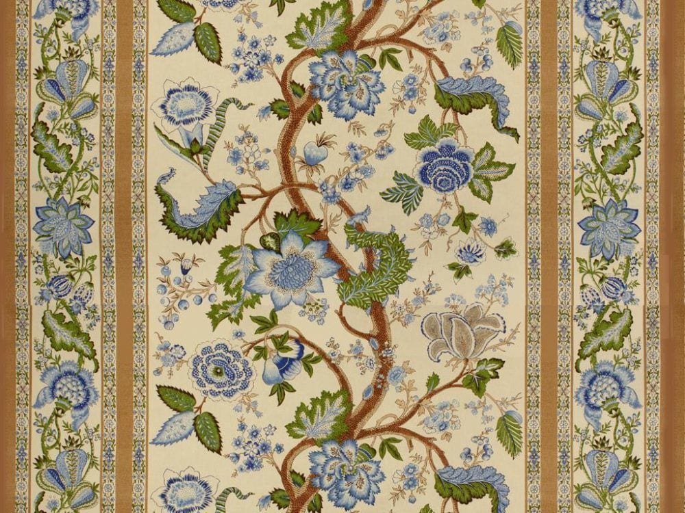
br-700016_278

I swear on a stack of paint chips that I did not pick the colors first. But, I did find nine paint colors in the collection and almost all of them are in the Universal section that pick out the colors in the fabric.

I do advise that you get the real fabric sample before doing this, however.

palette, green, cream, gold, blue

Above is our palette.

The four colors in the corners are White Dove, Elephant Tusk, Linen White, and Manchester Tan.

Now, I want you to go shopping– online.

Oh, if you are already working with an interior designer and she’s shopping, then please don’t do that, unless you want her to get uppity with you.

This is for the DIY and designers in the trade who are just starting out.

This will take a bit of time, but it’s really fun. Start putting fabrics that you like in a folder. It doesn’t have to be a lot. I did a lot, but I’m nuts. You are probably not that nutty. Keep the folder on your desktop for easy access.

Okay, here’s where it gets really fun!

I use a little program called pic monkey which is more fun than a…

It’s free unless you want to pay for the fancier stuff and get rid of the ads.

Click on the top menu where it says “Design”

Then, you will see a white square. That is your “board.” You can change the size of the board, but for now, it’s 2000 pixels x 2000 pixels which is pretty large. For instance, the graphic above is 700 pixels x 700 pixels. I made that on pic monkey too.

All right. Now, you go to the left and click on the butterfly icon. These are called overlays and essentially, that’s what you’re doing. You’re overlaying your images onto your white virtual board.

Click at the top where it says Your Own and start downloading the fabrics you’ve saved in a folder on your desktop. And then, you can also add in your paint colors to see how you like them and with which ones. Let your eye be the guide. If it looks funny to you, then it gets deleted.

These aren’t necessarily going to be the fabrics that you’re going to use. They could be, but the fact that you’ve found fabrics that will go with your scheme, you can feel more confident in your paint color choices.

But please remember to always test!
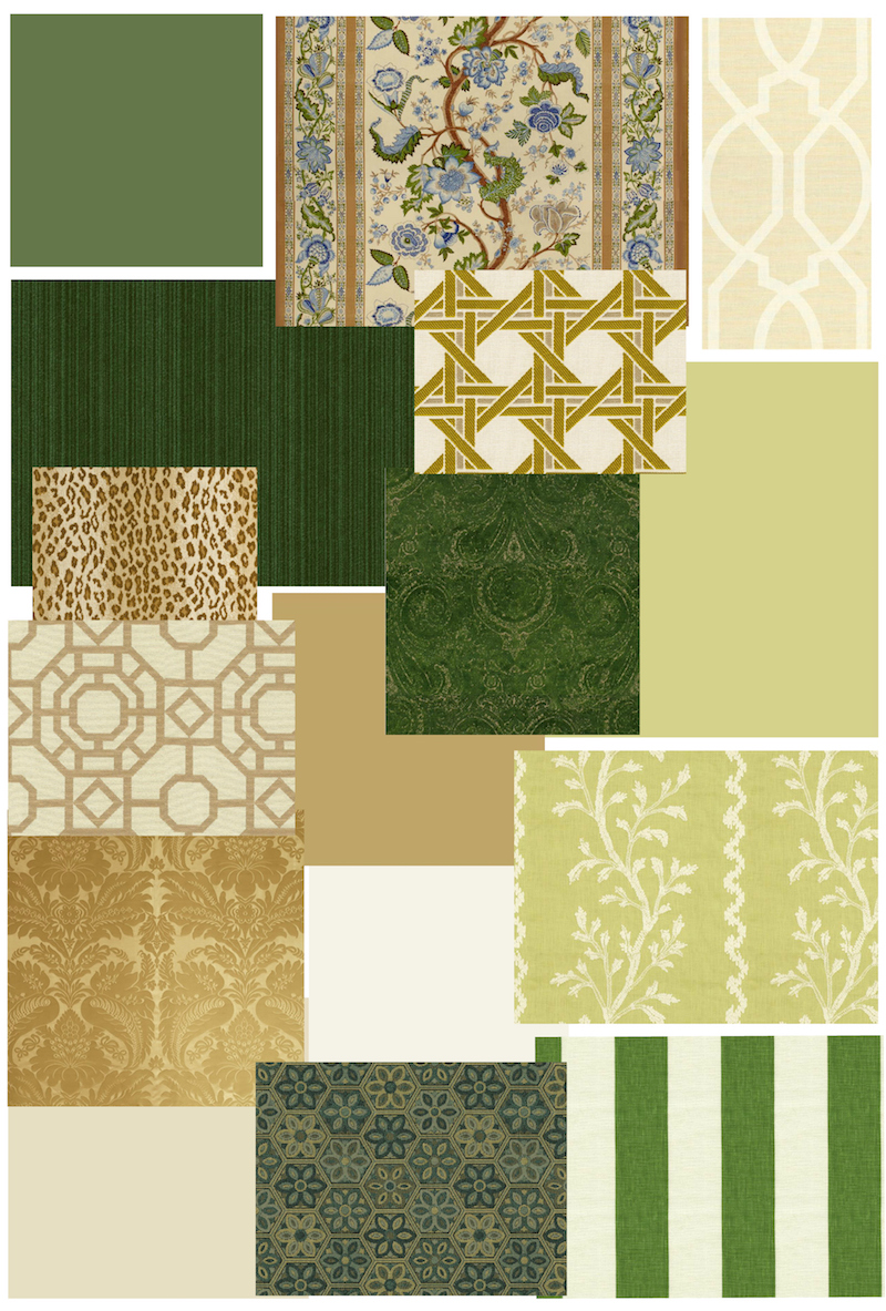
living room dining room kitchen entryAbove are the paint colors and fabrics I selected and edited for the pretend living room, dining room, entry hall and kitchen. Below, it continues into the back hall and family room.
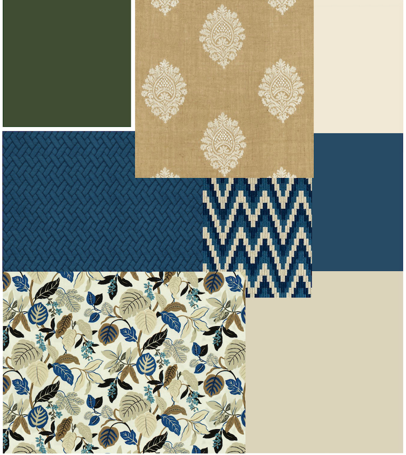
family room entry

BTW, I was having so much fun, that I created another really cool palette (well, I think so) which I want to share with you mid-week.

Hopefully, you can see how from one fabric, it is relatively easy. I say, relatively easy, because this is NOT easy. This is brain surgery, folks. But it is relatively easy to choose a paint palette.

And to facilitate this, I created The Laurel Home Essential Paint Color Guide. There are 144 colors and 66 Universal Colors. And all of the colors come with the best trim colors to go with that color.

Are there other options one could do here?

YES!

You could stick with a very neutral wall color palette and only have the color in the fabrics.

You could pick out only the green and neutrals and skip the blue.

There are lots of ways to go here.

Please remember, that I am more than happy to answer general questions that everyone can learn from, but I cannot help with individual problems in the comments.

Thank you guys so much!

xo,

Laurel

32 Responses

  1. My daughter has just purchased a 100 year old Tudor style, bungalow, brick with white siding, lead glass fun window in front and arches with what you and I don’t like….. dark-woodwork and trim!!!!!! We have a larger home the same age where we have painted all trim white, so you know where I am coming from..I have read your article and laughed so many times. Thank you.
    I had KT read it also and she did decided to keep the dark natural wood
    Since you showed us so many pretty rooms with dark trim, she came up with this palette.
    Dark green front door
    Foyer?
    Living room, white linen or Ivory white
    Dining room, dancing salsa or pale pumpkin
    Kitchen, very small and dark will have cork floor and orange tile. Color???
    Bathroom, white sink, bath tub, etc. citrine or Hawthorne (HC 4)
    Back two bedrooms, one rolling hills
    One grey elephant
    Where are we going wrong and right?
    Suggestions for kitchen and foyer?
    Ceiling color throughout?
    You are simply amazing. Thanks for sharing your talent!!!!
    Roxie

    1. Hi Roxie,

      Glad that you’re enjoying the blog. I so wish I could help everyone, but as I’ve said more times than I can count, I can’t first of all, because I’m not THERE! I can’t see what on earth you are talking about and a thousand other things I know.

      If you are struggling, then my best advice is for you to perhaps hire a local pro to help you make these decisions.

  2. I am getting ready to paint using Benjamin Moore’s Putnam Ivory. Should I paint the ceilings to match; use 50% of same color or ??? Any recommendations would be greatly appreciated.

    best
    s

    1. Hi Stacy,

      I’m sorry but it’s policy not to give recommendations in the comments. There is a small note which lots of people miss, but I put it as close to the comment box as possible.

      I wish I could help everyone individually, but choosing paint colors requires that someone be there in person. Perhaps you can find a local color consultant if you are struggling.

      1. Oh, thanks….just thought there might be a general rule of thumb like the advice you give re sheens.

        Best
        S

  3. Hi Laurel! I’ve just discovered your site and have been reading my way through it for the past few hours. Your advise is so helpful, thank you so much for sharing and helping! I was trying to find a topic on warm neutrals (maybe I just haven’t come across it yet?) that look beautiful in any light. See, my house doesn’t get a lot of natural light, some rooms are quite dark, and (ugh!) my family room is North facing. I love colors that have a lot of life and warmth, something that feels like being wrapped in a warm blanket. Sadly, most samples I’ve tried look drab and depressing in my dark rooms, they take on a green cast. Do you have any favorite light neutrals?

    1. Haha! Yes, Betty, I have seen that clip probably a dozen times. I think there’s a screen shot somewhere here of that scene. Myrna Loy is absolutely brilliant!

      Believe me when I tell you that I am just as crazy as the next one when picking colors for myself.

  4. Hi Laurel, thank you for this article today! I quake at trying out the monkey program, but I’ve quaked before and tried things anyway!
    Sometimes I get it…..sometimes…
    But here’s a general question: I’ve got a task coming up to choose colors for a newly opening( renovated) chiropractor’s office literally in a dense wooded area. The office is in a timber frame cottage. ( we are in the western NC mountains) My first instincts are to tend towards greens/ blues. Most of the consults I do here are similar — greens reflecting light into the homes -with very little sunlight. It’s a tough challenge, always. The lady doc wants the (existing) yellow beiges OUT of there. I totally sympathize!
    Ok, question # 2– shouldn’t I be making sample boards out of all of the 66 colors in your guide? Lots of time/$/ effort, but probably worth it?
    Question # 3– we are about to launch a cottage spec house — no existing fabrics, and I intend to keep the hard( countertops, tiles, etc, plain, clean & classic) Don’t you think an over all color, such as cotton balls, would be a good pick? There will be some Shiplap , some dry wall.
    Thanks again — also for your wonderful, personal writing!
    Paula.

    1. Hi Paula,

      Yes, I think those cooler colors are a good choice.

      Sample boards would be very expensive and a big deal. You’d have to buy 66 test quarts and then deal with that. So, it would be several hundred dollars, plus the mess. Did you know that professionals can get larger samples. They are different sizes which is dumb and not super big but a lot better than the little chip. Sizes are at least 4 x 4 but I think some are as large as 5 x 7. So, that’s probably what I would do. I did contact BM to see if we could work something out. They are out to lunch in that department. I didn’t get anywhere at all.

      Cotton Balls is an excellent over-all white. I can’t say for certain in your spec house, but it’s never failed me or anyone else who’s tried it and I’ve had a lot of people write in that they love it!

  5. Does the color collection contain any indicators about which colors would or would not work in dark vs light( Northern or Southern exposures) rooms?

    1. Hi Merridy,

      In some cases yes. But here’s something I never hear anyone talking about and why I don’t get overly hung up about this.

      I’ve been working in my bedroom for a while. It has three windows facing west and south. But in the morning, it is as dim as a north facing room. The only time that it is warm and bright is right before sunset. I am in an apartment on the third floor and there is some shade outside my window. My wall color is Tropical Dusk and it changes hugely throughout the day.

      On a rainy day, everything is gray-ish.

      At night, all rooms are south-facing.

      A north facing room can be bright and a south-facing room can be dark. Just depends on windows and outside terrain/vegetation, etc.

      Then, comes what the room is going to be used for and what else is going in the room. I’ve written some posts about a lot of this on here.

      My point is that there are so many factors involved which is why I didn’t go hog wild with the recommendations for which colors go where. Light changes. That much is certain. And usually, if one wants to use a certain color, it’s possible. The lighting may need augmenting, but it’s possible.

  6. Hey Laurel

    Another great post as usual.

    I have an act on the edesign trade site but would you mind sharing how you got from selecting the fabric to the paint colors using the site. Can’t find it in the tools.

    Congrats on all your blogging success. We miss you in the FB group.

    1. Hi Kelly,

      That’s a great question and one that deserves a better explanation.

      Well, I took the lead fabric (the print from Brunschwig) and then first I went into the Universal colors and chose colors I liked that went with it and then I went to the other color families such as the whites, warm beiges and khakis, yellow/gold to find the rest, but I think it was only the two whites which are almost universal except they might be too creamy for some colors like pink or a very clear blue and one pale gold which was almost a universal color but I felt that it just missed going with everything. The other six are in the universal color page. That is why I made that separate list. It’s not that there’s anything with the other colors. Not at all. While some are almost universal, some yellows and pinks are more difficult to work with. Notice, that those are primarily accent colors in nature. Even the yellow sun is too bright to look at! lol

      There isn’t a specific tool. It’s what your eye tells you. That is why I told my story in the beginning when I had my very first ID job while still a student. I totally doubted my ability to be able to differentiate between a color that “went” and a color that didn’t.

      Do I possess some unusual talent in that direction? I can’t say. It comes easily to me, but I do feel that we can train our eyes to see what goes and what doesn’t.

      If it looks good to your eye, it’s good. That is, unless you have some known color-seeing ability. My older son is partially color-blind. It wasn’t identified until he was in middle school. I always wondered why his clothes didn’t match sometimes.

  7. No no please don’t do it Laurel; not another book. We all have enough already. Good information, commentary and observations a bit at a time makes us able to absorb it all in a focused manner. Thus, I always look forward to sunday morning with you.

    1. I suggested a book only because what this kind of article does is so basic, it deserves as wide an audience as possible. The book format promotes a kind of long-term learning that our digital devices tend not to promote. I wish someone had given me something like this years ago when I was starting out. I have shelves full of fine,costly books on both garden and interior design. But I’ve seen nothing like this. It was an expressed desire, not a command. I purchased the materials to share with a younger friend who is agonizing over what to do with her first house. Ă€ chacun son goĂ»t…

      1. I agree with you- I’d love to have such a book too- can’t think of anything more delightful than sitting down and actually having a reference volume right at hand.

        1. Hi Dolores,

          Okay, I won’t rule anything out. Someone would have to approach me with a deal. I don’t have a “name” so that is unlikely.

          Also, I don’t know if you saw, but you can have these PDFs printed and bound in book form. If you google “how to turn a PDF into a book,” they’ll all pop up.

          I should use myself as a guinea pig and then let y’all know. One thing, though. For the paint guide, of course, the links won’t work. Also, I’ve already done one update and could really stand a second one but don’t want to bug people. I found quite a few boo boos which have been corrected as of Thursday evening. So anyone who’s gotten the guide since then has the latest updated version. The one I sent out, has a bunch of corrections too. It’s mostly things like I had a bunch of the fan decks wrong.

    2. I agree as someone with the attention span of a mosquito. lol As it is, I realize that some of posts are a little long, but I’ll go back and edit what I can without sacrificing what I want to convey. I think it’s a far easier gulp than a big long book. Of course, can’t please everyone so as the adage goes, “please all and you please none.”

  8. Thank you, Laurel, both for this remarkably generous sharing of your design knowledge, as well for the Paint Guide. I am certainly not a designer and have made all the common mistakes in selecting a paint palette.Now I have enough cans of expensive, but wrong color, paints cluttering up my basement shelves that buying the guide was a no brainer! 🙂

  9. Laurel, I am the person who wrote you about “all right,” thinking comments were screened. While I apologized when I realized I had offended you, I still was called a “troll.” But this column is a perfect example of why I even bothered saying anything. It is brilliant. You managed to put information that was layered and complex in language any attentive reader could understand. You did not lapse into the jargon of the trade or condescend. You used simple sentences and vertical space to emphasize main points. And you organized that information with such conciseness and clarity that even a woman with a painter breathing down her neck could grasp it and have the heart to set about planning the paint colors—and upholstery and textiles and accessories too! Then you tossed in web sites that would make it easier for novices or old hands. Not everybody, blogger or otherwise, can do what you did in this article and, I think, consistently. Thus, even a small usage problem stood out for me. In a lesser writer, maybe not. You write with obvious authority, and your readers will emulate you, too. You need to write a book like this column, one that simplifies the process of design for people whose professions are not design. Even if one were using a designer, she would be a better educated participant in the process and a better client. I’ve read lots of high-end design books lately, and I’ve seen nothing that takes the reader step-by-step with real life examples so well as you do here and in other articles. Thank you for consistently doing such good work.

    1. Gaye. Please. Let it go. My comment was not personal. I only knew that “someone” had said something about my spelling. If you look closely, you will find tons of mistakes. I prefer that you write me privately. That’s all. Thank you.

  10. Love todays color story. Very informative, very entertaining and very good advice. I do have a question about painting ceilings. Another blog I read says ceilings should be white, especially in a white room. I just painted my bathroom and mouldings Simply White, but kept the ceiling Wasabi green and while I think it looks great, I am second guessing if it too should be white? Thanks!

    1. Hi Liz,

      I don’t like the word “should” in this situation. Wasabi is a beautiful color and you think it looks great, because it IS great! Don’t doubt your instincts. That’s what makes great design, not some dumb, banal rule that I heartily disagree with!

      1. The white hallway with the green ceiling is somewhat similar to the look in my bathroom. Makes me very happy to know my decision was the right one, for me.

Leave a Reply

Your email address will not be published. Required fields are marked *

This site uses Akismet to reduce spam. Learn how your comment data is processed.

Welcome To Laurel Home!

laurel-aarons-18th-e1456449963926

Hi, I’m Laurel, and Laurel Home is the website and blog for Laurel Bern Interiors.
I’ve been creating new-traditional interiors since 1988. The blog is where I share all.

New Edition, November 2023! Get The Indispensable Guide For 100s of Home Furnishings And Interior Design Sources That Everyone Is Raving About

laurels-rolodex-final-book-cover-master 10th edition 23-24

laurel home archives

Categories:

Please click the image below for more info about my rockin’ Interior Design Guides for 2024!

Laurel Home Interior Design Guides 2024
Amazon ad

please click below to check out my favorite decorating & design books

Laurel Bern's Favorite Interior Design and Decorating Books
Subscribe To The Laurel Home Blog And You Will Receive A FREE Guide Where I Share How To Get Your Paint Colors Right, The First Time.