Below are three notes from readers. Each has a large living room and is having trouble.
Dear Laurel,
I’m hoping that other people have this problem so that you can write about it. But my problem is that I have a large living room. No, wait. It’s HUGE as it’s also the dining room and kitchen.
There is absolutely nothing cozy or homey about it.
I have no idea how to furnish this too large living room.
Sincerely,
A-Real-Reader-But-Laurel-Can’t-Find-Her-Comment
The second reader with a large living room said this:
Dear Laurel
Firstly, I truly enjoy your blog, your attitude, and talent! I read it faithfully and have benefited from many ideas, etc. My suggestion is to do a blog post for those of us who are blessed with enormous living rooms. Ours has a fireplace, French doors, lots of windows with great views, and nine-foot ceilings. Plus, there are hardwood floors, radiators, and doors just about everywhere; there are no windows.
I could tell you a lot more, but then it will look like I am asking for design advice. The room is 30×20. 600 s.f. I know, we could scrap it as a living room and do a really great Airbnb studio apartment. Keep up the good work.
Best regards, Nancy in Wisconsin
Note #3 regarding a large living room that came to me from Instagram:
Hi, laurel!
I’m writing you because I just don’t know where to turn. I read your blog religiously, and it is my go-to place for inspiration!
I am moving from a small cape (2200 Sq ft) to a large colonial, with BIG rooms, big windows, and TALL ceilings. Things people dream of! However, I’m having trouble with scale here! My living room is 25×20!!! How can I lay it out without it looking like my furniture is floating on an island in the center of the room?!!
How To Deal With A Too Large Living Room
Well, first of all, it really depends on the situation with your specific large living room. Don’t I always say that?
Is it:
- Only a large living room?
- A great room with eating and kitchen combined?
- A loft space that must function as different areas?
- Is the ceiling super high?
- Are there architectural givens that can’t be changed, such as doorways, windows, or a fireplace?
One thing I’ve struggled with over the years when I worked with clients is: just because something was built a certain way doesn’t mean that it’s right.
And, once the awkward area is fixed, it will look right, like it was always that way.
This includes:
- moving doorways.
- Adding walls
- Adding columns and/or pilasters
- Maybe adding a drapery or glass wall as a separator
- Adding beams and/or coffers to the ceiling to break up a huge expanse of space.
Then, we need to ask ourselves these questions about our large living room.
- Can we have two seating areas?
- What configurations will work?
- Do we need to create an area for dining or a piano?
- Do we need to create a separation for privacy?
- Is it possible that the best solution is to create another separate room?
In other words, put a wall up to create a new space. Or even a half wall such as a pony wall.
Common mistakes that people make when furnishing their large living room.
Just because a large room does not mean that the furniture needs to be BIG.
Well, at least not all of it. Pieces that can be large are things like an over-scale coffee table. That looks fabulous in a large living room.
A bookcase or cabinet can be on a grand scale.
I believe with all of my heart and soul that the thing that shouldn’t change size a lot is the seating.
Why?
Well, it’s something we were JUST talking about in the post “Does your Living Room Furniture Need to Go on a Diet?”
As I said in that post, the furniture is for the people sitting on it, not for the room itself.
The only exception to this rule is living in any of the three following states.
- California
- Florida
- Texas
And we can throw Montana in too. ;]
Then, you can have your furniture as large as you like.
Yes, I’m being cheeky.
What are other mistakes one can make when furnishing a large living room?
I read an article recently about decorating a large living room, and it said that the room needs a focal point. Seriously? Ask any five-year-old, and they know that one. But, below is the image they used to convey a focal point.
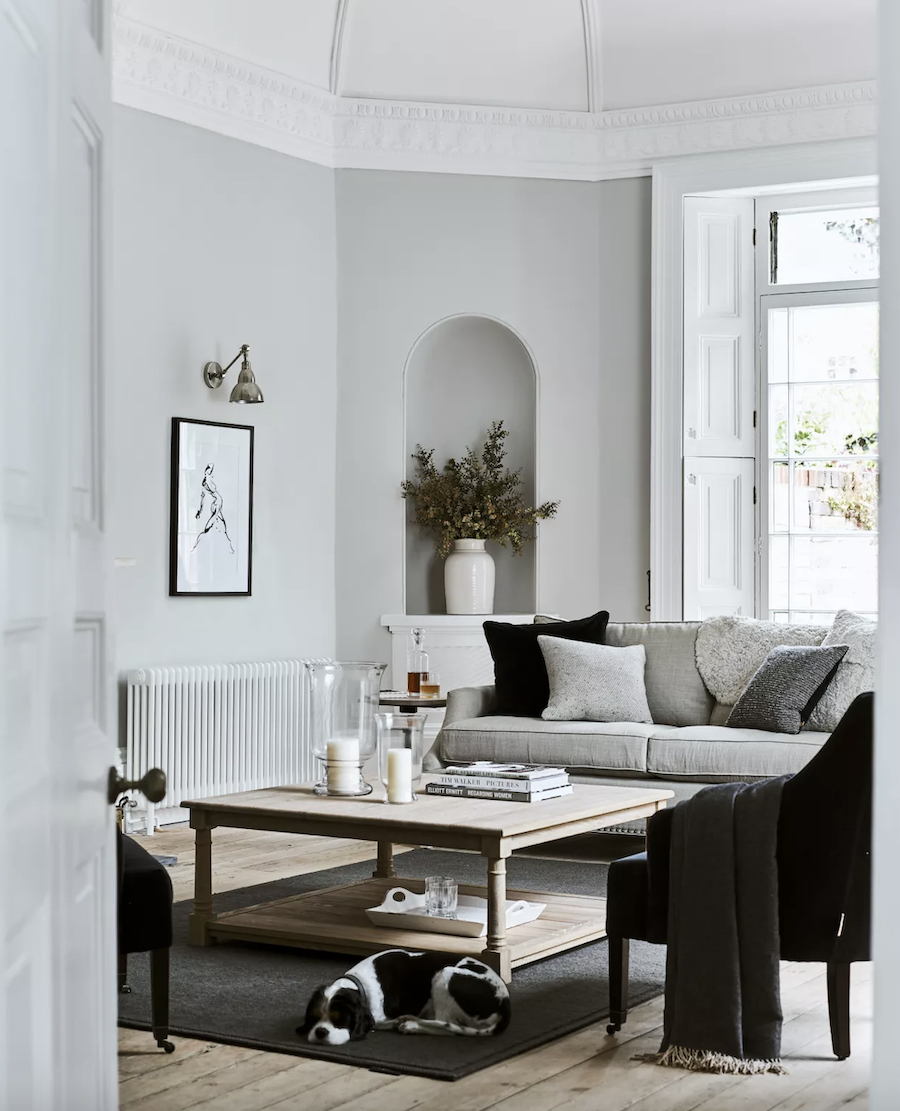
Yes, a radiator. That’s hot. haha, Remember when we discussed how to hide a radiator if it’s not a cool radiator?
But, this image should’ve been in the recent post about the gray trend. Aside from the radiator focal point, I do love this room. I love any room where the dog is an integral part of the decor. lol No, really.
This room is an architectural gem. Plus, there’s a healthy amount of black and white. I’d love to see a beautiful gold or brass accessory on the coffee table. However, overall, I think this is a handsome, sophisticated use of the color gray.
I can’t tell if this is a large living room or not, but in addition, I prefer a unified monochromatic palette for large rooms.
That is unless the designer is Miles Redd. He can do whatever he likes because it’s always fabulous, even if it’s not everyone’s taste.
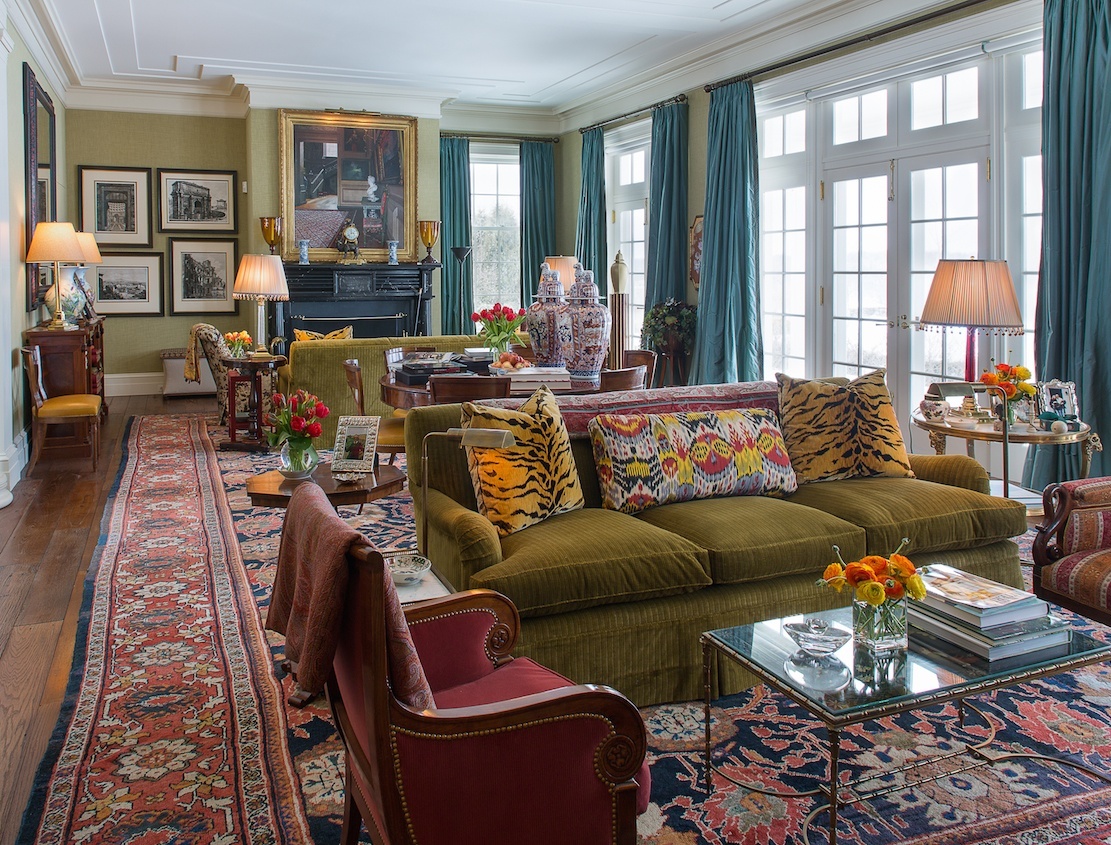
Above is a Miles Redd and Gil Schafer collaboration for a spec house, in Millbrook, NY. I think it took all of 10 seconds to sell it. Okay, maybe it was 15 seconds. ;]
However, for most of us, I think a pale monochromatic or analogous palette is stunning for a large living room.

This is, without a doubt, my favorite Windsor Smith living room. It is a huge living room.
This is a home run and then some. We need those layers of decor in a large living room.
What makes the room is the BLACK neo-classical table in the foreground and then flanked with the Gustavian chairs. Those elements plus the gorgeous, layered styling. We will come back to this room in a little while.
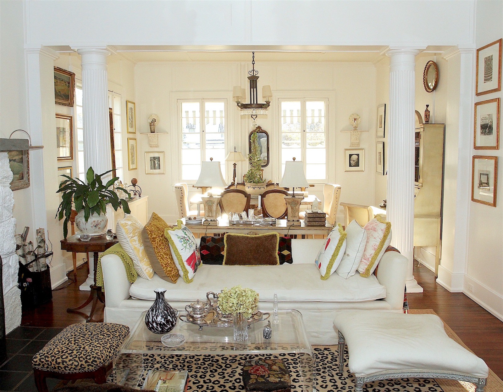
Nancy Keyes’ giga-gorgeous living room is a perfect example of chantilly cream layers, exquisite architecture, and styling. Her room came with the beam, pilasters, and columns. However, breaking up a vast expanse of the ceiling in a large living room is always a good idea.
Furniture placement is super important in a large living room.
Of course, it’s always essential, but here are two misses regarding the furniture placement in a living room.
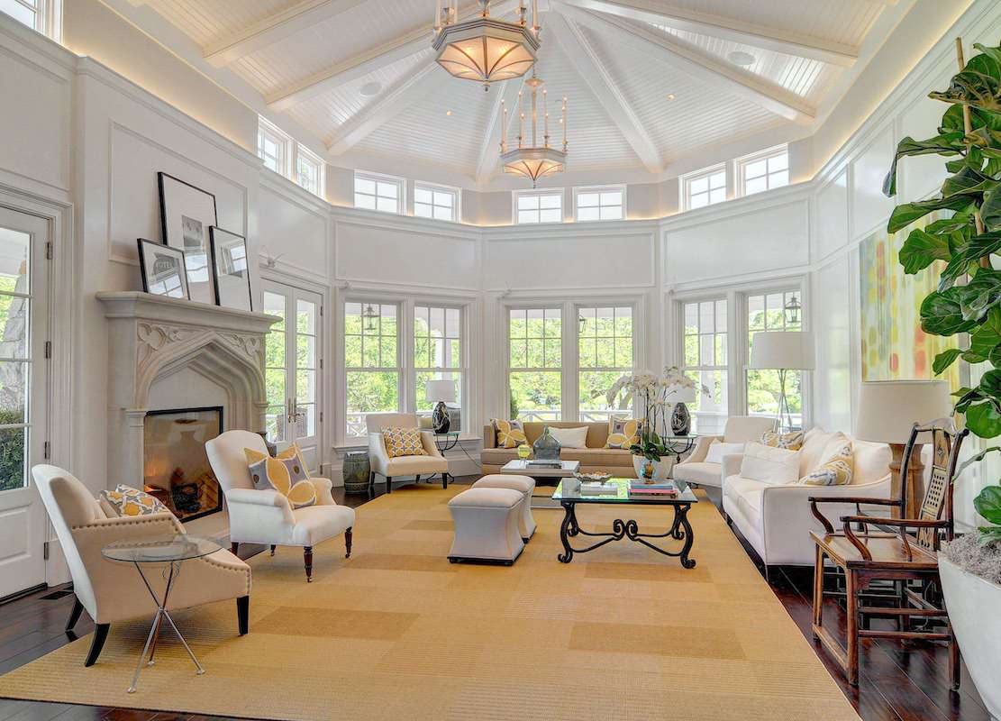 This is a lovely photo by Scott Dubose and some interesting post-modern architecture. However, the furniture is arranged like they’re about to have Church fellowship. Aside from that, what is that one chair doing hanging out IN FRONT of the fireplace? It’s the only piece of upholstered seating I like in this room. And, if you feel that the Tudor-style mantel feels out-of-place in this coastal-style home, I concur.
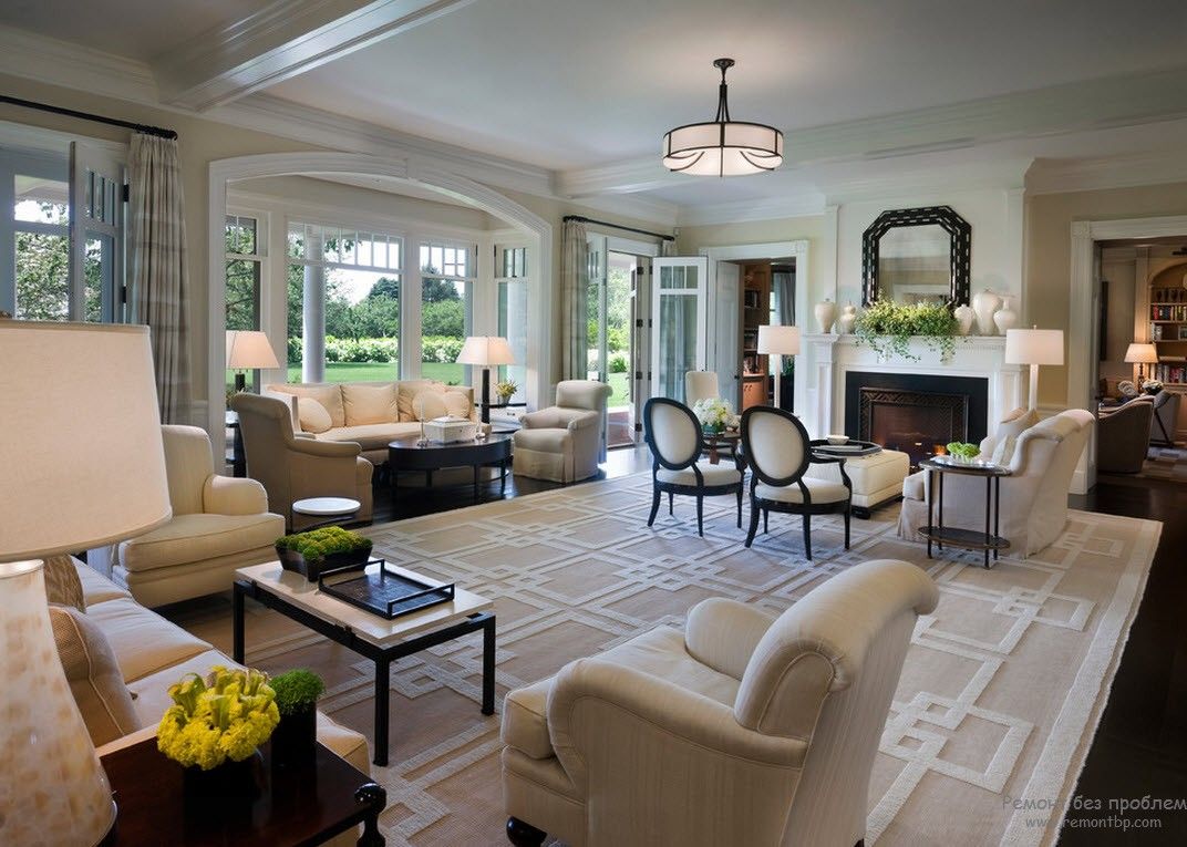 This beige-on-beige room isn’t terrible. The furniture feels a bit stiff and doesn’t look comfortable. In fact, I know those chairs by the bay window are phenomenally uncomfortable. I’ve sat in one like that, and not only is the pitch too vertical, the way the back of the chair throws the human upper back forward, much like the seats on Metro-North, the commuter railroad in and out of New York City.
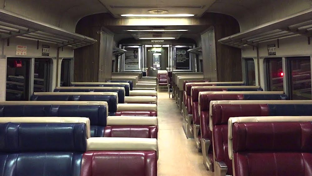 I used to see a chiropractor in Katonah throughout my 40s who told me more than once that he made a fortune due to these hideous seats.
However, there are other problems with the room above the Metro-North car.
The seating area around the fireplace feels cut-off instead of welcoming. In addition, there’s a huge open area in the middle of the room.
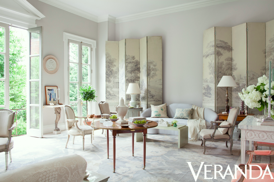
Frank Babb Randolph, in his classic large living room, has created a gorgeous and gracious room layout. A center hall table is a terrific way to bridge seating areas in a super large room.
Okay, I have some photos from note number three. But, wait a minute. I don’t know her name, however, she lives in Maryland, so I’ll call her Marilyn. :]
Anyway, she and her husband bought this gorgeous home built in 1930 in the Georgian style. They are planning an extensive renovation of a good portion of the house, but some rooms like their large 20 x 25 living room don’t need as much help.
Now 20 x 25 is a large living room, but it’s not super-duper large.
Let’s take a look at Marilyn’s large living room.
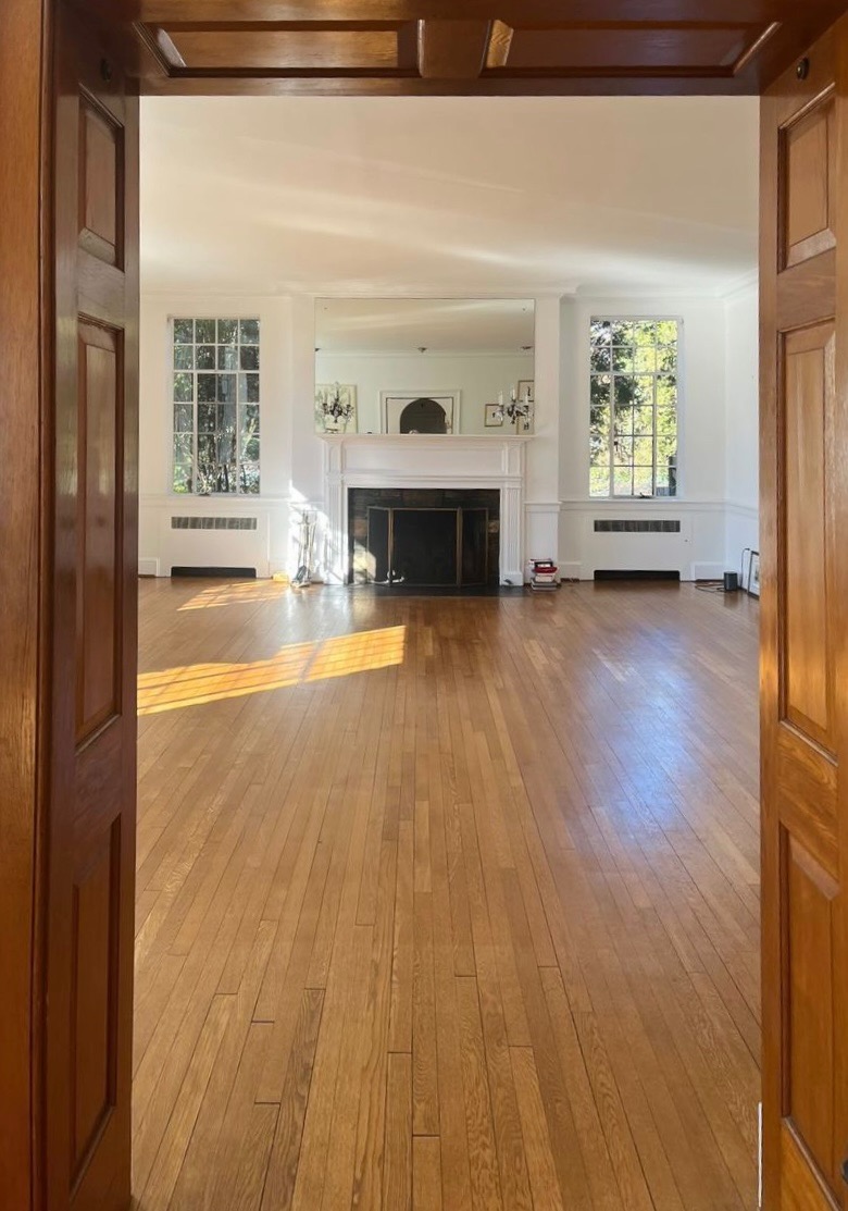
A photo Marilyn sent me looking into her large living room from the entry.
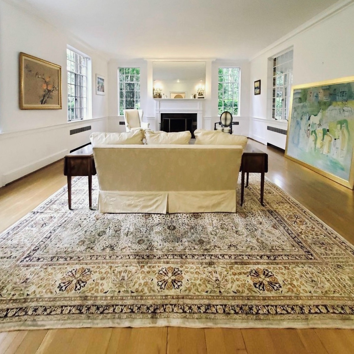
Most of these photos are before Marilyn and her family purchased the home.
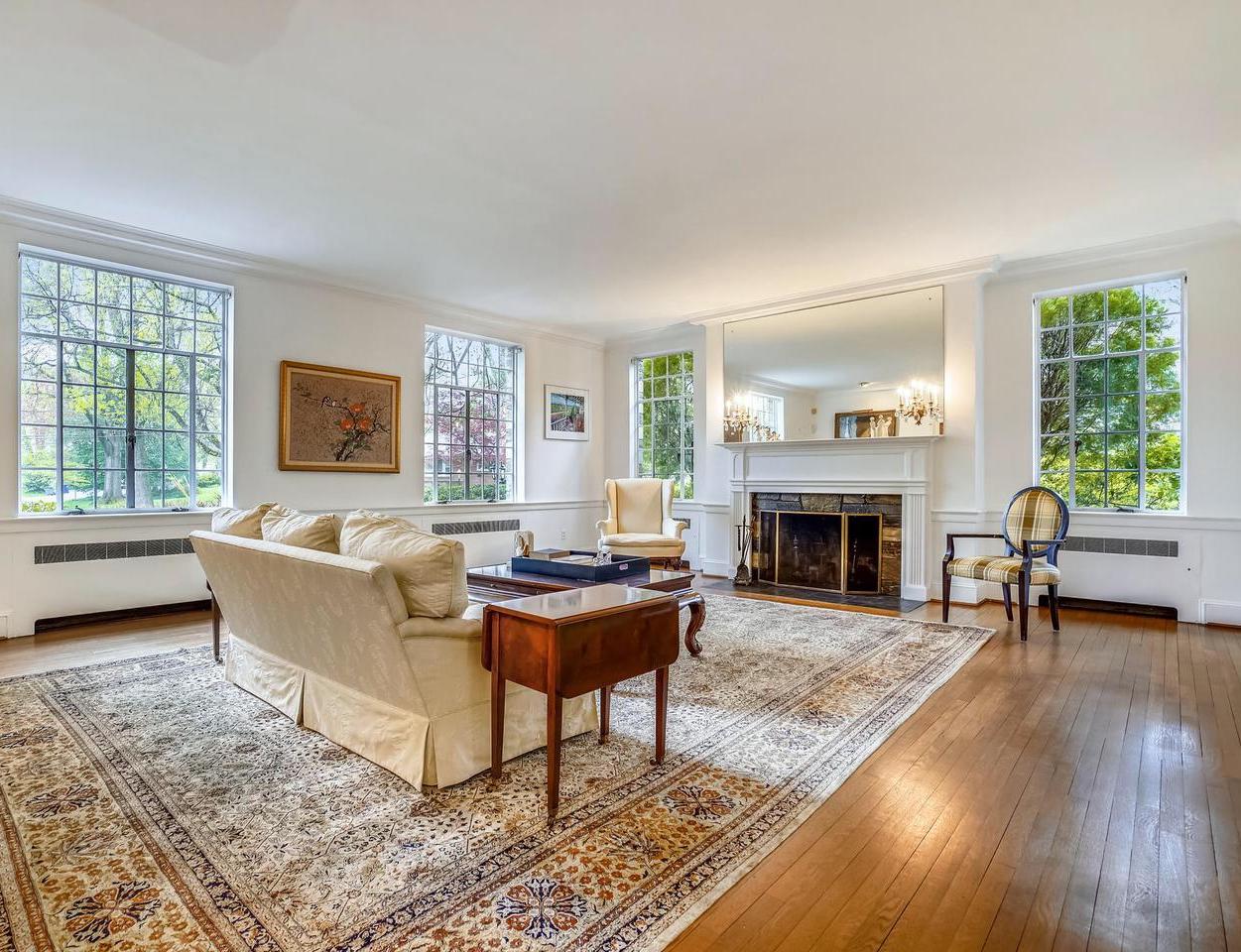
The mirror is a little large, and I would love to see a mirror with a frame around it. We looked at some gorgeous mirrors over the fireplace in this recent post.
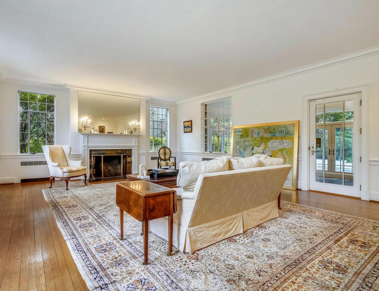
I would also add panel moulding underneath the chair rail to make a proper wainscoting.
In addition, I’d love to see some panel moulding on the walls and over the doors to beef them up.
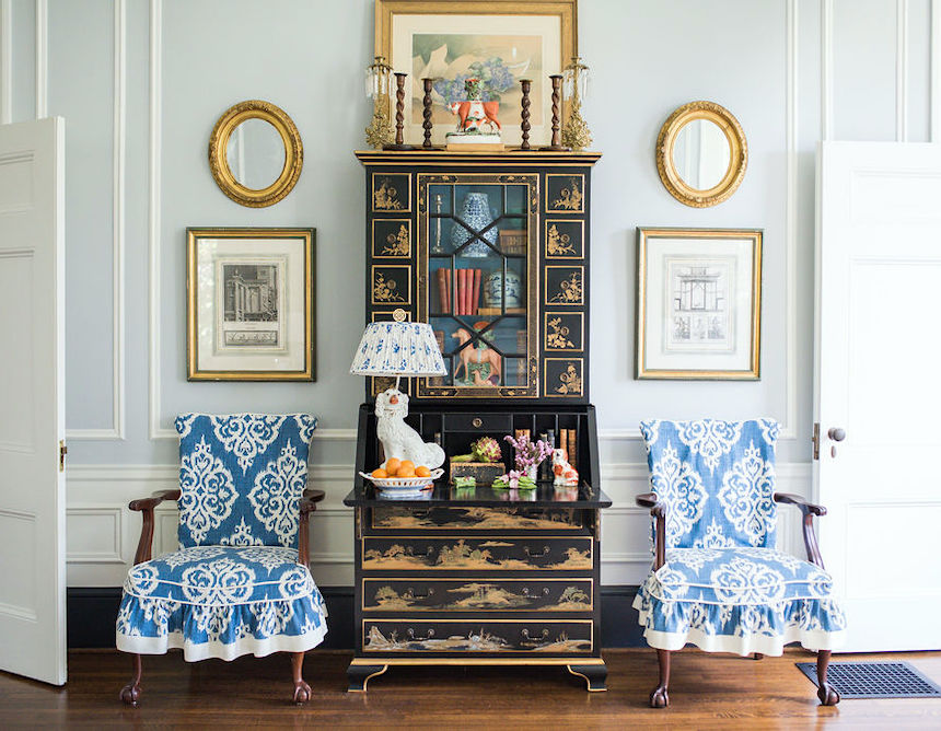
My friend Andrea who writes The Glampad, featured this exquisite home which I think y’all enjoy.
There is lots of applied wall moulding and beautiful furnishings.
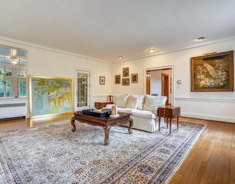
The back of the room and the adjoining large entrance hall. The woodwork is stained in the entry; however, I would paint it. It doesn’t make sense that it’s stained.
What about the windows, Laurel? Shouldn’t there be a window casing there?
Great question. Of course, that could be added; however, if doing drapes, by the time it’s all done, you won’t even notice it. So, I’d put my money elsewhere.
Okay, now we’ve seen all four walls and some suggestions which are common to most homes. Still, this is a beautifully classical, symmetrical room of good size. So, now it’s time to begin the space planning. That has always been one of my favorite parts of interior design. Some rooms are accessible, and some I’m pulling my hair out. Actually, for me, this room is easy. But, I’ve had years of experience.
The first thing I recommend if you’re new to space planning is reviewing the 12 step decorating plan that works every time.
While there are interior design software programs such as Sketchup that would be helpful for me to learn, I’m so comfortable now with Picmonkey, that for these purposes, works just fine.
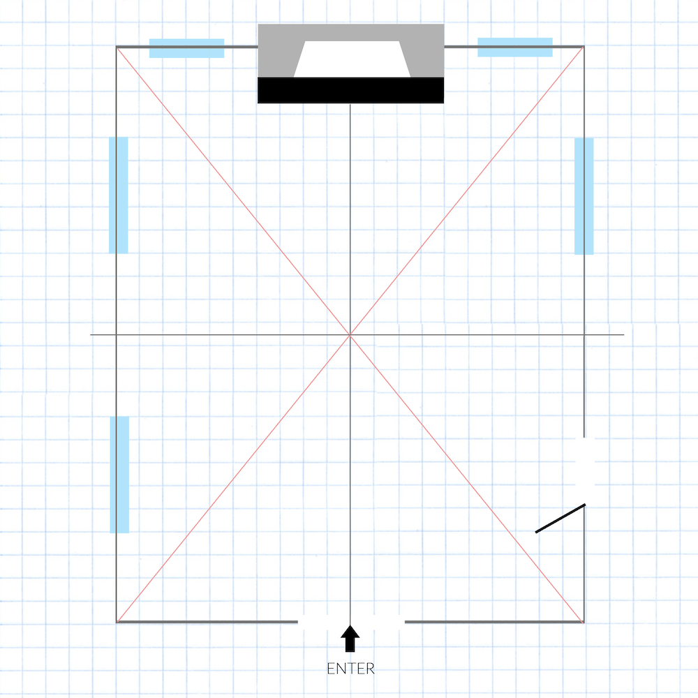
First, I lay out the perimeter of the room.
There is no need to show the wall thickness because it doesn’t affect the space planning.
One thing I see that is always something of a challenge is the fireplace faces the entrance into the room. Plus, the entrance is coming in on the shorter end.
However, the first thing I always do, which can come in handy later on, is to find the center of the room. An easy way to do that is to draw a line from corner to corner. (the dark pink lines) Where they intersect is the center. On my first day at the New York School of Interior Design, I learned that. From there, we can bisect the room horizontally and vertically.
Then, I start messing around with the furniture layout.
It is a LOT easier in picmonkey than sketching it out and erasing, over and over.
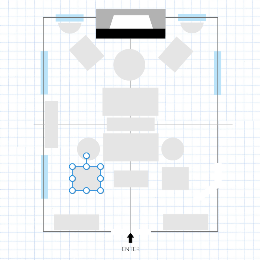 The light gray boxes and circles indicate furniture placement, but not necessarily where the furniture is.
In a large living room, it is good to have both floating furniture and furniture anchored to the wall.
However, I prefer matching pieces.
Will it be too matched, Laurel?
Well, the way out of that is through accessorizing, I think. This bookcase styling post is a good example of that.
One tried, and true way of dealing with a large living room is with back-to-back sofas. This is especially good when the opening is on the short end. That way, we won’t be walking into the back of the sofa. However, there are remedies for that, too.
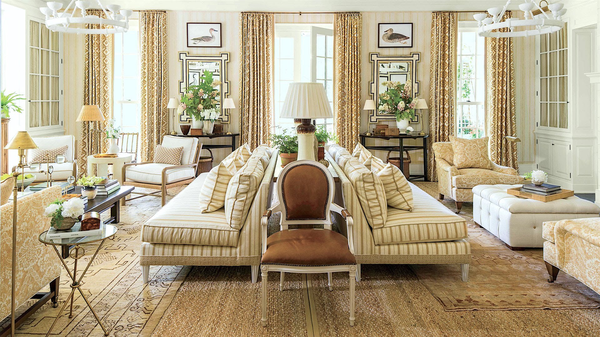
Oh, dear. Suppose I published this Mark D. Sike’s phenomenal room for Southern Living Showhouse a few years ago. This is an excellent example with a console table in between.
If there’s room, I prefer this to the two back-to-back sofas without a table.
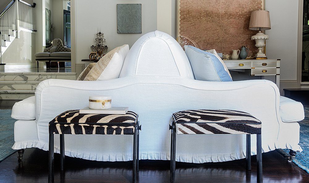
I’m a little on the fence about the conjoined twins sofas. This particular one by Windsor Smith is seriously cool, but please be careful because getting this baby INSIDE the room could prove to be quite problematic, to say the least.
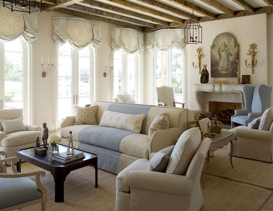
This is another back-to-back-sofa situation. A fabulous large living room by James Michael Howard.
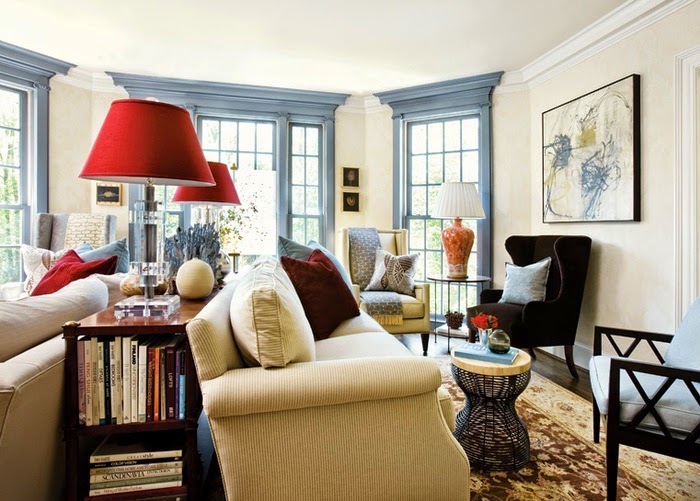
I love this room I found somewhere, but they only credited it to Atlanta Homes & Lifestyles. In addition, I love the blue trim and the moulding they used built right up to the ceiling, which works beautifully in this room.
Someone asked me if they do a contrasting darker trim in their home if they can do different colors in every room. I say probably not. But, you could do the walls and trim all blue. Or, all white and cream.
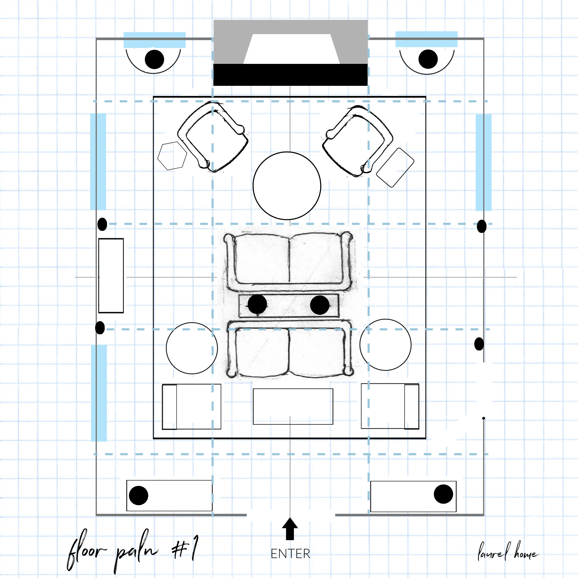
Above is the first of three-floor plans I did. Oops, there’s a typo. Oh well, that’s part of the charm! lol
So, let me explain what’s going on.
The seating is pretty self-explanatory. Those are two 72″ sofas in the middle, and the lower seating group has slipper chairs.
Flanking the doorway are two case pieces.
They could either be two bookcases with doors or not. Or too chests with art or a mirror over them.
The case piece on the side would be the alternate, either a tall bookcase or a chest with art or a mirror.
The black round things are lamps.
And finally, the area rug is a custom seagrass rug. This one would need to be pieced together with wide binding. I recommend doing it in three pieces.
What are the blue dashed lines?
Ahhh, that is a ceiling coffer. Or, there could just be the horizontal beams.
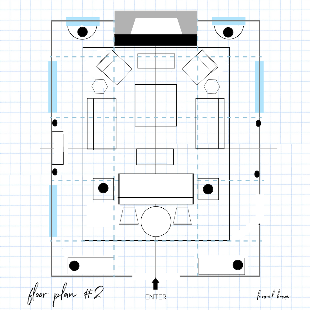
Floor plan #2 is based on Windsor Smiths exquisite blue-gray room. I’ll bring the image back down, so you don’t have to scroll back up.
We could also do a large round table in the back. Or, that could be a large coffee table ottoman in the back.
I love this large conversational grouping. And, the issue of the back-facing sofa is the round table and two chairs flanking it. Of course, it could be a console table without the chairs.

And the final floor plan for this large living room is below.
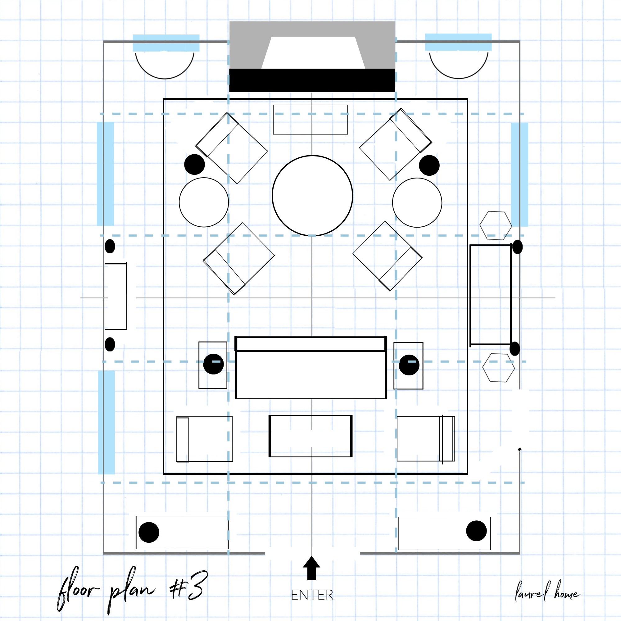
This plan also has two seating areas and a settee on one side, as in Windsor’s room. I like the versatility of this plan. Care should always be taken to have enough space to move through the room. Another important point is not to create an area rug that requires walking half on and half off the rug for more than a step or two.
Whew! I hope you enjoyed this post and found some useful info to help furnish your large living room.
You might also enjoy this post about one living area with several different layouts.
xo,
 PS: Please check out the newly updated HOT SALES!
Related Posts
 Dark Rooms – Are They Handsome or Depressing?
 Gray Walls? The Perfect Color Palette To Make Them Sing
 Small Decorating Details That Add Up For Huge Impact!
 16 Best Wall Colors to Go With Stained Wood Trim
 Heckfield Place – Get The Exquisite Georgian Look for Less
 Painted Wood Furniture – Cringe Worthy, Dated, or What?
 20 Fabulous Shades Of Orange Paint and Furnishings





41 Responses
Hi Laurel,
Fun to see the living room once again. A few things have moved around since then and a few more pieces of art! XOXO
We are working on a den addition that is 18×25 with a very similar layout to Marilyn’s house, so this was so very helpful. I’ve been concerned about the dimensions, but this gives me confidence that it doesn’t have to be too big/awkward. I personally love the plan with the three sofas in the U shape. Thank you!
Great , great examples and plans. Love the back to back sofa look.
I’m thinking the Windsor Smith ‘one-piece’’ is really two sofas with only the slip cover making it look like one?
Hi Cc,
Oh, that might very well be the case. I hadn’t thought of that. However, I have seen the conjoined sofas that are not slipcovered. I do love Windsor’s work!
Thank you, Laurel!
Beautiful LR in the Maryland house! As my husband always says, tall ceilings & big windows is half the victory! Hope the sellers are leaving that gorgeous rug!
Love the vaguely Asian expressionist large scale painting. Any chance that the home owner would be willing to share the name of the artist?
Agree that the sofa facing the entrance seems unappealing… I wonder if plan #3 could be flipped… sofa cluster at the fireplace and the multi-chairs at the entrance?
Hi dr mac,
You could definitely flip the two seating areas. Great idea!
Interesting solutions. I also prefer plan #2. While I love the photos, I’m not sure that some of the rooms are ideal for real-life large gatherings. In particular, the rooms with back to back sofas look nice, but the guests would be forced into two separate conversation groups, without the flexibility to allow a single group. Also, if the couches are directly back to back, background noise from conversational drift would be pretty high.
Another room arrangement that makes for a beautiful photo but might be awkward in real life is the lovely Windsor Smith/Veranda room. The furniture arrangement completely ignores the fireplace, making it impossible for a group to sit around the fire. Also, many of the furniture pieces seem to be placed so far away from each other that a conversational grouping would be difficult. Just some thoughts about keeping room arrangements practical in real life as well as pretty.
I did notice that, as well about the Windsor Smith room. It is quite likely the room was rearranged for the photo. They do that frequently for editorial images.
As always a great post! I have the opposite issue. Living room is 12×18 and doorways create 2 triangles to work with. So about 3 weeks ago we got the ultimate accessory 🐶. This “accessory “ bounces all over so I have forgotten about my decorating dilemma for now.
Hi Chris,
It’s funny how life can make problems go away.
Hello Laurel, One problem with large living rooms is that people take their old living room layout and blow it up to the new proportions, resulting in awkwardness as you describe above. Or they create multiple seating groups which, if you don’t require them, can make your living room look like the lobby of a hotel. (Of course, circulation patterns are very important in configuring your furniture.) One solution is to create new functional areas. My last house had a very large combined living-dining room. So I developed areas that featured plants, music, collections, a table and mirror where seating would have seemed unnatural, etc. In this way the large space was pleasantly filled without creating that furniture-store look.
–Jim
Hi Jim,
You’re correct on all fronts. The reality of this exercise for me, is time. When I worked with clients, I sometimes spent 15-20 hours developing ONE optimal floor plan. And, yes, coming up with multiple variations allowed time for the client and myself to go, yes to this, no to that.
The other thing about large rooms that I didn’t mention but have witnessed is creating a seating plan that worked beautifully, but then arriving at the client’s home months later to see that they had completely rearranged the furniture which also works beautifully! One was oriented on the TV (their adjustment) And mine was oriented on the fireplace focal point.
This is brilliant, Laurel. I’ve had a similar problem, dealing with an extension by former owners which has thrown the symmetry of a longish (by UK standards) thin room out. Plus too many doors and windows. Before I started reading blogs by my favourite designers (it’s a short list and you soar!) I used to think there was a magic answer. Reading this, I think I’ve done the best I can (and I know my limits lol) to resolve an awkward space. I might send my solution in as homework for marking 😉 Meanwhile, thankyou again. This is, as usual, so useful.
Boy did this come in time. I was just ready to order a velvet papaya for recovering my antique camel back sofa. I have an open living area which includes the DR, and 3 different seating areas. Cream love seat in tv area, cream ottoman and two club chairs in the sitting area that’s next to kitchen. The third area, which is in the middle of everything, has a colorful Moroccan rug layered on a larger sisal rug with 2 indigo velvet chairs and the antique couch which is in a medium brown suede. I was going to do the papaya to match the accents in the rug. Lots of blue trim snd chinoiserie in the room so sounds like I should do another cream or a soft blue. Seriously, I talked to the upholsterer today and told him I’d be ordering the papaya. I think I dodged a bullet. I can do the papaya w pillows.
I too love plan #2 with a long view towards the fireplace. I would be unlikely to sit on a sofa facing an entry way.
Aren’t mirrors sometimes strategically placed to make a room appear larger, when seen in the glass? If so, then, in Marilyn’s case, perhaps the mirror over the mantle is not helpful and art there would be better.
Wonderful solutions. : D
Joan @5:31, Laurel has a post about converting lamps to be cordless: https://laurelberninteriors.com/solution-table-lamp-cords/
You can also DIY this–there are lots of tutorials online.
Hi Laurel,
I enjoy your posts about floor plans. This post makes me appreciate my normal sized living room. I don’t have to buy that much furniture. Or such a large rug. 😂
I love #2 because it allows for one large group. However, as a practical matter, I would remove the table in front of the fireplace, to make it easier to poke the fire.
Hi Anne-Marie,
I didn’t say, sorry, but that’s a low bench. So one can actually sit on it to poke the fire. Or, move it out of the way, easily.
I love the look of a console table between two back-to-back sofas, but here is my question. When a console table like that has lamps on it, and the arrangement is not against a wall, where do the lamps plug in? You don’t want a cord running across a walkway due to a trip hazard. So, do you install outlets in the floor? I thought of that once, but then thought that really could prove limiting later on. But even if you did, and you have one rug under both sofas and the console table, how does the cord get into the floor outlet? Just trying to figure that out, but I am sure you already have solved that issue more than once!
Hi Joan,
Yes, people use floor sockets. You only need one for two plugs. So, how does it work with a rug? A fabricator needs to come over and make a small hole that’s bound so the lamps can access the socket. Believe it or not, people do this with fine Oriental rugs sometimes. It requires an expert in the field of fine rug repair. In the future, if the rug no longer requires a hole it can be repaired and won’t be noticeable.
For a less expensive seagrass rug, they are stiffer and in this case, it might require a permanent hole in the rug which no one will see because it’s under the table.
What a gift! Thank you for this wonderful, informative post! I am currently updating my living area and this post could not have come at a better time!
Oh! If only I had this post a few years ago when I had a very large living room!! Your advice here is just fantastic and inspirational. I have since downsized, but these designs still provide great ideas. Thank you!
Thanks so much, Diane!
It seems in vogue to put two sofas back-to-back to create two “spaces”. Or put two sofas flanking the fireplace, parallel to each other and perpendicular to the fireplace. Definitely move the furniture closer to the center of the room and away from the walls. And please no televisions that are visible to the naked eye. Hide the TV behind something when you are not watching it!!
Oh Laurel, If I was a blusher I’d be blushing right now. Thanks as always for including our living room! I would love to have “Marilyn’s” gorgeous living room! Frank Babb Randolph’s has always been a favorite. Miles Redd can do no wrong. I love the layouts you did. A really great post!!! XO
Hi Nancy,
You always make me look good! And, yes, that’s a wonderful living room as it is!
My home was built in 1984 in Oklahoma when dark stained trim was all the rage. I still have it in my main living and dining area however I’ve had all the bedroom and bathroom trims painted white. I guess you’re saying that’s. A no no. I can’t paint the trim in the public areas because of the of custom oak baseboards which match the wood floors in these rooms. Wish I could though
Hi Nanci,
You can paint all of the wood trim if you like including the baseboards. And, it is not always bad to have wood trim. However, I feel in this home it doesn’t make sense.
As usual, fabulous post on real-life topics! I am currently wrestling with an open concept living room, I’m so happy to see some practical insight from a pro. I love reading decorating dilemmas like this, they’ve helped solve a few of my own. Thank you for your insight and practical approach!
Loved this post, so practical and helpful! Thanks Laurel
My favourite is plan#2. It creates a long view towards the fireplace and somehow the seating areas still seem connected. I’m not sure how comfortable I’d feel sitting on the sofas facing the entry in plan 1&2. Walmart greeter perhaps, lol.
haha
This is a great post! Full of so much useful practical information and beautiful inspiration! Thank you!
I do not think I have seen a better design post . . . at any time or by anyone . . . ever. You are absolutely, brilliant!
Thank you so much Lily! I so appreciate your kind words!