Dear Laurel,
I’m so confused about how to mix patterns in a room. For instance: Can you mix stripes? And, how many stripes can you mix in one room if so? Or, can you mix stripes with plaids? What about stripes, plaids, and geometric patterns?
When is it too much?
Are there patterns that should never be mixed?
And, how do you avoid making it look too contrived?
Thank you. I hope you can do a blog post to clarify this confusing topic. In other words, what are the rules for how to mix patterns in a room?
Pat Urnte
*********
Pat Urnte, a fictitious person, asks some very good questions.
So, today, we’re going to (attempt to) tackle this important topic of how to mix patterns in a room. Although, it’s also a large topic. Therefore, I’m going to focus more heavily on the fabrics.
One solution to mixing patterns in a room is to have no pattern at all.
This is typically associated with contemporary or modern styles, of course. However, traditional rooms, or classic rooms as I call them, can be completely devoid of pattern.
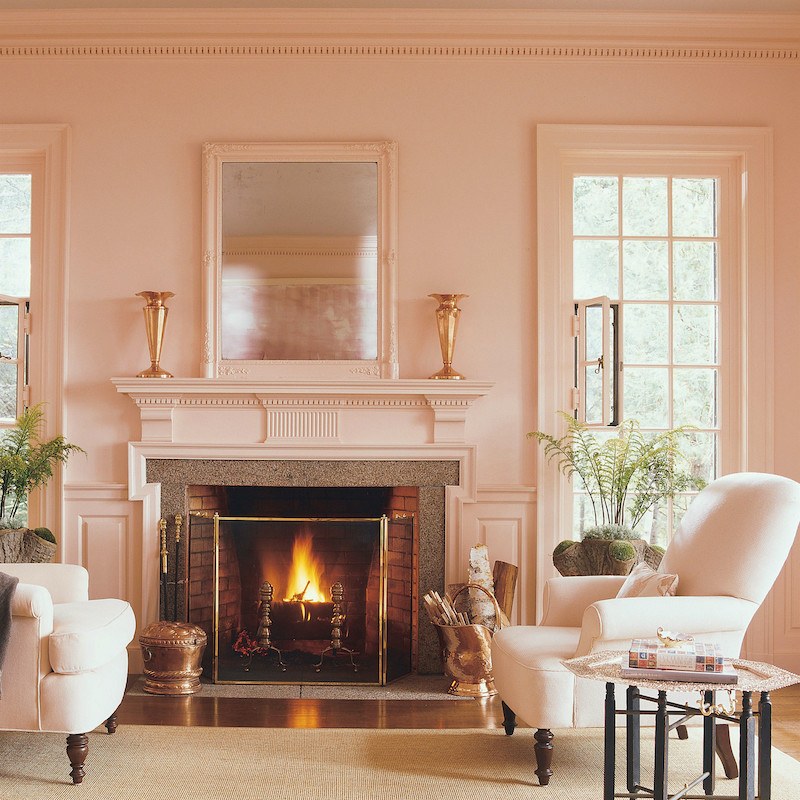
Martha Stewart, above and below, is known for using a minimal amount of pattern in most of her rooms.
For more pretty pink rooms, click here and here.
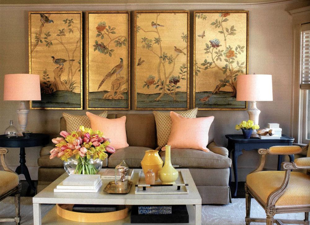
Love those Chinoiserie panels!
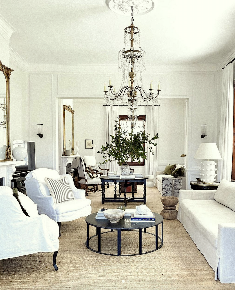
Above, the exquisite decorating of Steve Cordony’s home in Australia.
You may recall my attempt at replicating Steve’s gorgeous style here.
Please follow Steve on Instagram!
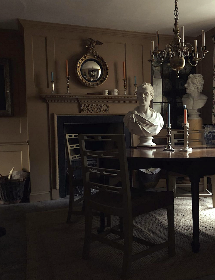
No pattern can be in a dark, moody room like this one belonging to Jack Laver Brister @tradchap on Instagram.
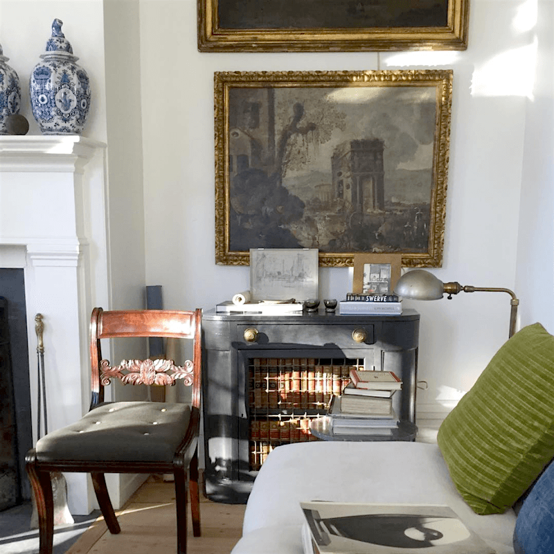
Above and below the exquisite home of antiquarian Gerald Bland on Instagram. Remember this post that celebrates his gorgeous style.
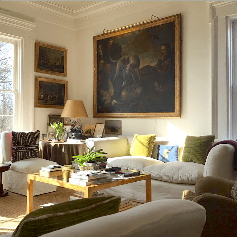
There’s virtually no pattern except in the pillow. Using no or very little pattern allows Gerald’s exquisite art to shine through.
Well, Laurel, isn’t art also a pattern?
It’s certainly a consideration, but I see it the same as what’s outside the window. And yes, that needs to be considered as well, IMO.
So, let’s dive in and look at some examples of how to mix patterns in a room.
But, before we do that, I need to say something.
This isn’t as complicated as some of you are thinking it is. However, in a bit, I’m going to show you a method that has always worked for other designers and me. You can copy it so that you’re less likely to make an expensive mistake when you mix fabric patterns.
And, sure, I can give you some general guidelines, but I have found that when I put together things I love, they usually go together just fine.
For example:
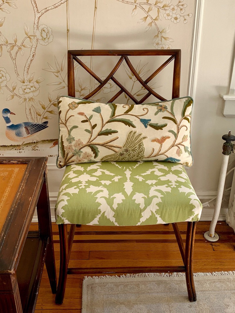
Here’s a quick pic I snapped with my phone back in 2019.
Let’s take a look at the mix of patterns here.
Do these patterns “go” together?
No. They do not.
Is it ugly?
I don’t think so; I think it’s interesting. And, I think so, because it looks collected. (It definitely is!) In addition, the pillow isn’t always on the chair. I move things around sometimes.
Is the pattern police going to show up and arrest me for breaking the rules?
Here’s the thing. There are certain colors I love and use over and over.
And, I believe that when the color scheme is harmonious and unified, the actual patterns matter less.
The wallpaper from Mural Sources, you guys know that this is for my old Bronxville bedroom refresh.
The chair is a classic from Sarreid that they discontinued. I’ve had two of them for at least a decade and had it recovered about nine years ago. The fabric on the seat is from Duralee but discontinued. The pillow was made from some scraps in 2010.
The rug I love and purchased from Overstock in 2018.
The point is that most of the elements in the image were not meant to go together.
You see… something else I discovered some years ago.
In my old townhouse bedroom in northern Westchester County, I had a bed from Grange in a cool celery green. And the rug was the one you can see here that was over wall-to-wall sisal-look carpeting. Yes, the rug was gold, and the bed was yellow-green. Didn’t it clash?
Yes, it did, haha, but I loved it!
I had a similar situation in my den.
The fabric on the sofa was a couple of shades different from the rug’s green colors. I think you can see that here.
I loved that too!
The truth is… I would never have taken such chances for a client– intentionally. But, what I learned is what I said earlier.
It’s okay if the colors and patterns are a little “off.”
In fact, it might even be better.
But Laurel… Can’t you at least give us some solid rules, and then if we want to break them, we’ll do so. ;]
Well, we’ll get to that.
I think the best way to approach this is to first look at the main categories of fabrics.
And, I’ll intersperse some examples of how people have used patterns in their rooms.
Let’s begin with Solids.
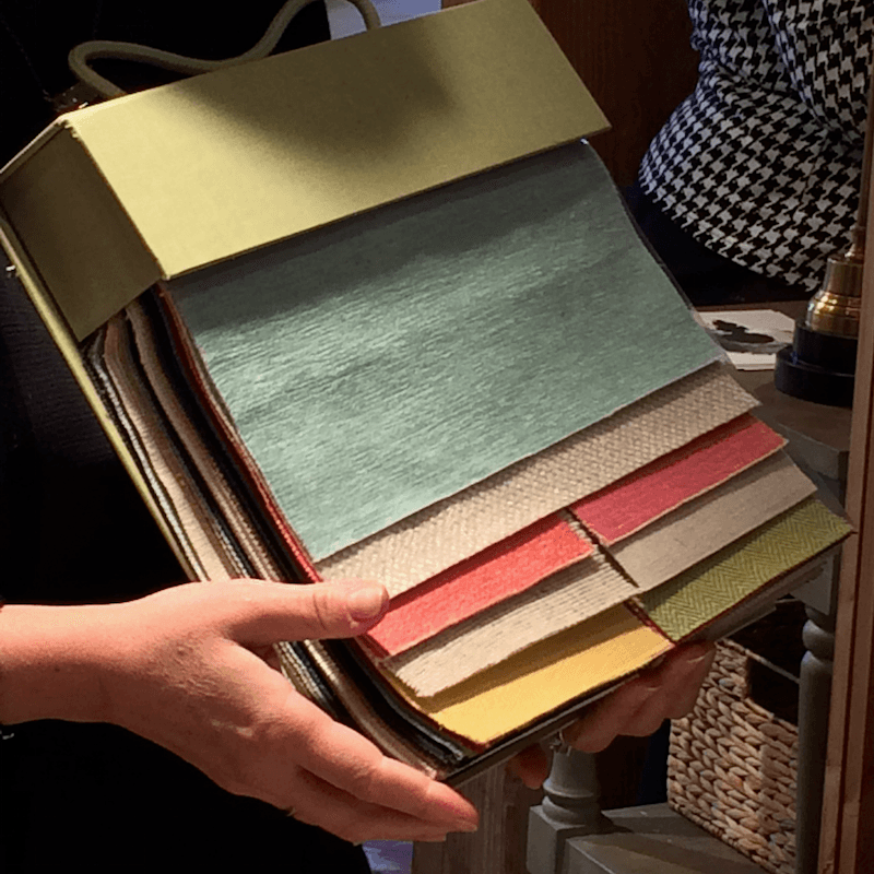
Solid fabrics come in all materials that can be used in an interior and blends of those materials. A solid fabric can also be with or without texture. Some solid fabrics have a pattern in the weave. Above is a super-practical Crypton fabric that I introduced to you here.
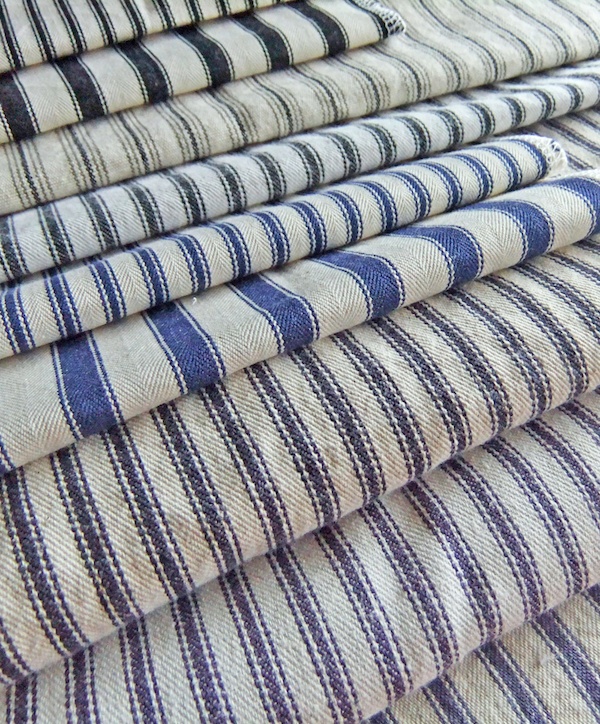
Stripes
Stripes come in all different sizes, from tiny pinstripes to super wide stripes. One of the masters of decorating with stripes is Ralph Lauren, as you can see here.
Checks and Plaids
When I started working for a decorator in Bedford, NY (about 2 miles south of Martha), her rule was usually a solid, a chintz or two, and a beautiful plaid.
Plaids are usually a fabric that I use sparingly. Some are sophisticated, but many say country. However, there are some wonderful rooms that feature plaids.
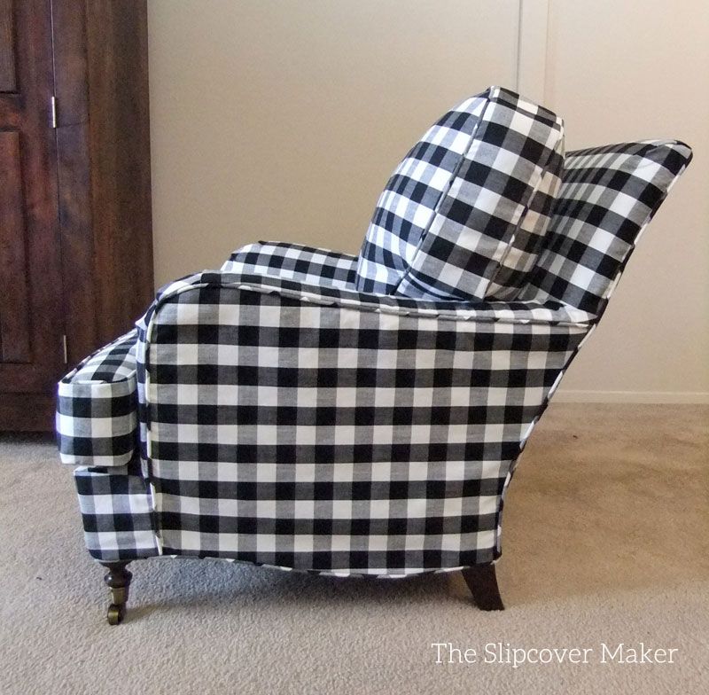
This large buffalo plaid looks chic on this English roll armchair by the Slipcover Maker.
Florals
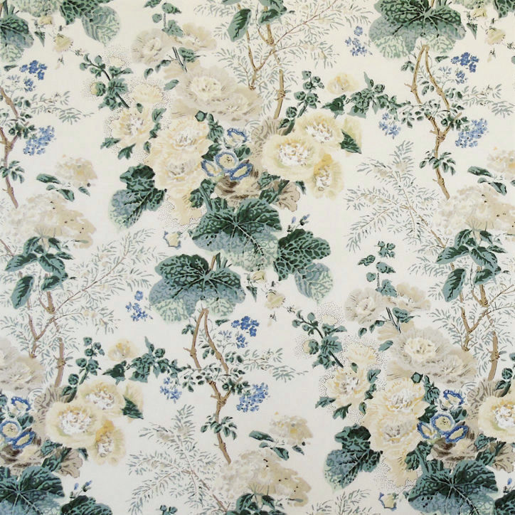
Florals can be small, medium, or large. There are millions in the marketplace. However, not as many designers use them as they did a few decades ago.
Some fabulous designers who use or used florals beautifully are:
We sadly lost Mario Buatta, the “prince of chintz,” not too long ago.
My favorite ways to use floral fabrics are for pillows, draperies for more traditional rooms, and smaller upholstered pieces like slipper chairs.
Some florals are known as chintz. A chintz has a protective glaze on the fabric. This does wear off over time if it’s on a piece of furniture that’s sat on.
Damask
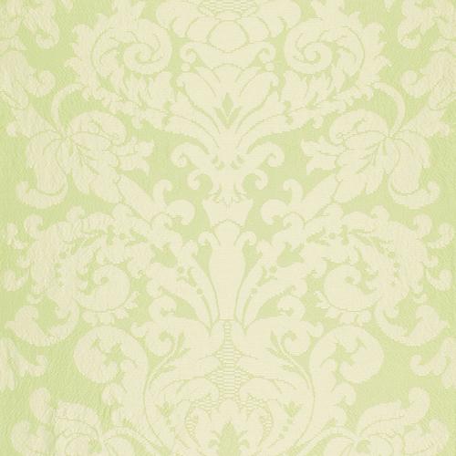
Schumacher CHATEAU SILK DAMASK CITRON Fabric
A damask is usually a type of jacquard weave and is traditionally made of silk, but some are not traditional damasks, but that type of pattern printed on linen or cotton.
- Mixes with solids, luxurious florals, tapestries, and more formal geometrics.
Ikat
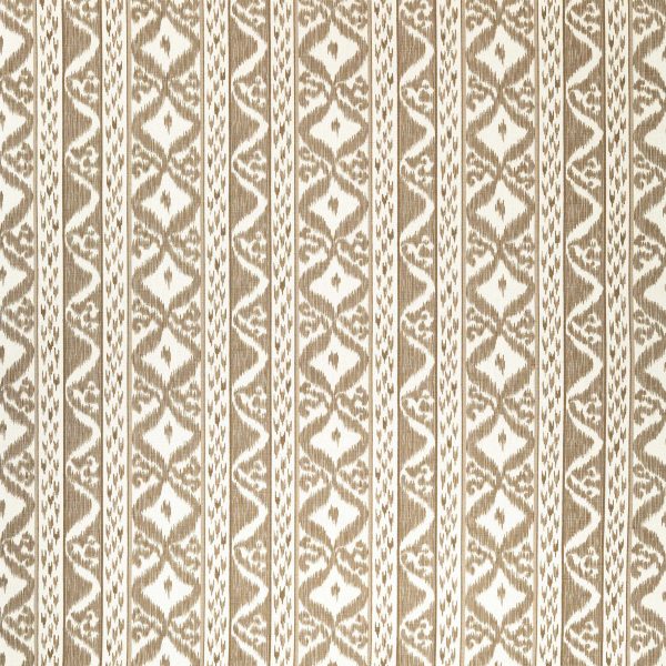
Rapallo Beige by Cowtan and Tout
is a dyeing technique originating in Indonesia. The pattern is created by a process called resist dyeing of the yarns before they are woven. Ikats look great with just about everything.
Geometric
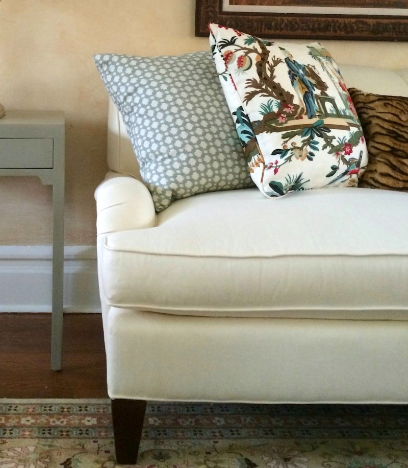
It can be large or small, angular or curved. Above is Schumacher’s Betwixt, one of my favorite accessory-type geometrics.
Paisley
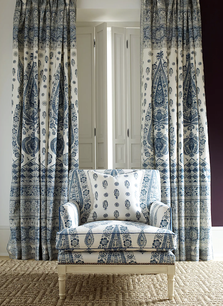
Brunschwig & Fils KOMAL PAISLEY INDIGO
Toile de Jouy
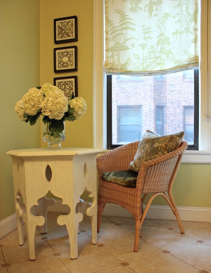
Above is my old kitchen in New York with a Chinoiserie Toile Roman Shade. The fabric Indo Day designed by Barbara Barry for Kravet has been discontinued.
For more about Toile Je Jouy fabrics, please check out this post.
Animal Prints
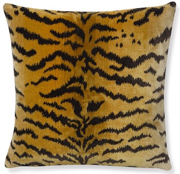
Le Tigre velvet pillow by Scalamandre
Tapestries
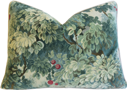
Scalamandre Marly velvet pillow
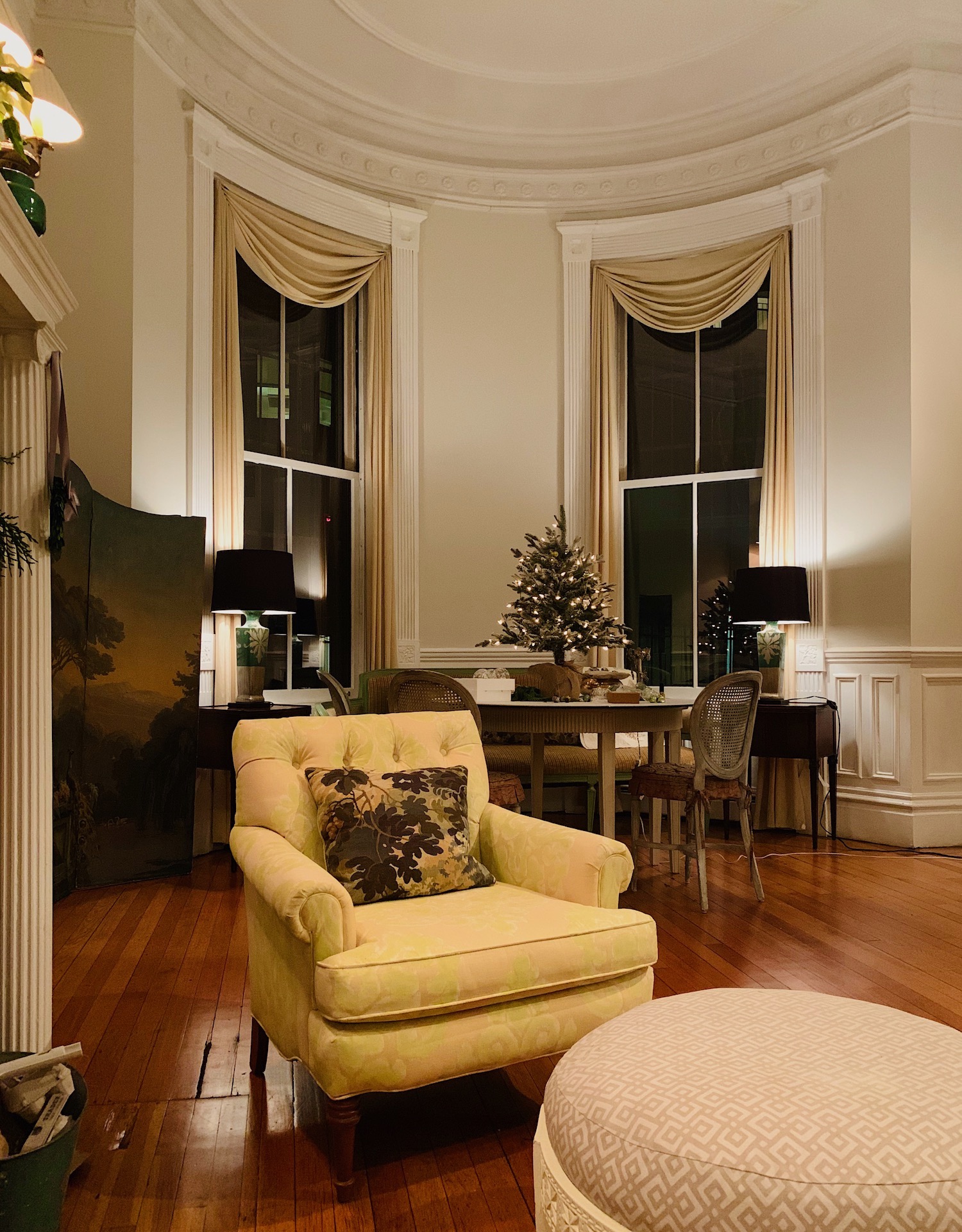
Above are my beloved tapestry pillows. I rarely use the hackneyed word “obsessed.” However, back circa 1996, I was completely so with the home of Ina Garten in South Hampton, NY.
 That’s where I saw this fabric from Clarence House, and even though it was over $200 a yard at my designer’s price, I ordered a yard of it and had the pillows made.
So, how do we put all of these fabric patterns together?

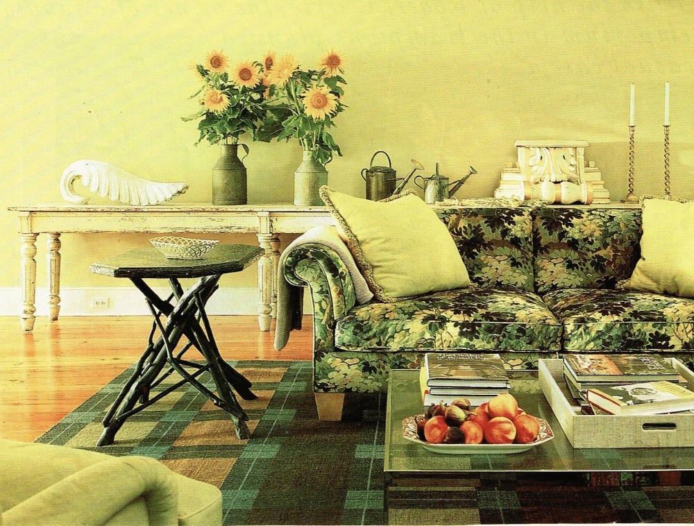
Most would probably think that the fabrics above in my living room do not go together in a traditional way. However, they’re not fighting each other, either.
A balanced tonality is perhaps the most essential element when mixing fabric patterns.
Each of the fabrics and pieces of furniture makes me happy. What I find interesting, is that everything I loved 25 years ago, I love, as much, if not more, today!
For example, if I introduced a fabric like this damask below, it wouldn’t look very good.
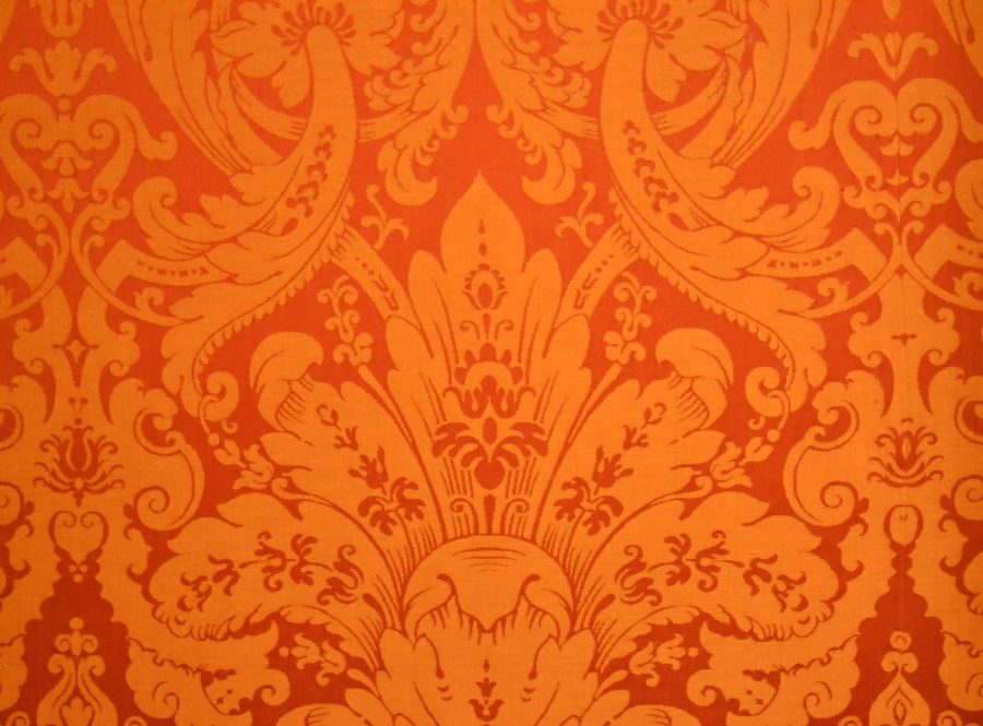
But some of you might prefer this, so it’s also a matter of taste.
It’s also a matter of artistry. If it looks good to you, it’s good. If it doesn’t look good to you, believe what you see, either way.
For example: Are you the kind of person that many patterns in the same room will make you crazy? If so, then maybe you don’t need any pattern at all. Or, perhaps you’ll do one smashing pattern, and the rest are solids.
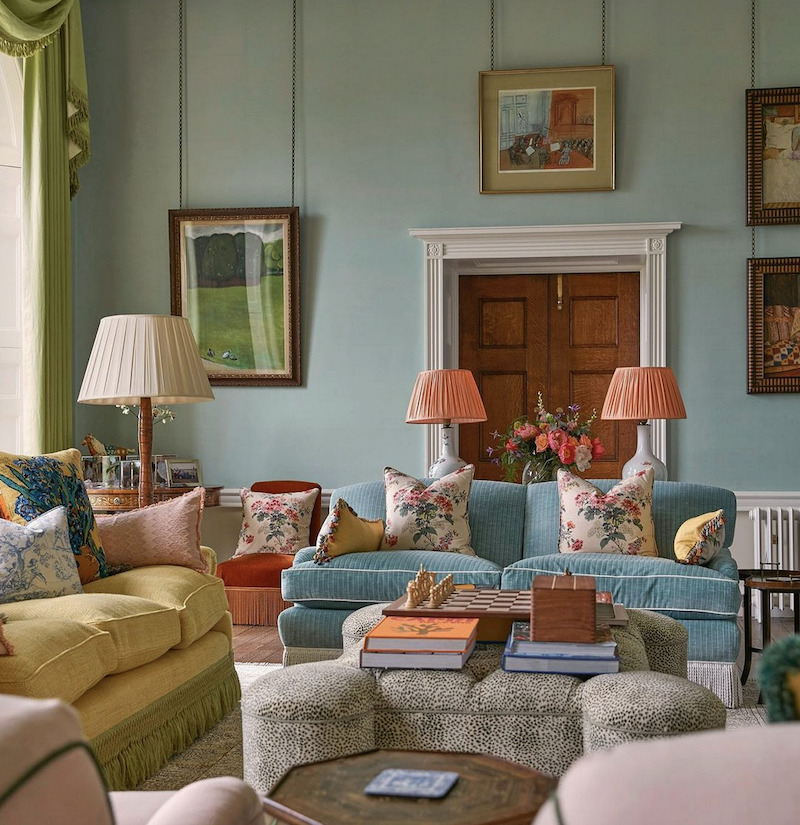
Ben Pentreath in this beautiful living room used a cheerful, colorful color scheme and then stuck primarily to one floral. (ignoring the pillows on the left. He added a small animal print; almost everything else is textural solids.
The next consideration is color.
I think one can get away with more of a mix if the room is primarily monochromatic. Mark D. Sikes is the master of that style.
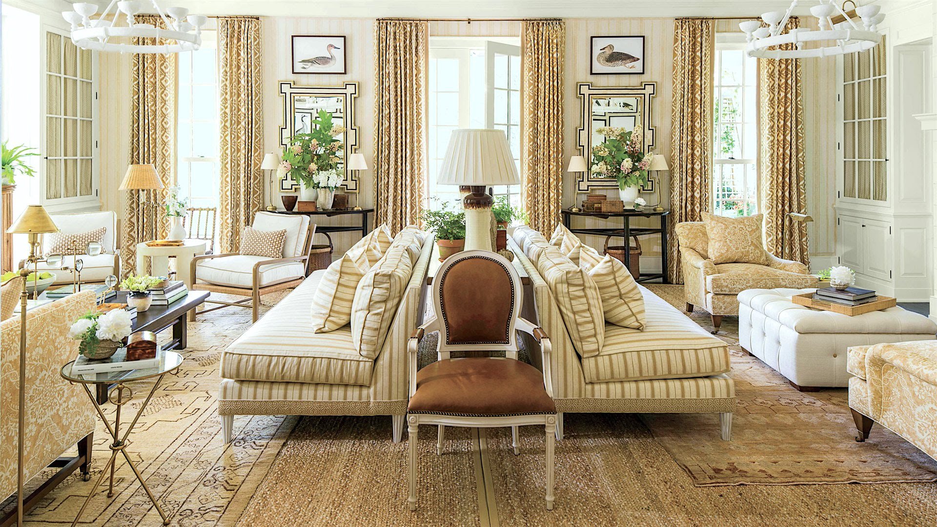
Above Mark’s gorgeous room from the Southern Living Showhouse, around 2016
A classic formula I saw ad nauseum decades ago was to do a solid, a chintz, a stripe, and maybe a plaid or a small geometric, or sometimes an ikat. That was paired with a Wilton diamond geometric with a floral border. I mean, it looked tired to me in 1992. Now, I heave a little looking at this.
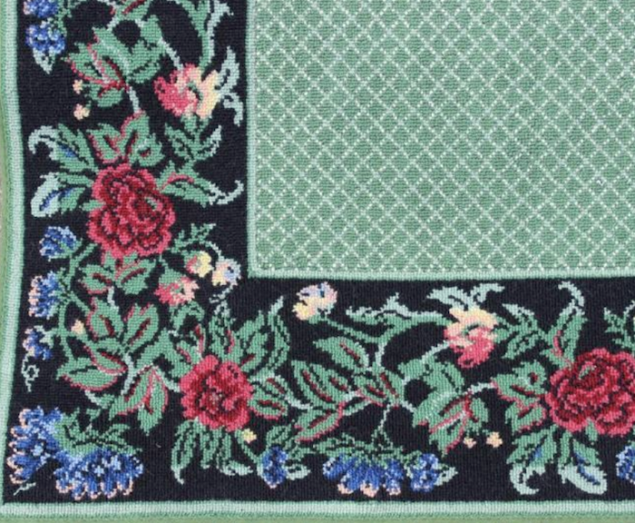
I checked Stark’s website, and I don’t know if they’re even making these patterns now. The rug above, I found on an auction site, but it was sold.
What about Oriental rugs, Laurel?
Well, that’s a great question and probably needs to be a separate post. However, I think Oriental rugs look great with solids, a floral or two, and a stripe.
But again, there’s the issue of color.
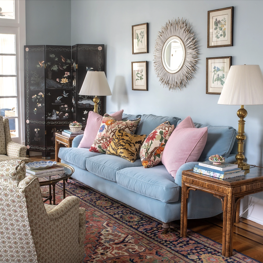
photo: Stackie Flinner
I adore everything Holly Rich from Stuck on Hue did in her fantastic living room. If you don’t know, Holly makes these incredibly gorgeous pillows. You can see many more of her pillows in this post, which links to her website.
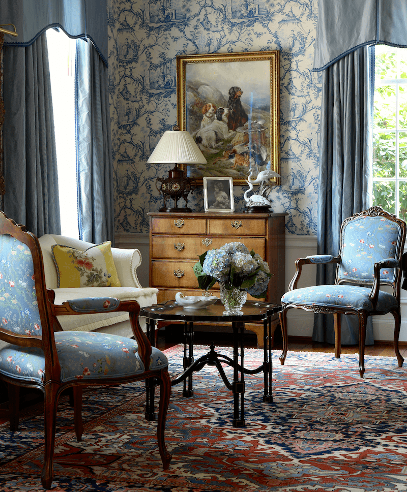
Kitty Tuttle Interiors photo – Randall Mill
I love what Kitty did in this traditional parlor that is definitely in the classic English style but still feels fresh and not at all fuddyduddy.
Let’s, please, look at more lovely takes on trad designs.
I think one of the best designers who truly understands how to use color and pattern, as mentioned earlier, is Mark D. Sikes.
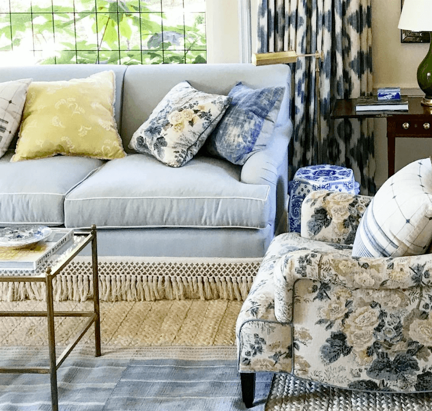
Amy Neunsinger photo – Mark D Sikes
Let’s take a closer look at Mark’s work because this one is an excellent example of how to mix patterns.
- Solid blue linen from Rogers and Goffigon was used for the sofa. That is one of my favorite boutique designer fabric companies. I have not seen it sold online to the public.
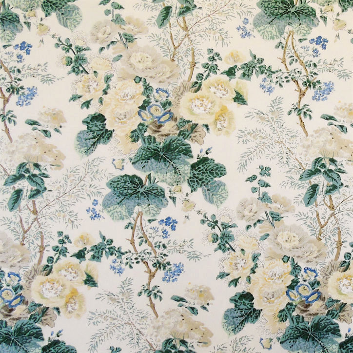
- A floral was used on the chairs and repeated on one pillow.
- A small-scale floral jacquard, it appears to be in lemon yellow (sorry, I don’t know where that one is from)
- Then, a more contemporary stripe in blue and white gives a fresh note.
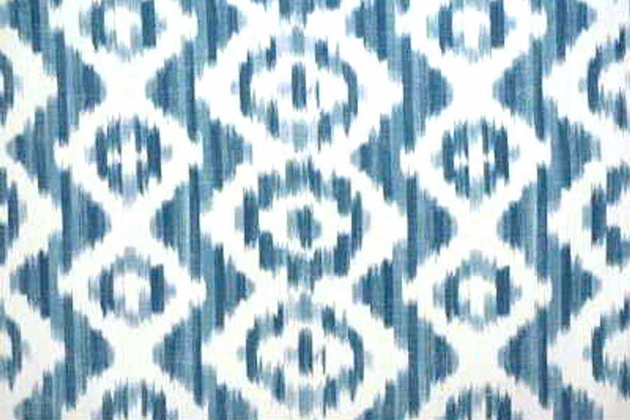
- And finally, a Suzanne Rheinstein for Lee Jofa Ikat in blue and white for the draperies.
Then, there are the details like that gorgeous fringe, the layered rugs, other furniture, lighting, and accessories. All of those elements are what give this room a beautiful richness in texture, color, and pattern.
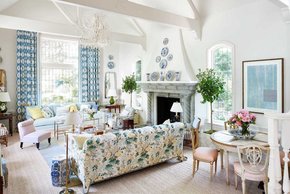
Amy Neunsinger photo – Mark D Sikes mixing patterns
Another shot of the room from the spread in House Beautiful. Interesting that Mark put the chintz on the opposing sofa. However, it’s actually further away than it looks. I see another coffee table in front of it. And, who knows? Maybe in real life, the furniture is arranged differently. What you see in photos is not always what you get.
I also think that the pink/orchid chair is an excellent example of using something a little off-color to provide a certain tension. This is the element that feels scary for most of us. But, the blue and white chinoiserie introduces a “clashing” shade of blue and the green lamps, a “clashing” shade of green.
So, maybe it IS the clashing shades and sometimes patterns that create the best designs?
I certainly feel these elements are not frequently seen in rooms by novice designers. And, I believe it takes a particularly refined eye to pull it off as beautifully as Mark does. I’m bringing it up because all of the furnishings that go into making a beautifully designed room are interrelated.
That’s why it’s so difficult to answer questions without seeing the entire picture.
The truth is, there is no one formula that explains how to mix patterns.
However, there is a trick to putting it all together so that it’s harmonious.
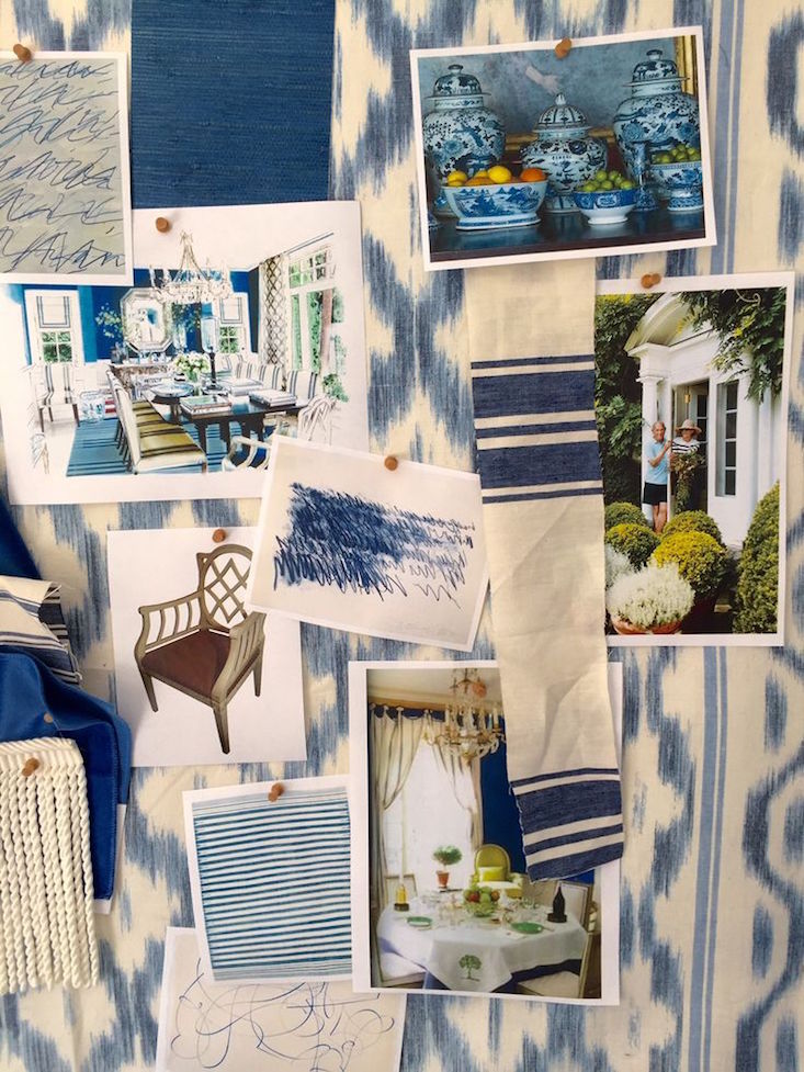
And, that trick is putting it all together as Mark has done so beautifully on a board or somewhere, where all of the elements can be seen together.
This works whether it’s for a living room or a kitchen that has numerous fixed elements.
It’s vital for a kitchen, however, that the elements be looked at how they’re going to live and in as close as possible actual lighting situation.
Sometimes when viewing materials on a board, it’s helpful to put only a tiny sample up of something that’s a small accent in the room.
Please pin to Pinterest for Reference
While there isn’t one precise formula, a good starting place for how to mix fabric patterns is:
- A solid fabric or more than one solid.
- large scale floral
- jacquard and/or smaller geometric or ikat
- or maybe a damask
- stripe(s) and/or a plaid or check
You can put it all together, and if it looks good to your eye, then it’s a go. If you’re not sure, leave it out. That goes for everything when furnishing rooms. Usually, if I left something out for a client, it stayed out. And, we realized our instincts had been correct when the room was finished.
xo,

***PS: please check out the newly updated Hot Sales
***And, definitely head over to the ground zero page for the Nordstrom Anniversary Sale. It’s one of the year’s best sales and ends on July 31. However, the best stuff sells out quickly.
Related Posts
 Amazing Classical Architecture and Gardens In England
 Should You Embrace the Dark Side of Wood Floors?-Part II
 5 Classic Kitchen Combos, Cabinets, Hardware, Lighting…
 Reconfiguring the Space When What Is There Isn’t Working
 A Common Renovation Mess – Can it be Fixed?
 The Top 20 Best Shades of White Paint Designers Love
 The Classic Kitchen – A Complete Source List


