Is An Unorthodox Small Unkitchen A Good Idea?

Hi Everyone,

Thank you all so much for your immensely kind comments regarding my small unkitchen design procrastination.

After last week’s little mockup, I have renewed energy for completing my plans for submission.

However, what have I been doing?

I’ve been looking at mural wallpapers. lol

Actually, it’s not really that funny. I could look at them all day long. What is funny is when I do a search and come up with my own blog post.


One thing I’ve discovered is that there are some document designs from the 19th century that are apparently part of the public domain. L’Eden and Bresil are two of the most popular ones.


However, I need to exercise some discipline and finish my drawings for my small unkitchen.

An idea I’ve been mulling around to lighten up my load a tad is to write a relatively short post, with only a handful of images at the most, to start a discussion about a topic that is one of the following:


  • Controversial
  • Not part of the mainstream
  • Current trend
  • A challenging aspect of interior design and decoration

Then, I’ll pose some questions, and you guys can voice your ideas and respectful opinions on the topic.


Well, today, I am kicking this off with the post about my small unkitchen.


For the newer readers who are not familiar with the term unkitchen, I’ve written about this numerous times in the past.

In general, an “unkitchen” is a place where meals are prepared that does not look like the typical 20th century American kitchen with:


What makes it an unkitchen?


Unkitchens have:

  • lower cabinets
  • an island if large enough
  • floor-to-ceiling cabinetry without a counter
  • clever and efficient storage solutions
  • pantries


And, something else that goes for pretty much every room. That is off-site (away from the kitchen) storage when:


  • space is tight
  • for items rarely used (incredibly if bulky)
  • for reasons of convenience


One of the most controversial aspects of an unkitchen is the elimination of over-the-counter cabinetry.


I realize that for some of you, this is like saying we should ban oreo cookies.

However, if you look at some of the previous unkitchen posts, you’ll see that the overhead cabinet is a stock market crash phenomenon, and that’s the first one in 1929.

Since most of us were born after that, that’s all we know. But, that doesn’t mean that it’s necessarily the best solution.


In my opinion, lots of over-the-counter cabinetry sometimes looks clunky.


In addition, after the first shelf, everything else is above eye level. With floor-to-ceiling cabinetry, we have the use of that golden 18″ space for hidden storage.

Another huge consideration is how many people are living in the home.

If 95% of the time, it is one or two people, that is entirely different than what is necessary to maintain a family of two adults and four children.


In my case, I am designing a home that was built in 1879 and completed in 1880.


The kitchen was where my bedroom is, on the lower level. This, the lowest level, was the coolest part of the house, except for the opposite end, which were servants’ quarters. However, the kitchen in the back had direct access to the alley. So, for practical reasons, that’s where it was.

Plus, a dumbwaiter went directly to the butlers pantry (now, my den/second bedroom). That, of course, is next to what was the formal dining room, now my living room.

Where my smallish galley kitchen is now was a reception area between the front parlor and formal dining room.


A few points I’d like to establish are as follows:


I cannot alter the central doorway between the entry/kitchen and living room, nor move the front door.
Although, I can move back the center wall and plan to do so by about two feet. In addition, I plan to widen it a few inches.

While we’re in the entry, I’d like to establish what else I’m thinking of.

It would be cool to do an over-door to beef up the dinky front door and give it more presence. I want to add mouldings to the door and maybe paint it black. I’ll need to do some more drawings for this too. However, I don’t want anyone thinking the closet is the front door as has happened.


So, let’s take a look at the floor plan for my unkitchen.
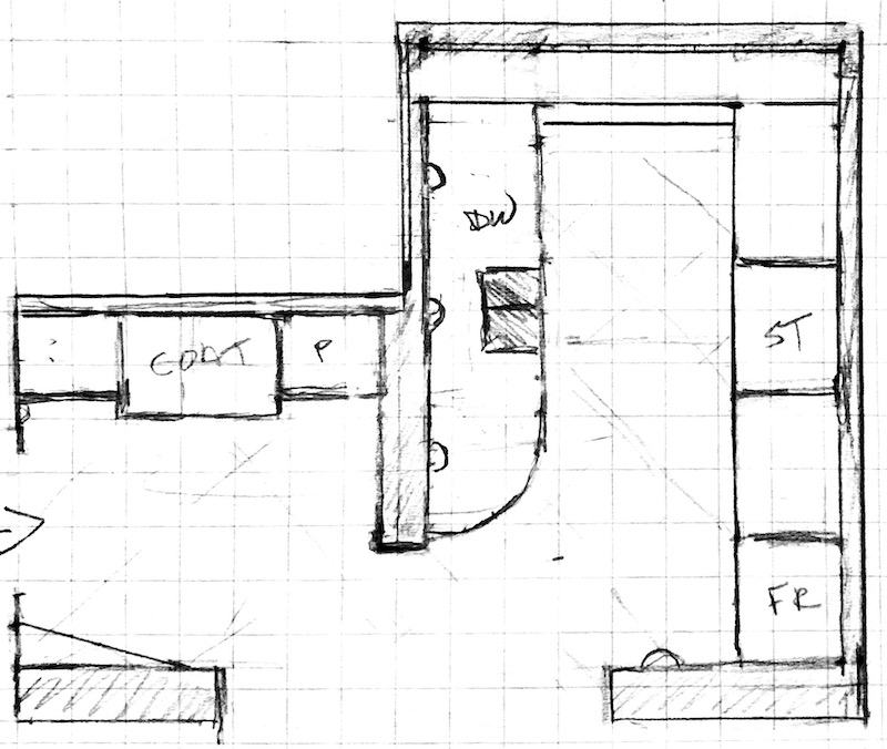
 

plan view - Boston Kitchen


This is actually from several months ago. The basic idea except that the coat entry closet will be all the same depth.

Okay, I still have one more elevation to do, but I did do two of them for the small unkitchen and entry.
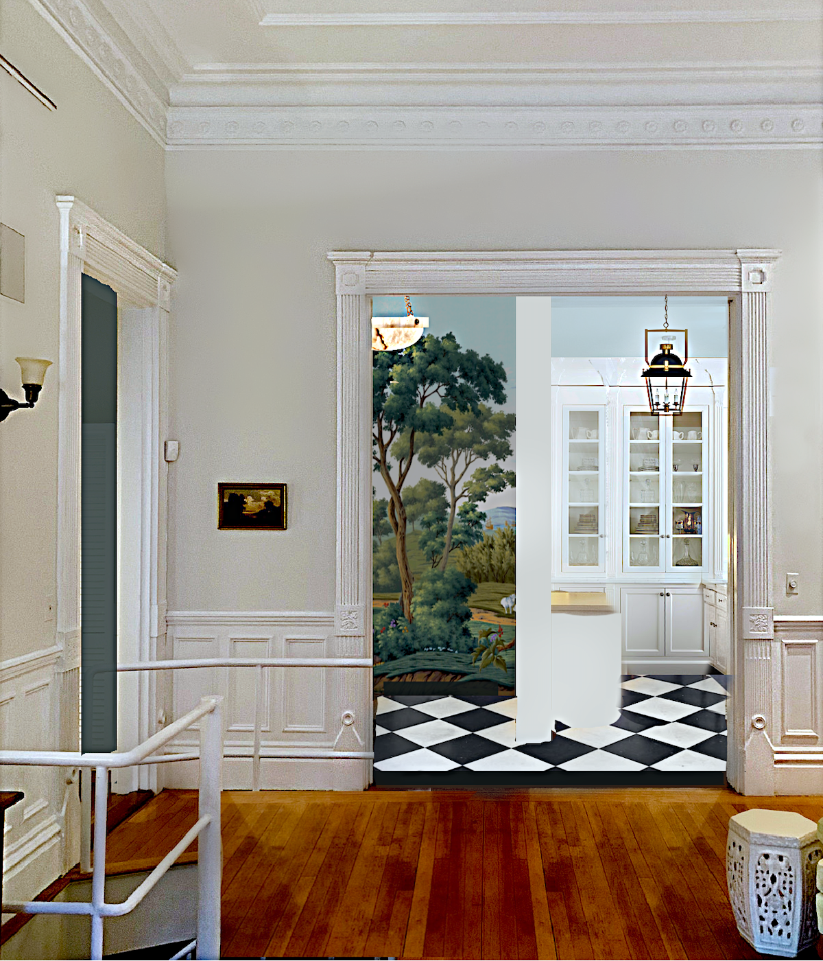
 

Renovation procrastination no more - small unkitchen and entry renovationAs a reminder, here is the schematic I did last week for the entry and kitchen. I may add wainscoting to the entry. By the way, I intend to put some sort of varnish or polyurethane to protect the mural and allow it to be wiped down.

Remember the hidden doors post? You can see some terrific examples there.
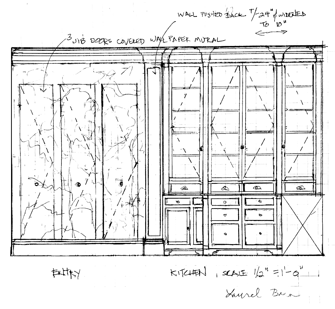
entry and back wall small unkitchenFor those who don’t know, an elevation is not in perspective. It is actually the measurements as they are, but in a two-dimensional image. That’s why it looks a little strange.

On the left, you can see the three hidden doors in the entry. The two areas on either end will have a little extra space, so I will make them the coat and broom closet. The door in the center will be the pantry and additional storage. And, yes, I definitely plan to put pull-out drawers inside.
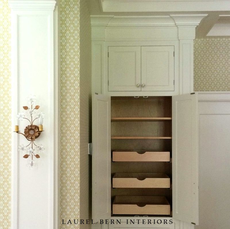
 

bronxville-kitchen-pantry-LB InteriorsSomething like this kitchen we did several years ago.
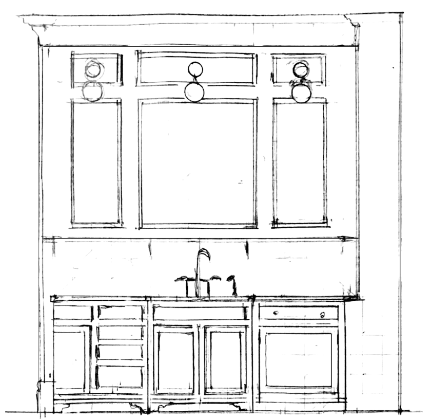
sink wall small unkitchen renovation

Yes, I know, these drawings are a little rough. And, I’ll also need to do some detail drawings. Oh yeah and I’ll draw the range wall, too, but that one should be fairly easy.
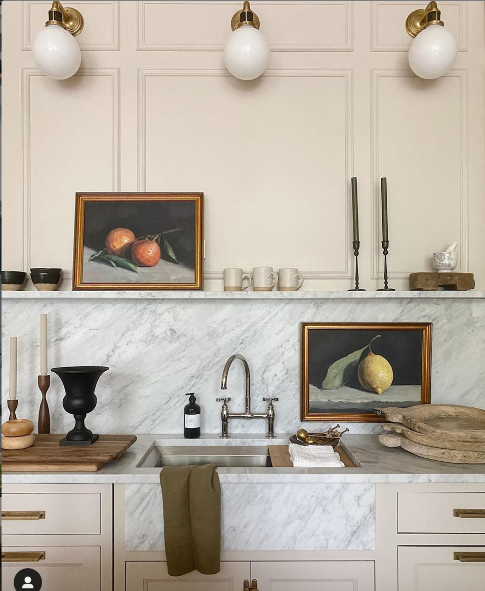
 

jean stoffer design instagram

I stole copied this pretty much from Jean Stoffer’s design of a kitchen in her showroom.
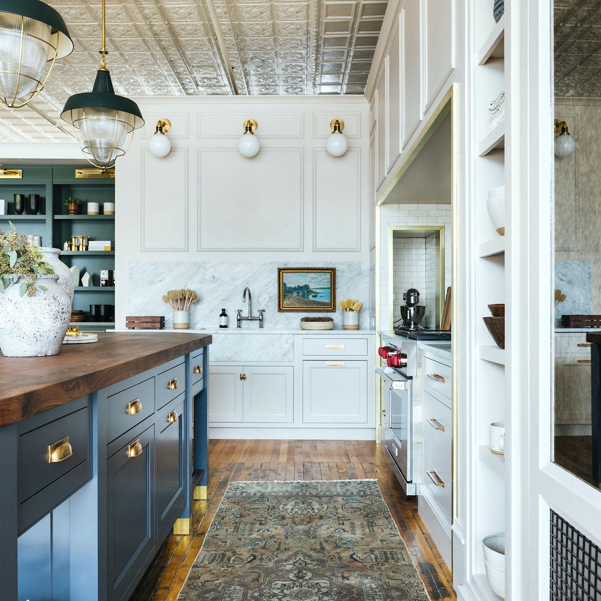
 

Stoffer+Home_Jean Stoffer Design - Shop - kitchen vignette - mother-daughter interior designers


An earlier iteration shows that wall in it’s entirety and before the little shelf went in.


In addition, I’m planning on having a small fridge/freezer downstairs and also some additional storage.

However, a point I feel the need to stress is that there is going to be more than enough storage for my things. But, I will still have a sleek, stylish, and small unkitchen.

Hooray, my son told me that he’s coming tomorrow and I only found that out this morning. It seems he told everyone but me. lol

Anyway, it’s good timing to help me uninstall the air conditioners.


I realize that I left a lot out of this post. It’s fine if you remind me what I already know. haha. Still, I don’t know everything.


***Oh, one last thing regarding a small unkitchen, especially a galley kitchen.***

I am totally fine with you doing upper cabinets over the counters; as many as you like. And, especially if you don’t have room for a pantry or, you absolutely need the extra storage because your home is smaller than mine. Or, you have more things.

Space was at a premium in my old apartment and there, I definitely had to have the upper cabinets. But, also the kitchen wasn’t on display as this one is.

So, whatever you need to do is absolutely fine. The point of these exercises isn’t to say that one way is right and another is wrong. It’s to get us thinking about alternatives as possibilities.

xo,


PS: Please check out the newly updated HOT SALES!


68 Responses

  1. It’s getting better and better! Best version yet! I love it but would also love the greenish cabinets, probably more! It doesn’t sound like it would be like a cave to me. It’s not that deep, and you’ll have the best cabinet lighting.

    I guess an alternative could be to choose a different, more whitish mural? (I like this one but it’s a thought for Lisa’s point.)

    Storage looks good to me. We don’t need every dish and appliance. You know what you really use and need to store better than anyone.

  2. Laurel, these posts give me LIFE, thank you so much for giving us an insight into your design methods! I find these so informative, I’m currently thinking about bathroom/cloakroom design and there is a lot of overlap. Plus, your taste is (as ever) exquisite, and such a rest from the more fad/trend-led design sites. And I love your sketches, even “rough” ones are so helpful to an amateur.

  3. I’m w you Michelle. I found for the most part I’d use just a few recipes from Cook Books. My solution? I download from my LIBRARY cookbooks! Ditto w other books. I can imagine BOSTON’S selection of books! We’ve eliminated such much clutter AND saved $$$$$! I always have the latest cookbook! If there’s a CB I continually refer to then I look for good, used books.

  4. I wish the U.S. had access to the same kitchen appliances Europe does. Euro models tend to be slimmer and more compact as kitchens are smaller there.

  5. We had tons of books that were smashed together on three different bookcases, with more books coming in.

    My husband’s plea: Get another piece of furniture to house more books!

    My solution: Get rid of a lot of books.

    My take: Learn how to live with less. So I’m all for no upper cabinets in a kitchen!

    Anything below the waist should be inside drawers, not behind doors for easier access. Right Laurel?

    My husband has come around, btw. We are now down to one bookcase. Yay! More breathing room.

  6. Laurel, This seems to be the Devol model as well. Question – does the “working triangle” go out the door when you are designing an un-kitchen?

    1. Hi Claudine,

      Galley kitchens are somewhat different, I think. Everything’s so close, in any case. It is nice having the sink opposite the range as long as there’s adequate space. But, some kitchen designers don’t feel it necessary about maintaining the triangle in every situation. That would be a great topic for a post.

    1. Hi Lisa!

      Oh wow! I know you could pull that one off and it would be spectacular. Originally, I was thinking of that beautiful dark gray with a hint of green DeVOL kitchen, but talked myself out of it. If this was the butler’s pantry and the kitchen was primarily white, that would be cool, but I’m afraid of it looking like a cave at the end of the living room.

  7. Lovely as ever, Laurel! I just had a thought looking at the mock-up, the view from the living room is the end of the cupboards. Would it be possible to end the cupboards approx. 10″ before the end of the counter, and put in a glazed cabinet with subtle lighting and use it to display ginger jars or beautiful glassware?

  8. Laurel, so classy as always. I hope you are using refrigerator drawers and not a cabinet style refrig that makes you crouch down every time to see in it.
    As far as the end of the wall in your view looking from the living room… What if you fattened the wall a bit, maybe to 8″instead of the usual 5″, and put a lighted inset glass shelf or shelves to display art? Or you could paint it the darkest green color of your mural so it fades into the distance visually. Or leave it alone and call it one of the wonderful quirks of beautiful old buildings.

  9. Laurel,
    What a beautiful design and vision for your kitchen remodel. It has great function and ATMOSPHERE!! Love the mural in the entry. Viewing the mural and beautiful cabinetry from the living room really redirects attention away from the end of the wall in the middle of the large opening. Brilliant!!! What if back wall of cabinets were mirrored to reflect light from opposite bay windows in living room and to add depth, just as the mural adds depth? Seeing your kitchen/entry design was a breath of fresh air. Nothing sterile and run of the mill about it!!! So many kitchen designs today are sterile and lack character and atmosphere, but you have created a joyful and inspired space!

  10. Creative and beautiful design! There’s just one thing about it that bugs me: looking from the living room, the wall between the kitchen and entry is just off-center enough to feel wrong. Is there any possibility you could push that wall farther left, so the proportions are 1:2 or even better the Golden Mean?

    1. Hi Anne-Marie,

      Well, I can’t move the wall because the part of the wall that extends past the closet is shared with the front apartment. However, I did push the wall back and widened it to more than double what it is. For bringing furniture in, I prefer to leave at least 40″. The other thing is that drawings and photos are much different than real life. I think it’s going to be a lot better than it currently is, working with the limitations of the space and architecture of an antique home.

  11. Laurel, your foyer mock-up is magnificent! Please keep the black and white floors and keep the mural floor to ceiling. It’s like a continuation of your tree-lined streets. If you add wainscoting, it will cut off the mural and the visual effect. I envision opening the front door and walking into the most spectacular enveloping jewel box, similar to how many powder rooms feel.

    On a less glamorous note, for those removing existing cabinets during a renovation, if they are in decent condition, consider salvaging them and installing them on a wall in your garage or storage space.That’s what our contractor recommended, and we love having dust and spiderweb-free places in our garage for extra pantry items. Best part- it didn’t cost a dime!

  12. Love the Evolution of Design you’ve been creating in your Back Baby residence. While looking at your photo of the livingroom opening into your front hall/kitchen, it occurs to me that the end of your cabinet run and the end of the wall on which that cabinet run attaches is uncomfortably protruding (almost centered) into the elegant opening of the livingroom. That awkward placement will be exaggerated when viewed while entertaining in the livingroom. An idea: adhere mirror to both elevations so the ends of wall and cabinet disappear and no longer take up visual space in that opening. This could also add to someone’s suggestion of mirror instead of glass in the pantry cabinets if you’re so inclined. I’m looking forward to the next installment! Thanks for putting efforts into making this available to your reading public.

  13. Really gorgeous, Laurel. I am planning to renovate my small kitchen in the next 1-2 years, so this is all very timely. Am I understanding the elevation correctly, is that just an undercounter fridge? You mentioned that you will have an additional fridge/freezer downstairs. I’m curious where that will go. What is an “over-door”? Definitely yes to wainscoting in the entry!

  14. Re suggestion to flip stove and sink locations – Where the stove is now will get a quick glance, but eyes will move to the living room. The present sink location will perhaps get more viewing time from those seated in the living room. It’s a great plan either way.

  15. Dang, it’s going to look really, really cool. I’m pretty psyched to see it come together for real via your posts. I have an unkitchen now, which my whole household loves, and it’s very much influenced by your writings. Thank you!

  16. Really like the drawings. I re-did my kitchen in 2004. At the time it was rather radical but I have never looked back after taking out the upper cabinets. It allowed more room for pretty pictures and wall displays. I did add an antique pine wardrobe where I store silver and other serving pieces not often used. It adds much more character than upper cabinets would offer.

  17. Brilliant design and seriously beautiful. I would not consider it an “unkitchen,” only a compact kitchen, for 1-2 people occasional entertaining for a limited number. You can stand almost in one spot and spin around reaching for this and that to create your signature dinners…Storage is generous for a small salle de cuisine, and you have 4 countertop segments. Enough to really cook. Probably not so much to bake. One stand mixer in a place you can get it out easily will cramp your storage all by itself. The downside will be that you will have to learn a kind of “kitchen tetris,” my term for when every item must be placed just so and processes must be choreographed to avoid collisions between various things going on at the same time. The drawing of the bottom of the “U” shows a nice little row of drawers, the ones on the sides right at counter height. I advise against it. Unless you keep things in those drawers that are only needed when the kitchen is completely tidy and clean, you’ll have to move things around the counters to sneak into those drawers. It will drive you slowly nuts. I can’t think of a single thing to use those drawers for that wouldn’t But where, oh where, will you hang your apron as you exit the kitchen with your laden plates or dishes? Eager fans want to know ALL the deets.

  18. love your un-kitchen! And if the b/w floor doesn’t make it to the final design – there’s always MacKenzie Childs b/w checkered teapot.
    Any links to the mural you can share?
    Glad your accident is behind you and you’re designing again…
    Really look forward to your blog posts…
    thanks.

  19. I believe your un-kitchen will be a gem in a jewel box when you are finished. However, it is a kitchen for one person. I lived in apartments for most of my young professional life before I got married – at 35! My mother was sure I was going to be an “old maid”. The small kitchens of these apartments were perfect for me because I never cooked. Now after 34 years of marriage, I am a pretty decent cook and baker. I could never go back to those little kitchens. We are now talking about downsizing – and as I look at the various communities on the Cape, the one thing that stands out and bothers me are the cramped kitchens with microwaves over the gas top – ugh! My husband is fearful that I will tell him we will need to build new again if we do move.

  20. I’m okay with banning Oreo cookies, as long as we keep the Girl Scouts thin mints.

    Okay, seriously, I’m suffering kichen envy. Your new kitchen is going to be so amazing! Wish it were going to be mine!

  21. I love the ideas for your kitchen. However, Oreo cookies should, in my opinion, be totally banned. My husband and friends all think I’m crazy, but even as a kid I thought they tasted like a mouthful of sand and Crisco!

    1. Hi Frederick,

      I’m with you. I’ve always thought they were dreadful. Yes, corn-syrup-sweetened crisco in the middle. with a fake chocolate cookie. Strange and Yuck.

  22. WOW. I think your designs is brilliant. I love the mural jib doors for storage. Also looks like you’re painting the kitchen ceiling and walls to match the background color of the mural. Terrific! I wouldn’t change a thing except for the black & white tile floor. It’s too visually “bossy” and too much vivid pattern for the small space. Why not continue the hard wood floor into those spaces instead?

    1. Hi Allyson,

      I had a black and white tile floor in my old kitchen and loved it. But, this one isn’t going to be strictly black and white. It’s a faux marble that’s not quite black and the white “marble” is more gray so it’s going to be softer than a strictly black and white floor.

  23. I absolutely love your unkitchen. Especially when I see the elevation with the beautiful entryway. I have a huge kitchen with lots of uppers that I also think is beautiful. We can enjoy our kitchens without worrying about what others think, right? I know, easy for me to say, I’m not posting mine on the internet! LOL

  24. Looking good. In my kitchen I did all lower drawers. I LOVE it! No more bending down to dig into the back of a cabinet. There are no uppers. I’m
    lucky to have an adjacent under-stairs nook that I made into a pantry. I also put a gorgeous antique wardrobe in my powder room and use it to store infrequently used items and household products. Of course all these ideas came from you. I’m so grateful I found your blog. Thank you for everything.

  25. seems like so many design details for a small space but a great layout. Are you planning on an undercounter refrigerator? much preferred as you will see a standing refrig as soon as you enter the apt. I just installed pullout drawers in my below cabinets and they are the BEST! EASY ACCESS and with the rubber lining nothing moves.

  26. Love your creative design. Just wondering about your choice if flooring in the entry way & kitchen. Did you consider and reject having the hard wood floor extended into both of those areas? We were advised to extend our hard wood floor into a partially open kitchen and I am so glad we did. It makes our space look larger.

    1. Hi Nancy,

      If I did a wood floor, I would change the pattern because matching will be next to impossible. However, in this case, I do want to differentiate the spaces with a different floor.

  27. I think your kitchen will look like a fresh example of what “could have” been in the house (ignoring the present configuration of rooms, of course). Actual kitchen cabinets, as we know them, didn’t really appear in houses until the very late 19th c. Prior to this, cabinets were pieces of furniture that were not built in – they could be picked up and moved around.
    Many victorian houses had fine cabinets built in, in the library and pantry areas especially.The earliest kitchen-adjacent ones had the upper sitting right on the lower – just like what you have planned. A space gradually evolved between the two. I used antique cabinets in my kitchen, from a fine early 20th c. house. The clearance between the uppers and lowers is too short by today’s standards – you can’t fit a blender or mixer under them. I have a separate lower cabinet for a work/prep surface and it works fine.

    In old houses I am the most excited when I see a kitchen or bathroom that looks like it “was always there” – ie the style and execution are sympathetic to the historical details of the house. Modern function can be well designed to fit in with this, which is what I think you have done.

    I am looking forward to seeing the execution of this design. The mural and hidden doors will look great, too.

  28. Good morning Laurel,
    I’m excited to see how your kitchen & entry hallway work out. You have a wonderful design planned out.
    I’m in the process of renovating the small kitchen in my new place. I didn’t realize the design I came up with was an un-kitchen. I have no upper cabinets, just a shelf. I had planned on having wallpaper installed & I may have to start looking into murals. I’m just not sure if there’s enough wall space to support a mural.
    Enjoy your visit with your son.

  29. I love your design! My only suggestion would be to have large drawers under the countertops rather than cabinets with or without pullout drawers. So much more convenient, and it still looks good.

  30. If you had been designing your kitchen pre-Covid, I would have pointed out that small kitchens often work well in smaller Back Bay apartments — people tend to come over for drinks or dessert before/after walking to one of dozens of nearby restaurants. Things are different now, and many of us are cooking daily and baking more, too. And we have fewer restaurants, although they’ll return.

    While I love the look of un-kitchens, I don’t know if one would work for me, even if I didn’t need my upper cabinets. (My kitchen is so tiny that it was featured in the Boston Globe years ago, when it was new.) I prefer to store as much as possible at waist- or eye-level rather than having to bend over or squat to reach stuff. I hate that, and that’s almost all I’d be doing in many un-kitchens. In my (so far imaginary) second home, I’d want a pantry or a wall of pantry cabinets. And a wall oven. And enough upper storage for all the things I use often. Un-kitchens are best for people who don’t have bad backs.

  31. I got married one semester shy of my college graduation. For that last semester, my husband and I lived in a 10 x 40 furnished apartment. The galley kitchen was about 7 x 9 feet, smaller than my closet now. To this day, it is the most convenient kitchen I ever had to work in. Actually, these days, if I matched my cooking appliance needs to the meals I actually produce, a hot plate and toaster oven would almost be overkill. Humongous kitchens are just show off spaces. Give me a galley kitchen and a huge and beautifully furnished porch, because the porch is really my happy space.

  32. Instead of glass fronts on the storage/pantry wall, I would probably prefer beveled mirrors to reflect whatever light comes in from the living room.

    Murals: some people use a projector and a paints by numbers design to do their own murals. Probably too much work, it an idea.

  33. happy to see you’re recovering & getting back to your wonderful kitchen design! Love the concepts. I’m a BIG proponent of the Economy of movement spaces! I do remember seeing a HGTV show YEARS ago about a New York designer renovating houses SHE purchased. One episode was she found a wonderful fabric but wanted it as wallpaper in the dining room. The solution –SHE HAD IT LAMINATED! I know laminated paper comes in MANY grades–but have you thought about doing something like that to your wallpaper?

  34. Laurel, I am thrilled (I hope not too selfishly,) to see you working on your own plans. The kitchen is sure to be a show stopper. And the entryway has me wide-eyed. Love the jib doors and mural. I believe it takes a true professional to enhance a SMALL space with both form and function! That fits you to a tee!

  35. Hi Laurel. I’m so glad you are feeling better and have a renewed enthusiasm for designing your historic home. Designing for ourselves is so much more difficult. Your solution looks fabulous and will feel completely natural in the home. Without seeing dimensions, there looks to be plenty of counter space for prepping meals. If you decide you need additional storage in the kitchen, you could always use solid doors on the two tall cabinets on the end. I have no doubt you would be able to design it so it looks like it’s been there forever. I look forward to seeing the completed project!

    Best,
    Anne

  36. Hi Laurel – I, like so many of your fans, are cheering for you. You are a trooper and continue to knock design out of the park. The kitchen will be you in wood. Doesn’t that make you righteously proud? You have graced us with mind changing ideas.
    Your son timed it just right. We need those hefty men to help out with work that is too heavy for us.
    Love the mural and yes a flat finish would certainly protect it and is so charming.
    Best wishes to you.
    Thank you for sharing your thoughts.

  37. I love your plans Laurel! Can’t wait to see it finished, it will be stunning. The murals are gorgeous what a great idea.

  38. Congrats Laurel! You’ve come up with a brilliant solution and your entry and unhitched will be gorgeous! I love following your process.

  39. Love your kitchen plan. You live in an urban area with walkable stores, so it’s not like you need to stockpile giant bags of chips from Costco.

    I’m a big fan of unkitchens and did one in my own 1880’s home.

  40. Are you sure you don’t want to flip the sink and stove placement? Seems like entering the apartment and walking to the LR, etc., it would feel more unkitchen-y to glimpse the sink rather than the stove. More bar-y, always welcoming!

    And, not for your kitchen, but wouldn’t it be fun to have a fab mural wallpaper (like your example) used in a small kitchen with no upper cabinets?

  41. Bravo! That’s all I can say. It was a labor of love and I enjoyed watching your process. Designing for ourselves is the hardest project one can attempt. I can’t wait to see the final results.

  42. Love it! I would be careful about the choice of cabinet door style. Plain Saker seems to be the default choice these days. And while it’s lovely in most contemporary homes, I think a design that is more similar in style to your wainscoting would work better in your historic townhouse.

  43. Hi Laurel – love that you are getting close. I have 2 houses where I have re-done the kitchens in the last 5 years – in both, I removed all/most uppers, and it is a game changer. It allowed windows in one house and sconces and a much more comfortable surface in another (headroom) and looks so fresh and modern. In response to “where will you put x or y” – I listed out every single thing that needed to be stored and found the optimal place for it. I got rid of stuff I didn’t need, stored stuff outside the kitchen that gets used infrequently, and made sure there was a good place for everything else. Couldn’t be happier with it. To me, upper cabinets are not that great – I’m 5’9″ and couldn’t reach most of the shelves in the uppers I got rid of. Good luck on your project – its going to be beautiful.

  44. Wow, all I can say is that is beautiful! I love the mural with the black and white tile. The color of your walls also. You are amazing. I wish you would come to my house and do my very small kitchen !

  45. Hi Laurel,

    I’m planning my next kitchen project.

    Referring to Stoffer’s kitchen design I have a question on how she used the stone (can’t tell if it is a quartz, as you know marble wouldn’t be optimal) for her farmhouse effect. How did she do that? For my needs I’ll never again go with a stainless apron i.e., belt buckles do a number on them. Also I prefer a zero reveal on those edges as gunk gets trapped. I love how the apron-like stone works with the countertop and stainless sink. I look forward to your reply. ~Michele

  46. Where will you keep your bread? And coffee or tea?
    Will the mural really hold up on actively used doors?
    The plan is lovely however!

  47. protective coat for mural – Modern Masters makes a versatile acrylic clear in a “dead flat” finish and Benjamin Moore Stays Clear flat. Both are used extensively in decorative and faux finish installations

Leave a Reply

Your email address will not be published. Required fields are marked *

This site uses Akismet to reduce spam. Learn how your comment data is processed.

Welcome To Laurel Home!

laurel-aarons-18th-e1456449963926

Hi, I’m Laurel, and Laurel Home is the website and blog for Laurel Bern Interiors.
I’ve been creating new-traditional interiors since 1988. The blog is where I share all.

New Edition, November 2023! Get The Indispensable Guide For 100s of Home Furnishings And Interior Design Sources That Everyone Is Raving About

laurels-rolodex-final-book-cover-master 10th edition 23-24

laurel home archives

Categories:

Please click the image below for more info about my rockin’ Interior Design Guides for 2024!

Laurel Home Interior Design Guides 2024
Amazon ad

please click below to check out my favorite decorating & design books

Laurel Bern's Favorite Interior Design and Decorating Books
Subscribe To The Laurel Home Blog And You Will Receive A FREE Guide Where I Share How To Get Your Paint Colors Right, The First Time.