Bedroom Decorating Ideas You Might Not Have Considered

The other day one of you lovely readers sent me an email asking me to take one of your homes, or a room from your home and give my best decorating advice.

Unfortunately, I forgot to bookmark who said that and then it got lost in a sea of reader emails.
I do try to answer everyone, but if I missed an email you sent, please don’t take it personally. It’s usually because I’m overwhelmed at the moment; it’s not intentional.

But, just the other day, I received an email from Kathy who lives smack dab in the middle of Texas.


Her original email asked for some bedroom decorating ideas.


I wrote her back. And, as anyone knows who’s ever sent in photos for post, I asked for better, larger, photos of all four walls. Oh, and one or two of the rest of the house.

This is because nothing is created in a vacuum. I can’t advise on someone’s bedroom without seeing what else is going on.

However, Kathy sent me back, not only the bedroom, but most of the kitchen and a lot of images of the living room and adjacent areas.

And, you know what?

I was going to do the entire home. In one day.

I ALWAYS do that to myself.

It is EXACTLY like giving birth. You have a baby and you swear you’ll never do that to yourself again. But, then you FORGET. Right? And, you go and get yourself pregnant with another one. But, after the second baby, I remembered.


So, I’m thinking, fine. I’ll make it easy on myself, I’ll just stick with the bedroom decorating ideas, for today.


Easy?

Haha

Nothing is easy.

However, for today, I am going to attempt a virtual bedroom refresh. And, then for Sunday, I am planning on tackling the living room and kitchen. Or maybe just one or the other. I need to get real with myself!

Now, before I begin with the bedroom decorating ideas, please understand that I have created A design. There are millions of other possibilities. But, some of this is based on other things I’ve seen in the house. But, I created this one because of some points I’d like to make.


First, let’s read Kathy’s letter:


Hi Laurel,

I have a dilemma I haven’t seen the answer for on your blog.

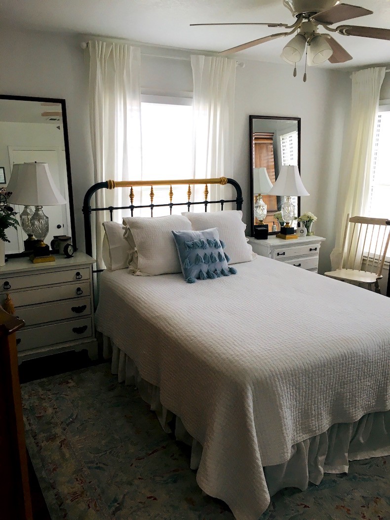
We have a 43” W window in the middle of our longest wall in the master bedroom.
 

Bedroom decorating ideas - bed - before

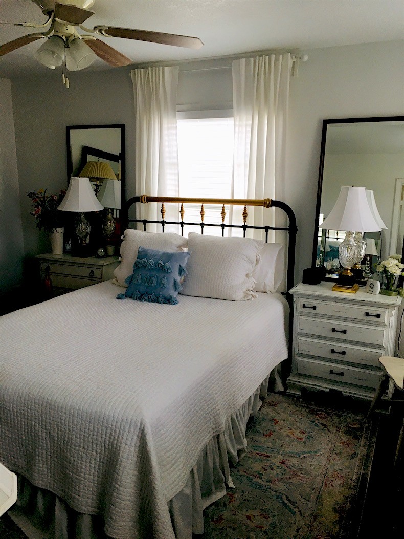
This is the only wall we can place our queen bed on.
 

Bedroom decorating ideas bed - chest before - fan

Do you have any ideas for how to dress this window and the other two on the adjacent wall?  Right now I have white 2” vinyl blinds with white IKEA curtains and rods.  The walls are white and the bed linens are white, also.  I guess I like a lot of white!


I was wondering if bamboo blinds might add some texture and depth to our windows. If so, would I hang them near ceiling height or at the top of the window?
 

Bedroom decorating ideas bed - chest before

Also, we have a metal headboard I painted dark bronze and gold.  I have wondered if an upholstered headboard might look better even though it would block some of the light from the window.  If so, what style and what color upholstered headboard would you suggest?
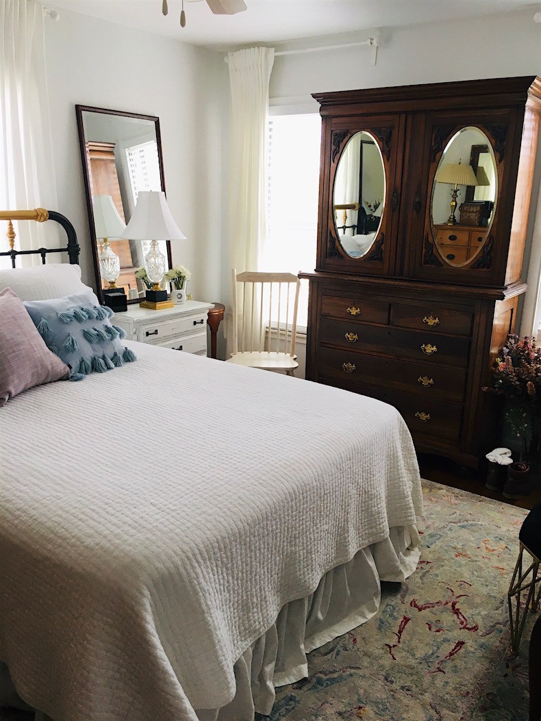
 

There is a 14” metal frame on our bed for added storage underneath and I’m thinking of getting an 18” metal frame for more storage underneath if it doesn’t make the bed too tall.

Would a bed with a footboard visually appear too large or obtrusive in our small bedroom?


We miss having a footboard on our bed.
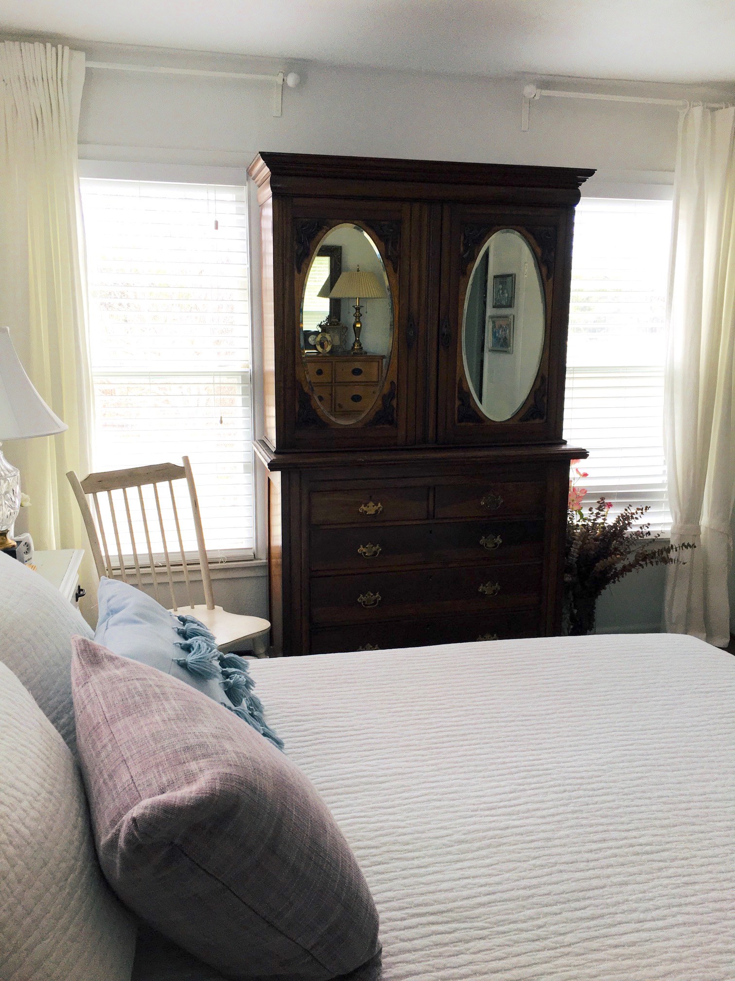
 

bedroom decorating ideas - wardrobe is too wide


BTW, our bedroom is 11’ x 13.5’ in size. 

If this could be a blog post with some affordable bedroom decorating ideas, that would be so cool!
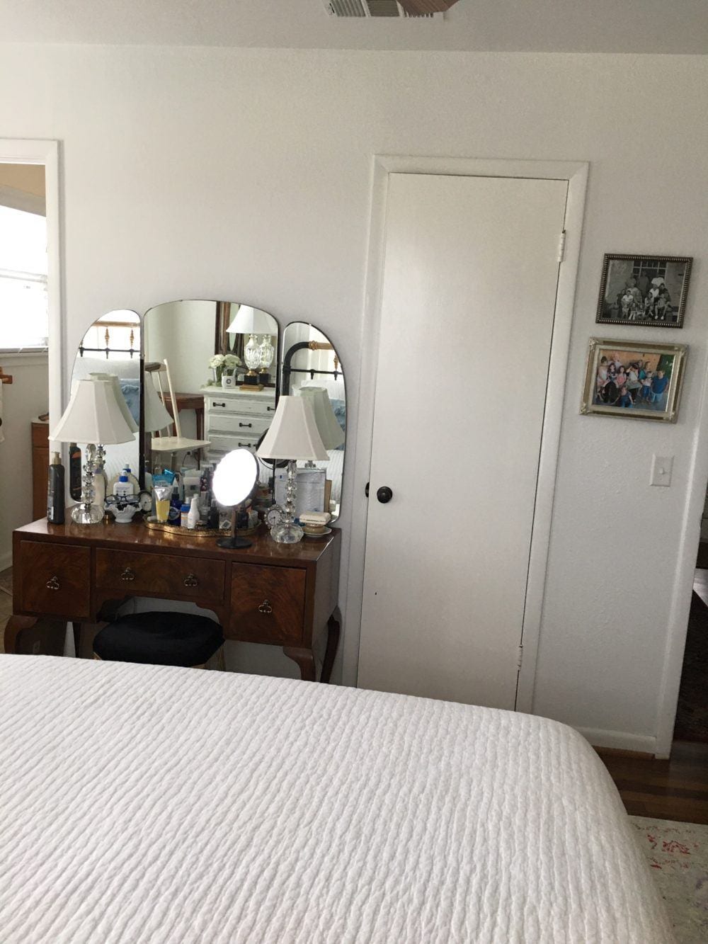
 

Bedroom decorating ideas bed - chest before - vanity


Many Thanks,

Kathy


Okay, first of all. As I told Kathy there is nothing wrong with her bedroom.


However, after looking at Kathy’s living room, I see that her taste has evolved in an appealing way. And, I think that Kathy instinctively knows that the room isn’t quite as good as it could be. But, I should talk!


I’m going to address some of Kathy’s questions and present lots of bedroom decorating ideas.


Let’s begin with the bed in front of the window. I have no problem with the bed in front of the window. But, not this bed.  I do feel that the headboard should be solid if in front of a window.

Another option might be to cover up the window. That would be to remove the moulding and sheetrock it up from the inside. This is not a permanent change. The window will still remain and from the outside will not be obvious that it’s been covered over.


Oh, stop looking at me like I just grew three heads!


Designers do this ALL of the time!

What about Kathy’s assertion that even with a solid headboard, the light will be blocked.

Well, even if the window remains, the amount of light blocked is negligible. That is because the sun is in the sky, above the horizon. And, that is above the height of the headboard.


But, IMO, blocking the light is a moot point.


Forgive me for stating the obvious. But, it’s the bedroom. A room that’s usually used for SLEEPING; at night, when it’s dark. I do not see the need for a third window. And, I think the bed will look a lot better in front of a wall.

As for a footboard. I would be careful. This is not a very deep room. We had an 11′ deep bedroom in our apartment in Manhattan. And, I was constantly banging my shins into the frame of the platform bed.


Would I raise the height of the bed frame?


No, I would not. It’s only an eight-foot ceiling and I feel that if the bed were four inches higher, it would be disproportionately tall and in a relatively small bedroom.

I realize that Kathy has some storage needs. Frankly, stuff under the bed tends to get awfully dusty. Fine, if you pull it out every month or so. But, most of us don’t do that.


Let’s talk about lighting for a sec.


There are six lamps and a fan with lights in this small bedroom.

The first change that I think will really help this space is to exchange this fan for a plain white fan. You can find a whole bunch of lovely ceiling fans in all different prices if you click that link.

I also feel that these particular lamps on the night tables are not right for this room. But, it’s fine if others like them. For some cheap, stylish table lamps that don’t look terribly cheap, please check this post out.


But, here’s the change that might come as a surprise to some of you.


As you notice, when you change one thing, it’s like a Pandora’s Box. That means, if you do this, then you’ll have to do something else and then something else and then… And, it just keeps going…

This is why I would never take a client job where they were in the middle of things. You’ll want to shoot yourself if you do.

But, I was thinking about the wardrobe.

And, what would really help is to change out the wall color for something far deeper. We’ll get to that in a sec.


What else?


Oh, I know that some of you do see a problem. In fact, it’s in my 333 Hard to Find Rules and Tips Guide [you need to know]

It’s about the wardrobe.

It’s very pretty.

However, it is about 10″ too wide for the space it is in. It’s a big no-no to have furniture overlapping the moulding.

But, there’s also another problem and it ties into the wardrobe, as well.

Even if the wardrobe were smaller, it is a big dark thing between two bright windows.

And, the wall color looks a little gray.

I realize that Kathy took these images on a gray day. But, that is the point. The wall color is not really working in this room.

So, let’s take a look at what I did for the wardrobe wall for this small bedroom refresh.
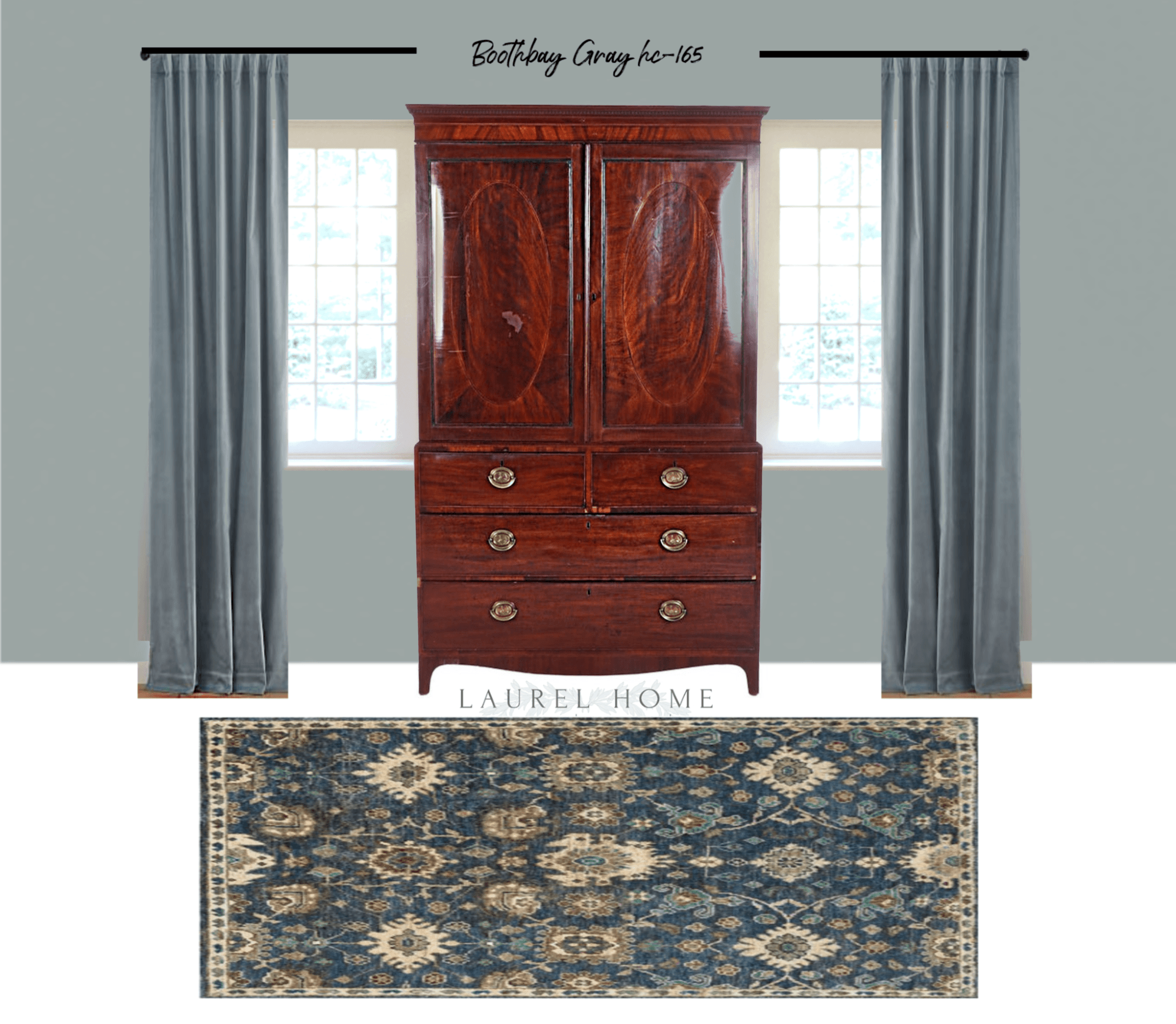
 

bedroom decorating ideas - wardrobe wall after

The walls are Benjamin Moore Boothbay Gray hc 165.

To balance things out even more, I chose a teal velvet curtain in a similar color to the wall. But, it could be a shade or two different.

 

Sufjan Jute Hand-Knotted Rug, Denim

Sufjan Jute Hand-Knotted Rug, Denim

I changed the area rug. But actually, I think Kathy’s current rug would work just fine with the new scheme.
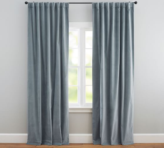
 

bedroom decorating ideas - teal velvet curtains from Pottery Barn
This is from Pottery Barn. It is possible that this colorway no longer exists. But, this is only to give an idea.
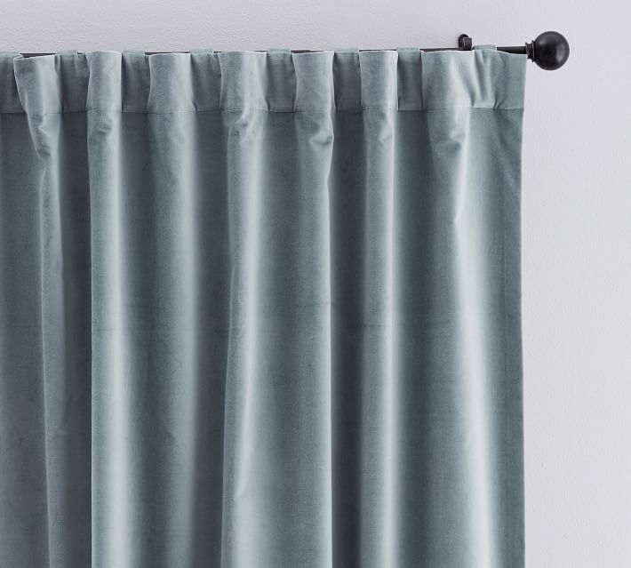
 

velvet-twill-curtain


Yes, the wardrobe still overlaps the windows. However, it’s not as noticeable now because the decor is more balanced.


It’s something that we’ll be talking about in the living room as well.


In fact, Kathy’s done something really wonderful in that room that she thinks is a mistake. But, you’ll have to wait to find out what that is.
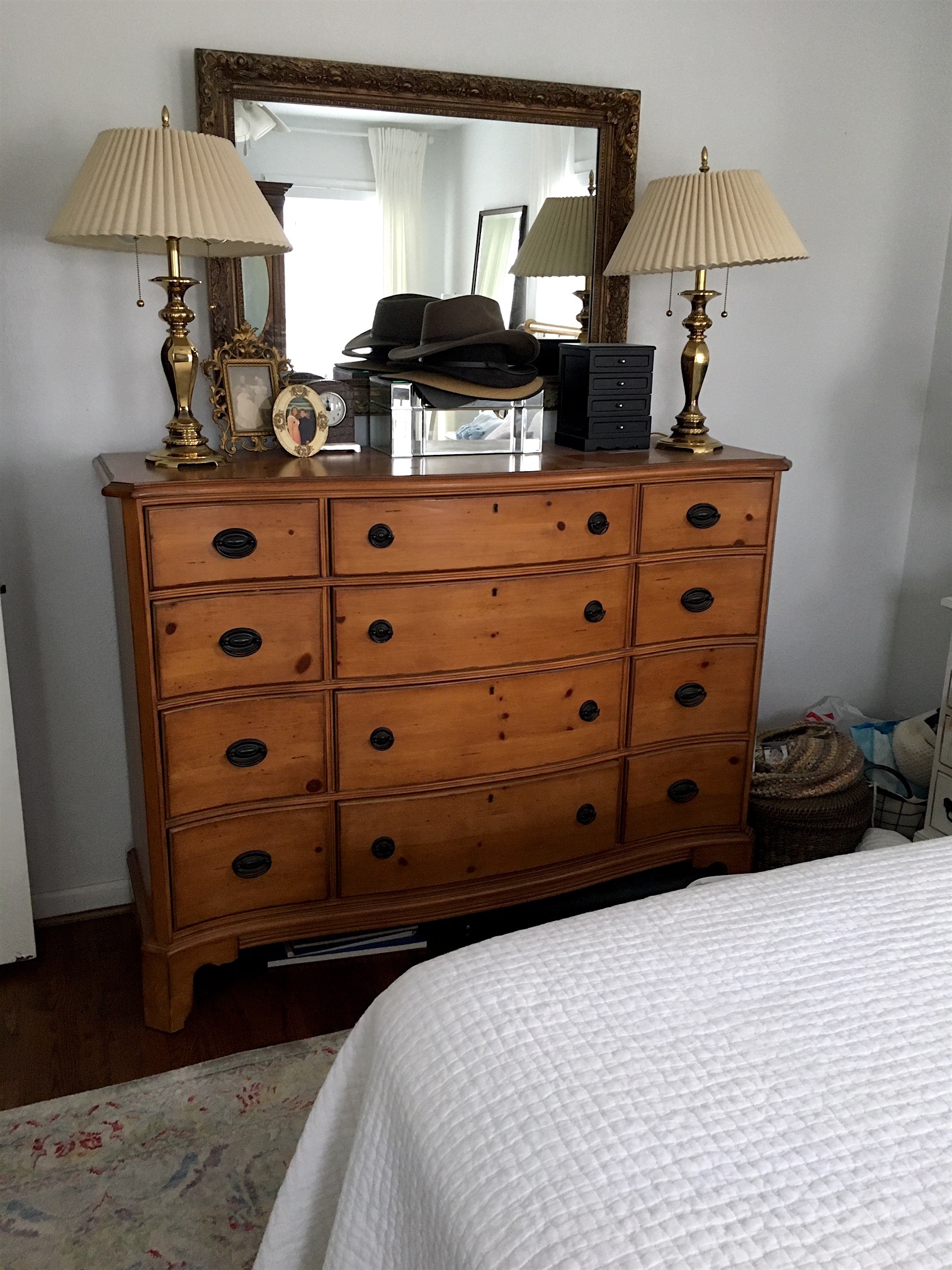
 

Bedroom decorating ideas - pine chest before
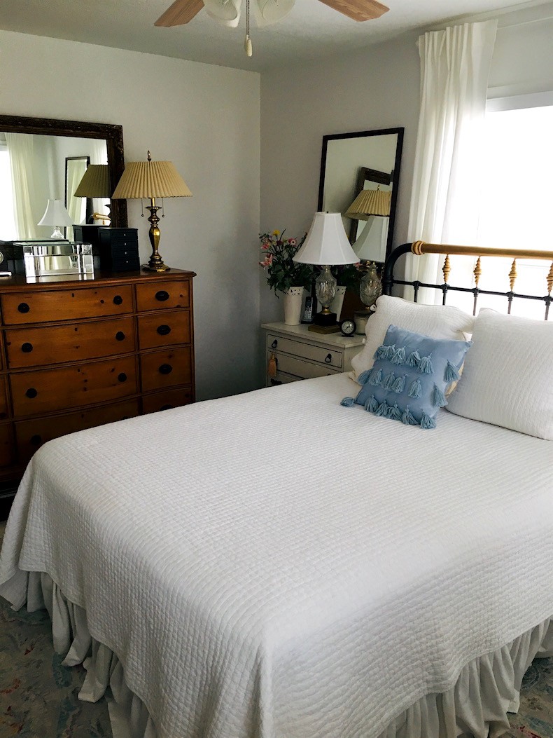
My favorite piece in the room is this gorgeous pine dresser. I would have only one lamp on here, however. And, I would change the shade to a plain linen shade. Or a black shade would look terrific with the brass.


I think that the dresser will also look fabulous with the Boothbay gray. Or a similar color.


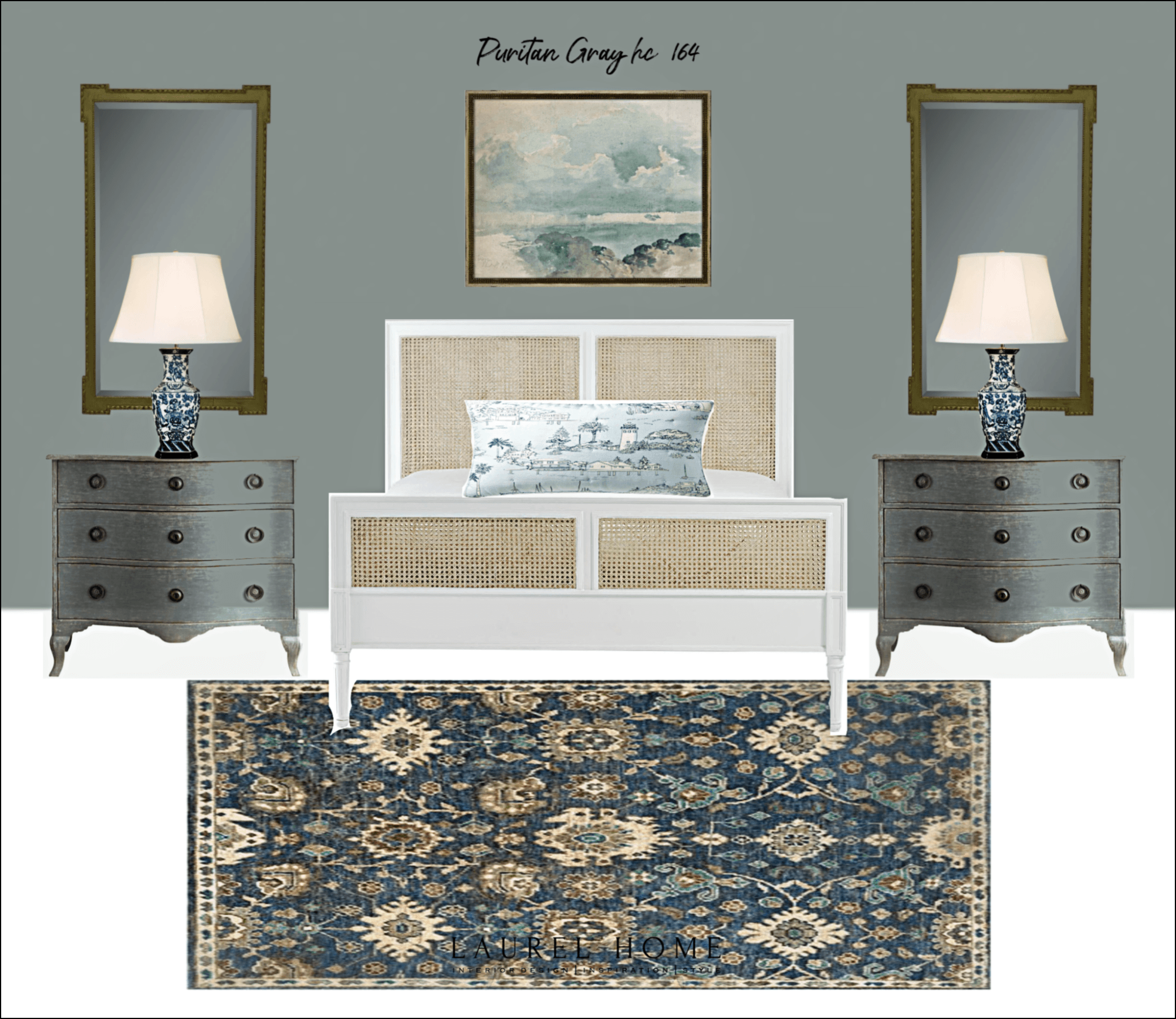
Benjamin Moore Puritan Gray HC-164


Please remember. I am not in the space. And, truly, it is the ONLY way. Anything else is only a wild guess. Above is Puritan Gray hc 165 which is a little bit deeper.

Just so you know. These colors are not in the Laurel Home Paint and Palette Collection. There are some similar colors, but it’s also good to bring out other colors that were on the original short list..
 

gray blue-green bedroom after a refresh- bedroom decorating ideas

As you can see, I used Puritan Gray for this wall, but the walls should be the same color. I am only presenting it as an alternative.


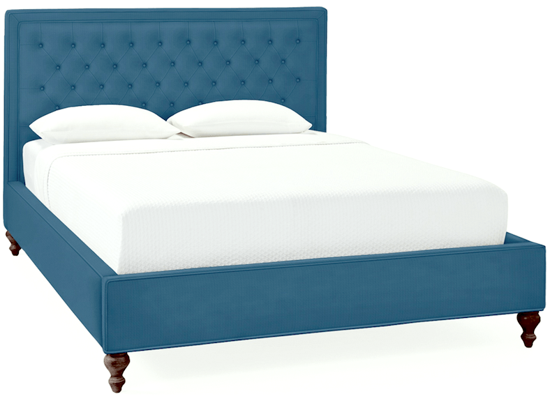
Serena and Lily Fulton tufted bed Aegean. bedroom decorating ideas
Serena and Lily Fulton tufted bed Aegean.


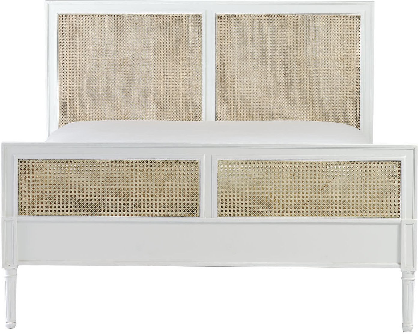
Harbour bed in white - Serena & Lily - bedroom decorating ideas


Although I used the Harbour Cane Bed in White, I think I might actually prefer the Fulton bed in the Aegean fabric. Please always get samples first.

Both of these beds from Serena and Lily come in a headboard only version, as well.

Of course, I could also be happy with a headboard made to match the velvet curtains.

And, to be clear, if the window is covered, it could work to keep the brass bed. I think Kathy did a great job with the painting. But, I’d update the linens and do a more tailored bed skirt.


Why can’t we do white curtains, Laurel?


Well, you can. :] I love white linen curtains

But, one reason for the teal walls with teal curtains is that it’s a small room. Remember when we were talking about monochromatic and analagous color schemes recently? Well, monochromatic schemes do wonders for small rooms.


When I put a room together, it rarely comes together in one day.


It’s definitely a process. I’ve been known to change my mind; even with clients.


What’s going on with the nightstands?
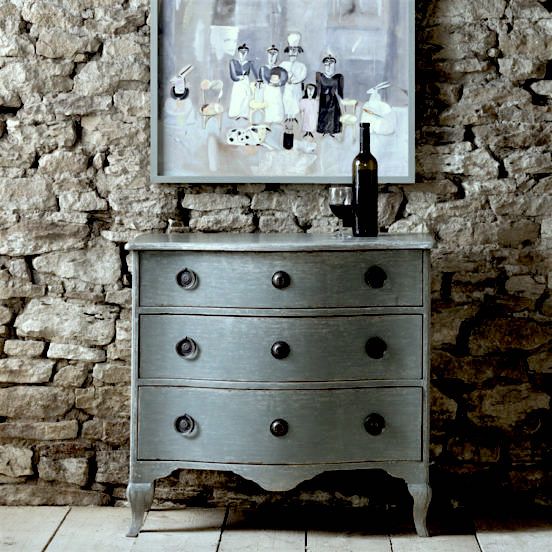
 

bedroom decorating ideas - beautiful chest from Chelsea Textiles

Above is a chest from Chelsea Textiles in Provence Blue

This is only for inspiration
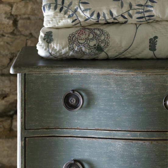
 

Chelsea textiles commode - detail Provence blue

And, a detail shot.

I think that Kathy could paint her beside chests with some chalk paint and lightly antique them. And, they would be so pretty. It’s a color very close to the wall color. I think this tone-on-tone look will make the room feel more spacious, put together and elegant.
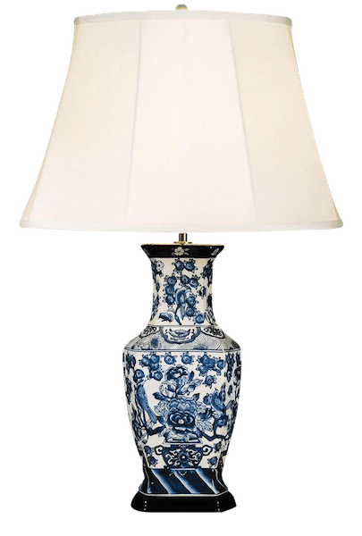
 

english-traditional-style-blue-hexagon-table-lampI added a blue and white porcelain Chinoiserie table lamp. I used this one because it doesn’t have a background. But, there is a nice one from Frontgate in the hot sales widget, too.


Anything else?


Yes.
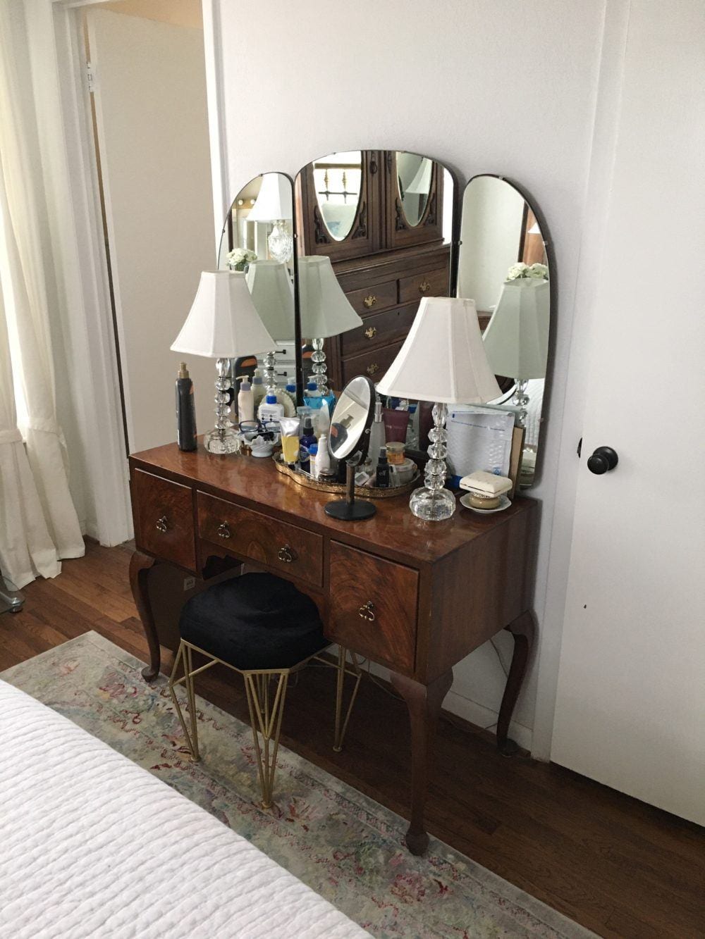
 

bedroom decorating ideas - vanity in bedroom before


If possible, I would prefer if we could do without the vanity. it’s small and it’s just another wood tone and furniture style. Plus, it’s a little cramped. And, if there’s no vanity, there would definitely be room for a footboard on the bed.

In addition, I feel there are too many mirrors in this room.

Instead, I would put up a wall sconce with some artwork. Of course, if Kathy has to have the vanity, that’s fine.


Okay, I have some other bedroom decorating ideas.


Yes, I plan to address the lack of artifice in terms of mouldings. But, I’ll save that for Sunday.

And, I realize that I haven’t talked about the bed linens. Oh my!

However, if you go over to Serena and Lily, they have such wonderful inspiration for putting your bed linens together.

By the way, I just saw on S&L if you’ve never ordered from them before, they are offering 15% off on your first order.

In addition, there’s a lot of good bedroom inspiration in this post.

And, looking for sophisticated twin bed ideas for grownups? That post has a lot of ideas, as well.

Please note that some of the items in Kathy’s bed room refresh are in the bed and bath widget. So, please check that out, too. Everything on the bed and bath page is currently on sale. It was just updated today.


Okay, I think the main take-away with this post is something I don’t talk about a lot.


Sometimes, though when a room isn’t quite coming together, one of the primary issues might be the wall color. So, step back and change that one thing. (on paper first) And, then see if that makes a difference. Of course, that might not be your thing. That’s when I recommend hiring a designer for a two-hour consult.

I hope you enjoyed some of these bedroom decorating ideas.

For a comprehensive decorating guide, please check out my 333 Hard to Find Rules & Tips, You Need To Know.

xo,


Please check out the newly updated hot sales!


43 Responses

  1. Great suggestions, Laurel, as always. Although I recognize that it is elegant and classic, I ‘m just not fond of Chinoiserie. For me, I would use the lamps she has on the bedside tables (I like the black and gold bases). Like You, Laurel, I adore the pine dresser. Does it really need any lamps at all? I wouldn’t use them. I also think the mirror is a bit ornate in comparison to the dresser. Without having the dimensions, I wonder if the mirrors currently over the bedside chests could be paired over the dresser? (Maybe the frames could be painted black?) Or, put a lovely piece of artwork over the dresser and flank it with narrow lamps?? Especially if keeping the mirrors in the armoire. Inexpensive, white, and perfectly serviceable ceiling fans are available from Home Depot or Lowe’s. She does say she loves white so perhaps the current bed linens could stay but be augmented. There are raspberry and orange colors in her current carpet. Perhaps these colors could be pulled in using decorative pillows on the bed and a blue-green bed throw for more contrast with the linens but coordinated with wall color.

  2. I always love your home refresh posts. I think this bedroom is quite lovely as is. It reminds me of my aunt’s guest bedroom, where I stayed recently, so it evokes a warm, cozy, welcoming feel for me. However, your ideas for a refresh are amazing, too! With that said, I think Kathy could go all the way with your design plan or use your ideas as inspiration to make changes that suit her taste and lifestyle, which is why I love these posts. I know when I first began following you, and purchased your books, I was looking to find room designs that I could copy from top to bottom. But fortunately, I guess, since I really can’t afford to redo an entire room all at once, each room became a project over time, which allowed me to use your design plans, color palettes, and rules, to create beautiful rooms, but also, make each room my own. I continue to enjoy the process!

    I look forward to seeing how mouldings add to this room. That always makes a big difference, I think! Also, when will we see a design update on your bedroom? 😊

  3. I LOVE YOUR BLOG BUT IT MAKES ME HATE MY HOUSE! Is that mean? I’m sorry. Honestly, while I’m reading your blog, I look around and every room in my house has issues. Sigh. One thing I need to know is the mixing of lighting finishes. That is, can you mix bookcase mounted picture lighting that is oil rubbed bronze with brushed gold sconces above a fireplace? I’m loving the brushed gold and I honestly don’t know the rule about mixing finishes and I can’t seem to find the answer and it’s driving me insane. Can I mix a more modern coffee table with my antique organ bench that I use as a sofa table? It’s a really cool organ bench that was used at Harvard in the early 1900’s. My style has always been eclectic, but lately I’m questioning my selections. The phrase hodgepodge comes to mind.
    Thank you for brightening my weeks with your blog even if it does make me anxious about my whole house!

    My Best,
    Gretchen

  4. This is such an amazing post! It’s well-written and it covers so much – now I’m inspired to send you some pictures and questions about my own design dilemmas too! Haha! Love love love!

  5. Great ideas, great post, sage advice! I have 4 long shallow containers under the bed. We only use them for storing off season shoes. I know where to find them if I need them and it makes use of underused space. I think if you limit what you store under there – one category – and it’s something you don’t need to drag out every week, it’s a practical solution.

  6. I’m like others, this room has so many good points (LOVE that pine chest!), but that’s the problem–SO many. I would get rid of the armoire, vanity and chair right off the bat. Editing all the “stuff” we store to what we actually use makes for an easier life. I’ve covered a window before for a bed placement like one of your other readers by using a large piece of matte board over the window and draperies across the whole wall. It makes the room so quiet. I love her little bedside chests, even that they aren’t exact matches. And I like the white cane bed you picked out. My initial thought was no footboard, but this one is unobtrusive enough to work without the vanity. Great ideas on color, Laurel!

  7. Oh, wow, Laurel, I just saw your “50 design trends in or out” post and the photo you posted of the grand millennial style is the exact layout of Kathy’s room, but with Sarah rideout’s valance idea with tall upholstered headboard and swing arm lamps! Kathy, be sure to take a look…

  8. Love real-life dilemma posts! I just have a few money-saving tips for Kathy. So, before you buy anything, you can paint the ceiling fan the same color as the ceiling and switch out bulb covers if necessary. White linens and curtains can be dyed any color, and even wool rugs can be painted/dyed with a color wash to make them match walls better. But the rug in your room is really beautiful. I wholeheartedly agree with editing out some mirrors and lamps. I would only keep the mirror over the pine dresser. If you paint the wardrobe, you could either reverse the door panels so the mirrors are on the inside, or put fabric panels/wallpaper /plywood over the mirrors. I would nix the vanity and put all the stuff into a bathroom or inside the top part of the wardrobe, with mirrors on the insides of the wardrobe doors. About lamps, I saved space in my tiny bedroom by attaching swing arm lamps to the back of the headboard because the bed had to be between two closet doors. Vintage doorknobs, wall sconces that just plug into a wall socket, and painted wood or unlacquered brass light switch covers are also a very inexpensive way to gussy up a room without requiring surface space. (There are also hydraulic lift storage beds that keep everything low down, dust free, and easy enough to get at.) Can’t wait to see where you go with this!

  9. Great ideas Laurel. I agree with putting sheet rock over the window. The other two windows are adequate. The bed will look more anchored if it has a wall behind. Changing out the trim (which I know is coming) would make a huge difference. I oh so know what you speak when you say changing one thing leads to changing many more….

  10. Definitlely sheet rock over the window! I did this in and it worked great…..no one courld tell from outside. Love your idea abou the wall color and taking out the vanity too!
    Actually love all of your ideas for this bedroom!

  11. Hi Kathy,
    I really like the vibe of your room, especially from the first photo. I’m not a designer, so will leave those suggestions to Laurel and others, but we have a similar master bedroom layout, 11 x 15 with two windows and several doors, so I get it. My solution was to use only one piece of storage, in our case, a mule chest, which consists of 12 drawers on the bottom and two sets of doors on the top. Sort of like two of your wardrobe, side by side (except this is one piece of furniture). We live near Amish country and this mule chest is typical of those made in the area. We placed this on our longest wall to the left of our bed (the same wall that houses your pine dresser) and ALL our storage is in that chest. This leaves us with the bed, and two side chests, which like yours, are painted the color of the wall. Where you have your vanity, we have placed a very narrow bench for seating, with art above it. That leaves the wall with the two windows open for art between the windows. The mule chest is a big piece of furniture, but it is only on that one wall, so the rest of the room looks rather spacious. It helped our layout to consolidate our storage into one piece of dark furniture, so maybe that would work for you. I hope we get to see the “after” photos! Good luck!

  12. Hello Laurel, My instinctive feelings were about the same as Colleen’s and GL’s. The easiest fix for this room would just be to get some stuff out of it. I would start with the mirrors on the nightstands, and then get small pieces of furniture to replace the nightstands, which are really small chests anyway and not just bedside tables.

    The wall with the vanity is another problem area. It looks too drab, especially compared with the rest of the room. I would replace the clam-shell molding around the door, and think about adding some paneling moldings to it to match the quality and antique look of most of the furnishings.
    –Jim

  13. Buy an extra matching velvet curtain panel. Use a spring loaded tension rod to suspend it at the level of the vertical rod at the top of the headboard. You would need some sewing skills to cut it and hem it to fit. Use scap fabric first. This would reduce the contrast of the light from the window and the headboard rods.  Keep it close to the window glass so not to impede the closing and opening of the vertical curtain panels.

  14. question from constant fan: for our homeowners association I have been charged with trying to create a web page that shows actual paint colors with names and numbers similar to what you do on your mood boards or on Pinterest.
    Can you please tell me the name of the app or apps you use?
    simple and inexpensive if possible although I am computer literate and can go a little complex. Love your site – sooo interesting. Thanks, Joanna

  15. Laurel,
    Please please read this! I once had a small bedroom with way too big dresser, and several small annoying windows behind the bed which had to go there! Answer??? My mother, a great designer, covered the wall (and other two) top to ceiling with lined curtains in the same fabric as bed. No windows in sight, we put in studio doors, all white wood trim, pale wall color. It was so romantic, tasteful, and cozy.

  16. I love your room make over posts. I learn a lot. The curtains the “ music lady” used would be nice. I bought them and am happy with quality.

    Question: Are upholstered headboards an allergy problem?

  17. Amanda, I am purchasing a small 100 year old cottage, they sheet rocked over an existing window but had to leave it because of regulations. It drove me crazy when I first saw the house trying to figure out which room the window was in as the paint was peeling and it is quite frankly an eyesore. Hopefully you could just take out the window and not have to deal with that type of restriction.

  18. Kathy, thank you for sharing your home with us! Laurel, these are my favorite kinds of posts. I love all your suggestions and can’t wait for Sunday’s post!

  19. Hi Laurel love these posts. Thanks Kathy for sharing. Question, I will have the same dilemma in July when I move. What about doing a treatment like Mathew Bees did, basically fabric panel behind bed with valence. You featured it in your blog 2020 design trends. As you said, a bedroom is for sleeping and his like a big warm cozy hug with the walls and ceiling painted the same. But if you did something like that in front of a window, would you put blinds on all the windows so when you’re looking at the house from the exterior it just appears like a window with the blinds closed, or maybe plantation shutters. Sorry I don’t know how to describe the look and I never liked it before because of pets and all that fabric but I find myself gravitating toward valences these days.

  20. I had a similar window-behind-the-bed problem in my bedroom, but to make matters worse the window was way off centered. I covered it with a blackout shade and then hanging curtain rods and panels behind the whole bed. It looks fine, but now I’m thinking how great it would be to totally sheet rock over it per Laurel’s suggestion. We already have two other windows in the bedroom, and don’t need more light anyway.

  21. Great ideas Laurel! I hope she implements them and sends us some follow up photos. These are my favorite types of posts–with real life rooms and your suggestions! Such fun!

  22. I definitely agree about the upholstered or solid wood headboard. In Fung Shui, the idea is not to let the energy drain out of your head through a window. In my last home I had my solid headboard in front of a window with heavier curtain panels, and it looked great. While I’m not a grey person, I really like the blue grey on the suggested nightstands.

  23. Wowzer! Excellent suggestions Laurel! I have a similar dilemma with our master bedroom and I plan on implementing some of these strategies. Lovely room, and with your insights it will be even better.

  24. Love this bedroom design. I have a house built in 1901 with very small bedrooms and only 3 closets. I also have windows that are either off center or take up most of one wall. I had wanted to put my bed in front of the windows but wasn’t sure how it would work. Now I will try it. I also love the armor and dresser. They don’t match but that’s what I love about it.

  25. Loved this post! You nailed it Laurel!!! I can relate to all your beautiful ideas. Please do more of these posts. You inspire me💕💕

  26. Thank you Kathy for sharing your lovely bedroom. I love the pine dresser! Like me it looks like you have collected pieces you love or have made the best out of things you have ( the nightstands).
    Laurel has given you some wonderful ideas. I especially love the wall color. I am sure you will take these ideas and make the room your own.
    Have fun!

  27. Oh my…big furniture overload in this room! Far too many large pieces of big brown furniture has taken over. I felt (by just looking at the pics) that the walls were closing in on me. Too many lamps, too many mirrors. Too many everything…personally, I don’t like a bed in front of a window. That big wardrobe ..if they absolutely need it, could it not be painted white? Make it disappear…vanity needs to go. I know “mismatched” bedside tables are “a thing”, but I think they look odd here, and so do the lamps. The entire room looks like a dropping zone for mismatched furniture that had nowhere to go. I wonder if there is room on that wall where that big dresser is, to put the bed, and move the dresser to the wardrobe wall and find a different home for the wardrobe..? I’m getting claustrophobic looking at it..lol..

  28. Looking at Kathy’s photos, the first thing I saw was the storage problem. There are things in every corner. So one question is the storage space nearby: hallway? bathroom? Can some of the “stuff” be moved elsewhere? If not, then the radical solution is to eliminate some of it!
    Because I think one way to look afresh at the space is to remove all the smaller stuff: the accessories (overload here), and the little chair in the corner as well as the vanity, whose proportions are wrong for that wall anyway. Too many lamps, too many mirrors at present.
    I agree fully with Laurel’s suggestion of a monochromatic colour scheme using muted blue-green. Painting the small chests would be good, perhaps also changing the hardware on one so that they matched more.
    I do think that the bed could stay as is. A way of testing the idea of getting rid of the window behind the bed would be to make a chinoiserie screen panel, with the same base colour as the walls, to hang over the window area, suspended from the curtain pole to begin with — no construction work required.

  29. Love your suggestions, Laurel. I’d like to add one possibility…
    maybe it wouldn’t work but what do you think of switching the placement of the beautiful pine dresser with the wardrobe?
    I would love to see the windows on either side balanced by panels on both sides and a bamboo shade to the ceiling. Of course i don’t know the dimensions and it might not be ideal but the dresser in that position might allow for the window panels to hang….maybe covers a bit but an improvement overall. Also, how about taking out that chair and getting a small stool to reduce the stuff in the room? Respective fully offered. : )

    1. That’s an excellent idea. Yes, the dresser will overlap even more, but it’s lower and will feel more open. And the armoire will have breathing room on the other side.

      Yes, I would move the little chair, too.

  30. Great tips and tricks!!! I love posts like this as I love real examples and to look at other people homes and fantasize about what can be done to them and what make it different! It’s very interesting to see possibilities and your thinking process. Sometimes I come to my friends home and redo it in my head, then I need a 2- hour consult with real interior designer, it so fun for me to get into another design head but the problem is that I need your thinking process or Miles Redd one but I’m afraid to write you or Miles as i’m not sure what can be asked and okay to ask in a 2 hour consult.

  31. Love all of Laurel’s suggestions, especially the upholstered headboard, window or no window. What I do find jarring is the amount and different styles of the furniture. It’s a small room. I’d lose the dressing table & wardrobe or the pine dresser. Either is nice enough to use in another room. I like the pine dresser, refinished side chests and the new bed together. Room would feel larger & and have new updated look.

  32. Yes, too many mirrors and lamps. What about going with a muted darker green (pulled from the rug, rather than gray? Then, following Laurel’s suggestion, find different lamp shades for the brass lamps and maybe putting them on the nightstands to associate with the metal tones of the headboard. Instead of sheet rocking the window opening, I cut plywood to fit, applied foam/stapled fabric (foam snugs the wood into the opening without nails), hung” faux drape on side facing out so it would look ok from outside. I removed the molding (save for resale) and then upholstered the whole wall. This could work here, I think. Also, the ceiling fan could be painted. Hopefully, the vanity can go away. Though pretty, there’s too much furniture in the room. I can’t wait to see what else Laurel suggests!

    1. The colors will not read as gray. Just because the name of the color says “gray” doesn’t mean it is. It has gray in it, but these are muted blue greens.

      That’s why selecting colors is not easy. Our minds play tricks on us.

  33. IMO this room is quite lovely to begin with, although I’m sure implementing some of Laurel’s recommendations would make it grand. I wouldn’t change that bed if it were me though. Window or no, I think it’s just too unique to let go. Kudos to Kathy for wiping up something so special with a little gold paint!

Leave a Reply

Your email address will not be published. Required fields are marked *

This site uses Akismet to reduce spam. Learn how your comment data is processed.

Welcome To Laurel Home!

laurel-aarons-18th-e1456449963926

Hi, I’m Laurel, and Laurel Home is the website and blog for Laurel Bern Interiors.
I’ve been creating new-traditional interiors since 1988. The blog is where I share all.

New Edition, November 2023! Get The Indispensable Guide For 100s of Home Furnishings And Interior Design Sources That Everyone Is Raving About

laurels-rolodex-final-book-cover-master 10th edition 23-24

laurel home archives

Categories:

Please click the image below for more info about my rockin’ Interior Design Guides for 2024!

Laurel Home Interior Design Guides 2024
Amazon ad

please click below to check out my favorite decorating & design books

Laurel Bern's Favorite Interior Design and Decorating Books
Subscribe To The Laurel Home Blog And You Will Receive A FREE Guide Where I Share How To Get Your Paint Colors Right, The First Time.