Hi Guys and an official Happy New Year 2020!
Yes, I took a rare day off on New Year’s eve. However, I’m back with a post that many of you have been asking me to write about.
You’re stuck with an open concept floor plan; and, you hate it.
You can’t stand it any longer; living, eating, cooking, reading, watching TV, etc, ALL in ONE room.
No interior walls.
And, no delineation of spaces.
In addition, if you’re real lucky, you’ll have a second story interior balcony six feet away from the master bedroom, so there’s just no place in your 3,000 square foot home to get away from the noise, cooking smells and mess.
(wife to husband) Honey, why did we buy this open concept home? Could you remind me?
- great school district
- close to his/her, parents, siblings, friends.
- near a park
- it’s in our price-range
- house was move-in ready and new.
- good for resale value. (hmmm… I’m not so sure about that!)
Plus, many other compelling reasons. I guess. These open concept homes have become wildly popular with builders. And, with the all-knowing HGTV. (she said dripping with sarcasm). However, some shows on HGTV are good.
This form of brainwashing has CONvinced many of us that we WANT to live in one room. AKA: The open concept floor plan.
Of course, maybe you do want to live in one room. That’s cool. Or, maybe there is no choice for whatever the reason.
Well, Laurel, if it’s just the home builders who think an open concept floor plan is what we want to have, can’t we just let them know it’s not?
Ummm… Good luck with that. haha
Of course, if you have a plan that you’re able to modify before it’s built, that is preferable. I would consult with a good interior designer. That is, unless you’re making structural changes. In that case, you’ll need an architect. But, you don’t need an architect to add walls.
Well, why are the home builders so gung-ho on building these barns of open concept floor plan houses ?
Oh, my dears… You know the reason why.
It’s the thing that drives everything.
MONEY.
Right?
So, what I’ve done for today is this: I took three open concept floor plans and did my best to “fix” them.
We’ll begin with one of my worst architectural peeves.
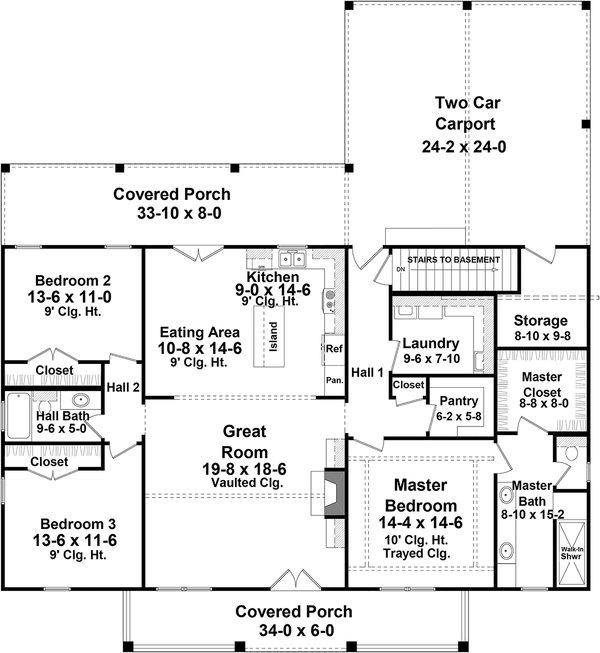
The entrance to the home brings one straight into the living room.
And, in this case, just feet from the fireplace, nicely centered on the interior wall.
Now what?
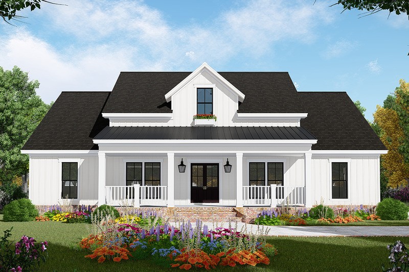
Oh, from the outside, it looks quite nice, if you’re looking for that modern farmhouse style.
For the answer to if you should do it or not, click here.
What should really be going on is that there should be a center HALL behind the front door.
Alas, there is not.
Below is how I fixed this open concept floor plan.
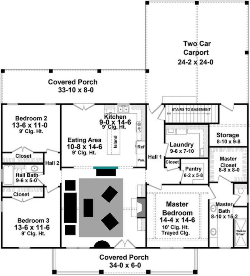
This one took me the longest. The teal wall in the back represents a new wall that was added. It was difficult to get the new wall centered. Picmonkey has made their program “intuitive” in terms of sizing and lining things up. Never mind. It’s good for some things, but not making walls and furniture.
We could also add some French doors possibly. But, at least the entire kitchen isn’t the first thing one sees when they walk in.
Below is an image I found a few months ago.
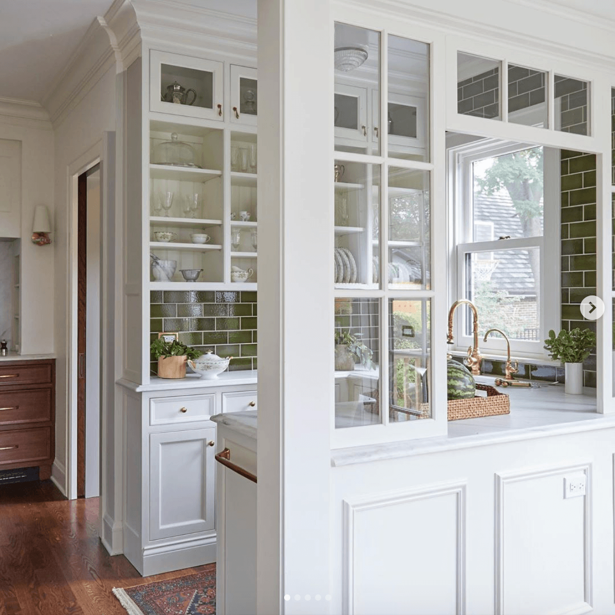
design by @kitchenlabinteriors on instagram photo by @michaelakaskel on instagram.
This is such a wonderful idea, I think. Separation is achieved; along with architectural interest. And, there’s no loss of light.
It’s reminding me of this post which featured many walls like this.
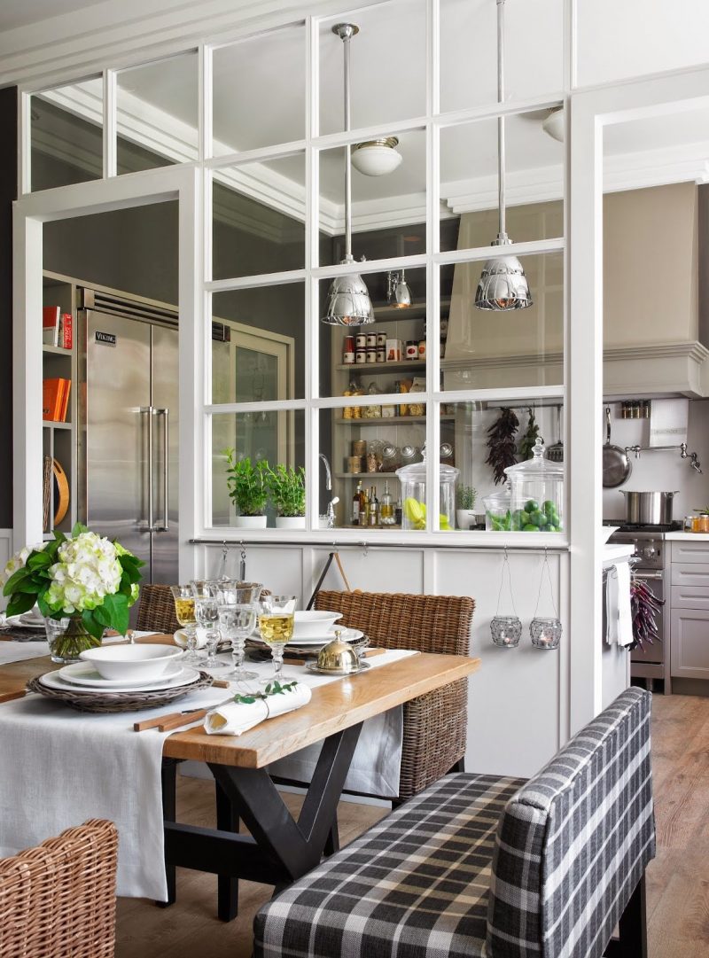
And, this popular image from Deulonder Kitchens.
Let’s go, now, to house #2
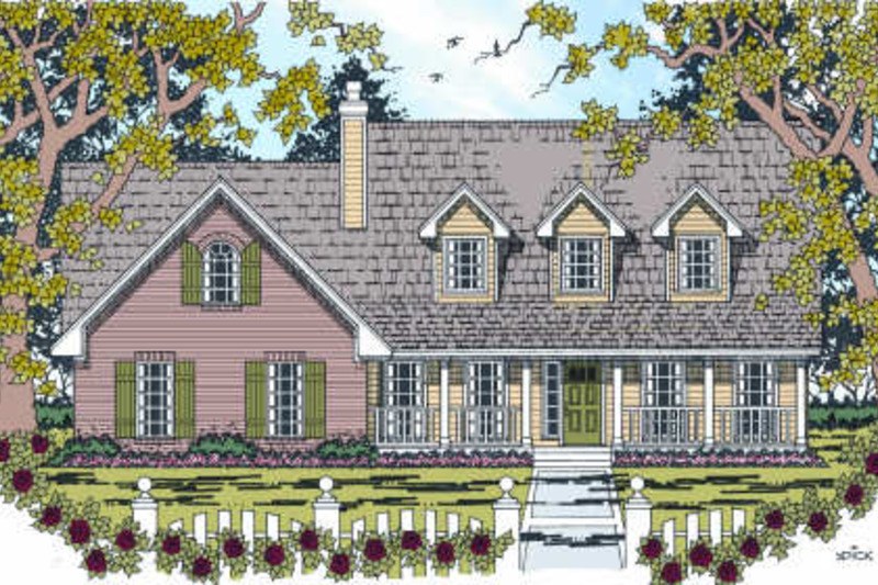
Above is a traditional home that also looks like a center hall colonial.
But, it’s not.
By the way, these homes from floor plans.com can be customized.
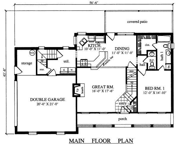
Again, we find ourselves walking straight into the great room.
And, the staircase is a little too close, to the front door, as well. The “great” room is really a glorified entrance. I admit that the rendering is wider than the floor plan, as shown. But, I’m working with what I’ve been presented with.
In addition to the entry, I’m not too crazy about the kitchen. Just too many angles.
Angles = Contemporary.
And, this is not a contemporary home. I like design that makes sense. Ya know?
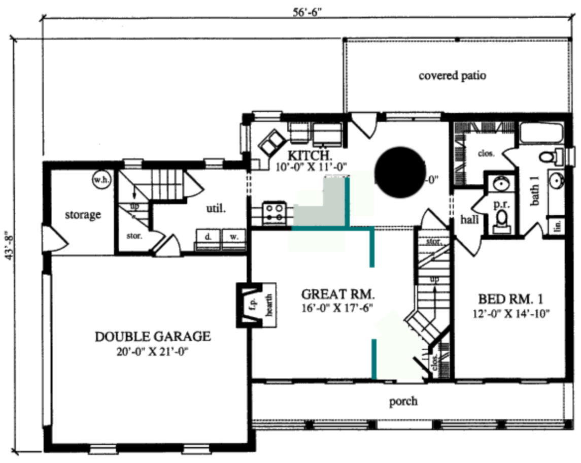
I’m liking this one a lot. The walls delineating the great room from the entrance hall could be a pony wall, a regular wall. Or, a wall with interior windows. There are lots of options.
For the front door, I would leave off the side-lights (row of vertical windows) which are only on one side of the door, anyway. Then, I think there will be room for a small chest on each of those small walls.
Just so you realize; these drawings are close to scale, but for our purposes are considered conceptual.
I squared off the kitchen and added some walls which I’m really liking. For the new longer wall between the dining room and kitchen, there could be an interior window and/or pass-through.
Our 3rd home is below.
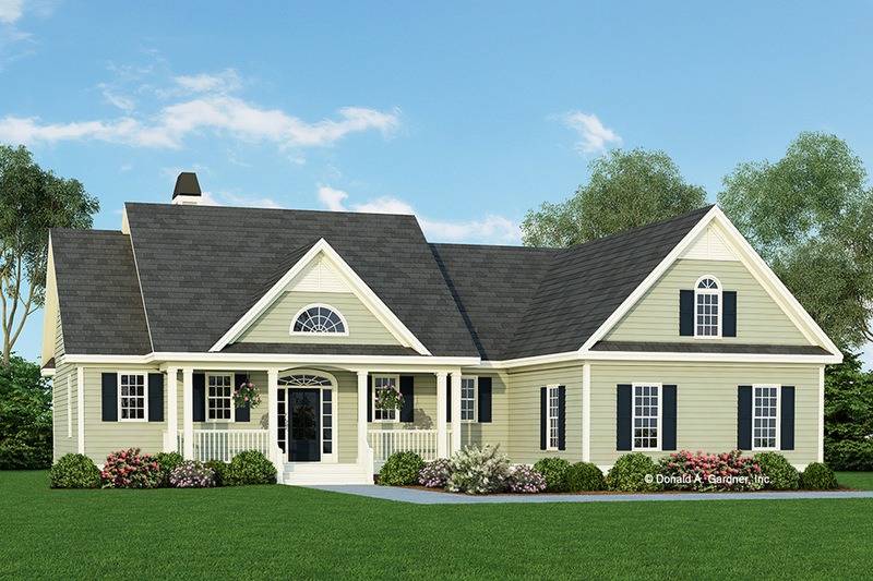
Another open concept floor plan home with a fairly traditional facade. hmmm…
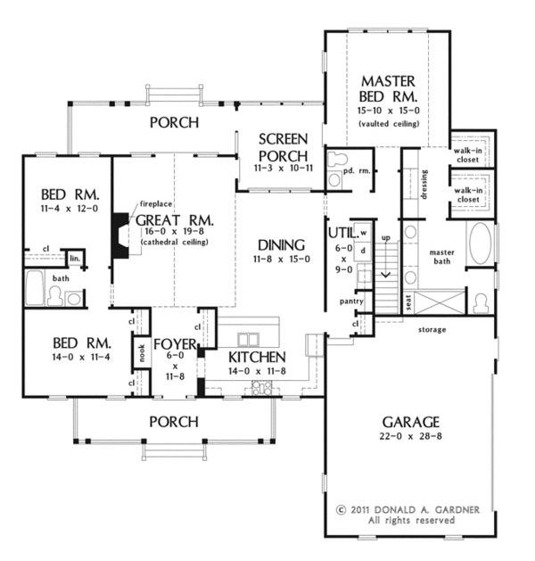 However, this one is not as open. And, we have a proper center hall entrance.
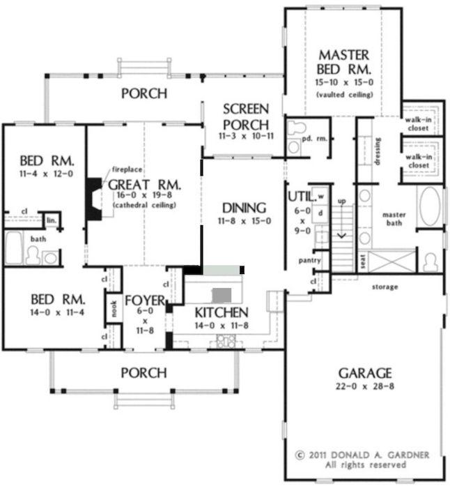
Oh, sorry, I forgot to make the new walls teal. But, you can see that I added some new walls to the dining room. I centered the opening on the fireplace in the great room.
I added an interior window to the kitchen and moved the sink to be centered on it.
There’s another post where I’ve taken an open concept floor plan and “renovated” it.
You might also enjoy this post featuring our old post-modern townhouse. It was light and airy, but actually very difficult to furnish.
Below is a graphic that you can save to your Pinterest boards for reference.
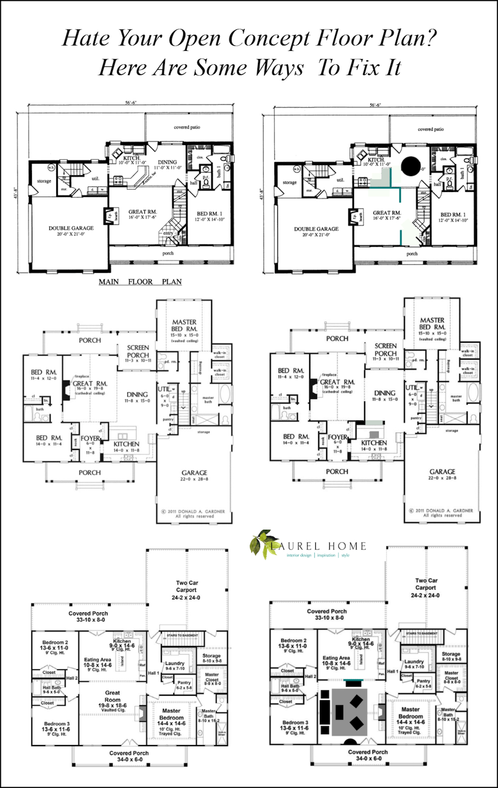
The bottom line for an open concept floor plan that is too open; make it less open. ;]
Adding some small walls can do wonders for creating a separation of space, without losing that light open feeling, if that’s what you want. I love how Nancy Keyes worked with Melissa Tardiff’s renovation. You can see some more examples of the small walls I’m talking about.
Oh, and don’t forget this unfortunate mess of a renovation. And no, this apartment has still not sold.
Here’s to a happy, healthy, prosperous and beautiful designed New Year for all!
And, please check out the newly updated hot sales!
xo,


Dedicated to my amazing friend and colleague Liza Jones who lost her battle with metastatic breast cancer last Monday.
She was beautiful, talented, and the kindest, warmest woman I’ve ever known. Plus, we shared the same birthday and many great times the last couple of years. Our community of designers are devastated.
Liza’s greatest legacy is her quiet, positive strength. And, ability to make every day count. I believe a scholarship fund is being set up in her honor.
Related Posts
 Our Modest Starter Home Might Be Our Forever Home.
 333 Decorating Rules You Need To Know is Here
 Best Fireplace Mantel Proportions – How Not To Muck It Up!
 An Attainable Kitchen Makeover You’re Going To Love
 The Most Exquisite Gardens and Landscaping Ever!
 A Typical American Home With Common Issues!
 20 Stunning Lifestyle Instagram Feeds You Must Follow










66 Responses
We built an open concept cottage (southern living low country cottage) in 2014. It was wonderful when all my children were small but my eldest is nearly 10 now and I feel very much over this style. I love my home, my neighborhood, but I think we need walls. Everyone else thinks I’m crazy. Just today I tried to use painters tape to tape up contractor paper to create faux walls (they are all falling down). I have been trying to do what you did in this blog post, took my original layout and created walls. Almost every wall in my house has several windows. My ceilings are tall. There is plenty of space even though its only 2100 sq ft. I see pocket doors and swinging doors in my future! The only thing is my plan I mapped out doesn’t have that coveted circle where people (kids) can tear through the house in a circle. But oh well. I was reading some of your other posts and your apartment one reminded me of some of the ranches we would tour when looking for a house, they were older and added on to. They were actually so fun because the hallways were winding and nothing necessarily made sense where it was. Made it feel unique and neat and not a part of everything. Also the powder room is basically in the dining room in my house (but also the kitchen, living, and dining are all quite literally, one large square).
Are you able to offer suggestions if I send our floor plan to you? We built our home 5 years ago and I miss walls/separation. Would love ideas!
Hi Brooke,
Sometimes I feature reader’s homes on the blog. I adore fixing floor plans that are too open! If you’re a subscriber, you can respond to any email you receive from me.
I have lived in 4 open concept homes which I designed. For me, if u have a framed out opening to the kitchen , it would make me feel that I am a drive up waitress taking orders and would need a sign saying “kitchen closes at 7:30. U r separated from everyone which cancels the open concept. It’s emotional as well as physical. I think it has to be with how close I want to be to family and guests. i want to be with my guests not emotionally separated. And yes, that does happen.
I’m sorry for your friend Liza and your sadness over losing her. I’m catching up on your blog during a tough time, and you give me some smiles, as usual, with this OC post.
On principle, I just cannot see plunking down a million bucks *easy* here in greater Boston–by the time you’re done paying 30 years’ interest–for a charmless “cook-in living room” that the builders were too cheap to put any walls in. It’s so beyond nickle-and-diming the buyer. For that kind of money, a homeowner really ought to be able to host a nice dinner where the guests aren’t staring at the dirty dishes.
It’s a mixed bag for me. The couple who built our house cut an opening through the wall where the plan had intended kitchen cabinets. I need that missing storage but I do like the ability to join in on conversations, etc. Interior French doors allow light to pass, but we have run out of wall for hanging things. And I always have to consider wall color as a whole-house issue. The noise is also, as you’ve noted, a problem. I am still not, after years here, firmly in one camp or the other.
Dear Laurel,
I love how timely this post is, just days after I wrote to you about this subject. I’ve been agonizing over my one-room condo, where you walk in the door and see the length of my house with the kitchen cupboards on the back wall, the stupid diagonal peninsula, and the counters and sink sitting there in all their messy glory. I’m not OCD, but I’m becoming easily overwhelmed with visual and auditory stimuli, cooking smells filling the living space, and waving at people who peek in my front door and see me in my kitchen, frantically wiping counters and throwing stuff into the pantry. You have enticed me with the possibility of a couple pointers, along with a few of your past blog posts that have inspired me with ideas on how to reconfigure my house.
My heart swelled with the picture of Liza and her untimely death. I’m sorry for your sadness.
Your devoted fan,
Jody
I’m so sorry about your friend, Liza. It’s hard to lose someone you’re close to, especially to that devil, cancer. I’ve lived in a partially open concept home (formal dining, living and entry are open concept but separated from the kitchen, family, breakfast open concept combo) for the last 20 years. I love it and find myself loving to cook more in this home than my former more traditional home. Also, entertaining is much more fun. In fact, I want a smaller home with all of the living space open concept. I live in the south, and you can’t sell a home that isn’t open concept or one that can easily be changed to that style. I guess we’re just less formal here in the south now, even though we throw wonderful parties with family china, crystal and silver! I love the first floor plan you worked with, but I would have liked your teal wall moved all the way to the right. That way the kitchen would be completely blocked from the front doorway. And I don’t like angles in kitchens either, but not because they’re contemporary. I have an angled island, and it greatly reduces the amount of cabinet and counter space available in the kitchen area. Thanks for all of your work to present these ideas!
Thank you too Donna!
I can see benefits of kitchen/family rooms being open to each other for young families. For myself, however, I would feel ill at ease. I can cook if I am forced to, but when I do I definitely don’t want any witnesses.
I’ve wondered if the HGTV-open concept link didn’t come down to purely telegenic considerations. Maybe they just look better on camera and are easier to shoot and maneuver a camera in. I love cottage-like nooks and crannies. Even more so with five children! Having a kitchen with a door is heaven for whoever wants to cook in peace with music playing. I do like it to be an eat-in kitchen, but away spaces are sanity savers for introverted families.
So sorry for the loss of your lovely friend, Laurel.
today Jan. 6 is the one year anniversary of the death of my dear friend Darlene who’s lungs filled up with fluid until it hit the tipping point. She was the nicest and funniest person you would ever want to meet. We love you Darlene and will never forget you…Susie and Teddy
I’m so sorry to hear that Susie. {{{hugs}}}
Yeah, I’m one of those people who are sick of open concept. I like wide-framed openings where rooms flow into each other.
Some open floor plans are worse than others. If you you are practically in the kitchen the minute you step in the front door, it’s awful.
I’ve come to realize many things about floor plans. For instance, I like all the bedrooms on one side and the garage/laundry/kitchen on the other side, so that the noise of a garage door or washing machine doesn’t wake up the other occupants if someone’s an early riser.
I love this! We live in a restored farmhouse and saved the elegant parts–fancy custom millwork and such–with the help of a great architect who turned it from a two-family into a one-family home. With great flow–everybody says that. But it is not open concept. I was adamant that I did not want anything unsightly to be visible from the front door and I didn’t want to be able to see the sink from the dining room. Even Joanna Gaines uses cased openings rather than opening everything up. I can’t imagine living in a barn with few walls, where it is hard to find a spot to hang art or place a lamp. It makes furniture arrangement needlessly challenging. And I would personally not feel cozy in such a room, with the very lofty ceilings that seem to go along with open concept. People say they need open concept in order to be able to keep an eye on their kids. Really? Voice of experience: it’s not a bad thing to go into a room where your kid is, to check. The kid then knows the parent is interested. Here’s an “okay boomer” comment, from my perspective as a psychologist. If said parents would put their cell phones away, they would be able to keep an eye on their kids, even with walls. I love your take on this subject, Laurel. Very sorry about your friend.
I find this interesting. Every one of my clients WANTS an open plan, especially if they have kids. Nobody wants to be closed off from the rest of the family and/or company just because they are cooking. In more than 90% of my projects I am removing walls, not adding them. Maybe it’s a beach house thing but I live in an open plan where I can see my entire living/dining and kitchen areas from my office space. I love the feeling of openness, especially with my high ceilings.
Well, Laurel, like a great bra, you lift and separate.
Cath
hahahaha
My condolences on the loss of your friend. This still happens too often, and always makes us feel like lighting a fire under the researchers and treatments to make it stop.
I am also not a fan of open concept design. It seems like nothing more than a souped-up version of the two-room log house my father was born and reared in deep in the mountains of North Alabama. I have closed off some semi-open spaces in my own home, as I prefer the rooms to reflect the function I want them to have. My son years ago coined the term “auditorium with a firepit” about these too-open spaces. I thik it fits.
Thank you! I didn’t grow up in an open concept house. I live in one now but I really don’t like it. I like the idea of separate rooms. If I ever manage to build my little house it will Not be open. Finally,someone who appreciates things the way they’re supposed to be.
I am so very sorry to hear of your friend leaving us. I remember the first time you mentioned her and what an impact she had had upon your life and career. You introduced her to many many more people through your writing; thank you.
My sister has a very large open-concept modern home that was recommended because they entertain a great deal and her husband is a great cook. Gatherings there have become increasingly difficult for me because it is so LOUD. Conversations bounce off the marble counters, wood floors, and huge windows and there is literally no place to escape to save the bathroom. It also feels so empty when there are no crowds there because it is so open. I have come to love the idea of the “Not So Big House” that purports that people need cozy spaces to feel comfortable. If I want to feel awe, I go to a church and look up; I don’t want to have that in a house.
Thank you for all you do.
Dear Laurel,
Thank you for this post! I am using many of your ideas in our current remodel. I just painted the newly French doored sunroom rolling hills. Yay, I love it.
I have an idea for future posts. What if you took one of your favorite floor plans, and went through it room by room. You could choose and place furniture, lighting, rugs and, of course, paint color with links for us to buy stuff. Maybe each Tuesday post could be a new room in the Laurel house. I find it so hard to create good flow from room to room and the act of seeing an entire house come together would be invaluable.
Thanks again and deepest condolences, Jean
I just have to say, in defense of open concept, if there is no tv in the great room, it’s not necessarily that obnoxious. (I think the tv is the straw that breaks the combined-living camel’s back.) With three kids, if my kitchen were separated by walls from the main living area, it would feel like prison to me – I would be unable to supervise (or enjoy!) anything going on. I do think the glass-wall idea is great. Also, I’ve heard that every open concept house needs an “away room” – which makes sense to me. I think open versus walled depends mostly on who will be there and how they use the space. (Also, when we finally get our new kitchen done, I’m going to want to see it from every possible angle in my house. Ha, ha!) Thanks for another interesting post.
Oh Laurel, This post was very timely for me, and apparently many others. I hate the idea of the entirely open concept home. No cozy spaces, no quiet nooks to read or have a private chat with a friend. And especially I hate the idea of looking into the kitchen while dining. I love to entertain and I love spend time setting a pretty table. Pots and pans have no place in a dining space. We are retired and looking for a one floor home, but are finding it difficult to find a home that has not been ruined by the attempt to cram all home life into one room. When I see an OC home I always look to see if it can be “fixed” sadly most would require too much work. Wish me luck, as I continue to look. Carole T Culver City Ca.
Laurel, I love that you dedicated this post to Liza. I also love that you and I got to know Liza so well that we all became good friends. The Designers Cruise was incredible and it was Liza’s brilliant idea. So glad we’ve been able to share some wonderful times together and have fun, fond memories to last forever in our hearts. Love you my dear friend. xoo
Hi Claire,
Been thinking about you too. I didn’t know the cruise was Liza’s idea. But, I’m not surprised, either. The other day I opened my cupboard after I had been away for two weeks and saw the beautiful mug she gave me that trip. I just broke down. Love you too! xoxo
Great post! I have never been an open concept fan, and you have offered some workable solutions. Sorry for the loss of your friend.
Something interesting a firefighter told me recently–in a house with interior walls, you have around 10 minutes to get out of your burning house. In an open concept house? Around 2 minutes. Those walls weren’t there for no reason.
I prefer clearly defined rooms, and, being an introvert and a lover of audio books, I like a separate kitchen where I can cook something intricate and complicated while listening to a nice gory murder mystery!
Thank you so much for this post! I am in the process of looking for a new home and so many of them are open concept – or at least way too open for me because I like separate rooms for each activity. My current house is in a development where there are many others with the same floor plan. I have at least two neighbors who have knocked down all the walls in the common area, and now the living room, dining area, kitchen and family room are all one huge space. It seems so impractical, and from what I’ve seen of them, impossible to decorate and furnish well. If I end up buying a new home that’s a little too open for my preference, at least you’ve given me some ideas on how to fix it!
Amen!! I thought I was just “old fashion” when my retired friends were buying, or building their last home for retirement with the open concept. You are right on the money. When we visit for dinner or cards I just can’t get past the fact that I am sitting in one large kitchen with the added bonus of a 70″ Plasma TV. I am not a fan of the 60’s long hall and low ceilings either. Really is it that difficult to build a nice home. Thank you for your insight.
Thanks for the post and sorry about your friend. Our front door opens into our open concept living space. But how do you break up space that has a 28’ high ceiling? Sigh!!! There‘s a challenge. At least we have tons of natural light.
Enjoy your blog.
I’ve never really been a fan of the open concept house. I suppose it originated when people started converting commercial or industrial spaces, in urban areas, into residential spaces. With their original, old architectural features, they’re really attractive, and that makes sense to me. I’m sure one of the positive aspects, from a profit standpoint to builders and sellers, is that a house with less square footage, appears larger if it is an open concept house. I’m very fortunate to be blessed with an old house that has very large and spacious rooms. I live in California, and with the ridiculous price and scarcity of real estate here, people are often forced to settle for much less than might want and need.
I’m so very sorry to hear about your friend, Liza. I lost an old friend to breast cancer just this past November, and another one in December of 2018. It’s devastating.
Very timely post, Laurel. People are sick of open concept, and I never liked it to begin with. Yes, it was all driven by Lowes and Home Depot on HGTV telling the lemmings that they had to rip out walls. Dumb idea. So glad people finally figured out it’s not the thing. So much so that Realtor.com just did a big article about what people want now.
Hi Laurel, I am one of your biggest fans and have been since the beginning. I also am one who downsized from a beautiful 100 year old center hall colonial in westchester to an open concept town home on the Hudson River. I have to say I do really like the change and because of the layout, don’t think I could or would want to put walls up. I am currently in the process of making the dining space it’s own color (dark) so it feels more like its own room and taking down some upper cabinets making more of a kitchen that doesn’t look so much like a kitchen (art, Sconces, open shelving ). you’ve been the source of inspiration for these changes, so thank you!
Dear Laurel,
So very sorry to hear about Liza. It is never easy to lose a dear friend.
The post has some great tips to provide a little separation. Thanks for the mention and link of Melissa’s kitchen. I still smile thinking about the “The After”.
Sending love, Nancy
I agree. I never understood why people thought an open concept was the best thing that ever happen to home design.
Well, thanks to these philistine builders, the homeowner must spend a lifetime trying to brighten dreary spaces, build walls, and generally make the best of poor design. There! I got my daily gripe in!
Laurel, So sorry to hear of the loss of your friend. May she rest in peace free of pain. May the wonderful attributes you speak of inspire us all to live better lives.
Best,
Pam
Thanks so much Pamela!
I’m so sorry to hear about your friend. Despicable cancer!!!
Regarding an open floor plan… We moved from the east coast to Colorado and “downsized” to an open concept ranch with a walkout lower level. I absolutely love the floor plan! We have a wide hallway/foyer and don’t see the kitchen from the entrance at all. And we do have a separate study with French doors where we can read etc. away from the main living area. It’s not a giant main floor but with all the windows and high ceilings and view of the Rocky Mountains beyond, it feels and lives much larger than it would with separate rooms. It is perfect for entertaining. The key is keeping it neat most of the time. If I am cooking and someone sees dishes on the island…oh well. If they judge, they aren’t worthy of eating what I am serving anyway. I guess whether or not open concept works depends on the particular house and it’s inhabitants.
This was a fun read. I just spent a weekend at a friend’s house where they recently renovated to create an open concept living, dining, kitchen space. She’s very talented and it turned out quite beautiful. However, we talked about furniture placement issues for both the dining “room” and the living area—which required the purchase of new, smaller! furniture. As I sat there, enjoying the ambiance, I realized that while I adore spacious rooms, and while her kitchen was fabulous, I wouldn’t want it to be the focal point of my home. I love your fixes. What a difference a wall or three can make! Me wants house number three!
I wasn’t a fan of open concept from the beginning because of the NOISE. You’re cooking, running appliances & the TV has be turned up, then everyone’s voice has to get louder… I now live in an open concept house – built in 1994 – with the front door opening right into the great room AND you can see the kitchen sink from the front door. I’ve grown to love it – mainly because I live alone with a cat and a dog. But when family comes over- it does get frenetic. Loved your ideas, Laurel. Especially for creating a foyer… Sorry for the loss of your friend. Realize grief is involuntary & must run its course. Hate for you it’s so close to the loss of your Mom as well. I know firsthand.
Another informative post as usual. I used to fear reading your posts out of thinking it would point out some heinous error I’d committed, but somehow, you seem to give my choices credence from afar and affirm that building to suit oneself (not the builder, or architect, or neighbors) is always the right decision. So glad we stuck to our vision and demanded an elongated kitchen peninsula, a partial dining wall, a ceiling height change from foyer to great room and a stairwell modification to emphasize foyer and build visually distinct spacal boundaries (despite significant eye-rolling from our builder and architect.) Sincere condolences in the loss of your colleague. She seemed to be a valuable treasure who will be missed greatly.
I live in a home with designated rooms. It’s an older home with many of them. I love the option of being able to leave one space and move to an entirely new one that has a completely different look, whenever I get bored with the one I’m in, or maybe just when I don’t want to deal with the kitchen mess/clutter that is almost always present. I would get bored with one ever present look and feel like I was in a large prison cell. The only problem I have with this house is the lack of symmetry. Whoever built it didn’t line up windows and doors or even place the fireplace in the center of the living room wall but pushed it to one side near a doorway, so I can’t out a chair on either side of it!! Trying to balance the placement of furniture in some rooms makes me crazy and may be the death of me yet!!!
I’ve had that situation of unbalanced rooms with many a client. I figure that the builders were drunk.
Loving tribute to a good friend.
I live in a small condo and have been customizing slowly over the years. Best thing I did was tear out the carpet and replace with luxury plank vinyl. I used a large antique cabinet to effectively create a sense of separation between my living room and kitchen, plus adding a ton of storage space. Your blogs are the best! Thank you for great content.
Thanks so much Rosie!
I am fairly traditional (definitely don’t want to see a kitchen from the front door, lol) but…in defense of the Property Bros (who seem to be doing quite well and certainly don’t need my defense, lol again,) it seems a majority of the homes that they take those sledgehammers to are attached homes, usually in Canada, that often only have windows at the front and back. There usually isn’t amazing architectural elements, and the ceilings are often low. Knocking down the walls and letting the light through lets the spaces breathe. To me, this type of open concept makes sense. A 4500 sq ft home (barn? arena?) that has no walls does not make sense.
I adore your blog, and am so sorry about your dear friend. She looks like a lovely person.
You make an excellent point. However, it would be interesting to see what they do with a different kind of home.
Great topic. I might incite your wrath on this one, but I really like my open concept home. I like empty space so I don’t feel claustrophobic. My problem is mostly where to hide the family’s clutter in the great room. I have a pretty dresser but it looks “off” no matter where I put it. Maybe a topic for another post? Adding hidden storage for when there are no closets.
No wrath. My old home was quite open.
Speaking of architectural peeves, these open floor plan examples fail on another level. Because the main living areas are all interior rather than at the outer corners, the space may seem dark and claustrophobic.
I know this comment is off-topic, but just what ARE these architects thinking?
Hi Gemma,
They usually aren’t architects designing these homes: they’re home builders who create these spaces.
Yes!!!!! My contractor thought I was crazy to build a wall between my dining and living room! But now I have room for a china cabinet and I can paint the dining room a fun color instead of keeping the same neutral around the house. Turned out great! It’s so nice to see others of the same opinion on open concept.
Thanks Katy. One wall at a time!
So sorry about the loss of your friend, Liza.
On the subject of open concept, thanks for defending walls. I recently had to make the decision to not open up a galley kitchen (I live in a city high rise), into our rather formal living/dining room because I didn’t want the sight-line being a sink.
So we have a walled off kitchen, which feels like some sort of decorating sin.
I hereby absolve you, Tracy, of all decorating “sins.” haha
I recently downsized and was shopping for a new house. One of my deal breakers was if I could see the kitchen sink from the front door. It was hard to find a house that met this criteria!
It’s mind blowing, isn’t it?
Also, I love the idea of small walls and interior windows to delineate spaces. We have a large open kitchen/dining area/living room/entry way and I keep daydreaming about putting a wall between the kitchen and just some narrow walls on the sides where the entryway connects to the living room.
We knocked down walls in our prior house but it was only parts of walls which let light into our narrow galley kitchen that had no windows. It worked. The space felt separate and you couldn’t see the kitchen mess from the living room and the kitchen no longer felt like a cave.
Sounds wonderful!
Sorry for your loss.
I also have a question about your post, I hope that’s not in poor taste because it’s less important.
In the house where you squared the kitchen, and added interior walls, if those walls are windows great we have lots of examples on your blog. But if they are solid, they are above counters. What do you do on those walls if it is an unkitchen? I can think of the dark DeVol unkitchen with the shelf and photos on it- are there other gorgeous pictures of wall space in a kitchen without uppers?
Hi Amy,
Probably, there are. If you go to the blog sidebar, and type in kitchen, you’ll see hundreds of kitchens. Ugh. My “zero” key
is on the fritz. I guess it’s time for a new computer!
Somewhere recently I read the main reason the open concept is such a hit on HGTV is because it means bringing in sledgehammers to knock down walls and that means more male viewers. (I don’t know if that’s true but it’s funny… in a sad way.)
Here’s the story from NPR:
Well, now it’s making sense. lol