Hi Everyone,
First of all, apologies in advance for the typos. Grammarly has lost its mind and instead of making my life easier, created dozens of substantial typos. I tried to get them all, but I might’ve missed some.
I’m still wading through the comments from Sunday’s post and making notes, too! One comment I heard at least a couple of times was the desire for more high-low posts.
I love those too. It satisfies all of my favorite ways to waste spend time, including detective work, and living ON Chairish.
So, today, we are will revisit Mark D Sikes, who is no stranger to the Laurel Home Blog.
As a matter of fact, he has been featured on over 80 posts! Or, roughly 10% of all posts mention him or feature him exclusively. (If you click that link, you’ll find all of the blog posts.)
Laurel, excuse me for interrupting, and I know you disapprove of negative comments. But, like you, I very much like many of Mark D Sikes’ rooms, but to be honest, the ones with all of the pattern on pattern on pattern give me a bit of a headache. Is it just me?
Okay, I knew that might come up, so here is what I have to say about Mark’s sometimes exuberant use of patterns.
Mark’s rooms I classify as new-traditional, or new-trad. His two most common palettes are blue and white a a monochromatic, beige, cream and white. However, he also sometimes does rooms with other colors, including green, red, and coral.
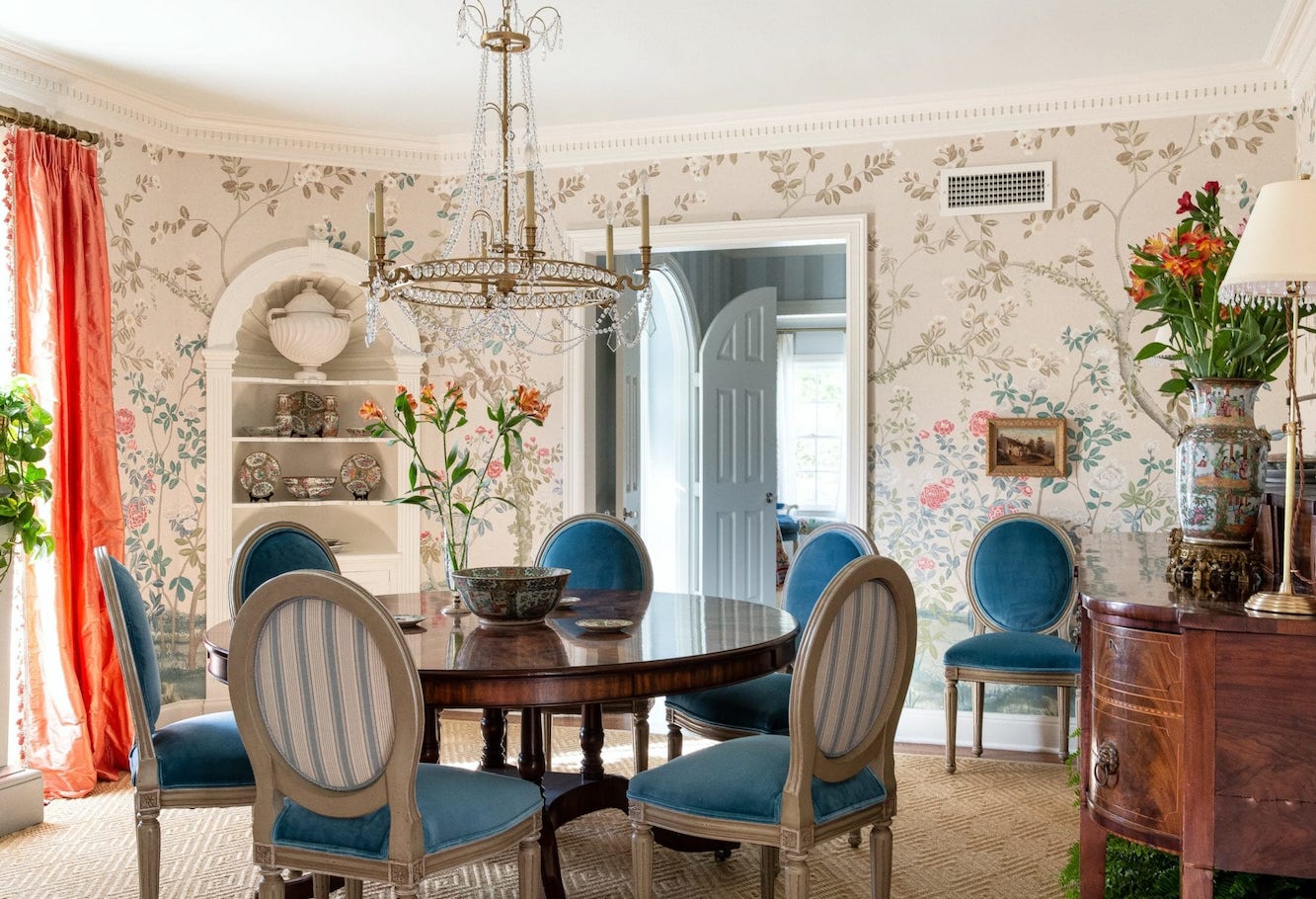
One example is this classic dining room featuring a gorgeous wallpaper by Miles Redd for Schumacher. (Madame Pompadour)
Mark sometimes uses a lot of pattern-on pattern, but in either the cool blue or the warm beige/cream color schemes. And, I believe that most if not all of those rooms are showhouse rooms.
I think it’s his way of doing something that pushes the envelope and is memorable. In other ways, I think he uses enormous restraint in his decorating.
One of my favorite Mark D Sikes rooms is this understated, elegant living room.
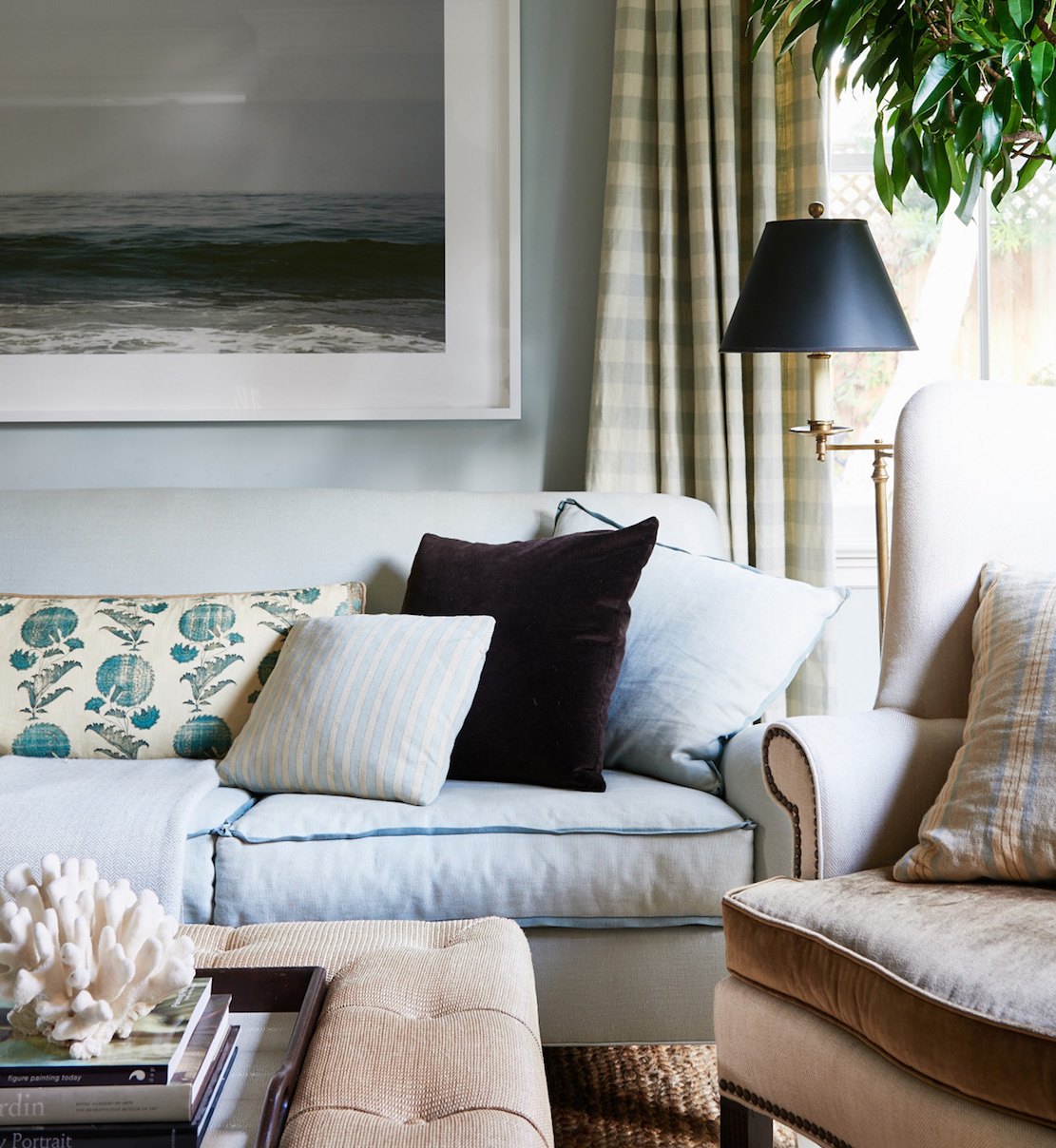
So, the point is that Mark can produce a zen-type space with only a whisper of pattern for his clients. The room above is about the subtle play of color and texture.
Val summed things up very nicely in this wonderful comment.
I’d love to read about the warm and cool mix. I’m so interested, I can’t wait. Mark D Sikes is so nuanced. He is the professor of color and subtle patterns. And, timeless and serene, layers etc. I will never tire of reading about his decorating tricks and formulas.
He is so great that could never deconstruct his work on my own. Only a strong decorator can do this.
Thank you, Laurel.
Val
***
Before I begin analyzing Mark D. Sikes, I have to say that I always feel a little funny doing these posts. I love doing them; they ARE a fun challenge. However, I think it’s a bit presumptuous to say that I’m creating a post and copying someone’s style. Of course, that isn’t stopping me. haha
In addition, the last thing I want to do is infer that one shouldn’t hire Mark. On the contrary; the reason I talk about him so much is that his rooms are like a masterclass in interior decorating. And, while quite expensive, I’m sure, they always feel accessible and like a place, I want to be.
You might enjoy this older post about Mark’s gorgeous patio and furnishings.
For this post, we’re going to examine some of Mark D Sikes’ rooms so that we can recreate the look on our own. Well, at least improve our skills.
There are many elements that Mark Sikes frequently uses. Let’s begin with:
STRIPES
Above, we can see this in play with a pinstripe on the walls and a variegated stripe on the chair.
Learn how to mix patterns here.
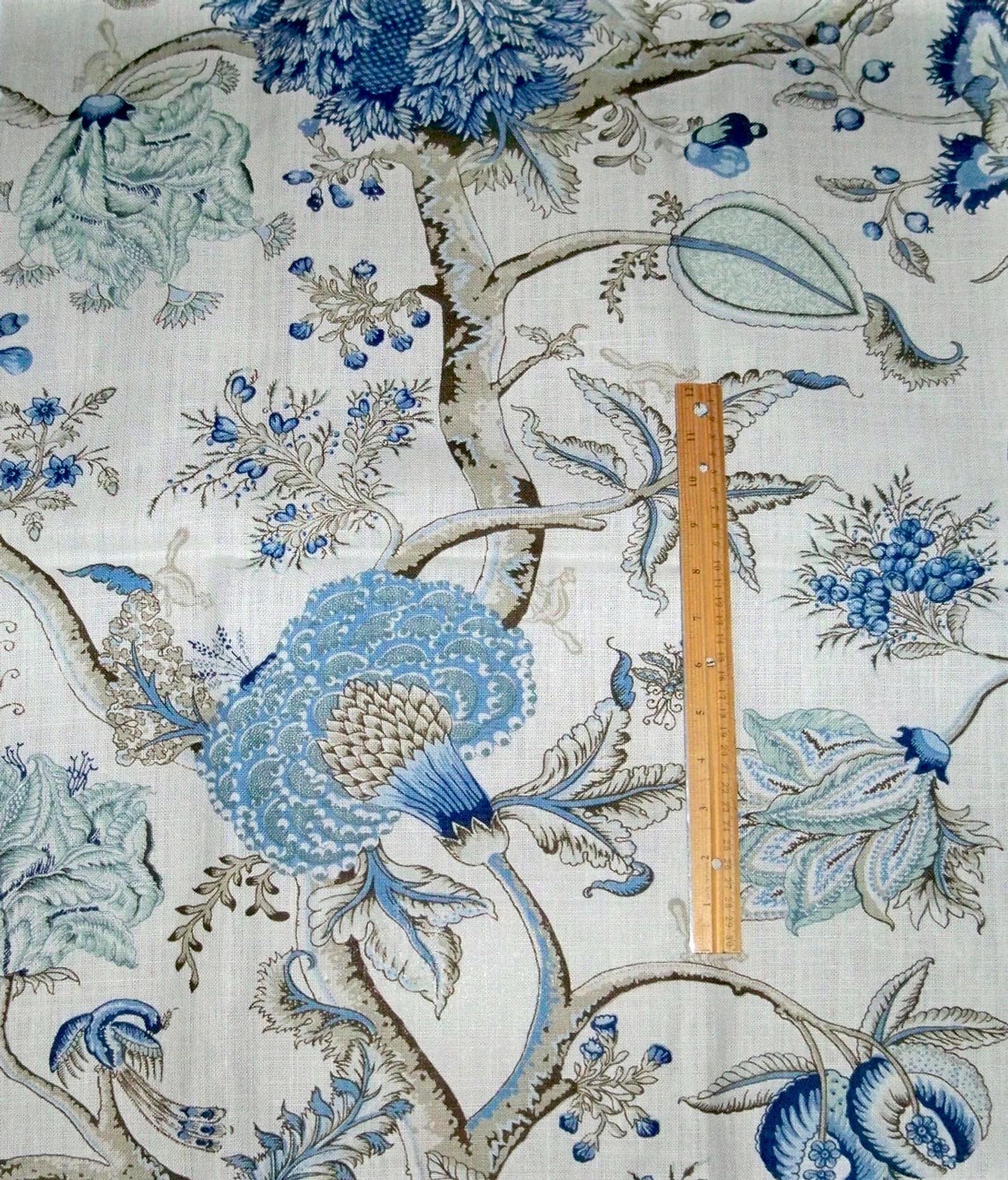
The sofa is out of Scalamandre’s Pondicherry Linen print in Delft
BLUE AND WHITE (I already mentioned.)
- Mark D Sikes is the master of blue and white. Well, he and Ralph Lauren.
However, Mark’s blue and white rooms never feel cold. That’s because he balances out the blue with plenty of white, warm tones, gold, and black accents.
BEIGE, CREAM, and WHITE
Above is Mark’s home with an overall monochromatic scheme featuring warm beiges, creams and white. I believe he may have sold this home.
CHINOISERIE
- All of Mark D Sikes’ rooms feature elements of Chinoiserie. All of his blue and white spaces have blue and white Chinoiserie porcelains. And, some of his neutral beige roms, do as well.
WHITE WALLS, but not always
- Wall colors are usually white or very pale unless it’s a library or .den
WHITE OR PALE FABRICS for UPHOLSTERY
- Fabrics are usually pale to medium in tonality. The exception would be in a library or den.
Mark D Sikes is a master of using the right touches of black, gold, and something a little out of place to add a touch of spice.
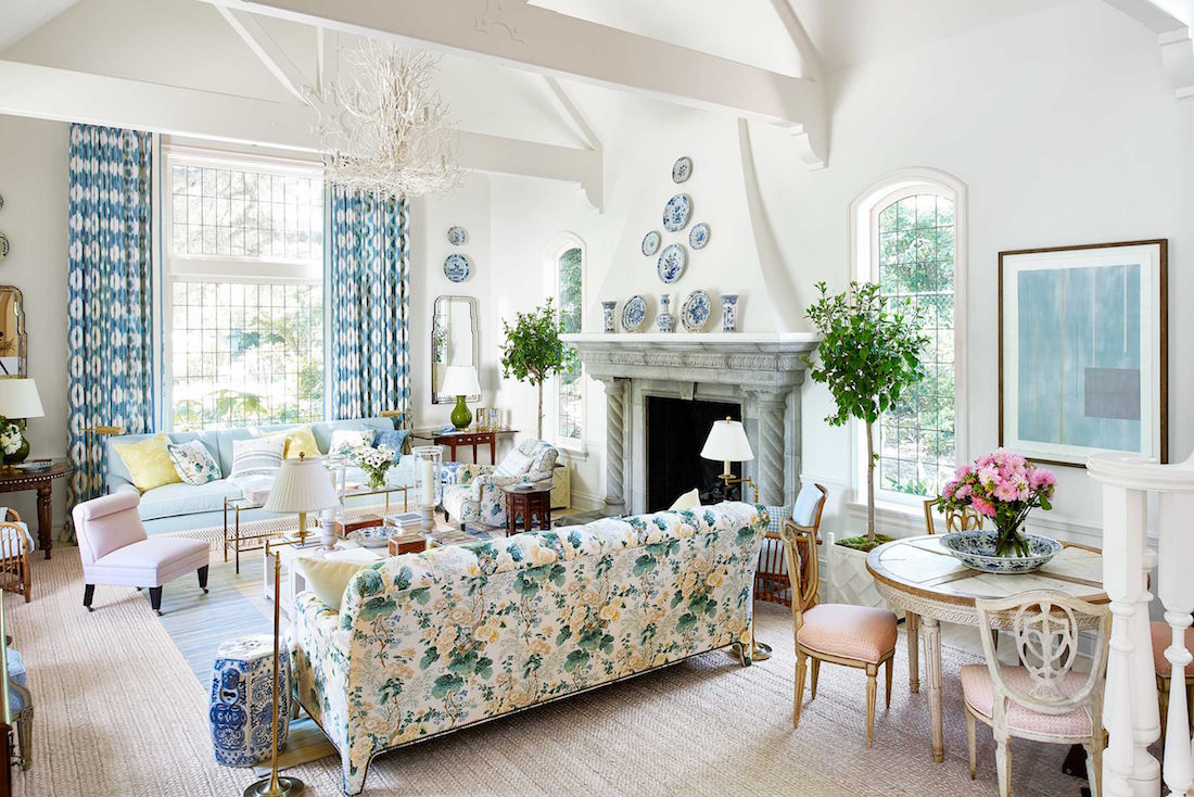
Above, you can see something a little out of place in one of Mark’s most beautiful spaces. Mark added a little lilac with the slipper chair. There’s no other lilac in the room unless the dining chairs are the same color.
FURNITURE PIECES WITH PRESENCE
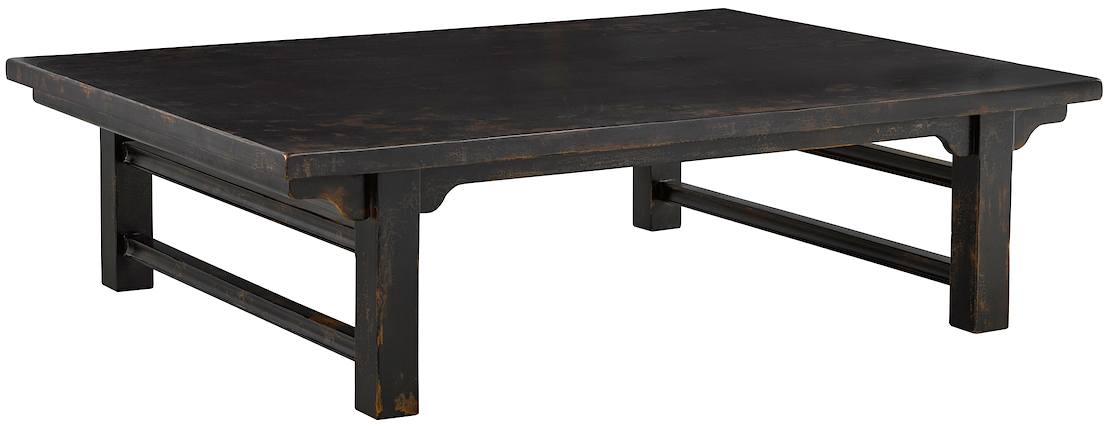
This could be like the coffee table below or a case piece. He never over-does it. Mark D Sikes understands that there’s ONE star of the show with a co-star, and a bunch of supporting players.
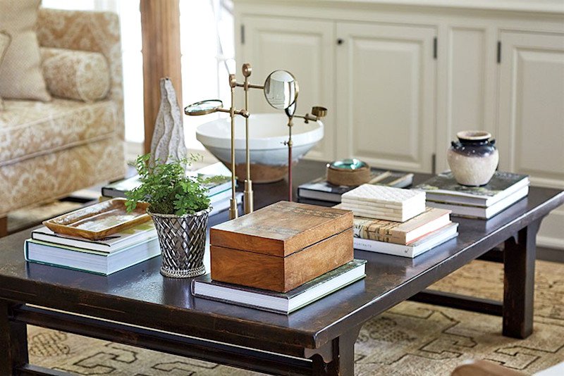
CLASSIC FURNITURE PIECES
This is where it gets a little tricky. However, Mark, like all of the designers I love, is a classicist. In all of his rooms you’ll find new mixed with 18th-century antiques.
- This is usually balanced, with one piece of black furniture and also some dark brown pieces. However, the overall look of most rooms is pale.
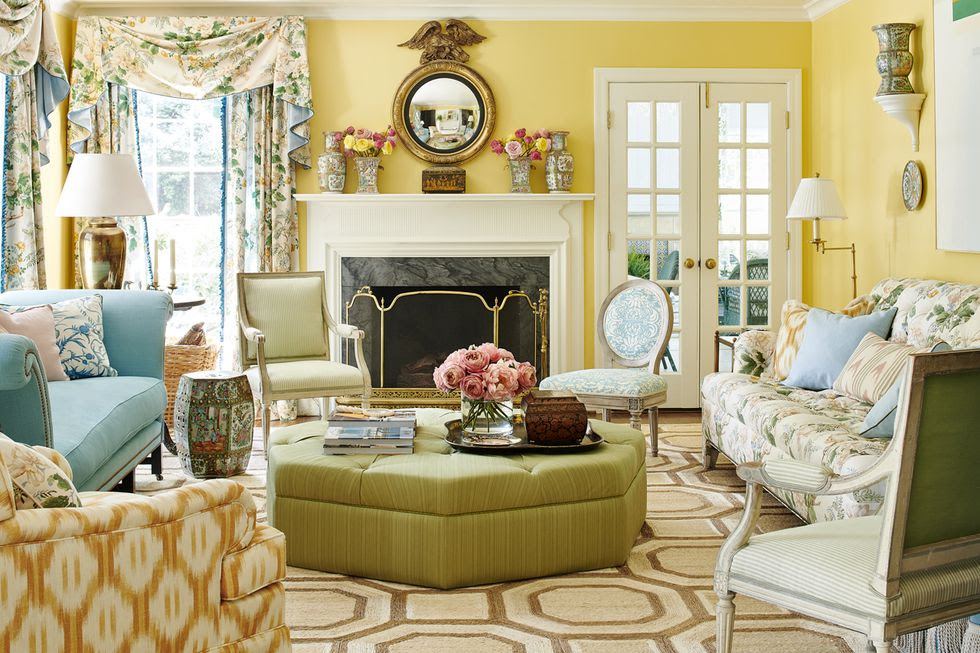
Mark does do colorful rooms, sometimes.
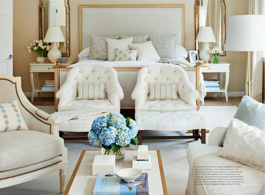
SYMMETRY
- He achieves tension in spaces by adding small amounts of a color that is unexpected.
- The rooms are beautifully styled. And, the elements are layered.
- There’s a variety texturesure from shiny to nubby.
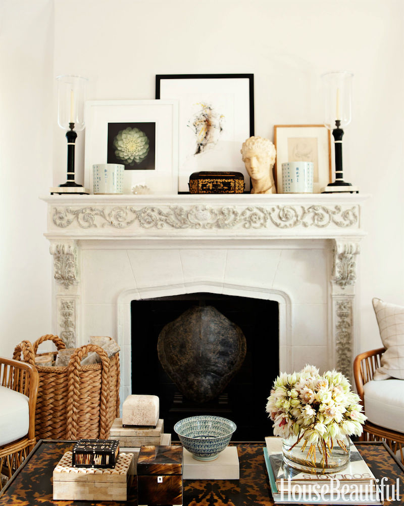
- Mark loves large woven baskets
- He uses lots of decorative art prints
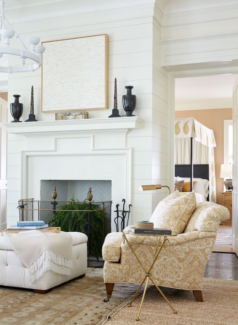
- And he likes large-ish abstract art.
- Most rooms have one or a pair of mirrors
- His furniture is all beautifully scaled.
And, finally, Mark always uses all kinds of Chinoiserie, from ginger jars, stools, and vases to case pieces and often gorgeous Chinoiserie wallpaper and murals.
So, where do we begin to deconstruct a Mark D Sikes room?
Let’s begin with the ground up.
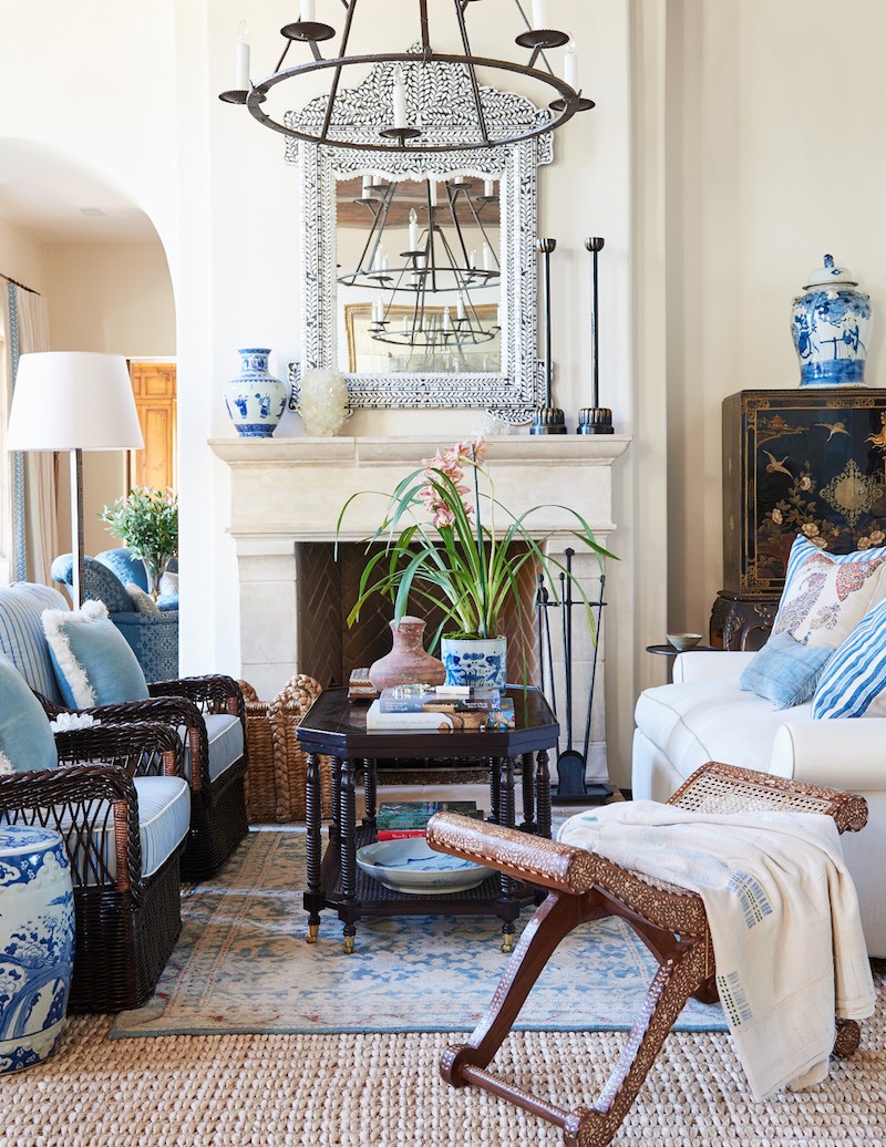
- Most of Mark’s rooms hardwood floors are in a fairly light to medium stain.
- Mark frequently layers his rugs.
- And, he almost always begins with a natural fiber rug.
- Mark uses different weaves, and typically uses a jute rug. But, sometimes sisal or seagrass. These natural fiber rugs are not expensive. In addition, they’re timeless.
- Sometimes Mark uses the natural fiber rug alone, but usually, it is layered with either a hand-knotted Oriental or a flat-weave rug with a striped pattern.
Of course, there are exceptions to this.

Above is still a natural fiber rug but with a more pronounced geometric pattern. The room also has more color than most of his rooms. However, it is the epitome of the new-traditional look in that there’s a relaxed formality.
If you look at Mark’s portfolio, you’ll see that for clients, his rooms are often quite colorful.
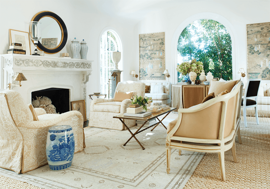
Above, another view of Mark’s monochromatic living room
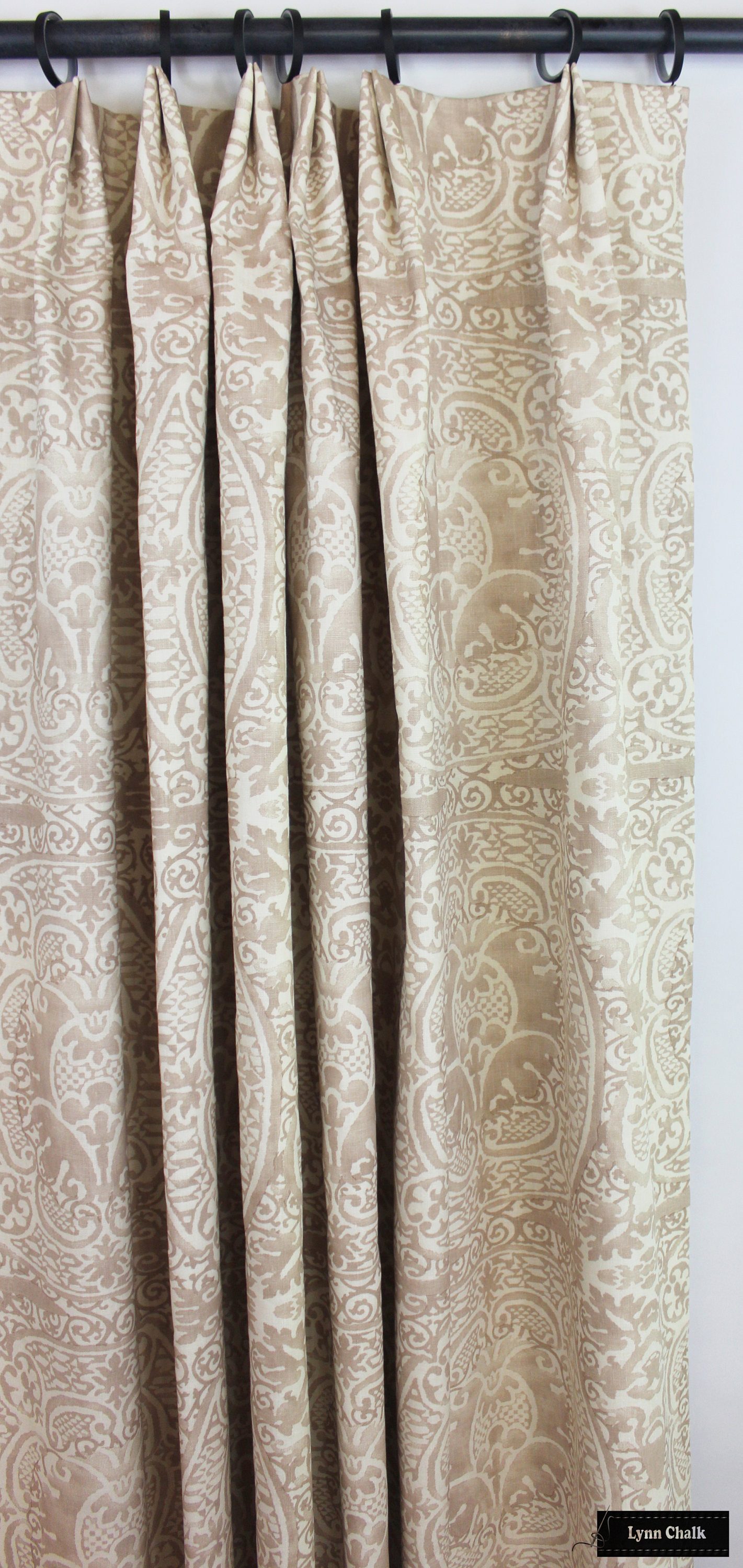
Beautiful window treatments and pillows by Lynn Chalk
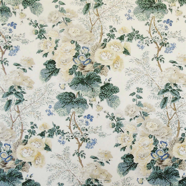
Above is the same fabric that Mark used on his club chairs. It’s one of my favorites as well. It’s Quadrille’s Veneto. This is a different colorway.
It’s the same fabric I used in this room.
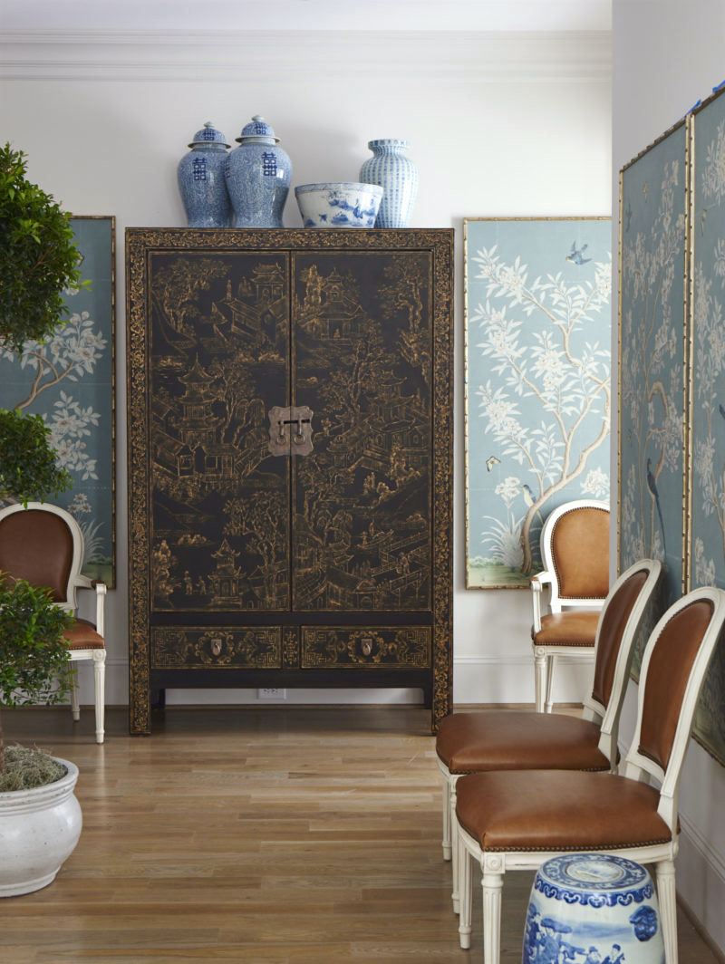
A Chinoiserie cabinet by Henredon anchors many of Mark D Sikes’ rooms.
Okay, I don’t know what’s going on with Henredon these days. Their website has been under construction for months. However, it looks like you can purchase the Chinoiserie case piece and others, as well, on Mark’s website.
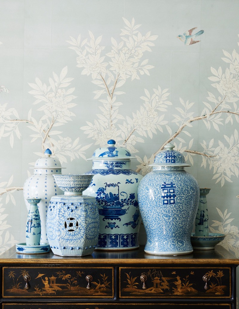
A Classic Chinoiserie vignette. The wallpaper is by Gracie, another favorite source. If that’s not in your budget and you love the look, please check out this post featuring numerous Chinoiserie panels.
This is another favorite post featuring Chinoiserie mixed with Swedish Gustavian.
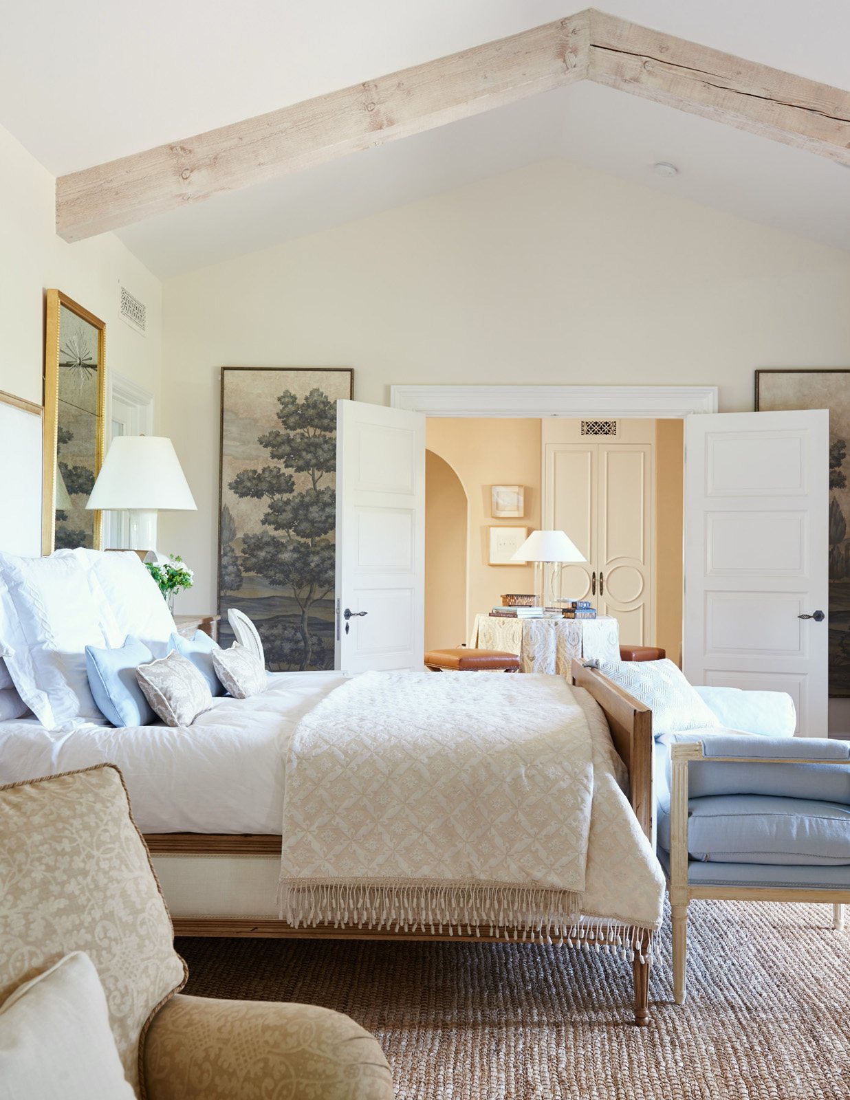
I love all of Mark’s bedrooms. Speaking of bedrooms, Serena & Lily is having a massive sitewide sale with 20% off!
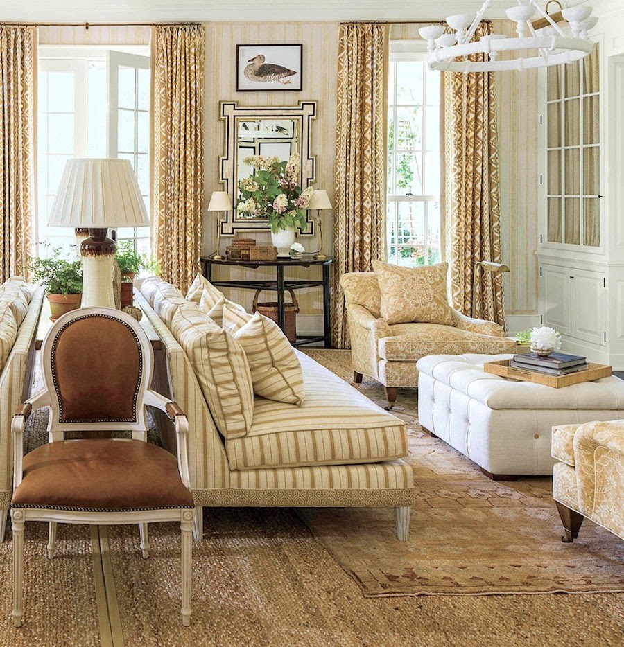
Above is a beautiful monochromatic living room that Mark did a few years ago for the Southern Living Idea House.
Mark uses these sources for the bulk of his fabrics.
The last three sources can be found retail at Decorator’s Best.
They are having a 10% off sale with code: FALLFAVES + FREE SHIPPING on orders over $100.00
Mark seems to be collaborating with just about everyone, these days.
For rugs, Mark has created a beautiful line with Annie Selke.
There’s even a line Mark created for Anthropologie. I have to admit, while I love both Anthro and Mark, I’m largely disappointed with the Anthro collab. The reason is: It doesn’t look like Mark’s work. It looks like it was created by a college intern who doesn’t get Mark’s aesthetic.
I get that it’s designed to be a lower-priced version of Mark D Sikes’ style.
However, it shouldn’t look cheap. And I think this line, despite the attempt at marketing it well, isn’t living up to the standard.
What do you guys think? Maybe I’m missing something? And, I’ve probably missed some other collabs.
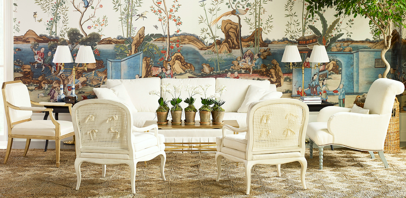
A vignette from the Chaddock Furniture Showroom at the High Point Furniture Market
In my opinion, however, Mark more than makes up for the Anthro line with his collaboration with Chaddock Furniture. Every piece has been carefully thought out. The only unfortunate thing, perhaps, is that Mark launched this gorgeous furniture line at the High Point Market in Spring 2020. Well, of course, it was a virtual launch.
It always works.
Laurel, what IS that wallpaper?

This incredible Chinoiserie mural has a zillion sections and is produced by Iksel. One can purchase the mural through Schumacher if in the trade. I cannot find Iksel on the usual retail sources like Wayfair/Perigold. There are some other sources that might carry it, but I don’t know anything about them. Of course, this is an exceedingly high-end wallpaper.
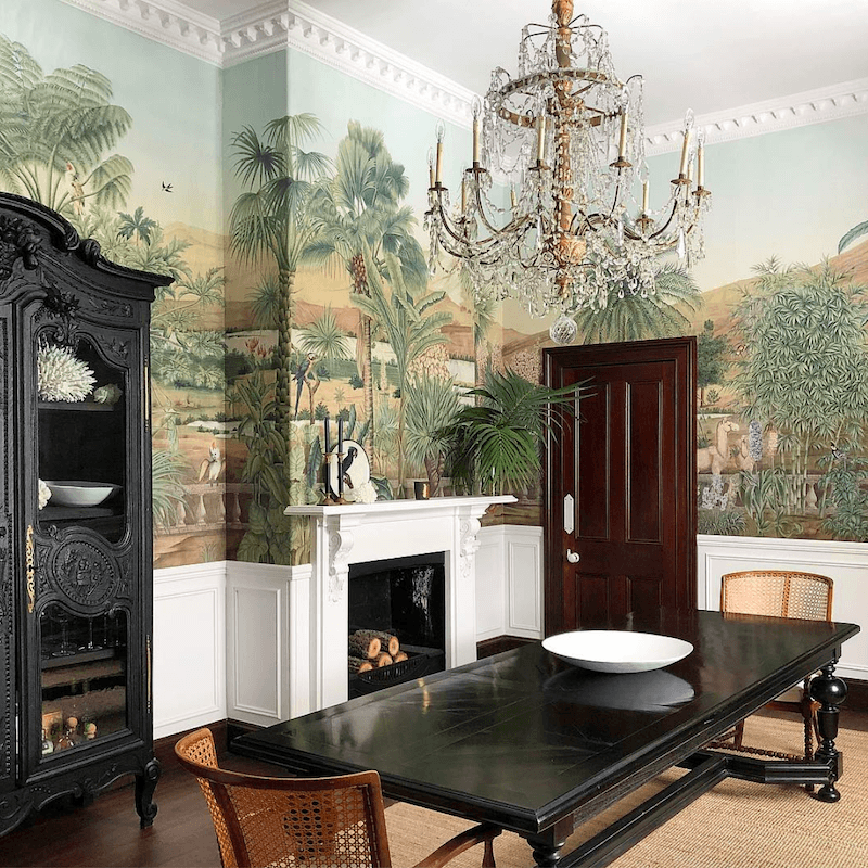
You might recall Iksel is the brand Steve Cordony used in his equally exquisite dining room.
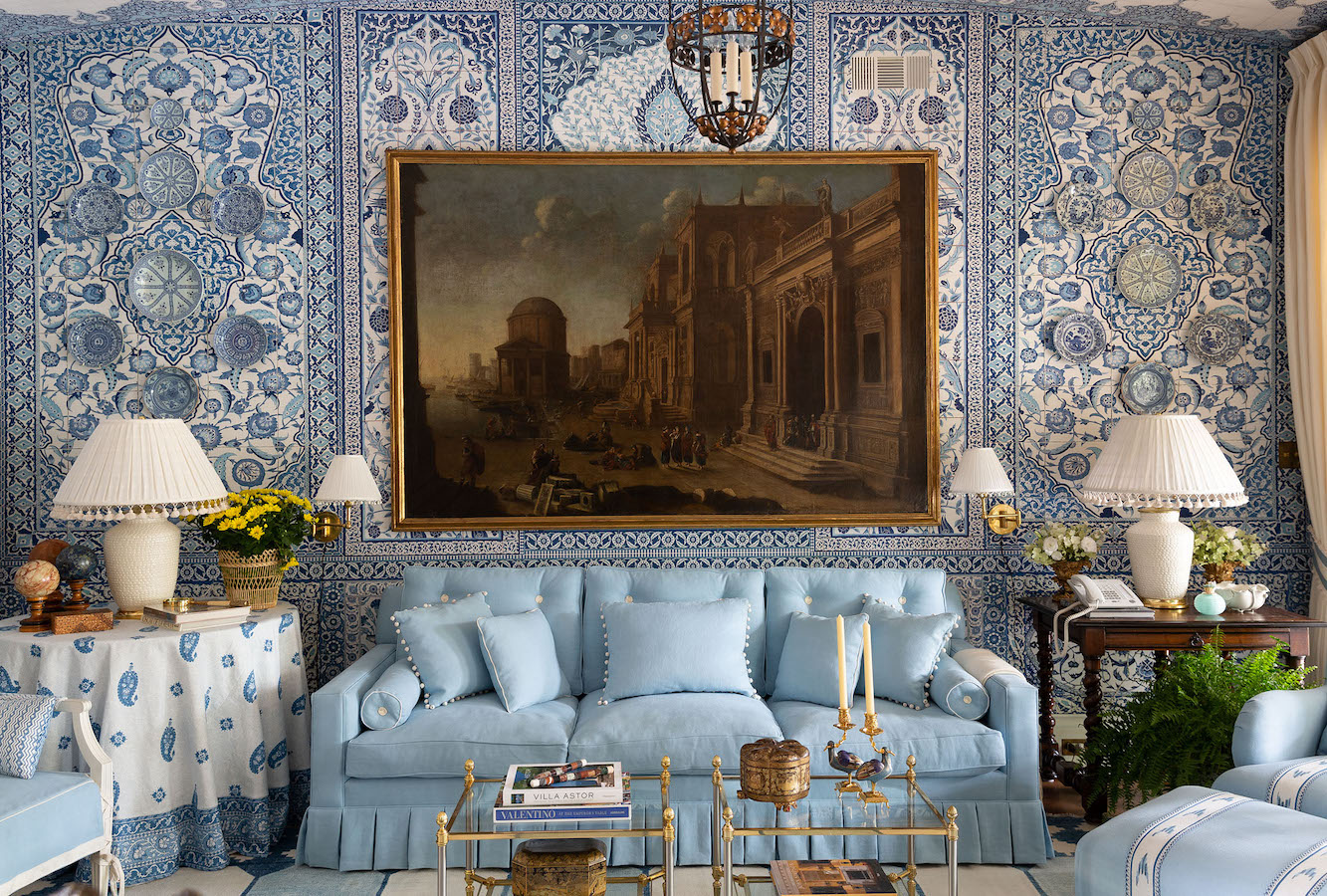
Photo: Jeff Jones
Also in 2020, Mark participated in the Dallas Showhouse with this striking blue and white room. This is one example of Mark’s robust use of patterns. Again, the manufacturer of the wallpaper is Iksel. I think that incredible and BIG oil painting makes this room a smashing success. I mean it looks like an oil painting. These days, who knows? Remember when I had this well-meaning but perhaps misguided idea?
Okay, I think 25 hours is enough time to spend on one post. haha.
Below I created a widget with roughly 100 items one might find in a Mark D. Sikes room. Of course, this is only a sampling.
Please click on any image for more info.

I hope you enjoyed this post that breaks down Mark D Sikes’ beautiful decorating style.
I think by studying a master’s work, the essence of it will rub off. The greats like Bunny Williams, John Rosselli, Albert Hadley, and Furlow Gatewood are a few whose designs I can see in Mark’s work.
And yet Mark D Sikes has interpreted what he learned and made it his own.
I think that we can do that too.
Or, if we’re lucky enough, we could hire him to help us create an exquisite home.
Also, please follow Mark D Sikes on Instagram by going here.
Thank you again for your time and support.
You guys are the best!
xo,

PS: Please check out the newly updated HOT SALES! You’d think it was the end of November because all of my favorite brands are currently having massive sales.
Related Posts
 Little Known Exquisite, Affordable Wallpaper Murals & Art
 I Kind of Hate My Too Formal Dining Room
 Subway Tile Alternative Everyone Knows About But Me
 How To Build A Unified Interior Color Palette
 Exquisite Bedroom Furnishings Inspired By Mark D Sikes!
 30 Astonishingly Beautiful and Best Front Door Colors
 I’m Afraid Our New Rustic Home Will Be Depressing!











19 Responses
These Mark Sikes rooms are all beautiful eye candy, and I love them, however when I imagine myself in them I start to feel like I’m going to trip over something any second. I can’t wait to get out. So weird? A post on unexpected visceral reactions would sure be interesting.
Is he the one that had the very very deeply sloped back yard? If so it also made me uncomfortable even as I could also admire it. Hmmm.
Love, love ,love. His taste is my taste. Can’t afford much of it, and live in a small house, but I do, in my humble way, the kinds of things he does.
Henredon Furniture went bankrupt five years ago. They had HUGE showroom in my area and I loved that store! Filled to the brim with beautiful furniture, rugs, accessories, art! One of my favorite things to do was browse the store, and drool.
Miss them terribly!
Hi Dee,
Yes, they like a lot of furniture companies, have fallen on hard times. I believe they were bought out years ago, but, aside from that, didn’t realize they were completely off the map. Their website says, “Henredon Furniture, Coming Soon Sign Up For Our Newsletter.”
I am late to comment on this, but I love Mark Sikes and first found him through you, Laurel. Can you find any of his rooms with high color but not so much print? I suppose I need to look at every pic of his work I can find. It isn’t that those rooms aren’t gorgeous, but I find a lot of pattern and color too much.
Good Morning,
One hearty Aye for pattern mixing. I love seeing this skillfully done and your analysis of the MDS style is very helpful. The interplay in these rooms fascinates me and I’m now much better attuned to the way it works, given your breakdown. Thank you.
Thanks also for letting us know that the grammar software is the problem; I was wondering if aliens had taken you because I have always enjoyed the quality of your writing. It reminds me of the time I ran something through google translate to check; “Give the fat man a paintbrush.” was the return. Of course, I stuck with my own translation.
Have a Great Day!
Fantastic post! Thank you so much for the time and thought (and talent!) you put into this. I appreciate your responsiveness to the comments on Sunday. This is my favorite kind of post, although I enjoy all of your posts and always find a takeaway that’s helpful or inspiring…or both. Your widget selections here are beyond beautiful – the luxe Laurel look!
Laurel, the items you curated for the widget are exquisite and would create some very stunning rooms. I recently bought (and I so wish it had been through you) the Lee Jofa Althea pillows in lemon for my bedroom from Etsy, and am forever walking by to admire them. I believe Mark Sikes has used that pattern in citron for his stunning couch and pillows in one of his rooms here.
I struggle to admire Mark Sikes as wholeheartedly as many do, but some of his rooms are wondrous and to my taste, and his talent is undoubted. I’m firmly wedded to the English country house style and would like to second Mary Evers above in her plea for a possible future post on English designers. I’m absolutely thrilled that chintz and sofas and chairs with flowery patterns are making a comeback! Bunny Williams and Furlow Gatewood, whom you mentioned above, are my two favorite American designers who reference that style here. In these fraught times I think connections to nature inside our homes are more necessary than ever.
Thanks so much, Laurel, for this amazing post and all the time and effort you put into it. I’m not a fan of the rooms that use so much pattern, but love his more restrained rooms, which are always perfect. Your deconstruction of his style is very helpful to me because my husband and I are preparing to redecorate our condo after many years of the same style. I’ve been perplexed on how to get started, but with a few ideas on color I’ve found last couple of days, and your post, I think it’s beginning to come together in my head. We want to lighten everything up, but own some darker vintage pieces that we would never get rid of. Now, I think we can make it work by lightening everything else up and letting those pieces shine in contrast. I know if it works for Mark, it will work for us! Now, if I could only afford his services in my home! Thanks again for the post. It was very helpful to me and perfectly timed today!
Mark Sikes is currently decorating the White House for the Biden. Cannot wait to see what he does there – and maybe it will last into the future!!
Thanks so much for an incredible post! I would never have heard of this fantastic designer without your blog. I have a tendency to be a bit too maximalist in my taste, and I’m inspired by his choices and restraint—an interesting and harmonious room with some surprises, but not *too* many. Gorgeous.
Fabulous post-thank you! Morning coffee with a Laurel post and MDS-Doesn’t get much better!
Great post, Laurel. I do love Mark Sikes, and I love Annie Selke rugs. However, I recently ordered one from the Sikes / Selke collaboration and had to return it. It was a small jute rug in a diamond pattern, but the white diamond was actually an unfortunate shade of yellow, and the whole thing was so loosely constructed it looked weird. My IKEA jute rug was much better made.
Hi Laurel,
Mr Sikes is very talented. It’s great that you showed how to recreate his look because I don’t know many people that could afford to hire him. Maybe I’m hanging with the wrong crowd. LOL.
The tea table you showed that’s available on Chairish caught my eye. I’m very into anything English lately. But I’m confused by the height. It’s too low to sit at. And too high to use as a coffee table.
So I’m not sure how it’s used.
I know you’ve done other designers in the past. English designers use a lot of pattern together & some folks don’t care for that look but I love it. Hopefully some others do also. And getting them to all work together without matching & looking contrived is a skill I’m trying to acquire. Maybe you could feature an English designer again.
Thanks Laurel.
Fantastic post Laurel! To think that we just requested one like this a couple of days ago. You’ve gone above and beyond in deconstructing MS’s amazing style. Thank you!
Adore what Mark does. Just recently I “borrowed” one of his drapery styles. Turned out beautifully.
Thanks for the post.
I love Mark Sikes blue and white themes and have used these colours for over 35 years. My rooms feel classical and warm to me and apparently to others. I sometimes add a soft yellow. I’m not comparing what I’ve done to ANY decorator. If I could have Mark to decorate my home, I’d be in heaven!
One other positive comment is about the photo entitled “Hollye Jacobs Residence in Santa Barbara, CA for Santa Barbara Magazine feature”. I could almost swear that it’s the same as the one I purchased back in 1988 from Ethan Allen! It’s still in use in my home and is a treasured piece of furniture along wirh the matching sofa table.
Thank you, Laura, for dedicating this post to the stunning works of Mark Sikes!
Nancy
Wow, just WOW! Awesome post Laurel!
I would like to suggest that your readers search the Quintessence site on YouTube for the episode featuring Mark’s California home, and also “A Journey of Four Rooms” in which he shops at John Rosselli’s showroom for the Kip’s Bay Showhouse. He seems very friendly and genuine.