

Hi Everyone,
Whew! What a week it’s been. I’m back in New York for the time being. My tooth got fixed.
That was on Thursday. It was hot out, but I got the car packed, including Joe, in his little spot on the floor in the passenger seat next to me.
The car wouldn’t start.
Again.
Dead Battery.
I’ll cut to the chase. I took Joe out of the hot car and sat him nearby in the shade. And, also gave him a little water. And, I made a mental note not to forget him!
It took the guy from AAA a good 90 minutes to show up. And, then, a good hour to replace the battery. I kept looking at my GPS, and it had me arriving at my dentist, 115 miles away about five minutes before my appointment, but I hadn’t left yet!
Oh, you already know what happened.
That’s right. In my worry about getting to the dentist on time, I did forget about poor Joe. What’s worse, I didn’t even realize until I was 2/3 of the way into my trip. Imagine my panic on I-91 when I realized what I had done? I called Cale, who happily said, he’d go and fetch Joe and take care of him.
For those, who don’t know who Joe is, he’s my five and a half-year-old half-dead plant. But, he means the world to me. Here’s Joe shortly before we left New York last May.( you have to scroll down to see him)
(And, yes, I realize that he’s outgrown his pot.)
Cale knows how attached I am to my dear plant. And so he had a little sadistic fun by telling me that Joe was crying when he showed up. Honestly, the very thought makes me want to throw up.
Good God! What an eccentric nutjob I’ve become! However, Joe has become a surrogate child. And, that’s why I need to move closer to a real one!
But, Guys! Thank you again for all of your kind notes. I’m still reading them! If you missed the news about a big change coming my way, you can read about it here.
And, I do want to keep talking about my new home; of course, I will. But I thought I would take a break from that to provide some variety.
So, this is a re-working of a post from 2016 about my favorite Benjamin Moore Paint Colors.
However, instead of 16 colors, I added four more. So, now it’s my 20 favorite Benjamin Moore Paint Colors.
I added two more shades of white, a cool gray and a black. But, really, there are so many wonderful colors. And, if you’d like to have a larger list and don’t have it yet, please consider purchasing the Laurel Home Essential Paint and Palette Collection. It’s 144 Benjamin Moore Paint Colors. These 20 are part of the collection. The Palette portion is when I take all of the colors and put them into palettes, 40 mood boards with furniture and much more. You can read more about the paint collection starting here.
So, let’s get into the colors.
MY 20 FAVORITE BENJAMIN MOORE PAINT COLORS
I’ll begin with the four colors I just added.
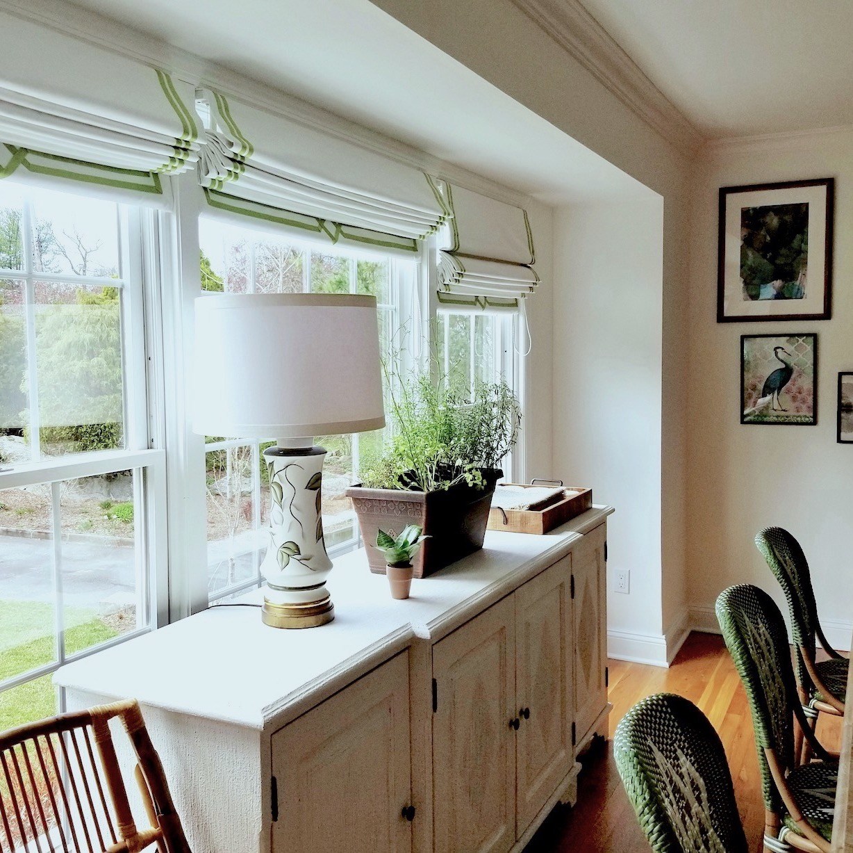
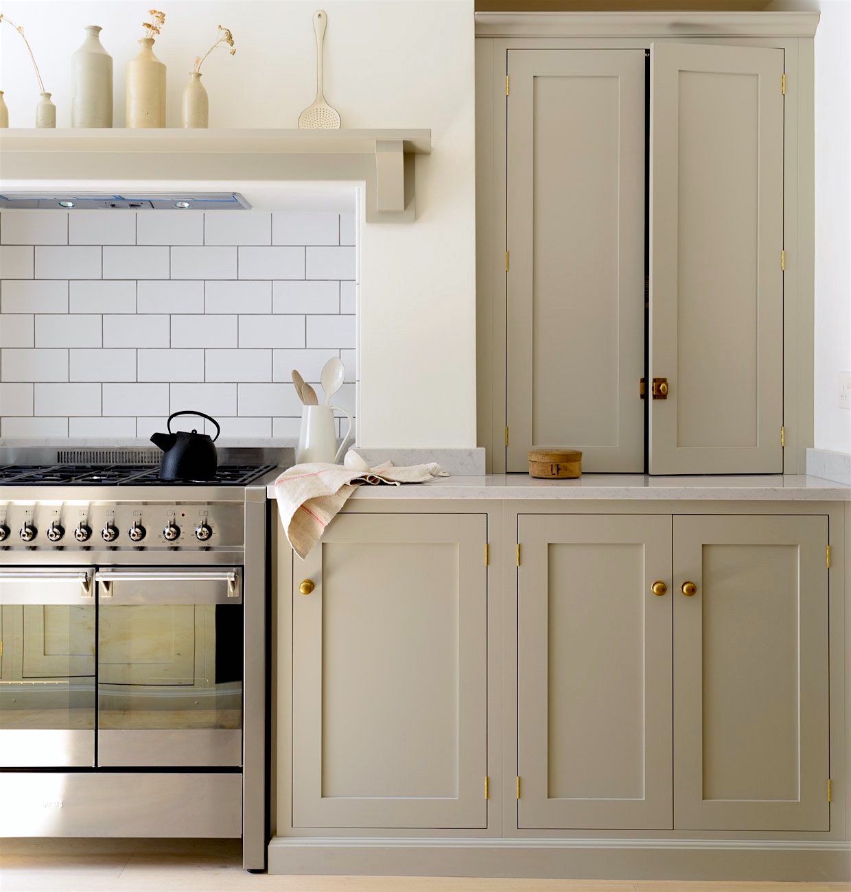
SIMPLY WHITE – It’s not at all a stark white. And, it does not read at all yellow. It’s a terrific shade of white and I would say you probably can’t go wrong with it, either as a trim or wall color. But, of course, always test first. For more of this terrific kitchen, please go here.
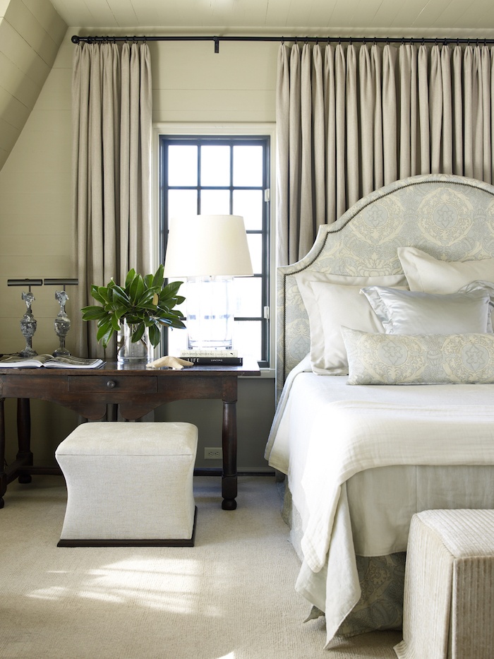
And, the other white is another popular shade and the one I chose for my bedroom to go with my lovely Mural Sources wallpaper.
WHITE DOVE
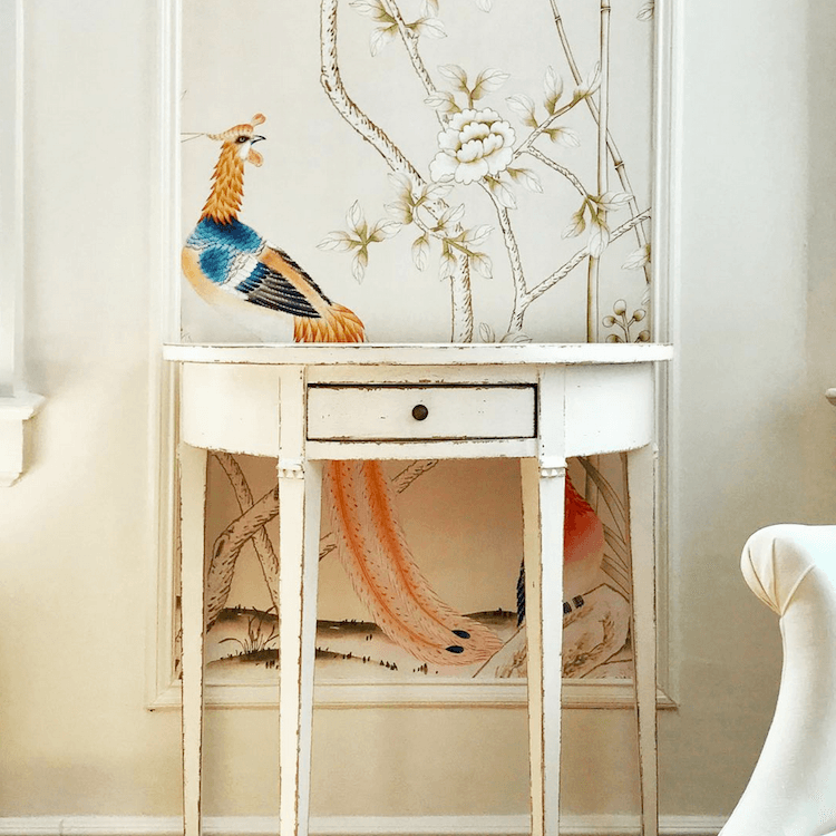
Oh, I so wish I could take this wallpaper with me to my new home! When I arrived home at 6:00PM on Thursday, the light in my bedroom was so lovely and the room looked magical to me. I am going to have to do a few things to this place. I would like to sell it.
For times I need/want to come back to NY, I can stay someplace else.
There is no point in shelling out over $800 a month if I’m not going to be here very often. Plus, I would love to put the money for the apartment sale into fixing up and furnishing the new place.
That reminds me! Remember this open concept mess I wrote about four years ago?
Well, it FINALLY sold!
I wanted to include a black this time and so I chose is Benjamin Moore’s Onyx.
There are several great shades of black in my curated paint collection. And actually, Benjamin Moore’s plain black is quite fine. Onyx is a tad softer and a touch warmer without looking brown.
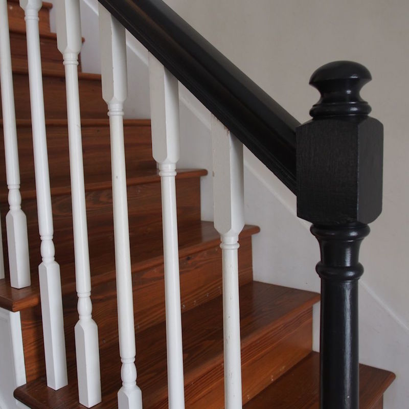
Lovely staircase make-over with a newel post painted in Benjamin Moore ONYX.
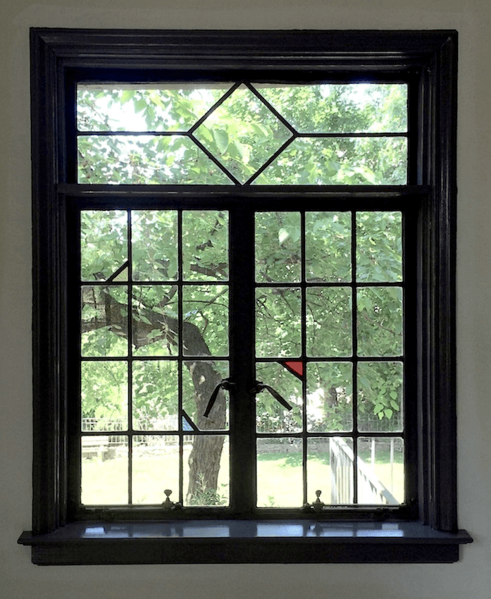
This window frame painted in Onyx was from a consultation I did in 2015. It was one of the last ones I did before stopping all of that a few months later. If you open up the link, you’ll see how I almost helped my clients make a big mistake. Fortunately, they ended up with Onyx and were totally happy.
The last of the four new colors is a cool gray.

WICKHAM GRAY. It is a touch lighter than another favorite, Quiet Moments which is below. You can see Wickham Gray in this post along with a bunch of other great gray-blues.
These colors are often referred to as “haint blue.” It’s that indescribable color that’s not gray or blue or green, but a combination of all of them. But, some haint blues are brighter than this one.
COTTON BALLS
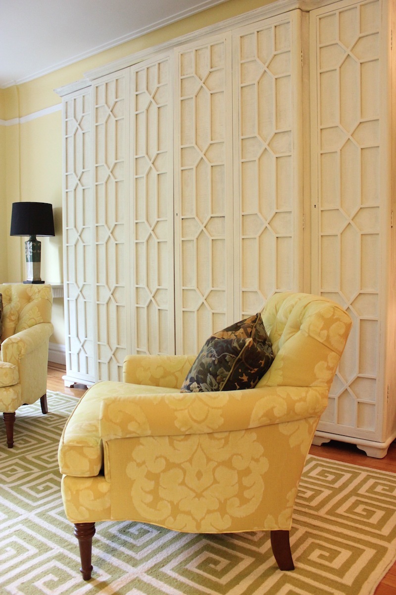
I guess anyone who’s been reading my blog for more than a week knows that I love Cotton Balls. This is a white that does what you tell it to do! And, it’s sloppily painted onto my living room cabinet.
SWISS COFFEE
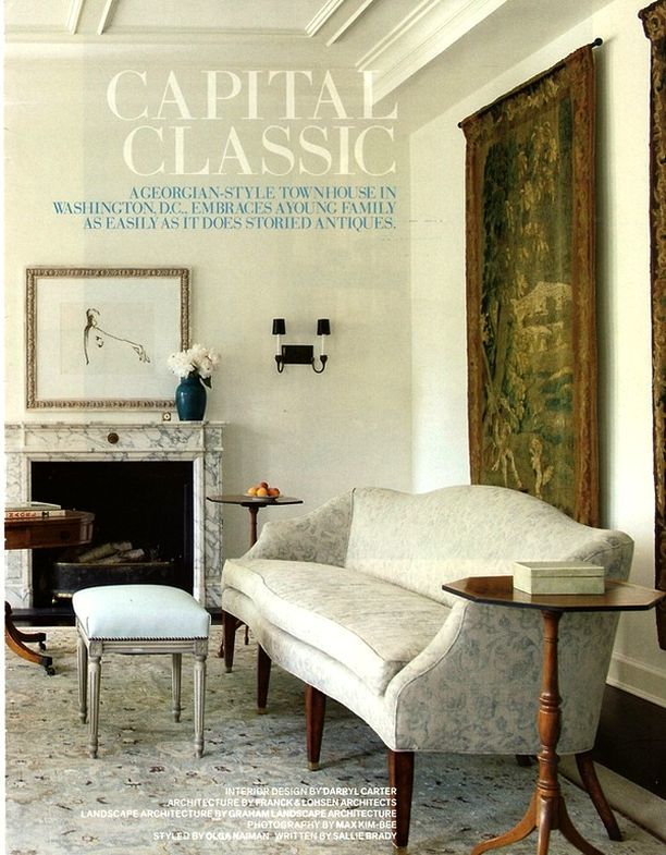
Darryl Carter (this is his gorgeous room) has a line of Benjamin Moore paint colors, and Swiss Coffee is one of them only he calls it Hanover White.
I don’t know for sure if the room above is Swiss Coffee/Hanover White or not.
It doesn’t matter. It’s a lovely, warm, but not yellow-white with the right amount of gray.
It is also a superb color for the OUTSIDE of your home if you’d like to paint it white.
IVORY WHITE
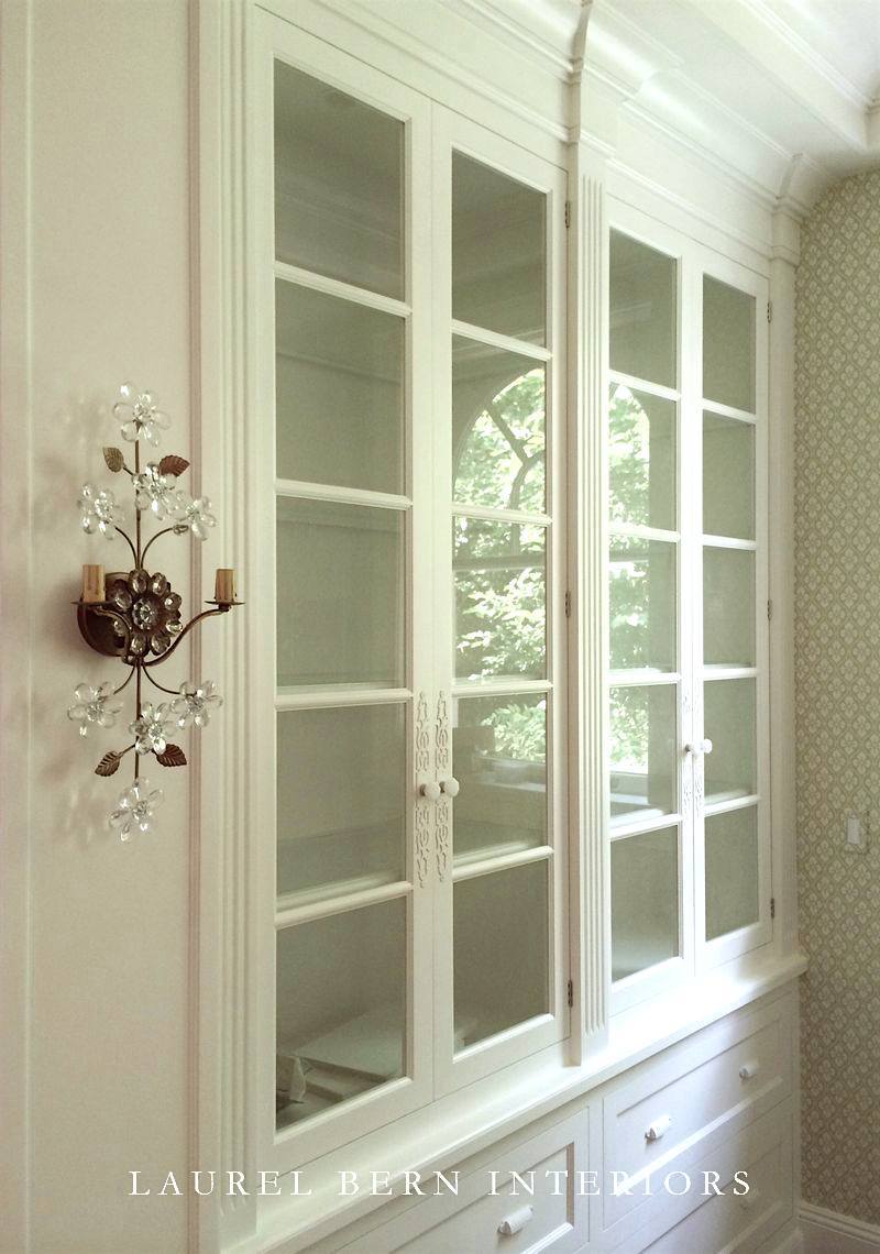
Sorry, I cheated. This cabinet is white dove. What’s the difference? Not a lot. Ivory White is just a little creamier, is all. Both are fabulous white colors for cabinetry, walls, and trim. For the only six white paint colors, I’ve ever used, click here.
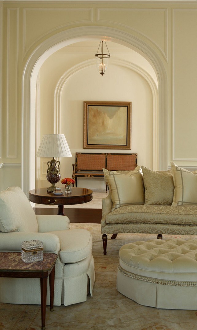
ELEPHANT TUSK
is one of those colors that can look gold, khaki, or cream depending on the light. It’s a wonderful neutral and a great alternative to builder’s beige.
A job we did a few years ago.
CLASSIC GRAY
Classic Gray is a whisper of a warm gray that sometimes has a very slight lavender undertone, which is very appealing. For more wonderful warm gray paint colors, please go here.
RICHMOND GRAY HC-96
This is one of my all-time go-to colors. It’s another fantastic neutral. Not too pale, but not dark. It can go anywhere. However, I’ve used it at least three times in a bedroom; one adult and two boy’s rooms.
KINGSPORT GRAY HC-86
Kingsport Gray is the quintessential putty or drab ware color. It always makes me think of Martha Stewart. It’s a classic shade and looks quite fabulous in older homes. This is a good one for painted brick, cabinetry, and libraries too!
QUIET MOMENTS
This is in my top three favorite colors. (but don’t ask me what the other two are.) I’ve specified it more than any other color– especially for master bedrooms. It’s a color that everyone loves! It’s just the perfect blend of gray, blue, and green.
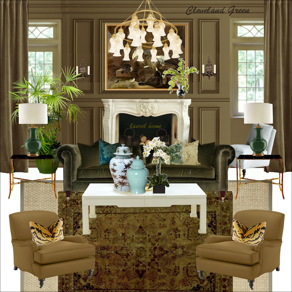
CLEVELAND GREEN
I included one of the boards from the Paint Palette and Home Furnishings Collection. Cleveland green is a color that I found out about through Bunny Williams. It’s deep and rich. Not brown, not green really, but a blend of the two.
ABALONE
Abalone is another fabulous color. It’s a warm gray, but with a healthy dose of brown and a touch of lavender. It looks fabulous in either dark or bright rooms, but I love it, especially in a darker room. The lavender will come out a little more, but it’s very beautiful, and not at all PURPLE!
CHELSEA GRAY
This is a rich, warm gray that often looks slightly taupe-y when it’s up. It’s like a warm hug and one of my favorite no-fail colors. (source unknown)
VAN DEUSEN BLUE
The image is mine from a job we did in 2008! Van Deusen blue is another of Benjamin Moore’s historical colors. This deep blue has just the right amount of gray and a touch of green. In a darker room, it will go almost navy, but it will look lighter in a brighter room.
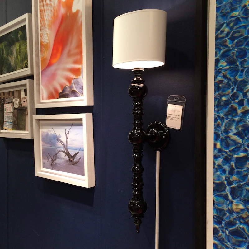
DEEP ROYAL
This is a color that I first saw last spring at the High Point Market at the Dunes and Duchess booth. Hands down, the best navy I’ve ever seen. Of course, I saw it in artificial light, but it held it’s own and looked amazing as a backdrop to their colorful art and their line of home accents.
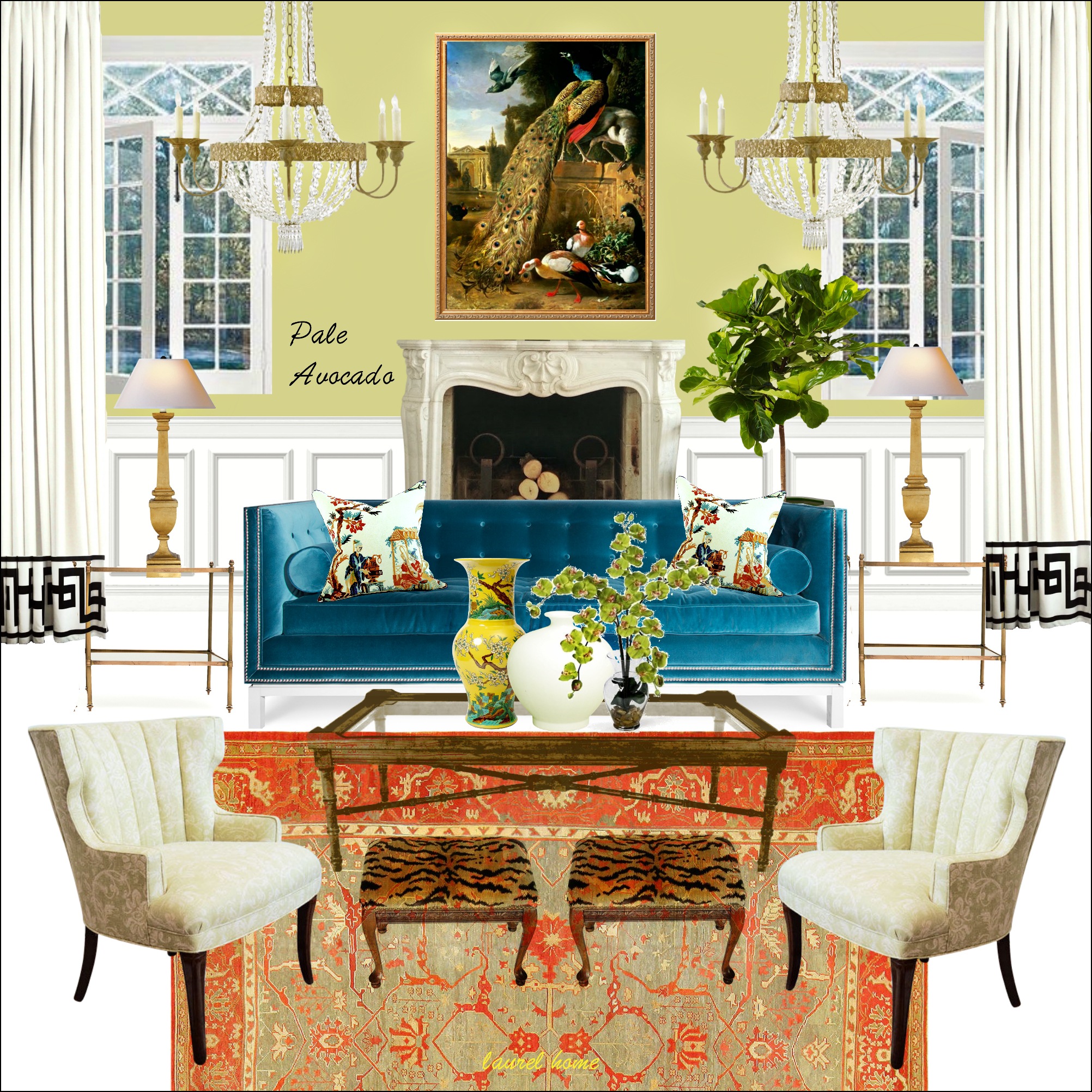
PALE AVOCADO
Above is one of the more colorful mood boards from the Paint and Palette Collection.
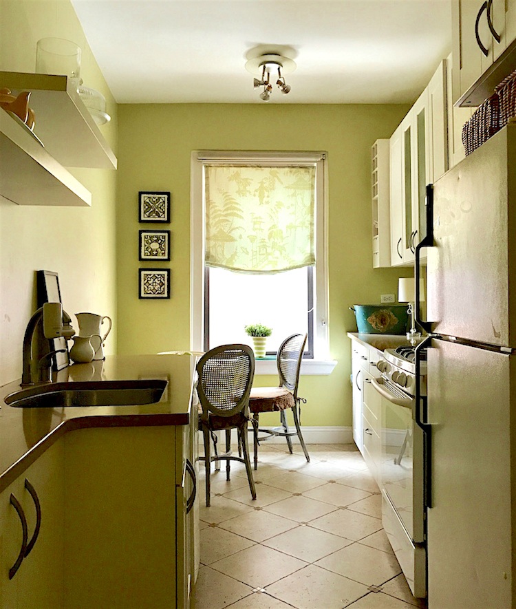
My kitchen is also Pale Avocado. This is a wonderful chartreuse with a touch of gold. It’s a terrific choice for someone wanting to try out a yellow-green for the first time. It tends to photograph brighter than it is. It’s quite easy on the eyes. My kitchen came painted this color. But, what’s funny is that my old kitchen was a similar color from Pratt & Lambert.
RACING ORANGE
This is an image I took a few years ago from another booth at the High Point Market in the antique section. The guy gave me the name of another color, but when I got home, it did not look at all like the color, so I went with Racing Orange. It’s not orange and not quite red, but right in between. It looks incredible with antiques and gold, as you can see. Well, I think so!
If you like the idea of a red dining room, please check out this recent post.
And below is the last color, which is in my tiny bathroom.
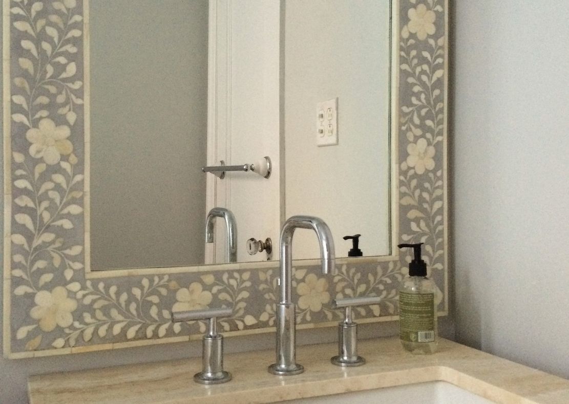
SHORELINE
Well, a little sliver and then a lot of reflection. Shoreline is the most soothing, soft gray. And, it has the tiniest whisper of blue-green.
This is also a good post about some beautiful pale gray colors that look especially good in bathrooms.
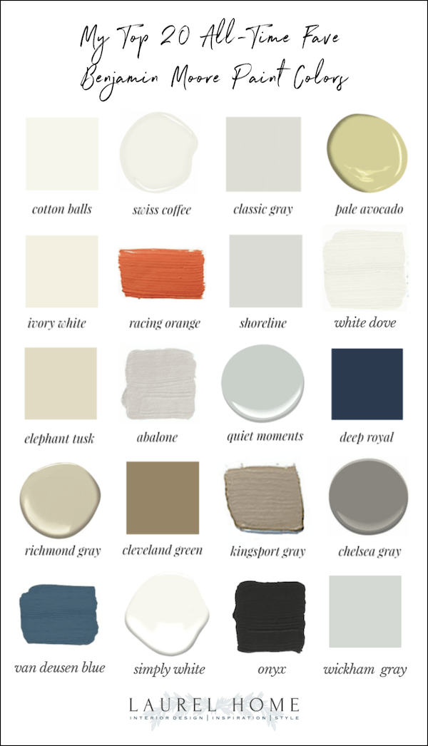
Please pin this graphic to Pinterest for reference.
I hope you enjoyed some of my favorite Benjamin Moore paint colors.
It’s funny, but in the original post, I had a troll who hated the colors. He didn’t say why, and he didn’t say what colors he preferred. Of course, a color taken out of context is just that. It takes the right furnishings to make the room beautiful. That is why I put the paint colors in my collection in palettes and with furnishings. That way, it gives a better context for the colors.
xoxo,

PS: Please check out the newly updated HOT SALES!
Related Posts
 Nine Fabulous Benjamin Moore Blue Paint Colors
 The Dangers of Curtains Over Baseboard Heat!
 The Wood Stain Color Is Too Red After Poly. Can It Be Fixed?
 Benjamin Moore Color of The Year 2016 – Anything But Simple
 333 Decorating Rules You Need To Know is Here
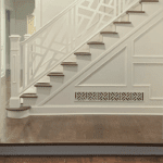 The Best Builder Upgrades You May Not Have Considered
 A Secret for Creating A 25 Color Whole House Color Palette


36 Responses
Hello! Can you tell me where the sconces are from in the photo captioned “A job we did a few years ago”? Thank you!
Hi Katherine,
They are the Silhouette Fretwork Sconce (hand-rubbed brass finish) from Visual Comfort. The light they give is gorgeous!
Hi Laurel,
I’ve been reading through your blog articles and LOVING all the information! I’m getting ready to paint my dining room which is an open ceiling with a 9 ft wall enclosure. It has stained wood French doors that open in from our foyer stained in the English chestnut finish but has a chair rail which is painted white. I’m considering painting the walls above the chair rail a navy blue but struggling with which one to go with. I’m looking at Hale Navy, After Midnight, or the Deep Royal. I want a Navy that is going to give a rich, deep navy and not look like a cheap blue, or look black. The rest of the walls in the living room which are seen from the dining room is BM Revere Pewter. Any thoughts are appreciated!
Thanks so much!
Love your chosen paint colors. I just painted my condo trim in “Simply White” and walls in “tissue Pink”. Love your posts and your humor.
Thank you for your witty and sincere posts. I thoroughly enjoy your emails and wish you the best of luck in your new place.
Wisteria’s folding, damnit, but you might get a great deal on furnishings for the new house. Just put it in storage!
Thank you for another beautiful post on colors. I am so happy for you with your new purchase. Have you determined your closing date yet? I love that wallpaper, I hope you can figure out a way to save it. I’m glad that Joe is safe! 😉
I wonder if it would be possible to strip that lovely wallpaper and make it into hangable panels on wood for your new home.
I would be so sad if the next owners ripped down all that “horrible” wallpaper.
Does this mean that you are finally going to do something about your kitchen? I’ve heard bits and pieces over the years but haven’t seen a final result.
Thank you so much for your paint color posts. The one you did on picking the perfect white recently helped me personally. We updated a 1936 craftsman home and I wanted a snappy-but-not-cold white for the interior and exterior walls. We chose Cotton Balls and could not be happier! I adore what you do!
Laurel, I always enjoy so much reading your blog! Not only is it interesting and informative, but your writing style is perfect! Reading feels like we’re two friends chatting. Hearing that you purchased a home is exciting news and I can’t wait to travel that journey with you. Wishing you the best with the move.
Belted congrats on the new home!! So happy for you and excited to see what changes you make in the future! Thanks for taking us along for the ride! Love your writings & style.
Interestingly, BM renamed some colours for the Canadian market. Here, quiet moments is Smokey green. I like the American name better. I painted my kitchen and dining room ceilings in quiet moments. It looks amazing against the simply white crown one other trim. The kitchen walls are simply white and I did pale oak in the dining room. Quiet moments is a lovely colour on ceilings. Such a wonderful surprise. I first painted colour my ceiling 20 years ago and I’ve never gone back. Especially where there is no crown. I almost always wrap the wall colour onto the ceiling.
I tried Simply White on my south facing garage door and it did look yellow! I changed it immediately. In fairness, it was not BM.
Sorry, my comment about Chelsea Gray for exterior was in reply to Monica!
Beautiful inspiration photos! I’m glad Joe got rescued. I’m a known “plant killer,” so I don’t have any real plants these days, except for a small succulent! Carol & Colleen, Laurel’s living room is Hawthorne Yellow. I’m having fun looking up the colors that your kind readers are mentioning and finding that I really like many of them. Laurel, I love when you show your mood boards – they are all swoon-worthy! I love your blog so much 🙂
Thanks for helping me out, Sheree. My sleep patterns have been quite out of whack.
Oh thanks for this–I’m getting my house (1924 cottage with wood siding) painted next month and going nuts trying to decide. I’ve spent a fortune already on sample pots, none of which looked like the online colors. All the new builds in my gentrifying area are navy, gray, blue…but I like the Chelsea Gray. Alas the estimate was for Sherwin Williams (company also uses BM but I think they were trying to save me money). Other issue, one long side faces due west and gets full sun for about five hours–I’ve heard that dark paints fade within a couple of years. I’ll go and get a chip of Chelsea gray and maybe can find a Sherwin Williams equivalent!
Please blog about your new house as much as you can! It will be so interesting to read about your plans — your quick fixes, inspirations, and long range ideas. Also very interested in how you create your rental, since it will have to be CHARMING ON A BUDGET!
Can’t wait — your mind must be racing with new ideas.
For Carol. I painted my living room Summer Harvest (BM)(Classic Colour) and loved it. It looks too pale to be pretty but give it a try because its subtleness is what makes it work. Another colour that reads yellow or a goldish yellow is Pittsfield Buff (the paint chip is very deceiving) (an Historical Colour). As said by its name, it’s a HC so there’s a hint of ‘gray’ to it that makes it very livable. Good luck on your search. Cathy D.
Good morning, Laurel.
I can vouch for the beauty of Quiet Moments. All of my rooms are painted that color except for my guest bedroom. So I have it in rooms with different exposures & it looks amazing.
I love seeing pictures of rooms painted this color to see what other colors the designer has paired with it. It opens my eyes to new possibilities.
I don’t recall ever seeing photos of your redesigned bedroom. Did I miss that post?
I hope Joe has forgiven you for abandoning him. Plants can be very sensitive.
I bought your paint collection book when it first came out, about 4 years ago?, and I STILL refer to it often. It’s a fabulous resource! I love all of the descriptions about each of the 144 paint colors and why they work, suggestions on where they can be used, and with what trim color. I have read it over and over again as we update each room in our home.
We just took the plunge this weekend and painted our large, very low natural light, great room with Van Deusen Blue. I was afraid it would feel too dark in the space, but the color actually brings the room to life and creates some dimension.
And you were right!- VDB goes almost navy in a dark room, but it feels warm, not cool like a very deep navy might. We have a creamy white fireplace, cabinets and crown molding that sometimes looked dingy or too yellow before, but the VDB brightens it up to a cleaner looking white.
Now to figure out a wonderful, welcoming color in our long skinny entry/hallway leading to the great room in the back of the house. I need a great post on colorful entryways that aren’t tan, beige, khaki, or gray. Just an idea for a future topic!!
Enjoy dreaming of your new home in the coming months!!
Elizabeth
Thanks so much for your kind words, Elizabeth.
Carol, I have Benjamin Moore Hawthorne Yellow in my open concept living area. The area has southern exposure windows, and a sliding glass door facing east, so lots of bright light. I LOVE this yellow! It’s beautiful, cheerful, always sunny. Hope this helps, best of luck to you!
I love Chelsea Gray (painted a study this color during the course of our renovation and you are right– it is like a warm hug). We also painted our kitchen cabinetry Classic Gray and I love it. Everyone thinks it “reads” white, but it’s a nice, warm white, which is exactly what we wanted. We used “Silver Crest” for our formal living room ceiling, another Haint Blue type color and it looks perfect. I relied heavily on your blog when selecting our colors for the renovation, clearly! Thank you for such wonderful information; I have always been quite insecure about selecting color, and your blog gave me the confidence to move forward full steam ahead. (We of course tested all of the colors first, but probably had to test way less than we would have without your blog insights– again, thank you!). And congrats on the new home– it’s lovely!
It sounds beautiful! And, I’m so glad the blog has been helpful for you.
I can vouch for Chelsea Gray and White Dove. We had our cedar shake house painted in these colors two years ago and love it! We live in Atlanta and the colors look beautiful in the light here.
Spot on as always! My east exposure living room is 20 year old Elephant Tusk. It is not that creamy white as in your gorgeous pic, but more goldish as you stated, probably due to low light.
Can’t wait to see the colors of your new home!
We have fallen in love with BM Patriotic White. It’s the most subtle haint blue. It looks white until you put it next to white. We first painted the bedroom and we loved it so much, we painted the entire beach house this color. It’s very very subtle ,clean and soothing. The darker the room, the more pronounced the blue/ green. It’s like living in water.
Have you checked out Benjamin Moore Sea Haze. It’s a mid tone grey with green and possibly blue undertones. I love it and it’s never mentioned.
A shout out for Quiet Moments! I painted our bedroom this color and it’s the most peaceful, zen, pale blue-green. Looks good in any light.
I hope Joe has recovered from his near-abandonment experience. 😉
Dear Laurel:
I am in the midst of pondering a paint color for my family room which flows into the downstairs and upstairs hallways. I’ve used your colors in a study, and two bedrooms; cotton balls is my favorite trim color! I am leaning toward a yellow but you don’t often suggest a soft yellow but isn’t your living room yellow? Would you please let me know what the name of the color is? I know yellows are tough but they do make me so happy!
Thank you Laurel!
My living room is Benjamin Moore Hawthorne Yellow hc-5. I think you’ll like it.
Hi Laurel,
I love that you mentioned Haint blue!
I have painted many a ceiling a pale blue for this very
reason.
A nod to my southern roots.
Thank you
Hello Laurel, I tend to veer towards the lighter colors, and am learning many of their subtleties thanks to you. While I admire the vividness of Deep Royal and Racing Orange, I think they would be hard to live up to. (I noticed that both of the rooms featuring them were temporary commercial spaces.)
One question–in your kitchen, the floor tiles have a quartet of mini-tiles at the corners, except for the area between the sing and the stove. Why the discrepancy?
–Jim
p.s. If it were I instead of Cale who had rescued Joe, your protégé would be in big trouble. At 105F, my a/c went on the fritz.
Oh! You may have found my blue! I’ve been thinking I want a ‘tanzanite’ blue for my study in the new house but couldn’t really find it. That DEEP ROYAL is as close to what I’ve been thinking of as I’ve seen. Thanks!
(god, I’m glad Joe is just a plant, I was worried it was a dog!)