Dear Laurel,
I found your blog the other day when I was trying to figure out some builder upgrades. And, I’m hoping you can do a blog post about this sometime soon.
Here’s my laundry list of woes:
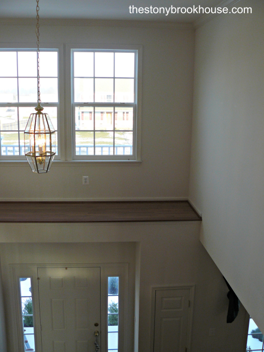
The shelf above the doorway. Why do they do those home builders do that? And, you won’t believe what the previous owners had up there. I think it was a dead animal that escaped from the attic and didn’t know how to get back.
Then, there’s the standard builder’s grade kitchen. Oak. Oak, and more oak.
Plus, the cabinets are one foot short of the nine-foot ceiling
Also, there are no mouldings. No crown moulding and just the very standard fare window and door trim.
There’s more. I just realized that there’s no pantry! There is a side by side washer/dryer, however in the kitchen. No other laundry room. Is that weird, or what? We have two little kids and lots of nephews and nieces. We need food storage! Can we move the washer/dryer? I don’t want to move it to the basement.
This home builder cut every corner imaginable.
Plus, money just became tighter as my husband’s business has taken a hit.
We need some builder upgrades that won’t cost a lot. Or, at least some ideas that we can do gradually over time. The house is still basically nice. The ceilings are still nine feet and the windows are big. It is bright and airy but just lacking in the character and charm I was so hoping to get.
Oh, one last thing given what’s going on in our world right now. It’s about having workers in our home. Do we have to take their temperature first before they come in?
Thanks so much,
Betty Baitinswich
*********
Oh, Betty
Before, I go on… For those of you not familiar with my “dear laurel” letters. There is no actual Betty Baitinswich. However, she is an amalgam of a few different letters or comments I’ve received over time. And, my prior experience with clients who have purchased either a builder home lacking in character. Or, another home built maybe in the 1960s.
Let’s begin with your Builder Home Upgrades for the Kitchen.
You have three choices when dealing with the homebuilder’s kitchen.
- Live with it.
- Rip it out and start over.
- Augment and paint.
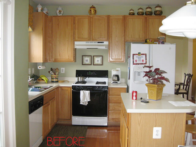
Here we go. Standard fair. This is the kitchen of a wonderful blogger, Cristina from the Romodelando La Casa blog. She chose door #3– Augment and Paint.
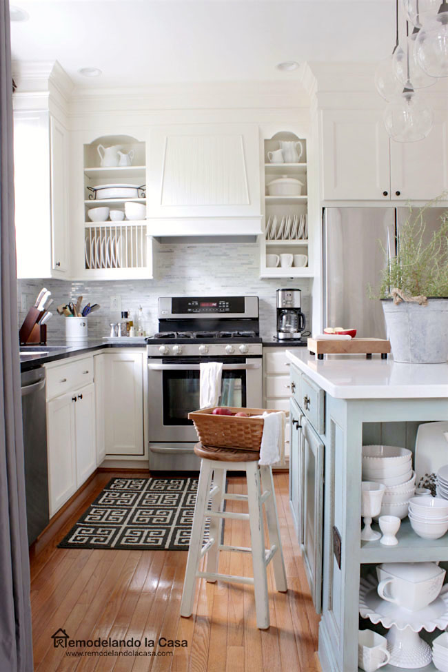
Here’s what she did for $11,000. Amazing! I love this!
And, Cristina and her hubs did it all themselves! Folks, to be clear, these are the SAME cabinets, but everything else is new. Please check out her blog in the link above and here and here. It is chock full of wonderful advice— including how to paint your cabinets. There are lots of other great projects too!
IF you don’t like the color of your cabinets, it IS possible to paint them. It is a lot of work, but from one who did it or rather had it done, it is absolutely worth it!
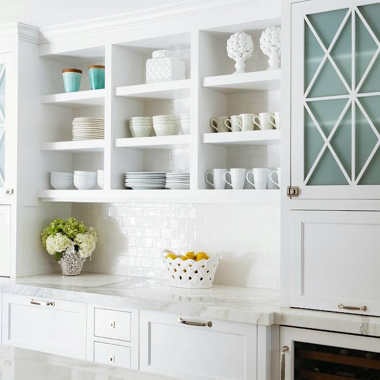
Let’s discuss the laundry in the kitchen.
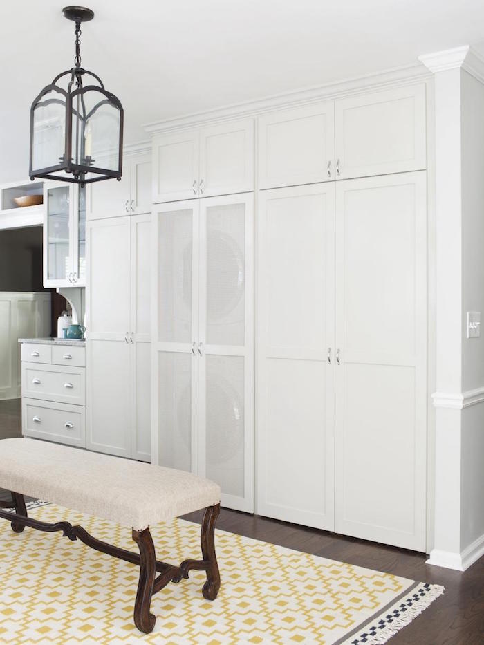
HGTV – photo by Jeffrey Herr
I had a client who does have a washer dryer in the kitchen of her builder home. Actually, it is in the eating part of the kitchen. One solution for Betty who is sans pantry would be to have a top and bottom washer/dry and then use the other section as a pantry, and/or broom closet.
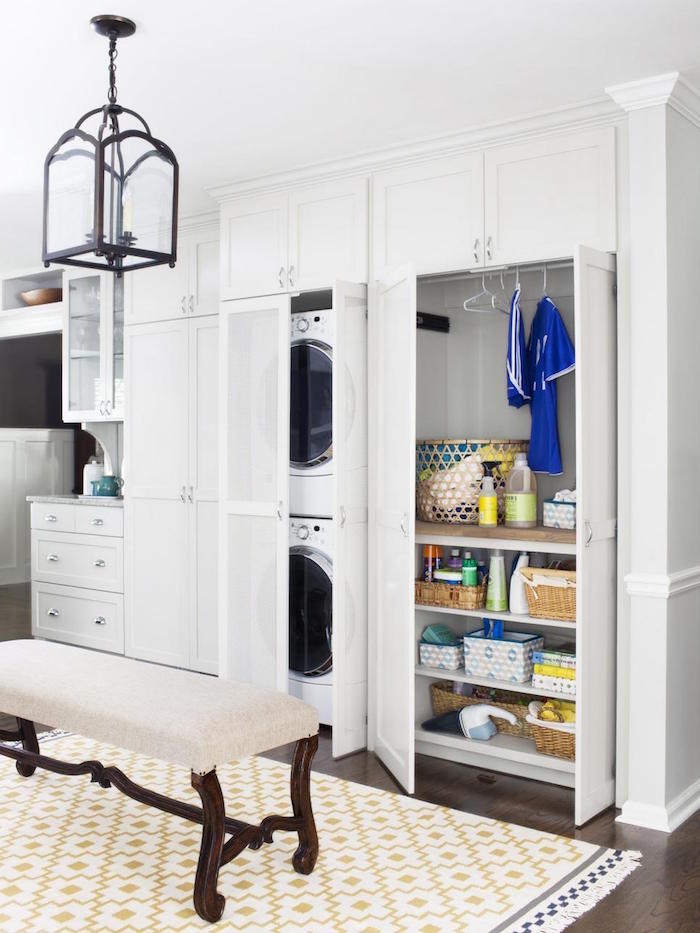
Something like the above situation.
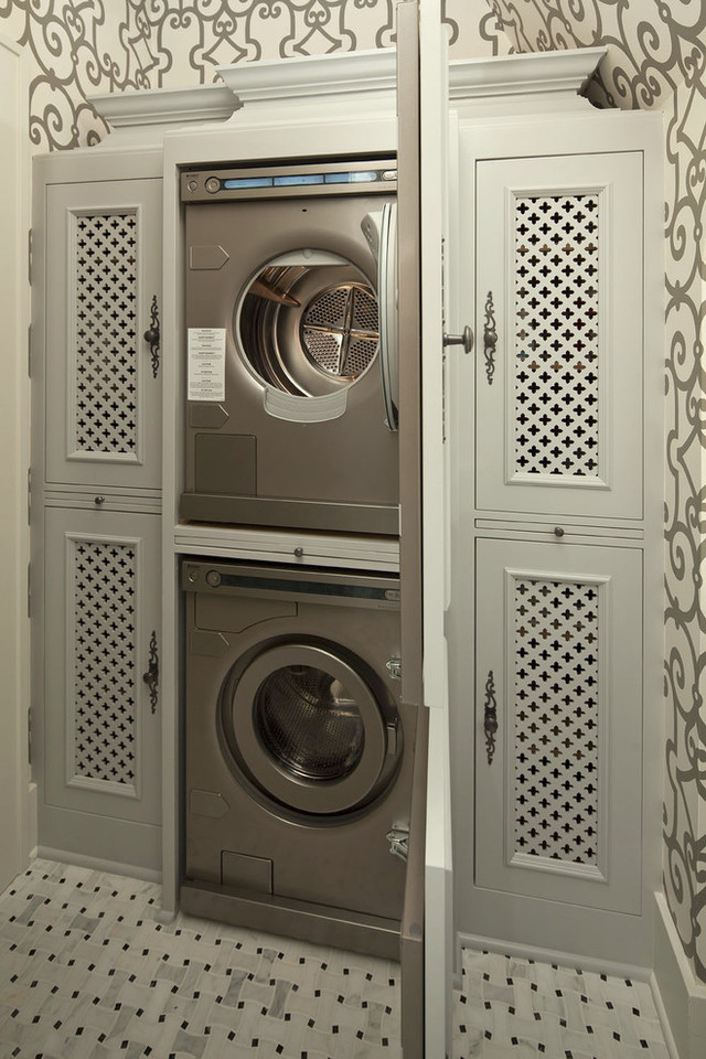
This is a very cool idea, as well. That is a radiator grille material in the doors. Very clever and beautiful!
Okay, let’s move on to the most bizarre piece of architecture to come out of the 1980s-onward builder’s homes.
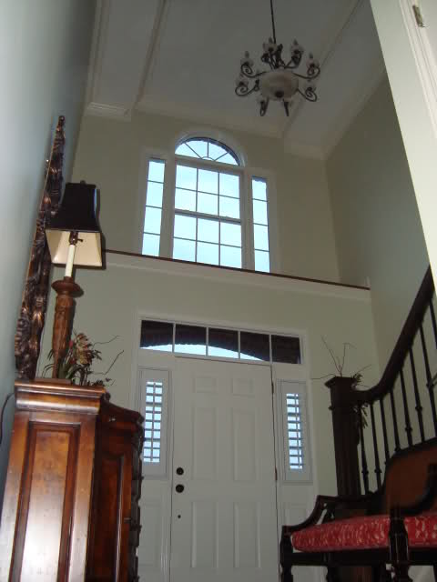 dum dum dum.
The ol’ ledge-going-to-know-where-with-no-access-gathering-copious-amounts-of-dust-over-the-front-door-abomination.
Yes, indeed. Oh, I do kind of understand the logic behind it. Homeowners want to put coats somewhere grumbled the home builder. Fine. There you go. I made them go somewhere.
Yes, typically, what lives underneath the overhang to nowhere are two coat closets. Like I said, I get the need for a closet.
But sorry. It’s shit design.
And, sometimes, there isn’t even a coat closet. There’s nothing but wasted space.
For decades, homeowners have been scratching their perplexed heads wondering what on earth to do with the dangerous and unreachable landing. I have seen it all. Living plants. Dead plants. Dusty plants. Murals. Plastic flowers. You name it.
Let’s take a look at some ways some folks have handled “the ledge to nowhere.”
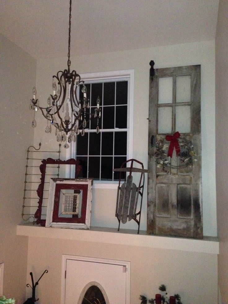
Oh, it’s such a pity when your mother-in-law stops by unexpectedly and the sled falls on her head as she slams the door shut.
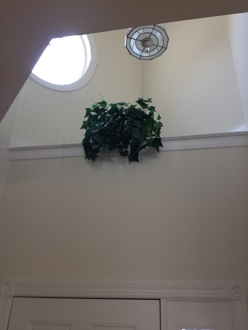
Please, don’t jump!
Oh, wait. It’s plastic. I was nervous there, for a second.
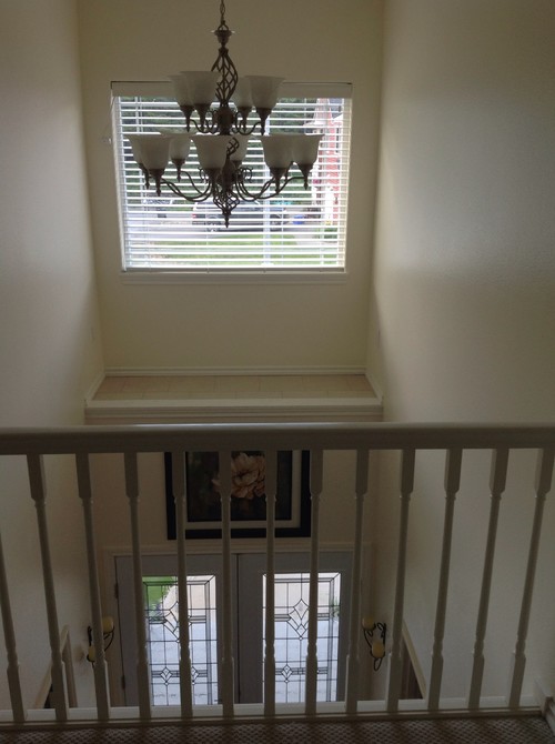
This one, the builder added just for spite.
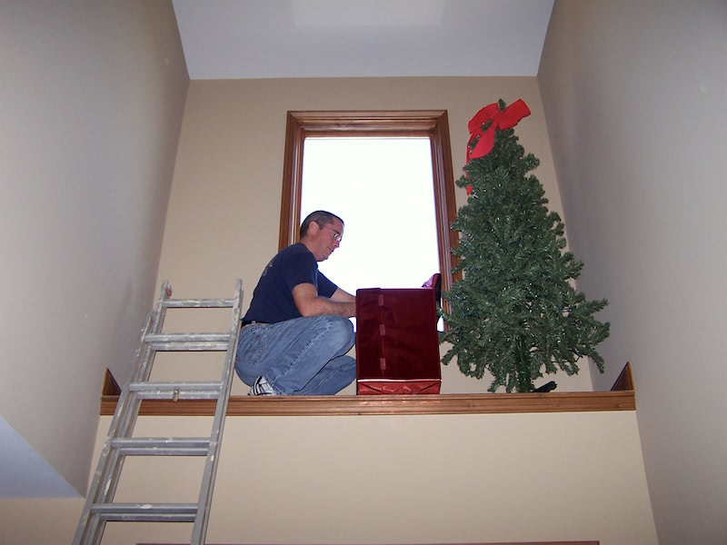
How do these homes get a C of O? Anybody? You can’t take possession of your home without so much as a lightbulb in a ceiling fixture. But, you can build a death-trap of a ledge. Apparently, that’s okay.
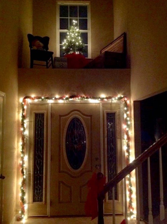 This is seriously disturbing.
Okay, here’s my budget builder upgrade recommendation.
Do nothing. And then, get a Swiffer with an extra-long arm and give it a dusting once a month.
But, if you have some cash to spare, here’s what we did circa 2003. You can tell because the quality of the digital photograph is far from what they are today. At the time, we thought they were just wonderful.
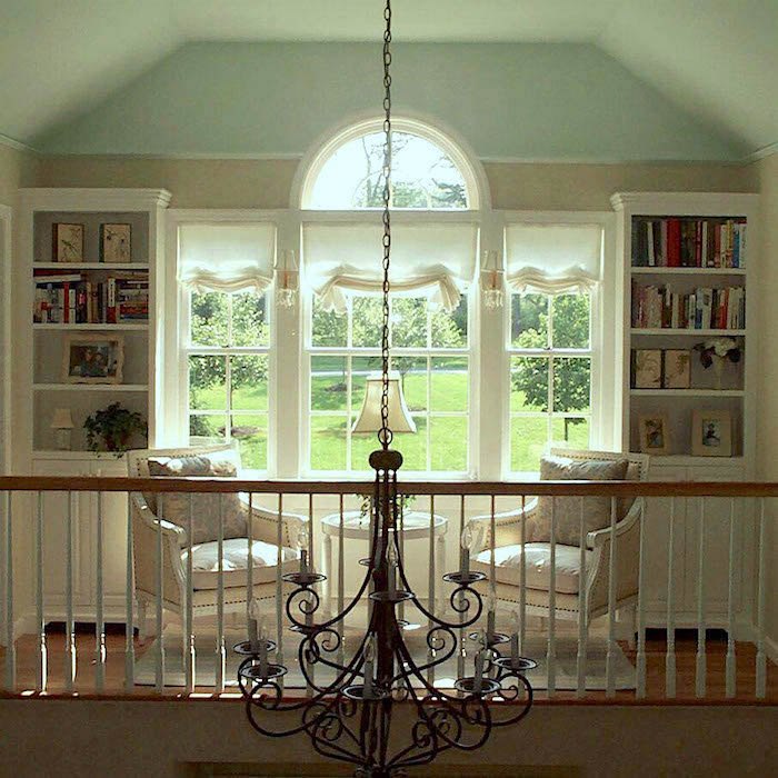
I wish I had a before photo. We were lucky because in this case, the home builder was kind enough to give us four feet to work with. So, the contractor and I were standing in the entry without client looking up. And, I asked him what he thought of putting a railing up there and then putting a door that connected to the master bedroom.
Well, he loved the idea and so did the client.
As you can see, that’s what we did. Then, he added the built-in bookcases. And, we did the chairs and table, too. The chandelier was the only thing that was already there.
So, as long as your ledge is at least two feet deep, you could put in a door (and a coordinating railing) from whatever room and then you could put up some living plants. Or create a little, safe play area.
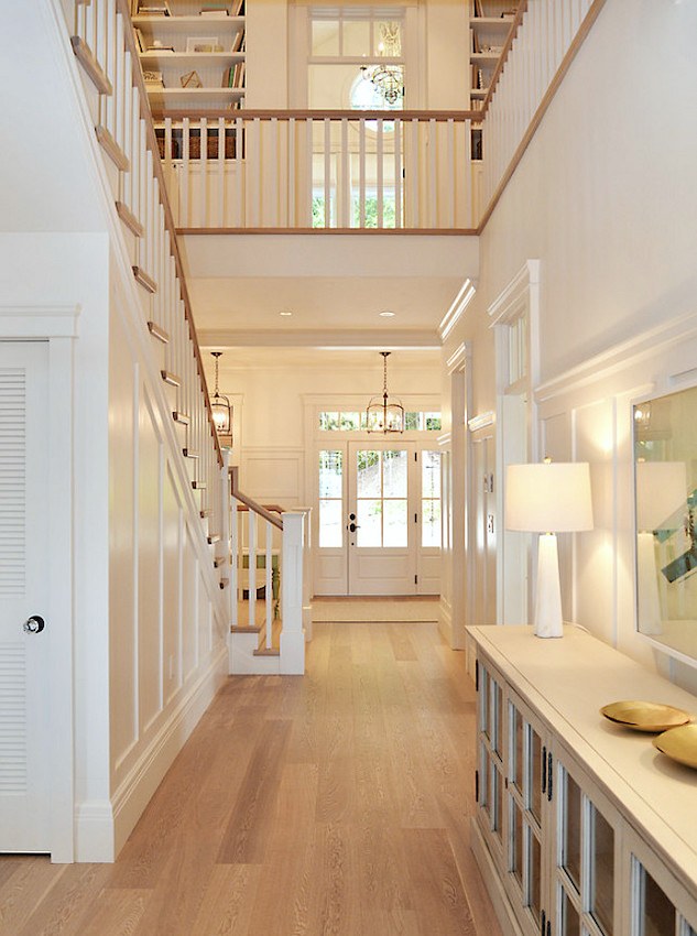
Walter Powell – Architect, Sunshine Coast Home Design, Interior Design Kelly Deck Design, Photo -Linda Sabiston
Another possibility in some cases is to actually build an entire area over the double-story entry. However, you’ll need at least 17 feet to work with, preferably more.
Next up on our list of builder upgrades and related to the balcony idea is the rest of the staircase.
I’m going to present some ideas here, but for a post that’s all about staircases, go here.
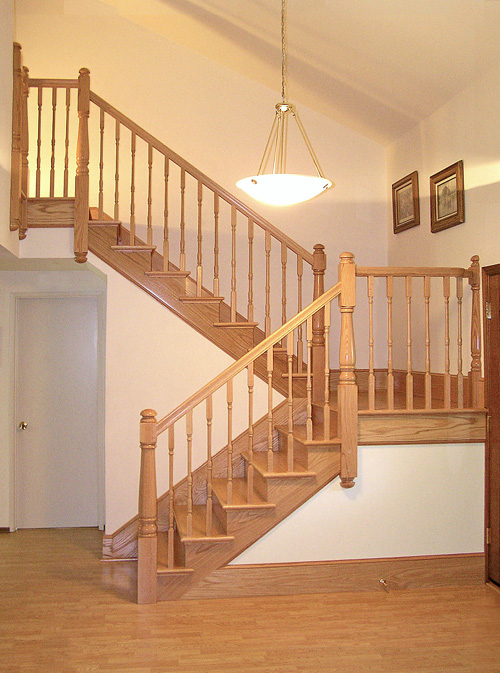
The builders home – standard oak staircase.
In all fairness, this isn’t the worst thing I’ve ever seen. But it’s common and lacks finesse, that’s for sure.
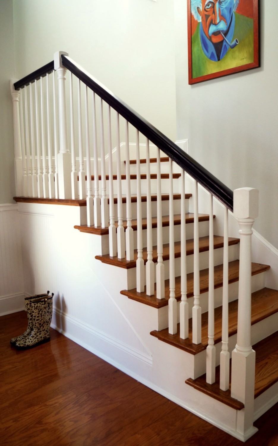
They did a wonderful job of updating their standard builder’s staircase.
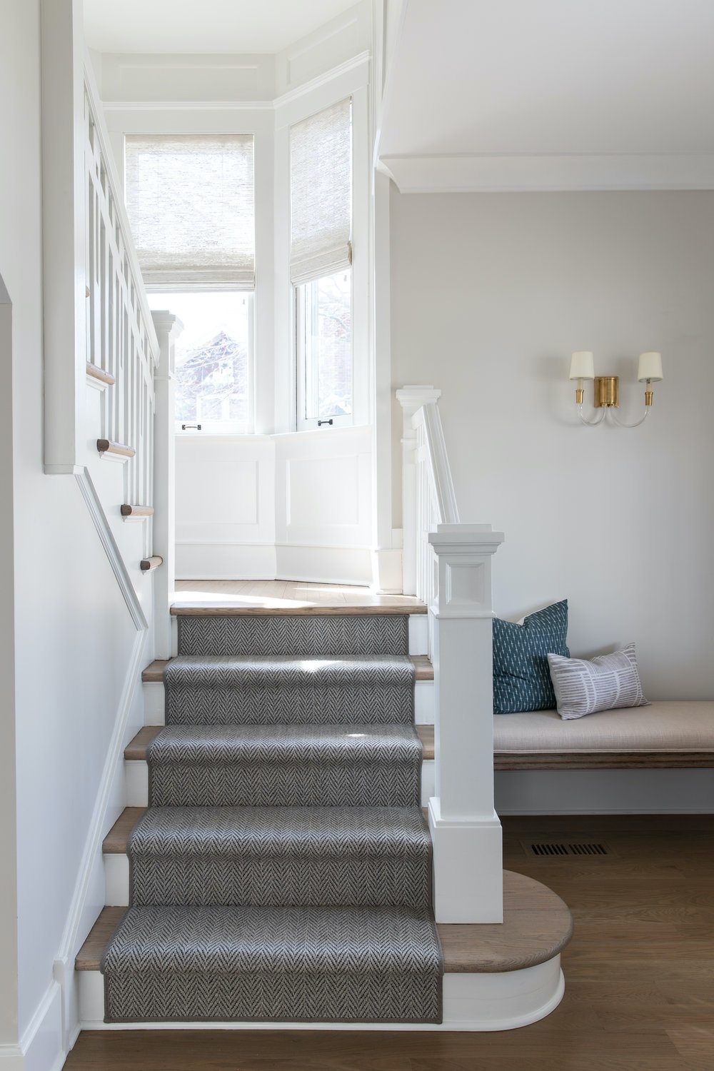
photo – @margaretrajic on instagram
I love how Kate had everything painted white.
Typically, only the spindles and newel post are white. But, a white handrail is also beautiful and a great design choice. It does always work better to paint on unstained wood. We did paint over our stained wood and did have a little chipping. But, it wasn’t terrible.
By the way, please check out Kate’s gorgeous Instagram account and her website. (above link) Both are incredibly lovely. I adore her fresh, young traditional style. I find it quite soothing. So, I think that a lot of you will appreciate that ease on your eyes, especially at this time.
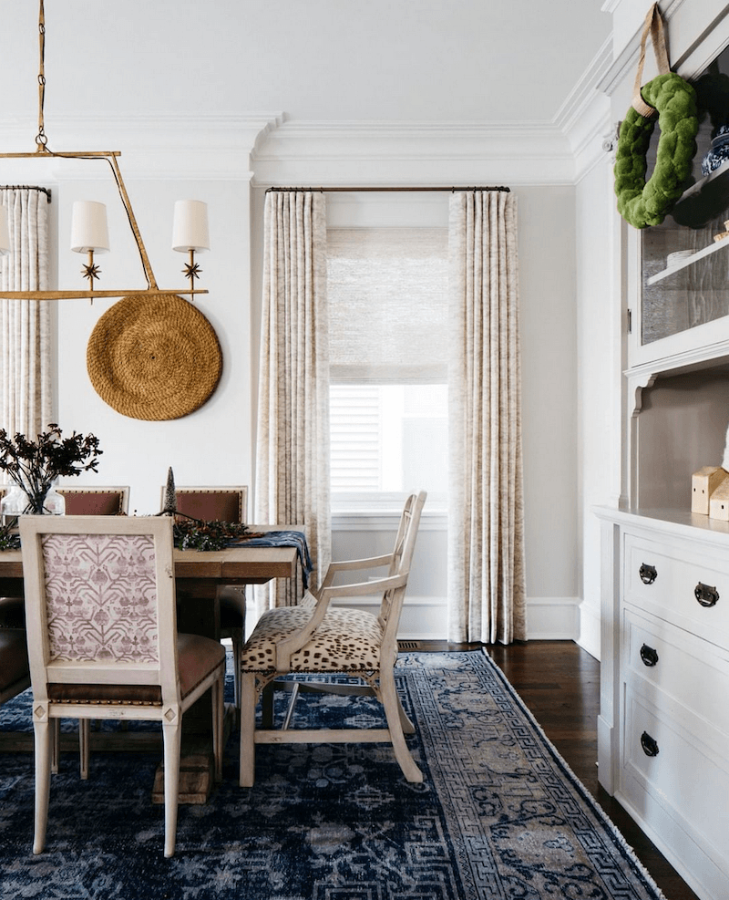
Kate Marker Interiors via instagram
See what I mean? Super talented, she is!
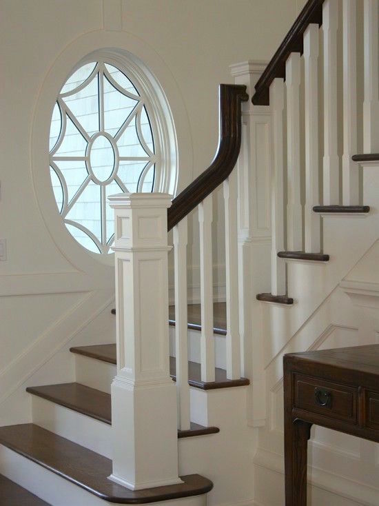
My favorite square newel post. (source unknown)
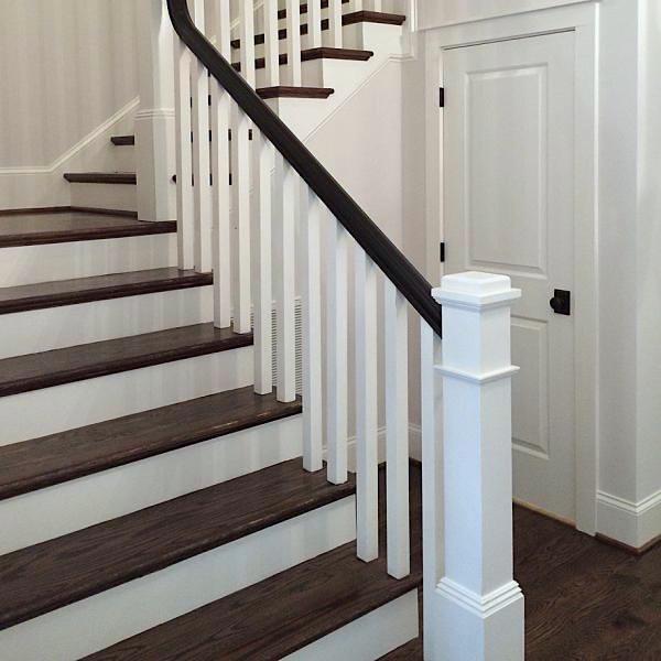
This is from Home Depot. That link will take you to the square ballisters.
I also love the square newel post.
However, I found another newel post that’s actually sold on Etsy.
They really have just about everything on Etsy.
And, if you love Etsy, you’ll also enjoy this recent post.
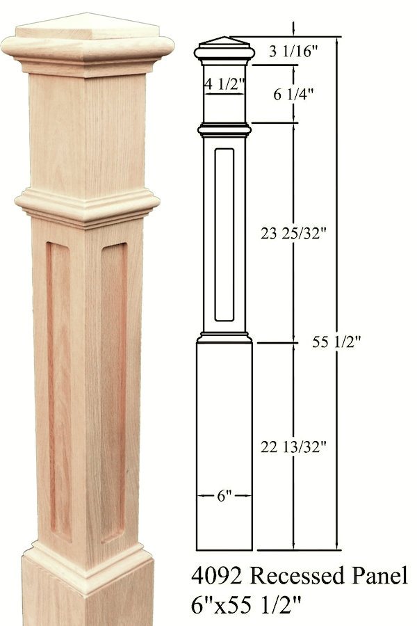
recessed box newel post – premiumstairparts – Etsy
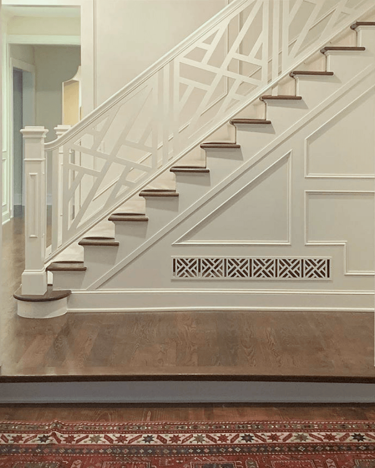
913 interiors – Chinese Chippendale stair railing
Of course, I always go ape for a Chinese Chippendale style railing. And, I love how they coordinated the vent with a coordinating grille. Remember the recent post about how to handle ugly baseboard heaters and radiators?
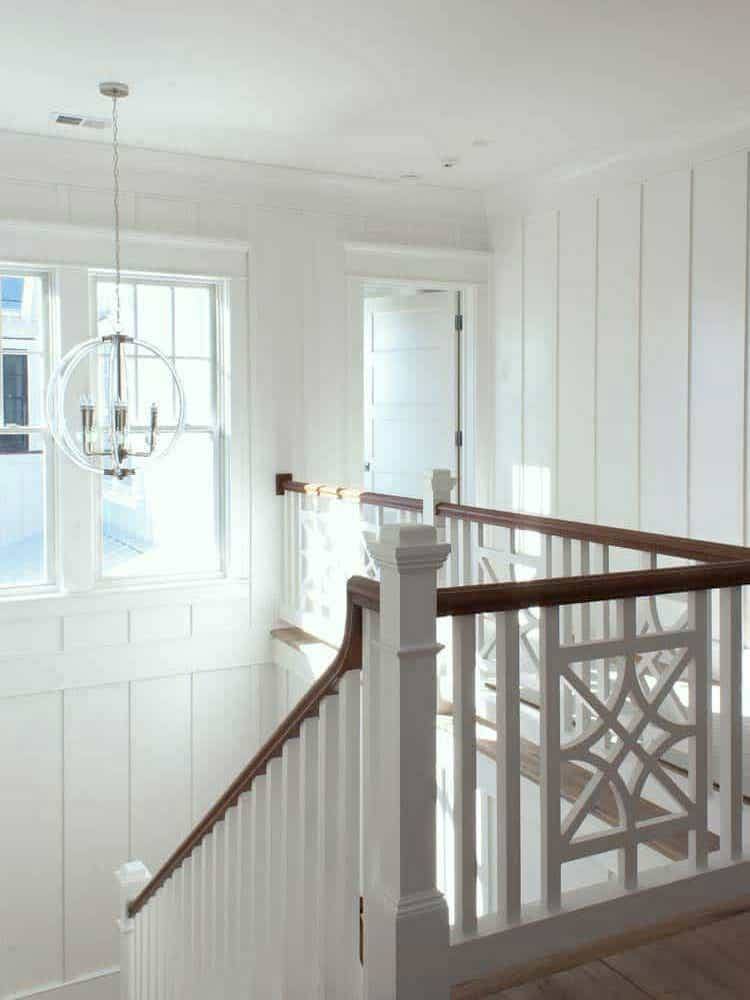
Chippendale design stair rail-The-Guest-House
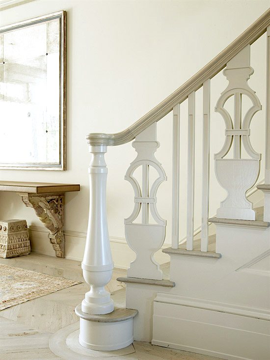
Traditional Home – Louise Brooks of Brooks & Falotico
Here’s one staircase that is anything but standard but I think I love it!
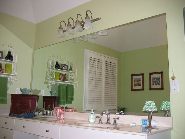
I’ve always adored the idea and have done it at least once. That is, putting a frame around an existing, boring bathroom mirror.
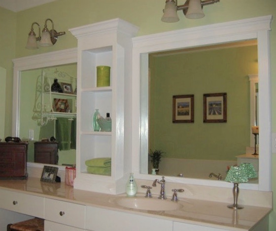
That’s much better! Bathroom makeover by Home Talk
Mouldings are a great upgrade for a builder’s home.
There are many posts that discuss beautiful architectural wall mouldings.
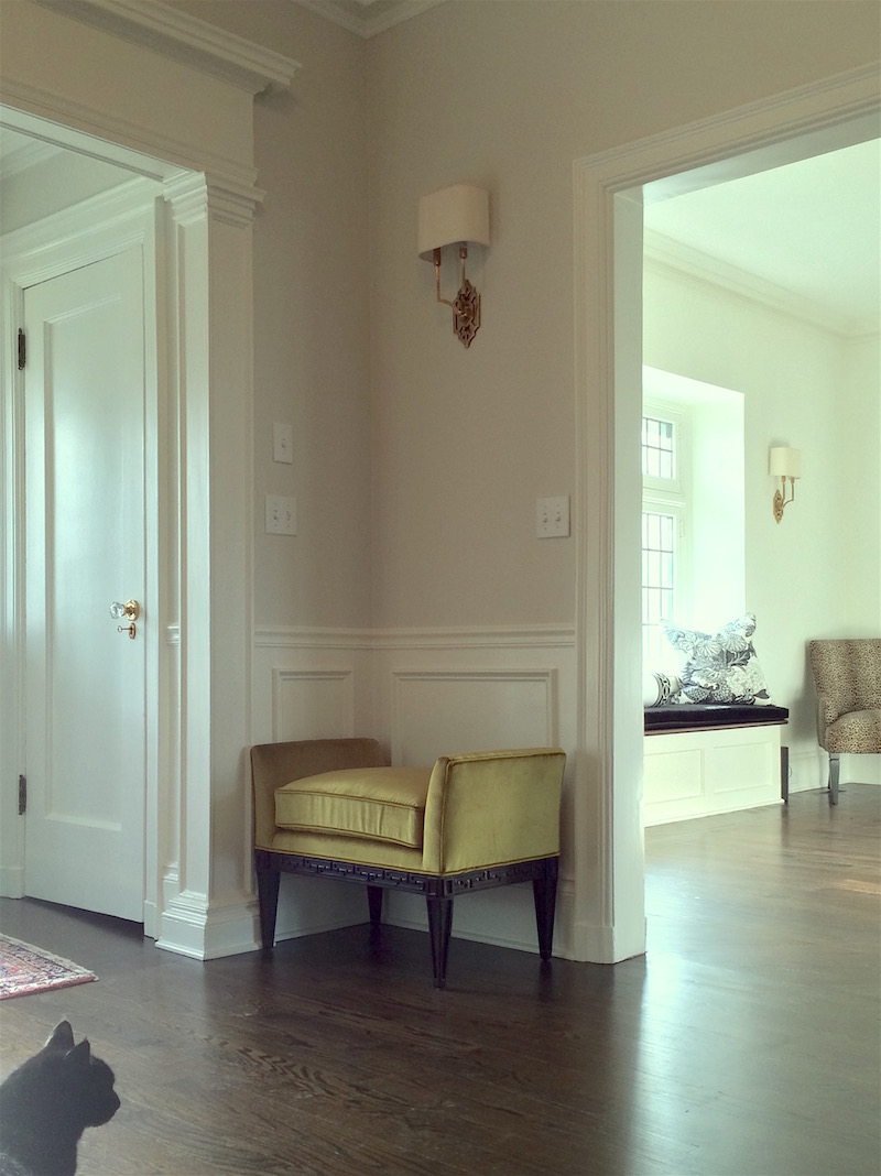
This was a special job I got to work on a few years ago. I talked about it in this post. Although the home isn’t a builder home, it did need some embellishing. The clients did a beautiful job. I came in after they did that. But, I did a lot of other things here.
Love how the door is framed. Very elegant! That was there, I believe, but the wainscoting is new.
To learn all about wainscoting, please check out one of my favorite posts.
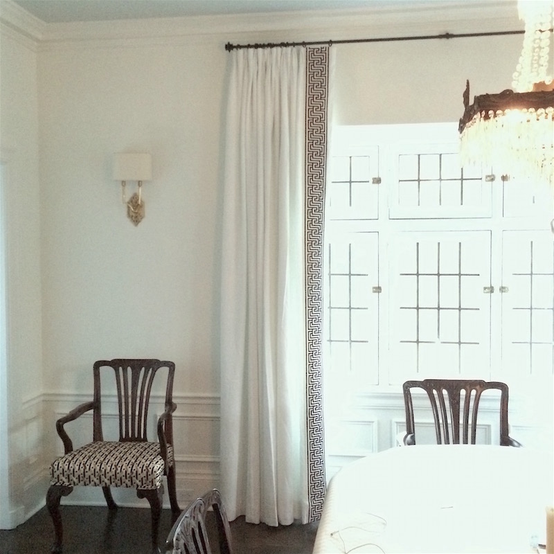
The window treatments in the dining room. The wainscoting is new too.
Oh, you want to know the wall colors?
Yes, please, Laurel…
The walls in the entry are classic gray. Everything else is Cotton Balls except for the ceiling in the dining room which is Glass Slipper. All by Benjamin Moore. And, yes, those are all colors in the Laurel Home Essential Paint and Palette Collection.
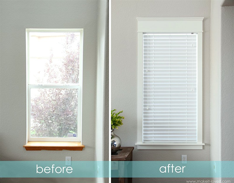
Window and door casings can add so much.
We talked a lot about moulding details in this post. And, how to get the proper porportions.
Windows. Not really much to say. What a difference!
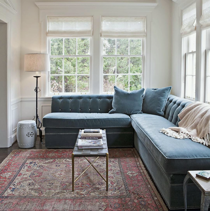
I saw this room a couple of days ago by Rachel Halvorson on her instagram have to admit that I’m a little obsessed with it. I’ve already posted it on instragram, twitter and pinterest. Love everything and especially all the little trim details. That’s what makes it soar, IMO!
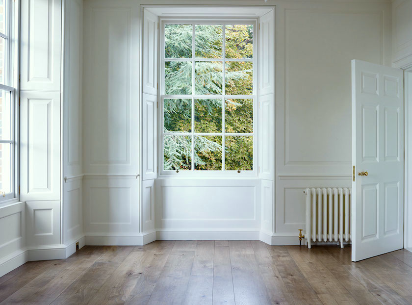
Closing with a little piece of heaven by the wonderfully talented Ben Pentreath. Please check out his website. It is chock full of room candy for days!
Actually, I got to see this gorgeous home when I was in England, but we weren’t allowed to photograph it. But, you can see more of it here.
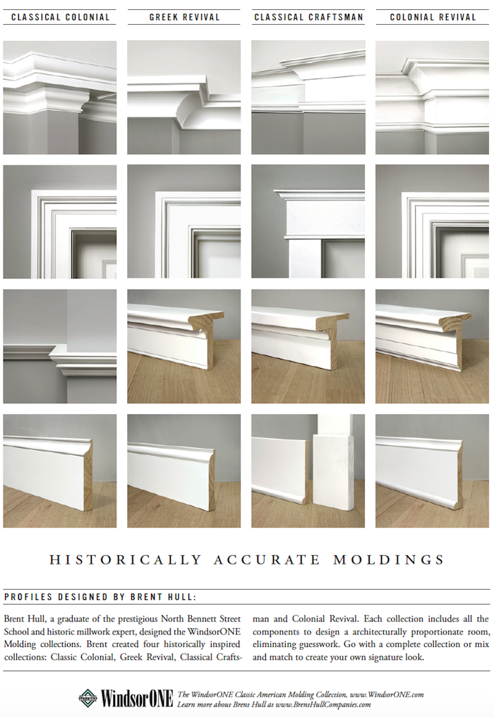
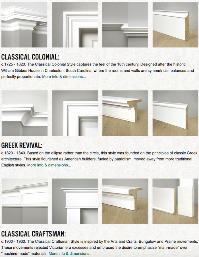
Above, lots of wonderful ideas for classic mouldings from Windsor One. I guess you can tell that mouldings are one of my favorite builder home upgrades.
Please also check out this post for other ideas to spruce up your home.
And, I think this is also a very good post full of ideas for some simple renovations.
please pin to your Pinterest boards for reference
Well, I hope that gave you some ideas for some good builder upgrades
xo,

Please check out the newly updated HOT SALES! Many new sales to see!
Related Posts
 The Guaranteed Way To A Beautiful Room (It’s Not The Wall Color)
 She Loves A Brown, Masculine Room, But He Doesn’t. Huh?
 Three Home Furnishings Trends Revisited 7 Years Later
 How To Get The Cool-High-End Bathroom For A Lot Less
 50 Interior Design Trends for 2020 – In or Out?
 Ranch House Decor Mistakes You Might Be Making
 20 Favorite Exterior Paint Colors + Doors and Trim


