

Dear Laurel,
I know I’ve read somewhere that the gray paint trend is dead. And, thank God, I thought. But, then, a few months ago, I stumbled upon your post from January that says the gray paint trend is not dead because it’s not a trend. Well, something like that.
I will admit, after I finished reading your post about gray paint colors, I adored every image so much that I wondered if perhaps I’ve been gaslighting myself all of this time? I’m only half-joking. Although, I get your point regarding why it is that I’m so over the “gray paint color trend.”
By the way, I’m a decorator, but I’ve only been in business for seven years. I’d like to tell you, if you’re interested, about this awful experience I had about three years ago. I had a young, pregnant client who wanted a “pure gray” paint color. I say “had” because they blessedly fired me.
This is the cool gray paint color true story:
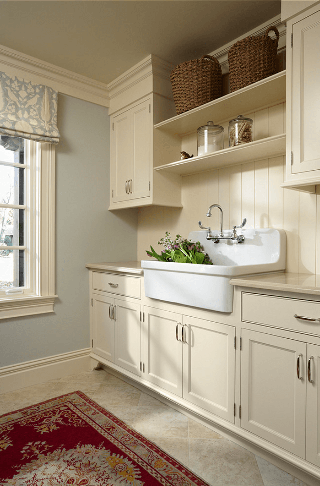
The young clients wanted a PURE GRAY nursery for their male fetus. So, I went over TWICE because hubs wanted to weigh in, and he couldn’t be bothered to attend our first paint meeting even though he works from home. The color we chose is Benjamin Moore Oyster Gray 864, which I now understand is the same as Wickham Gray hc-171. However, on my fan deck, they look slightly different.
Anyway, a week after the paint consult, I got a panicked call from my former client that the walls looked GREEN.
She was beside herself, practically hysterical as if someone was critically ill. I know, Laurel.
I went over to their home the next day. The house stunk of paint fumes to high holy heaven. That struck me as odd because I specified Benjamin Moore Regal Select, which has virtually no smell at all. I used it in my own home, and it was fantastic. Plus, I always spec it, and my clients love it too.
Then, I went into the nursery, and yes, the paint color did have a slight green tinge to it. However, it was late afternoon in the summer with lots of greenery around. I took out my fan deck and pressed it up against the wall. And, the color looked like the one ABOVE Oyster Shell–PEARL GRAY 863.
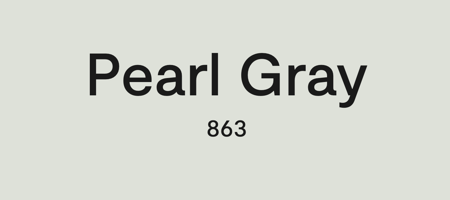

That color definitely has a slight greenish cast. By comparison, Oystershell (directly above) looks like a pure cool gray paint color. And, if anything, it appears to go ever so slightly purple on the fan deck. I would never select a color from anything online! It does look a touch green here, but this is a computer monitor.
So, how in the hell is it possible that it looks green?
I asked to see the paint can. The painter pointed to a plain white can. I took a whiff and knew instantly that this was not Benjamin Moore paint. It appears that her painter used an off-brand, and computer matched it. Ugh, I have not had good luck with that.
Oh, Laurel, I hope you don’t mind this long-winded note.
I asked the painter where he purchased the paint. It was a store I’d never heard of, several miles away. I spoke with the manager and asked him about the paint. He was quite defensive, insisting that it’s IMPOSSIBLE for there to have been a mistake.
I said, “if a human was involved with the paint, it is indeed possible for there to be a mistake.”
He was a complete ass, and that told me everything I needed to know about the so-called Benjamin Moore paint. He was a jerk, I reckon, because he was most likely lying to cover up any culpability.
But, it gets even better. The client blamed ME for the color looking green and expected ME to pay to have the room re-painted. I told her that she, her husband, and I looked at numerous shades of cool gray paint, and we all agreed that Oyster Shell was the best choice. Since I did not purchase the paint, and it appeared to be an off-brand, I told her it wasn’t my responsibility.
And then I got out of there as quickly as possible, praying all the way home that she and her icky-poo husband would fire me.
Blessedly, God heard my prayers, and later that evening came the great news that I was indeed dismissed! Yipppeee!!! However, she asked that I return their $1,000 non-reimbursable design fee.
I wrote her back quickly and said, “I’m sorry it didn’t work out, however, the design fee, per our letter of agreement, only covered the first ten hours, and I have spent over 20 hours measuring, drawing up plans, researching, planning, and visiting your home SEVEN times. However, I am waiving any further billing, and I wish you and your family the best of luck.”
But, do you think that was the end?
No, Laurel. It was not the end.
Princess writes me back and demands that I either return the FULL DESIGN FEE or return and help them further with their paint colors. Otherwise, I would be in “breech” of contract.
WTF???
I wrote back and said:
Dear Princess,
Thank you so much for the kind offer. However, I prefer to remain fired.
All the best,
Aleta.
My husband quipped to me after I shared her email with him:
“Hun, I think she meant in BREACH of contract. The breech is what will happen to her baby if she’s not careful. Hehe.”
Oh man, I needed that laugh.
Anyway, I ignored her, but then, like a painful pimple returning after a long absence, I discovered that she had posted negative reviews all over the freaking internet about me. They were obnoxious defamatory rants filled with lies, half-truths, and glaring omissions. She raked me over the coals but good.
Thank you for listening, Laurel. I feel so much better now.
If you use this for a blog post, I have a couple of questions.
What are the best shades of cool gray paint, and is there a cool gray paint color that is PURE GRAY, with no undertones whatsoever?
By the way, I purchased your fantastic paint guides a few weeks ago and love both parts I and part II, those gorgeous palettes! Laurel, you should be charging at least triple for it. It’s like at least two semesters’ worth of interior design school! And, they’re charging tens of thousands!
Thanks so much for all of your wisdom and blog info.
Aleta Gray
***
Oh wow! Thank you, Aleta, for your kind words and for sharing that unfortunate story. I’m so sorry you had that happen to you. For the other readers, this is a true story from a real person; however, “Aleta Gray” is not her real name. :]
This topic of the best Benjamin Moore cool gray paint colors is terrific, and I love Aleta’s questions.
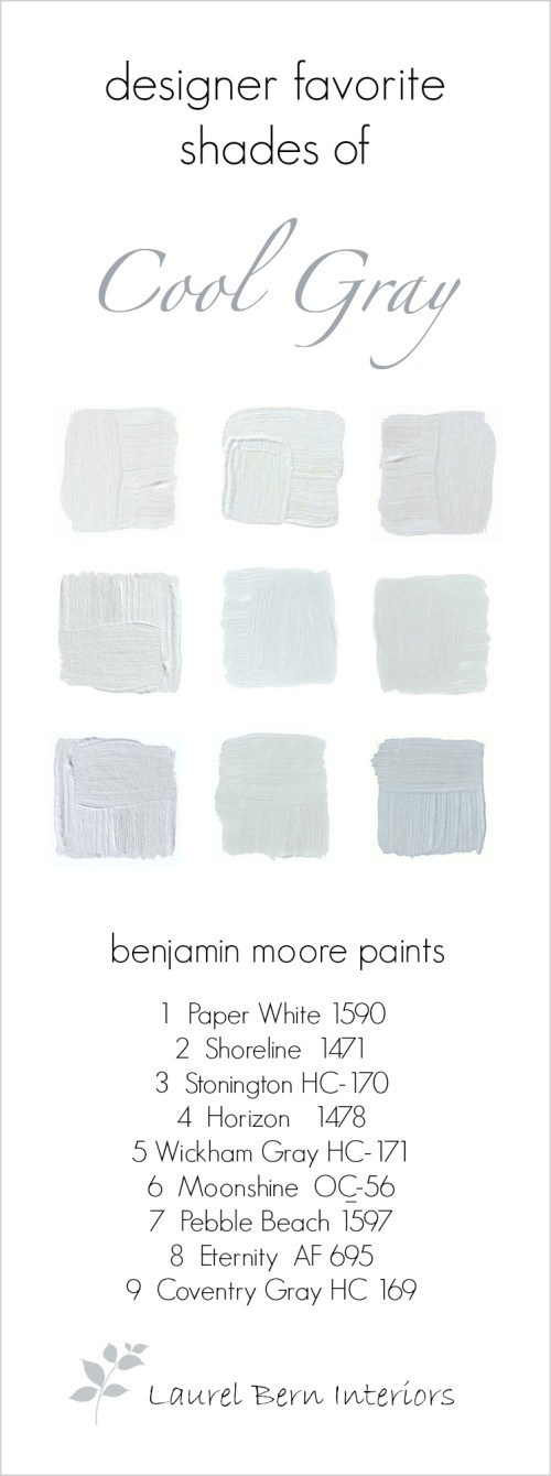
I will also share nine of my favorite Benjamin Moore light to medium, cool gray paint colors.
So let’s dive in with Aleta’s first question.
Is there such a thing as a cool gray paint color that does not read as any other color?
The short answer is, “No, there is no such thing.”
For sure, some will say they’ve found “the one,” the one perfect shade of gray with no visible undertones whatsoever. And, that might be partially true.
For example, this magical shade of gray might look like the perfect shade of gray in the middle of winter at 10:00 in the morning in a south-facing room. But, here’s the problem.
What happens to that perfect shade of cool gray paint with no visible undertones when it’s:
- 8:00 PM in the summer?
- 1:00 PM on a sunny fall day?
- 10:00 PM any time of the year?
And, what happens if you try that same color in a north-facing room and it suddenly looks baby blue?
Or, you move to a new home using that perfect shade of cool gray paint, and now, it looks ever so slightly golden beige?
I can pretty much guarantee that this perfect shade of gray with no visible undertones will not look like it has no undertones in each of those situations.
It’s even possible that if Princess would calm the freak down, that “green” paint might very well look slightly lavender six months later on a cloudy winter day.
WHY does this happen?
Oh, I know that you already know. Yes, it’s the sun! Often it’s yellow, but no wait, now it’s orange…red, brown, purple, gone. Now, we need to turn on the lights. What color are they, white, yellow, pink? Tomorrow the sun will be obscured by clouds, so the sun will be gray, and then six months from now, the sun will be shining through masses of green leaves.
In addition, there are the other interior colors at play:
- the color of your floor
- direction of the light… The variables go on and on and on.
And, those light changes will change the perception of the paint color, from one thing to another.
Another factor that’s really freaky is one person’s perception of color is not the same as another. We all see colors slightly differently. Remember this fun experiment where we looked at a shade of blue thinking it was a pure blue? Please go here to check it out.
So, here’s what I suggest and as I have before, when trying to figure out how to control the uncontrollable.
I mean, you’re going to drive yourself nuts.
Gosh, I drive myself nuts, too, sometimes. However, it’s not necessary. There are some things we can change, but most things (and people), we cannot change. That goes for paint colors, as well.
The harsh reality about the best cool gray paint colors is that 99% of the time they are going to look more like:
green, blue, purple, or a combination of those.
And, here’s the super yucky part. Sometimes, a cool gray paint color will look slightly lavender on one wall and slightly gold on another. I’ve seen this numerous times, including in my own home, as evidenced in this post written shortly after I moved to Boston about my changing Benjamin Moore Classic Gray walls.
But, the freaky nature of paint colors on the wall is why you must test, test, test! And in all kinds of lighting situations.
However, there is one situation where the paint color will be pretty constant.
There is, Laurel?
Yes, the color should remain fairly consistent in a room with no windows.
In fact, I have a windowless room with one of my favorite Benjamin Moore Cool Gray Paint Colors. (Yes, it’s in the Laurel Home paint and palette collection!)
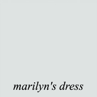
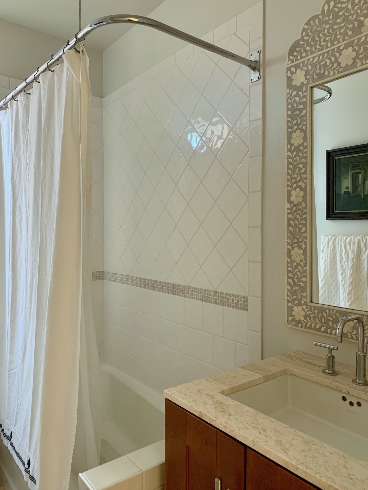
Coincidentally, my upstairs WINDOWLESS bathroom was already painted MARILYN’S DRESS. It was already in the LH Paint and Palette collection, but I never used it for myself. Anyway, I love it! I feel it’s probably one of the most blue of these cool gray paint colors, but it’s a very ethereal pale gray-blue.
Hold on a sec please; suddenly, I am sitting in the dark. haha. Hang on; I’ll be back in a jiffy. ;]
The Best Benjamin Moore cool gray paint colors.
Isn’t gray, by definition, cool? Well, some are, and some have a warm tone that goes slightly brown, beige, lavender, or khaki. We’ll be getting to the warm grays, too. However, today, we are focusing on the best Benjamin Moore cool gray paint colors.
You might enjoy this post about someone who’s wondering if their warm color scheme is going to look dated, one day.
By the way, I do realize that Sherwin Williams and Farrow & Ball make some lovely shades of gray; however, for now, I’m focusing on Benjamin Moore cool gray paint colors. However, numerous posts discuss many wonderful gray Farrow & Ball paint colors. You can see them here.
You can also purchase Farrow & Ball paints and wallpaper online now!
Nine fabulous Benjamin Moore Cool Gray Paint Colors
(colors marked with a hot pink asterisk * are in the Laurel Home Paint and Palette Collection.)
My old bathroom in New York shortly before I moved in 2020, painted Benjamin Moore Paper White

* PAPERWHITE 1590 – Paper White is a very soft, verrrrrry pale gray. It is so pale that it might look white in some lights, especially in a brightly lit room. Or, if juxtaposed next to a deep color. It is actually not terribly cool, but not warm either. It’s a very pale dove-gray and a wonderful choice for anyone wanting to give a pale gray room a go.
Of all of the cool pale gray paint colors, Benjamin Moore Paper White has very little undertone that I can discern.
However, it’s a chameleon color that can go slightly lavender or blue. It looked beautiful in my little New York bathroom.

SHORELINE-1471
My bathroom again. This was my crappy paint job from several years earlier. However, Shoreline is a beautiful cool, gray paint color.
Please enjoy this old post about great pale gray shades for bathrooms. Shoreline did have a subtle blue undertone, and at night, it went a little more green with the lighting. Either way, I loved it. It reads just a shade deeper than Paper White but is still quite pale.
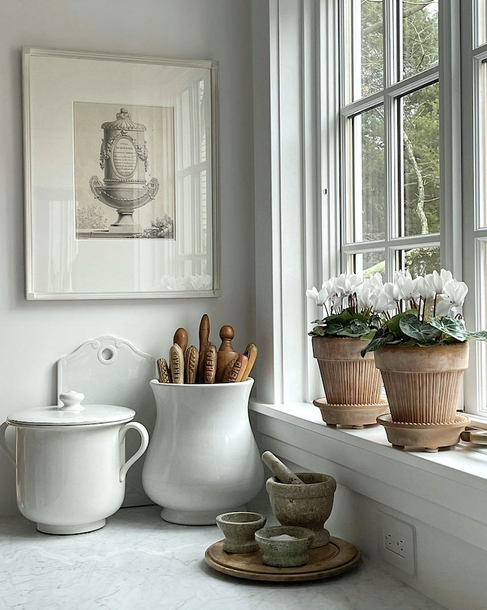
Above is a much better image by the always fabulous Loi Thai, who now has a thriving Instagram account. Please follow him there, if you’re not already.
This image is the perfect lesson in using gray so that it’s stunning and NEVER boring.
Loi layers his soft pale gray paint colors with whites and other shades of gray. He introduces a touch of green with the plants. And, what I think is an essential element, is an accent or accents of warmth. Here it is with the terra cotta, pots, and collection of vintage wood-stained rolling pins.
A common mistake, in my opinion, when doing a room with a lot of gray colors is to make EVERYTHING gray.
Otherwise, it’s like flying through the clouds.
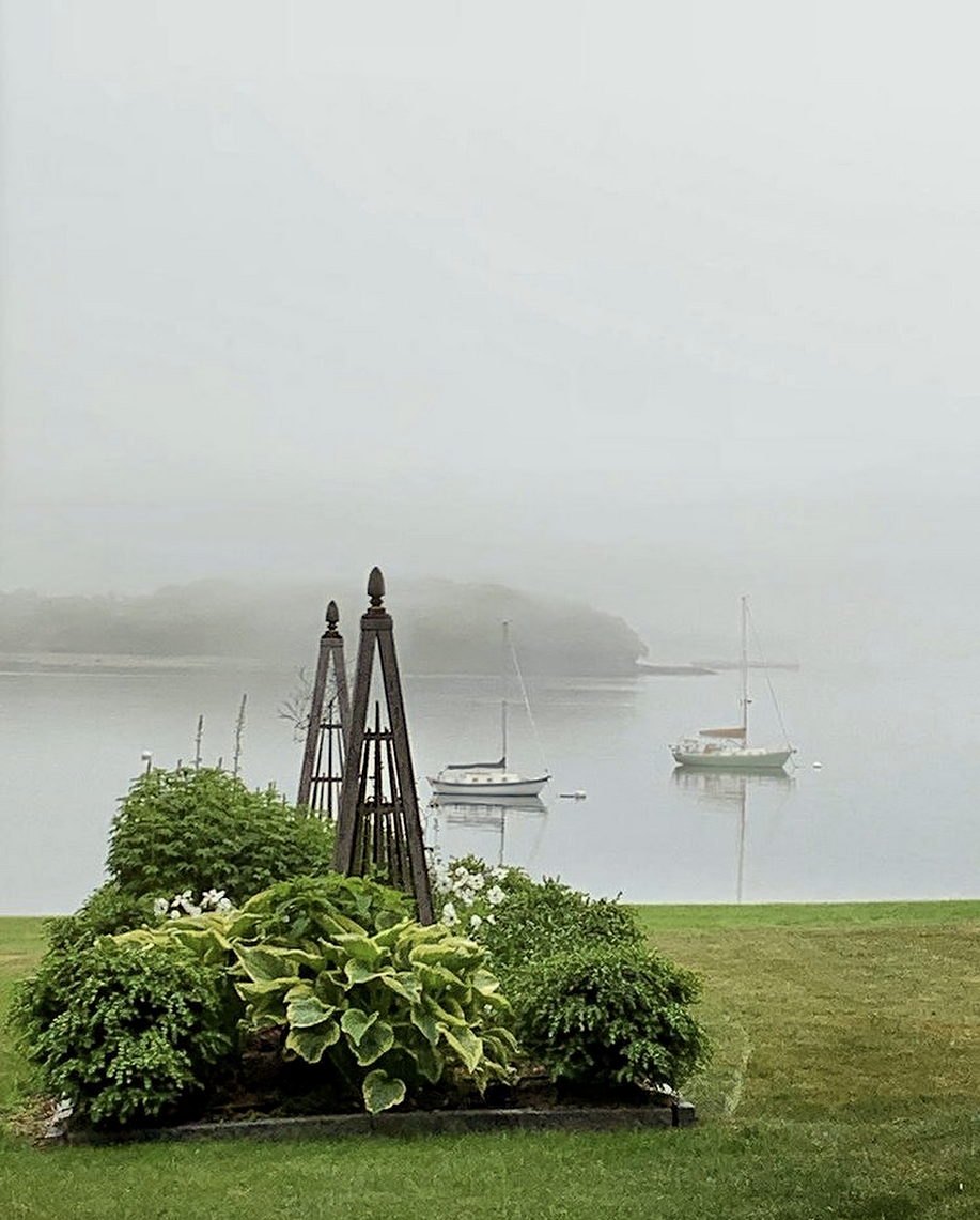
Another image I swiped from Loi Thai’s exquisite Insta account is this beauty from his exquisite summer home in Maine. I love the contrast between the vibrant green and gray fog. Gray LOVES green! In fact, it’s a color that loves all colors.

* STONINGTON GRAY HC-170
Stonington is a favorite amongst gray aficionados. It is a lot like Shoreline but a touch deeper. It does have a touch of a cool blue or sometimes blue-green or slight green undertone. However, this color can read as a pure gray in some lights.
![Benjamin Moore Cool Gray Paint Colors Horizon - Murphy Co. Design Susan Gilmore [photo] interior design - Marita Simmons](https://laurelberninteriors.com/wp-content/uploads/2015/03/horizon-benjamin-moore.png)
Murphy Co. Design Susan Gilmore [photo] interior design – Marita Simmons

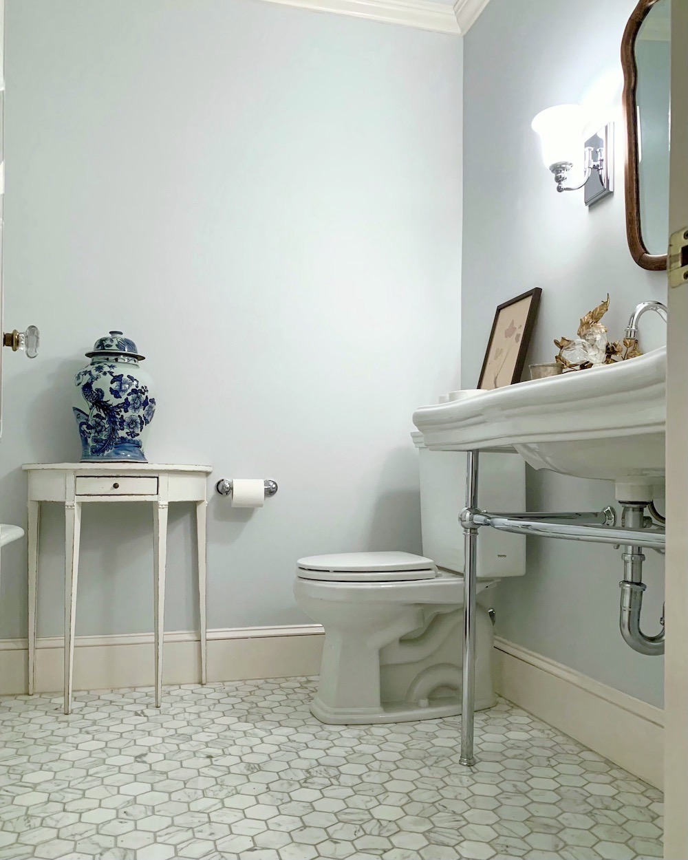
* HORIZON-1478
Another popular cool gray color is Benjamin Moore Horizon. Before selling our home, I had painted our master bedroom and bathroom in this soft color. I think this color is fabulous for bathrooms, especially with Carrara Marble.
Our bathroom only had a small skylight, but I liked the color, as it looked lovely with the Carrara marble in there. Horizon looks darker than on the chip. In the bedroom which faces south-east, and is quite bright, I was less impressed.
However, that doesn’t mean that this is a bad color. The bedroom was devoid of architectural interest. So, in a room with lots of moldings, I think it would be a great color! It is a pale gray with a bit of blue-green in it. But, it is not at all icy!
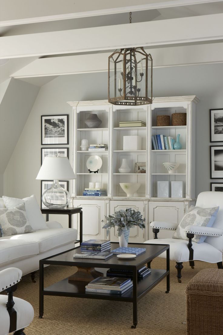
 WICKHAM GRAY-HC-171
Wickham gray is a beautiful pale gray with a lovely blue-green undertone. It will not read as pure gray, but it doesn’t look like baby blue. I used it in a very dark entry, which was a great choice.
Wickham Gray is the color that Benjamin Moore is saying is the same as Aleta’s Oyster Gray. And yes, in my fan deck, it also looks slightly different from Wickham Gray.
Let’s see if they look different on the internet.
Above is Oyster Shell
And, above is Wickham Gray.
They look pretty close, but when I look at them side by side, Wickham does look a bit more blue-green to me. But, we’re splitting hairs.
But, the fan deck issue reminds me of an important point, about cool gray paint colors and all colors, for that matter.
Paint colors can and often do appear slightly different from other fan decks with the same color. This is because there are also dye lots in the chips AND the paint itself. Plus, if one fan deck is five years old and the other one is new, the colors could be different.
That is another reason why we need to CHILL. ;]
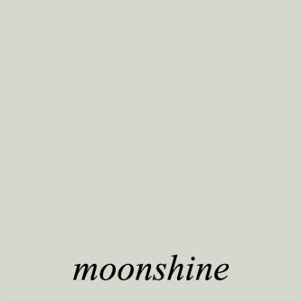
* MOONSHINE-OC 56
Moonshine is a pale gray with slight green undertones. I’ve never used it, but there are folks who adore this soft shade.

* PEBBLE BEACH-1597
Several years ago, I specified this color for a master bedroom, and the client loved it madly! It’s one of those that changes a lot with the light. Sometimes it reads ever so slightly lavender and sometimes goes a bit blue, but a very nice grayed-out blue. It’s a very soft color and wonderful for a bedroom.
Murphy Co. Design Susan Gilmore [photo] interior design – Marita Simmons
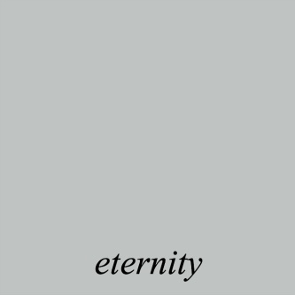
ETERNITY-AF-695
This lovely is on the Affinity fan deck and a bit deeper than Pebble Beach, with blue undertones. If you don’t know, the affinity colors were the first low VOC colors that came out at least 15 years ago.
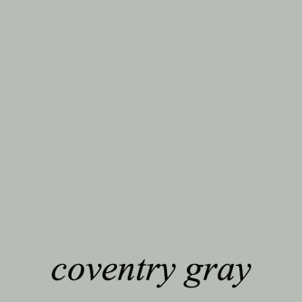
* COVENTRY GRAY-HC-169
Coventry is a bit darker than eternity. It is a little deeper than Stonington Gray and a bit bluer, as well. Again, I’ve never used it, but it has gotten rave reviews.
For your Pinterest boards, below is a recap of the Benjamin Moore cool gray paint colors.
I hope you enjoyed this post about some of my favorite Benjamin Moore cool gray paint colors.
Eternity did make the shortlist for the Laurel Home paint collection. However, I chose a couple of others for the paint collection that are not in this post. I decided to not use Eternity because it is in a different fan deck. Most of the colors are in the two big fan decks. There are 144 colors in total in the collection.
xo,

Please check out the newly updated HOT SALES!
Related Posts
 Beige Decor — How To Make It Go From Boring To Sensational!
 54 Iconic Designer Fabrics To Make Your Room Look Rich
 The Only Six White Wall and Trim Colors You’ll Need
 20 Timeless Kitchens You’re Going To Love Forever
 Six Drab Paint Colors – Should You Try Them?
 Small Living Room Decor -Should It Be Pale or Dark?
 A Virtual Kitchen Design And The Results Are Stunning!


25 Responses
I have an entire musical production around the dangers of paint switching, along with dancing girls and a big band. My clients are trained to caution their paint contractor to not even *think* of going off brand. Lol. I still inspect the site and look for BM cans and/or ask my client to do it. I also spec the BM primer because BM doesn’t guarantee their paint unless their own primer is used.
Oh, I gave up trusting people long ago. I purchase the paint for my painters, and I use the most persnickety painter I can find.
Or, you could take the trouble to verify–I buy a sample, put it on the walls myself and look at it at different times of day. Then, I schedule the painter and buy the paint, pick it up, label it and the walls and trim with the color for each. If you stop trusting people and stop believing people are intelligent, you suffer many fewer setbacks. Sorry to be cynical, but that’s the way it is.
Thanks sooo much. My summer hair is really needing a fix, so I will certainly contact him. And you always look beautiful in your pics!
I think this chick moved to south Florida afterward and I got her!! What she did down here was ship down her paint from New England from some unknown company, complain when the color looked different on walls in a yellow stucco condo with lots of asphalt and heavily tinted windows, as opposed to Nantucket with a water view, and then get all out of joint because my Ben Moore painter said the coverage was poor, would require multiple coats, and wanted more money.
True story!
Laurel I am a little late reading your blog. It’s summer and we are always in a rush to get to the beach and get “our” parking space. I had a client/friend who wanted “just f-ing gray” no undertones. She went to the paint store and told them she wanted JFG. In the meantime I called a Benjamin Moore representative and asked for GRAY with nothing else. The color he recommended was Marilyn’s Dress which had gone blue when my friend used it before. I used Paperwhite in our bedroom inn Atlanta and it was gorgeous. Our bedroom here it was dull…ANyway she went back to the store and he had a sample for and named it “Just f-ing Gray”.
Cataract surgery made a big difference to me…I’m glad I had it done BEFORE we remodeled and I had to choose colors. Everything came out great!
I have had to do the same thing, Jeanne. If the contractor does not want to use Benjamin Moore paint, I just say then I will buy the paint. I also check the paint cans before a painter starts painting to make sure that the paint is what I specified. I know it sounds like going overboard but it saves a lot of time and angst. Otherwise, when I go to touch up areas, using the BM paint I had specified, you can tell the difference.
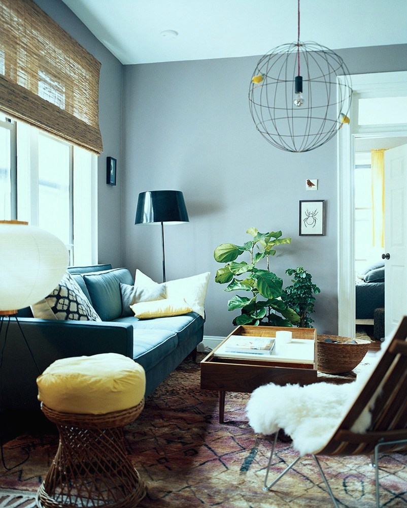
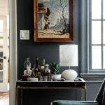
Just curious, I hope you will answer……is the ceiling in the last photo blue, or is it a reflection? All this talk of undertones and the variables that influence what the eye transmits to the brain has me wondering.
Thank you always for sharing.
Hi Sande,
Well, it does look like a pale blue-gray, but it could be the photo; not sure.
One more thing about colour perception, I recently had cataract eye surgery, with (clear) lens implants to improve vision. Magically! Not only can I see MUCH better, but the slight yellow haze, in no longer altering colours.
OH,… and I too had specified Benny Moore paint when we moved to a new home. Unbeknownst to me, until the entire house was painted, in our absence, painter had used a ghastly inferior brand of paint.Grrr.
All windows are green glass now. I see big squares of green tinge on my walls when it’s bright out, even if it’s not direct sun. My breakfast room is only 8 feet deep with a very large window and the wall opposite it gets so green that it actually bounces onto the other walls. I once rented an apartment with trees right up to the bedroom window, bright sunlight and the walls looked bright Lime when they were painted light beige. I got into it with my painter when I had my bedroom painted a very grey green and a big patch looked bottle green — it’s the low-v glass. Tragic.
Hi Laurel,
I love reading your blog! Being someone who has sampled many shades of gray, the best one that worked for my old plaster walls and the amount of sunlight I have was Bunny Gray by Ben Moore. I’m happy every time I walk into the room!
We corresponded before (remember the mermaid in my living room?) and you gave me some good insight. But I have a more personal question now. Will you share the name of your Mt. Kisco hairdresser and her shop? I’ve decided it’s a time for a change (just like in my mermaid beach house…which we now plan to sell at the end of the season instead of retiring there).
Thanks…and as someone who has many fond memories of Boston, I am happy the move is giving you joy!
Gail (from Westchester)
Hi Gail,
I had to check my email and then it all came flooding back. There’s a blog post somewhere about the home, I believe. My stylist in NY is Matt Cucolo, co-owner of Ave 145 on Kisco Ave, in M.K. of course. I actually talked about him (with his permission), in this post.
He’s awesome and I miss him. However, I found a very talented woman in Boston, as I hope is evidenced in the pics I post here.
While some gray themes are cold and dreary, you’ve proven it can be done right!
Last year I was struggling to find just the right pale gray for our upstairs. The previous color was supposed to be gray but looked baby blue (yuk!). I tried many of your “go to” grays, only for them to read “beige” in my bedroom with lots of north light.
Our new carpet is a gray Berber with definite cool green undertones. When I finally found my paint color – Benjamin Moore’s Vapor Trails – it was magical! We get tons of compliments from all who see it. And it looks great with creamy white trim (Linen White is the closest match) as well as blond and dark brown furniture. It’s also a great, neutral backdrop for lots of art.
Those grays are beautiful.
I love gray and hated the gray trend. Rooms that epitomized the trend were cold and uninteresting. But gray used in the ways you show look classic, not trendy.
When we redid our bathroom 17 years ago, I found an inspiration photo with gray and white tile combined in various ways. Finding the right tile was quite difficult because we were deep in the brown trend, but eventually I found it. The bathroom includes lots of white, including walls painted Garden White, a Ralph Lauren paint with an extremely faint cool pink cast. I have loved that bathroom for all 17 years. When things are right, they don’t need changing.
I am surprised and a little disappointed not to see Benjamin Moore Mt. Rainier Gray listed. I have it on the walls of my SE facing living room, where the very slightly blue undertone enlivens a a dreary day and the cool pure gray is perfect at night. Take another look at this color, Laurel.
Hi Sandra,
I just took a look at it and I would classify Mt. Rainier Gray as a blue-gray, not a gray-blue. So, this one does not have enough gray in it for this post, in any case. However, it’s in some serious competition with Quiet Moments which stole my heart many years ago. That’s not to say it’s not a great color. There are dozens of beautiful colors I didn’t include.
I agree. The fun is in the undertones 🙂
I have never had a painter who did NOT switch to a cheaper brand, thus increasing his profit. The colors are not exact and the difference is obvious. Of course the painters didn’t tell me they switched brands but the paint can is the proof. On my last paint job I INSISTED that I buy my own BM paint. I got exactly what I wanted: Nantucket Breeze.
Hi Jeanne,
Now THAT is highly unethical and might be a good reason to give someone a bad review. However, I still would not diss a person on the internet, and especially make character judgments. #tacky
Something I had in my letter of agreement was that I wasn’t responsible for the poor performance of a product, due to situations out of my control. However, I would certainly do everything in my power to make it right for them. I can’t speak for Aleta, but it sounds like if the people had been more sensible, she most likely would’ve helped them reselect a paint color. All it would’ve been would’ve been one more coat of paint, as the color only needed tweaking. Maybe it would’ve cost a few hundred dollars. I imagine the nursery wasn’t a large room.
In this case, Aleta did nothing wrong. The painter hired had no affiliation with Aleta, therefore, the clients were on their own with this painter. It was his responsibility to make sure he has purchased the correct color, that it was mixed CORRECTLY, and make sure the homeowner is happy with it before he paints the entire room. Mistakes have been made. I can think of two situations where the paint store did make a booboo with the formula and the color was clearly wrong.
My clients knew it wasn’t my fault, but of course, I came over and worked with them to fix it.
But, yes, to be safe, there is nothing that should be stopping a homeowner from purchasing their own paint. They have to purchase it from the painter, anyway.
One of things I like about paint is how it changes with the light! I love these pretty soft greys you are showing us 💗
I’ll take this opportunity to be a little opinionated about grey paints. Undertones may be tricky to get right, but they add so much depth and nuance. Getting the undertones right is so worth it. Otherwise, grey paint can look like, we’ll, grey primer.
What lovely photos! I tired of gray over the last several years because I saw so many monotone gray rooms (walls, floors, furniture, etc. all gray). I do think gray can be a perfect backdrop for other hues, though.
I have unfortunately experienced a painting contractor who switched paint manufacturers on me. Some rooms were ok, some looked completely different – in a bad way. Also, color is relative – It looks different depending on what other colors are in the room (or out the window).
I had an undertone experience with BM AF20, Mascarpone, loved it in the living room but in the north bedrooms, looked green. I drove the painter crazy, had him paint the room 3 times, all with the same outcome! Since that time, with the help of this blog, I am learning about undertones and how they influence the colour! Who says you can’t teach an old dog new tricks.
Hi Laurel,
I’ve never had a grey room before. But you are showing some lovely examples. You’re making me wonder if I should try it.