Dear Laurel,
I love that post about the entrance to one’s home! However, I have just one little problem.
Our new home has no foyer entry whatsoever!
You open the front door, and now you are in the living room. My husband and I just purchased this home and loved it otherwise. It’s a darling cape built in the 1930s. Oodles of charm, but at only 950 sq feet, it is pretty tiny. The living room is downright little!
And, furniture placement is quite awkward.
I mean, who builds a house where there’s no foyer entry, and you walk straight into the living room?
Is there a solution to create that lovely sense of entrance short of building out the front entrance? Maybe one day, but right now, we don’t have the funds for that project. I just hate not having a proper entry into our home.
Sincerely,
Nadia Rien-Hall
*********
Dear Nada,
In answer to your question: Who builds a house with no foyer entry? A lot of builders do this.
Why? The only answer I can think of is because they can. Unless some substantial structural issues require load-bearing beams, it’s far cheaper to put up a house without walls than a house with walls. That might be why; not sure.
But before we go any further…
Nadia is a fictitious character this week but based on a real-life problem of no entry foyer.
And I need to say that especially this week since we’ve had a lot of very real and very nice people share their homes recently. You can see these posts, here, here, and here.
Over the years, I’ve seen some variation of this situation of not having a real entrance into the home, not infrequently. Most of the time, these were interior design consultations, not full-fledged clients.
One thing to consider when buying a new home is this:
Just because something isn’t there doesn’t mean that it needs to stay that way.
We will get into some variables and viable solutions, but one of the most obvious ways to deal with no foyer entry is to create one.
But, let’s begin with some relatively inexpensive solutions to create the illusion of a foyer area when there is none.

I have often used a sofa or sectional to create a divide between the front door and the rest of the living space. If there’s room, a sofa table, beautifully styled, is very nice too.
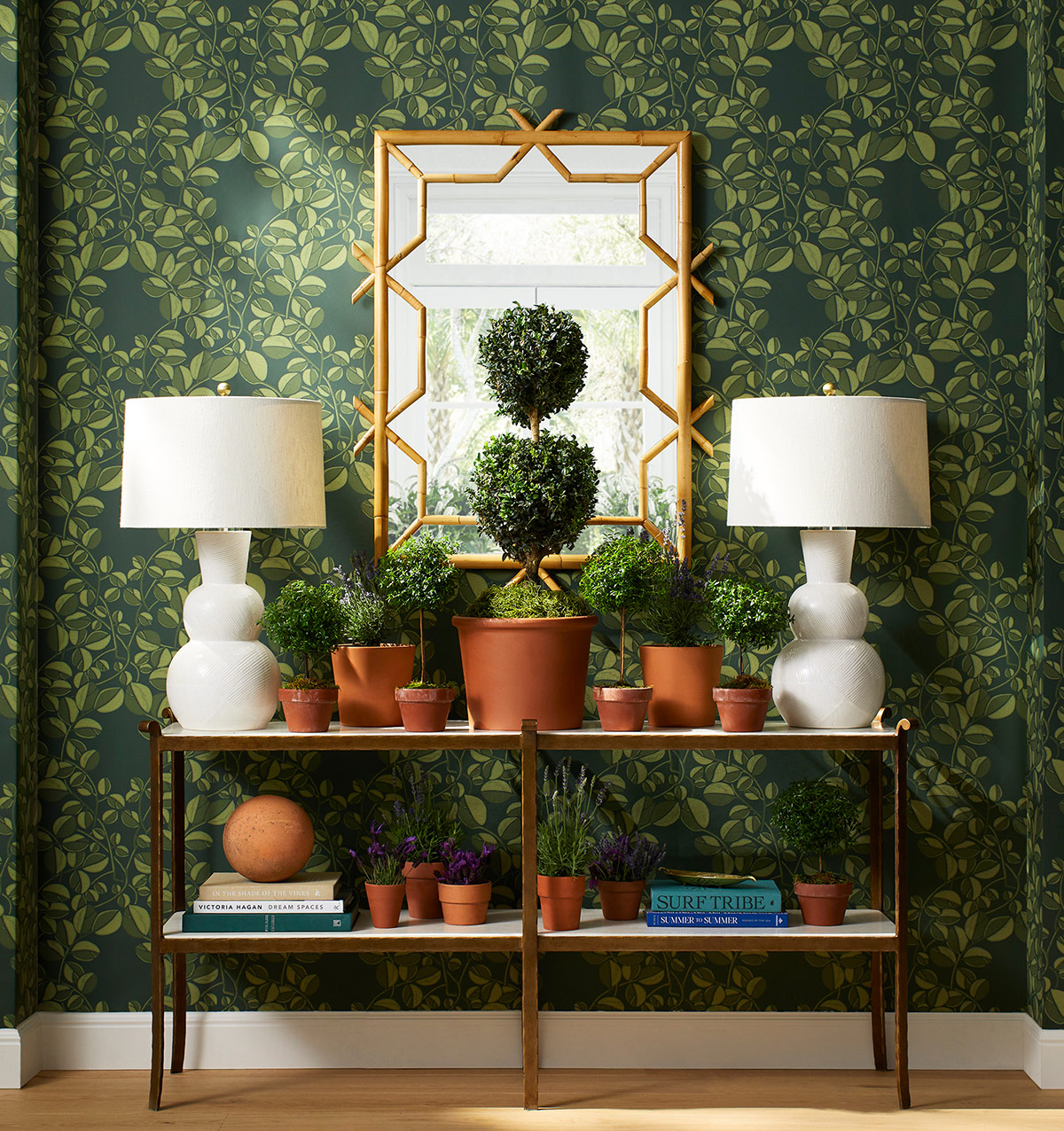
Via Serena & Lily. Please check this out for a lot more great ideas for entry tables.
- Create a welcoming feeling with tables or chests. Artfully styled
- attractive baskets and boxes can be used to store necessary items
- a small cabinet or bookcase can make a good room divider. But it should be no more than 36″ high and heavy enough that it’s not going to tip over. The exception would be if it’s bolted down to the floor, somehow. I don’t know how to do that; I’m just saying. Safety first!
However, If there’s enough space and funds, I would consider putting up a wall or partition to create an actual foyer entry.
The rest of the post focuses on structural changes one can make when there is no entrance foyer.
Let’s look at that floor plan again.
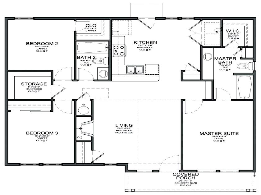
It’s missing a wall on two sides. However, I am presuming that the measurements of the room include what is necessary for the hall. And there are two halls in this case. Yes, that is one itty-bitty living room.
Therefore, if the space isn’t very large, it’s way better to keep things open.
One solution that I don’t have an image of for this post would have some columns act as dividers. I would probably do about four– two of them perpendicular to the fireplace, one in the corner, and then one perpendicular to the front of the house.
Option Number two is the very popular “pony wall,” sometimes called a “knee wall” or a half-wall.
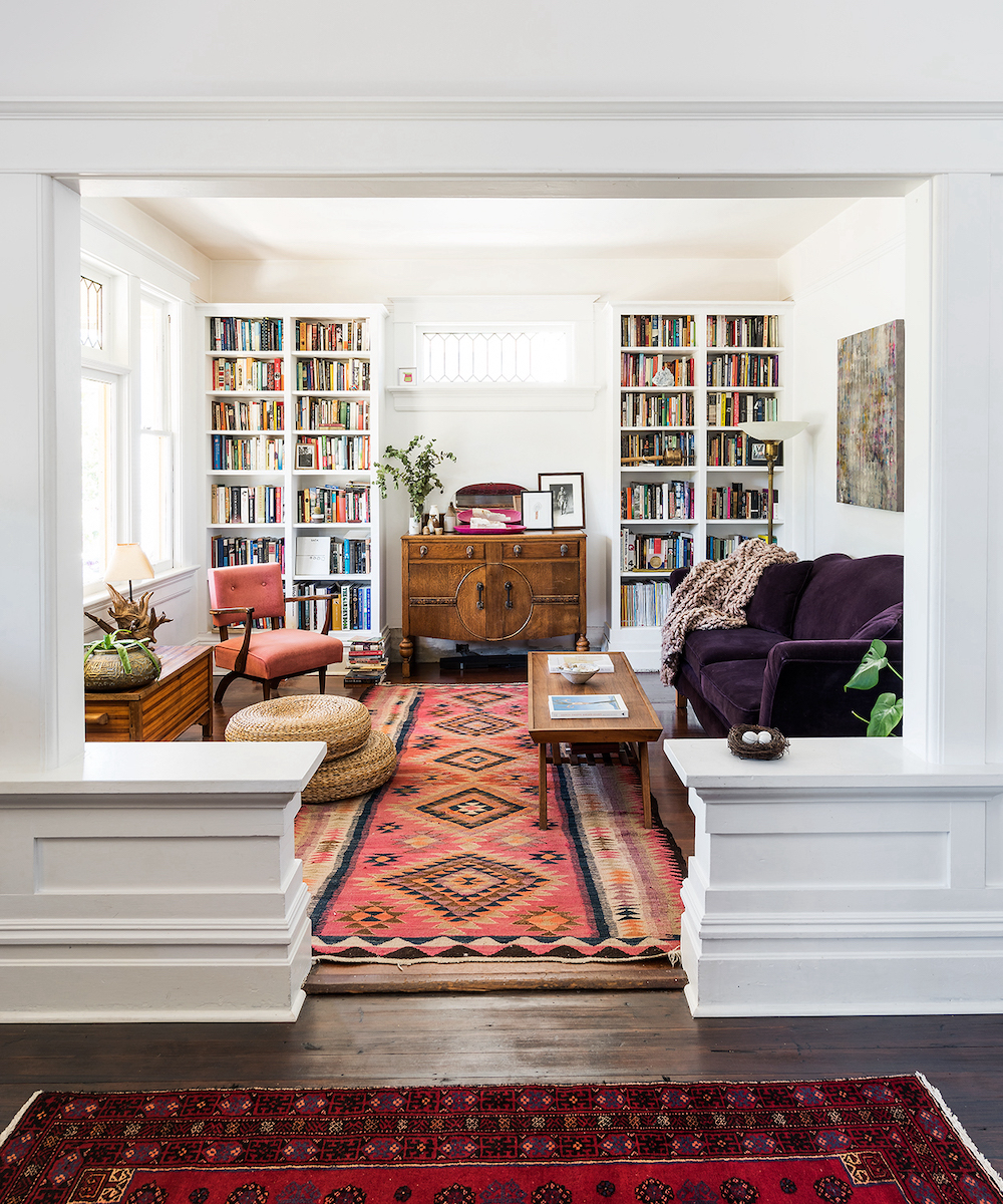
Via Victoria Home Modern Mag – photo – Jody Beck – Lovely pony wall
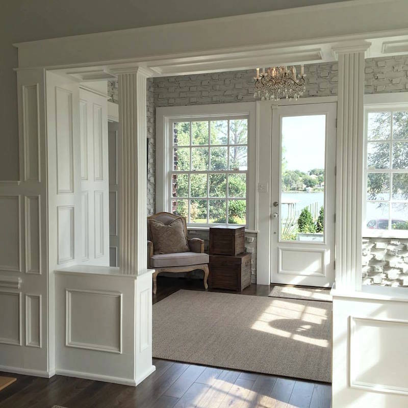
Pony walls can have columns or not. But I love columns and usually prefer them to be square. However, it depends on the house. The columns below taper very slightly, which is fine for this craftsman-style, but I’ve seen some that look more like pyramids. That wouldn’t be my preference.
I don’t think that it’s ever wrong to do a square non-tapering column. Sometimes I see some that IMO, is too thick. Well, how wide is too thick? Well, I think it depends on the size of the room and ceiling height.
A six-inch square would be the minimum on each side, and I probably wouldn’t do more than one foot for most homes. But, for a small living room, one foot would probably be overwhelming. This is when your builder needs to draw an elevation so that you can see the proportions.
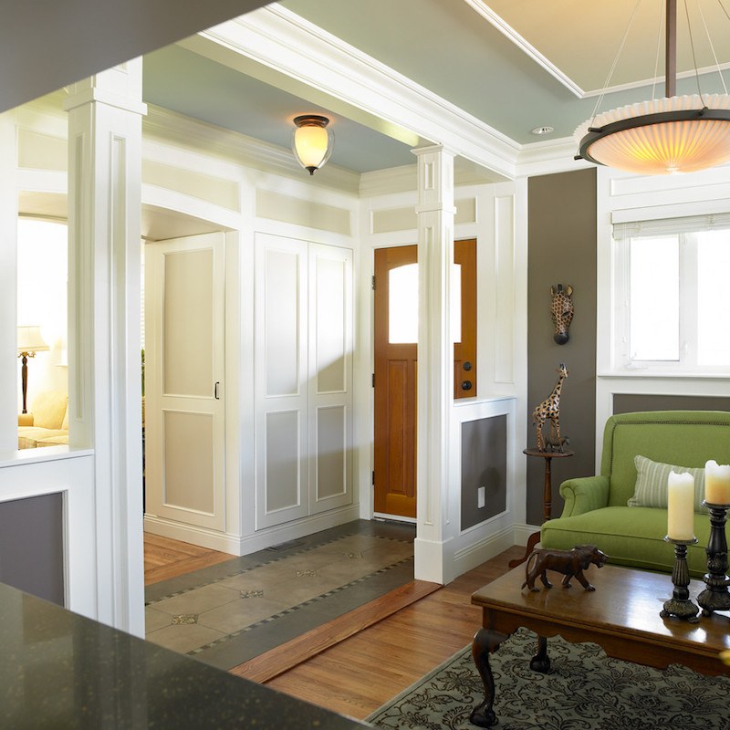
Here’s another pony wall. I’m not totally in love with the design as a whole, but I think that the columns and half-walls are in good proportion. And, it gives just enough separation of the spaces. Plus, the architectural interest is a crucial component.
This pony wall creates a vestibule before coming into either a hall or a room.
***
There are also a couple of lovely pony walls with columns in this post.
Another huge problem with having no foyer entry, especially in parts of the country that are freezing in the winter.
If the door is opening a lot, then it’s going to be very drafty, so sometimes it’s good to have a way to block some of that arctic blast.
And that would be with an enclosure or at least a full-height partition.
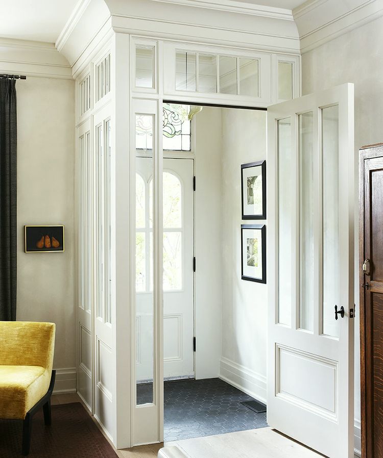
Most likely, an old vestibule was taken down, and a more updated one was added, still in keeping with the Victorian architecture. This is a great solution for those “polar vortices” ;] and to claim a space to store wet boots.
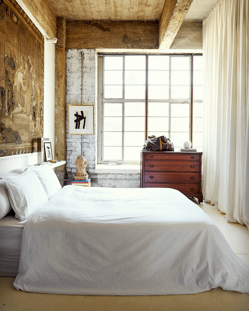
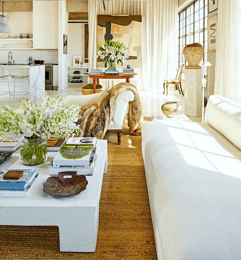
Fabulous curtain divider above and below by William McLure
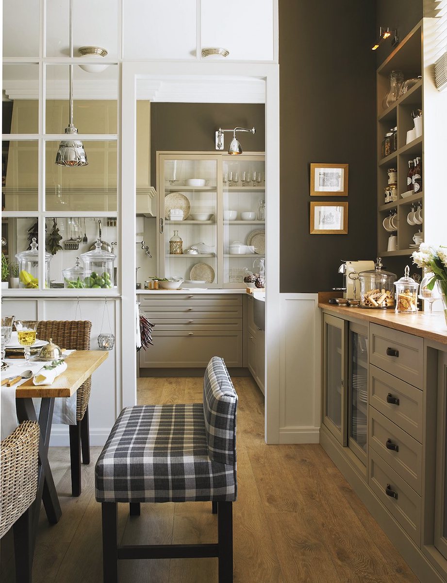
However, I especially love the partitions that are really like interior windows and doors.
These seem to be very popular in Europe, but they haven’t caught on here in the US yet. At least not in a big way.
So, let’s take a look at the many beautiful options I found. Not all of these are by a front door or even a living room, but they certainly could be.
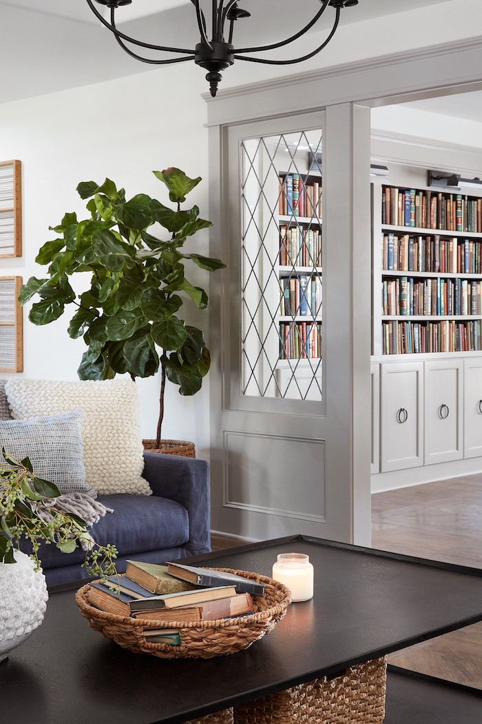
This is from the show Fixer Upper and is probably the most classic example.
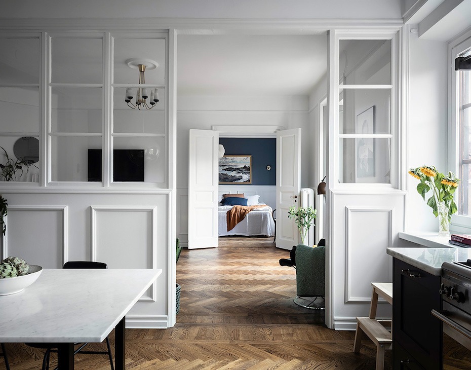
One of my favorite glass partition walls – photo Anders Bergstedt – The post in the link is lovely too.
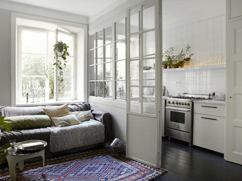
Fantastic Frank – wonderful partition
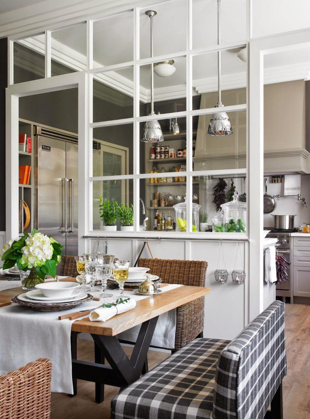
That’s reminding me of this amazing partition in a kitchen in one of my favorite posts.
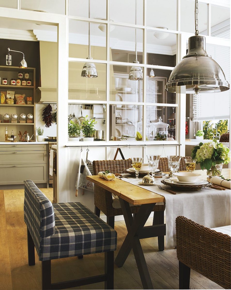
Above and below two more photos of this spectacular space via El Mueble.
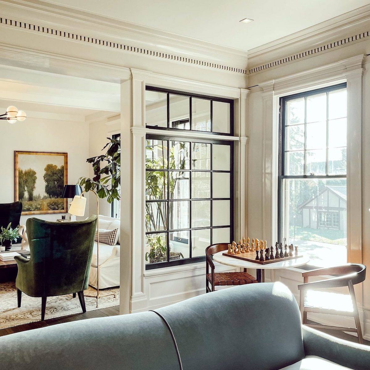
Gorgeous from the home of the amazing Jean Stoffer.
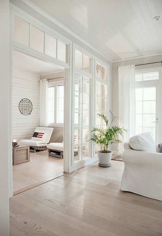
Sorry, the original source is unknown. This one requires a high ceiling. These, of course, also work in loft spaces, and I also love them when they have drapes.
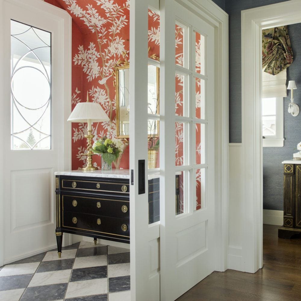
I love what Alexandra did to create a vestibule that has the versatility to be more open or closed.
And, the Gracie wallpaper makes the space, I think.
Please check out Alexandra’s website. She’s a young, super-talented interior designer. And her site is gorgeous! She also has a beautiful Instagram account. So, please be sure to follow her on insta.
And while you’re there for a sec, if you’re not following me, please do so. I don’t care that much, but other people do. Haha.
Next up is the awkward front door in the middle of the living room.
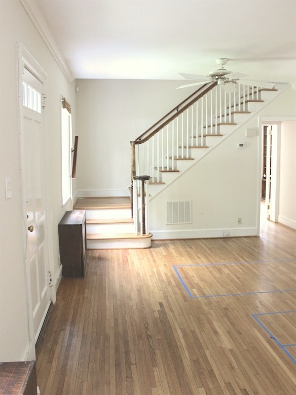
In my internet research travels, I came across this charming home of Corbin Page of the Blue Door living blog with a not-so-charming front door, as I said, smack dab in the middle of things. The link above will take you to her post to see more of the room and her floor plan and ideas.
Corbin also has a beautiful Instagram account, so please be sure to follow her as well.
In Corbin’s case, it’s not a solution necessary for the furniture arrangement, but it comes close to working with what she’s done.
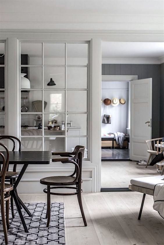
What if we had only a small wall in front of the door. There would need to be a steel header and steel beams on the sides as well. The bottom part could be like the image above, or it could be taller. And of course, it could be painted white. And depending on what works best, it could be a little wider.
My last idea is these wonderful iron windows and doors that make beautiful partitions.
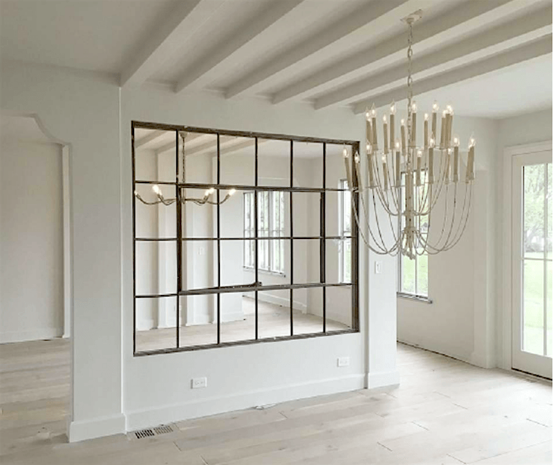
The partition in front of the door could be something like this. Or plainer and probably with the wood muntins.
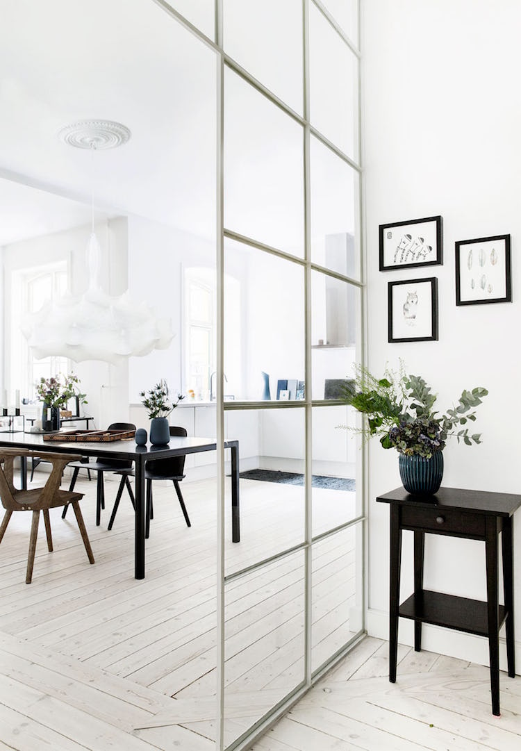
These partitions are more contemporary but could also work in a variety of situations. But, since they take up very little space would be ideal if the room is very tight. I think that they are beautiful!
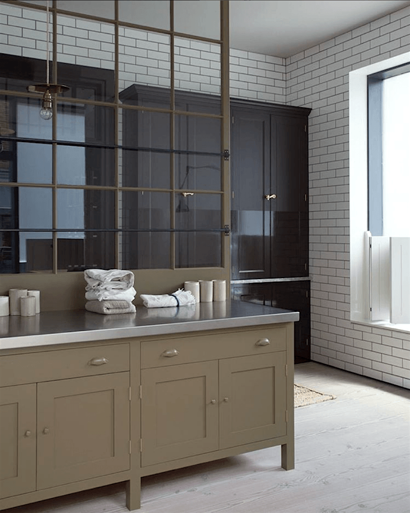
We saw this in this post about fabulous, classic kitchens that aren’t white.
There’s also another wonderful iron and glass partition in this post.
Well, I hope that gave y’all some good ideas for making a foyer entry even when there is none.
please pin to a pinterest board for reference
You might also enjoy this post about what to do when your floor plan is too open.
xo,

*** PS: Please be sure to check out this week’s HOT SALES! ***
+
the Serena & Lily Fall Design Event – ends October 4, 2021
A SITEWIDE sale, including 250 new items!
Use promo code: NEWSEASON
Related Posts
 What are the Best Interior Color Schemes?
 Can A Cramped Vacation Home Become A Full-Time Home?
 The One White Trim and Wall Color That Works Every Time
 Can a One-Bedroom Condo Turn Into a Three-Bedroom? (Revised)
 New Farrow & Ball Colors 2020 Inspired By Nature
 Nine Fabulous Benjamin Moore Blue Paint Colors
 The Beacon Hill Hidden Garden Tour 2022


