Hi Everyone,
I love it when you guys write in with a problem and then show me the results months or even years later.
Well, the other day, I got a darling email from Kim. Many of you will recall in this post from December 2019 that she was the victim of a bossy home builder.
So, we picked her room plan apart. Poor Kim. However, she is in the process of implementing many of our ideas.
But, she wrote to me because she hit a snag with her dining room plan.
Here’s what Kim said:
[My kibitzing commentary will be in teal.]
Hi Laurel,
First off, congratulations on your new place! It’s over the top gorgeous and is going to be loads of fun decorating!!!
I emailed you back in December a year ago about my weird mantel (bossy builder home) to refresh your memory. Here is the link:
https://laurelberninteriors.com/her-bossy-home-builder-needs-to-calm-down/
Oh, yes, I remember this well.
So we took some of your suggestions and have done quite a bit over the past year but haven’t quite finished. We added a wall to separate the living room from the entryway (we now have a REAL entry) and added a transom window.
I can’t wait to see that, Kim!
We also painted the angled super vaulted ceiling the same color as the walls (green). You had also suggested adding a ceiling in this room to bring everything down, which we plan to do probably sometime this year. That will solve much of the ugliness in this botched room plan.
But here’s my question.
After four years of agonizing, I was forced to decide on wallpaper for my dining room. Haha. I’m the world’s worst at making decisions.
No, probably the second worst after me, unless I’m impulsive.
Well, this paper is actually my 4th choice because I waited too long to decide, and the others I had picked had been discontinued.
Uh, huh, the most dreaded word in the decorating world after the word, “busted.”
The paper I chose is Thibaut Ting Yuan in the cream colorway.

GORGEOUS!!! I love the colors!
I originally wanted a dark and moody dining room, but could not do that. So I went with this, which was my original pick in 2016. Obviously, it’s not even close to dark and moody. But my floors are going to be dark, so I guess it’ll be ok.
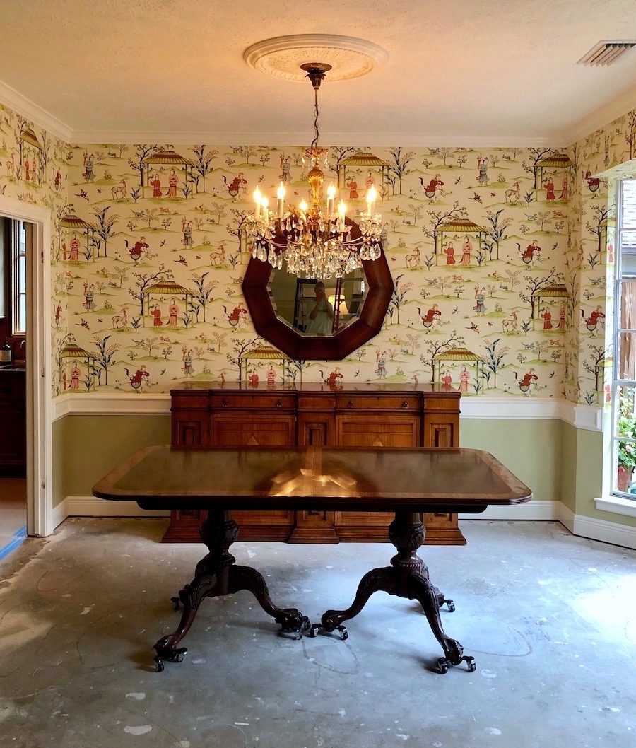
No, sorry, Kim, it’s not going to be okay.
It’s going to be FANTASTIC! I would not have recommended a dark, moody dining room for you. If you have a powder room, that would be a great place to do something dark and dramatic like we did for this beautiful powder room a few years ago.
Anyway, I think the wallpaper is a splendid choice and looks amazing off of the living room.
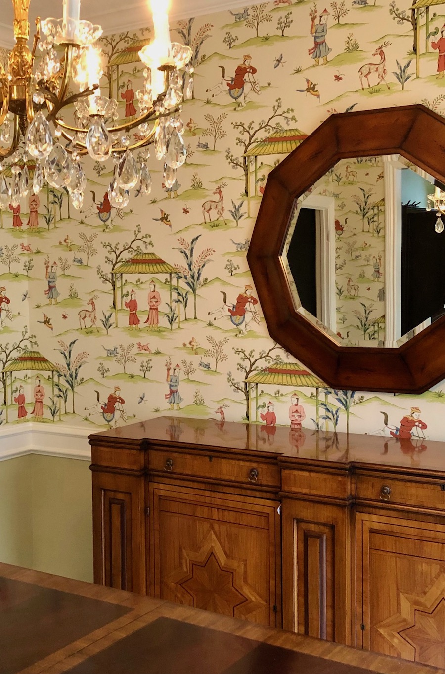
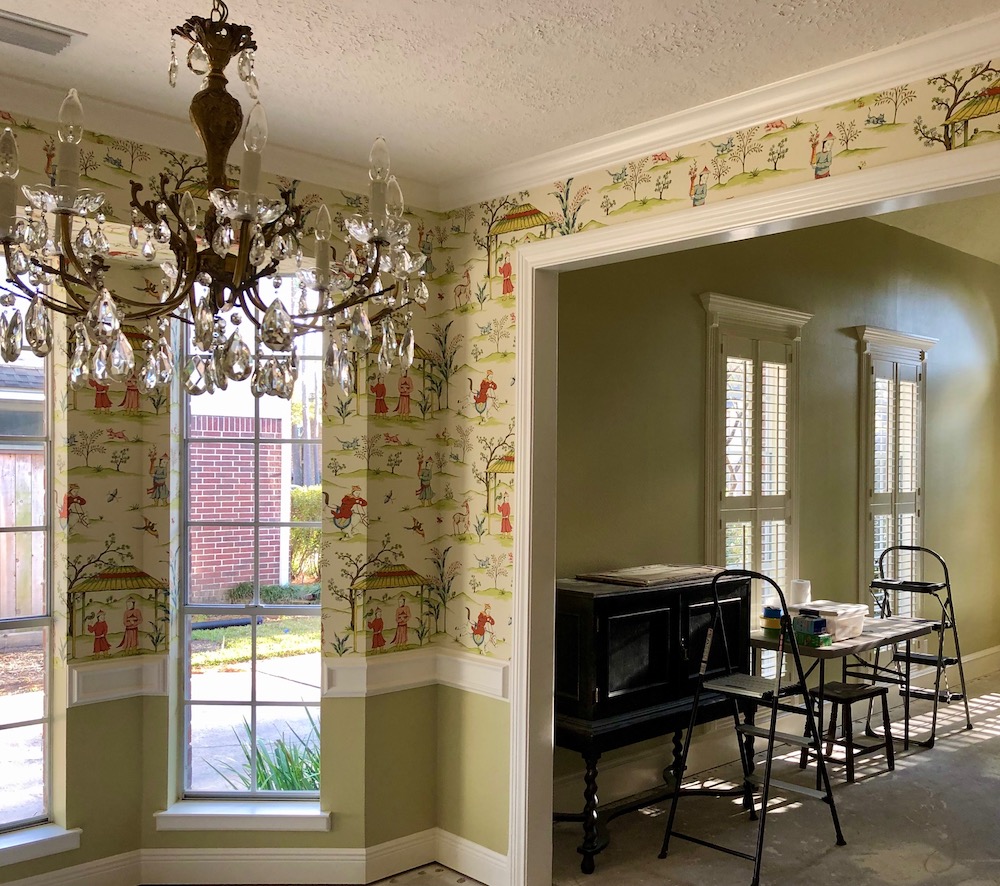
OK. So the paper is now up as of last week, and the first couple of days, I was sick to my stomach because it wasn’t the feel I wanted.
Oh, I know the feeling. I’m listening.
I do love the pattern, though. We repainted ALL the trim in this room, and the living room before the paper went up because it had yellowed and it was 33 years old. And just nasty. I also painted below the chair rail the green in the living room so the rooms would flow together. Well, now that it’s all done, something is really BUGGING me in here.
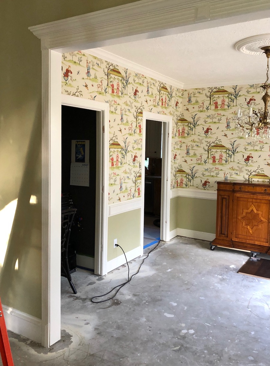
The color on the ceiling and medallion is BM Mayonnaise OC-85. In fact, all of the trim in the living and dining room is Mayonnaise Satin Impervo (BM oil-based). The green in both rooms is a custom color from an old Martha Stewart color I love. It’s very moody and changes throughout the day.
Then there’s the wallpaper in cream.
I can’t put my finger on what is bugging me about this room. Something is off to me. And I’m wondering if it’s all the breaks in color which to me, is making it super busy…from the top – white to paper to white to green and back to white at the floor…and then my dark wood white oak wide plank floors are going in next Monday.
So have you done a post on situations like this…where everything looks choppy and how NOT to make it look choppy?
Whether painting all the trim and walls the same color, is it a “better” look and solves this kind of problem? I’m wondering if my room looks a bit “2000-ish”. I just don’t like a lot of white contrast, I think.
Also, there are bamboo blinds that go in the windows and curtains (multi-colored). Two double sconces are coming with black shades that will be going over the buffet. I know that you always recommend some black in a room plan, and I love that too. There are also painted black Chippendale chairs with green buffalo check fabric.
Oh, sounds fantastic!
My ideas to “fix” this room plan is this:
Hold on a sec. I didn’t want to know to start with what Kim’s ideas are. I wanted to know if we had the same ideas.
And, guess what? We did!
1. Paint crown, chair rail green
2. Paint crown, chair rail, baseboard green (and door surrounds?) (window sills?)
3. Paint only chair rail green and leave the rest white
4. Paint the walls under chair rail mayonnaise to match trim and ceiling. Not sure if this will kill the whole thing (too white? and not flow into LR)
5. Leave everything alone. It looks great. Haha.
Soooo if you could steer me to any post you may have done on how to paint the trim in a room with wallpaper or just trim in general, I’d really appreciate it. If not, is this something others may be interested in?
Thanks a bunch,
Kim
My first thought was, yes, paint all of the trim green.
But, then, I started messing around with her image.
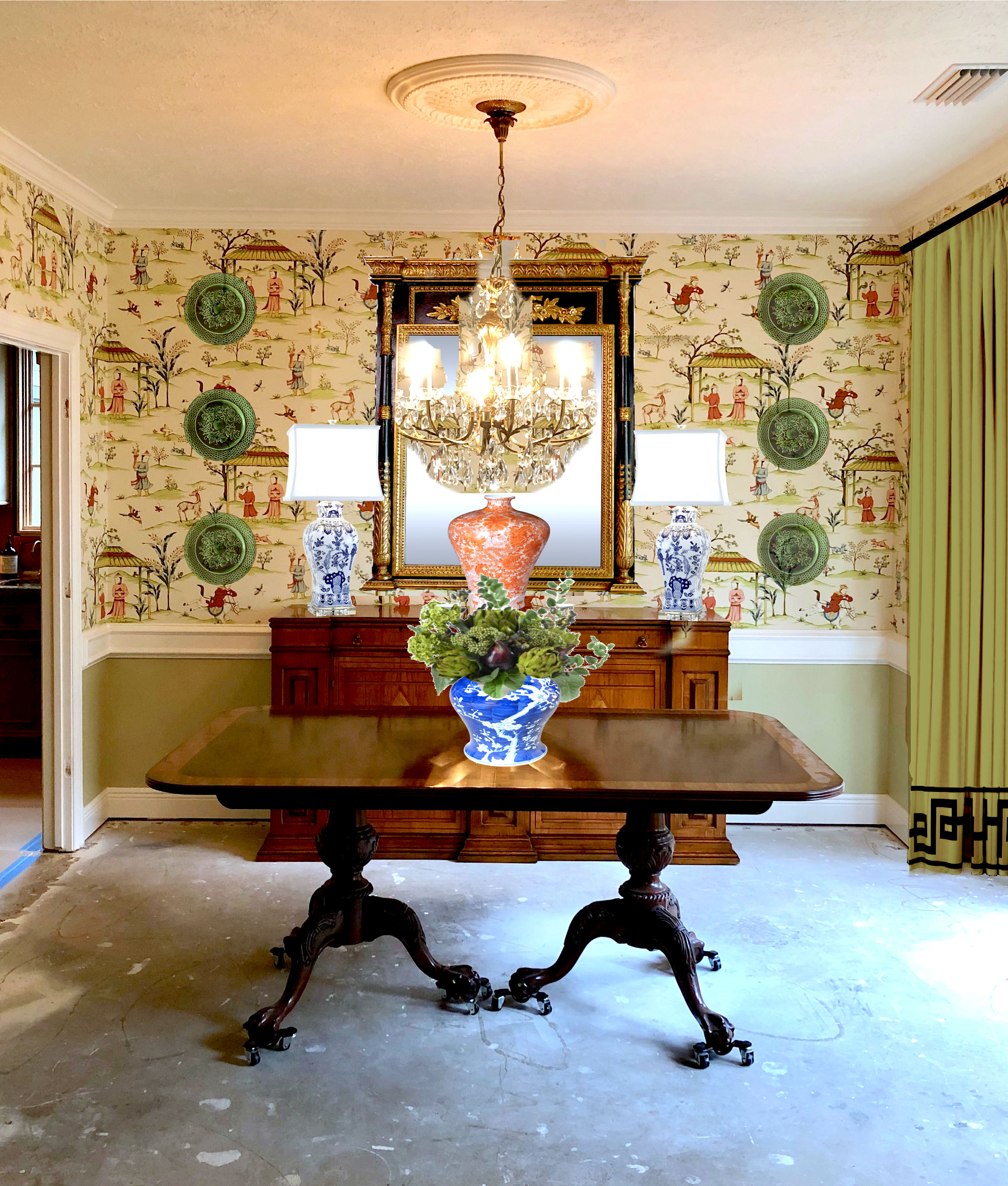
That’s because I wanted to see what the wallpaper looked like if we accessorized it.
Here’s the bottom line.
YOU CANNOT JUDGE HOW A ROOM IS GOING TO LOOK WHEN YOU’RE IN THE MIDDLE OF IT.
I mean, if you were going to a party and you had your shoes on but hadn’t had a shower or put on make-up, you’d look in the mirror and decide to stay home. Okay, YOU wouldn’t. But, I would. haha
However, my point is that a room that’s not finished isn’t ready for viewing.
But……………. How are you supposed to visualize your completed room plan?
I use picmonkey. Please go here for a picmonkey tutorial. It’s easy and fun!
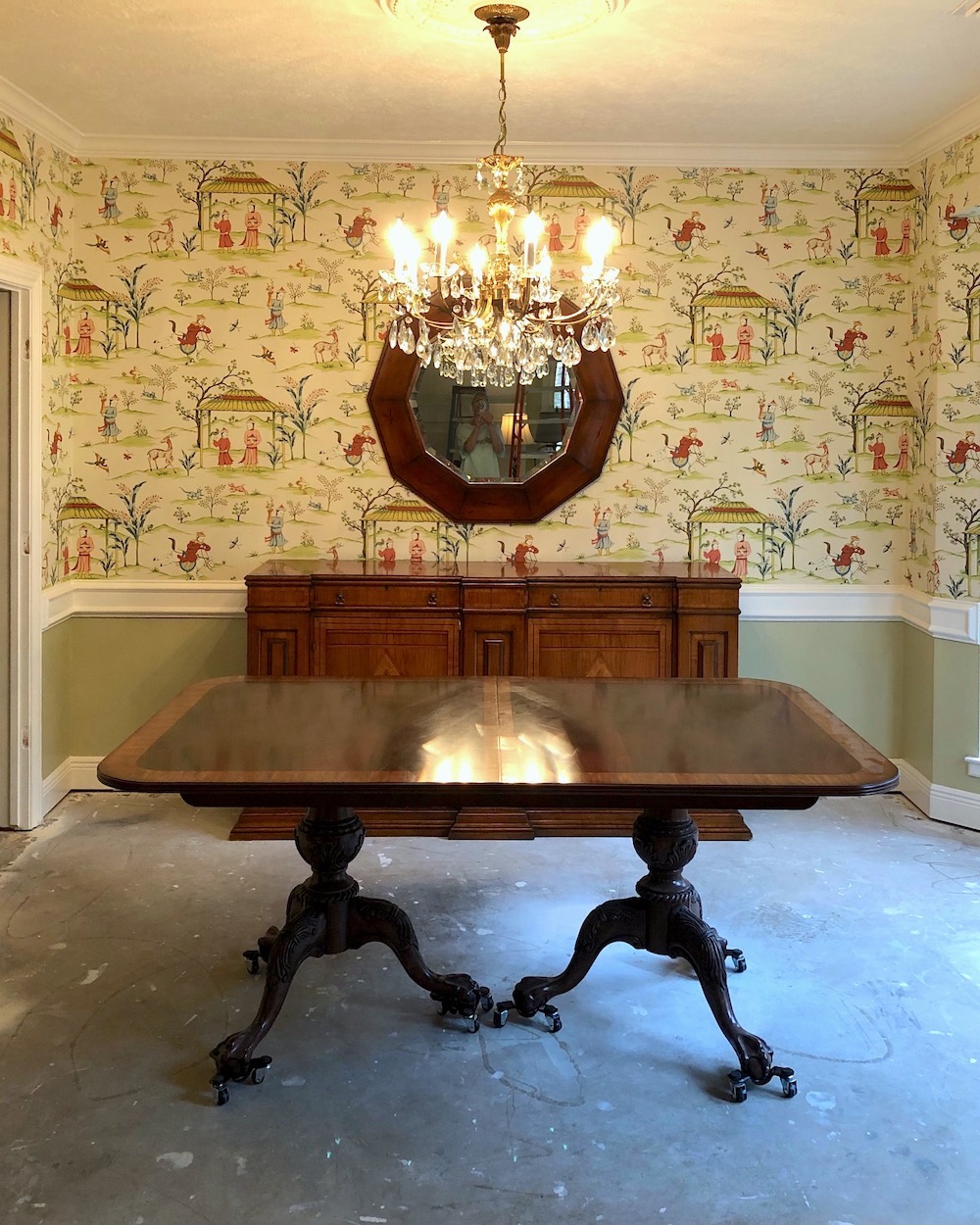 The only thing that isn’t working for me is the mirror. I mean, it’s a beautiful mirror, but not the best choice, in my opinion for this room for these reasons.
It’s stained brown, and that makes the table, sideboard, and floor that’s coming in. Plus, I feel it’s a tad too casual with the crystal chandelier and a little heavy.
 I found this neoclassical beauty on Chairish. I love it because it’s black and gold and has a lot of presence. There are other mirrors, but definitely, something with gold in it would be terrific.
The thing is that the paper on its own feels overwhelming unless it’s broken up.
I mean, one can eat only so much whipped cream without the pumpkin pie to go with it. :]
Let’s look at some examples of what I’m talking about.
The master at layering everything in a room is James T Farmer. I would go over to his Instagram and study his rooms like crazy. Of course, some of you may not like this style, but for those of you who love a new-trad style, this is as good as it bets, in my opinion.
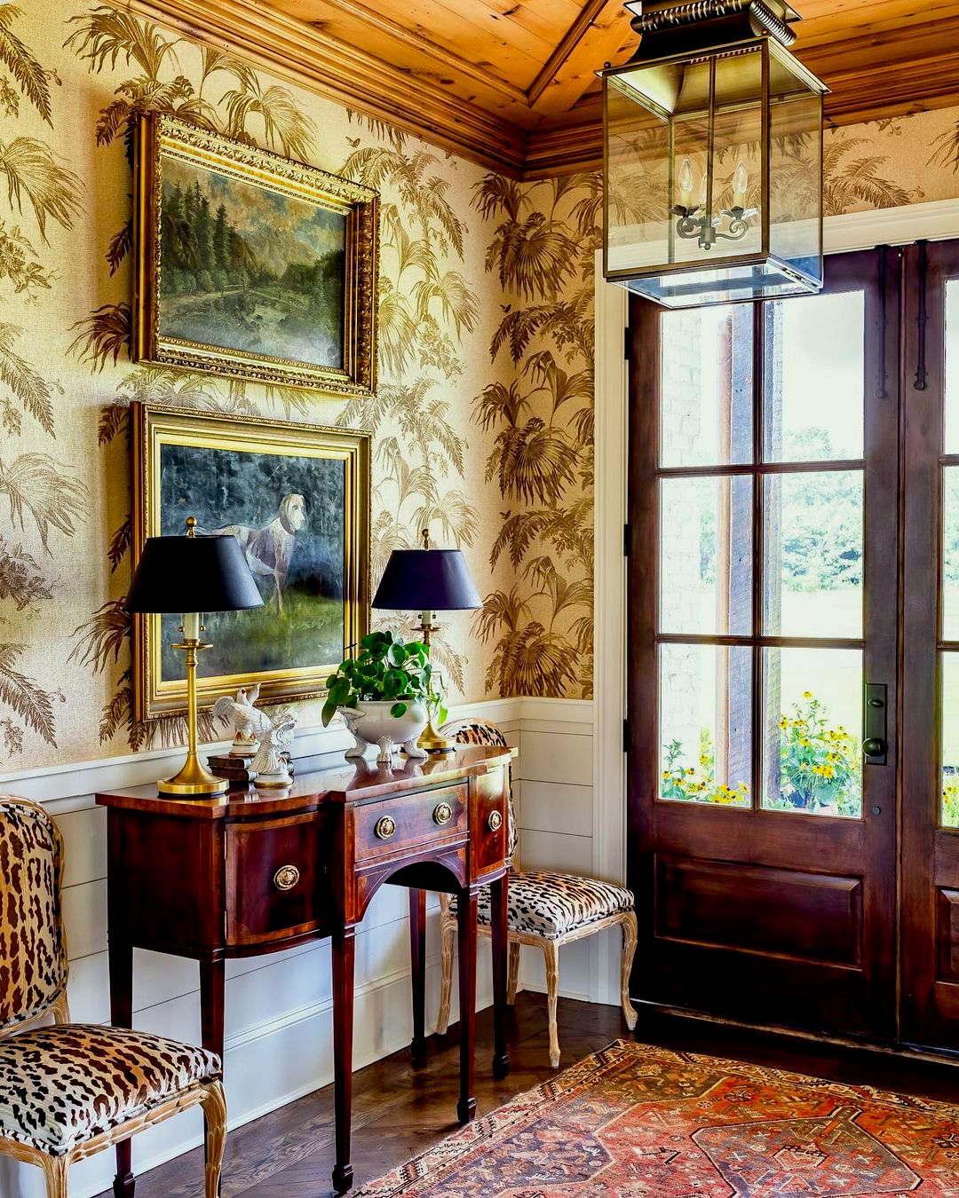 via Instagram @jamestfarmer – @jeffherrphoto
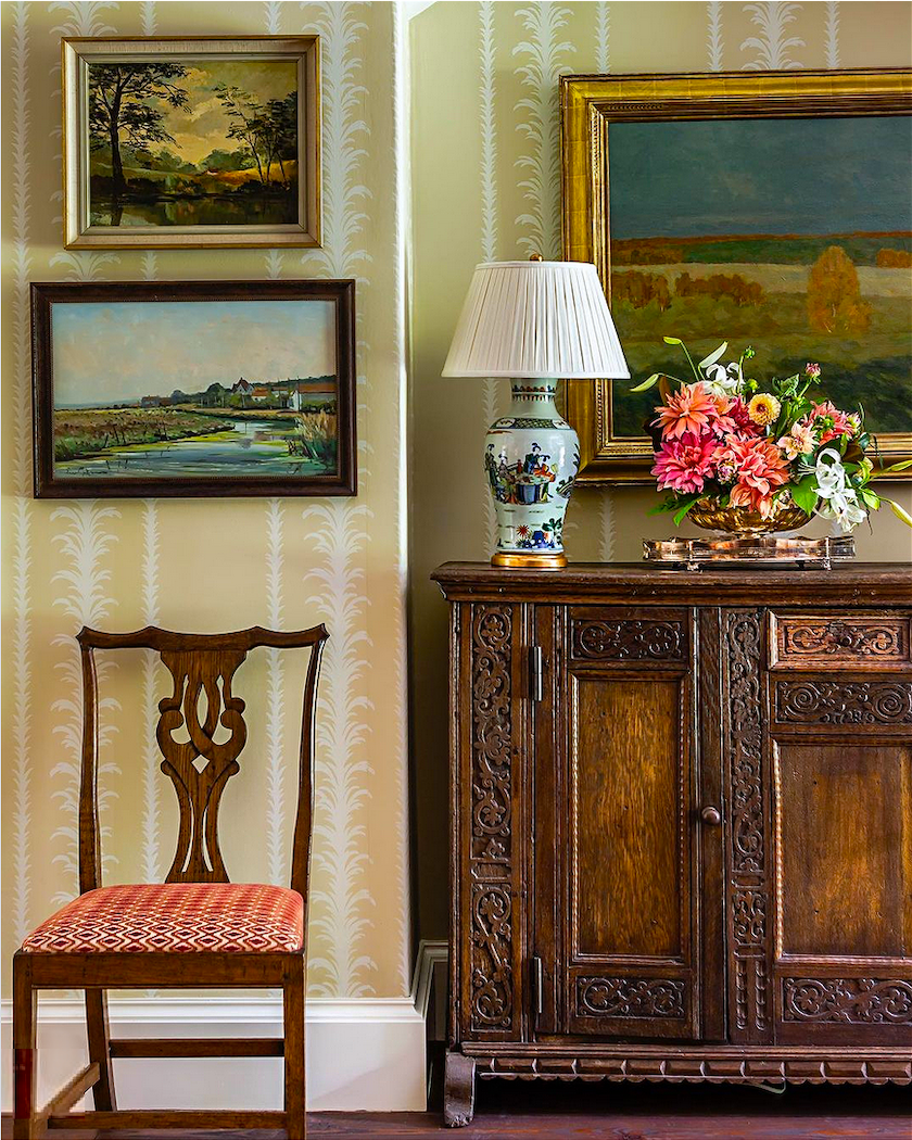
Another fantastic James T Farmer vignette
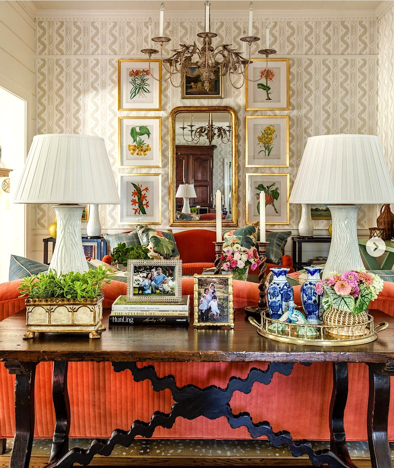
@jamestfarmer on Instagram photo: Jeff Herr
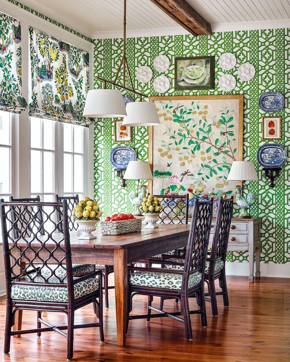
via @flowermagazine @jamestfarmer on Instagram @emilyfollowillphotographer @normanaskins architect plates and art over wallpaper
I love how James uses plates and art together. Remember this post where we looked at decorating with plates? And, he also introduces some blue and white Chinoiserie as if it’s a neutral.
Here is what I came up with. Of course, there could be art, but I’d need another four hours to work on this. But, do you see what a difference it makes when the room is accessorized?
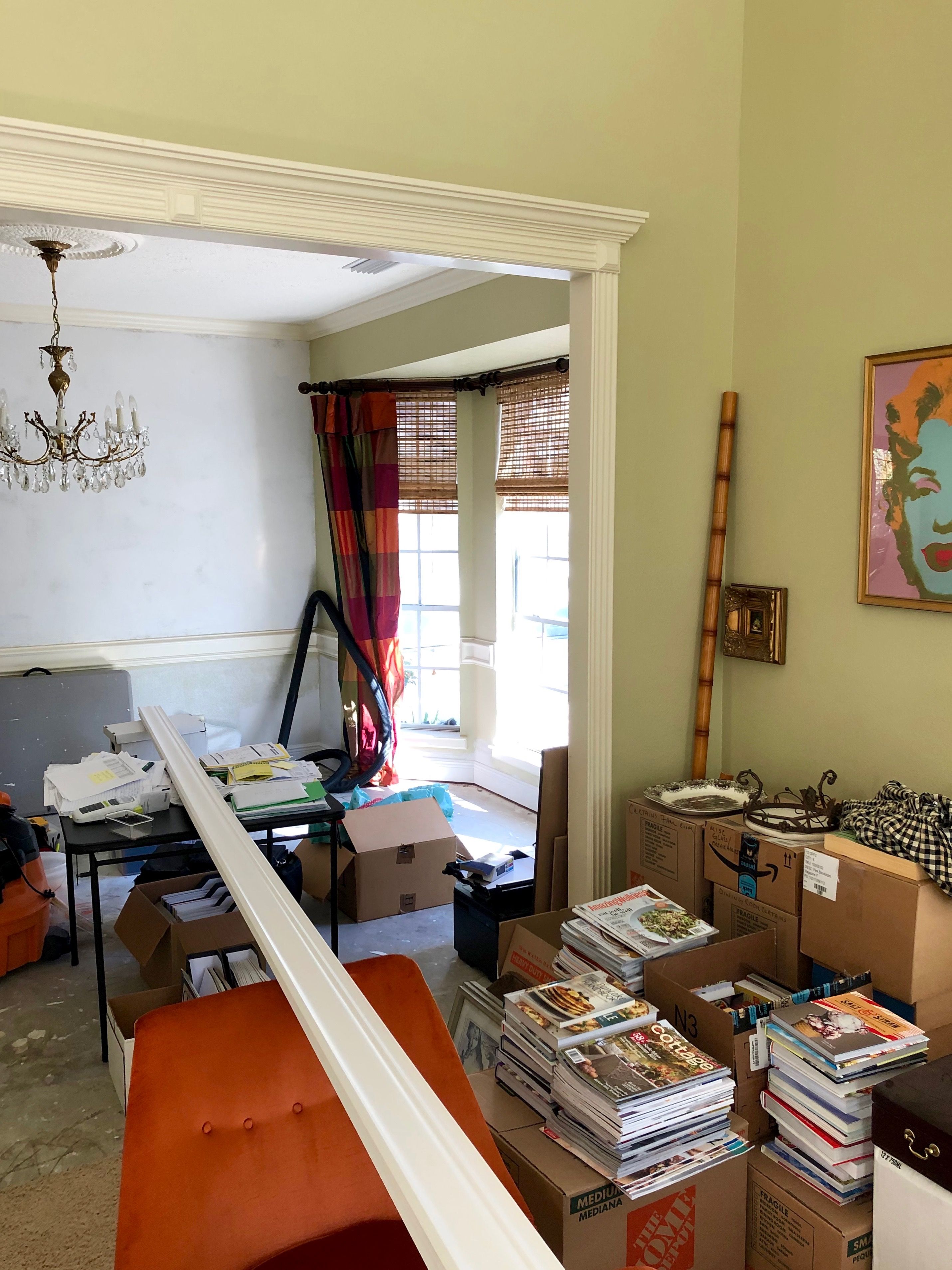
Now, I don’t know if Kim is planning on putting back the old drapes. I would do something quieter and only drape the outer soffit so that the rod can go right underneath the crown moulding.
I also did a room plan with a cream-colored curtain.
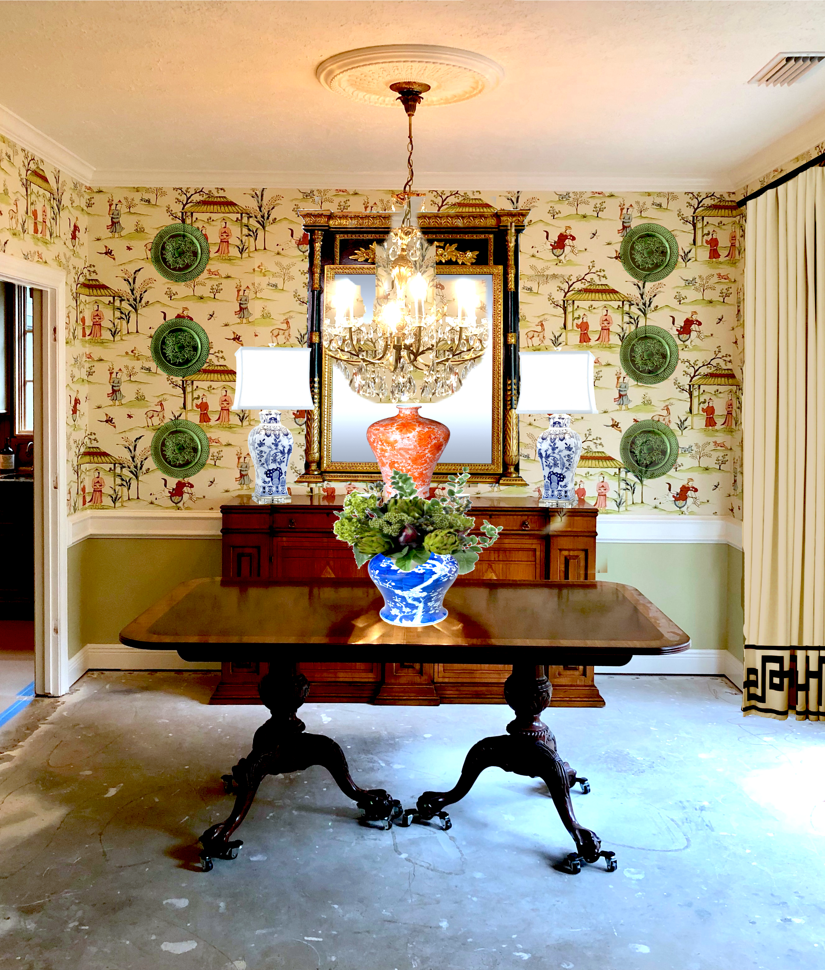 I like them both, but for me, the green has the edge. I’m also thinking about the black Chippendale dining chairs with the buffalo check.
Then, there’s going to be a dark hard-wood floor. I would love to add a seagrass rug. They’re so good looking and durable.
I think this room has the potential to be stunning!
But, what do we think about the trim, now? I think I would paint the chair rail and baseboard green and leave everything else in the mayonnaise. But, really, now that more elements are in the room, I’m not as bothered as before.
The bottom line is to make as solid a room plan as you can using all of the visualization tools at your disposal.
And, try not to freak out when you’re in the middle of things, and it’s not looking “right.” It most likely won’t look right, especially if the window treatments or wallpaper go in before the rest of the room.
I hope this gave everyone some food for thought when developing your room plans.
You might also enjoy What You Need to Know About Wallpaper.
And this post about Chinoiserie Wallpaper.
Plus, one of my favorites about Chinoiserie wallpaper panels.
I just want to add. I’m sorry that I’m not answering all of the comments. I feel guilty about it. I shouldn’t, but I do.
If I skip yours, it doesn’t mean it wasn’t a good one. It’s just that I’m trying to keep my head above water and stay healthy!
Getting settled in is extra challenging because it’s a new state, and I have to change EVERYTHING.
However, I’m really enjoying “Robby,” my Roborock vacuum! If you missed him, please check out that post here. I wish I had gotten a Robby a long time ago. My floors are gleaming, and all I have to do is press a button on my phone. Sick.
Tonight, when I was walking down Commonwealth Ave (on my way back from Trader Joes) with the lights and the amazing row houses, I thought I must be dreaming. I don’t think I’ll ever get tired of this incredibly beautiful city! I just don’t quite remember how I got here. It happened so fast!
xo,

PS: Please check out the newly updated HOT SALES!
Related Posts
 Can A Raised Ranch Home Become A Traditional Home?
 Hate Your Open Concept Floor Plan? Here’s How To Fix It
 20 Stunning Lifestyle Instagram Feeds You Must Follow
 Our House Floor Plan is Impossible to Furnish!
 Analogous Color Schemes In Interiors – The Right Way
 Best Bay Window Treatments + Measuring Guide
 60 Downton Abbey Colors +10 Palettes {like you’ve never seen}


