This topic of mixing Chinoiserie Decor with Gustavian Swedish Decor is one that I’ve had percolating in my mind for probably the last four years.
How come I’ve never discussed it before?
That’s a good question; not sure.
Maybe because it would be like going for the best massage of my life and then following that up with a piece of the yummiest banana cream pie (BCP) ever! Not that I’d mind that, but you’re supposed to have green tea (which ALWAYS makes me nauseous); or one of those vile unfiltered apple cider vinegar and ginger shots (in a little bottle) after a massage.
Have you ever had one of those?
Like I said…
And like a massage followed by BCP, I adore both Gustavian Swedish and Chinoiserie Decor. Having them in the same room is sublime.
But how does the exotic, oft-tropical Chinoiserie Decor work with the coolness of the Scandinavian Gustavian Swedish decor?
That’s a very good question and to answer it, we have to go back in time and have a little refresher about Chinoiserie decor for those who don’t already know.
Chinoiserie does not equal Chinese any more than a Tootsie roll equals fine chocolate
Chinoiserie decor, fabrics, wall murals, some porcelains, etc are a fanciful IDEA of Chinese designs. Yes, they are based on some porcelains brought back from the far east; but more so, the tales told of an exotic land. The Europeans were fascinated with the foreign customs, food, vegetation and climate of these faraway places.
And as we discovered in this post about surprising Gustavian Swedish colors, the Swedish Gustavian version of Chinoiserie circa 1750 was anything but pale and gray.
The period was actually just before and at the beginning of Gustav’s reign. Most of Gustav’s reign took place during the neo-classical period AKA Louis XVI in France. The period before was uhhh… Louis XV, or the Rococo period.
What’s the dif?
The Rococo style is known for lots of curves, heavy carvings, gilted finishes and painted furniture. And also some wood.
*The neo-classical and subsequent Regency (England) Directoire (France) periods brought about far more streamlined furniture with tapered legs, less carving, and more classical motifs, such as the Greek Key pattern.
Therefore, it’s only natural that Chinoiserie motifs such as wall panels, wall paper and porcelains are a wonderful accompaniment to Gustavian Swedish.
The only thing is… it’s not that easy to find images incorporating both.
Now, let’s take a look at the magnificent example of late 18th century Chinoiserie in Sweden, the Chinese Pavilion (Kina Slott) on the grounds of the magnificent Drottningholm Palace.
Drottningholm Palace, if you don’t already know is considered to be the Versailles of Scandinavia.
The Chinese Pavilion has an interesting history which you can read here. The architecture is in the Chinese Rococo style. It consists of one large glorious semi-circular building with numerous small buildings on several acres.
The plans of the main building and out buildings.
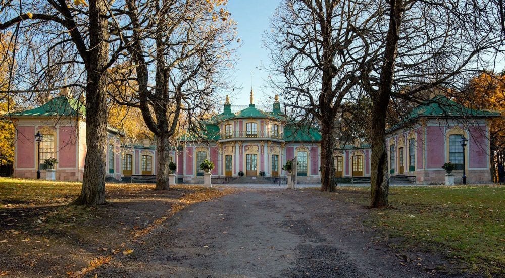
Kina_slott_October_2016_ photo – Arild Vågen Chinese Pavilion – Drottningholm
The front facade of the main building.
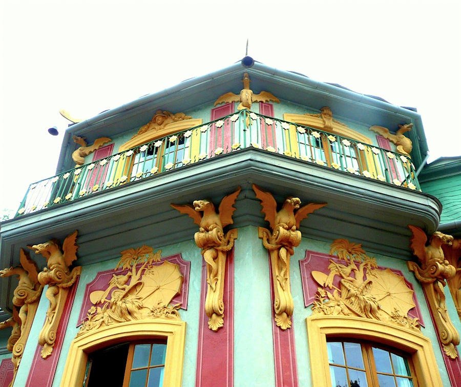
Some of the architectural detail featuring gargoyles and Chinoiserie bas relief. Love the palm trees! And the colors! I found this and other images on the Love Is Speed Blog. It appears that most, if not all of the images are taken from a book. But, I’m not positive about that.
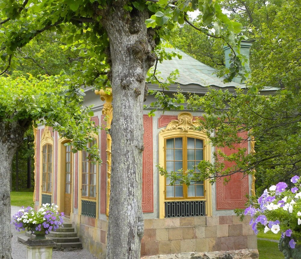
One of the small out buildings. I’ll take this one! I could see myself living here! Please notice the Greek Key motif!
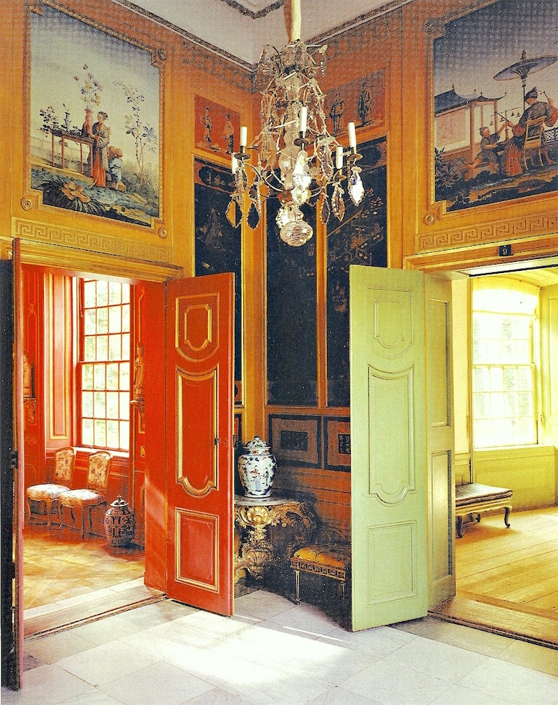
Definitely from a Book, above and below. But look at these rich saturated colors coupled with neo-classical motifs.
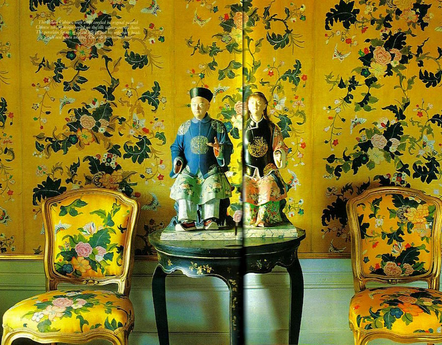
The wallpaper is original! Wow! And the fabric was created to match fairly recently.
One thing we don’t see here is the beautiful Gustavian Swedish style furnishings. The chairs above look like French Louis XV which makes sense.
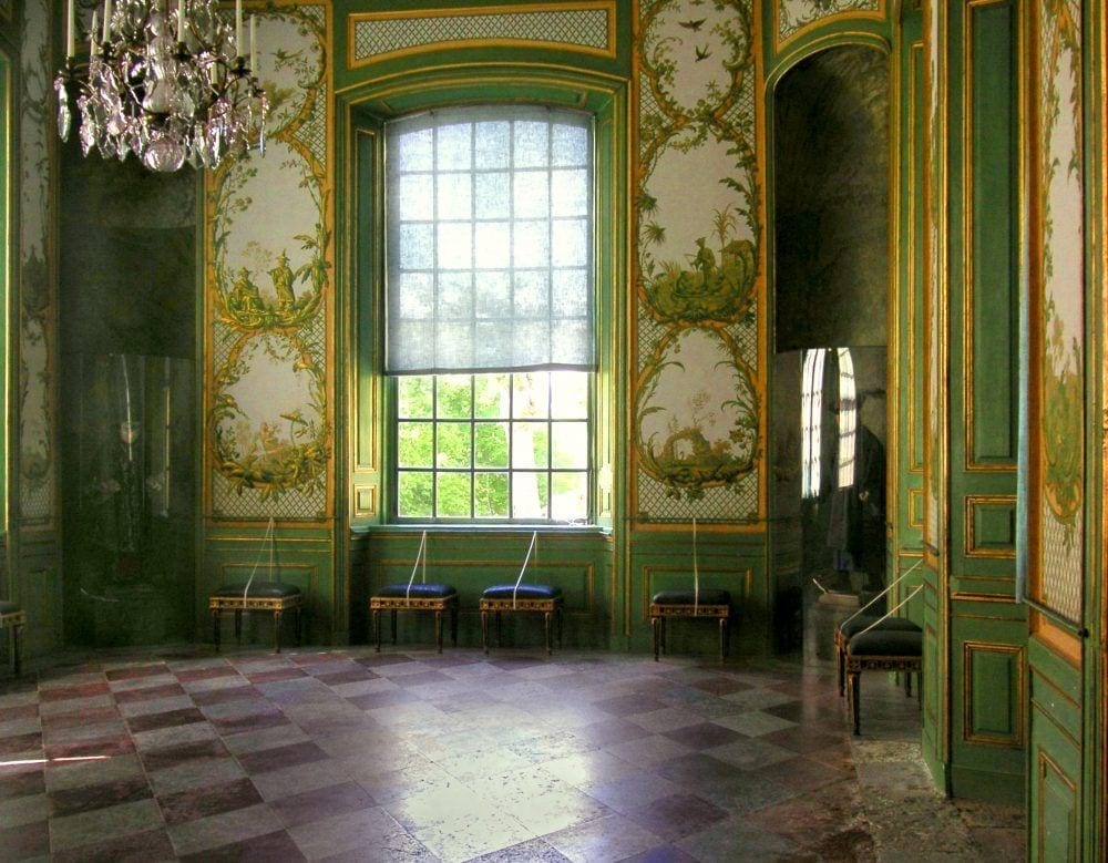
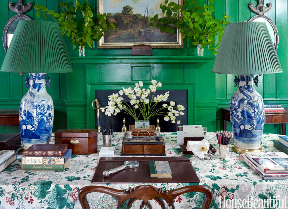
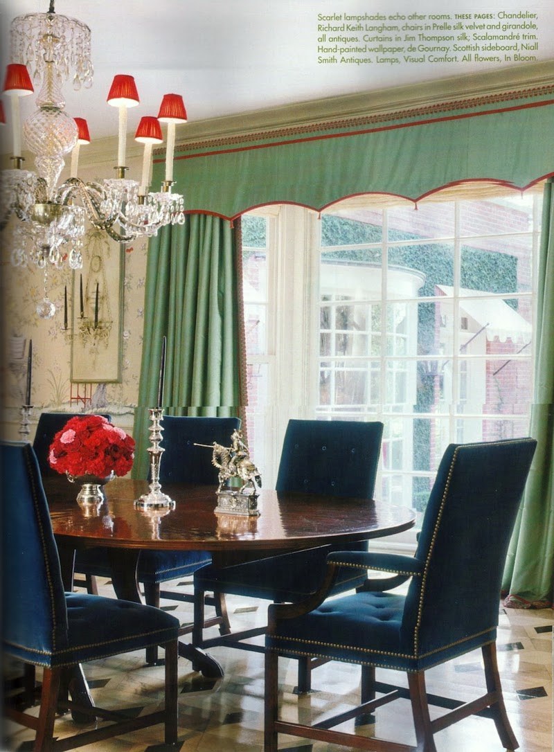
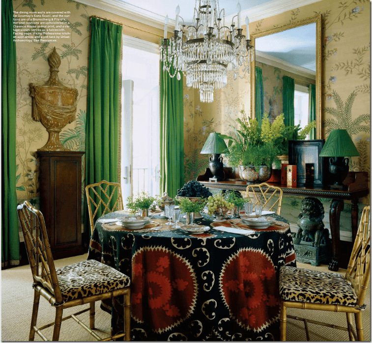
When I see these amazing exteriors and interiors, it makes me think of Miles Redd.
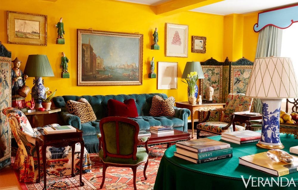
True, there’s no Gustavian Pieces, but one can see how Miles was influenced by the Chinoiserie designs of that era and quite possibly the Chinese Pavilion.
But what about the more traditional Gustavian Swedish colors, grays, blues and creams?
Can we mix that with Chinoiserie Decor?
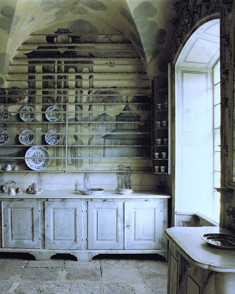
Tureholm Castle (sometimes spelled Thureholm)
YES!!! But you already knew the answer, I bet.
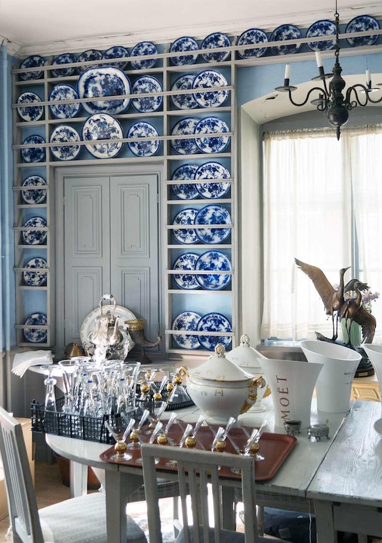
godsochgardar.se – Carl Jan-Granqkvists blue and white Chinoiserie porcelains with Gustavian Swedish
Let’s take a look at how some interior designers are incorporating Chinoiserie decor with Gustavian furnishings.
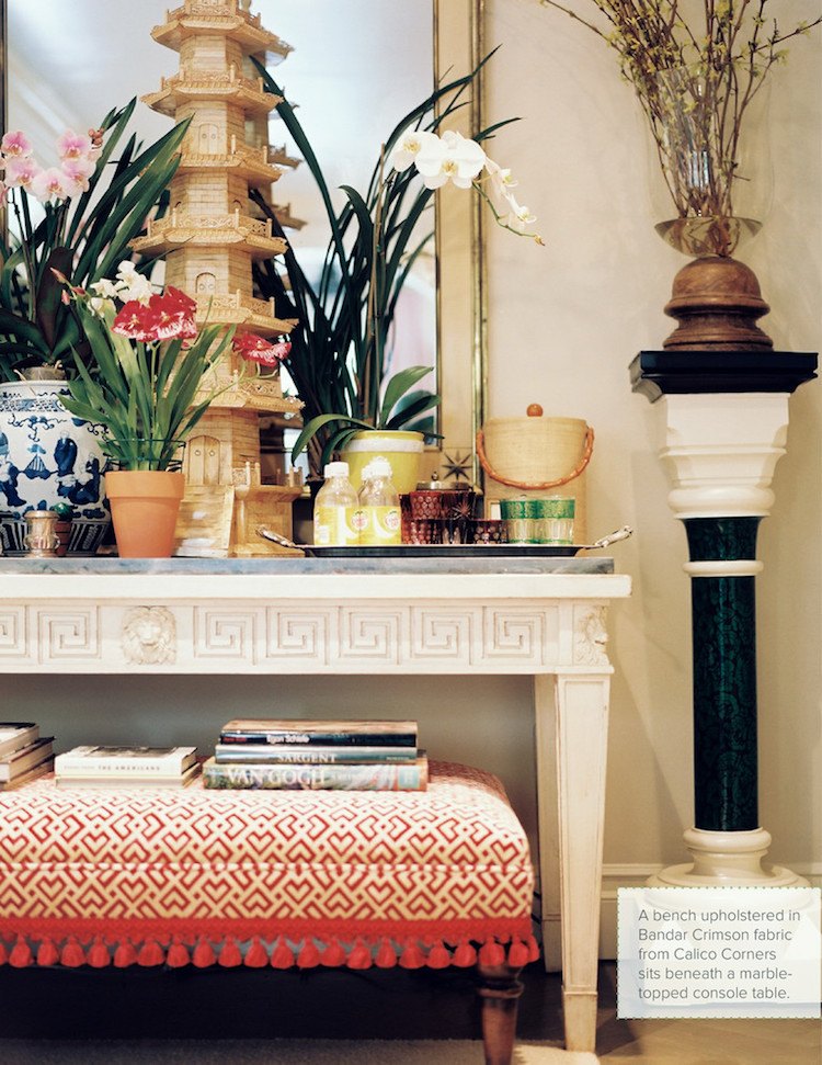
Ruthie Sommers via Lonny – photo: Patrick Cline
The table is probably not strictly Gustavian, but it is painted and neo-classical and it might be French. Gustavian furniture does have some distinctive qualities, but some of it is indistinguishable from the French versions.
What makes it neo-classical? See above*.The Greek key pattern on the apron and the tapered leg. the lion heads, I don’t know. I’m sure somebody out there does and will bail me out. I have a feeling that it might be Directoire. That is the period just after neo-classical and therefore does share many of the same characteristics :]
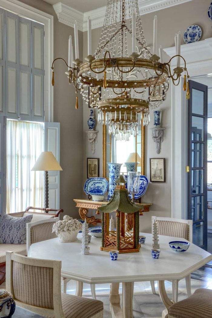
Above and below one of Furlow Gatewood’s amazing rooms
photos by Rod Collins
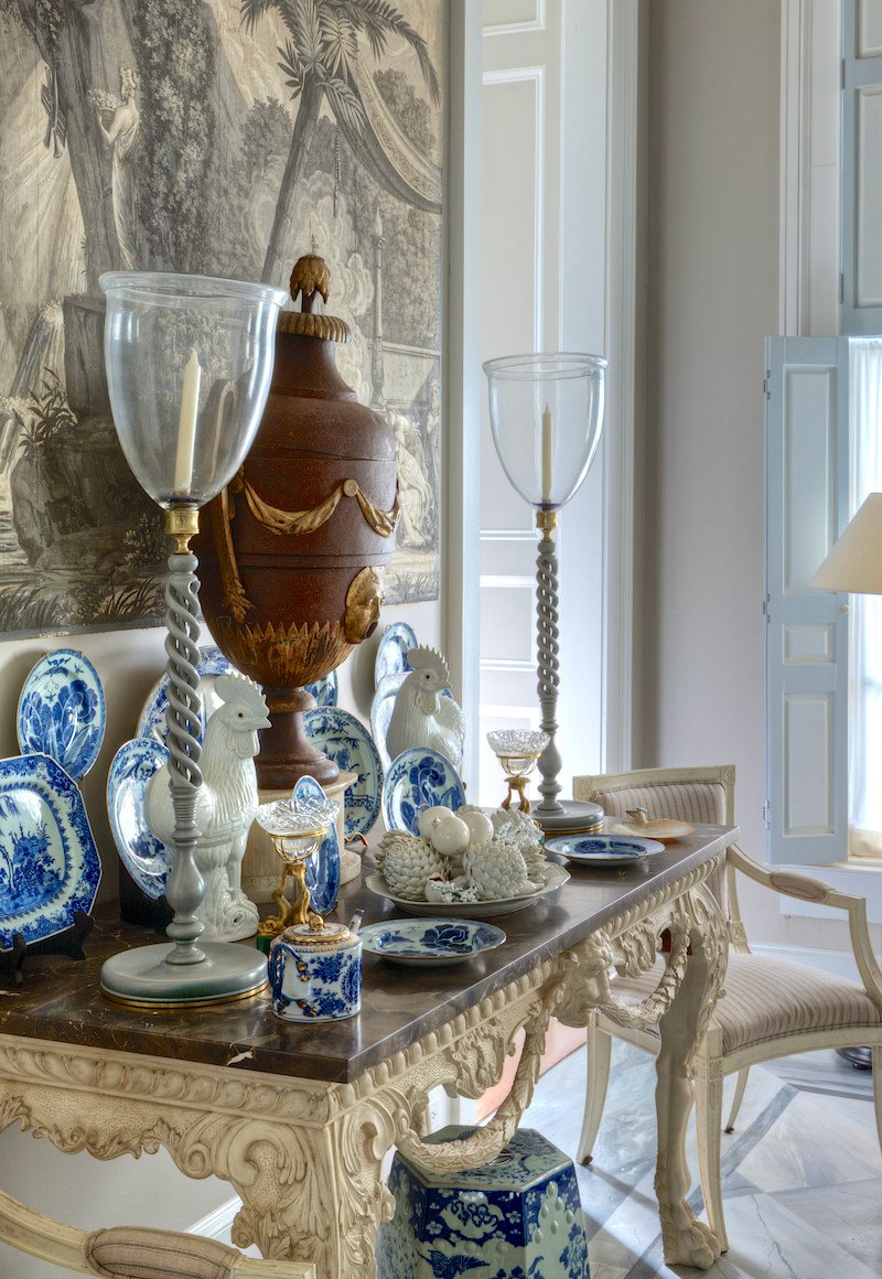
Furlow’s incredible dining room has elements of Gustavian with French Rococo and chairs which look to be Directoire. (early 19th century) A Chinoiserie Grisaille panel and then his inimitable styling of porcelains and various objets that are part of his vast collection of antique furnishings. For more of Furlow please enjoy this post.
And this is a beautiful post with more Furlow and other designers and loads of Chinoiserie used in rooms that aren’t blue and white.
And here’s where I came up with a Furlow Gatewood paint palette.
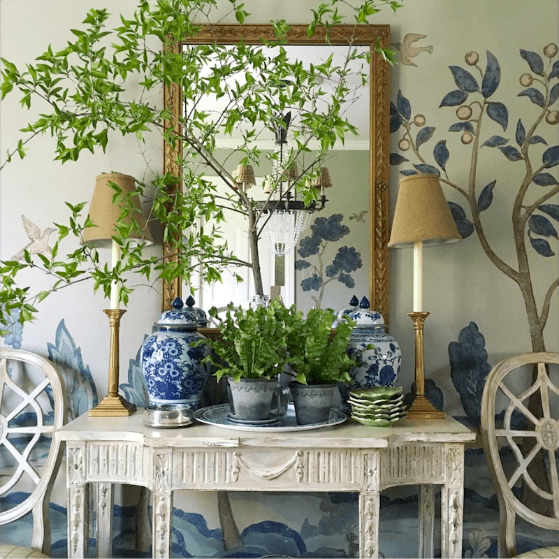
The fabulous Maura Endres whether she realizes it or not is one to embrace all classical styles. If you aren’t already, I heartily recommend that you follow her on instagram.
The table is probably French neo-classical, but the over-all feeling is Swedish.
The reality is and probably what this post is really about is that ALL classical styles go together. And Chinoiserie is really part of that period of architecture and design.
But that means genuinely classical styles. Just because something is sold as “traditional” or “French” or anything at all, doesn’t necessarily make it so. Remember this mess? If you’re not sure, please look it up. Or if something looks odd, that means it probably is.
And it doesn’t matter if the item is not a bonafide antique. I’m fine with well-done reproductions based on authentic antiques!
One thing I love about Chelsea Textiles Gustavian Furniture is that every item in their collection IS a copy of an actual antique. And because of that, their dining chairs are surprisingly petite. I imagine that some people have a problem with some of them, but if they were to buy authentic Gustavian antique dining chairs, they would be THAT size.
However, I’m okay with adding another inch in all directions, for comfort’s sake. Some purists I guess, would say no, but…
After all, we’re probably bigger than folks from over 200 years ago. And you know the great phrase. “form follows function.”
What isn’t right is to take a side chair that originally was 34″ high and 18″ wide and then make a bizarre version of that is 41″ high by 22″ wide. I see that all the time.
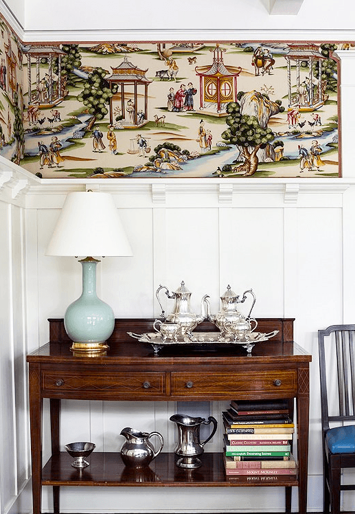
One of my favorite vignettes ever by Megan Rice Yager featuring Scalamandre’s Shanghai Wallpaper.
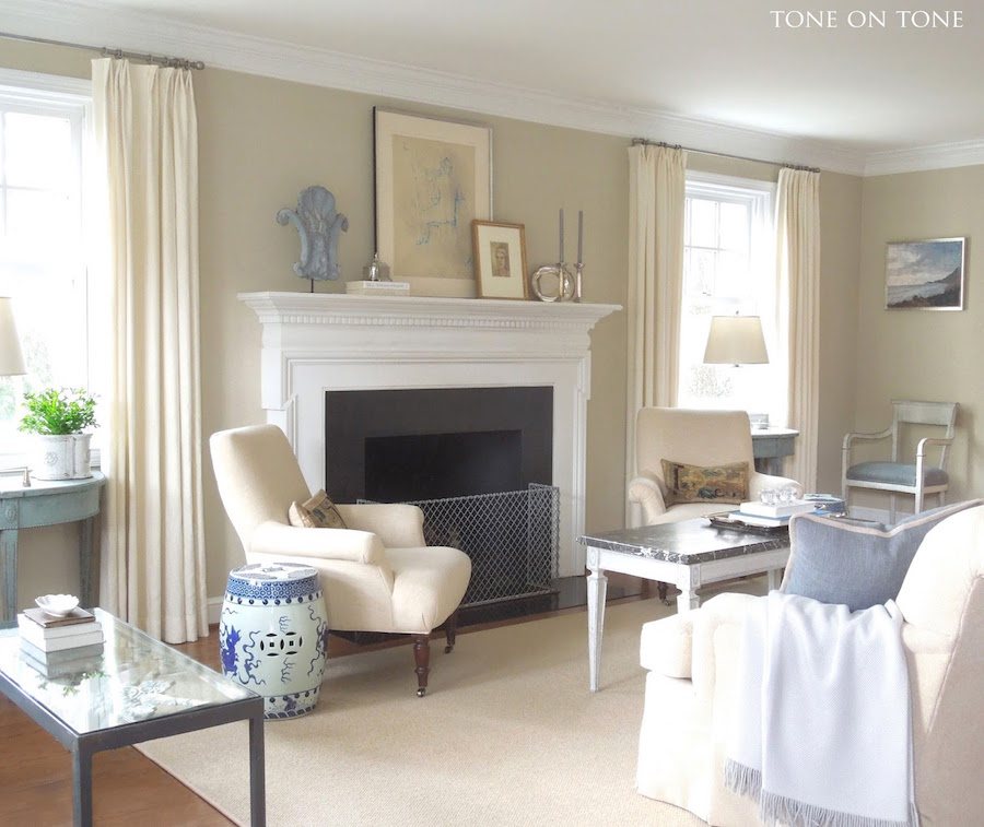
And I cannot ever have a post having anything to do with Gustavian Swedish without including an image from my friend Loi Thai of Tone on Tone Antiques. I’d give my eye teeth for those gorgeous blue-green Gustavian demi-lune tables!
Loi owns an antique store in Bethesda, Maryland specializing in Gustavian Swedish Antiques and well, he’s Chinese. So, there it is! ;]
Plus he is a superb gardener and is known for his legendary topiaries! Super talent and a really nice guy too! Oh, and please check out Loi’s insta account too. He has quite a large following there and for good reason!
I love his blend of classical styles with Gustavian antiques. Loi told me once that he only deals with the real thing.
Interestingly, to me, is that Wisteria, one of my favorite online sources and for many years is the only company I can think of that totally embraces the mix of Gustavian Swedish with Chinoiserie decor and furnishings.
Here’s a beautiful example with their Gustavian extension table styled beautifully with a few of their lovely collection of blue and white porcelains. BTW, they’re having a big sale over at Wisteria and it looks like all of their blue and white porcelains and 100s of other great pieces are at greatly reduced prices.
[Sadly, Wisteria is no longer but I am leaving this up, anyway. December 2020]
xo,
Related Posts
- My Room Isn’t Blue. Can I still Do Blue and White Chinoiserie?
- The Surprising Thing That Nate Berkus Said About Design Trends
- Painted Hardwood Floors – Good Idea or a Bad One?
- Nine Fabulous Benjamin Moore Warm Gray Paint Colors
- Why Is kitchen Lighting The Hardest Thing To Get Right?
- 12 Of The Hottest Kitchen Trends – Awful or Wonderful?

- 20 Timeless Kitchens You’re Going To Love Forever
34 Responses
I see you are celebrating 30 years “in the trenches” this year! Congratulations!
Oh wow! Yes! That’s right!
A tootsie roll analogy, banana cream pie, and apple cider vinegar shots – you’re baaaaack! And on a roll with a great topic. Thanks for the intro to the grand and colorful architecture of that Swedish estate – it was new to me. The discussion of gustavian, neoclassical and directoire styles and the current images you pulled together demonstrated the interplay of chinoiserie and gustavian style yesterday and today brilliantly.
My intro to Swedish colors and domestic scenes was through the artist, Carl Larsson. Rich reds, greens and yellow in the interiors and often blue dresses, shirts or aprons. Later, the beautiful pale greens, blues and grays attracted me and I was painting handmedown furniture my own mix of light blue-green paint (1980s).
Thanks so much Libby!
This has to be one of my favorite blog posts ever- such lush, exquisite interiors, such wonderful designs! I was sad when I reached the end- and had to return to the every day..
I was particularly taken with Miles Redd’s masterful, vibrant yolk yellow living room, esp. as I noticed that he used the Le Lac on the chair.I have Le Lac curtains in my bedroom- but my room looks nothing like his. Nothing! I wonder why ? 🙂
Happy Passover to you and your family!
Thanks so much Dolores! Miles is a decorator whose clients undoubtedly have 100% faith in. I can just imagine if I walked in to a meeting and pointed to the most saturated egg yolk yellow and told my clients, “this is the living room color. Oh, it’s going to be fabulous!” I’m quite sure that they’d fire me on the spot and then call the guys in the white coats to cart the crazy lady away! haha!
I hope that I get to meet Miles one day. I still think that he looks like he just graduated college. I bet it’s all that vibrant color that appears in most (but not all) of his rooms! And I adore his collabs with Gil Schafer!
Haha oh man, I’ll send you a pic of my living room in a few years when it’s complete – it’s gustavian and chinoiserie up in here 😄
Oh Cathlin,
Do I have to wait that long to see it? I mean, it’s not like you’re busy raising three young children or anything like that! haha!
5 month olds practically raise themselves!! 😉 I think you’ve been #blessed enough by IG shots of my living room floor littered with light sabers and calico critters to last you awhile yet!
Niiiiiice! There is no one as magical as Furlow Gatewood. Bow to the king.
Indeed, Chris! And God Bless him. He’s 96 now! I hope that he still has many wonderful years left. But the legacy of his book will live on forever. It should be required reading for every design student!
Gorgeous post, Laurel! Some of my all time favorites. And when I saw Miles Redd use that floral in his Mother’s dining room I predicted a new wave of chintz!
Oh, and me also.
XO
Hi Nancy,
Yes, Miles single-handedly made chintz cool again! Not that it hasn’t always been. But it had gotten a rep for belonging to a more snooty sort (nobody here. lol) and it often felt tired and dated. Although, Mario Buatta’s rooms are anything but tired, IMO.
Not only is this a beautiful post, but it also saves my head from days of wondering how I make the two styles I love work in my one little house. As usual, you cut down the hours of deliberation considerably. Thank you for your artistic insight!
Thanks so much Susan! Have to say that while I was in the middle of the post, I was thinking, how am I supposed to tie all of this together? But the wonderful thing about the traditional Gustavian colors is that they are so neutral, they go with everything. And Chinoiserie colors run the gamut from pale to bright and every color!
And then I realized, without saying so that my own living room has elements of both Swedish, Chinoiserie and Neo-classical with some more contemporary interpretations thrown in for fun.
Something that just came to me is that I’m often referring to doing things in a “classical way” and that doesn’t mean that we can’t ever have new things. Not at all. But the same principles, of color, form, style and proportion need to be followed. What that is exactly, is in the eye of the beholder to some extent.
What a wonderful post with all its links – a great class in glorious color – and WOW! what you’ve done for Sweden.
Gustavian Apple Green? I’m in heaven.
Thanks so much Sandy! Here, here for Gustavian Apple Green!
A fascinating post with achingly lovely interiors. Thank you. The saturated colors, rectilinear division of wall surfaces and classical details, as well as the delicacy of small figures painted on a dark ground reminded me of wall paintings from Pompeii. I went back to a post you wrote in January 2015 and, sure enough, you made the connection between neo-classical style and late 18th century interest in Roman art and architecture. I really appreciate the time you put into the history of style.
I am happy to see color again. I wonder whether all of the white on cream on pale gray dominating interior design today isn’t in danger of becoming a cliché.
Thanks so much Barbara! Some of the interiors will look dated in a few years. I think too much of any one thing is not a good thing. I feel that the most successful rooms have variety, in terms of texture, color, materials, light and dark even if they are over-all pale and monochromatic.
Barbara expressed my thoughts on this post exactly. The serenity of the lines and details, but with some color to enliven them, makes these rooms much more interesting and livable.
Laurel, hurry up and IG this so I can repost it!
Hi Caryn,
Okay. I’ve been so bad with IG recently. It’s my little rebellion, is all, because I do get bogged down some weeks. Not that I don’t like insta. I do! But if they went out of business tomorrow, I wouldn’t miss it terribly. I’ll post shortly. xoxo
I’m new to IG, and it’s the only social media I have kept since my purge of last year (for sanity). I get to look at “pretty pictures” without political commentary! I know it’s not an ideal medium, though.
I’m learning and enjoying much more by spending more time with select blogs (yours is a go-to!) than an endless glut of images scrolling by…
Thanks so much Caryn! I hear ya re: SM! It can be a trap, for sure. Facebook, I use 95% only for business. Twitter, I’d be very happy if I could shut it down.lol I love instagram, but really I am almost never interested in someone’s story unless it’s a ballerina dancer performing 8 pirouettes on pointe. Something like that. And if there are too many personal photos and they are cluttering up my feed, I tend to unfollow. Nothing personal, but I want to see inspirational design pics!
I’m almost fainting from the gorgeousness of this post! And also the older post referencing surprising Gustavian colors. Here’s the funny thing: I am Swedish on my mother’s side, but that is not something that is top of mind on a daily basis. We are restoring a farmhouse in the country, and my goal has been “happy” and “airy” but also “traditional”. For my kitchen I had a custom blue/aqua color made that is sort of in between BM Gossamer blue and Heavenly blue. I used this for the cabinets (walls are Chantilly white), and the floors are faux white marble that looks real. I took the blue into the attached sunroom/office with the custom blue on the cathedral ceiling with Chantilly white V-groove paneling. In the dining room is going Thibaut’s “Newman” Chinoiserie wallpaper in aqua, which also has some deep rose and olive green in it.
I used the colors that make my heart go pitter-pat, and only afterwards did I realize that there must be some subliminal Swedish thing going on. And then I found your post, in which you completely validated my decision to use the Chinoiserie paper alongside my “Swedish” kitchen Thank you, thank you 🙂
I think that if one listens to their pitter-pat, they can never go wrong! Sounds gorgeous Dale! And I’ve used Thibaut’s Newman wallpaper in the mint colorway. It’s one of my favorites! In fact, I’m sure that I mentioned it here. Hang on. Here it is. https://laurelberninteriors.com/new-photo-portfolio-living-room-decor/
Oh, I was planning on doing it in my entry but had to not do it for what is a bit of a long story.
Where has that Megan Rice Yeager image been all my life–it is so perfect and I love it! Great images as always. I love the idea of two seemingly opposite styles being used together–I’d love to see more blog posts on the topic.
Thanks so much Alice! Actually, I posted it once before. Hang on. This post. https://laurelberninteriors.com/modest-starter-home/ which is one of my favorite posts!
Color mixed with classic. Just exactly my living dream.
This was an excellent education – thanks for this, Laurel! This is how I learn; interesting information with beautiful pictures to bring it home and stick in the memory.
Thanks so much Sarah! These types of posts serve as a refresher for me too!
Beautiful post. I love Wisteria and they are my go to for blue and white porcelain so I was very excited to purchase the large dragon vase/ginger jar at 60 percent off!
Hi Angie,
I love Wisteria’s blue and white porcelains and actually pretty much everything they have. I own a few of their products and specified many of their mirrors for clients over the years.
As always, another thorough, informative and visually lush post.
You invariably select the most relevant, inspiring examples to illustrate your message. Furlow Gatewood and Miles Redd. I want to marry them both.
Thank you for your work!
HiAnn,
Me too! oh wait. Better, not say that. Me also! :]
Me too and me also!!!