

Update September 1, 2025
Hi Everyone,
Happy Labor Day! First of all, a reminder that many incredible sales are ending tonight at midnight. And I just added a few fabulous items to the widgets.
There are also many never-before-seen awesome pieces in the Hot Sales Widgets. The sales are amazing and some fantastic brands that rarely have sales.
And please, guys. Please click my Amazon link. (at the bottom of every post.) I hate to beg, but if I’m only make 59 cents, it means only one person clicked it.
Today, there is an update to yesterday’s post.
I goofed. I made several iterations of the living room and in one moved the wall to the bedroom over one foot. However, in the drawing posted, that wasn’t the case.
So, I corrected that and also have two new ideas I’d love for you to check out.
Okay, if you’re here for the first time, please begin at the top, otherwise, it won’t make sense. If you were here the other day, then please click the link below to part 2, to see the revisions and new ideas!
Please click on the link below, which will magically take you to part 2.
Part 2 Begins Here
Hi Everyone,
Yes! It’s time for another “Let’s Fix This Place!”
This time, I debated between two properties. The one I didn’t choose is a Beacon Street duplex with an incredibly awkward layout, but the bottom level is the real problem with lower-than-low ceilings and teensy basement-type windows.
The interesting thing about that apartment is that it was on the market right after I bought my place.
However, the place I chose is an exquisite Beaux-Arts condo located in an early 20th-century building on the southern tip of the Back Bay. It was located on one of my routes to physical therapy during late June and all of July.
Garrison Hall it’s called. It’s tucked away behind the massive Prudential building and center, and just behind the charming St. Botolph Street.
We will look at it in a sec, but first, I wanted to show you something from an earlier Let’s Fix This Place.
273 Commonwealth Ave. Remember?
In addition, I finished that post with more options, here.
What I didn’t show you is that a week or so after the second post came out, I was out walking and decided to walk stalk down the alley behind 273.
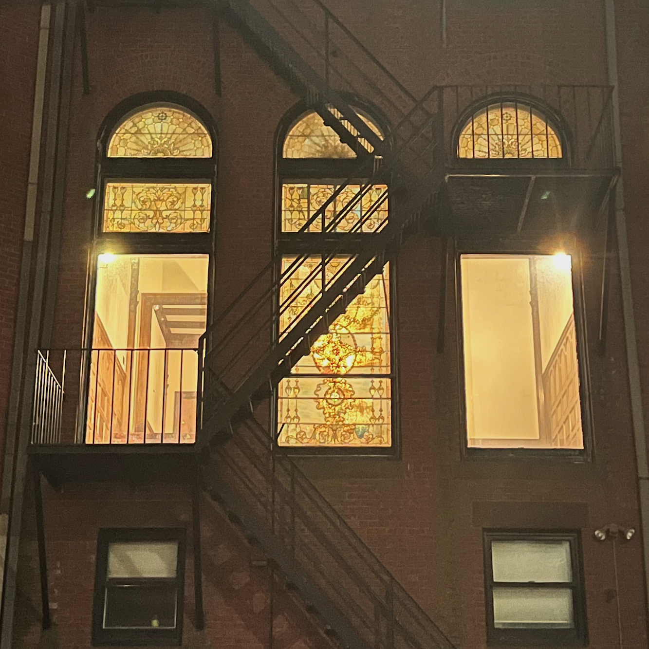
And then, less than four weeks ago, during the day, I was again walking by the front of the building and looky looky!

Yes! A building permit!
273 Comm Ave is under renovation!
Of course, the only way we’ll get to see what they did is if it goes on the market.
Okay, let’s take a look at 8 Garrison Street, a gem of a Beaux-Arts condo. This links to the real estate listing if you would like to see more images.
For funsies, I made a little map of the area so you can see it in context.
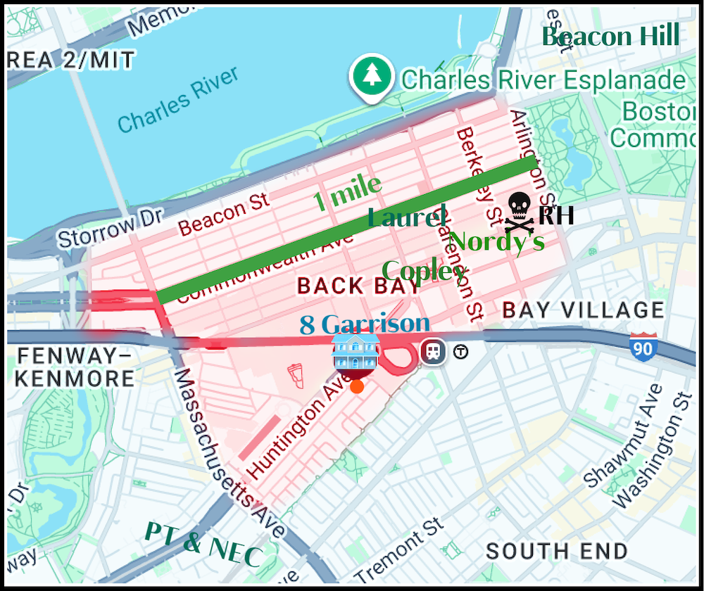
The area shaded in pink is the entire Back Bay neighborhood I wrote about here.
- At the top right is the bottom of Beacon Hill. The flat part.
- To the left of Boston Common, where the Puritans routinely held public lynchings, is the exquisite Boston Public Garden. And I must say that since they renovated the Child Fountain at the main entrance, the entire garden looks the best I’ve ever seen it.
- Then, traveling from right to left is
- RH, Nordy’s, me, and Copley Square.And yes, it’s one mile along Commonwealth Ave, from Arlington St. to Mass Ave.The red part of I-90 (Mass Turnpike) is underground.
8 Garrison is just south of Huntington Ave.
At the very bottom of the map is where my son, Cale, went to college, New England Conservatory. (NEC) Or, as we fondly call it, “Not Exactly College.”
To the left of NEC is where I went to PT.
Okay, I know that 90% of you didn’t read any of that and have already been scrolling through to the pics. ;]
But, for the 10% still with me, ;] Below is the Beaux-Arts condo at 8 Garrison. I’m not including the specific number because it’s irrelevant, unless you’re interested in purchasing. And I’ll tell you, if this were September 2020, I might very well have put in an offer here.
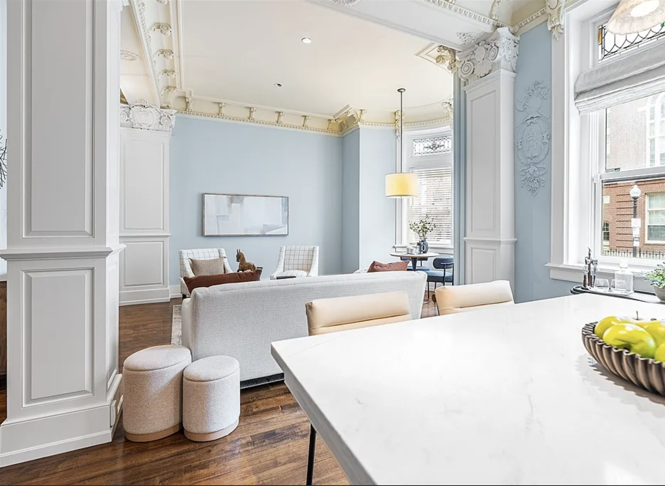
Looking into the spacious living area from the kitchen.
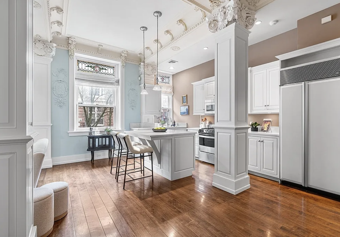
Thems some fancy columns, huh?
As you can see, it’s an architectural gem if ever there was one. In fact, it’s bordering on being a bit too fancy, but that’s not the real problem.
What is the real problem, Laurel, besides the paint colors?
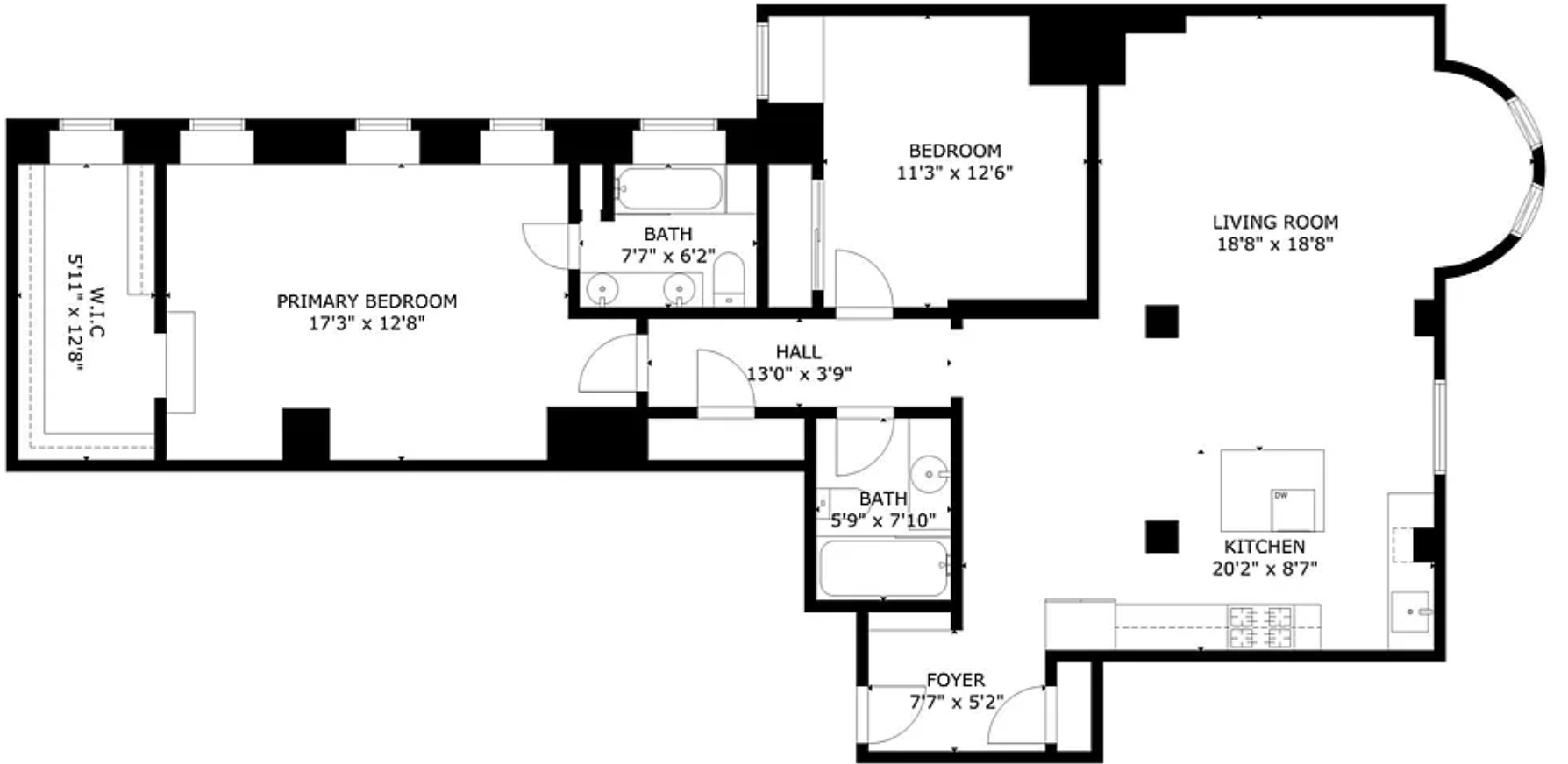
(Shhhh, we’ll get to that.) Do you see it? (Above is the floor plan)
I bet some of you do, and it’s okay if you don’t, but as soon as I tell you, you’re going to go, “of course, duh!”
It’s the element that makes this unit so unbelievably stunning.
Yes, the two giant columns and three pilasters. (engaged columns)
But, mostly, it’s the columns that are in the way.
How did that happen?
8 Garrison began its life in 1910 as a hotel with a grand lobby. My guess is that when this building was converted into condos, they decided they no longer needed such a huge lobby and designated this part of the lobby as living quarters.
I mean, doesn’t this look like part of a grand lobby?
The current configuration isn’t terrible.
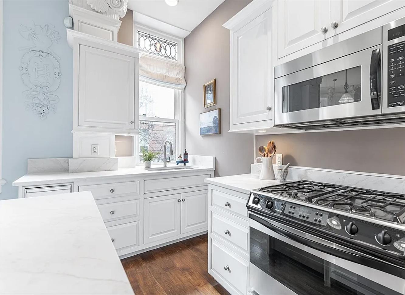
The kitchen isn’t totally sad, but it’s pedestrian. It looks as out of place as it would if the King and Queen of England were serving Dunkin’ Donuts to their visiting guests.
But look at all that open space. For today, I worked on this all of yesterday, and I will say this is the most challenging place yet.
It’s not only the huge columns, there are also one massive and one large window in the kitchen. Now, that isn’t a bad thing. Windows are always good, but it would be easier if the one over the sink weren’t there.
Okay, YES, some of you are panting in the back!!!
You were waiting for the other shoe to drop and a thousand times yes, the paint colors are atrocious. Please remember that Laurel puts things down, NOT people. However, it appears that they didn’t get the memo, and it looks like they took Pantone seriously. Remember the baby twins Rose Quartz and Serenity?
The colors look like a baby nursery where the caretakers forgot to put a nappy on the baby.
I know; so bad. But isn’t that why you’re here? Just waiting for Laurel to say something completely inappropriate? ;]
Ya know, this place has been on the market for over ten months, and maybe the paint has something to do with that.
However, if you look at the listing, while nothing is terrible, it’s dated. And the price, although it has come down, is probably a bit overpriced. While it’s an excellent location, it’s surrounded by some gigantic skyscrapers. Plus, there’s only on-street parking, no outdoor space, and no fireplace. So, actually, I’m not sure about that offer. In addition, the monthly fee is on the high side. It’s actually double what I pay.
I bet you’d paint the entire living room white. Right, Laurel?
Well… that would certainly be better. However, with all of the flourishes, I think it needs a different treatment– one that includes a lot of white, but a much creamier white. This looks like the plain white out of the can.
One thing about all-white for this place is that it has a bit of a wedding cake look, as it is.
Okay, I am not going any further for today. But I’d love to hear your ideas for renovation if you can think of anything. It’s all right if you can’t because the roadblocks are immense. It does help to know that the space between the columns and counters is too tight, as it is. One can get through, but I see a lot of stubbed toes and bruises from opening cabinet doors. There either needs to be more space or no space.
Also, I’m not proposing building any walls separating the kitchen. The primary reason is that it would be prohibitively expensive with the plasterwork. The room has a lot of interest, and in this case, I am fine with the single room situation.
Still, it isn’t taking advantage of the space, and I’d love to see more storage.
This was my favorite Let’s fix this place.
The other thing is wall color or colors. My view is that the main room needs some yang to the intense amount of inherent feminine yin. In other words, I’d love to see a super hunky wall color, keeping the ceiling, columns and trim creamy white. Or, if the walls were to be white, maybe something in the manner of Ralph Lauren in Milan.
That could be a terrific look for this beaux-arts condo.
I have one more idea that was inspired by friends of ours in Manhattan who did something amazing. So, some good stuff is coming up.
Speaking of which. Labor Day is upon us. I know, it’s always bitter-sweet.
I am working on my update for the paint guide and hope to have it out within the next week.
Please enjoy today’s photo of the Boston Public Garden. It was an exquisite late summer day!

I am incredibly fortunate to live among such splendor. It will be five years this December, and I still can’t believe it.
And yes, I do walk through my place quite often and feel as if I’m living in a dream.
xo,

*********************************************************
Part 2 Begins Here
Sunday, August 31, 2025
Hi Everyone,
I hope you’re enjoying a long holiday weekend if you’re in the US.
Okay, I have been working on a viable floor plan for this beautiful apartment.
But first. A few of you commented that you like the blue walls.
I apologize if I didn’t make myself clear. There is nothing wrong with the blue walls or any color in isolation. However, this is only one small part of the entire scheme, and the scheme as a whole isn’t working for me.
I’ve been thinking a lot about why it doesn’t work, and I have an answer for that as well. But, not today, because I need more time to put it all together. So, for now, let’s hang tight with the colors.
My guess is that the owner(s) moved out ages ago, and this is rental furniture. I mean, if you look at the huge walk-in closet, the only article of clothing is one trench coat.
Can buyers see past how bland this place is?
Not for that price.
I imagine this kitchen is a helluva lot better than what was there, but it’s still not a kitchen that belongs in a 1.6 million dollar condo. There’s too much of a disconnect between the old and the new. It’s commonplace, but that doesn’t make it okay.
If I were the owner, I’d drop another 10-20 thousand to spruce the place up and make it a more inviting space.
However, for today, I want to go over what might be possible with a real renovation.
For those who’ve studied the 12-step decorating plan, figuring out the layout and furnishings comes first. However, we need to think about what we might like to add.
1. A lot more storage
2. A washer/dryer
I’m excited to share the plan and ideas, and I have tried to make it as clear as possible.
Okay, please don’t freak out. I realize the rendering below is quite detailed, and there are a lot of note. But I will go over everything here, and then it should be easier to understand.
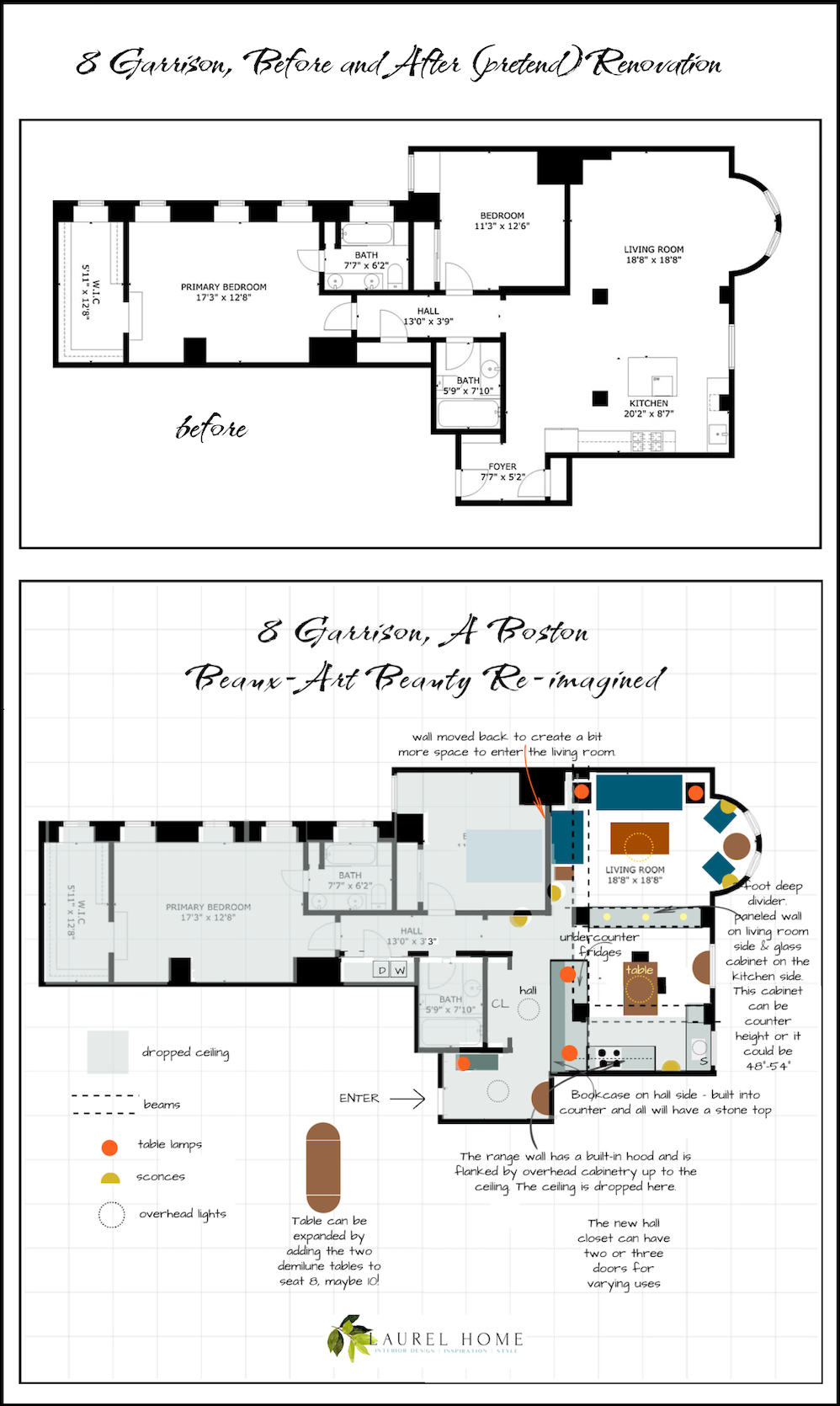
Below is the floor plan I botched.
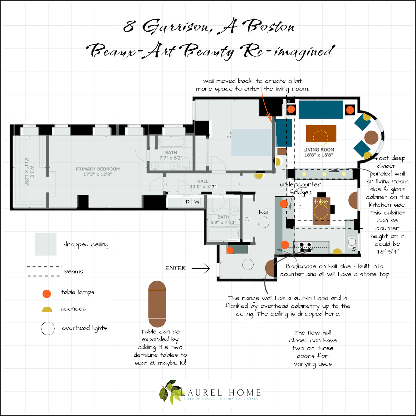
Below is the revised floor plan.
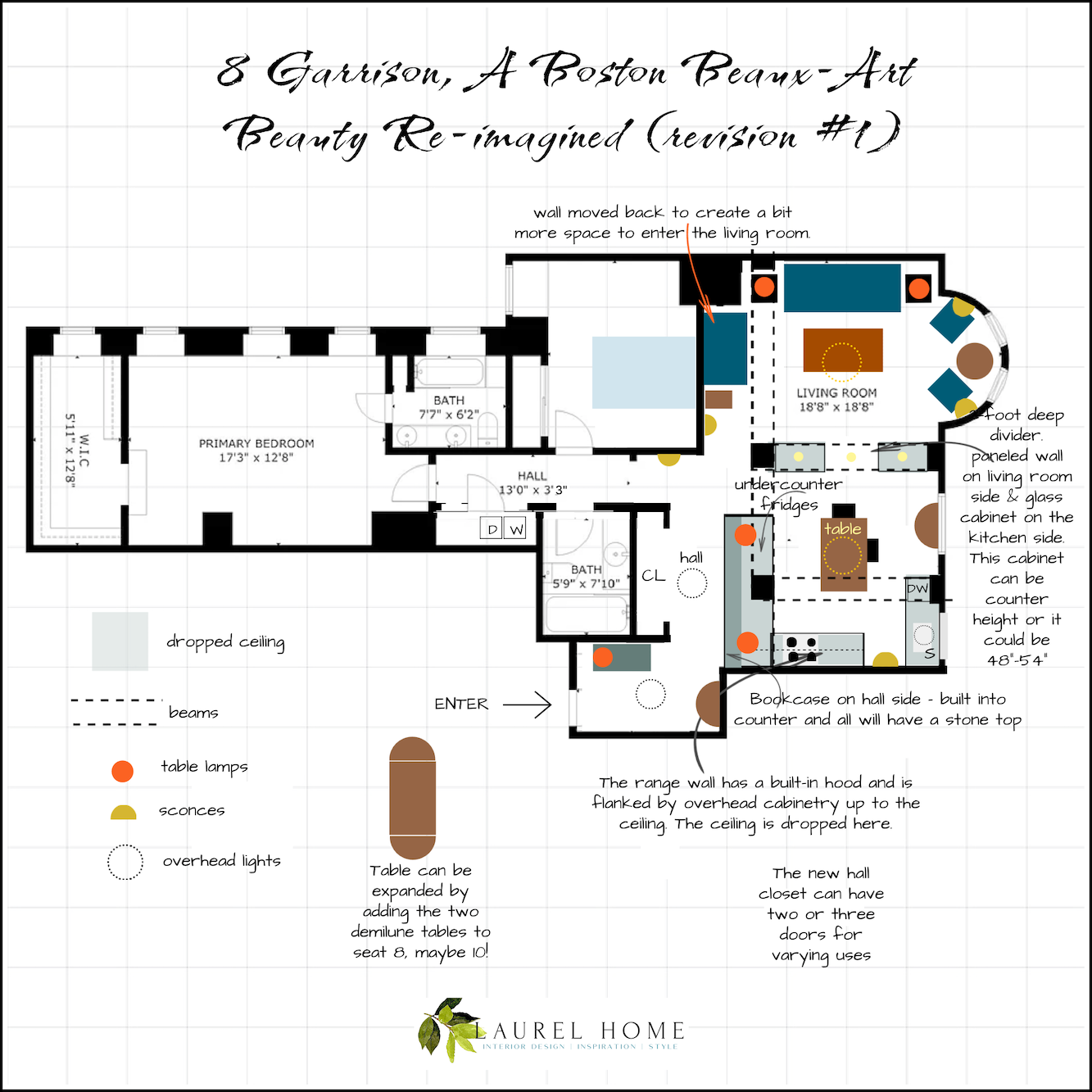
As you can see, the wall to the bedroom is pushed back to allow adequate space to enter the living room.
In addition, I turned the one dividing cabinet into two cabinets with an opening in the middle.
While this is a viable option, I prefer the solid cabinet.
If for some reason a piece of furniture doesn’t fit through the doorway, it could always be hoist over the cabinet.
Okay, for those who haven’t seen what I did, please continue.
We enter as before, of course. But instead of a closet straight ahead, there is a lovely demilune table with art.
To the left is a chest with a mirror over it.
Then, we turn the corner, and to the left is a big closet for coats, utilities, and maybe even a workspace. But that is optional. A workspace could also be carved out of the enormous walk-in closet.
Turning left at the continuation of the hall, I moved the wall 6 inches to make plenty of room for a washer and dryer! I also moved the wall bordering the bedroom back six inches to create more space for entering the living room. However, it’s possible that the drawing is slightly off, and there is already sufficient room. If that’s the case, the wall won’t have to move.
The pale gray-blue represents all areas with dropped ceilings. You can see the drop in the real estate images.
There is an alternate idea for the bedroom, but that will have to wait.
Let’s now go back into the main living area.
I’d like to review some of your ideas, which were terrific, but may not be feasible.
1. Switching the living room and the kitchen.
First of all, it might not be possible from a building standpoint. But, it will also be exceedingly expensive, and I’m not sure it’ll make things any better. There isn’t adequate room in the bay for a table more than about 36″ in diameter– max. Plus, it’s a bit tight back there, so it would be far better to get anything larger than a tea table out of the living room.
So, I did a number on the kitchen.
Let’s go back to the entry. Opposite the new closet is a one-foot-deep, very long bookcase. It could have hidden panel doors like I have in my bathroom. I love them! Attached to the bookcase is a kitchen cabinet that’s built around the column. The top isn’t two colors; it’s one top. I made the bookcase darker so you could see it as a separate piece from the kitchen cabinet.
The range and sink are in the same location, or close to it.
I got rid of the island and put a custom 36″ x 60″ table in the middle of the kitchen. And yes, there’s a second demilune table, which, as you can see from the drawing, can be used to create an extra-long table for guests, along with the entry demilune. The expanded table could be positioned at an angle to utilize more space.
Having the table in the kitchen makes so much more sense. It’s movable and can expand to seat at least eight.
Why not a counter-height dining table or island?
I’m not a fan, and also, the dining chairs can be used in the living room, but counter stools cannot be used.
And now for my favorite part.
Behind the table is a cabinet built between the two large columns. It can be either double-sided or single-sided. From the living room, it can be 10″ deep for storage for books, games, a TV, or kitchen supplies.
The kitchen side can be glass cabinetry.
Alternatively, if more deep storage is needed, it could open from the kitchen side only and house kitchen items such as recycling bins, a microwave, a mini oven, or a coffee station. This piece makes so much sense. It acts as a room divider, but still feels spacious, and most importantly, provides much-needed storage.
This is the sort of thing I’d consider heavily when renovating for resale. Have you ever gone into a home and said, “Oh my! What were they thinking? There’s an absurd amount of storage space.” It’s like saying, “There’s too much oxygen in the air.”
Moving the dining area into the kitchen totally opens up the living room, where there is now ample space for movement and a gracious, welcoming seating area.
These changes double the previous storage capacity and also make navigation a bit easier. Adding an in-unit laundry is a great selling point.
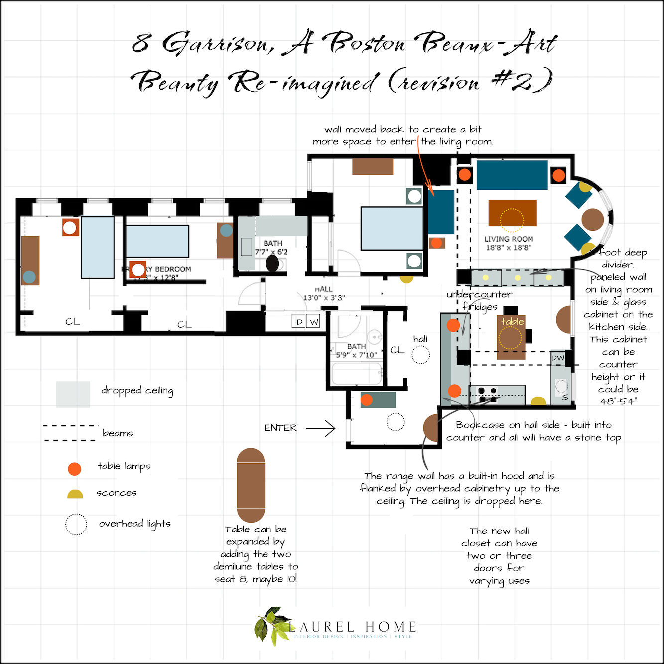
Okay, below is my last idea for this beautiful Beaux-Art condo. The cabinet turned back into one unit.
But first, a little explanation.
Years ago, when my kids were very young, two couples, friends of ours in NYC each had two children. One had two girls about 2 years apart and the other had twins, a boy and a girl.
The problem was that the parents lived in not-very-big one-bedroom apartments. However, these parents were both very clever and turned their one-bedroom units into 3-bedrooms. However, the two new bedrooms were tiny, but large enough for what was necessary.
Below is a quick diagram of that apartment as I remember it from 25 years ago! And on the bottom is what the couple did to the apartment after they learned they were having twins!
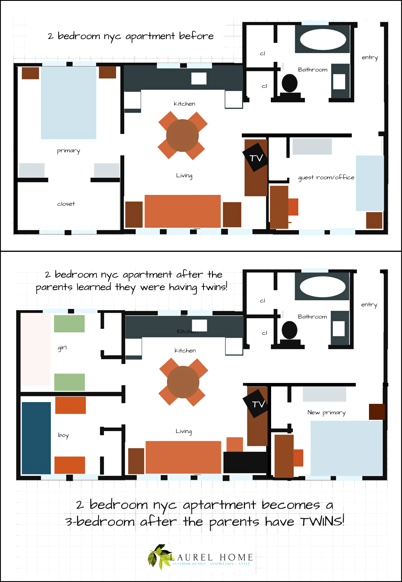
So, that gave me the idea. What if the same thing happened in Boston? Even if it’s only one child and it’s a one-bedroom. Maybe the parents bought the place 12 years ago. Now, they can’t afford to move. So, could we do something similar here?
Here it is!
It’s very rough, and I moved some things in the top bathroom that might not be possible.
And sure, it’s a little tight, but a palace compared to the cramped quarters our friends lived in. The apartment was less than 600 square feet! That’s less than half the size of the Garrison St apartment. This is more in scale with the Boston condo, so you can see how much smaller it is.
Next, I’d like to discuss color schemes. This is very important, so please stay tuned!
xo,
The Labor Day Weekend Sales are ending tonight or tomorrow night.
So, please check out the Hot Sales pages!
There is now an Amazon link on my home page and below. Thank you for the suggestion!
Please note that I have decided not to create a membership site. However, this website is very expensive to run. To provide this content, I rely on you, the kind readers of my blog, to use my affiliate links whenever possible for items you need and want. There is no extra charge to you. The vendor you’re purchasing from pays me a small commission.

To facilitate this, some readers have asked me to put
A link to Amazon.com is on my home page.
Please click the link before items go into your shopping cart. Some people save their purchases in their “save for later folder.” Then, if you remember, please come back and click my Amazon link, and then you’re free to place your orders. While most vendor links have a cookie that lasts a while, Amazon’s cookies only last up to 24 hours.
Thank you so much!
I very much appreciate your help and support!
Related Posts
 Hubs Wants a Say In the Home Decor, Because It’s His Home Too?
 Best Bedroom Ideas Inspired by Mark D. Sikes
 The Nightmare of Doing Long-Distance Interior Design Work
 Best Windows – Size, Type + Is It OK To Do Black Frames?
 40 Outdated Home Trends. But, Are They All Passé?
 7 of the Hottest Bathroom Trends To Avoid or Embrace?
 Mrs. Laurel Builds Her Parisian Dream House


39 Responses
I would not pay 1.6 m for a place without a dining space out of the kitchen, no washer dryer and no parking. I come from modest means and we didn’t have a separate dining room until I was in high school. Except for my aunt’s kitchen which was always pristine, I never felt comfortable eating in small kitchen spaces.
I second Dee-Dee Davidson‘s idea of building a banquette in the bay window and adding a (small) dining table there. During the day, it could be used as a workspace. It would also be a lovely place to play cards or games when guests are over. We have an eat-in-kitchen and let me tell you, dinner next to dirty pots and pans and bowls and food scraps is not the Nancy Meyers movie it seems on paper. Laurel, would your wonderful plan work with a banquette or would it ruin the layout? Thank you for sharing your expertise.
Excellent job! I love to look at your before and after floor plans. If only the owner/developer/speculator had hired an architect or a crafty interior designer with your “know down” before the construction! No doubt the apartment would already be sold.
Laurel – Of course I realize the columns are structural. More clearly, they appear to be paneled in wood. I’m wondering if there is perhaps beautiful marble or some other stone behind the paneling.
Dear Laurel:
Always enjoy your website.
Often, I find your space planning creative and the money, but….
I’m afraid that there is no way to justify the width of the opening into the living room. It seems to be barely 24″.
I think you need to seriously consider another way to solve that.
Incidentally, I spent 50 years doing interior design and many remodels in Seattle. Retired now.
Hi Mervin,
You are right. I have another idea.
Laurel, your solutions look brilliant! Wouldn’t it be fun to have AI do a 3-D rendering? Haha, I’m not even thinking about asking you to consider this – just pondering how cool it would be to look at. I really am so impressed with how you can visualize the possibilities. I guess that’s what comes with years of schooling and most importantly, experience in the field. I look forward to every post!
Hi Sheree,
That would be cool. Chat would need to see the elevations in order to do that. Or, maybe he could do it with a very detailed explanation.
Laurel, reading your blog, I can’t help but think I am missing much of the visuals. I am exceedingly bad at anything technology related, so I’m thinking I may have inadvertently blocked some of your pictures in an attempt to block other on my PC, and I don’t know how to remedy the problem.
Hi Lisa,
Sorry, I wish I knew the answer. Usually, when I’m stumped, I’ll try googling the query and 90% of the time, I get the solution.
Good morning Laurel,
The new design is perfect. It makes much more sense. The only tweak I would add is to put the table under the kitchen window. There’s something nostalgic about having your morning coffee & looking out the window & watching the world go by. Of course it could be pulled out when needed.
Hi Mary,
That’s a lovely idea. There’s the dem-lune table which two people could sit at.
I’d consider removing the cabinets on the window wall, then running the main run of kitchen cabinets all the way to the window and have the sink facing the wall, with the window on the left. The sink would still be next to the window, but without the awkward corner. Also, is there enough space to move furniture in and out of the living room with the new cabinet?
Hi Caryl,
I’m not sure if the sink can be moved. A couple of things are that I prefer a sink under a window and I’m also not fond of the sink and range on the same wall. However, it’s a good thought, if it’s a possibility.
Yay for you Laurel in getting rid of that island. so many kitchen island plans just irritate me, not all of them of course.
And I didn’t catch until reading comments last week that there is no laundry in this unit. $1.6 million and no laundry? I cannot
grok that.
Hi Kim,
It’s true. There is a laundry room in the building. However, I lived like that for eight years and was always stressed out that I’d lug everything down there, only to discover that all the machines were taken. It only happened a few times. However, I learned that doing laundry later was a safer bet.
A no-no painting the crown moulding and ceiling that creamy white. Against the cooler white of the walls it looks dirty. Too much butter in the wedding cake’s icing?
Hi Randy,
Yes!
I would definitely remove the cabinet on top of the pilaster; that’s just wrong! And, I’d want the remaining kitchen cabinets to go to the ceiling. I’m not a fan of the paint colors, but I will defer to you for what might look best (or at least better). I have no idea what other storage solutions to offer except the additional kitchen cabinetry! Can’t wait to see your ideas!
I actually like the paint colors.
Thanks for the mini video tour of your stunning home. Everything looks so perfect, all your selections, just are marvelous. What caught my eye was the wall above the dining table (between the two windows) – could a piece of artwork be placed there, I see that the wall is curved. Or do you prefer it without since you have the chinoiserie panels and this is a resting place for our eyes?
Before I did anything, I would want to know what is behind material boxing in the columns. Just curious…
Hi Traci,
Do you mean, are the columns structural? They most likely are since this unit is on the ground floor.
I can’t get past the light fixtures. They are too small and ugly for such a space. I looked at the listing photos…I wish they hadn’t used a fish-eye lense for every single shot! And I agree with all those who say … get that cabinet off the pillar! So gauche!
Can’t wait to see it “Laurelized” 😍
Hi Gabrielle,
Yes, the cabinet on the pilaster is awful.
Guess I’m dated- I like the blue!!
Hi Lisa,
People are never dated. The blue is fine. It’s the way it’s used, and the combination of other colors that I have a problem with.
Hi Laurel, this place is lovely, but the trim overwhelms such a small kitchen. I think I’d cover the small kitchen window with uppers, but leave the pretty transom above. Then I’d take that silly cabinet off the column and continue lowers under the big window, maybe backless glass upper cabinets above in front of the plaster decorations- could put pretties in there. Then I’d enlarge the island to incorporate the column, and place the sink there, if possible. More seating (not so modern!) at the island. Maybe a bit more color or black for the countertops.
Then I’d do a built-in banquette and a larger round table in the bay window for a dining room. I think I’d paint the cabinets (hopefully custom and not quite so big-box) a creamy white, like your B. Moore Cotton Balls. Maybe paint everything that color! I don’t think the trim needs contrast to show it off because it speaks so loudly by itself! Then, I’d do deeper colors in the furnishings. It will be a fun one to figure out!
Good morning Laurel,
You are right about the place being extra fancy. But I could live with it. But it has a couple of deal breakers for me. It doesn’t have an in-unit laundry. And it doesn’t have dedicated parking.
I like Linda’s idea of swapping the living room & kitchen. I can’t wait to see what you do.
Kim, I like the blue too! I think if the ceiling and crown were a different color, the blue wouldn’t look as out of place. That said, a bit more gray in the blue might look more sophisticated while still being cheerful and feminine.
Hi Laurel. First, I think it would be interesting if you assumed that this COA or coop is not as flexible as yours was and will not allow the sink drain to be moved more than 10 inches. Second, I have a theory on how the current owner ended up with this color scheme. It’s a mistake that I almost made with my 18 foot, highly ornate ceiling. The paint on my ceiling was in good shape, though not a shade of white I cared for. (It was warm; I like fairly bright and cool colors.) Most painters wouldn’t even bid on painting the ceiling, and the ones that would were quoting ten figures. Not only was it expensive, I worried about losing detail in the trim. I spent three weeks trying dozens of trim and wall colors to find something that appealed to me AND would go with the ceiling. Fortunately, I eventually realized I was being an idiot, bit the bullet, and had the ceiling painted the white that I wanted in the rest of the apartment — Benjamin Moore’s Super White, one of your oft recommended colors. Everytime I look at my ceiling now, I smile. It’s a color that makes me happy, and it works with all the other colors in my home.
Hi Tsippi,
That’s an excellent point and I’m not positive of the answer in this case.
My coop had no say in the change in the plumbing as the plumbing in my unit is at the bottom and it’s not a factor. While the units above me are undoubtedly stacked, that is not the case with my unit and the front duplex. To make the changes, the plumber had to go underneath where there is a five-foot high exceedingly scary crawl space.
However, things might be different in this building as it was built as a multi-unit dwelling, not a single-family house. But the only thing that might make it possible is that this unit is also on the bottom. Great point!
I am such a newby. i scrolled through these and found the place to be beautiful!
but I do like your suggestion of cream vs white paint. Confession: that blue is pretty!
Hi Kim,
The place is beautiful. That’s why I chose it. However, it could function better and provide much more storage by making better use of the space. I also find the combination of colors– well, let’s just say, they make me a little queasy.
Initial thoughts: I would reverse the kitchen and the living space. I would install a banquette in the bay window and place a dining table in front of it. I don’t like the white lights hanging from the ceiling. I would remove them and use hanging fixtures with more visual presence that are centered on the ceiling moldings. The present design looks like it ignored the historic elements and tried to make the unit look modern. I think the design would be more successful if it embraced the historic elements and incorporated them into the design in a decorative and functional way.
Can’t wait to see what you do with this! Colors are horrid.
I’d build an island with a sink in it and totally reconfigure the entire kitchen. A cosy little breakfast table and 2 chairs would be fun in front of the small kitchen window.
The kitchen cabinet stuck on the column by the sink looks awful. No dishwasher that I can see, deal breaker for me. I do like all the natural light that comes into this space.
No laundry! This should be fun:)
Where do they eat? Must it be at the island seating?