Happy Saint Patrick’s Day!
In honor of the holiday, it’s time to do a post about some of my favorite green paint colors.
However, this is the problem with green paint colors.
About a quarter of the colors in the fan deck are some shade of green. There are a zillion shades of green paint! It takes nothing for green to pop out of colors that don’t look green UNTIL they go up! In fact, here’s a post with some of my favorite shades of green that don’t say “green.”
I bet a good many of you have had this surprise after you painted your room.
For example. Several years ago, I got a panicked phone call from a prospective client.
“HELP,” she said. “I just had our large family room painted in Benjamin Moore French Canvas, and it’s GREEN!”
I went over to her home as soon as I could. And yep, she was right; what looked like a warm, creamy white on the chip went up looking like a pale celery green. But, not a healthy piece of celery. It was like the celery that you find in the back of your fridge six months later, forlorn and limp.
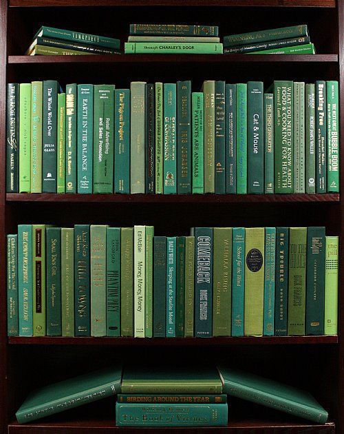 green, green, green
The “green effect” is common in north-facing rooms.
One more story, I know I told recently, but who knows where. But, I was helping a client with her bedroom. Everything and I mean everything we sampled, looked green. Even pink looked green. It was the weirdest thing ever, and I’m sure my client thought I was a total fraud. Finally, we went with a lovely cream which took on a very pale but healthy-looking celery color, and it was lovely. Phew!
With that in mind, I’m going to give you the usual 9 fabulous shades, but I will steer clear of some of the less obvious shades of green paint for the most part.
But, there are too many fabulous shades of green paint! I could probably list 200! But I won’t. When I was creating the Laurel Home Palette of colors, green was the most difficult color to narrow down.
Therefore, this post will center around unabashedly green shades of green paint—nothing to make you go blind, but 9 really great shades for you to try out.
What is the common mistake with shades of green wall paint?
I’ve been through this mistake before, but if you missed it or this is the first time with us, here it is.
You get all nervous that it’s going to be “too much,” and you dilute it with white. (mixing it at “50%” or something like that) Or, you wimp-out and pick that really sickly, icy tooth-pasty minty-green. AKA: Hospital green. Or Crest Toothpaste
Please don’t. There’s an excellent chance that you’ll hate yourself if you do. So, be brave. You won’t be sorry.
One thing to always keep in mind, and I forget it too, is that unless the room is a basement or something, most rooms have windows, doors, furniture, and stuff on the wall. Usually, the paint color is a backdrop, not the main event. (If your room doesn’t have windows, please check out this post)


Many of the greens today are not ones that I have done; however… they came highly recommended by people I trust, and I checked them out scrutinized ’til the cows came home, and I approve.
And, several are in the Laurel Home Paint Palette Collection.
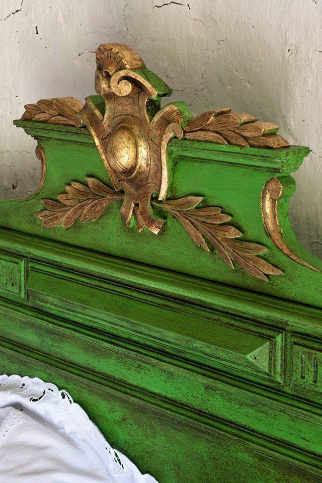 Annie Sloan Chalk Paint in Antibes Green with a dark wax finish and gold leaf accents.
Annie Sloan is one of the top chalk paint companies. And, she provides lots of tutorials to help you with your projects. I posted this because I think it’s a cool bed.
Okay, time to dive into the 9 green paint colors for walls.
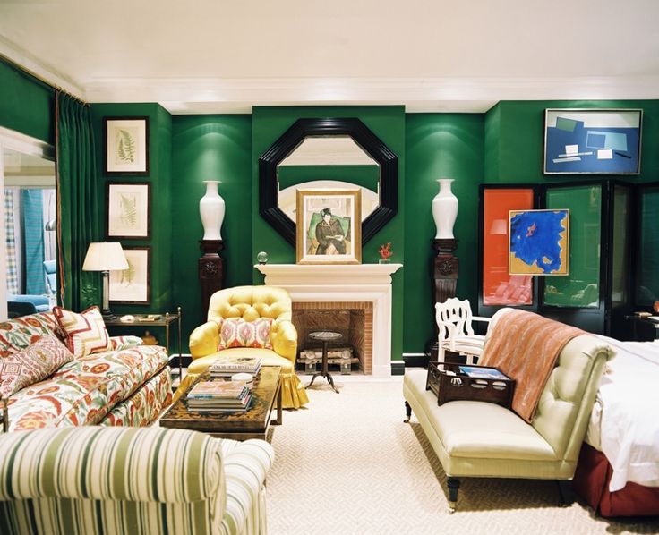
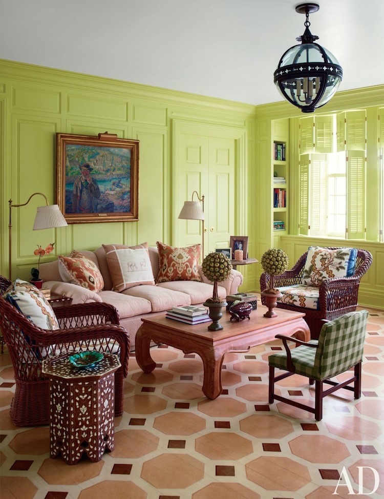
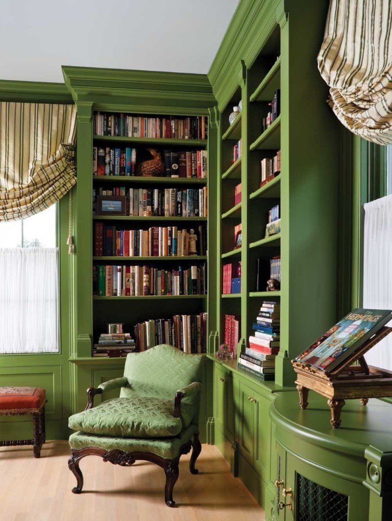
Benjamin Moore AMAZON MOSS 2037-10
I adore Miles so much!
He can take a hideous green like this and make it glorious. I mean, it really IS billiard cloth green. Remember his Mom’s home?
Another thing I’ve realized is that green loves itself more than any other color, I think.
If you don’t like the green you’ve chosen, select art with other shades of green, and it’ll start to come together.
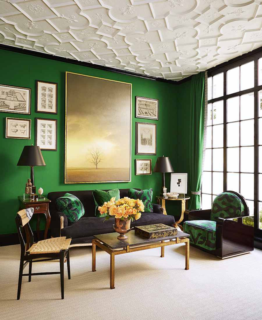
Another Miles Redd super-saturated green. I want to point out that Miles makes this intense green paint color work with art to break it up. And then, there’s that stunning ceiling.
Benjamin Moore 416 TASTY APPLE
Benjamin Moore CHIC LIME 396
I love this cheery chartreuse in this room by the late, great Mario Buatta.
Benjamin Moore PEACEFUL GARDEN CSP-830
John Loecke and Jason Oliver Nixon, the guys behind this company, gave a charming talk at the Design Blogger’s Conference last month. They’re all about traditional elements expressed with exuberant colors and fun fabrics. This green is a classic sage but not boring.
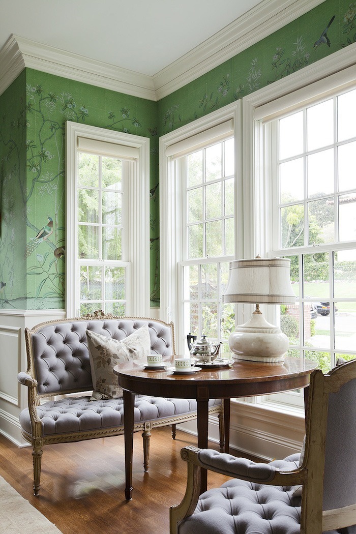
I couldn’t resist sharing this charming dining nook featuring green Chinoiserie wallpaper.
 Hotel Particulier in the Marais en Paris
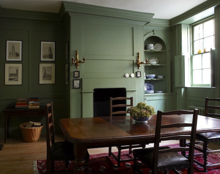
FARROW and BALL BREAKFAST ROOM GREEN 81
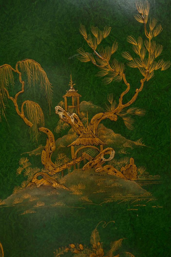
Gotta have a little Chinoiserie detail from this fabulous chest.
Above and below by the extraordinary Sheila Bridges. You may recall that she’s one of the top 20 interior designers that I would hire. This color is said to be
FARROW and BALL CHURLISH GREEN 251
which is a fabulous green-yellow. The original images looking nothing like Churlish, so I edited them. They were both far greener than this lovely yellow-green.
The lesson is: Never trust a color from an image. 9 times out of 10, the real color will look very different.
In fact, we discussed that here, at length.
For a conversion of Farrow and Ball into Benjamin Moore, please check out this post.

 Windsor Smith brings the outdoors inside in this lovely room with a spectacular view.
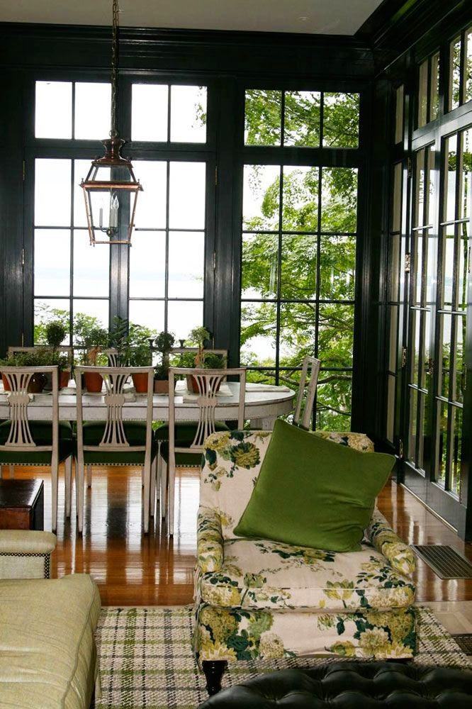
FARROW and BALL STUDIO GREEN 93
This green is almost black, but it’s not; very sophisticated.
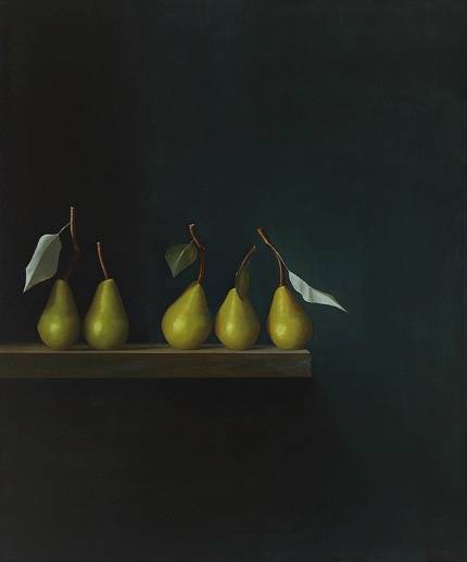 I love this enigmatic painting by Malcolm Rains.
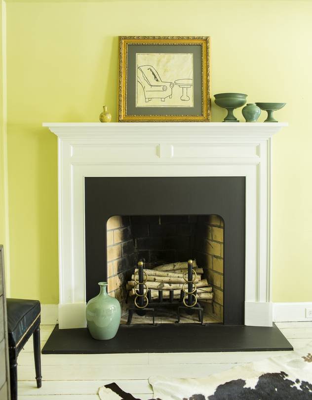 Photo by Julie Bidwell for the Wall Street Journal
Benjamin Moore FRESH CUT GRASS 2026-50
A very yellow-green paint, but fresh and lovely as you can see here.
Benjamin Moore GREEN THUMB CSP-870
a true grass-green from Benjamin Moore’s newest collection of colors–Color Stories. I’ve been following Charles since I was a student back in the 80s. Fabulous interior designer!
FARROW and BALL CALKE GREEN 34
It is a true English library green, but it could be used in other rooms as well. In fact, you can see Farrow & Ball Calke Green in this beautiful kitchen!
*********
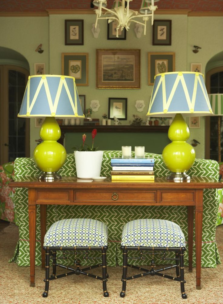
For Fun, I made a shopping widget filled with green home furnishings to go with all of the green paint colors.
Some are new pieces and some vintage. Please click on any image for more info.


Spring is on its way in the northeast!
For more outstanding shades of green, please click here.
xo,

Please check out the newly updated HOT SALES!
To order Farrow and Ball samples and paint, go here.
Related Posts
 Is He Right? Are White-Painted Walls Boring?
- 5 More Fabulous Interior Designers I Would Hire {part II}
- The Surprising Thing That Nate Berkus Said About Design Trends
- The 12-Step Decorating Plan That Works Every Time
- Painted Brick-How to Easily Change It Back After Painting It
- The Dining Room Chairs Cost What???
- Flush Mount Ceiling Lights – No Boobs Allowed!


29 Responses
I love this post. I’m more of a blue person, but lately I’ve been feeling the need to mix a chartreuse in with the blue. Laurel, do you think it would be weird for me to paint my breakfast room chandelier one of these colors, maybe Tasty Apple? Is that done these days, or is tacky to paint an iron chandelier a color like that? Thanks!
Dear Laurel, I have never replied to a blog post before. I saw your responses to negative comments about your chinoiserie blog and I wanted to tell you that i think you have handled people’s negativity admirably. You have remained calm and dignified and defended yourself and your views. Good for you. I love your blog. I am English, just moved to France and have a house and garden to renovate. your wonderful posts are an inspiration- thank you!
Diane
Wonderful post that inspired an Etsy shopping trip where I found perfect pillow covers in a citrine green color. So glad I had your guides and this blog. LR is starting to look less winter and more spring. Thanks!
My 13 year old daughter recently chose Farrow and Ball’s Bancha for her room— quite a daring choice. I was nervous about the color and immediately went to your site to see if you had any thoughts about it. Well, the year the color came out you mentioned that it was your favorite new F&B shade. And my daughter is an artist so I thought, let’s just go with her gut. As with all F&B paints, the first coat is a test of faith. It looked like the inside of a newborn diaper. But the second coat went on and immediately looked amazing. We carried it up onto the ceiling too, since it’s a smallish room with not much light and we were okay with a dramatic cave-like look. My daughter absolutely loves it. There’s a stained wood original mantel in the room and her furniture is mostly creamy white, both of which look great against the green. So thank you for endorsing the color and helping us take the risk!
I’m green with envy over these rooms!
I’ll take one of each please. Lol.
I have a client that loves green, but prefers very soft shades.
She got the boldest in her master bathroom, which was still not as bold as any of the greens you’ve shown us.
I was a little concerned because sometimes green can cast a glow onto your skin that makes you look sick in the mirror.
Thankfully, with plenty of light, a creamy countertop, and a very large mirror, we avoided that effect. It turned out lovely.
Green can be simultaneously soothing and stimulating.
Great post! My Irish thanks your Irish.
One of my learning lessons, and truthfully, I already knew better, but I ignored my instincts, is like with most any color, it’s often better to pick a color a little muddier than you think you want. We moved to a new home a year ago, and I chose a bold green for the guest room. When I’m choosing paint colors, I’m always drawn to the clearer colors, but when they go up on the wall, they’re usually too much. Yep, it’s now feeling just a little too childish, too sherbet-ish, not sophisticated enough. I would switch it in a heartbeat if it were as easy as snapping my fingers. F&B Calke Green would be my top choice.
Particularly this past year, your posts have been like hearing from a fun but exceptionally talented friend. Thank you for your witty, often irrelevant, and much needed love-of-your-craft observations. Blessings to you.
Beautiful photos. A reminder that green is nature’s neutral. All we have to do is look outside. For some reason and I’m not exactly sure why, I have not used green in my home. Looking at your photos, it now seems like a mistake, so thank you!
Don’t like any of the green walls. It all feels like old money. a bit stuffy and dark.
Will keep my green in plants and furnishings.
Oh! That Gil Schafer dining room is just glorious. I do like chartreuse in home decor, quite a bit, and enjoy seeing it used here. Thank you for such a lovely post, Laurel.
20 years ago I painted my kitchen, family room and breakfast room (open floorplan) Benjamin Moore’s Fernwood Green to use as the backdrop for blue and white porcelain. People still say “I love this green!” when they come in. I have a much deeper version of it in one of the upstairs bedrooms that I love, too. Green is really easy to live with.
Hi Laurel,
Could you please advice me on how to get your blog posts again?
I had been subscribed some time ago & used to receive them via email. But I don’t receive them anymore. I’ve tried resubscribing several times & it hasn’t helped. They don’t even come to my junk mailbox. I don’t know what changed.
You are my go-to for advice and you never fail. This post is very timely, I am planning on painting my kitchen cupboards F&B Calke Green. I noticed that several of these inspirational photos use green on the walls and trim. I thought about doing that in my kitchen but not sure I have the guts.
I’m drooling over all these gorgeous pics. I love green, but haven’t used it much except with plants. However, I recently redecorated our master bedroom and have green (in varying shades) play a supporting role in art, accessories, pillows, and plants. And I love it so much! Thanks for the lovely post :]
I really look forward to your posts..the learning is easy and fun (funny!) and we vicariously can enjoy your process re-doing your new digs
Hello Laurel,
Longtime reader here, although I hadn’t visited this lovely blog for a month or so (I blame my 4 young children). Today I was deciding what color lamps to put in a bedroom painted Vert de Terre (Farrow & Ball). I found a set of beautiful chartreuse lamps but couldn’t tell whether the color pairing (chartreuse & vert de terre) would work.
Online was all boring, safe advice from ‘experts’ like ‘only use light pinks, browns, and whites’ with mid-tone warm greens…’nothing too bright!’ Chagrined, but then I thought – what does Laurel say??
Lo and behold the prettiest room appeared in my image search with dusty green walls and eye-catching chartreuse lamps! And it looks fabulous (holy toledo those lampshades). Of course it was this post, on the very day I was looking!
And so, yet again, you have solved my interior design dilemma and inspired me to go boldly forth, this time into the redoubtable world of chartreuse. Thank you, Laurel, for saving so many of us from HGTV design mediocrity.
You refer to “hospital green.” I remember as a child we visited a family friend who’d been hospitalized for suicidal depression and even at that age I thought, “The first step in treatment should be to repaint the hospital walls.”
And yet… the picture from the Hotel Particulier is one of most beautiful in the whole post, but the paint colour itself is practically hospital green. Fascinating.
I didn’t really think about it, but I actually have 3 green painted rooms, all from Nen Moore Historical Collection.Dining room is Georgian Green, hubby’s office is Great Barrington Green and less obviously, the hall bath is Beacon Hill Damask, purportedly a yellow, but actually a yellow -khaki -green hybrid, at least it appears that way in my room.
I have such loves/hates with greens. Some of them make me feel nauseated. Some I just love and need.
Thought provoking post today. Our living room is mostly blue and white, and there’s an empty wall space that I’ve been hung up on. The room is not terribly formal, but Chinoiserie panels seem to be too formal. After seeing the examples you’ve posted, I’m seriously considering a dark green panel as a good contrast.
Hi Laurel!
Love the blog and have been scouring it for years as I decorate my 1920s tudor-esque cottage in White Plains, NY. My dining room is F&B’s Breakfast Room Green and I LOVE IT!!!! So cheerful and dramatic without being dark or heavy, traditional with a touch of whimsy. I’m in the process of trying to figure out furniture…I have a vintage dining set from my grandparents that is a darker wood with orangey undertones and orange velour upholstery (YUCK!!!!!) I’m thinking of having them re-upholstered in a lovely cream shade. I’ve already painted my china cabinets and sideboards in Breakfast Room diluted with lots of white, to bring the green down to a softer tone for contrast. I love it. Anyway, thank you for all of your amazing posts!!! I love them.
I love the Apple green and the lime. Light bright greens just make my heart happy! The deep, almost black one is intriguing.
Hi Laurel – Always love to read your blog.
Love all the green rooms except Mario Buatta’s (wonderful man) room painted with crispy apple (BM) makes the furniture and floor look old and faded, especially the sofa.
All the rest are off the chart beautiful. Can you believe back in the late 60’s, I painted a guest room bright green and lined one wall with a striped green fabric. In my young 20s, I loved buying junk furniture and having it reupholstered, Now at 78,I still love doing this!!!! Just got more daring.
Blessings to you and stay safe and always see the bright side of life.
In your youth, you may have thought you didn’t measure up, but you see, in God’s eyes, you were the apple of his eyes and heart.
I love all things green and this may be my favorite post ever! The Chinoise post is a close second. Thank you for the fabulous eye candy today Laurel! 😍
Hello Laurel, I’m not sure that I am ready for green walls, although you do show some handsome examples here. I do like green objects, and am now debating whether that would be a good accent color for my apartment. I especially like certain green-glazed ceramics. I already have a favorite green accent piece, but since I can’t include a photo here, I will email it to you.
–Jim
Love, Love, Love the dining nook by Buaia Burge & Associates. Also love the green room (not shown) by Ralph Lauren. Thanks for a great post!
I love green! My favorite green is Cooking Apple Green.
I have Churlish Green in a hallway, and, for me and the hallway, it’s a beautiful color. The back of my house gets tons of north and east and west light. So I get a lot of shift in colors. The widgets in this post are wonderful!
Love green and these rooms are sumptuous!!