Hi Everyone,
It’s blessedly mild, clear, and dry after some typically humid, muggy days here in Boston. It’s a reminder that the summer is waning, and soon, the weather will turn crisp.
I just returned from a lovely walk down and then back up Beacon hill. When the weather is like it is today, it’s fun.
So, while it’s still warm and, in some places, downright scorching, I thought it would be a good time to refresh the best medium shades of blue paint.

You might recall that a while back, there was a post about the best dark blue paint colors.
And then, there is another pretty summer-time home decorating post.
But, you might also enjoy this post about the best light blue paint colors.
Today, I’m including a couple of the darker blues, more for balance, and one shade of light blue.
The rest of these blues are medium to medium dark.
Most run to the warmer side of blue. Blue colors that lean to the warm side are called cerulean, teal, turquoise, and aqua. But, you probably already know that.
A misconception that some make, including me sometimes, is regarding indigo.
Indigo is a blue that leans towards purple, not green.
And, it’s not that I don’t like indigo. I do if it has enough gray in it. But, I still prefer the warmer blues.
And, I love a beautiful cobalt blue, but usually in small doses
This post has a cool trick that shows how our eyes can play games with us using the color blue.
But, here’s something very important to know about blue paint colors.
Blue is a color that can go fugitive.
That’s something I learned in design school. What that means is that the color that goes up on the wall could turn into something else. And, that’s especially true if the sun is hitting it. The once gorgeous blue paint color could go muddy, greenish, or reddish.
Does this always happen with blue paint colors?
It won’t happen if your windows have a good UV protective coating. If your windows don’t have UV protection and it’s a south or west-facing room, you can look into having a pro apply a UV-blocking film to the windows. Once it’s on, you won’t notice it at all. It will also help with your utility bill.
Some of the blue paint colors you’re about to see are quite saturated. And, we’ll discuss how to work with those colors. I love these colors because a saturated blue can create an awesome furniture and art backdrop.
Most, but not all, of these shades of blue, are in the Laurel Home Paint and Palette Collection.
I will put an asterisk* by the name if the Benjamin Moore color is in the LHome Paint and Palette Collection.
*DOLPHINS COVE 722

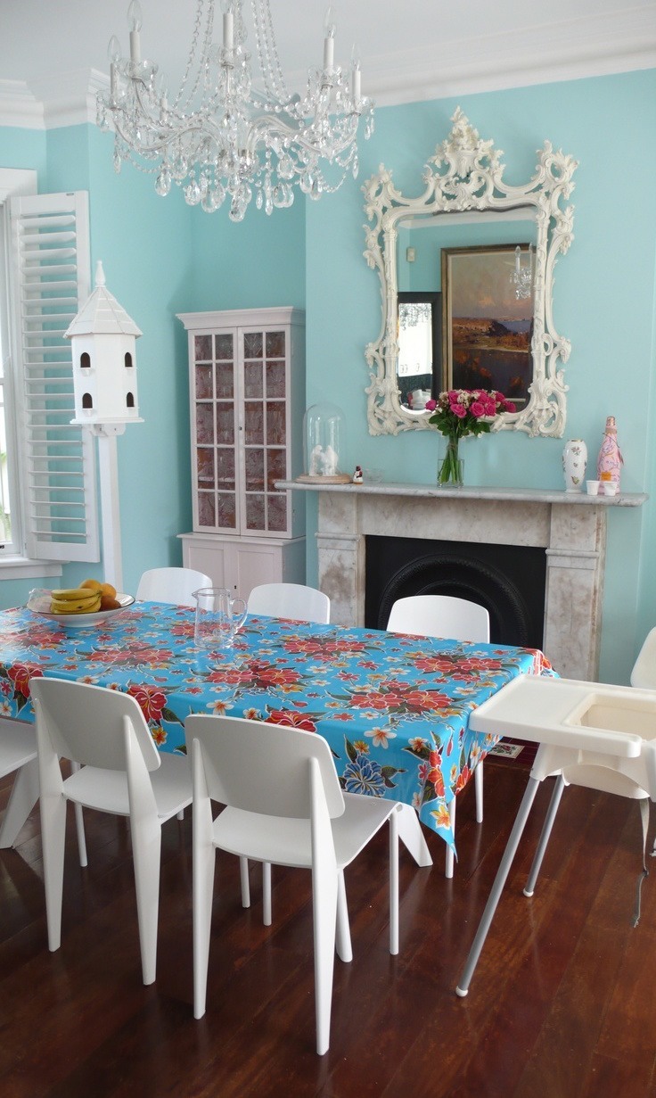
I don’t know the source of this image, so if somebody does, please let me know, and I’ll add credit.
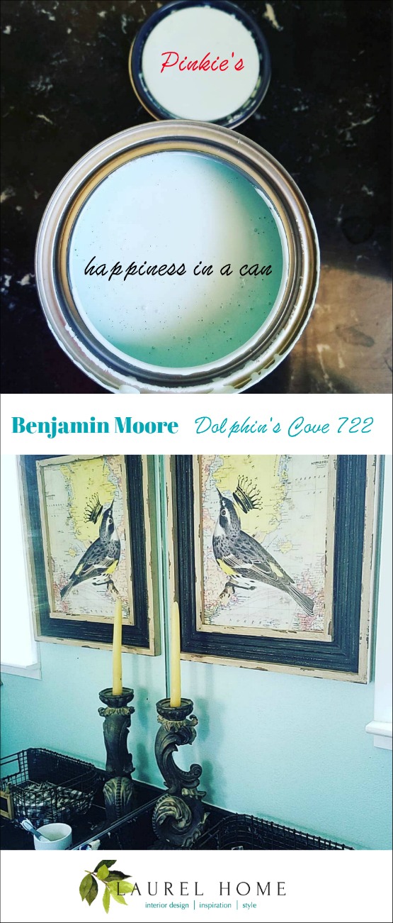
A faithful and lovely reader who goes by “Pinkie Crabtree” on social media painted a room this color and adores it. So, a year ago, I made a graphic from the images she posted.
*TRANQUIL BLUE 2051-50

Tranquil blue is the quintessential turquoise blue. Please note that in the images, the color looks close to the actual color. But in some cases, I don’t know what the color is.
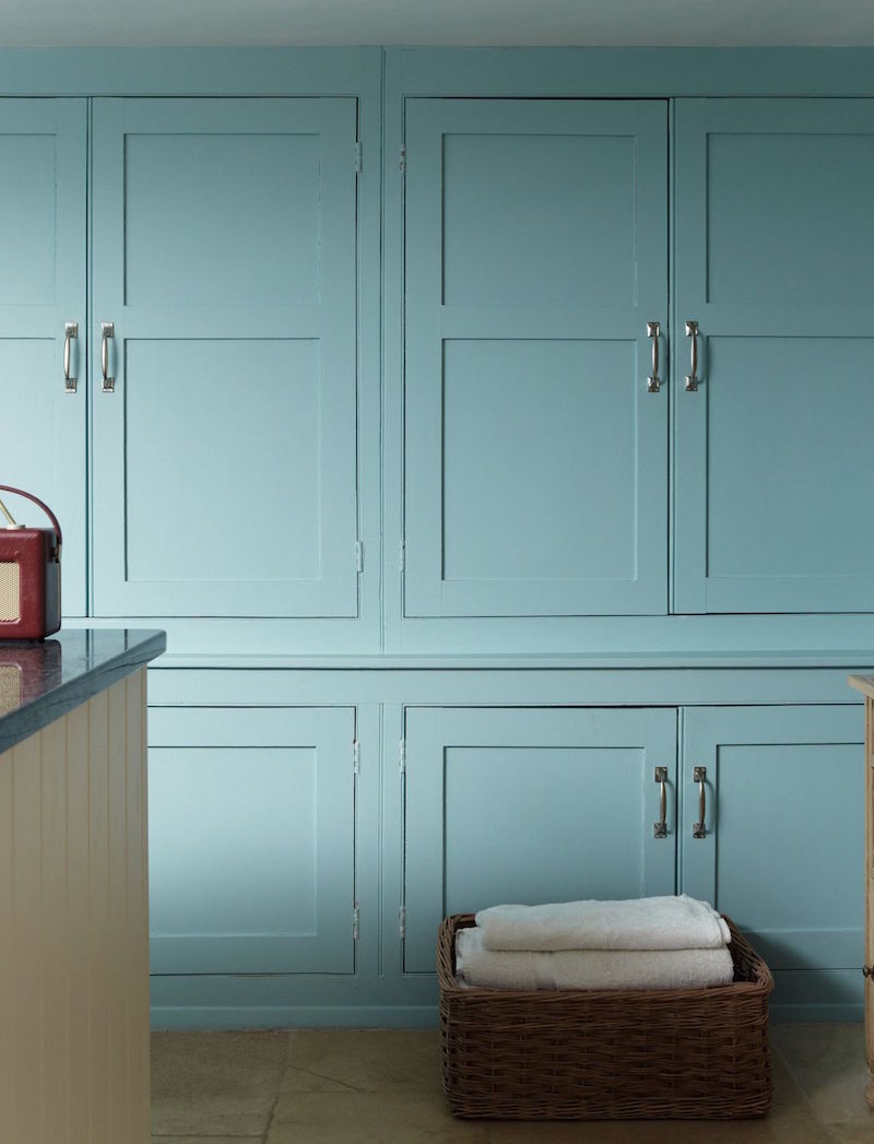
This color is actually Farrow and Ball’s Blue Ground. But, Blue Ground is very close to Benjamin Moore’s Tranquil Blue. For a conversion chart matching Farrow and Ball to Benjamin Moore, click here.
You can now get Farrow and Ball paints online.
If you want samples, you can get the test pots from F & B via the link above. However, I recommend getting the reusable paint samples from Samplize.
Unfortunately, Benjamin Moore doesn’t sell their paint colors online. However, you can also get BM samples through Samplize. And, Sherwin-Williams, too!
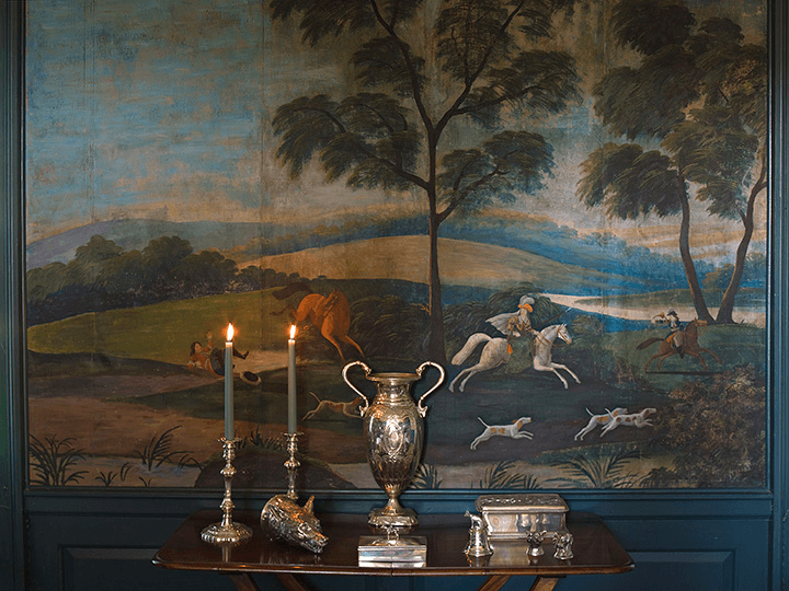
Mural from the dining room of the Ladew Gardens Manor House.
Those colors! What an exquisite vignette.
*WILMINGTON SPRUCE – 754

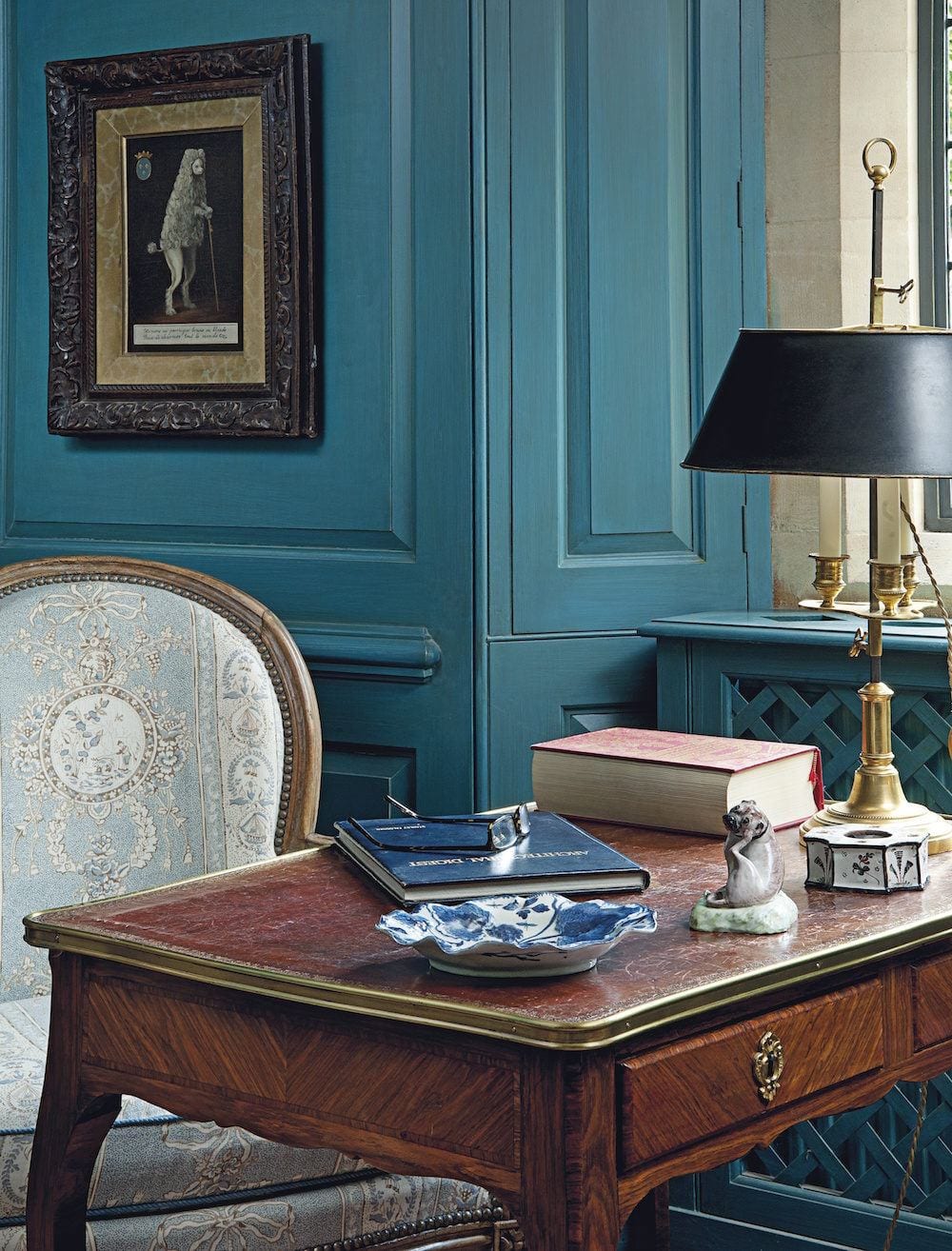
This is one of the most saturated colors in the Laurel Home Collection. However, as you can see from the above image, it’s a very cool color. I don’t know if this color is Wilmington Spruce, but it looks like it. And, that’s all that matters to me.
*JAMESTOWN BLUE HC-148

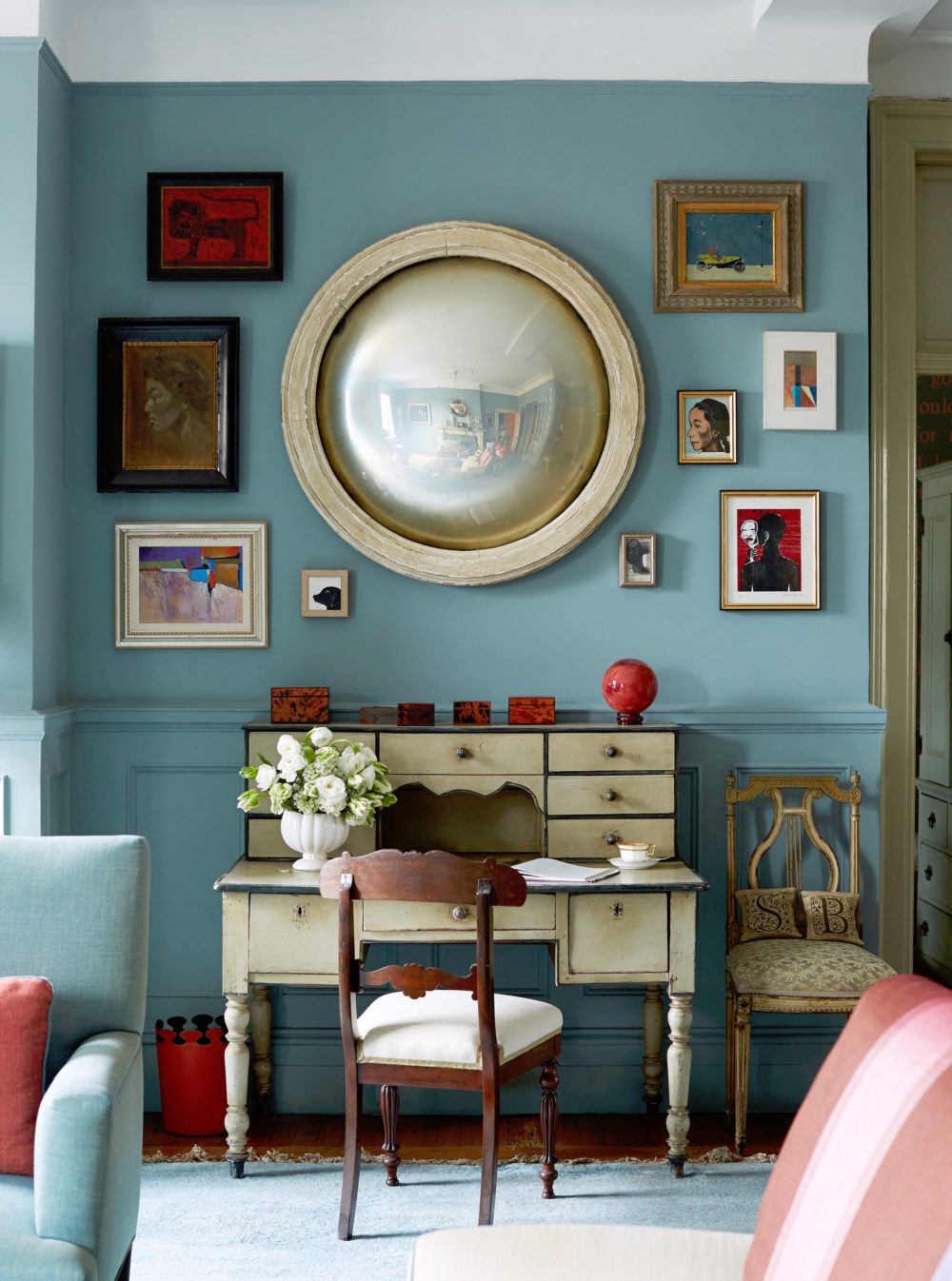
Sheila Bridges iconic living room – The color is actually Farrow and Ball oval room blue – However, it is close to Benjamin Moore Jamestown Blue hc-148.
Before I go on, I know some of you feel passionate about this, and I respect that 100%.
However, I would prefer if a few of you damp down on some of the indignant responses I’ve received over the years stating how much better Farrow and Ball paint is…
No one is arguing with you. F&B is wonderful paint and is formulated differently from Benjamin Moore. Can the average person tell the difference? Probably not. Maybe side-by-side, but even then, I’m not sure. If you see a difference, that is fantastic.
I’ve used Benjamin Moore paints my entire career. They make a fabulous product. But, of course, if you can afford F&B and want to use it, by all means, do so.
I’m using these twin images (of the same paint color) because sometimes I can’t get a decent image for a Benjamin Moore paint color.
But, the images Farrow and Ball supplies are usually of better quality.
COOL BLUE – 2058-40

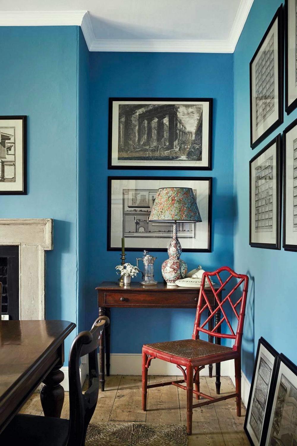
Of course, this is from Ben Pentreath’s gorgeous dining room. For another image of it that I took– click here.
I believe his color is Farrow and Ball St. Giles Blue, which they just put in their archive collection to make room for a new shade of blue. When they archive a paint color, it doesn’t mean it’s a bad color.
It’s just that their business model calls for a collection of only 132 paint colors. And, they always introduce six or more colors every year. That means they archive some of the colors every year.
Laurel, when are you ever going to update the Farrow & Ball to Benjamin Moore conversion chart?
What? Are you trying to kill me? ;] I hope to have it done this fall. Right now, I am working on getting everything ordered and shipped that will be needed for my place.
*BUCKLAND BLUE HC-151


18th Century Selfie – haha – Self-portrait with Lace Jabot (ca 1751)-Maurice Quentin_de_La_Tour
Handsome devil. And, I think he knows it! I read that he worked mostly in pastels. Very talented!
BAINBRIDGE BLUE – 740

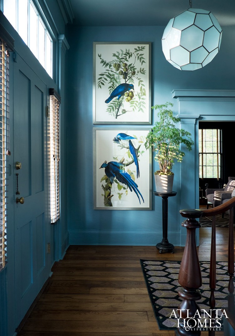
Atlanta Homes and Lifestyles stanton_madison_blue on blue entry
The rest of the house is wonderful, too!
I posted this image at least once before. I love it!
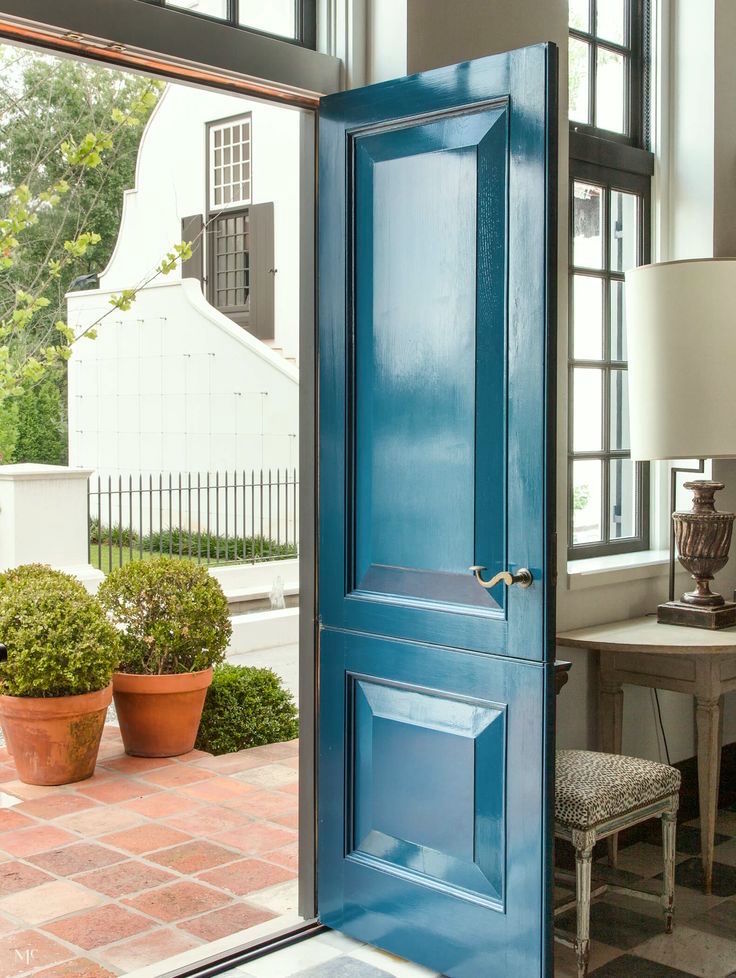
This gorgeous door is from the post about great front door paint colors.

Jean Abercromby, “Mrs. Morrison of Haddo,” Allan Ramsay, 1767 photo – York Museums Trust
*CHAMPION COBALT 2061-20

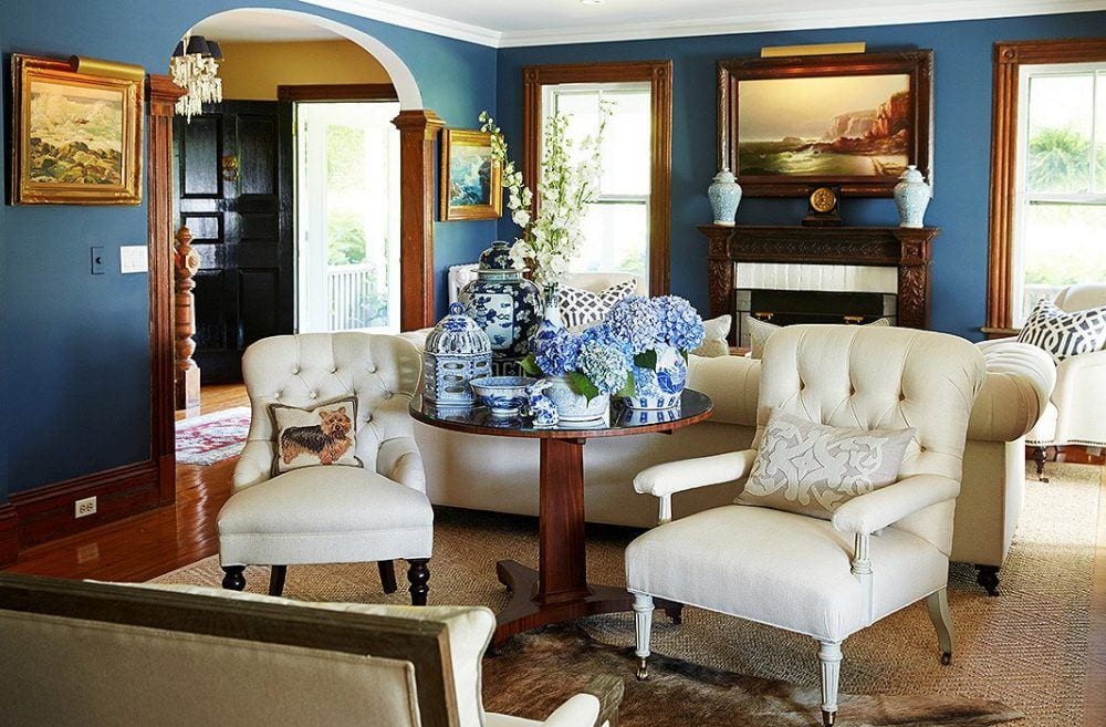
Kelli Delaney sitting area – Looks like Benjamin Moore Champion Cobalt.
*GENTLEMAN’S GRAY 2062-20

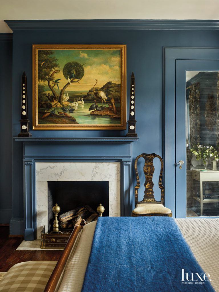
Luxe Magazine – Designers – Nina Nash and Don Easterling
Farrow and Ball – Stiffkey Blue – Benjamin Moore Gentlemans Gray
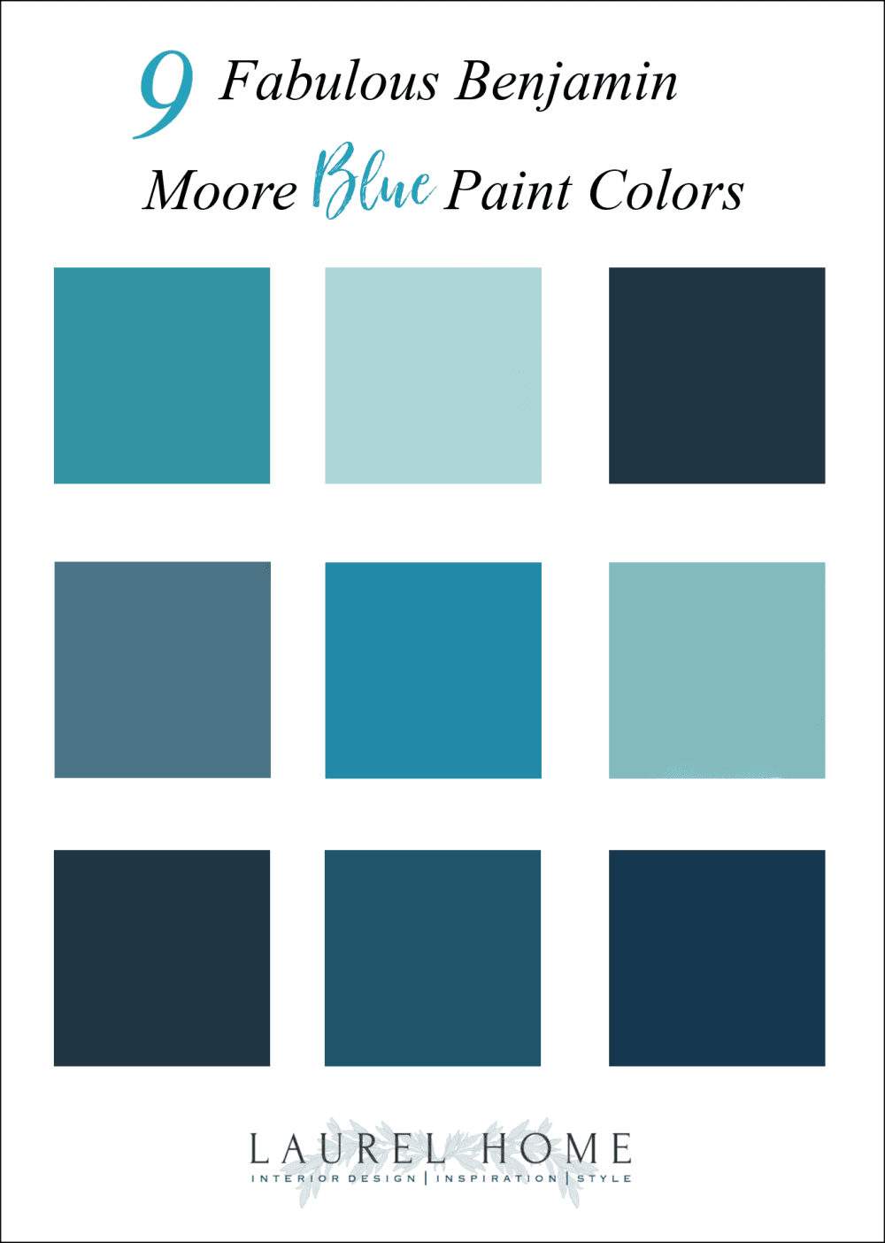
Please pin to Pinterest for reference.
The Benjamin Moore Paint Colors in the Graphic Above:
1. Wilmington Spruce – 754
2. Dolphins Cove – 722
3. Jamestown Blue – hc-148
4. Buckland Blue hc-151
5. Cool Blue – 2058-40
6. Tranquil Blue – 2051-50
7. Gentleman’s Gray – 2062-20
8. Bainbridge Blue – 749
9. Champion Cobalt -2061-20
I hope you enjoyed these nine beautiful Benjamin Moore blue paint colors!
xo,

Please check out the recently updated HOT SALES!
There is now an Amazon link on my home page and below. Thank you for the suggestion!
Please note that this website is a free service. However, it’s very expensive to run. To provide this content, I rely on you, the kind readers of my blog, to use my affiliate links whenever possible for items you need and want. There is no extra charge to you. The vendor you’re purchasing from pays me a small commission.
To facilitate this, some readers have asked me to put
A link to Amazon.com is on my home page.
Please click the link before items go into your shopping cart. Some people save their purchases in their “save for later folder.” Then, if you remember, please come back and click my Amazon link, and then you’re free to place your orders. While most vendor links have a cookie that lasts a while, Amazon’s cookies only last up to 24 hours.
Thank you so much!
Your support of my work and website means the world to me!
Related Posts
 Are Green and White Rooms Trendy or Passé?
 Painted Hardwood Floors – Good Idea or a Bad One?
 How Much Does It Cost To Do A Smart Kitchen Renovation?
 The 12 Best Sofas You Will Love Forever
 An Easy Renovation Idea To Increase Your Home’s Value
 Everything You Need To Know About Classic Woven Wood Blinds
 The Elegant Gerald Bland Style-How To Get the Look!







37 Responses
Hi, I’ve been pouring over colors trying to find the proper modern coastal pallet for my Beach House bungalow. I found Benjamin Moore‘s Adriatic Sea, which appears to be very close to Benjamin Moore champion cobalt. One of the coordinating colors to that is the Baltic sea, which is extremely similar to the Bainbridge blue. I’m not tied or schooled in interior design so perhaps I don’t see the variations that you do. Can you please explain to me the difference in the above listed paint colors? Thank you so much!
Sidenote: I am sorry that people are rude and disingenuous simply because they are lofty and self-aggrandized. I hate that some are rude simply because you use variations from different manufacturers to illustrate a point based. It’s rude and uncalled for. I’m sorry you had to deal with that. Thank you for your help!
Hi Laurel,
I really enjoyed this information on blues, I didn’t think I was a huge fan but now I’m realizing if it’s the right warmish shade, I really love it.
Can you tell me if the entryway picture that has Bainbridge blue listed above it is actually Benjamin Moore Bainbridge blue or a color similar to it? Also, the door under it pictured opening to a terra-cotta patio is that the same color?
Thank you!
Eve
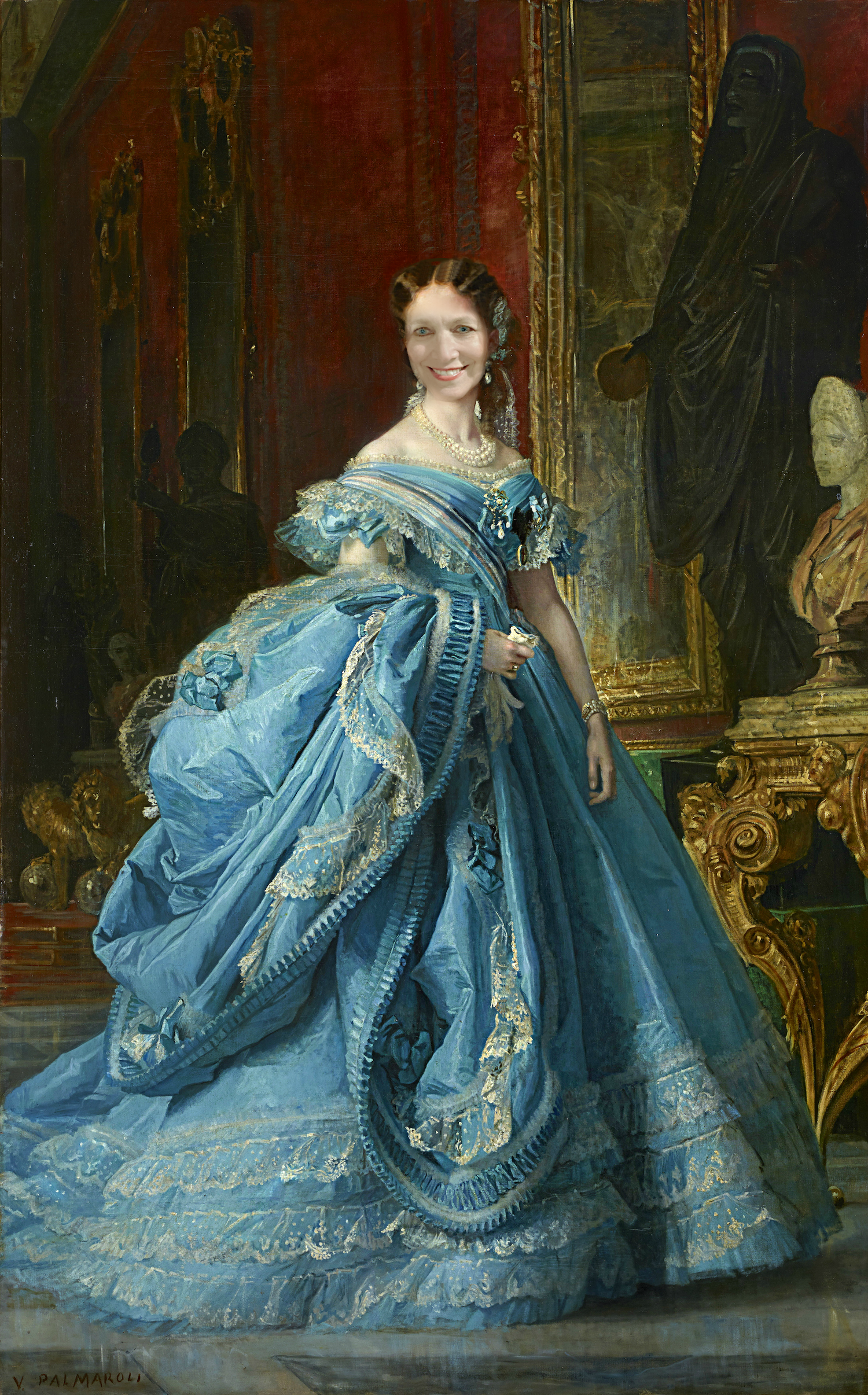
I’m enjoying hearing about your renovation saga as mine just recently was completed. I switched my house from all warm colors to all cool. I love blues and teals! My double vaulted south facing living room ceilings are the Bainbridge Blue. I was so excited when I painted on the sample and realized I had finally found the right color. The walls are BM Waterfall 2050-50 and it looks fantastic. That color is almost Tranquil Blue. Every bedroom is a different color. The front door is Lago Teal. I love it! And, you belong in a blue ball gown!
I definitely do not take credit for that Dolphin’s Cove playhouse scene.
I have a question sort of related to the F&B/BM cross-reference. A couple of weeks ago I bought a few sample jars of Valspar paint (Lowe’s house brand–don’t shoot me!). When I got home, I realized I had been given jars of Sherwin-Williams paint instead. When I called the store, I was told, “They’re the same.” Is it really the case that Valspar is Sherwin-Williams paint relabeled? Or did the clerk just mean the colour would be the same?
Hi Anne-Marie,
I don’t believe they’re the same, however, I’d ask the clerk at the store.
I have you to thank for recommending Buckland Blue on your website a few years back; I used it to paint my guest room (paired with Cotton Balls on the moldings)….and I LOVE it!! Alas, I have no talent for seeing paint on a chip and visualizing it on the wall, so your recommendations really help. Thanks for another great post!
Well that was fun and informative! I had to chuckle at the last picture though. M. de la Tour is a stunner, I agree and like somebody else in the comments, I looked him up and saw his portraits of well known people and how he portrayed them with such happy faces and lighthearted poses. Also today I was introduced to the Sleeper-McCann house in Gloucester, MA via a travel article and was intrigued by its style. Do you know anything about it and its builder or have you ever been to visit it?
I noticed that several of the rooms have the molding painted the same color as the walls and wondered if this was done for a special effect of some sort??
Hi Nelle,
I’ve written about this here.
Oh my! I have different colored bedrooms ( one is yellow- the other is blue!)
This is a condo too!
What to do! What to do?
Advice plzzzz…
Hi Janet,
Take two aspirin and call me in the morning… ;]
I just love your posts, Laurel. They are always so informative, in fact I found the colour I am going to paint my front door through this post (Gentleman’s Gray). I truly think the best part though, is your sense of humour. It is really just the best! I love your dress in the last photo and I think you and Maurice Quentin de la Tour would be a match made in heaven!
Your new blue ball gown is Devine! 🤣 And the post about blue paint colors right up my alley. Thank you so much for your expertise and sometimes a “gut feeling”.
I love your posts – always informative, clever and fun to read!
Regarding beautiful blues: I’ve used BM Lookout Point in a north-facing ensuite guest room and it’s lovely – warm and inviting. It does change somewhat throughout the day but never takes on a harsh or garish tone. I am very happy with it. North-facing blues can be challenging!
Another blue I recommend considering is BM Blue Dusk. It’s a deep, rich blue we used for a den/TV room and it gives the space a cozy vibe. It also pairs well with many different accent colors (think pillows etc.)
Thank you, Laurel! And can’t wait to see your beautiful home once completef!
Hi Carol,
Lookout Point is in the Laurel Home Paint and Palette Collection. It’s also in the light blue paint post.
Big fan here and owner of your wonderful guides! Have you heard it’s no longer ok to paint bedrooms different colors? My interior designer relative recently stayed with me at our new retirement historic beach home and commented I need to use the kitchen cabinet White Dove through the entire house including the bedrooms on the 2nd & 3rd floors. He said different colored bedrooms are akin to having a two-toned car, which no one does anymore. I used some blues from your guide in bedrooms in the last house we did at the beach and they were wonderful (well, I thought)! Did I miss a memo about not doing different yet coordinated colors in a home, esp bedrooms? Thank you for your spectacular blog-love following your reno!
Hi Julie,
If you missed the memo, so did I, and every other designer I’ve shared on this blog.
As you were.
Thank you so much for all the
“not the blues blue” but the gorgeous blues.
Love every one of them.
Laurel have you ever used the Ben Moore blue color constellation? It is the AF line. I used in my previous living room and got so many compliments. It’s a light blue that does not look too gray or bedrooms. Love your stuff!
Hi Debbie,
I haven’t used that color, but have used some similar colors from BM.
Lovely post but noticed several comments are from July 2019?
Hi Monica,
Yes, many posts get updated periodically. I deleted most of the comments, but left a few up. I have always updated posts, but only recently, can update the original post (instead of updating and republishing as a completely new post) since we expunged the dates from the URL. I realize that’s probably meaningless for most people. But, it’s helping keep the site structure intact.
I love any color as long as it is blue.
I painted my bookcases in the family room Gentlemen’s Gray. I have had many compliments and it’s a color I don’t think I will ever want to change.
Just finished painting my bedroom Sherwin Williams Azure Tide – a true saturated blue that does not clash with the mossy green in the living rm when the door is open. My seascape paintings seem to float on the walls and the room feels cozy now.
Every time you photoshop your face into a portrait of some aristocrat, I laugh out loud! I don’t know why it’s still so funny but I’m not complaining. The opposite of “blue”! I’m allergic to all of these lively blues, but fine the post riveting nevertheless! Thank you!
Thank you for the inspiration Laurel. We painted our North facing drawing room Bainbridge blue, and it is a triumph! My husband could barely be talked into it, and now he thinks I am a genius.
The whole room is elevated without spending any further money. We’ve just switched around the paintings in the house to get the ones with yellow in them in the drawing room. The yellow pops against the blue. Even the tatty old beige/taupe sofas mauled by the cat somehow look better.
This shade of blue is not too dark or too light, there is not too much black, red, or yellow in it. It feels ultramarine without being shocking or garish. Thank you, again.
Oh, Laurel, don’t make me choose between even more blues! Just kidding—but seriously, I bought your paint color guide because my husband and I needed some serious help narrowing the options. Truly one of the most useful investments we’ve made as 1st-time homeowners restoring a big, old place. Whole house is being done with your help, and we appreciate your products so much. And we took your challenge…we used Wilmington Spruce and it’s super! Three other of your blue “Essentials”, too, but I won’t say which since it’s not for me to give away the goods. 🙂
I loved your post on “blues” but I fell in love with the self portrait of Maurice Quentin de la Tour! What a handsome, interesting, mischievous looking gentleman. Don’t you wish you could have known him? I googled his work and found some of the other portraits he had done and they are equally fascinating. Every one of his subjects looks happy. Amazing. They are not your formal or stodgy views of most portraitists (is that even a word?) of the time period. Anyway, thanks so much for another wonderful post.
Hi Gayle,
Are you kidding? I have a massive crush on him! hahahaha!!!
What timing! I have been mulling over doing a deeper blue shade in my son’s room, and I think I’ve about decided to go for it. Gentleman’s Gray was on my list, will have to check the others out.
Laurel, I’ve seen bits and pieces of your blog over the years via Pinterest, but recently came across a couple posts and started reading…next thing I knew it was 2 a.m! Such good information and very entertaining. I have a degree in design myself but have been on the sidelines for a few years with young children, and moving around with my husband’s job. We anticipate moving one last time next year and hopefully settling into a long-term home, so I plan to purchase the paint guide and Rolodex then as we do the inevitable ‘fixing up’ (because no, darling husband, I can’t just leave well-enough alone 😂)
Thanks for all you do, I find myself asking ‘What would Laurel do?’ When contemplating my house and decor decisions. Keep up the wonderful work!
I LOVE blue! These are great colors!
Elizabeth Bauer’s bedroom design in the February 2017 issue House Beautiful is swoon-worthy! I want to paint my bedroom that color but can’t quite figure it out. It appears to be a very light aqua blue.
I plan to paint my laundry room Cool Blue (or something very close).
Our temps here are in the 100s this week!
Dear Laurel,
I want to thank you for all your paint ideas and beautiful photos. I will never be able to afford an interior designer, so your blog is mine.
We live in a modest greek revival that we are slowly renovating. After obsessing about paint for weeks ( I have a grocery bag of paint sample cards) and picking a sample that turned positively glum (think 13 year old girl getting grounded), I came upon your blog and picked Lookout Point. It is perfect – pale blue with a hint of green – just what I wanted. I painted the ceiling Cotton Balls and it looked so great, I spend the last 2 weeks on my knees stripping the paint off the wide pine floor. I still need to put down the finish, maybe its just the fumes, but it looks amazing – better than I dreamed.
I have really learned a lot from you and enjoy your sense of humor.
Thanks again.
Janet
P.S. I love the blues in this blog. I’m not sure I have the spine to put them on a wall but my front door is a good place to start.
Jamestown Blue looks lovely to me here.. A friend who is an amateur artist, furniture designer, gardener and all around talented guy asked me recently what my favorite color was in interior design. I told him I love almost all greens, with lots of white around. His reply was “Oh but green is so easy to get wrong” ! As a person who sadly has no talent in interior design and needs a lot of help from the likes of you Laurel, I told him I disagreed and that I thought blue was easy to get wrong! I stay away from blue for that reason although I know I’m completely in the minority here. I do love that blue door however! And I like some houses with blue shutters. Do you think there’s one color that’s easier to get wrong than other colors? Or perhaps its possible to get any color wrong lol ! !
That’s a very good question Maggie. I think any color can go wrong because it’s only one element out of many. I always say that the most important element of any space is the architecture. The color is way down on the list.