Picking paint colors is probably the most difficult decorating issue of all.
It would seem based on the number of queries I’ve received over the years that what folks really want is a palette for no-fail paint colors. A sure thing. A done deal.
The typical inquiry reads something like this…
Dear Laurel,
I am desperate. We’re closing on our home next week and the painter says that he needs to know what colors we’re using? We went to the paint store, but have absolutely no idea what will work. We can’t keep it the way it is.
In addition, I’m 8 months pregnant with our third child. We love the house, but the previous owners have lots of hideous wallpaper and disgusting neon-colors that we cannot live with. Should we just paint everything some shade of white?
Certainly that would be better than what’s there, but we would prefer not to have to paint twice.
I’m attaching a floor plan to give you an idea of the flow.
Help! Could you recommend some no-fail paint colors? We’re desperate!
Thank you ever so much!
Stressedout Homeowner
ps: we do like sophisticated colors and more earthy shades if that helps.
It’s as if they’re assuming that Laurel has the answer for this as if I’m handing out a recipe for chocolate cake.
Well, that, I have. haha
(click here for the recipe for the world’s best chocolate cake)
And in discussions with my colleagues, they get similar inquiries.
So, are there no-fail paint colors, Laurel?
That’s a very good question.
Is there such a thing as a palette of say, nine colors that one could just mix and match and they would look great in any home, no matter the situation or room?
Well, that would certainly be nice, but the answer should be “no, not in every situation.”
But I need to stop here for a sec and state that this post is a revision of an old post from 4.5 years ago. And, well, at that time, I actually said that it is possible.
So, what gives? Why are you re-writing the post, Laurel and why did you say yes you can have a no-fail palette and now, you’re flip-flopping?
I knew that you’d want to know that and I think that I have a fairly lucid answer. :]
Back then, I figured that this palette could work in some fashion or other for just about every house and I still think that. I didn’t say that you have to use every color. You don’t.
But, over time, thousands of people have read this post. And guess what? A few went out and got the colors and painted their rooms with them. And do you know what happened after that? No, of course you don’t.
They were actually very happy!
Phew! What a relief. Look. I take everything I say very seriously, (even when I’m joking) ;] but when I first wrote this, the blog was still not very widely read and it never occurred to me that somebody would actually blindly go out and get the colors and use them for their home.
Still, even with that success, I didn’t do much to promote this post about no-fail paint colors and here is why.
I think that I can do better.
First of all, the graphic I made is HORRIBLE. I mean HORRIBLE!
At the time, I was working on a Lenovo PC. Foolishly, I believed with all of my heart that the colors I was looking at were the right colors and Benjamin Moore screwed up.
Later, I realized that the Lenovo put a blue-ish cast on everything.
So, when I got my Macbook Pro four years ago, I was horrified to see that most of my “perfect” color-corrected images had a sickly yellow cast to them. Ugh. Like, no, the dog did not pee all over your screen. It’s me, not you. I peed all over the images before I uploaded them.
Oh gosh, that is so gross. I hope that you didn’t just choke over your French toast. And of course, I didn’t really pee on them. Sick. But, I might as well have.
Knowing that the colors were off, I wished the graphic hadn’t circulated all over pinterest, but alas, it did.
Please note that some paint companies do put up colors that look quite different than their colors do, in real life– on ANY monitor. Here’s an excellent example of that.
In addition, the writing for this particular post and probably others is not altogether to my liking 4.5 years later.
Therefore, I’m going to edit some parts and leave some in so that we can have a little fun. This will also serve to bring the post up-to-date. In addition, some of the images are different and of course, the graphic for the colors is going to be more accurate.
I realized when I was creating the Laurel Home Essential Paint Collection that what I was seeing on my monitor WAS very close to how the colors look in real life; at least, from Benjamin Moore.
Please enjoy the new and (hopefully) improved post about no-fail paint colors.
[my comments about what I wrote are like this]
your comments are like this
The post, is like this. Hope that’s not too confusing. :]

Dear Stressedout Newhomeowner,
Yes, you could paint everything linen white.
b o r i n g
[Actually, I have no idea why I said boring. Common, perhaps, but I love white on white. I probably would not pick linen white as my one white, however. Long-time readers are aware that when someone was holding a gun to my head I chose ONE shade of white as the one to go with that goes with everything.]
However, there are other great white colors. For the big list of white paint colors click here. And for the only six white trim (and wall) colors I’ve ever used, click here.
Linen white is fine if your room gets a lot of light like the sun room with the two white love seats in my portfolio. In a dark room, Linen White can look dirty and/or peachy. However, Linen White is a fine trim color for deeper golds, green, warm red, rust, orange and shades of brown and other dark neutral shades.
What IF I could give you nine no-fail paint colors that will work no matter if your home faces north, south, east or west? Colors that will go with EVERYTHING and of course, with each other?
Yes, I can…
[Oh dear. Did I really say that? Apparently, I did. The reality is, I can’t. I can come pretty close and I can explain the caveats just like I did with linen white and like I have tried to do with the Laurel Home Paint Collection. That way, it will help you to make a more informed choice.]
Well, what if I don’t like your choices Laurel?
Well, you have a painter breathing down your neck and it’s either this or Barney on Acid. Your choice. :] But, I think that you’ll be okay.
Normally, I would advise you to choose your colors AFTER you know, or in conjunction with your other choices. But, I understand that’s not always possible.
Now, some of you are going to be nervous because some of these colors are not in any way pastel.
Of course, you don’t have to use the dark colors. But dark colors are wonderful for smaller spaces; just something to keep in mind.
These colors all go with each other, AND you can mix any other color in these rooms. They also all look good in a variety of lights. Yes, they will look different in some lights as all colors do, but they look good in all of them.
Just so you know, there are dozens of other fabulous colors in the Laurel Home Essential Paint/Palette Home Furnishings Collection.
Okay… I know that nervous look on your face. Yes, of course, you should always test your colors. So, go out and get your test pots and make some boards.
And please do me a favor and not wimp-out on me and ask the guy to mix anything at 50% or some crapola like that. Whoever started that is utter nonsense, except maybe for something like white dove at 50%, but that is probably the same as Simply White or Cotton Balls.
If a color is too deep or saturated or bright or dark, pick a different color!
So let’s get to it! (please note: This is for a typical home, although, I think that for the most part, this could also work with some modification for open concept homes.)
Today is Part I, the first floor and nine no-fail paint colors including trim and ceiling.
Part II – is upstairs. (that one, I’m sure needs revising too.)
 Here is the original no-Fail Paint Colors Image. Please do not pin this
The First Floor
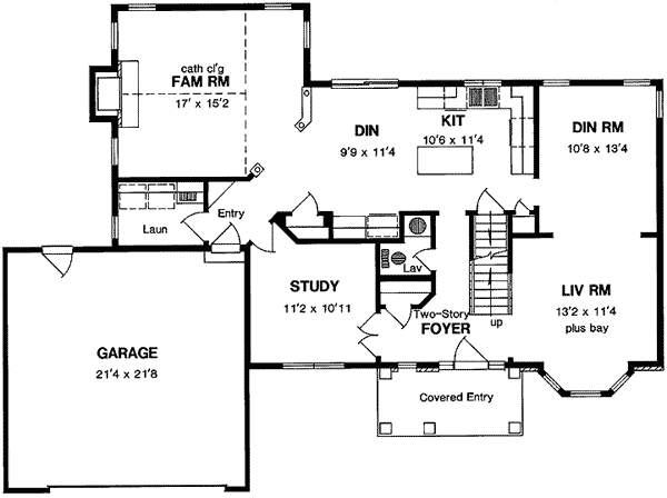
First Floor Plan
This home is a pretty typical center hall colonial with smallish rooms. Cozy. (pardon me, for all of you, who abhor that word.) There is an entry, a study, living room, dining room, kitchen, family room, powder room and family room. That is a total of eight colors on the first floor.
Are you ready to look at the No-Fail Paint Colors?
For the purposes of creating less stress, I am going to stick to ONE PAINT COMPANY. Isn’t that a load off your tired shoulders already? Don’t you just hate it when there’s a list of “go-to” paint colors and there’s a list of five different companies? That means five different stores— like life isn’t difficult enough as it is?
Besides, your painter is going to go apeshit on you if you make him run around and you don’t have time either. The paint company that I am the most familiar with and find that painters in my area like, is Benjamin Moore. It’s not that I don’t like other companies and colors. I most definitely do, but I am trying to create less stress for you, not more.
[Above is where you can see the origins of my sticking with Benjamin Moore, primarily]
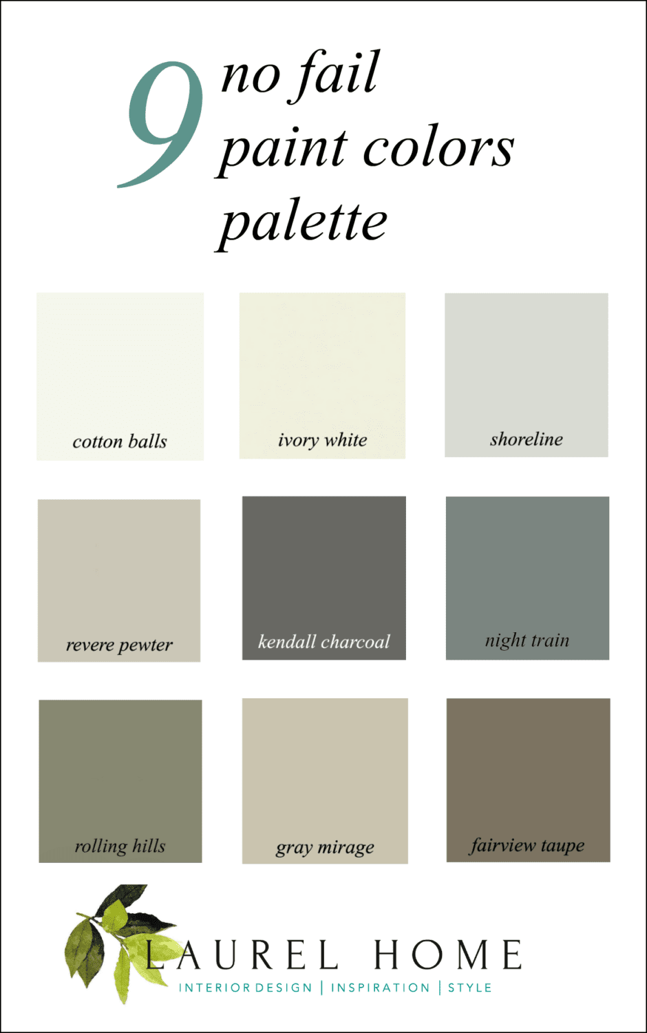
Below is the graphic for nine no-fail paint colors- please pin to your pinterest boards for reference
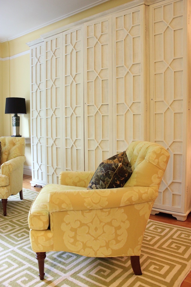
my living room
The first color is Benjamin Moore COTTON BALLS OC-122. We can use that for the trim and ceiling. You can read about it here.
1) Entry
The entry is the area that welcomes people into the home. It could be a wow! Or it could be soft and serene. However, it is the backbone of all of the other colors and it will be the same color downstairs and upstairs as well. We are going to paint it a soft cream.
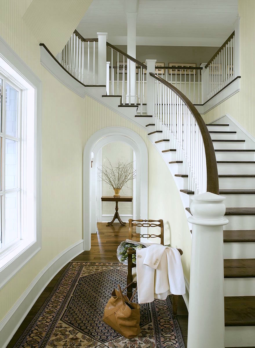
IVORY WHITE 925 (ACADIA WHITE AC-41 is the same color) is a lovely cream that looks great in bright or dark spaces. You pretty much can’t go wrong. I’ve used it several times and even in a dark, dreary living room, it brought it back to life.
You can see a lot of this color in this lovely home I worked on three years ago.
One rule to keep in mind, when choosing which no-fail paint colors is that if you can see into the room from front to back, it is better to have the deeper colors behind, not the other way around.
You can see how masterfully Susan Serra did that in last Sunday’s post.
2) Kitchen
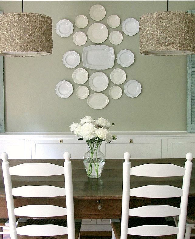
Let’s pick a terrific neutral as this room is a pivotal space. However, there isn’t very much wall space, so don’t be afraid. GRAY MIRAGE 2142-50 goes with everything. It is a warm gray-green with a touch of khaki. You will love this color as it’s very easy on the eyes and goes with everything!
3) Family room
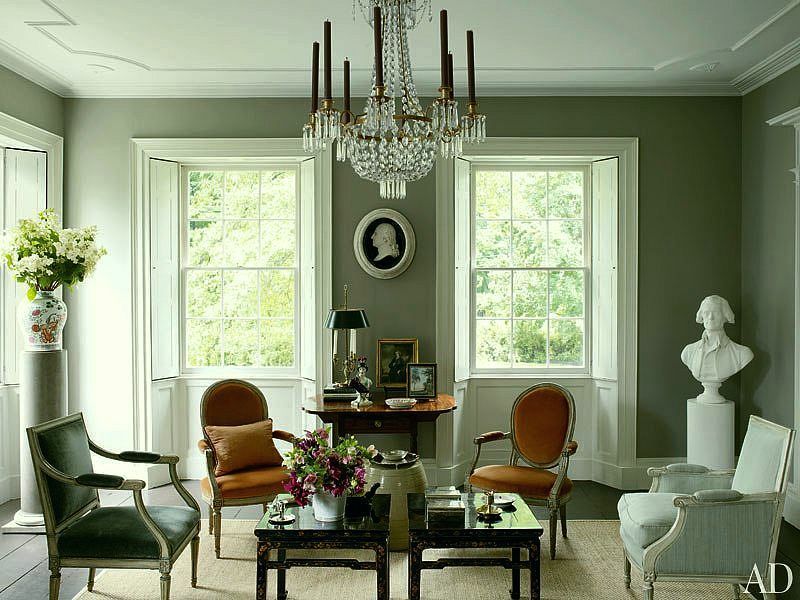
ROLLING HILLS 1497. I once went into a store that sold stone. It was their showroom, actually. The color in there was the most sophisticated mossy, rich greenish, grayish I have ever seen. I couldn’t say anything but… please, PLEASE, please tell me the color. He said that EVERYONE said the exact same thing. He remembered it because of 1492 and he had also painted his living room this color.
4) Dining Room
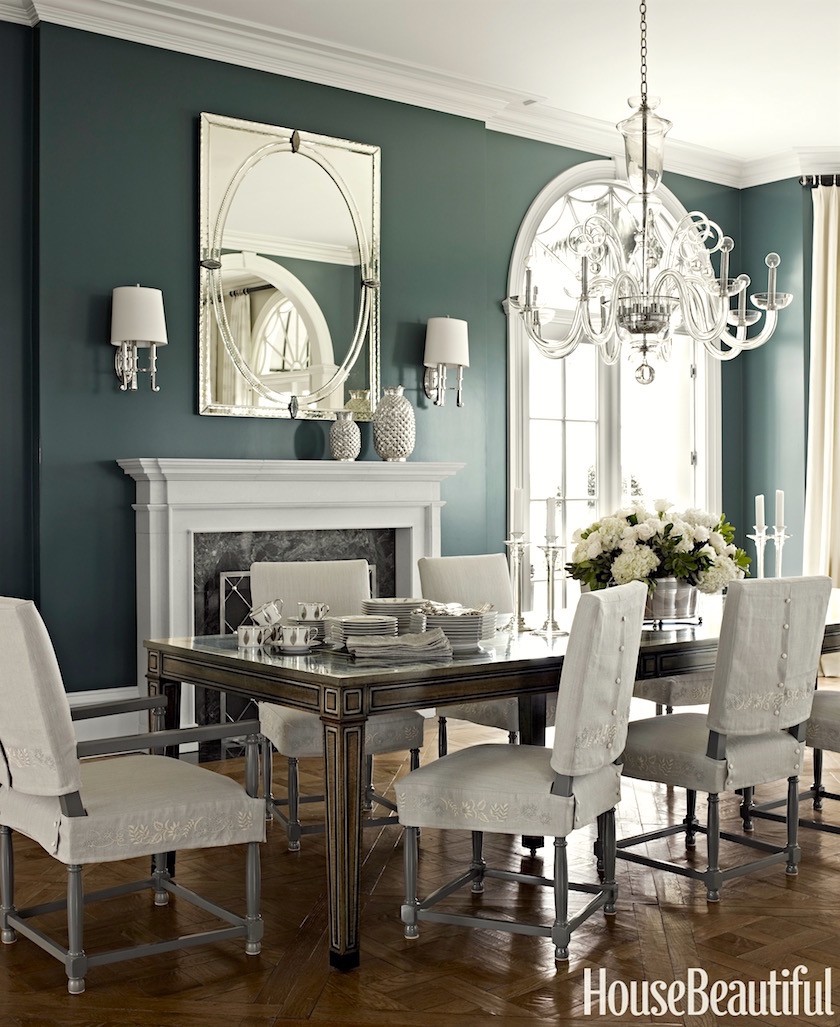
NIGHT TRAIN 1567 This is going to be a saturated, deep blue-green gray with just the right amount of blue-green. This color looks AMAZING with wood tones. It will play off the family room color nicely and of course, the kitchen.
5) Living Room
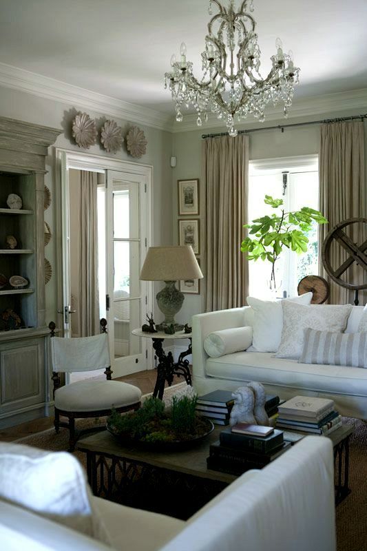
above and below by John Jacob
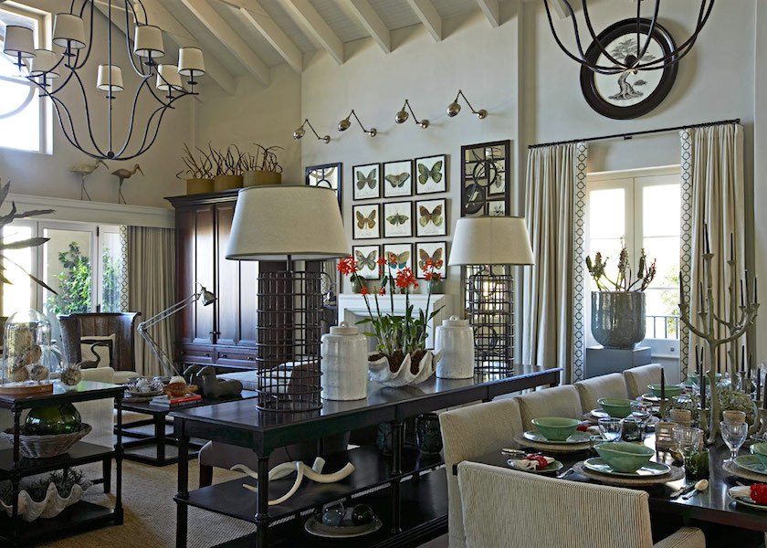
The living room needs to have a dialogue with the dining room AND the office/study. It should be sophisticated and a soft wonderful neutral.
Let’s go with REVERE PEWTER HC-172. This is one of the best colors that God ever created. It’s a warm gray that can look slightly khaki depending on the lighting. It is sophisticated and it goes with everything. In a bright room, it will look more like a creamy gray. I prefer it in darker rooms.
6) The Office/Study

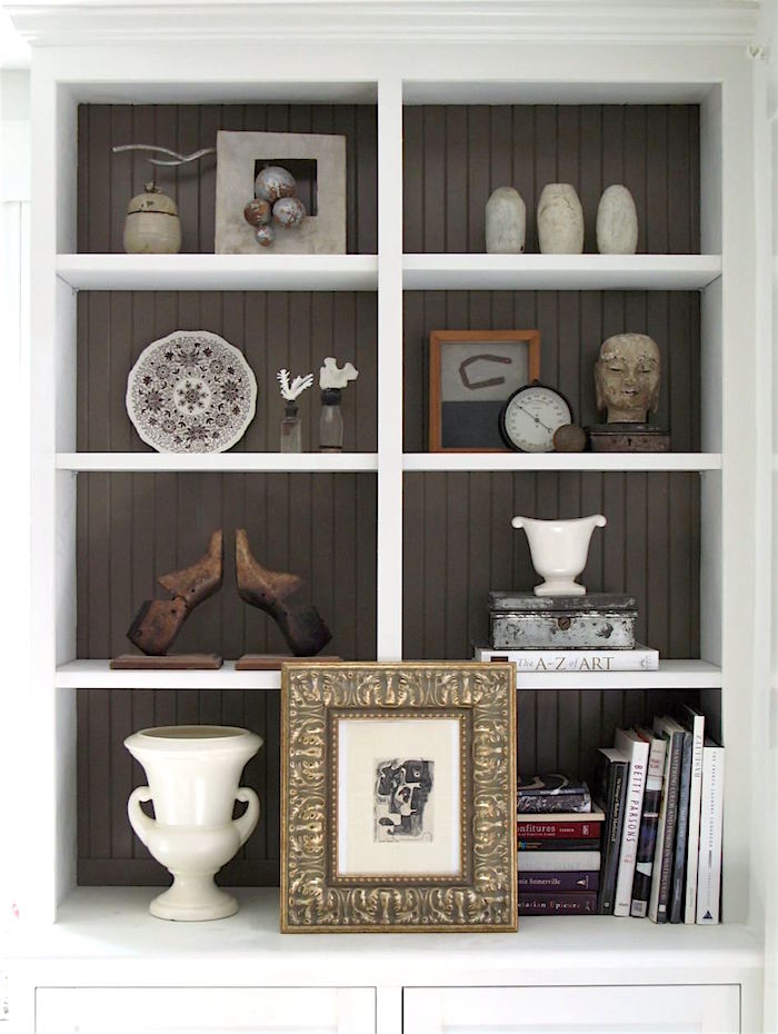
via Bill Food and Drink (but they have gone out of business)
a rich, deep brown FAIRVIEW TAUPE HC-85. Stop whining and complaining about how dark it is. ;] I know, but I think that you will love this color. I promise you that it looks nothing like shit. It’s a very soft brown-gray [BRAY, we call it] :] and actually has no red in it at all, so the taupe is a misnomer.
I love how it looks in the back of those bookcases above.
Two more spaces.
7)Powder Room
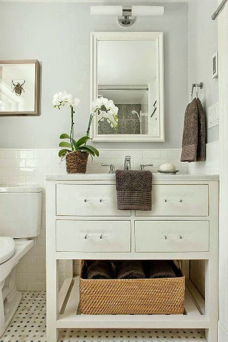
I love pale bathrooms with white fixtures. Originally I had HORIZON 1478. But, I’ve been living with my SHORELINE 1471 and still love it after nearly six years. Just a whisper of blue-green in the gray and I mean a whisper. To see it in my bathroom, click here.
8) Laundry Room
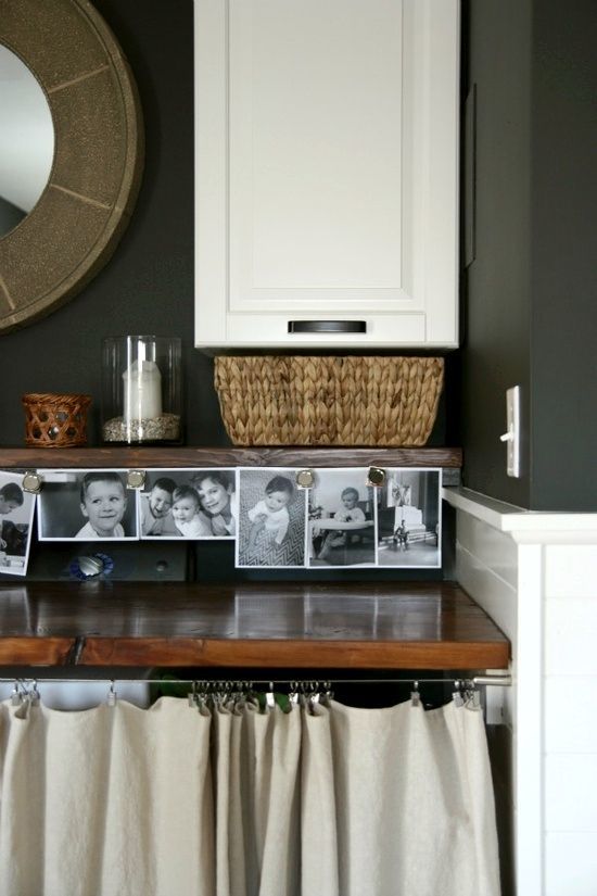
Okay. Hang on now. It’s a small area with big white boxes and we’re going to paint it a deep almost black color that is going to be so chic, you’ll be hosting folding parties in there! KENDALL CHARCOAL HC-166 This will be a refreshing change from the other colors and a shot of it in our palette is going to look amazing.
Alternatives for trim and ceiling. SIMPLY WHITE OC-117, WHITE DOVE OC-17, and CLOUD WHITE 967.
Trim, which is anything that’s wood, like casings and doors should be in a semi-gloss finish. For ceilings, I prefer a flat finish.
Walls can be in either matte or eggshell. Nothing shinier than eggshell, for me. You don’t need eggshell, because the matte is washable. I prefer that finish to the eggshell. But darker colors should be in eggshell because dark colors can “chalk” if something rubs against the wall.

The no-fail paint color graphic again. Please pin it to your Pinterest Boards.
Well, I hope that you enjoyed this post about a no-fail paint color palette, and please remember that these are only suggestions and that it is important to test your paint colors, first.
xo,

PS: Please visit the newly updated HOT SALES here.
And there are a lot of new things in the holiday shop filled with beautiful holiday decor, trees, wreaths, ornaments as well as dozens of great gifts.
Related Posts
 One Living Room Layout – Seven Different Ways!
 Paralyzed By Perfection – Should She Paint Wood Paneling?
 This is How I’m Creating a Cohesive Color Palette
 21 Common and Hideous Interior Design Mistakes
 She Fears Her Trendy, Painted Antique Table is a Mistake
 The Staircase Railing Mock-up is a Failure + Answers to Your Questions
 The Perfect Shade Of White Wall Paint For Oak Trim







83 Responses
As a Painter for 25 years, these colors are wonderful but dark colors only if you have big open spaces with lots of light. Many designers work for paint or carpet companies and dark colors take more paint and painters time ( More Money) To sell a home I don’t suggest these colors they are to dark and bold. To sell, stay light and bright like with BM Oc-17 White Dove, or even just decorators white SW 7006. Flat sheen -hides more imperfections and builders use flat for this reason. People want to beable to see themselves in the home with their tastes. Designers love color and different sheens, but it will look outdated, not the classic colors that don’t look like the times in a few years. They continue redecorating and most homeowners don’t buy all knew furnature or repaint their entire house every few years and it is not their money usually paying for paint, labor and decor.
Designers are great at staging homes to sell. They can declutter and know how to pair things and what not to in a space. They can get your home looking its best to be sold for what your wanting usually.
If your building a new home, designers are great at pulling a house together to match flooring materials to sinks and knobs looking right throughout the house so it flows from inside to outside. also, to many time homeowners pick colors they step into a room and glow green/pink/orange or reflect other colors off of from floor to walls or even outside color to inside. Designers are great at picking colors that pick up or reflect undertones of the surroundings. grey colors do this alot becareful
on the pixel, magazine pictures, old swatches, always get the color code and ask to see a new swatch or if they don’t carry that colored fan deck get a quart sample made at the store with it. you will be greatful to see what the color really is before having a whole house worth mixed and you had to purchase it when mixed and it not be what you thought. I’ve been in the paint store and seen this happen so many times. lol
Hi~
New Blog reader here! So helpful. If I use Ivory White in my foyer, what ceiling/trim color should I use.
I also want to do my bedroom. I like bright and airy. Could I do my bedroom this color too? I like Philadelphia Cream…too yellow? Want it to flow into foyer/upstairs hallway.
Thanks!
Hi Lisa,
I wish I could help you, but I’m no longer doing private paint consultations and when I did do them, I need to be in the space. Otherwise, all I’m doing is guessing.
Just can’t thank you enough. Finalizing wrapping up a 1930″s small
home and use your help in No Fail Colors. Acadia in small living room. Cotton Balls on ceiling and trim. Rolling Hills on bead board in a small woodstove room.. And re-painting kitchen cab. to gray mirage. Thank you, you’re website made it fun!! Nancy
Oh, how cool Nancy! I’m so glad that you’re having fun.
I’m so glad you’re revisiting this, Laurel! As one of those crazy people that took the palette and painted a bunch of boards and used the colors in their home … 🙌🏻🙌🏻🙌🏻 I’d need like a couple dozen homes to satisfy my love of PAINT it was such a relief to have you narrow things down for me ❤️ And guys….do not skip steps. TEST THE COLORS. Some beautiful colors looked downright pukey in some rooms – and it’s not the color (well it’s the color in that that color wouldn’t have worked there) it’s the roooooooom.
Thank you so much Cathlin! And happy holidays to you and your darling family! xoxo
I am looking for a color for a baby nursery. Any suggestions ? Was thinking a gray. Tks
sounds great!
I have had gray mirage in my kitchen for about 15 years now and is truly a life long color. Sherwin Williams makes a color called Morning Dew that goes well next to it.
Thanks so much for the info Mary!
Laurel,
I would love to see you continue in this vain and decorate this house room by room using the chosen paint colors. I think a lot of us live in this type of home and it’s wonderful to see a whole house decor rather than just one room as connecting rooms is a difficult task at times with color, upholstery, window coverings, etc. particularly when, unlike this home, it is a more open concept floor plan but using different complimentary room colors would still work well. Enjoy your blog:)
Hi Cynthia,
I’m confused because in the beginning I understood you to mean room by room and then at the end I see open concept. I think that perhaps you’re referring to room flow in terms of colors and furnishings?
Hi Laurel,
This is a great post! I know you will tell me to test the colors in the actual rooms but can you tell if the dark shades (Night Train and Kendall Charcoal) will generally work in rooms with north light only? It would save me time and expense if they won’t. We are building a new house and it’s not even dry walled yet but I’m trying to get the colors I want to test later chosen. I value your opinion! Thank you!!
Oh gosh, Barb. I’m so sorry, but there’s so much more to it than the direction the windows are facing. I don’t know how large these rooms are, or what they are being used for. Then, there’s floor color. Are there mouldings? What style is your home? What does your furniture look like… I could keep going on and on and on… and even then, I can’t say. But, if it was me, I would take my time and wait until the walls are up and you have some lights and so forth.
Love your paint color recommendations and have used many in your Collection in our home in the past year. Our last “room” to paint is the basement. It is a large area with living room, bedroom, and bath, but only small windows (and no bathroom windows.) Do you think Grey Mirage would work for the basement living room area or does it need more light?
Hi Crystal,
I would get a test pot and make a big sample, moving it around and looking at in your light. That will give you a better idea. And, of course, you also need to think of it in conjunction with your furnishings.
Dear Laurel, I have been a fan of yours for quite some time now and always enjoy your posts – so many good thoughts and possibilities!!!
I am in dilemma that I was hoping you could offer your opinion. We are in the hopes of moving closer to our children and building a new home. We have purchased a lot but the actual building may not happen for another year. While I can design the interior layout fairly easily, I struggle with the exterior. I am so tired of the traditional new house that you see most readily – at least in my midwest area. It is a typical ranch home with peaks and valleys galore. I am searching for the classic, simple, downsized, cozy one story (or story and a half) home that is timeless.
Do you have any photos of houses that you feel might meet some of my criteria?? Our lot is a large open area that slopes gently to the back and in the distance is a wooded area. It lends itself perfectly for a circle drive. Another thought is that we need at least a 3 car garage and I am not a fan of the garage overwhelming the house. An option that we might consider is a two car attached garage and an additional two car detached garage. Both garages mostly likely would need to have front facing garage doors.
I would so appreciate any input you could offer.
Thank you.
Susan
Hi Susan,
Well, the first thing that comes to mind is, have you hired an architect? Short of that, I would get on Houseplans.com where they have thousands of house plans and I imagine that something there or a combination platter will give you the inspiration you’re looking for.
Thanks for your reply. No, we have not yet hired an architect. I wanted to narrow my choices a bit before I did this. And I have looked at hundreds and hundreds for web sites, including houseplans.com, and so many are quite similar – lots of roof lines and lots of peaks. This is something I want to avoid, yet I do want the classic, timeless design. Nothing is jumping out at me. Maybe I should just keep up the search – I think I will know it when I see it.
Thanks
Then, I would focus on old houses. Maybe try looking on pinterest. For instance, if there’s a period of time in history that you like, that would be a good place to start.
And, I would also look again and houseplans.com. I took a look earlier and found several homes that I like. Some, don’t have great roof lines, but others are good. And of course, an architect can make those kinds of changes, most likely.
Hi Pam.
From personal experience I don’t recommend cutting the color. Just use it at its normal strength in a ceiling formula. I have Mayonnaise in all of the open, main portion of my home with Cotton Balls on all trim. The paint store convinced me to do the ceilings at 50% Mayonnaise instead of normal strength, and the change in light during the day creates purple-gray shadows that I don’t have on the normal-strength walls. The undertones in the base white ceiling paint you’d be mixing with are not likely something you’ve tested in your rooms and so may give you a few surprises. Hope that helps.
Thanks for sharing your experience Nicole.
Hi Laurel! Thanks for the great post! The colors are beautiful and inspiring. We’ve just been living in yummy golds, creams, and whites, but we’ve sold the house. This palette would be a fun change, and would go beautifully in the type of historic house that we’re hunting for! You mentioned that you would’t use the flat finish with darker colours. Specifically, which of the colors in this palette would’t you use in the flat finish?
Probably only the Kendall Charcoal. But you can speak to either the paint store, your painter or contact Benjamin Moore for more information.
Laurel- always learn from your Blog- thank you! Of course lighting plays a big factor in wall color, but my biggest challenge is my floors. They have a red undertone and I find that I really have to take them into consideration. Would these work with most wood tones? Currently I’m struggling with what paint color to use on a book case and fireplace in a room painted F&B Hague Blue. Would love a tutorial on using dark English type “library” colors together!
Hi Dana,
I think this palette would work with most wood tones, yes.
Hi laurel – have loved all your post of late and wishing you a comfy cozy holiday season – cheers🍷🥂🍸 –
I have white dove 0c-17 on all my moulding/trim and doors and even kitchen cabinets – I’m having my ceilings painted and curious should I do white dove. Should it be at 50%??? I have northern – southern eastern exposures for these rooms I’m painting the ceilings. Pray tell Laurel –
You’re simply the best.
Oh Pam, I really don’t know. I’m sorry. It will most likely be fine either way.
Hi Laurel!
Great post! Beautiful palette, charming and elegant.
Do you think an open concept might work with a palette of dark colors? I always hear you say that open concepts look best with light colors. But as open concept homes have few walls and usually very high ceilings, there is little room for color so I thought bold or darker colors would help give some mood. Am I wrong?
Pale walls does not necessarily mean an absence of color. I would not paint a big open two-story home in a bold color. I’ve seen it done and it always looks wrong to me. But if it’s open but one story and it’s not a huge room, then that’s a different story.
The #3 image – Family Room, is really a drawing room, but that is moot. It belongs to my friends Craig and Bruce, and I’ve been in that room. Of course, one is looking at a photograph here, but the grey in that room is a pure grey, with no yellow or green tones whatsoever. It is merely the colours black and white mixed together. I don’t know whose paint it is – maybe Farrow and Ball, as Bruce is a designer. But it doesn’t look the colour shown in the photograph. It’s a very clean colour. They were very diligent with the colourations of their house, as it is historic and they had professional paint tests done in each room before they painted it to see what colours it had been in the 18th and 19th centuries.
Hi Cynthia,
I have a feeling you might’ve commented on this the last time, because it sounds familiar, but alas the post is gone now. If you have a credit, I’d be happy to add it.
Now, you are correct on all counts. The original color IS gray. But at the time, I couldn’t find anything that wasn’t hideous looking that was even close to this color. The idea is to show what the color will look close to in a beautiful room. And certainly no disrespect whatsoever is meant for the original room/color. It is exquisite no matter. My dream parlor/living/drawing room!
Thanks to you my kitchen walls are a beautiful Kendall Charcoal & my mudroom looks beautiful in Cotton Balls. What color white do you suggest for those of us that want to paint our dining table? There are too many different woods/browns in my dining room. Wood floor w/ golden undertones. Giant Beverage Center w/ grayish wood, & dark brown leather chairs. White wainscoting, a navy/cream area rug & walls are painted Danville Tan.
Oh Laney,
This is sooo difficult. It may be difficult to understand, but it’s impossible for me to visualize a space and the furniture from a description. And even if I could, there are a 100 other things that I don’t know that I would need to know in order to make an informed, responsible answer. But I often use pinterest for inspiration when I’m looking for an idea.
Hi Laurel,
Peed all over the images… you crack me up. I also remember moving into a place at 8 months pregnant, painting the whole interior before baby number two arrived…. while my wasband was conked out on the couch. I mentioned it to a colleague who said he once stripped wallpaper and underneath someone had painted ‘This is no job for an 8 month pregnant woman’. Guess there are a few of us around.
Thanks for updating! It really helps me to visualize with a floor plan in addition to the photos. I LOVE your posts!
Sending you festive vibes!
Michi
Thank you Michi and you are right! All of my clients were pregnant. Even the ones who weren’t trying or who had given up trying got pregnant. I guess it’s that nesting thing.
Is there also a no-fail front door color for the green palette? Some traditional, some smashing?
Hi Denby,
I’m not sure if this is the palette you are referring to. But it depends on a lot of factors such as the style of the home, location, age, the other houses. But I do like black doors and think that this with palette, a shiny black door would be stunning. But again, if it’s a home on the beach, that might not work out so well.
Thank you so much for this post. We are closing on our new home soon and I was fortunate to work with a designer for finishes in my kitchen\living room\dining room area as the builder builds a basic home with no upgrades allowed. She chose SW Agreeable Gray for this space and I was at a loss as to colors for the rest of the house. You have given me some great choices for the bedrooms and bathrooms. I really enjoy your blog and have learned a great deal from your posts.
Hi Nancy,
I’m so glad that the post is helpful for you!
What a great post! And I love the addition of some richer colors to the palette. One question which is sort of related, have you ever addressed step-down living rooms in any of your posts? From my entryway, I have a step-down living room and then a step up to the dining room. I just wonder could a rich color like Night Train still be used in the dining room? Or would a more neutral color for both rooms be more advisable? Thanks
Hi Angela,
That sounds very pretty. It would be impossible for me to say for sure without seeing the situation but if it’s very open, it might make sense for it either to be one color, or at least something not too abrupt a change. But again, impossible without seeing and really being in the space. Believe me. I tried to do color consults long-distance and it made me crazy(ier). :]
I love all these rooms. My trim is Sherwin Williams Extra White. Can I achieve the look of these rooms without repainting all trim and doors.? My house is open floor plan.
Hi Noel,
I’m sorry, I’m not familiar with that color. If you are struggling, I recommend hiring a professional.
Beautiful palette! We recently repainted our open living space in BM Pale Oak and love it. When we built the house almost 2 years ago, we had to test and choose paint colors before the electricity was turned on – aghh! We went with SW Worldly Gray, which was ok, but at certain times of the day it looked green, especially next to the limestone fireplace. I saw Pale Oak in one of your posts and tested it in our space. It’s a subtle difference but makes ALL the difference in our home. Thanks for sharing your ideas and inspiration – love your blog!
Hi Robin,
Pale Oak is in my paint collection!
So glad that it worked out for you. It’s easy for some colors to go green or violet, too.
I have a picture of the cakes just out of the oven that she made….tell me how I can send it to you! She said her apartment smells divine!
hang on please. I’ll email you. :]
Thank you so much for updating this timeless post. I used it last year when I moved into my new-to-me house. I used Night Train on my living room fireplace and bookshelf wall and I LOVE it. Everyone who sees it wants to know the color and I send them to your web site.
I’m using Revere Pewter in the adjoining kitchen/dining room with Simply White trim. Big windows look out onto a lake, and it’s heavenly. What a great palette of colors and thank you for sharing them.
Thanks so much for sharing that Gayle and for telling your friends about the blog! I’m wondering if you are one that had written me about that. I’ve received several responses over the years and for the post about the second floor too. I didn’t link to that one, because that one probably needs updating too! xo
Hi Laurel,
Thank you for another wonderful post! I love all the colors that you have recommended and plan to head to the store as soon as they are open. I have several rooms that need sprucing up and feel that some of these colors will make the final cut.
In my area, most decorators and painters use Sherwin Williams paint and don’t like to change paint companies. In the past, I had a painter ask if he could have a color that I had chosen “paint matched” at the company he was most familiar with. I told him, he could try, as long as I could veto how it looked.. when he tried matching the color, there was a strange pinkish undertone that he could also see.. is this a common occurrence?
I also would like to compliment you on your chocolate cake recipe. I recently made it for my husband’s birthday And he said it was the best chocolate cake he had ever had!
Thanks again for your wonderful blog!
Hi Jane,
So glad that you had success with the chocolate cake “weapon.” I say that in a loving half-joking way that the recipient will dutifully do whatever you like once he’s had a piece of the delectable chocolate cake!
As for the paint having a pinkish cast to it. The bases for the two companies are different is one possible problem. But I suspect that he tried computer matching which in my experience does not work. I mean, it’s in the ball park, but as you can see, it’s not the same. Your eyes are really the best way to ascertain if a color matches or not. The reason I suspect that they don’t like to change paint companies is most likely that they have contractor’s accounts with stores that sell the Sherwin Williams paint and not with Benjamin Moore. But, if that’s the paint you want, I would just stand firm and say that’s what you want. I mean, (presuming that there’s a BM store in your area) *you* (or your darling hubby) can go over and buy the bloody paint! Just ask them how much to get. Of course, first you’ll have to get the sample pots. Some colors come in very small sample sizes and some in a quart only and some, you might have to get a gallon because the formula can’t be created in a smaller size. I believe that their smallest calibrated shot of pigment is something like 1/48th or 1/32nd of an ounce and if that’s the amount needed for a gallon, it won’t work to make a quart, only.
Another great post on color. I have used a couple of these colors but your post has drawn my attention to some I have never given a second glance. Fairview Taupe is one and Night Train is another. These are two I would never have selected from the paint deck without your recommendation. I won’t be using them in the same house and they will be combined with a different palette but I think they both will add a zing to the colors around them. Thanks for the inspiration.
Hi Tricia,
I’ve never actually used Night Train. But I believe that it was or is one of Ballard Designs recommended colors. Please let me know how it goes.
What was the cake recipe story again? I have forgotten why the bakery gave it to you!
There was a local bakery that made this cake and we loved it and ordered one for all of our birthdays. But, then they changed the recipe. When I went in to order one for my son’s third birthday, they said they couldn’t give it out. However, I tried again a week later and the boss was there and she gave me the recipe for about six cakes, but I was able to figure it out from there.
Hi Laurel, That’s right! I remember now. I sent the recipe to my daughter in NYC. She has a friend that is a Gourmet Foodie and he makes fabulous meals. She is going there for dinner and is bringing dessert….guess what it will be? I can’t wait to hear how yummy it is! Have a wonderful Holiday Season!
What time will dinner be served? Oh, never mind. Dessert will do. hahahaha!
Laurel
Your posts are wonderful and have enhanced my understanding of the how tos in all areas of decorating. Thank you! I also have your Rolodex and Paint Colors. I used Ballet Wite with Cotton Balls in a guest bedroom and Bryant Gold with linen White in our library…..so dramatic, especially in the evening.
I love my house but the family room has high, dramatic ceilings which connect to all the halls both upstairs and downstairs. I can look down into the family room ( southern exposure) from the upstairs hallway. This means when I paint my family room there is no break so a massive area is all the same color….and I love color! My husband and I also have a lot of original art…. and yes, most are filled with color. I love true blues, nothing muddy, and yellows with accents of orange or red depending the room. My living room is a lovely clean yellow while my kitchen is a very pale straw yellow color.
So how does one handle the open family room that leads into every hall in the house?.I am certain that other Laurel fans have the same dilemma. Your posting on 9 no fail colors just won’t with my colors….and I am shying away from so much white. Thoughts???
Uncertain in Charlottesville
Hi Carol,
Although last week’s home doesn’t have the soaring ceilings, it is modern in style and shows how gorgeous AND colorful a home can be with white walls AND floors. I realize that you have a lot more wall, however, I would keep the colorful walls to the more enclosed spaces.
Laurel
What color is the wonderful yellow in your living room? This may just be what I am looking for in my halls and family room.
Hi Carol,
Benjamin Moore Hawthorne Yellow HC-4. The apartment came painted that color. It’s very lovely and especially at night. It glows!
is it ever ok to paint a ceiling darker than walls? i live in a 1000 sq foot home with low ceilings
I love a muted light blue with touch of green ceiling. The ceiling will appear to float! Check out this post for one of my favorite ceiling colors.
But a ceiling moulding like you can see here will also visually lift the ceiling. It really works. And, there’s another link underneath the pic of my living room. And this post too.
Hi Laurel,
I love ALL the colors you chose. It makes me want to move into a home that has more designated rooms. As opposed to the open floor plan I have. I have to paint the wide open living space all one color.
Also, I love very dark colors in small dark room. I’m so glad you recommended some.
Hi Mary,
There might be some ways to add some small walls to delineate some spaces like Melissa Tardiff did with her reno. I realize that your home is quite different, but the principle is the same.
Hi Laurel
haha I think I must’ve written that email 5 years ago bc it was totally me—8 months preg, new house, and a husband hounding me for paint choices. Also, that is almost the exact layout of our house. We’ve since undergone major construction/addition and we’re back to square one with paint choices.
I had all intentions to use Cotton Balls, however I just used it in our apartment this summer when we were gettting new tenants in, and when I went to look at it, it’s really way too yellow.
I’ll still test it in our new space but it’s definitely yellower than I expected!
Anyway this post is perfectly timed. Thank you for these ideas!!! I love the colors you suggest for the office, I love a dark moody office however I think my husband is going to fight me on that one. The laundry room color would work for my mudroom (there’ll be a second laundry room in there too)., I’m debating painting the walls white and having the built in cabinets that color instead. we’ll have herringbone brick floors in mudroom, with white hex tiles in the bathroom, brass hardware. Very NY/England.
Anyway just wanted to pop in and say hi!!! Still read your advice, still love it all!!!!
Hi Heidi,
That’s so interesting. I’ve used Cotton Balls counting trim in at least 30 rooms and have never seen yellow, but I do believe you. That is the nature of light. In my bedroom, the white dove is also surprisingly yellow. I have three windows that face south and west. However, it is super cloudy today and it looks even more yellowish/beige-ish. If Cotton Balls is looking yellow-ish, I would look at Chantilly Lace or Decorator’s White.
One of the things I like doing when it’s the New Year is to re-assess my accessories and decide what will stay, what will go, what needs a new location. I’m constantly browsing my favorite local stores and shops and when I add something new to my decor, it usually means something else has to go to make room for it. One of the pleasant surprises of 2018? I won a quilt at a quilt raffle in Jacksonvile, Oregon!! Got a raffle ticket when I drove through there on my road trip. The quilt is now on the bed in my guest bedroom which required moving some accessories around to coordinate with the quilt. Always fun to freshen up the decor for the New Year. Hope everyone is having fun getting ready for Christmas.
That sounds lovely Susie. This is a tough time of year for me, but I don’t want to get into it because three years ago someone told me that I needed to get in touch with “my people” by going to visit Israel and a concentration camp. wtf?
“My people” are just people. I don’t care what religion, race or background they are.
Hi Laurel. You mentioned that you prefer Revere Pewter in darker rooms. What would you recommend in its place for a brighter room? And, does Revere Pewter work with warmer colors?
Also, do you give lighting tips for all the color palettes in your color guide?
Thanks for your help!
Hi Maureen,
My rec is to test some colors so that you find a color with the effect that you’re looking for. Off-hand, I don’t have a recommendation because light is strange and you might love RP in your brighter room. Plus, it might not be possible to get a color that looks the same as RP does in a darker room, in a lighter room. There are several shades in that family in the Laurel Home Collection. And of course, other colors in the BM fan deck.
We painted our kitchen, dining area and front entrance/hallway Gray Mirage. It really is very lovely. We chose this color after reading your first article. Although you describe it as gray with a touch of khaki green I think it is the other way around. Much more green than gray. We love it and I am going to seriously look into the other colors in this blog as we continue painting our first floor. Thanks for the help!
Yes, like a lot of Benjamin Moore colors, the grays that go green really read as green, especially in darker rooms or rooms with warm lighting. I will change that in the post. Thank you for the correction.
Hi Laurel, I always look forward to your posts and thank you for all the time you put into them! I, too, love BM paints. And I have several of their decks literally lying at my feet. So when I saw the Rolling Hills I looked it up. Aren’t we lucky! Canada’s BM does different coding than the US. So I looked up the words and found a gawd awful green I wouldn’t put on anything. By the way, is it BM1492 or BM1497? Now I’ll have to get the number translated into Canadian. 😉
Keep writing – you make my day when I have your posts to read and digest. Cathy
Hi Cathy,
I panicked for a sec when you asked if it was 1492 or 1497. But, I see the problem now. It is correct in the post. phew! The color is 1497, but the way the guy in the store remembers the number and me too, is that 1492 is when Columbus discovered America. But, being Canadian, perhaps you weren’t taught that? Although, Canada is part of America as well. Not sure how that works in Canadian history lessons.
But I still don’t get why BM has different names for their colors in neighboring countries that speak the same language! Like, it isn’t confusing enough as it is with at least five fan decks and some 3,500 colors!?
Hi Laurel,
I love your blog! Thank you for your wonderful advice. I noticed that the photo you have as an example of Night Train is actually Charlotte Slate (aka Providence Blue). Just yesterday I was on the HB website looking at that exact photo! Kismet! They credit the color as Charlotte Slate. Your post is perfect timing because I had just settled on Duxbury Gray for our guest room/playroom/music room BUT NOW that I’ve seen Rolling Hills I think that may be “the one” – deep-ish gray green is my quest. Any advice about choosing one over the other? It’s an east facing room with big windows, 2 doors, a fireplace.
Love everything you do! Thank you!
Katey
Hi Katey,
Good to know. When it comes to photos of rooms, I look for rooms that I think are well-done and are close to the color I’m trying to convey. I do this for a lot of reasons. One, photos of paint colors rarely look like what they really are in real life. Plus, I want to put up a well-done, interesting room, if possible.
In fact, the room that’s Rolling Hills is not Rolling Hills either. I had to manipulate that one quite a bit. But it looks very close to the color. I can’t advise which would be better for you because there are so many factors to consider. I would get sample pots of each and make large samples on poster board. Then look at them one at a time in various lights and on different parts of the wall. But, you’ll also need to consider the other furnishings. I think that both colors look great with all other colors.
I love the rug in your living room! Can you share the info where to purchase?
Thank you
Hi Vinita,
Yes, I can, however, Surya discontinued it at least three years ago. I still love mine.
I’m so impressed with your desire to be truly helpful and your no-fail palette is elegant, classy and I can see that it would work brilliantly alone and also later when people might want to introduce a bit of a favourite colour.
Personally I think it’s a shame to paint before the furniture and fabrics arrive and everything can be related, but I quite appreciate that most people, and all decorators, would rather not live and work in a house where all the stuff is huddled together in the middle of the rooms while the walls are painted.
Oh, and isn’t it a joy that Mac screens are so great at accurate colour representation? I once ordered a carpet to suit a focal painting by holding my iPad with the carpet picture in the appropriate spot and it worked out brilliantly.
Hi Jane,
Thanks so much! I was in complete denial when I first got my Mac and was actually trying to adjust the settings which didn’t work, either. When I got over my initial shock, it was quite a revelation! If I see a photo that looks pink or purple on my mac, I know that no one bothered to fix it.