Dear Laurel,
I’m a fairly new subscriber and really love your blog! We’re planning on doing a kitchen remodel in the near future.
I read recently about your term “unkitchen” which I gather is different from the typical kitchen most people have. I love so many of these kitchens.
But, my most pressing question is: Is it a kitchen design trend that’s here to stay? Or, are people going to laugh and point their fingers in 20 years and go “What on earth were they thinking?”
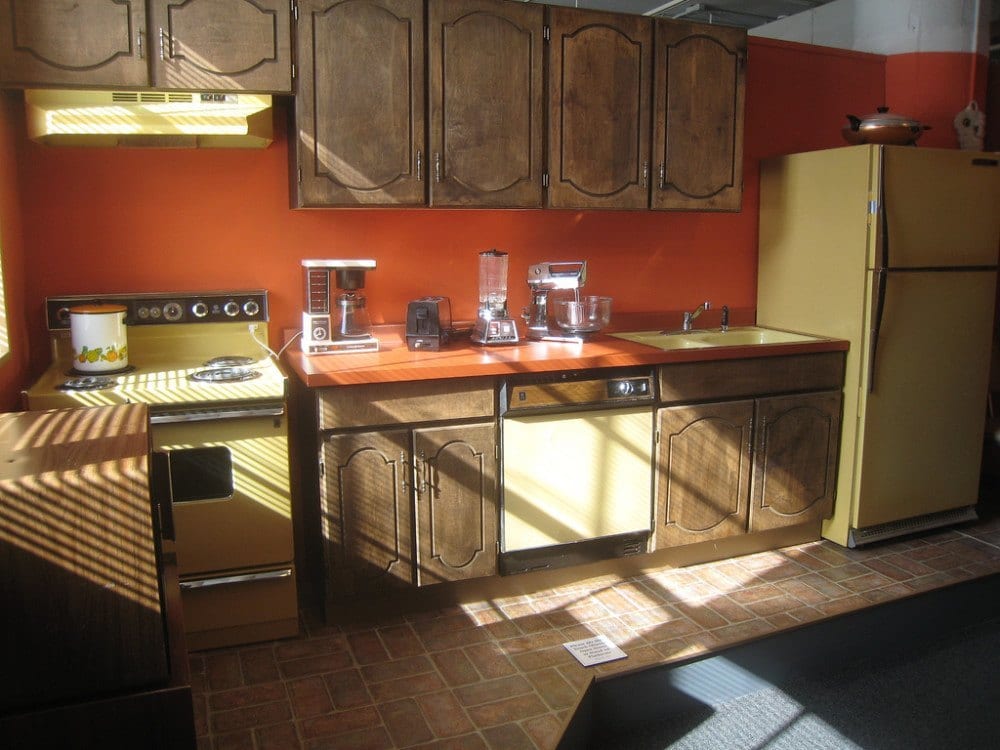
You know, like we do for this abomination from the 70s that clearly was the result of too many drugs in the 60s. It had to be.
This may very well be the last kitchen remodel we’ll ever do. (but never say never). And what is hugely important is that we do something that will not make our home difficult to sell.
Your kitchen posts are so enjoyable; I’m just nervous about designing something that’s so radically different from what I’ve been used to seeing my entire life!
I would love to hear your thoughts about this unkitchen kitchen design trend in a blog post; that is, if you think it’s worth discussing further.
Best,
Jean C.
Thank you Jean. She brings up an excellent point regarding her fear about embracing something she considers to be an avant-garde kitchen design trend.
If you don’t know what Jean is talking about. There are a number of kitchen posts where we discuss what I call an “unkitchen.”
Actually, that links to every post that’s about kitchens. The best ones are on page one.
What IS an unkitchen and is that a real design term?
Well, it is now!A few years ago, the idea popped into my head and I thought maybe I had lost my mind for real. But I checked on pinterest and found two boards entitled “unkitchen.” And then I thought. “Okay, unkitchen, it is!”
But, for those that are just tuning in, or forgot. This is my criteria for a kitchen to be an unkitchen
An unkitchen:
- generally has very few if any upper cabinets that go over a counter.
- might not having any built-in cabinets at all.
The English and maybe others call this an unfitted kitchen.
It is a little more like a living room.
It does not look like what we expect to see, with dozens of upper cabinets over counters lining the perimeter of the kitchen with a huge island in the middle.
The cabinets are usually painted either in white or earthy colors. Here is a post where I found several great Farrow and Ball colors for this type of English unkitchen.
Often, instead of cabinets, there are shelves.
There are also floor-to-ceiling cabinets– usually with pull-out shelves. This is an excellent post on storage solutions for the new unkitchen
In an unkitchen, there is often a pantry.
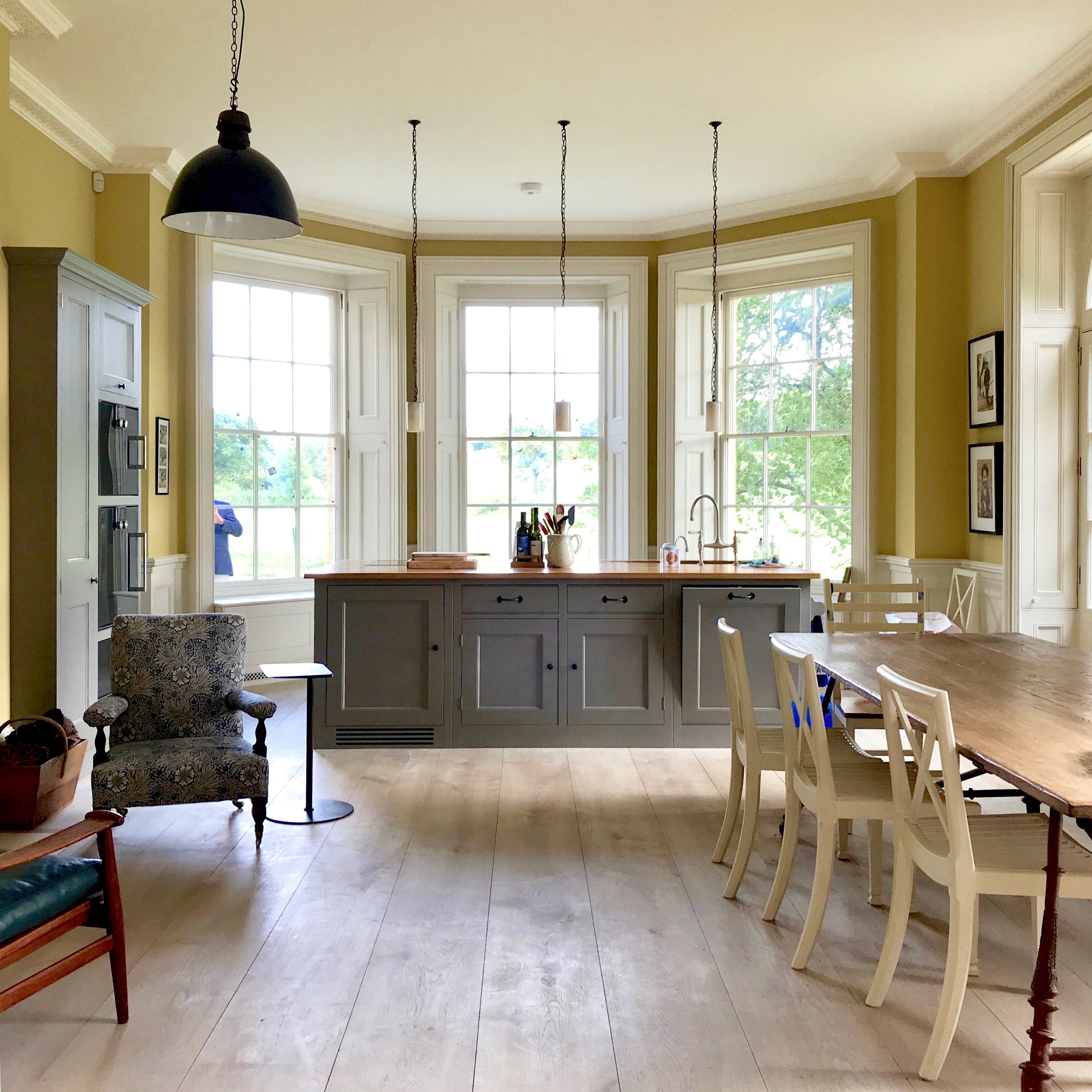
That is reminding me of one of my favorite unkitchens that I saw during my trip to England last year. You can see more of this gorgeous home, designed by George Saumarez Smith here.
Unfortunately, I forgot to go back and take pics of the AMAZING pantry. But, for more beautiful pantries, click here.
Here are some more unkitchen attributes:
- There may or may not be open shelves. I realize that some people abhor open shelves. You do not have to have them!
- There is often artwork and sometimes there’s even a little lounge seating.
- Sometimes, there’s more of a work table which might be an antique. But, this is not a requirement. Remember this beauty?
In other words, there are various levels and styles of unkitchen.
One favorite example of a perfectly executed unkitchen is that of Nancy Keyes.
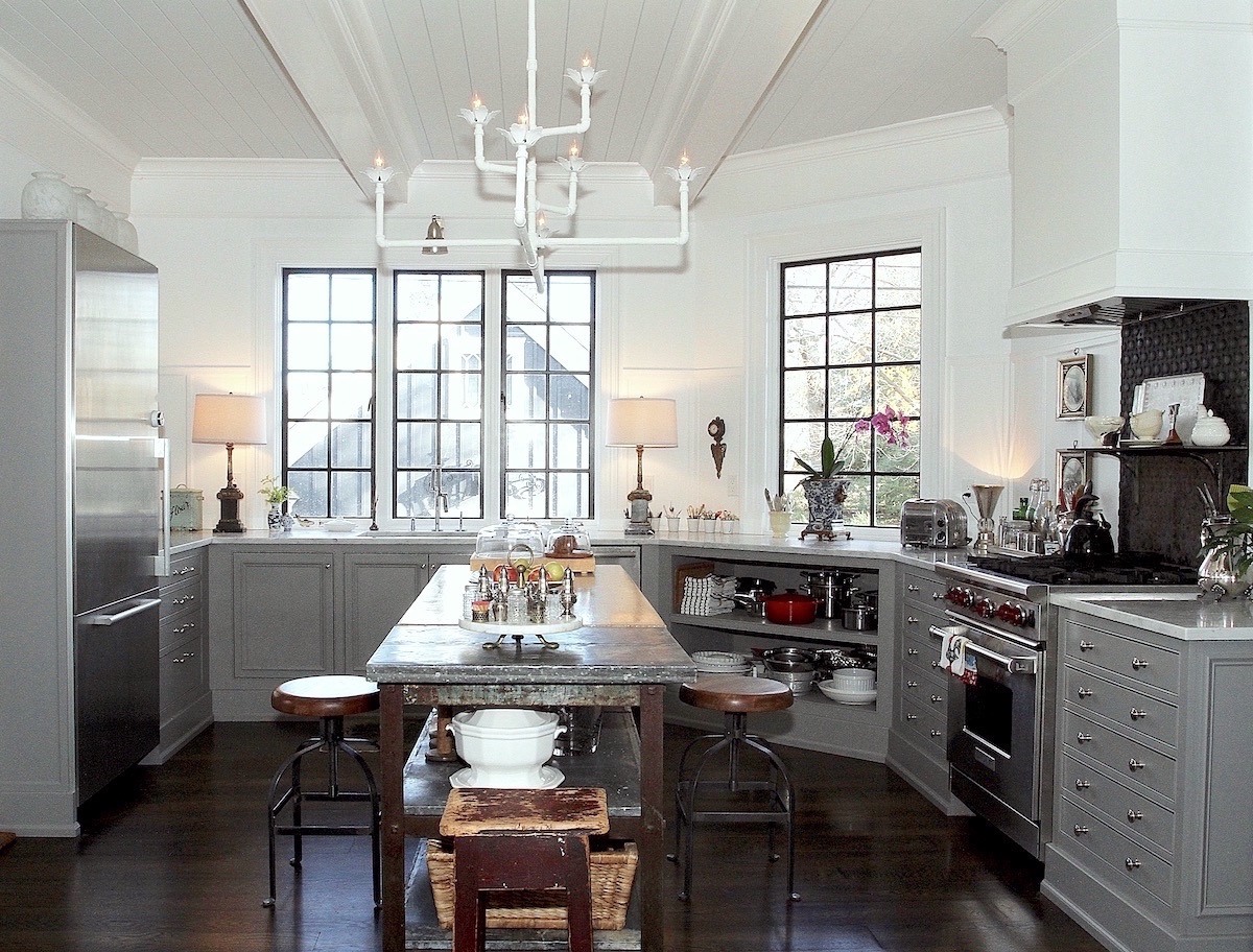
Please check out more of Nancy’s magnificent home which she lovingly renovated with her husband in New Jersey.
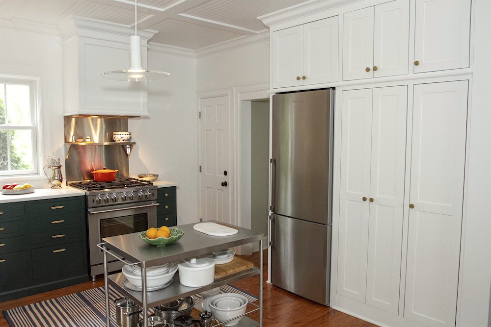
And more recently, she designed a smaller, “little sister” unkitchen for Melissa T that you can see more about that here.
So, the question still hangs above my head. Will these kitchens look dated one day?
Sure, I guess one day. But let’s talk about 20-30 years from now.
One way that helps me figure out what’s classic or a fleeting trend is to look at past design trends. I mean, the distant past. And then, I compare those findings to trends in more recent history that we have deemed to be dreadfully worthy of our ridicule.
To do so, we need to go back into history a few hundred years and work our way back.
Of course, it would be more accurate if we had photos, but since that’s not possible, we’ll have to make do with fine art depictions of the way people lived– more or less.
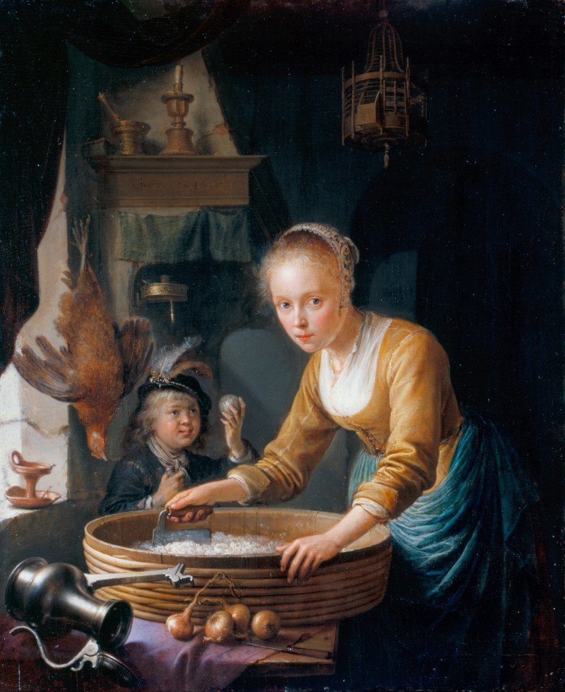
A Girl Chopping Onions by Gerret Dou 1646
In days of yore… kitchens looked a lot different than the way they do now. That’s for sure!
How can her feet possibly be that tiny? Oh, never mind. Artistic license, is probably at work there.
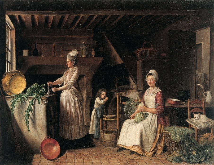
Antoine Raspal c. 1778 Interieur de Cuisine
Cute. I don’t like eating at the kitchen table either.
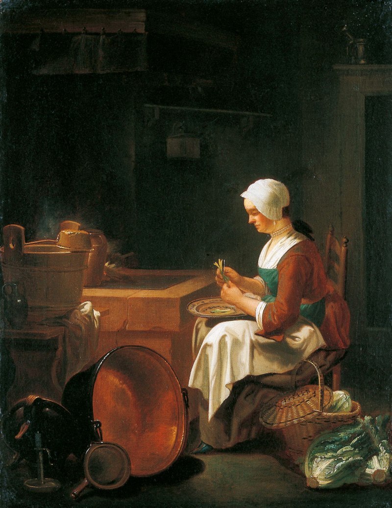
Justus Juncker before 1767 – The Maid in the Kitchen
Pretty dim, isn’t it? Isn’t it amazing how people ever worked in a kitchen without recessed down-lights?
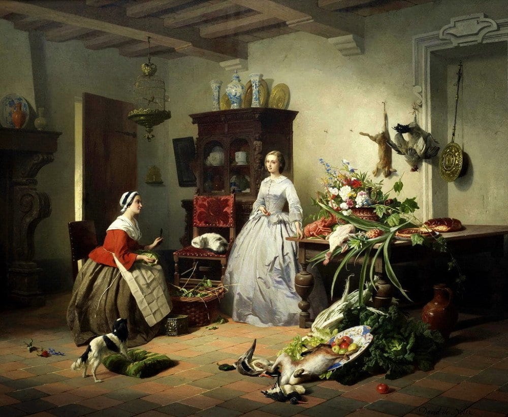
I couldn’t decide which image to use so I put in all three by David Emile Joseph de Noter 1818-1892
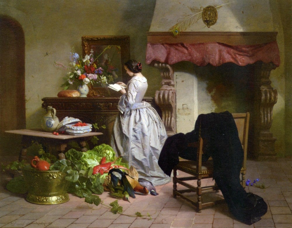
This artist was obviously a real foodie. Or else, the Victorians were just slobs. But it sure is pretty. Oh no, we’re supposed to be focusing on the KITCHENS. Yes, these are all kitchens. And there is nary a cabinet, much less an overhead cabinet!
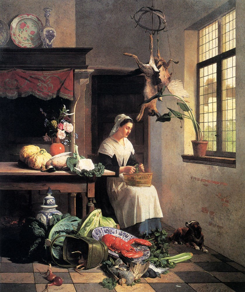
Hope that doggie didn’t drag something in…
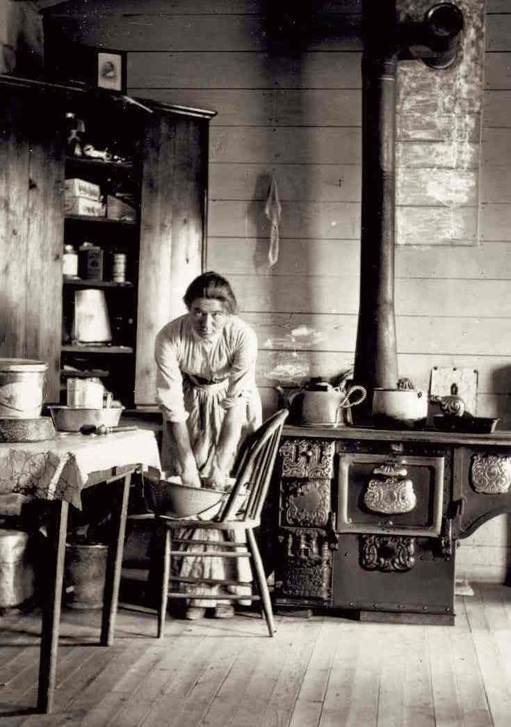
Honestly. Is anyone else wondering if that’s a woman or a man? Oh, never mind. But, Is that shiplap? hmmm… Another kitchen design trend from circa 1900. hmmm… Here’s a post that discusses current kitchen trends like shiplap and whether they are good or bad.
Interesting cupboard. I don’t see much in it, however.
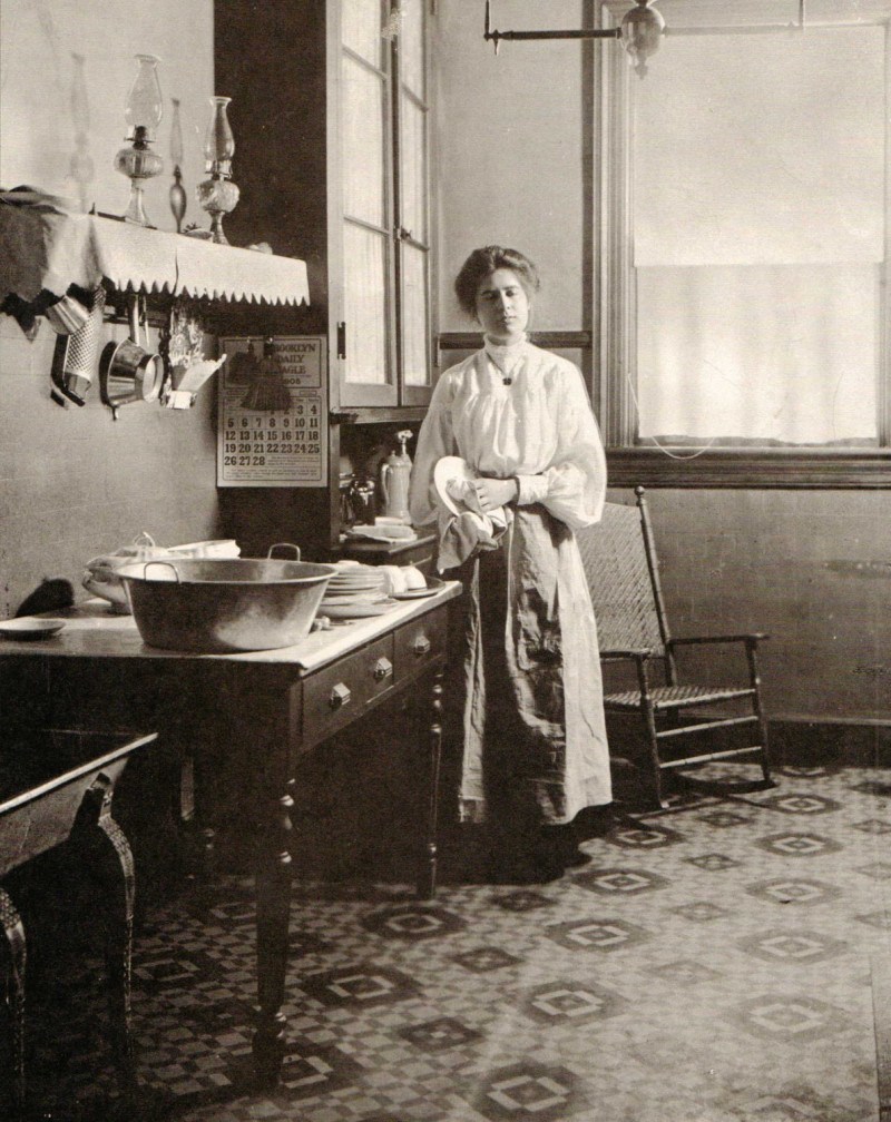
“Hmmm… Did I give Bob the regular or the decaf?”
I see that she has a wonderful floor to ceiling cabinet, so handy for putting the dishes away at least! This looks to be very early 20th century.
Some will say that we have more things now; therefore, we need a LOT more storage!
Well, if you ask the fabulous organizing team Done and Done.
Their answer would be that most of us “have way TOO much sh*t.”
By the way, every day, I want to kiss their feet that they came here and got my place all spiffy. (meaning they helped me get rid of a lot of sh*t!) I can’t recommend them highly enough!
And yes, some of us DO have a lot more than we need.
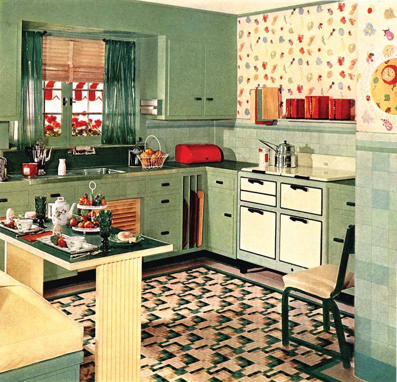
And then the thirties… Things started to change very quickly. Fun colors and patterns help with depression I guess. Plus– look at all of that storage!
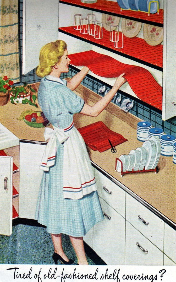
40’s-50’s. She can’t possibly be that happy lining her shelves.
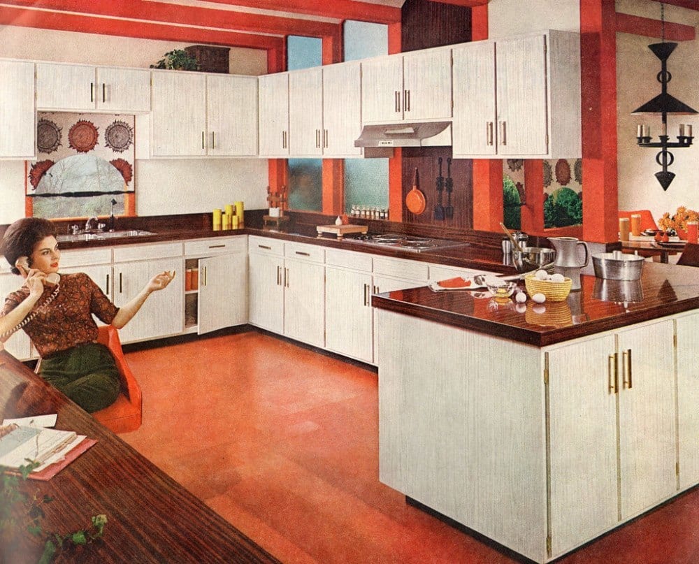
The sixties. Gosh, THAT was my mother— always on the phone! Except our kitchen was blue and Mom’s hair was “tipped” as they called it back then.
The 70’s. Please scroll back up if you need to see it again. haha
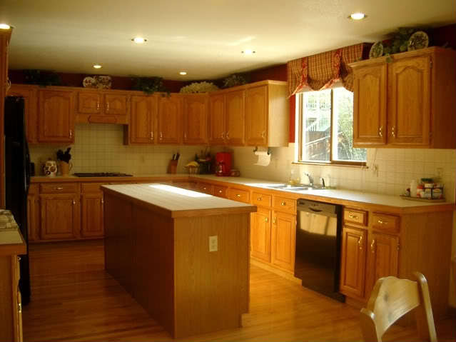
The 80s and beyond… I STILL see this. The ubiquitous oak kitchen with faux French door cabinets just stuck to the wall with all sorts of crap sitting on top. And the upper cabinets, all lined up.
Most people do have a lot of upper cabinets. You can include me in on that.
But, my kitchen is small and the cabinets are only on one side.
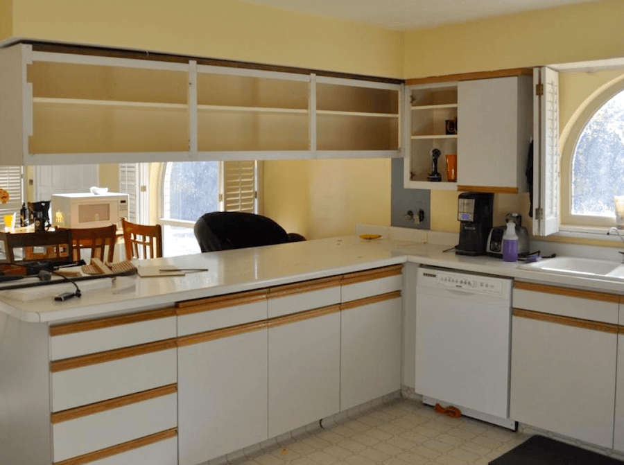
And possibly worse than the oak. Melamine. Almond. Whoever dreamed this up should be, well… What IS that thing hanging there over the peninsula? In this photo and the one above, imagine removing all of the upper cabinets (and the plaid balloon shade). Doesn’t that already look better?
This is what our old kitchen cabinet doors looked like before I had a guy do a number on them 22 years ago! You can see the results of that makeover here.(although, not crazy about the photos)
Okay, Did this exercise yield any results in terms of our deciding if the unkitchen – kitchen design trend is here to stay?
Yes, and no.
Any design needs to be a holistic experience. There are so many factors to consider including:
- location of your home
- style of your home
- size of your kitchen
- lifestyle
- if there’s a husband. (just joking. sort of) ;]
Well, it goes on and on.
But, here’s something else to consider.
Remember the days before the internet?
Please, try. :]
Remember how we used to clip pics out of magazines?
I certainly did and I actually still have a lot of them.
Some of them are as much as 30 years old. But what I love is that aside from the photography, itself, most of the designs do not look dated to me.
In fact, I found a couple of unkitchens. And one, I know has to be 25 years old!
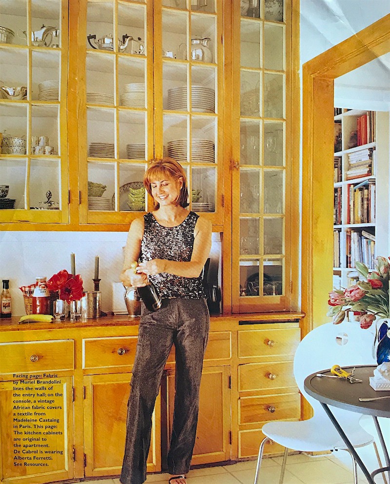
I mean the magazine article is at least 25 years old. The cabinets themselves are far older. This is the designer Milly De Cabrol. I’m sorry, but I don’t remember which magazine this came from. Maybe House Beautiful.
I did attempt to find another image of this unkitchen and finally did find one.
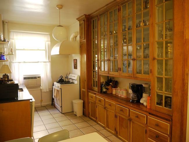
Very interesting. And it also points to what a spectacular photo the first image is.
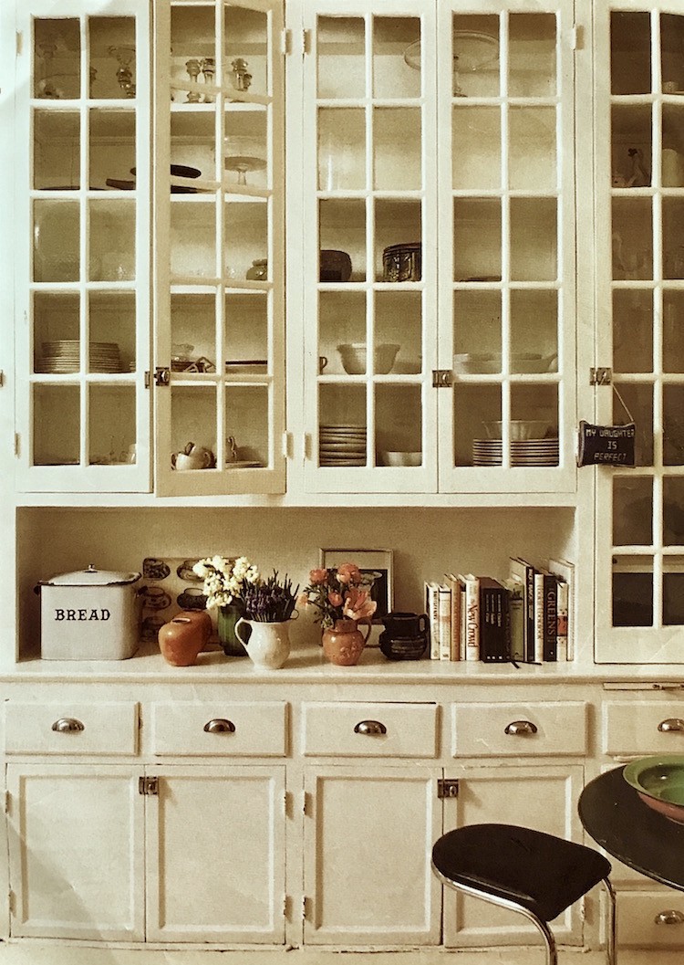
Similar cabinets painted off-white. Sorry, source unknown. But, you can see that all of these cabinets are quite old. I’m thinking maybe from the 20s. Ahh… this is reminding me of my 1920s apartment in Palo Alto where I lived briefly in the mid 70s.
This is my conclusion:
While this kitchen design trend might seem “avant-garde,” it’s really not.
And therefore, I would go for it!
In any case, I always suggest going for what you really love.
Let’s look at some more inspiration examples of this kitchen design trend that’s really been here all along.
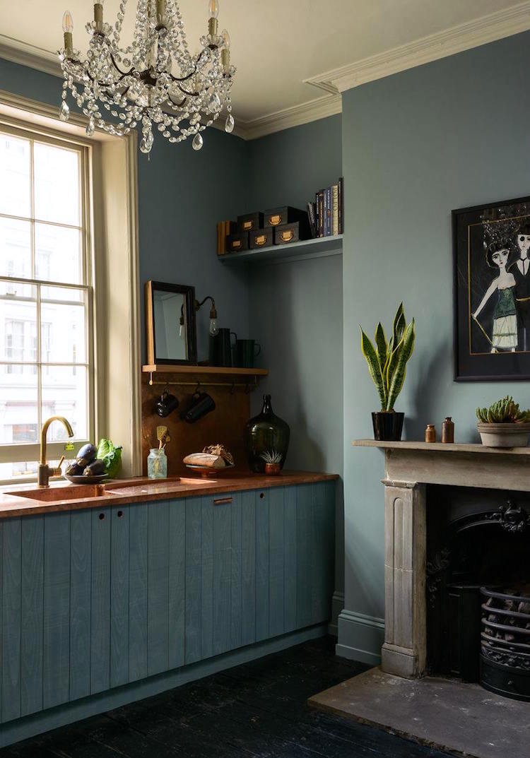
Another fabulous DeVOL kitchen unkitchen. I’ve featured them a few times. Love their kitchens!
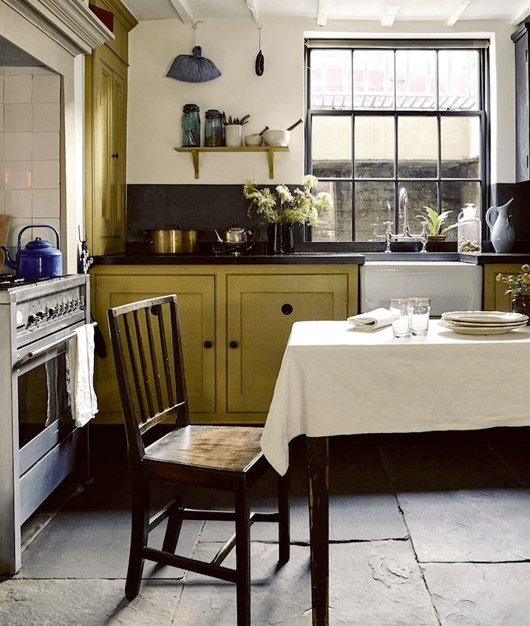
via @hayman_design House and Garden UK – photo: Michael Sinclair
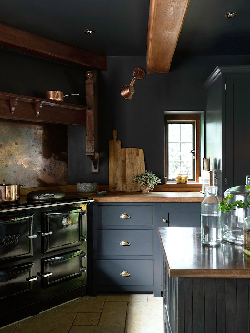
Another DeVOL beauty with a gorgeous a black Aga. The cabinet color looks a lot like Farrow and Ball Down Pipe.
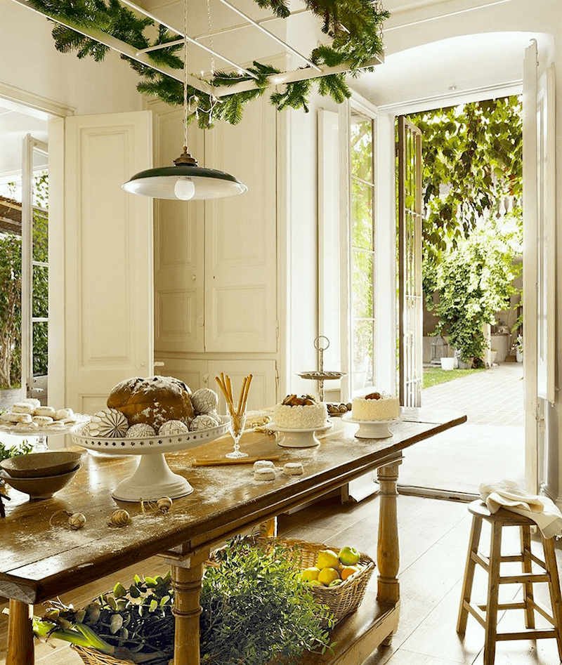
How fabulous is this!!! Another beauty from @hayman_design instagram page.
Just gorgeous! – Image via elledorationfr
Some of these unkitchens look more typical, but just not as many upper cabinets.
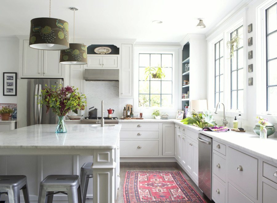
This classic white kitchen is open and airy. The cabinets integrate into the ceiling and windows. There is a gorgeous island with a little sink close to the range. This is vital if the primary sink is further than an arm’s length away!
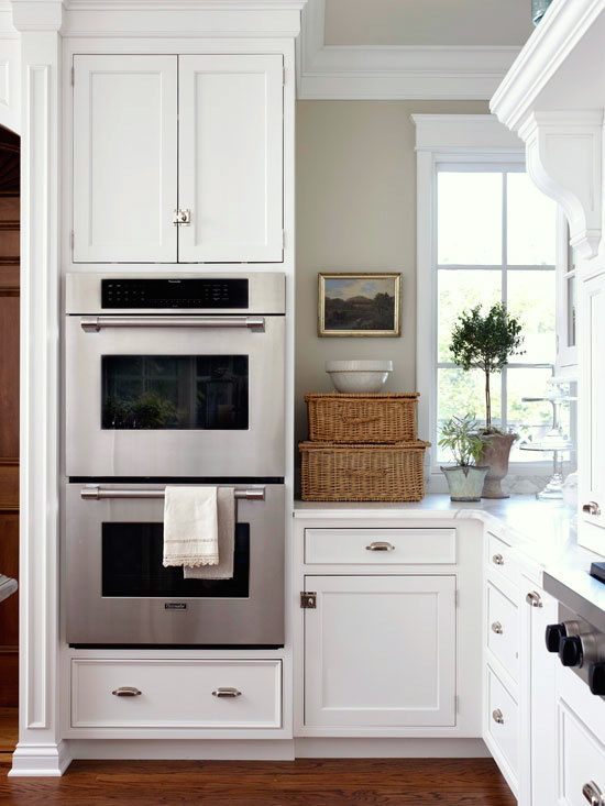
via: Better Homes and Gardens
Our ranges are frequently separate from the ovens. Double ovens have become increasingly popular.
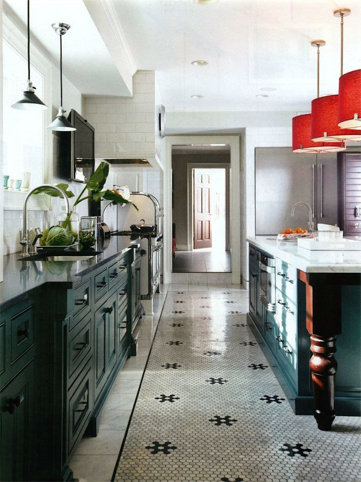
Bob Williams (of Mitchell Gold + Bob Williams) fabulous retro inspired kitchen. Love the hexagonal marble tiled floor!
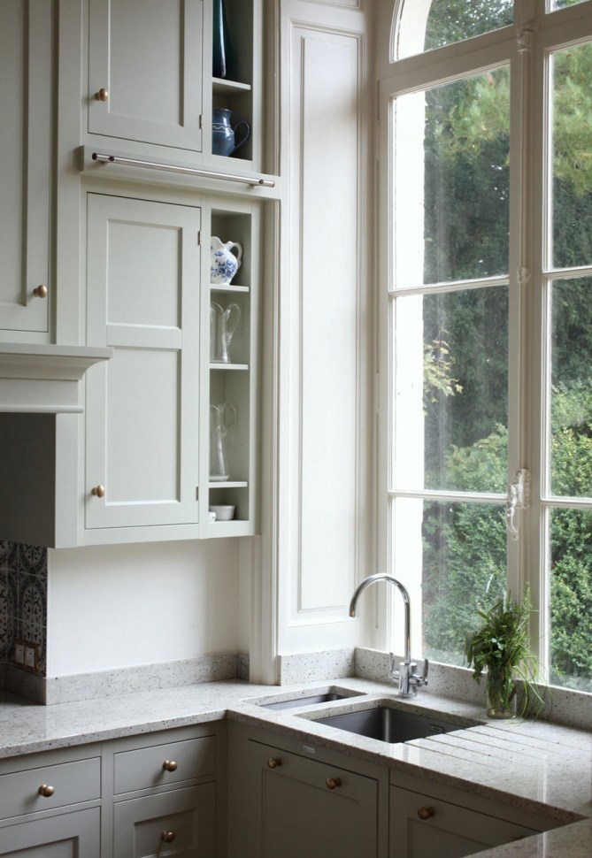
Love that huge window!
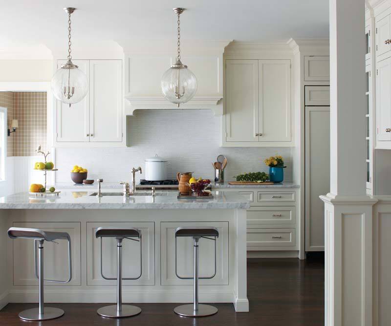
Of course, it is fine to have some upper cabinets.
A perfect example of upper cabinets that make sense within the composition.
In closing, I want to share an image from a reader’s Instagram.
The other day, I was looking at my feed and noticed that there were some interesting images, so I went over to the profile (Jennifer Faulkner) and was incredibly touched to find out that the inspiration for her kitchen refresh came from all of the unkitchen posts!
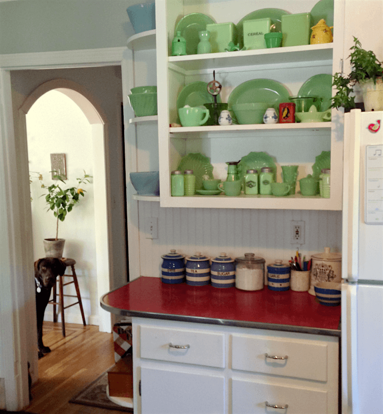
I love this charming vintage-inspired unkitchen!
She did the oft-mentioned Benjamin Moore cotton balls for the cabinets and painted the walls in everybody’s favorite gray-blue-green, Quiet Moments. Of course, both colors are in the Laurel Home Paint and Palette Collection.
She didn’t spend a lot of money, but the difference is quite amazing! Please head over to her page- rosie_mcposie_ and take a look at the other images and especially the before. I think that you’ll enjoy that.
You might also enjoy these posts about kitchens
breathtaking beautiful classic kitchens that aren’t white
12 of the hottest kitchens trends – awful or wonderful?
the death of the boring white kitchen KBIS
Please have a beautiful holiday weekend!
xo,
***PS: And, please check out the special edition Labor Day Hot Sales.
It’s worth it, just for the site gag.
Related Posts
- A Purple Color Scheme That Purple Haters Love!
- The Elegant Gerald Bland Style-How To Get the Look!
- Laurel, Why Does My Decorating Look So Awful?
- Christmas Mantels-24 Classic & Exquisite Favorites
- A New Home Color Palette Inspired by OKA!
- Beige Decor — How To Make It Go From Boring To Sensational!
- Can A Stained Wood Kitchen Look Fresh?
57 Responses
I love the look of these kitchens, but my experiment with freestanding antiques was just a mess. Nearly all of the unkitchens I see in magazines have tens of thousands of dollars in custom cabinetry. No one wants to see an unfitted refrigerator.
I think in a bohemian apartment or rustic cabin it’s possible to do an unfitted look without buckets of money. But there’s a bit of Marie Antoinette in the magazine images — you have to be rich to look rustic.
It’s funny, the 70s kitchen isn’t as appalling to me as it should be. My mom loves yellow, so we had that exact stove and dishwasher in our kitchen. The first thing I think when I see that kitchen is “Mom”. The second thing about that kitchen is that she had white walls, and instead of the usual “stone pattern” linoleum (like this: https://goo.gl/images/WNCxB8), she had a white linoleum with a more delicate pattern in a paler blue and metallic gold, similar to this: https://goo.gl/images/eBvWbP (the blue was less saturated, and the metallic was gold instead of silver). They sold the house in 1998 with those same gold appliances, but it worked so well with the floor, the buyers didn’t notice until they’d moved in. (Imagine not noticing mustard yellow appliances!).
Thanks for the post. The unkitchen idea is interesting. I haven’t quite decided if it’s for me, but it’s quite lovely (especially the vintage-inspired one with the jadeite!). I started following you when I was looking for home staging ideas. Yours was the only site that wasn’t “make your house look like every other pinterest/instagram house”.
Thanks for this post, Laurel, and for the whole concept of the unkitchen. Because of you, I’ll be putting in a little unkitchen downstairs in the TV room (which is continuous with the library). I just wanted a sink, refrigerator drawers, microwave, and coffee maker in a little kitchenette. But most designs I see look like, well- kitchenettes. And uppers would have hidden the one tiny window that room has (the darkness is why it’s the TV room). Now it’ll look more like furniture, I can hide everything but the sink and plan to bring in a petite armoire I already own for the dish- and drinkware. I’m beyond excited to do it! I was at a friend’s beautiful home with a similar snackbar setup and the whole time we were watching TV I could see those huge cabinets looming over me in the shadows. It’ll be so much prettier to have artwork over there instead.
Hi Danielle,
That sounds divine! So glad that the post inspired you. Please send pics when it’s finished, if you like.
Great kitchen post. I happen to love the “unkitchen” concept. You’ve got everything here, Laurel – all kinds of kitchens. WHEW! SO many kitchen choices, and so little time! I especially love the look of the one from Hayman Designs instagram page, but I love anything that brings the outdoors inside. Technology aside, some of the older ones are actually quite charming. The one with Milly de Cabrol and that big bank of cupboards and drawers behind her, and the next one with the off white cupboards and drawers. They have a genuineness and a handcrafted quality about them. They appear to be made of real wood, and not machine made.
I guess I’m actually one of the few people that still clips articles and pictures from magazines. I frequently find that when I save things on my computer, they get lost in this electronic abyss. I forget what I’v got!
Thanks again for the terrific post!
Hi Lisa,
The trick to saving things from online is putting them in folders and then the folders go in one specific folder. But, of course, there’s nothing wrong with doing it the old-fashioned way.
And yes, I love the “unfactory” for those two unkitchens. haha.
At 5’ tall I am so thrilled that my new kitchen will not have uppers. We have agreed to two uppers flanking the stove, with glass fronts, that we will use for glasses. Or something pretty at the top that I don’t need always. The bottoms are ALL drawers, and the two pantry styles will have pull outs. Tomorrow is “demo day” and so it will begin. I enjoy your posts, your sarcasm a lot, and your wonderful ideas and examples. Thank you for your interesting and educational posts. I am a fan.
Thanks so much Kathi! And all the best with your demo/reno!
I think doing a “vintage” kitchen, such as with a 1940s or 1950s look can be really cute. But it is very “taste specific” and the next owner of your home may want something else. If you keep it fairly conservative, everyone can like it. If you make it according to your taste and your taste only, not everyone is going to like it. I love jadeite, have some pieces in my kitchen along with some Fiestaware Sea Mist Green.
I agree. Please check out this post for that exact situation.
With the exception of open shelving; do love the concept of the ‘unkitchen’ however something I do notice which I find odd; in most images of ‘functional’ kitchens there is seldom a 30″ – 32″ (or waist height surface) provided for a pastry/dough station. With that said in respect to pantries if you wish to answer; I do have a question. Would having a one located about fifteen steps away from the kitchen work area be acceptable or do you feel it is too far away? Reason for asking is; it would also provide space for a freezer giving room for a wider/larger (counter-depth or built-in) all-refrigerator in the kitchen itself. (Thank you!)
-Brenda-
P.S.: HAPPY LABOUR DAY BTW. Hope you are relaxing.
Hi Brenda,
I think it would be okay to have a pantry that far away if that was the only option. Of course, I wouldn’t store stuff in there that I was using on a daily basis.
I didn’t know that a pastry station should be lower. Is that because people are sitting? Or is it a better angle for rolling out dough? I’m 5′-7″ and my waist is higher than normal counter height. 36″. Alas, how many people still make their own dough. Oh, I know, I’m sure a lot of blog readers do. haha. I never made pie crusts because it makes me nervous. But I do enjoy whipping up my chocolate cake.
As for relaxing. I find it is better not to get too relaxed if I’m home alone. :]
Happy Labor Day!
Your chocolate cake recipe is the best, Laurel! I made it for my son’s birthday and it’s our new favorite. Even though none of us knew what a “plotz” is, but trusted it was nothing bad. 🙂
Hi Danielle,
So glad that you’re enjoying the recipe! Plotz is a Yiddish word which means over-come with emotion.
Hi Laurel re a pastry/dough station; as usually in a standing position to either knead (using the heels of your hands) or roll (use of a rolling pin) what you basically want to avoid is a hunched shoulder position plus one that causes strain on the upper back, arms ‘n wrists reason why the work surface is often somewhat lower than standard counter height. (At least that is what I learned from personal experience as there was a time I use to make all my own homemade breads/rolls and yes pie crusts/pastries/cookie dough.) Also, re the location of a walk-in pantry; thank you so much for responding as do wish a counter-depth fridge of a reasonable size without having to tear down walls (or add an addition to the home) due to a small kitchen work space and overall layout, unless of course I win the lotto or you have a few spare grand + to donate to the cause …. winks!
-Brenda-
Thanks for the baking lesson Brenda.
If you want to make money, start a blog!
I understand that this woman is killing it.
Sally’s Baking Addiction
And if you scroll down to the bottom, she has a link with lots of blogging tips.
You have so much knowledge on many topics in the lifestyle/home-making realm.
xoxo
As you know, I just redid my kitchen and loved every minute of the process. Thanks to reading so many of your posts and looking at pictures I had a strong idea of what I wanted. I kept your voice in my head, make a plan and I hired a local pro to deal with all the workers and create a design that wasn’t pieced together by non pros (aka the husband and me).
You are the best Laurel!
Your kitchen is gorgeous Eileen! Whenever I do kitchens, I also work with a kitchen designer. I liken them to the cardiac specialist. I’m the general practitioner.
I just thought maybe there was a rule or something, but now I remember your post on choosing fabrics and the post on colors for an entire house from a fabric, excellent!!!! I could choose colors from the stone as I chose chocolate to enhance the hood…I am being lazy, sorry!
Dear Laurel,
Thank you for this wonderful post. You are awakening my forgotten dreams about my kitchen! I now realize it is an “unkitchen” what I was after. Both of my grandmothers had tiny kitchens and almost no cabinets, chippy dressers and quite distressed wooden tables. I loved being in those kitchens full of delights and warmth. I don’t know what happened when we built our home, I didn’t follow my dreams and did wooden cabinets, but fortunately didn’t do uppers, but did an island which is nice, but the kitchen looks as you say woody-woody…
I was wondering if maybe I could paint some of the cabinets or island (after convincing my husband because we paid a lot for real wooden doors 😬)
But….How many colors are too many? As I have chocolate walls, white trims, a big range hood in local stone (soft pastel green), black granite counters… Etc… It’s not that I would like to add another color but, can I? Four colors plus wood is more than enough? How many colors can live together in an unkitchen without killing it’s character???? Maybe a theme for another post… Ha, ha ha
Thanks again Laurel!
You are great!
Oh, I’m sorry Carolina, but without seeing what you are talking about, it’s impossible. I like the idea of chocolate walls with wood stain, however.
I think that mostly, it comes down to whether or not you REALLY like to cook. And if you need a “two-butt kitchen”.
If you really like to cook, you have pots of every size, commercial size vats and mixing bowls, full-sheet baking sheets, every kind of cake and muffin pan, stand mixers, food processors, etc. etc. You also tend have more ingredients on your shelves, and might even need multiple refrigerators. You are also probably a person who will buy muscatel jelly, hot pepper jelly, and god-knows-what jelly in addition to of every type of olive that grows on the earth. You see where I’m going. You need storage, and you use it all. And you need room for two people to maneuver.
I realized that the seductive beauty of an un-kitchen was not for me. But when renovating my kitchen I tried to make it feel that way as much as I could. So I have lots of traditional cabinetry, an island, and two large pantry cabinets, painted a very airy blue, with everything else a hint off white. Some of the cabinets have glass doors with curved muntins. I put in a 6′ 6′ picture window over the sink, and a full-glass door to the outside on the opposite wall. I’m about to have a deep valance made for the window, and full-length draperies alongside the exterior door, in an airy printed damask. Oh, I forgot, two chandeliers.
In one space between two doors, I put in a bank of drawers, but no uppers. Above that hangs a clock and a mirror. Now that I think about it, it’s this one little detail, along with the draperies, that is a tip of the hat to the un-kitchen.
I think if you combine beauty and functionality, you won’t go wrong, no matter what the trend is at the moment.
Hi Dale. The important thing is that you love it and that it works for your needs. And it sounds like it does!
Thank you as always, Laurel, for the mention of our kitchen and also now Melissa’s! Before you coined the “unkitchen” I would always say I hated “hanging cabinets”. No one understood what I meant because every kitchen had them. I don’t think a kitchen will look dated just because there are no uppers. As for appliances, I almost bought the Viking mixed metal in either white or black. I do love that look! XOXO
Right. It would be as if you said, “I really prefer a lawn without grass.” It doesn’t compute. And I agree that a kitchen won’t look dated without uppers.
I think it depends where you live what people want. We had an 1890 Farmhouse. We had the kitchen completely redesigned in the unkitchen style. We worked with a fantastic historical renovator. We used all scrubbed pine furnishings from the same period. Not American. It was all English and French pieces. When it was time we had to move everyone loved it but did NOT want to live with it. Mind you this wasn’t done in a rustic style. We had beautiful woodwork and wide plank flooring. People just couldn’t get past the fact it wasn’t an hgtv kitchen. Why they wanted an old historical home in a historical village is beyond me. We now live in a different historical village that it would be desirable. This community is much more artsy. The other community was mainly people that were type A and worked in a more conservative occupation. I truly it just depends who you’re marketing to. What’s the area like? Many people say they hate cookie cutter but really the only thing they might change is the color.
Hi Kathy,
I’m sure with you on the historical home thing. One thing that makes me super crazy is to see a beautiful, old historical home with a kitchen that has absolutely no bearing to the rest of the home.
One of my favorite unkitchens is Meryl Streep’s character’s kitchen in “It’s Complicated”–remember that one? I was always so sad that the whole movie revolved around her adding a massive addition including a new kitchen!
Hi Jenn,
I did not see that movie. The title alone, is a massively triggering suckfest. Although, I love Meryl Streep! However, I just looked it up. And yes, that is one stunning kitchen in a very unassuming way, if that makes sense.
Hi Laurel, what do you see as the trend for appliance colors? Is stainless now the new Harvest Gold?!? I heard white is making a comeback. We are going to need a refrigerator soon…when did they get taller? Most are about 2” too tall to fit in my space! Although I love the open cabinet look, I’m a neat freak and that look needs very frequent washing of all those lovely arrangements of dish and glassware.
Hi Roxanne,
I don’t think that stainless will every have harvest-gold designation. I do love white appliances, but mostly the very high-end ranges that have small amounts of brass, or nickel. I don’t know why they can’t pick up on this for refrigerators, instead of making them out of plastic if they aren’t stainless. Therefore, I mostly prefer appliances that are clad in cabinetry.
To be clear, a lack of upper cabinets does not mean a lack of cabinets. As a matter of fact, it often means MORE cabinets. The choice is either counters alone or cabinets, floor to ceiling. Yes, there can be shelves, but a lot of people don’t want that. I fully understand that. But what I think is not good design, is a kitchen with a boring row of cabinets which wraps around and then wraps around again.
Great post. I have also saved photos from the last 30-40 years. I’m always surprised by the number that still look fresh and classic. Rooms i could still love today. Have not seen too many white kitchens I didn’t like, well except for the melamine.
Hi Leslye,
I think it comes from knowing what one likes and if what one likes is classic, it most likely will look fresh. Photography aside, I love everything Albert Hadley did 40 years ago!
Good morning, Laurel!
Thanks for showcasing some really beautiful kitchens. Your advice is spot-on. Just doing what you love is so important in your own home. If you’re constructing a kitchen that’s not really you, you’re not going to be happy when you’re in it every day. Especially if you’re going to be in your home for quite a while.
I would consider what’s popular now only if I was planning on selling in the near distant future. Then your kitchen is more of an investment & will hopefully help sell your home.
Regarding the kitchens featured in the artwork before the 20th century, folks lived off of food that was fresh. There was no need to store all the processed food people eat today. And nobody had the small appliances that we’ve all acquired over time. As long as you had something to cook with, a place to store your dishes and a place to eat, you had a great kitchen!
Hi Mary,
I do miss my microwave, however. About two weeks ago, it started making a horrible racket, meaning a loud, annoying ding every few seconds. There was a signal on the monitor that I had never seen before. I looked up what it meant and it basically said that the jig is up. Very dangerous! Do not attempt to repair or use. So, I unplugged it and that was that. But now, I have to use my range even to heat up water.
Wonderful post, as usual. I certainly hope kitchens change as they are far too expensive to remodel in their current configuration. Often people are forced to buy ‘upgraded’ homes which are redone in hideously, scary kitchens which have cost a pretty penny. Always with ugly granite and hideous color choices as in floor versus cabinets versus counters.
I love the look of the unkitchen but would need a pantry or a wall of cabinets which look gorgeous to my eyes. However, setting things up so most everything is in lower cabinets is very bad ergonomically as a huge number of us have bad backs.
I dislike peninsulas with or without upper cabinets. They close things off.
Also, given the back issues, counter height islands seem perfect to me as they can provide limited seating and a huge prep space which my spacey brain needs. Putting everything out in one space with room to sort, etc. is my idea of heaven.
My present kitchen looks big because of huge windows for in kitchen table, but I would give anything for an island instead. Floor plan does not seem to allow for that without starting from scratch.
And what do I do with nice maple shaker cabinets which leave a huge gap to my nine foot ceilings? Cannot afford the cabinets on top. Right now they are just collecting dust.
Forward with the unkitchen with windows!!
I have two pieces of art in my wanna bee unkitchen and a rug over the hardwood floors because my aging mother dropped a lot of stuff.
The rug does not bother me. It is mainly black with trellis pattern and lots of color. I attack it with a carpet shampooer.
Hi Ramona,
I love rugs in kitchens! As for lower cabinets. I hear you. I’m advocating drawers. Drawers are the answer to having to bend over and “dig.” And yes, to counter-height islands.
I too have a 12″ gap on my nine-foot ceilings. Once, maybe six months after I moved in, I actually got my step ladder and climbed on top of my counter and took a look and went “ewww…” Then, I attempted to “clean.” I would need a powerwasher. hahaha. I climbed back down.
I’ve thought about having a soffit built to fill in the gap. That’s the solution, I think.
What I really need, is a magic wand. I’m not expecting a free magic wand. I just want to make my wish, wave it and done.
LOL
I think I’ll sell before I climb up there!!
haha!
I am in the moon right now!! I never thought I’d tune in on Sunday and see my unkitchen on your site. Thank you for your kind words and inspiration!! Xox
Well, you deserve it Jennifer. Anyone who can make a transformation as pretty as that and in only three days impresses me! xo
Laurel, I agree that an ‘unkitchen’ is the way to go …if you have room for a large pantry! I have a very fashionable friend (that traveled to Europe) that did one in the 90’s. I think because it isn’t a ‘hot trend’ that it looks timeless. Unfortunately I have a small U shaped kitchen so I need to keep my uppers 🙁
I think things that WERE timeless (like subway tile or shiplap) have now become ‘hot trends’ that will look dated because they will have a ‘time stamp’ on them. Just like looking back to the older kitchens… when we look at all white kitchens with subway tile and white counters we will know it was a 2010’s kitchen.
As a home stager I pay attention to color trends and most of the paint companies are highlighting darker colors, so I think we have started a slow shift away from white/light colors.
Maggie
PS I LOVE your blog and it is the first thing I do on Sunday!
Hi Maggie,
I actually don’t mind uppers on a small u-shaped kitchen. In fact, that’s my favorite shape of kitchen. I too, think that the darker kitchens are on trend at this time. I love the dark DeVOL kitchen and how they took the color all the way around the room. I’m sure that it’s a small kitchen and I don’t know if it’s part of their shop or someone’s home, but it’s quite cool. Does that mean that I would do it for myself? It would need to be a rustic, very old house– maybe by a lake. I could see that.
I have wanted a Christopher Peacock scullery-style kitchen since 2003…back when all you could find were 42 inch maple cabinets and granite in every newish kitchen. I finally got a chance to refurbish my kitchen towards the scullery style this year. I think it looks classic and I can’t image ever not loving shiny subway tile, hardwood floors, marble and polished nickel. I guess time will tell if it looks like 2010 but I can’t imagine a future when I won’t still love these materials!
Great post, Laurel, with lots of chuckles!
In so many cases “dated” means “something I don’t like.” I think that if you use high quality materials and workmanship, good design, and maintain it well, your kitchen will be attractive and workable for a very long time.
After 27 years with my kitchen with cherry cabinets, white laminate counter tops and sheet vinyl flooring it was time for a change. I needed more light/windows and wanted a different layout. However, it looked wonderful even on the day we demo’d it. We donated the cabinets and some of the appliances. But it would have served us well if we didn’t have the resources to renovate it.
All the kitchens you showed in the post will be beautiful and functional for many years to come!
Thanks Diana,
I think so too!
Laurel, Just wanted to add, I think I may have read your blog a little much…
We went out to dinner last night, And when we sat down, I looked at the walls
and I was like “This color is Guilford Green” and I checked to make sure…
Absolument! My husband laughed
Susan
Oh, how funny! xo
*I meant Cleveland green. Guilford green would have been quite a feat Ha!
When you are Right Laurel, You are Right!
We are grateful!
Susan
Ahhh… Cleveland. Big difference. They must be fans of Bunny Williams too!
Hi all,
Thought I would share an un kitchen I was recently enamored with.
It’s in France so right off the bat I’m in love. Beautiful photos by her husband I believe.
I’m a tiny bit jealous I must say
Susan
Ahh… yes, Mimi Thorisson. I remember my mother teaching me to never be jealous of anyone. She said that you never know what’s really going on or what’s in store for that person. Of course, she’s right, but still… Thanks for sharing her amazing home!
Hello Laurel,
Just wanted to tell you how much I enjoy reading your blog and the links to more blogs and information. I discovered you on Pinterest and think it’s like discovering a new book author that you love. It’s fun to go back and read the previous posts because it’s all new to me. I’m now also reading and following several of your recommendations. No questions for now, I’m just buttering you up for later!
Xoxo
Sharon
lol on the buttering up. Thanks for the chuckle!
Hi Laurel,
Great blog as usual.
Many years ago I frequented a local antique mall. In it was a vendor that had these beautiful free-standing cabinets. They were long and heavy, solid wood with feet and glass doors. I don’t know if they were French, faux-French or what, but I always said if I could custom design a kitchen I would have cabinets like that instead of a bunch of built-ins. I still think about those cabinets that are long gone.
A good kitchen design won’t go out of style, and you can’t please everybody anyway, so build what works for you and enjoy it.
I was just thinking. Aunt Bea on Andy Griffith had an unkitchen. One upper cabinet that we could see and a free-standing cabinet for her blue and white dishes.
Thanks for another great blog, I enjoy the paintings and history lessons.
Hi Carolyn,
Well, there you go. Good for Aunt Bea. Or rather, I should say, the set designer!
Yes, I am sure it was all the low tv budget allowed for. It really was a “non-kitchen.” As in non-existent.
As far as reality goes, I can’t easily reach most of the shelves in of my upper cabinets. The lowest shelf is just below eye-level for me. I am 5′ 3″. I was able to lower the second shelf in each cabinet, but they are still above my head. Then, the rest of the storage pretty useless being the lowest shelf in the lowers are near the floor. No deep drawers or sliding shelves. It really is a crap design. I always wonder what house designers are thinking. They do live in houses and use kitchens….or do they? Maybe they are all 6 foot tall contortionists.